
Emily Henderson's Blog, page 3
September 29, 2025
The River House Entry And Staircase Reveal (+ Why We Designed The Stairs This Way)

This entry is not the infamous family drop zone, which makes me just so happy. I really love how the architect, Anne Usher, designed the layout of this house. There are two exterior entrances that lead to the mudroom (up the garage stairs and up the side of the house), allowing the front door entry to be pretty, spacious, and clutter-free. It’s such a dream.

As a reminder, this entrance is up a cascade of wide concrete landings and exterior stairs, and once inside you can move forwad into the living/dining/kitchen area, cut to the right into the game room/library or cut left and see this sweet little sitting area under the railway. But a lot of designing had to happen along the way.

This was the stairway a couple of years ago, before I had even thought about what it should look like. Katie knew she wanted wood (as opposed to metal or glass), but where should it start and stop? And how does it integrate with the railing along the landing above?

At this point, they were so far over budget that doing something super bespoke was not on the table – no intricate carvings or welding this time, which was fine because this house is meant to be simple in its finishes, more eclectic in its styling.

We chose 2×2 squared off white oak lumber, installed vertically with a simple railing along the top. We thought this would create architectural interest, dimensions, and shadow lines, while not breaking the budget nor being too builder-grade.

I remember that we had to stop the vertical wood to float an inch (or less) above the floor, mostly because of timing – it had to go in before the flooring and so stairs could be installed. But the exact measurements (height) were a bit unknown and god forbid if they weren’t exactly flat/uniform that would be a huge pain in the A. So they wanted to give some space as a buffer for a trim piece. I knew that for the most part, your eye wouldn’t clock this and that there would be furniture here, so I was ok with it. I also didn’t want this decision to hold up the rest of the construction, which needed to happen in a specific order. Designers can famously hold things up, especially when we are so myopic and obsessed about the details that honestly later barely matter (I’ve learned this lesson every single project and will likely for the rest of my life, but it’s easier for me to be less perfectionist at my brother’s house, lol).


I’m obsessed with those wood wall washers going up the stairs (from Cedar and Moss), and while I love the Schoolhouse flushmounts on the ceiling, we always meant to switch the bulbs out to be bigger. They are so tiny!

The railing continues up the stairs onto the second-floor landing that opens up to all the bedrooms. I love how it adds a lot, just with one material.

Chandelier (no longer available)
The large chandelier up here is from Schoolhouse Electric. We needed something with a lot of bulbs and a really big scale without being insanely expensive or too ornate. The amber glass is quiet and pretty.

I honestly don’t remember where I ended and Max started on some of these design decisions (or vice versa), but I know that he helped troubleshoot some of the measurements – he’s excellent at making decisions when I got super stuck in indecision mode.
The Finished Staircase
The Alice Sofa | Rug | Pillow | Throw (similar) | Side Table | Lamp | Planter | Wood Sconces | Artwork
I truly love how it turned out. It’s just so striking and simple. Sierra Custom Construction executed it really well, and honestly, it’s just so perfect for the house as a whole. It’s really strong and sturdy (Ken’s biggest concerns) while being visually really powerful.
The paintings up the stairs are by a local artist named Anna VonRosenstiel, which I found at Urbanite (a Portland mall that has both vintage and makers). I can’t believe how perfect they are in size, color, style, movement, scale, price, and the fact that we could get a diptych going up the stairs really nailed the whole look.

The light and shadows give it so much movement and texture, not to mention the “striped” pattern that packed a big design punch.

Stacked Artwork | Wooden Mirror
I hadn’t planned for a sofa to go here, but we had this one from our new collection, the Alice, that found its home. Ken and Katie are, like me, typically scared of a light colored sofa, but this is really just a pass-through space and is visually really important (you can see it from so many rooms), but gets very little functional use, so it was the perfect place to put something really pretty. Originally, I thought I’d put a round entry table with a dope lamp or maybe just a huge tree with a sculptural chair underneath, but once we put this here, we realized it was perfect. Again, they have a mudroom as their drop-zone entrance, but for guests, they can absolutely throw their coats here for gatherings, so it does actually serve a purpose.

The brown amorphous rug was really the best move (it’s not the highest quality, but it’s so affordable and perfect in color, size, and shape, so they kept it here). The plant breaks up the stripes with something organic and asymmetrical. And Katie has kept it alive since January with only mild to mid-level daily fear that she’ll kill it. (Ahem, more to come on the excellent faux house plants/trees that I bought for her after realizing how much stress this real plant created – I found pretty dang great ones, I promise).

This color of the rug is really forgiving (being brown), and a rectangular rug would have cut off the space in a really odd way (and no rug felt sad). Once we put this down, it immediately created the sense of a “room,” even though it’s just a pass-through space. It warmed it up a ton.
The Front Door

Ceiling Lights | Flooring | Wall Color
They chose all glass and white oak front doors and side lights (which they have come to regret, actually, for privacy reasons), but they sure are pretty  Turns out you don’t want your Amazon delivery friends to have total visibility into your morning (so they might add a film onto it). There wasn’t really room for much of an entry table (we might still add a very narrow one on the right white wall), but we needed something to make it feel special.

Finding this rug was clutch. We put a big mat outside where you wipe your shoes, but I really felt like this should be a special rug since it’s the first thing you see walking up to the house, and really invites you in. But what size? And do you place it horizontally with the door or more vertically perpendicular to the door? I bought two of these green scallop rugs from West Elm in hopes of creating a longer rug, and it looked great in the shots. But that day I realized that if we had 3 of them, sewn together, it would actually act as a long corridor rug leading people into the living/kitchen area towards the view of the river. Like so:

I’m pretty dang obsessed with it. Katie ended up just getting a really sticky rug pad instead of dealing with sewing them together (which would have cost hundreds and taken a couple of weeks), and she swears it’s fine:) You can get a sneak peek of the living room and dining room up there, and I cannot wait to show you the rest of the house in a couple of weeks.
.slider-info-382447.bafg-slider-info .bafg-slider-title { font-size: 22px ; } .slider-info-382447.bafg-slider-info .bafg-slider-description { } .slider-info-382447.bafg-slider-info .bafg_slider_readmore_button { text-align: center; } .slider-info-382447.bafg-slider-info .bafg_slider_readmore_button:hover { }


The first impression is pretty dang perfect. And being that mid-tone green, it’s really forgiving (versus a lighter rug). I can’t believe I sold them that vintage Swedish oil still-life painting. Sure, technically it didn’t have a home in my house currently, but I love it so much (don’t worry, I’m charging them a lot for it, lol). The colors look so beautiful here, and it gets a lot of attention and appreciation, which is important to this hoarder:)

The whole vibe when you walk in is honestly so warm, welcoming, and exciting. The green rug takes you straight into the main living space, and you pass by what I think is my favorite room in the house – the game room. A big thanks to Anne Usher, the architect, Max Humphrey, who helped make a lot of design decisions, and Sierra Custom Construction for building the house. More to come soon:)
*Architect: Anne Usher
**General Contractor: JP Macy of Sierra Custom Construction
***Interior Designers: Emily Henderson (me!) and Max Humphrey
****Styling: Emily Henderson (me!)
*****Photos by Kaitlin Green


September 28, 2025
The Link Up: Em’s New Sofas, Jess’ Perfect Suede Jacket, And The Resuable Cure To Annoying Flies

It’s been a very intense and rather devastating couple of weeks for our country. Part of you wants to scream at the top of your lungs, another part of you doesn’t have the words. While there are many issues that many of us will sadly never agree on, one that we feel we can is the right to free speech. It’s the foundation on which this country was built. To help protect this most important right, you can always donate to an organization like the ACLU. It’s their job to protect it. We can’t close our eyes and keep our fingers crossed that “everything will work out”; we have to take action in some form before it’s too late. We know this intro is heavy, but it’s a very heavy time. Ok, now let’s link up for something lighter.
This week’s house tour is architecturally stunning! And yet cozy with a perfect amount of moodiness. You have to just go see it:)
 here’s a little unedited photo as a sneak peek:)
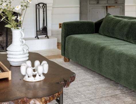
From Emily: My link this week is definitely self-serving, but I am so excited about my new sofas (from our Room Service line). I’m sitting on the 96″ Alice in forest green right now, and it’s exactly what I wanted in our living room (and was designed literally for me and my family/pups). The seat is soft, but not too mushy (in a good way, our last sofa was too loungey for this more conversational space). It’s deep enough without the pillows to really lean back and lounge, but so ergonomic that the curve of the back cradles you. Still really comfortable for a TV room, I promise. I’m still deciding if I want to use the back pillows that came with the sofa or remove them and put cute patterned throw pillows (the back pillows aren’t cushions; they are intended as an option for a cleaner look, but the sofa was designed to look good both ways). We have two facing each other, and the backs of them are so simple and pretty, with a slight curve that catches the light. My team really nailed this one, which makes me incredibly happy and proud. If you are looking for a sculptural, beautiful, comfortable sofa for your living room with pretty statement arms and adorable oval wooden feet, I’m happy to recommend this lady, Alice. Full reveal coming soon, but here’s a sneak peek! And y’all, the quality is so high (it’s pretty heavy!) for the price point. Am I allowed to leave my own review? If so, it’s 5 stars:)
From Caitlin: LA folks – next weekend is your last chance to shop the Allee Willis estate sale! If that name rings a bell, it should – I linked up an incredible documentary about her (now streaming!) last year. She was a prolific songwriter – September by Earth, Wind & Fire is my personal favorite – and I’m so pleased with the few spoils I brought home last Sunday. (Yes, I did go on the 21st of September, and yes, it’s now a fun memory I’ll take forward every time I hear that track for the rest of my life.) If you’re in the area, grab some tickets and stop by – her backyard is a total dream in and of itself. See you there?
From Jess: After nearly a year of contemplating this purchase of this most wonderful and beautiful suede jacket, it’s now hanging in my closet!!! Suede is one of those things that’s currently very on trend but also a classic. I love that it works perfectly with my wardrobe, is light enough yet warm enough for cool California nights, and looks really effortless. It also comes in different colors and fabrics if suede isn’t your preference!
From Mallory: Nordstrom Rack has the best cashmere sweaters right now for only $60 (over 50% off the normal price) – I snagged this one in bright blue and LOVE the color (I got a large because I like my sweaters to be oversized). They have lots of color options if you’re in need of a new sweater for fall!
From Arlyn: Not all Link Up links are sexy, okay? But you know what else isn’t sexy? FREAKING FLIES! Every single summer, our home evidently signs a short-term lease with all the flies in the neighborhood that seem to come out every night when I’m cooking dinner. We have no idea how they are getting in or where they are living until they emerge. Then, once the weather cools, POOF, they are gone. ANYWAY, we wanted to get ahead of the madness this year and picked up this reusable outdoor fly trap to help thwart them before they even make it inside. We saw a similar one on Sara’s outdoor patio one night when we were over for dinner, and it was full of flies. We knew right then and there it would be the fly siren we needed around our property. Heads up: It doesn’t smell pleasant, but that’s why the flies love it. Keep it a good distance from where you hang out outside.
From Marlee: Initially, I was going to just link up my new satin pillow case, which I got to remedy the insanity that is my hair every single morning. As someone with wavy hair that’s very susceptible to frizz AND a severe toss & turn sleeper, this has really helped me reduce the amount of damage control I need to do every morning. I was able to get it in a color similar to my sheets, and it’s not the prettiest against my linen bedding, but I just tuck it in the back of my pillows when I make my bed in the morning! ANYWAYS, as I was pulling up their website, I realized I have quite a few other products that I love from this brand – here’s the quick and dirty rundown… The eye mask, which is the only one I’ve ever used that doesn’t fall off constantly and doesn’t leave creases in my hair – the thickness of the band means not ONE OUNCE of light is getting in my eyes. I use this every single night. The heatless curling set, which takes a little bit of practice but creates perfect mermaid waves while you sleep without damage/heat, definitely works best on longer hair. This would make a great gift if there’s a teen girl in your life! The detangling brush, which I keep in the shower to brush conditioner through my hair, and since it doesn’t have anywhere for water to get trapped, it doesn’t get gross. OK, that’s all. Looks like they’re having a 20% off sale right now too with code FALL20:)
From Gretchen: With fall upon us, my desire for cozier clothes is creeping in quick! I’ve been living in these AMAZING Le Bon Shoppe sweatpants–wearing them to work, popping out to the shops, or while hanging at home. They are just so comfortable and easy to throw on, but feel less like schlubby sweatpants and more like stylish loungewear. I have them in two colors (Basil and Almost Black) and love/wear-them-to-death equally. They are 100% cotton, hit at the perfect height around my waist, and have such a fantastic drape and flow to them. They’re called the “Balloon Pant” for how they gather and “balloon” out at your ankles, hanging at the perfect, slightly cropped height. They’re nice and loose, and the material isn’t too heavy or hot, which is often the case for me and sweats. They’re on the spendier side, yes, but they are QUALITY and feel much more elevated than just any old pair. And with the amount I’ve worn them already, just a few days into fall, I really feel like I’m getting my cost per wear. I’ve been obsessed with their socks (I have like 12 different pairs) and fear that my comfy Le Bon pant collection will grow in a similar fashion…but I’m not mad about it!
Thanks for giving us some of your time today, and see you tomorrow for another beautiful river house reveal. xx
Opening Image Credits: Architect: Anne Usher | General Contractor: JP Macy of Sierra Custom Construction | Interior Designers: Emily Henderson (me!) and Max Humphrey | Styling: Emily Henderson | Photo by Kaitlin Green | From: Revealing My Brother’s Ultra Cozy Family Room (And The Most Comfortable Green Sectional)
September 27, 2025
The Great Fall Boots I Own And Love

Fall boots, historically my favorite of all the “shoe” drops, are dang good this year (if not more expensive due to what I think is tariff inflation). But man, do I wear them a lot, even my over-the-knee boots that I’ve had for three years (which takes any winter outfit from basic to date night so fast). Here’s what I’m into this year.
Classic Brown Mid-Calf Boot

Outfit #1: Sweater (Small) | Top (Small) | Scarf | Shorts (Size 27) | Belt (Medium) | Boots (Size 7) | Outfit #2: Jacket (Small) | Sweater (Small) | Scarf | Shorts (Size 2) | Belt (Medium) | Boots (Size 7)
These were my main purchases, and I struggled to find them for under $300, but boy, are they great. They are comfortable, have enough of a heel, and are the perfect color of leather that goes with everything and makes something basic look more polished. They have a stitching detail that makes it look a little more designer. I’m fearful of faux leather not lasting, but there are definitely more budget-friendly options in that category.


Tall Riding Boots | Campus Knee High Boot | Riggs Boots
Go-To Black Leather Mid-Calf Boots

Slouchy Cable-Knit Cardigan Sweater | Jeans (similar) | Boots (similar)
I found these at American Eagle for much less (but they aren’t real leather, should you care about that). They are definitely more of a moto vibe, but for the price are pretty great. I returned them and now they aren’t available for Jess found some great, better quality dupes for you


Terryy Round Toe Tall Boots | Sajan Riding Boots | Milah Platform Boot
Awesome “To The Knee” Suede Boots
Scarf (Similar) | Long-Sleeved T-Shirt (Large) | Sweater Vest (Small) | Skirt (Size 2) | Belt (Medium) | Boots (Size 38)
I LOVE these boots, and if I had an office job where I wanted to impress (and not wear the same boots daily), I would have absolutely kept these. I love the suede, the pointy toe is so flattering, and the little heel gives you that lift. They are wider in the calf, which I loved the look of, but didn’t slouch. Definitely a more polished vibe that really elevates an outfit.


Kendr-a Western Tall Boots | Kiki Kitten Heel Boots | Erena Kitten-Heel Boots
The Best Over-The-Knee Boots

Jacket (Small) | Long-Sleeved Tee (Medium) | Necklace (Unavailable) | Skirt (Size 2) | Boots (Size 7)
These are my over-the-knee boots I’ve had for years that come in a lot of different colors and are for sure an investment, but they are excellent and frankly hard to find for less in real leather. But Jess found a few that are also awesome.


Logan Over-The-Knee Boots | Linger Boots | Wide Fit Carter Over-The-Knee Block Heel Boots
The Very On-Trend Western Boot
Flannel (2 Extra Small) | Jeans (Size 27) | Boots (Size 7)
I haven’t gone full cowboy boot yet, but these are a great intro into it, just being a bootie. They are comfortable, look great with both jeans, skirts, and shorts, and are perfect for any festival vibe or just as a casual going-out boot.


West Ankle Boot | The Sadie Western Boot | Wesley Ankle Boots
The Go-To Heeled Booties

Outfit #1: Jacket (Small) | Jeans (Size 26) | Favorite Boots (Size 7) | Outfit #2: Knit Sleeve Crop Chore Jacket | Jeans (Size 26) | Boots (Size 7)
These are my favorite heeled booties that I wear most days. They are Korkease, so extremely comfortable, but with a heel that looks good with all the wider pants that I’m sporting. Stylistically, they are just simple and easy to mix with every vibe, up or down. They are super high quality and wear really well (I should know, I had them last for months that I wore every day until Buttercup ate one). Just rebought them and so happy that I did.


Carmine Waterproof Bootie | Downtown Chelsea Boot | Norfolk Staked Heel Ankle Boot
The Perfect Kitten Heel Boots

Outfit #1: Denim Trench | Kitten Heel Boots (Similar) | Outfit #2: Jacket | T-Shirt | Jeans | Boots
I wouldn’t have thought I would wear these kitten-heeled booties so much (from 2 years ago), but y’all, I’m so surprised how often I reach for them and how flattering they are. The pointy toe elongates you, and that little heel says, “I’m a delicate lady, but I don’t need to wear crazy high heels”. Big fan.


Wide-Leg Kitten-Heel Tall Boot | Liora Kitten Heel Boots | Quinley Pointed Toe Bootie
The Weather-Proof Cool Boots
Denim Blazer | Striped Top (Similar) | Jeans (similar) | Sorel Boot | Bag (similar)
These Sorrel waterproof leather boots are my favorites for when it rains. I don’t even wear rain boots up here, just these. I like the chunky rubber sole, and these look GREAT with cute socks and leggings. The perfect PNW boot for any occasion.


Joan FRWD Chelsea Boot | Bend Chelsea Boots
Happy boot season, y’all. xx
*Photos by Kaitlin Green
September 26, 2025
Team News: A Big Magazine Spread Of My Brother’s House And A Recap Of Our Team Retreat!!

Y’all. My brother’s river house has a 10-page spread in the October Better Homes & Gardens issue!!! I was terrified to pick it up, TBH. Here’s how it works (at least here’s how I do it). I shoot these projects and create a big old pitch deck to send out to the magazine that I think is the best fit for. Sometimes I send them scouting shots before shooting to guarantee the house will be in a magazine, but this one I sent them a huge deck of every room that has been shot and all the rooms shot but unpublished (I know that magazines want exclusive content that hasn’t been on the internet yet, so I always hold the best rooms). Should they think it’s the right fit (usually months in advance), we do an interview where I’m on the hook to represent the project honestly, accurately, and ideally with an interesting angle.

A huge shout out to the writer, Jody Garlock, and editor Kathy Barnes – they are such pros and I knew I was in good hands (but still, I was nervous!!). Months later, I try to recall the phone interview in my head – did I say nice things about my brother’s family? Did I give Max and Anne enough credit? Will the writer include said crediting? Will some brands get love in print and others not? Will anything be taken out of context?? With this kind of journalism, you don’t get any approval of what gets printed, and while they want everyone to be happy (they aren’t in the business of a gotcha piece or a slam article, obviously), not knowing how you or the project will be represented until you pick it up at the grocery store is a little scary. I’m just so happy with how it turned out (thank goodness!), and we will obviously be showing you the rest of the house soon, but I’d really love for you guys to go pick it up and give Better Homes & Gardens some love before we do. I subscribe to the magazine (I subscribe to most shelter mags, TBH) and love their art direction, their cozy vibes, the approachable home, cooking, and life tips. Ever since Stephen Orr took over in 2015, and now Oma Blaise Ford, I feel like it’s been so good.

A huge thank you to BH & G, not to mention my talented friend and photographer, Kaitlin Green, who did such an incredible job with the photos, my team (Gretchen and Marlee!) for the weeks of styling and production to create the photography, and again, the writer, Jody Garlock. Oh and thanks to my brother and his family for letting me expose their lives on the internet for four years – I know that this kind of exposure can bring a lot of vulnerability that they didn’t necessarily ask for, so I want to give the a public than you for letting me and my team use their house as a space to showcase our designs the last four years. It’s a real win for this project that makes us all feel so grateful and proud to be here. So go buy it!!! (Make sure you get the October issue, not the Halloween issue or their soup issue, which are also on stands.)
Fall Team Retreat!


Last week, I took the team to Manzanita, OR, to stay at the most beautiful beachside Airbnb (designed by Max Humphrey). We did all the things. We worked for about 4 hours each day (brainstorming gift guides, 2026 content, partnership strategy, new social media ideas, etc) and then the second half of the day was for fun.


We went to Cannon Beach, ate at Pelican Brewery, and strolled around.


The second day after a big brainstorm on how we are rebranding/rebuilding this site next year, we explored Nehalem Bay. Both are super charming small towns (think of Lucy Score romance novels).


The house was so dreamy and cozy (and the views were so insane), so we ended up staying in each night instead of going out to dinner (plus a lot of places are closed mid-week). The third night, we did 6 hours of vision boarding (we brought like 150 old magazines) and watched reality TV. It was incredibly fun and a great way to hang out, while listening to music, drinking some wine, and catching up on our lives.


All of us have birthdays within 6 weeks of each other, and I’m not the best at remembering in time to send actual presents (so I tend to do gift cards). This time, two months in advance, I reached out to one of my favorite local artists, Purl, and asked him if I could commission 6 pieces of art for them. I know from experience that great original contemporary art is extremely expensive, and often impossible to buy for ourselves, so I personally think it’s such a special gift to receive (and therefore give). I hadn’t seen them before they opened them (I knew the general collage vibe), so it was a real unveiling, one by one, with a lot of joyous freakouts


Lots of mushiness, love, and gratefulness that we get to do what we do together, with a huge thanks to you readers for following along and reading Know that this team of people is so rad, care so much about what we do, who we do it for, and are always trying to do it better, be more helpful, and create a balance of budgets as we share our lives. Thank you so much for being here. xx
*Opening Photos by Kaitlin Green
September 25, 2025
The Grand Finale: Mallory’s DIY Hollywood-Inspired Dining Room Reveal

A few weeks ago, we revealed my living room and my closet speakeasy, and I’m happy to report that I have one more space to share with you – my dining room! You might’ve seen a sneak peek or two if you saw the last two blog posts, since all the spaces are adjacent to each other – but now it’s time to take you on a full tour of this funky little space and share everything I did.
As a reminder, this apartment is a total GEM – perfect location, walkable to a ton of fun spots, month-to-month, vintage charm, and original tile in the kitchen and bathrooms, but almost every room was in need of a good dose of TLC when I showed up. Let me show you…
DINING ROOM BEFORE
Yeah, so it wasn’t a totally turnkey move-in situation…but my boyfriend, Austin, and I gave the entire apartment a quick paint job. It’s proof of why you should never underestimate the power of a fresh, white paint:

So much better, right?! The beige-y brown walls were just not it. Plus, they were pretty banged up if you looked closely, so this made a MASSIVE difference. It did, however, make the flooring imperfections more noticeable. We’re lucky to have the original hardwood flooring in our apartment, but it’s also pretty banged up. But I knew I could just cover it up with a rug and a big, long dining table, so it wasn’t a huge deal (because refinishing hardwood floors in a rental is where I personally draw the line).
I explained the design direction for my apartment in great detail over in my living room reveal, but the TLDR is this: we’re going for “single grandma that’s back out on the streets and ready to party.” I know you’re probably like, “Mallory, what does that actually mean??” A simpler way of putting it: a touch of vintage, a touch of modern, and a whole lot of feminine energy – that’s the vibe!
Also, see that ancient AC unit? It’s so old-looking, I didn’t even try to see if it worked (I just figured it was broken since it looked broken…like it’s missing buttons and is overall super sketchy lol), so when Austin and I painted this entire place last summer, it was about 90 degrees, and we never even turned it on. I laughed SO hard when I finally just pushed the button and realized that thing actually cranks…I was honestly in shock. All this to say I knew I wanted to find a way to cover that puppy up but still make sure it was functional…it’s quite the eyesore after all.
If you’ve been following me for a while, you know I have a thing about leopard and/or tiger wallpaper. Just take a look at the bathroom from my old studio apartment – I’m still obsessed with those walls. Something about the coolness and the sheer amount of personality the leopards add…I just think it’s so fun. So I sampled tons of different wallpapers, but ultimately had the Sarah Sherman Samuel x Lulu and Georgia tiger jacquard grasscloth one in my heart (and have since the moment this pattern dropped). Originally, I was going to go with the darker yellow one, but then realized this room is already fairly dark during the day – and while it’s a great idea to go to dark in a room without a ton of natural light – I work from home in here all the time and knew it would be a lot for me to be in a dark yellow room for hours everyday, so we went with the creamier white ish one. And I put it up myself!!
DINING ROOM PROGRESS
Obviously, this wallpaper isn’t peel-and-stick – so I basically just installed regular wallpaper on the walls, but did two things to make it easier to take off later: 1. I overlapped the panels a bit so that I could easily lift off the corners and sides, and 2. I used way less glue than I would have if this were a place I owned. Ideally, the next tenant will want to keep the wallpaper up, so I’m hoping I won’t have to remove it, but if I have to remove it, it’s not a huge deal – you just use a steamer and a scraper, and yes, it takes a bit of elbow grease, but it comes off. The wallpaper in my last apartment wasn’t peel-and-stick either, and it took about 3 or 4 hours to remove, but I got my security deposit back, no problem.
Wallpaper can be a big investment (time and money-wise), depending on the type you get, but it truly makes the biggest impact, in my opinion. I mean, just see for yourself…(REVEAL INCOMING!)…

Rug | Dining Chairs | Dining Table | Wallpaper | Chandelier | Sconces | Art Print | Vase | Candle Holders | Paint Color
There she is!! My dining room in all her glory. Once the wallpaper was up, I sampled a ton of colors and found the perfect shade to complement – Shaded White by Farrow and Ball. It can lean sort of tan sometimes and sort of mauve other times, and it’s just so gorg in every light! Then I thought about adding in a fun moulding under the chair rail, but I might do that for phase 2, or might not do it at all, since it’s a rental and I’m not sure it’ll be worth the bang for the buck.
The dining table and chairs really grounded the entire space – I love the contrast of their modern shapes with the more traditional feeling wallpaper. I wanted to have a good mix of old and new (read: sexy grandma). I swapped out the boob light (of course) to this gorgeous Soho Home chandelier, which has the perfect traditional/modern mix, and I had been eyeing it for literally years.
Now let’s chat about that ugly AC unit in the window…


My quick and easy fix to cover up that window AC unit was to pop in a cafe curtain. Functionally, it’s perfect – you can slide it to one side if you want to let in some light from the window, and you can slide it to the other side to use the AC unit in the summer. It helped SO much with the eyesore that was this ancient box in the middle of the window. In a perfect world, I wouldn’t have to have that AC and would’ve done some gorgeous pinch-pleat floor-to-ceiling curtains so the cafe curtains wouldn’t be in the same eye-line as the chandelier, but the AC unit is so functional and I actually like being comfortable in my own home, so we had to keep it

This rug was SUPER affordable – I needed a strange size (7×10) and I didn’t want to invest too much into it. When I found this one, I knew it was perfect for the space. Those sconces are hardwired sconces, but I don’t have a junction box here, so I just put rechargeable light bulbs in them, and I’m truly in love. They’re from the Crate and Barrel x Athena Calderone collab, and I’d been eyeing them for a long time as well. I like investing in lighting that I’m planning to take with me, and the lighting in this space will definitely come with me to my next place or project.
I needed some large art for this space, so I went through some Slim Aarons prints (my favorite photographer – I always love putting his work in my projects). I got this 20×20 print and put it in a 30×30 frame – then I did a little DIY to make the framing look more expensive. I got a 24×24 mat with a 20×20 cutout and then two 30×30 mats with a 24×24 cutout. I took one of the mats and drew a black outline with Sharpie around the edge of it – then I put the second 30×30 mat on top so it covered any imperfections. Note the black outline is on all sides – it’s just the angle of this photo that only shows 3!

I might want to swap this frame to be a gold/bronze antique-looking frame – but I haven’t found one I love yet, and frames can be big investments. So for now I’m using this one, which is actually really great quality (and it’s real glass – it’s hard to find a large, affordable frame that doesn’t use acrylic), and it isn’t a total arm and a leg for how big it is.

Frame | Gold Corners | Music Center Vintage Postcard | Los Feliz Vintage Postcard | Candle Holders (Vintage)
On this wall over here, I created a gallery of vintage LA/Los Feliz postcards, and it was crazy affordable. Let me show you the breakdown…
The frames were sold in bulk and averaged to be about $3 a piece (I got 9×12 in a pack of 3), and they don’t come with a mat, so I bought those in bulk too (in a pack of 10 for $30), and then I cut them each down to size. I ended up just taping the vintage postcards on top of the mat because they obviously didn’t have a cut out for the postcards, and in the end you they look great. Then each postcard was between $3 and $15, and I found them all on eBay.

Frame | Gold Corners | Music Center Vintage Postcard | Los Feliz Vintage Postcard
Then I wanted to make the frames a bit more interesting – so I added on these gold corners, which were only $10 for a pack of 12. To fill my entire wall, I needed 8 frames – so here’s how much it cost:
$3-$15 per postcard$3 per frame$3 per mat$3 per frame to add gold cornersSo each piece of art + framing cost me between $12-$24, and after I did the math, I spent a total of $170 on the entire wall, which is EXCELLENT in my opinion, considering how much space this gallery wall takes up! If you’re looking for art – I highly recommend doing this

Leather Chair | Living Room Rug | Drink Table | Dining Chairs | Mirror | Dining Room Rug | Wallpaper | Coffee Table | Chandelier | Sconces | Cafe Curtains | Curtain Rod | Curtain Rings | White Paint Color
Okay, as we’re wrapping up – here’s the shot that shows where my living room/speakeasy are in relation to the dining room, just to give a bit more context. I just love this photo – and that mirror is so perfect & bounces the light around in the best way.
Here’s a reminder of the crazy transformation!
.slider-info-384067.bafg-slider-info .bafg-slider-title { font-size: 22px ; } .slider-info-384067.bafg-slider-info .bafg-slider-description { } .slider-info-384067.bafg-slider-info .bafg_slider_readmore_button { text-align: center; } .slider-info-384067.bafg-slider-info .bafg_slider_readmore_button:hover { }


There I am! I just wanted to say thank you to everyone for taking the time to read this and look at all the photos. And if you saw my other reveals as well, THANK YOU! Means the world to get to do this and I’m so appreciative. See you in the comments!!
*Design by Mallory Wackerman
**Photos by Sara Ligorria-Tramp
September 24, 2025
5 “Grab & Go” Fall Front Door Decor Combos (Halloween Too:))

The season officially changed this week to our beloved fall (and also became Libra season:)) So, for the design/holiday decor lover, that means it’s time to deck your fall front doors and porches with pumpkins, squashes, festive wreaths, etc. And if you are a Halloween enthusiast, maybe a spooky (or welcoming) skeleton too. Now, for those of us who love a little festiveness but aren’t really the types to go FULL OUT, this post is for you! I put together what Caitlin so brilliantly coined “Grab & Go” Combos. Just 3-4 items to give a little curb appeal and make you feel festive every time you walk through your front door. I’m starting with a couple of Halloween combos, then the rest are strictly fall-inspired.

Faux Lit Black Berry Wreath | 3 Piece DIY Decorative Pumpkin Set | Chihuahua Skeleton | Beware Doormat
I’m starting with the more “adult version” because this is what I would do if I had an actual front door to decorate (it just doesn’t hit the same inside an apartment building, you know?) The colors are very monochrome, the vibe is “spooky chic”, and I love it. The wreath is SO good and currently on sale! It’s pre-lit, and the perfect “creepy” vibe without being too on the nose. Now let’s go to the doormat. I love it! And honestly, depending on your sense of humor could be a year-round rug:) But to really “Halloween” it up, there must be pumpkins. I love these ones, and they are actually meant to be painted if you want a DIY project. I think you could easily leave them white or just go grab some pumpkins at the store and spray paint them. I do think that might end up being close to the same price, and these ones are reusable. Lastly, a little skeleton figurine! It doesn’t have to be this one, but I think getting some kind of skeletal decor will officially nail this look.

Spooky Halloween Bat Live Wreath | 10″ Lit Metal Pumpkin Lantern | 19.75″ Lit Triple Stacked Pumpkins | Kids Ed Emberley Bat Doormat
Here’s a fun, more kid-friendly version! I also LOVE this wreath. It’s not cheap, and you might be able to DIY something similar, but if you are like me…that’s probably not happening, ha. I think it’s both elevated and fun and will last many, many years because it’s pretty timeless. Moving along! As soon as I saw that doormat, I knew I had to include it. It’s actually what this whole combo was based around. How cute is it?? We love a friendly bat! West Elm is kinda killing it. Then, for kids, goofy pumpkins are kinda a must-have. I like how the stacked pumpkins and the lantern pumpkin (less goofy, I know) give the combos different height levels, and both have a classic orange glow. Adding a few more real “kid-carved” pumpkins might not be a bad idea either:)
Now, let’s talk fall-only front door combos…

Burgundy Umbrella Sedge Dried Wreath | Bishop Ceramic Indoor/Outdoor Pedestal Planter | Allston Outdoor Doormat
Not to pick favorites, but I think this might be it for me personally (but I love all my kids, I promise!). That STUNNING burgundy wreath is under $50, WHAT?! It is for either indoor or covered outdoor use, so if that works for you, then this purchase is a go. It’s plush and cool and very on trend while still looking classic. Then notice how that great doormat ($35) has some burgundy in it to effortlessly tie in with the wreath. Finally, is it a modern traditional design if there isn’t a hit of black? I think not. This planter is clean, simple, and perfectly modern. It’s not as affordable as the other two pieces, but it’s also something that can go with any style, and you would want to keep forever. Pick a plant of your choice, and you are all set for the fall!

Dried Jasmine Wreath | Rattan Reversible Outdoor Planter Basket | French Creel Coir Mat
Maybe you love fall, but you are less into the fall traditional color palette. This is for you. That dried Jasmine wreath is so beautiful. The hits of brown and gold give this combo the “fall feel”. Then that doormat is also more “fall leaning” but is great for the fall and Christmas (with different decor) around it. It also comes in a few other colors. That rattan planter is great for year-round front door decor and is reversible! I think a little brown leaf tree would be perfect to really drive home the fall-inspired look.

Dried Natural Wheat Wreath | 25″ Outdoor Lantern | Stacked Doormat
And finally, we have my true blue modern combo. The doormat is what I started with, and I love it (it also comes in green). This is also a mat that is great for year-round use! But to really drive the “modern harvest” vibe, this dried wheat wreath is perfect. It gives a hint of rustic, but is balanced by the doormat and that great outdoor lantern. It’s classic, tall, and you can easily add a real or battery-operated candle. This combo is simple, cool, and versatile (well, aside from the very fall-specific wreath:))
Hope this was helpful and shows that you don’t need a whole big front door setup with a ton of decor pieces to make a beautiful and festive impact. Grab & go, baby!
Love you, mean it.
Opening Image Credits (Left to Right): Left Photo by Kailtin Green, From: Our Front Porch Decorated For Halloween | Center Photo by Sara Ligorria-Tramp, From: My Spooky (And Super Simple) Kid-Approved Halloween Decor | Right Photo by Sara Ligorria-Tramp, From: Make Your Home Fall Ready With 7 Simple Tricks
September 23, 2025
What’s The Actual History Of Your Favorite Fabric Patterns? + Where To Shop For The Real Deals

I’d bet that many of us don’t know much about the products we put in our homes. We buy things because we’re drawn to them for some reason; whether how they look, how they feel, what they cost, or what solution they bring to us. But what if we treated the things we bring inside more as friends we get to live with, rather than things that take up space around us? What if we asked, “Who are you? What life have you lived before me? What makes you interesting?”
I’m not suggesting we sit on our couch having a one-sided conversation with our new throw pillows, but rather, take a bit of time to learn something about them. Is there a print on that pillow you think looks pretty, but you don’t know where it originates from? Some things are just something dreamed up by an artist or company, of course, but so many other things have such provenance, it’s a shame not to know.
That suzani print on your bedspread, for instance. Did you know the name comes from the Persian word for “needle” (suzan), as traditionally this fabric is heavily embroidered, and large suzani cloths were created as part of a bride’s dowery? The embroidered imagery stood for different things (more on that below). Or that ikat is one of the most complex forms of weaving given that individual threads are dyed and then woven together to create the visual pattern (and double ikat is purely masterful).
I’m truly dumbfounded by the creations of craftsmen and artisans the world over. These people have been doing intricate, beautiful things by hand for centuries, often with very simple tools. We see a pretty quilt and perhaps take for granted how many days/weeks/months it may have taken a toiling artisan to weave, making patterns from their minds with skill sets I could never dream of having.
Not only that, but so many of the fabrics and textiles in our homes, in particular, tell the story of the people or tribes they come from. They are a visual history, a preservation of culture we simply are not giving enough attention or credit to, and it’s more important than ever to give these works voices in a time when history is being forgotten, rewritten or simply erased.
So, in an effort to do just that, allow me to introduce you to some of the most popular prints and patterns that may already be gracing your walls, windows or furnishings. While I’m no scholar of design, I did try my best to pull some cool info for each, as well as pick a few shopping items that are authentic and handmade mostly by the hands of the people in which they originated. (Note: a lot of designs these days are digitally printed, so the item has the style but none of the substance. This makes things much cheaper, of course, but lacks the soul and human touch of a handmade piece.)
Suzani 19th century nurata suzani silk embroidery on silk ground, from uzbekistan – 2’6 x 3’8. Via heirloom
Origin Story: Suzanis are elaborate embroidered textiles whose name stems from the Persian word suzan, or “needle,” as I mentioned earlier. They emerged from the nomadic cultures of Central Asia, mostly what is modern-day Uzbekistan, Tajikistan, and Kazakhstan, where embroidery was a key expression of identity and artistry. There aren’t many surviving older textiles, as these groups were nomadic and lived on the move; most of the original and authentic suzanis we have today date back only to the 18th and 19th centuries, though some believe the art form goes as far back as the 15th century.
Why It’s Special: Something I never knew about suzanis was that they were created by a bride, her mother and anyone in the bride’s inner circle. The design of a suzani was first drawn out on a homespun cloth, then embroidered by hand in several pieces so multiple people could work on it at the same time, even on the go. Then, they were brought together to create one large textile that was then given to the groom as a representation of the union of the two families. The patterns carried lots of meaning, from prosperity, health, and fertility (pomegranates were commonly used to represent this!), as well as communicated cultural beliefs and generational stories. Suzanis offered a window into the lives of the women who stitched them, reflecting a shared heritage of resilience, craftsmanship, and community woven directly into fabric. Amazing.
Picks We Love:

1. Cotton Uzbek Suzani Embroidery Bedspread | 2. Pure Silk Suzani Tulip Design Pillow | 3. Royal Blue Floral Suzani Bedspread
Ikat a vintage indonesian handwoven ikat textile from a vendor on etsy.
Origin Story: This beautiful, blurred print originated in Southeast Asia nearly 5,000 years ago. It’s most commonly associated with Indonesia (the word ikat actually comes from the Malay-Indonesian word mengikat, which means to tie or to bind). The process of binding and dyeing yarn to create soft-focus patterns spread from there to India, Africa, central Asia, and even South America through trade routes like the Silk Road, each region creating its own distinct style and motifs.
Why It’s Special: While many patterns of other ancient textiles come from applying a design to cloth (either through resist dying with wax or with block printing), ikat actually starts with binding yarn in certain spots to dye in a variety of colors and then weaving it to create the motif. This can be done using either the warp thread (the long, vertical strings) or the weft (the shorter, horizontal strings), and in some instances, can be done with both. That’s called double ikat and is thought to be one of the most intricate forms of textile making, and can take artisans more than a year to produce a single run of the fabric.
Picks We Love:

1. Indonesian Ikat Blanket | 2. Yuna Silk Ikat Pillow | 3. Ikat Pure Dupion Silk Handwoven Fabric Yardage
Batik indonesian vintage kain batik tulis from java circa 1960. this textile is a traditional hand-drawn wax resist painting by canting on cotton, dyed in three colors: beige, dark indigo blue, and soga brown on a white reserve ground. via 1stdibs
Origin Story: The art of batik textile dying began more than 2,000 years ago on the Indonesian island of Java. The name “batik” comes from the Javanese ambatik, which means “a cloth with little dots.” Those “little dots” were traditionally hand-drawn with a special wax by an artisan who would then use a resist-dye method to add color to the fabric and bring forth the designs. These could be incredibly intricate; if you’ve ever seen a traditional batik up close, you’d be blown away by the time investment and artistry that must have gone into it once you understand the process it took to make it. The craft was traditionally passed down through generations, and often carried spiritual meaning, coded signals of identity, and even status by the hands that made it.
Why It’s Special: Creating a batik is really a labor of love. First, the fabric (usually cotton or silk) is stretched and a design is transferred lightly, then molten wax is applied using tools like the canting, which is a pen-like spout. Once the wax is in place, it’s dyed, sometimes numerous times to reveal layers of colors underneath (wax is boiled off between color applications). As is the case with most of the fabrics in this post, there are different styles of batik, and they all reflect their place of origin: “inland” batik usually comes in earthy tones with traditional motifs; coastal batik has bold colors; Sundanese designs lean heavily on indigo blues; Balinese batik tends to blend tradition with more contemporary designs. Outside Indonesia, batik has been adopted and adapted by Malaysia, Sri Lanka, China, and parts of Africa, each bringing their own aesthetic and cultural norms to the craft. It’s truly a combination of craftsmanship, history, and visual poetry.
Picks We Love:

1. 2.30 Meters Long Hmong Cotton Indigo Batik Fabric | 2. Vintage Hmong Batik Blue Gray Indigo Pillow Cover | 3. Vintage Sogan Batik – 3’5 x 7’10
Shibori a rare japanese indigo-dyed tapestry by artist kahori katano circa 1940s. it was created using the traditional katano shibori technique. via etsy
Origin Story: Shibori is a Japanese term meaning “to wring, squeeze, or press,” but it actually refers to a whole family of resist-dye textile techniques found around the world. The method has deep roots—ancient tie-dye examples show up in Peru from around 500 AD, in China’s Silk Road tomb textiles from the 4th century, and among the Indus River civilizations. In Japan, shibori has been practiced for over 1,300 years; it was introduced from China and found its popularity in the 8th century, including in tribute and offerings to temples. Over time, it evolved alongside clothing culture, eventually being embraced by both peasant and aristocratic classes.
Why It’s Special: To some, it might just look like blue tie-dye, but shibori is so much more than that. It’s really the art of manipulating cloth through folding, stitching, clamping, or twisting before dyeing, often with indigo (Indian shibori is known to use thread to twist off tiny knobs to create little circles). The fiber-type, dye strength, and fabric thickness all affect the result. Each piece is unpredictable, its blurred lines and layered tones shaped by hand and chance. No two results are alike, making every textile a one-of-a-kind work.
Picks We Love:

1. Jeba Ombré Shibori Cotton Napkins Set of 4 | 2. Long Cushion in Kapok with Removable Cover | 3. Vintage Japanese Sashiko Shibori Handmade Fabric
Blockprint 19th-century indian chintz block-printed kalamkari boccha cover panel. via etsy
Origin Story: Block printing is one of the oldest known methods of decorating fabric, dating back over 2,000 years. Its earliest roots are found in India, where artisans carved motifs into teak wood blocks, dipped them into natural dyes, and pressed them onto cotton. By the 12th century, Indian block prints were being exported across Asia and the Middle East, later influencing textile traditions in Europe through trade routes like the Silk Road. Rajasthan, in particular, became—and remains—a hub for this craft, with regions like Bagru and Sanganer developing their own distinct styles and cultural storytelling.
Why It’s Special: Similar to how ikat starts with the dying of the thread, block printing starts with the carving of the block. There is both artistry in creating the patterns that will be stamped, as well as the expert layering of the colors. When you see a motif that has a few colors, each of these colors was applied in a different step (BY HAND!) onto the same spot, using multiple blocks to create the design—yes, each color and each design element requires its own separate block. Can you imagine how long that would take to do on several yards of fabric? How precise would it need to be to have a perfectly repeating pattern…without a machine? How each block created needs to match up exactly with the other blocks needed to create a single design? It’s kind of miraculous, tbh.
Picks We Love:

1. Orange Marigold Hand Block Printed Cotton Curtains Panels | 2. Luna Long Lumbar | 3. Cotton Dusty – Indian Buti Print Material by the Yard
Kantha one-of-a-kind vintage repurposed textile kantha quilt, sourced and prepared in india. via aloka
Origin Story: Admittedly, out of all of the textiles in today’s post, I knew very little about kantha. I could recognize the thick vertical stick of kantha, but that’s about it. While today, modern kantha quilts lean more “farmhouse” style with a simple block print pattern and their signature stitching, kantha (pronounced KAHN-taa, not can-tha) is so much more than that. Meaning “patched cloth,” kantha began in the Bengal region of South Asia, which is Bangladesh and the Indian states of West Bengal and Odisha today. For centuries, women would recycle worn saris, layering the fabric (three layers in warmer climates, up to six layers in colder areas) and binding it with rows of tiny running stitches to create blankets.
Why It’s Special: Kantha may have started as a practical way to keep warm, but it eventually turned into a storytelling medium. Quilts were often gifted for weddings or family milestones, their patterns and sari pieces carrying blessings, protecting, and cultural identity. It’s so cool that these kantha textiles really transform the ordinary into something lasting.
Picks We Love:

1. Kantha Throw Pillow – No. 240510 | 2. Kantha Quilt Throw – No. 250510 | 3. Handmade Brown Kantha Quilt Cotton Bedspread
Mudcloth handwoven bogolan mud cloth textile from mali, africa by the bambara people, circa 1920s. via chairish
Origin Story: Mudcloth (also known as bogolanfini) originated in Mali, West Africa, from the Bambara people. The name actually comes from the Bambara words bogo (“earth” or “mud”), lan (“with”), and fini (“cloth”). Culturally speaking, many textiles are either mostly created by the men or the women in a culture, but mudcloth was made by both, where the men traditionally handled the weaving of the cloth and the women the dyeing (the dye created by sticks and other natural elements), and painting using fermented mud. However, with the textile reaching mainstream Western popularity in the past decade or so, it’s not mostly made by men on a commercial level.
Why It’s Special: In its place of origin, Mali, West Africa, mud cloth is worn by hunters as ritual protection and as a badge of status. It is also used immediately after childbirth to wrap women, as it is believed to have the power to absorb pain and deflect anything negative or dangerous. And while we might see a pattern and think “oh, that looks cool,” each actually tells a story—of myth, local history, battles, community values—and often the precise meaning is only fully known in its originating village.
Picks We Love:

1. Mud Cloth Textile | 2. Handwoven Mudcloth Pillow Cover | 3. Extra Large Bogolanfini Mud Cloth #105
Kuba Cloth vintage boho kuba cloth esc cloth from the republic of congo. via chairish
Origin Story: Kuba cloth comes from the Kuba Kingdom in what is now the Democratic Republic of the Congo. It dates back to about the 17th century, when the Kuba people—noted for their political sophistication and arts—were rising in power. Kuba cloth is made from raffia palm fiber, harvested and woven into flat, stiff cloths by the men, then embellished with appliqués, embroidery, patchwork, and even some cut-pile sections by the women. Historically, these textiles were worn in ceremony and used in ritual, sometimes even serving as a kind of currency.
Why It’s Special: Kuba cloth is striking and very distinguishable. It’s bold, graphic, and geometric in an organic way. What sets it apart is the layered craftsmanship; it requires many hands and lots of time, from weaving the raffia to dyeing and creating all the decorations that are applied to it. They are rarely uniform or perfect, each a one-of-a-kind creation. It is intensely meaningful and a testament to where and by whom it was made.
Picks We Love:

1. Congo Raffia Kuba Cloth #74 | 2. Kuba Cloth Pillow Cover – Square | 3. Med Authentic Kuba Cloth African Wall Art
Toile an antique french bedcover or daybed cover dating from around the 1930s, constructed from a much older late 1770s english toile. via etsy
Origin Story: We know this pastoral print by the name toile, but its full government name (ha, kidding) is toile de Jouy, which translates to “cloth from Jouy,” a little French town just outside of Versailles. It first appeared in the late 1700s and was the brainchild of Christophe-Philippe Oberkampf, a German-Swiss entrepreneur who jumped on the cotton craze as soon as France lifted its ban on imports in 1759. His factory became famous for its finely printed fabrics, first made with woodblocks and later with copper plates that allowed incredible detail. The prints were often pastoral scenes, love stories, or mythological moments, and captured the charm of everyday life (or even a touch of fantasy). Toile became super popular with the French aristocracy, including Marie Antoinette. They eventually made their way abroad to colonial America and other parts of Europe through trade and imitation.
Why It’s Special: What makes Toile so beloved is that it’s more than a pattern—it’s a picture. Each design tells a little story, whether it’s a couple picnicking in the countryside or shepherds under trees, all sketched in a single color on a pale backdrop. Over its peak years, Oberkampf’s workshop produced tens of thousands of these designs, each one like a snapshot of 18th-century life. Today, toile still carries that same mix of nostalgia and elegance, bringing both history and romance to any room it lands in. Though my favorite toiles these days are the unexpected versions (like this Back to the Future Hill Valley print I got for my powder bathroom from Hygge & West).
Picks We Love:

1. Schumacher x Johnson Hartig Modern Toile Fabric | 2. Rare Vintage French Toile Fabric | 3. Lovers’ Toile Dark Brunswick Green
—
Whew! I feel like I just wrote a dissertation for my PH.D. in historical fabrics. But I hope everyone learned a little (or a lot) about something they didn’t know about before. Especially if it was a pattern you had and loved in your own home. I find this endlessly fascinating, not to mention incredibly important, so if there is anything else you want the “Arlyn Deep Dive” on, let me know in the comments and I’ll gladly get to work!
Until next time, friends…
Sources: Fashion History Timeline | Metmuseum.org (Suzani) | Kanju.com | Dalston Mill Fabrics | Schumacher.com | Wanderingsilk.org | House Beautiful | Victoria & Albert Museum | Metmuseum.org (Block printing) | Saffron Marigold | BBC.com | The House of Wandering Silk
What Are Your Throw Pillows’ (Or Bedspreads’ or Curtains’) Fabric Patterns Saying? More Than You Likely Know + Where to Shop the Real Deal
I’d bet that many of us don’t know much about the products we put in our homes. We buy things because we’re drawn to them for some reason; whether how they look, how they feel, what they cost, or what solution they bring to us. But what if we treated the things we bring inside more as friends we get to live with, rather than things that take up space around us? What if we asked, “Who are you? What life have you lived before me? What makes you interesting?”
I’m not suggesting we sit on our couch having a one-sided conversation with our new throw pillows, but rather, take a bit of time to learn something about them. Is there a print on that pillow you think looks pretty, but you don’t know where it originates from? Some things are just something dreamed up by an artist or company, of course, but so many other things have such provenance, it’s a shame not to know.
That suzani print on your bedspread, for instance. Did you know the name comes from the Persian word for “needle” (suzan), as traditionally this fabric is heavily embroidered, and large suzani cloths were created as part of a bride’s dowery? The embroidered imagery stood for different things (more on that below). Or that ikat is one of the most complex forms of weaving given that individual threads are dyed and then woven together to create the visual pattern (and double ikat is purely masterful).
I’m truly dumbfounded by the creations of craftsmen and artisans the world over. These people have been doing intricate, beautiful things by hand for centuries, often with very simple tools. We see a pretty quilt and perhaps take for granted how many days/weeks/months it may have taken a toiling artisan to weave, making patterns from their minds with skill sets I could never dream of having.
Not only that, but so many of the fabrics and textiles in our homes, in particular, tell the story of the people or tribes they come from. They are a visual history, a preservation of culture we simply are not giving enough attention or credit to, and it’s more important than ever to give these works voices in a time when history is being forgotten, rewritten or simply erased.
So, in an effort to do just that, allow me to introduce you to some of the most popular prints and patterns that may already be gracing your walls, windows or furnishings. While I’m no scholar of design, I did try my best to pull some cool info for each, as well as pick a few shopping items that are authentic and handmade mostly by the hands of the people in which they originated. (Note: a lot of designs these days are digitally printed, so the item has the style but none of the substance. This makes things much cheaper, of course, but lacks the soul and human touch of a handmade piece.)
Suzani19th century nurata suzani silk embroidery on silk ground, from uzbekistan – 2’6 x 3’8. Via heirloomOrigin Story: Suzanis are elaborate embroidered textiles whose name stems from the Persian word suzan, or “needle,” as I mentioned earlier. They emerged from the nomadic cultures of Central Asia, mostly what is modern-day Uzbekistan, Tajikistan, and Kazakhstan, where embroidery was a key expression of identity and artistry. There aren’t many surviving older textiles, as these groups were nomadic and lived on the move; most of the original and authentic suzanis we have today date back only to the 18th and 19th centuries, though some believe the art form goes as far back as the 15th century.
Why It’s Special: Something I never knew about suzanis was that they were created by a bride, her mother and anyone in the bride’s inner circle. The design of a suzani was first drawn out on a homespun cloth, then embroidered by hand in several pieces so multiple people could work on it at the same time, even on the go. Then, they were brought together to create one large textile that was then given to the groom as a representation of the union of the two families. The patterns carried lots of meaning, from prosperity, health, and fertility (pomegranates were commonly used to represent this!), as well as communicated cultural beliefs and generational stories. Suzanis offered a window into the lives of the women who stitched them, reflecting a shared heritage of resilience, craftsmanship, and community woven directly into fabric. Amazing.
Picks We Love:
1. Cotton Uzbek Suzani Embroidery Bedspread | 2. Pure Silk Suzani Tulip Design Pillow | 3. Royal Blue Floral Suzani Bedspread
Ikata vintage indonesian handwoven ikat textile from a vendor on etsy.Origin Story: This beautiful, blurred print originated in Southeast Asia nearly 5,000 years ago. It’s most commonly associated with Indonesia (the word ikat actually comes from the Malay-Indonesian word mengikat, which means to tie or to bind). The process of binding and dyeing yarn to create soft-focus patterns spread from there to India, Africa, central Asia, and even South America through trade routes like the Silk Road, each region creating its own distinct style and motifs.
Why It’s Special: While many patterns of other ancient textiles come from applying a design to cloth (either through resist dying with wax or with block printing), ikat actually starts with binding yarn in certain spots to dye in a variety of colors and then weaving it to create the motif. This can be done using either the warp thread (the long, vertical strings) or the weft (the shorter, horizontal strings), and in some instances, can be done with both. That’s called double ikat and is thought to be one of the most intricate forms of textile making, and can take artisans more than a year to produce a single run of the fabric.
Picks We Love:
1. Indonesian Ikat Blanket | 2. Yuna Silk Ikat Pillow | 3. Ikat Pure Dupion Silk Handwoven Fabric Yardage
Batikindonesian vintage kain batik tulis from java circa 1960. this textile is a traditional hand-drawn wax resist painting by canting on cotton, dyed in three colors: beige, dark indigo blue, and soga brown on a white reserve ground. via 1stdibsOrigin Story: The art of batik textile dying began more than 2,000 years ago on the Indonesian island of Java. The name “batik” comes from the Javanese ambatik, which means “a cloth with little dots.” Those “little dots” were traditionally hand-drawn with a special wax by an artisan who would then use a resist-dye method to add color to the fabric and bring forth the designs. These could be incredibly intricate; if you’ve ever seen a traditional batik up close, you’d be blown away by the time investment and artistry that must have gone into it once you understand the process it took to make it. The craft was traditionally passed down through generations, and often carried spiritual meaning, coded signals of identity, and even status by the hands that made it.
Why It’s Special: Creating a batik is really a labor of love. First, the fabric (usually cotton or silk) is stretched and a design is transferred lightly, then molten wax is applied using tools like the canting, which is a pen-like spout. Once the wax is in place, it’s dyed, sometimes numerous times to reveal layers of colors underneath (wax is boiled off between color applications). As is the case with most of the fabrics in this post, there are different styles of batik, and they all reflect their place of origin: “inland” batik usually comes in earthy tones with traditional motifs; coastal batik has bold colors; Sundanese designs lean heavily on indigo blues; Balinese batik tends to blend tradition with more contemporary designs. Outside Indonesia, batik has been adopted and adapted by Malaysia, Sri Lanka, China, and parts of Africa, each bringing their own aesthetic and cultural norms to the craft. It’s truly a combination of craftsmanship, history, and visual poetry.
Picks We Love:
1. 2.30 Meters Long Hmong Cotton Indigo Batik Fabric | 2. Vintage Hmong Batik Blue Gray Indigo Pillow Cover | 3. Vintage Sogan Batik – 3’5 x 7’10
Shiboria rare japanese indigo-dyed tapestry by artist kahori katano circa 1940s. it was created using the traditional katano shibori technique. via etsyOrigin Story: Shibori is a Japanese term meaning “to wring, squeeze, or press,” but it actually refers to a whole family of resist-dye textile techniques found around the world. The method has deep roots—ancient tie-dye examples show up in Peru from around 500 AD, in China’s Silk Road tomb textiles from the 4th century, and among the Indus River civilizations. In Japan, shibori has been practiced for over 1,300 years; it was introduced from China and found its popularity in the 8th century, including in tribute and offerings to temples. Over time, it evolved alongside clothing culture, eventually being embraced by both peasant and aristocratic classes.
Why It’s Special: To some, it might just look like blue tie-dye, but shibori is so much more than that. It’s really the art of manipulating cloth through folding, stitching, clamping, or twisting before dyeing, often with indigo (Indian shibori is known to use thread to twist off tiny knobs to create little circles). The fiber-type, dye strength, and fabric thickness all affect the result. Each piece is unpredictable, its blurred lines and layered tones shaped by hand and chance. No two results are alike, making every textile a one-of-a-kind work.
Picks We Love:
1. Jeba Ombré Shibori Cotton Napkins Set of 4 | 2. Long Cushion in Kapok with Removable Cover | 3. Vintage Japanese Sashiko Shibori Handmade Fabric
Blockprint19th-century indian chintz block-printed kalamkari boccha cover panel. via etsyOrigin Story: Block printing is one of the oldest known methods of decorating fabric, dating back over 2,000 years. Its earliest roots are found in India, where artisans carved motifs into teak wood blocks, dipped them into natural dyes, and pressed them onto cotton. By the 12th century, Indian block prints were being exported across Asia and the Middle East, later influencing textile traditions in Europe through trade routes like the Silk Road. Rajasthan, in particular, became—and remains—a hub for this craft, with regions like Bagru and Sanganer developing their own distinct styles and cultural storytelling.
Why It’s Special: Similar to how ikat starts with the dying of the thread, block printing starts with the carving of the block. There is both artistry in creating the patterns that will be stamped, as well as the expert layering of the colors. When you see a motif that has a few colors, each of these colors was applied in a different step (BY HAND!) onto the same spot, using multiple blocks to create the design—yes, each color and each design element requires its own separate block. Can you imagine how long that would take to do on several yards of fabric? How precise would it need to be to have a perfectly repeating pattern…without a machine? How each block created needs to match up exactly with the other blocks needed to create a single design? It’s kind of miraculous, tbh.
Picks We Love:
1. Orange Marigold Hand Block Printed Cotton Curtains Panels | 2. Luna Long Lumbar | 3. Cotton Dusty – Indian Buti Print Material by the Yard
Kanthaone-of-a-kind vintage repurposed textile kantha quilt, sourced and prepared in india. via alokaOrigin Story: Admittedly, out of all of the textiles in today’s post, I knew very little about kantha. I could recognize the thick vertical stick of kantha, but that’s about it. While today, modern kantha quilts lean more “farmhouse” style with a simple block print pattern and their signature stitching, kantha (pronounced KAHN-taa, not can-tha) is so much more than that. Meaning “patched cloth,” kantha began in the Bengal region of South Asia, which is Bangladesh and the Indian states of West Bengal and Odisha today. For centuries, women would recycle worn saris, layering the fabric (three layers in warmer climates, up to six layers in colder areas) and binding it with rows of tiny running stitches to create blankets.
Why It’s Special: Kantha may have started as a practical way to keep warm, but it eventually turned into a storytelling medium. Quilts were often gifted for weddings or family milestones, their patterns and sari pieces carrying blessings, protecting, and cultural identity. It’s so cool that these kantha textiles really transform the ordinary into something lasting.
Picks We Love:
1. Kantha Throw Pillow – No. 240510 | 2. Kantha Quilt Throw – No. 250510 | 3. Handmade Brown Kantha Quilt Cotton Bedspread
Mudclothhandwoven bogolan mud cloth textile from mali, africa by the bambara people, circa 1920s. via chairishOrigin Story: Mudcloth (also known as bogolanfini) originated in Mali, West Africa, from the Bambara people. The name actually comes from the Bambara words bogo (“earth” or “mud”), lan (“with”), and fini (“cloth”). Culturally speaking, many textiles are either mostly created by the men or the women in a culture, but mudcloth was made by both, where the men traditionally handled the weaving of the cloth and the women the dyeing (the dye created by sticks and other natural elements), and painting using fermented mud. However, with the textile reaching mainstream Western popularity in the past decade or so, it’s not mostly made by men on a commercial level.
Why It’s Special: In its place of origin, Mali, West Africa, mud cloth is worn by hunters as ritual protection and as a badge of status. It is also used immediately after childbirth to wrap women, as it is believed to have the power to absorb pain and deflect anything negative or dangerous. And while we might see a pattern and think “oh, that looks cool,” each actually tells a story—of myth, local history, battles, community values—and often the precise meaning is only fully known in its originating village.
Picks We Love:
1. Mud Cloth Textile | 2. Handwoven Mudcloth Pillow Cover | 3. Extra Large Bogolanfini Mud Cloth #105
Kuba Clothvintage boho kuba cloth esc cloth from the republic of congo. via chairishOrigin Story: Kuba cloth comes from the Kuba Kingdom in what is now the Democratic Republic of the Congo. It dates back to about the 17th century, when the Kuba people—noted for their political sophistication and arts—were rising in power. Kuba cloth is made from raffia palm fiber, harvested and woven into flat, stiff cloths by the men, then embellished with appliqués, embroidery, patchwork, and even some cut-pile sections by the women. Historically, these textiles were worn in ceremony and used in ritual, sometimes even serving as a kind of currency.
Why It’s Special: Kuba cloth is striking and very distinguishable. It’s bold, graphic, and geometric in an organic way. What sets it apart is the layered craftsmanship; it requires many hands and lots of time, from weaving the raffia to dyeing and creating all the decorations that are applied to it. They are rarely uniform or perfect, each a one-of-a-kind creation. It is intensely meaningful and a testament to where and by whom it was made.
Picks We Love:
1. Congo Raffia Kuba Cloth #74 | 2. Kuba Cloth Pillow Cover – Square | 3. Med Authentic Kuba Cloth African Wall Art
Toilean antique french bedcover or daybed cover dating from around the 1930s, constructed from a much older late 1770s english toile. via etsyOrigin Story: We know this pastoral print by the name toile, but its full government name (ha, kidding) is toile de Jouy, which translates to “cloth from Jouy,” a little French town just outside of Versailles. It first appeared in the late 1700s and was the brainchild of Christophe-Philippe Oberkampf, a German-Swiss entrepreneur who jumped on the cotton craze as soon as France lifted its ban on imports in 1759. His factory became famous for its finely printed fabrics, first made with woodblocks and later with copper plates that allowed incredible detail. The prints were often pastoral scenes, love stories, or mythological moments, and captured the charm of everyday life (or even a touch of fantasy). Toile became super popular with the French aristocracy, including Marie Antoinette. They eventually made their way abroad to colonial America and other parts of Europe through trade and imitation.
Why It’s Special: What makes Toile so beloved is that it’s more than a pattern—it’s a picture. Each design tells a little story, whether it’s a couple picnicking in the countryside or shepherds under trees, all sketched in a single color on a pale backdrop. Over its peak years, Oberkampf’s workshop produced tens of thousands of these designs, each one like a snapshot of 18th-century life. Today, toile still carries that same mix of nostalgia and elegance, bringing both history and romance to any room it lands in. Though my favorite toiles these days are the unexpected versions (like this Back to the Future Hill Valley print I got for my powder bathroom from Hygge & West).
Picks We Love:
1. Schumacher x Johnson Hartig Modern Toile Fabric | 2. Rare Vintage French Toile Fabric | 3. Lovers’ Toile Dark Brunswick Green
—
Whew! I feel like I just wrote a dissertation for my PH.D. in historical fabrics. But I hope everyone learned a little (or a lot) about something they didn’t know about before. Especially if it was a pattern you had and loved in your own home. I find this endlessly fascinating, not to mention incredibly important, so if there is anything else you want the “Arlyn Deep Dive” on, let me know in the comments and I’ll gladly get to work!
Until next time, friends…
Sources: Fashion History Timeline | Metmuseum.org (Suzani) | Kanju.com | Dalston Mill Fabrics | Schumacher.com | Wanderingsilk.org | House Beautiful | Victoria & Albert Museum | Metmuseum.org (Block printing) | Saffron Marigold | BBC.com | The House of Wandering Silk
September 22, 2025
Revealing My Brother’s Ultra Cozy Family Room (And The Most Comfortable Green Sectional)

REVEAL DAYS ARE MY FAVORITE DAYS. While the magazine (Better Homes and Gardens) is about to hit newsstands (revealing four of my favorite rooms in my brother’s house that you haven’t seen yet), this room wasn’t done in time to shoot, so I get to actually reveal it earlier (and hopefully get you excited for the rest coming soon). You see, the sectional we had in here a couple of months ago was one of ours, a sample of The Bennett that wasn’t ready for me to approve at the Texas factory, so I had to wait to approve it in Portland. Then once I sat on it, I knew it had to be tweaked. So we reworked it to make it way better, got the new one, and finally finished styling this cozy family room for my brother and his fam. This room is a cozy green cave, proving that green can be so warm when mixed with warmer tones. Let me prove it to you…
Our U-Shaped Sectional – The Bennett
Wall Color | Floor Lamp | Side Table | Ceramic Dish (Vintage) | Curtains + Roman Shade | Bennett Sectional | Left Side – Large Burgundy Pillow, Moss Pillow, Stitched Lumbar Pillow | Right Side – Large Cocoa Pillow, Dark Olive Pillow, Burgundy Lumbar Pillow | Throw Blanket | Merrick Rug | Coffee Table | Candle | Marble Tray | Faux Branches | Vase | Table Lamp | Sconce | Wall Mirror | Ochre Throw Blanket
Introducing my first U-shaped sectional, and it’s a pretty great one. I’m equally obsessed and proud. It’s a one-and-done piece of furniture, which isn’t that easy to shoehorn into a room you might already have other pieces for, but if you are designing from scratch or rethinking it’s a great way to keep a TV/family room feeling simple and yet so comfortable. Plus, you’re able to sit so many people. We originally designed this room with the cub velvet sectional, but when I redesigned the sectional it they didn’t have that fabric in stock so they did it in one of the other fabrics we were carrying it in, “evergreen” which is a green linen blend (poly blend and really, really soft) and once I saw it at the factory I said “ship it on up”. I actually think this fabric is better for their family, a bit more forgiving with dog hair, as it has more thread variation. And again, for a linen blend, it’s super soft and cushy (not stiff at all).

The proportions of it are so generous, as you can see – my brother is a big guy! We actually redesigned the original Bennett to make sure that the middle seat depth was ample so that no one got the shaft. The seat cushions are cushy but not sloppy (medium plush), and the back cushions are really easy to sink against, but made out of a foam combination, so they won’t just get smooshed down and deformed. The arms are wide and solid – it just feels so good when you flop into any of these seats. You feel comfortable and supported (isn’t that what we want out of most people/things in our life??). I might add this to the line as just a chaise sectional, as I know that a lot of people might not have the right room for a huge U-shaped gentleman.
The Paint Color + Vibe
Wall Color | Roman Shade | Pollack Bench Fabric
This room was kinda inspired by our family room – dark, tonal, cozy, and contained (you can close the door to the mess). We painted it Evergreen Fog by Sherwin-Williams, which is truly incredible – so cozy in the dark and extremely soft and beautiful with a lot of natural light. I became obsessed with this color after it was painted in here – I wanted everyone to come over and experience it (Warning: in Brian’s small writing office with only one tiny window, it looked sad for whatever reason, so you still have to sample it!) Of course, the OG sofa was meant to be this warm brown velvet, but we all agree that this looks incredible in here as well, and the green on green on green works really well to keep it all calm and un-busy.

Chairs | Table Lamp | Chess Set | Sconces | Wall Mirror | Left Bench Pillows – Fringed Pillow, Jacquard Tree Pillow, Fringed Lumbar Pillow (not pictured here) | Center Bench Pillows – Lumbar Pillow, Patterned Pillow, Burgundy Pillow | Throw | Right Bench Pillows – Pleated Velvet Pillow, Patterned Pillow | Bench Fabric | Art by Purl Samoheyl | Switch Plates
We accented the green with this super warm dark burgundy that is almost aubergine, and many hits of ochre and mustard, which pick up on the tones of the wood flooring, doors, and built-ins. I’m pretty dang obsessed with this color palette – it’s just so warm and balanced, and holistically looks fantastic in the entire house.

Art | Console | Floor Lamp | Side Table | Pillows: Left | Center | Right | Throw Blanket
I LOVE that this MaryAnn Puls piece made it in such a prominent place in their house. We had it in their guest room when we revealed it, but no one saw it, and it obviously works even better in here. I love it over that AllModern piece, which adds a nice, deep, darker wood tone (that works with the table/chairs in the opposite corner).
Their kids (7 and 10) still play some on the floor and craft in the corner, but there is plenty of room for that and this incredibly big sectional for TV watching. They wanted two cuddle corners (which fit one adult and one kid), and the proportions of this are big and really comfortable for whoever sits in the middle as well.
The Curtains And Shades
Roman Shade and Drapes | Floor Lamp | Right Side Pillows: Left | Center | Right | Throw Blanket | Merrick Rug | Coffee Table | Candle | Marble Tray | Faux Branches | Terra Cotta Vase | Chair | Glass Vase | Pedastal Table
That big window is western-facing, so it gets pretty sunny in the afternoon (and into the evening in the summer), so we knew we’d need blackout curtains. We worked with Decorview again, showcasing their drapery on the huge window and motorized roman shades on the flanking windows. We chose this dark green, almost black, which we loved with the wall color and all the hits of black in the room.

Note that the curtains are hung high and wide, making the room look taller and bigger, even though they are dark. Now, a warning – we really, really wanted dark curtains in here, but we were warned that the edges might fade due to the sun. We chose a linen poly blend for this reason, but over the years, there is still the chance that these dark curtains could fade just on the edges.
The TV And Built-In Cabinet
Black Picture Frame | Vase | Faux Branches (similar) | Marble Fluted Bowl | Door Pulls | Cabinet Color | Long Plate | Dark Wood Picture Frames
The sectional is centered on the Samsung Frame TV (an 85″ for scale), and we had these simple cabinets designed and installed underneath it (and painted a darker green). There is still enough room to walk in front of the sofa and play. The cabinet houses their media, board games, bins of crafting/toys, and drawing.

Picture Frame | Vase | Faux Branches (similar) | Marble Fluted Bowl | Door Pulls | Cabinet Color
The dark green is Foxhall Green from Sherwin-Williams, and it kept the room still tonal, but added depth and contrast in a non-busy way. The handles are stained black wood from Etsy.
The Game/Homework Table
Chairs | Pedastal Table | Glass Vase | Table Lamp | Chess Set | Sconce | Wall Mirror | Jacquard Tree Pillow | Velvet Lumbar Pillow | Bench Fabric | Patterned Pillow | Throw
We wanted to create this little corner where they could do arts and crafts, color, play a game, etc. They had this chess set on their dining table, so we styled it in here, which admittedly looks awesome (if not pretentious, lol). We had ordered 8 chairs for their dining table for when they have people over, but they only need 6, so they put two in here, and they look pretty great.

Lumbar Pillow | Throw | Pleated Velvet Pillow | Patterned Pillow | Bench Fabric | Art by Purl Samoheyl | Sconce
The velvet bench fabric is from Pollack, and it’s just so pretty and soft, with texture and a subtle pattern. I found the three paintings from Purl (a local artist and maker who I’m a huge fan of – he made our coffee table, corbels, and the large pencil and paintbrush that we love). They feel vintage, are moody, and color-wise, they are just perfect in here.

We balanced out the three paintings with this beautiful mirror from Anthropologie that reflected the light really nicely and rounded out the vignette. Again, the hits of this darker wood really pulled in the richer dark red tones of the fabrics and added a lot of depth.


“Before” and after slider time!


The room turned out really inviting, layered, comfortable, warm, and still design-forward. I personally love a darker TV/family room, especially if it’s one that can be closed off (not open to the rest of the home). It just feels like its own experience when you walk in, and yet the colors and style match the home (warm contemporary). I hope you like it!
Family Room Resources:
Wall Color by Sherwin-Williams
Media Cabinetry Color by Sherwin-Williams
Flooring by Stuga
Bench Fabric by Pollack
Window Drapery and Hardware by Decorview
Windows by Marvin Windows and Doors
Scones and Chandelier by Rejuvenation
Sectional by Room Service by Emily Henderson:)
*Architect: Anne Usher
**General Contractor: JP Macy of Sierra Custom Construction
***Interior Designers: Emily Henderson (me!) and Max Humphrey
****Styling: Emily Henderson (me!)
*****Photos by Kaitlin Green
September 21, 2025
The Link Up: Em’s New Favorite Affordable “Vintage Art”, Marlee’s Ideal Makeup Remover, And A Great Travel Bag

Happy Sunday, everyone. The EHD just came back from another incredible company retreat where we talked, brainstormed, projected, and of course, made vision boards (an activity we didn’t get to last time:)) We are planning on writing a whole post about so you’ll get all the details then. For now…links?
This week’s house tour isn’t a house tour, but it is an article from Architectural Digest. They just announced their New American Voices 2025, and it’s, of course, stacked with unbelievable talent. We are always so inspired by getting to see the new artists and designers coming up. So take a peek, learn about some new people, and get creatively inspired with us:)
From Emily: Very affordable “vintage art” without the hunt. I was so shocked when I was at a friend’s house and saw this painting – the colors were perfect, the texture was so lovely, and the framing was spot on. She told me it was from Target, and I was like WHAT?! I then found a few more pieces that I thought were incredibly convincing. Listen, I’ll always love vintage more, but for all those who don’t have time or budget for the hunt, these Hearth and Hand pieces are incredibly well done, beautiful, and feel timeless (with such beautiful colors).
From Gretchen: I know I’ve talked about my perfect BAGGU crescent bag before, but now I’ve got TWO more to add to my collection. What can I say? They make some awesome bags! So good, in fact, that the first one I was going to tell you about is already sold out in the fun blue/green checkered print I bought it in. I picked it up inside an awesome Portland local store called Cargo (so you may still have local luck), and I just couldn’t say no. I bought it in the largest size, which I know will be great for schlepping work things around. It’d also be great to use for traveling, but I hesitate to say so because the other BAGGU bag I picked up is this incredible carry-on bag in ‘Mahogany’. Did I need it? Not really. But is it awesome? Absolutely. Truth be told, I bought it on Ban.do’s website while shopping for some other items. I had been eyeing it for a while, and it helped me get free shipping during their warehouse sale (which might still be happening?), and I’m really glad I did! The color is beautiful, and it’s so easy to slip on and off my rolling luggage. Plus, the plushy straps remain comfy on my shoulder even with the bag stuffed to the brim–an easy feat since the material is so flexible (and durable). I love them both!
From Marlee: MY NEW MAKEUP REMOVER HOLY GRAIL I am an avid micellar water user – it’s been my main method of removing makeup for as long as I can remember. My only gripe is that you have to use disposable cotton rounds/a washcloth to apply it, and I find that this reallyyyy irritates my eye area. Especially when I’m trying to remove waterproof mascara or anything stubborn, I’ll rub the skin around my eyes raw trying to get it off. For some reason, this hasn’t been a dealbreaker for me though, UNTILLLL last week, when I was picking up some drugstore essentials and stumbled upon this makeup remover balm from the same line as my micellar water. Whatttt. This stuff is magic in a tub – it’s a super soft balm that literally melts my eye makeup right off, and instead of wiping it with a cotton round, you just rinse it off with water. It leaves my face and especially the area around my eyes feeling actually moisturized and soft instead of irritated, and I love that it has hyaluronic acid/vitamin C in it for extra benefits. I’ve tried similar products out there, but this is the best one!
From Arlyn: Buying jewelry online is tricky (heck, buying anything online is tricky). You can’t tell quality, size…basically anything. But I had my eye on a delicate mirror chain for a long time, and last Mother’s Day, I bought myself the necklace and matching bracelet, and I’ve loved them. The company I purchased from, Baby Gold, is local to LA, so my package came quick and the pieces were a great value. The other day at my daughter’s preschool orientation, another mom I knew stopped mid-sentence in our conversation to say she was blinded and mesmerized in a good way with how the sun was bouncing off my necklace and asked me immediately where I bought it. I’m sad to say that I care too much about compliments like this, and if you do, as well, then you know what to add to your upcoming holiday lists.
From Mallory: I got these fun coupe glasses as a gift, and I really love them – they’re fun and spunky, and I love putting cute cocktails or sparkling wine in them. If you’re in need of a gift idea or new glassware, these are adorable!
From Jess: I’ve been an Intuition razor user since I was 16, but after talking to my cousin, who was RAVING about this shaving bar, I might need to change. I mean, she’s never led me astray before! I think her exact words were “Do you have a link because I have something amazing to recommend!” Here is her official review: “It’s completely replaced shaving cream for me. It’s soooo much better, and gives that super silky, brand new razor blade feel (you know how new razor blades have that super silky feel?) I love it.” The bar is also from MegaBabe, which we are all huge fans of, and is only $8. This could be the product that changes my 22-year-old razor relationship.”
From Caitlin: As a resident of LA’s vibrant Koreatown neighborhood, I enjoy no shortage of perks: it’s walkable, the food is amazing, the cafes can’t be beat (even Bon Appétit agrees!), and there’s always something fun going on. But my favorite part? The total proliferation of late-night Korean beauty joints. A few weeks ago, my friends and I enjoyed a long dinner at Dan Sung Sa (the skewers are great, but don’t sleep on the chicken gangjung!), followed by some otherworldly shaved ice at Oakobing (a single size still easily serves 2, FYI), and topped it all off with a visit to SM Korea Beauty (my favorite spot!) where I grabbed this AWESOME Korean oil cleanser. I’ve been using oil cleansers for a while, but this blew all my previous buys out of the water – it’s rich, nourishing, and easy to apply (read: it won’t drip off your face instantaneously) without feeling heavy or sticky. I LOVE THIS CLEANSER. I’m so lucky to have it stocked nearby! If you’re an LA local, come check out my neighborhood – there are tons of fun small businesses to enjoy. And if you’re not, well, you can still grab it at your local Ulta:)
Thanks for spending a little time with us today, and get ready for a River House reveal tomorrow! xx
Opening Image Credits: Design by Mallory Wackerman | Photo by Sara Ligorria-Tramp | From: See How Mallory Turned Her Coat Closet Into A Speakeasy
Emily Henderson's Blog

- Emily Henderson's profile
- 10 followers

