
Emily Henderson's Blog, page 55
April 18, 2024
The 15 Coffee Table Design Books That Will Teach You About Design And/Or Help You Get Out Of Your Design Rut (Tried And Tested By Us:))

Coffee table books: let’s talk about them! They’re dense, often expensive, but the good ones are SO worth the price of admission. As a voracious reader-turned-design fanatic, I’ve collected my share of big ol’ tomes – so today, I want to show you my fifteen favorite coffee table books. The catch? They’re all ones that I’ve learned from!
Let’s be real: a lot of coffee table books are photo-heavy, but my current budget is dedicated towards the titles that are both beautiful AND helpful. Below, you’ll find the books that taught me how to spot good vintage, how to mix patterns, how to identify American architecture by name (saltbox? Beaux Arts? Richardsonian Romanesque? I know them all!), and how to live comfortably in my home. I own and love every single one of these books.
But before you get started, I have a tip for you! Most of these are available to preview on Amazon – just click the button right below the cover image. I’m a big fan of thoughtful consumption these days, so make sure that you love the book before you add it to cart! (And if your budget allows, I’ve shared links to independent booksellers when available! Let’s keep those little stores in business. :)) Now, onwards, to what I’ve learned from the fifteen books that have shaped my design world…
Lesson 1: How To Modernize, Respectfully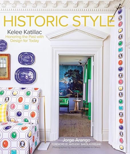
$64, Amazon
Historic Style: Kelee Katillac – Honoring the Past with Design for Today by Jorge Arango: Full disclosure: this one is a BEHEMOTH (in a good way). It has it all: historic preservation! Classic interiors-turned-technicolor showstoppers! 400 years of design knowledge! It’s eight solid pounds filled with enormous shots of brilliant, thoughtfully crafted interiors.
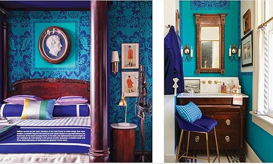 via historic style
I love Kelee’s fresh, modern eye – her spaces mix old and new in a bold, dynamic way. This book is the perfect mix of information and inspiration – if you’ve ever enjoyed a design history post on the blog, Historic Style is RIGHT up your alley. Preservation has never been more interesting!
Lesson 2: Make Your Home Feel Like You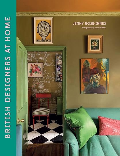
$25, Amazon | $46.50, Bookshop
British Designers At Home by Jenny Rose-Innes: When I’m feeling stuck with my color palettes, British Designers At Home yanks me RIGHT out of that creative rut. The spaces featured in the book run the gamut, style-wise – some are grandiose, some are simple – but they all have that cozy, collected, distinctly-British vibe that we’ve come to admire. If you’re looking to make your “house” feel more like a “home,” there’s some great inspiration here. (Jenny is also the author of Australian Designers at Home, if you’d like to complete your set!)
Lesson 3: How To Do…Everything
$17.69, Amazon | $27.89, Bookshop
The Interior Design Handbook: Furnish, Decorate, and Style Your Space by Frida Ramstedt: This book was marketed as the “comprehensive bible of interior design,” which would have been brash had it not been TOTALLY TRUE. If my memory was erased and I needed to re-learn everything (not a joke – everything) about interior design, this would be the first book I’d pick up.
 via the interior design handbook
LOOK AT THAT! I’m an over-thinker, so having a list of rules for every possible design scenario punctuated by simple, clear illustrations is SO helpful. I’m of firm belief that we all should own a copy The Interior Design Handbook – it’s that good.
Lesson 4: How To Find Inspiration Anywhere
$27.70, Amazon | $32.55, Bookshop
Creative Spaces: People, Homes, and Studios to Inspire by Poketo: Before Em moved to Portland, she (very graciously!) allowed me to pull a few books from her stash. Creative Spaces was one of the titles I pulled and I’m so glad I did – it’s packed with all kinds of interiors, crafted by all kinds of creative types. If you were also a daily DesignSponge reader (RIP), you’ll LOVE this book.
Lesson 5: How To Spot High-Quality Pieces
$35.49, Amazon | $55.80, Bookshop
The Finer Things: Timeless Furniture, Textiles, and Details by Christiane Lemieux: This one’s a must-read for my fellow flea market and Facebook Marketplace fans! The goal of The Finer Things is to train your eye so you can recognize (and appreciate) those valuable, well-made pieces in the wild.
 via the finer things
There’s a ton of great design history in the book, too, along with some stunning interior photos. I credit Christiane with SO MUCH of my design education – last year, we ended up in a few of the the same Zoom meetings and it took everything in me not to fangirl!
Lesson 6: How To Live More Sustainably
$24.69, Amazon | $37.20, Bookshop
The Low-Impact Home: A Sourcebook for Stylish, Eco-Conscious Living by Remodelista: There’s no shortage of great coffee table books from the Remodelista team, but I’m especially partial to The Low Impact Home. I picked this one up after a trip to Antarctica left me with some residual climate panic and I’ve really enjoyed implementing the tips I’ve learned in this book! It’s exciting to read about the future possibilities, too. (PS. If you’re currently renovating, you might find some eco-friendly money-saving ideas in here!)
Lesson 7: How To Take (and Embrace) Risks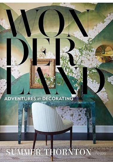
$37.30, Amazon
Wonderland: Adventures in Decorating by Summer Thornton: OBSESSED. This is actually my favorite coffee table book – Summer’s spaces are just beyond. She’s mastered the art of the mix-and-match and she’s spilling her secrets in this book!
 via wonderland
Her spaces are maximalist AND uncluttered; bold AND calm; whimsical AND sophisticated. Wonderland is a total masterclass in how spaces come together – if you’ve ever felt nervous or unsure about your design taste or skill, Summer’s words will reassure and embolden you.
Lesson 8: How To Win Bar Trivia With A Deep Knowledge Of American Architectural Styles
$70.14, Amazon
A Field Guide to American Houses (Revised): The Definitive Guide to Identifying and Understanding America’s Domestic Architecture by Virgina Savage McAlester: This is, for all intents and purposes, an encyclopedia. We start with the Wigwam, we end with 21st-century American architecture, and we learn EVERYTHING in between. A must-read for preservationists, design history lovers, OR for anyone who wants to communicate accurately with their contractors. (The paperback is also available for under $30, which I’d recommend over the hardcover – easier to transport!)
Lesson 9: How To Pick Design Rules To Follow (And Design Rules To Break!)
$25.39, Amazon | $51.15, Bookshop
Every Room Should Sing by Beata Heuman: You’ve undoubtedly seen Beata’s work over the past few years…and now, you can jump inside her brain and learn exactly how she pulled those iconic rooms together.
 via every room should sing
Her style is famously British – collected, vibrant, warm, and unfussy – so it’s fascinating to learn which rules she keeps in mind when designing! (In the pages above, Beata writes about how she chose denim upholstery to ground the other colors in the room. It’s a classic tip, but her finished room is so fresh and dynamic!)
Lesson 10: How To Blend Pattern, Texture, and Color
$19.99, Amazon | $32.55, Bookshop
Living With Pattern: Color, Texture, and Print at Home by Rebecca Atwood: If you love a good block print or a more worldly, eclectic, California-cool style, Living With Pattern will be especially interesting to you! Rebecca REALLY breaks things down and holds your hand in this one – she makes design feel approachable as she provides room-by-room commentary and tips. (Added bonus: the edges of each page orange, so it looks REALLY cool on a table.)
Lesson 11: How To Implement Your Inspiration
$30.99, Amazon | $37.20, Bookshop
Vivid: Style in Color by Julia Green & Armelle Habib: When they say “style,” they mean it! Vivid is like Pinterest in book form – there are a ton of great home tours, but they’re mixed in with gorgeous travel and fashion photography (arranged by color, no less!).
 via vivid
The spaces featured in this book rely heavily on vintage; they feel lived-in and personal and attainable. Plus, the final two chapters – white and black – showcase some really fun, thoughtful, and fresh neutral spaces.
Lesson 12: How To Build A Dreamy, Functional Kitchen
$27.49, Amazon | $41.85, Bookshop
The deVOL Kitchen: Designing and Styling the Most Important Room in Your Home by Paul O’Leary, Robin McLellan, and Helen Parker: Why aren’t we talking about this book ALL THE TIME? deVOL’s three directors met up, wrote down all of their kitchen design tips and tricks, and you’re still reading my blurb? RUN! Your dream kitchen is waiting! (If you binged For The Love of Kitchens on Magnolia, you’ll adore this one.)
Lesson 13: How To Stop Stressing And Embrace What You Love
$33.99, Amazon | $55.80, Bookshop
How To Live With Objects: A Guide To More Meaningful Interiors by SIGHT UNSEEN: I have a special spot in my heart for this book – I’ve had it for a year and a half, but it just helped me out of my bedroom design rut! I’m a huge over-thinker and designing spaces that will be shared on this platform is pretty nerve-wracking for me – How To Live With Objects is the antidote. It makes design feel less precious and more possible.
 via how to live with objects
This book preaches the gospel of enjoying what you have and working with what you’ve got. It eschews the idea that rooms need to be “designed,” instead suggesting that our homes are more comfortable and more beautiful when we fill them with things we love. Is that obvious? Maybe! But sometimes a mix of practical tips, fantastical photographs, and common-sense advice is just what the doctor ordered, you know?
Lesson 14 & 15: How To Come Full Circle

Left $14.92, Amazon / $30.23, Bookshop | Right: $17.13, Amazon / $30.23, Bookshop
Styled: Secrets for Arranging Rooms, from Tabletops to Bookshelves by Emily Henderson: I’d be remiss if I didn’t call out the book that started it all for me: Styled, written by my boss, Emily Henderson. (It was my first design book, and I bought it years before starting here! It’s crazy to think about. :)) It still holds up, too – I love that it offers a taste of each style and that it really encourages play and exploration in your own home. It’s REALLY fun to flip through and I’m still gleaning new tips with every read, even though I work here now and can literally ask the author questions whenever I want. Books are magic!
The New Design Rules: How to Decorate and Renovate, from Start to Finish by Emily Henderson: And our pride and joy, The New Design Rules. If you could see how much time, care, and heart our team put into this book…well, you’d be pretty sentimental, too! There’s a lovely mix here – need some inspiration? It’s in here. Need a diagram of the stairs or a window with all parts labeled so you can have a coherent conversation with your contractor? That’s also in here! Whatever you need, we’ve got you.
There are a ton of books out there that didn’t make this list – some are just a little light on the text; others I just haven’t read yet! – so let me know if you have any other recommendations! I’d love to prioritize checking out your favorites. And if you liked this format, let me know – maybe we can get some more book recommendations going from the rest of the team. LET’S TALK ABOUT BOOKS!!! I’ll see you down there in the comments. xx
Opening Image Credits: Opening Image Credits: Design by Caitlin Higgins (me!) | Styled by Emily Bowser | Photo by Sara Ligorria-Tramp | From: The Reveal We’ve All Been Waiting For! Caitlin’s Mostly Thrifted, Postmodern Regency Deco Living Room
The post The 15 Coffee Table Design Books That Will Teach You About Design And/Or Help You Get Out Of Your Design Rut (Tried And Tested By Us:)) appeared first on Emily Henderson.


April 17, 2024
An Epic PNW Coastal Patio Reveal (With Insane Architecture By ARCIFORM)

Welcome to a dream outdoor patio situation that I had the honor to style and shoot a few weeks ago. If you think you recognize this it’s because it’s the outdoor space of the Bay House, built by the owners of ARCIFORM and Versatile Wood Products (Anne and Richard, respectively) and we showed a sneak peek last year here. Their creativity and genius in this particular house is what made us decide to hire them for our farmhouse. But when we originally shot the interiors (two years ago now) the outdoor furniture hadn’t arrived yet so we got to go back a few weeks ago (now that the weather was nice) and style it all out.
 photo by sara ligorria-tramp | from: the home that made me want to hire arciform – see their open concept living room/kitchen done right
The inside of the house, designed by Anne, and styled by EHD, is so special. It’s an incredible home with so many design details and bold choices.
 photo by sara ligorria-tramp | from: the home that made me want to hire arciform – see their open concept living room/kitchen done right
I know. It blew us away, too. So we were so excited to go back and see how we could show off the outside.
 photo by sara ligorria-tramp | from: the home that made me want to hire arciform – see their open concept living room/kitchen done right
This was it before we furnished and styled it out (two years ago), featuring Richard and Anne, the owners (architect and designer). As you can see there is a lot of outdoor space and without any furniture, we couldn’t really shoot it (thus the reason for today).
So here is how it all went down: They were about to buy a lot of durable furniture and had chosen most from Room&Board, but it wasn’t going to be enough to fill their massive patio. So since I was on board to style and shoot it we needed more, I pitched Room&Board a larger partnership, knowing that their furniture was perfect for the space – not just stylistically but also when it comes to longevity and durability. So almost everything you see here is from Room&Board (just not the tabletop accessories, many of which you’ll recognize:)).
Wait, Where Is This House??
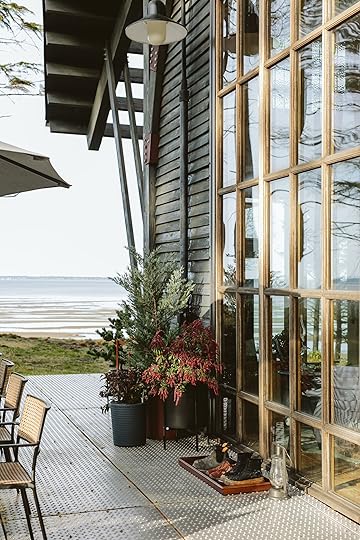
It’s on a bay on the Washington coast. They bought the land over 10 years ago and slowly built this house, using most of the wood from the trees that they fell on the property. It’s in a super remote area so getting subcontractors up there was extremely challenging (its 3 hours from Portland, an hour north of Astoria). But my goodness it’s stunning.
The Front Patio
The shape is so special and arresting. I have been here three times, but Kaitlin, Alyssa, and Gretchen were BLOWN away when we first pulled up. They had it stained dark since I was last here which I love so much. ARCIFORM doesn’t actually do new builds (they specialize in historic restorations) so the creativity and imagination to build this house floors me.
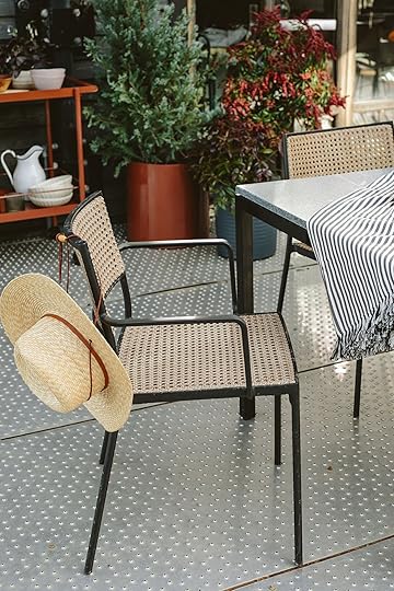
The Dining Area
Black Footed Planter | Bar Cart | Terra Cotta Planter | Ribbed Planter | Umbrella | Dining Table (x2) | Dining Chairs
I shopped for furniture that would be really appropriate here, stylistically – nothing too bohemian or traditional. Room&Board has a lot of contemporary, midcentury, and transitional styles that work so well here. We chose two long marble dining tables that are awesome since the space is so long (with one umbrella for when the sun comes out. These tables feel very heavy, in a good way – with marble on top of iron legs, these things will LAST. And yes, even outside. We paired them with these black and caned chairs because we loved the texture and color, but also they stack (they need to be stored because the winds are too nutty out there and they’ll blow them around in the winter, so stacking was key).

The stone on top is a honed gray stone that feels forgiving and super timeless. The texture of the caning on the chairs feels really elevated for outdoor chairs.

I brought in pops of warm pink, coppery tones, and a lot of green to style it all out.

Umbrella | Dining Table (x2) | Dining Chairs
If you are wondering about the flooring (me, too!) I asked Anne to tell me about it and here is what she said:
“We have a lot of elderly friends, so we were worried about them falling. We also like the perforated aluminum because it does not require maintenance and yes, Richard and I installed it with the help of the Arciform crew. Cons are that it is not nice to walk on it with your bare feet. But honestly, we rarely walk at the bay house in our bare feet as the floor surfaces are rough. The metal is also a bit reflective in the sun, which can be very bright. On the plus side, it reflects light into the interior space – brightening it up.”
Anne is from Northern Europe and I love her general non-conformity towards American design-isms. They use their resources in a more uninhibited way, with ideas that are far more sustainable but less conventional which I’ve always admired.

We styled with all Room&Board pots and bar cart (bringing in another color and tone with the dark coppery orange).


Black Footed Planter | Bar Cart | Ribbed Planters
We thought that the pop of this warm metal against the dark house was so pretty (and worked really well with the railing that they let patina (aka rust). The pots are a mix of fiberglass and ceramic, all from Room&Board.
 The Bay Side Patio
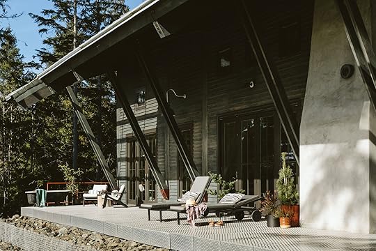
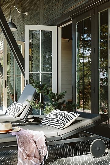
This side of the house gets a lot of afternoon Western sun so Anne and Richard wanted some sun loungers, but they needed to be super heavy-duty so that the wind couldn’t move them around. We created two different seating areas over here (it’s huge!).

These loungers are black iron with wood underneath and are adjustable in height. They are super heavy, durable, stylistically simple, and well-made.
 Is That A Bathtub On The Deck?
Black Planter | Chair | Side Table | Terra Cotta Planter
Yes! And I love it so much. Anne had this old clawfoot tub and had no hesitation to put it out on the deck near a hot/cold hose bib (not officially plumbed, just a hose from the exterior of the house for hot or cold). While we were there I filled it with cold to plunge and Alyssa and I took turns. They have no neighbors so there is very little privacy concern.


The mid-century style chairs are outdoor chairs if you can believe that (you can obviously use them inside). These are right outside their bedroom (they stored them in the winter because the elements out here are intense). It’s a classic midcentury shape that Room&Board does so well.

The bay comes in at night and it’s unbelievably stunning. Also please note that arched door within a huge window. Ridiculous.
The Firepit Area
These Adirondack chairs are rather famous for how long-lasting and durable they are (especially against the elements). While we all love wood Adirondack chairs, the Polywood of these chairs will last so much longer in the wind and rain. They actually usually have their firepit area somewhere else (not on the grass, which is likely unadvisable) but we moved it here because it was so much prettier (and our job is to make pretty photos with pretty product).

I brought my collection of hoarded quilts and blankets that felt like the right vibe for PNW in the spring.

A quick call out for Room&Board that you might not know (I didn’t until I was writing this post). They are now a registered B Corp which is a certification that is actually really laborious to get (I’ve tried and kinda lost steam) so when a large company does this we should take note and give them some love. I think there are a few different ways to qualify, with likely different goals (i.e. sustainability, diversity, employee-owned, American-made, etc). I’m not an expert but I’m always extremely impressed when larger companies take the time and effort (and profit margin hit) because they care. It makes me want to support them even more.
Sunset And That’s A Wrap!
It was a seriously lovely shoot with my team. We had so much fun at this gorgeous house with this awesome furniture that deserved its day in the sun (WE ARE BACK TO SUN UP HERE FOLKS!!!).


A huge thanks to Room&Board for partnering on this outdoor space (and being so patient with me – between weather issues, the darkness of winter, and all of the shoot schedules getting, 3 non-rainy days in a row on the books took far longer than I had predicted. The whole space turned out so great, with furniture that feels so appropriate for the architecture and durable for the weather and elements.
*Design by ARCIFORM
**Styled by Emily Henderson (me!)
***Photos by Kaitlin Green
The post An Epic PNW Coastal Patio Reveal (With Insane Architecture By ARCIFORM) appeared first on Emily Henderson.
April 16, 2024
The Final Curtain Call: Here’s How To Cover The Trickiest Of Windows (A/Cs, Pipes, Radiators & More!)

We’re back with the last installment of what Jess cleverly coined “Curtain Call” (she’s a punny queen, that one). The final Curtain Call, if you will. As I promised in my original post—read that here for context and some helpful curtain rules I laid out—today’s adventure involves window obstructions. We’re talking A/C units, random pipes, radiators, and ceiling slopes.
I’m the first person to tell anyone who asks me that a lot of times, curtain coverings are a personal style choice. If you like something dreamy and dramatic, go with full-length drapes. Want something modern and crisp? Opt for a shade or Roman shade. Interested in something traditional and stately? Plantation shutters might be just the thing. The gist: Go with what you like (and then follow the rules—like these—for each). BUT! Sometimes, you don’t really have much of a choice. Or rather, there is a *right* and (kind of) *wrong* way to go about dressing a window. At least if you’re dealing with some tricky, sticky architectural details and wish for peak function meets form.
If I’m being upfront, two of these reader submissions really stumped me for a bit. Are there maybe some other ways to solve the problems presented? Yeah, sure! And feel free to share those ideas in the comments below. But I do strongly believe that the solutions I’ve offered would work and look pretty good, considering the limitations, and that’s a win for me. 
At this point in these types of posts, I typically share some inspiration photos that directly relate to what I’m going to talk about, but as these are fairly specific situations, I don’t have those today. Will you forgive me? We can all use our imaginations, yes? (And for those asking themselves while they read this why we wouldn’t just Photoshop the suggestions over the photos as I did in this post about filling a blank wall, it’s because I tried and it was…not great. My skills only take me so far, as does AI.) Why don’t we skip to the good stuff?
Bulky, Funky & Barn-Like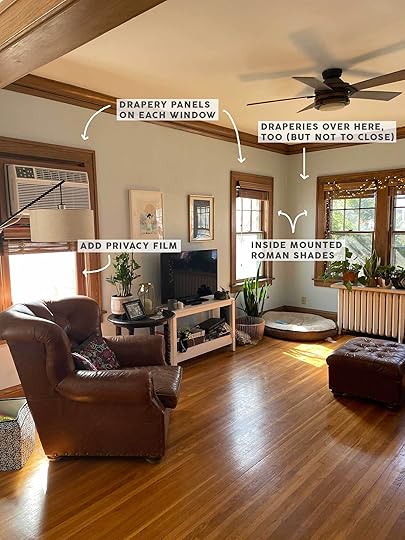
From the reader: “I would love some help! The wood blinds I have now give it a hunting cabin look. Challenges are the numerous things blocking the windows – radiators right below, a weird wall AC unit that’s been placed in the window. They’re all south and west facing so I need to block visibility at night but let in enough sunlight during the short winter days.”

OKAY! So, I’ll confess…that A/C unit above the window gave me considerable pause. After taking down all the wooden mini blinds (I have no doubt those were probably expensive and custom for those windows, so maybe try selling or giving away in the scenario where they might work for someone else’s home), what could this homeowner do? The window by the radiator was fairly easy to sort out (shades!), but that funky bottom window…hmmm. At first, I wondered what it might look like to just do a little cafe curtain there. But after I decided the whole room could use the softness and brightness of drapery panels, I concluded that a cafe curtain under full-length curtains was a bit bizarre.
Then I chewed on the idea of doing a small shade there (both Roman and pull-down/solar), but that also was just something my brain couldn’t materialize a photo of, making me think it was also a bit bizarre. It could work, maybe, but it would always be kind of strange. Then I thought, well…why do we need to cover that portion anyway if I’m suggesting adding curtain panels? Maybe some privacy film for a bit of light filtering and privacy during the day would do the trick. Yes! Sure! That’s it!
But then…silly ol’ me forgot that someone might want to run an A/C unit at night, when the shades would be closed on the other windows, and I went right back to the last idea of having a shade there. Frankly, I still don’t love that option, but I think this reader can play around with a few things. I’d start with adding panels, then adding privacy film (maybe a frosted or reeded finish so no one could make out what was happening inside at night, as opposed to a clear film that reflects back sunlight but doesn’t do much after sunset). If that feels too exposed on that one window, then I’d suggest adding a shade to match what was put on the other windows.
Now that that issue is solved, I recommended inside-mounted Roman shades for all the other windows to accommodate the radiator that seems to have a shelf that hits above the baseline of the window molding. Outside mounted shades would help to mask some of the “cabin-like” vibes we’re getting from the brown wood, but it wouldn’t look ideal to have the sill exposed on one side of the room and not the other. As for curtains, it’s hard to get a sense of style or colors in this home/room to confidently recommend something, but I would suggest something in a color or subtle pattern to inch up the decorative styling. As long as they’re hung at least halfway between the top of the window and the crown molding, it’ll add some nice drama to the room and make the smaller windows feel more grand. OH, and you may have noticed I said to add curtains to the window with the radiator. This is just to match the weight of the side of the room with the TV. Those won’t be able to close around the radiator, so they can just sit off to the side of the whole bank of windows.
Window Shopping:
Chambray Blue Roman Shade | Blue & Beige Patterned Curtains | Organic Cotton Roman Shade
As I mention in a few of these, I didn’t have much to go off for style or color palettes so I kept it neutral and color-friendly with a light, denim-y blue Roman or a soft white Roman. As for the drapery, since there would be a handful of them, I wanted something light and not too heavy but with a little impact. I found these great linen-like SUPER affordable panels (seriously, under $50 for a set of two 96-inch length) with a fun pattern that will bring some interest to the fairly neutral room. They would work either with the blue shade or the cream, I think.
Hot Radiator, Cool Window Coverings
From the reader: “I moved this past fall, and my bedroom is still a major work in progress. One of my unsolved problems: my window coverings. My two major considerations: 1. Budget — I moved with next to nothing in the way of furniture and decor, so it’s been a spendy few months trying to fill the space. I’m not looking to splurge on curtains. 2. Blackout — my apartment building has alley lights that stay on 24/7 directly outside my window, so I’m looking for something to block that out. Blackout curtains seem like the best option, but I have a radiator directly in front of my window, so I can’t get floor-length curtains. (The curtain rod is left over from the previous owner.)”
We’ve got ourselves another radiator here, but this time, it’s off-center to a window that’s nearly flush to the corner. Tricky, tricky, my friends. As much as I’d love to say “add draperies!” to make this primary bedroom feel larger and in charge-r, that’s just not going to work for this setup. But that’s okay, because it can still end up feeling lovely, functional, and beautiful. My solution? Surprise, surprise…a Roman shade with a blackout lining since the reader needs to block the alley light. To make the window feel perhaps more stately, I recommend one wide shade hung at least six inches above the window frame. This trick does the same thing as hanging draperies tall and wide: makes the window look bigger and ceilings feel taller. As this requires an outside mount, honestly, I’d just leave the mini blinds for additional light control considering this reader wanted to keep the budget minimal (otherwise, I’d recommend blackout pull-down shades).
And while this is a post about window treatments, I just want to suggest balancing the placement of the window in the room with some art pieces or even a large floor mirror to the left to fill that white space.
Window Shopping: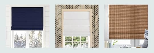
Navy Room Darkening Cordless Roman Shade | White Blackout Cordless Roman Shade | Bamboo Blackout Roller Shade
I kept things pretty straightforward here, as it sounds like the reader is only just beginning her decorating journey in the space. The walls seem similar to a fleshy putty, kind of like the walls on my old bedroom which I know worked great with blue, white and warm earth tones. These are three affordable options for blackout Roman shades that I think could look great in her space, depending on what direction she takes her style. The bamboo roller is by far the lowest price but doesn’t work as seamlessly as a cordless lift shade, of course. Either way, one of these will bring softness (and light blocking) to her bedroom.
A Not-Too-Young Yet Playful Playroom Solution
From the reader: “This is the bonus room above our garage, though our house is small so we do a lot of living in here. We use it for a playroom for my twin 7-year-olds, as well as a place for the whole family to watch TV and a very occasional guest room when we have a lot of guests over. There are two large windows and I’d like to get rid of the blinds and have something that looks a little nicer and ties together the room. I am challenged by the sloping ceiling by one window which can limit curtain rods. Neighbors recently built a new house on the previously vacant lot to the side of our home, so we’re needing privacy, but also something that can easily let light in (or easily be opened). Since it’s a playroom, I want something fun and safe, but since the whole family uses it, it can’t be too childish.”
Whew! A straightforward one, thankfully. The second I saw this space, I knew the all-mighty Roman shade would be our hero. There isn’t much else this reader can do for the window on the left considering the angles of the ceiling. Hanging a curtain rod is a fool’s errand and will look dinky. I suggest doing an outside mount for a touch more visual drama, but also because I think a pull-down solar shade mounted on the inside, in place of the mini blinds, would give the reader the privacy *and* light-filtering they’re after. For the cleanest look, do each shade as wide as both windows together in the same framing.
Window Shopping:
Blockprint Custom Roman Shade | Gray Gingham Roman Shade | Striped Roman Shade
This reader mentioned wanting this room’s window coverings to be fun, safe, and not too kid-like. Any florals or shapes or patterns I found started feeling too heavy-handed, so I figured, you know…let’s stick to some classics here. Stripes, gingham, blockprint (and all cordless, as well, because…kid safety). They’ve got some blues, grays, and burgundy happening in the photo which I think would work great with the gingham and striped shades, and for some color palette expansion, this muted green leaf print might just also work nicely.
A/C Unit & Pipe: Meet Your Match
From the reader: “My issue is this is the only window in my apartment and my bedroom is on the other side of the open area on the right of the photo. The current curtains are cheap blackout ones and they feel really heavy and dull. I’d prefer a more layered look with a blackout option but lighter-looking curtains. There’s no spot in the middle to drill into (other than the top windowsill, where you can see my last effort to drill into it, and somehow stripped the screw, so I need to have that removed). I don’t think outside mount works because the pipe at the right is a heating pipe and gets very hot. I also can’t move the window AC. (Lots of very New York problems!)”
I sat and stared at this room for, I kid you not, at least an hour. Trying to find the right advice to give the reader. There’s the issue of the hot pipe, the A/C unit (at least it’s on the bottom part of the window this time!), and being a rental (I think). As the reader mentions, this is her only window, so I want to make it both stately but also not block light as best I can. The curtain panels she has don’t work for a few reasons: They’re mounted on a tension rod *inside* the window, but flow *outside* the window. They also seem to cover what maybe is a radiator at the bottom with the metal grate in front. It might also not be a radiator, but it’s something so…maybe best to keep that uncovered? She knows better than I do, though.
The reader mentioned wanting a layered look with a blackout option, but frankly, I think keeping things simple is going to be the best bet. Curtains are likely never going to work here unless they’re mounted above the window on a traditional rod, but the pipe prevents them from resting on each side. What *could* work, if she really wants panels, is to have the curtain rod be installed wide enough (again, above the window, not inside the window) that two or three panels could rest on the far right of the window instead of flanking it. It’s not often done but I do always love when I see it. That way, she could close the drapes right up until the pipe, but have them look more purposeful when open than they do right now. If that’s not an option, I’d suggest just taking them down altogether.
But she’ll still need some window coverage, and that’s where an inside mount Roman shade comes in. She could either do a blackout option there and keep the curtains light and breezy, or vice versa. The sill seems deep enough that if she installs it close to the edge, it just might be able to cover the A/C unit if she wants to, but it can also rest above it, as well. Two shades give her more flexibility, but one shade would look cleaner. Not to mention, there are so many great no-drill shade options on the market, but the way it would need to attach by pressure to both sides of the interior window frame means she could only do one wide shade, rather than two narrow ones. If she can figure out how to drill overhead, two traditionally mounted shades would work just fine.
Window Shopping:
Blackout Customizable Roman Shade | Light-Filtering Linen Shades | No-Drill Blackout Roman Shade
I didn’t so much mind the idea of white curtains this reader was using, just that it wasn’t the right color for the warmth of her walls. That’s why what I’m suggesting is still neutral (it’s a small space, so don’t want to overwhelm things), but with a bit more creamy yellow undertones to feel soft, glowy and welcoming, rather than stark. I picked a product that installs normally into the sides of the window frame, but also a no-drill solution that might work well for the problems she was having stripping screws. As for the curtains, I love these light-filtering panels with blocks of stripes for some visual interest without feeling like “PATTERN!”
—
We’ve reached the end here, friends. As I went back through to dot my i’s and cross my t’s, I realized it should just be retitled: Got a tricky window you need covered? Just add a Roman shade! Because yes, okay, almost all instances required one. But they really are just so helpful and versatile. Regardless, I’d love to see if any of the readers I’ve advised on the first or second post of this series, as well as this one, of course. And if any of these helped someone reading, I’d love to hear about that, too!
Now that my DNA makeup is 80% window-covering advice, I can hang up my hat…for now. I hope these posts were beneficial or at the very least fun for you. Whether to look into people’s homes (I get it, I’m a house voyeur, too), or just to get ideas for how to work around design conundrums.
See you next time, likely with more problem-solving.
The post The Final Curtain Call: Here’s How To Cover The Trickiest Of Windows (A/Cs, Pipes, Radiators & More!) appeared first on Emily Henderson.
April 15, 2024
Here’s The Step By Step Of How To Use Fabric As Wallpaper…It’s WALLFabric, Y’all!

Well, the day is finally here and I hope you’re all prepared! It’s been a long time coming and I know we’ve all been anxiously awaiting it: tax day. Did you do them? If the answer is yes, congratulations! Your reward is this post, where I finally reveal just how I was able to use fabric as wallpaper in my bedroom makeover. It’s completely renter-friendly and won’t break the bank, so you can spend your return on something fun, like a tropical vacation, instead of hiring a professional installer, after paying $100/roll for wallpaper.

If you’ve been following along since last week, I sincerely thank you for your patience! Now, many of you already guessed the answer to my magic trick: fabric starch. But hopefully, today’s post will answer any remaining questions you might have about applying wallfabric. I’m offering up my full, tried and true, step-by-step process so you can recreate this look for yourself–with modifications for my lazy girls and perfectionists alike! Though this is the first full room I’ve done myself, I’ve used this technique a number of times and can fully vouch for its effectiveness in transforming a space. And if you need a reminder of just how transformative it can be, here’s where we left off:

 right photo: design by gretchen raguse | styled by gretchen raguse and emily henderson | photo by kaitlin green | From: gretchen’s bedroom moto reveal
Now, before I fully dive in, I must give credit where it’s due. I first came across this application through Apartment Therapy years ago and I’ve been experimenting with it ever since. So while I wasn’t the first to discover it, I’ve fine-tuned their instructions, based on my research, and am writing my findings here, for you. Also, they weren’t the first to discover it–I recently picked up a 1976 Sunset Magazine guide that provided a how-to for fabric walls. And I’m sure Queen Elizabeth had fabric hanging from a wall or two in her castle (not fact-checked, but seems like it). Point being, knowing this technique has spanned YEARS of decorating eras, I say you should feel pretty confident in trying it out for yourself. Let’s get started.

You will need (almost) everything pictured here. Anything labeled in white is a MUST and anything labeled in blue will just make your life easier.
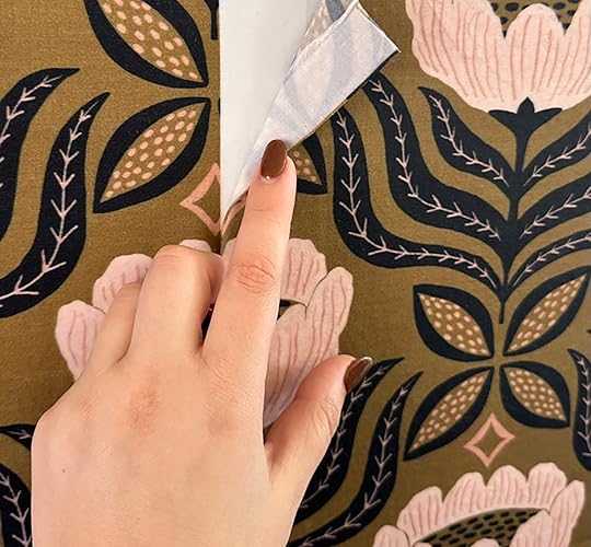
Your fabric of choice, enough to cover your intended walls (ideally a lighter-weight cotton) Hot tip: Check out the bedding section at the thrift for big sheet sets–an even cheaper way to cover a large surface area!Liquid starch (this one is the best bang for your buck)Bucket (or a paint tray works, too)Paint roller (make sure it’s clean!)Fabric scissors (regular scissors could also work)Painter’s tape (any color)X-Acto Knife or Utility Blade (the newer and sharper, the better)Staple Gun (this, in combination with the painter’s tape, will help a TON, especially if you tackle this project on your own. But it’s not 100% necessary (and will leave tiny holes))Step Stool (or a chair, whatever will help you reach your fabric to the ceiling)Iron (only really necessary if you plan to hem your edges–more on that later)Hem tape (used with your iron, to achieve a cleaner seam line)Measuring tape (if you want to be more exact with the length of panels needed, also helpful when measuring your room)Drop cloth (it’s nice to have a towel handy to catch the larger spills, but I’ve found that this stuff can really get anywhere and be fine)Spray bottle (filled with starch solution, sometimes handy when you need to smooth out any bubbles on the spot)To Begin: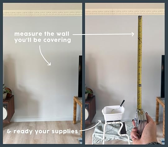
After gathering your supplies, you’ll need to locate a good spot for your wallfabric application. Maybe it’s an entire room, an accent wall or the just the upper half of some wainscoting–I’ve done and loved them all! Here, I’m just demonstrating on a better-lit wall in my living room, mostly so I can show you how clean the wall is after removal.
A few of you had questions about the types of walls you can apply this over. Though I’ve only wallfabric’d over typical, textured drywall, I would be surprised if it didn’t also work atop wood paneling. I once applied it to a cardboard cutout (that I then attached to my ceiling) and it adhered just fine to that, too! I think as long as the surface is flat-ish, it should stay (and remove) no problem. I would proceed with caution if applying over existing wallpaper. Since wallfabric requires a lot of wetness, I’d first do a small test spot to see if the moisture interacts negatively. If you don’t care what happens to the wallpaper underneath, you should be totally fine.
Prepare Your Panels
Depending on the space you’re tackling, it might make better sense to cut/prepare all of your fabric panels at once–or cut as you go. You do you. You’ll need to measure the height of the space you’re covering, and do the math on how many panels across you’ll need to complete your space. I knew I had a LOT of fabric to work with, but I still cut all the panels I would need for my bedroom at one time to make sure I had enough to complete the pattern, 360°.
Since my fabric’s motif was pretty streamlined, I could simply count the flowers vertically to find my cutting spot, and then repeated this 13 times. When cutting, make sure you leave at least an inch or two of overage at the top AND bottom. You’ll be trimming this away later. Another important note: when cutting your panels, the cuts should start and end in the same place each time (if there’s a repeating motif), so that each panel’s pattern will line up horizontally, as they’re placed side to side. Once you cut your first piece, the additional cuts should be easy to figure out (lay them next to each other as you cut, if you need). It may mean that you tack on more than 4″ to keep the same repeat, which is totally fine. You’ll cut that off later.
You can see that my fabric has a pretty noticeable, white selvage edge. Not all fabrics will have this, but if yours does, THAT is where the iron and hem tape comes in handy (I’ll get there). Regardless, your first panel can be applied with these edges showing.
Mix Your “Glue”
Arguably, the most important step is your liquid starch mixture, and it’s basically impossible to get wrong. This stuff is truly liquid gold, and you could absolutely dump the whole thing in your bucket and get rolling. But I’ve found that mixing it with water, roughly 1:1, really helps it stretch, without compromising the grip. To do my small bedroom, even after mixing it with water, I still needed about three of these bad boys, but I also wasn’t too careful with how much ended up on the floor vs the wall. It can be helpful to fill a spray bottle with this same mixture if you want to limit the mess and better concentrate the solution to certain areas of the fabric. The paint roller, though effective for most of the application, does tend to drip everywhere.
Stick ‘Em Up
Once your mixture is ready to go, start by loosely taping your fabric panel a bit above where you’ll be trimming it back later. In my case, that was roughly 4″ into the crown moulding. Tape works pretty well to hold it up–the more, the better. But if you’re okay with a couple of small holes, I highly recommend a staple gun, to truly lock it in place. Just one staple, right below your future trim line, is all you need. Any more and you might be locked into a placement that isn’t ideal. That’s why tape is your friend, because it can move with you as you plaster down the fabric. Also, it’s why you don’t want to hang it too taught right away, because once wet, it’s necessary for the fabric to shift as you smooth it. In the picture, the fabric is already a bit wet, so know that you’ll have to adjust initial loose-ness more than this.
Let’s Roll
Other people will tell you to coat the wall in starch first, but I think this is a waste of time. So long as your fabric isn’t too thick, rolling directly on top of your dry, hanging panel should totally suffice. This is where things will likely get messy. But remember, this is basically just cornstarch and water. It wipes up so easily, whether you catch it as soon as it drips or after it’s dried down. It’s never left a noticeable trace for me and is generally so forgiving. It’s meant for fabric, so if it gets on your clothes, all it takes is a wash to get it gone. Floors and furniture just require a damp rag.
Dip your roller into your mixture and begin rolling on top of your fabric panel until it’s completely saturated. It is VERY likely you’ll have wrinkles or unevenness as you do this. That’s okay. Pulling up on your newly wet fabric and re-placing it is totally allowed and encouraged.
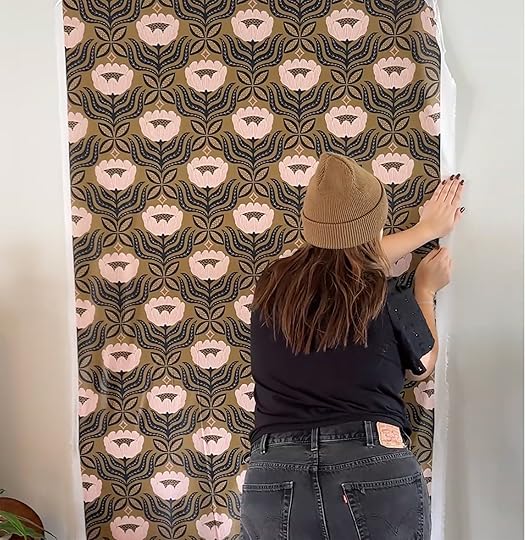


Once everything is wet, use your hands to smooth it out, like you might with pottery or paper mache. I like to start in the middle, smoothing outward and upward, readjusting as I go to ensure that everything is straight and flat to the wall. Take a step back every so often to make sure the panel looks straight. Lift, tug, and manipulate the edges out where needed. For the “eyeballing”-ly-challenged, a level can come in handy here. Around any moulding and baseboards, do your best to push the fabric into the creases to aid in your trimming, later.

This is the first panel applied. Now you’re ready to repeat the process on either side, but you might have to finish (or carefully trim) the edges of your next panel. Let me explain…
Creating The Perfect Seam
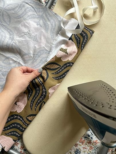
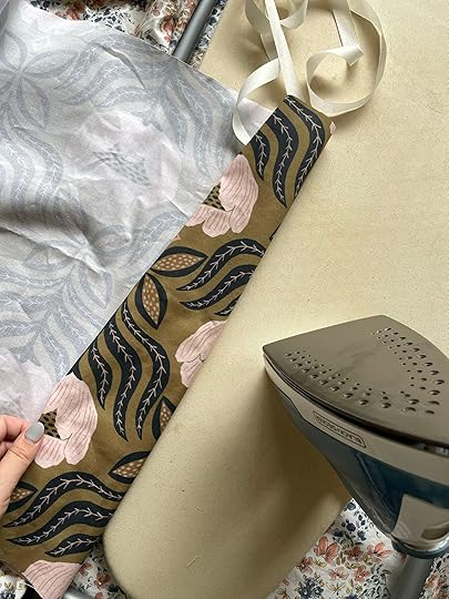
As you’ll see in the pictures above, my fabric has a FAT, white selvage. I can’t apply this piece onto the last without first trimming it back to the edge of the repeating pattern–or as I prefer to do here, iron and “glue” it back. With some iron-on seam tape (and a little patience) I can hem the edge of this fabric to line up PERFECTLY. This way, you don’t risk the fabric edge fraying (which is likely to happen if you cut it (and annoying, but still workable)). It becomes a lot easier to line up on the wall with a finished edge. Just be sure that if you choose to hem the sides, your pattern still repeats seamlessly (pun-intended), side to side.
You can opt to hem just one side, leaving the other side to be covered up, again, with the next hemmed panel. So on and so forth, until the last panel, where you’ll have to hem both edges to finish it off.
Let’s Speed This Up A Bit
You’ll repeat the same steps as before, taping your newly hemmed, dry panel to one side of the pasted panel, being careful to match up the seams. Here we see Gretchen in her natural habitat, being a mess and a perfectionist, all in one.


I start by wetting just along the new seam, lining it up, and smoothing it down on top of the panel next to it. You may need to shift your panel around a bit, but you really won’t get it matching up perfectly until it’s wet and pasted to the wall. Once you like how it’s laying, continue saturating the rest of the panel, adjusting as needed. Then repeat and repeat again, until you’re done.

This stuff dries pretty quickly with just a breezy window open, but a fan can aid in speeding it up a bit. It can take as little as a few hours, but I like to stretch a project out, and usually give it until the next day to dry. You’ll know it’s dry and ready to trim when it feels a bit stiff or scratchy to the touch.
There might be a few bubbles after it first dries. I like to go in with a second-coat, spot treatment only, and roll out these spots. This is also where the spray bottle can come in handy, to wet small spots, smoothing with your hands. Rarely do I need a third pass, but will occasionally need to apply to just the edges to lay them back down after trimming.
Trim Time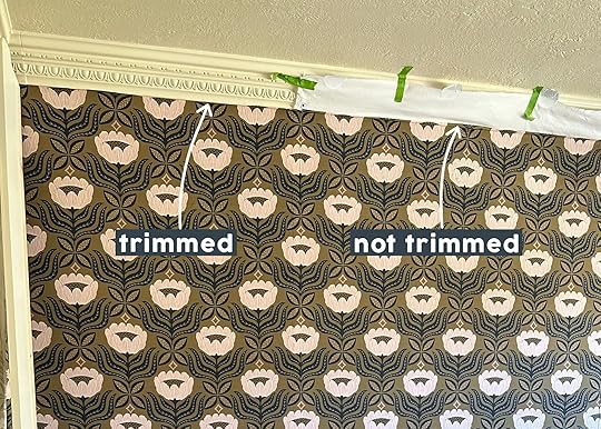

To finish your wallfabric installation, take your SHARP X-acto blade and carefully cut along your trim lines. Mine was fairly easy because I just needed to press my blade into the underside of the moulding, going slowly to keep my cuts straight. A sharp blade and truly dry fabric make all the difference, but keep in mind no one will be SO CLOSE that they see all your imperfections. In some cases, it may help to peel the trim edge up enough to cut your (newly indented) fabric with scissors along the line to achieve that finished edge. Not pictured is me repeating this step along the baseboards, windows, and outlets.
You may also have obstructions you’ll need to trim around. This should be fairly straightforward, but I always like to hang the full panel, regardless of what’s behind it, be it light switches or windows. This will ensure the pattern is continuous from top to bottom. When it comes to windows, I roughly cut out the necessary holes while the fabric dangles from the wall, leaving enough space on all sides for a clean trim, taping or stapling any new top edges.
With outlets, I like to cover plugs with a piece of painter’s tape to repel the liquid starch, then cut an X in the center to each corner, later trimming the sides when dry. In some cases, you can skip the X and just trim the box out when it’s dry because the wet fabric has enough give to fully stretch over it.
When It’s Time To Move Out [image error]
Literally, peel it off the wall. Done. So long as the surface won’t come with it when you peel it off (ie potentially, wallpaper), you won’t need to wet it to remove it. Some suggest doing this anyway, so you’re welcome to try it, but I’ve never had issue with doing it dry–the paint always stays in place.
If you’re someone who really likes to deep clean a place before leaving it for good, you might give the wall a wipe down, but I never find I need to. It looks like nothing was ever there. The mixture soaks in and dries more to the fabric, than the wall.
The best part? Now you have huge, starched panels of fabric ready to re-use in a new project! Take your wallfabric with you to apply in your next place, or make a pair of overalls to wear and remember your past room fondly. My mom says she’ll sew me a pair with my leftover fabric scraps, and the EHD crew told me I should ‘go as my room for Halloween’–I’m kind of into it.
 design by gretchen raguse | styled by gretchen raguse and emily henderson | photo by kaitlin green | From: gretchen’s bedroom moto reveal
So that should be all, folks! If I’ve somehow managed to not address your burning questions in this girthy, Monday post, please feel free to ask away in the comments and I’ll do my best to answer, though I will NOT be giving out tax advice. You wouldn’t want it, anyway. As always, thanks for reading! And if you try this yourself, I’d love to see it! DM me or something, @gretchenraguse.
Sincerely, Gretch
Opening Image Credits: Design by Gretchen Raguse | Styled by Gretchen Raguse and Emily Henderson | Photo by Kaitlin Green | From: Gretchen’s Bedroom MOTO Reveal
The post Here’s The Step By Step Of How To Use Fabric As Wallpaper…It’s WALLFabric, Y’all! appeared first on Emily Henderson.
April 14, 2024
The Link Up: Em’s Newest Beach Reads, Arlyn’s Very Affordable No-Slip, No-Show Socks, And The Calendar App That Keeps Us Focused

Happy Sunday and happy first MOTO week to Gretchen! In case you missed her incredible room reveal go check it out NOW. We are so proud of her but also not surprised because this gal is talented. Jess is headed up to Portland for a quick but exciting trip. More on that to come and today marks the official one-month countdown to our team retreat. Can you tell we’re a bit excited?? Alright, let’s get into these links…
This week’s house tour only proves that light blue is likely the color trend of the year (as we predicted) and that exposed brick, a stunning art collection, and oversized floral arrangements are always in style. This converted warehouse has so many cool details so go take a look here.
From Emily: I read three books over spring break (THREE). Turns out I’m not necessarily a big sit by the pool and do nothing gal so I flew through books while the kids swam (and after they went to bed as we were sharing a room – shout out to Kindles – no reading light necessary). Ok first up: Bad Luck Bridesmaid. Terrible title, but so was “How to Lose a Guy in 10 Days” and it’s nothing but rom-com genius, so don’t judge the name. This one is by the same writer as Maybe Once, Maybe Twice which I loved more (mostly because I loved the ending more) but BLB is so fun, the writing is friendly and smart, and I want to be friends with everyone in the book. I just utterly enjoyed it. Great for those of you who are not necessarily sure you want a forever partner as it gives a really personal perspective toward that. Then I moved on to Bride, the new Ali Hazelwood Romantasy which I COULD NOT PUT DOWN. I don’t think there is one Ali book that I haven’t read but I have to say that this is in the top 2 or 3 for me (if not my favorite). It has a pretty high spice level (biting is involved – it’s a vampire/werewolf story) and is just very romantic and hot. 4.5/5 for me. Lastly, I finished with Yellowface which is more LitFic (not romance) and is an “inside publishing” fictionalized story about a white writer who, well, I don’t want to give too much away but let’s just say there is racial appropriation, theft, death, and a lot about social media and cancel culture (both within the publishing industry which has certainly deserved it at times and at large). There were moments I was frustrated as I was waiting for the other shoe to drop for so long, but the last 150 pages were riveting (as were the first 60) and I really enjoyed it (and it was thought-provoking and very entertaining).
From Arlyn: I was in need of some new no-show socks because I’ve been finding my normal low-cut athletic socks hit my ankle at a weird spot with my sneakers and it looks and feels bulky. I picked these up on a whim during my latest Target stop and I’m so happy with them! They’re cut low enough that they actually don’t show but not so low that it’s just basically the tips of your toes covered. They have a little gel strip in the back so they don’t slip down below your heel (grrr!) and are thin so they don’t add width to your foot if your shoes are already kind of snug (wide feet problems).
From Gretchen: If you saw my bedroom makeover this week (thank you!) you might’ve seen that I added a shelf to my window ledge. I didn’t really touch on the how-to of it because it was pretty darn simple thanks to this clever device! It’s called a contour gauge and it’s awesome. I wanted the shelf to tuck all the way into the window, but have the sides of it curve out and around to hug the front of the frame a bit. To get that exact shape or measurement would’ve required some expert eyeballing or clever tracing with some kind of paper template. Instead, all I had to do was push this gauge into the corner to “record” the shape, then take it to my piece of wood to trace the contour and cut it to size. It fit perfectly, first try! For about $12, it’s such a handy, timesaver tool to keep around, especially for all my DIY-ers out there.
From Caitlin: YAY, I’m glad there are some calendar nerds out there! Last week, I spilled the beans on the email tool that’s made my inbox far more manageable – and now, I have to share the calendar app that pulls me straight out of my “oh my God, I have too much to do and no idea where to start” spiral and places me right on track. It’s called Motion and it’s GENIUS. I write all of my tasks down, assign them a priority level, choose a deadline, and Motion organizes them into a schedule for me around any existing meetings or events! So now, I can jump straight into my day because it’s all been planned for me. IT ROCKS. If you also have ADHD or if you feel a little lost when trying to decide what to tackle first every morning, Motion will be a total game-changer. I’ve been using it for a year and I love it!!! (They usually offer a one-week free trial, but either of the links above should get you a two -eek free trial! I hope you also love it!)
From Mallory: Jeans are haaaard to shop for because as we know skinny jeans are out but then finding pants that are baggy/straight-leg that simultaneously make the back peaches pop is damn near impossible. I also notoriously struggle to find jeans that fit the entire length of my leg – I’m a 5’7 glad with a lengthy bottom half so it’s come to my attention that 90% of my jeans are cut just a little too short and we had to do something about it. ENTER THESE $30 PANTS THAT CAME OUTTA NOWHERE!!! The other day I took me a lil trip down to H&M where I picked up a random pair of jeans and was feelin a little too lazy to try them on so I just bought them in hopes that they would work out AND SURPRISE! THEY DID! I bought them in the regular denim wash in a size 4 but I also just purchased them in the lighter wash because I’m so thrilled to find a pair of jeans that check all my boxes!! Yay!
From Jess: This week’s haircare product rec is Pureology’s Color Fanatic Heat Protectant Leave-In Conditioner! It came highly recommended so I grabbed the travel size first to make sure I liked it. Well, clearly I did and ordered the full size since it’s the Sephora Savings sale…and I was almost out. So if you are looking for a leave-in conditioner (something I was always afraid to use for fear it would make my hair heavy and greasy- lol not the case at all!) this is a wonderful one. It makes my hair feel great and bonus points that it’s also a heat protectant.
Thanks for stopping by and y’all tomorrow. xx
Opening Image Credits: Design by Gretchen Raguse | Styled by Gretchen Raguse and Emily Henderson | Photo by Kaitlin Green | From: Gretchen’s First MOTO Reveal: A Tiny Bedroom Comes Alive With The Perfect Pieces From Article (And Fabric On The Walls??)
The post The Link Up: Em’s Newest Beach Reads, Arlyn’s Very Affordable No-Slip, No-Show Socks, And The Calendar App That Keeps Us Focused appeared first on Emily Henderson.
April 13, 2024
Wait, You Have To Meet Our Kune Kune Pigs, Barb And Elisha!! + The Official Henderson Farm Animal Update


Kaitlin asked me the other day when we were out in the paddock, chasing around the pigs with a camera if I would have guessed 10 years ago that Brian and I would be doing life like this. I knew what she meant. “Yes,” came out quickly – my mouth opening before my brain even processed the question. While we moved here to have a simpler life, that doesn’t mean it’s gotten “easy,” just less (in a good way), but adding animals complicated our lives in the best of ways. It’s such a different life than we had 4-10 years ago in LA (after 10 years in New York). I have become increasingly aware of my identity contradiction even if it makes sense to me. Most days I live in workout clothes or gross farm clothes, unkept from the Zoom-shoulder down, with mud stains on the back of my calves from the pig’s snouts (a telltale sign you have a pig). Then come Thursday, I’m ON. I get my hair and makeup done for back-to-back campaign shoots and multiple blog posts in cute clothes. It’s not a “performance” because it is a version of me, but it’s a stark contrast to the day before or the day after. Most people aren’t just one thing and I feel like most of us could happily lead multiple types of lives.

Maybe in 20 years, I’ll write about how this search for simplicity while actively on social media (a toxic cesspool if you aren’t careful) was never going to work, that the two are intrinsically at war and fated to fail. Or maybe (and this is my hope), this pseudo-countrified suburban mini-farm-life that we chased and now have was/is, in fact, the only way that I can sustain this career (which I love) and family (which I love more) while staying mentally healthy. It forces my feet firmly on the muddy ground, tethering us to our home and each other (currently in the best of ways). It’s more work but not stress if that makes any sense. But y’all, I love the simplicity and also the challenges of this pseudo-suburban farm life so much (right now at least) and feel really really grateful to be raising our kids here.
Ok, Thanks For The Existential Update Now Show Us Those Piggies!!!
YOU GUYS. You’d think I would have shifted into full pigfluencer when we got Barb and Elisha but for whatever reason (rain and other shoot priorities) we didn’t shoot them properly until this month. So I’d like to officially introduce you to Barb (white with black markings) and Elisha (black with white markings). We adopted them in July as little bitty piglets, picked them up in August once they were weaned, and chose them because of how affectionate and funny they were even as piglets. They are Kune Kune pigs (which means fatty, fatty we are told) and are now 7 months old and at least 200 lbs of hilarity. LOOK AT THEIR FACES!!!!!!!! Those cute little flat noses! And they are 100% just pets (we are not raising them to be bred, but honestly if one of them got knocked up I’d be PSYCHED).


Can you believe that was only 7 months ago???? They have honestly brought so much joy into our lives because they are so cute, affectionate, and HILARIOUS. They are always ravenously starving, truly only caring about food all day, every day. They run so fast when we are coming because they hope to be fed and then knock each other over getting to the food. They fight, snort, squeal and we just laugh and laugh and laugh. The kids LOVE them in every way and look forward to feeding them (I swear, right now I’m on the flight home from spring break and they can’t stop talking about how much they miss the pigs).
How Do You Take Care Of Them? Are They A Lot Of Work?

Brian and the kids get almost full credit for the real work. We researched and asked a lot of questions before we adopted pigs – we knew that they would be work, but we also felt confident that the work wouldn’t be too annoying or more accurately, worth it because the love would be there. We don’t have any regular farm help (we have someone who is helping weed right now, but no crew of yard folk yet). Brian and the kids do all things animal.
How Do You Feed Them?
They have to be fed twice a day – morning and night, but the timing is pretty flexible (because they can always graze outside). They eat pig food from the farm store and the best part is leftovers from our fridge (not meat) and then any and all greens they can get their snouts on. Every Sunday I clean out our fridge of about-to-be-too-old veggies and fruit and it’s a real win/win for everyone (essentially what you can compost).

The kids do 80% of the work, yes, even before school. It was not easy or awesome during the winter when it was dark until almost 8 am so they were out there with headlamps and huge coats. I was extremely proud of them. They honestly rarely complained because they really like seeing the piggies, but specifically in the winter we would let them off the hook because gearing up and finding the flashlights would take too long (yes, we need landscape lighting, still).
 What About The POOP?
No need to show you photos, but if you’ve ever had a large dog, times the size by 2. It’s constant, huge and unlike dogs, they have no discretion on where they dump. Like they just walk and dump. Eat and Dump. Drink and Dump. We are fine with poop (remember I was a professional dog walker in NYC) but this is next level. Brian spends 2-3 hours most sunny Sundays (or whatever the dryest day is) shoveling it all. If he doesn’t then all the animals (and kids) walk in it all day in the paddock and it mixes with the mud and becomes total poop/mud sludge.
There’s Big Barb – she’s very assertive and knows what she wants and how to get it (by knocking aside anyone in her way).

Elisha is a bit less aggressive and more affectionate. Brian calls her his girlfriend and she will sit for food and let him pet her behind her ears for a long time. Brian and the kids spend more time in here than I do (per our original agreement) not because I don’t want to but because life responsibilities have to be divvied up and I couldn’t take on the role of being in charge of these two.
How Are The Alpacas? Any Drawbacks To Having Only Boys?
This photo is from June when we adopted these boys. They were newly sheared and now have MUCH longer fur as you can see below. They are easy, awkward, skittish and like the pigs, make us laugh a lot. The only negative is that we adopted three boys (which we knew) and let’s just say they take the gender stereotypes to the extreme. A lot of establishing dominance, alpha stuff and let’s just say they don’t ask for consent, even from each other. It was kinda odd/funny at first, but then we would find Milo (our favorite and the smallest) underneath both of the other two, and Birdie and I were NOT OK WITH IT. I would spray them with a hose to break it up and both of us were crying and screaming for them to get off of him. Again, they told us this would happen (this is why male alpacas can’t be with female alpacas, they are not very smart, and yet their male desires are unquenchable so they will even mount their mom or sisters… yes, ewwww). So we hired a guy to come out and castrate them (which took 5 minutes) and it’s been MUCH better since September.

They have warmed up to us all so much, coming to Brian and yes, Bert even gives him kisses. They love the kids (because they are shorter), but are still scared of most adults if they don’t know them.
 Are The Pigs And Alpacas Friends?
YOU bet. But not at first. When the piggies were little they were fast and they scared the alpacas (which was very funny to watch). But now they all get along, cuddle in the barn at night and graze together. It’s very wonderful to watch them all be a little family.

Admittedly we are not winning any 4-H awards with these 5 – it’s a funny farm y’all and they are often covered in mud and hay (like always). The paddock is gross, full of plastic pools and an old cast iron tub that six dudes can’t move. The animals eat the grass before it grows so we might need to start rotating them… Oh, and we are going to shear the alpacas this spring (maybe watch YouTube videos, maybe hire someone to teach us this year so we can do it ourselves next year?). And I guess we need to start cutting one of their teeth that grows to a dangerous length? That sounds like a Brian problem…

All in all, it’s going very well (THANK GOD) and we made it through our first dark winter. I was nervous that we were biting off more than we could chew and while I was pretty clear that they weren’t my responsibility (because I’m full up), I still wondered/feared that they would become my problem. But not at all (obviously this is due to Brian coaching the kids to help and him having a lot of flexibility). These 5 animals (7 with the pups) are absolutely enriching our day-to-day here and are responsible for making us laugh a lot. Having to prioritize other living beings, of course, adds work but similar to kids (but not, ha) it’s also strangely fulfilling.

But to be clear, Brian still wants miniature goats and I’m still very interested in chickens for the fresh eggs (shout out to a reader Marlee in SW Portland who convinced me to reconsider chickens). Part of me thinks we should stop while we are ahead but Brian keeps making a case for having more… And what is the difference between having 6 or 7 kids? Not much! We really love the lifestyle and while of course it limits us and adds work, we are thankful to feel tethered to our home and hang out with the kids and this crew on the weekends. I think this is middle age, y’all, and we are here for it.

*Photos by Kaitlin Green
The post Wait, You Have To Meet Our Kune Kune Pigs, Barb And Elisha!! + The Official Henderson Farm Animal Update appeared first on Emily Henderson.
Wait, You Have To Meet Our Kune Kune Pigs, Barb And Elisha!! + The Offical Henderson Farm Animal Update
Kaitlin asked me the other day when we were out in the paddock, chasing around the pigs with a camera if I would have guessed 10 years ago that Brian and I would be doing life like this. I knew what she meant. “Yes,” came out quickly – my mouth opening before my brain even processed the question. While we moved here to have a simpler life, that doesn’t mean it’s gotten “easy,” just less (in a good way), but adding animals complicated our lives in the best of ways. It’s such a different life than we had 4-10 years ago in LA (after 10 years in New York). I have become increasingly aware of my identity contradiction even if it makes sense to me. Most days I live in workout clothes or gross farm clothes, unkept from the Zoom-shoulder down, with mud stains on the back of my calves from the pig’s snouts (a telltale sign you have a pig). Then come Thursday, I’m ON. I get my hair and makeup done for back-to-back campaign shoots and multiple blog posts in cute clothes. It’s not a “performance” because it is a version of me, but it’s a stark contrast to the day before or the day after. Most people aren’t just one thing and I feel like most of us could happily lead multiple types of lives.
Maybe in 20 years, I’ll write about how this search for simplicity while actively on social media (a toxic cesspool if you aren’t careful) was never going to work, that the two are intrinsically at war and fated to fail. Or maybe (and this is my hope), this pseudo-countrified suburban mini-farm-life that we chased and now have was/is, in fact, the only way that I can sustain this career (which I love) and family (which I love more) while staying mentally healthy. It forces my feet firmly on the muddy ground, tethering us to our home and each other (currently in the best of ways). It’s more work but not stress if that makes any sense. But y’all, I love the simplicity and also the challenges of this pseudo-suburban farm life so much (right now at least) and feel really really grateful to be raising our kids here.
Ok, Thanks For The Existential Update Now Show Us Those Piggies!!!YOU GUYS. You’d think I would have shifted into full pigfluencer when we got Barb and Elisha but for whatever reason (rain and other shoot priorities) we didn’t shoot them properly until this month. So I’d like to officially introduce you to Barb (white with black markings) and Elisha (black with white markings). We adopted them in July as little bitty piglets, picked them up in August once they were weaned, and chose them because of how affectionate and funny they were even as piglets. They are Kune Kune pigs (which means fatty, fatty we are told) and are now 7 months old and at least 200 lbs of hilarity. LOOK AT THEIR FACES!!!!!!!! Those cute little flat noses! And they are 100% just pets (we are not raising them to be bred, but honestly if one of them got knocked up I’d be PSYCHED).
Can you believe that was only 7 months ago???? They have honestly brought so much joy into our lives because they are so cute, affectionate, and HILARIOUS. They are always ravenously starving, truly only caring about food all day, every day. They run so fast when we are coming because they hope to be fed and then knock each other over getting to the food. They fight, snort, squeal and we just laugh and laugh and laugh. The kids LOVE them in every way and look forward to feeding them (I swear, right now I’m on the flight home from spring break and they can’t stop talking about how much they miss the pigs).
How Do You Take Care Of Them? Are They A Lot Of Work?Brian and the kids get almost full credit for the real work. We researched and asked a lot of questions before we adopted pigs – we knew that they would be work, but we also felt confident that the work wouldn’t be too annoying or more accurately, worth it because the love would be there. We don’t have any regular farm help (we have someone who is helping weed right now, but no crew of yard folk yet). Brian and the kids do all things animal.
How Do You Feed Them?They have to be fed twice a day – morning and night, but the timing is pretty flexible (because they can always graze outside). They eat pig food from the farm store and the best part is leftovers from our fridge (not meat) and then any and all greens they can get their snouts on. Every Sunday I clean out our fridge of about-to-be-too-old veggies and fruit and it’s a real win/win for everyone (essentially what you can compost).
The kids do 80% of the work, yes, even before school. It was not easy or awesome during the winter when it was dark until almost 8 am so they were out there with headlamps and huge coats. I was extremely proud of them. They honestly rarely complained because they really like seeing the piggies, but specifically in the winter we would let them off the hook because gearing up and finding the flashlights would take too long (yes, we need landscape lighting, still).
What About The POOP?No need to show you photos, but if you’ve ever had a large dog, times the size by 2. It’s constant, huge and unlike dogs, they have no discretion on where they dump. Like they just walk and dump. Eat and Dump. Drink and Dump. We are fine with poop (remember I was a professional dog walker in NYC) but this is next level. Brian spends 2-3 hours most sunny Sundays (or whatever the dryest day is) shoveling it all. If he doesn’t then all the animals (and kids) walk in it all day in the paddock and it mixes with the mud and becomes total poop/mud sludge.
There’s Big Barb – she’s very assertive and knows what she wants and how to get it (by knocking aside anyone in her way).
Elisha is a bit less aggressive and more affectionate. Brian calls her his girlfriend and she will sit for food and let him pet her behind her ears for a long time. Brian and the kids spend more time in here than I do (per our original agreement) not because I don’t want to but because life responsibilities have to be divvied up and I couldn’t take on the role of being in charge of these two.
How Are The Alpacas? Any Drawbacks To Having Only Boys?This photo is from June when we adopted these boys. They were newly sheared and now have MUCH longer fur as you can see below. They are easy, awkward, skittish and like the pigs, make us laugh a lot. The only negative is that we adopted three boys (which we knew) and let’s just say they take the gender stereotypes to the extreme. A lot of establishing dominance, alpha stuff and let’s just say they don’t ask for consent, even from each other. It was kinda odd/funny at first, but then we would find Milo (our favorite and the smallest) underneath both of the other two, and Birdie and I were NOT OK WITH IT. I would spray them with a hose to break it up and both of us were crying and screaming for them to get off of him. Again, they told us this would happen (this is why male alpacas can’t be with female alpacas, they are not very smart, and yet their male desires are unquenchable so they will even mount their mom or sisters… yes, ewwww). So we hired a guy to come out and castrate them (which took 5 minutes) and it’s been MUCH better since September.
They have warmed up to us all so much, coming to Brian and yes, Bert even gives him kisses. They love the kids (because they are shorter), but are still scared of most adults if they don’t know them.
Are The Pigs And Alpacas Friends?YOU bet. But not at first. When the piggies were little they were fast and they scared the alpacas (which was very funny to watch). But now they all get along, cuddle in the barn at night and graze together. It’s very wonderful to watch them all be a little family.
Admittedly we are not winning any 4-H awards with these 5 – it’s a funny farm y’all and they are often covered in mud and hay (like always). The paddock is gross, full of plastic pools and an old cast iron tub that six dudes can’t move. The animals eat the grass before it grows so we might need to start rotating them… Oh, and we are going to shear the alpacas this spring (maybe watch YouTube videos, maybe hire someone to teach us this year so we can do it ourselves next year?). And I guess we need to start cutting one of their teeth that grows to a dangerous length? That sounds like a Brian problem…
All in all, it’s going very well (THANK GOD) and we made it through our first dark winter. I was nervous that we were biting off more than we could chew and while I was pretty clear that they weren’t my responsibility (because I’m full up), I still wondered/feared that they would become my problem. But not at all (obviously this is due to Brian coaching the kids to help and him having a lot of flexibility). These 5 animals (7 with the pups) are absolutely enriching our day-to-day here and are responsible for making us laugh a lot. Having to prioritize other living beings, of course, adds work but similar to kids (but not, ha) it’s also strangely fulfilling.
But to be clear, Brian still wants miniature goats and I’m still very interested in chickens for the fresh eggs (shout out to a reader Marlee in SW Portland who convinced me to reconsider chickens). Part of me thinks we should stop while we are ahead but Brian keeps making a case for having more… And what is the difference between having 6 or 7 kids? Not much! We really love the lifestyle and while of course it limits us and adds work, we are thankful to feel tethered to our home and hang out with the kids and this crew on the weekends. I think this is middle age, y’all, and we are here for it.
*Photos by Kaitlin Green
The post Wait, You Have To Meet Our Kune Kune Pigs, Barb And Elisha!! + The Offical Henderson Farm Animal Update appeared first on Emily Henderson.
April 12, 2024
Here Are The 11 Styling Essentials For 2024 (Come See If You Agree:))

You may have heard that Emily Henderson started out as an editorial stylist:) Just kidding. I’m sure 99% of you are VERY aware of the fact. I mean, her famous “Style. Play. Everyday” wasn’t directed at renovating, people. Nope. It’s all about looking at your room, your home, and moving things around, adding a cool new piece, and seeing what you like! But understandably that may come more naturally to some which is why we are here. We want to give you the basics, show ya some tricks, and ultimately empower you to create a home you love.
So today we are essentially giving you the “2024 styling starter pack decor list”. A list of things (with shoppable options) that if you grab one, two, or hey, all 11 then you will be well on your way to having a more unique and layered home. But the good news is you might even already own some of these things so pairing them with a “new friend” or moving them to a new location could give it a whole new life. And while we are calling this the 2024 list, most everything has been on Emily’s forever list meaning they aren’t going out of style anytime soon because they are true styling staples. Ok, let’s dive in!
Statement Lamps
 left: photo by kaitlin green, from: farmhouse primary bedroom reveal | right: photo by sara ligorria-tramp, from: la living room reveal
I know I’ve been talking, dare I say too much, about statement lighting recently but it’s because they are that impactful! The drooling I have done over Emily’s awesome lamps for the last 100 years has only created an addiction of my own. But look, they are functional art and can easily become conversation starters (something Em always thinks a room needs at least one of). They can be put on tables, shelves, pianos, you name it. Also, they can add an easy pop of color, essentially be a cool sculpture, and of course, will add a layer or two of texture. I firmly believe that statement lamps are a worthy investment no matter if they are affordable or expensive. If you love it then it’ll be something you keep forever. You bet I’m planning on passing my lighting down to my future kids or nieces/nephews! Man, they’ll be lucky punks one day:)


Ruins Black Ceramic Sculptural Table Lamp: As you can see, this lamp looks pretty cool in Emily’s primary bedroom. The base is an actual piece of art (peep that shape!) and the juxtaposition of the more traditional pleated shade is too good. The two styles blended together in one piece means it can act complementary and as a contrast to a more organic style as well as a traditional one. 10/10 no notes.
Jojo Table Lamp: It’s modern 2024 mixed with a vintage MCM vibe. While green is a neutral color in our book, it can also act as a fun but safe pop of color. Oh, and it’s bigger than you might think which is also exciting! It was designed in collaboration with Zoe Feldman (if you don’t know her designs, GO NOW!) and Mitzi which should only make you feel more confident in the style and quality. I’ve only worked with Mitzi once with this chandelier but I was so impressed with the fixture so I wholeheartedly recommend them.
Bond Lamp: If you’ve been around for a minute, then you know this is a classic Emily Henderson lamp. The blue shade is quiet yet powerful and the shape of the base is so playful yet clean. It’s such a versatile lamp and I’ve never not loved it when Em’s used it. I mean look at it on her old vintage piano?!
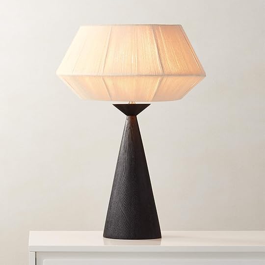


Totora Oak Wood Table Lamp: The shape and organic textures are to die for!!! This puppy could easily fit in with so many styles and that shade shape really makes it extra unique. Plus, while not cheap, other lamps with oak bases are typically much more expensive.
Zoe Lamp: I can’t promise this will be the last time I talk about this lamp because that’s how special I truly think it is. I have it in my own home and consistently tell myself it may be one of the coolest pieces I own. The pattern and colors are good. Each wood piece is kept together by elastic bands which gives it an added uniqueness. Whomever I leave this one to will know they are my favorite. JK, but also…
Como Rechargeable LED Table Lamp: If you are into the “unexpected red theory” then this is a very cool way to do it. This tone of red is so cool and will undoubtedly awaken your space, especially if you’ve felt like you’ve been in a design rut. Plus, it’s rechargeable so you can put it anywhere in your room and not have to worry about needing an outlet for a cord.


Mooney Table Lamp: I’m a sucker for a rice paper lamp and this short and wide cutie is no different. The colors aren’t exactly bold but I think the shape and size are more than enough to make a statement. It’s the perfect option if you have a natural, organic style OR if you have a very boldly colorful style. This lamp could act as a perfect contrast to give your eye a break and pique your interest. Just a thought.
Rigby Table Lamp: This one is such a fun mix of traditional and organic styles what with that stone base. I just think it would be a great addition for someone who wants something cool but not visually too loud.
Tall Table Lamp with Metal Shade: What, you thought I wouldn’t add a purely brass-colored mushroom lamp? It’s a class for a reason. Gretchen even borrowed one of Em’s for her bedroom reveal shoot! The proportions are great and it’s a decent price for something really special if you ask me. A little luxe never hurt anyone:)
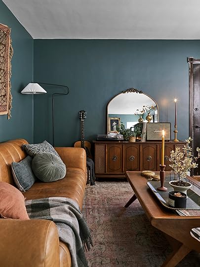
 design by ryann trombetti | styled by emily bowser | photos by sara ligorria-tramp | from: ryann’s living/dining room reveal
Another category that I’m sure is of no surprise. We LOVE candelabras and candlestick holders. Here is a whole post I dedicated to it. But truly this is maybe the most affordable decor piece to have in your styling arsenal. It can add instant sculpture, instant color (be it the holder or the candlesticks), and when lit, instant ambiance. This is another category I have “over-collected” as I have rarely met a candelabra or candlestick holder I haven’t wanted for my own. So with that in mind let’s start with candlestick holders…


Asker Black Wood Taper Candle Holders: Do I even need to say anything? They’re perfect. A modern shape in an organic material. Love, love, and love. Put ’em on your mantle, put ’em on your table.
Stoneware Candlestick: What a cool and interesting shape that can absolutely stand on its own. No need to make a little duo or trio:) Oh and for $20 what a steal!
Venezia Glass Taper Candle Holder: If you really want to play with great shapes, this trio is so good! You can use them to lean into your MCM style or play with some contrast and add them into your traditional style home. The sky’s the limit.
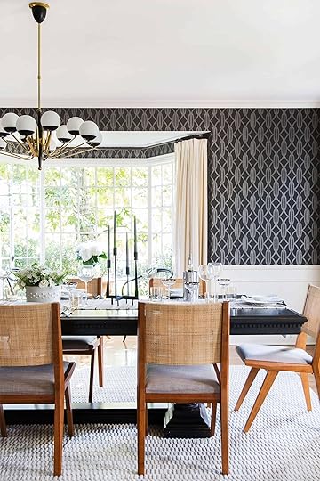
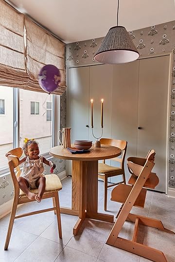 left: photo by tessa neustadt | from: griffith park formal dining room reveal | right: design by alryn hernandez, styled by emily bowser | photo by veronica crawford, from: arlyn’s kitchen reveal
Now let’s get into these candelabras!


SIN Weylyn Candelabra: Maybe the most famous candelabra from this and last year! It’s so pretty and cool and holds six candlesticks. It absolutely will make a statement but can easily be “quiet” if you choose more neutral candles. Also, if you love it but wish it came in black you are in luck because it does:) Oh, and Emily has one and boy is it so pretty in person.
Stoneware Candlestick Vintage Mexican Tree of Life Ceramic Candle Holder: There are so many cool vintage options on Etsy, like this Oaxacan candleholder (whoops though it was a candelabra but it’s too pretty to not include). It’s really special don’t you think??
Luxe Double Taper Candle Holder: Affordable but looks expensive – what an ideal combo! Love the mixed materials, the color tones, and look at it in action in Arlyn’s kitchen
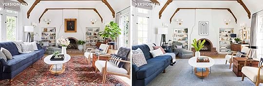 right: photo by tessa neustadt, from: our modern english tudor living room | left: photo by sara ligorria-tramp, from: my living room update
We’ve been promoting the use of trays for um…ever. They are a stylist’s secret weapon. They corral things, they add beauty, and you can find great ones on every budget! What’s not to love?! They are great in the living room, entry, kitchen counter, bathroom, bedside table, and more. I think I counted seven just in my one-bedroom apartment so you know I’m being sincere.
I thought it would be fun to show you how Emily styled her old LA living room with three different trays in four different versions!
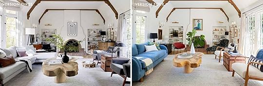 right: sara ligorria-tramp, from: a quick update: the changes i’ve made to my la living room | left: sara ligorria-tramp, from: living room update – again
They all add a layer of texture and visual interest (even a focal point) and keep the coffee table from having a bunch of bitsy things that tend to look like clutter if you aren’t careful. Also when there’s a credenza on the right wall of her living room, the large black tray keeps all of the bar things together and organized:)
Ok, onto our recommendations…

Bon Wooden Tray: I am currently looking at this tray because it lives on my desk and I couldn’t love it more. All credit goes to Emily Bowser who brought hers to style with for my reveal shoot. I immediately knew that this desk needed to have one for itself so I hit add to cart FAST. I have the large size, which is incredible, but if you love the style but need something small don’t worry, you have options. It also comes in a natural oak.
Reverie Tray: I have also seen this one in person and in action! My cousin bought the large size for her living room to act almost as a serving tray more than a decorative one. It sits on top of a stack of padded stools to set drinks on but they also grab it and use it on their sectional for the same reason. Their sofa is very deep, so it’s a very stylish solution to not having to reach to the coffee table for your drink or snack when they are sitting more towards the center corner.
Black and White Marble Decorative Checkered Tray: A tray is a perfect place to add some pattern! And this black and white check one is fun, classic, and very cool.


Footed Marble Countertop Tray: I still can’t get over that this tray is only $25! I saw it in person at Target and if I didn’t already have seven trays in my house (and no place to put it…yet) I would have swooped it up. The feet are so cute and I love that stone color.
Decorative Serving Tray: Simple, elegant, and will work with almost any style. The wood tone is so pretty and it’s under $50!
Benjaman Metal Tray: I just really loved the lines of this guy and the fact that the lip is suuuuper minimal. It’s little details like that make something simple look a little more special.

 photos by sara ligorria-tramp | left from: portland project family room reveal | right from: mountain house dining room reveal
In the same family of the tray is a big bowl. I’ll be focusing on large, centerpiece-like bowls but little catchall bowls are also such a great styling piece. But a large bowl is definitely going to make a bigger impact, duh. They are another piece that can be used in so many areas of the home but also act as a sculpture depending on the shape of the bowl. Take that footed bowl on the coffee table in the family room of the Portland Project. It looks like a piece of art while also having the ability to hold something if needed. Then obviously, a dining table is a classic spot for a large bowl because it covers a decent amount of space but also usually having some height for visual weight.


Valentia Crackled Ceramic Decorative Bowl: This one very much mimics the one on Emily’s coffee table in her living room reveal. The movement is so beautiful and the organic feel of the material, I think, makes it really versatile.
Turmont Pedestal Bowl: All hail the footed bowl. Like I said, it marries function and height which automatically makes it look like a sculpture. And this blue color is so stunning. 10/10
Alura Black Ceramic Decorative Centerpiece Bowl: The chunky lip and cool texture make me feel things. It’s a very chic piece with a lot of presence (that could also act as a try if you wanted).

 photos by sara ligorria-tramp | left: design by velinda hellen, from: sara’s living and dining room reveal | right: design by sara ligorria-tramp, from: sara’s primary bathroom
Unless you are better than most of us (ha), having a little box or two to hide random things away is SO helpful. It’s like a tray in terms of its “corraling” capabilities but even better in some ways because you don’t have to look at what’s inside. Plus a pretty box is a great opportunity to play with adding in a cool shape, pattern, and/or material. They are great to put on a shelf, console, or even a coffee table for those less-than-attractive remotes.


Fiore Box: I mean it’s so pretty! I love the roundedness of it and all that texture. Maybe not great for a remote but would be so pretty on a shelf, nightstand, or bathroom counter!
Shagreen Box: Simple, versatile, and affordable. Right up our alley! It comes in two sizes that are both great options and I just think it looks so great for the price.
Coffered Inlay Box: I really love a patterned box and this one is no exception. I’m also pretty sure we’ve recommended it before and it also comes in two sizes. The perfect pop of pattern for those who don’t want “too much” pattern. Go here for more anti-pattern assistance:)

 photos by kaitlin green | left from: farmhouse primary bedroom reveal | right: farmhouse living room reveal
The sphere pillow is a new staple that we feel real good about. Its rise has been undeniable over the past few years and for good reason. It’s a fun shape that doesn’t feel too risky like say, a triangle. It also just looks modern and chic when done right. We might be biased but the two places Em used them in her house are excellent examples:) They are great on an accent chair but can also be paired with other pillows on sofas and beds.


Striped Velvet Ball Pillow: Sarah Sherman Samuel knows her pillows and this striped cutie is exhibit A. It’s another version of the one in Em’s bedroom so we can wholeheartedly recommend it. And you bet I’m eyeing one for my house.
Palle Shearling Decorative Sphere Pillow: Actually, I am also looking at this one! The color is so stunning and that texture is GOOD. But then again, Athena Calderon is another designer that always kills it:)
Terre Velvet Sphere Throw Pillow: But if you want to keep it simpler, this solid blue option is so pretty, gives you a pop of color while still staying pretty neutral.
 design by jess bunge | photo by sara ligorria-tramp | from: jess’ living room reveal
But just because we love a sphere doesn’t mean we don’t still love a round accent pillow, especially these newer chunky disc-like ones that have been gaining traction for a minute too. It’s just nice to throw in a pillow without a right angle, you know?


Velvet Round Throw Pillow: Emily is a big ole fan of this one for its style and price! I mean for $22 how can you beat it?! She does mention that it’s definitely a decorative pillow and not a comfy one, FYI.
Round Pomp Pomp Cushion Decorative Pillow: I love a neutral pom pillow! It’s playful without feeling too young. Of course, there are great colorful pom pillows but I think we can all agree not all are created equal. This one, however, is great and handmade from Etsy!
Velvet Disc Pillow: If you saw Em’s April Fool’s toilet styling post then you’ve seen this pillow in cream. She loved it so much that she bought two! The structure is really elegant and cool. Another SSS design that we can’t get enough of.
 photos by sara ligorria-tramp | left from: experimenting In my living room: trying to find “the” rug | right: design by alryn hernandez, from: arlyn’s living room reveal
Obviously, we weren’t going to leave out throw blankets:) They add instant cozy, texture, and pattern if you so choose! There are also a ton of ways to style a throw. Two ways are styled above and here is a video of Emily showing a few more of her “throwing techniques.” Enjoy!

Checkered Wool Throw: Graphic, moody, and neutral. This would be just a great pop of pattern that wouldn’t take over the room color-wise.
Marta Throw: We love a blue throw over here and this one is beautiful! A little less graphic than the first one but would add a perfect amount of visual texture. It also comes from a great company.
Textured Grid Lines Dobby Throw Blanket: If you love texture but are not a fan of bold patterns then this could be a great option for you. It also comes in other colors and is affordable.


Stillwater Floral Quilt: Emily recently bought this quilt for the back of one of her living room sofas and it looks so perfect. Since it’s a quilt, it’s not an easy throw-and-go blanket and is better for adding interest to the back of a sofa or folded nicely on the chaise of a sectional.
Pampas Ivory Striped Waffle Oversized Throw Blanket: I love the simplicity of this one because those black stripes pop the perfect amount. It’s on my personal list of things I want:)
Eleanor Pritchard Dovetai Throw: Here is an EHD classic that Em has used a bunch. She loves a graphic throw and this one is perfect in that regard. Plus the colors are so pretty and would add a good amount visual weight to a sofa, chair, or bed.

 photos by kaitlin green | left from: farmhouse primary bathroom reveal | right from: farmhouse primary bedroom reveal
Is there anything like a good vase? Especially when there’s a beautiful floral arrangement (or big awesome branches) inside of it? A vase is where you can get playful because the stakes are so low here. You can find awesome vases at almost any price point and if you want to switch them out or move them to another location in your house, it’s easy and fun! But when choosing one for your space it should at least have one of these things: a cool shape, a great color, or an awesome pattern. Of course, you can have two or all three at once but to have them look like a statement piece, go for at least one.


LG Double Clover Vase: This potentially perfect vase has really been making the rounds at the farmhouse. It’s been in the living room, Em’s bedroom, and in her bathroom. And guess what? It looks perfect in every space. It’s a piece of art in and of itself, is large, and neutral enough in color that it can work almost anywhere (but it comes in a TON of other colors). Plus B Zippy is just a cool artist that you should support if you can!
Imre Black Ceramic Vase: Simple but bold if you ask me! The shape is good and the texture adds that something extra.
Verso Table Vase: What a color! And the handles are great too. I love the idea of putting this in a fairly neutral room because it would be unexpected but awesome.
 photo by sara ligorria-tramp | from: portland project dining room reveal


Dark Grey Putra Vase: Do I even need to say it? What a shape and what a piece of art. Flowers not needed but always welcome:)
Large Glass Vase: This is from H&M! There are a few different sizes but I love this large one so much. The pattern feels cool and organic but the fact that it’s made of glass makes it feel also perfect for a more refined, traditional style home.
Plateia Medium White Earthenware Vase: I’m a big fan of that modern-looking lip and the overall presence of the vase. It’s just cool and oh-so versatile.
 styled by getteline rene | photo by mark weinberg | from: it’s here! our first ehd collection with rugs usa (+ why now? and why this?)
Ooh baby do we love a graphic neutral rug. It’s all of the pattern and texture you want without the visual overwhelm. So while we definitely aren’t saying that a rug and a vase are on the same level of “swapability,” a rug can be a massively impactful styling piece that technically could be swapped out easily enough if you wanted. Much easier than a new wall color for example. Curtains are in the category too but we prefer to focus on rugs since they aren’t in your direct eye line and it’s less of a risk to go for a pattern. This was a big focus when Em and I were creating our first Rugs USA drop. We wanted to primarily focus on fun but neutral-toned rugs (remember blue is a neutral to us:)). Ok, let’s see some rugs.

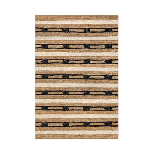
Merrick Tasseled Cotton and Wool Area Rug: Are we biased? Well yes, yes we are! This rug has sold out a few times and we couldn’t be happier about it. We think the graphic pattern and two-pile construction make for such a cool yet not overwhelming rug. Oh, and this is the rug my dad bought for any Les Bunge fans out there:)
Citra Grey Hand Knotted Wool Rug: Now this rug is not one of ours but we’ve used it in so many projects (my old living room being one) that we feel very close to it:) It has worked with so many styles that it’s a rug I plan on keeping forever.
Raleigh Striped Jute Area Rug: This jute was another one of our favorites from our first collection. A little bolder with the heavy black stripe but is balanced out by the warmer tan jute!
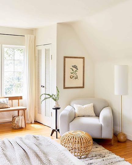
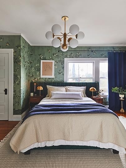 photos by sara ligorria-tramp | left: design by julie rose, from: suzanne’s bedroom reveal | right: design by jess bunge, styled by emily bowser, from: the feel-good modern romantic bedroom makeover
While drink tables are not new, they are another decor item that’s totally taken off in more recent years. It’s a small little piece of furniture that is easily moved around for function and can easily add some visual drama. Plus they are so great for small spaces and can be used as a chic plant stand if you want (which is what we did in my friend’s bedroom above). We are all huge fans and here are some current good ones.


Ciccio Green Marble Side Table: What a chic way to bring in a little color and pattern! It’s understandably the most expensive of the three but a real showstopper. It’s going on my list.
Gideon Drink Table: I love this one too. The texture of the black wood is subtle but awesome and how cool is that shape?! It almost doesn’t even look like a drink table and could easily be a cool piece of art.
Round Pedestal Table with Weighted Base: This one is simple, cute, and under $40. Win, win, win!
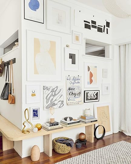
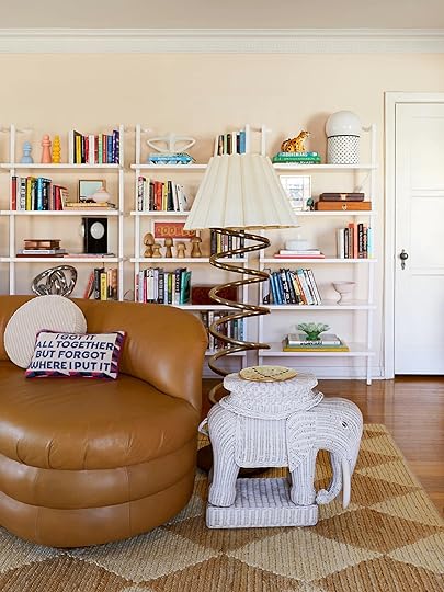 photos by sara ligorria-tramp | left: design by jess bunge, from: jess’ living room reveal | right: design by caitlin higgins, styled by emily bowser, from: caitlin’s living room reveal
Last but certainly not least are objects. Now an object can really be anything. Heck, when I was living in NYC I grabbed a cool-looking piece of cement that had been jackhammered out of the ground and placed it on my shelving unit circa 2014. I loved it! Their function is to add interest to a room and make it feel even more layered. Ideally, they are things that have sentimental meaning but collecting those can take a long time to acquire and you should! But in the meantime I have no shame in buying beautiful things I love to look at because for me that also makes me very happy. Add objects to your shelves, on your coffee table, a credenza, or even on the floor if you’re like me (see above – objects galore). Here are some of our current favorites if you want some inspo…


Alba Wood Sculptural Object: Love the mixed materials, the height, and the vintage inspiration! Such a great piece to mix and match with other pieces.
Talisman Stone: The first time I ever saw a beautifully wrapped rock was at Emily’s and now I’ll forever be a fan (much cooler than my cement chunk:)). Perfect to place on top of a stack of books or place on your coffee table.
Ceramic Organic Modern Loop Sculpture: Target is honestly a great place to look for cool and affordable objects and this one is no exception.


Infinity Object: This cutie is much bigger than it looks and is COOL. It reminds me of the brass sculpture I have which I really love. A little brass accent is a nice thing to have in your home:)
Wilkinson Abstract Figurine: I know this one won’t be for everyone but I love it! It’s cool, a little more unique than your average object, and makes me smile! See what I mean? I don’t need every object in my house to have a unqiue story of how I found it if it genuinely makes me happy looking at it.
4 Wood Finials: I wholly endorse using vintage finials as decor. They come in so many shapes and sizes, can be found at awesome prices, and they will add some soul to your space instantly. If you look at the top of my window trim in my office I put a bunch that I found at the vintage shop up there! It’s a fun little unexpected moment that I love.
Well, this turned out to be a VERY big post but I truly hope it was helpful and got you excited about styling up your home. Of course,I didn’t include things like vintage art or plants but those are much more “find in person” things:) Happy styling!
Love you, mean it.
Opening Image Credits: Photo by Sara Ligorria-Tramp, | From: LA Living Room Reveal
The post Here Are The 11 Styling Essentials For 2024 (Come See If You Agree:)) appeared first on Emily Henderson.
April 11, 2024
3 Design Choices We ALMOST Made At The Farmhouse (And Why We Didn’t)
There is a “fantasy” period while planning a remodel – this happens at the beginning when you haven’t fully comprehended what the ultimate cost is going to be (or maybe as you renovate inflation hits and ruins your “budget” anyway). It’s so easy to think/hope/wish anything is possible, which becomes even more challenging because of the “idea inundation” of the internet (i.e. so many good ideas out there, which ones do I want to do?? What if we did that? Could we do that?). So today I’m showing you some of our more fantasy ideas for our home that we did with ARCIFORM and then eventually nixed, mostly due to budget or major changes that made it impossible to execute. Let’s just say a glass ceiling was involved…
The Kitchen With The Walk Through Apothocary Pantry
What you are seeing here is the kitchen moved into the now living room with a walk-through apothecary cabinet wall into the pantry/mudroom (the glass cabinets with shelving in that light wood). We were SET on this plan until many of you readers pointed out the obvious: “If you want more natural light in the living room (with the best coming from behind the range wall) then open it UP!” There were definitely layout issues with this version, too. The kitchen would be dividing the LR in 1/2 with the fireplace not in the middle of the room so trying to layout our furniture was a massive challenge to me. But I LOVED the idea of that walk-through apothecary.

Anne designed the walk-through from the pantry (with that library ladder) which was the old kitchen (at the time we tried to keep it). Anne had such creative ideas!!! But ultimately we nixed it all and we love how it turned out.

Anne from ARCIFORM was so invested in making this work. This would have made the pantry/mudroom really big (on the left) with these gorgeous walk-through doors with glass (likely a $10-12k unit on its own). I loved the interior windows so much and that symmetry is so perfect. Ultimately, when sitting in this room I truly can’t imagine it being cut in half by the island. We really do use our living room – both sofas, so much. Maybe not all day every day but we have people over enough that having it shoved to one side to accommodate for the kitchen might have been a regret.
How It Actually Turned Out design by emily henderson and arciform | photo by kaitlin green | from: farmhouse living room
 design by emily henderson and arciform | photo by kaitlin green | from: farmhouse living room
While the living room is indeed large, now that we have it laid out with two facing sofas and a big chair it feels GREAT. We love the size and 10 grownups can hang out easily in here (and we do). And yes, it is so light in here because of the kitchen (and sunroom) but it wouldn’t have been without moving the kitchen back and letting that sun flood in.
The Cabinet Filled Entry
At one point I wanted to put in a wall of cabinetry here for front entry storage. Boy, am I glad I got talked out of that. Little did we know that we would NEVER come through that door and if we had it would be for guests and we’d likely want them to look at something like beautiful art – not a wall of cabinets. This was me reacting to (where we were living at the time) not having a front door coat or shoe storage situation. This also would have been more expensive than drywall, obviously (like $3-5k). We are still looking for a nice standing coat rack for the rare occasion that guests come over through this door (our kitchen door is the closest to the cars, soooo…)
What We Actually Did: The Entry design by emily henderson and arciform | photo by kaitlin green | from: farmhouse entry
Instead, we wallpapered, hung art, and kept it easy. It’s such a pretty entry and I’m so glad that I didn’t insist on those cabinets. And while we do have room for a hook, or four, I know that it would just collect coats that otherwise should be put in the coat closet in the big mudroom.
The Built-In Laundry Hamper Wall
For a while, we were going to create this awesome shaker cabinet unit in the kid’s bath with a shoot into the upstairs laundry room. You would essentially put your laundry into the bathroom on this side and then BOOM it’s on the other side in the laundry room (in a hamper or a built-in cabinet. I think this was a genius idea.


Now the reason we didn’t do this was two-fold:
We turned that future laundry room into a guest bath (this one), so this laundry room doesn’t even really exist (we put in a laundry closet instead with just a washer/dryer). We needed to cut budget and any type of custom built-ins are CRAZY expensive so we had a big old slashing day where we slashed and slashed and slashed. While I loved these for their shaker reference, it just wasn’t necessary.The Upstairs Guest Balcony
This one really cracks me up. Again, we were in the “dreaming up” phase and not wanting to miss opportunities that we would later regret. Since we were adding this sunroom, someone (I think Brian this time) threw out the idea of a patio on top. And THEN someone (Brian again) said to add natural light we could do a glass ceiling? And for some reason, all of us were so enthusiastic about this! Like we went as far as to reach out to see how a glass ceiling works. Then the following questions arose:
Who is going out on this patio? Our kids? Well, that doesn’t seem too safe. Our guests? Why are we giving our guests their own balcony? We have an abundance of outdoor places to sit. If it’s glass, then if we put furniture or rug on it that would be super weird when you are sitting downstairs in the sunroom. Also what if someone wears a dress?
It just became one of those ideas that stopped making sense in ONE SECOND, but not before Anne was nice enough to do the renders for it. Also please note that the primary bathroom was at one point where our mudroom is and I don’t remember why we moved it. And aren’t you so glad that we did a covered porch along the whole back? In case you need a reminder, here is how it looks now (and I can’t wait to shoot it again after the plants explode, summer #2 is going to be so pretty!!). Back porch decor coming sooooonnnn…
 design by emily henderson and arciform | from: our farmhouse back porch reveal – the “1st summer” edition!
Renovating is wild, y’all. So grateful to get to do it and so glad the main house is done. xx
Opening Image Credits: Design by Emily Henderson and ARCIFORM | Photo by Kaitlin Green | From: The Farmhouse Kitchen Reveal
The post 3 Design Choices We ALMOST Made At The Farmhouse (And Why We Didn’t) appeared first on Emily Henderson.
April 10, 2024
Should The Farmhouse Garage Be The EHD Studio Space??

At the top of the list titled “Things we’d like to put off forever” are 1. our kids growing up and leaving us and 2. rebuilding the garages. Necessary, but not my favorite way to spend $$. As I write this post it dons on me that perhaps we could kill two birds and create a compound for our kids to live in the garages, thus avoiding the horror of #1 altogether. Eh? While that isn’t the plan I’m legit rethinking it this very second – I mean what is the housing situation going to be like in 15 years?? Anyway, these garages I know will be a valuable way to invest in the property and as my business moves more into product development or different future revenue streams (Yes, I’m always toying with a podcast, design retreats, and/or photo studio space). You can’t have this real estate taken up by four extremely dilapidated garages forever. Here is how it looked last year during construction (pre-new re-grind driveway).

Here is how it relates to the property – it’s near the kit house (or what I’ve been calling the Victorian), but separated by a few feet (we’ve thought about connecting them and might construct the garages so that if we wanted to one day do that we could:) You can see our house in early construction in the back there.

Here are some things you should know:
It would likely be cheaper and easier to just demo them out and rebuild with basic electrical, drywall, etc- to rethink the whole thing entirely. But they are so close to the property line (thus our neighbor’s houses) that we can’t rebuild. We need to keep some walls to be grandfathered in, thus remodeling and not just rebuilding. The structure itself is probably from the 1850s, so close to 200 years old. And let’s just say that this little old lady did not take good care of herself. She is absolutely falling down (you’ll see) and can’t even really be storage right now as everything gets wet, moldy, and spidery. Truly a waste of space (and likely dangerous). There is a lot of history here! As a massive sentimentalist, I love that these were once carriage houses (so sweet!) and a sheep barn. While we can’t really retain much of the original structure I’m curious how we can rebuild them to keep or add any charm. None of the garage doors work – one goes up and down, but they all have to be replaced. So yeah, it’s going to be a thing but at least it’s on this area of the property that we don’t hang out in at all so it can be relatively contained. So What’s The Plan??? Why The Garages Before The Other Kit House??
Step 1: Garages, Step 2: Remodel the Kit House (oof). We need more space for work, but NOT an “office” per se. I love having a collaborative space for the days we are together shooting or designing, but we all prefer writing/editing or doing computer work on our non-shoot/prep days at our own houses. The long-term plan is to redo the original farmhouse on the property – a kit house from the 1850s that came flat-packed on a train. It’s adorable, despite not having electrical, plumbing, HVAC, or one straight angle. But right now that kit house is used for dry storage (props), rugs, furniture, etc – all necessities of my job. We are not prepared for what that will cost or how we even want to go about doing it (DIY over 5 years? Just make it safe? Totally invest and make it a proper house for future parents or kids or a guest house as we potentially rent it out?). After three years of renovation on our main house and yard, we need another 1-2 years to save $$, pitch partnerships, and think about it all. So our plan is to invest in the garages (knowing it will still be very expensive) because it’s much more straightforward. It’s hopefully not going to take too much of my creative energy (I have to focus on the river house). Sure we have to have a plan and of course, I’ll want it to look really good, but they will be more functional, utilitarian, and most of the work will be done by our contractor and subs. Then once we are done with those we’ll move the prop storage into it and hopefully by then feel ready to tackle the kit house. We feel pretty good about this timeline – I should be done with the river house by the end of 2024, early 2025 so then I can jump on the kit house.

It’s a lot of square footage and could easily be a six-car garage, but obviously, we aren’t going to do that. I don’t know how we are going to use the space but I do know that this job requires storage more than any other (and office/studio/projects). We are very grateful to have all of this potential space, that’s for sure.


We had the garages painted at the end of the summer because they were so dilapidated that they were bumming us out since the house finally was done. So we found a painter who was willing to do very little prep and just give all the outbuildings a coat of white paint (except the barn) so that they looked 30% better. The siding is in terrible shape and properly prepping it (scraping off decades of old paint, sanding, etc) would’ve taken so much time and been so laborious. We know (almost 100%) that we are going to have to reside altogether so investing in painting this properly was dumb.

The plan is as follows, left to right:
Storage for larger pieces – This would be for rugs, furniture, and larger shelves for vintage furniture. While we love the idea of the sheep barn, we plan on zero sheep in our future. This room won’t have a window but will have large doors to get furniture in and out of easily. I’m thinking some pretty/sweet carriage doors. Two car garages – While we aren’t sure if we’ll use them, we know that people really believe in garages (especially “car” people), and while we never think about resale (the likelihood of ever getting out of this house what we will have put into it is ZERO. Due to that we don’t really think we’ll sell it until we absolutely need to, likely decades from now). But we also know many people who have not been able to sell their houses easily because they didn’t have a good garage situation (especially at this price point). Besides in the winter, Brian does want to park his vintage truck in here. So I’m thinking two carriage-style garage doors for storage and two more traditional motorized garage doors for actual cars. “EHD Project Room” – This is the catchall term because we don’t know if we know exactly what this room would be for, but essentially it’s a non-in-my-home workspace – for shoots, design projects, and DIYs. We want at least one simple enough white wall to shoot content in front of. The point is – it will be finished out, and act as a secondary work space when we aren’t on our computers (or heck, maybe after the kids get home I’ll write in there?). It will have either one big garage door or more likely a set or multiple sets of carriage doors with windows in them. It will have drywall on the walls and ceiling (maybe paneling), cement floors, and natural light. In a perfect world, we do skylights so that we can keep the walls all storage or shoot walls. TBD. We won’t splurge on good flooring or wall paneling (as of now) and sadly have to drywall that beautiful ceiling in order to have insulation. And then we’ll add a mini-split for AC/heat. The Project Room
The ceiling is so cool, but it’s also really rotted and we need to add insulation in order to keep it warm enough in the winter (and temperature-controlled for props). While you can add insulation on top of the roof (or so I’ve heard, although you have to re-roof) in order to keep the ceiling beams it’s way more expensive. So we are sadly going to drywall the ceiling and if I feel like we can spend money on it we’ll add paneling. Like I’ve said (repeatedly, now) I’m trying to not go “all out” on a garage-turned-project room but at the same time know that everything is a space that we shoot that can create some interesting storytelling so I don’t want it tooooooo boring.
So this room (the first garage/project room) will be most of my focus to make sure that it works for us without us spending too much mone. Bare bones. Cheap and fast. (Someone go ahead and screenshot that quote and we can all laugh at it in 2 years when I’ve made this the cutest project room ever that took 2 years to finish).

Last summer Gretchen, Brian, Bailey, and I spent a few days pulling everything out of the garages and the kit house and organizing it all (donating a lot). So above you can see it in a cleaner state. We have one extra sliding door that we could add over on that wall (there is some extra space on the other side but it’s all blackberry bushes) but again, not sure if we need that or if that’s just a fun thing to have that will cost money.

Here is what it looks like now. We’d likely salvage that window and keep it or put it somewhere else. I’m unsure if I want all three walls to be blank for storage, or to add windows or doors here (but that means we’d have to clean up the blackberry bushes and probably put up a new privacy fence, and well…everything this is a thing (also fully understanding that even being able to fantasize like this is a total privilege.) I wonder frequently if this would be used as some sort of prep kitchen should we do events here or maybe this is where a parent could age in place because it’s a single story and in that case, we need a small bathroom in here(!!).

The opposite wall will be likely a shoot wall or storage (at least for now). In my fantasies it has a door into the “car” garage and all the tools would be in that space so easy to get to, but not messing up our studio space.
The Future “2 Car Garage”
Now these rooms are huge and could easily fit even three smaller cars, but great for a roomy two-car garage. This will house more power tools and MAYBE this is eventually where we put one of those garage ceiling storage shelves for our holiday decor once the kit house is done (which won’t be for at least 2-3 years).

Right now it holds a bunch of my sister’s bins (watertight I hope!) and a ton of leftover building material that we plan on using.

It’s in ROUGH condition – the floors are wood and rotted (and you can easily step through them and break your ankle). There are many vines that have wormed their way into the garage. Also, the ceiling is falling down.

While the windows in here are nice, the neighbor’s fence is 2′ away so we’ll just have these be drywall and forego natural light in here.
The Sheep Barn
Truly a barn of horrors. This room is in the worst shape…

We have thought about foregoing this room altogether, but if we keep expanding product lines I think we are going to want as much safe storage as possible (and it’s not like this part of the yard is desirable or anything to use it for entertaining or playing).


It’s a real job, but like I said – it’s actually not intimidating to me because most of the work and brain space will be done by our contractors (JP and my brother) and a handful of subs. We’ll start with foundation, then walls, basic electrical, drywall, and paint. So easy, right???
What’s The Timing??We are hoping to start ASAP with dreams of being done during the summer so we can transfer all the props and get settled before the rainy season (November) so that it’s usable next winter. So for those of you into garage content, this is really going to be your season at the farmhouse
*Photos by Kaitlin Green
The post Should The Farmhouse Garage Be The EHD Studio Space?? appeared first on Emily Henderson.
Emily Henderson's Blog

- Emily Henderson's profile
- 10 followers

