
Emily Henderson's Blog, page 271
February 8, 2019
7 Tips For Creating A Unique Home You REALLY Love


If you love vintage things and going to the flea market, you are not alone. Michael, our newest team member is OBSESSED with them. In fact, for years I would run into him at the Rose Bowl, he would stop me and we’d chat all things blog and flea. He has also been showing up at all things EHD for nearly a decade like volunteering at the rummage sale and helping at the shelter holiday decorating event. Naturally, after all those run-ins we became friendly. Every now and again he would tip me off on some new social media app that came out. He was always so supportive and made me feel like someone was actually reading and learning from this blog. Cut to last year when we were desperate for help in all things communication and he texted me saying, ‘how about me?’ Not only did he have a ton of experience (13 years in digital marketing alone, which is basically since the beginning of the internet) but he’s read the blog every single morning for eight years. So as Brian put it after our 2-hour interview, “Woah, that guy is uniquely qualified to work for the blog”. If you think I just hired a yes man, it’s actually often the opposite. He reminds me why people read and have read this blog for years and even shuts down ideas that he thinks are just not what you (the readers) want. He quickly dubbed himself our “Fan Ambassador,” (I like ‘Reader ambassador’ more) telling us what he thinks you want, need, and most importantly how things will be interpreted, or misinterpreted, etc. He’s already campaigned for things like the return of Craigslists finds, DIY projects and more thrift store excursions which I’m so happy we are doing because frankly, it’s all I want to be doing. We’ll get into that in a separate post but boy is it fun to have a one-person-focus-group actually on staff – and I LOVE hearing about what surprises him most being on the inside after watching from the outside for years (hot tip: we make it look really easy). If you want him to write about it, leave it in the comments (maybe we’ll do it on stories?). But for now, it’s time to let Michael take it away. P.S. You should know that Michael is literally the most enthusiastic person I’ve ever met, so if you think his excitement is faux, we promise it’s not. Head to insta stories to meet him in person:) Take it away, Michael.
Hi readers! First off—and I’m not joking—this is an ACTUAL BUCKET LIST dream of mine coming true. As Emily mentioned, I’ve read this blog every day for eight years and I couldn’t help but wonder/have daydreams of channeling my inner Carrie Bradshaw and writing something for this blog…and now HERE I AM?! Over a year ago, I cooked up the idea (long before I ever worked here) to pen a story about “Everything I Know About Design, I Learned From This Blog.” That’s what I get to write about today in my EHD debut…dreams happen, people. And I bet a lot of you have learned tips, too, that I’m hoping you’ll share in the comments once you hear my seven that I’ve applied to my house over the years. (Sidenote: is it me or do we look like Amish siblings in that photo?) 


February 7, 2019
How To Design A Pass-Through Room – REVEAL – The Portland Family Room

A “pass-through room” with lots of doors is a layout nightmare for anyone, including this designer. Welcome to the family room reveal of the Portland Project – otherwise known as the hardest room in this house to design, where we spent HOURS upon HOURS laying out, deciding on scale and location of furniture – until all of a sudden … it worked. This room needed to function as the family hang out room – fine, easy, we know how to do that. The kids can hang out while dinner is being prepped, with the option for a TV (wired above the fireplace but here is hidden by art), and yet it is a pass-through room between the kitchen and the dining room, smack dab in the middle of the house with 3 doors that had the annoying task of ‘swinging’ which takes up even more real estate. Sure we could have turned this into a dining room and boy did we consider it, but then there would be two sitting rooms next to each other (a living room and a family room), which could have worked but we made a choice. And now I’m so glad that we did.
The biggest problem was that the sofa had no obvious place to go. None. In order for someone to watch tv, it obviously needed to face the TV. We even thought about two facing sofas, to create a cozy area and you could lay down facing the TV to watch it. It just wasn’t obvious and it was driving us a little nuts.
Now since we are here to help you learn from our experience, we came up with some very useful tips for designing a pass-through room. This way you won’t have to go through the agony we did.
Find The Right Sofa
Once in the space, we decided that in order to make it a pass-through room and for someone to watch TV it needed to be shoved against the wall. Just floating it would be too close to the TV (as it had to be high to accommodate the indoor-outdoor fireplace which made the TV higher).
My brother even reacted saying, uh, aren’t you NOT supposed to shove a sofa against a wall, and while you aren’t supposed to in big rooms, of course in smaller spaces it’s often only what makes sense and totally works.

In order for that sofa to make sense against the wall it needed to be deep, cozy and low – it couldn’t be this high backed, shallow, fussy settee – we needed to make sure its purpose was known – to create a seating area, anchored by this flop down-able sofa in which to watch TV. It was the right scale for where we needed it to be and trust me when I say it’s one of the most comfortable sofas in which I’ve ever sat in – yet with low clean lines. EVERYONE loved it (including the buyer). It’s from Lulu and Georgia and I seriously considered it for the mountain house 95 times. The big cozy rug is from Lulu and Georgia as well and it’s the perfect amount of ‘busy’ that hides some dirt while still feeling light and airy. I’m very much considering this one as well for the mountain house.
Ovals Are Your Friend
Ok sure, we’ve figured the sofa problem but then what do we do about the rest of the room? It still needs to be a pass-through and we didn’t want to just have a sofa against a wall, we needed a coffee table and some other chairs to create a seating area. When choosing a coffee table we chose an oval shape for a reason. Hard corners like the evil “rectangle” take up more space, whereas an oval usually provides the same function, but with the ability to go around it, thus creating a better “flow”.
We did consider a couple different shape options – a cluster of smaller round tables – could be nesting or a round table with a pouf. Ultimately they were no-gos.

The winner was this Thomas Moser piece and boy is it a beaut. The oval shape was truly perfect. It was long enough to be the right scale with the sofa, but narrow so it allows space to walk and no one is getting bruised by hard corners.
Vary Weight And Texture Of Furniture
This is something specific that I’ve found I have done over and over and over, and works even in non-pass-through rooms. It’ my favorite sofa/chair combo – the upholstered sofa with the more sculptural leather and wood armchairs. These chairs are a great medium scale but are visually light because of the open arms. This really helps make the space feel open and breezy. Now the texture of the leather takes it from basic to more high end and special. The pretty detailing on the wood arms and curved back also help make it special. HOT TIP: Leather/wood + linen and fully upholstered is a winning furniture formula.
And yes, your chairs can have their backs to the TV. You can still have a conversation area in your TV room and in fact, this is a GREAT way to take the importance away from the TV. The future family of this house has an additional media room so this wasn’t where multiple families were going to watch TV. So it’s ok that those two chairs are faced away from the TV.
Don’t Crowd The Space
Once we had the layout it all came together. You could pass on both sides of the coffee table as well as behind the chairs. That in and of itself is a HOT TIP. Make sure you can walk between your furniture pieces. You will be so happy that you didn’t crowd your room, making it feel like it’s closing in on you.

I can’t say enough about the ‘see-through’ fireplace. It’s actually an indoor/outdoor fireplace (I stole it for the mountain house and it’s WONDERFUL) – it pumps hot air both ways, which means that you can sit outside in the winter. I will say in order to make it actually warm out there it has to be up really high which is loud, so at the mountain house we have it on pretty low and its perfect for inside and great for more spring/summer nights when it’s chilly but not FREEZING. But the big design win of this piece is that it makes your room feel SO MUCH bigger and open. If you have the ability to add one of these puppies into your home, do it.
Let’s take a second to dive a little deeper into the rest of the fireplace. We used Ann Sacks tile and Metrie moulding to design the fireplace, and we had to limit the mantle in order for a TV to actually fit on top without it being too high. Having that fireplace definitely limited the design as there needed to be 6″ of non-combustible space on each side of the fireplace. But at the same time, we wanted it high enough to actually see out of when you are sitting on a sofa – almost like another window. It was tricky for sure.

We debated hard about whether or not to put a TV up there to make sure that people knew it was all wired and possible – so they could see their lives (and we would likely put it on a mount that could lean down and angle left and right). But ultimately we had so much art (by MaryAnn Puls and Jennifer Urquhart) that looked so good, so it just seemed painful to me to put a big black TV where we could put art and we didn’t have a budget for The Frame TV, sadly.
Lastly, that fan was everyone’s favorite – my brother wouldn’t stop talking about it so if you are in the market for an attractive ceiling fan, I highly recommend that one.

There you go. The Portland casual family room reveal (did you see the basement media room?). It ended up being a room that we spent a LOT of time in and loved. It is casual and comfortable, but felt “intentional” and done well. In the above photo, I believe we cheated the chairs in so you could see all of them, but there really was enough space to live, walk and hang in this ever-so-challenging pass-through room.

A couple quick call outs of things I LOVE – that black vessel from Mantel by Bobbie Specker Ceramics (I bought it actually and had it shipped down), that wood side table by Vince Skelley from The Good Mod is insane. It was $750 otherwise I would have bought it and lastly, that blanket (not available. SO SAD) is one that I have used one million times because it’s just the perfect amount of pattern in a sophisticated way.
If you are interested in the products we used get out the ‘Get the Look’ below:

1. Abstract Art by Mia Farrington | 2. Throw Pillow | 3. Pillow Cover | 4. Pillow Cover by Rejuvenation | 5. LED Ceiling Fan by Rejuvenation | 6. French Doors by Milgard | 7. Floor Lamp from Schoolhouse Electric | 8. Sofa | 9. Rug | 10. Coffee Table by Thos. Moser | 11. Wood Sculpture via The Good Mod | 12. End Table from Room and Board | 13. Vessel by Bobbie Specker Ceramics from Mantel | 14. Metal Trays (set of 3) | 15. End Table from Room and Board | 16. Leather Chair from Room and Board | 17. Lumbar Pillow (similar)| 18. Banded Stripe Pillow | 19. Throw Blanket by Rejuvenation | 20. Marble Sculpture | 21. Stone Sphere Object | 22. Abstract Art by MaryAnn Puls | 23. Painting by Jennifer Urquhart | 24. House Painting by Jennifer Urquhart | 25. Crown Moulding by Metrie | 26. Candle Holders via Mantel | 27. Wood Flooring by Hallmark Floors | 28. Indoor/Outdoor Fireplace by Montigo | 29. Window & Door Casing by Metrie | Baseboard by Metrie | 31. Oyster White by Sherwin-Williams | 32. Pure White by Sherwin-Williams | 33. Fireplace Surround by Ann Sacks | 34. Fireplace Hearth by Bedrosian Tile
***Photography by Sara Tramp for EHD
Design and styling by Emily Henderson and Brady Tolbert (and team). JP Macy of Sierra Custom Homes was the General Contractor, and Annie Usher and the architect.
***For anyone following along with the Portland Reveals, make sure you didn’t miss out on any:
Living Room | Master Bedroom | Master Bathroom | Foyer & Staircase | Office | Kitchen | Mudroom | Powder Bath | Dining Room | Upstairs Hall Bathroom | Guest Bedrooms | Laundry | Media Room | Downstairs Bathroom
The post How To Design A Pass-Through Room – REVEAL – The Portland Family Room appeared first on Emily Henderson.
February 6, 2019
Design Mistakes: How Not to Design a Boring Neutral Room

 photo by tessa neustadt | from: mel’s living room reveal
***written by Arlyn Hernandez
We all know someone (heck, some of you might be that person) who is annoyingly effortless. You spend 2 hours getting ready for a night out with a friend trying to avoid looking like you crawled out of a dumpster, and just when you start feeling a little good about your vibe, nonchalantly catching glances of yourself in your rearview mirror on the drive over, you get to your meet up spot and realize you look like the Hamburglar compared to that person. How do they do it? Are your genes that much more garbage than theirs (thanks, mom)? Maybe she’s born with it, maybe it’s actually Maybelline? I’m not here to tell you how they do it, but what I am here to report is that your friend—the one who makes you think they just threw on some ol’ thing, tousled their hair and swiped on some Chapstick—is lying to you. Well, that is if your friend was a neutral room. THAT WAS A STRETCH, HUH? But for real, they relate. Keep reading, folks, because it’s about to get helpful.
Neutral/beige rooms aren’t as “effortless” as they look. In fact, they’re kind of an oxymoron in that most people go this route because it’s “easy”…beige goes with beige, after all, right? It’s not necessarily a difficult feat, but it’s not as simple as just buying everything in the same shade of off-white. There’s a reason beige gets a bad rap and is synonymous with lackluster or uninspired rooms. B is for beige…is for boring. Really good neutral rooms all share similar qualities, including the right balance of texture, tones and a sprinkling of je ne sais quoi (we’re about to dive deeper into all of that, promise).
In fact, when done right, it feels nearly masterful. I’m all for color, but some hue-deficient rooms are done so well that they can take your breath away. You envision what it would be like to live in a home that’s so visually light…I mean, just look at Mel’s previous apartment up there. She couldn’t possibly ever have a bad day in there right? Never once did she argue with her mom about posting a well-intentioned super unflattering photo of her on Facebook. In a room like this, bad photos don’t exist, so said fight would NEVER happen to begin with…
Let’s jump to the “tip” and “educate” portion of this blog post before I start making other unnecessary comparisons, shall we? So, the seven talking points to follow are key elements we pulled out of studying dozens and dozens of photos of successful neutral rooms.
1. Varied wood tones
 image source | design by saaranha & vasconcelos
You’re going to notice that a common thread in all the rooms we’re showing you is variety, be that in tones of textiles, finishes and, for this point, wood. Successful neutral rooms need depth and complexity to be special, so picking everything in a matchy-matchy shade will fall flat (unless you have some other factors, which we’ll get into). Here, in this room I wish I could move right into at the very least for a long weekend, you’ll notice that there are both deeper rich tones (like the sweet chair in the background), middle shades from the coffee table, trays and rattan armchair, and some lighter finishes via the bench holding up the art.
2. Mixed shades of beige, white and other neutrals
 image source | design by m. elle
Remember that time (45 seconds ago, depending on how fast you read) I mentioned varied tones of basically everything is crucial to a good neutral room? I was serious. This room by M. Elle works so well because of the subtle variations. The walls are a nice crisp white, then a few shades down are the sofa and armchair in a nice creamy hue. The wood tones of the shelving, coffee table and floors are all pretty similar (all which add some really nice warmth), but are separated by the toffee rug. Once that foundation is set, it’s easy to layer in all the extras that bring in some life (pillows, trays, decor, curtains, art…), and kept in a quiet palette, they just perfectly meld into the scheme like butter on a warm biscuit. It’s like the “no makeup” makeup look of interior design.
 image source | design by tamara magel
The varied hues don’t even have to be that severely different, as showcased in this bedroom. The walls and bedding are a bit brighter than those buttery curtains that are just barely a shade lighter than the knit poufs, which are a touch lighter than the rug (it just has darker stripes throughout that tricks the eye a little).
3. A touch of black or metallic (or both)
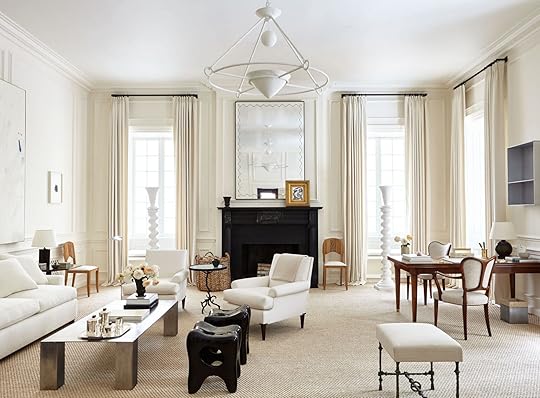 image source | design by Alyssa Kapito
Look, a touch of black will ALWAYS be a welcomed addition to a room. It’s grounding, adds depth, draws the eye…it’s interior design panacea, and it absolutely has a place in a mostly beige room for all the same reasons. Here, in a room by Alyssa Kapito that feels like a deep breath personified, the painted black fireplace surround, the…tooth (??) stools and the peppering of matte black via lamps and vases help the eye to move around the rather one-note cream colors.
 image source | design by erin fetherston and Consort
The home of Erin Fetherston has always given me palpitations. Mostly because it’s the type of room I could likely never put together because I swear up and down I only want to live in a home with lots of patterns and colors, but then in my heart of hearts, I realize maybe I don’t want that at all? I’m a very complex person who knows nothing about her own true desires. Actually, I’m polyamorous when it comes to interior design and would gladly take many aesthetic “wives” if I could, BUT back to why this room works. It has a lot of the elements we’ve already talked about (and will talk about): varied wood tones, texture, a touch of pattern and, last but not least a bit of black and brass. These provide much-needed contrast and tension in an otherwise quiet room and this is CRUCIAL to neutral spaces. Do I need to say it louder for the seats in the back? Write this one down.
 image source | design by tamara magel
The same thing goes for this room in a home by Tamara Magel. The addition of the black door frames, pillows, coffee table frame and aged brass chandelier and sconces really add such richness and depth that would otherwise be absent here.
4. Interesting shapes and silhouettes
 image source | design by emmanuel de bayser
Sure, this room screams I HAVE A TON OF EXPENDABLE INCOME TO BUY CUSTOM AND DESIGNER FURNISHINGS…AND SHEEP! But there are still everyday lessons to be pulled from the Berlin home of Emmanuel de Bayser. When your palette is this pared down, something has to provide visual intrigue. In this case, it’s the rounded and sculptural seating as well as that sinuous coffee table that makes your eyes buzz. It’s like a DING DING DING, this room is interesting. Now, you don’t need an entire room full of insanely expensive furniture, but try to bring in at least two or three things that break the monotony a bit, whether it’s a funky armchair or a super special grouping of side tables.
 image source
While that last room was basically a work of art, this shot proves that you really need just a handful of “interesting” items to bring a neutral room to life. Here, that knot pillow, the zig-zaggy sconce and the rustic milking stool take a simple vignette to the next level.
5. Tons of texture
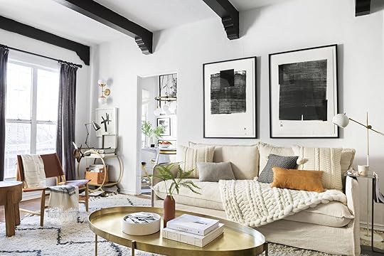 photo by sara tramp | from: brady’s living room refresh with the citizenry
When Brady refreshed his living room last year, he went way more beige and neutral than in his previous reveal. He kept it interesting by bringing in so much texture via the rug (which was already there), slipcovered sofa, and that chunky knit throw and pillows. They’re all in relatively the same shade, but it doesn’t feel stagnant because of all the other elements (black, metallics, wood).
 image source | design by Erin Fetherston and Consort
This is such a simple, quiet space that I’ve loved since the moment I saw it. The mix of linen, mud cloth, rattan, caning and seagrass comes together in an insanely lovely and welcoming marriage.
 image source | design by tamara magel
This is the third Tamara Magel room we’ve shown in this post, but well, she knows what she’s doing when it comes to neutrals. This shot sings because of the delicate balance of textures between the threading and wood of the dining chairs, the nubby rug, the plush animal skins (which I don’t suspect are faux, but really hope are at least vintage??), and the grain of the table top and ceilings. So quiet, yet it screams of success.
6. A subtle layer of soft color or a statement pattern (but just a little)
 image by Alison Bernier | from: a warm scandi inspired house
When you have a pretty neutral backdrop, even the littlest bit of color and pattern will sing, like the Rebecca Atwood pillow and peach throw in Samantha Gluck’s living room.
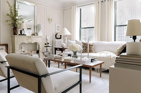 image source | design by josh young design house
Excuse me while I have a bit of a fangirl moment over Josh Young’s Chicago apartment. It’s homes like his that make me want to cross over to the neutral side (though I know I say that but don’t fully mean it because I am who I am). There’s so much to look at here, but it doesn’t feel cluttered because of the soft, colorless palette. However, it’s those wild tiger-print pillows that take this from sophisticated and lovely to a bit edgier and…younger? Sometimes all it takes is a little out-of-the-box pattern, people.
7. Architectural interest certainly helps
 image source | design by kerry vasquez
And finally, we get to something that is likely quite hard to help for most people, unless you plan on moving or renovating, and that’s architectural detail. Designer Kerry Vasquez’s LA home is such an effortlessly pretty study in neutrals, but let’s get real…the domed ceilings, original fireplace tile and woodwork (which you’re not seeing in this photo, but it’s there), add that much-needed sprinkle of character. This is not to say to run out and find a new place to live should you be paying rent or a mortgage in a detail-less tract home or basic apartment, BUT if you are so lucky as to live in a home with some original detailing or spectacular moldings/built-ins/ceilings/etc., remember that that’s nearly enough to carry an entire room without having to bring in a crayon box of color.
So, that’s how you build a really fantastic neutral room. Beige can be beautiful and interesting and full of character, and hopefully now you have the treasure map to that design bounty. Oh also, we want to keep working on Design Mistakes for you guys, so please share in the comments below what specific topics that we haven’t already covered you guys want to read about. We’re an open book!
The post Design Mistakes: How Not to Design a Boring Neutral Room appeared first on Emily Henderson.
Design Mistakes: How to Avoid “Basic B” Beige (& Pull Off the Perfect Neutral Room)
photo by tessa neustadt | from: mel’s living room reveal***written by Arlyn Hernandez
We all know someone (heck, some of you might be that person) who is annoyingly effortless. You spend 2 hours getting ready for a night out with a friend trying to avoid looking like you crawled out of a dumpster, and just when you start feeling a little good about your vibe, nonchalantly catching glances of yourself in your rearview mirror on the drive over, you get to your meet up spot and realize you look like the Hamburglar compared to that person. How do they do it? Are your genes that much more garbage than theirs (thanks, mom)? Maybe she’s born with it, maybe it’s actually Maybelline? I’m not here to tell you how they do it, but what I am here to report is that your friend—the one who makes you think they just threw on some ol’ thing, tousled their hair and swiped on some Chapstick—is lying to you. Well, that is if your friend was a neutral room. THAT WAS A STRETCH, HUH? But for real, they relate. Keep reading, folks, because it’s about to get helpful.
Neutral/beige rooms aren’t as “effortless” as they look. In fact, they’re kind of an oxymoron in that most people go this route because it’s “easy”…beige goes with beige, after all, right? It’s not necessarily a difficult feat, but it’s not as simple as just buying everything in the same shade of off-white. There’s a reason beige gets a bad rap and is synonymous with lackluster or uninspired rooms. B is for beige…is for boring. Really good neutral rooms all share similar qualities, including the right balance of texture, tones and a sprinkling of je ne sais quoi (we’re about to dive deeper into all of that, promise).
In fact, when done right, it feels nearly masterful. I’m all for color, but some hue-deficient rooms are done so well that they can take your breath away. You envision what it would be like to live in a home that’s so visually light…I mean, just look at Mel’s previous apartment up there. She couldn’t possibly ever have a bad day in there right? Never once did she argue with her mom about posting a well-intentioned super unflattering photo of her on Facebook. In a room like this, bad photos don’t exist, so said fight would NEVER happen to begin with…
Let’s jump to the “tip” and “educate” portion of this blog post before I start making other unnecessary comparisons, shall we? So, the seven talking points to follow are key elements we pulled out of studying dozens and dozens of photos of successful neutral rooms.
1. Varied wood tones
image source | design by saaranha & vasconcelosYou’re going to notice that a common thread in all the rooms we’re showing you is variety, be that in tones of textiles, finishes and, for this point, wood. Successful neutral rooms need depth and complexity to be special, so picking everything in a matchy-matchy shade will fall flat (unless you have some other factors, which we’ll get into). Here, in this room I wish I could move right into at the very least for a long weekend, you’ll notice that there are both deeper rich tones (like the sweet chair in the background), middle shades from the coffee table, trays and rattan armchair, and some lighter finishes via the bench holding up the art.
2. Mixed shades of beige, white and other neutrals
image source | design by m. elleRemember that time (45 seconds ago, depending on how fast you read) I mentioned varied tones of basically everything is crucial to a good neutral room? I was serious. This room by M. Elle works so well because of the subtle variations. The walls are a nice crisp white, then a few shades down are the sofa and armchair in a nice creamy hue. The wood tones of the shelving, coffee table and floors are all pretty similar (all which add some really nice warmth), but are separated by the toffee rug. Once that foundation is set, it’s easy to layer in all the extras that bring in some life (pillows, trays, decor, curtains, art…), and kept in a quiet palette, they just perfectly meld into the scheme like butter on a warm biscuit. It’s like the “no makeup” makeup look of interior design.
image source | design by tamara magelThe varied hues don’t even have to be that severely different, as showcased in this bedroom. The walls and bedding are a bit brighter than those buttery curtains that are just barely a shade lighter than the knit poufs, which are a touch lighter than the rug (it just has darker stripes throughout that tricks the eye a little).
3. A touch of black or metallic (or both)
image source | design by Alyssa KapitoLook, a touch of black will ALWAYS be a welcomed addition to a room. It’s grounding, adds depth, draws the eye…it’s interior design panacea, and it absolutely has a place in a mostly beige room for all the same reasons. Here, in a room by Alyssa Kapito that feels like a deep breath personified, the painted black fireplace surround, the…tooth (??) stools and the peppering of matte black via lamps and vases help the eye to move around the rather one-note cream colors.
image source | design by erin fetherston and ConsortThe home of Erin Fetherston has always given me palpitations. Mostly because it’s the type of room I could likely never put together because I swear up and down I only want to live in a home with lots of patterns and colors, but then in my heart of hearts, I realize maybe I don’t want that at all? I’m a very complex person who knows nothing about her own true desires. Actually, I’m polyamorous when it comes to interior design and would gladly take many aesthetic “wives” if I could, BUT back to why this room works. It has a lot of the elements we’ve already talked about (and will talk about): varied wood tones, texture, a touch of pattern and, last but not least a bit of black and brass. These provide much-needed contrast and tension in an otherwise quiet room and this is CRUCIAL to neutral spaces. Do I need to say it louder for the seats in the back? Write this one down.
image source | design by tamara magelThe same thing goes for this room in a home by Tamara Magel. The addition of the black door frames, pillows, coffee table frame and aged brass chandelier and sconces really add such richness and depth that would otherwise be absent here.
4. Interesting shapes and silhouettes
image source | design by emmanuel de bayserSure, this room screams I HAVE A TON OF EXPENDABLE INCOME TO BUY CUSTOM AND DESIGNER FURNISHINGS…AND SHEEP! But there are still everyday lessons to be pulled from the Berlin home of Emmanuel de Bayser. When your palette is this pared down, something has to provide visual intrigue. In this case, it’s the rounded and sculptural seating as well as that sinuous coffee table that makes your eyes buzz. It’s like a DING DING DING, this room is interesting. Now, you don’t need an entire room full of insanely expensive furniture, but try to bring in at least two or three things that break the monotony a bit, whether it’s a funky armchair or a super special grouping of side tables.
image sourceWhile that last room was basically a work of art, this shot proves that you really need just a handful of “interesting” items to bring a neutral room to life. Here, that knot pillow, the zig-zaggy sconce and the rustic milking stool take a simple vignette to the next level.
5. Tons of texture
photo by sara tramp | from: brady’s living room refresh with the citizenryWhen Brady refreshed his living room last year, he went way more beige and neutral than in his previous reveal. He kept it interesting by bringing in so much texture via the rug (which was already there), slipcovered sofa, and that chunky knit throw and pillows. They’re all in relatively the same shade, but it doesn’t feel stagnant because of all the other elements (black, metallics, wood).
image source | design by Erin Fetherston and ConsortThis is such a simple, quiet space that I’ve loved since the moment I saw it. The mix of linen, mud cloth, rattan, caning and seagrass comes together in an insanely lovely and welcoming marriage.
image source | design by tamara magelThis is the third Tamara Magel room we’ve shown in this post, but well, she knows what she’s doing when it comes to neutrals. This shot sings because of the delicate balance of textures between the threading and wood of the dining chairs, the nubby rug, the plush animal skins (which I don’t suspect are faux, but really hope are at least vintage??), and the grain of the table top and ceilings. So quiet, yet it screams of success.
6. A subtle layer of soft color or a statement pattern (but just a little)
image by Alison Bernier | from: a warm scandi inspired houseWhen you have a pretty neutral backdrop, even the littlest bit of color and pattern will sing, like the Rebecca Atwood pillow and peach throw in Samantha Gluck’s living room.
image source | design by josh young design houseExcuse me while I have a bit of a fangirl moment over Josh Young’s Chicago apartment. It’s homes like his that make me want to cross over to the neutral side (though I know I say that but don’t fully mean it because I am who I am). There’s so much to look at here, but it doesn’t feel cluttered because of the soft, colorless palette. However, it’s those wild tiger-print pillows that take this from sophisticated and lovely to a bit edgier and…younger? Sometimes all it takes is a little out-of-the-box pattern, people.
7. Architectural interest certainly helps
image source | design by kerry vasquezAnd finally, we get to something that is likely quite hard to help for most people, unless you plan on moving or renovating, and that’s architectural detail. Designer Kerry Vasquez’s LA home is such an effortlessly pretty study in neutrals, but let’s get real…the domed ceilings, original fireplace tile and woodwork (which you’re not seeing in this photo, but it’s there), add that much-needed sprinkle of character. This is not to say to run out and find a new place to live should you be paying rent or a mortgage in a detail-less track home or basic apartment, BUT if you are so luckily as to live in a home with some original detailing or spectacular moldings/built-ins/ceilings/etc., remember that that’s nearly enough to carry an entire room without having to bring in a crayon box of color.
So, that’s how you build a really fantastic neutral room. Beige can be beautiful and interesting and full of character, and hopefully now you have the treasure map to that design bounty. Oh also, we want to keep working on Design Mistakes for you guys, so please share in the comments below what specific topics that we haven’t already covered you guys want to read about. We’re an open book!
The post Design Mistakes: How to Avoid “Basic B” Beige (& Pull Off the Perfect Neutral Room) appeared first on Emily Henderson.
February 5, 2019
Budget Room: Designing an “Adult” Living & Dining Room, 3 Ways

 photo by tessa neustadt | from: sara’s living room reveal
Hi y’all. Ryann here with our first budget series of the year. We’re calling this one “The Starter Apartment” and I hope you love it and if you don’t please be gentle in the comments (just kidding, you guys always are).
Being newer here at EHD as well as being the office “youngin,” Arlyn thought it fitting to ask me to lend my voice for this little ditty. Or maybe this is just her way of initiating me. Either way, we have lots to talk about because today we have a living and dining room roundup extravaganza. Let’s get into it, shall we?
A lot of you guys asked for us to bring back budget rooms in the new year, and as soon as that news trickled down to me, I couldn’t help but rejoice in how much I was going to benefit. This is certainly not a post all about me, but I am at the stage where I’m living without roommates for the first time so what goes in and out of my place is up to me and only me (just kidding, my boyfriend has a say, too). That said, we’ve been living in our apartment since May of last year with no dining table, an old couch that is starting to deteriorate, and no decor besides books stacked on the floor and a few plants.
Sure, I want the perfectly styled space that I think we ALL deserve, but I keep running into the same questions: Where do I start? What is worth splurging on? What even is my style? How do I attain what I envision my place looking like while staying within a reasonable budget? I needed answers and EHD came to the rescue. The fact that I get to contemplate this for my job? Well, it’s a privilege I don’t take lightly which is why I am so excited to share with you guys what I have learned.
So let’s talk. What exactly do we mean by starter apartment, anyway? The idea is that this would be your starter kit for your first “grown-up” apartment, whatever that means to you. It may not be your first apartment ever, so you can think of it as the first apartment you have real autonomy over, or maybe the first home you can relatively afford to put some care into. You went through the trouble of scouring countless renter’s websites and Craigslist to find it. You had a clear idea of what it would look like in your head, what the style would be, how you would make it YOURS. Now you’ve signed the lease and right away you can’t wait for your space to look like a spread in Architectural Digest. You picture yourself sipping coffee in your perfectly styled breakfast nook every morning, reveling at how adult you’ve become.
The reality is furnishing your home, finding your style, and building an eclectic collection is tough. It is time-consuming. It is so (at times) frustrating. Decorating your first apartment is NOT instant gratification despite what we were all led to believe. It’s a lot of having to stare at pieces of furniture you absolutely hate. It takes a lot of patience (I know this from experience).
To make things a little easier for you, we created three “Get the Look” styles for your living and dining rooms (bedroom and bathroom are on tap for next week). Chances are, you aren’t starting with a completely blank room and likely won’t go out and buy one of these boards top to bottom IRL, but we wanted to present some inspiration for how to put together something that would be easily buildable style-wise over time. They’re all fairly neutral, but pretty different styles. Just add your own flair. Fair warning: you are going to want to lock your wallet in a safe somewhere until you finish this post and get your head straight. BUT before we get into that, a few tips to keep in mind to help with your budgeting needs:
Always check Craigslist for a specific item you have your eye on or even do general searches like “West Elm sofa” or “IKEA storage.” You’d be surprised how often you can find the same piece of furniture in great condition for far less than retail price. This probably seems like a given and you might be thinking “where have you been girl, that is EHD 101” but I think we are all guilty of forgetting this. It’s easy to get swept up in the buyitnowandhaveitshippedtomeimmediately mentality. So here is your friendly reminder to check Craigslist, Let Go, Facebook Marketplace (which I am just now learning is a great resource), etc etc.
Don’t be afraid to DIY. When you’re on a budget, get thrifty. YouTube is your friend and there are countless apartment hacks that aren’t scary or overwhelming. Even something as simple as adding a trim to really simple curtains can level up your living room.
Mixing and matching price points is good. A $10 vase next to a $2,000 sofa is perfectly acceptable and very common in EHD world. Pretty looks good next to pretty, no matter the price.
As hard as it may be, wait for a sale. Places like West Elm, Overstock, AllModern, Urban Outfitters regularly having great sales. So, if you’re not DYING for the piece or in DESPERATE need, maybe meditate on the purchase for a bit. Patience is a virtue, my friends.
Splurges happen and that’s okay. We all see things that set our hearts ablaze (as Arlyn would say). If splurging on a couch or a bookshelf is what you need to do to live your best life, GO FOR IT. It just might just mean you get a $50 armchair from the thrift store instead of a $150 one. Life is all about balance (am I sounding like a lifestyle guru yet?).
As always, a mixture of new and vintage (or upcycled) is key. Check your thrift stores and flea markets (and eBay) regularly for vintage pieces to layer in that element of soul that’s so important to an EHD room.
And finally, DON’T RUSH THE PROCESS. Taking the time to find special pieces will make your place feel more special and more genuinely you. You may be eating on a rolling cooler right now, but you won’t regret the wait once you find your dream coffee table.
Okay, get ready for three curated budget rooms (with final price tags) that will knock your socks off. Away we go…
Simplified Modern: $2,996

1. Side Table | 2. Table Lamp | 3. Sofa | 4. Floor Lamp | 5. Curtains | 6. Coffee Table | 7. Rug | 8. Box | 9. Tray | 10. Blue Pillow | 11. Lumbar Pillow | 12. Leather/Canvas Pillow | 13. Throw Blanket | 14. Accent Chair | 15. Wall Unit | 16. Pendant | 17. ‘Canter’s’ Print | 18. ‘Black 03’ Canvas Print | 19. Abstract Heads Print | 20. Dining Chair (set of 4) | 21. Wood Vase | 22. Dining Table | 23.Wine Glass (set of 4) | 24. Water Glass | 25. Bar Cart | 26. Decanter | 27. Bar Tool Set
Talk about grown up am I right? That color palette really knows what it’s doing. It’s simple yet very sophisticated. It’s cool but with enough nuance in color and texture that it doesn’t seem cold. Truthfully, I wouldn’t expect myself to be drawn to this style as much as I am but there are A LOT of items in this bad boy that I am itching to buy.
First things first: That sofa. Those legs? That color? The shape?? GOODBYE. I almost bought it as soon as I laid eyes on it. I only refrained because I have to consider I live with another human being and we agreed we would both have a say what lives in our apartment. Truth be told, it’s been a struggle for us to pull the trigger on a sofa but this one might be the one (especially at under $700). Speaking of “the one,” can we talk about the wall unit. I won’t lie. I want it so badly. It would fit perfectly in my space and would provide the added shelving I really need and finally a place for my TV to live (which is currently resting on a random console I got for free that is way too tall). I picture LOTS of drooping plants on that top shelf with a few books and a really unique vintage vase or figurine. So ADULT.
I was surprised I was completely drawn in by that bar cart. Something about the matte black is so cool, and SO sophisticated. It says “I am hip” without trying hard. It’s functional and has this industrial flair that I am really into at the moment. That said, it’s a little pricy at $159 and unfortunately more than I see myself spending on a bar cart. However, I can also picture it in a kitchen as a little breakfast cart. I see myself having an espresso machine and toaster on top, a few mugs, a pretty tea towel, and small plates on the second shelf, maybe assorted teas and coffee stored on the bottom. Kind of like an open-faced, makeshift breakfast pantry. So maybe it would be worth it. I don’t know you guys, what do you think?
Cool Eclectic: $3,433
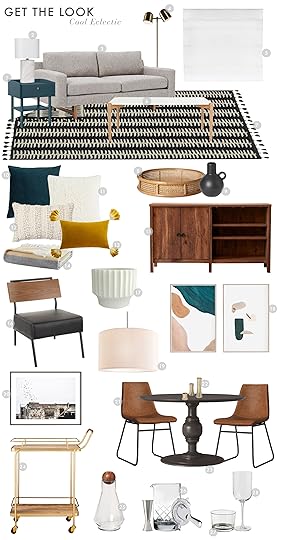
1. Side Table | 2. Table Lamp | 3. Sofa | 4. Floor Lamp | 5. Roman Shade | 6. Coffee Table | 7. Rug | 8. Rattan Tray | 9. Bud Vase | 10. Blue Pillow | 11. Faux Fur Throw Pillow | 12. White Pom Lumbar Pillow | 13. Yellow Lumbar Pillow | 14. Colorblock Throw | 15. Media Console | 16. Accent Chair | 17. Planter | 18. Printable Abstract Art (set of 2) | 19. Pendant | 20. ‘Brooklyn’ Print | 21. Dining Chair (set of 2) | 22. Candle Holder (set of 3) | 23. Dining Table | 24. Bar Cart | 25. Decanter | 26. Bar Tool Set | 27. Water Glass | 28. Wine Glass (set of 4)
Can someone please pass me my martini? But really though. If my apartment looked anything like this, I wouldn’t be surprised if a dirty martini became my drink of choice. The effortlessly put together vibe is palpable, in a good non-pretentious way. Like, if this were my apartment, I probably just wrote my first novel but it’s totally not a big deal. Not to mention those warm and bright colors juxtaposed with dark wood and leather accents keep it all casual with just enough edge.
But let’s talk some specifics. Starting with the sofa. I am really drawn to this one and it’s getting me into trouble (Geminis are notoriously indecisive and these options are not helping.) When I showed it to my boyfriend, his response was “I’d feel like Don Draper sitting on that thing” and I was like, YEAH. IT’S SO COOL. So MCM in the best possible way. It is pricey at $899 (way more than I honestly can see myself paying at the moment) so I may have to take my own advice and wait for a sale and/or commence some serious Craigslist trolling. Speaking of budgeting, if you glazed over those abstract prints LOOK AGAIN because you’re looking at two really cool pieces for $12 (they’re printables). A STEAL if I’ve ever seen one. And that coffee table? $169. After months of being in the market for a coffee table, I can say confidently you don’t find that price everywhere and you jump on it when you get the chance. Just saying.
Neutral Oasis: $3,294
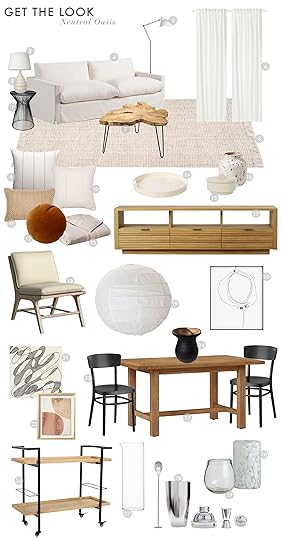
1. Side Table | 2. Table Lamp Base | 3. Lamp Shade | 4. Sofa | 5. Floor Lamp | 6. Curtains | 7. Coffee Table | 8. Rug | 9. Striped Pillow | 10. Raw Edge Pillow | 11. Textured Lumbar Pillow | 12. Round Pillow | 13. Throw Blanket | 14. Tray | 15. Box | 16. Vase | 17. Media Console | 18. Accent Chair | 19. Pendant | 20. Printable Abstract Art | 21. ‘Read Between The Lines’ Canvas Wrapped Print | 22. Framed Canvas Neutral Wall Art | 23. Dining Chair | 24. Wooden Vase | 25. Dining Table | 26. Bar Cart | 27. Pitcher | 28. Bar Tool Set | 29. Wine Glass (set of 6) | 30. Water Glass
For the those of you who crave a warmer, more inviting space, this one is for you. This look is Cozy with a capital C. Those soft neutrals are enticing and so so yummy to the point where I just want to take a quick nap in this here. Add in that slight pop of color and INSANE media console and I am sold.
Speaking of the media console…be still my beating heart!! This is one of those pieces I just ache over. There is something so classic about it while still feeling contemporary. Like this piece invented the idea of media consoles altogether.
And that dining table coming in at $300 (on sale now for $195!) is making a strong case for farm tables I have to say. I usually lean towards more sleek mid-century dining tables like this one, but this table is bringing out my rustic side and I am not mad about it.
Of course, I will comment on the sofa because apparently, I’m obsessed with sofas now. This one is not really my style, but I have a feeling its comfortability level wins over everything. The cushions are down filled so I can only imagine what a dream it would be to sit on. Also, it’s quite bigger than the other two which makes it a real sofa rather than a love seat which may just make up for the price.
So there ya have it. Three looks for a living and dining area in three budgets. What do you guys think?! Are you into this series? Would you want to see more of these “Starter Apartment” pieces? Who here is finding themselves in the first stages of Adult Starter apartment-ing? What other spaces would you want this budget treatment done for? We’ll get to work!
The post Budget Room: Designing an “Adult” Living & Dining Room, 3 Ways appeared first on Emily Henderson.
February 4, 2019
All The Counter Stools I Considered (& Decided On…Sort of) for the Mountain House

 image source
Welcome to “Mountain House Mondays” where yes, we talk current mountain house projects, design conundrums and generally “where we’re at” in the furniture/decor phase of this home. You guys asked for it, so what you are going to get is in-process decision making which sometimes (like today) might be messy. I’m hoping that you still gleam some information from the indecision and learn truly about the conundrums that even “experts” deal with on a day to day basis. Todays conundrum is the riveting stool debate. This post was finished on Friday with stools pretty much decided on, but over the weekend I’ve been up here and actually experiencing the house and now … well, you’ll see.
We are hoping to shoot the kitchen in mid-February (with a reveal end of month or beginning of March) and the only thing we are waiting on are the stools for both the island and peninsula. So, I thought I’d walk you through the process of how the EHD team chooses furniture for a particular space and how we narrowed it down to the two stools that we ended up choosing.
As a reminder, here is the layout of the kitchen.
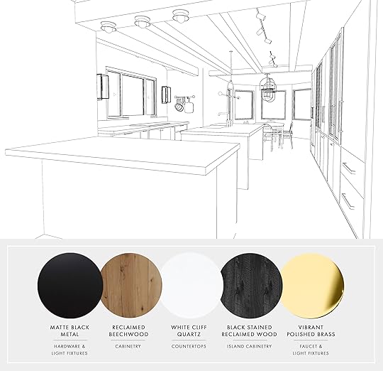
The last time you probably heard from us about this kitchen, it looked a little different in terms of material (remember this?). So for a little clarity and context, we included the final materials in the board above so you can get a sense of the vibe (but we didn’t want to give it away).
So, since we need stools for two areas (like I said, peninsula in front and island, in the niddle), it’s made a little trickier because the material is not the same on both those spots. The island is a black stained reclaimed wood while the peninsula is a reclaimed beechwood (though both have a white quartz countertop). Now they can be the same stool, but I think it will be more interesting if they are not, and vintage isn’t really an option as “counter stools” weren’t really a thing until the last couple decades so most vintage stools are bar stools (for anyone wondering what the difference is, it’s a seat height difference; counter stools range from 24-29 inches in height seat to floor while bar stools range from 30-36 inches).
The problem with stools is the same problem with, well, EVERYTHING IN LIFE: finding something that is comfortable, beautiful and affordable is quite a challenge. I might even say you have to choose 2 generally and that getting all three is impossible. Hell, getting ‘comfortable’ and ‘stylish’ is already hard.
Here are a few points we had on our mind while the design team was doing research:
FUNCTION
Ideally, I’d keep it clean and not have stools with backs on them so they can tuck under the island but over the break as we were up there (and I was cooking all day every day), people kept me company at the island for hours and therefore having a back on them became a necessity. Ideally, they’d even be padded or be something where it would be easy to put a cushion on. So on the comfort level, I need these on the island to be at least a 6-7.
But I think the stools at the peninsula can be backless as they will get less use and I really want to keep the sightline clean from the living room. I think these are more the kind that people will hang out at, but not for hours just while making a drink or eating a snack. But if they could also have a cushion, or be comfortable then yes, GREAT.
STYLE
While the whole mountain house style is minimal and Scandinavian, I want to keep it relatively classic and not trendy. It’s a hard balance…comfort, stylish, cool but not trendy, timeless but not boring. But it seems fun to fantasize…so first I’d like to introduce you to my dream stools. Some of the most beautiful stools in the world.

1. Moreno Barstool | 2. Strel Stool | 3. Siro+ Bar Stool | 4. Oak Hiro Counter Height Stool | 5. Brown Leather and Oak Stool | 6. Black and Leather Counter Stool | 7. Spot Counter Stool | 8. Meru Counter Stool | 9. Leather and Wood Stool | 10. C603 Stool | 11. Tractor Counter Stool | 12. In Between SK7 Bar Stool
My dream front-runners are #1 (from Lawson-Fenning) and #2 (by BDDW).
When I saw those (#1, #2 and #4), I had a visceral reaction. Those lines are simple but stunning. They are unique but not loud. They are minimal but still warm. They are also all very expensive, weighing in at $1,200 for #1 and I’m not sure how much the BBDW ones are but likely over $1k each.
The reason the Lawson-Fenning pick made the list is that it looks SO comfortable but without being a generic upholstered stool or one that could be found at a slot machine in Vegas. But these are already an investment and I would want them in leather which would cost even more and then Julie realized that they are too tall to tuck under the island, which was the whole point. I kept them “on the list” because they do check most of the boxes (comfort, simple, unique). Am I tempted to actually go for any of these splurge-y stools? My heart says yes, my brain and wallet says no. Besides, there are SO MANY great stools out there at all price points.
So Julie basically put together a document of all the best stools that fall in the Scandinavian vibe, that would work for the house (and my budget). We divided it into counter stools with backs and without because again, I want the people around the island to have backs, while the peninsula doesn’t necessarily need to (although ideally there wouldn’t be any backs, visually). If you are thinking that maybe a low back would be the best option, I’ll warn you that last night, I sat at a bar that had a low back and it basically felt like it had no back so it’s kind of pointless with the false sense of security a real back gives you.

1. Lovell Counter Stool | 2. Anna Stool | 3. Slope Upholstered Counter Stool | 4. Black Windsor Stool | 5. Faith Bar Stool | 6. Pause Bar Stool | 7. Gray Upholstered Counter Stool | 8. Plymouth Bar Stool | 9. Mackinder Counter Stool | 10. Klein Counter Stool | 11. Upholstered Walnut Counter Stool | 12. Remnick Counter Stool

1. Wood and Metal Square Counter Stool | 2. Perch Bar Stool | 3. Origin Backless Counter Stools | 4. Revolver Counter Stool | 5. Tan Leather and Light Oak Stool | 6. Plato Counter Stool | 7. Wood and White Metal Counter Stool | 8. Trace Counter Stool | 9. Smoked Oak and Black Counter Stool | 10. Spin Counter Stool | 11. White Ash Stool | 12. Plato Counter Stool
To keep it easy and to speed up the process (with fewer questions), Julie included the lead time and the price on these when we went over them internally.
Typically, the design team will put all options on a sheet (in Photoshop or InDesign), print it out and I basically just X out the “no’s” first. Don’t get me wrong, in this instance, ALL of these are “yes’s”—just being considered on this list means we really like something about all of these. But we have to consider the finish (the peninsula is light wood and the island is black wood), and whether we want the stools to pop or go away. I definitely don’t want them to pop, though some contrast could be nice, but also since this house is to remain as airy and calm as possible, I do want to make sure I’m not adding contrast just for the sake of contrast. Tone on tone is definitely the quieter route.
Once we got down to the “maybe’s,” she put them on another board so we could see them together.

Honestly, I love all of these. Some of them were nixed simply because of budget or lead time. If they were my dream stool that we had to wait ’til March for, we might have, but I love so many of these that obsessing over one seemed silly.
Then it came down to what looks good together:

Originally I wanted the pair on the left, but we didn’t hear back about lead time on the stool and we are trying to move fast. Then Article came out with these stools (creating the pair on the right) which frankly do look more comfortable and have a roomier bum (with a pad!). So we ordered them to get here in time for the shoot and now the Finnish Design Shop stools are in stock and can get here in time (and we get a nice press discount).
The price difference between the Article stool and Finnish Design shop is about $80 each, which in the grand scheme of things isn’t that much. Stylistically the finnish stool looks better with the lostine stool … What do you guys think? If you had to pick a pair for the kitchen based on the materials I mentioned, what would you go with and why?
*Last minute Update: after spending the weekend up here with my friends i’m even MORE concerned about the need for comfort around the island. My girlfriends and I discussed how no one really wants to sit at a bar or island on stools without a back, for more than 20 minutes anyway. Now I fear that the lostine stools should go at the peninsula (I already bought them, but we could return).
It really is a cruel cruel world that the elements that make something comfortable often make them less streamlined, bulkier, bigger, less sculptural. I’m tempted to go back to the drawing board and sacrifice a bit of that minimal scandy vibe to get more comfort. I now have 4 more that i’m contemplating that look comfortable and family friendly albeit less beautiful.
The post All The Counter Stools I Considered (& Decided On…Sort of) for the Mountain House appeared first on Emily Henderson.
February 3, 2019
The Link Up: CBD, Our Favorite Shoes and a Good Happy Cry
 Palisociety West Hollywood Longe
Hi everyone. Let’s have a check-in. How’s it going? How do you feel January went? What are the new February goals? What’s the hot gossip? Tell me everything. We have a BIG February ahead and are pretty excited to jump in. Hope you’re ready.
February 2, 2019
Soup Saturday: Fast & Simple Veggie-Packed Vegan Pho


We’re in what feels like the fifth month of 2019 and January is only just officially over. For real though, was that not the longest 31 days of everyone’s life? Maybe it was the post-holiday exhaustion, or the ramp up to a new year that is incredibly exhilarating (all those possibilities of the promises you make to yourself that you absolutely won’t break this year, again). Some of you might say it was all the souping, but don’t blame my skewed perception of time on this glorious brothy friend, okay?
And though #JanStewary is now in the rearview mirror—#FebStewary has a nice ring to it, still…thoughts?—we wanted to wrap things up with one final soup recipe because we just can’t quit you, soup.
For all of you in a straight up polar vortex who might want something warm and soothing in your bellies, we bring to you today a recipe that Sara cooked up (literally and figuratively). It’s a take on pho, but totally vegan, jam-packed with veggies and an insanely flavorful broth. Here, we went with seared tofu because frankly, it looked really pretty, but I’d probably veer left from “vegan” the next time I eat this and add chicken meatballs (like the ones from last week’s recipe) or very thinly sliced rare beef like you find in Vietnamese restaurants for variety.
Instead of the typical rice noodles, we upped the fiber quotient with zoodles (just zucchini put through a spiralizer, though Sara said ribbons made with a standard potato peeler would probably work just as well if you don’t have one of those fancy contraptions…or just get them pre-made at Trader Joes or Whole Foods). Rainbow carrots are just darn pretty, though regular orange carrots are also perfectly fine. And heck, if you want to swap the zoodles entirely for rice noodles, that would also be great. This is SUPER versatile and so easy.
Pho broth gets its deep yummy flavor from cooking for like 9 hours or DAYS, but man…that’s a lot of time, so we took a few shortcuts and while it’s not by any means authentic, it does the trick for sure.

[Recipe adapted from It Doesn’t Taste Like Chicken]
Servings: 6
WHAT YOU NEED
For the Broth:
Vegetables
1 yellow onion, quartered
4 cloves garlic, roughly chopped
Herbs, Spices & Pantry Goods
3 whole star anise
3 whole cloves
1-inch piece fresh ginger, sliced into coins
2 sticks of lemon grass, chopped into two-inch pieces
1 cinnamon stick
2 tablespoons coconut aminos (or soy sauce)
1 tablespoon fermented red chili paste
Liquids
2 L vegetable broth (8 cups)
For the Toppings (use whatever combo you like):
Fresh basil (thai basil if you can find it)
Fresh cilantro
Fresh mint
Fresh green onions
Mung bean sprouts
Hot peppers
Unsalted peanuts, lightly ground or finely chopped
Sautéed mushrooms
Sautéed tofu (or meat of choice)
Hot sauce
Lime wedges
1 package zucchini noodles (or 3 zucchinis, spiralized)
1/2 bag shredded rainbow carrots (or 3 carrots, shredded)
Hoisin sauce
HOW TO COOK IT
In a pan on medium heat, toast your cinnamon stick, star anise and cloves until fragrant to bring out the flavors, careful not to burn them. Pho broth is usually cooked over several hours (or even days) so to achieve it in a shorter amount of time, we want to get as much flavor out of our ingredients as possible.
In a large stockpot, add your broth, onion, garlic, lemongrass, garlic, toasted star anise, toasted whole cloves, and toasted cinnamon, to a large pot and bring to a simmer. Cover and let simmer for 20-30 minutes.
While the soup simmers, prepare your tofu and mushrooms (if that’s your topping of choice). Remove your tofu from its packaging and using a towel, gently press as much liquid as possible from it.
Slice your tofu into 1-inch squares OR 1/2 thick slices (as pictured). In a pan, add two tablespoons oil of your choice, along with one tablespoon chili paste. Heat over medium heat and add your tofu. Fry on all sides until golden brown all over. Remove and set aside to be used as toppings. Wipe out pan with a paper towel and put back on the stove for mushrooms.
Slice your mushrooms into coin-thick slices (or use pre-sliced mushrooms). In the same pan, add 1 tablespoon oil and heat. Add sliced mushrooms and 1 teaspoon chili paste, and sauté until mushrooms are tender. Set aside to be used as toppings.
To the simmered broth, add coconut aminos/soy sauce and chili paste, and taste. You can add more or less of aminos/soy sauce and chili paste depending on how salty or spicy you like your soup. Allow to simmer for 10 more minutes.
If you’re going to be serving all your soup at once, you can strain it now using a mesh spoon or cheesecloth to remove all the solid ingredients. If you’re going to eat only a little at a time, we prefer to leave the solid ingredients in the soup to continue adding flavor every time the soup is heated. Add a handful of zucchini noodles and shredded carrots to a bowl and ladle hot broth over top. Allow to sit for a minute to soften the fresh veggies just a touch, then load up with toppings and enjoy!

A few of you asked last week about the bowls we were using for these photos, and while some of them were no longer available, we did round up six favorite bowl and spoon favorites below. Quick note on soup bowls: The elusive perfect soup bowl can be tricky. It should be deep enough that things aren’t dangerously sloshing out of the bowl (2.5 inches is GREAT), but wide enough that you have room for varied toppings (7-8 inches is ideal). Plus, those dimensions hold a good helping of soup so you’re nice and full. These are not “soup course” sizes. These are “entree” sized bowls, just how we like it.

Top row: 55 oz Bowl (set of 3) + Stainless & Matte Black Spoon | Everyday Bowl + Matte Black Spoon | Matte Black Bowl + Wood & Stainless Spoon
Bottom row: Low Indigo Bowl + Rose Gold Spoon | Gray Soup Bowls (set of 4) + Soft Brass Spoon | Mint Bowl + Polished Brass Spoon
The post Soup Saturday: Fast & Simple Veggie-Packed Vegan Pho appeared first on Emily Henderson.
February 1, 2019
Back By Popular Demand: Our First Trolling Craiglist 2.0 City Picks


Blast from the past, anyone? TROLLING CRAIGSLIST IS BACK BY POPULAR DEMAND. And by popular demand, we actually mean DEMAND. Any chance you guys had to ask us to bring this baby back, you took. Truthfully, I have no idea what even took us so long, but pish posh, no bother, here we are again. Digging through pages and pages of horrendous office furniture castoffs, chunky wood bed frames carved with baby angels, and the occasional gem. Emily Bowser, one of our stylists, is also insanely handy and loves a good furniture rehab/reenvisioning, so she volunteered to be our go-to Craigslist troller. Our plan is to do this once a month, on a Friday, and change cities each time. We’re starting with LA because well, it’s our backyard and had to scratch that itch for ourselves personally, but we promise to go somewhere more “challenging” next time (any suggestions welcome, though we have some ideas from the comments in this post).
I’m going to hand it off to Emily B. (who we just call Bowser to avoid confusion) now, who found some pretty great things, even if they need a little TLC. Take it away, Bowser:

Antique Oak Table with 4 chairs, $400: This is beautiful and functional (comes with 2 leaves!). Sure, it could stand for a sanding and the seats need reupholstering, but it’s a DIY I could handle on a Saturday morning and wouldn’t cost much.
Modern Floating Credenza, $250: It’s simple and I like it. Paint if you like, maybe just the doors? Although I hear that brown is having a moment. I’m into the minimalism and love that it’s off the floor and has lots of storage. Wait. Do I need this?
Vintage Trunks (Side Table/Coffee Table), $40: These trunks are an awesome scale and SO cheap! Sure, you could use them like the listing mentions as a side table or coffee table, but they’d also just be a pretty cool “installation” in a room as “art.”
Amazing Vintage Drafting Drawing Table with Flat Files, $1,800: This isn’t cheap, but it’s very cool. Use as a desk, sure, but what about as a kitchen island? Maybe with a vintage sink put in the left side with exposed pipes? I DON’T KNOW, JUST A THOUGHT.

Set of 2, Michel Arnoult Brazilian Sling Chair, $450: I feel like I would be so cool if I owned these and when people asked, I’d casually say, “Oh yeah, I found them on Craigslist or whatever.” They’re pricey, but not really for what you’re getting. Plus these seem sturdy…pieces you’ll likely have a very long time. $225 per chair is far better than you’d ever be able to score at full retail.
Mid-century Wider Wood Coffee Table, $60: Good shape, good price! Hard to see in this pic, but there’s some pretty detail in the wood. Would be great for a narrow living room.
Queen Size, Black Iron, 4-Post Bed Frame, $339: Dreaming of ways to achieve the look of the Portland master bedroom? Look no further! You could probably talk them down a little…I’d shoot for $300 here.
1800s Oak Drafting Chair, $175: Probably needed if you’re going to get that awesome drafting table (but if you’re not ready to drop $1,800 on that, this would be so cute styled against a wall with an offset piece of art, maybe a stack of books.

Tiger Oak Coffee Table, $350: I wish I didn’t love my coffee table because this one checks all the boxes for me: Over 100 years old, solid wood, and sort of weird. The price is also SO right, so right I wouldn’t even argue about it.
Fog & Morup Hammerborg MCM Spun Aluminum Light Pendant Lamp, $100: I love a hanging light to bring the eye up! I like how this one is simple while still having vintage charm (and other similar pieces from this designer can run 3, 4 or 5x the price). HURRY AND GET IT BEFORE I DO.
Rattan Chair, Set of Two, $275: All these need is a simple reupholstering of the two cushions and these guys are ready for your boho beach patio (or living room).
Arthur Umanoff Walnut Side Table Mid-Century Danish Modern, $250: $250 is more than I want to spend on a side table but, I mean, it’s Arthur Umanoff, it’s walnut, and more than that, it’s interesting (and reminds us of the table we used in the Portland foyer).

Mid-century King Headboard, $200: I don’t have a king bed, but man, if I did, I would be ALL over this. It’s solid wood but missing pieces to make it a platform bed. French cleat it to the wall, buy a cheap frame and call it a day.
Mid-century Brass Five Globe Table Lamp, $295: Put a dimmer on this thing, in an eclectic space, I’m in.
Custom-made Swivel Chair and Ottoman, $160
Great Wooden End Table, $100: I think this may be a situation where the bad photography is hiding the fact that this is a cool piece. It’s solid (“very, very heavy” apparently) and looks like it has cool patina with an interesting shape. I may or may not have already sent out an email inquiring about it for myself…
And there you go. Our very first 2019 version of Trolling Craigslist. Yes, we started with an easy pick, LA (but according to our analytics, a ton of you are local). DO NOT WORRY. As I said, we will be sure to spread the love, in “cool” cities and “non-cool” cities. We’re likely headed to the midwest next, but throw out some locations or types of pieces you’d be into us researching, and we’re on it! Have a great weekend (and let us know if you buy anything…oh, and if you do, when you get it home and have it all set up how you like, please do post a photo on Instagram with the #ehdweekendmakeover hashtag…we wanna see!).
The post Back By Popular Demand: Our First Trolling Craiglist 2.0 City Picks appeared first on Emily Henderson.
January 31, 2019
The Ultimate Family-Friendly Media Room + Wet Bar

Welcome to the Portland project’s party central…the ground floor media room. It’s 540 square feet of family fun. We really thought about how to present this lady, trying to figure out how to make its reveal “editorial” but something about saying “how to design the ultimate entertaining space that’s as large as some people’s apartments” just didn’t feel right. Sure, there are takeaways here for anyone who has even 1/4 of the space (color palettes, how to slice up the areas, etc.) but I know this is a pretty aspirational room, and I didn’t want to sell it as anything but that. It would be like putting eyelash extensions and a matte red lip on a beaver and passing it off as a beauty queen. Wait, no…backwards? Because this is a beauty queen, not a beaver, so whatever the opposite of that would be. So, I thought it would be best just to show you this baby in a “look at this eye candy” way and walk you through the room. Ready?

This whole bottom floor felt like a bit of a waste when we got our hands on it. The home already had a pretty sizable garage, so a GIANT storage area (the bottom half of this floor plan) was itching, nay, crying out to be repurposed. Unless the new owners were somehow going to be an Amazon distribution center, it just didn’t make sense. We shifted the smaller bedroom down into the storage area (and where we also built out a laundry room area and moved the stairs), so that we could open that whole area up to be a kick-butt media room and wet bar. It ended up being 36 feet long by 15 feet wide, and the French doors open up to the backyard so it can feel really indoor/outdoor (you know, when it’s not raining in Portland).

The space above the mechanical/storage room is actually a little different, where we landed. It could have been one big closet (like in the floor plan), but we built-in a daybed nook on the right half, leaving the left half open to be used however the new owner wanted (for staging, we put in a games cabinet for board games and other fun family things).
We really wanted the vibe to feel casual yet sophisticated yet a little funky and special. Tall order, but I feel good about where we landed and how we got there. You know I love a bold wall color, so we brought the same shade from the powder room upstairs down here (Sherwin-Williams’ Waterloo) because it looked so, so good streaked with natural light. And because we didn’t want it to be too cave-like (which wouldn’t have been the worst thing, frankly), we designed a “feature ceiling” to draw the eye up and add in that little bit of “funky special” that was on the checklist.


Because I envisioned this being used as a family space, I wanted the color palette and textiles to be playful and not as serious as they were upstairs. A striped rug from Dash & Albert is subtle but adds a nice graphic punch (as does the black and white pillow on the armchair) and the throw pillows and blanket bring that bright but comfy pop with some earth tones (and of course, lots and lots of wood, because I can’t help myself and every room benefits from the warmth of wood).
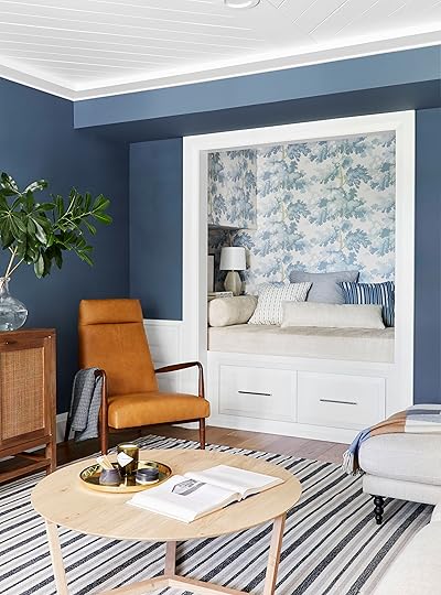
Wanna see one of our favorite little details in this whole house? This was originally going to be a closet, but then we thought WAIT THIS SHOULD BE A BUILT IN DAYBED. Perfect for impromptu naps, as a reading/coloring corner, or a place to hide nooked into a corner talking to boys late at night (you know, for the teenagers…or grown women).

I think maybe a tree wallpaper or mural should be my calling card. Never leave a project without plastering some tree trunks up on a wall somewhere. I do very much love this soft blue paper by Sandberg mixed with the striped and graphic Schumacher fabric from the throw pillows. Altogether, it’s sweet but not saccharine. If you have a nook like this to work with, I say treat it like you would a powder room…have some fun, take some risks, it’s just a tiny little corner.

We made sure to build in some shelving to make this the ultimate reading nook (you need a place to set a drink, maybe glasses…other books). Plus, it doubles as a “nightstand” if you want to use it as an extra spot for a guest to sleep (it’s an actual twin-sized mattress in there covered with Schumacher’s Olympic fabric…Arlyn can attest because it’s where she slept—very comfortably she says—during the open house event this summer).

On the other side of the daybed nook wall is this inset area that would and could easily be a closet but we left it open and used it more as games central.

I highly recommend adding art and creating a “moment” on any horizontal surface you can get your hands on, so we brought in three pieces—the left two from MaryAnn Puls, and the embroidered piece by Annie O’Dorisio—and rounded it out with a brass “small” (as we call little decor pieces like that in the styling arena). I’m not sure what it’s for, but I’d like to imagine it’s a giant coaster that holds your beer while you open this beautiful Room & Board cabinet to grab one of the 438 available ping pong balls or prep for a riveting game of Bingo.


Speaking of ping pong, is this not THE most unnecessarily beautiful ping pong table you’ve ever seen? I mean, the net is LEATHER (as are the paddles…well, leather and wood). I’m sorry, I just can’t. If you’re on the market for an “artisan” games table and have a spare $6,000, I highly recommend this one from City Home for your home (no, seriously).
We are not entering the wet bar area of the room and I’m not afraid to admit that it’s so very beautiful.

It has all the essentials of a wet bar: wine/beverage fridge, ice maker, sink and faucet, easily cleanable hard surfaces (and the added bonus of a dishwasher, keep reading).

Can we take a moment to admire the detail of this sink and prep faucet by Kohler? We could have gone with a traditional sink here, but if you have the opportunity to do something a little extra special, why not? I went with the polished nickel here as I did the rest of the house, which I’m loving because it’s traditional but warm (unlike chrome that can feel very cold).


A beverage refrigerator with side-by-side compartments that have their own temperature control lets you keep “adult juice” in one at some fancy “perfect for rose or white wine or cabernet” temp I won’t pretend to know, and, well…more “adult juice” in the other…just in canned form…but extra cold! Or of course, a bunch of La Croix or sodas for the whole family.

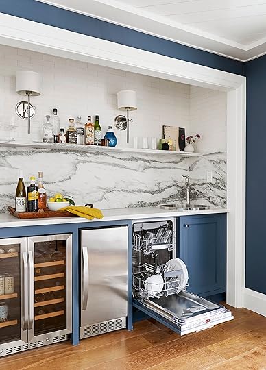
A smaller dishwasher is perfect for a wet bar area, especially on a floor removed from the kitchen. It’s just roomy enough to throw in glasses, popcorn bowls, plates crusted over with pizza cheese…you know, typically family area things (this one holds 10 place settings). We went with a panel-ready option so the bottom cabinetry wasn’t just a line of stainless steel and we could show off that dreamy blue paint color.
And, of course, like a good tree mural, I can’t leave a room untouched by an ice maker, for all my icy cold water/beverage dreams. This compact guy makes 45 pounds of “restaurant quality” clear ice a day and I don’t know what that really means, but it sounds like you’d never have to make an emergency ice run mid-party again. Oh, and a pretty cool feature is the door is reversible, so you can decide to make it left or right opening, whichever feels best for your kitchenette or wet bar.
[image error]

A ledge made of the same material as the slab backsplash blends in but also keeps the counters more easily clear (where else will you put the pizza boxes, otherwise?).

And there you have it. The ultimate family party room from soup to nuts (TV to ping pong table?). We put together two Get the Looks, one with all the furniture and styling, and another for the wet bar with all the details of everything we used here. As always, we’d love to hear from you…any questions, comments, concerns, loves, hates (kidding, don’t hurt my feelings)…leave for us in the comments below and we’ll chat back!

1. Maxwell Custom Sectional Sofa | 2. Custom Drapery and Drapery Rod by Decorview | 3. Window by Milgard | 4. Hourglass Stool | 5. Tripod Coffee Table | 6. Woven Cotton Rug | 7. Floor Lamp by Rejuvenation | 8. Pender Charme Chair | 9. Metal Tray | 10. Ceramic Salt Cellar | 11. Ceramic Match Striker | 12. Lumbar Pillow Cover by Rejuvenation | 13. Canvas Pillow Cover | 14. Block Printed Pillows via Mantel | 15. Tweed Throw by Rejuvenation | 16. Stripe Pillow (fabric available here) | 17. Cotton Throw | 18. Sconce by Rejuvenation | 19. Media Console | 20. Coffee Table via The Good Mod | 21. Wood Containers by Thos. Moser | 22. Vase | 23. Abstract Art by MaryAnn Puls | 24. Abstract Art by MaryAnn Puls | 25. Abstract Art by MaryAnn Puls | 26. Embroidered Art by Annie O’Dorisio | 27. Ping Pong Table | 28. Glass Door Cabinet | 29. Wallpaper | 30. Faux Leather Storage Bin | 31. Lamp Shade | 32. Dipped Ceramic Small Lamp | 33. Abstract Art by MaryAnn Puls | 34. Abstract Art by Mary Ann Plus | 35. Abstract Art by Mary Ann Plus | 36. Zoila Fabric by Schumacher | 37. Rania Stripe Fabric by Schumacher | 38. Cusco Ikat Fabric by Schumacher | 39. Olympia Fabric by Schumacher | 40. Ribbed Sculptural Vase via Mantel (similar) | 41. Sculptural Vase via Mantel | 42. Wooden Chest via Aurora Mills | 43. Wood Flooring by Hallmark Floors | 44. Waterloo by Sherwin-Williams | 45. Pure White by Sherwin-Williams | 46. Baseboard by Metrie | 47. Window & Door Casing by Metrie

1. Faucet by Kohler | 2. Tile by Pratt & Larson | 3. Sink by Kohler | 4. Marble Countertop | 5. Abstract Art by MaryAnn Puls | 6. Abstract Art by MaryAnn Puls | 7. Vase | 8. | 9. Textured Carafe | 10. Cabinet Maker | 11. Pull by Rejuvenation | 12. Knob by Rejuvenation | 13. Sconce by Rejuvenation | 14. Serving Bowl by Rejuvenation | 15. Napkins (set of 4) | 16. Marble Tray | 17. Ivory Knives (set of 6) | 18. Bronze Bottle Opener | 19. Wine Glasses (set of 4) | 20. Textured Lowball Glass | 21. Trapeze Glassware (set of 4) | 22. Beverage Fridge | 23. Ice Maker | 24. Dishwasher
***Photography by Sara Tramp for EHD
Design and styling by Emily Henderson and Brady Tolbert (and team). JP Macy of Sierra Custom Homes was the General Contractor, and Annie Usher and the architect.
The post The Ultimate Family-Friendly Media Room + Wet Bar appeared first on Emily Henderson.
Emily Henderson's Blog

- Emily Henderson's profile
- 10 followers

