
Emily Henderson's Blog, page 267
March 16, 2019
On My Body This Week: Trying Out a New Maximalism Thing + Some New Favorites

Due to my weeks of travel + pajamas lately, even I was relieved to find that this week I actually put on clothes that I really liked. What I have to remind myself is that most days, I’m on set, styling or checking in on projects so whatever I wear has to be comfortable, moveable and not precious (nary a dress) but I also had five photo shoots this week (three on camera) so I had my hair and makeup done. We also shot a fun spring fashion piece but you’ll have to wait for next week to see those lewks. Today, it’s all about real-life, what I actually wore on my body outfits.
Monday:

Jeans (similar) | Jacket | Hat | Boots
My new favorite spring jacket that I find flattering, comfortable and useful (big pockets). My Nisolo boots have become my go-to “utility” shoe and they work really well with skinny jeans. Insert new hat for my not-dealing-with-my-hair Monday look.
Tuesday:

Shirt | Jeans (on sale!) | Mules | Necklace (similar)
This was a moment where I tried color this week and I’m not actually sure about it…not convinced I like red. I like florals. I like ruffles. But do I like RED FLORAL RUFFLES all together? Not sure. This is however what is happening right now…maximalism in fashion. I know this because we’ve been talking about it and literally Googling what 25-year-olds are wearing in New York and what you’ll find is CAH-RAZY. I’m sure I’ll be on board soon, always slightly behind the nutty trends. Meanwhile, though I’m not selling those clogs there (I think they are wrong with the jeans), I LOVE THEM and I’ve worn them a ton since I bought them last week.
Wednesday:

Hello SUMMER SHORTS. I’ll still rock last year’s Levi’s but pretty psyched about this year’s although they are going even shorter…I’m wearing these right now while in Ojai on vacation with my friends. Also, that top was my attempt at BROWN. Are you guys dipping your mule in the brown color fashion trend right now? I’m still on the fence.
Thursday:

Shirt | Jacket | Pants | Shoes
All my friends are here: drop crotch, casual shoes with a heel, a simple button up and my new amazing chambray coat. You might not be impressed with the innovation here, but this is my favorite outfit of the week.
Friday:

What an awkward thing to do with your leg, but I do love my new boyfriend cut jeans. Those mules are my first attempt at an animal print, and since it’s small enough, I can do it. The button up is still my favorite oversized one from Target.
And there you go. We’ll have an actual fashion post next week…meanwhile HAVE THE BEST SATURDAY EVER. I’m at the Ojai Valley Inn and Spa with my best friends from Oregon and the only thing that would make me happier is if Brian drove my kids up for a 15-minute squeeze, only to leave post-hug. Have a lovely one. xx
All Our Fashion Favorites In One Place: Shop Emily’s Go-Tos on Our Shop Page
The post On My Body This Week: Trying Out a New Maximalism Thing + Some New Favorites appeared first on Emily Henderson.


March 15, 2019
Cancel Your Plans: 12 DIYs You’ll Want to Try This Weekend


***Written by Jess Bunge
Happy Friday everyone! You may remember about two weeks ago, Emily did a call out on Instagram (are you following us yet??) to ask all you talented folks to send through your DIY projects. BOY did you all deliver. We love a brilliant DIY project and have been really trying to experiment a bit more with it lately. And as suspected, we have so many talented readers in our little community that we thought what better way to finish off the week than to show some of you off. There were so many more we wanted to include but didn’t want to make this post too overwhelming. However, if you guys like this post, we can/will share more at some point. Sorry to be a tease. 
March 14, 2019
My New Interior Design Secret Weapon + Win a Room Refresh by Me With Velux Skylights
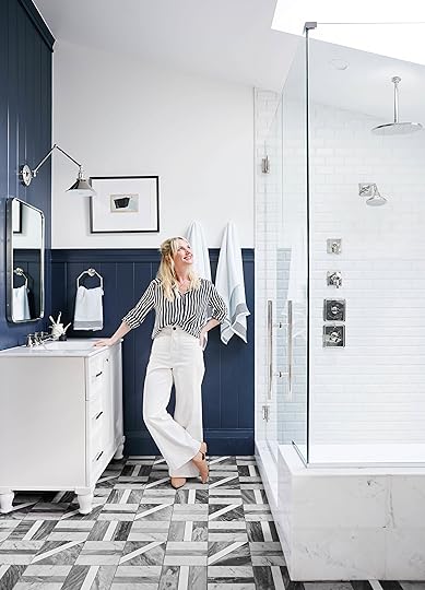
I learned very early on in my career as a prop stylist that for photography, natural light truly is the #1 element that you need for a room (or shot) to look alive. Before the wonders that is of Photoshop, photographers used to get booked and paid based on their ability to replicate natural light with strobes, etc. It simply makes a room. Before we get into today’s FREE “Brighten Up Any Room” MAKEOVER GIVEAWAY with Velux Skylights, we need to talk natural light—all the whys and hows. You might already be convinced about the benefits of natural light in your home, but I was, too, and I still missed opportunities during renovations of our current house. So really, this isn’t just a post talking about why I love natural light and how it’s a key element of design, but rather all the places you can bring in that sweet sweet sunlight that maybe you’re overlooking (hint: it involves looking up). Perk up if you are currently—or are going to soon—renovate to ensure you maximize your best friend, natural light, before you close up the walls.
Here’s a weird secret: a lot of the most “successful” bloggers and Instagrammers live in SoCal…did you know that? It’s not because “Hollywood.” It’s because of the light. We have beautiful light all year for more hours of the day. The winter light is even more beautiful here than the summer light. We don’t have to chase it or find it, it’s normally outside and full of blue (sky) and green (tree) accents. I’ve literally met people who moved here because “there is so much more daylight here” which of course makes sense but even three years ago, I was shocked by the fact that people relocate from New York or Portland for the use of natural light in their work.
But we aren’t talking about taking selfies. Who cares. What I care about is how natural light affects the interior of your home. Now obviously, windows are a big factor, but what happens when you have windows that face close buildings or with big overhangs outside (or mature trees) or can’t have windows because it’s an interior room? Is your room fated to forever be selfie-less? How will your room grow its Instagram following?
March 13, 2019
Combining Furniture Styles in The Casa Soria Family Room
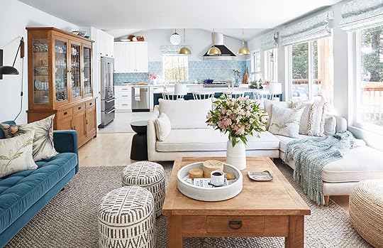

***Written by Orlando Soria | Photography by Zeke Ruelas
As I get ready to start shooting my upcoming HGTV series, it’s more than appropriate that I keep sharing my work with my OG clients, my parents, Ormomdo and Orlandad. I’ve been helping them decorate their house since I was about seven years old. And the home they moved into in 2012 (after moving out of my childhood home) is no exception. As with every other room in their home, this room brought with it significant challenges: odd architecture, weird angles, pre-existing furniture my parents weren’t willing to part ways with, and its inherent multifunctionality (it’s now fully open to the kitchen, which we recently renovated).
Today, the topic of conversation is combining furniture styles and how that can aid in decorating a house like my parents’, a house that has multiple architectural styles and lacks a cohesive look. But before we get too far into TIPZ N TRICKZ, let’s take a walk down memory lane and see what was happening in here before we got started.

This is pretty much what it looked like when my parents moved in. The floor was carpeted, the fireplace was ugly, and literally everything in the whole house was 1999 Beige (not cool, chic 2019 Beige which I’m actually into). The only remnants of beige left in the house are the bathrooms (which are next on my to-do list and we’ll get to once my parents get over the trauma of their extremely expensive, year-long kitchen renovation project we did last year).
The fireplace caused a considerable amount of questions for my parents when they moved in. Their initial idea was to just rip the whole thing out and not have a fireplace, which I advised against because I thought it would decrease the value of the house. I wanted to square it off and put it on the wall (where that console table is in the before pic) but that was going to be super costly. I’m not a fan of the caddy corner fireplace so leaving it as is wasn’t ideal, but turned out to be the best decision when we thought about all the options/costs/etc.
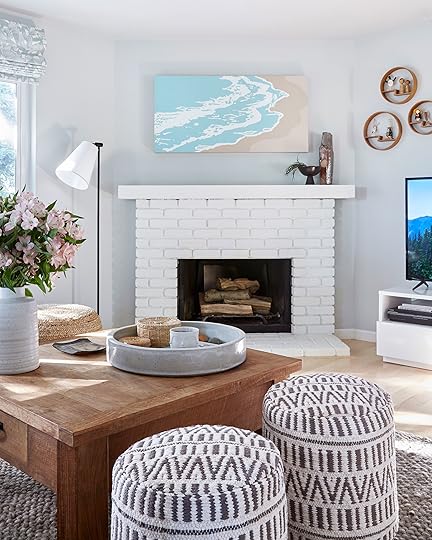
The simple solution to covering up that dated brick was to paint it white. I know this is a controversial move, but I have to say I love the look of painted brick, especially in a chic matte white or black. I also removed the brass/glass fireplace door (which is shockingly easy to remove FYI – I did it myself and was only moderately filthy when I was done!) and styled the fireplace with some logs I got which will literally never get burned because my parents never ever want a messy fire again after living in a fire stove-heated house in Yosemite for 30 years. This is why I’m such a baby about being cold now, I was literally raised in a freezing house heated by a fireplace and I think being freezing cold for 18 years is enough, k? Normal parents will be like “PUT ON A SWEATER” to their kids if they whine about being cold. In our house, it was like “WHY AREN’T YOU WEARING A PUFFY JACKET???” Anyone who has ever tried to keep their house warm with a fire knows it makes the biggest mess ever so I totally don’t blame my parents at all for never wanting to have a fire ever again, even though sometimes during the holidays we beg for a fire and feel like The Little Match Girl when they say no. In related news, their house is still freezing. I think they’re just not used to being comfortable inside so the idea that they could just turn up the thermostat and not see their breath is too much for them to handle.
One of the first improvements my parents made to their house was replacing the gross carpet (which was literally everywhere throughout the house) with solid hardwood maple flooring. This immediately brightened up their house and made it feel a lot cleaner. Initially, I wasn’t fully on board with this flooring selection because my dad wanted a really traditional vibe and this color looks inherently Scandinavian/modern to me. But once it was installed, I loved how pretty and luminous it was and it added to the home’s beautiful style ambiguity.

This vase weighs like 4,000 pounds and Ormomdo’s friend made it. Her name is Susanne and she doesn’t have an online shop but I feel like I need to make her make one because most of the pottery in my parents’ house comes from her and I’m always getting questions about it. Another artist I’m obsessed with named Jonathan Cross makes similar pieces which are more readily available, but cost like forty thousand million dollars (and are worth every penny).

And now, A TRULY SHOCKING PROCLAMATION. One of my biggest pet peeves is a TV above a fireplace. I know this is controversial because above the fireplace is maybe the most common place to put a TV. HOWEVER, I hate it for many reasons. Firstly, the TV is too high. You’re not meant to crane your neck looking up at a TV like that. Second, since most rooms are oriented around the fireplace, it makes the TV the focal point of the whole room. While I want you to never turn your TV off ever again once my HGTV show comes out, I don’t want you to be watching my show in a badly designed room. So please do your best to avoid putting TVs over a fireplace whenever possible (I realize that sometimes there is truly no other option). One of the blessings of my parents’ fireplace being an annoying corner fireplace is that there’s a logical place to put the TV.

This room is HIGHLY trafficked and very multifunctional. One of the must-have items my parents listed was toy storage for their three grandkids who live nearby. The solution was this INCREDIBLY beautiful custom piece from Hedge House. The four bottom drawers are all full of toys while the upper portion is reserved for cookbooks and pretty objects. The upper shelves are no longer styled like they are here, because my nephew Camilo is now a year old and his favorite thing is ripping things off shelves and throwing them on the floor (my other niece and nephew are 4 and 7 and old enough not to rip things off shelves anymore). Usually, the first thing the kids do when they come over to this cabinet and open all the drawers and throw everything all over the floor (and the entire room) immediately. It’s really cute to watch and also I feel sorry for my parents that they’ll eventually have to clean it all up (though it’s amazing to have a place to put it all so it looks neat again).

A lot of the small objects scattered around the room come from my Orgrando (my mom’s mom. She’s dead now THANKS FOR BRINGING IT UP). My mom spent part of her childhood in Japan which is why there’s so much Japanese stuff in my parents’ house. The Native American objects are a nod to our family’s Yosemite past, though only some of them come from the local Miwok tribe.

To maximize seating, I added a mid-century inspired loveseat from Article. This section of the room demonstrates how we mixed furniture styles in here to create an eclectic look. The loveseat is mid-century, the side tables are contemporary/beachy, and the hutch is craftsman. The reason I wanted to combine furniture styles in here was that A) the style of the home is ambiguous perhaps nonexistent (sorry Casa Soria), B) my parents have conflicting styles, and C) I wanted the room to feel cozy and casual. The reason that it worked is that I selected items in contrasting finishes that complement each other. For example, I knew I wanted light/bright side tables to pop off the dark color of the sofa. But I knew I didn’t want to do a light wood because I also had the wood coffee table and the china hutch to contend with, so I selected a lacquered white.

There wasn’t much room for side tables, so these 12″ wide beauties from Serena & Lily were perfect. They’re pretty much still styled like this but Ormomdo has to hide everything on them when Camilo comes over. Luckily, he’s the cutest baby in the world so it’s all worth it (see evidence here).

The rustic coffee table provided a great opportunity to add warmth to the room (sadly, it’s from a company that no longer exists and I could not find the vendor online). The beautiful Richard Carter ceramic tray is one of my favorite things in their house (it used to be mine but there’s no room for it in my apartment, also it was a gift from my ex so I was like GET OUT OF MY HOUSE speaking of my ex HAVE YOU HEARD I HAVE A NEW HGTV SHOW CALLED “UNSPOUSE MY HOUSE”???). The accessories are all things I found in Ormomdo’s studio (those woven boxes contain tons of buttons which my niece and nephews love to dump all over the floor while yelling). And, of course, no coffee table is complete without a copy of my book, Get It Together! (available at finer bookstores everywhere, don’t even bother going to the garbage ones). Sorry, this whole paragraph has been self-promotion.


My mom has quite an extensive dish collection, which I restyled a bit for this shoot. One of my favorite pieces is that hand-painted Japanese cook pot (also from Orgrando, who is still dead, WHY DO YOU KEEP BRINGING THIS UP???). JK Orgrando passed away when I was 12 so now I just like to use her death as a way of making people uncomfortable and guilting them about bringing it up when I was totally the one to bring it up in the first place. I totally loved both my grandmas but they’ve both been dead forever so it’s ok for me to joke about it now, okay? OH MY GOD STOP JUDGING ME WHY AM I STILL TALKING ABOUT THIS.
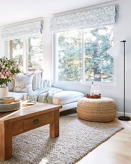
The very pretty window coverings from The Shade Store are one of my favorite additions to the room and one of the only places I brought in pattern. My mom and I picked out this fabric together on a sunny day in Marin County (where the nearest Shade Store location is) and it was the best day of my whole entire life. We immediately fell in love with it that gorgeous pattern and the simplicity of the shades’ design. It was also a great way of bringing the pretty aqua color from the kitchen tile into the family room space.
This large hutch, a relic from our Yosemite house, was previously tasked with holding the overflow from the previously-tiny kitchens my parents had in both houses. Now that we’ve added so much storage to the room, more space was freed up to display pretty dishes.

These poufs from Article are definitely a favorite with the grandkids, who love rolling all over them (or sitting on top of them to watch TV with PapaGramma). Good thing these poufs are sturdy. They definitely get the grandkid beat down regularly.


Opening up the room and creating one great entertaining space has completely changed the way the room functions and made it a cozy place for everyone to hang out. The added storage makes it much easier to keep everything neatly stored away when not in use (which is important in a space that already has so much going on visually).
The room taught me quite a bit about mixing furniture styles. I’ve always been a fan of that eclectic, naturally-collected-over-time, California casual look. But I never really thought about what actually makes it work. And what I learned from this project is that if you keep a consistent color/material palette, you can really get away with pretty much anything. The furniture styles here include contemporary, mid-century, Craftsman, country, coastal, and more. But I tried to keep the color palette in the ivory, gray, blue, green, woven, and wood world. Combining all these different styles gives the space a very cozy feel that doesn’t feel too fussy.
My goal with clients is always to give them a look that their guests won’t question they did themselves. I want it to just look like they knew what they were doing. And my parents’ house looks like something they might have done themselves. And that makes me happy because A) I think they are cool people and would wanna hang out in a house they designed and B) that means I did a good job interpreting their style into their house.
DID I MENTION I HAVE A NEW TV SHOW COMING OUT SOON???
OKAY BYE.
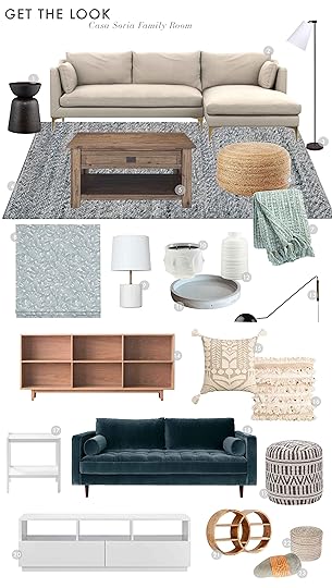
Black Side Table | 2. Beige Sectional | 3. Floor Lamp | 4. Rug (similar) | 5. Coffee Table (similar) | 6. Seagrass Ottoman | 7. Throw Blanket | 8. Custom Roman Shade | 9. Table Lamp | 10. Face Candle | 11. Round Tray | 12. White Vase | 13. Sconce | 14. Custom Bookcase (similar) 15. Embroidered Tassel Throw Pillow (similar) | 16. Moroccan Wedding-Style Throw Pillow (similar) | 17. White Tiered Side Table | 18. Teal Loveseat | 19. Printed Ottoman | 20. Media Cabinet | 21. Round Shelf (similar) | 22. Small Rattan Lidded Basket (similar) | 23. Leather-wrapped Rock
The post Combining Furniture Styles in The Casa Soria Family Room appeared first on Emily Henderson.
March 12, 2019
Pillowfort DIYs: Custom Window Treatments & Whimsical Canvas Tent

Hi All! Julie here, ready to dish out exactly how we (Emily Bowser & myself) managed to create/mostly troubleshoot all these cute DIYs for the mountain house kids room we revealed earlier today. First off, I will let you in on a little secret: these projects were my first DIY attempts…ever. I have some sewing experience from when I was in high school about *cough* 15 *cough* years ago but aside from that, I have never tried my hand at upholstering or making window treatments, let alone creating a whimsical tent for two little kids. So when Emily, Emily B. (going to refer to her as Bowser to make things less confusing) and myself were brainstorming the room and decided on the adventure theme, we went on Pinterest for inspiration and came across this similar window treatment idea which we eventually made our own for the space. Emily asked Bowser and myself if we thought that we could make something similar for the room, we paused, looked at each other, and said “we can figure something out.” Basically we rock, paper, scissored to see who would execute the window treatments and since I owned the better sewing machine of the two of us (hers was from IKEA, love you Bowser but we didn’t think that would get the job done) it was up to me and my 15-year-old sewing machine to make window treatments up to par for an Emily Henderson Designed room for Target, no pressure. Immediate internal panic sets in.
All in all, if you do have some sewing experience, a decent sewing machine, the proper needle and lots of patience, I think this window treatment is very doable. Especially since I threw away the first round and figured out a simpler way to construct them. I was pretty happy with how they turned out so much sew (pun intended) I am actually making the same window treatments for my space with a different fabric. Should I just open up my own Etsy shop at this point? I hope you all love them as much as we do!
The Window Treatments

What you’ll need to make them yourself:
Fabric of your choice (we used: 11oz Broken White Bull Denim “aka white canvas”)
7/8″ Leather Strips in tan color (currently out of stock, medium brown is closest in color to what we used)
3/8″ Grommet Kit (if you already own a kit, get some refills here)
1-1/4″ Cup Hooks
Blackout liner in white (especially if you are using a white fabric)
Sewing Machine
Denim or Leather Sewing Needle
White Sewing Thread
Cutting Mat
T-Square 24″
Fabric Rotary Cutter
Fabric Straight Pins

Step 1: First things first, exactly how big should you make these window treatments? We created one panel for each set of windows (61″ wide x 44″ long). We wanted the sides of the panel to overlap the outer edge of the window frame by about 2 inches on either side. We then determined that they should sit 6 inches above the header of the window (because that looked best to us so we went with it) and wanted it to overlap the sill of the window frame by 3-4″. Accounting for hemming the fabric (1″ hem for the sides in step 2) and 2-3″ on the bottom edge (in step…well I honestly forgot to take a photo of that step so I will explain that in detail later, sorry!) we cut a piece of canvas 63″ wide by 94″ long. Yes, that is correct 94″ in length (stay with me, I will explain more in steps 3 & 4).
Step 2: Using your Fabric Straight Pins, fold the long edge (94″ long to be exact for me) to create a 1″ wide hem. Once you have pinned the fabric, sew and repeat on the other side.
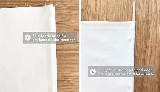
Step 3: You now should have two hemmed edges…you do? Perfect! Now go ahead and fold your fabric in half longways. When folded, mine measured 61″ wide by 47″ long, give or take a 1/4″ here and there for error. This about the time I regretted not taking Emily up on outsourcing this to a trained professional (note if Emily is reading this: just kidding, I was totally confident it would turn out amazing, of course). You want to make sure that when you fold your fabric, the edges align and lay as flat as possible. Starting on one side, line up your hemmed edges, then holding that in place with a lot of heavy books (told ya I was a professional), smooth out the fabric with your hands so that the other side lines up as close to perfect as possible, pin both sides.
Step 4: Pin a 1/2″ hem along the folded edge. I found out that our spare 1/4″ wooden dowel worked well as a guideline to pin the fabric in place. In the first round that I made (and eventually tossed in the trash), I had used my measuring tape and checked it every couple of inches when pinning the edge (raise your hand if you are a perfectionist).

Step 5: Once you have that folded edge go ahead and sew! Only 4 more hems to sew, told you this was easy, am I convincing you yet?
Step 6: Unfold the fabric along the hem you just did and lay it flat with the inside bottom layer of canvas facing up (as shown in the photo), then place your Blackout liner (I cut mine to be 60″ wide by 38″ long) approx. 4″ from the top of the folded edge hem. Make sure to overlap the blackout liner and the hemmed edges from step 2, you will be using them as guidelines to sew the liner to the fabric. Take your top layer of fabric that is currently folded back and lay it on top of the blackout liner so all three layers are as flat as possible (canvas, liner and canvas). Feel free to use that really professional & great technique in Step 3, I would recommend your grandfather’s dusty encyclopedias that no one including himself read. Once you have it flat, pin both sides first and then sew both sides using the first hem you did as a guideline to sew the liner to the two layers of canvas.
Ladies and gentlemen, we have now come to the part where I forgot to take a photo of the last step of the sewing process probably because I was so excited that I was almost done. Let’s not think about that whole other one I had to make…hahaha good times.
At this point you have done all of the hard steps, all you have to do is take the bottom part of the window treatment, fold a 1″ hem with all 3 layers of fabric. Pin and sew…and then repeat that with a 1.5″ hem. This might be why I would highly recommend getting yourself either the denim or leather sewing needles for this project. I sewed through 6 layers of fabric…yikes. I was just praying that my sewing machine wouldn’t break down on me since we were snowed in up there. If anyone has any recommendations on how to finish this off better, I am OPEN to suggestions…please, anyone. Help a lady out and thank you in advance!
Okay, last part of the construction. I promise. If you are a grommet expert then keep reading but if you are like myself who had never tried to use grommets before, check out this great step by step (thanks, Lowe’s). Pro tip: buy a grommet kit and not just the refills, no Emily we, of course, didn’t do that!

Step 7: Bowser and I had about a 45 min discussion troubleshooting how we would install these curtains and this is what we came up with. Again, we are far from professionals so we are open to suggestions! We determined that we would use 5 grommets per panel. The first would be 6″ in from the edge (same on the opposite side), then we measure and found where the middle one would sit. Then found the middle between the one 6 inches from the edge and middle of the full panel. Wow, I think that was the most confusing sentence I have ever written…hopefully you understand.
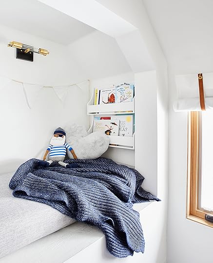
Mountain House: The Kids’ Room Reveal!!


ONE. ROOM. DONE. The kids’ camping/safari/pirate/astronaut—in short ADVENTURE—room in the mountain house is done and today is the REVEAL. In case those photos don’t portray it properly, we love it. But unlike most love stories, it was born out of challenges. Frankly, it was the most challenging room in the house. When Target said “We are launching a new Pillowfort collection, wanna do a makeover?” I thought to myself, this might be the ONLY way that I ever get this room done, and then when the very cute and fun product was aligned with what I wanted, I pitched this room back which gave me a deadline. You see, doing a kids room is usually FUN, but due to the challenges of this room (a wall of plumbing that needed to be accessible, awkwardly placed windows due to a roofline and the need for low twin beds, read more here) this room was full of design conundrums that were just more annoying than fun to think about. But thanks to my very talented and hardworking team, we DID IT.
Yesterday you got the back story, with the before shots and process, and today you’ll get the reveal with an extra post later in the day (BE SURE TO COME BACK!!) that breaks down the DIYs. What DIYs you ask? Oh just this simple (but not so simple to make) canvas, wood and leather tent and rolling shades.

Here’s how it went down: the goals of this room, stylistically, were to make it feel playful, interactive for the kids, yet still Scandinavian and not too busy. I wanted to stimulate their imagination but not their 8 pm energy level.
It’s so much easier to design a kids room with a theme, so that’s where we started. Julie, Emily Bowser and I sat in my studio and brainstormed how to use these awkward conundrums to our design advantage. Yes, it’s a mountain house but that felt too generic so we honed in on what our kids like to do up here…and that’s to create imaginary adventures all day and night. That means part camping, safari, pirate ship, bug hunting, space exploration, and general “get the bad guy” missions. And since they like to sleep basically on the floor near each other, we decided to make that look purposeful by putting them in a tent, like they are camping.
I shared our weird family secret yesterday, but in case you missed it, here it is again: What you might not know is that Charlie actually likes to sleep on a couch cushion (i.e. not an actual bed) in between the beds, thus us wanting the lowest beds possible.
What I’m about to say next is something you’ll relate to if you are a parent of young kids, but if you don’t have kids you will think we are crazy. Ahem.
When your kids are sleeping well, you get obsessed with their exact situation and you will, under no circumstances change it. You will give even the tiniest element unnecessary praise and value, crediting IT as “the” reason your kids are sleeping 11 hours straight (and thus you). This could include the make and model of their pajamas, the location in the room of the white noise machine, the thread count of their sheets, the opacity of window treatments, and, yes, the location and style of beds. Over Christmas break, they shared this room which at the time had two twin mattresses on the floor and guess what? Their nightmares were over, they slept all night and Charlie loved that he could be right next to Birdie, on his couch cushion, encased by the two beds. THEY ARE NOW FOREVER BETHROTHED TO THIS SLEEPING ARRANGEMENT.
So that’s the “why” behind the two low twin beds versus a bunk bed or two normal-height twin beds. We tried bunk beds for six nights of hell and after them each waking up four times a night (separately), Brian disassembled it and practically burned it (kidding, they were donated). So this is our solution.
Of course, Charlie STILL asked for the cushion back so unfortunately, we are back to the sofa-cushion-twin-bed-sandwich which begs the question—WHY CAN’T OUR KIDS JUST SHARE A BED??? It would make reading so much more comfortable. More on that later, but as for the LA house, I’m leaning towards one big bed for all of us. I fall asleep with them every night anyway. Okay, on to the design.
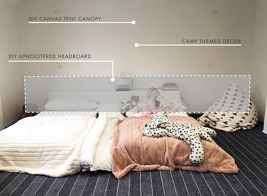
The Tent.
I’m OBSESSED with that tent. It’s what we call “quiet impact.” It’s made of just canvas with leather and wood detailing. We came up with the idea and my team figured out how to execute because they are “quiet impact” geniuses.

I love how simple it is and yet makes a huge statement. Of course, I was tempted to do a pattern or a color, and yes I was worried that the white wouldn’t pop but I reminded myself about the overall style of the house—neutral and simple, with a heavy dose of quirk and a less is more mantra. Thus, we landed here and I’m so glad we used restraint.
The Headboard Wall.
Take a peek at yesterday’s post if you don’t know about the plumbing that has to be housed behind the bed (and yet still be accessible). As our solution, we took the same canvas and upholstered a wooden box that slides over a frame (and can be pulled out if needed).

It stretches almost the whole wall and looks pretty intentional without garnering much attention at all. The single long headboard also helps our “simple yet impactful” mission for this house.
The Bedding.
The kids LOVE the treasure island print of the Pillowfort sheets as they are in a huge Peter Pan phase that is not waning. We decided to add in the green via the bedspreads to, well, not just have it be blue and white. The leather trunk (which we brought up from the LA house…it used to be in my living room) certainly warms it up, plus it speaks to the camping vibe as well as tying in with the leather detailing on the tent.

The cloud bookshelves are so cute (and house the books so the kids can see them) and the sconces are in the place that we originally had the junction boxes when we thought we were doing built-ins, so we had to find some that could articulate over to the new bed placement so it made visual sense (we found these at Schoolhouse…they’re awesome).
The trees are from Target’s holiday line because why would you not bring faux pine trees into your kids’ camping theme mountain cabin room? We might not keep them in there, but they were just so cute and really hit the theme home (and kinda did what a normal plant would do visually without us actually having to care for one).

We used that antique English pine dresser I bought a few years ago for their clothes storage and finally dug that blue pottery lamp out of storage (so glad I never got rid of those, plus they are from Charlie’s first nursery which will ALWAYS make me nostalgic).
Onto the other side of the room…
The Rock Climbing Wall.

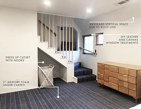
Remember that awkward window placement due to the roof line? Well, we figured out that we needed to fill that vertical space in a way that didn’t intrude on the wall, thus a climbing wall. The kids (and the adults) love this new out-of-the-box feature.

We went for the natural wood which worked so well with the stair banisters. For anyone wondering why it’s on a box and not just the wall, well…if we were to just install the wooden climbing holds straight into the drywall, they would most likely have just ripped out upon first climb. So Sara’s incredibly handy brother Shade built this custom climbing wall (thank you, Shade) which attaches to the studs in the wall. He then created a pegboard-like grid which let us easily set our preferred climbing route for Charlie and Birdie. If you are interested in creating your own climbing wall, here is a link to a great video tutorial (though we did link to the footholds in the Get the Look below).
The Carpet.
The carpet in this room, with its 2-inch, 7-pound density memory foam underneath, is honestly one of our favorite things in the whole house. Sourced through Stark, it’s a high-quality tonal navy stripe and frankly, it’s so perfect. As my first foray into wall-to-wall, I wanted it to feel so much more special than the ubiquitous builder grade (which can be fine, too!), but is dark to hide dirt and mud, and refined enough to fit into our Scandi vibe but at the same time squishy and bouncy. Plus, it’s so soft though nothing in the world is softer than those two floor pillows. They are alarmingly squishy and I want 10 of them for obstacle courses and to play human frogger in there. I’d win.

Windows.
Welcome to the prettiest white oak windows you’ll never get sick of looking at. That’s right— there’s no casing (or baseboards) because we wanted the windows and the doors to be the star of the show, architecturally speaking. These are casements we got through Marvin that have child locks because well, children.

Now, while we love most everything in here, there are some regrets, including…
The Double Nook.

You might remember that we originally wanted to do a pull-out closet for that bottom floor nook under the stairs. Well, we didn’t. YET. Our contractor was like “I don’t think your well-thought-out idea that you spent weeks rendering is possible” and while we do, I also respect an expert when they are sending the clear message that maybe they aren’t the one for the job. So we plan on doing this later and have since gotten some good references. We are also debating how much we care. I mean, the kids love a double nook, I just think it’s visually messy but they are PSYCHED.
What I WISH I had done before the shoot is have Ross Alan Reclaimed Lumber (who did the amazing door here and throughout the house) build doors for that nook so it wasn’t nook in front of nook. IT’S JUST SO BUSY.

We do a lot of treasure maps over here with X MARKS THE SPOT being a sentence that is screamed often. So when we ran out of ideas of what to do in this SECOND nook while styling and shooting, we put in a bunch of vintage park maps, black and white photos of bears in the wild, hiking trails, a stump, and walkie talkies and created a moment, but ultimately I wish it just visually didn’t exist.
Let this be a lesson to you: never “double nook” yourself. It’ll just turn into a stressful moment of what to fill/style it with.
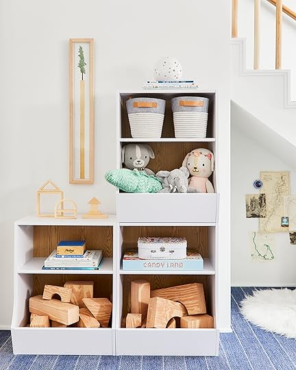
Those cubbies, however, are very cute.
The toy gods answered this year when Pillowfort launched the affordable cubby/bookcase combo. These are $60 each and they check so many boxes (PUN!). Kids need to see their toys in order to play with them, and yet bin after bin equals a lot of mess. These are perfect and we actually just bought them for our LA house playroom that I am finally designing.
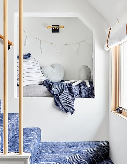
The upper nook is pretty darn cozy and the kids LOVE going up there. The sconce, from Jones County Road as well as the two-tier wall-mount shelf help with reading time at night.
But yet ANOTHER REGRET:
We measured the seat based on the interior and had these custom cushions made (covered in a stain-resistant Crypton fabric) with those measurements in mind. But then when we put it in, we realized that we weren’t capitalizing on the real estate and the cushion could have extended out another six inches or so. We might redo it.
March 11, 2019
Mountain House Update: The Kids’ Bunk Room & A Genius Wall-to-Wall Carpet Hack

Progress has been made on the “bunk” room in the mountain house. Reveals are about to begin (TOMORROW!!) but don’t think you can just show up tomorrow without the back story of this room (above photo is just another progress, OBVIOUSLY). It would be like reading the fourth Harry Potter book without having ever touched the first three. You need the tale of woes and heartfelt plight in order to root for the room. Also how else are you going to learn about Brian and my second biggest “mountain house design debate” right behind the wood ceiling? One must read on…
The kids’ room started out as the “master,” below.


It was a big room, with the largest closet ever, no windows and a finished attic above it only accessible by a pull-down terrifying ladder in the hallway. We had to completely reconfigure the space, moved both doorways, got rid of fireplaces, added stairs, added windows, squared off all the corners, replaced the carpet…geez, I’m only now realizing how much work it was.
The Carpet.
I think it’s important to note that this is my first foray into wall-to-wall—the jeggings of flooring. Oh, folks. When you find the right wall-to-wall carpet (and then put 2″ memory foam underneath it) it’s like discovering that “pajama-level-comfortable” outfit that you can actually wear to your corporate job. You feel like maybe you just created the genius hack that no one else has ever thought of.
The house had all wall-to-wall carpet apart from the kitchen and some baths, and frankly, it was WONDERFUL. Once you experience that carpet comfort, it’s hard to go back to cold. hard. wood. So we chose to do carpet in the kids’ and upstairs guest rooms and then in our room, we have the biggest, thickest rug ever that I’m obsessed with. But the main rooms, living areas and hallways are all hardwood.
But the “debate” didn’t stop just on a “yes” or “no” to do carpet in the bedrooms. As you can imagine, the best carpets that fit our casual-mountain-Scandi vibe were low pile and more simple and expensive. We didn’t want a beige poly plush for this house (although we used builder grade in last week’s secret room reveal and it’s great). No. For my intro into wall-to-wall and for this house, I wanted something special that made my heart respond with a happy beat. I wanted low pile and sophisticated, Brian wanted our children to be able to walk on what felt like a heavenly cloud made of whipped cream and feathers.
So we put a 2″ memory foam pad underneath and it is indeed HEAVENLY. It does double the cost of the pad (and make sure your doors have clearance for it), but it’s basically like giving them a padded room, but it looks all sophisticated with nary a 70s shag vibe.
The Windows.

This room had no natural light and that’s unacceptable. So when we went to put them in, we had to place them awkwardly due to the roofline of the kitchen below. So as you can see, we have two high small ones, with two lower bigger ones (sharing the same sill height to help it look a little more intentional). These windows are casement with window locks, and to be placed between load-bearing studs, so while it was a bit tricky, I’m so glad we did.
The Stairs.

Well, one of the reasons this is the kids’ room (without a bathroom) and not just a guest room is the attic playroom upstairs. We had this fantasy that this would be where they sleep and upstairs is where they could feel like they had a kid headquarters. So we built these stairs where the closet was, with the intent of the underneath nook to be storage for them (not done yet, don’t get too excited about that).
The Built-Ins.
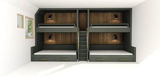
Do you remember when this was our intent? Do a big fancy built-in bunk room wall like you see all over Pinterest? Well, we got them a bunk bed for our LA house (after they begged to share a room) and well, it didn’t go well. It was six nights of hell, with both of them up 4-5 times each night because they just felt uncomfortable—Charlie up high and Birdie down on the bottom. Granted, we bought an inexpensive IKEA one that isn’t that big, so that could be it, but regardless, it just made us realize that we are spending real money on a huge built-in bunk bed that our kids might not actually want or need. And when we have more kids up here, we can always just roll out some mats because the 2″ memory foam is certainly comfy enough.

Plus, we were done spending money and this was going to be part of “stage 2” both for money and time. And then when we did our survey with you guys and you said that you wanted more approachable ideas and more of a “make it work” attitude, I was SO RELIEVED. I thought the world wanted fancy built-ins (and according to Pinterest, we do). Sure, there were hours upon hours of wasted design and rendering time, but it’s a sunk cost and we have since moved forward with a make-it-work plan. Besides, we can always do this plan. We have the renderings done, and in a few years, we’ll have a better grasp if the twin over full thing is really what we want in life. It feels so good AND FREE to push off some major life decisions.
The Awkward Half Wall That We Need Access To.

But we still had some challenges. BIG challenges. The plumbing to my precious steam shower and micro-bubble bathtub is housed in this room —it’s a long story. So that long white box you see up there has to be removable or accessible, it has to have some air vents, and it would be nice it if muffled the sound a bit in case I want to micro-bubble after the kids go down (prime micro-bubbling time).
Plus, both kids want to sleep near the ground. What you can barely see up there is that Charlie actually loves to sleep in between the two beds, on two couch cushions. As an “internet famous” interior designer, you can imagine how proud I am of his design choice. This is the same at our LA house. Two low twin beds, with a couch cushion in between. It’s because they want to be close. I’m just like “why can’t they share a big king bed??” It would certainly make all our family reading sessions easier…
The Sconces.
We originally had our electrician put in the J-boxes for all four bunks, but now that we are temporarily nixing it, we still wanted to utilize the bottom two, despite them being far apart (they were meant to be the power source for sconces at the heads of the bunks). So that’s a challenge.
So we had to come up with a design plan that addressed all of these trying bits. As a quick recap, all those challenges were:
An unmovable big box full of plumbing that we need access to (AKA we can’t just drywall it or even make it a full height wall).
Oddly placed and sized windows.
The fact that our kids like low-to-the-ground beds…
It doesn’t seem like that should be much of a challenge, but trying to make two short beds look cool isn’t that easy.
Wanna know what we did? COME BACK TOMORROW.
But here’s a sneak peek…

The post Mountain House Update: The Kids’ Bunk Room & A Genius Wall-to-Wall Carpet Hack appeared first on Emily Henderson.
March 10, 2019
The Link Up: Blog Awards, “Kidfluencers”, Genius New Home Decor


We made it to the best day of the week once again…the link up. This week was a little extra special because we welcomed a new member to the EHD team. Please welcome Veronica, our new photo assistant. We nicknamed her Mars (duh) as soon as we heard her name. Don’t worry, we are 99% positive she likes it despite not having seen an episode of Veronica Mars yet. That fact will change shortly if we have anything to do with it. Now please enjoy this week’s links, go watch Veronica Mars and don’t forget about daylight savings (we LOSE an hour) if you live in a place that recognizes it…why is this still a thing, California??
This article was terrifying for Emily, especially for someone like her whose business relies so heavily on social media (PS, it’s a piece on “kidfluencers”). She’s been drafting a ‘how I feel about my own kids in social media’ for almost 4 years now so let us know if this is something you actually want to be published. It’s a piece full of vulnerability so she told us she just wants the assurance people will actually read it in order to get it out there. Let us know in the comments.
Exciting news!! We made Domino’s Best Design Blogs of 2019. We are so honored to still be on their list.
As Emily and the design team are wrapping up the mountain house design, this mountain getaway designed by the multi-talented Brooklyn Decker is a true inspiration. It’s the perfect mix of rustic, classic and coziness.
Emily wants you to know about Rebecca Atwood’s new line. Yes, a new line of her textile genius. It’s evokes everything wonderful about springtime and will most likely have you immediately drooling upon first sight.
Our resident brow gal, Jess cannot wait to try this crazy affordable brow styling technique. All you need is a bar of soap and a mascara wand. Wait…huh?
Veronica is coming in hot with her first recommendation, a VERY cute and affordable jewelry company she loves and wears basically every day.
Our EHD baker extraordinaire Sara swears by this super easy and SUPER TASTY chocolate cake recipe. All of us are waiting for the day she brings it into work. Sara? Does Monday work?
During last month’s trip to Target HQ, we got a sneak peek of some new releases. Arlyn’s favorites including Auden, a new lingerie line that looked SO great in person, and Stars Above which are pajamas and loungewear that were SUPER soft with lots of options in a wide range of sizes.
Dog owners, this one is for you. Velinda highly recommends Nulo Adult Grain Free Dog Food. It’s the only food her 15-year-old dog with skin allergies eats. She says it boosts his energy and keeps him from itching.
Julie is trying to take care of herself (finally). In her committed effort, she bought two products this week to boost her health. The first is Bulletproof Unflavored Collagen Protein (she doesn’t eat a lot of meat so it’s a great substitute) and Garden of Life Green Superfood because she is a self-proclaimed “forgetful human” who doesn’t eat enough veggies. She will report back in a month.
Favorite candle alert! Grace bought this Thymes Frasier Fir Pine Needle Candle last week while at a shop near the mountain house based on Sara’s recommendation (Arlyn has it, too, via Brady, and stands behind it, too). She used it Sat and Sun and says it’s SO GOOD! Woodsy, but kinda sweet at the same time.
Michael loved this video interview with Selma Blair. He said it’s shocking, inspiring and powerful.
Juicers aren’t cheap but you know what else isn’t cheap?? JUICE. So Bowser bought a new juicer. A friend told her about the Omega and was sold when she said it was the easiest juicer she’s come across to clean. DUH. BOUGHT. She will also report back.
Arlyn has had this cable management box for a few months and while in her dream world, would prefer no wires ever in her sight, it DRASTICALLY improved the cordage bombardment around her TV in the living room.
Enjoy the rest of your weekend and if you are local, don’t forget to head to Pen and Napkin’s Rummage sale today. See you tomorrow,
The post The Link Up: Blog Awards, “Kidfluencers”, Genius New Home Decor appeared first on Emily Henderson.
March 9, 2019
7 Things I might return + my new shopping mantra

It’s 3am on friday night. I fell asleep with the kids at 8pm and woke up realizing I forgot to write todays post. There is no “what I wore on my body” today because I wore such boring things all week, things you’ve seen 1 million times, that I couldn’t bear to show you. And not in a way that you would have appreciated the normalcy, more in a way that you might have been embarrassed for me. But I did do some shopping to try to rectify the situation, only to be unsure about these pieces (very excited about others which you’ll see next week). So instead of not posting my team took all the pieces that I brought to the office to debate, and threw them into a post. Next saturday will be full of some new spring pieces that I’m VERY excited by but this one is more a ramble about fashion and my body. ENJOY
Up first, that denim puffer up there is SO CUTE. In theory. The reason it’s off her shoulder is because it’s so oversized that her frame literally can’t house the volume. I bought a small and it looks like I’m a 12-year-old wearing my dads coat. BUT both Julie and Sara bought it after they tried it on so they were apparently into the ‘wear your dads coat for the day’ look. I’m still of the old school notion that things should be somewhat flattering (or incredibly comfortable) in order to wear them. Mostly I just want my hands to be usable and not swallowed up by a sleeve.

Vintage Navy Oversized Surplus Jacket
In my constant quest to be edgier I buy things like this. It is cool, but far too big for this frame.

The fleece is coming at us hard right now and I’m apparently trying to buy it, behind on a trend, but this guy again is oversized. I’m going to buy it in an extra small, but I’m not cool enough to rock the oversized. I love it when the body of it is oversized, full of volume, but the sleeves need to fit and be tight. Again, I like the use of my hands.

You know that SMILE tee I’ve been wearing for months? Well, this was my attempt to wear a different shirt. I love Sundry clothes so much, but unsure this guy is worth it so for now it’s sitting in my office in the ‘return’ pile (which is wear my team pulled all of this stuff).

I’m looking for a new gown, guys. If you haven’t noticed I have ONE ‘fancy’ dress – that navy blue ruffle number from Ulla Johnson from a year and a half ago and I still love it, but for every fancy occasion (premieres, weddings, etc) I pull that sucker out and even my kids are getting bored with it. So I bought this to see if it could be rotated into my repetoire. I fear its a bit too safe and sweet and I am NOT safe or sweet despite the hype.
But I have certain ‘gown’ requirements. I don’t like to show my arms, I don’t like super tight, I don’t like to show to much cleavage (listen I was raised LDS so modesty is just ingrained) so i’m always looking for something that might feel sexy without being too revealing. The way they styled that dress with those opalescent metallic shoes, I mean, NO. But picture it with a moto or a jean jacket and maybe?
Nope.

S hort Sleeved Collared Denim Jumpsuit
I’m not really proving my case right now. But I like a wrap jumpsuit, too. I forgot to tell you that I made a pact with myself that i will never, for the rest of my life, buy high waisted wide legged pants. The Kamm pant is not for me. I can pose uncomfortably in a photo and look fine but Its not flattering or comfortable. It’s not what I want to grab or wear on a daily basis. Only people that are teeny tiny are flattered by them, not to say that everyone shouldn’t be part of that overall intentionally unflattering movement.
So after a HUGE purge this week (are you going to the rummage sale on Sunday?) I looked at every piece that wasn’t “bringing me joy” and a lot of them were high waisted wide legged pants. My body wants a boxy top/blouse, a jacket and a skinny pant or baggy short-short, and when I try the boxy part on the bottom of my body its not flattering and therefore I don’t feel good.
But two days later, TWO DAYS, I found myself buying a longer, looser version of those pants at a store, joking the whole time about my promise, but still buying them. I’ve subsequently returned them, emboldened even more now about my pact. I, EMILY HENDERSON, will never, NEVER buy another wide legged high waisted pair of pants. I know in the moment they are cool. I know that when you kinda push your butt back they look better and even flattering (in the mirror), that when you suck in you don’t look like you are in a perpetual first trimester zone. I can “pull them off”. But when you are just throwing on clothes in the morning you never ever ever opt for them. Do not, under any circumstances fall prey to this unflattering-on-you trend.
I shopped twice for clothes this week and I came up with a NEW pact – If its not a ‘HELL YES’, it a “NO”. Unless I’m doing the literal happy dance, I’m not buying them. I found a new pair of jeans after trying on 19 pairs and yes, I did a pretty epic dance because I felt so good in them, and my friend who I was shopping with said ‘that is how you need to feel every time you are about to purchase something’.
That might be obvious to you guys, but you know how after you’ve been shopping for a long time you really want to come home with something so if something is ‘cute’ you buy it because you’ve invested the time and you want something in return? Well, no longer. Say this to yourself, “if it’s not a ‘Hell Yes!’ then its a ‘NO'” it actually makes it so much easier. I purged a lot this week so I don’t feel guilty about buying, because yes you are about to see a lot of ‘hell yes” next week.

Are we still wearing nursing shoes? These are from Vince, a brand that I trust is still kinda edgy but I’m not sure I can be trusted any longer because its in every mall now. That sounded like it wasn’t a hell yes, but I think it might be, I just want to put it on and style it out before the full commitment happens. Not sure if you’ve noticed, but I LOVE a nude shoe. These came in too big (order smaller) and we all loved them, but they were in my ‘return’ box because they are oversized. You know what piece of clothing should never be oversized? SHOES.

Ok. I’m debating returning this because I live in LA and I don’t need a faux fur coat, despite a lot of you loving it (and buying). I’m also worried that I jumped on this train too late and since this is expensive I kinda don’t want to splurge unless i’m going to wear it a lot.
That didn’t sound like a ‘hell yes’ did it?
NO.
Well, its 4:30am. I should probably go back to bed or get up for the day. But its been nice “externally processing” with you. While this was a last minute post I actually think if we had more a ‘what is in my cart and why’ series would be fun. Stay tuned for better fashion next week where I can show you my new happy pants, my updated nude mules (FINALLY) and the sweats that I don’t want to ever take off my body.
The post 7 Things I might return + my new shopping mantra appeared first on Emily Henderson.
March 8, 2019
The Best (Unexpected) Color Combo Trends of 2019

Just when I thought that I had figured out what makes a color palette timeless, Laurren, today’s contributing writer, proposes this: Perhaps the new “color trend” is actually unexpected and more about clashing or pairing together unexpected hues. I suppose like many things, creating tension can be what makes them exciting. Typically for room longevity, I’m a classic “opposite sides of the color wheel” fan, but when someone proposes new, dramatic color combos that I don’t have the guts to actually implement (permanently) I say “go for it”, like literally, YOU go for it, because I’m too scared.
BUT, it is fun to think about throwing blue caution to the wind and going for a peach-on-peach (wait, do we all know that peach is HUGE right now…it is, as is mustard) vibe. Anyway, Laurren dug deep and is going to walk you through 10 combos that, like I said, might be scary to anyone used to neutrals and safer palettes, but SUPER exciting to anyone ready for a little something new. Who knows, maybe by the end of this post, I’ll be convinced to paint something orange (ha!). Laurren, take it away.
Thanks, Emily. Hi everyone, I’m Laurren. Long time reader and freelance magazine writer and stylist. (Fun fact: I actually interviewed Emily for a story when I was an editor at Country Living which I haven’t even mentioned to her until now!)
We’re here to talk color. Let me first say that light, bright and airy will always have a place in design (and our hearts). But, after years and years of largely neutral spaces, it feels like the right time for a reverse palette cleanse of sorts. (Arlyn recently made her own plea for more colored walls in design here, and I offer her my full support!) If you, too, are in the mood to shake things up—whether you embrace color via paint or textiles or both—we hope these ideas will serve to get you moving in that direction. And look, most designers (including Emily) would agree that setting a color palette before embarking on a room design is the first (and best) thing you can do to usher decisions further and end up with a room that feels intentional and pulled together.
That said, it’s not always easy to know what to put together. What colors play well in the sandbox of design life? Some combos are obvious, but for anyone who’s tired of seeing the same three colors used again and again, that’s where this post comes in. After doing some initial research and then working to finalize with the EHD team, I think the 10 combos we’re about to share with you are exciting and fresh.
Let’s just dive right into what I suspect might be the hardest sell for some of you, shall we? Are your eyeballs ready to party?
Peach + Coral
 image source
I fully acknowledge that the above image is a lot—like a Flintstones Push-Up (remember those? RIP) and an Orange Julius (can you tell I like frozen treats?) melted together into a dining room. I get it. We get it. In fact, the EHD team talked about their reluctance to embrace the coral trend in this post here. (Now I’m wondering if maybe I should have named this post “8 Unexpected Color Palettes We Love Plus One That Maybe Only Laurren Loves?”) but I just can’t stop looking at it. Am I going to go out tomorrow and paint my living room all the shades of orange? Well, no. But in the right space (ideally not a bedroom or bathroom—feels a little energizing for those areas) it can be really, really pretty.
In the above photo via the February 2018 issue of Elle Decoration UK, a heavy helping of black—from the table to the artwork to the light fixture—adds the grounding, sophisticated edge that makes the whole thing just work (well, that and those wood floors). It sort of acts like the little black blazer of the room, taking a color pairing that could lean childlike and fanciful then BOOM—baby’s all grown up! Being able to see into that other room also helps a lot—the dark paint job and patterned flooring gives your eyes a place to regroup, which can be important in such a bold space.
 image source
If the first example is just a little too Wild Wild Country for you, or if you’re into something requiring less legwork or commitment, allow your textiles and artwork to do the heavy lifting and skip the paint altogether. Or, use it sparingly, like in the above photo where the orange hue is almost celebrated more than it would be if the whole space were clad in the color.
Terra-Cotta + Cobalt
 image source | design by Giancarlo Valle
Peach was large and in charge in the ‘90s, so any Laura Ashley-induced anxiety over its return is 100% understandable. Strip away all the frills and pattern, though, and you’re actually left with a pretty versatile hue that is particularly sophisticated when you bring it down a notch and enter the earthier terra-cotta territory (this is Dead Salmon—lol—from Farrow & Ball). Pair it with black and warm wood accents and a heavy wash of rich blue (specifically that cobalt from the velvet pieces in the living room pictured above), and the controversial shade takes a moody and, dare we say it—lasting—turn.
Blush + Teal + Emerald
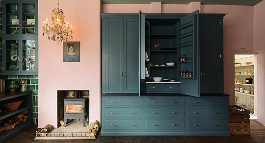 image source
While “millennial pink” may be losing steam, it’s not gone for good and goes a long way in softening up the dark blue and green that grounds this kitchen. In a smaller space with lower ceilings, we’d probably recommend layering in some lighter neutrals to add a little airiness, but this particular space can handle all the drama.
Teal + Rust + Mustard
image source | design by Harding and ReadA wash of super-saturated teal (we’re pretty sure this is Farrow & Ball’s Inchyra Blue) is the perfect backdrop for the burst of warmth coming in from this rusty headboard. (It just wouldn’t feel as special against crisp white walls!) The punchy pillows keep things from feeling too moody and prove that sometimes pattern is most impactful applied in small doses. By keeping the rest of the furnishings—from the lamp to the side table to the bedding—relatively simple in terms of color and style, this bold pairing commands allllllllll the attention. (And we’re not mad about it!)
Turquoise + Red-Orange
 image source | design by Studiopepe
Historically, this combo is not my favorite, but after coming across the above image during a Pinterest dig, I’ve recently warmed up to it. Sure, it comes on strong and can easily lean more coastal or traditional, but when used in unbalanced quantities, with turquoise taking the lead and red-orange coming in as an accent, it feels very fun and fresh. That linen low-slung headboard and sculptural matte black sconce also help the cause.
It’s important to remember that even when your palette is this simple (as in, just two main colors), you need to layer in neutrals (like the bed) and don’t be afraid to take one of the protagonist hues and play with the tones. This could have looked a bit amateur had the walls, sheets and blanket been the same shade, but by varying them just slightly piece to piece, it feels more well-rounded and sophisticated.
Hunter Green + Pink + Yellow
 image source | design by Angela Chrusciaki Blehm
2019 has promised a resurgence of bold primary colors, and I’ll be the first to admit: it’s a little intimidating. They just don’t feel all that special on their own—and would certainly feel jarring paired together—but, as seen in the above image, they can be a refreshing addition to a softer palette when used sparingly. Sign me up for those yellow chairs!
 image source | design by General Assembly
Here, yellow comes in in a more buttercream way with the side tables, and set against a deep dark green and a light blushy pink artwork it could feel playful, but with the cognac leather and wood furnishings, it’s elevated and very adult.
Dusty Blue + Maroon + Wood Tones
 image source | design by Atelier Abraha Achermann
Here, warm wood accents and maroon (wait…are these brown?) floor tiles lend a sophisticated edge to a soft blue that might otherwise lean a little saccharine. (It also helps that this particular blue has a lot of gray in it.) We’d pepper in some black accents to really round out the mix.
Peach + Persimmon + Teal
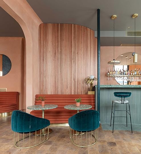 image source | design by Sella Concept and Wilson Holloway
You didn’t think I was done with peach, did you? (I can agree to call it terracotta if that will help you open up your heart.) Designed by Sella Concept and Wilson Holloway, London-based restaurant Omar’s Place, pictured above, makes a strong case for the controversial, sherbet-y palette. A smattering of teal provides an unexpected contrast in the largely monochromatic space while a cloudy-gray ceiling adds depth and dimension without stealing the show. It’s somehow bubbly and moody all at once.
Green + Green + Green
 image source
We definitely have a thing for monochromatic tonal palettes and earthy greens are no exception. (Why settle for one shade when you can have them all?!) Green can be moody and dramatic but also somehow warm and fuzzy and soothing—it’s a real over-achiever and the EHD team’s current golden child.
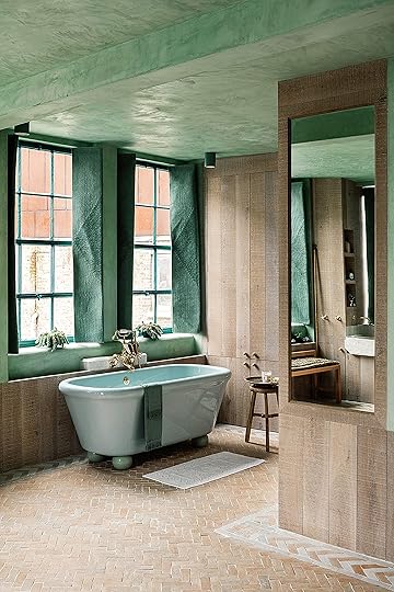 image source | design by Chan + Eayrs
Paired with lots of pale wood tones, stone and mixed metal finishes, the space above, which was designed by architects Zoe Chan Eayrs and Merlin Eayrs, is a great example of how you can use color to make a bold statement without sacrificing a light-and-airy feel. It helps that the green tones vary (from pastel to fresh and minty to deep and earthy) to keep things interesting and feeling intentional (not like you didn’t know what else to pair together). Also, I never thought I’d like a colored bathtub, but here we are.
Mustard + Burgundy
 image source | design by studio ashby
You might be looking at this photo (a room by Studio Ashby) and thinking, wait…where’s the burgundy, but that’s actually the magic of this. (BTW, it’s in the trim of the pillow shams and while one tiny detail does not a color palette make, feel free to amp it up yourself). As Emily mentioned in the beginning of this article, mustard and golden hues, specifically rendered in velvet textiles, are huge right now and while this would have worked just as well set against a base of white and black, the added oxblood from the pillow trim (and frankly, the book on the nightstand) is that little ounce of secret sauce that takes it to the next level.
Okay, you made it! I was afraid I lost you at “peachy pink.” How are you feeling? Did we convince you about any of these? Are there some you went “OMG YES DUH HOW DID I NEVER THINK OF THAT?” Are you on your way to buy paint RIGHT NOW!? What’s a color combo you’d be happy to never see again for the rest of your life? Tell me everything.
***Thank you to Laurren Welch, freelance writer and stylist, for helping to write and produce this post.

The post The Best (Unexpected) Color Combo Trends of 2019 appeared first on Emily Henderson.
Emily Henderson's Blog

- Emily Henderson's profile
- 10 followers

