
Emily Henderson's Blog, page 264
April 20, 2019
Turns Out I’ve Been Blow Drying My Hair All Wrong—Here’s How to Get It Right

Turns out, I’ve been blowdrying my hair all wrong—and not only does it not look as good as it could, but I’ve been damaging it. I was recently at my friend Janine Jarman’s salon (Hairroin Los Angeles), complaining about how I can never make my hair look good on my own, and convinced that I’ll never learn, when she handed me the blow dryer and a brush and said “show me how you do it.” I did and she, horrified, said “I see…yeah. That is all wrong and now I understand why your hair is so damaged.”
She was actually relieved because this is a problem that we can solve.
To be fair my hair is a challenge and even she admits that. I used to have great long, natural looking blonde hair. Then I had two kids and proceeded to bleach and chop it and it’s never been the same. It’s curly (therefore frizzy and fuzzy) and broken (so I have to be gentle with it) and it’s actually only shoulder length so while I try to grow it out, I have extensions. It’s also naturally blonde, therefore fine. All of this makes it VERY hard for me to blow it out. The extensions are long and straight, my hair is short and curly. It’s awesome.
So to be clear, yes, I was doing it all wrong, but my hair is absolutely a challenge.
Here’s what I was doing wrong:
I was not using product, did not have the right brush or the right hairdryer (my good one broke a while ago and so Brian picked this cheap guy up at the drugstore).
I was blowing the wrong direction, therefore opening up my cuticle and CREATING frizz.
I was putting the dryer far too close to my hair while it was still really wet (more frizz and damage).
I had no real order and started in the wrong place.
I was doing it WAY too fast, creating more frizz.

Here’s what it looked like “before” when I was done. I mean, I don’t think it looks that bad, honestly, but does it look like I just stepped out of a salon? Uh, no. It was still a little wavy, a little frizzy, not that shiny. Good enough for everyday life, but yeah, nowhere near what a pro could do.

So yeah, the finished product, as you can see, is not great. Let’s move on to how you are SUPPOSED to do it:

1. First, towel dry as much as possible. There is no reason to damage your hair by going straight to the blow dryer with soaking wet hair. I hear that this hair towel is great and apparently reduces drying time 50%. (When Arlyn was reading through, she said she actually had that towel, and it indeed made her hair dry faster…though she said maybe by like 30% but she liked it because it was felt light and not like a big lumpy heavy towel that was always flopping around on the top of her head).
2. Next, you want to protect your hair with a product. It’s not like I haven’t tried this but I honestly didn’t know what do use for my hair, how much of it to use and at what point to put it in??? Janine gave me just a pea-sized amount of invisible oil primer and told me to work it all throughout the hair, evenly, while it is still damp. If you have hair like mine, using something that is heat protective is key. It will act as an SPF for your hair, and protect it from the sun and heat (and reduce frizz). I hate my hair feeling product heavy so at first, I resisted, but using this stuff really made a difference and my hair did not feel weighed down by product at all.
3. Use a gentle wet brush to brush out your hair. I was just using my other bristle brush and not being NEARLY as gentle as I should be. She recommended this one.
4. Then we added a conditioning straightening balm and applied it evenly throughout my hair (avoiding the scalp, because it will get greasy).

5. First big thing I learned: You HAVE to start with bangs. Why? Because they are the most important part and it’s best to do them at the beginning before your arms are tired, while you still have the patience and before they get too dry and frizzy. She recommended using this brush, then pull the bangs to one side and blow dry pointing the blow dryer down. Repeat the same motion on the other side.
6. For my hair, Janine told me to do a flat wrap where you use the forehead to help shape and bend bangs. When bangs are almost dry, use a large metal brush, which acts as a curling tool, and pull bangs forward in a circular motion for volume.
7. Before going into sections, rake through hair using hands and blow dry (always pointing downward) to help get rid of some more moisture so you are not spending a million years drying each section.

8. Then move to the crown using a bristle brush and roll the hair under and back using SO MUCH TENSION, while pointing the blow dryer downwards and towards the back of your head. Hot tip: Tension is the key to shiny and frizz-free hair.

9. As you go along, clip sections to cool. Janine told me to clip it like there is a pretend roller in there. This allows your hair to cool down in that smooth shape.
To be honest this is where I started to get REALLY ready for this to be over. It’s so much work and as Janine kept telling me “it’s not a race,” but I just wanted to be done. My arms were tired. I was tired. But I get it. If I take the time, a blowout can last 3 to 4 days so that 1/2 hour to 40 minutes it takes to do it properly is WORTH IT.

10. Once you give yourself a pep talk to keep going (you’ve got this), move to the side sections of your hair, making your way from front to back. We used the big boar bristle roller brush for smoothness, and then moved to the metal brush to add more style, curl and movement. Angle the brush tool the direction you want your hair to go (if you want your hair down and smooth, the brush will need to be curled under your hair, as opposed to just lose like in the top right photo above).
11. Repeat for the rest of the sections of your hair. Hot tip: the sections you work with should not be bigger than the tool you are using.

To give my hair a little movement, my normal routine is to add some curl with a curling iron until it looks nice and voluminous (I did this even when I was doing everything else so. wrong.) so that’s what we did here at the end. The finished product is a lot shinier, smoother and healthier looking. And look, NO FRIZZ. You may notice the exhaustion behind my eyes from the effort, but okay fine, it was worth it.
In case you forgot what MY technique looks like next to Janine’s expert advice, here’s a side by side of the first finished job next to the new and improved blowout:

I kept saying to everyone in the office “are you sure the before is bad enough?” and they all would politely just laugh and say “yeah, it’s convincing.”
So, what do you guys think? Did I succeed? Have I just become a woman who knows how to blow out her hair? I think so.

A HUGE thank you to Janine for taking the time to show me the tricks of the trade. She is the best and you can check out her salon here and shop ALL the products we used here (Janine was nice enough to extend a 20% discount with code “emstyled” for the full kit through the month of April. You’ll also get a free travel size product with any order).
Happy Saturday, folks. xx
***photography by Veronica Crawford for EHD
The post Turns Out I’ve Been Blow Drying My Hair All Wrong—Here’s How to Get It Right appeared first on Emily Henderson.


April 19, 2019
How to Haggle (or Not) at the Flea Market Like Emily Henderson

I think it’s fair to say that most of us fell fast and hard, not only for Emily’s talent and humor, but her uncanny ability to find the SICKEST VINTAGE around. The question, “where were you when you first saw the blue sofa?” is probably something most old school fans could answer without blinking an eye. Now, while I am no stranger to a flea market, I am also not, shall we say, a seasoned pro (like I have dreams of being)? I mean how and when do I haggle?? Is it basically expected or ultimately disrespectful to the vendor? I am terrible at knowing when I need to come out of my shell and ask for a better price versus just paying the sticker price because it’s easier and I feel bad/it may just be the fair price. Sooooo why not then go straight to the source and ease my worrisome mind? Enter Vintage Ninja, Emily Henderson. We asked for her advice on how to go about getting the best price for your flea finds and she delivered with eight super user-friendly tips that even the newest of flea market goers can tackle with ease. See…dreams do come true and price haggling nerves can finally calm themselves. Without further ado (the anticipation is also killing me), let’s see what THE expert flea market maverick has to say…

From Emily: You all wanted to know how I haggle and here are my rules:
1. BE RESPECTFUL. Realize that (almost) everyone selling at the flea market works hard and has a livelihood (and/or family) to support. They are not swindlers or peddlers looking to screw you. Approach them how you would want to be spoken to—with respect and admiration for a craft. They work hard to find, transport and bring you pretty things. Essentially, don’t be A D*CK.
2. CONSIDER THE EFFORT AND HOW THAT WOULD EFFECT THE COST. A large piece of furniture is cumbersome and took them likely time/effort to bring from the original source (estate sales, thrift stores from far distances) where they then put into a larger vehicle they might have rented, then likely stored in their storage unit, then transported multiple times and ultimately unloaded at 5am at a flea market. If it’s a large piece, it should cost more than it would at a thrift store. A lot more effort went into bringing it to a flea market, so please consider that. At the same time, a small piece is easier to deal with and should be less expensive to unload (figuratively and financially).

3. LEVERAGE MULTIPLE PIECES FOR BETTER PRICING. If you buy multiple pieces (small or large), you have the leverage to ask for a discount and you should. If you buy one piece, ask for 10% off, 15% off for two pieces, 20% off for three or more. This behooves everyone if you do…you get a better deal, and the vendor sells more in one go.
4. CHOOSE YOUR WORDS. Use the phrases like, “Do you think you could you do $25 for this?” or “What could you do if I bought this and this and this…” Don’t just say you’ll give them $7 for something that is $10. Respect them enough to ask in a way that you would want to be asked. They care about these pieces, so don’t disrespect them by just saying “I’ll give you $7.” You’d be surprised how often someone is willing to bend if you just ask nicely (general life lesson, too).
5. SHOW APPRECIATION FOR THE PIECE. Vintage dealers love what they have taken the time and effort to bring to market, so they want someone who cares about the piece to get to own it. Yes, it’s a business and sure they care about profits but they might not sell it to someone who is a jerk because they secretly are worried that a prized possession might go unappreciated in an unloving home. However, don’t fawn. Don’t go overboard but show appreciation. Let them know you get it.

6. FORECAST THE WORK. If something is big (say, a sofa), needs a lot of work (upholstery and restoration) and the dealer is charging a lot (say $1,200), do the math in your head before you get too excited. Getting it home will cost $200 in delivery, reupholstering will be $900, new fabric will be $300, refinishing will be $300…before you’ve even sat on it, your $1,200 sofa just cost you $2,500. Then think about what you could buy for that amount new in the market. It’s a lot. If it’s something SUPER unique then it still could be worth it, if not then you can talk them through your future expenses and they might come down realizing that what they have is actually a future investment for someone, not an immediate gift. That gives you leverage for a discount, FOR SURE. I don’t pay more than $400 for a sofa unless it’s super unique, important and irreplaceable.
7. BE FAIR. If the price feels fair, don’t haggle. Could you haggle and get them down? Sure, but I actually hate this culture of haggling especially in this day and age when the economic disparity is so huge. If it’s a fair price, just give them the cash. You don’t have to haggle just because you are at the flea market. When I overhear a conversation where the buyer offers $9 for a $10 item, I cringe knowing that they are haggling for haggling sake. It’s like they watched it in the movies and they are performing “haggling.” It’s strangely demoralizing for the seller. They will likely say yes, but at what cost? It doesn’t make them feel proud of the sale and what does it do for you? It’s the difference between tipping 15% and 18%—often it’s minimal but it means the WORLD to the waiter/waitress. (P.S. this is only for American flea market culture…I realize that in other cultures, haggling is a sport).

8. SPOT A SALESPERSON AND BE READY TO PLAY. Most people who specialize in something will declare high prices because they might have an inflated sense of “vintage dealer.” This happens most with specialized rugs, mid-century or European antique dealers. If they want $1,200 for a chair, know that they are ready to play/negotiate. Picture the prices at a retail store and if they are on par, then know you should negotiate because retail stores have a MUCH higher overhead and therefore charge more. If they are charging what a store would charge, then negotiate because they might be hoping you will just write that check.
Listen. It’s nuanced. You have to feel them out but my biggest tips align perfectly with my general ethos: be nice, be brief, be gone. It’s business, with a huge dose of human element. Don’t be a d*ck.
Thanks Em!
Well, there you have it. It’s actually insanely simple. Be a good human, use your gut and love your vintage as much as baby Charlie loves this toy pony. I think we can all handle that, no? And guys, it’s FRIDAY which means we are only hours away from finding a flea market where you can put these tips to good use. Hope you all have a great weekend!

Let us know in the comments if there are any other flea market or general vintage shopping topics you want us to cover. We want all of your suggestions. 
How to Haggle (or Not) at the Flea Market…According to Emily Henderson
I think it’s fair to say that most of us fell fast and hard, not only for Emily’s talent and humor, but her uncanny ability to find the SICKEST VINTAGE around. The question, “where were you when you first saw the blue sofa?” is probably something most old school fans could answer without blinking an eye. Now, while I am no stranger to a flea market, I am also not, shall we say, a seasoned pro (like I have dreams of being)? I mean how and when do I haggle?? Is it basically expected or ultimately disrespectful to the vendor? I am terrible at knowing when I need to come out of my shell and ask for a better price versus just paying the sticker price because it’s easier and I feel bad/it may just be the fair price. Sooooo why not then go straight to the source and ease my worrisome mind? Enter Vintage Ninja, Emily Henderson. We asked for her advice on how to go about getting the best price for your flea finds and she delivered with eight super user-friendly tips that even the newest of flea market goers can tackle with ease. See…dreams do come true and price haggling nerves can finally calm themselves. Without further ado (the anticipation is also killing me), let’s see what THE expert flea market maverick has to say…
From Emily: You all wanted to know how I haggle and here are my rules:
1. BE RESPECTFUL. Realize that (almost) everyone selling at the flea market works hard and has a livelihood (and/or family) to support. They are not swindlers or peddlers looking to screw you. Approach them how you would want to be spoken to—with respect and admiration for a craft. They work hard to find, transport and bring you pretty things. Essentially, don’t be A D*CK.
2. CONSIDER THE EFFORT AND HOW THAT WOULD EFFECT THE COST. A large piece of furniture is cumbersome and took them likely time/effort to bring from the original source (estate sales, thrift stores from far distances) where they then put into a larger vehicle they might have rented, then likely stored in their storage unit, then transported multiple times and ultimately unloaded at 5am at a flea market. If it’s a large piece, it should cost more than it would at a thrift store. A lot more effort went into bringing it to a flea market, so please consider that. At the same time, a small piece is easier to deal with and should be less expensive to unload (figuratively and financially).
3. LEVERAGE MULTIPLE PIECES FOR BETTER PRICING. If you buy multiple pieces (small or large), you have the leverage to ask for a discount and you should. If you buy one piece, ask for 10% off, 15% off for two pieces, 20% off for three or more. This behooves everyone if you do…you get a better deal, and the vendor sells more in one go.
4. CHOOSE YOUR WORDS. Use the phrases like, “Do you think you could you do $25 for this?” or “What could you do if I bought this and this and this…” Don’t just say you’ll give them $7 for something that is $10. Respect them enough to ask in a way that you would want to be asked. They care about these pieces, so don’t disrespect them by just saying “I’ll give you $7.” You’d be surprised how often someone is willing to bend if you just ask nicely (general life lesson, too).
5. SHOW APPRECIATION FOR THE PIECE. Vintage dealers love what they have taken the time and effort to bring to market, so they want someone who cares about the piece to get to own it. Yes, it’s a business and sure they care about profits but they might not sell it to someone who is a jerk because they secretly are worried that a prized possession might go unappreciated in an unloving home. However, don’t fawn. Don’t go overboard but show appreciation. Let them know you get it.
6. FORECAST THE WORK. If something is big (say, a sofa), needs a lot of work (upholstery and restoration) and the dealer is charging a lot (say $1,200), do the math in your head before you get too excited. Getting it home will cost $200 in delivery, reupholstering will be $900, new fabric will be $300, refinishing will be $300…before you’ve even sat on it, your $1,200 sofa just cost you $2,500. Then think about what you could buy for that amount new in the market. It’s a lot. If it’s something SUPER unique then it still could be worth it, if not then you can talk them through your future expenses and they might come down realizing that what they have is actually a future investment for someone, not an immediate gift. That gives you leverage for a discount, FOR SURE. I don’t pay more than $400 for a sofa unless it’s super unique, important and irreplaceable.
7. BE FAIR. If the price feels fair, don’t haggle. Could you haggle and get them down? Sure, but I actually hate this culture of haggling especially in this day and age when the economic disparity is so huge. If it’s a fair price, just give them the cash. You don’t have to haggle just because you are at the flea market. When I overhear a conversation where the buyer offers $9 for a $10 item, I cringe knowing that they are haggling for haggling sake. It’s like they watched it in the movies and they are performing “haggling.” It’s strangely demoralizing for the seller. They will likely say yes, but at what cost? It doesn’t make them feel proud of the sale and what does it do for you? It’s the difference between tipping 15% and 18%—often it’s minimal but it means the WORLD to the waiter/waitress. (P.S. this is only for American flea market culture…I realize that in other cultures, haggling is a sport).
8. SPOT A SALESPERSON AND BE READY TO PLAY. Most people who specialize in something will declare high prices because they might have an inflated sense of “vintage dealer.” This happens most with specialized rugs, mid-century or European antique dealers. If they want $1,200 for a chair, know that they are ready to play/negotiate. Picture the prices at a retail store and if they are on par, then know you should negotiate because retail stores have a MUCH higher overhead and therefore charge more. If they are charging what a store would charge, then negotiate because they might be hoping you will just write that check.
Listen. It’s nuanced. You have to feel them out but my biggest tips align perfectly with my general ethos: be nice, be brief, be gone. It’s business, with a huge dose of human element. Don’t be a d*ck.
Thanks Em!
Well, there you have it. It’s actually insanely simple. Be a good human, use your gut and love your vintage as much as baby Charlie loves this toy pony. I think we can all handle that, no? And guys, it’s FRIDAY which means we are only hours away from finding a flea market where you can put these tips to good use. Hope you all have a great weekend!
Let us know in the comments if there are any other flea market or general vintage shopping topics you want us to cover. We want all of your suggestions.
April 18, 2019
A Basement-Turned-Office Reveal (+ 7 Steps For How to Pull Off “Edgy Neutral”)

You might remember this space from our “staging to sell with soul” post from earlier this month where we gave you a sneak peek into a seriously cool house that, along with local staging company The Platform Experiment, Emily and our wonderful style team outfitted to shoot for book #2 and the blog. As it was going up on the market, they had mostly carte blanche to create a “look” with some existing pieces as well as what was brought in specifically for the photoshoot. Owners Amanda and William Hunter (of William Hunter Collective) already had killer style (they gut-renovated and rearranged the whole floor plan of this house and it’s honestly just so good all around), so we used them as the style muse for what was created in the basement-turned studio…what we’re calling “Edgy Neutral.”
So, yes, while this basement space lends SO much character and that “cool” factor you need in Edgy Neutral just by being, well…a basement (the open beamed ceilings, the exposed wires, the rock and cinder block walls, those concrete floors, etc.) it doesn’t mean you can’t follow some of the rules applied here to get a similar (if more refined) look in your non-basement of a home. This here was set up as an office space/studio, but all the principles could easily apply to a living and dining room situation…let’s show you.
1. Keep things crisp with white walls.

chairs via lulu and georgia | desks via lulu and georgia | pendant lights
Just when we thought we were mostly over white walls (okay, not really)…the key to this look is making sure it feels airy and not too heavy, as a lot of the elements you’ll eventually layer in are. You’ll want to pick out a crisp, neutral white (we love Sherwin-William’s Pure White) so things don’t get either too warm or too cool (but when in doubt, go a touch warm so it doesn’t come off clinical).
2. Amp up the contrast with plenty of black and dark gray.

This is where things start to go from neutral white shell to pretty rad, high-contrast room. Here, William painted the ceilings a slate-y charcoal gray, which echoes the concrete floors and adds so much dimension to the space. Layering in mid-tones like this is important so the whole room doesn’t end up reading simply like a black-and-white scheme (that’s not the look here, it’s about being well balanced, “cool” but welcoming, minimal but inspired). While I’m not telling you to necessarily paint your own ceiling a dark gray, maybe I am? Painted ceilings have been a big trend in the last two years (though they’ve always been a go-to interior designer trick for adding instant drama to a room), but only really work if you have the (literal) headspace for it.
Let’s say you have 8-foot ceilings; this might be something you skip because adding a darker color up there will just visually lower them even more, but anything 10-feet and above should be just fine. In fact, if you are blessed with very tall ceilings, bringing the color down from the ceiling on the wall about 6 inches (if you don’t have crown molding) will add even more interest.
3. Keep furnishings minimal yet interesting (and when in doubt, choose leather).
coffee table via article | rug via lulu and georgia | blanket via lost & found (similar) | bench via lulu and georgia
Leather furniture is pretty synonymous with a cool, edgy room, right? (Also, does calling something “cool” automatically make you not cool? Oh well, proud card-carrying member of the nerd-alert club here.) In here, the black sofa, definitely reads more industrial and, dare I say…bachelor pad-y, but in a good way. Like, a now-bachelor who had a previous partner with really good taste that left behind all their stuff in the loft home they once shared. That wood base there also keeps the sofa in solid “eclectic vintage” territory, far away from “corporate office waiting room.”

All the furnishings in this room, in both the seating and desk areas, are rather simple in shape. Nothing fussy or frilly about them, clean lines, relatively cohesive colors (black, brown, camel) and materials (wood, leather, steel), and that’s what you want to go for. The wood definitely helps things to feel more “lived in,” but we’ll touch more on that in a few points.
4. Layer in streamlined matte black metal accents (and maybe a touch of brass).

armchair via lulu and georgia | floor lamp via lulu and georgia
Matte black is the name of the game for Edgy Neutral, so let that be the majority of the metal finishes you bring in via accessories, lighting, and even furniture. BUT THEN, so that it doesn’t read “local hipster coffee shop with lots of beanie-above-the-ears-wearing patrons” the key is to break it up a little with a touch of brass. It’ll make things feel more layered and collected but not so much that it comes off too eclectic or luxe. Anything brass should be delicate and streamlined to keep things modern, like the floor lamp (from Lulu and Georgia) and side table in the vignette above. Let’s pretend that coffee table was also brass here…this scene would absolutely read far more glam than we’d want it to for this aesthetic. It’s a subtle balance that requires restraint, but as a good rule of thumb, we’d say not to bring in any more than three or four brighter metallics.
5. Add in organic shapes and woods.

With all that metal and leather and white and gray, you’re going to need to warm things up a bit so your room doesn’t end up feeling sterile. Here, in the little entry area of the basement studio, the style team brought in a live-edge wood bench (with black steel legs because #edgyneutralstarterkit) and the well-worn peg rail keeps things down to earth and not too showy.
From this view, you can also see the shapes of the other (beige) bench and office chair. The curves on the frames there go a long way to break up all the straight lines happening in the room’s architecture and key furniture pieces.
6. Warm things up with earthy accents and textiles.
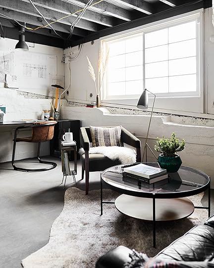
And the warm front continues. Textiles always finish off a space, no matter what design vibe you’re going for. Without rugs, pillows and the various throws around, this would have felt far less inviting. It would have still been very nice, but maybe a little too “corporate.” You’re designing a home, after all, not an office building, so layer them on. The key here is to keep everything in the neutral category, i.e. nothing too boldly patterned or colored. Nubby linens, sheepskins, cowhides, they all bring in that “organic” element we just talked about while adding coziness. A little goes a long way in Edgy Neutral, as do earthy ceramics.
7. Don’t forget the “weird and unique.”

chairs via article | table | vase via the citizenry
And finally, the point that really homes in the soul and character of Edgy Neutral: the “weird” and unique. The part of the design that feels “off” but “off” in a good way. Like wearing a vintage holey T-Shirt with a sleek leather skirt and simple pumps. The classic “wait, why didn’t I think to put that together?” that happens when you see an effortlessly cool outfit/room. This photo above isn’t inherently strange in any way, but the added layer of that white plywood well with venting that William installed just MAKES that vignette. I’m not entirely sure what its purpose is, but maybe it doesn’t need a purpose? It’s different. It’s edgy. It’s a little weird and perfectly imperfect. That’s the secret sauce here. Find your “weird” moment and let it shine (but beware of bringing in too much of it all over. In general, err on the side of more minimal with everything else so you don’t end up with a room that looks like a garage sale).
Before we go, I have a question: if you had to pick between a cool, neutral minimal room and something more colorful and collected, which would you rather live in? And one other question: what styles have you been seeing out there (even if they don’t have a real name yet…get creative with the description!) that you feel are refreshing and like something new that you’d want us to dive into, style up via mood boards, and pull together shopping roundups for? Chime in in the comments below.
***photography by Sara Ligorria-Tramp for EHD, produced and art directed by Emily Henderson, designed and styled with Velinda Hellen and Erik Staalberg
The post A Basement-Turned-Office Reveal (+ 7 Steps For How to Pull Off “Edgy Neutral”) appeared first on Emily Henderson.
Office & Studio Reveal: 7 Steps For How to Pull Off “Edgy Neutral”
You might remember this space from our “staging to sell with soul” post from earlier this month where we gave you a sneak peek into a seriously cool house that, along with local staging company The Platform Experiment, Emily and our wonderful style team outfitted to shoot for book #2 and the blog. As it was going up on the market, they had mostly carte blanche to create a “look” with some existing pieces as well as what was brought in specifically for the photoshoot. Owners Amanda and William Hunter (of William Hunter Collective) already had killer style (they gut-renovated and rearranged the whole floor plan of this house and it’s honestly just so good all around), so we used them as the style muse for what was created in the basement-turned studio…what we’re calling “Edgy Neutral.”
So, yes, while this basement space lends SO much character and that “cool” factor you need in Edgy Neutral just by being, well…a basement (the open beamed ceilings, the exposed wires, the rock and cinder block walls, those concrete floors, etc.) it doesn’t mean you can’t follow some of the rules applied here to get a similar (if more refined) look in your non-basement of a home. This here was set up as an office space/studio, but all the principles could easily apply to a living and dining room situation…let’s show you.
1. Keep things crisp with white walls.
chairs | desks | pendant lightsJust when we thought we were mostly over white walls (okay, not really)…the key to this look is making sure it feels airy and not too heavy, as a lot of the elements you’ll eventually layer in are. You’ll want to pick out a crisp, neutral white (we love Sherwin-William’s Pure White) so things don’t get either too warm or too cool (but when in doubt, go a touch warm so it doesn’t come off clinical).
2. Amp up the contrast with plenty of black and dark gray.
This is where things start to go from neutral white shell to pretty rad, high-contrast room. Here, William painted the ceilings a slate-y charcoal gray, which echoes the concrete floors and adds so much dimension to the space. Layering in mid-tones like this is important so the whole room doesn’t end up reading simply like a black-and-white scheme (that’s not the look here, it’s about being well balanced, “cool” but welcoming, minimal but inspired). While I’m not telling you to necessarily paint your own ceiling a dark gray, maybe I am? Painted ceilings have been a big trend in the last two years (though they’ve always been a go-to interior designer trick for adding instant drama to a room), but only really work if you have the (literal) headspace for it.
Let’s say you have 8-foot ceilings; this might be something you skip because adding a darker color up there will just visually lower them even more, but anything 10-feet and above should be just fine. In fact, if you are blessed with very tall ceilings, bringing the color down from the ceiling on the wall about 6 inches (if you don’t have crown molding) will add even more interest.
3. Keep furnishings minimal yet interesting (and when in doubt, choose leather).
coffee table | rug | blanket (similar) | benchLeather furniture is pretty synonymous with a cool, edgy room, right? (Also, does calling something “cool” automatically make you not cool? Oh well, proud card-carrying member of the nerd-alert club here.) In here, the black sofa, definitely reads more industrial and, dare I say…bachelor pad-y, but in a good way. Like, a now-bachelor who had a previous partner with really good taste that left behind all their stuff in the loft home they once shared. That wood base there also keeps the sofa in solid “eclectic vintage” territory, far away from “corporate office waiting room.”
All the furnishings in this room, in both the seating and desk areas, are rather simple in shape. Nothing fussy or frilly about them, clean lines, relatively cohesive colors (black, brown, camel) and materials (wood, leather, steel), and that’s what you want to go for. The wood definitely helps things to feel more “lived in,” but we’ll touch more on that in a few points.
4. Layer in streamlined matte black metal accents (and maybe a touch of brass).
armchair | floor lampMatte black is the name of the game for Edgy Neutral, so let that be the majority of the metal finishes you bring in via accessories, lighting, and even furniture. BUT THEN, so that it doesn’t read “local hipster coffee shop with lots of beanie-above-the-ears-wearing patrons” the key is to break it up a little with a touch of brass. It’ll make things feel more layered and collected but not so much that it comes off too eclectic or luxe. Anything brass should be delicate and streamlined to keep things modern, like the floor lamp and side table in the vignette above. Let’s pretend that coffee table was also brass here…this scene would absolutely read far more glam than we’d want it to for this aesthetic. It’s a subtle balance that requires restraint, but as a good rule of thumb, we’d say not to bring in any more than 3 or 4 brighter metallics.
5. Add in organic shapes and woods.
With all that metal and leather and white and gray, you’re going to need to warm things up a bit so your room doesn’t end up feeling sterile. Here, in the little entry area of the basement studio, the style team brought in a live-edge wood bench (with black steel legs because #edgyneutralstarterkit) and the well-worn peg rail keeps things down to earth and not too showy.
From this view, you can also see the shapes of the other (beige) bench and office chair. The curves on the frames there go a long way to break up all the straight lines happening in the room’s architecture and key furniture pieces.
6. Warm things up with earthy accents and textiles.
And the warm front continues. Textiles always finish off a space, no matter what design vibe you’re going for. Without rugs, pillows and the various throws around, this would have felt far less inviting. It would have still been very nice, but maybe a little too “corporate.” You’re designing a home, after all, not an office building, so layer them on. The key here is to keep everything in the neutral category, i.e. nothing too boldly patterned or colored. Nubby linens, sheepskins, cowhides, they all bring in that “organic” element we just talked about while adding coziness. A little goes a long way in Edgy Neutral, as do earthy ceramics.
7. Don’t forget the “weird and unique.”
chairs | table | vaseAnd finally, the point that really homes in the soul and character of Edgy Neutral: the “weird” and unique. The part of the design that feels “off” but “off” in a good way. Like wearing a vintage holey T-Shirt with a sleek leather skirt and simple pumps. The classic “wait, why didn’t I think to put that together?” that happens when you see an effortlessly cool outfit/room. This photo above isn’t inherently strange in any way, but the added layer of that white plywood well with venting that William installed just MAKES that vignette. I’m not entirely sure what its purpose is, but maybe it doesn’t need a purpose? It’s different. It’s edgy. It’s a little weird and perfectly imperfect. That’s the secret sauce here. Find your “weird” moment and let it shine (but beware of bringing in too much of it all over. In general, err on the side of more minimal with everything else so you don’t end up with a room that looks like a garage sale).
Before we go, I have a question: if you had to pick between a cool, neutral minimal room and something more colorful and collected, which would you rather live in? And one other question: what styles have you been seeing out there (even if they don’t have a real name yet…get creative with the description!) that you feel are refreshing and like something new that you’d want us to dive into, style up via mood boards, and pull together shopping roundups for? Chime in in the comments below.
The post Office & Studio Reveal: 7 Steps For How to Pull Off “Edgy Neutral” appeared first on Emily Henderson.
April 17, 2019
The Ultimate Budget Living Room Furniture Roundup
 photo by sara ligorria-tramp for ehd | from: how target’s fall threshold collection nails the “updated classic” trend
I very clearly remember buying furniture for and decorating my first apartment (it did NOT look like the above for anyone wondering). I was in my mid-20s, only had bedroom furniture in my possession (mostly espresso-stained pieces from IKEA’s Hemnes line with the exception of the upholstered headboard I DIYed), and found myself in need of things like a sofa and coffee table after accepting a job three hours south of my home town (and parents’ house where I lived after college like every proper millennial). It was my first real foray into “design” and man was it exciting. You know, except for the part that I had very little money to do any of it. As any super responsible twenty-something would do, I opened lines of credit to buy furniture so I wasn’t sitting on the floor for six months. (Keep reading if you’re interested in the tale of “Arlyn Proudly Buys a Macy’s Sofa and Also Lots of Random Things From HomeGoods and the Internet”…if not, feel free to skip my nostalgia trip and head straight to the roundups.)
Being a total furniture newb, I scoured the web, not really knowing what anything should/would cost, what stores to go to besides Rooms To Go or Ashley or IKEA. This was my first real adult apartment (I’m not counting my college dorm apartments with the clinical waiting-room furniture they provided), so obviously it had to be a chic work of art that precisely expressed my 26-year-old tastes and the fact that I was now, ahem, a design magazine editor. And you know what I wish I had back then, all those years ago? AN ULTIMATE BUDGET APARTMENT FURNITURE GUIDE. Like THIS ONE! If you can’t help your past self, help the present and future people that are living your same experiences, right?
 photo by tessa neustadt | from: a neutral mid-century living room vignette
There are so many more options today, specifically online, for furniture that isn’t just a generic honey oak veneered box or the same espresso-stained birchwood media cabinet over and over again. That is what I affectionately refer to as furniture déjà vu—when you hit a point in the search process where you recognize every silhouette, it just goes by a different name and price at a different online store. Anyhow, none of this is to say I don’t fondly remember my gray velvet Macy’s Chloe sofa I bought during a One-Day Sale for $600 (plus the “care” package for an additional $150 that I absolutely never used) or my too-small-but-who-cares black-and-white chevron rug or the “weathered” wood coffee table I afforded with a rebate for signing up for AT&T U-Verse. I was proud of what I had put together, which subsequently made me want to have people over (except I had no friends because I was living in a new city). I felt like an “adult” with my matching throw pillows and my DIYed wall art (a constant reminder I clearly needed of my initials plastered in numerous parts of my apartment).
My very practical brother kept telling me not to waste my money because it was “just a rental” but I knew better. Sorry, bro. I knew that I would want to go home to a place that felt special to me. That had “my touch.” Sure, eventually I’d upgrade from most of that stuff once I merged homes with my S.O., but I carried it with me through three apartments and I don’t regret the money or time I put into my “just rentals.” Plus, they all were sold off or donated to new homes. I’d like to think that that old Macy’s sofa is somewhere still…probably in another 20-something’s apartment, definitely not splattered with red wine stains and French fry grease.
And now I’ve reached the part of this post where I realized no one besides my mom would care about my furniture ghosts of apartments past, and I’m about to get to why you’re probably here in the first place (that, or you created your own blog post reading adventure and skipped ahead to about here). Welcome. We worked really hard to dig up “budget apartment” living room furniture that we love right now, regardless of being “budget” and tried to touch on the main pieces you’d need. This roundup doesn’t include any soft goods (pillows, rugs, curtains), since those are pretty easy to find in your own personal style, but rather sofas, coffee tables, armchairs, media consoles, and accent tables, at price points by category we thought were fair but manageable. BUT WAIT. I cannot continue without throwing in the obligatory BE SURE TO GO THRIFTING/FLEA MARKETING/CRAIGSLISTING IF YOU WANT CRAZY GOOD FINDS THAT ARE USUALLY VERY WELL BUILT. Okay, now that that’s done, let me get down from my soap box and walk you through what we found:
Sofas Under $800
 from: a target budget living room
Here’s something funny we learned while going through this exercise: inexpensive sofas are not that difficult to find (a handful here are even under $400). Now, we can’t vouch for quality/comfort here, so be sure to dig through reviews as best you can…and double check measurements. A lot of these are on the smaller “apartment-sized” side, though there are a few larger ones. I’m pretty smitten with the shape of #5, the color of #3, the legs of #1, the cool modern side table thing of #6, and the French seam of #19. Oh, and for added fun, #21 is exactly like my first sofa, except mine was a lighter gray.
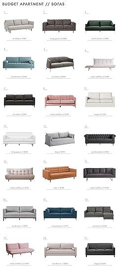
1. Aaron | 2. Aquarius Dark Grey | 3. Forest Green Samara | 4. Derry | 5. Ambrose | 6. Reid Side Table Convertible | 7. Owen | 8. Marcella Velvet | 9. Salisbury Slip Cover | 10. London Optical | 11. Sandbacken | 12. Charcoal Gray Quentin Chesterfield | 13. Winslow Armless Sleeper | 14. Landskrona | 15. Magner | 16. Shullsburg | 17. Loft | 18. Novogratz Chapman Sectional | 19. Henley Convertible | 20. Mid-Century Modern Linen | 21. Felton Tufted
Coffee Tables Under $300
 photo by stephen busken | from: a modern yet warm loft with project62
While “budget” sofas in good styles are easy enough to come by, coffee tables are a totally different story. Man are these hard to source under $300. We did, however, excavate six that are $100 and under (check those sizes, though, some are on the smaller side) and a few others that didn’t feel like your usual coffee table fare. I’m very into the natural look of #2 (two side by side could be cool if you have the space/budget), #3 has some storage, #5 is minimally cool, #7 is a great pop of color (cute hardware, too!), #14 looks far more expensive than it actually is, and #18 is a classic mid-century style in a price that would be hard to beat outside of a garage sale.

1. Annette | 2. Hakon | 3. Alina Storage | 4. Arianna | 5. Tulou | 6. Listerby | 7. Wiley | 8. Stockholm | 9. Buckland Live Edge | 10. Janelle | 11. Mid Century Large | 12. Sayer | 13. Elgin | 14. Wyatt | 15. Toluca Marble and Brass | 16. Folkston | 17. Tachuri Geometric Front | 18. Elizabeth
Media Consoles Under $300(ish)
 photo by zeke ruelas | from: combining furniture styles in the casa soria family room
 Alright, so a few of these are just over $300 (but in all fairness, when we picked them, they were $300 and under but prices fluctuate often on sites like Wayfair and Overstock). If you’re after a more modern look, pick something lower like #2 or #15. #3 (which is the same line as Emily’s dining room cabinet), #7, #9 and #14 are more on the traditional side, while #1, #4, #6 and #8 would be cool style additions (I’ve seen that caned Target #6 cabinet in multiple homes and it always makes me want to grab it…except I don’t need a media console right now). For many years, I had the larger size of the IKEA Besta (#11) and I LOVED it. I could customize the interior storage however I wanted (shelves, drawers, etc.), brands like semihandmade sell great retro-fit door options to up the design factor and you can throw on some cute legs from Etsy or Prettypegs and boom, you’ve got yourself a custom cabinet/media console.

1. Dayton | 2. Ezra | 3. Hadley | 4. Fjallbo | 5. Scandinavian Link Double Door | 6. Minsmere Caned | 7. Lunenburg Farmhouse | 8. Draper | 9. Westerleigh | 10. Wiley | 11. Besta | 12. Avondale | 13. Loring | 14. Windham | 15. Jarod
Side Tables Under $125
 photo by tessa neustadt for ehd | from: a little room refresh with the citizenry
Side tables…because we all need a place to set a drink and some random stack of books/decor piece. This is their official slogan, FYI. So, the good news is, side tables can be VERY cost effective (four of these are under $50 and all but one under $100), which is a good thing because typically, you need two of them for each side of the sofa or next to a sofa/armchair.
I’m very into the double-tier situation at #1 and #13, as well as the little handle thing from #5, though the bean shape of #4 is a fun visual addition to a room usually full of straight-lined furniture. #7 in the matte black feels cool and modern, and the fabric storage “bucket” on #9 would also probably be pretty useful. I can’t believe #11…two tables under $50. These also come in black if white doesn’t work with your aesthetic. I think #15 is actually a nightstand, but a nightstand is just a side table…in a bedroom. Hot tip: Be sure to look for both terms to see ALL your options.
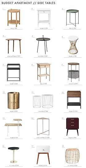
1. Listerby | 2. Cambridge Turned Leg | 3. Gladom | 4. Mae Bean | 5. Melia | 6. Aloysia Rattan | 7. Glasgow Metal | 8. Bjorksnas | 9. Meeks Round Storage Basket | 10. Manila Cylinder Drum | 11. Veria | 12. Loring | 13. Mandelin Wood/Metal | 14. Triangle | 15. Hafley Three Drawer | 16. Marble Pedestal | 17. Amherst Mid Century Modern Two-Tone | 18. Habitat
Armchairs Under $250
 photo by sara ligorria-tramp for ehd | from: how target’s fall threshold collection nails the “updated classic” trend
I lived many, many years without an armchair (again, no friends, so I just needed my sofa to sit on), until I found an $80 bergère chair at a local thrift store that had a very ugly beige taffeta-like fabric on it I swore up and down I was going to change soon. That was 8 years ago. It’s still untouched, but…one day guys…one day. Anyhow, these are kind of the “icing” on the cake in terms of living room furniture, but they can be so great as, you know, something useful to sit on for guests, or as something that provides visual interest (hello #6, #8 and #13 below!).

1. Koarp | 2. Mid Century Prouve Standard | 3. Lincoln Cane | 4. Gilliam | 5. Blue Tweed Thompson Upholstered | 6. Hanging Rope | 7. Rose Pink Tyley Upholstered | 8. Pierce Wicker | 9. Cora Slipper | 10. Massey Faux Fur Metal Base Slipper | 11. Kenn | 12. Luna | 13. Willow Wicker | 14. Vedbo | 15. Sorrento Mid-Century Retro Modern Fabric Upholstered | 16. Esters Wood | 17. Pomeroy Barrel | 18. Tankvard | 19. Isabella Rattan Barrel | 20. Poisson | 21. Storsele
And that’s all she wrote (after 1,700 words!). We’d love to continue on and expand the “budget/first adult” apartment series, so please chime in about what you want us to round up or put together. We have some ideas up our sleeves, but always want to hear from you all. Oh, and don’t miss the other posts in this series so far (here and here) or the giant shoppable Pinterest board we’ve put together with tons more budget-focused furniture options. Thank you for letting me relive my apartment memories…and can’t wait to show you my new LA apartment living and dining rooms soon (coming atcha next month). ::waves::
The post The Ultimate Budget Living Room Furniture Roundup appeared first on Emily Henderson.
April 16, 2019
Design Mistakes: 5 Lessons From the Portland Project (i.e. How We Could Have Saved A LOT OF MONEY)

The which we recently wrapped all the reveals for, was meant to be an investment property (okay fine, a “flip”) that we would renovate, design, sell and then, well, I didn’t go to business school but I think the idea was to profit. There is good news and bad news. The good news is that my brother and I loved working together and are even still speaking! The other good news is that I learned SO MUCH. So many lessons. All day, every day I would say “okay, well that’s a new lesson” but a lot of them were very expensive lessons to learn. I cost us a lot by making big mistakes and choosing to do some more custom (and therefore expensive) things to the house that no one would EVER do in a flip. I’ve said it before and I’ll say it over and over until I die: this is not your typical flip, it was a show house for me and never meant to be “budget”. It simply couldn’t be for the neighborhood it was in. So do I regret doing any of those extra custom things? NO! But I could have saved my brother some money by 1. Being more careful with my mistakes and 2. Knowing some pretty important things about major renovation costs.
So this post is talking about the things we could have done differently to save money and the general lessons that I learned about renovation that I think you should all know to help save you in your renovations.
1. “Cutting” is your real cost.
 photo by sara ligorria-tramp for ehd
It almost rarely matters what your materials are, but rather how custom you make them that affects labor and labor is the real cost of a renovation. Every single cut that a subcontractor makes costs you money. Let’s talk about the tile in the patio (above). It’s GORGEOUS and, of course, if I were moving in here I wouldn’t change a thing. But for an investment property, I cost us SO much time by choosing to herringbone it instead of a stack or stagger. Why? That front patio was huge and the border around the entire thing had to be cut perfectly at an angle. Hundreds of tiles had to be cut to make the border flush. (and every time you cut, you risk breaking tile, too, which just means another cut and, of course, waste). This patio took WEEKS to tile. WEEKS. We could have saved so much money in labor had we just stacked it—or hell, built a wood deck. Now, am I suggesting to stack or stagger instead of herringbone always and forever? Not necessarily, I love how it looks very much, just know that it can drastically change the cost of the labor so just make sure it’s worth it to you and be prepared for what it will cost. (I did however just see a herringbone floor tile recently where the right angles mimic the square shape of the patio, essentially eliminating the angled cuts around the border if it’s in the shape of a rectangle, so just know this does exist as an option if you like the look but don’t want to/can’t allocate the budget to it).
Need another example? All the moulding and paneling costs. There is a reason why less expensive new builds or a lot of flips don’t have crown moulding—it’s not the material that is expensive, it’s the—YEP—cost of cutting it. We chose to double stack the baseboard in here to give it an extra 10″ step and be thicker and BOY did it look stunning. But that’s double labor time. Every time they had to cut something they have to measure, go outside, grab the wood, cut it, bring it in, realize it’s slightly off (maybe) go back outside, re-cut, bring it back in, etc. MAYBE they are doing this inside if there is space, but for tile it’s always outside due to mess so just the back and forth is such a time suck.
 photo by sara ligorria-tramp for ehd | from: the portland entry and foyer reveal
I didn’t just stop there with the paneling and the special baseboard…
 photo by sara ligorria-tramp for ehd | from: the portland media room reveal
We did a special treatment to the ceiling of the media room and the walls of the rumpus room because I LOVE wasting money, evidently.
 photo by sara ligorria-tramp for ehd | from: the portland rumpus room reveal
Would I have done it differently if it were my home? NO. I LOVE IT. But for an investment property/flip it certainly cut into the potential to profit. (Again, the intent of this house for me wasn’t to make a ton of money. It was a portfolio project so I’m very glad it looks the way it does, but I now know where all the profits disappeared to: custom cuts, at my request). Do I think that doing these things helped the overall price of the house and helped create more of an emotional sale? Not as much as I had hoped.
2. Smooth coat walls cost a fortune.
If I could go back in time, I ABSOLUTELY would have saved money on this. If only I knew then what I know now: that there are more options than just smooth coat and texture spray. Okay, let me explain. Get yourself some coffee because this is about to get really boring unless you are about to renovate.
Dry wall is installed in panels over framing that then have to be mudded and taped next to each other, which is messy and has seams, etc. You either need to mask the imperfections (plaster, spray texture) or smooth them out and make them perfect. Making it smooth is EXTREMELY LABORIOUS WHICH MEANS EXPENSIVE. I can’t boldly capitalize that enough. Plastering can be expensive and is also a particular look that we weren’t going for (although it’s so trendy right now). So I fought HARD with NO room for negotiation to smooth coat the main level, the master bedroom and all the bathrooms. I let the media room and the guest bedrooms be sprayed with texture. So was it worth it?
This is the smooth coat of the living room:
 photo by sara ligorria-tramp for ehd | from: the portland living room reveal
This is the orange peel in the downstairs bedroom:
 photo by sara ligorria-tramp for ehd | from: 14 rules for how we style the perfect bedroom
They look mostly IDENTICAL in photos. In person, there is a difference and yeah, I’m glad the main level isn’t orange peel texture but I wish I had known that we could do what we did in the (a light hand-applied plaster over rolled paint).
This isn’t something we knew before and our contractor up at the mountain house was like “there’s not really a name for it, it’s just kinda messy paint and plaster together.” They tape, mud and clean up as much as they can then roll the paint and then go back afterward with the slightest big of plaster with a trowel and just kinda mess up the wall to make everything more forgiving. It’s like putting on thicker primer and foundation on your face, instead of getting a facelift. You still see the wrinkles but it actually looks good, and it’s FAR less expensive.
WHY AGAIN IS IT SO EXPENSIVE? Because it has to be professionally done. EVERY SINGLE TIME you have to alter anything, you have to bring in a drywall team to fix it, rather than just a painter or project manager touching it up. If you decide to move an outlet? You have to call them. If you decide to change the location of a sconce? Them again.
I literally just wrote 860 words about “smooth coating your drywall” and I’m sure most of you have fallen asleep at your laptop/with smartphone in hand, but I hope this PSA saved some of you the $20k that we could have saved by not smooth coating this house.
Yes. We think the difference would have been roughly $20k due to changes and patching (plus, Ken reminded me that we did smooth coat under all the paneling in the lower level because we didn’t know at the time we were going to do pretty wood work on the walls at the time, so that doesn’t help). So that’s cool. Sorry Ken/Katie.
3. Order windows first.
 photo by sara ligorria-tramp for ehd | from: the portland master bedroom reveal
In my next book, we are outlining the order in which to think about and order things (again, writing the book I wish I had during these renovations) but please just know that windows typically have a very long lead time and will hold up your entire project.
Why can’t the other projects keep going without the windows in? Because while you have them planned out and framed, there are likely some tweaks and therefore installing them before you close up the walls is easier, cleaner and just more ideal to make the frames of them clean, right, perfect, etc.
4. Do a walkthrough with your contractor before you close up all walls.
Again, not being there was a real bummer because junction boxes for sconces got placed that were totally wrong and strange, outlets and light switches got installed not knowing that we had already ordered a 5″ door casing (and thus almost all of them had to be moved), plumbing for our wall-mounted faucets was wrong (not centered over the sinks!). But drywall went up anyway. So, over the course of those months, we realized that so many things had to be moved, and it’s much easier to move them pre-drywall than after (also if I haven’t told you the story yet about how expensive it is to repair smooth coat drywall????).
Also hot tip: take photos and video of the inside of your walls before you close them up. You will want to know the guts of the house, what lies behind the walls and, if you can, even take measurements and draw things out on a photo of the inside of the walls so you know where everything is after you forget years later.
5. Let your expert subs give advice…and TAKE IT.
 photo by sara ligorria-tramp for ehd | from: the portland living room reveal
For example: The electricians recommended where to put the sconces early on, but the project manager we had on the project at the start had a different plan and insisted on the placement. Well, guess what? We had to end up moving almost all of them (hello smooth coating labor costs). Sometimes, you think you know best in the name of “style” but if this is your first(ish) rodeo, keep your ears open and humble yourself enough to listen.
Here’s a follow-up tip: allow for extra electrical wire in case you have to move anything, this way you don’t have to rewire anything, move the junction boxes, etc.
Honestly, I could probably keep going, but outlining the key takeaways and mistakes that might help you or apply to a renovation you guys might be doing or have on the horizon was the focus here. I could tell you about the mistake windows in the kitchen, or the fireplace in the master bedroom that could have been designed much more simply (hence saved money), but I’ll stop here for now and turn it over to you.
You guys seem to be knowledgeable and experienced in so many different home areas so tell me: what else have you learned the hard (read: expensive) way that you’d want to share with your pre-renovation self to save time, money, frustrations, tears, relationships?
The post Design Mistakes: 5 Lessons From the Portland Project (i.e. How We Could Have Saved A LOT OF MONEY) appeared first on Emily Henderson.
April 15, 2019
Mountain House Monday: The Living Room Rug Dilemma (+ Ask the Audience)
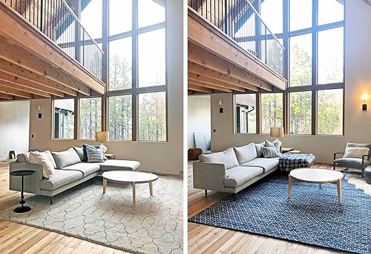
It’s mountain house Monday, living room edition. We have some rug debating to do as I can’t move forward with the living room design and keep decorating until we know what is happening underfoot. In a perfect world, it’s a big white fluffy comfy, cozy rug. But I have kids and they have limbs full of marinara, mud and sand, plus we are a big Play-doh and Lego family (which get easily stuck in high pile rugs). I want a light simple rug, but what will be the easiest and hide stains the most is something darker or busier. It’s an age-old conundrum and it’s painfully boring.
I know you need more information. Here is what’s going on: everything in here was left over from previous projects and I really love every piece, but it’s not there yet design-wise so any of the given pieces MIGHT change.
The sectional is from Article—a brand I love—and they kindly loaned me this sectional back when I staged the Glendale house. I really really really love it and almost wish I had tried it in before bringing up here. It’s extremely comfortable, a really simple shape, has the right depth and comfort level, and the color and fabric is even pretty forgiving. My thought is that it’s a great piece to mix with other more weird/vintage pieces HOWEVER if I find a vintage sofa that is a show-stopper, I might switch it out (in which case it would either be donated to a family via Pen + Napkin or used in a Feel Good Flash Makeover project).
The coffee table (from Rejuvenation, though I don’t think this finish is available anymore) is also leftover and might get switched out for that big live edge stump I got at the flea market (which I wrote about here).
Another leftover (from the ) is the rug, above, which is GREAT but it’s the EXACT color of the sofa, plus in person, the blue is brighter than we were going for. But we really do love how neutral it was. So we tried a darker rug, which felt more “usual EHD fashion” in a patterned navy:

The above rug from Serena & Lily really changed the feel of the room. We actually think that the wood flooring should be the big “texture story” in the room, and that this rug is strangely distracting from it, while I do love it. There’s also the visual layer of the plastered stone fireplace, and all together, it might just be too much “visual noise.” As a reminder, I really want this house to be calm, minimal, Scandi. I’m not sure this rug is helping to achieve that look here (at least not in this room).

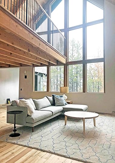
So what do I want?? Secretly, I just want this rug that I’ve used a few times, seen below:
 photo by sara ligorria-tramp for ehd | from: target’s new “see it in your space” feature
  photo by sara ligorria-tramp for ehd | from: styling to sell the (new) master bedroom
It’s so soft, plush but lighter than the sofa, with enough darker gray pattern to hide dirt, etc.
I also REALLY love the rug from the Portland project family room:
 photo by sara ligorria-tramp for ehd | from: how to design a pass-through” room
It has enough darker tones in it to be forgiving and while I might think that it would be too simple (and therefore boring), I think that it really worked up there and I love the simplicity in a way.
So we figured we’d round up all the rugs we are considering, broken down in two categories: adding some blue (i.e. old-school EHD), or sticking with neutral (which might be what my heart truly wants).

1. Malta Blue Woven Wool Rug | 2. Rida Rug | 3. Marais Rug | 4. Matrix Ink Wool Tufted Rug | 5. Rider Denim Rug | 6. High-Low Dilla Lapis | 7. Modern Rug, Teal | 8. Classic Rug, Blue/Cream
I’m going to try out #7 but it’s far less textured than I want. It does have some interest and pattern but it might be too bright. #3 is the same Serena & Lily rug from one of the photos of the living room above, and #8 is a rug we used in one of the Portland guest bedrooms, and it has a nice flatweave texture to it.
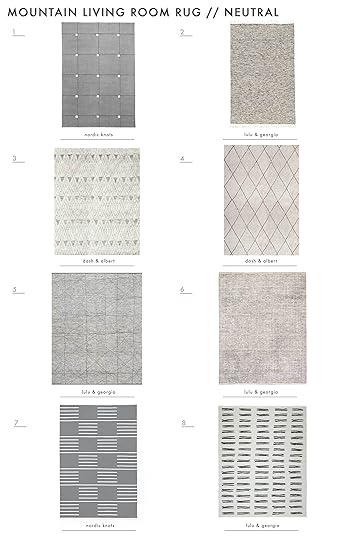
1. Modern Rug, Gray | 2. Edison Rug, Light Gray | 3. Masinissa Hand Knotted Rug | 4. Numa Charcoal Hand Knotted Rug | 5. Linzie Rug, Gray | 6. Judson Rug, Ivory & Black | 7. Classic Rug, Gray/Cream | 8. Evee Rug
I hate pulling triggers on rugs without knowing what else is going on, but it really will set the tone for the decor. I’m SERIOUSLY considering #8 even though it is busier. The black lines will look good with the black island. But #3, #5 both could also be good, forgiving, but still calm and quiet.
We shoot this room (and most of the rest of the house) in 6 weeks so I HAVE to start pulling triggers. Luckily, because we are shooting for a magazine, many companies will send the rugs for us to try out as an option (plus we have other spaces we can try them in if they don’t work in the living room).
But I’d love your opinion. Know that any other chairs and accessories we bring in will be vintage and weird, but not wacky or too colorful. So…do I stick with a cozy neutral color story here and let the wood and windows be the star, or do I bring in some soft color/pattern with one of the blue rugs (which will feel in line with classic EHD style)? Let me know what you guys think. Xx
The post Mountain House Monday: The Living Room Rug Dilemma (+ Ask the Audience) appeared first on Emily Henderson.
April 14, 2019
The Link Up: The One Thing Nearly Everyone at EHD Bought This Week (& More Fun Reads!)
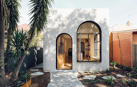 photo source | design by sans-arc studio
We know this is pretty insensitive to those dealing with yet ANOTHER snow storm but in LA we are in full springtime fever mode. Floral outfits are being presented almost every day at work, vacations are getting booked and the beach is an actual place we want/need to be on the weekends (despite the 45+ minute commute for some of us east siders). However, the construction outside the office that has been going on for what feels like YEARS is keeping us humble. Overall, we had a great week and hope you did, too. So before we head into a brand new one, let’s fill up on some great recommendations from all of us…
Emily’s friend and EHD favorite Justina Blakeney just redesigned her laundry room and boy is it so fun. It’s colorful, full of life and of course oh so cool. That wallpaper!
Speaking of Emily’s friends, Arlyn loved this interview on Bleu with Jen Gotch (and a peek inside her fun, warm, collected home).
Bowser can’t stop, won’t stop, posting about Bulletproof. She is fully integrated into their cult. She takes so many of their supplements but she does want to single out one in particular—Glutathione Force. It’s like a drug for being a superhero. In the past, her immunity was terrible and all she can say is during the year of being on this stuff, she hasn’t gotten sick once.
Jess has probably watched this video five times. This love story caught on tape is truly the definition of beauty but undefinable in its depth. All love should sound like this. Yes, she happy cried and you probably will, too.
Speaking of love stories (kidding…or are we?), Julie finally found her perfect one-piece swimsuit. She says it has the right type of cut-outs (the flattering kind) and is the unicorn of swimsuits. SOLD.
Sara is always wearing this scent from Madewell called Beau Fragrance. The scent is described as “always feeling like magic hour” and it really does. Plus, aside from being our resident photog extraordinaire, she’s our resident scent expert so if there is anyone from our team to trust on this topic, it’s her.
Umm, that little arch-heaven addition in the photo above had Jess straight up drooling when she saw it on The Design Files Instagram. The rest of the team agrees on its utter perfection. Go to their site to see the inside ASAP.
Emily + the design team have recently been stalking @tintaluhrman‘s Instagram account for some neutral eye candy.
A friend of Ryann’s boyfriend, Desure just released a new song called Los Angeles and she just really loves it (though she may be biased)
Arlyn has another solid gold Instagram eye candy account recommendation: DISC Interiors. She bookmarks images from them again and again.
Sara found this SUPER interesting Reddit article about a specialist that helps people to overcome the idea of perfection. She is a self-proclaimed perfectionist and with her job/general lifestyle, her need to be “perfect” causes a lot of anxiety. So reading through some of these questions and answers has been helpful to better understand it.
Grace loves this Etsy seller Dirt and Hands that makes the cutest miniature ceramic houses. She saw her set of freestanding ceramic houses over the holidays and has been wanting to buy from her since, but hasn’t gotten anything because she’s not quite ready to commit to the shipping costs from the UK.
Since we were talking all about jeans yesterday, Veronica can’t say enough about her American Eagle Mom jeans. According to her, they are the best thing to ever happen to her. And while she knows that sounds dramatic, she’s someone who always struggled with finding a jean brand to fit perfectly in the waist and thighs. She swears by these. AE often has deals such as buy one, get one 50% or will reduce all of their jeans to $30 and below, so keep your eyes peeled.
Last week, Jess, Arlyn, Erik, Bowser and Veronica all bought these Lou and Grey glasses. They are supposed to block 30% of the blue light emitted from our computers to better protect their eyes. They are clear and they all look very hip…but also like total dorks because they are all matching. For $30, why not? FYI not great for photo editing because they have a yellowish tint on the lens.
April 13, 2019
Ripped & Distressed Jeans Roundup + A Genius Shopping Hack for Affordable Denim


Shirt | Jeans (similar) | Shoes | Hat
I wear a lot of ripped jeans, and anytime I’m in some and you see me (on stories, in photos on the blog), “Where did you get those?!?” is always one of the most asked questions from you guys. So, the time has come to talk denim picks here. Being the distressed denim enthusiast that I clearly am, I am always on the lookout for the next best pair of torn-up denim goodness to throw on my body. The go-to jeans that I do have, like these Levi’s I got from Urban Outfitters and the Moussy jeans (below), I seriously wear all. the. time. I simply just love a GOOD, quality pair of jeans that are durable and versatile. They’re edgy, “cool” (is saying cool uncool?) dress down floofy, boho tops that I tend to love and, in the more relaxed cut I normally get, are frankly just so comfortable for being on set, running around town, or mom-ing (when I have to look like a real-life human outside of my home).
I’m VERY into Japanese denim right now, which is typically made on a short old-school loom (called a selvedge loom) and “denim enthusiasts” herald this stuff above everything else. Being selvedged means that the edges of the denim are finished in a different way that means they will never fray, and in general are more durable. Plus, the older looms are slower and less precise, which makes for lots of variation in texture and color which is EXACTLY WHAT YOU WANT in distressed denim.
Shirt Dress | Jeans | Jacket (similar) | Sandals | Hat (similar)
But, like my favorite Moussy jeans (which are um…over $300), really really great jeans (especially Japanese denim) are often a splurge. For me, I justify it because I wear them A LOT, so I think it’s worth the investment (especially if they are from a brand that uses sustainable practices which a lot of denim brands are doing now). I realize that dropping three Benjamins on jeans isn’t realistic for all (most), but HOLD THE PHONE because I’m here to share with you one of my favorite durable/quality denim shopping hacks for much MUCH cheaper jeans than you’ll find at standard retail prices. Here it is: All over Etsy, there are TONS of vintage Levi’s that are just begging to be bought, worn and loved again. They are the vintage jeans that a lot of fast fashion brands base their styles off of AND since they are used (aka recycled!), this saves so much in waste that comes with producing a new pair of pants. WIN WIN. But, finding a great pair that actually fits is similar to scouring Craigslist for the perfect credenza so here are a few tips to try:
1. Search for vintage Levi’s + your size (501s are my favorite but there are lots of other great styles, too). Note that this type of denim normally goes by waist size, not your standard 4, 6, 8, etc. So try something like Levi’s 501 28.
2. Make sure you look in the product description and check out the measurements. Sizing can be tricky so best practice is to take your measurements and compare to the product measurements.
3. If you see a pair you really love but it isn’t your size, click through the Etsy shop it’s sold from. A lot of these shops have a wide range of Levi’s in different sizes.
4. You can always size up and get them tailored to fit you perfectly. (In general, tailoring is ALWAYS a great option for getting a great fit, which automatically will make you love and want to wear something so much more, plus properly tailored clothes generally LOOK better and more “expensive” because there are no awkward fitting issues.)
Another hack before I go and leave you to your Saturday shopping is to check out The Real Real for a huge selection of second-hand high-end jeans. They consider themselves luxury consignment and a lot of the products are OVER 50% off the original price, and the stuff they have is seriously good. I have been trying to buy more second hand (in home and in fashion) so any other suggestions you have please leave in the comments below.
OKAY, now let’s get to some of my favorites (plus a few vintage picks we found on Etsy, too):

1. Premium Cigarette Jeans | 2. Classic Straight Jeans | 3. Stella Skinny Jeans | 4. High Rise Skinny Jeans | 5.Levi’s Wedgie High Rise Jeans | 6. Maggie Mid-Rise Straight Leg Jeans | 7. Ripped Ankle Straight Leg Jeans | 8. GRLFRND Distressed Jeans | 9. Curvy High Rise Skinny Crop Jeans | 10. Vintage 505 Distressed Levi’s (size 32) | 11. Ribcage Straight Jeans | 12. Vintage 716 Levi’s (size 28) | 13. Rag & Bone Low Rise Jeans (size 23) | 14. Levi’s 501 Taper Jeans | 15. Vintage Levi’s 501 (size 32) | 16. Vintage Levi’s 501 (size 29) | 17. Rag & Bone Mid-Rise Skinny Jeans (size 23) | 18. Vintage Levi’s 501 (size 27)

1. Mother Denim Tomcat Jeans | 2. Nobody Denim True Jeans | 3. Cynthia High Relaxed Jeans | 4. Moussy Vintage Wide Leg Jeans | 5. The Billy Jean | 6. Good Legs Jeans | 7. Rivet & Thread High Rise Slim Boyjeans | 8. Current/Elliot Vintage Cropped Slim Jeans | 9. High Rose Stove Pipe Jeans | 10. Vintage Levi’s 501 (size 33) | 11. Good Curve Jeans | 12. 90’s Mom Jean | 13. Re/Done Distressed Levi’s 501 (size 27) | 14. The Billy Waterfront Jean | 15. Nobody Denim Frankie Ankle Jeans
Alright, that is all I have for you today, folks. Comment below if you have any sustainable denim suggestions or other ways you find affordable quality jeans…and HAPPY SATURDAY.
***photography by Veronica Crawford for EHD
The post Ripped & Distressed Jeans Roundup + A Genius Shopping Hack for Affordable Denim appeared first on Emily Henderson.
Emily Henderson's Blog

- Emily Henderson's profile
- 10 followers

