
Emily Henderson's Blog, page 268
March 8, 2019
10 Unexpected Color Palettes to Try If You’re Bored of Beige

Just when I thought that I had figured out what makes a color palette timeless, Laurren, today’s contributing writer, proposes this: Perhaps the new “color trend” is actually unexpected and more about clashing or pairing together unexpected hues. I suppose like many things, creating tension can be what makes them exciting. Typically for room longevity, I’m a classic “opposite sides of the color wheel” fan, but when someone proposes new, dramatic color combos that I don’t have the guts to actually implement permanently) I say “go for it”, like literally, YOU go for it, because I’m too scared.
BUT, it is fun to think about throwing blue caution to the wind and going for a peach-on-peach (wait, do we all know that peach is HUGE right now…it is, as is mustard) vibe. Anyway, Laurren dug deep and is going to walk you through 10 combos that, like I said, might be scary to anyone used to neutrals and safer palettes, but SUPER exciting to anyone ready for a little something new. Who knows, maybe by the end of this post, I’ll be convinced to paint something orange (ha!). Laurren, take it away.
Thanks, Emily. Hi everyone, I’m Laurren. Long time reader and freelance magazine writer and stylist. (Fun fact: I actually interviewed Emily for a story when I was an editor at Country Living which I haven’t even mentioned to her until now!)
We’re here to talk color. Let me first say that light, bright and airy will always have a place in design (and our hearts). But, after years and years of largely neutral spaces, it feels like the right time for a reverse palette cleanse of sorts. (Arlyn recently made her own plea for more colored walls in design here, and I offer her my full support!) If you, too, are in the mood to shake things up—whether you embrace color via paint or textiles or both—we hope these ideas will serve to get you moving in that direction. And look, most designers (including Emily) would agree that setting a color palette before embarking on a room design is the first (and best) thing you can do to usher decisions further and end up with a room that feels intentional and pulled together.
That said, it’s not always easy to know what to put together. What colors play well in the sandbox of design life? Some combos are obvious, but for anyone who’s tired of seeing the same three colors used again and again, that’s where this post comes in. After doing some initial research and then working to finalize with the EHD team, I think the 10 combos we’re about to share with you are exciting and fresh.
Let’s just dive right into what I suspect might be the hardest sell for some of you, shall we? Are your eyeballs ready to party?
Peach + Coral
 image source
I fully acknowledge that the above image is a lot—like a Flintstones Push-Up (remember those? RIP) and an Orange Julius (can you tell I like frozen treats?) melted together into a dining room. I get it. We get it. In fact, the EHD team talked about their reluctance to embrace the coral trend in this post here. (Now I’m wondering if maybe I should have named this post “8 Unexpected Color Palettes We Love Plus One That Maybe Only Laurren Loves?”) but I just can’t stop looking at it! Am I going to go out tomorrow and paint my living room all the shades of orange? Well, no. But in the right space (ideally not a bedroom or bathroom—feels a little energizing for those areas) it can be really, really pretty.
In the above photo via the February 2018 issue of Elle Decoration UK, a heavy helping of black—from the table to the artwork to the light fixture—adds the grounding, sophisticated edge that makes the whole thing just work (well, that and those wood floors). It sort of acts like the little black blazer of the room, taking a color pairing that could lean childlike and fanciful then BOOM—baby’s all grown up! Being able to see into that other room also helps a lot—the dark paint job and patterned flooring gives your eyes a place to regroup, which can be important in such a bold space.
 image source
If the first example is just a little too Wild Wild Country for you, or if you’re into something requiring less legwork or commitment, allow your textiles and artwork to do the heavy lifting and skip the paint altogether. Or, use it sparingly, like in the above photo where the orange hue is almost celebrated more than it would be if the whole space were clad in the color.
Terra-Cotta + Cobalt
 image source | design by Giancarlo Valle
Peach was large and in charge in the ‘90s, so any Laura Ashley-induced anxiety over its return is 100% understandable. Strip away all the frills and pattern, though, and you’re actually left with a pretty versatile hue that is particularly sophisticated when you bring it down a notch and enter the earthier terra-cotta territory (this is Dead Salmon—lol—from Farrow & Ball). Pair it with black and warm wood accents and a heavy wash of rich blue (specifically that cobalt from the velvet pieces in the living room pictured above), and the controversial shade takes a moody and, dare we say it—lasting—turn.
Blush + Teal + Emerald
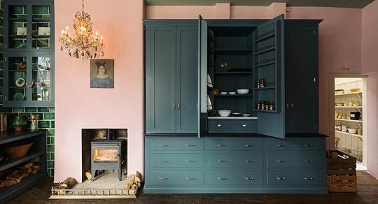 image source
While “millennial pink” may be losing steam, it’s not gone for good and goes a long way in softening up the dark blue and green that grounds this kitchen. In a smaller space with lower ceilings, we’d probably recommend layering in some lighter neutrals to add a little airiness, but this particular space can handle all the drama.
Teal + Rust + Mustard
image source | design by Harding and ReadA wash of super-saturated teal (we’re pretty sure this is Farrow & Ball’s Inchyra Blue) is the perfect backdrop for the burst of warmth coming in from this rusty headboard. (It just wouldn’t feel as special against crisp white walls!) The punchy pillows keep things from feeling too moody and prove that sometimes pattern is most impactful applied in small doses. By keeping the rest of the furnishings—from the lamp to the side table to the bedding—relatively simple in terms of color and style, this bold pairing commands allllllllll the attention. (And we’re not mad about it!)
Turquoise + Red-Orange
 image source | design by Studiopepe
Historically, this combo is not my favorite, but after coming across the above images during a Pinterest dig, I’ve recently warmed up to it. Sure, it comes on strong and can easily lean more coastal or traditional, but when used in unbalanced quantities, with turquoise taking the lead and red-orange coming in as an accent, it feels very fun and fresh. That linen low-slung headboard and sculptural matte black sconce also help the cause.
It’s important to remember that even when your palette is this simple (as in, just two main colors), you need to layer in neutrals (like the bed) and don’t be afraid to take one of the protagonist hues and play with the tones. This could have looked a bit amateur had the walls, sheets and blanket been the same shade, but by varying them just slightly piece to piece, it feels more well-rounded and sophisticated.
Hunter Green + Pink + Yellow
 image source | design by Angela Chrusciaki Blehm
2019 has promised a resurgence of bold primary colors, and I’ll be the first to admit: it’s a little intimidating. They just don’t feel all that special on their own—and would certainly feel jarring paired together—but, as seen in the above image, they can be a refreshing addition to a softer palette when used sparingly. Sign me up for those yellow chairs!
 image source | design by General Assembly
Here, yellow comes in in a more buttercream way with the side tables, and set against a deep dark green and a light blushy pink artwork it could feel playful, but with the cognac leather and wood furnishings, it’s elevated and very adult.
Dusty Blue + Maroon + Wood Tones
 image source | design by Atelier Abraha Achermann
Here, warm wood accents and maroon (wait…are these brown?) floor tiles lend a sophisticated edge to a soft blue that might otherwise lean a little saccharine. (It also helps that this particular blue has a lot of gray in it.) We’d pepper in some black accents to really round out the mix.
Peach + Persimmon + Teal
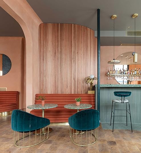 image source | design by Sella Concept and Wilson Holloway
You didn’t think I was done with peach, did you? (I can agree to call it terracotta if that will help you open up your heart.) Designed by Sella Concept and Wilson Holloway, London-based restaurant Omar’s Place, pictured above, makes a strong case for the controversial, sherbet-y palette. A smattering of teal provides an unexpected contrast in the largely monochromatic space while a cloudy-gray ceiling adds depth and dimension without stealing the show. It’s somehow bubbly and moody all at once.
Green + Green + Green
 image source
We definitely have a thing for monochromatic tonal palettes and earthy greens are no exception. (Why settle for one shade when you can have them all?!) Green can be moody and dramatic but also somehow warm and fuzzy and soothing—it’s a real over-achiever and the EHD team’s current golden child.
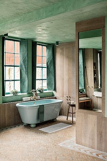 image source | design by Chan + Eayrs
Paired with lots of pale wood tones, stone and mixed metal finishes, the spaces above, which were designed by architects Zoe Chan Eayrs and Merlin Eayrs, are a great example of how you can use color to make a bold statement without sacrificing a light-and-airy feel. It helps that the green tones vary (from pastel to fresh and minty to deep and earthy) to keep things interesting and feeling intentional (not like you didn’t know what else to pair together). Also, I never thought I’d like a colored bathtub, but here we are.
Mustard + Burgundy
 image source | design by studio ashby
You might be looking at this photo (a room by Studio Ashby) and thinking, wait…where’s the burgundy, but that’s actually the magic of this. (BTW, it’s in the trim of the pillow shams and while one tiny detail does not a color palette make, feel free to amp it up yourself). As Emily mentioned in the beginning of this article, mustard and golden hues, specifically rendered in velvet textiles, are huge right now and while this would have worked just as well set against a base of white and black, the added oxblood from the pillow trim (and frankly, the book on the nightstand) is that little ounce of secret sauce that takes it to the next level.
Okay, you made it! I was afraid I lost you at “peachy pink.” How are you feeling? Did we convince you about any of these? Are there some you went “OMG YES DUH HOW DID I NEVER THINK OF THAT?” Are you on your way to buy paint RIGHT NOW!? What’s a color combo you’d be happy to never see again for the rest of your life? Tell me everything.
***Thank you to Laurren Welch, freelance writer and stylist, for helping to write and produce this post.
The post 10 Unexpected Color Palettes to Try If You’re Bored of Beige appeared first on Emily Henderson.


March 7, 2019
Portland Reveal: You’ll Never Guess What This Bookcase Is Hiding…

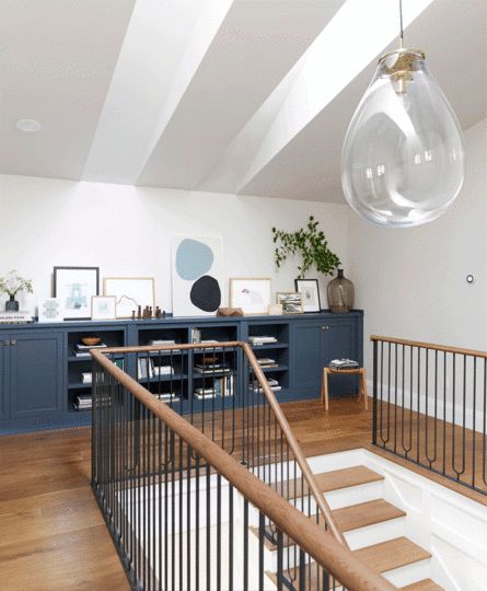
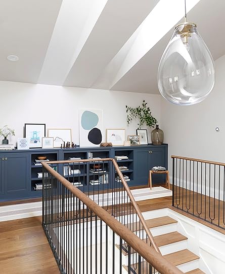
Oh, how we’ve been itching to reveal this super fun space. WHAT’S BEHIND BOOKCASE DOOR NUMBER ONE? Any ideas? I mean, it could be ANYTHING, right? From a hoarder-like stash of Christmas nutcrackers to a master bedroom no child knows actually exists (is that the secret to sleeping in?). But before we spill the secret, let’s talk about this upstairs landing on the second floor of the Portland home.

This second floor is a new addition to the . As a reminder (catch up fully on this house ), we reconfigured the floor plan, added the top story and shifted the stairs a bit so that all three floors (top, ground, basement level) would have a continuous staircase. We worked in conjunction with Base Modern to design the railings and banister (which we went into a little more in the entryway and stairway reveal), and the open metalwork work so well up here to bring in light from the ground floor as well as from the other rooms on the second floor (should the doors be open).

While this could have been treated like an open loft-like landing, we decided to make it a LANDING, designing this custom built-in cabinet as a showpiece for beautiful things (art, books, decor items…and as you’re about to find out, the entrance to a super top secret room). Craig Cowing from Crestwood Inc. helped to execute the work (he also did the cabinetry in the kitchen). To work with the color palette throughout the home’s permanent fixtures, we decided on a slate-like blue by Sherwin-Williams called Grays Harbor and it’s the perfect saturated yet moody shade.
We worked with Velux here (as we did throughout the home) to bring in some more natural light via skylights (at night that stunning organic yet modern Rejuvenation light—which is ENORMOUS and such a power piece up there—illuminates the area). Had the skylights not been installed, the only sunlight that could have potentially graced this space was dependent on the doors being open from the master bedroom and two guest rooms. That just wouldn’t do. This was an opportunity to flood in whatever light the dreary Portland skies would offer, so we had to think outside the window and Velux was a “light” saver here.
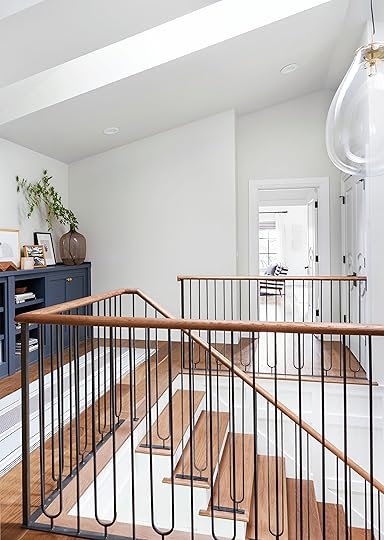
Since we’re talking about light, I think it’s time to pivot and move into what’s behind that secret passageway through the bookcase because it also involves natural light…

THIS PLAYROOM. Well, really it could be anything, but considering it’s only about 5 feet 5 inches at its highest point, we thought it would make perfect sense to be a little “hideaway lair” for the littles in the family. However, how badly would you want to commandeer this for your grown self and turn it into a full-on read-until-you-fall-asleep nook? Honestly, this could have been a throw-away space for Christmas decor of year’s past, but instead, we had some fun. It was actually just rafter space over the living room. There’s a breaker box in here that need some access so why not turn it into real usable space?
Because this was essentially a niche under the roofline, we knew we needed to bring in light, otherwise it’d literally be a tiny cave, which sure, is cool, but frankly, this is cooler. As we did out in the stair landing, Velux came in and positioned a skylight to provide maximum light. At night, there are cans in the ceiling for when the sun goes down.
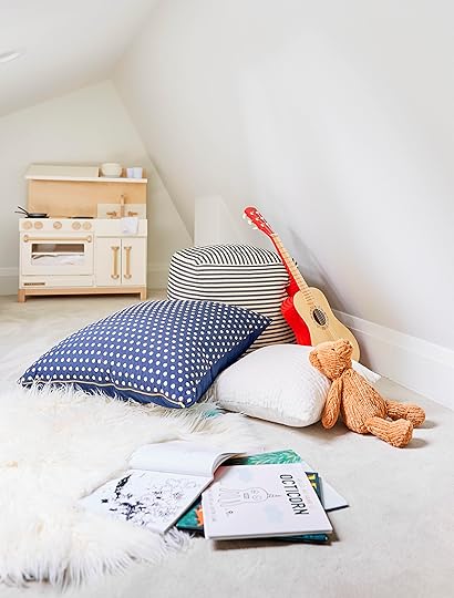
Aside from the lighting, because it’s a really tight space (literally, the ceiling drops to about 2’5″ at the lowest point), it was important to make sure this secret room was comfortable. I mean, let’s get real…wall-to-wall carpeting, though not super desirable, is AMAZING. Picture yourself as a child…wouldn’t you want to be smooshing your tiny toes into plush carpeting? Roll around uninhibited? Think about what you’d want as a kid…then do that.

Let’s take a second to admire this insanely chic play kitchen by Milton & Goose. Play kitchens absolutely DID NOT look like this in the ’80s…right? The adults might have to duck and kneel to watch the cooking show or come over for plastic pancakes, but I think it’s well worth the spatial sacrifice.

Okay, coming back to the cabinet to talk art, because we had the pleasure of working with so many unbelievable artists and artisans for the staging of the whole . The vessels (the knobby white concrete vase and the tiered wood bowl atop the books) were loaned to us—the vase from by The Good Mod and the bowl from Mantel, both local Portland stores, which, if you’re in the area or traveling there, you would be doing yourself a disservice if you didn’t stop in. Both stores have GOOD stuff, folks.
The little blue geometric piece is by Jessica Poundstone, available through Chairish, the threaded work of the bridge (the detail in person is insane) is by Amy L. Frazer, and the small collage piece is by MaryAnn Puls.

On the opposite side of the cabinet is this really pretty vignette graced by the Annie Selke runner and that sweet wood stool via The Good Mod (designed by Spencer Staley). More local artist work dot the cabinet and boy do we love all these pieces. The large abstract with the colored organic shapes is by Mia Farrington (you might remember her work from the rumpus room we revealed last month), the embroidered mountain piece is by Annie O’Dorisio, the landscape by Von Stead Art on Etsy, the mixed media wood-like piece by MaryAnn Puls, and the botanical artwork by Kelsi Cross Studios. It’s a mix of price points (i.e. that wildflower is $28 while some of the other pieces are a bit pricier), but art doesn’t have to be all “collectors” pieces. As long as it strikes you, it could cost $1 or $100,000…

Lastly, the wood figure set (from McLauchlan Made) and the geometric sculpture by Aleph Geddis (which we borrowed from The Good Mod), bring in the warm tones of the Mangrove Ventura planks from Hallmark Floors. It’s important to balance cooler tones (like the blue of the cabinet and art) to get a well-rounded, welcoming look.
And there you have it! Below is the Get the Look with all the shopping resources, but let us know if you have any questions! Pop into the comments and let us know what you think!

1. St John’s Bridge Thread Painting by Amy L. Frazer | 2. Small Abstract by MaryAnn Puls | 3. Kinetic Lines 4 in Navy Blue Print by Jessica Poundstone | 4. Untitled by Mia Farrington | 5. Tim Lamp Pendant by Rejuvenation | 6. Wildflowers by Kelsi Cross | 7. Small Abstract by MaryAnn Puls | 8. Nature Painting by Von Stead Art | 9. Cabinet Maker | 10. Ball and Rod Sculpture by Spencer Staley via The Good Mod | 11. Cabinet Knob by Rejuvenation | 12. Vase | 13. Expand by Annie O’Dorisio (similar) | 14. Wood Sculpture by Aleph Geddis via The Good Mod | 15. Large Vase (similar, original via City Home) | 16. Small Sculpture Set by Elise McLauchlan via Mantle | 17. Runner by Annie Selke | 18. Wooden Bowl by Elise McLauchlan via Mantle | 19. Painting by Whitney Jordan | 20. Play Kitchen by Milton and Goose | 21. Table Lamp | 22. Wood Side Table | 23. Wood Stool by Spencer Staley via The Good Mod | 24. Bean Bag | 25. Soccer Ball | 26. Red and Blue Basketball | 27. Storage Bin | 28. Sherling Rug | 29. Octopus Throw Pillow | 30. Alligator Knit Throw Pillow | 31. Striped Pouf by City Home | 32. Guitar | 33. Dot Pillow by City Home | 34. White Pillow (similar) | 35. Tebby Bear (similar) | 36. Cat Throw Pillow | 37. Deer Knit Plush | 38. Wood Train Set (similar) | 39. Skylight by Velux | 40. Wood Flooring by Hallmark Floors | 41. Oyster White by Sherwin-Williams | 42. Pure White by Sherwin-Williams | 43. Grays Harbor by Sherwin-Williams | 44. Baseboard by Metrie
The post Portland Reveal: You’ll Never Guess What This Bookcase Is Hiding… appeared first on Emily Henderson.
March 6, 2019
Our Ultimate Vintage Rug Resource Guide

***Written by Jess Bunge
In terms of decor, is there really anything better than a beautiful vintage rug to bring some serious soul to a room? They have a way of grounding a space instantly with personality and injecting a mysterious sense of “history.” Now, while I and the whole EHD crew are vintage rug fangirls, I realized I actually didn’t know anything about the types of vintage rugs I lust after daily. Even when I went to go buy my kitchen rug, I knew I wanted something vintage but I went in blind and crossed my fingers (knowing I could return for a refund). So when I was assigned this post after some talk in the office about new (vintage) rugs for the mountain house and where others on the team source pieces for projects—including Emily who shares her #1 rug sourcing secret at the end of this post so keep reading—I figured it was time to rectify my (shameful??) lack of knowledge for myself while also paying some research forward to you guys. Two birds, one kilim stone.
First, let’s start with some tips to know before you buy online so you don’t suffer from instant buyer’s remorse:
A rug is considered vintage if it’s less than 100 years old. If it’s more than 100 years old, then it’s an antique and usually very $$$$.
Imperfections are good but a rug that is falling apart isn’t (unless that’s your thing). Make sure to ask about any damages previous to clicking that “buy it” button.
Ask for more pictures if you are unsure about the color (or damage) of your dream rug, ideally in different lighting. Online photos can be deceiving so there is no shame in wanting some more visual confirmation. This is easier to accomplish on Craigslists, OfferUp, Etsy, etc.—basically where the seller can be directly
Check the return policy. Sometimes no matter how much you know about the piece, it may just be different than you thought when you see it in person. Make sure you are able to get your money back if you change your mind.
Double check sizing! Vintage rugs come in all kinds of sizes (which is especially awesome if you need an unconventional size) however lots of sites put their measurements in centimeters and will obviously be VERY different if you were planning them to be inches.
Vintage rugs are rarely inexpensive and if the dealer can prove some sort of authenticity then they really aren’t cheap. Basically, it’s hard to say what is a good price. Set a budget for yourself, look at the quality and uniqueness. Then decide how bad you want it. That’s where the value ultimately lies.
 photo: by zeke ruelas for ehd | from: introducing my living room
Of course, shopping from e-commerce sites is not the only place to grab a gorgeous vintage or antique rug. Emily’s three in-person go-tos are Craigslist (she scored the blue rug from a previous home here for $75), estate sales (she got the 3 rugs from the for $1,000 total at a celebrity’s estate sale) and, of course, flea markets, but read to the end to find out what her most precious tactic of all is for finding affordable rugs.
Before diving into our favorite shops and picks, I wanted to make a little cheat sheet and break down the types of rugs you will most likely encounter on your search (though keep in mind there are SO many other varieties like Heriz, Serapi, Mashad, etc.):
Oriental Rug: This is just an umbrella term for a knotted-pile rug from North Africa, the Middle East, Central Asia and northern India.
Kilim: A flat-woven carpet or rug usually made in Turkey.
Beni Ourain: Shag Moroccan rugs that are are typically very soft and made from high-grade wool. The colors are neutral and the designs are simple and geometric. These have been king in the neutral boho world for a while now (like in the photo above of Emily’s old living room).
Boucherouite: Usually color and hand-loomed from “clothing fabric scraps” by the women of the Moroccan Berber tribes.
Tabriz: A type of Persian Rug from the city of Tabriz. They are very intricate and made from either cotton or silk.
Overdyed Rug: This is less a “type” a rug and more a treatment of a rug you’ll see throughout vintage and antique dealers. These rugs have been dyed one consistent color and are very saturated where only a hint of the pattern comes through.
Oushak: Their designs are usually geometric with a central medallion or smaller scattered medallions, typically with a border design of a similar medallion or scroll/vine pattern.
Now that the tips, trick and terminology are sorted, let me present to you our collective EHD online vintage rug resource guide.
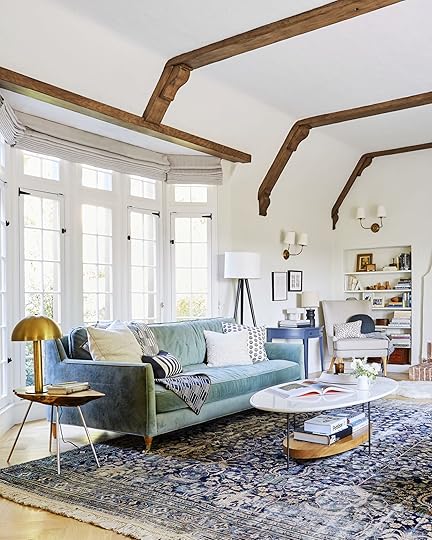 photo by sara tramp for ehd | from: experimenting in my living room: trying to find “the” rug
Blue Parakeet Rugs
They have a BEAUTIFUL selection of heirloom-quality vintage and antique rugs. Emily actually used one of their rugs in her most recent living room update debate where she borrowed that beauty up there to test out for a bit (for sale here). Sheba, the owner, is such a lovely person and wonderful to work with, and we’ll always encourage the support of a small business like hers. We can absolutely attest to the quality of their rugs that include the perfect amount of patina.

Antique Kazak Rug | Love Worn Kurdish Rug | Kurdish Runner | Tribal Wool Rug
Canary Lane
There was a time (not so long ago) when every vintage runner Arlyn stumbled upon while scrolling through Instagram was from Canary Lane. It was like a running joke for her, she said. She’d see a kitchen with the most perfect runner rug, wonder where it was sourced from, and see that it was credited to Canary Lane. When I went to their site myself, I saw why she was petitioning for them to make this roundup. Their rugs are vibrant and chic…but sell fast. Don’t stew too long or you will probably miss out.
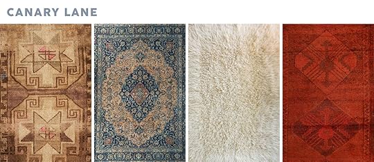
Vintage Mini Rug | ‘Azure’ Vintage Persian Large Area Rug | ‘Aster’ Primitive Vintage Tulu Rug | ‘Carley’ Turkish Vintage Runner
Chairish
They are an EHD household favorite. Not only is their selection vast and varied but you can counterbid the listed price (as opposed to upbidding like you would on an auction site). My life changed when I started to use that tool. Deals, deals, deals.

Mid Century Modern Turkish Jajim Kilim Flat-Weave Rug | Early 20th Century Antique Blue Chinese Art Deco Rug | Distressed Oushak | 1960s Turkish Striped Kilim Rug
Coco Carpets
Coco Carpets is like the cool girl of vintage rug retailers. They have an awesome selection of colorful and bold rugs that have that effortless modern boho feel. If you’re on the market for stunning Moroccan rugs that break the mold (i.e. not just your standard neutral Beni Ourain), click through RIGHT NOW because you will not be disappointed.

Apocalypse Never Boucherouite Vintage Moroccan | Your Art is the Best Art Vintage Beni Ourain Moroccan | Poor Unfortunate Soul Vintage Boujaad Berber Moroccan Rug | Basic Instincts Vintage Berber Carpet
Ebay
The OG bidding site for vintage. Ebay can be an overwhelming place to navigate (and a lot of “vintage” rug sellers are actually just selling vintage-looking rugs that are power-loomed out of nylon and acrylic so read carefully). To give you a little bit of a headstart, be sure to check out the following sellers who have a ton of great options: RugSource, MiamiVintageRugs, BeniourainDirect and eCarpetGallery.
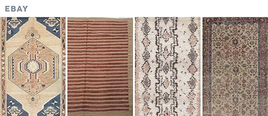
Muted Oushak Turkish Hand-Knotted Wool Rug | Vintage Persian Kilim Area Rug | Beni Ourain Style Vintage Moroccan Boucherouite Rug | Hand-knotted Turkish Melis Vintage Wool Rug
 photo by tessa neustadt for ehd | from: brady’s bedroom makeover with parachute + shop the look
 Esmaili Rugs
If you want a WIDE selection of high-quality vintage and antique rugs, go to Esmaili. You may remember Brady’s Bedroom Makeover starring one of their neutral Beni Ourain rugs as well as Sara’s living room rug selection with that blush and blue beauty. They aren’t “budget” rugs but boy are they special if you have the funds.

4×6 Vintage Moroccan Rug | 6 x 9 Vintage Moroccan Rug | 5 x 8 Vintage Moroccan Rug | 6 x 11 Vintage Beni Ourain Rug
Etsy
Etsy has a special place in my heart because it’s where I bought my kitchen rug (RugToGo) and I love it. I feel like Etsy is your best bet for deals without the extra step of bidding (or having to deal with in-person pick up like Craigslist or finding a cool flea market). Again, it’s a real hunt but RugToGo, BerberArtisanatFine and EFESRug are all great vendors for you to start your search with.

Vintage Distressed Beige Oushak Rug | Ben Ourain Rug | Small Vintage Kilim | Small Vintage Kilim
New England and Loom
I found this great resource on Jess Ann Kirby’s Instagram and thought their offerings were really punchy and beautiful. The owners behind New England and Loom are a super cute couple that is always on the hunt for beautiful rugs. All their sales are final so you are going to want to be sure before you buy.

Antique Hamadan Runner | Antique Persian Mahal Rug | Antique Heriz Serapi Rug | Vintage Turkish Rug
One Kings Lane
Gone are the days when One Kings Lane was a flash sale website. They’ve transitioned into a traditional e-commerce retailer, however, being a go-to for new and vintage goods for designers and decor aficionados, the latter is always prone to flying off the virtual shelves because it’s a GOOD stock, specifically their rugs. They are a great resource with an awesome variety of prices, sizes and styles.

Turkish Kilim | Antique Khotan Rug | Moroccan Zenefe Wool Runner | 1960s Turkish Tulu Rug
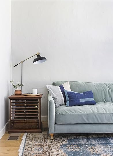 photo by sara tramp for ehd | from: an update on our family room
Rejuvenation
You may have forgotten that one of our favorite shops also sells amazing vintage goods… rugs included. Remember Emily’s family room? That rug still makes my heart skip a beat but not to worry because they have plenty more to choose from. Having the “Rejuvenation stamp of approval” makes purchasing a no brainer.

Finely Woven Striped Navajo Blanket | Avanos Turkish Rug | Modern Blue & Yellow Turkish Konya Rug | Kurdish Runner
Rug and Weave
Arlyn found this great shop on Instagram and a find it was! They have a killer selection of traditional yet fresh looking rugs, full of color (you know that girl loves her color). They also have a handful of their rugs photographed in actual spaces which is SO nice and takes a lot of the guessing game out of a purchase.
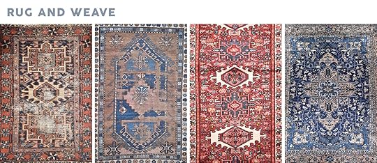
Antique Persian Karaja Rug | Antique Caucasian Kazak Rug | Vintage Persian Heriz Rug | Vintage Persian Heriz Rug
Vintage Rug Shop
Brittany from Vintage Rug Shop has SUCH an eye for vintage rugs. Finding nicely muted and not over saturated vintage and antique rugs can be tough, but that’s just what this store stocks. If you follow them on Instagram, you’ll constantly be tempted to blow your savings on a new floorcovering…they’re that good consistently. Oh, and they are constantly adding to their curated collection so be sure to check often if you have something specific in mind.

Now that you have all of our online vintage rug secrets, Emily wanted to share a secret she keeps close to the chest…until now. I’ll let her take it from here before I wrap it up:
Hey guys. Em here. I couldn’t let this blog post go up without sharing my most precious strategy that has helped me find my favorite (and most affordable) rugs. Here goes: Instead of going to actual rug dealers at flea markets, head to regular flea market dealers. Look on the ground of normal dealers (people selling furniture, etc.), because sometimes they’ve brought in their grandma’s old rug and just laid it over a chair or underneath all their other goods. Some of them have REALLY good vintage rugs and you get a great deal (steals even) instead of going to specific rug dealers. Just because it doesn’t have a “for sale” tag on it doesn’t mean they won’t be willing to sell it. Shoot them an offer…you might be surprised what you take home.
If you have anything to add to our research, please feel free to let us know in the comments. Also are there any other online resource guides you have been jonesing for? Let us know about that too. Knowledge is power. Sharing is caring. Happy Wednesday. Love you, mean it.
EHD ONLINE RESOURCE GUIDES:
The post Our Ultimate Vintage Rug Resource Guide appeared first on Emily Henderson.
March 5, 2019
House Tour: Original Woodwork, Moody Walls & A Gasp-Worthy Wallpaper

Written by Arlyn Hernandez
I first discovered Emily (Cosnotti, not Henderson) of The Sweet Beast as I feel like I have most of my new house crushes lately: via the One Room Challenge (for real though, a veritable gold mine of talent over there). One glimpse of her guest bedroom which she completed last spring, with those deep moody walls and those tone-on-tone DIYed curtains and I knew I wanted (needed?) to see more. Emily was gracious enough to share a peek into her Pittsburgh, Pennsylvania, home which she shares with her husband Andy and corgi pup Penelope with the EHD universe and here’s a spoiler alert: there’s so much character and personality to love here (just wait until you see the original wallpaper from her sunroom).
Emily always has some new project brewing over on her site (and I can’t wait to see if she does another space for the upcoming ORC), so be sure to pop over there and her Instagram to give her some love and check out what’s new with her and her home. But alright, you’re not here to listen to me blab surely, so I’m going to pass the keyboard to our protagonist of the day to introduce herself and her home. Blog, meet Emily, Emily meet blog.
Thanks Arlyn! Hi everyone, I’m Emily of The Sweet Beast. A little background on me before jumping into my house: I always thought I would work in a museum, but after finding myself working in e-commerce and later in content, I’ve made surrounding myself with beautiful objects my hobby instead. My husband and I shared an apartment in a historic building for seven years before purchasing our home, I broke all the rules in our lease there by painting the walls and even removed paint from hardware and marble. I knew each step honored the space and its history, and that’s the same approach I take with the home we now own. It can be scary to dive into renovating and restoring an old home, but often tell myself, “you can hardly make it worse.” Our home was well decorated by the previous owner but in more of a bed and breakfast style than one that supports comfort and living. I often say that I’m “undecorating” our home, as I remove extra frills and opt for a modern traditional home that feels lived in and loved.
Foyer

Vintage Kilim (one of a kind) | Jute Runner | Frames | Pendant
The best part of the entryway to our home is our round top door with its tiny window panes. With closets on both sides, we are blessed with storage space for all our coats, shoes, my vacuum collection, and whatever else I can hide in there when guests come over. Those stacked frames feature some of my husband Andy’s photography from our trips to New York and his hiking trips with friends. And of course, our home wouldn’t be the same without our corgi Penelope, up there sitting on our one-of-a-kind pink and blue printed kilim rug, waiting for her favorite person to come home (hint: it’s not me).
Living Room

Vintage Rug (one of a kind) | Record Cabinets (similar) | Swing Arm Sconce | Shag Rug (similar) | Coffee Table (custom) | Sectional | Paint Color
Our living room’s paneled fireplace is probably the fanciest touch in our whole home and is likely an addition and not an original feature. It got lost in a sea of warm yellow tones before we stripped the walls and painted. Removing yellow striped wallpaper from the largest room in our house in the hottest days of summer with no air conditioning was a task I will never forget. It took four of us (myself, Andy, and my parents) days to complete the task of scoring, steaming and peeling the wallpaper and then scrubbing away the paste. Painting this room afterward was a breeze compared to that task. I was inspired by Deuce Cities Henhouse to pair our unpainted warm woodwork with dark, moody cool-toned walls and it was one of the best decisions I’ve ever made.

Floor Lamp | Throw Pillow | Chair and Ottoman (vintage) | Fox Print by Camille Engman
We divided the living room into two zones, one small sitting area that houses Andy’s record collection, vintage speakers, and an inherited turntable, and a larger area for lounging on our sectional and watching Netflix. The long shape of the room has presented some modern-life layout challenges—there is no good place for a TV in this room that doesn’t block either the windows or the fireplace, but it glows with light all day long and is the most comfortable spot in our home.

Art (DIY) | Copper Pillow | Dome Table Lamp | Chest of Drawers (vintage)
Dining Room

Table | Rug (vintage) | Chairs (vintage) | Pendant | Glass Vase | Abstract Screenprint by Jen Ray | Screenprint Framing | Paint Color
When we toured this house for the first time, there was so much furniture in this room that we nearly missed seeing the corner built-ins. The family before us used this as a living room and music room, so it was outfitted with quite a few sofas, chairs and floral patterns. I painted this room first when we moved in, anxious to cover up the yellow walls with a crisp white and to repaint the cranberry pink shelves of the built-ins a deep gray-blue. The dark paint inside the built-ins lets my white and black ceramics and serving pieces shine and also looks so good with our honey-toned woodwork.
We went with a simple woven pendant from IKEA (that replaced the chandelier that was existing), the bright kilim rug was an eBay find and the dining chairs were a Craigslist score. As for the table, we found it in the IKEA as-is section and had to disassemble it to fit it in my car…so worth it because it was a steal.

Credenza (vintage) | Lamp (vintage) | Small Footed Bowl
A vintage mid-century credenza stores our board games and extra table linens inside and our growing collection of cocktail ingredients on top. I like to display a few of my collected ceramic pieces here as well or put out snacks when we entertain.
Master Bedroom
Curtains (with DIY tweak) | Curtain Rods | Ceiling Flushmount | Basket | Vintage Rug (one of a kind) | Fireplace Insert | Fireplace Tile | Chair (vintage) | Drink Table | Paint Color
A refresh of our master bedroom came about with the fall 2018 One Room Challenge. The design for the space was anchored around my plans to install an electric fireplace where a wood-burning fireplace once was. I sketched up plans to build a Tudorish-Craftmanish-modernish fireplace surround and sent the plans and revisions back and forth to my dad. I spent my weekends traveling two hours away to his garage where we built, painted and tiled the surround, piece by piece, completing it JUST in time. Now, the fireplace adds a nice boost of warmth on winter days and is a cozy place to curl up in a chair and enjoy a cup of coffee. Just kidding, that’s just a clothes chair.

Bed | Nightstands | Lamps | Duvet Cover | Quilt | Large Lumbar Pillow | Small Lumbar Pillow
I had my eye on that beautiful spindle Rejuvenation bed ever since I saw it in Emily (Henderson’s) bedroom, and knew that if I was going to do this bedroom justice, I had to get that bed. Putting a bulky frame in front of a window can seem like a terrible idea, but not if you pick something that lets light pass through instead of blocking it.
Grid Art (DIY)

Terracotta Vase | Little Pink Vase | Spotted Vase | Ceramic Knots | Knot Necklace | White Lamp (no longer available) | Kent Coffey Dresser (vintage)
As for the rug, I struggled to find one large enough to fit this big, long room and even considered going with two rugs instead of one. All my Instagram friends encouraged me to keep searching for one big rug and, just in time (again), I found this overdyed vintage rug and it’s just so perfect. It adds age and texture to a room filled with newer pieces and cleaner lines, achieving that just-right mix of modern and traditional that I’m always striving for.
Guest Bedroom
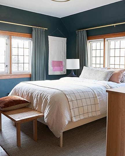
Bed (no longer available) | Ikat Lumbar Pillow (no longer available) | Pink Lumbar Pillow | Boob Pillow Cases | Wall Hanging | Duvet | Curtains (color no longer available) | Curtain Rods | Blanket (similar) | Rug (similar) | Paint Color
I revamped this room as part of the spring 2018 One Room Challenge and I knew what color I wanted to paint it before I’d picked anything else for it (it was previously a bright green boys room, decorated in a space theme complete with a ceiling boob light with glow-in-the-dark planets). I’d been seeing deep rich greens in places like Chris Loves Julia’s reading room and knew that dark hues make the woodwork in our home glow. My biggest revelation in this space was moving the bed in front of the windows, which allowed for access on both sides, and room for a small, guest-sized dresser. Previously, the bed had been against the short wall where the IKEA dresser is now, which left half the room oddly open and relatively unusable.
Nightstands | Nightstand Hardware | Black Lamps | Blanket Ladder | Brass Mobile Kit | Dresser | Mirror
For the curtains, I went tone on tone, adding inexpensive velvet IKEA curtains with a DIY pinch pleat. I get so many questions about where the headboard is from because rattan is so huge right now, but it is an IKEA piece that I’ve held onto for several years that has long been discontinued (sadly that bench is also unavailable).
Those nightstands were a budget Amazon find at $100 each and equipped with USB ports so guests don’t have to search for outlets. I upgraded them a little by replacing the stock wood pulls with brass hardware from CB2. Right before photographing the room for the big reveal, I realized the corner looked so empty and decided to craft the brass mobile from a Crafters Box I’d been hoarding.
The room is a perfect mix of pieces that go but don’t match. And no more boob light, just boob-print pillows.
Bathroom

Art Print | Sconces | Vase (no longer available) | Paint Color
Finding a classic bathroom with original features was on my wish list for a house—a line item I didn’t think would be crossed off. But then we found this house with this perfect bathroom with its original floor, pedestal sink, medicine cabinet, bathtub and shower. The previous owners had added layers of extra frills with busy wallpaper, three layers of window treatments, a skirt for the pedestal sink, and even ruffled covers for the shower curtain rings. We painstakingly removed the wallpaper (it was really on there and holding together some of the plaster walls), repaired the plaster, and painted the room a soothing blush tone. It casts flattering color on everyone and lets the tile really pop without standing by being boring.
Sun Room

Wallpaper (historic reproduction) | Vintage Rug (one of a kind) | Coffee Table (vintage) | Green Coil Plant Pot | Watering Can
These windows right here…they’re what sold us on this house. I’d never seen anything quite like them and fell in love. The wallpaper is not something I would have chosen for myself, but it is growing on me. I also can’t imagine removing wallpaper ever again. At the closing, the previous owners made sure to tell us it was expensive and to “think about that” before removing it or painting over it. I’m still overthinking this space and the best way to use it, but for now, it’s a place where our plants are thriving.
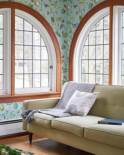
Sofa (no longer available) | Pillow
Arlyn back again. Thank you SO much Emily for letting us (digitally) into your home. Sharing the work of such talented bloggers and designers in our community brings us so much joy (plus it’s fun to have permission to peek through people’s windows). It’s like touring model homes on the weekend except 100 TIMES BETTER for so many reasons. Feel free to share any bloggers/designers/stylist you follow that you get the sense have amazing homes and we’ll take a look, too, for a possible house tour.
To take a “tour” of all our EHD-designed homes and spaces, don’t miss our BRAND SPANKIN’ NEW PROJECTS section.
***photography by Emily Cosnotti of The Sweet Beast
The post House Tour: Original Woodwork, Moody Walls & A Gasp-Worthy Wallpaper appeared first on Emily Henderson.
House Tour: A Stylist “Undecorates” a 1929 Tudor-ish Cottage
Written by Arlyn Hernandez
I first discovered Emily (Cosnotti, not Henderson) of The Sweet Beast as I feel like I have most of my new house crushes lately: via the One Room Challenge (for real though, a veritable gold mine of talent over there). One glimpse of her guest bedroom which she completed last spring, with those deep moody walls and those tone-on-tone DIYed curtains and I knew I wanted (needed?) to see more. Emily was gracious enough to share a peek into her Pittsburgh, Pennsylvania, home which she shares with her husband Andy and corgi pup Penelope with the EHD universe and here’s a spoiler alert: there’s so much character and personality to love here (just wait until you see the original wallpaper from her sunroom).
Emily always has some new project brewing over on her site (and I can’t wait to see if she does another space for the upcoming ORC), so be sure to pop over there and her Instagram to give her some love and check out what’s new with her and her home. But alright, you’re not here to listen to me blab surely, so I’m going to pass the keyboard to our protagonist of the day to introduce herself and her home. Blog, meet Emily, Emily meet blog.
Thanks Arlyn! Hi everyone, I’m Emily of The Sweet Beast. A little background on me before jumping into my house: I always thought I would work in a museum, but after finding myself working in e-commerce and later in content, I’ve made surrounding myself with beautiful objects my hobby instead. My husband and I shared an apartment in a historic building for seven years before purchasing our home, I broke all the rules in our lease there by painting the walls and even removed paint from hardware and marble. I knew each step honored the space and its history, and that’s the same approach I take with the home we now own. It can be scary to dive into renovating and restoring an old home, but often tell myself, “you can hardly make it worse.” Our home was well decorated by the previous owner but in more of a bed and breakfast style than one that supports comfort and living. I often say that I’m “undecorating” our home, as I remove extra frills and opt for a modern traditional home that feels lived in and loved.
Foyer
Vintage Kilim (one of a kind) | Jute Runner | Frames | Pendant
The best part of the entryway to our home is our round top door with its tiny window panes. With closets on both sides, we are blessed with storage space for all our coats, shoes, my vacuum collection, and whatever else I can hide in there when guests come over. Those stacked frames feature some of my husband Andy’s photography from our trips to New York and his hiking trips with friends. And of course, our home wouldn’t be the same without our corgi Penelope, up there sitting on our one-of-a-kind pink and blue printed kilim rug, waiting for her favorite person to come home (hint: it’s not me).
Living Room
Vintage Rug (one of a kind) | Record Cabinets (similar) | Swing Arm Sconce | Shag Rug (similar) | Coffee Table (custom) | Sectional | Paint Color
Our living room’s paneled fireplace is probably the fanciest touch in our whole home and is likely an addition and not an original feature. It got lost in a sea of warm yellow tones before we stripped the walls and painted. Removing yellow striped wallpaper from the largest room in our house in the hottest days of summer with no air conditioning was a task I will never forget. It took four of us (myself, Andy, and my parents) days to complete the task of scoring, steaming and peeling the wallpaper and then scrubbing away the paste. Painting this room afterward was a breeze compared to that task. I was inspired by Deuce Cities Henhouse to pair our unpainted warm woodwork with dark, moody cool-toned walls and it was one of the best decisions I’ve ever made.
Floor Lamp | Throw Pillow | Chair and Ottoman (vintage) | Fox Print by Camille Engman
We divided the living room into two zones, one small sitting area that houses Andy’s record collection, vintage speakers, and an inherited turntable, and a larger area for lounging on our sectional and watching Netflix. The long shape of the room has presented some modern-life layout challenges—there is no good place for a TV in this room that doesn’t block either the windows or the fireplace, but it glows with light all day long and is the most comfortable spot in our home.
Art (DIY) | Copper Pillow | Dome Table Lamp | Chest of Drawers (vintage)
Dining Room
Table | Rug (vintage) | Chairs (vintage) | Pendant | Glass Vase | Abstract Screenprint by Jen Ray | Screenprint Framing | Paint Color
When we toured this house for the first time, there was so much furniture in this room that we nearly missed seeing the corner built-ins. The family before us used this as a living room and music room, so it was outfitted with quite a few sofas, chairs and floral patterns. I painted this room first when we moved in, anxious to cover up the yellow walls with a crisp white and to repaint the cranberry pink shelves of the built-ins a deep gray-blue. The dark paint inside the built-ins lets my white and black ceramics and serving pieces shine and also looks so good with our honey-toned woodwork.
We went with a simple woven pendant from IKEA (that replaced the chandelier that was existing), the bright kilim rug was an eBay find and the dining chairs were a Craigslist score. As for the table, we found it in the IKEA as-is section and had to disassemble it to fit it in my car…so worth it because it was a steal.
Credenza (vintage) | Lamp (vintage) | Small Footed Bowl
A vintage mid-century credenza stores our board games and extra table linens inside and our growing collection of cocktail ingredients on top. I like to display a few of my collected ceramic pieces here as well or put out snacks when we entertain.
Master Bedroom
Curtains (with DIY tweak) | Curtain Rods | Ceiling Flushmount | Basket | Vintage Rug (one of a kind) | Fireplace Insert | Fireplace Tile | Chair (vintage) | Drink Table | Paint Color
A refresh of our master bedroom came about with the fall 2018 One Room Challenge. The design for the space was anchored around my plans to install an electric fireplace where a wood-burning fireplace once was. I sketched up plans to build a Tudorish-Craftmanish-modernish fireplace surround and sent the plans and revisions back and forth to my dad. I spent my weekends traveling two hours away to his garage where we built, painted and tiled the surround, piece by piece, completing it JUST in time. Now, the fireplace adds a nice boost of warmth on winter days and is a cozy place to curl up in a chair and enjoy a cup of coffee. Just kidding, that’s just a clothes chair.
Bed | Nightstands | Lamps | Duvet Cover | Quilt | Large Lumbar Pillow | Small Lumbar Pillow
I had my eye on that beautiful spindle Rejuvenation bed ever since I saw it in Emily (Henderson’s) bedroom, and knew that if I was going to do this bedroom justice, I had to get that bed. Putting a bulky frame in front of a window can seem like a terrible idea, but not if you pick something that lets light pass through instead of blocking it.
Grid Art (DIY)
Terracotta Vase | Little Pink Vase | Spotted Vase | Ceramic Knots | Knot Necklace | White Lamp (no longer available) | Kent Coffey Dresser (vintage)
As for the rug, I struggled to find one large enough to fit this big, long room and even considered going with two rugs instead of one. All my Instagram friends encouraged me to keep searching for one big rug and, just in time (again), I found this overdyed vintage rug and it’s just so perfect. It adds age and texture to a room filled with newer pieces and cleaner lines, achieving that just-right mix of modern and traditional that I’m always striving for.
Guest Bedroom
Bed (no longer available) | Ikat Lumbar Pillow (no longer available) | Pink Lumbar Pillow | Boob Pillow Cases | Wall Hanging | Duvet | Curtains (color no longer available) | Curtain Rods | Blanket (similar) | Rug (similar) | Paint Color
I revamped this room as part of the spring 2018 One Room Challenge and I knew what color I wanted to paint it before I’d picked anything else for it (it was previously a bright green boys room, decorated in a space theme complete with a ceiling boob light with glow-in-the-dark planets). I’d been seeing deep rich greens in places like Chris Loves Julia’s reading room and knew that dark hues make the woodwork in our home glow. My biggest revelation in this space was moving the bed in front of the windows, which allowed for access on both sides, and room for a small, guest-sized dresser. Previously, the bed had been against the short wall where the IKEA dresser is now, which left half the room oddly open and relatively unusable.
Nightstands | Nightstand Hardware | Black Lamps | Blanket Ladder | Brass Mobile Kit | Dresser | Mirror
For the curtains, I went tone on tone, adding inexpensive velvet IKEA curtains with a DIY pinch pleat. I get so many questions about where the headboard is from because rattan is so huge right now, but it is an IKEA piece that I’ve held onto for several years that has long been discontinued (sadly that bench is also unavailable).
Those nightstands were a budget Amazon find at $100 each and equipped with USB ports so guests don’t have to search for outlets. I upgraded them a little by replacing the stock wood pulls with brass hardware from CB2. Right before photographing the room for the big reveal, I realized the corner looked so empty and decided to craft the brass mobile from a Crafters Box I’d been hoarding.
The room is a perfect mix of pieces that go but don’t match. And no more boob light, just boob-print pillows.
Bathroom
Art Print | Sconces | Vase (no longer available) | Paint Color
Finding a classic bathroom with original features was on my wish list for a house—a line item I didn’t think would be crossed off. But then we found this house with this perfect bathroom with its original floor, pedestal sink, medicine cabinet, bathtub and shower. The previous owners had added layers of extra frills with busy wallpaper, three layers of window treatments, a skirt for the pedestal sink, and even ruffled covers for the shower curtain rings. We painstakingly removed the wallpaper (it was really on there and holding together some of the plaster walls), repaired the plaster, and painted the room a soothing blush tone. It casts flattering color on everyone and lets the tile really pop without standing by being boring.
Sun Room
Wallpaper (historic reproduction) | Vintage Rug (one of a kind) | Coffee Table (vintage) | Green Coil Plant Pot | Watering Can
These windows right here…they’re what sold us on this house. I’d never seen anything quite like them and fell in love. The wallpaper is not something I would have chosen for myself, but it is growing on me. I also can’t imagine removing wallpaper ever again. At the closing, the previous owners made sure to tell us it was expensive and to “think about that” before removing it or painting over it. I’m still overthinking this space and the best way to use it, but for now, it’s a place where our plants are thriving.
Sofa (no longer available) | Pillow
Arlyn back again. Thank you SO much Emily for letting us (digitally) into your home. Sharing the work of such talented bloggers and designers in our community brings us so much joy (plus it’s fun to have permission to peek through people’s windows). It’s like touring model homes on the weekend except 100 TIMES BETTER for so many reasons. Feel free to share any bloggers/designers/stylist you follow that you get the sense have amazing homes and we’ll take a look, too, for a possible house tour.
To take a “tour” of all our EHD-designed homes and spaces, don’t miss our BRAND SPANKIN’ NEW PROJECTS section.
***photography by Emily Cosnotti of The Sweet Beast
The post House Tour: A Stylist “Undecorates” a 1929 Tudor-ish Cottage appeared first on Emily Henderson.
March 4, 2019
Mountain House Monday: The Search for Sentimental/Family Inspired Art

I suffer from chronic “sentimental-memory-making.” The #1 symptom usually involves me orchestrating a big and messy project to do as a family that the kids aren’t even ready for, but it makes us (me) so happy and yes creates memories that I KNOW we’ll all keep. Ever tried building and decorating a gingerbread house from scratch with three 2-year-olds? How about papier maché with gallons of glue? “Building a birdhouse” with a 3-year-old boy and two hammers? Nail polish marble art like out of real nail polish full of chemicals and toxins that don’t come off their hands or faces for days? I’ve been accused, and have pleaded guilty, of so many parenting fails in the name of my selfish “memory making.” But it’s my crime to commit, my mess, my children and continue my serial record I will.
As we keep trucking on the decor phase of the mountain house, I increasingly want to bring in as much personal, family and sentimental pieces as possible, without adding too many “things” up here. So the natural way to do it is in the art and textiles. I’ve been brainstorming, obsessed with personalized art that is pretty, feels curated, unique and furthermore trying to figure out how to involve the kids in the actual making of it. Here are the ideas that I’m exploring, some of which I’m VERY excited about.
Pressed Flowers
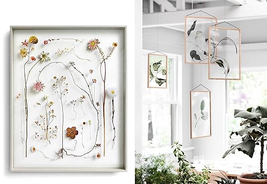 image sources: left | right
My kids pick them and while I know this is normal, the ritual of running into the house and yelling “mama I picked this beautiful flower for you!” will NEVER not be special. Up here, they are more branches and pretty leaves, manzanita and pine. I am a massive fan of flowers and trees (this blog was first called The Brass Petal, after all) and I grew up pressing flowers myself. Plus, I’ve put two forest murals in my house so this seems like a very natural collection.
The question is how to do it in a new way that feels more unique to us and this house? We always try to take a good idea and reinvent it, right? So here’s what we have so far: I want to tweak the scale by going BIG. This could either be big flowers/branches, OR we could press a ton of flowers and wait to put them in a frame until we have a massive amount, then frame a huge huge huge collection, in an interestingly arranged, curated color palette. No pics of that to reference because we haven’t seen it done yet (thus making me really excited about it). I don’t love the idea of an organic collection creating a gallery wall up here (I love it in general but I want it to be more clean and modern) so I’m thinking either a large scale grid or one big piece that we make over the summer together.
 image source
Not exactly like this, but you get the idea. Pressed flowers, done EHD style.
Curated Kid Paintings & Paper Collage Art
 image source
Art you actually love looking at. I’m sure every mom in the history of parenting has tried this, but here’s my new attempt that I’ve already started: I pulled out all colors in the color palette of this house—muted greens, blues, grays, blushes, blacks—and gave them materials in all of these colors.

This included pastels, watercolors, acrylic paints, colored pencils, ripped up fabric, tissue paper, origami paper, watercolor paper, newspaper, construction paper and let them go at it. Charlie isn’t that into drawing but he sure loves ripping up paper and playing with glue. This is going to take some time, but it’s super fun and they know they are working on something with me that will live up at the mountain house.
 image source | artist: kirill bergart
The inspiration for this comes from two of my current favorite artists whose work I have purchased for both homes: Kirill Bergart and MaryAnn Puls. Both of these artists create really inspiring, highly provocative mixed media pieces that are quiet and interesting. I love to stare at both of them.
 photo by sara tramp | from: my living room update
These paper hands in my living room are by Kirill Bergart while the mixed media piece below that was used in the living room of the is by MaryAnn Puls:
 photo by sara tramp | from: the portland project living room reveal
Now, do I want or expect my kids to do anything like this? Am I teaching my kids how to knock off adult artists? No. They are 3 and 5. This is just the inspiration that got me excited and made me think that curating the materials might actually produce a piece or multiple pieces that can adorn the walls of this house and remind me of this age and time. I’m even thinking that I can take all their work and collage them together on one big piece of beautiful paper or canvas. Maybe I can add some embroidered bits. I’m not sure, but so far I’m loving the process with them. This is more about the process, doing it together than the final outcome. It’s an experiment in doing an art project over time together, and if it is attractive then all the better.
Sun Art
 image source
I have ALWAYS loved sun art and last summer we started doing it together up here. The kids love it because all you do is leave an object on top of a piece of sun paper and let the sun bleach it out. You then add water to stop the reaction. It’s scientific, quick, colorful and pretty. So I’m going to find a way to integrate sun art that, again, we do with the kids up here. Maybe it’s all leaves they forage, or maybe it’s their current favorite toy. Then we can either collage them all onto one big piece or create a grid down the hallway.
 image source
Sentimental Quilts
 image source
Hold on to your granny on this one. I grew up quilting and have an affinity toward pieces of fabric sewn together. I made some very similar to that above, but this would be different. My kids are a bit young to quilt with me, but I’m VERY into textile art right now. So I have a plan and it sounds creepy, but I’ve been hoarding some of their baby blankets or my favorite, nostalgic clothes of theirs. Not a ton as I’m such a purger, I wish it were more, actually, but I can’t seem to donate their baby blankets specifically because all I do is picture the first months of their lives in them. Some of them are in bright colors that clash, so here’s what I’m thinking: I’ll dye them all the same tone OR bleach them out. You’ll still see the pattern and get the texture, but it will reduce the color palette. I was telling my friends about this and they looked at me VERY skeptically but then I was in a store and saw the work of Adam Pogue and I said “SEE THIS IS IT.”
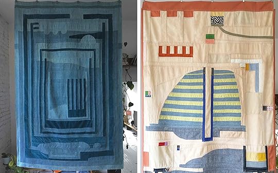 image source | artist: adam pogue
 image source | artist: adam pogue
Turns out he follows me on Instagram and is based in LA so I’ve reached out to see if he wanted to work with me on it, even if it’s just giving some advice or yes, if he WANTS me to drop off the blankets/clothes and give him free reign to create a large piece of textile art for our house I WILL NOT SAY NO. I’m still waiting to hear back and if he’s not involved then I’ll do my best and likely create something ugly, but if it’s all blue or all bleached and combined with simple washed linen or denim then I think it could be pretty enough either for a piece of art, headboard or a blanket at the foot of the bed.
The next two ideas are pretty basic, but I think we can execute them well and frankly, they are always good ideas.
Black & White Family Photo Wall
 image sources: left | right
The reason for this began because I have SO MANY already and they just aren’t popping in our LA English Tudor as much, but when I brought them up here with the dreamy light and simple modern architecture, they sing. They are quiet, interesting and obviously very personal.
I like the idea of putting them above the bench here in the front of the house by the staircase:

I need more interesting shapes and texture, more photo strips, Polaroids, etc. But it’s the perfect fit up here and it makes me super happy. Part of me wants to mix in other wood tones, but I have so many in white frames that I’m like “why not just keep it simple?” I will mix up the white frame profile and the matting, though so that it looks interesting.
Monthly/Seasonal Polaroids
 photo by tessa neustadt | from: sara’s living room reveal
Lastly, another long term photo project because I suffer from an incessant need for sentimentality (my scrapbooking has gotten out of control). I got a polaroid camera from Jess for Christmas and while I’m still learning how to actually take a good picture, the kids love it and will actually let me take photos of them. So ideally, we’d do one a month, but I think that’s a bit ambitious. Maybe one a year each? Or one summer, one winter each every year? I don’t know. I just love seeing them altogether in a grid and there is something inherently nostalgic in a polaroid that gets lost in a printed photo.
 image source
So that’s where we are at. Family memory making in the form of art projects that with some luck, curating and discipline, we can ACTUALLY put on the walls and always remember how we did it as a family. Anybody need any pink, red, orange or yellow art supplies?
I’M JOKING 
March 3, 2019
The Link Up: Rummage Sale Details + The Best Tomato Soup + New Product Faves

 image source | design by sarah sherman samuel
 This past week was pretty darn good. I think I achieved a near perfect balance of work and family (with the help of the one and only Brian Henderson). This is not something that happens often, as the concept of balance feels like as likely as me riding a unicorn, with the perfect color of blonde on my head, owning every Thonet chair in the universe. But this week I NEEDED to get in a solid writing session for that book I keep saying I’m writing.
March 2, 2019
On My Body This Week: Crazy Coats, My Favorite Jeans, A Petite-Friendly Jumper

The good news is that these posts are inspiring me to actually try harder to do better with the clothes on my body. This week is not evidence of the shift, but we have a photo shoot planned where my friend is helping me curate five “lewks” to show you. This is, however, just normal clothes on my body, due to that fact that I’m shooting four days a week these days and I have to be comfortable and wear clothes that I kinda don’t care about. Then on the weekends, I’m momming really hard so I need comfy cute clothes there, too. It’s probably why I wear a lot of boyfriend jeans, T-shirts, cute sweats and no-lace shoes (you have to take off your shoes a lot on set for stepping on rugs, but working without shoes all day hurts so I opt for mules or easy to put on books/slides).
Anyway, for any of you who like comfy, flattering and casual clothes, then take a peek at my unimpressive looks.
Monday:

Shirt (similar) | Coat | Pants (similar) | Boots | Lip color
I actually tried this day. I love that new camel coat (although I’m now thinking it’s too big). Maybe I’ll have the sleeves taken up. The jeans are from a year or so ago but I linked up similar ones from Madewell (these are also Madewell). The high waist is slimming and flattering.
Tuesday:


Tuesday night, we all went to happy hour as a team for Velinda’s bday at Salazar and I put on my new coat. I had a big credit at a store that I returned stuff to YEARS ago and they still had it in their system, so naturally, I splurged on a ridiculous pink coat, of unnatural proportions (which I love). Still wearing those jeans every day and yes, it’s time for some new nude mules…any suggestions?
Wednesday:

Shirt | Jacket | Pants | Shoes | Hat (similar) | Sunglasses
I’m prone to costumes and when I’m at the mountain house, I get rugged. I’m obsessed with that new little jacket, and those pants are so comfortable that I bought TWO pairs—one that fits more like a boyfriend and these that are more fitted. I highly recommend them (and they were on sale when I bought them for $60).
Thursday:

Lastly, I’m diving deeper into the jumper trend with this one that I bought at Gift of Garb after I sold a bunch of clothes. I’ve never heard of this brand but the cut is pretty flattering for this style, plus it has cute pockets. Not recommended for the long-torsoed out there as reaching high to get something out of a cabinet is pretty uncomfortable if you know what I mean, and I have a pretty short torso.
Friday:

Shirt | Jacket | Sweatpants
When I sent the team this photo, I first said “wait…what exactly am I showing people here?” Sorry. Friday was a travel day after a few days of shooting up at the mountain house, so I wore my new very comfy sweatpants that have pockets and a really cute waistband. I was in desperate need of layering shirts, you know, those really thin, comfy easy to throw on shirts that you put underneath other shirts (your welcome for the definition of layer). This one is Lou & Grey and is insanely soft. As is my new chunky sweatshirt blazer thing (also Lou & Grey).
That’s it, guys. Have a lovely Saturday and don’t forget to come back tomorrow for the link up. xx Emily
The post On My Body This Week: Crazy Coats, My Favorite Jeans, A Petite-Friendly Jumper appeared first on Emily Henderson.
March 1, 2019
$50 Bentwood Chairs, $10 Stools, Free Bookcases: The Best Dallas Craigslist Finds Right Now

Hey everyone, Emily Bowser here (EHD styling assistant, and secondhand and DIY aficionado), back with our second installment of Trolling Craigslist. Last time, we stayed close to our ‘hood in the LA area, but today we’re heading down to Texas—Dallas specifically. We found tons of chrome, SO many chairs and maybe the cutest $10 stool we’ve ever seen. Let’s take a look:
Vintage Mid-Century Modern Sling Chairs, $600

Okay, there may or may not be a chrome theme in this post. I was at the flea market with Julie the other week and I was all, “are people still into chrome? Is it weird that I’m STILL into chrome??” She didn’t give me a good answer, so I want to hear from you in the comments section! IS CHROME STILL COOL? AM I STILL COOL? DO PEOPLE SAY “COOL” ANYMORE?? I think the bases of these are very “cool.” Or, as Sara’s younger brother, Shade, who has been helping us on the production end of things, would say “dope, dope.” The bases of these are “dope” and easily worth $300 each in my mind (though I can see why $600 might feel $$$$ for secondhand furniture). I’m not sure what the cost here would be to recover, but I feel like it wouldn’t be too bad because you wouldn’t need much yardage. That said, I’ve never recovered something quite like that, where the fabric is what is connecting it to the base. In a less aggressive fabric, I think they would feel visually lighter than a lot of other big and comfy chairs out there because the design gives the illusion of floating.
Vintage Pair of Chairs, $449
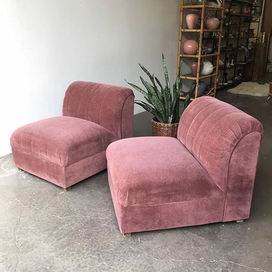
If there isn’t a chrome theme in this post, then there IS a matching pair theme (keep reading)! I actually LOVE this rose color and wouldn’t recover them, just give ’em a good cleaning. $250ish/chair is not bad but I bet you can talk them down to $400 at least. Oh, and I love that you could separate them or put them together as a love seat.
Antique Pedestal Oak Table With 4 Oak Highback Chairs, $40

Okay, if it’s not chrome or a matching set, then SOLID WOOD is a third theme you will see today.
I am a fan of antique pedestal tables. I own one myself. They are perfect for smaller spaces because they are easy to walk around. There’s a whole conversation that I could have about mixing up shapes in your space, as well. The short version is this: a lot of times, you will look around and everything is a rectangle in a house, couches, tables, the actual rooms! Mixing up shapes is one of the easiest ways to make a space feel less cookie cutter. I’m not a huge fan of the chairs but I LOVE the shape of the base of the table and $40 is a great price for an oak table. You could probably even just take the set, and sell the chairs themselves for at least $50. MONEY MAKER. ALSO, do I spy wheels?? I love a table on wheels. All you need is a sander and a sealant or stain if you please.
2 Chairs, $40

$40??? Deal. They look like they swivel and I am a fan of a swivel and a…MATCHING PAIR. I have a chair that swivels in my family room that sits kind of in front of the TV which is great for two reasons: 1. It blocks the TV and makes it less of a center piece and 2. When the TV is on, you just swivel it out of the way! They look to be in really good condition so if the color works for your living space, this is a no brainer. Recovering would not be cheap, because that is a lot of fabric but also…$40!! So there’s room in the budget to make these your dream Goop x CB2 knockoff chairs.
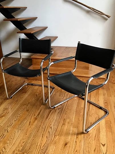
Pair of Chrome/Leather Bauhaus Chairs, $200
HELLO CHROME! (The evidence is mounting for the “cool” *ahem* “dope” factor, am I right??) $200 for the PAIR?? About to drive to Texas and get these myself. Would be very cool to mix them into a dining room situation.
Vintage Domore Conference Chairs, $145

There’s been a bit of a debate over office chairs in the office lately. Fashion? Function? HAS ANY OFFICE CHAIR EVER DONE BOTH?? (If you know, please comment below!!). If we lived in Texas I’d try to convince the team to get these and have them recovered. Not cheap if you add in recovering for sure, but $145 each isn’t bad. I’d try to negotiate down if I bought all eight. But, all that said, good luck finding a comfortable and good looking office chair for less than a million dollars anyway. Also, would like to note chrome base here.
February 28, 2019
A Home Office Makeover With Threshold Removable Wallpaper by Target


I’m going to take a guess and say that your blood pressure skyrockets when the phrase “do-it-yourself wallpaper installation” is uttered, am I right? But guys, the days of fussy, paste-y paper as your only option are SO far behind us and thank goodness because EHD loves their wallpaper. Now, it’s so much easier to find peel-and-stick varieties in very very cute patterns, and I don’t just mean at specialty retailers. What a time to be alive where you can swing by your local Target, grab a few rolls and completely change the vibe of a space in as long as it takes you to put it up.
For any of you out there that are renters, commitmentphobes or just generally scarred from bygone installation (and removal) methods, this post is for you. But before getting into the nitty gritties of how we did what we did (and some other fun DIYs), let me walk you through where we are right now…

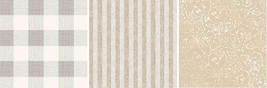
Large Gingham Wallpaper | Twill Stripe Wallpaper | Delphinnia Floral with Metallic Ground Wallpaper
Threshold reached out to see if we’d be up for working with their new neutral removable wallpapers (available in-store in the home innovation section of your local Target and Target.com). They sent us samples of three new patterns (above) and because it was hard to say no to that super cute large gingham, we set out to find a space we could makeover and Emily Bowser offered up a room in her home that was sitting pretty unused.
Because we didn’t have a “real” live-in client, we created one based on something we felt we had a firm grasp on: a design student. I think the part of the team that attended design school would agree that the space they’re crying and stressed tinkering away in most of their free hours needs to be streamlined and organized with just enough style to provide a springboard for ideas without being cloying (back me up here EHDers).
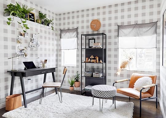
Wallpaper | Desk | Desk Chair | Task Lamp | Leather Basket | Rug | Planters | Bookcase | Resin Box | Wire Baskets | Clock | Plant Shelf | Message Board
A good office should be a few things: comfortable, effective, organized, inspiring, regardless of what you’re studying/where you work, so we split up this space into a few different zones: the desk is Grand Central for work and projects, the seating corner is a great place to kick up your feet and flip through magazines/Pinterest when you’re in a creative slump (cat absolutely vital here) and the shelving in between is there to keep you tidy.

Chair | Ottoman | Round Pillow
Because we opted to keep the furnishing plan and pieces simple, the room was going to need a little punch by way of textiles, which is where the large gingham comes in to bring it all together.
Let’s dig into some things to keep in mind with peel-and-stick paper because, while it is as simple as peeling back the liner and adhering to wall (i.e. no messy, pastes or glues and no need to activate it with water), we learned a few installation notes along the way to make this relatively easy task even more efficient for you.

Supplies needed: one or two sets of hands, a step ladder, a straight edge, scissors, a sharp box cutter and a squeegee
First things first, buy more than you think before starting! No matter how perfectly you think you’ve measured, there will be waste, and you can always return an extra tube or two if you don’t open them.
This is not something I would recommend doing alone. The paper can be applied, removed and reapplied a surprising number of times but you will definitely need an extra set of hands, especially if your ceilings are high.
Prepping the walls is important both for ease of installation, as well as the eventual removal. If your walls aren’t smooth, sanding down bigger bumps is a good idea because anything that causes the pattern to be off means the pieces you put on thereafter will also be off and a few sheets in, the inconsistency can really start to show. Also, don’t try to paper around faceplates and outlets. Simply remove the faceplates, apply the paper over, then (carefully) cut off the excess paper and replace your plates. Same goes for windows. It creates more waste, but your pattern repeat will be way more accurate. Windows that have casings are going to be a bit tricky, though, so making a cardboard or paper template may be a good idea to trace onto the paper and cut before applying.
Take the time to squeegee before moving on to a new sheet to ensure all your air bubbles are out and you won’t have to adjust.
I recommend leaving an inch or so extra at the top in case your walls are uneven so you can adjust as you go on. At the very end, just take a sharp box cutter to the ceiling edge for a clean line.
All that said, a lot of people don’t have level floors and therefore the walls can be a bit wonky. Think about it like tweezing your eyebrows, though. Up close, you’re going to see all the imperfections and keep plucking past the point that is flattering, but if you step back occasionally and look at the “big picture”, you’ll hardly be able to point out the things that drove you nuts up close.
[image error]
In total, we used 7.5 rolls for 170 square feet and the whole process, start to finish, took us about 2 hours (though maybe budget twice that if you’re a Type A perfectionist).

If you’ve never installed removable wallpaper before and have questions about ANY part of the process, how to figure out how many rolls you need, etc., pop into the comments and let us know what you need us to talk more about. The first wall is the most intimidating because you’re not sure where to start (we recommend hanging your first strip top to bottom from a corner), but once you get going, it’s like anything else…you just feel more confident as you’re figuring it out.

Speaking of things to figure out, we’re moving on to another DIY part of this makeover. We had the idea to add in a clear inspiration board as not to cover up our newly installed paper, and instead of buying something, we did what any overachiever would do and set out to make one ourselves after searching “clear eraser board” on Pinterest and studying the plethora of simple DIYs we found.

Here’s what you’ll need: A piece of acrylic (which you can buy at most home improvement stores) cut to whatever size works for your space, 3/4″ wooden dowel cut to size (noted below), 2.5″ wood screws, hot glue gun
Now for how to do it:
As most of these acrylic board DIYs are made with sign standoffs (which we thought was our plan, at first), it turns out you have to order those online because not many stores carry them, so we improvised, and now you can, too.
Cut your dowel into four, 1-inch pieces and four, 1/2-inch pieces.
Predrill the 1-inch pieces for your screws to avoid splitting.
Measure and drill holes into the four corners of the acrylic, then screw through the acrylic and into the predrilled 1-inch dowel piece. This will attach everything to the wall. (Quick note: when the screw was just barely through the dowel, one of us held the acrylic up while the other screwed the four corners into the wall, making sure to hit a stud. If you’re going into drywall, you’ll have to think about anchors.)
Once the whole thing is secured to the wall, put a dab of hot glue onto the screw head, add the 1/2-inch dowel cutting, hold for a second until dry. (We tried super glue at first, but it didn’t work as well, so we recommend the hot glue, for sure).
To get extra fancy, we finished it off with a 3M magnetic strip to attach a pen cup to hold our dry erase markers.

And finally, a DIY that Bowser and Julie dreamed up which is SO creative and super cost effective…the pin-up shade:


All we used for this was some gray Made by Design curtain panels, Threshold drapery clip rings (with the rings pulled off) and some simple nails.
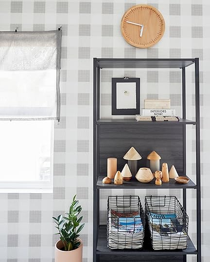
Simply measure your window, cut your curtain panel to size (be sure to leave a little extra for the hem), clean up the unfinished sides with iron-on hem tape, clip on the ring clips to the top, bottom and middle, then hammer in three nails at the top of your window (where the clips loop into) and BOOM, you have window treatments. How genius is that?
And there you have it. An empty shell of a room transformed to fit any budding design student (or anyone, really!) with a few smart and simple DIYs, and of course, that cute and neutral yet punchy peel-and-stick Threshold wallpaper. What do you think? Can you see yourself working in this space?
*This post is in partnership with Threshold but all words, designs and selections are our own. Thanks for supporting the brands we love that support the blog.
The post A Home Office Makeover With Threshold Removable Wallpaper by Target appeared first on Emily Henderson.
Emily Henderson's Blog

- Emily Henderson's profile
- 10 followers

