
Emily Henderson's Blog, page 265
April 5, 2019
Why Do I Put Photos of My Innocent Children On Social Media? (And Should I?)

I’ve avoided finishing or publishing this post since Charlie was 8 months old, almost five years. Probably because it’s both relevant and yet redundant, and while typically I like to have a thesis with these kinds of posts, I don’t today. Like digital media itself, my stance and mindset shift almost daily and knowing what is the “right” thing to do is most often an in-the-moment gut decision. I like to think that I’m principled, as if I have these morals that are unwavering and these limits that are inflexible. But absoluteness, or a “never will I” attitude, is the vernacular of youth. And being unwavering in your principles is certainly easier said than done.
Needless to say, I have very complicated feelings about my kids and social media (both their involvement and presence in my social media and, looking down the line, Charlie and Elliot on social media themselves). But like any intelligent, progressive, responsible (and terrified) mom, I mostly just want them to be as far away as possible from social media. Hilarious, I know but there is a plot twist at the end.
The irony of me being who I am and what I do for work is not lost on me; in fact, I’m more sensitive to it because of what I do. You have no idea. I know what it does to my fully grown adult brain and I didn’t have the Internet until I was 18 and social media until I was 30. My brain was FORMED.

Most of parenting is modeling good behavior. Showing not telling. We are VERY good at adhering to a no phones at the breakfast and dinner tables policy and for the last six months have gotten The New York Times daily – the actual paper – so we can catch up on the news while the kids play, but without having to be on our phones. We are trying to take the power of the phone away and show our kids that these things are tools we use for work and for information, but not something we need. So if that’s the case then why can’t I just teach them how we are being and how they can be responsible with social media?
There is a lot of research that says that my generation (xennial) and above are far worse at the daily mindless scroll than a typical 23 year old. I’ve read that the younger generation has learned to use it moderately whereas even our parents’ generation is addicted to scrolling and updating the daily feed, although in my experience, I’ve seen a lot of 16 years old locked to their phone.
While I could honestly talk about this at length (and regularly do with other parents to hear their points of views), my kids are still young, so this isn’t really about them actually using social media. I’m several years (hopefully a decade or more) away from actively having to have this conversation. They hopefully won’t have a cell phone until 8th grade, and, if I can convince all of our friends to make the same promise, not be on any social media until they are 18. Please join the #waituntil8th movement. PLEASE.
No, this post is more about how much our kids are involved in MY social media. Just writing that makes me feel gross.
“NOT AT ALL,” should be the obvious answer. Our kids deserve their privacy and should be able to dictate where and when they are shown publicly. They are their own people.
And that was the firm answer a couple of years ago. No more kids on the blog and social media.
As Charlie started getting older, we decided that I would show less of his face in photos (like seen here – lots of back-of-heads). I would be more sensitive to the person that he was going to be once he was past baby age. Brian and I had a lot of heated conversations about it, even though we were on the same side. Neither of us wanted our kids to be in the public eye or to have a presence on social media. We want to respect their privacy. We don’t want them recognized in public. We don’t want this blog or my success to affect their futures because living in Hollywood is already hard. The obsession with fame here is potent and we want our kids as far away from it as possible. We joke all the time that while most parents “strive towards excellence” we hendersons “Strive Towards Normalcy”. We just want our kids to have the normal, safe, upbringings that we had.

So why did I move away from that staunch “our kids won’t be involved” decision? Or did I? Why do I still put photos of my two innocent children on social media even if its mostly the back of their heads? After much reflection, I think these are the answers:
1. I can’t blog without thinking about my kids. Those two are the biggest, most important part of my life. They are my only real priority. And while this blog is predominantly about design, the large following and engagement I have are likely because I’m also a human being with human reactions and honest responses. I’m not the best designer in the world, so why are all of you here? You’ve followed along for 10 years because I use this blog as a journal, documenting my self-expression and reflection, both stylistically and personally. I have the same struggles, challenges, concerns, joys, tears, tantrums and overwhelmingly happy moments as you. Therefore completely deleting that portion of my life feels like almost negating the most important part of myself. I know this sounds insane, but for the few months (a few years ago) that I didn’t talk about my kids or show them on social media, I actually think I wasn’t able to be authentic because I was shutting down the most volcanic section of my emotions and life. Brian agreed. He saw it in my mental state and in my writing. He could tell that I needed to express myself as a mom, as a professional mom, as a crying, emotional, highly joyful and sad mom. And maybe a photo of Charlie hugging me would help close some sort of door that not showing/talking about my kids left open.
2. Just like all of you, I have compulsions to photograph my kids when they are doing something really special. Taking home photos and videos of your kid is a good thing, it helps you all remember moments you will surely otherwise forget. And then at night, when they are asleep and I’m scrolling through photos, it’s like I can’t NOT put their adorableness out there. Believe me, I only put out about 1/1,000th of the photos that I want to. But I know that it’s not just a compulsion, there is obviously some sort of pride and well, EGO involved. In a day and age where people feel like they know you, you want to share and show them all aspects of your life. Like a house you worked on years to design, you want to put it on display for the world to see. You are so proud of it! You love it so much that you want other people to either recognize your work or love it as much as you, although they never will. It’s not just “being relatable,” it’s a serotonin and dopamine burst when you see a cute photo of your child doing something adorable earlier in the day, and you just want, well…I guess everyone to ooh and ahh with you. This is not a reason TO do it, but I suppose it’s been one of the reasons I have kept sneaking them onto social media—because it’s also fun FOR ME.
3. Alright, so here’s where it gets tricky. We have turned down jobs that have required my kids to be involved, so far. Sure, at times they have been in sponsored posts but I’ve never told a partner that their presence is guaranteed (well, maybe when they were infants, to me that’s different because they are just laying there, but I don’t remember). Honestly, most companies don’t even ask. Since my brand isn’t a mommy blog, they usually ask nicely if it’s a possibility but understand when I say it’s not guaranteed. But being an “influencer” is absolutely weird, you guys and life is full of slippery slopes. I realize even writing about this will take me out of jobs. Or maybe not. WHO THE HECK KNOWS (OR CARES) IN DIGITAL MEDIA.

I involve my kids when I know it’s important for our lives, like a magazine feature about our family or a post about their rooms in which they are super excited to play. That sounds like we are open to pimping out our kids for money. But we aren’t. Those don’t pay and it’s more about telling our story to a larger audience that is important to us. And we have learned how to make it really fun for the kids and we are very selective and how we do it (limit who is on set, get to the know the photographer first, have kittens, milkshakes, etc. at our disposal).
Does that mean that I’ll always say no to work that requires my kids on camera? Not necessarily. If it’s a good project, with a good message and something that we as parents feel will be a positive experience, we MAY consider it. But no, we are fiercely protective of their youth and privacy. At the same time, I can never say never. What if in five years Birdie, has some insane performance ability and BEGS to upload a video to YouTube? I shudder to think, but it’s also not that much different than taking your kid to a national talent show. My level of fear about this kind of stuff is so high that I don’t want it to cloud my ability to support my child, although I do think I can find creative ways to do this that doesn’t involve the dark web and the aftermath of comments/trolls and anxiety that will likely ensue. This is all a hypothetical and one that I hope never plays out.
So for now, it seems like I should just stick to my general parenting ideals and processes when it comes to challenging situations, the negative stuff in life. Maybe they are universal. Maybe not. Here ya go: (P.S. It’s been very good for us to really write down how we want to handle things in general.)
Protect. Full Stop. This involves physical, mental and emotional safety.
Model good behavior. We try to show them how to be good people. A good rule of thumb I remind myself all the time is ‘show, don’t tell. It’s an ‘all day every day’ situation. No pressure.


April 4, 2019
About Those Integrated Appliances in the Mountain House Kitchen

This kitchen is my pride and joy, mostly because it’s not only visually very lovely (I’m trying to be modest here, when really I just want to scream IT’S THE MOST BEAUTIFUL KITCHEN IN THE WORLD) but it also really works. There really aren’t very many restaurants up there and we have a lot of weekend guests so we cook A TON. But being new at kitchen designs (I’ve only really done a handful of them), I really didn’t want to mess this up. I didn’t want to have regrets later and wish that I had put the fridge somewhere else.
My team did some painstaking research to ensure that the set up we created would really work the best it could while keeping it open and making sure the reclaimed wood cabinets and island + natural light are the star. We intentionally designed a kitchen where the appliances take the back seat to the design, visually, which I know is controversial (but I honestly don’t know why). To have a kitchen that houses everything you need, but is visually streamlined and beautiful is the future. That’s not to say that appliances aren’t nice to look at because they certainly can be (I LOVE a beautiful range like the one we put in Portland project), but you can reduce your finishes/contrast and have them integrated into your cabinetry if you are into this look. And these days, it’s not that much more expensive than comparable non-panel-ready appliances.
We worked with Build.com who has such fantastic personalized customer service (whether you’re trade or consumer level) and a huge selection of some of the best products out there in terms of style and new tech. They are all excellent in every way. Here, we used almost all Viking appliances, which made me incredibly excited, never having had a luxury brand of appliances before. Let’s get into it:
Wall Ovens:
[image error]

The double oven—the Viking 5 Series 30″ Wide Double Electric Oven—is hidden behind our cabinetry which slides back into pockets while in use (and until the oven is completely cooled down). Although honestly, this oven is pretty enough to look at all the time. We went with this versus a range because I wanted a double oven and wanted a cleaner cooktop area. I roast a lot of chicken and we bake a lot of cookies (yes, at the same time) so it was time for a double oven and now I get it.

It has all the bells and whistles it should for anyone who’s serious about their ovens (plus it comes in seven great colors and finishes). Each of the ovens has 4.7 cubic feet of capacity and the knobs are super easy to use with lots of cooking modes, including convection and broil. Something that’s REALLY useful is the Rapid Ready pre-heat feature, which basically means the oven pre-heats much faster than your standard oven (12-15 minutes to 350, and no preheat on convection mode if using center rack).
The TruConvec convection mode—a much more efficient heating method in ovens compared to conduction—is great for cooking those chickens (or cookies, or brownies) much more evenly and quickly. These babies have the largest fans in the industry (8 1/2″ inches), which maximizing airflow and just makes whatever you’re baking or roasting better (more even cooking, less chance to dry out, etc.).
Refrigerator:

As I’ve said in the past (specifically, this post from almost a year ago), I wish we had gone integrated and panel-ready in our LA kitchen instead of having the large stainless-steel refrigerator steal the show from the pretty green cabinetry, so I knew when it came to mountain house, these would be panel ready FOR SURE. While we originally had planned for the refrigerator placement to me swapped with where the dry bar is right now, you guys talked us into flip-flopping them and I’m so glad you did (THANK YOU). Basically, there were 48 inches of clearance between the wall unit and the island, and opening up the fridge and freezer drawers would have been a pain with anyone sitting at the island. This makes SO much more sense.
Having it where it is works great because we pull out what we need, bring to the island or peninsula to prep (and having the sink right there is also super convenient for washing anything off like produce), then move on to the stove to cook. It’s a flow that works really well for us, even if it doesn’t follow your traditional work triangle (we thought about this ad nauseam, trust me).

We went with the Viking 7 Series 36″ Wide Bottom Mount Energy Star Rated Right Hinge Refrigerator, and its 13.6 cubic feet capacity (in the refrigeration portion) fits all my souping necessities (plus all the leftovers). The spill-proof shelves are easily adjustable in the case I need to store a big stock pot in here or something and it’s nice to have a continuous, big crisper drawer instead of two separate ones for larger greens like kale and long turnips and whatnot. The LED interior lighting also feels very schnazzy.

There’s a “feather touch” built-in internal water dispenser with filtered water, and let me tell you, having that inside the fridge as opposed to outside is so much more aesthetically pleasing. (It’s on the left wall of the fridge right above the first shelf if you’re looking for it). Yes, it’s a few more steps to open the freezer drawer for ice then open the refrigerator for water, but it doesn’t really bother you once you get used to it and it’s a small price to pay for full integration.
Oh! And for anyone who suffers from “stinky fridge syndrome” (it riddles approx. 88% of Americans…very serious), you’ll love Viking’s BlueZone Fresh Preservation Technology, which uses patented air cleaning that strips microbes, ethylene gas, hydrocarbons and odors from the air inside your fridge.

Having freezer drawers is so much better for us than a top-to-bottom freezer sliver typical to French door refrigerators (which we had in previous houses and once we made the switch to the wider format in my LA house, there’s no going back as long as you have the space for it). So much of that space is wasted because you have like…10 inches to fit in everything you need and it’s a game of Tetris. Things get lost in the back and fall prey to the dreaded freezer burn, only to be remembered during a big freezer purge.

We liked the double drawer (as opposed to the freezer drawer within a big freezer drawer compartment) because mentally it’s easier to organize that way. When it’s the drawer-inside-a-drawer situation, it’s easier to just open the freezer and just make things fit any way they can, while the two drawers make me compartmentalize what goes into each. For instance, the top drawer here is for easy to make frozen food and veggies as well as sweet treats, while the bottom drawer (which we forgot to shoot, whoops), could be used for frozen meal prep items, or meats. The clear divider is there to help keep things organized and can be moved around (or removed) however it works best for your storage needs.
Cooktop & Downdraft:
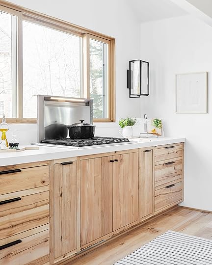
Because we went with the double oven, we didn’t need a range, so we went with Viking’s Professional 5 Series 36″ Wide Built-In Gas Cooktop and paired it with the brand’s 36″ Built-In Downdraft Ventilation System. I knew I wanted to have the cooktop near that beautiful Marvin picture window and didn’t want a hood, so the pop-up downdraft is an unobtrusive solution I’m pretty obsessed with. It has an 18-inch rise, two-level lighting so you can create your own illumination adventure and four fan speeds. Do note that you’ll need to build in room in the below cabinet for the downdraft to be stored as well as its mechanism, so there is some storage loss there.

The six burners range from super high output (18,000 BTUs in the front left burner) to 6,000 BTUs in the front right burner, though all of the burners have variable simmer options (that allows for different pot sizes and liquid volumes) for all those delicate sauces I whip on the regular (or delicate broths, of course). The knobs are really intuitive, so there’s no futzing around, plus I like that they are off to one side instead of in the front which keeps them out of reach of little hands.
Viking is a high-end appliance brand, and this range feels like it. There’s no “click click click” to ignite the flame, plus it re-ignites automatically if the flame were to go out at any point during cooking (say, if I open up that sliding window and a gust of wind comes in), and the porcelain-coated cast iron grate is really easy to clean.
Dishwasher:

Because throwing dirty dishes out the window instead of cleaning them every day is not an acceptable way of living by any means, we need the luxuries of a dishwasher. This is the Viking 24″ Setting Energy Star-Rated Built-In Dishwasher from their 3 Series, which also has an adjustable upper rack that allows for taller items on either the top or bottom rack. Customization, folks. That’s a true luxury. It fits up to 12 place settings, though their new, even quieter model (the FDWU324, which isn’t online just yet but will be adding in a few days), has a 14-place setting capacity. It has six cycles—posts/pans heavy soiled, China/crystal, regular wash, hour wash, quick wash (35 min.) and rinse/hold—and five options (express drying, sanitize to NSF requirement, high-gloss drying, half load, and delayed start up to 24 hours).
At 50 decibels, that means you can have a normal conversation standing at the island while it runs and you’ll barely notice it (it’s actually one of the quietest washers on the market right now). For context, 50 decibels are equal to the hum of a refrigerator. It also has something called “turbidity monitors” which “senses” how clean your dishes are so everything always comes out squeaky clean.
Wine Fridge:

Now that we’ve talked through your everyday appliances, it’s time to shift into the real fun (no kids allowed). How adult are you when you have a separate wine fridge? I’m pretty sure that means you’ve “made it,” right? This puppy (the EdgeStar 15″ Wide 26 Bottle Built-In Dual Zone Wine Cooler with Reversible Door) stores up to 26 standard size wine bottles on its slide-out shelving, has two temperature zones to chill reds and wines at their own particular temps (I feel so sophisticated saying that), a door that can swing either left or right, plus an integrated door lock.
Refrigerated Drink Drawers:

The peninsula is “drinks central.” We put in these Marvel 24″ Wide Built-In Refrigerated Drawers for Brian’s beer, fizzy water, juices and kid snacks and we LOVE them. It leaves the fridge space for actual food and larger items instead of cluttering shelves with La Croix and Go Gurt. The temperature settings (which you adjust on the top drawer) range from 34°F to 42°F, which means drinks will always be so cold they’re nearing freezing point without actually freezing over. This is my happy place. As cold as possible without being a chunk of ice. THIS IS THE FUTURE.

We use the top drawer for bar carry over (citrus, tonic and seltzer, beer, etc.) and the bottom one is at the perfect level for Charlie and Birdie to be able to grab apple sauce, cheese sticks or whatever healthy snack is there on their own (by the way, both drawers have that nice soft close feature so nothing bangs shut). They wouldn’t be able to reach anything in the refrigerator really at their current age/height, so this is their little spot.
According to the specs, these offer something called “Dynamic Cooling Technology” which equates to cooling things down almost two times faster than competitors, which is great for parties when you make a drink run and want to get everything nice and cold ASAP.
But, in case that’s not fast enough for you, let me introduce you to maybe my favorite thing in this entire kitchen…
Ice Machine:

Oh man does this thing make me happy. As soon as I found out it was an option, I could accept nothing less. It’s a NUGGET ICE MACHINE.
Viking, let this be my wholehearted thank you for thinking to make this amazing machine. You know that soft, chewy, pillowy, DREAM-LIKE ice you get at Sonic or Tijuana Flats or wherever else they’re smart enough to make you a loyal customer via their ice selection? This is the stuff.

Just look at those beautiful pillows of crunchy ice up there. The things true ice-lover fantasies are made of. It produces 80 pounds of ice in a 24-hour period and holds up to 26 pounds of ice at any given moment. Is it a necessary addition to a kitchen appliance plan? Well, no, but if you’ve always dreamed of having this restaurant-style ice at your fingertips, know that it’s a possibility and will up the fun ante of your kitchen and cocktailing by about 255%.

Again, I just want to give an enormous thank you to Build.com for working with us on these amazing appliances. Everything feels like SUCH a luxury (mostly because it is) and makes me want to just spend all my time in here whipping up stew after soup after bone broth. If you’re going to be doing a kitchen remodel soon, or swapping out your appliances, absolutely consider Build.com. They are super knowledgeable and their project experts are so helpful in helping you to find exactly what you want and need for your home. They’re available to talk (phone, email, online chat) every day of the week (and advice is always free, whether you’re a customer yet or not). Plus, their prices are honestly hard to beat, and once you order, you get a dedicated account manager that helps to streamline ordering, delivery, quoting and coordination. You don’t have to be a trade professional to benefit either.

All available through Build.com: Viking Refrigerator | Viking Double Electric Wall Oven | Viking Dishwasher | Marvel Built-In Refrigerated Drawers | EdgeStar Built-In Wine Cooler | Viking Ice Maker | Viking Built-In Downdraft | Viking Gas Cooktop
This wraps up all the kitchen posts. Phew, there was so much to talk about (hope you’re not tired of us yet). In case you’ve missed anything so far, we’ve done the big overall reveal last week as well as all the inside organization of the drawers and pantry this past Monday. We’ve been answering your questions along the way, but let us know what else you’ve got for us (or if we didn’t answer something specifically in the posts or from your comments).
*Photography by Sara Tramp for EHD
**This post is in partnership with Build.com but all words, designs and selections are our own. Thanks for supporting the brands we love that support the blog.
The post About Those Integrated Appliances in the Mountain House Kitchen appeared first on Emily Henderson.
April 3, 2019
9 Springy Front Door & Porch Combos That’ll Shake Away Those Winter Cobwebs
 photography by sara tramp for ehd | from: the portland mudroom & pantry reveal
We’ve reached that time of year finally where it’s okay to talk about the outdoors! Yay us! Yes, some of you might still be calf-deep in snow, and for you, we’re so, so very sorry (they said, soaking up the rays of Southern California). But things will turn around in no time, we know it. To pre-celebrate, we’re here today to talk about front door and porch appeal because the zeitgeist is telling us that people are ready to start thinking about sprucing up the front of their homes (even if all you have is a door). The last time you probably paid any attention to this area was around the holidays—heck, there still might be remnants of your wreath lingering between your pavers…the pine needle ghosts of Christmas past—but let’s shake off the winter cobwebs and usher in that vernal spirit.
We know that not everyone has the same amount of space to work with. You might have just a little patch and a door (maybe even inside a hallway of your apartment complex), or maybe you have a small patio where you can fit a chair (that will inevitably just be a landing place for your Amazon packages) and a potted plant, either way, we put together nine combos—these span three styles across three sizes of front door real estate—that we hope inspire you to do a little spring zhush.
Let’s take a look.
Front Door Style
 image source | design by arent & pyke
Living in an apartment rarely inspires you to put any effort into your front door situation, but we promise there’s something you can do to put your personal touch on the compact area to set your space apart from the same door happening right next door (because we all aren’t graced with insanely beautiful and character-ridden checkerboard marble stoops like the front porch above). A fun or graphic doormat, a small table (SO useful to perch grocery bags or packages if your hands are full) and a planter or two would be just enough to make you smile when you slink home after an interminable day at the office.
You can go the colorful eclectic route and bring in a spring-y wreath, lanterns and glam brass plant stands or keep it streamlined and modern with a tight black-and-white theme with plenty of matte black. Pick your own front door adventure!

1. Sunset Wreath | 2. Lantern | 3. Textured Planter | 4. Plant Stand | 5. Woven Planter Basket | 6. Rug

1. Wreath | 2. Doormat | 3. Small Fluted Planter | 4. Urn Planter | 5. Lantern

1. Accent Table | 2. Lantern | 3. Stripe Jute Mat | 4. Artificial Palm | 5. Ceramic Planter with Stand
Small Porch Style
 image source
Moving up in front porch square footage means you have some more room to up the style ante, whether that means bringing in planter boxes, umbrella stands, lighting, or house numbers (and a colored door never hurts). We love the natural texture on the chair in the colorful eclectic board below (and all the happy pottery which would brighten up any concrete corner), but also that pill-shaped sconce and brass hanging planter from the modern design makes our hearts pitter patter.

1. Accent Table | 2. Wicker Lounge Chair | 3. House Numbers | 4. Sconce | 5. Mat | 6. Square Staccato Pillow | 7. Bell Chime | 8. Textured Wood Planter | 9. Terracotta Planter | 10. Dash Planter

1. Side Table | 2. Chair | 3. House Numbers | 4. Lantern Sconce | 5. Doormat | 6. Throw Pillow | 7. Basket Planter | 8. Urn Planter | 9. Small Textured Planter

1. Accent Table | 2. Metal Chair | 3. House Numbers | 4. Outdoor Sconce | 5. Jute Doormat | 6. Diamond Pillow | 7. Brass Ring Planter | 8. Stripe Basket Planter | 9. Sphere Planter | 10. Footed Planter
Large Porch Style
 image source | design by camille styles
We see so many large front porches heavy on the rocking chairs and Adirondack seats (which we love), but we wanted to shake things up and give some new ideas for how to use the space in the front of your home should you have space to create conversation areas or a little outdoor living room. The black spindle bench in the traditional board still leans modern because it’s so skinny, and pairing it with a rattan stool, smooth white and gray planters, and cool matte door hardware keeps things feeling updated while rooted in classic style. The teak chairs from the modern design add lots of visual interest with their simple yet interesting silhouettes, a side table invites lingering with drinks or morning coffee, and the mix of finishes on the pots feels contemporary but just varied enough. And finally, in colorful eclectic, all those pillows and textiles make this read more “casual living room” than front porch (and who doesn’t want to add another “room” to their home?).
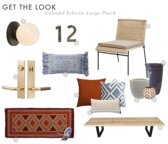
1. Sconce | 2. Cast Iron Numeral | 3. Wicker Armless Chair | 4. Door Hardware | 5. Blue Embroidered Pillow | 6. Copper Pillow | 7. Geometric Pillow | 8. Stripe Lumbar | 9. Ceramic Planter | 10. Pattern Planter | 11. Glaze Planter | 12. Diamond Mat

1. Wall Lantern | 2. Door Hardware | 3. House Numbers | 4. Rattan Stool | 5. Metal Bench | 6. Jute Border Rug | 7. Floral Pillow | 8. Linen Pillow | 9. Stripe Lumbar | 10. Urn Planter | 11. Radius Planter

1. Light Fixture | 2. House Numbers | 3. Chaise Outdoor Chair | 4. Metal Folding Side Table | 5. Door Knob & Lock Set | 6. Color Block Pillow | 7. Braided Mat | 8. Ceramic Planter with Stand | 9. Column Planter | 10. Brass Planter with Stand
Are you itching to refresh your front door situation? What other rooms or spaces around your home do you want us to tackle, combo or budget room style? Ask and you shall receive. Happy Wednesday, all.
For more exterior refresh ideas, head to our ROOMS page, and when you’re ready to do some shopping, we’ve got you covered in the outdoor section of our SHOP pages.
The post 9 Springy Front Door & Porch Combos That’ll Shake Away Those Winter Cobwebs appeared first on Emily Henderson.
April 2, 2019
How to Pull Off “Quiet Maximalism” With Target’s New Opalhouse Spring Line

A big part of our job as designers/editors/writers is to sniff out new trends, not because we live and die by them, but because they’re palate cleansers. The new kid at school everyone has fun whispering about because you’re bored of the same people you see every day. And what we’re seeing come down the pike lately is a serious shift into maximalism. This is not to say minimal, neutral rooms are “out” (hello mountain house) but color and pattern seem to be making a fast and furious swing back into our homes, and we’re not mad about it.
The aesthetic isn’t for everyone nor is it effortless to pull off in a sophisticated way, but guess what? We reinvented it using Target’s new spring Opalhouse collection (read: budget-friendly) to make it more relatable and so much easier to recreate yourself. It’s a look we’re calling “quiet maximalism”…you can even refer to is as “maximalism lite”…all the same flavor of the original, half the calories!
It’s like when someone goes FULL THROTTLE with their makeup, and while you applaud the confidence and boldness, you kind of want to pull them aside and give them a “make-under.” You’d use all the same products, just…not as much of them and with less pigmentation. That’s this look. Fully made up face but in a no-makeup-makeup natural vibe that makes you think “whoa, you must have just come from a two-week beach vacation where you had no cell service and definitely never checked your email.” (Boy do we love an analogy around here, huh?)
We’ll walk through each of these elements in every vignette we created below, but while maximalism embraces a general more is more mindset, quiet maximalism is like ::whispering:: more is sort of more. The key elements of the style include texture (and lots of it), a mostly neutral/curated color palette, a sprinkling of natural materials, a touch of glam and, of course, layers of plants and greenery. It’s about being restrained and balanced but visually lush and inviting. Alright, let’s do this…
How to Pull-Off “Quiet Maximalism” in Every Room
Bedroom

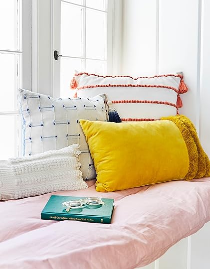
As you’ll quickly learn, texture is a HUGE component of quiet maximalism, especially in the bedroom. Here, while there isn’t a plethora of color, the room still feels layered, interesting, inviting, and that’s all thanks to your friend texture. We brought it in floor to nearly ceiling, starting with that amazing rug. The tassels, the nubbiness, the patches of shag…it’s so good it’d make anyone want to leap out of bed in the morning to plant your feet on.
At the opposite end of the floor is our DIY star of the show: the canopy. Have you noticed we’re really into canopies lately? We created a canopy “tent” in the kids’ room at the mountain house we outfitted with Target’s super fun Pillowfort collection recently, and we didn’t stop there. It felt right to bring one in here, IN THE NAME OF TEXTURE, of course. There’s a Pinnable DIY at the end of the post with all the information you need to recreate this, but in short, we used a sheer curtain fabric instead of a netting because we wanted it to feel refined and organic. The bells added that touch of whimsy every maximalist room needs.

The next stop on the texture train is all that bedding, which also plays into the “curated color palette” aspect of this style. While this could have been a flat cotton duvet, it wouldn’t have really spoken to the look we were going for so instead, we went with a crinkly, casual textile here. The blush hue is subtle and picks up the pinky tones from the rug and the velvet pouf (which you’re not seeing here, but is present in the first shot in this post…our touch of glam in this specific vignette).

Let’s stop and take a moment to talk about this amazing lumbar. It’s SO good and looks so much more expensive than it really is ($30, though on sale today only for $21). The raised shaggy texture creates a pattern that plays off the throw at the foot of the bed, the tassels are a fun, eclectic detail, but the tonal white plays down all those elements and keeps it as a textural element instead of a blatant pattern. SO GOOD.
Also, how sweet are these sheets? We love a delicately patterned sheet to level up a bed, plus the hint of black from the speckling and edging touch is grounding to the airy palette and instantly modernizes the room.

Bringing in some natural materials and tones is crucial to the breezy quiet maximalism vibe. That hanging basket planter from the new Opalhouse line is so fun and draws the eye up (as does the canopy, of course). Part of maximalism is engaging the eye wherever you look, so this was how we thought to fill the space top to bottom but in a way that wasn’t overwhelming or suffocating. A mix of seagrass (via the handled tray on the bed), rattan from the hanging planter and headboard, and caning in the nightstand make things feel cohesive without being too matchy-matchy. This new Opalhouse line makes it easy to keep things varied.

A touch of brass (or a metallic) is integral in quiet maximalism to layer in a bit of glam. We brought this in via the frame and the lamp, which is so dimensional and perfectly whimsical here. It’s a great counterbalance to the streamlined and natural caned nightstand.
And, as the final must have, we sprinkled plants (both faux and real) throughout at different levels (like we said, all about filling out the space from bottom to middle to top).
Sunroom Swing Area

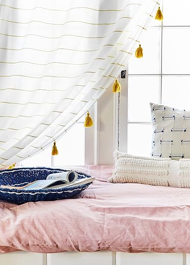
We’re officially obsessed with hanging swing chairs in interior spaces from this point forward. The price point on this one is excellent ($60) and it adds an unexpected moment to any room it graces (it would be particularly nice in a sunroom or even a living room). The off-white macrame brings in just the right amount of texture and is a nod to ’70s style, an old friend of maximalism.

For our curated, tight palette, we went with a base of cream and white but brought in a happy yellow in the curtain details (how fun are those tassels?) and grounded it with a deep teal throw. The hammered brass side table, with its interesting silhouette, feels worldly but adds to both the texture of the space and ups the glam factor.

Like in the sheets from the bedroom vignette, the black from the rug here adds so much depth and grounds the space, while the leopard-like pattern keeps things playful.
Bathroom Beauty Cart

There’s a certain loftiness that comes along with maximalism, and what’s more indulgent than a “beauty cart” or vanity area in a bathroom? It takes a purely utilitarian spot and turns it into a spa-like luxury. It’s downright Victorian, and you know how I feel about Victorian leanings (it gets all the thumbs up). To create our beauty cart moment, we actually repurposed a rattan bar cart (which would also be SO GREAT as its intended purpose) and borrowed that amazing velvet and fringe pouf (glam, check) from the bedroom. Can’t you just see yourself perched there, brushing your coif the recommended 100 strokes every night before slipping on a silky floral robe and sauntering into the parlor for a nightcap? This is a life I want to live on the regular.
And because the size on the cart (which ticks off the natural requisite here) is compact, it would be just right for a smaller bathroom or apartment.
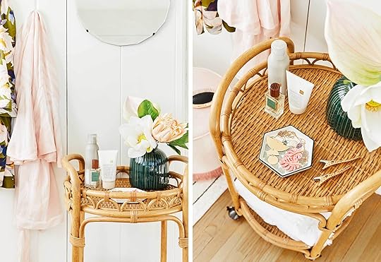
While you can certainly add other greenery, we loved these faux flowers. They played so nicely with the curated blush-and-green palette in this vignette, and, even better, they’ll never wilt on you.

While there’s tons of texture in this whole space (velvet, nubby rug, palm fronds, rattan), to create a true “spa” environment, you gotta bring in the towels. We love plain white towels normally, but we couldn’t pass up the textural and fringed details on these to really drive home the “quiet maximalism” vibe.
Desk Space/Office

Quiet maximalism doesn’t have to be just for bedrooms, bathrooms or living rooms. Bringing this highly textural, special style into a home office space or desk area actually works really well because it’s soft and tonal enough to not cause distractions, but layered and textural enough to stimulate.
Here’s how we checked off all the elements in this space:
Texture: The caning of the desk, the fringed, woven rug, the lace and fringe curtain details and the seagrass basket/planter.
Curated Palette: The majority of this space is neutral, but the plants, hanging ceramic and vase prevent things from looking too one-note.
Natural Materials: Most of the textural elements pull double duty here as well.
Subtle Glam: It’s not an EHD space without a touch of brass, which comes in in the edging of the picture frame on the windowsill.
Plants: We went faux here (seriously into that paper cactus), but using two different types of plants at different levels keeps things interesting and the eye moving.

Window Seat Reading Nook

Our final vignette we created in the quiet maximalist aesthetic is probably the most vibrant out of all the spaces, but it still follows all the rules. The palette is a bit more varied but there’s still really only three main colors happening here: yellow, blue and coral/pink. But because most everything is rooted in a neutral, isn’t doesn’t feel like a rainbow explosion.
Texture is everpresent in nearly every element here, from the pillows to the wreath to the blue basket tray.
It’s important to stop a moment and talk about this mix of pillows, because it’s a question we get asked all.the.time. To get that effortlessly thrown together yet awesome looking combo, here are some good guidelines to follow:
Rule 1: Vary pillow shapes and sizes. Here, we used a big squishy Euro size (normally around 26″x26″), a smaller 20″x20″, a chunky lumbar and a super skinny lumbar.
Rule 2: Mix up your patterns. For this vignette, we did two solids and two “prints”…one a stripe and the other delicate embroidery.
Rule 3: Introduce quiet texture. What is “quiet texture” you ask? Well, it’s a texture but done in a solid, like that mustard lumbar with the shaggy trim and the white lumbar. If these had any pattern AND all that tactile detailing, it’d be a little too much to take it. Pick your power moment.
I do realize that maximalism is not everyone’s style, but we think this “quiet” toned down version is so much easier to swallow and frankly, we’re crushing hard on it. For anyone who wants to amp it up, the new Opalhouse collection has so many more amazing products in bold colors and patterns, so if this is too subtle for you, be sure to check out the whole line.
So…what do you think? Which vignette could you see yourself recreating in your home? Are you into “quiet maximalism” or want to turn up the volume? We can’t wait to hear what you think.
For all the shoppable products, we put together the below Get the Look with everything we used here, but you can also find everything from each vignette directly on Target.com:
Bedroom | Swing Chair Area | Office Space | Beauty Cart | Window Seat
Happy shopping!

1. Textured Planter | 2. Tumbler | 3. Tassel Throw | 4. Pom Throw Pillow | 5. Hammock Chair | 6. Artificial Palm | 7. Rattan Planter Stand | 8. Woven Mules | 9. Accent Table | 10. Leopard Spot Rug | 11. Lace Trim Panel | 12. Ceramic Bird Feeder | 13. Writing Desk | 14. Tufted Velvet Chair | 15. Faux Cactus in Basket | 16. Utility Jacket | 17. Colored Pencils | 18. Stripe Woven Rug | 19. Artificial Lotus | 20. Artificial Anthurium | 21. Artificial Protea 22. Textured Vase | 23. Memory Book | 24. Frame 25. Rattan Bar Cart | 26. Sea Salt Air Dry Spray | 27. Weightless Shine Air Dry Crème | 28. Unisex Perfume | 29. Jewelry Tray | 30. Accent Towel | 31. Bath Rug | 32. Brush | 33. Fringe Ottoman | 34. Hair Clips | 35. Necklace | 36. Earrings | 37. Floral Robe | 38. Pink Robe

1. Artificial Palm | 2. Faux Cactus | 3. Wastebasket | 4. Bell Garland | 5. Headboard | 6. Duvet Set | 7. Macrame Window Valance | 8. Lamp | 9. Nightstand | 10. Parrot Frame | 11. Zebra Jar | 12. Jewelry Tray | 13. Bell Chime | 14. Round Hanging Planter | 15. Rug | 16. Lumbar Pillow | 17. Sheet Set | 18. Moroccan Throw | 19. Green Fringe Ottoman | 20. Pink Fringe Ottoman | 21. Napkin | 22. Woven Tray | 23. Marbleized Mug | 24. Candle | 25. Orchid Wreath | 26. Round Basket | 27. Square Textured Pillow | 28. Orange Stripe Pillow | 29. Velvet Fringe Lumbar Pillow | 30. Looped Stripe Lumbar Pillow | 31. Contrast Stripe Curtain | 32. Throw Bed
Wait, before we go, for anyone interested in the canopy DIY, we put together this Pinnable materials board and step-by-step. Let us know if you have any questions!

*Photography by Sara Tramp for EHD, design and art direction by me, styling by Emily Bowser with assistance by Julie Rose
***This post is in partnership with Target, a brand who we support completely and love partnering with.
The post How to Pull Off “Quiet Maximalism” With Target’s New Opalhouse Spring Line appeared first on Emily Henderson.
April 1, 2019
Inside All Our (Super Organized) Drawers & Cabinets in the Mountain House Kitchen

I’m pretty sure there is a support group for those of us who get an unnatural thrill from staring at the perfectly organized pantry. Previously I have only done so in the magazines (please read like on the internets) or at the . But thanks to my genius design team + NEAT Method + Target’s Made by Design line, we are dripping with tips on how you can design, organize and style your kitchen, including how to store EVERY SINGLE THING in the most efficient and frankly beautiful way possible. Or if you just want to know where I hide my kids’ sippy cups, we got that covered, too.
We’re going to go into every area and every drawer, but before that, we wanted to get all the deets from Krisztina Galambos, owner of NEAT Los Angeles, about her top five expert tips that anyone can use to get a super organized kitchen, regardless of how much space you have.
Tip 1: Take inventory, purge, categorize. Our process at NEAT Method is to start by taking everything out of a space, sorting into categories, measuring the space for bins/containers, purchasing products and then implementing them into the space. For the pantry, we recommend tossing expired items first to free up space. From there, create your categories for like items: baking, spices, snacks, pasta, canned goods, etc. If you can see everything you have, you are less likely to buy duplicates which means eliminating clutter. Decanting also helps with seeing everything, and as long as you find a brand with tightly sealed lids, it will preserve your food longer, too.
Tip 2: Find your flow. Think through how you move in your kitchen on a daily basis. You’ll want to place items in areas that create efficiencies so you aren’t walking in circles! There are obvious things like wooden spoons and spatulas near the stove, oven mitts near the oven, cleaning supplies near the sink, etc. but there are also questions we like to ask our clients about how they function in the kitchen that helps us understand how a space can be customized for them. For example, having sweet treats stored out of reach from the kiddos or storing serveware up high because it’s only used once a year when your mother-in-law is in town.
Tip 3: Win the war against tops. Where possible, keep bottoms and lids together (storage containers, pots/pans). If space is an issue, use drawer dividers and stack bottoms on one side; lids on the other in order vertically filed by height (we like to use bamboo dividers like these).
Tip 4: Help your kids help themselves. For those of you with families, we love creating a kids drawer of plates, cups and bowls (we did that here in Emily’s kitchen). Having said drawer where your kiddos can help themselves at mealtime is a great way to teach them independence in the kitchen. If there are any drawers you do not want them getting into (such as fragile items), consider child locks.
Tip 5: Conquer the “junk” drawer. We typically don’t like to recommend “junk” drawers, but there definitely needs to be a place for multi-use items like pens, scissors, batteries, keys, post-it notes, etc. A drawer divider tray is a great solution in a spot off the beaten path in the kitchen, and we try not to leave empty space for “stuff.” It’s best to decide what to do with an object right away instead of delaying the decision by “dealing with it later.”
I know you’re just itching to see the inside of all my drawers, but first, we asked Krisztina what her can’t-live-without kitchen org products (and what to skip) and here’s what she recommended: “Our must haves definitely include bins/baskets, lazy Susans, risers for canned goods, drawer dividers and labels! If on a budget, maybe skip decanting as this can add up quickly.”
Okay okay, let’s open up those drawers and cabinets now:
Cooking Central
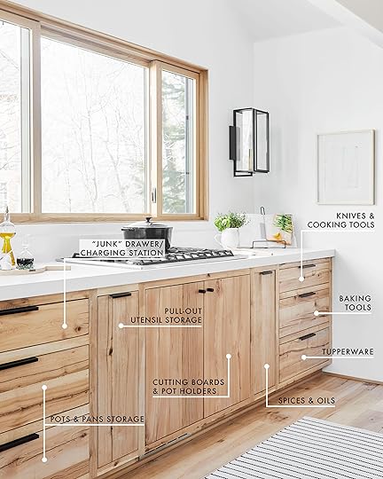
There have been so many soups cooked here, guys, and since everything is SUPER organized and exactly where I need it to be when I need it, that souping has been nearly effortless. We labeled where it all goes in this area above, and it’s really so great not having to run around the kitchen to find the top to a certain pot or containers to put away leftovers. Three cheers for kitchen org!
I knew I wanted a window here, which meant less uppers, so it only made sense to put in deep drawers for pots and pans, dishes, etc. We toyed with having this be a cabinet front with drawers you pull out, but that was a two-step process to get what you needed, while this was just one: pull open the drawer you need and boom, done.

To the left of the cooktop are all the pots and pans (with every lid that belongs to each pot paired so there is no digging around) as well as our “tech” drawer (this is NOT a junk drawer…yet).

Our cabinet maker built in a charging strip so our phones, laptops and tablets could be tucked away here (away from cooking splashes and spilled juice cups), and if you’re currently renovating, THIS IS THE WAY TO GO FOLKS. The left side of that drawer has a removable top compartment, so the top part is where we keep all our “office-y” stuff and down below is a handy tool section. NEAT Method kept it all organized with Made by Design clear dividers. My goal was to come in, drop off my phone and laptop and not touch it over the weekend and my theory was that If I didn’t see it, I wouldn’t check it mindlessly.
This house was meant to be minimal, and the kitchen’s focus was just all that beautiful wood and crisp countertops, so I didn’t want to get clutter body by having a utensil canister up top, hence the pull-out drawer to the left of the stove that has different “cups” to hold all our whisks, spatulas, ladles, etc.
The above photo was taken before the drawer-within-a-drawer was inserted above the utensils. If you are thinking “geez, that’s a lot of wasted space,” you are right and our cabinet maker simply forgot about it but it’s now installed, don’t worry.

The downdraft of the stove takes up a good portion of the left side of the cabinet underneath it, but on the right side, we took a pan organizer and used it for all my cutting boards, and added small hooks to the door frame for pot holders and trivets.

Hold on…I want to ask everyone: are you a butter on the counter or refrigerator person? I know this is polarizing, and both have merits (soft, spreadable butter 24/7 vs. you know…food safety??) but please tell me. We are VERY warm, spreadable butter people over here and believe strongly in butter dishes (though note, we kind of just grabbed this pretty container for the shoot, but it’s a bathroom organizer, and not sure whether it’s food safe).
Okay, back to org lust. The pull-out two-tiered drawer to the right of the stove is where we keep all the spices, oils, vinegars, shelf-stable sauces and below. There’s plenty of clearance on the bottom shelf for anything that might be super tall (this was intentional because we are sauce and oil heavy over here). Decanting is my life mission, forever and always, but I’ve never done it with spices before, thank you NEAT Method. Those come in all kinds of shapes and sizes, so getting cohesive containers keeps it all visually pleasing, plus the labels on the tops make it super easy to find what you’re looking for. I think it’s not as necessary as other decanting, but for me it’s more about the labels on top. Why don’t all spice companies just put labels on top, too?
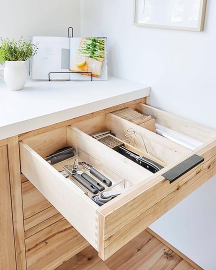
Moving over to the far right are all the drawers with kitchen tools, baking sheets and tools, and food storage.

The knife holder, again, keeps things off the counters, which makes me very very happy. FYI, all these things (the can opener, garlic press, masher, etc.) are all from the Made by Design line, and I love how they all coordinate and are all similar in size (makes putting them in a designated divider so much easier). The price point on these are SO great and work really well/feel solid. I splurged on the cabinets, I didn’t need to splurge on the tools (and while I do have a budget at Target for these posts, I had actually bought most of them in December because I knew we would be living up there). My goal was to match and not be expensive.
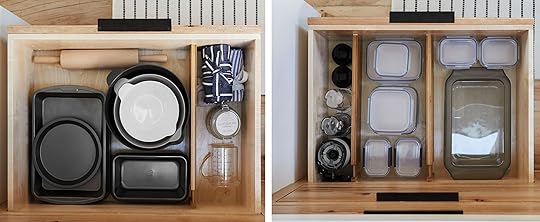
We didn’t really have storage near the oven for all the baking stuff, so it went here, but because I’m not using this stuff every day, it works just fine for my “kitchen flow.” Also, can I recommend something that will make your life so much easier hence happier? Get yourself coordinating sets of food storage, instead of all those rogue repurposed takeout containers or mix-and-match stuff that’s all different colors and shapes. When everything can be stored together and properly, you’ll avoid that inevitable avalanche of tops. And I much prefer glass over plastic because I can heat up leftovers without transferring.
The Wall Unit

I knew I wanted a full-wall unit like this one, where all the appliances were hidden away and I had an actual pantry (our LA kitchen doesn’t really have a pantry…it’s just a cupboard with random empty granola bar boxes).
Before we reveal that glorious pantry, let’s start over on the left:

Backstory: we actually intended this to be at least 12 inches wide with pull out drawers for more food storage (you might remember from this kitchen functionality post) except there were some things we didn’t plan for and had to make some adjustments. We were left with this sliver which isn’t ideal, but it actually works for keeping oven mitts, extra cookie sheets and “auxiliary” things like cupcake liners and sprinkles. Extra storage is extra storage, so we made it work but the proportion of that cabinet is HILARIOUS.

Directly to the right of the double oven (which is hidden behind all that beautiful Ross Alan Reclaimed Lumber cladding) is the coffee and tea bar. There’s a built-in outlet so there’s no need to pull out the coffee maker when we want to use it. The doors tuck back in, so we usually just leave this open all morning while we’re up here, then close it up when we move on from caffeine to adult happy hour.
[image error]
Under the coffee bar is our small appliance storage and while some people might think it’s odd to have a microwave this low, it doesn’t actually bother me. Plus, if the kids want to make popcorn, they can reach (with adult supervision, of course).
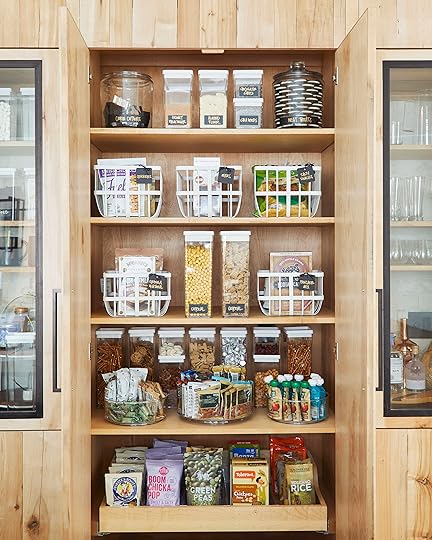
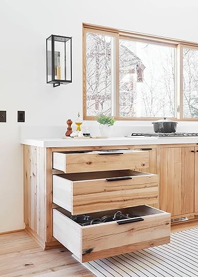
Oh man. I think we all know I didn’t do this alone. NEAT Method really delivered here and I just want to sit and stare at this all day. With all the constant grabbing of food and snacks (and kids’ hands), it doesn’t always look like this, but it’s kind of fun to try to keep it this organized. All the drawer dividers, lazy Susans, cereal and snack sealed containers and baskets make it MUCH easier though to get it all back to tip-top shape. I have SUCH pride for this pantry cabinet, I force all my guests to sit and have me show this off to them when they visit (you’ve been warned).

We’ve never thought to use lazy Susans like these and they are a game changer. Everything is so easily accessible, the kids can spin them to grab their snacks and everything is visible. Same goes with the air-tight storage containers from Made by Design. I LOVE THESE THINGS. I’m not great at clipping bags and boxes to keep things fresh, plus I always just forget I have stuff, so I end up with four bags of open almond flour, half tipped over. Yes, buying containers to decant can add up fast, and it’s an investment, but I find that I buy fewer multiples of things because I can SEE things. Plus, they keep food fresher longer (LOVE the cereal containers), so there’s less food waste. I want to start buying more in bulk to also reduce packaging in general, so it’s an initial spend but will eventually spend less by buying in bulk.
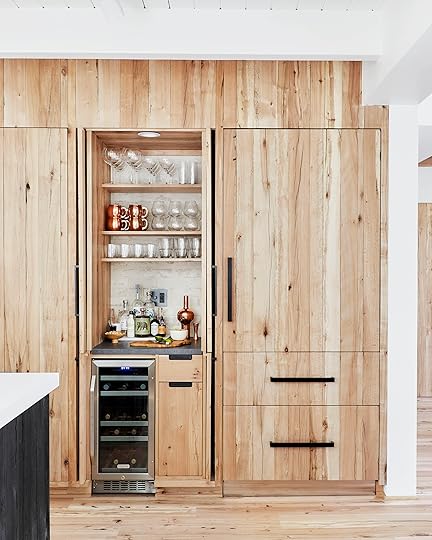
Next is the dry bar which we outfitted with a dark stone from Bedrosians. I typically keep a small cutting board in here to cut citrus for cocktails, pretty bar tools, pretty bottles and all the glassware I need for “happy hour.” Should I need to bring in a blender to make something frozen, there’s an outlet (with that amazing bronze Forbes & Lomax) here, as well as that super sexy dimmer switch.
We went back and forth between whether to do a bold tile back there (which you can see through the glass cabinet doors here and in the coffee bar) or a simpler textural brick, and ultimately landed on the brick (from Bedrosians) and I’m so happy with it. It’s just enough texture to keep it interesting without stealing attention from the wood.

We didn’t get a great photo of it, but the drawer under the double oven cabinet is where I store bigger bowls, serveware and linens for the nearby dining room and the drawer under the bar is for larger bulk bottles of drinkies and bar tools.
The Island
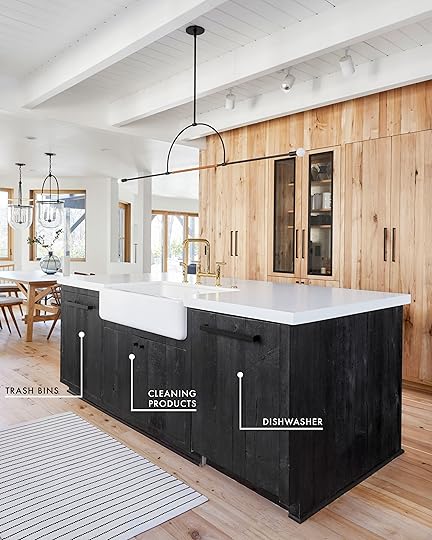
I spend so much time hanging out at this island (there are barstools on the other side where people perch all day) mindlessly tidying anything that ends up in the sink as I chit chat with guests so I love how visually simple it is with the hidden dishwasher and the trash bin compartment (instead of having a trash can against the island, hiding the special ebony stained wood).

We had trash bin and recycling compartments built in with a side section to hold all the bags. There was enough room to put up a hook for a small brush and dustpan.

Under the sink are all our kitchen cleaning supplies (dish soap, sponges, brushes, cloths, etc.), a towel rack for a hand towel and a higher up little shelf for more brush storage. I don’t normally keep the dish pods that accessible because with little kids, that can be a hazard, but if you don’t have small children, this is a great way to further decant and know at an instant glance if you’re running low on anything.
The Peninsula

The last “arm” of the kitchen is the peninsula, which is part adult and kid plate storage, part drink storage (there is my dream nugget ice maker in the middle and refrigerated drawers for snacks, juice boxes, beer, etc. at the far left).

Like I said, there are no traditional “uppers” in this kitchen, so drawer storage was the way to go for us in terms of plates, bowls, etc. To prevent things from banging around inside and breaking, our contractor installed this peg system which we love. You can move around the pegs based on the size of your dishes or what you’re storing and they’re awesome.

And while I love a mix of vintage and handmade plates, they can either look messy or just waste space generally. This simple set from Made by Design keeps everything looking cohesive, plus they are super light and stack SO well and tight, so it takes up very little space. It’s affordable, durable and works really great for our family up here.
That bottom drawer is where we keep the kids’ plates/cups/silverware and napkins and it’s so convenient. They can help set the table, help unload the dishwasher because it’s all easy to reach and feel like they’re contributing.

And now you’ve seen inside everything (well, except for the refrigerator and oven…more on appliances soon).
Thank you again to NEAT Method who did such an incredible job getting me organized and maximizing space in this kitchen. There’s a place for everything and everything tucks away into its space. I feel like the luckiest person on the planet.
If you’re ready to tackle your cabinets and drawers, seriously check out the Made By Design line from Target. Also, a quick tip is don’t just look in the kitchen section. We hit up the bathroom storage section and general home storage and org collections, too. Get creative and just find the shapes and functions you need, regardless of the room.
As always, let us know in the comments if you have any questions, and browse through the below Get the Looks we put together with all the product we used (and loved).

1. Two Tier Server | 2. Metal Wire Basket | 3. Black Mug | 4. Tall Tumbler (set of 6) | 5. White Mug (set of 6) | 6. Wine Glass | 7. Coupe Glass | 8. Moscow Mule Mug | 9. Wood Tea Cup | 10. Travel Mug | 11. Champagne Flute | 12. Glass Straws (set of 8) | 13. Japanese Style Jigger | 14. Cocktail Shaker | 15. Tea Cup | 16. Cocktail Picks (set of 8)| 17. Old Fashioned Glass (set of 8) | 18. Stemless Wine Glass (set of 6) | 19. Long Coffee Spoon | 20. Expandable Drawer Organizer | 21. Vessel | 22. Cutting Board | 23. Canister | 24. Black French Press | 25. Drawer Organizer | 26. Black Flatware (5 pc) | 27. Spoon Rest | 28. Book Easel | 29. Bowl | 30. Salad Plate | 31. Dinner Plate | 32. Pasta Bowl | 33. Tall Storage Container | 34. Small Storage Container | 35. Pot Holder | 36. Spinning Organizer | 37. White Tumbler | 38. White Square Plate | 39. Organizer Set | 40. Terry Dishcloth (set of 6) | 41. Shelf | 42. Drying Mat | 43. Pot Holder and Oven Mitt | 44. Cabinet Turntable | 45. Tea Towel | 46. Food Storage Container (12 pc) | 47. Pan Organizer | 48. White Basket | 49. Spice Jar | 50. Spice Jar Label | 51. Bathroom Tray | 52. Knife Dock

1. Tongs | 2. Pasta Server | 3. Serving Spoon | 4. Slotted Spatula | 5. Solid Spatula | 6. Electric Tea Kettle | 7. Pour Over Coffee Maker | 8. Coffee Maker | 9. Strainer | 10. Can Opener | 11. Measuring Cups | 12. Mixing Bowl | 13. Toaster | 14. Dutch Oven | 15. Measuring Pitcher | 16. Cooling Sheet | 17. Box Grater | 18. Jumbo Cooker | 19. Skillet | 20. Jumbo Cookie Sheet | 21. Pizza Pan | 22. Cookie Sheet | 23. Rolling Pin | 24. Wood and Silicon Spatula | 25. Wood Turner | 26. Wood Slotted Spoon | 27. Wood Slotted Spoon | 28. Loaf Pan | 29. Muffin Tin | 30. Garlic Press | 31. Masher | 32. Scrub Brush | 33. Round Cake Pan | 34. Dish Brush | 35. Dutch Oven | 36. Sauce Pan | 37. Sauté Pan | 38. Hand Broom and Dust Pan | 39. Cake Pan
***Photography by Sara Tramp for EHD
*Catch up on all mountain house posts here, and don’t miss the first reveal of the kids’ bedroom here or the kitchen here.
The post Inside All Our (Super Organized) Drawers & Cabinets in the Mountain House Kitchen appeared first on Emily Henderson.
March 31, 2019
The Link Up: We Are Getting Serious About Summer Prepping and Soul Cleansing
 image source | design by Elizabeth Roberts and John Erik Karkula
This week we thought a good ole fashioned checklist would be a nice way to check in given that it’s the last day of the month…
Weather: Great. (happy dance) Perfectly springy, plus California is (mostly) no longer in a drought!
Shoots: Lots and great. (all the thumbs up)
March Blog Posts Recap: Such an amazing month full of posts we’re really proud of and you guys seemed to enjoy. (THANK YOU!!!!!!!!).
Serious Plans to Relax: Already in motion.
We are great and hope you are, too. This week, we are all VERY excited about our 15 recommendation so let’s get to it.
-Everyone has been DMing Emily like crazy the last few weeks asking about her “glow” and skin in general, and she says it’s all because of this Pixi Glow Mist. From Emily: “I’m almost out of this stuff because I use it a few times a day. Sometimes I blend it in with my foundation but many times I just refresh my face with a spritz and yes, it makes me glow.”
-Another Emily favorite this week comes from the Goop Podcast, which she loves, but a recent episode with Dax Shepard really got her good. They talk all about triggers and self-esteem. Topics we all can relate heavily to. She wants you to go listen now.
-Arlyn said she DEVOURED Catastrophe on Amazon Prime a few weekends ago, and the new (and final) season just came out earlier this month (she finished it in a day). It’s hysterical, SO relatable for anyone who’s ever been married or in a long-term relationship, and she’s so very sad it’s now done.
-Michael bought the most delightful, light and airy cologne. He knows scents are a very personal thing and they smell different on everyone. But this one just makes him so HAPPY whenever he smells it. It’s unisex and here’s the description they have (how fun does this sound): a fragrance inspired by the salty air and fresh waters from boating trips outside Trekroner Fortress at the entrance to Copenhagen’s harbor.
-This week’s house tour is from our dear Grace and it’s of the one and only Maggie Gyllenhaal’s home. She basically obsessed with the bathroom in this home tour (that mirror! And all the tiles!). She’s pretty sure that she’s saved it on Instagram three different times by now. I think we all have “that room” in our saved section.
-Veronica bought the NYX Ultimate Eye Shadow Palette a few weeks ago and she is in LOVE. It comes in six different options—Brights (the one she owns), Warm Neutrals, Cool Neutrals, Smokey & Highlight, Phoenix (fiery reds and corals), and Ash (cool grays and blues). She can only speak personally about the Brights option, but she said it makes getting ready in the morning so fun!! It’s great for everyday wear as well as nights out with friends or date nights.
-Ryann takes Natural Factor’s Stress Relax supplement every day and she says it has really helped with stress and anxiety + it increases mental focus. 
March 30, 2019
7 Items I Bought Recently (and LOVE, LOVE, LOVE)

 photography by veronica crawford for ehd
I’ve been purging my wardrobe lately but also maybe doing some shopping, mostly because I felt like I was in a rut, but also in the name of these Saturday fashion posts. So today I want to share with you guys a few things that I LOVE LOVE LOVE that I recently purchased, starting with that Levi’s jacket (above). It is the perfect year-round (nighttime) coat that makes me feel a little bit like a badass. I’m pretty sure I had it in high school, too. It’s just cool and despite the sherpa lining, it’s very slimming because of the crop cut. I am a BIG FAN.
photography by veronica crawford for ehdNext, I got this romper from Urban Outfitters and as you can tell I feel very pleased with myself. It’s super comfy and it’s just one piece of fabric, which mentally makes my life easy. There is no outfit to put together. It’s just THAT. It does run super small so size up (I’m wearing a medium).
 photography by veronica crawford for ehd
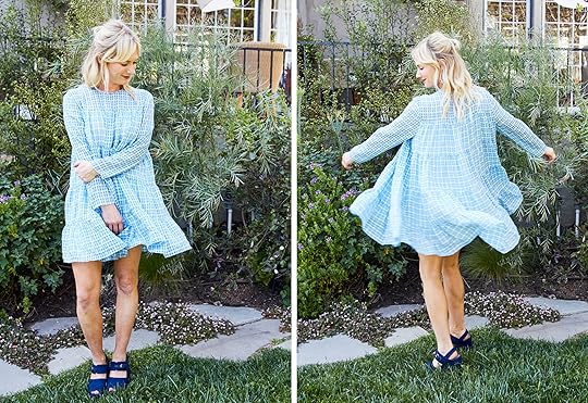
Then we have a dress I am really happy I got. I’m doing an Easter dress post (you know, for my return to a church, as one must embrace any ritual to dress fancy) and some of the dresses I ordered came early. I am telling you guys, I absolutely LOVE this dress. I think I’m going through a baby doll/generally dressing like a small toddler phase but I swear I’m not alone. It’s a thing. In retrospect, I don’t like those shoes with it (I think). But here is why the dress is great: It’s slimming in the shoulders and arms, but crazy voluminous everywhere else. There is a slip lining that falls more straight so even when you twirl (as you do) the slip stays put to avoid any, ahem, embarrassing moments.
I admittedly like wearing short dresses but this is really only possible because of the invention of the spray tan. I want to give a shout out to Brittany (my spray tan expert) because that tan you see up there lasted OVER a week. I normally go to a local place and do Versa spa (level 2 with bronzer if you want to know) but it usually only lasts 4-5 days (and comes off unevenly). I’m normally cool with it because its affordable and fast (for reference: I have a membership for $60/month and I go weekly and I’m in and out in 5-6 minutes.) But then my friend was going on vacation so she wanted the real deal so I had Brittany spray me, too. The second day I was super tan, like VACATION tan, but as it mellowed out it looks pretty darn great. Anyway, if you are in LA she just opened up a store in West Hollywood called Be Bronze Studio. Tell her I sent you.
Alright, moving on. These last four products I didn’t get a shot with me in them, but I’m including them because I bought them, I DO love them, so I want to recommend them.

1. Ray-Ban Sunglasses: I finally bought new glasses which I am very excited about. I decided to veer away from my usual aviators and I am loving these guys. I think they are a good frame size for my face and they are a nice mix between classic wayfarers and aviators.
2. Ruffled Embroidered Blouse: I posted an IGTV video the other day and a LOT of you asked where I got the blouse I was wearing. It’s from Zara and like most tops, I love that it’s boxy (shocking) but also very flattering in the arms and shoulder. Plus, it has this lovely embroidery that feels very appropriate for spring/summer.
3. Sundry Le Soleil Pant: I am really loving these pants that I recently got from Sundry. They are a super cute boyfriend straight-leg cut, and extremely comfortable. The stripe on the side and rope belt add a little extra flair but otherwise, they are very casual and cozy. Weekend mom pants, FOR SURE.
4. Carla High Neck Blouse: Let me introduce you to one of my all-time favorite shirts. It’s safe and easy to wear (blue! stripes! blouse-y!) but those ruffles and the Victorian neckline are special. I do a half tuck and it’s super flattering and I feel really good in it. It is, however, a splurge.
Alright, that’s it folks. A short and sweet Saturday read. But before I go, we are gearing up for Earth Day and want to feature brands that care about the earth, whether beauty, fashion, farms, home, basically any that considers the impact it has on the earth and treatment of animals. So if you know of any that you can vouch for, please comment below and let us know so we can research and feature!
The post 7 Items I Bought Recently (and LOVE, LOVE, LOVE) appeared first on Emily Henderson.
March 29, 2019
Power Couples: How to Expertly Pair Curtains & Rugs (+ 30 Combos to Try)
 designed by courtney bishop
Apparently, I have a pretty intense fear of pattern combo-ing (outside of a classic grid, of course). This was profoundly brought to my attention when Arlyn assigned this post to me. After my momentary panic (clearly marked by my eyes opening as big as possible while I exhaled a “sure, no problem” in a medium pitched squeak) was over, I thought that what better way to get over this insane “fear” than to dive in head first into as much pattern combo-ing as my little plain white linen heart could take. I’m sure you feel super safe in my hands now. But I think my initial hesitation only works in your favor because I have rounded up options that both the patterned obsessed and patterned avoider can both love as I am more or less in the middle…as any true balanced Libra would/should be.
Let’s first go in hard with the pattern on pattern combos. Ready to see what I came up with???
 photo source | designed by pierce and ward
WAIT. First, in true EHD fashion, let’s talk rules or, better yet, guidelines when it comes to pairing patterned rugs and curtains.
1. Scale, scale, scale. Mix them up! This is probably the most important guideline. If you have a large scale pattern on your curtain, you’ll want to choose a rug with a small scale pattern and vice versa. This way, your eyes won’t be in visual overload and it will give your space dimension.
2. Consider your color palette. This is kind of a no brainer and is a rule for all three of our categories today but just make sure your colors at least talk to each other. Choosing a bunch of random colors won’t look cohesive and will probably be visually overwhelming.
3. When in doubt, just go for it. Okay, so this isn’t a “rule” more than a good piece of advice. Pattern on pattern can be intimidating, but as long as you love what you’ve picked out and considered the previous two guidelines, then just do it.
4. Don’t be too matchy. If you have a floral curtain, avoid going floral in your rug. Same goes with geometrics. You can pull it off if the scales are different enough and you have more going on in the space, but you want to side step being too matchy-matchy here to feel natural and not forced/amateur.
Okay, now let’s get into the EHD-approved pattern on pattern recommendations:
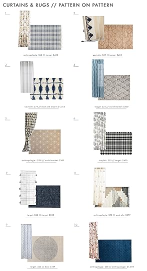
1. Light Floral Curtain // Blue Plaid Rug | 2. Embroidered Border Curtain // Diamond Wool Rug | 3. Striped Curtain // Blue Grid Rug | 4. Blue Patterned Curtain // Diamond Wool Rug | 5. Diamond Curtain // Lattice Rug | 6. French Toil Curtain // Black Plaid Rug | 7. Tassel Curtain // Leopard Print Rug | 8. Embroidered Curtain // Multicolored Rug | 9. Vines Curtain // Circle Rug | 10. Pink Florals Curtain // Blue Rug
My personal favorites are #1, #2, #5 and #8.
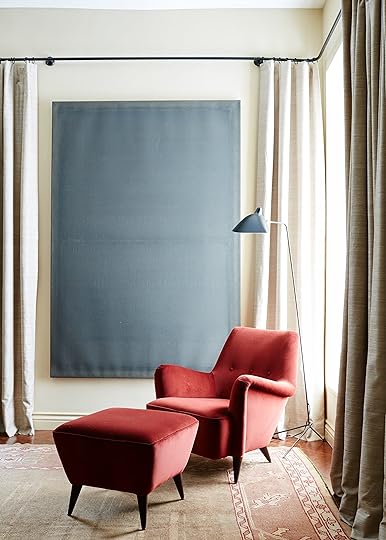 photo source | designed by billy cotton
That last category was like a peaty scotch that smacks you in the face (in a great way) but now let’s take it a little easier with some easier drinking. If that just went right over your head I am now taking you onto the pattern + solid combos. Still fun but a little more palatable to the pattern adverse. But first, rules…
1. Pick your moment. We typically love a bold patterned rug and solid curtain but if you have patterned furniture then a patterned rug might not be the best choice. However, a fun complimentary curtain might be. It’s always about balance.
2. Keep it interesting. You don’t need to always go for the safe white curtain. I’m also talking to myself here. Pick a color, even in a textured fabric like velvet. A great way to choose a color is to look to your rug for one of the more subtle colors. It will be more of a visual surprise and also bring it out in your rug.
Combo time…

1. Forest Green Linen Curtain Panel // Wool Cotton Boucle Rug | 2. Linen Curtain Panels (set of 2) // Color Block Tufted Rug | 3. Aina Curtains (set of 2) // Scale Natural Jute Rug | 4. Tasseled Moira Curtain // Bella Rug | 5. Velvet Curtain Panel // Stockholm Flatwoven Rug | 6. Honeycomb Light Filtering Curtain // Pamela Wiley Zigzag Rug | 7. Belgian Linen Curtain // Alrik Rug | 8. Fringed Linen Curtain // Mosaik Teal Rug | 9. Concentric Squares Curtains (set of 2) // Raymie Rug | 10. Tie Tab Window Panel // Patchwork Design Rug
Yikes, I don’t know if I can choose a favorite. But if I HAD to then maybe #1, #3, #6, #10. But as you can see, each one has a dominant piece (mainly the rugs) and most of the colorful curtains were chosen by the least assuming color of its rug buddy.
 photo by tessa neustadt for EHD | from: the design milk family room reveal + get the look
This last roundup was unexpectedly challenging because how does one make a solid rug and solid curtains interesting without the furniture and decor getting involved??? Well, I figured it out and here are my secrets…
1. Vary up the texture. It’s the quickest and easiest way to keep it solid and visually interesting. This works particularly well if you’re going with neutral on neutral. For instance, a velvet curtain paired with a chunky woven rug, or a textural linen drapery combined with a raised tonal tufted pattern on a rug.
2. It doesn’t have to be all neutrals. If you don’t want a lot of different textures then have fun with color. Whether it’s high contrast (two very different colors) or tonal (two very similar colors). It’s an easy way for the space to look very cool and pulled together.
3. Follow all the rules at one. Doing both of the above rules together (texture and color) is also totally great.
March 28, 2019
How We Staged a House (To Sell) With Soul + Some Sneak Peeks

The EHD team just wrapped a staging/styling project in Eagle Rock (goes on the market tomorrow) that we are so proud of and today we are giving you sneak peeks and talking about how to give a house some soul, even while trying to sell it to the masses (though they can absolutely apply to any house that needs a little styling love). There are some pretty special things about this house and I wanted to shoot it for the book (those photos are to be kept a secret) so we teamed up with The Platform Experiment (an actual staging company) as well as some of our favorite vendors—Article, Lulu & Georgia, Serena & Lily, MidcenturyLA, The Citizenry, Shelfology (those super thin and awesome steel shelves up there are by them), and Lost & Found—to design, style, stage and shoot the entire house over two months. It’s not typically our business model to work for free for weeks just for pretty photos of styled out spaces, but we got a lot out of this special house that we are excited to show you so IT WILL BE WORTH IT (what we chanted throughout the whole process).
How to Stage a House With Soul to Sell
There are a lot people out there that will opt for, even fight for, a house with personality, style and soul and they will sacrifice space and function for it. Hell, have you met my closets? Our FULL of soul and charm has the tiniest closets ever and I knew it and didn’t care because I wanted that house. But what if your house doesn’t have that much innate charm? Can you still style it with soul? YOU BETCHA. Here are some tips to help you stage or style whether your house has an inherent charm or not:
Give Your House a Muse.

A muse is kind of a more romantic (if not pretentious) way of saying a “theme” but more in the scope of a city an actual person. In this case, it’s a Modern New Orleans with a California bent. This means more old world antiques, deeper jewel tones, warm pinks, greens, and blues (carpet and a room you’ll see) and some drama throughout. But we’ve chilled it out with a lot of neutrals to give your eye a rest and some more streamlined pieces with hits of black to make it feel edgy and cool.
You might recognize that living room from the Target fall shoot we did there, where we rented out this house (how I learned about the location), and here it’s transformed with my favorite sectional from Article (I have the linen version up at the mountain house). The owners William and Amanda already had that pretty rug, and then we recovered their vintage chair from MidcenturyLA in a white Crypton fabric (those lines! so pretty). The wall sculpture is a collection that he found on a set he was working on and we, well, just hung them on the wall. Remember, a collection has a lot of impact when it’s displayed the right way like this. It’s just wood blocks, but it looks so cool.
Mix in Vintage and Antique Pieces.
Nothing groundbreaking here, just your daily reminder that vintage and antique pieces have good, storied energy that will make your house feel more like a home and give it soul. Where a piece of furniture or rug has been provokes an emotion in us that a new piece just can’t. Between The Platform Experiment, the rug dealer (CorreMarie) and our own collection (plus what William already had), this house had SO much beautiful vintage. We borrowed that chair from MidcenturyLA and I want that painting SO BADLY (perhaps a gift for designing/styling your house for free?).
Balance That Vintage With More Streamlined Pieces.

In order for a house to feel balanced and therefore be attractive to as many people as possible (what you want when you are staging), you want to hold the reigns on having too many decorative details. That antique lamp needed to be balanced out with a modern, streamlined side table and a simple upholstered bed (both from we borrowed from Lulu & Georgia). William found that textile tapestry at a flea market and hung it to draw your eye up (I’m still on the fence about it, wishing that the black parts weren’t so high contrast though I understand that traditionally, Kuba cloths are), but also please note the pendant, in the original style of the house. By the way, that exposed turret ceiling you see (round, so special) was previously just your average 8-foot ceiling. ISN’T THAT CRAZY? They busted through and exposed it and it’s just stunning. I know you are dying to see more of this house, I’m sorry!! We have to have a lot of original photos for the book so I have to hold them (and it’s hard to do, folks).
Rethink Your Dead Zones.
This “home office” is actually just a basement that we turned ad hoc studio/office space and it’s soooo cool. William and his team had worked down here at some point, but it was a storage room when we started the project. They put in a window a while ago, but mostly they just painted the ceiling black (to disguise the pipes, etc) the walls white and poured new concrete. We will be doing a whole reveal of this room as it doesn’t really fit in the book so stay tuned for that in the coming weeks. We borrowed those desks from Lulu & Georgia (so great, with a lot of hidden side storage) and warmed it up with the chairs, also from Lulu & Georgia.
For this space, we used William as our “muse” and styled it out with drawings and props from his career. Again, more on that later. Okay fine, ONE MORE:

MAN. I love that shot. That was wasted space (a “dead” zone) so they put up wood with what seems to be venting but how insanely cool does that look? VERY. The dining chairs (from Article) bring in that cool edgy matte black via the leg frames and leather seat.
Don’t Be Afraid to Take Some Risks.

A pink room to stage and sell a house? IT’S OKAY. At this point, whoever buys this house will likely be REALLY into it and it will be an emotional purchase. It will be someone who gets this style and normally people who “get style” also know how easy it is to repaint a room.
But this room color is SO pretty so we couldn’t bear to paint it back to white (it’s Benjamin Moore’s Odessa Pink). We had an abundance of eclectic art so we went with a gallery wall up over that antique style daybed from Lulu & Georgia (which fit perfectly in this smaller room). We let the gallery wall be the focus and kept all the textiles more simple and neutral (all of those are from The Platform Experiment as is the side table—they have such great pieces with a lot of character and soul).
So yes, we took a risk and added even more drama to a pink room but it’s an absolute JOY to be in and has so much depth and interest, even though it’s on the smaller side.
And we didn’t stop there…
It’s Okay to Be Bold.

I’m still under the impression that almost everyone loves blue so I think this is not only okay to do but actually something that can really add value. We will be doing a whole post about how to create a super chic moody bedroom and why this works (versus just looking like a cave), so again (sorry), stay tuned. But I had to show you this shot because it’s so editorial and dreamy (as is that chair we borrowed from Lulu & Georgia, draped with that tasseled throw from Serena & Lily).
There is so much more that I can’t wait to show you but I have to hold on more photos for the following reasons:
A. Not all the images are edited (but we wanted to announce the sale) so those of you in LA could go to the open house.
B. We are saving some posts for full reveals coming soon!
C. We have to save bathrooms and kitchen for the book. We don’t want you guys buying the book and then being like “wait, I’ve seen ALL OF THIS.” As someone who is notoriously bad about keeping a GOOD secret (I can keep your bad ones), this is hard for me.

If you live in LA and want to take a peek at in person, or if you are in the market for a very family-friendly, beautiful, special house with a view and a flat back grassy yard, head to an open house this weekend they’re having (we’ll link up the information as soon as it’s live so come back later today for that). I have nothing to do with the sale, just proud of the EHD Team + Platform work here.

For anyone interested, the house is a combined 1,940 square feet, 3 bedrooms, 2 baths with a basement office (with a bathroom), is in one of the most desirable school districts (Dahlia in Eagle Rock) and has views of THE Eagle Rock. It’s not huge but it sure is special. Contact listing agent Lauren Reichenberg at 310.503.0580 for more information and be sure to check back later today for the listing link for all details (including price, floorplan and open house hours).
***photography but Sara Tramp for EHD, art direction by me, styling assistance by Velinda Hellen and Erik Staalberg
The post How We Staged a House (To Sell) With Soul + Some Sneak Peeks appeared first on Emily Henderson.
March 27, 2019
Before & After: How We Took a $20 Thrifted Chair & Made it Cool Again

Earlier this year, when we did our reader survey, literally thousands of you begged us to do more simple projects (or what we call internally “micro projects”). You also requested in hoards that we do more vintage and second-hand-focused blog posts so that’s what we’re here for today, folks. Double whammy. You might have noticed that I’ve been deep in the thrifting and flea market-ing game lately (hope you didn’t miss this past Saturday’s post) partly as a result of what you guys asked for but mostly because it’s ALL I actually ever want to do.
So today, we’re trying something different we hope you’re into. We picked up that safari chair up there for $20 last month at the St. Vincent de Paul of Los Angeles thrift store because that is a steal of a deal. Sure, the high-gloss cherry finish on the frame screamed 2002 and made the black canvas seat and back look faded and dingy (which, to be fair, it was…nothing a little wash couldn’t fix, though), but it was in great shape and pretty clean…it just needed a little kick in the tush in terms of style and bringing it into 2019.
[image error]
Did I mention this was $20?!? For a chair that, in the right finish, could go for at least a few hundred in a retail boutique in LA? I’m no chump. So it came home with me and myself and Emily Bowser from my team helped to give this lady a refresh. We love a good cheap makeover around here.

It was a pretty simple process (which is outlined below), and in my usual fashion, there were some mistakes made that we learned from along the way and will share with you. But ultimately, we just hope seeing what can be done with a little vision, a little cash and a little sanding/staining will make you want to run out this weekend and see what you can find to make your own. I’m your official flea market and thrift store ambassador…just go hunt. You never know what you’ll find or what you can turn it into. Okay, PSA over. Let’s get into how we rehabbed this baby and what everyone wants to see…the “after.”

Step 1: Find a chair that has solid bones-slash a silhouette you’re into. If this is your first DIY rodeo, we don’t recommend spending a fortune here, so the twenty buckeroos I spent on this felt like a worthy investment should things go south (though I’ve done this enough, I knew it wouldn’t).
Step 2: We knew we wanted to get rid of that shiny cherry finish, so we went to town sanding the frame once we took it apart. (Quick note: take pictures of the process of taking something like this apart because it was actually a little bit of a puzzle putting it back together, more than you would think). We used 100 grit sandpaper for the bulk of the job and finished it with a finer 220 grit we put on my trusty DeWalt orbital sander. For the harder to reach areas, we used angled sanding blocks. Definitely use face masks and protective glasses! Was there purple-y dust everywhere during the process? Yes, but we persevered because we were confident in the final prize of a rad chair. We sanded…and sanded…and sanded.
Step 3: You might see this photo and think…”wait, why is this all of a sudden a weird red? Did someone spill their Kool-Aid all over perfectly sanded wood?” No my friends, we just couldn’t leave well enough alone. The purple tone persisted so we decided to try a paint stripper. In theory, this should have worked. We used a paintbrush (make sure you wear protective mask, glasses and gloves!) to apply and let it sit overnight, knowing this situation was INTENSE. In the morning, we used a scraper to remove the stain and remove it did…except somehow it was worse?? It was even more purple. Here is the part of the post where I say DO AS I SAY NOT AS I DO. Maybe we needed to do it a few times, or maybe the wood was too raw, or maybe this wood was just TOO stained?? This whole step could have been skipped. Just go straight from sanding to staining (well, wipe down after sanding, of course, to reduce sawdust).
Step 4: Stain that puppy. Stain it dark enough to cover any undertones, like, literally stain it black. We used Minwax Ebony which required two coats. I highly recommend you do this outside because of the fumes and definitely put down a cloth to avoid transferring black onto everything you own. Wear nothing precious, protective glasses, face mask, oh, and WEAR GLOVES unless you want black fingertips for two weeks. Also, as we were doing this, Emily Bowser and I kept saying “wait, why don’t we stain things more” as in, instead of painting. We will forever just stain everything black now. You’ve been warned.

There are a few more steps you’re not seeing in the last grid (we had to take the chair apart to fully sand, strip and stain the dowels that held the canvas seat and back, plus we cleaned the canvas which left it looking worn but in a cool, purposeful way), including the moment between stripping the wood and staining it where we thought maybe we’d leave it oak colored, but it was just too pink. Hence why we stained the whole frame black, and we’re happy we did, because here’s the finished product…

Maybe we’re all biased, but no one here thinks this looks like a $20 chair…what do you think? It could ABSOLUTELY be at least $300…so if you think about it, we just saved $280…that’s how it works, right?!? Styled in this corner of my living room, with my new antique oil lady, it’s such a cool juxtaposition. Throw in an ottoman for ultimate lounging, and you’ve got yourself a little reading/podcast listening nook. (Oh, and for anyone who might ask, the dress is vintage and these are my absolute new favorite sneaker).
Here is the before and after side by side because that’s the real fun in these kinds of projects. Like seeing a poorly lit frowning face next to a professionally photographed and made up face advertising a “miracle” serum in a late night infomercial. Except there’s no asterisk here or trick of the eye. Just a genuine refresh of something that was already pretty great…a make-under really.
Thanks to Emily Bowser for helping throughout the process, and like I said earlier, I hope you’re inspired to get your hands busy in the near future with a thrifted treasure. Have fun, and tag us using #ShowEmYourDIY if you finish something this weekend.
The post Before & After: How We Took a $20 Thrifted Chair & Made it Cool Again appeared first on Emily Henderson.
Emily Henderson's Blog

- Emily Henderson's profile
- 10 followers

