
Emily Henderson's Blog, page 261
May 7, 2019
Reveal Alert: The Color Trend We’re VERY Into (That You’ll Love, Too)

Remember that house we’ve been showing you (this backyard, this edgy basement office) over the last few weeks? It’s a killer home the production and design team staged and styled for Emily’s upcoming book project and today we’re showing you the master bedroom, which is a study in how to do moody yet modern (and also, one of my personal favorite spaces here). The wall color—French Beret by Benjamin Moore—was already there, selected by the homeowners Amanda and William Hunter (of William Hunter Collective), so the team really leaned in to create a luscious retreat with a tonal palette, lots of texture and hits of glam. We’re breaking down the seven things to keep in mind or try if you love this dark, cozy vibe, whether you want to use it in a bedroom, dining room or beyond.
Go tone-on-tone.
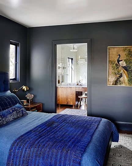
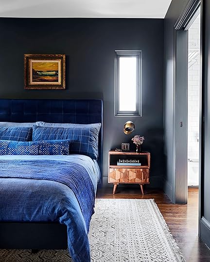
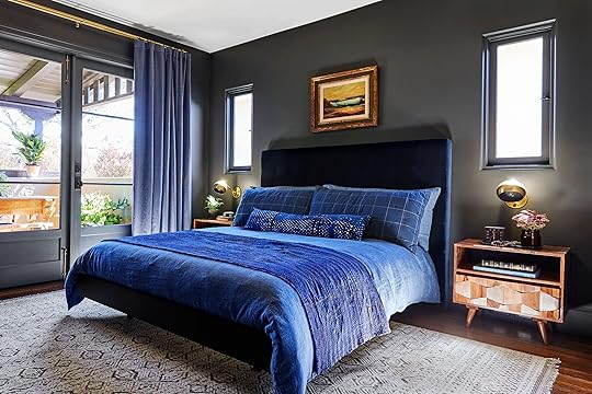
Let’s start with THE talking point about this particular room, but also moody rooms in general: for the greatest design impact (and to create something that reads very “editorial” and high-end), go for a tone-on-tone look. Note that this does not mean everything has to be the exact shade. In fact, you’ll want to vary them, but in this room, there’s an overarching punch-you-in-your-face, blue-on-everything moment happening here. It’s kept interesting and visually layered by playing with tones: dark inky navy blue headboard, cobalt and denim blue bedding, slate walls and matching millwork, blue-ish gray curtains. The lower the contrast, the moodier yet quieter it will feel. Let’s say we decided to do these same dark walls, but then pair them with bright white bedding and blonde wood furniture…that would be a very different story. Pretty, but not the subdued, quiet, straight-up dreamy vibe we have here. So, for that calm moody oasis aesthetic, pick a color and run with it on nearly everything.
Paint all doors, trim and woodwork/millwork.

The whole “paint the baseboard and trim the same color as the wall” movement is HUGE right now, and sure, maybe it’s a little trendy and in a few years will fizzle out (we hope not), but this is also clutch for moody rooms. With such a deep, pigmented color, is there anything else to do but slather it on every surface? It wouldn’t be right to have a bright white on the baseboards, doors and woodwork. For a truly uniform look, you’ll want to go with the same finish for both (or for something super dramatic, you can do a flat wall and a high-gloss trim, though the matte-on-matte is a bit more modern).
Vary it up with lots of texture.

Bed Base via Article | Headboard via Article
When you’re really working within a single color for your whole palette, it’s super crucial to vary up those textures so things don’t come off one-note. Here, we used linen on the curtains and duvet, velvet on the headboard, cotton on pillows, a textural quilt and a nubby low-pile patterned shag rug (all the bedding, by the way, was borrowed from The Platform Experiment, a staging company we teamed up with on this home to tap into their insane inventory of props). A good rule of thumb to follow is to pick at least three to four textures and fabrics in varying monochrome hues to nail that perfectly layered (but still tonal) aesthetic.
Keep wood tones rich and dark.
Rug via Lulu and Georgia | Nightstand via Lulu and Georgia | Sconce | Duvet via Lulu and Georgia | Tray via Lost & Found
This is not the time to go all light and Scandi. This is the time to fully lean into the richness you’ve already started building to really dial in the moodiness. You’ll want to stick to darker finishes (like walnut) but careful that they don’t lean too red or else you risk losing the more modern edge of this style. This nightstand that we borrowed from Lulu & Georgia has a few tones in it, sure, but they’re all more neutral (not too yellow, not too red), and the interesting shapes created by the drawer front creates more visual interest in a relatively simple piece. When you don’t have a ton of furniture in a room, finding pieces that feel special and different is clutch to “simple yet intriguing” so you don’t end up with “empty and flat.”
Brass is the perfect complement.
Honestly, there is no better metal finish than gold for the moody, sexy vibe (though matte black is a good runner up). You’ll want to stick to a darker aged or unlacquered brass instead of a brighter, shiny finish. Bring it in via lighting (like these sconces from Schoolhouse), frames, accessories, and curtain and cabinet hardware, though be sure to not go overboard. You don’t want EVERYTHING to be gleaming brass, but a few touches will really elevate and break through the darker tonal palette.
Paint the ceiling (or don’t).
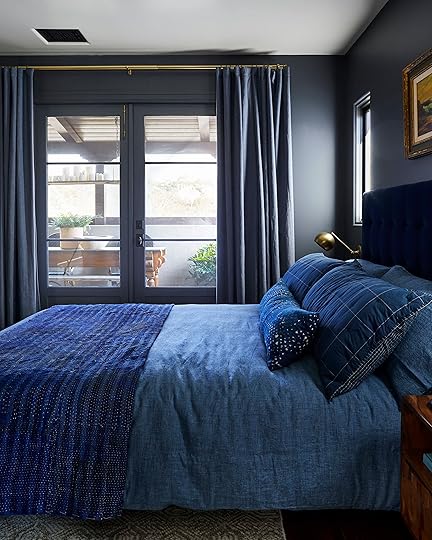
Okay, so this one is purely preferential. Here, the ceiling was kept white, which draws the eye up and brings in a punch of brightness overhead, but there’s another winning option: painting the ceiling the same color as the walls for a truly cozy, cavernous (but in a good way) room. In my dining room (which I’m revealing in two weeks!), I opted to bring a dark color up the walls and onto the ceiling and I couldn’t love it anymore than I do.
Keep furnishings simple and pared back.

Chair via Lulu and Georgia | Throw via Serena & Lily
And finally—and we can’t say this enough, but the dark tonal color is the star of this room/style, so keeping furniture pared back and also streamlined is the key to not creating a space that feels overwhelming or suffocating. There are really only three furnishings here: bed, nightstands, chair. Boom, done. There isn’t much by way of “decor” or art, either; accessories were kept to a minimum, and there’s just one framed piece over the bed.
Because of the wall-to-wall built-in wardrobe, there’s no need for a dresser, but here’s a trick for everyone who doesn’t have custom woodwork that blends seamlessly into the wall: paint any larger pieces the same color. It’s actually a designer trick to get a cool, high-end vibe for a smaller space. You can try it on a bookcase or dresser (though keep some of the other casegoods their natural wood tones to vary things up and bring in warmth). Of course, you can totally skip this, too, and just go wood for all pieces.

We’re all pretty obsessed with this look (amazing job Velinda and Erik), especially because it’s rich, textural and luxurious but still modern and cool. It’s like a parfait of style…so many layers, all necessary to create a balanced, sweet treat.
What do you think? I know dark and moody isn’t for everyone (we also really dig bright and airy, so we get it), but is there any room in your home you’d be willing to try this aesthetic in? Bedroom? Powder room (easy), living room? Let’s hear it.
***photography by Sara Ligorria-Tramp for EHD, produced and art directed by Emily Henderson, designed and styled with Velinda Hellen and Erik Staalberg
The post Reveal Alert: The Color Trend We’re VERY Into (That You’ll Love, Too) appeared first on Emily Henderson.


Everything You Need to Know For How to Nail That Moody Room Look
Remember that house we’ve been showing you (this backyard, this edgy basement office) over the last few weeks? It’s a killer home the production and design team staged and styled for Emily’s upcoming book project and today we’re showing you the master bedroom, which is a study in how to do moody yet modern (and also, one of my personal favorite spaces here). The wall color—French Beret by Benjamin Moore—was already there, selected by the homeowners Amanda and William Hunter (of William Hunter Collective), so the team really leaned in to create a luscious retreat with a tonal palette, lots of texture and hits of glam. We’re breaking down the seven things to keep in mind or try if you love this dark, cozy vibe, whether you want to use it in a bedroom, dining room or beyond.
Go tone-on-tone.
Let’s start with THE talking point about this particular room, but also moody rooms in general: for the greatest design impact (and to create something that reads very “editorial” and high-end), go for a tone-on-tone look. Note that this does not mean everything has to be the exact shade. In fact, you’ll want to vary them, but in this room, there’s an overarching punch-you-in-your-face, blue-on-everything moment happening here. It’s kept interesting and visually layered by playing with tones: dark inky navy blue headboard, cobalt and denim blue bedding, slate walls and matching millwork, blue-ish gray curtains. The lower the contrast, the moodier yet quieter it will feel. Let’s say we decided to do these same dark walls, but then pair them with bright white bedding and blonde wood furniture…that would be a very different story. Pretty, but not the subdued, quiet, straight-up dreamy vibe we have here. So, for that calm moody oasis aesthetic, pick a color and run with it on nearly everything.
Paint all doors, trim and woodwork/millwork.
The whole “paint the baseboard and trim the same color as the wall” movement is HUGE right now, and sure, maybe it’s a little trendy and in a few years will fizzle out (we hope not), but this is also clutch for moody rooms. With such a deep, pigmented color, is there anything else to do but slather it on every surface? It wouldn’t be right to have a bright white on the baseboards, doors and woodwork. For a truly uniform look, you’ll want to go with the same finish for both (or for something super dramatic, you can do a flat wall and a high-gloss trim, though the matte-on-matte is a bit more modern).
Vary it up with lots of texture.
Bed Base via Article | Headboard via Article
When you’re really working within a single color for your whole palette, it’s super crucial to vary up those textures so things don’t come off one-note. Here, we used linen on the curtains and duvet, velvet on the headboard, cotton on pillows, a textural quilt and a nubby low-pile patterned shag rug (all the bedding, by the way, was borrowed from The Platform Experiment, a staging company we teamed up with on this home to tap into their insane inventory of props). A good rule of thumb to follow is to pick at least three to four textures and fabrics in varying monochrome hues to nail that perfectly layered (but still tonal) aesthetic.
Keep wood tones rich and dark.
Rug via Lulu and Georgia | Nightstand via Lulu and Georgia | Sconce | Duvet via Lulu and Georgia | Tray via Lost & Found
This is not the time to go all light and Scandi. This is the time to fully lean into the richness you’ve already started building to really dial in the moodiness. You’ll want to stick to darker finishes (like walnut) but careful that they don’t lean too red or else you risk losing the more modern edge of this style. This nightstand that we borrowed from Lulu & Georgia has a few tones in it, sure, but they’re all more neutral (not too yellow, not too red), and the interesting shapes created by the drawer front creates more visual interest in a relatively simple piece. When you don’t have a ton of furniture in a room, finding pieces that feel special and different is clutch to “simple yet intriguing” so you don’t end up with “empty and flat.”
Brass is the perfect complement.
Honestly, there is no better metal finish than gold for the moody, sexy vibe (though matte black is a good runner up). You’ll want to stick to a darker aged or unlacquered brass instead of a brighter, shiny finish. Bring it in via lighting (like these sconces from Schoolhouse), frames, accessories, and curtain and cabinet hardware, though be sure to not go overboard. You don’t want EVERYTHING to be gleaming brass, but a few touches will really elevate and break through the darker tonal palette.
Paint the ceiling (or don’t).
Okay, so this one is purely preferential. Here, the ceiling was kept white, which draws the eye up and brings in a punch of brightness overhead, but there’s another winning option: painting the ceiling the same color as the walls for a truly cozy, cavernous (but in a good way) room. In my dining room (which I’m revealing in two weeks!), I opted to bring a dark color up the walls and onto the ceiling and I couldn’t love it anymore than I do.
Keep furnishings simple and pared back.
Chair via Lulu and Georgia | Throw via Serena & Lily
And finally—and we can’t say this enough, but the dark tonal color is the star of this room/style, so keeping furniture pared back and also streamlined is the key to not creating a space that feels overwhelming or suffocating. There are really only three furnishings here: bed, nightstands, chair. Boom, done. There isn’t much by way of “decor” or art, either; accessories were kept to a minimum, and there’s just one framed piece over the bed.
Because of the wall-to-wall built-in wardrobe, there’s no need for a dresser, but here’s a trick for everyone who doesn’t have custom woodwork that blends seamlessly into the wall: paint any larger pieces the same color. It’s actually a designer trick to get a cool, high-end vibe for a smaller space. You can try it on a bookcase or dresser (though keep some of the other casegoods their natural wood tones to vary things up and bring in warmth). Of course, you can totally skip this, too, and just go wood for all pieces.
We’re all pretty obsessed with this look (amazing job Velinda and Erik), especially because it’s rich, textural and luxurious but still modern and cool. It’s like a parfait of style…so many layers, all necessary to create a balanced, sweet treat.
What do you think? I know dark and moody isn’t for everyone (we also really dig bright and airy, so we get it), but is there any room in your home you’d be willing to try this aesthetic in? Bedroom? Powder room (easy), living room? Let’s hear it.
***photography by Sara Ligorria-Tramp for EHD, produced and art directed by Emily Henderson, designed and styled with Velinda Hellen and Erik Staalberg
The post Everything You Need to Know For How to Nail That Moody Room Look appeared first on Emily Henderson.
May 6, 2019
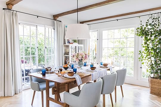
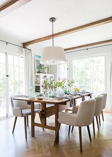
My Updated LA Dining Room + My Dream Dining Chairs (Kinda)


We’ve done some updates in the dining room that I’m VERY happy with and it was time to share. Naturally, we aren’t done so this is not a reveal, just a fun process post.
Here’s what it used to look like:
Now to be fair, typically there are two chairs on the ends and four on the sides, but the chairs blocked the architecture of the table which is my favorite part.
(Above was before we reupholstered the chairs in Crypton fabric).
Now, I liked everything up there, but the arms of the chairs were getting so disgusting from the kids’ hands and I was having to clean them too often. They would clean up well, but it did become another job that I had to do. Plus, the chairs just felt so basic and while they were comfortable and simple, I knew they could be cooler. I’ve been chasing the “super stylish and comfortable” dining chair for years now and will likely never find that combination. Generally, it’s because I like the look of sculptural chairs which inherently are less comfortable than large-scale upholstered numbers.
I wasn’t looking to change them out, but I always have my eye out for cool, vintage, chairs that are still comfortable and work with the stools and the table.

I tried mixing them up with vintage wood chairs but it looked better in a photo than it did in real life (it just looked a bit messy and unintentional).

A while ago at the flea market, I spotted from afar, six upholstered Cherner armchairs and darted instantly towards them, knowing they were mine. I’ve wanted them since I was 25. In case you don’t know how rare that is, trust me it’s SO HARD TO FIND. You can find single Cherner chairs relatively easily, but finding SIX UPHOLSTERED ones and having them all be the armchair version (versus just the side chairs) is HUGE. Normally they’d be anywhere from $6k – $10k for a set on 1stdibs. They had just come out of the truck and as I was buying them so many people came over to the booth to ask about them and everyone was so bummed that I had snagged them. I couldn’t pay fast enough. They were still expensive, at $2,200 for the set, but like I said it’s such a steal and they are one of those things that we could eventually sell and even make money off if we needed to in the future.
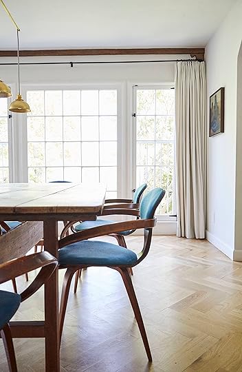
Why do I love them so much? I suppose the beautiful line of the bentwood and the scale. They are simple (meaning that the eye has an easy job understanding them) but so unique. And because they are bentwood, I think they are hard to knock off so I won’t deal with them being everywhere (thank goodness). They are a classic and just so sculptural.
The downside: Due to their age they are super creaky…and no, they aren’t as comfortable as our old chairs but I think once there is new upholstery and padding, they will get closer.
Sitting in a creaky chair is more annoying than you might think and we TRY to ignore it but sometimes, if the kids are moving and shuffling around too much in them, I just want to snap “STOP MOVING!!!” It’s very confronting to know that you intentionally bought some expensive, uncomfortable, un-returnable, creaky chairs for your family.

But I’m REALLY REALLY hoping that I can get them upholstered and restored to be more comfortable (more padding) and not creaky.
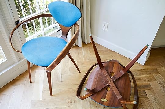
There has GOT to be a way to reinforce them, right? If anyone knows anyone in the LA area who can restore these so they aren’t creaky, please let me know.
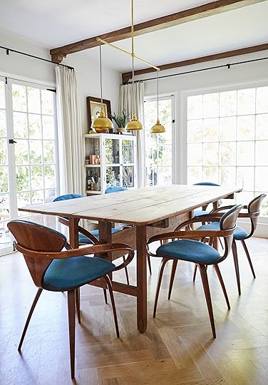
We also updated the table: A few months ago, we sanded off the stain on the top of the table, making it SO much prettier. Right now it isn’t sealed and while it does pick up some stains, it doesn’t bother me at all. The base is a bit darker and I like that, too. It’s a pretty light pine and I like it so much more than the more orange stain that was on it.

The light: We switched out the big pleated pendant for this triple pendant fixture that I got on Chairish (for $375).
The old one was kinda big and made it strangely hard to shoot. We were always trying to minimize it and avoid it so for a recent shoot I put in this one and I suppose I like the micro-pendants better and they still work so well with the other lighting in the kitchen.
So the question remains: How do we reupholster these Cherner chairs?
I actually secretly love this bright blue, but the fabric is in terrible condition.
 image source
We could keep it classic with black leather or vinyl, but now that I’m used to a bright color on them, I might miss it!
 image source | design by arent & pyke
I hadn’t thought about a brown or camel leather, but that could be really tonal and pretty.
 image source | design by joan mcnamara
 image source | design by marmol radziner
I could always go with a similar fabric that the chairs currently have in a bright blue, but this is a bit too bright for me…
 image source | design by john maniscalco architecture
By the way, it was super hard to find any inspiration photos of colorful upholstery on the chairs. Are people not doing this?
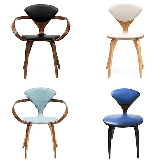
image sources: top left | top right | bottom left | bottom right
I suppose leather or vinyl will be the best choice with kids so I need to go shopping. I guess if there was a really beautiful slate blue leather I could see that looking good, but camel leather could be so pretty.
I’d love to hear your opinion: you see we really have the stools and the island color to work with, and I want to keep it classic and simple, not do any pattern or anything too dramatic.
Thoughts? And do you even like my creaky 60-year-old expensive “dream” chairs?? I’ve just wanted these for so long and I INSIST on making them work. Everytime I’m at my friend’s house (who is borrowing my old chairs until I want them back), I am jealous of how comfortable they are and I know that Brian is, so let’s hope the upholstery can add more foam and the restorer can reinforce the wood and get rid of all the squeaks and creaks…
***photography by Veronica Crawford for EHD
The post My Updated LA Dining Room + My Dream Dining Chairs (Kinda) appeared first on Emily Henderson.
May 5, 2019
The Link Up: The Beauty Buy That Changed Emily’s Skin, Three AMAZING Tours and The End of Instagram Likes??
 image source | design by annie sloan
We made it to May in one piece, the sun is kinda shining (“Gray May” as us Southern Californians call it) but here are all the things we have been chatting, DMing and emailing about this week.
Emily wants everyone to know about the new Target private sustainable cleaning line, Ever Spring. They just came out with 70 products that are said to be 20% cheaper than the competition. So better for the environment and better for your wallet. Plus the design is so good.
Arlyn saw this living room (pictured above) and audibly gasped. Annie Sloan, chalk paint queen, featured her beautifully colorful and eclectic French farmhouse this week on House Beautiful and looking at it just makes your soul feel happy.
After seeing this article on an Instastory from Tessa Neustadt, our previous photographer, the whole office is VERY curious to see what the future of Instagram “likes” will be. Will this new feature help, not make a difference, hurt? Only time will tell…What are your thought??
This week’s music recommendation comes to you from Veronica. The Band Camino is one of her favorite bands who she absolutely thinks deserves to be heard by everyone. They are a mix of rock and pop and describe themselves as, “your mom’s favorite band,” which she thinks is such an iconic bio, and it rings totally true—her mom, for one, loves their music. Very lovely and talented guys making genuine songs that you can blast your speakers out and drive with your windows down to, cry to, and everything in between.
Manrepeller FINALLY decided to show off their new office just as we were finishing this post. Like about to hit the schedule button. But honestly, it’s too good not to include as soon as possible, a.k.a today. It’s bright, fun and full of personality which is why we all love them so much in the first place.
It’s a really special day because we are serving up THREE “home” tours today. Jess also had a shortness of breath when it came to design this week. This home tour by Corinne Mathern is Southwest modernism at it’s finest.
Velinda is gearing up for summer which means amping up her stock of camping supplies. She found these pop-up trash cans and loves how easy they’ll be to travel with/store during the months they won’t be in use…though they’d also be great for parties. A solid $12 ‘garbage’ investment!
ANOTHER AMAZING CANDLE REC: Sara is OBSESSED with this candle from Tatine in Garden Mint. She says she is about to order three of them and already has one. She loves it so much she brought it up to the mountain house with her on a recent trip so she could have it in her room. “It’s the only gift I want to give from now on it’s GOOD, and it projects really really well, even when it’s not lit.”
Grace is sure that this is no surprise but half of Team EHD is very Harry Potter-obsessed (we have three Gryffindors, four Hufflepuffs, two Ravenclaws and once Slytherin in case you were wondering) so this episode on “This American Life” caught her eye—it’s about libraries and how it’s like a real-life Room of Requirement for us mere muggles! (She also used to read A LOT when she was younger so she loved the angle of people going to libraries needing something so specific, but not necessarily book-related and finding the fulfillment they need inside).
You may think this is so random but Michael can’t help it…he LOVES flavored sparkling water. And this Bubly blackberry one is his new discovery and tasty treat! Perfect for summer BBQs. Trust him, it’s so delicious, drop some fresh mint in it too if you want to be fancy.
Ryann loves horoscopes and all things astrology (she finds it fascinating and informative) so she uses this app, Co-Star, to see what the planets are up to. It’s so fun. She is a Gemini Sun, Leo Moon, and Pieces rising for anyone wondering. 
May 4, 2019
My New Insanely Comfortable “Mom-Friendly” Weekend Wardrobe

You all know that I am first and foremost a mom (duh) so my weekends are mostly spent rolling around with my kids, building forts, creating backyard adventures and scavenger hunts. We have come to find out that we will imagine up pretty much anything to keep those tiny people happy and entertained (good for them, good for me and Brian). So, being the “fun mom” that I certainly am, weekends almost always require outdoor activities and lots of physical exertion. That said, getting dressed/looking like a human on the weekends is low on my priority list and I’ve noticed lately I’ve created somewhat of a uniform… SO, welcome to my “weekend mom outfits” featuring lots of loose and stretchy pants, T-shirts, and comfortable shoes. That may be the most boring sentence ever written, but before you doze off, let me explain that mom life does require a certain amount of comfortability but that doesn’t mean I’ve completely given up. I try to at least assemble outfits that I think are live-able but also somewhat exciting. Let’s see how I did…

Shirt | Pants | Shoes | Jacket (similar)
First up, we have slouchy trousers paired with a very comfy and breathable tee, high-top converse, and a lightweight denim jacket. This outfit is ideal for both errand running and weekend mom-ing. The pants are low waisted and roomy enough that I can bend and move around no problem, but are still presentable and give the appearance of a put-together adult if/when I have to leave my house. You may have noticed I am usually not someone that wears sneakers, but sometimes it is absolutely essential that my feet are in flat shoes (especially if adventuring with my kids is on the to-do list) so Converse are a great go-to.

Here we have my absolute favorite pair of what I am coining “weekend mom trousers.” They are REALLY comfortable and I love the stripe detail on the side with the rope belt. And paired with that ship T shirt? Very nautical chic. My 5-year-old approves. This feels like an extremely casual outfit but the platform sandals (how do we feel about these?!?) elevate it just enough while still being practical for being on my feet all day long. They’re kind of ridiculous, but in a good way? Of course, anyone who has kids knows the key to getting through the day seemingly unscathed by marinara-slathered little hands is wearing dark colors, which is why I am drawn to these pants constantly. They are easy to wear and hard to dirty-up.

Shirt | Pants | Shoes | Bandana
Another white shirt/dark pant combo (are you seeing a trend here?) but this time I spiced it up with a bandana and henley tee. I definitely felt more “stylish” in this outfit while still maintaining the laid back mom look. Oh, and say hello to my first ever pair of Dr. Martens. At first, I was hesitant about them, but my friend Suzanne convinced me that I could pull them off so I went for it. And I actually LOVE THEM. I can walk around all day in those puppies, plus the color is great and goes with anything. The sherpa lining will make them hard to wear in the summer in LA (just say no to swamp feet) but I can’t wait to whip them out for cold nights at the mountain house.

Well, there you have it. Short and sweet go-to weekend mom/general comfy, casual outfits. If you are like me and ready to embrace the comfortable side of life, we rounded up some casual pants that will go perfectly with weekend shenanigans (kids or no kids):

1. Slouched Trousers | 2. Harrison Tapered Pants | 3. Linen Rope Tie Pants | 4. Luna Pants | 5. The Relaxed Chino | 6. Stovepipe Fatigue Pants | 7. True Love Le Soleil Pant | 8. Softstretch Linen Rope Tie Pants | 9. Contrast Trim Linen Trousers | 10. Stretch-Cotton Blend Straight Leg Pants | 11. Drawstring Knit Pants | 12. Dayla Cargo Pants | 13. Paper Bag Pants | 14. Side Panel Tailored Pants | 15. Cassidy Pleat Pocket Pants
What do you like to wear in the name of comfort? Comment your suggestions below…and HAPPY SATURDAY.
***photography by Veronica Crawford for EHD
The post My New Insanely Comfortable “Mom-Friendly” Weekend Wardrobe appeared first on Emily Henderson.
May 3, 2019
13 MUST FOLLOW Designers (i.e. The New Trendsetters)
 photo source | design by arent & pyke
 The good and the all too unfortunate part of social media (in terms of design) is that we are completely inundated with pretty photo after pretty photo, most of the time unable to really look and appreciate the work that goes into each space. But then it happens. You see a space as you are scrolling through Instagram, pinning inspiration or searching the web that makes your heart STOP and eyes bulge out of your pretty little head. It’s honestly one of my most favorite feelings because since I (very luckily) get to look at beautiful images all day for work and at night for myself I sometimes fear that because my brain is so saturated that it’s bound to stop having that experience. Well, that has yet to happen because of insane designers that keep me on my toes. SO when I/the team sees something that makes our heart sing, I/we take note. Emily and the team thought it was high time we share designers and design firms that we are currently crazy about. Now this list does not contain every person we love because that would be the longest blog post in the world so we narrowed it down to 13. Some are new, some have been around for a minute but all have been serving up those dopamine-induced serges to our brains. Get ready of an emotional design ride people…
Etc for Short
 photo source | design by etc for short
 photo source | design by etc for short
Etc for Short is the design child of Sally Breer and Jake Rodehuth-Harrison. I am sure that most of you are aware of Sally because Emily featured her home in her first book but you should also know Jake. They, along with their crazy talented team, create stupidly exciting work that is always pushing the envelope. Their recent design of the Firehouse Hotel was one of the most exciting things to happen to my eyeballs in a minute.
EyeSwoon
 photo source | design by athena calderone
 photo source | design by athena calderone
The aesthetic genius of Athena Calderon of EyeSwoon is unparalleled. While not new to the design scene the recent renovation of her Brooklyn brownstone was pretty much my dream home. I’m obviously not alone in that. Her way of mixing ultra high end modern and traditional pieces that still make you feel like you are in a real person’s home is truly out of this world. Plus, if you love food, her site and Instagram are filled with unbelievable (show-stopping) recipes that will make you look like a pro in the kitchen. Yes, she cooks, too.
Colin King
 photo source | design by colin king
Colin King is just that…well, a king of styling I should say. I promise you know his work so now it’s time to know his name. Colin’s work can be seen in major publications like Architectural Digest, T Magazine, Vogue, Domino, Dwell plus many more. His aesthetic is a blend of sophisticated, moody and super unique. He even helped styled Athena’s home (above). Please enjoy his stunning feed. 
13 Seriously Heart-Stopping, MUST FOLLOW Designers We love
photo source | design by arent & pyke The good and the all too unfortunate part of social media (in terms of design) is that we are completely inundated with pretty photo after pretty photo, most of the time unable to really look and appreciate the work that goes into each space. But then it happens. You see a space as you are scrolling through Instagram, pinning inspiration or searching the web that makes your heart STOP and eyes bulge out of your pretty little head. It’s honestly one of my most favorite feelings because since I (very luckily) get to look at beautiful images all day for work and at night for myself I sometimes fear that because my brain is so saturated that it’s bound to stop having that experience. Well, that has yet to happen because of insane designers that keep me on my toes. SO when I/the team sees something that makes our heart sing, I/we take note. Emily and the team thought it was high time we share designers and design firms that we are currently crazy about. Now this list does not contain every person we love because that would be the longest blog post in the world so we narrowed it down to 13. Some are new, some have been around for a minute but all have been serving up those dopamine-induced serges to our brains. Get ready of an emotional design ride people…
Etc for Short
 photo source | design by etc for shortphoto source | design by etc for short
Etc for Short is the design child of Sally Breer and Jake Rodehuth-Harrison. I am sure that most of you are aware of Sally because Emily featured her home in her first book but you should also know Jake. They, along with their crazy talented team, create stupidly exciting work that is always pushing the envelope. Their recent design of the Firehouse Hotel was one of the most exciting things to happen to my eyeballs in a minute.
EyeSwoon
photo source | design by athena calderonephoto source | design by athena calderoneThe aesthetic genius of Athena Calderon of EyeSwoon is unparalleled. While not new to the design scene the recent renovation of her Brooklyn brownstone was pretty much my dream home. I’m obviously not alone in that. Her way of mixing ultra high end modern and traditional pieces that still make you feel like you are in a real person’s home is truly out of this world. Plus, if you love food, her site and Instagram are filled with unbelievable (show-stopping) recipes that will make you look like a pro in the kitchen. Yes, she cooks, too.
Colin King
photo source | design by colin kingColin King is just that…well, a king of styling I should say. I promise you know his work so now it’s time to know his name. Colin’s work can be seen in major publications like Architectural Digest, T Magazine, Vogue, Domino, Dwell plus many more. His aesthetic is a blend of sophisticated, moody and super unique. He even helped styled Athena’s home (above). Please enjoy his stunning feed.
May 2, 2019
Your Mom Deserves a Thoughtful Gift for Mother’s Day—Here Are 10 Tear-Inducing Ideas


Warning: This post is going to start out kind of sad but I promise it will end up happy and your heart will be full and hopefully even a little inspired. Okay? Cool.
Once you start reading this post you might think I was an odd choice to be its author (Jess, not Emily) but I feel I am actually the perfect candidate. My story is not unique but it’s a good reminder that future days are not guaranteed and showing appreciation to those you love should be at the absolute top of the priority list….duh. I lost my mom eight years ago. Well, I didn’t lose her, I always kept a very good eye on her (pardon while I laugh at my own jokes, humor is important). But when she died, it really put everything—including “things”—into perspective. Now I’m not saying all material things lost value (I mean I’m a Market Editor…I love things) but I definitely was able to look at them in a way that was much healthier. The value I thought they held, to my surprise, was not that much. She is a part of me and our memories doing special things together trump any gift she ever gave me or me to her (and she was a great gift giver). Time is truly the only priceless gift anyone can receive. Quality time is also my top love language so maybe I’m biased.
May 1, 2019
Our Kids Now Share a Room …With Layout Challenges and a New Gender-Neutral Theme
Today’s post really proves that I deserve to be an internet-famous PROFESSIONAL Interior designer. If you need to feel better about yourself and your home (and will keep judgement to yourself), then continue where you’ll enjoy a peek into my process, which is actually quite ugly and messy. I’m mid-re-design of FOUR of the rooms in our house. Here’s what is happening:
The kids moved in together so Charlie’s room is going to be their shared room and I have to redesign it for function (two beds), which gives me the excuse to change it because I never felt it was right.
Birdie’s room is now up for grabs. What should it be? It needs to be like four things—home office? Guest room? Yoga room? Craft/art room? Brian’s editing room?
In the dining room, I found my dream dining chairs and changed out the light, but a few decisions have to be made (fabric, mostly).
I’m FINALLY designing the downstairs playroom—YAY—which is actually coming along, although full of garbage because IT’S A PLAY ROOM.
See? It’s a lot. Almost every room, except the master bedroom and the bathrooms are in flux (the living room is always in flux) and if I carried the gene for embarrassment and shame, I would not let anyone into my house, let alone post it on the internet but lucky for you, I DON’T!
So here you go. Today you are going to see what is happening in Charlie’s old room which we’ll refer to as ‘the kids’ room for the immediate future.
You might first be wondering WHY are the kids sharing a room when they have their own room?
Well, a few months ago, they both said they wanted to share a room. Both were waking up with nightmares or just generally feeling scared to be alone, and at one point Charlie even said, “but mama, you get to sleep with daddy, you aren’t alone, why do I have to be alone?” He was trying to convince me to stay in his bed, and it was a good point. Up at the mountain house over the holidays they shared their bedroom and they loved it and slept well. When your 3 and 5 year olds ask to share a room because they WANT to spend time together, you just say yes even if you technically have separate bedrooms for them. It’s painfully sweet.

But nothing is easy in this house. The bedroom is a challenging shape for two beds.

It’s a rectangle with a niche into the closet making the windows not centered and one wall hard to use because the doors open into it.
Where do we put the kids’ beds??
Well, they begged for bunk beds after they had played at another kids’ house who had them and thought they were a blast. Great! But since the ceiling slopes where the bunk beds would go we couldn’t really have normal tall ones, nor did I want to invest too much in this, not totally convinced this would stick or that it was the right thing to do design-wise. So I did what any professional interior designer would do—I sent someone to IKEA and bought cheap bunk beds (save money!) where it took them like 6 hours to put together (whoops).

Sorry. It’s the only photo I took probably because somewhere inside of me I didn’t want to show you this. They LOVED it during the day time, but come dark, they were both TERRIFIED. I think we didn’t fully realize that this isn’t really a bunk bed – it can be kinda hacked into it, but it’s not meant for someone, let alone with their mama, to sleep on the bottom. We tried but I ended up sleeping on the bottom with Birdie and Brian sleeping on the top with Charlie (both disoriented and therefore scared), so I basically laid there terrified that it was going to break and the weight would crush us. Birdie and I had severe claustrophobia and Charlie was really scared up high. We tried to give it enough time, not be those parents that pull the plug quickly after, allowing for enough adjustment time but after nines nights of HELL, all four of us up ALL NIGHT LONG, Brian disassembled it while I was out of town and we called it quits.
For weeks, they had two mattresses on the ground with Charlie strangely sleeping on a couch cushion in-between the mattresses.

We had put the couch cushion in between for us to read (and yes, for us to sleep when we get called in) but Charlie liked the comfort of being snuggled in between and they started sleeping through the night again so Brian did what any parent in this situation would do: INSISTED that we keep it this way.
It was painful for me. So I at least bought those really low beds to put the mattresses on (above), as if that looked any better.
So over spring break while the kids were out of town, we started the larger parts of the redesign, including removing the beadboard that I regretfully installed two years ago.

I hired Spaulding Co to take care of it because we clicked really well, they are awesome people, know what they are doing and AREN’T FLAKY. We have other things we need to fix (severe water damage in kitchen cabinets, leaky roof in the playroom) so we are working on these things simultaneously in the house. They took down the beadboard and chair rail, which damaged the casing – but we knew that and it’s being replaced.
So when I came back from spring break, it looked like this (already so much cleaner, fresher, simpler and felt so much bigger):

The question is how do we arrange two beds in here?? Bunk beds are kinda out of the question as we are all scarred and Charlie and Birdie are still scared of the idea, and there really isn’t one good option. We played with different options and we THINK we have the best set up.
Option 1:


We tried shoving them together in front of the window but they wouldn’t be centered (because of the niche) and it would definitely feel like a big, low king bed so design-wise I wasn’t psyched.

Option 2:

We even tried putting them long-ways to help save some space (I had seen it on Pinterest).
While I think it can work, and certainly does open up the room, it didn’t feel ideal either. If you have a square room and if it also has to function as your playroom, I think this can be a great solution. I saw a few that were styled out a lot like a long daybed and it was cute and interesting.
Option 3:

Ultimately, we are thinking that we are going to do this L-shaped configuration:

This layout allows the following for a lot of space in the middle, a cuddle or reading corner, plus it kinda mimics the architecture of the room.

If you think this is weird, know that I did, too, but I found a few online and thought, wait, that could work…
 image source
 image source
 Sure, they have a corner piece that separates the bed, but I think this could still work.
So now what? We have a potential layout, but what about the design?
Would there be a theme?
You betcha. The theme to the new kids’ room is…drumroll please…wait…be quiet because the theme is…
BEDTIME OR NIGHTTIME.
That’s right. It’s a super subtle hint to my two darling children to GO TO SLEEP and STAY IN BED. He wanted ninjas, she wanted unicorns but ultimately this isn’t a playroom, it’s their BEDroom and well, ninjas don’t say “sleep.”
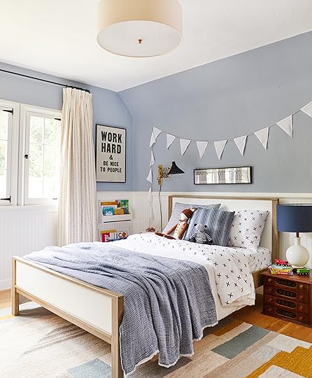
So what does that look like? A tonal, blue calm-ass room.
 image source
Yes, we might consider painting the window casings and the doors. This is a HUGE decision and I’m not sure why. I want to do it but I do fear that this is a trend that in five years I’ll regret but then what? Just paint back, right?
 image source
Calm. Quiet. Cozy. And what about the ceiling? Our ceiling is coved so it would make sense to take the color up onto the ceiling. Would this be too cave-like? Possibly, but I hear people pass the hell out in caves, for even 12 hours at a time.
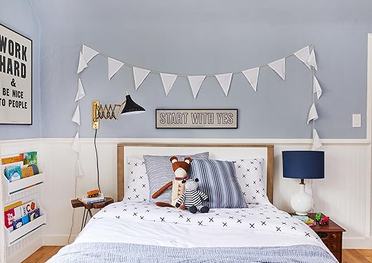
So “nighttime” or “bedtime” would be the theme, with elements of sky, clouds, stars with some whimsy but mostly calmness and softness.
 image source
We might keep the same paint or paint it darker. At night, I LOVE the blue that it is and then I think, well, would I love it more if it were darker? Probably.
 image source
 image source
 image source
I’m going to stay away from too much pattern or color, and lean into this direction, maybe there is some dark green or wood, but nothing busy.
 image source
I DO want to potentially do a ceiling treatment like this below, but in tonal blues instead of a bright color. This room still has to be interesting, just not busy.
 image source
In order to do a treatment like that, I might need to square off the room or at least give that niche (where the closet is) some purpose. Right now, I’m in the middle of trying to convince Brian to let me build some sort of corner secret fort that would visually make the room more of a square, but be less permanent.
 image source
You know I love a castle theme. This could also be made out of wood like the original doors are so it looks more purposeful. The only thing is that we wouldn’t be able to access the reach-in closet as well, but right now there is NOTHING that we put in there except the toys that are being rotated. No clothes actually hang in there. So we could make it more toy storage that they have access to and then when they are older and it’s likely just one of their room’s again we’ll take out the castle thing and restore it to the normal closet that it should be. I’m also wishing that we had just reconfigured it to be a larger reach-in closet instead of a niche and a tiny closet if that makes any sense.
 image source
But how wide could it be to have a big cut-out fort like that, above?
There are other elements we are playing with like a cloud-shaped upholstered headboard, a large cozy rug, new whimsical lighting, Roman shades…but right now, it looks like this and with all the projects that have actual deadlines (the mountain house, the Atlanta project), this room will likely look like this for a while…
And yes, it kills me. In case you are like Brian, confused why it bothers me so so much, I’d once again like to give you an analogy of a more “professional” career: it would be like me being a dentist, a pretty good one actually, and my kids walking around with disgusting dirty, neglected teeth. I really like looking at clean teeth in my house and it’s just hard to see the yellow plaque and say “we’ll get to you in June.”
But it’s not dental hygiene. It’s not even their first set of teeth (you parents know what I’m talking about, we care a bit less about their baby teeth than maybe we should because they’ll get new fresh ones around age 6). It’s just their bedroom and they are PERFECTLY FINE with how it is right now.
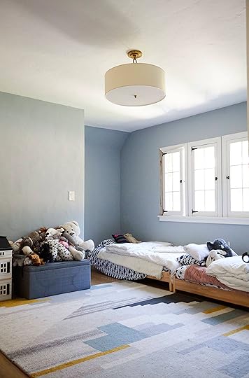
Here is the mountain house shared room, which actually IS done, if you actually came here for inspiration.
 photo by sara ligorria-tramp for ehd
For now, we are working on our other more pressing projects while pinning and planning for this one. And just getting that beadboard down, having it all painted one color and moving the beds into what seems to be the best configuration is super helpful to keep going.
I do have a question for you, though. Up at the mountain house (see above) we’ve removed the trunk and shoved the twin mattresses together so we can all read together and because inevitably one of us is called in to cuddle in the middle of the night and there isn’t enough room in a twin bed. So at least temporarily we are going to buy one of those mattress joiners because all spring break (when Brian wasn’t there), I slept with the kids (because it’s a fun excuse to snuggle all night…gee I wonder why they call me in all the time….????) albeit HORRIBLY because I fell through the crack all night long. The question is, is the reason that more kids don’t share a king bed because it seems weird and potentially socially unacceptable? I’ve done some research (google) and most child psychologists say that it’s very bonding for, yes, even children of opposite genders when they are young. They say that it’s totally fine and healthy until they don’t want to anymore (usually around 8).
Looks like we’ll give it a whirl up at the mountain house, but I’d LOVE to know why this isn’t more of a thing. Have any of you ever shared a room OR bed with your opposite-gendered sibling while little OR are your kids sharing a room or large bed?
Very curious…
** and yes, feel free to weigh in on the whole shit storm of a design, too.
Our Kids Are Sharing a Room – Here’s The Where, What, How and Why…
Today’s post really proves that I deserve to be an internet-famous PROFESSIONAL Interior designer. If you need to feel better about yourself and your home (and will keep judgement to yourself), then continue where you’ll enjoy a peek into my process, which is actually quite ugly and messy. I’m mid-re-design of FOUR of the rooms in our house. Here’s what is happening:
The kids moved in together so Charlie’s room is going to be their shared room and I have to redesign it for function (two beds), which gives me the excuse to change it because I never felt it was right.
Birdie’s room is now up for grabs. What should it be? It needs to be like four things—home office? Guest room? Yoga room? Craft/art room? Brian’s editing room?
In the dining room, I found my dream dining chairs and changed out the light, but a few decisions have to be made (fabric, mostly).
I’m FINALLY designing the downstairs playroom—YAY—which is actually coming along, although full of garbage because IT’S A PLAY ROOM.
See? It’s a lot. Almost every room, except the master bedroom and the bathrooms are in flux (the living room is always in flux) and if I carried the gene for embarrassment and shame, I would not let anyone into my house, let alone post it on the internet but lucky for you, I DON’T!
So here you go. Today you are going to see what is happening in Charlie’s old room which we’ll refer to as ‘the kids’ room for the immediate future.
You might first be wondering WHY are the kids sharing a room when they have their own room?
Well, a few months ago, they both said they wanted to share a room. Both were waking up with nightmares or just generally feeling scared to be alone, and at one point Charlie even said, “but mama, you get to sleep with daddy, you aren’t alone, why do I have to be alone?” He was trying to convince me to stay in his bed, and it was a good point. Up at the mountain house over the holidays they shared their bedroom and they loved it and slept well. When your 3 and 5 year olds ask to share a room because they WANT to spend time together, you just say yes even if you technically have separate bedrooms for them. It’s painfully sweet.
But nothing is easy in this house. The bedroom is a challenging shape for two beds.
It’s a rectangle with a niche into the closet making the windows not centered and one wall hard to use because the doors open into it.
Where do we put the kids’ beds??
Well, they begged for bunk beds after they had played at another kids’ house who had them and thought they were a blast. Great! But since the ceiling slopes where the bunk beds would go we couldn’t really have normal tall ones, nor did I want to invest too much in this, not totally convinced this would stick or that it was the right thing to do design-wise. So I did what any professional interior designer would do—I sent someone to IKEA and bought cheap bunk beds (save money!) where it took them like 6 hours to put together (whoops).
Sorry. It’s the only photo I took probably because somewhere inside of me I didn’t want to show you this. They LOVED it during the day time, but come dark, they were both TERRIFIED. I think we didn’t fully realize that this isn’t really a bunk bed – it can be kinda hacked into it, but it’s not meant for someone, let alone with their mama, to sleep on the bottom. We tried but I ended up sleeping on the bottom with Birdie and Brian sleeping on the top with Charlie (both disoriented and therefore scared), so I basically laid there terrified that it was going to break and the weight would crush us. Birdie and I had severe claustrophobia and Charlie was really scared up high. We tried to give it enough time, not be those parents that pull the plug quickly after, allowing for enough adjustment time but after nines nights of HELL, all four of us up ALL NIGHT LONG, Brian disassembled it while I was out of town and we called it quits.
For weeks, they had two mattresses on the ground with Charlie strangely sleeping on a couch cushion in-between the mattresses.
We had put the couch cushion in between for us to read (and yes, for us to sleep when we get called in) but Charlie liked the comfort of being snuggled in between and they started sleeping through the night again so Brian did what any parent in this situation would do: INSISTED that we keep it this way.
It was painful for me. So I at least bought those really low beds to put the mattresses on (above), as if that looked any better.
So over spring break while the kids were out of town, we started the larger parts of the redesign, including removing the beadboard that I regretfully installed two years ago.
I hired Spaulding Co to take care of it because we clicked really well, they are awesome people, know what they are doing and AREN’T FLAKY. We have other things we need to fix (severe water damage in kitchen cabinets, leaky roof in the playroom) so we are working on these things simultaneously in the house. They took down the beadboard and chair rail, which damaged the casing – but we knew that and it’s being replaced.
So when I came back from spring break, it looked like this (already so much cleaner, fresher, simpler and felt so much bigger):
The question is how do we arrange two beds in here?? Bunk beds are kinda out of the question as we are all scarred and Charlie and Birdie are still scared of the idea, and there really isn’t one good option. We played with different options and we THINK we have the best set up.
Option 1:
We tried shoving them together in front of the window but they wouldn’t be centered (because of the niche) and it would definitely feel like a big, low king bed so design-wise I wasn’t psyched.
Option 2:
We even tried putting them long-ways to help save some space (I had seen it on Pinterest).
While I think it can work, and certainly does open up the room, it didn’t feel ideal either. If you have a square room and if it also has to function as your playroom, I think this can be a great solution. I saw a few that were styled out a lot like a long daybed and it was cute and interesting.
Option 3:
Ultimately, we are thinking that we are going to do this L-shaped configuration:
This layout allows the following for a lot of space in the middle, a cuddle or reading corner, plus it kinda mimics the architecture of the room.
If you think this is weird, know that I did, too, but I found a few online and thought, wait, that could work…
image sourceimage source Sure, they have a corner piece that separates the bed, but I think this could still work.
So now what? We have a potential layout, but what about the design?
Would there be a theme?
You betcha. The theme to the new kids’ room is…drumroll please…wait…be quiet because the theme is…
BEDTIME OR NIGHTTIME.
That’s right. It’s a super subtle hint to my two darling children to GO TO SLEEP and STAY IN BED. He wanted ninjas, she wanted unicorns but ultimately this isn’t a playroom, it’s their BEDroom and well, ninjas don’t say “sleep.”
So what does that look like? A tonal, blue calm-ass room.
image sourceYes, we might consider painting the window casings and the doors. This is a HUGE decision and I’m not sure why. I want to do it but I do fear that this is a trend that in five years I’ll regret but then what? Just paint back, right?
image sourceCalm. Quiet. Cozy. And what about the ceiling? Our ceiling is coved so it would make sense to take the color up onto the ceiling. Would this be too cave-like? Possibly, but I hear people pass the hell out in caves, for even 12 hours at a time.
So “nighttime” or “bedtime” would be the theme, with elements of sky, clouds, stars with some whimsy but mostly calmness and softness.
image sourceWe might keep the same paint or paint it darker. At night, I LOVE the blue that it is and then I think, well, would I love it more if it were darker? Probably.
image sourceimage sourceimage sourceI’m going to stay away from too much pattern or color, and lean into this direction, maybe there is some dark green or wood, but nothing busy.
image sourceI DO want to potentially do a ceiling treatment like this below, but in tonal blues instead of a bright color. This room still has to be interesting, just not busy.
image sourceIn order to do a treatment like that, I might need to square off the room or at least give that niche (where the closet is) some purpose. Right now, I’m in the middle of trying to convince Brian to let me build some sort of corner secret fort that would visually make the room more of a square, but be less permanent.
image sourceYou know I love a castle theme. This could also be made out of wood like the original doors are so it looks more purposeful. The only thing is that we wouldn’t be able to access the reach-in closet as well, but right now there is NOTHING that we put in there except the toys that are being rotated. No clothes actually hang in there. So we could make it more toy storage that they have access to and then when they are older and it’s likely just one of their room’s again we’ll take out the castle thing and restore it to the normal closet that it should be. I’m also wishing that we had just reconfigured it to be a larger reach-in closet instead of a niche and a tiny closet if that makes any sense.
image sourceBut how wide could it be to have a big cut-out fort like that, above?
There are other elements we are playing with like a cloud-shaped upholstered headboard, a large cozy rug, new whimsical lighting, Roman shades…but right now, it looks like this and with all the projects that have actual deadlines (the mountain house, the Atlanta project), this room will likely look like this for a while…
And yes, it kills me. In case you are like Brian, confused why it bothers me so so much, I’d once again like to give you an analogy of a more “professional” career: it would be like me being a dentist, a pretty good one actually, and my kids walking around with disgusting dirty, neglected teeth. I really like looking at clean teeth in my house and it’s just hard to see the yellow plaque and say “we’ll get to you in June.”
But it’s not dental hygiene. It’s not even their first set of teeth (you parents know what I’m talking about, we care a bit less about their baby teeth than maybe we should because they’ll get new fresh ones around age 6). It’s just their bedroom and they are PERFECTLY FINE with how it is right now.
Here is the mountain house shared room, which actually IS done, if you actually came here for inspiration.
photo by sara ligorria-tramp for ehdFor now, we are working on our other more pressing projects while pinning and planning for this one. And just getting that beadboard down, having it all painted one color and moving the beds into what seems to be the best configuration is super helpful to keep going.
I do have a question for you, though. Up at the mountain house (see above) we’ve removed the trunk and shoved the twin mattresses together so we can all read together and because inevitably one of us is called in to cuddle in the middle of the night and there isn’t enough room in a twin bed. So at least temporarily we are going to buy one of those mattress joiners because all spring break (when Brian wasn’t there), I slept with the kids (because it’s a fun excuse to snuggle all night…gee I wonder why they call me in all the time….????) albeit HORRIBLY because I fell through the crack all night long. The question is, is the reason that more kids don’t share a king bed because it seems weird and potentially socially unacceptable? I’ve done some research (google) and most child psychologists say that it’s very bonding for, yes, even children of opposite genders when they are young. They say that it’s totally fine and healthy until they don’t want to anymore (usually around 8).
Looks like we’ll give it a whirl up at the mountain house, but I’d LOVE to know why this isn’t more of a thing. Have any of you ever shared a room OR bed with your opposite-gendered sibling while little OR are your kids sharing a room or large bed?
Very curious…
** and yes, feel free to weigh in on the whole shit storm of a design, too.
Emily Henderson's Blog

- Emily Henderson's profile
- 10 followers

