
Emily Henderson's Blog, page 258
June 15, 2019
Come Virtually Shopping With Us: 5 Body Types, 25 Swimsuit Picks


Let’s be real: Swimsuit shopping is tough. Not only is it hard because everyone’s body is different, but there are SO many brands out there, and so much to filter through; it can be overwhelming. Also, online shopping for bathing suits is less than ideal because you can’t try anything on. But, we here at EHD have been talking a lot about summer trips and beach days so a bunch of us are on the hunt for the perfect suit. We figured since we are looking all for the same thing, why not share with you lovely readers and call it work? (ha! jk.) Last year, you all really loved this post and since we have some additions to the team, we thought it would be fun to do a “Virtual EHD Shopping Tour: Swimsuit edition” with five us who all have different body types and wants and needs when it comes to swimwear. These are all the swimsuits we are contemplating buying or in some cases, have bought and LOVE. Let’s get into it.

Name: Emily
Title: Emily of Emily Henderson Design (founder!)
How would you describe your figure? I’m petite but curvy and have secret boobs and currently a tummy that could probably use a month of souping before suiting.
What do you look for in a swimsuit? The challenge is that I can never find a one piece that supports the ladies and I’m done wearing bikinis (well, maybe in Souptember). I look for boob support and ideally some pattern to disguise some tummy ripples. I also am so fair that I prefer a color over black, but currently, my favorite swimsuit due to fit is black and I wish so badly it came in a black and white vertical stripe.
What are you willing to spend on swimwear? I’d spend up to $300 if it’s flattering, modest enough to wear around kids and in-laws.

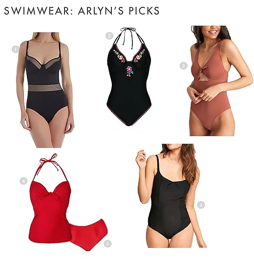
1. The Sunbather, $95: I’m excited to see if this brand is as flattering and comfortable as it looks. I am not afraid of a bright pink and red number, and I am really into the shape of this one.
2. Babe, $450: I’m EXTREMELY curious why this suit would be $450. What could it possibly do to your body?? MAGIC? I want to try it but thank god it’s sold out in my size.
3. Frida One Piece, $200: I like this one because there is a shelf to hold the ladies, plus a thick strap which seems comfortable (and is a cut I like on me).
4. Gaia Bodysuit, $230: I’ve talked about this suit before (and likely won’t stop talking about it) because it is just so good.
5. The Fused Delta Bikini Top, $50: This top looks like it could definitely support my secret boobs. This one is from that same brand as #1 that I am excited to try. Their stuff is cute and I really like their general ethos.
6. The Belted Classic High Rise, $45: I know I said I am done wearing bikinis, but I feel like I can see myself in this one because of this high-waisted bottom. Oh, and I love the little belt detail.
In case you need a refresher on the team, we included photos so you can get the gist of who’s talking. First up, our Editorial Director Arlyn can’t wait to show you the suits she’s been eyeing…(she may have purchased one since writing this):

Name: Arlyn
Title: Editorial Director
How would you describe your figure? I’m pretty petite (5’3”) and definitely curvy. I’m hourglass-shaped, just like…in larger proportions. My chest is LARGE and I’ve got some Latina hips and legs on me.
What do you look for in a swimsuit? I have pretty low expectations for finding swimwear that makes me feel cute + just sexy enough + young(ish). I have a very large, heavy chest so I absolutely, without question, need an underwire. “Full bust support” usually means a built-in molded cup (HAHAHAHA) with a shelf liner or just a tight seam under the bust. That’s cute…maybe if my chest was half the size it is, but I’m not kidding around. I want perky, round, young boobs in a swimsuit, and the ONLY way for me to accomplish that with my GG-cup breasts (yup, that’s a cup size people) is to have an UNLINED, bra-sized underwire swimsuit with adjustable straps and back clasp. Also, most underwired, cup-sized swimsuits are bikinis and I just don’t feel comfortable in one (never have). It really just makes me feel like swimwear companies are lazy (or the market share for my body type is VERY small, which somehow I doubt). DO BETTER SWIMSUIT COMPANIES. Oh, and I like thicker fabrics because they are lasting but also slimming.
What are you willing to spend on swimwear? I’ve spent upwards of $175 on suits, but I’m happy to do that because I only buy them every few years and I’d prefer to purchase something that fits really well, makes me feel confident, and is high-quality so it lasts years and years.
1. Pour Moi Glamour, $80: I love a black swimsuit, and I think the “mesh” sections (which are not sheer, actually) could be nicely waist-defining. Sizes through 38G.
2. Fig Leaves, $65: LOVE the price point here and the fun embroidery feels summery without being too young (or aging). Sizing goes through a 38G. The back strap seems a little wimpy (that’s where most of the support comes from), but I might order and try on, actually.
3. Peekaboo One Piece, $95: This is SO cute and actually looks age appropriate (unlike other underwire suits on the market). It says it supports up to a G cup and while I’m skeptical of anything that doesn’t actually have an underwire in terms of support…I’m intrigued (even though I’d have to squeeze my ladies in there).
4. Pour Moi Halter, $69: I like a halter because I can adjust it to be as “lifting” as I want. My Puerto Rican-toned skin would work well against the bright red I think.
5. Pour Moi Control High Waist Bottom, $35: I love that the bottom is high-waisted to help with sucking and tucking any tummy woes.
6. Anya Underwire Balcony Swimsuit, $99: Panache swimwear has NEVER failed me. I probably buy one of their suits every year or two. The price point seems reasonable, the side rushing would be nice to camouflage some of my fluff, and I just think it’s a classic suit that would be pretty flattering. Sizes go up to a 40K. (I have purchased this since writing and I’ll report back when it arrives.)
Next up, Ryann is serving all the classic swimsuit feels…

Name: Ryann
Title: Special Projects Editor
How would you describe your figure? I have long legs (I am 5’9″) and a bit of a booty, thick thighs, medium/large bust, and a bit of a tummy that I just recently learned to love. 


June 14, 2019
#ShowEmYourDIY: 10 Totally DIY Ideas to Transform Your Sad Backyard

Welcome to another edition of #ShowEmYourDIY. The feeling about these seem to be mutual: we love seeing/showing off all of our readers’ amazing work and homes, and you guys seem to be loving reading all about it, so we’re back with a no-brainer topic: backyards! We’re in the FULL swing of summer-y things now (heat wave included here in LA), so sprucing up our outdoor spaces is pretty imminent. I know it can seem daunting to look out into a yard that is crying out for help and not know what to do about it/think it’s going to cost a fortune or need a professional, but if these 10 projects are any indication, it’s very doable, I promise. Get ready to sit back, sip a cold drink and let that charred smell of grilled sausages all up into your nostrils.
For the first transformation, we’re just dipping out toes into “outdoor” but it’s actually a sunroom because that’s kinda outside, right?

Fun fact, we actually have already showcased Leigh’s handwork in the DIY kitchen post where she transformed her kitchen for $250. But when she heard about our DIY outdoor space callout, she emailed us this room and it was too good to pass up. We play by our own rules and definitions here. This awesome transformation took six weeks and cost $650 (minus the rug and curtain dye). She first painted the space with Sherwin Williams’ Extra White, the accent wall with Aubusson Blue from Annie Sloan and the floors with gray epoxy paint. She then, with the help of her brother-in-law, built a bed swing, transformed free tree stumps into coffee tables, and then made custom olive drapes by dying basic white IKEA curtains. For the rest of the pieces, she either owned them or thrifted. My biggest question to her was how did she feel secure about the swing and her advice was to just make sure that “you screw your eye hooks into ceiling joists.” Noted for the future. It looks awesome and if you want more info go here and for the swing DIY go here.
Shall we officially head outside now?
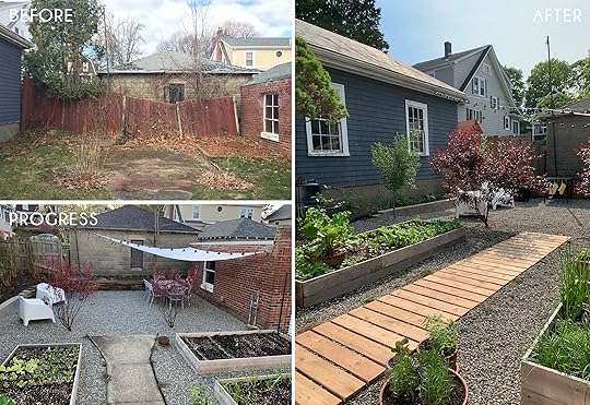
When Melissa and her husband bought their 90+-year-old home they knew a lot of love was needed for their backyard. So over the past 2.5 years, their yard went from falling apart to looking brand new. The first thing they did was tear down the old fence. Instead of rebuilding it, they repurposed some of the pavers from the ground and created a small retaining wall (needed due to the slopping of their yard). They then dug out all of the grass and built those great garden beds and added pea-sized stone all over. The last DIY was that awesome cedar walkway. Since the rest of the yard had gotten a facelift, they decided to say goodbye to the cement walkway because it looked out of place. It was definitely the right call and the whole space looks fantastic. Like I said before, this project took them about 2.5 years and a rough total of $2,700. Well worth the wait!
Now I’m pretty excited to show you this next DIY because I feel that A LOT of people deal with similar less-than-ideal backyard plaster walls. This is how Anita made her’s nearly disappear.
Anita decided she was tired of looking at her old plaster walls so she and her husband DIYed these very cool modern wall panels to help disguise them. They started by digging holes for the posts followed by pouring a bit of cement into the holes to create a foundation. Next, they sanded the posts down, set them into the holes and finished by securing them with filling the holes with gravel. Once the posts were all set, Anita and her husband painstakingly sanded the rest of the slats with an electric sander and then decided to leave them natural instead of painting which was the original plan. Once the slats were up, she added the flower boxes to add some more visual interest. They also wanted to give their cement pad a fresh look so they painted it with a soft grey. In addition to that, Anita learned how to limewash brick so the previous ’90s red bricks that would have been in front of the wall now look brand new! Now for the grand total…the fence (all materials included) was $244 and the plants/planters came out to $481. Anita said that weather prolonged the process but that someone could easily do this over two weekends or even a long one (weather permitted). This is really such a clever and budget-friendly DIY.
Want another killer wall idea but for a patio??

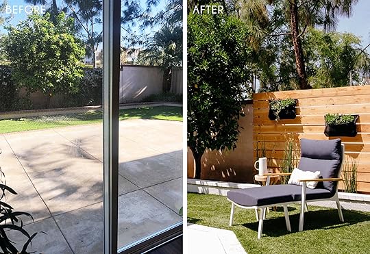
Bev is one of the lucky few in New York (Brooklyn specifically) to have outdoor space. But as expected in a big city, it lacked privacy. In a stroke of genius, she decided to figure out a way to create a green wall and I think it’s safe to say she nailed it. With a bamboo fence, a faux trellis and zip ties, her patio looks like a slice of serene outdoor heaven. She calls it “The Easiest DIY Green Wall Ever” but it’s also the smartest. Since NY experiences all of the seasons, her bamboo and faux greenery should hold up beautifully. This is incredibly renter-friendly (no tools needed), small space friendly and for a rough total of $500, you can make one yourself. She wanted to point out that the $500 is for two panels so if you need only one panel then slash that price in half.
June 13, 2019
“Revenge Body For the Home”: The Juicy Backstory to Orlando’s Show Unspouse My House
A question I’ve been getting quite a bit since my HGTV show Unspouse My House was announced is, “How did this come about?” So I thought I’d take a minute and write down how I got here, how the show came into being, and give you some behind-the-scenes goss on what goes into making a TV show. Because we’re creatives that live in LA, Emily and I have been surrounded by “Hollywood” types since before we were on Secrets from a Stylist (which I just found out you can still watch on the HGTV app). It’s kind of hard to escape “The Industry” when you live in this town. And there are a lot of misconceptions about it. I think one of the most common misconceptions is that people in Hollywood are somehow “elites” handed things on silver platters. None of the people I know who have created or starred in successful shows/movies got there without a lot of sacrifice, years of financial struggle, and a ton of worrying and anxiety that they might never get there.
The origin story of “Unspouse My House” started in 2015, when a random lady from the internet (named Jen Rettig) found me on Instagram and DM’d me about working on show ideas together. We met and began working on show concepts back then, but none of them got as fully fleshed out as Unspouse My House. We had some crazy ass ideas. One of them was called “Dear Design Disaster” and was basically a parody show of every design show out there. Just a totally insane version of a design show. That idea never really took off, but a few years later I started doing Insta Stories and that brought in a lot of attention from producers and production companies, who are constantly on the hunt for “talent” to create shows with. At this point, my agent chose a production company from the dozens that had reached out and Jen and I started working with 51 Minds (best known for producing “Below Deck” and a bunch of other fun reality shows).
Jen and I began meeting with 51 Minds to flesh out show ideas and eventually as a group, we came up with a concept for Unspouse My House, a show that’s actually pretty easy to summarize. This is how I generally explain my show: “Every week, I take someone who’s been recently dumped and I give them a home makeover to help them heal.” An even more efficient summary is “It’s basically ‘Revenge Body’ for the home.” In all honesty, I’ve never actually seen “Revenge Body,” but I imagine that it’s about giving yourself a body makeover to regain confidence and reboot your life, which is exactly what we’re doing except with houses.
Once we’d settled on a general concept for a show we wanted to move forward with, the process of creating the show went like this:
August 2018, create a sizzle reel (3 minute “preview” of the show consisting of footage we shot for the sole purpose of selling the show).
September 2018, 51 Minds shops sizzle around to production company.
September 2018, HGTV bites, wants to move forward with pilot (test) episode.
November 2018, HGTV views pilot, decides right away to move forward with series.
March-May 2019, show goes into production.
June 2019, show gets released.
That is a super streamlined summary of what happened, but I didn’t want to bore you with too many details. Basically, HGTV was enthusiastic about our show from the beginning and pushed it forward as quickly as possible at every step along the way. We completed the pilot in October, had a green light from HGTV by November, and spent the next few months preparing for the show and casting our homeowners (an outside team of genius detectives finds the homeowners and I have no idea how they find them to be honest). We shot the show over the course of about four months, which was a really challenging, exhilarating time for me. And then the show was finally released last Thursday (Side note: we got great viewership numbers! So hopefully that’s a good sign!).
So, there you have it! The whole story of how my show came about! The End!
JUST KIDDING THERE IS TOTALLY A WAY LONGER BACKSTORY HERE.

The original concept for the show came directly out of something that happened in my own life and my desire to take that experience and turn it into something positive.
This story really begins at Orcondo (pictured above, read more about it here and here and here). Orcondo was a home I shared with my ex that I spent a long time renovating and decorating. Doing so was a dream come true and something I’d wanted to do for a long time. It was the first time that I’d really had myself as client for a renovation project (my ex kinda gave me free rein to do whatever I wanted). And it was really fun. Not only because it was creatively really fulfilling, but also because the space itself represented a life we were creating together. I had a (false) feeling that I’d found my person and that we were going to be together moving forward. It felt like a very secure relationship.
So when my ex dumped me, it came as a shock. There hadn’t been many signs before that. It was a painful experience for obvious reasons, missing him, our relationship, having a companion. But it was also a painful experience because it was similar in many ways to the breakup I’d experienced in the previous relationship I’d been in. I felt like I was entering into this pattern of seeking out people who would eventually hurt me, an endless cycle of making myself vulnerable only to have my vulnerability delivered back to me in a trash bag.

When I left Orcondo and moved into Chateaulando (my West Hollywood apartment, pictured above), I was at an odd crossroads in my life. I turned 35 that year, and while I’ve never been one to be hyper-concerned with age (I’m rebelling against the very LA idea that youth is somehow inherently “better”), turning that age was really hard for me. Not because I felt old (I don’t really believe in that) but because I felt like I’d entered full adulthood. When you’re in your early thirties, it’s kind of like being in your twenties. You’re still kinda like “oh I was just 28 a few years ago!” But when you’re 35 you kinda start to feel like “Wow, I’m fully an adult.” And quite honestly I was pretty disappointed at how adult life had turned out.
I’ve been an overachiever since high school, when I went to school in a rural, very conservative town that wasn’t necessarily the most welcoming place for gay people (or any minorities for that matter). Going to high school was a cultural shock, and I kinda realized that if I wanted to get as far away from this place as possible, I’d have to do well academically. So when I was 14, I started working really hard in school, joining every school club I could and getting all As. I even worked (kids were allowed to start working at 14 where I was raised). So I’ve been working very hard to do well and to be a success since I was a kid, jumping through whatever hoops I had to jump through to get good grades, work, do the summer internships (I had four in college), and the extra credit that’s supposed to lead to a happy, successful life. I ended up gathering four Ivy League degrees and countless honors and awards by the time I’d made it back to the West Coast. And I’m not just saying this to brag, I’m mostly saying it to emphasize the fact that my entire life has been about working hard and striving.

But somehow, even with all this experience and education under my belt, I couldn’t get a job at a bakery (or any random job) to save my life. My twenties had been mostly worrying about money and what job I’d have next (eventually my production/set design work led to a job on Emily’s show, which was the job that finally turned my employment luck around). Right after my ex-boyfriend dumped me, the startup I was working for laid me off (they’ve since laid off most of the employees I worked there with, so I was just the tip of the iceberg apparently). This is less of a complaint and more so just to explain what a dark place I was in the year after my breakup. I had to write a book (I was on deadline), figure out how to make a huge salary (my living expenses had been based on a pretty high income), and figure out how to heal emotionally.
Furthermore, I was at a crossroads with how I felt about human connection and relationships. Feeling incredibly lonely in the fact that you never really can know what’s going on in someone else’s head, that you never really know if a relationship is permanent or not, that at the end of the day we’re kind of alone in our own thoughts, trying our best to connect ourselves to the people around us. Clearly, I was having an existential crisis. And to be honest it had little to do with the actual person my ex was. He’s oddly replaceable in this story. It wasn’t that I was so sad about him particularly, though I did miss him and the little world we’d created together, the love I had for him. It was mostly that him dumping me made me question everything I’d grown up thinking was a given. That I’d grow up, meet someone, create a family, and we’d build a history together. That hard work was rewarded, that doing all the “things you’re supposed to do” would lead to an at least moderately comfortable life.
I’m not bringing this up to complain, but mostly just to emphasize to people feeling the same way that they’re not alone. It can be really hard, even if you’ve done everything you’re supposed to do, to make your career work, to make ends meet. My heart goes out to anyone who is currently struggling with that because I have been there so many times. And my heart also goes out to people dealing with the emotional aftermath of a breakup, which is why I decided to make a show about it.
Don’t give up! This is where the story stops being depressing! It was during my post-breakup, layoff transition that I spent a lot of time trying to set up my new apartment. I’d left most of the furniture I’d selected at Orcondo, so I was moving into an empty space with basically no furniture. I had intentionally chosen an apartment that was much different than Orcondo, which I’d renovated to be organic and minimal (a look I still love). I wanted to try out a new style with my place, so I chose a beautiful two bedroom apartment in a French Chateau-style building on a tree-lined street in West Hollywood (note: I made this semi-stupid and expensive decision before I was blind sighted by being laid off).


Every room in the apartment got a massive makeover, including the kitchen (you can read that slightly harrowing story here). While I was sad to be off on my own and feeling intensely lonely, I started to notice that the process of choosing furnishings, doing small renovations, and making the space my own was a good distraction from the sadness I was feeling about my breakup and about life in general. While my mind was feeling stuck wondering where things went wrong with my ex, working on my new place had me thinking about the future.

One of the benefits of interior design, especially during a sad time in your life, is that it grabs your brain, yanks it out of the past, and asks it to think about the future. What will I do in this space? Who will join me here? What will I need to make this space look beautiful and considered? Notice all the questions you’d ask yourself while designing a space are in the future tense. This forward thinking is so beneficial to someone trying to keep their brain from fixating on something painful.

Another benefit of interior design for someone going through a breakup is that it’s a time where you can be totally selfish, to imprint your identity and only your identity onto your home. Designing for couples always involves so sort of compromise. I’ve never worked with a couple whose taste was fully in alignment. There are always things that one member of the couple likes that the other hates. Which is why it can be so liberating to design post-breakup. Not only are you free from the constricting desires of a partner, you’re also in a discovery zone. This is perfect to try out something you might never have tried had your ex still been around. For me, this was painting my bedroom ballet pink.
I LOVED my pink bedroom (and I kinda regret painting it aqua a year later). There were a number of reasons I painted pink, not least of which I wanted to scare away any guy who might be too insecure in his masculinity to handle dating a man with a ballet pink bedroom. But practically speaking, from a design standpoint, it’s just a really wonderful warm color for a bedroom (especially one like mine that gets a lot of natural light).

Another thing I did post-breakup was to make sure I had a beautiful guest bedroom. I did this because I wanted to make sure I had a space for people from out of town to stay. I think it’s important when you’re going through a breakup to spend time with the people who matter to you. You need your support system around you.
Designing Chateaulando brought me so many lessons. Firstly, it was an opportunity to design a new style of space. I’d done mid-century, I’d done modern minimalism, and this was an opportunity to do something that looked more like a Parisian flat with some rustic and deco elements. Second, and more importantly, it taught me the therapeutic power of interior design (and yes, I know how cheesy and self-helpy that sounds). Your surroundings have a huge impact on the way you feel about your life. Having a beautiful home can help make you feel more enthusiastic about your life.
Interior design is also a way of showing care for yourself and the people in your life. Taking care to make your home beautiful is a way of expressing self-care, doing something for yourself to proactively make your life more beautiful. It sounds superficial, but it’s a way of taking the reigns in your own life, of making active changes to make it better.

The post-breakup journey I went on became the basis of Unspouse My House. As I’ve done with my social media, I wanted to take my experience and figure out how I could use it to help other people. The show came from a simple desire to do something nice for people, to take an experience (designing my own place) that helped me get over my breakup and pay it forward to other people. And it’s been amazing to see how it has panned out. Every week, we meet someone at a different point in their healing process (we have breakups as long as eight years ago, some as fresh as six months). And it’s so satisfying to see how much the concept of the show—using interior design to heal from heartache—really works. The homeowners on our show go through amazing transformations that mirror what’s going on in their homes and it’s really amazing and inspirational to see. Freeing their homes from remnants of their past relationships helps set them on a much quicker path to recovery.
The reason I’ve been so open about my breakup and other hardships I’ve faced in my life is that I think we do each other a disservice when all we share about our lives is the good stuff. I believe in being positive, but there’s something kinda gross going on with social media these days. It feels like all anyone shares are their successes, all the happy stuff that goes on in their lives. While I love seeing good things happening to good people, I think over time having all this “MY LIFE IS PERFECT” content shoved into your face on a daily basis can start to make people feel like their lives such in comparison, that somehow they’re not measuring up.
What I’m trying to do with Unspouse My House is the same thing I’ve tried to do with my social media. I’m trying to show a less-than-perfect version of life and how to make the best of it. The show itself is really fun and funny, and we did that on purpose. The point isn’t to bum you out about someone’s breakup. The point is to empower people, to show them how they can get their lives back and be happy. It’s a very feel-good show, essentially you’re just watching me do nice stuff for someone who needs it and watching their emotional state change, going from heartbroken to joyful.
The past few years have been a roller
While having my own TV show comes with a considerable amount of fear (Will people like it? Will they like me? Will it get canceled?), what I am feeling now that it’s out is mostly gratitude. Gratitude for all the people who expressed support for it, gratitude for the incredibly rare opportunity to head up a project like this, and most importantly gratitude that I was able to take one of my least favorite life experiences and turn it into one of my favorites.
Unspouse My House airs Thursdays at 9:30 on HGTV and the HGTV app (you can also access through Amazon, Google Play and Vudu if you don’t have cable). The first episode is available to stream for free (no login required) on HGTV!
The post “Revenge Body For the Home”: The Juicy Backstory to Orlando’s Show Unspouse My House appeared first on Emily Henderson.
June 12, 2019
When You Need More Storage But Your Closets Aren’t Getting Any Bigger: 72 Storage Furniture Picks
 photo by sara ligorria-tramp for ehd | from: jess’ small space living room makeover
I don’t think there has ever been a time in my life where I thought to myself, “I have enough storage.” Or perhaps more accurately, I have never thought “Everything I own has place.” Ask anyone who knows me well and they will tell you my organization skills are the opposite of Marie Kondo. I have a habit of throwing clothes onto the nearest chair/dresser/table as I am getting ready for the day (and sometimes, I do this multiple times a day to my boyfriend’s utter chagrin). Then, to “clean up,” I am the queen of throwing clothes and clutter blindly into drawers and cabinets. By the way, it has come to my attention that shoving clothes into a dresser unfolded takes up a lot more space then if said things were neatly folded into perfectly symmetrical squares. Who knew?
If it isn’t obvious already, storage for someone like me is best presented in the form of several LARGE drawers and cabinets to keep things out of sight and to keep up the appearance that I am “tidy.” (p.s. will I ever change? Someone, please send help). The problem is space doesn’t always allow for king-sized dressers and trunks to make up for my messy little habits. In any case, my ideal situation would be to cast an Undetectable Extension Spell a la Hermione Granger and never have to worry about where things go ever again. But so long as Hogwarts doesn’t exist and I have to function through life magic-free, storage furniture is where it’s at and here is why: pieces that are multi-functional are always going to help you save on space. If every piece of furniture I had also served as a place for storage, I would likely be a better, more tidy partner.
So, if you too have storage woes, or if you simply love functional, practical furniture, I sincerely hope you will come along with me on this journey as I attempt to write about storage in a fun, interesting way that won’t have you falling asleep into your coffee. I think we found some really great storage solutions that are versatile and multi-faceted (and really cool) that we hope you will love as much as we do. Let’s get into it.
Beds
What I love about platform beds equipped with drawers or storage compartments is that they make it impossible for things to get misplaced under the bed. Take #2 for example. There is no way anything is getting underneath that sucker. There is nowhere for runaway socks to hide, and no place for empty water bottles to stow away for months. Plus, like I said before, any piece of furniture that has extra drawer space is going to make you a better human being and make your partner/roommate love you more (or is that just me?). Regardless, bed frames aren’t just for looks and can be a great extra storage solution.

1. Stratton Storage Platform Bed Frame With Drawers | 2. Nexera Nordik 3-Drawer Storage Bed | 3. Chesterfield Tufted Storage Bed | 4. Astoria Storage Headboard & Platford Bed | 5. Massie Storage Platform Bed | 6. Malm Lift-Up Storage Bed | 7. Nordli Bed Frame With Storage | 8. Fortin Upholstered Storage Platform Bed | 9. Matera Bed | 10. Urbano Storage Platform Bed | 11. Step One Storage Platform Bed | 12. Brooklyn Storage Bed & Headboard | 13. Bowlin Storage Platform Bed | 14. Brandy Modern Fabric Platform Bed With Storage Drawer | 15. Hemnes Daybed with 3 Drawers
Benches
I love a good entryway bench. They can be really chic and also SO practical. If you are a renter like me, something like #1 is great because it adds height (very important) and dimension, while also serving many functions. You can hang up your purse, backpack, and hats for easy accessibility when you are running out the door. If you have pets and need a place to hide toys, leashes, and treats, something like #11 would be perfect. The possibilities are endless, my friends.

1. Easmor Hall Tree | 2. Dusk Leather and Wood Storage Bench | 3. Ronquillo Upholstered Storage Bench | 4. Dean Sand Storage Bench | 5. Boatman Wood Storage Bench | 6. Parocela Wood Storage Bench | 7. Belham Living Storage Entryway Bench | 8. As You Wish Upholstered Storage Bench | 9. Birch Plywood Storage Bench | 10. Navy Textured Decorative Storage Bench | 11. Matera Storage Bench | 12. Palm Canyon Louella Velvet Storage Bench | 13. Cleo Storage Ottoman | 14. Loring Storage Bench | 15. Belham Living Finn Mid Century Modern Bench
Coffee Tables
When it comes to coffee tables, we think you should never have to substitute style for practicality. Depending on your needs, you might want a table with open storage to display your favorite books that also has a drawer for your tv remote, coasters and games. #15 (my personal favorite) is a great option if open shelving is more your style.
But…some of us need some more space (ahem, me). Here is the thing, I love throw blankets. They are the unexpected gift you receive from a cousin on Christmas and get SUPER excited about because you realize you can never have enough blankets (like candles!). But, unless you have a plethora of linen closets, the question is where do they go when summer comes along and even the sight of a faux sherpa blanket makes you break out into a sweat? Answer: in your coffee table! See #1 for example. It is about 2 and a half feet wide and can certainly hold two throw blankets that will be ready for you when the cold months return.

1. Drum Storage Coffee Table | 2. Two Drawer Coffee Table | 3. Poplar Wood Lift Top Dixon Coffee Table | 4. Ruby Storage Coffee Table | 5. Zen’s Bamboo Lift Top Coffee Table | 6. Euro Style Aurora Coffee Table | 7. Naya Pop-Up Coffee Table | 8. Pure Storage Coffee Table | 9. Oslari Painted Coffee Table | 10. Aurelle Home Wood and Iron Industrial Coffee Table | 11. Industrial Storage Pop-Up Coffee Table | 12. Gold Hammered Coffee Table | 13. Reda Lift Top Coffee Table with Storage | 14. Charles Coffee Table | 15. Porthos Home Bowie Mid-Century Coffee Table
Ottomans & Stools
Ottomans are a great place to store throw blankets (again), books, board games, playing cards, sewing supplies, you name it. Really anything you use often but don’t necessarily want displayed all the time can easily be stored in an ottoman like #11. I would even throw slippers or an extra pillow in there for movie nights because why not be prepared for a comfy night in?

1. Frankford Tufted Storage Ottoman | 2. Loring Storage Cube | 3. Trinity Hexagonal Storage Ottoman | 4. Natural Abaca and Wood Odette Storage Ottoman | 5. Movie Salt & Pepper Storage Ottoman | 6. Jonathan Leather Storage Ottoman | 7. Square Storage Ottoman | 8. Carson Carrington Storage Ottoman | 9. Upholstered Base Storage Ottoman – Large | 10. Round Accent Storage Ottoman | 11. Alina Storage Ottoman | 12. Mid-Century Ottoman | 13. Glenmont Storage Ottoman | 14. Bozeman Tufted Storage Ottoman | 15. Porch & Den Rockwell Tufted Storage Stool
Shoe Storage
Remember, a lot of these pieces can be used in a number of ways, in whatever way fits your lifestyle. Do not be fooled by the product description. It is your life so you should definitely let your furniture be whatever it needs to be for you. For example, when I saw #12, my brain immediately went, “woah, what a cool shoe organizer!” It is technically not for shoes, but I say why the heck not? It can be if I want it to because I am an ADULT that makes very important ADULT decisions.
There are a lot of options here to completely hide your shoes but if you are like me, sometimes you want to display those babies. I like to keep the shoes I wear the most out in the open and I also tend to display my favorite pairs because who says shoes can’t also act as decor? IMO, shoes are a great way to show off your personal style both inside and outside the home. Something like #2 could act as both, by hiding your not-so-cute shoes and displaying the ones you love love love.

1. 18 Pair Shoe Storage Cabinet | 2. 16 Pair Shoe Storage Cabinet | 3. Carson Carrington 18 Pair Shoe Cabinet | 4. Gunter Wood Storage Bench | 5. Stall 8 Pair Shoe Cabinet | 6. Shoe Rack Entryway Storage With Hidden Compartment | 7. Cade Modern 18-Pair Shoe Storage Cabinet | 8. Lucy Entry Collection Shoe Bench | 9. Hemnes 9 Pair Shoe Cabinet | 10. Kace Tall Locker Storage Console | 11. 2-Door Entryway 16 Pair Shoe Storage Cabinet | 12. Industrial Storage Dresser
Okay my friends, that is all we have for you today. Are you pro storage furniture or totally against it? What are your storage secrets? Tell me everything.
Til next time
The post When You Need More Storage But Your Closets Aren’t Getting Any Bigger: 72 Storage Furniture Picks appeared first on Emily Henderson.
June 11, 2019
Is This the Next Big Color Trend? (+ 7 Ways to Use It at Home)
 image source | design by lynn k leonidas
There’s a part of my design process I left out of my MOTO introduction from a few weeks back, and that was all the variations of color combinations I played with (even if just in my head-slash-Instagram bookmarks) for specifically my living room. I went back to look at all my saved images halfway through making firm decisions about the spaces, and you guys…there was SO MUCH yellow. To say that surprised me is an understatement. Who even am I? Aside from my blue-and-yellow moon and stars themed bedroom as a kid, the golden hue has rarely ever been a consideration for me in decorating. Sure, I had a gray-and-yellow phase, but really all that was was me buying a set of floral Target pillows from the now debunked DwellStudio line. The draw to the earthy hue lay as forgotten in my brain as all the decimal points of pi I diligently memorized as an overachieving high schooler. BUT THEN IT CAME BACK (the yellow lust, not the numbers).
 image source
This was the photo that kickstarted it all for me. The White City House hotel (photographed by Ellie Lillstrom) popped up in my Instagram feed and I stopped and stared at it for maybe 10 minutes. I love a box pleat, so I wasn’t exactly surprised by my visual lust for this room, but there was something about the warm mustard velvet paired with those crisp white bed linens, the mid-century palette rounded out by the icy blue radio and nightstand, and green table lamp…it felt nostalgic yet new. It’s a room that feels robust yet casual, and that is not an easy combination to achieve.
 image source | design by vanessa prosser
In terms of tone, I’m not necessarily talking about buttery yellow or anything too creamy. This is not to say I don’t love a bright, sunny yellow—is there anything happier than that?—but what really has my eye (and I’ve been seeing used in a fresh, forward-thinking way) are deeper, richer shades like mustard, ochre, butterscotch. Anything almost gold like; all the richness of the metal but none of the glam. In fact, these yellows tend to be very grounding in a way that makes my eyes relax when I see them in a space. They’re a “deep breath” moment in a design for me, and I can’t believe I’ve overlooked it for myself all this time.
 image source | design by cortney bishop design
Here, in a relatively neutral bedroom by Cortney Bishop Design, the mustard rug rounds out the blues, whites and weathered wood tones. Without it, it would be a beachy, light-filled room that was a bit floaty, but with it, it’s a beachy light-filled room that feels balanced and tethered. Do me a favor. Take your hand and cover up the rug (and the bed’s base). What do you see? Pretty, sure, but almost too visually empty. Now remove your hand…can you see what the yellow does to the space? It’s like your eyes refocus and it just feels…right.
 image source | design by alison cayne
I very much appreciate someone who leans into a color. If my living room is any indication, I LOVE a bold sofa moment, but you rarely see a yellow one and now the inside of my brain is screaming WHY NOT?!? The room above was designed by Alison Cayne (founder of Haven’s Kitchen), and if it looks familiar to you, it’s because it was inspired by the previous (internet-famous) home of Jenna Lyons, yellow velvet English roll arm sofa moment and all. Sure, decorating with yellow can feel like the path of a truly daring design braveheart, but Alison’s home is any indication, it can actually be very mellow and serene. It’s all about what shade you choose to work with and what you pair it with, which brings me here:
I didn’t want to just do a piece that was like “yay yellow” and send you off into the world with yellow fever (hopefully) all willy-nilly. The mission of this blog is to inspire and educate, so let’s move on to the “educate” part of this blog post, mkay?
Because yellow can be a bit tricky, I thought it would be a fun exercise to narrow in on some color palettes that work well in real rooms so either 1: I can further convince you that yellow is wonderful and not scary or 2: I can help usher the color into your home effortlessly for anyone already on board.
Let’s start with one of my favorites that makes the bright hue feel hip and edgy:
Yellow + Slate Blue + Black
 image source
This is one of those photos I mindlessly bookmarked in my Instagram account, forgot about, then re-fell in love with when I went back to look. The deep goldenrod yellow of the bedspread mixed with the black rug and leather bench could have felt a bit heavy if not for the white walls and linens and the cool casual nature of the slate blue/gray nightstand. Those walnut-hued herringbone floors certainly don’t hurt either. The room feels worldly, eclectic yet minimal and just plain cool. ::runs out and buys a yellow throw for her bed immediately::
Yellow + Neutrals
 image source | design by studio ashby
In a similar vein is this next idea for how to work with yellow: just pair it with a bunch of neutrals. The above photo (a room by the crush-worthy Studio Ashby) brings ochre in via multiple textiles to create variety but a concise color palette. White walls keep things light, and black lighting and art injects a bit of modernity and, well, downright “coolness” to the vignette.
 image source | design by sarah sherman samuel
Ochre is a clay-like hue that is not-quite-yellow, not-quite-brown and probably the most “popular” yellow right now. It’s the cool kid in the crayon box and elicits desert vibes. To me, it’s pretty calming and earthy, and works best paired with a whole lot of nothing. White, cream, wood tones, maybe a tiny bit of black, brass…okay that’s not “nothing” but they are tones and materials that act as great support to the star that ochre is in its own right.
 image source
If you stopped at that last image and thought it was too “trendy” for you, may I offer you up this warm and welcoming bedroom? This is the room of my vacation dreams. Who wouldn’t want to wake up here every day? I can almost feel the cool mountain breezes and the mosquitos buzzing in my ear. Ha, yeah right. Mosquitos would see this room from the window and know they don’t belong in there. It’s too chill for them. Anyhow, this is just a puffy cloud of neutrals that’s kicked up a notch by the pigment of the linen bed throw. The yellow brings the rest of the wood tones to life in a way.
Yellow + Teal
 image source | design by jeancharles tomas
Moving away from the safer yellow path is yellow + teal. It can be as simple and subtle as the above Paris home by Jeancharles Tomas or as daring and saturated as the below room from Soho House Berlin.
 image source
 I think what’s important to note here is something we’ve seen in the other palettes already discussed: yellow (in any shade) needs to be “grounded” by wood tones and can be “kicked up” by matte black and brass if you want to lean more modern. Creams and shades of white also help to make a much brighter hue—like the hand-glazed tile in the below kitchen by Lynn K. Leonidas—feel natural and, dare I say, calm?
image source | design by lynn k leonidasYellow + Mint Green
 image source
This specific hue or yellow is a little too buttery for me but I like the idea of a deep, rich yellow with a light and playful mint green (grounded by black and wood, as always). The painted black millwork is a bold move, but I think I like it? White might have felt too childlike and playful.
Yellow + Ice Blue
 image source | design by luis laplace
If yellow + mint green isn’t your slice of life, may I suggest yellow + icy blue? There’s really something nice about a warm golden yellow mixed with a light-as-air pastel like sky blue. Be careful though, because this could easily turn the corner into “baby room” territory. Be sure to keep things a touch more serious by adding in plenty of warmer neutrals and “grown up” textures like linen, leather and wood. The gray linen curtains are particularly nice here to add in another neutral layer that isn’t more white (particularly because of all the snow out the windows of this particular room).
 image source
Keeping furnishings more abstract or artful is another sure-fire way to make this perfect-for-a-nursery-but-also-adults palette clearly in the “adult” category.
Yellow + Pink
 image source | design by megan bachmann interiors
Alot of what I’ve already shown you has, I’ll admit, felt a bit serious. Yellow is supposed to be a “happy” shade after all, so let’s bring in some pep via blushy pinks (and in the case of the below room, shades of blue). If you go this route, be sure to keep your yellow firmly in the mustard or ochre family if you want things to still feel fresh and modern.
 image source
Yellow + Rust + Navy
 image source | design by alison carroll
And finally, the earthiest of all the palettes I’ve explored with you today: yellow (mustard) + rust and coral + navy via boutique hotel El Rey Court. Cool tones tend to marry really well with other cool tones, and the same goes with warm tones, but don’t be afraid to cross over, even if just a little bit. The addition of the navy (which is delivered here through the art) balances all the earthy hues nicely here. This could have also been achieved through a navy throw on the sofa or an armchair.
Notice how all but one of these didn’t have bright yellow walls. That’s where things can get scary. I applaud you if you’re willing to plunge into the yellow deep end and go all in, but for anyone looking to round out or add some depth to a palette they already have going, I hope you saw something here that got you excited. As I get to work on some other rooms in my home, you can bet that ochre or mustard will likely make a cameo. It’s hard to beat the warmth or comfort those hues can bring to a space.
Let me know if you’re into the color or even this type of article. I’m not calling yellow a “trend” necessarily, just trying to bring attention to something that’s on our radar. Something doesn’t have to be in vogue for us to love it/want to talk about it. Chime in in the comments friends. I love to hear from you!
The post Is This the Next Big Color Trend? (+ 7 Ways to Use It at Home) appeared first on Emily Henderson.
June 10, 2019
Mountain House Monday: The Last-Minute Changes I Want to Make But Won’t (or Maybe I Will)

To make a fashion analogy, when we shoot my house, it’s typically dressed more to host an Oscar viewing party, but when being shot and featured in a professional interior design magazine, read by professional interior designers and brands (and seen for the FIRST time), it feels like it’s being photographed on the red carpet then presenting Best Picture of ALL TIME. The once-thrown-together outfit for friends now becomes a real “look” that I get to amp up. It’s not bad stress, it’s kinda the best stress ever. I really want it to represent my style and show what myself and the EHD team can do.
So with nine days until the shoot, there are some things that I’m like, “ooh, would it make more sense/be more impactful if it were [insert musings here].” Most of these were decisions that were made quickly near the end of the renovation and some were even placeholders that we never switched out. None of them truly drive me nuts or I would have changed them, and thank god I have SO few regrets with this house. But here are the things that I’m considering at the 11th hour…
First up, the closet door hardware.
Near the end of the renovation, we chose these knobs because they match the rest of our interior doorknobs, which I LOVE, but once they were installed, my team and I had the same reaction: They should be long and linear not round and small. I suppose it’s because of the vertical nature of the wood that just wants a long handle, versus a knob. Plus, those closet doors (from Ross Allen) are SO pretty, so I don’t want to miss an opportunity to show them off.

But they are so nice!!
A month ago, I told Julie that we should replace them, then two weeks ago (when I was super tired and feeling overwhelmed), I changed my mind with a “no, it’s good enough. It’s fine!”
Then last week, as we were doing another walkthrough, predicting the shots and angles we were going to shoot, we realized once again that if the closets were to be shot (and they will for the blog regardless) then it’s just such an easy fix. Sure, we are going to have to patch some holes, but the wood is busy enough and wood filler will blend in. We have these in two of the bedrooms.
So we are switching them out for these.
A far bigger dilemma is the dining chairs and light.
As a reminder, we originally were going to have the table oriented in the middle of the room, so we had two junction boxes installed with those beautiful matching pendants (custom from The Urban Electric Co.).

Then we realized that my dreams of having a massive banquette could come true, so we oriented the table this way to see if it would work, but at that point, the second pendant closest to the kitchen was no longer necessary.


We took the second light down and capped it. Here’s where we are now with just the one fixture over a pretty massive (top secret) table (House Beautiful, like all magazines, wants us to keep a few spaces secret so that when its shot professionally its the first time you’ll see it!):

While it’s still gorgeous, it feels small for the space now, and as Julie said, it looks like it’s missing its friend. This type of light usually is hung in multiples in order to have the impact that it should have.
The kitchen has a linear piece so I feel like a linear chandelier could also work here to fill the overhead space. Here are some we’re considering, although many are over our budget and have a crazy lead time (but fun to show you what i’m thinking):

1. Balance Chandelier | 2. Astro Mobile Light No. 2 | 3. 3 Arc Island | 4. Lodge Chandelier Three | 5. Black Sputnick Light | 6. Chiltern Double | 7. Sculptural Pendant | 8. Lucca Chandelier Iron | 9. Industrial Chandelier
Will I change it out? I don’t THINK so. I actually just found a few more on Lulu and Georgia and a couple vintage ones from MidCenturyLA that are affordable (and available in LA). But as I write this (at the mountain house, sitting at the banquette) I look up and see the fixture and it’s truly so pretty (the underside of the disk is brass, by the way) that it seems just silly to replace it just because something might be a better scale.
Additionally, the banquette is built and the cushions are being made as we speak but I kinda forgot about the three chairs that will be in front. I have some vintage wood chairs that are cute and it wasn’t until like two weeks ago that I thought maybe we should actually consider what the right chair would be. I love a mixed chair situation but is this the right house for that? When I brought it up to Brian, he said “oh, I thought those were placeholders.” HA.
So now I’m on the hunt for chairs that are “right” stylistically, but also good for kids, work with the new bench fabric design and frankly can get to us in time. Here are some I’m strongly considering (one of which we landed on):

1. George Armchair | 2. Sammie Stacking Chairs (Set of 4) | 3. Tilt Side Chair | 4. Bok Chair | 5. Tanner Dining Chair | 6. Nestor Chair
The table is so pretty that I don’t want them to be too visually heavy and block it, but at the same time, they need to be fairly wide to fill the space properly. I don’t want them to be stylistically “loud,” rather minimal (but not cold). They also need to be comfortable. It’s hard, guys.
Okay, let’s move onto the schmear on the fireplace…

I’m around 80% in love with the schmear, and to get me to 100, I’d love one more layer of plaster. Just a tiny bit more schmear. Maybe it’s that I know what was under there, but I just want the bubble rocks to be smoothed out just a bit more. Julie, Emily B. and Brian do not agree and with nine days left to go, I think I’m losing this battle. I also don’t care THAT much but I’d love for you guys to weigh in.
Should we all chant together “ONE MORE SCHMEAR, ONE MORE SCHMEAR?” Or no?
Onto some (more) lighting choices:
Let’s start in the living room:
These sconces are so good for the price ($118 from Shades of Light) and we chose them later in the renovation to pass inspections, but we all really like them.

Lately, I’ve had this thought that they could be more special, but I also know that not everything has to be a “moment.” As of now, I’m leaving them because the living room will have enough visual interest and perhaps these don’t need to scream STYLE at you. The black squared off lines are kinda perfect and the fabric shade provides the light that we want (more ambient, not directional). One thing we could do is switch out the shades for black ones…should we?
Next up are the master bedroom sconces:

There are two awesome sconces above the nightstands, so we chose these as a placeholder for the other two in the room. I’m so sorry to say we don’t remember where we got them, but these are similar and so affordable.
But we always had the intention of putting in an articulating statement reading light, we just had decision exhaustion so to pass inspections we put in these.
These are the sconces we are considering (the lantern style ones were to go by the patio door, not in this corner:

1. Perry Sconce | 2. Houe | 3. Peel | 4. Leighton Adjustable Sconce | 5. Scoop | 6. Tully Sconce | 7. Hillgate Pocket | 8. Bayberry Wall Sconce | 9. Arlo Light
I think this is important to really make that fireplace wall the moment it deserves. I’m not sure if that is the chair that will live there, but I think something with a black arm coming out will be the best choice.
This stuff is the good stress. It’s not renovation. Not permanent tile choices. I can honestly say that I love this house so much regardless, even if I didn’t change a thing, but as a designer and stylist its fun to care about the details and talk about the creative process.
Head to stories today where I’ll show you more and YOU GUYS COME BACK NEXT MONDAY FOR A BATHROOM REVEAL!!!!! We finally found out what rooms the magazine will likely not run, so we can start revealing those. YAYAYAYAYAYAYY!!!
The post Mountain House Monday: The Last-Minute Changes I Want to Make But Won’t (or Maybe I Will) appeared first on Emily Henderson.
June 9, 2019
The Link Up: We’re Hiring (!!), the Perfect $30 Summer Sandal, Great Father’s Day Gift Ideas
 image source | design by jessica helgerson interior design
Another big week with an all too short weekend. The final prep for the mountain house before the big magazine photoshoot is happening, which is EXCITING. Can’t wait to start rolling out whatever reveals we can (tune in the week of the 17th for what’s next!). Hope the sun is shining where you are and our links bring you some smiles (and Father’s Day gifts ideas). Let’s get into it because it’s a long SPECIAL EDITION one…
Emily’s new favorite cookbook is Every Day is Saturday: Recipes + Strategies for Easy Cooking, Every Day of the Week. Not only are the photos shot by one of her favorite photographers, Gentl and Hyers, but it’s full of awesome recipes that feel as easy and breezy as cooking on a Saturday.
Ryann ATE up this article about how to create a therapeutic alter ego and now she can’t wait to envision her very own “Karen” that will help her do things like organize the thousands of photos on her desktop and not get stains on every white T-shirt she owns.
Another amazing app rec from Bowser, MileIQ. She purchased the $50/year version last year which shes KNOWS sounds steep, but if you drive a lot for work and especially if you are freelance, you NEED this for accurately logging miles for reimbursement and/or for tax write-offs. No more writing miles down in a small notebook that gets lost in your car, or more accurately, NOT writing anything almost ever and then trying to guess for tax purposes and worrying about the IRS coming after you. As an example, in 2018, she started logging in April, paid the $50 for the year and saved $2,407 in those 9 months.
Julie is going to live in this jumpsuit from Target this summer.
She also would be fine living in this loft in Portland (probably in her jumpsuit) designed by Jessica Helgerson…she’s just saying.
This is Sara’s absolute FAVORITE way to make potatoes. It’s so easy and quick and they turn out perfect every time. She makes them to go with rotisserie chicken or to pop them into a salad.
Anything you ever see Velinda wear is second hand, scavenged from racks. But this week, she got lazy when she needed new summer work-wear and decided to shop online via thredUP (Em actually did an awesome partnership with before Velinda’s EHD time). The best part is that they accept returns, so the stakes are low. She definitely found good deals! Worth a look if you’re a fellow thrifter.
Arlyn’s holy grail wallet/carry-all is this beauty from Madewell. She bought this wallet about four years ago and it’s probably one of the best things she’s ever spent money on for her everyday life. It works as a wallet but also a small clutch where she can slip her phone and keys into if she’s not carrying a purse. “I got mine monogrammed because…why the heck not? I think it would be a great gift to yourself or…anyone else you know.”
Jess just bought these $30 sandals for her big international trip (next week!!) and she loves them. The shape of the sole is super flattering (sounds weird but it’s real). Plus, they are super light-weight and thin which is perfect since she’s trying to pack a 2.5 week trip into a carry-on sized bag…wish her luck.
Veronica bought this mug from Target a month or so ago, and she loves it. It’s the perfect size for a nice cup of tea or coffee and she feels like a major girl boss drinking from it.
Grace is relieved there’s actually a scientific explanation that justifies why she’s watched Gilmore Girls and Friends from start to finish probably a hundred times in the last two decades. This article explains why. Curious to know what shows other people revisit over and over again.
One of Michael’s absolute favorite IG accounts right now is Brian Patrick Flynn. He’s a wildly talented interior designer and does amazing work but what’s even greater are his IG Stories. He is so funny, charming and is always traveling to interesting places. (He got married in Antarctica?!) You’ll like it.
WE ARE HIRING! Wanna be a part of The Link Up by applying for one of three open positions??? We are looking for a Social Media Coordinator, an Account Manager for Partnerships, and a Marketing Manager. Head to the Instagram post on Emily’s account to see the job descriptions and if you think you are a good fit, email jobs@emilyhendersondesign.com.
Now, for something SPECIAL!
We have one week until Father’s Day so if you aren’t planning on taking an idea from our Mother’s Day Thoughtful Gift Ideas post then here are a few things we are planning to pick up for our wonderful and deserving fathers:
Emily is thinking this awesome retro Bluetooth boombox would be perfect for Brian this year as he has been VERY into retro things lately. This one is a cheaper option but won’t be available in time for the big day.
In addition to a year in review letter idea, Jess is also getting her The Greatest Showman OBSESSED father this T-shirt.
Julie is getting her dad this genius Luggage Tracker Device. He is going on two big trips this year and hasn’t always had the best luck with his bags. This device comes with an app so you can track it right on your phone. I think we all want one for ourselves.
Ryann’s dad is all about building things so this magnetic wristband will keep him from putting loose screws in his mouth…hopefully.
Velinda and her wife are getting her father-in-law (a retired butcher) this Chef’s Meat and Fish Knife.
Veronica has a few ideas up her sleeve this year but the one she can disclose (since her dad reads the blog, keeping some things top secret) is this beautiful tie. He is a lawyer so she wants to make sure his tie game is on point.
Michael’s dad loves to read and historical things, so he is buying him this fantastic WWII non-fiction book called The Longest Winter by Alex Kershaw in addition to this book about a young Theodore Roosevelt called Mornings on Horseback.
If you need more ideas, head to our gift guide section on the blog. Happy gift finding and see all you beautiful people tomorrow. xx
The post The Link Up: We’re Hiring (!!), the Perfect $30 Summer Sandal, Great Father’s Day Gift Ideas appeared first on Emily Henderson.
June 8, 2019
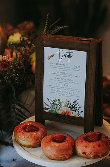
Velinda and Katie’s Love-Filled Backyard Wedding + Their Genius Budget Tips

Today, my wife and I have been married for a year. So, we’re marriage experts obviously…no. But the EHD team was impressed by the fact we had a 70-person wedding for $10K when the current average cost of a wedding in California is $32K(!?!). To celebrate LGBTQ Pride month, I’m sharing my wedding (with a few of our budget-friendly tips that Emily is obsessed with), so today, I’m a wedding blogger who’s never read a wedding blog. “The big day” just wasn’t on the list of daydreams for my wife or I growing up. Despite marching and voting for the right since 2003 (thank you fighters who came before me), I never really “needed” marriage myself. Then there was Katie.
I married an old friend. The details (and the relationships-turned friendships-turned new relationships-turned friendships that only queers seem to pull off that surrounded us and brought us together…then back together) are enough to fill another post (or two), but a clip: In 2013, I bonded instantly with this quick-witted, unconventional thinker over the invisibility of bisexuality, a joint love of camping and a shared, life-long crush on the X-Files’ Gillian Anderson. We double-dated, camped and rang in 2014 together. Then we lost touch. Two years later, she missed an exit on the freeway near my house and ended up turning around on my street. She texted. When we met up to grab a drink a week later, I felt nervous, despite easy and unlimited conversation. I suddenly noticed the crease in her bottom lip and the freckle in her eye. She’d later confess to a 3-year-long crush. But until we reunited, I was clueless. Now, I had to escape to bathrooms when she was around, fearing I might actually vomit. What was happening to me? So much fear preempted shifting from friendship to…more…I didn’t want to lose my friend again. But I also knew if she felt the same, I was done. For good. And I’m a pragmatist. So again, what was happening to me???
My. God. If kissing a friend always went like it did for us, I’d advise everyone to go kiss a friend (bad advice). The weeks that followed that first kiss, we were smitten. It was hard to form words when together. Katie spilled soy sauce all over the table every time we went for sushi. I was gushing to a journal and any friend willing to listen. “I’ve lost my heart and sanity to my friend. Send help.” It was disgustingly adorable and we just belonged. Then, three weeks later, my mom got diagnosed with stage 4 ovarian cancer. And shit got real.
Avoiding the ins and outs of cancer (always fun to include in a wedding blog), I’ll say this: Katie’s embrace, dry-morbid-ish-humor and ability to ground me by sitting outside, playing Gin Rummy (and other such retirement home-appropriate entertainment) kept me laughing through a dark year. She was my vessel (term of endearment from a stylist!). And as my mom said when she met Katie for the first time, in a hospital room upon getting diagnosed, “I knew instantly she was family.” At the end of that year, I proposed fireside in our backyard. And a year and a half-long engagement brings us to the point of this post: The budget wedding.

Having never really dreamed of a wedding, it was time to plan one. Neither of us had a family with funds or a church affiliation to provide a venue. What we had was a lot of friends and a house with enough yard space for 60ish people…we thought. We really hoped.
Without unlimited resources, we homed in on what mattered to us and where we wanted to spend. And when it was all said and done, we looked back on what worked, what was necessary/paid off…and what didn’t. And now, I can form the list of “budget-wedding advice” I needed then—and maybe you need now. Having done this once (or at least that’s the story I tell Katie), here is my expert advice, given the hindsight:
1. Invest in What Matters and Lasts*
(*like, dog tutus)

Your guests won’t leave a bad Yelp review if they don’t get monogrammed napkins (which end up in the trash). Splurge only on a few limited details that last and keep the rest simple. For us, it was our bar sign, which now hangs on our wall and a Polaroid book for guest memories ($280 total for book and film, we had the camera).

Prioritizing what lasts, we spent most of our flower budget on potted plants. Our jasmine/bougainvillea wedding “backdrop,” the table succulent boxes and the plant walls (which we made with wooly pockets) are all flowers we’re still enjoying today. Plus, we filled in slightly-neglected window boxes and hanging planters since some needed home improvement with florals. These lasting plants cost $570 and completely transformed our yard…still! Only $350 spent on “fleeting flowers” that were used for bouquets (gorgeously designed as a gift from our friend Melissa). That’s still a lot for something that doesn’t last, and you could consider some sort of wooden flower instead.

2. Rethink the Sit-Down Dinner
This was obvious for us because we had zero room for lots of tables/simultaneous eating and are the proud owners of the tiniest, galley kitchen ever! We didn’t even have space for a catered setup. Our solution: a food truck! They provided several hours of food, starting with “tray-pass apps,” which THEY SERVED, and ending with really great tacos/side options. It cost us $2,500. For 70 people! And this is LA.
 photo by Laura Spencer
Instead of a cake, we opted for donuts (Pinnable trend of the year, I know, but we’re obsessed with our local vegan donut place and Katie is severely allergic to dairy).

Donuts have the added bonus that they’re easy to grab and require less plating/utensils. As avid campers, we opted for s’mores for late night treats. Any excuse to be fireside…and there ain’t nothing cheaper than a marshmallow.
3. Forego Gifts and Opt for Favors/Services
Hands down the reason our budget was low (and our wedding even possible) was that we have insanely talented friends! We made a list of roles our friends could fill based on skillsets and then made calls (okay, texts) asking, “instead of a gift, would you help us…DJ (Mike Kopelow)… do our hair and makeup (Kelly and my sister, Paige)?” Honestly, many friends came out of the woodwork to help and it was just a matter of delegating.
(Side note, we almost forewent having a DJ but were advised to not skip that role and would pass along that advice!)

Y’know how everyone you know seems to get married in the same year? It’s the perfect opportunity to BORROW. No shame. Our Yelp rating remains intact despite being the third wedding that year to use the same sign stands.
…and the second within the month to feature these collected goblets:

The “year of weddings” is also a chance to trade services. Darci, who served as our day-of coordinator (required!) and handled everything bar-related asked us to do design/floral arrangements for her wedding the year prior as an exchange. Boy did we come out ahead on that one…suckahhh!
(Bonus budget bar tip from her to us to you: Pick 1 or 2 signature cocktails and otherwise stick to beer/wine, which is to be purchased during Bevmo’s 5 cent wine sale!)
4. Choose a Location Where You Can BYOB & Caterer
Avoiding a venue’s upcharge on catering and bar services/alcohol can save hundreds to thousands. Many venues mandate such services, but more flexible locations can definitely be found. OR, avoid the venue fee entirely ($$$$$) and find a backyard. We were lucky to have that piece in place, though it meant being a slave to our yard/house projects for the entire lead-up year (we built this deck!).

If you opt for the route of a backyard wedding, don’t forget you’ll need host insurance, possibly a permit, and patient neighbors. We groomed ours by dropping a bottle of wine/note on each porch within immediate proximity. The note gave an end time, several phone numbers to call instead of the cops, and a preemptive “thank you!”
5. Keep It Small
This is hard to do! But more people = more money. Mind-blowing, I know.

This tip is so obvious, I almost nixed it, but one of my very favorite things about our wedding was how intimate it felt. We not only easily engaged with every guest there, but Katie and I were also able to stay present with each other because there was no need to “divide and conquer” to cover ground. “Controlling the flow” was easy, too, due to limited space and people, so the night remained a sequence of group activities (ceremony, toasts, Bingo!, dancing). No risk of the party spreading out too much and, therefore, dying early. It was a night of intimate, shared experience from beginning to end, from pre-bar to the last dance. (New Rule #1: Opening the bar early—required!) If you can endure the pain of cutting that list down, I’m here to say it’s worth it.
6. Avoid the Rack for the Dress(es)
But…don’t miss the fitting experience. I had two best friends (and soon-to-be brides) by my side for several appointments as we did some dress research. We did the shopping. We drank the champagne. But ultimately, there wasn’t a single dress that looked good on me below $1,250. And yet, I discovered through this process what style I was drawn to (and realized, to my surprise, I had a desire for a two-piece). Ultimately, both my and Katie’s dresses came out of our friends’ closets (insert obvious gay joke).


Katie’s friend had changed her mind about a dress during her own wedding process, so Katie bought it at half price ($600). One of the two friends I was shopping with, Autumn, who happens to be a stylist, MADE my dress from one she already owned, a designer dress SHE had found SECOND HAND (final design sewn by her go-to seamstress Faith). Total cost: $100. My backup plan was to shop vintage or get a pretty non-wedding dress. If you’re on a budget, don’t pay for the “wedding” part of the term “wedding dress”!
7. Pick (& Plan) Your Pics
Photographers, videographers and photo booths are each SO expensive. $1-7K each, easily. On a truly snug budget, you can’t have it all…okay, sorta. But you’ll definitely have to assess your priorities. Ours fell in this order:
1. We wanted the best-quality photos we could afford since we planned to frame them/would “have” to look at them every day. Katie found The Dream Choice through a Facebook group. Siouxzen was highly reviewed and fit within our budget ($1,300) because she was doing a summer sale. And she made us so, so happy! BUT, we couldn’t afford her the whole night, so we also had a couple incredibly talented “amateur” photographer friends bring their cameras as their gift to us. (Thank you Steve Agee and Laura Spencer.)

2. We wanted the experience of a photo booth as an activity for our guests, but were happy to make a homemade backdrop/iPad setup suffice. We asked our cinematographer friend Mike and muralist friend Eve (clearly, make a lot of talented friends before planning a budget wedding) to be in charge of this D.I.Y—okay, They.I.Y—and they went above and BEYOND…like, WTF, this shouldn’t be what DIY looks like?!:

3. We decided we could totally forego a professional, edited video. BUT we wanted someone (anyone) to at least record the ceremony. In 20 years, a video will look dated no matter the camera chosen today, so we were okay with something basic. We weren’t okay missing the record/something to watch/rewatch for years. Katie called on an old college friend who owned a decent camera and we paid him ($300), not expecting too much. Yet somewhere between college and wedding, he’d apparently become a professional. I mean we got footage edited…raw…we had it all. Regardless of budget, assign someone to video. You’ll want it.
We opted to do all professional photos before guests arrived so that we never had to “kill” the party once it got rolling, but I don’t care how and when you decide to do pics, PLAN them. Make a list of all the shots that are important to capture. Which we did. AND think through where you want them to be. Which we did not. After an entire year, there was one dumb project we didn’t find time for…cutting down an ugly, old partial retaining wall in our carport/driveway. “Ah well, nobody will notice it.” Well, guess what made it into every. single. family. photo that. day?

8. Limit Paper (Save the Date… and The Trees)
We put together a Paperless Post save the date announcement AND a Paperless Post invitation for almost everyone and it cost $12 instead of a few hundred for printing/mailing. We did this for everyone we thought might open, enjoy for 2 seconds, then toss. Anyone we assumed would want to save the commemoration, (or who we assumed didn’t understand the digital world/had a 0% digital signature)…got a hard copy. Regardless, it was all the same design and homemade. The save the date, I pulled together with my at-the-time new Illustrator/Photoshop skills. And the invitation was our gift from graphic designer friend, Jen.

9. Pick Your DIY Moments
The DIY trap! Guys, Pinterest helps wedding planning so much…but it can also hurt. Don’t buy into believing you need to show your creative genius around every corner! We kept asking ourselves, “does this enhance the experience for all?” For the most part, we did a solid job of being super selective/asking for help. My main advice would be don’t save a single ounce of DIY for the “day-of.” It’s too late and/or you’ll be distracted from what’s important by that time.
The DIY I think paid off the most for us was hanging our own (permanent) heavy-duty string lights in both the front and back yard from $4 electrical conduit pipes! It took one afternoon. I wish I could take credit for the idea, but it all came from here.
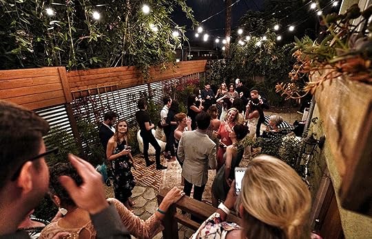 photo by Steve Agee
The DIY I still question:
Aiming to “only invest in what lasts,” we decided to forego renting anything. So instead of renting any chairs/tables, we found (via Craigslist) a restaurant that was closing down and selling their tables. We kept some intact and cut others in half, throwing on $25 hairpin legs to turn them into benches. They looked cooler than the cheapest chair/table setups (to which the price would’ve equated), BUT we weren’t able to resell them as we had hoped. And, while we’ve enjoyed them outside for the last year, they’re wearing down now. Worth it? Can’t decide. But definitely still grateful to our friends (Maura and John for embarking on this DIY venture with us).

10. SPEND A TON…of Time
Like in design, with a wedding, you can’t have good, fast and cheap. You pick two. So, if you want “good” and “cheap,” you’re looking at sacrificing some “time.” But doesn’t time mean the most?

We put in lots of time thinking through personal details that were 100% free. For instance, as Bingo prizes, we pulled together “gift bags” from random things nobody would want that we found around our house. It either meant something or was attempted hilarity for the people that knew us best. Example, one gift bag included a “survival kit” complete with items such as half a box of bandages and a flashlight and another was a “Badass Bag,” which included a Ruth Bader Ginsberg coloring book (already half colored in) and a “Future is Female” Christmas ornament.
 photo by Laura Spencer
We also spent a lot of time deciding ceremony details. My brother officiated, my mom ‘gave me away’, our friend Allie and a sister, Meg, sang us down the aisle both ways and a best friend re-read the Andrea Gibson poem that I had read when I proposed… the same one she had read to me the night we first kissed. (Thanks, Laura!)

I’ll say the two time investments I would NEVER undo. We wrote our vows early. I mean, it’s what everyone came for, right? Yet, it’s so easy to postpone. AND we planned a moment immediately after the ceremony to be alone. I like to think of it as our “holy shit!” moment. While everyone else herded into the backyard for toasts/got a second drink, we stowed away to take in the fact we were married.
I have to go back to #1 on the list…invest in what lasts and what matters. I got really overwhelmed as a bride who never hoped to be a bride. This woman meant so much to me, yet I found myself caring about things I hoped to never care about…table runners! Try to remember it’s not about the table runner…

In January, my mom passed. Just seven months after one of the best days! My WIFE got/is getting me through. And because of the simplicity of our wedding and all the support we had, that celebratory day wasn’t consumed by utensils and balloons. We got to truly invest in/experience what mattered.
For me: the dichotomy of fear and trust; utter vulnerability in my wife’s face as she heard my vows:

The friends who are family and made the whole thing possible:

And my mom’s dance face:
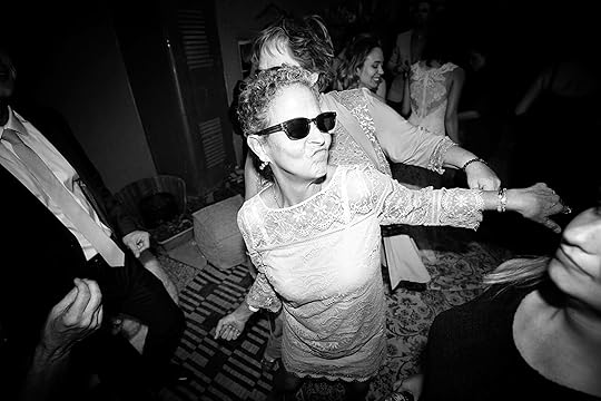 photo by Steve Agee
Having done this wedding-thing once, I’m now the EHD trusted expert. And I’m here to tell you, your budget doesn’t matter. NBD!!!! What matters costs more than paper. So, keep fighting the fight…and then go dance!
 photo by Laura Spencer
***unless otherwise noted, photography by The Dream Choice
The post Velinda and Katie’s Love-Filled Backyard Wedding + Their Genius Budget Tips appeared first on Emily Henderson.
June 7, 2019
The 7 Things You Need to Know Before You Try to Hang That Gallery Wall

Right around the time that we decided to work with Pen + Napkin on a new Feel Good Flash Makeover, this time for a very deserving family of soon-to-be five transitioning out of homelessness (see yesterday’s reveal here), Artfully Walls reached out to us to partner on a post about art and it just felt like the perfect marriage for what we had going on. Our goal for this family’s home was to make it comfortable and safe (they were removing themselves from an abusive situation), with some “life” and color (our Mama Bear’s request) and truly, there’s no better way to bring in character and a sense of place and personality than through art.
If you don’t know Artfully Walls, they’re a really great site where you can source affordable art prints of all styles, but they also have tools that make creating art setups (especially gallery walls) SO easy. With their Wall Designer, you can pull in any pieces you like and play around digitally to create an arrangement you love before committing to purchasing either the prints or the whole she-bang with custom frames. That takes the guessing out of sizing and orientation that’s so hard to figure out without doing some manual labor and/or guessing. Also, for anyone who suffers from paralysis of choice (or as a reader said a few weeks back in a post and I never forgot, “Fear of Better Choices”), they also offer pre-selected gallery walls in over 50 styles. Yay for not having to make any real choices (I mean, of course, you have to pick from the 50+ but it’s a VERY good starting point slash way easier to see someone else put something together that you can then tweak rather than starting with a blank slate). Gallery walls and more complicated art arrangements can feel like you need a Ph.D. in art history mixed with an apprenticeship at a custom framer to figure out, but we’ve put up our fair share around here and have plenty of tips so you can feel confident in doing it yourself (you CAN do this).
Before we get to that, I’m going to walk you through the art picked out for this home, the whats and whys, so you can hopefully get a sense for our thought process, i.e. LESSONS and plenty of HOT TIPS. Let’s start in the living room.

Top Left | Top Middle | Bottom Left | Bottom Middle | Bottom Right
The big art moment here was the loose grid on the picture ledges, balanced further down the wall (in the kitchen) with an overscale piece. Here, we went with a mix of frame colors (black and white for variety but still keeping things concise) in varied scales and orientations. We didn’t go with anything too large and vertical, otherwise, the shelves would have to be further apart. That would create more white space around the horizontal or square pieces and then this whole arrangement would feel too airy. Try to keep things light yet tight. We put the largest pieces in the center of both ledges then played around with the other smaller pieces to fill in (that’s typically what you want to do with any art grouping).


In terms of the prints we actually picked, you’ll notice there’s a mix of “media” (watercolor, mixed media, oil), but it’s all kept cohesive enough because we’re working within a color palette of blue, mustard, and blush, for the most part. Everything is on the moodier or muted end, so the landscape still feels like it belongs next to the ethereal portrait.
Because of the open floor plan, the pieces in the kitchen still needed to “talk” to the art in the living room. There were some things we wanted to cover up (the float-mounted circle print below actually covers up the fuse box), but for the most part, the purpose here was really to bring some life and color into this pretty neutral space. HOT TIP: If you’re in a rental and handcuffed to the style because of your lease, the easiest thing you can do to detract from what you don’t like is to bring in things you do like.

Large Abstract Print | Circles Print | Smaller Abstract Print
The photo up there on the right is a good reminder to switch up your framing. Here, we went with a float mounted piece and a near full bleed. There’s definitely nothing wrong with going all float-mount or all matted, but if you want something a little more casual and “loose,” make sure to vary up the mounting.

We kept the art in the girls’ room simpler in terms of layout, going with a big anchor piece above the dresser that felt age appropriate, then peppered the bookshelf and the wall by the window with a few other pieces:


These two pieces (above) felt very much in line with each other, having that painterly touch, and keeping the frames white let the art pop more against the neutral wall and bookshelf backdrop.


While yes, this is a room for young girls, that doesn’t mean it has to be all “baby” art. That floral portrait would work just as well in an adult-woman home, and the yellow and blush arches (monotone rainbow? …is that a thing?) would be pretty great as graphic touch to a grid of art or a gallery wall (for both grown people and littles).
Okay, now that we’ve laid the groundwork and helped you with your art arranging 101 homework, we’re graduating up to the more advanced gallery wall. Okay, I shouldn’t paint the picture (ha) like that. I have some breaking design news: GALLERY WALLS ARE NOT THAT HARD. I know they can seem super intimidating, especially if you’ve never done one before, but do you trust us? I mean, hopefully, you do if you’re here. Trust us.

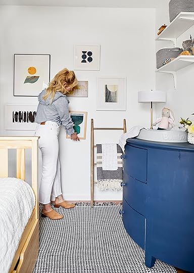
This particular “salon” wall (that’s just a fancy way to say gallery wall, BTW) was a little different in that it had to visually serve both a grown mama, her teenage son and still feel appropriate for what would be the nursery in this two-bedroom apartment. Everything picked out by Velinda (who was the lead designer on this project) leaned more modern to keep it adult yet playful, with the addition of that funny little animal drawing in the middle.

Top Left | Bottom Left | Top (Circles) | Right | Bottom | Center
Let’s study this for a minute…what do we have here and why does this work?
A cohesive palette: Orange, teal, black and navy make up the colors of the pieces. It’s nice to have one piece that speaks to all those colors (like the large anchor print at the top left), than the rest individually answer some of the other hues. What this does is two-fold—keeps things jiving visually but also doesn’t feel too matchy-matchy. “Matching” can be tricky because anything too same-same is going to feel overly planned. The goal is to keep it casual. The two teals aren’t exact? Cool, totally fine (actually, that’s better).
Plenty of orientations: This is one of the biggest keys to a successful gallery wall (which was done here). You’re going to want to shake things up with squares, horizontals, verticals, and extreme versions of the two latter shapes. Also, don’t be afraid to bring a framed canvas into the mix to inject even more variety.
Different colored frames (but reigned in): Our favorite mix of frame colors in a wall is pretty simple—black, white, white oak (or another light wood). Sometimes, for impact (and if you’re building out something BIG), a brass or chrome frame adds a nice punch, but mostly, keeping everything streamlined, i.e. nothing too ornate in a sea of modern gallery-esque frames, is your best bet for GWS (gallery wall success). Here, there’s a nice variety of frame widths, too. A thinner frame will always come off more modern than something thicker, but generally, anything in the 1-inch arena will feel updated and fresh.
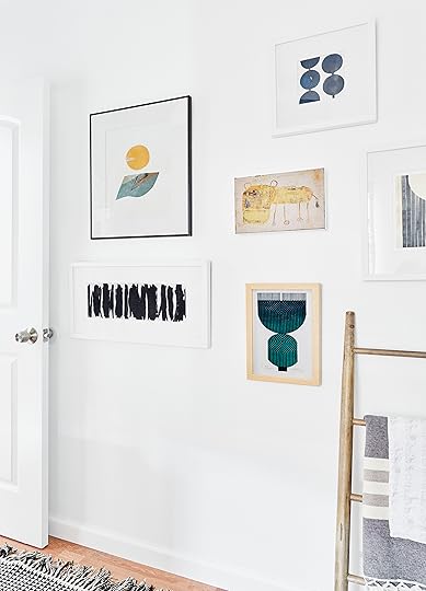

Now that you know how to pick your art, it’s time for a quickfire hit list of dos and don’ts of hanging a gallery wall so you get it right the first (or first-ish) time. Some of these points have already been touched on, but I wanted to put them all in one place so you can reference back as your cheat-sheet when you embark on your gallery wall journey.
How to Put Together a Gallery Wall (Without Panicking):
Pick your anchor piece and build out different frame sizes and orientations from there. I’ve probably said this, what…three times now? But anyhow, yes, this is paramount to a pulled together yet eclectic arrangement. Mix up small and big pieces (and don’t be afraid to go to extremes), horizontals, verticals, squares (squares are GREAT), canvases, etc.
Vary frame colors and finishes. A good rule of thumb is to stick to three finishes. Black, white and one wood tone is a great place to start. If your gallery wall is very large, you can get away with mixing in one more finish, like brass, but that works best if there are at least two pieces in a metallic, as one will feel pretty solitary and unbalanced. Another note in terms of frames is to not be afraid to mix up frame widths. You do not need to use the same frame over and over again. In fact, it looks less finicky if there is some variety. Going super thin will feel more modern, while a thicker frame comes off more traditional.
Play with mounting options. I’m not saying not to use all matted pieces, but a mix of matted, float-mount, full-bleed and partial bleed (with a white border) is our personal favorite here at EHD.
Pick and stay within a color palette and “vibe.” If you’re buying all new art for this project, this is pretty easy to control as you can just make sure everything you purchase will work together. If you’re putting something together from collected pieces, you’ll want to weed out anything that feels like it doesn’t belong, whether because of style or color (or add more pieces to round out that outlier if it’s super important to you). You can also just “pick” a style of art (all B&W photography, abstracts, vintage oil portraits or seascapes, for example), and go all in. That’s SUPER chic and special.
Find a flat place to lay everything out before getting your hammer. Step away from the hammer, please. You’re not ready. Collect all the art you think you want to hang together and lay ALL of it out either on the floor, a bed and dining table. Arlyn told me that in her dining room, Jess helped her with the process and she advised that she measure the area she was going to use (her ENTIRE wall), and mark it out on the floor with painter’s tape. She said it was genius and will never not do it that way. She even taped out where approximately her wall sconce is so she didn’t mistakenly plan art for that spot. Play around until you have something you like. You’ll want to make sure all the verticals aren’t all together, or all the black frames. It should feel mixed but doesn’t have to be exact. If two white frames end up next to each other, it’s totally fine if you love the way it looks. You’re not going to go to gallery wall jail. Take a deep breath. It’s going to look great!
Don’t stress about “fixed” spacing between pieces. Repeat after me: all art pieces do not have to be exactly the same width from the next. That causes a logistical nightmare when you’re working with varied sizes and orientations. It’s okay to eyeball (try about 3-4 inches between pieces). The easiest thing to do is, once you get your arrangement, pull your largest anchor piece from where you have everything laid out, and hang that, then start working from there. You’ll have to adjust as you go, and you might find that some of your measurements were wrong, but it’s TOTALLY fine.
Note where the nail actually goes. Unless you got all your frames at the same place, make sure to pay special attention to the distance between the top of the frame and where the nail will actually hang off the frame. Some pieces might have a wire, some might have hooks, some might have nothing at all, so it’ll all differ and if you want things to be precise, measure each frame individually before putting up.
Okay, I think you’re finally ready for some art. You’re all studied up, you have your cheat sheet…it’s time for some shopping. Again, don’t forget about Artfully Wall’s pre-selected gallery walls (they offer 20% off entire purchase if you go this route, too), but if you want to go at it alone, we arranged some favorites from the site into roundup categories:
1. Swyre Head | 2. #3 by Justine Moody | 3. Series 1 No. 7 | 4. Persimmon Rains | 5. Garden Carvort | 6. Poco a Poco | 7. Song | 8. Line & Shape Studies 01 | 9. #5 by Justine Moody | 10. Spring Is Like A Perhaps Hand | 11. Sunday Market | 12. Knott Cloud | 13. Wabi Sabi 16-01 | 14. Snowmelt | 15. Series 3 No. 2

1. Bait and Switch | 2. Cycle 01 | 3. Abstract No. 9 | 4. Two Loops | 5. Looped | 6. Geometric | 7. Turquoise Triangles | 8. Herba Mythologica XV | 9. Kinetic Lines 18 | 10. Red and Blue Branches | 11. Out of Shape | 12. Turn II | 13. Untitled | 14. Striped Stone #1 | 15. Black Form

1. Into My Arms | 2. Woodcut Floral | 3. Jalmia | 4. Bowl of Lemons | 5. Pot Plant | 6. Ink Floral | 7. Eucalyptus 1 | 8. Pears Black and White | 9. Yellows Roses in White Pitcher | 10. The Good Listener | 11. Bouquet Study No. 1 | 12. Freda | 13. Wild Cactus | 14. Blue Pod | 15. Lemons

1. Autumn Girl | 2. Head | 3. Woman Sitting on a Quay | 4. Prayer | 5. Afro 1 | 6. A Time of Roses | 7. PJH | 8. Comet and Oranda | 9. Just Moody | 10. The Big Leap | 11. I’ve Got You | 12. Posey | 13. Silhouette | 14. La Espera | 15. Wrestling | 16. August 1980 | 17. The Gallant Pluck | 18. Malalla | 19. Riley | 20. Monica In a Red Dress | 21. Julie

1. Negba | 2. Desert | 3. Tangerine Sky | 4. A Calm Sea | 5. Waters of the World | 6. Walk in the Woods 4 | 7. Without Expectation | 8. Headspace | 9. Six Shooter Peak | 10. Sete Cidades | 11. La Veta Farm | 12. India no.8 | 13. California Coast, Trees & Beach | 14. Petoskey Hunter | 15. Beach Huts | 16. To Richardsons Hill | 17. She & I | 18. Cherry Coast
There are literally hundreds more options in a wide array of styles and categories, so have a look.
Thank you again to Artfully Walls for providing the art for yesterday’s makeover, and let us know what art pairing, framing or arranging questions you might have. I know it can feel intimidating sometimes, but we’re here to help.
*This post is in partnership with Artfully Walls but all words, designs and selections are our own. Thanks for supporting the brands we love that support the blog.
**photography by Sara Ligorria-Tramp, creative direction by Emily (Henderson), design and styling by Velinda Hellen with styling support from Emily (Bowser)
The post The 7 Things You Need to Know Before You Try to Hang That Gallery Wall appeared first on Emily Henderson.
June 6, 2019
New Reveal: A Colorful, Happy Home Makeover For An Incredibly Deserving Family

It’s time for another Feel Good Flash Makeover. Every one of these will be different, obviously, but this one was extra unique because the single mom of three is about to have a baby (next week), so we had to move very fast. We got this “call” (literally and spiritually) right after I listened to a podcast about how obsessed we are about having “enough.” “Scarcity” the hot button word is a larger fear that people will never have enough. An example of this extreme is the success of storage unit companies. Think about it: people have so much “stuff” that we pay for essentially a garage to put extra stuff, of which probably won’t be touched for years, meanwhile—you guessed it—so many people around us, often in our own communities, don’t have ANYTHING.
It was literally that same week that Catie of Pen + Napkin, with whom I’ve worked with in the past for the Rummage Sale, called and said, “We have a family transitioning out of homelessness that has nothing and is about to have a baby, can you help?” The timing was pretty incredible emotionally as I looked at our garage, full of beautiful furniture just sitting there and realized that instead of consuming more, buying more “stuff,” we’d give this family a lot of what we already have (as well as a supplement–I didn’t have bunk beds). So that’s where we started and what we based the design off. Velinda was the lead designer and took over once we decided what we could repurpose. After shopping my garage, our prop unit (which we technically still need for the book) and shopping retail, we pulled together this two-bedroom comfortable and happy apartment for this family of soon to be 5.
Take it away, Velinda!
“We are installing more than furniture. We are installing hope.” — Pen + Napkin
With that slogan, how were we to say “no” when Pen + Napkin reached out to us asking if we would sponsor one of their families who had just transitioned out of homelessness. Let’s be honest, we had no desire to say “no.” Flash makeovers are 400% our favorite thing to do. It’s all we want to be doing! This one was a slightly bigger challenge than our Feel Good Makeover last December. Our family of (soon-to-be) five had NOTHING but basic beds and a TV (thanks to Pen + Napkin) in their 507 square foot, two-bed apartment…for FIVE people to sleep, study, lounge and eat together comfortably. (And hopefully, have better access to their limited storage? This won’t do.)

Because this makeover was never meant to be a surprise, we met up with the head of the household and single parent, Mama Bear, to learn more about her family and their needs. Shockingly, “Mama Bear” isn’t her real name. But we were sworn to certain levels of secrecy because she and her three (almost four) children are actually in hiding after escaping an abusive home…house. An abusive environment isn’t home. After surviving a period of homelessness, it was time for them to have a home to feel safe and feel pride in.
When we arrived, the sleeping arrangements were as followed: Mama sharing a queen bed with her 13-year-old son in bedroom one (which the new baby will also share), and her two younger “girly-girls” sharing a second room (above). We coaxed Mama Bear to describe her dream home, but she insisted we “do whatever we wanted” because she was just “happy to have furniture again,” though she did drop the hint she needed more color and “life” in her world right now. She’s having a baby on Father’s Day, so we aimed to move fast (three weeks from beginning to end), so that she’d really be able to bring that new baby home.
Here’s what we learned about their needs for the space: School and homework take up most of this family’s time. Everyone living in the house is in school. But when there’s time, they enjoy doing crafts together and Mama insists they eat together as a family every night. But eat where?

Our top functional priorities were to:
Get Mama and sons into their own beds and liven up the girls’ room
Create a shared space with color and “life” and find a way to squeeze some sort of dining surface/area for the family to eat together
Storage (always)
And of course, make it pretty!
Priority #1: Let’s get everyone in their own bed.
Here’s what bedroom one (where Mama and son slept) looked like before:
And after:

Anyone recognize that dresser below?? It was time it found a new happy home.

Bunk beds were the obvious solution for maximizing the limited sleeping space (always try to design “up” when your floorplan is smaller), but it meant swapping out standard ceiling fans (which Mama said they used often) for a safer/compact caged fan since we hoped to, y’know, avoid top-bunk decapitations.
Stacked beds are great, but can feel very kid-ish since bunks aren’t usually an adult’s first choice (and are typically twin-over-twin). We didn’t have the budget (or landlord permissions) to construct one of those grown-up-cool built-in bunks, so instead, I looked for a simple way to upgrade your standard bunk bed-in-a-box. And it was truly so easy (thanks to our volunteer seamstress, Lillis and my friend Maura who helped make the few needed cuts). The bed becomes more of a daybed lounge, but the “headboard” could also cushion a sleeping toddler in the future.

We put together this quick graphic in case any of you out there were interested in getting a closer look to make one yourself:

“Leather” makes anything cooler and the modern design detail “adultifies” the bed a bit. But we still had the kids in the room to consider. And I FELT for that 13-year-old with no privacy! Hence the curtain design (sewed by our own Julie), which we made from Rebecca Atwood’s two-sided, woven fabric and a ceiling-mounted track system.

Bed | Rug | Curtain Fabric | Ceiling Fan | Roller Shade | Sconce
To maximize function, we repurposed (and dual-purposed) Emily’s chest of drawers by throwing a changing pad on top, creating both a changing table and dresser. Oh, and note the under bed storage! This 100-square-foot room now comfortably (and more privately) sleeps three (with a sleek little bassinet) and more storage and space. And Emily threw in noise-blocking headphones for Big Brother to use when Little Brother cries.

Throw | Changing Pad | Art: Top Left | Bottom Left | Top (Circles) | Right | Bottom | Middle
The gallery wall from Artfully Walls livens up the space and pulls together a color scheme of their combined favorite colors, green and blue. And hold onto your “how to do a gallery wall” questions, because we’ve got tips on that and more art pairing coming tomorrow in a special post.
On the other side of the wall is the shared girls’ room, and though they had their own beds, it was far from cheerful. These two girls had such vibrant personalities, and we wanted their bedroom to match that. In fact, their brother teased that they lived in a “prison cell” (brothers…). And these are girls who love pink, purple and glitter. Remember it looked like this… lacking anything shiny, bright or happy.
But after:

Mural | Curtains | Bed | Plug-In Sconce | Pink Throw | Embroidered Shams | Tassel Garland

Fan | Bookshelf | Dresser | Rope Basket | Lamp | Floral Art Print
Several key pieces came from Elliot’s former nursery and the books and craft supplies came courtesy of you readers (THANK YOU!). The bunk/new fan was the same functional solution as the other bedroom, but what makes this room SO fun, undoubtedly, is the art we sourced through Artfully Walls. The wall mural is from Minted and is a temporary, sticker solution so great for a rental.

Each lady now has a space just for her, with some shared room to play AND access to all of the room’s storage (one of the beds was blocking the closet). Toss in shiny pom-poms, a dose of sparkly lights and pink fringe and faux fur, and you’ve got a room that “glitters” (without the embedding torture of actual glitter. Oy!)

Lady Art Print | Abstract Art Print | Round Pillow
Okay, now onto the shared spaces, where we had to check off another priority:
Priority #2: Bring “life” and color into a shared space + create a place for the family to eat every night together.
Here it is when we arrived:

They weren’t even using this space because there wasn’t even a chair to sit in. But we changed that…
Coffee Table | Round Ceramic Tray | Blue Vase | Black Side Table | Floor Lamp
Armchair | Art: Top Left | Top Middle | Bottom Left | Bottom Middle | Bottom Right
The family’s favorite colors and Emily’s were in sync (reminder: blue and green) and we got to bring a ton of fresh color and “life” from our own inventory to this little living room (longtime readers, spot the repurposed pieces?). And here, we found a perfect home for Emily’s turquoise-eucalyptus-jade-ish (??) sofa. Whatever color that is, it’s SO soft and deep; the size of a twin bed actually, which means extra bed options for the growing family.
Since it’s a house full of students, a desk or homework space would be ideal, but unfortunately, there was just no room. Not-so-secretly, I love small spaces. So many creative solutions and cleverly designed products to uncover under such limitations. And one thing any truly small space needs is a lift top coffee table. Storage (priority #3!)? Check. But look, an instant desk! No excuses for not doing homework now. Sorry, kids.
With a mission to find a new home for some of the great pieces we had just sitting in inventory, we hoped to reuse the tulip-esque table we used in our basement turned office reveal, but quickly realized in the design process it would’ve “eaten” the entire kitchen (kitchen pun). But we had to bring this family around a TABLE, considering dinner together was a nightly tradition. This table became a perfect solution thanks to a low profile (it’s just long/wide enough to seat four)…plus it’s more counter space (counter height!) and storage (shelving).

Counterheight Table | Barstools | Art
With it, the 95-square-foot space became an eat-in kitchen, anchored by a large, cheerful piece from Artfully Walls.
We WANT so badly to share the reveal moment with all of you as we usually do, but we’re keeping this family safe by keeping them secret, so you’re going to have to tap into your imaginations just a bit…
The family returned home around 5 pm on our second day of install (we had put them in a hotel overnight to keep the whole thing a surprise). We hadn’t really met the kids until the reveal. From past Flash Makeover experience, we expected them to show up cautious of a small crew of strangers in their home, but the little ladies showed up dancing, so eager to get a peek of their new rooms. The 13-year-old played it cool as any 13-year-old would do…until the surprise was revealed. Once inside, dancing became singing, with songs featuring catchy lyrics like, “Kitchen looks goooo-oood, kitchen looks goo-oo-ood”. No tears this time, all bouncing, “ooOOoo-ing” and climbing on new beds. So much joy and “life”! When we left, they were touring every room for a third time, seeing new things with each revisit as the initial shock wore off.

Flash Makeover execution days are the best days of our work-lives. This time, nearly the whole team got involved (though Sara and Bowser were on another shoot this day and Arlyn popped in not soon after this photo was taken). THANK YOU, Team. The “flash” part of the Flash Makeover was 100% possible because of your hanging and hammering.
If you guys want to contribute to the next flash makeover (and help support the lovely people of Pen and Napkin and the general overhead costs of running a non-profit) you can head to this page – typically 80% goes to the makeover and 20% goes to Pen and Napkin but EHD is foregoing any help with the budget and 100% will go towards Pen and Napkin and the next family.

These projects are so important to us for many reasons, but mostly because they’ve taught us that when a person/family transitions into an empty home, they are more likely to return to homelessness. But with furniture, the Pen + Napkin team has seen a 100% success rate of ending the homeless experience. We believe in them and these families. Help us support them, if you can. Thank you, Catie (pictured above with Emily) and Corey (her husband) for this amazing thing you do.
Also if you are an interior designer (or enthusiast), you can sign up to help a family and raise the funds to support it. Learn more here.
***photography by Sara Ligorria-Tramp, creative direction by Emily (Henderson), design and styling by Velinda Hellen with styling support from Emily (Bowser)
The post New Reveal: A Colorful, Happy Home Makeover For An Incredibly Deserving Family appeared first on Emily Henderson.
Emily Henderson's Blog

- Emily Henderson's profile
- 10 followers

