
Everything You Need to Know For How to Nail That Moody Room Look
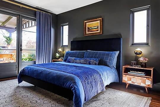
Remember that house we’ve been showing you (this backyard, this edgy basement office) over the last few weeks? It’s a killer home the production and design team staged and styled for Emily’s upcoming book project and today we’re showing you the master bedroom, which is a study in how to do moody yet modern (and also, one of my personal favorite spaces here). The wall color—French Beret by Benjamin Moore—was already there, selected by the homeowners Amanda and William Hunter (of William Hunter Collective), so the team really leaned in to create a luscious retreat with a tonal palette, lots of texture and hits of glam. We’re breaking down the seven things to keep in mind or try if you love this dark, cozy vibe, whether you want to use it in a bedroom, dining room or beyond.
Go tone-on-tone.
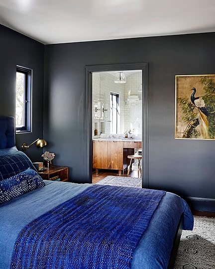
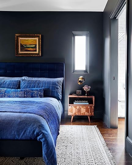
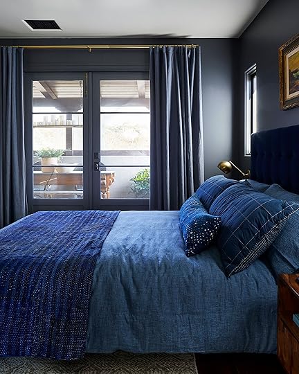
Let’s start with THE talking point about this particular room, but also moody rooms in general: for the greatest design impact (and to create something that reads very “editorial” and high-end), go for a tone-on-tone look. Note that this does not mean everything has to be the exact shade. In fact, you’ll want to vary them, but in this room, there’s an overarching punch-you-in-your-face, blue-on-everything moment happening here. It’s kept interesting and visually layered by playing with tones: dark inky navy blue headboard, cobalt and denim blue bedding, slate walls and matching millwork, blue-ish gray curtains. The lower the contrast, the moodier yet quieter it will feel. Let’s say we decided to do these same dark walls, but then pair them with bright white bedding and blonde wood furniture…that would be a very different story. Pretty, but not the subdued, quiet, straight-up dreamy vibe we have here. So, for that calm moody oasis aesthetic, pick a color and run with it on nearly everything.
Paint all doors, trim and woodwork/millwork.

The whole “paint the baseboard and trim the same color as the wall” movement is HUGE right now, and sure, maybe it’s a little trendy and in a few years will fizzle out (we hope not), but this is also clutch for moody rooms. With such a deep, pigmented color, is there anything else to do but slather it on every surface? It wouldn’t be right to have a bright white on the baseboards, doors and woodwork. For a truly uniform look, you’ll want to go with the same finish for both (or for something super dramatic, you can do a flat wall and a high-gloss trim, though the matte-on-matte is a bit more modern).
Vary it up with lots of texture.

Bed Base via Article | Headboard via Article
When you’re really working within a single color for your whole palette, it’s super crucial to vary up those textures so things don’t come off one-note. Here, we used linen on the curtains and duvet, velvet on the headboard, cotton on pillows, a textural quilt and a nubby low-pile patterned shag rug (all the bedding, by the way, was borrowed from The Platform Experiment, a staging company we teamed up with on this home to tap into their insane inventory of props). A good rule of thumb to follow is to pick at least three to four textures and fabrics in varying monochrome hues to nail that perfectly layered (but still tonal) aesthetic.
Keep wood tones rich and dark.
Rug via Lulu and Georgia | Nightstand via Lulu and Georgia | Sconce | Duvet via Lulu and Georgia | Tray via Lost & Found
This is not the time to go all light and Scandi. This is the time to fully lean into the richness you’ve already started building to really dial in the moodiness. You’ll want to stick to darker finishes (like walnut) but careful that they don’t lean too red or else you risk losing the more modern edge of this style. This nightstand that we borrowed from Lulu & Georgia has a few tones in it, sure, but they’re all more neutral (not too yellow, not too red), and the interesting shapes created by the drawer front creates more visual interest in a relatively simple piece. When you don’t have a ton of furniture in a room, finding pieces that feel special and different is clutch to “simple yet intriguing” so you don’t end up with “empty and flat.”
Brass is the perfect complement.

Honestly, there is no better metal finish than gold for the moody, sexy vibe (though matte black is a good runner up). You’ll want to stick to a darker aged or unlacquered brass instead of a brighter, shiny finish. Bring it in via lighting (like these sconces from Schoolhouse), frames, accessories, and curtain and cabinet hardware, though be sure to not go overboard. You don’t want EVERYTHING to be gleaming brass, but a few touches will really elevate and break through the darker tonal palette.
Paint the ceiling (or don’t).
Okay, so this one is purely preferential. Here, the ceiling was kept white, which draws the eye up and brings in a punch of brightness overhead, but there’s another winning option: painting the ceiling the same color as the walls for a truly cozy, cavernous (but in a good way) room. In my dining room (which I’m revealing in two weeks!), I opted to bring a dark color up the walls and onto the ceiling and I couldn’t love it anymore than I do.
Keep furnishings simple and pared back.

Chair via Lulu and Georgia | Throw via Serena & Lily
And finally—and we can’t say this enough, but the dark tonal color is the star of this room/style, so keeping furniture pared back and also streamlined is the key to not creating a space that feels overwhelming or suffocating. There are really only three furnishings here: bed, nightstands, chair. Boom, done. There isn’t much by way of “decor” or art, either; accessories were kept to a minimum, and there’s just one framed piece over the bed.
Because of the wall-to-wall built-in wardrobe, there’s no need for a dresser, but here’s a trick for everyone who doesn’t have custom woodwork that blends seamlessly into the wall: paint any larger pieces the same color. It’s actually a designer trick to get a cool, high-end vibe for a smaller space. You can try it on a bookcase or dresser (though keep some of the other casegoods their natural wood tones to vary things up and bring in warmth). Of course, you can totally skip this, too, and just go wood for all pieces.

We’re all pretty obsessed with this look (amazing job Velinda and Erik), especially because it’s rich, textural and luxurious but still modern and cool. It’s like a parfait of style…so many layers, all necessary to create a balanced, sweet treat.
What do you think? I know dark and moody isn’t for everyone (we also really dig bright and airy, so we get it), but is there any room in your home you’d be willing to try this aesthetic in? Bedroom? Powder room (easy), living room? Let’s hear it.
***photography by Sara Ligorria-Tramp for EHD, produced and art directed by Emily Henderson, designed and styled with Velinda Hellen and Erik Staalberg
The post Everything You Need to Know For How to Nail That Moody Room Look appeared first on Emily Henderson.


Emily Henderson's Blog

- Emily Henderson's profile
- 10 followers

