
Emily Henderson's Blog, page 256
June 26, 2019
In Our Book: 78 of Our Favorite Bookcases (All Sizes & All Budgets)
 photo by tessa neustadt
When I was in college and family members would ask what I was planning on doing with my life (as family members do), I would proudly reveal that I was studying English literature. Anyone who received a degree in Liberal Arts might guess the popular response: “Oh, so you want to be a teacher?” My answer would be a big resounding no, leaving them scratching their heads and praying I would change my mind and switch to a more reasonable major, such as business. In my mind, the reasoning behind my choice in higher education was quite simple: I love reading and writing. When you don’t have a math brain or an inkling for science, you sort of need to stick with what you know, and reading is what I know. It turns out when you are someone like me, studying literature eventually becomes synonymous with hoarding books, so to this day, I have an absurd number of books that I hold near and dear to my heart like a coin collector would their many coins. As it so happens, displaying these books in my home has become a source of comfort. I like looking at them and being reminded of the stories within. I like seeing the wear of their spines indicating a vigorous read. I like reading them once and then reading them again. If I have somewhat lost you on what is beginning to seem like an ode to books, have no fear because I am mostly here to say books are an important styling tool that can show off your interests and personality (or, even if you don’t style with them and just let them be in their natural habitat, books are such an important part of a home). Take it from someone who will immediately scan a bookshelf in any home I enter to see what the owner is into, books can say a lot about a person and their style.
So today, I am not going to try and recruit you to participate in an EHD worldwide book club (although that would be fun…wait should we start a book club?) but instead will present to you over 70 bookcases that we really really love right now. We scoured the internet for tall and short, vertical and horizontal, slim and wide bookcases for any and all potential square footages and budgets. So, assuming you have your books and tchotchkes that need a home, let’s get you a bookcase.
Tall Vertical Bookcases
First up, we have tall vertical bookcases. In a small footprint (or any home really, no matter the size), designing “up” is a powerful tool to both save space but also create interest for the eye high and low. #27 would be a great choice to add a ton of character, while something like #5 could be more minimal and quiet depending on how you chose to fill the shelves. Here’s a hint: bookcases will look more styled and put together when books are accompanied with other items (sorry for making you read the most boring sentence ever written, but it is true). Vessels are your book’s best friends, and decorative objects are their long lost mates. Again, there’s also nothing wrong with just cramming those shelves with books and only books—in fact, sometimes that’s the most powerful design statement you can make.

1. Billy Bookcase with Glass Doors| 2. Douglas Tall Bookcase Solid Walnut | 3. Mid-Century 38″ Bookshelf | 4. Amalie Cabinet | 5. Apanas Hardwood Bookshelf | 6. Hemnes Glass-Door Cabinet | 7. 62″ Siegel Bookcase With Doors | 8. Vintage Brass & Glass Bookcase Etagere | 9. Zephyr Bookcase in Coal | 10. Tall Walnut Brown Wood Ashlyn Bookshelf | 11. Modrn Industrial Finna Tall Bookcase | 12. Leaning Bookshelf | 13. Madison Bookshelf | 14. Laran Bookshelf, Oak | 15. Stax Walnut Bookcase | 16. Posner Standard Bookcase | 17. Lignum | 18. Natural Acacia Wood Fletcher Bookshelf | 19. Archive | 20. 72″ Amherst Mid Century Modern 5-Shelf Bookcase | 21. St. Paul Ladder Shelf | 22. Vintage Boho Chic Bamboo Rattan Etagere Bookshelf | 23. One Step Up Bookcase | 24. Zane Wide Bookshelf | 25. Modrn Scandinavian Finna Tall Bookcase | 26. Helix Acacia Wall-Mounted Bookcase | 27. 1970s Boho Chic Wicker Bookshelf with Glass Shelves
Medium Height Bookcases
A medium-sized bookcase like any of the below would be great for additional shelving in say, a bedroom or entryway where you might want to keep your sight lines open. I am swooning over #4 (those legs!) and #2 because it looks like you can also store records on those shelves which I am very into. Also, a cabinet like #3 is a very chic alternative if open shelving is not your thing.

1. 48″ Minsmere Caned Bookshelf | 2. Maud Shelf – Medium | 3. Malsjo Glass-Door Cabinet | 4. Cameron Ash Bookcase | 5. Carneal Standard Bookcase | 6. Vintage Rattan 3 Level Shelf | 7. Havsta Glass-Door Cabinet with Base | 8. Bergerson Standard Bookcase | 9. Chapple Geometric Bookcase | 10. Dahl Console Bookcase | 11. Woodcrest Etagere Bookcase | 12. Ashby Storage Cubby | 13. 66″ Paulo 4 Shelf Bookcase | 14. Archive | 15. 46″ Amherst Mid Century Modern 3 Shelf Bookcase | 16. Small Olive Green Bookcase | 17. Copenhagen Bookcase in Cherry | 18. Kirby Bookshelf
Horizontal Bookcases
Now onto the horizontals. What I like about these is you can save on space by going for a media stand that doubles as a bookshelf. I know some people don’t have TVs in their living rooms (which is wild to me by the way) but a stereo or record player could easily go on top a lot of these bad boys, as well. I have my eye on #5 and #7 because I am a sucker for weird, geometric shaped furniture, and I am really loving #21 because of the scattered shelving that adds just enough element of visual interest.

1. Industrial Modular Bookcase | 2. Graywash Wood and Metal Keenan Shelf | 3. Stax Console | 4. Mainstays 34″ Conrad 3-Shelf Bookcase | 5. Maud Shelf – Low | 6. Billy Bookcase | 7. Walnut Brown Wood Ashlyn Bookshelf | 8. Harper Shelf – Medium | 9. Foshay Console Bookcase | 10. Modrn Scandinavian Finna Wide Ladder Bookcase | 11. Contender 2 Compartment Shelving Unit | 12. Florence Media Stand | 13. Novogratz Baxter 33″ Bookcase | 14. Bandit Ave Low Bookcase | 15. Hayward Bookcase | 16. 29.5″ Dudley Bookshelf | 17. 34″ Loring 8 Cube Bookcase | 18. IKEA PS 2017 Shelf Unit | 19. Long Bookcase | 20. Way Basics 2-Shelf Bookcase | 21. Amherst Mid Century Modern Horizontal Bookcase
Extra Large & Wide Bookcases
Here, we have the GO BIG OR GO HOME section for the bold and fearless (and non-spacially challenged). If you are leaning towards any of these I would venture to guess you have A LOT of books and tons of unique objects that would make me insanely jealous. Look out for #6 because it just about knocked the wind out of me it is so beautiful, and #5 is perfect if you require both open and closed storage.

1. Studio Bookshelf | 2. Foshay Bookcase Wall Unit | 3. Hart Modular Walnut Double Shelving Unit | 4. Beckett 6-High Shelf | 5. Logan Large Wall Suite With Open Shelving | 6. Wave Bookshelf | 7. | 8. Balboa Wide Shelf | 9. General Store Shelf | 10. Oak Rise Rack | 11. Reclaimed Pine Wood Bookshelf | 12. Whitewash Carved Wood Peacock Bookshelf
Okay my friends, that is all the shopping for today. What bookcases are on your radar? What is your favorite way to style a bookcase or shelf? Tell me everything.
AND BEFORE WE GO, we thought it would be fun to get a peek into your homes and see how your store your beloved books. Head on over to Instagram, snap a photo of your shelves (whether full of books or your favorite doodads), and use hashtag #ShowEmYourShelfie to make sure we see it. We’ll share our favorites throughout the day on Stories, so check back to see if you were featured.
‘Til next time.
The post In Our Book: 78 of Our Favorite Bookcases (All Sizes & All Budgets) appeared first on Emily Henderson.


June 25, 2019
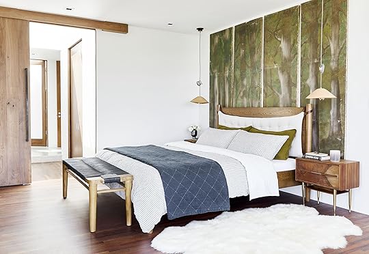
New Reveal: This Organic, Punchy Bedroom Might Be Our New Favorite Makeover


We’ve styled a lot of bedrooms around these parts but this one right here might be our new favorite. I mean…just look at those vintage tree canvases. What?!? They very much set the tone for this master suite’s design aesthetic, which we’re going to walk you through today because it’s GOOD. But first, a little backstory: Emily has been a huge fan of Brooklinen since probably night #1 of sleeping on their sheets. Their percale sheets are her current favorites from any brand she’s tried, so when they reached out to partner with us, it was a very quick “YES” on our part.
Plus, we’d been itching to get our hands on another room in and a mostly empty space there to makeover felt like the stars aligning. The bedroom this home is in belongs to one of Emily’s best friends, Corbett—you might remember some of the spaces indoors from here, here and here, as well as the KILLER outdoor space from this post. She already had a modern, organic thing going on so we worked within that for design consistency (but also because it feels perfect for a serene, unfussy bedroom).
Armed with some beautiful bedding from Brooklinen (more on that in a sec), a view of LA so killer it feels almost unreal, and plenty of fun furniture and decor accessories to play with, we “made over” this room that already had very, very good bones (not hard). Here, we’ll walk you through the elements that make up this high-impact yet fresh and organic bedroom so you can recreate it with your own twist in your home (vistas not included, sadly).
But first, a quick aside before moving on: we want to talk a little about the features that make Brooklinen’s bed linens so dang good:
Their sheets are made with long-staple cotton (lower quality sheets are typically made of short-staple or brushed cotton), which really means your sheets will be longer lasting, softer and just generally feel more luxurious.
They were so smart in adding “short” and “long” labels to each side of their fitted sheets. Raise your hand if you’ve ever wanted to roll your fitted sheet into a ball and throw it out the window after multiple failed attempts of getting the orientation right. Obviously, you’re not alone.
For all you pillowtop or plush mattress owners, their fitted sheet fits mattresses up to 15-inches deep, which should prevent that frustrating middle-of-the-night snapback we’ve all no doubt experienced.
OH, and one of our favorite parts is the envelope closures on the pillowcases. There’s never a need to stuff your pillow back. High five to Brooklinen for taking all the little annoyances of traditional bedding and finding smart, simple solutions. Okay, on to our regularly scheduled programming…
5 Elements You Need to Create a Modern Organic Bedroom
#1: Natural Textures

Striped Duvet Cover | Striped and Olive Green Pillowcases | Sheets | Quilt | Rug | Vintage Nightstands | Pendants | Bed (similar) | Bench
Let’s start with one of the most important parts of a bedroom: what goes on the actual bed that you put your body on every night. Here, we used a mix of Brooklinen’s Classic Core percale sheets (like we mentioned, Emily’s favorites for how crisp and cool they sleep…they really will make your bed feel like an expensive hotel), and the brand’s linen duvet and pillowcases. Now, a few of us have tried the linen from some other companies and have mixed feelings about them. This is not a blanket statement for all, but linen takes a while to break in and until you do, can feel scratchy and uncomfortable—the opposite of what you think you’re getting into based on the internet’s universal rave review of linen bedding. But Brooklinen’s is honestly different. It’s stonewashed so it’s soft from the get go and just really pliable and inviting. In a “modern organic” bedroom style, a subtle, natural texture like the Belgian and French flax linen of this duvet cover works so, so well.

To keep the bed textural and layered with enough punch, we opted for the striped duvet cover with the solid sheets, then brought in that awesome army/moss green with the back set of shams. That color really helps tie in the verdant elements in the vintage tree artwork as well as the actual trees out the windows. Finishing off the bed is a linen quilt that Emily Bowser couldn’t stop raving about. She said it was the perfect medium weight (not too heavy, not too flimsy) and SO incredibly soft she just wanted to live wrapped up in it.
Another textural element in this vignette is that cushy shag rug on the side of the bed. Who wouldn’t want to sink their toes into that every morning? Keeping that in a neutral color really lets it be all about the texture, while the imperfect shape keeps it squarely in the “organic” part of “modern organic.”
We’ll talk more about these two things next, but the use of rich wood grains in all the furnishings as well as the leather from the pendants varies the tactility. When you’re building the design for a room, you want to be sure you’re tapping a diverse range of textures so everything feels well-rounded and effortlessly pulled together. For instance, in this space, we have the imperfectness of the canvases, the sleekness of the percale sheets, the floppiness of the linen duvet and shams, the lushness of the rugs, the lived-in quilt, the visually rich wood grain and even the roughness of the cotton rope of the end-of-bed bench.
#2: Imperfect Shapes

Organic doesn’t just mean a natural material, but also wonky, imperfect shapes (i.e. not streamlined and straight-edged). Here, we used a 4’x6′ sheepskin rug to break up all the straight lines from the bed, nightstand and console and it really pulls its weight to relax the eye.

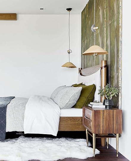
Okay, it’s time to touch on these pendant lights. UGH SO GOOD, right? They get their slightly wonky shape from being wet-formed, which means each one is just slightly different from the next. Also, take note of the cable. It lets you put these up as high or as low down as you want, plus all excess length can be coiled right up and is built into the design of the light fixture. Here, we went with just about the height of the headboard for visual cohesion but they could have also been easily lowered to avoid being blasted in the eyes at night from the bulb.

Art | Rug | Side Table | Mug | Chairs (vintage)
Possibly less subtle but still impactful is the imperfect edge of the blockprint piece above the fireplace. Having that float mounted to leave the rawness exposed works really well against the very crisp frame of the gas fireplace insert. This visual tension is integral to creating rooms that feel cohesive but also not too overthought (even though a lot of thought goes into it…).
#3: Vintage Furniture & Decor for Character

We’ll preface this point by saying no, not everything in this room is vintage. If it were, it might have been too much “old world” and not enough “modern” but the pieces that are here fit in in a way that adds both character and warmth. Let’s start with that bureau. The movement in the burlwood is so special, and the arched shape really stands out amongst boxier pieces in here. How do we find a way to, um, “borrow” that from her?

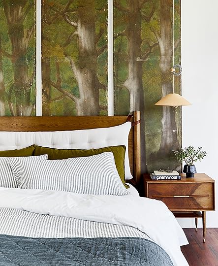
The Robsjohn-Gibbings nightstands, found via Pop Up Home here in LA, add a nice mid-century touch (because what Emily Henderson room doesn’t have a little mid-century in it?). They’re clean in silhouette with an interesting leg, so don’t come off feeling too heavy or overwhelming but still special. The bed, which was a custom commission (though this one is similar), is new, so flanking it with two vintage tables keeps the scene from looking too catalog-y.

And of course, that vintage tree quadtych mural, which like we mentioned, was our jumping off point for the look and feel of this room. When you have something like that, you really don’t need much else to make a statement. That’s your visual “moment” and boy is this one special. The imperfections and wear-and-tear on the panels give them a presence you just can’t replicate with newness. It has a history (even if you don’t know what it is) that emanates warmth, character and, frankly, a cool factor.
#4: A Neutral Palette (With Natural Color Punches)

We touched on this in the first portion about the texture and bedding, but the key to “modern organic” is keeping the palette mostly neutral while layering in an edgy pop of color; here, for instance, we went with army/mossy green. Whether the tree mural was there or not, it would have still provided a nice balance and shot of warmth between the cool palette of the blue and white bedding, and all the warm, rich wood tones. Not to mention, olive green is very much in style right now but doesn’t scream “trendy” when kept at a minimum.
#5: Pepper in Modern Touches
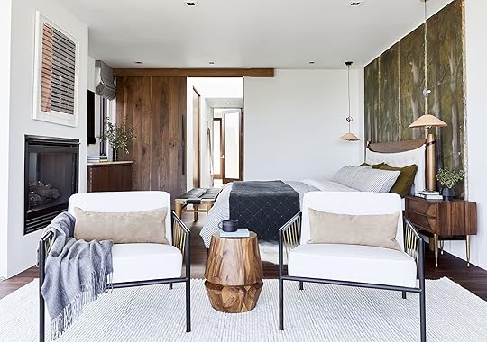
Overall, this room is minimal yet warm, and doesn’t come off too rustic even with all the wood pieces and tree art, but part of that is because of the other more modern touches sprinkled throughout the room, like these vintage chairs for instance.
Quick back story: When we first got our hands on this room, these chairs were facing the bed, and we decided to flip them around because…the tree-top view. If you have a panoramic vista like Corbett does (or even just any view worth looking at, i.e. not the brick wall of the building next door), you’ll want to make sure that your seating area, should you have one, faces out. Now, a few notes, take note of the seating you choose. You don’t necessarily want something big and bulky with a less-than-attractive back because they’ll be very visible. These chairs are low-profile (hence, don’t block any of the view), and the frame is interesting from every angle.

Alright, back to the “modern” touches. To balance the warmer woods, we opted for a matte black and brass frame on the chair, which is also just visually lighter than something more solid. The legs of the nightstands also bring in another hit of brass, as does the polished shade of the arch floor lamp.

Leather Ottoman | Arch Floor Lamp | Concrete Tree Planter
Of course, a room with windows like those with a view like that would look crazy good empty, but even if your room doesn’t look like this (because, uh, whose does?!?), there are plenty of lessons to pull from its design and styling to get something similar in your own bedroom. This high-impact yet organic vibe would easily translate and we think it’s such a nice look for a room that’s interesting but calm. Is this a place we’d love to tuck ourselves in for the night in? Yup.
Speaking of tucking ourselves in, Brooklinen is offering all readers $20 off an order over $100 with code EMILYH20. If you’re on the market for new bedding, definitely check them out and take advantage of the discount because this stuff is honestly good. Also, they offers free exchanges and returns for a full 365 days should you be unsatisfied in any way, and free replacements FOREVER with their lifetime guarantee.
Thanks for hanging out today, folks. Let us know what you think of this look, and if you are a proud owner of Brooklinen products, let us know what your favorites are because sharing is caring.
RESOURCES
Bedding
Striped Duvet Cover | Striped and Olive Green Pillowcases | Sheets | Quilt
Furniture
Bed (similar) | Vintage Nightstands | Bench | Wood Side Table | Leather Ottoman
Rugs & Decor
Sheepskin Rug | Pendants | Art | Knit Rug | Black Mug | Arch Floor Lamp | Concrete Tree Planter | Wood & Brass Tray | Green Mug
*This post is in partnership with Brooklinen but all words, designs and selections are our own. Thanks for supporting the brands we love that support the blog.
**photography by Sara Ligorria-Tramp, creative direction by Emily Henderson, design and styling by Emily Bowser
The post New Reveal: This Organic, Punchy Bedroom Might Be Our New Favorite Makeover appeared first on Emily Henderson.
Makeover Alert! 5 Steps to Know to Design a High Impact Yet Organic Bedroom

We’ve styled a lot of bedrooms around these parts but this one right here might be our new favorite. I mean…just look at those vintage tree canvases. What?!? They very much set the tone for this master suite’s design aesthetic, which we’re going to walk you through today because it’s GOOD. But first, a little backstory: Emily has been a huge fan of Brooklinen since probably night #1 of sleeping on their sheets. Their percale sheets are her current favorites from any brand she’s tried, so when they reached out to partner with us, it was a very quick “YES” on our part.
Plus, we’d been itching to get our hands on another room in and a mostly empty space there to makeover felt like the stars aligning. The bedroom this home is in belongs to one of Emily’s best friends, Corbett—you might remember some of the spaces indoors from here, here and here, as well as the KILLER outdoor space from this post. She already had a modern, organic thing going on so we worked within that for design consistency (but also because it feels perfect for a serene, unfussy bedroom).
Armed with some beautiful bedding from Brooklinen (more on that in a sec), a view of LA so killer it feels almost unreal, and plenty of fun furniture and decor accessories to play with, we “made over” this room that already had very, very good bones (not hard). Here, we’ll walk you through the elements that make up this high-impact yet fresh and organic bedroom so you can recreate it with your own twist in your home (vistas not included, sadly).
But first, a quick aside before moving on: we want to talk a little about the features that make Brooklinen’s bed linens so dang good:
Their sheets are made with long-staple cotton (lower quality sheets are typically made of short-staple or brushed cotton), which really means your sheets will be longer lasting, softer and just generally feel more luxurious.
They were so smart in adding “short” and “long” labels to each side of their fitted sheets. Raise your hand if you’ve ever wanted to roll your fitted sheet into a ball and throw it out the window after multiple failed attempts of getting the orientation right. Obviously, you’re not alone.
For all you pillowtop or plush mattress owners, their fitted sheet fits mattresses up to 15-inches deep, which should prevent that frustrating middle-of-the-night snapback we’ve all no doubt experienced.
OH, and one of our favorite parts is the envelope closures on the pillowcases. There’s never a need to stuff your pillow back. High five to Brooklinen for taking all the little annoyances of traditional bedding and finding smart, simple solutions. Okay, on to our regularly scheduled programming…
5 Elements You Need to Create a Modern Organic Bedroom
#1: Natural Textures

Striped Duvet Cover | Striped and Olive Green Pillowcases | Sheets | Quilt | Rug | Vintage Nightstands | Pendants | Bed (similar) | Bench
Let’s start with one of the most important parts of a bedroom: what goes on the actual bed that you put your body on every night. Here, we used a mix of Brooklinen’s Classic Core percale sheets (like we mentioned, Emily’s favorites for how crisp and cool they sleep…they really will make your bed feel like an expensive hotel), and the brand’s linen duvet and pillowcases. Now, a few of us have tried the linen from some other companies and have mixed feelings about them. This is not a blanket statement for all, but linen takes a while to break in and until you do, can feel scratchy and uncomfortable—the opposite of what you think you’re getting into based on the internet’s universal rave review of linen bedding. But Brooklinen’s is honestly different. It’s stonewashed so it’s soft from the get go and just really pliable and inviting. In a “modern organic” bedroom style, a subtle, natural texture like the Belgian and French flax linen of this duvet cover works so, so well.

To keep the bed textural and layered with enough punch, we opted for the striped duvet cover with the solid sheets, then brought in that awesome army/moss green with the back set of shams. That color really helps tie in the verdant elements in the vintage tree artwork as well as the actual trees out the windows. Finishing off the bed is a linen quilt that Emily Bowser couldn’t stop raving about. She said it was the perfect medium weight (not too heavy, not too flimsy) and SO incredibly soft she just wanted to live wrapped up in it.
Another textural element in this vignette is that cushy shag rug on the side of the bed. Who wouldn’t want to sink their toes into that every morning? Keeping that in a neutral color really lets it be all about the texture, while the imperfect shape keeps it squarely in the “organic” part of “modern organic.”
We’ll talk more about these two things next, but the use of rich wood grains in all the furnishings as well as the leather from the pendants varies the tactility. When you’re building the design for a room, you want to be sure you’re tapping a diverse range of textures so everything feels well-rounded and effortlessly pulled together. For instance, in this space, we have the imperfectness of the canvases, the sleekness of the percale sheets, the floppiness of the linen duvet and shams, the lushness of the rugs, the lived-in quilt, the visually rich wood grain and even the roughness of the cotton rope of the end-of-bed bench.
#2: Imperfect Shapes

Organic doesn’t just mean a natural material, but also wonky, imperfect shapes (i.e. not streamlined and straight-edged). Here, we used a 4’x6′ sheepskin rug to break up all the straight lines from the bed, nightstand and console and it really pulls its weight to relax the eye.

Okay, it’s time to touch on these pendant lights. UGH SO GOOD, right? They get their slightly wonky shape from being wet-formed, which means each one is just slightly different from the next. Also, take note of the cable. It lets you put these up as high or as low down as you want, plus all excess length can be coiled right up and is built into the design of the light fixture. Here, we went with just about the height of the headboard for visual cohesion but they could have also been easily lowered to avoid being blasted in the eyes at night from the bulb.

Art | Rug | Side Table | Mug | Chairs (vintage)
Possibly less subtle but still impactful is the imperfect edge of the blockprint piece above the fireplace. Having that float mounted to leave the rawness exposed works really well against the very crisp frame of the gas fireplace insert. This visual tension is integral to creating rooms that feel cohesive but also not too overthought (even though a lot of thought goes into it…).
#3: Vintage Furniture & Decor for Character

We’ll preface this point by saying no, not everything in this room is vintage. If it were, it might have been too much “old world” and not enough “modern” but the pieces that are here fit in in a way that adds both character and warmth. Let’s start with that bureau. The movement in the burlwood is so special, and the arched shape really stands out amongst boxier pieces in here. How do we find a way to, um, “borrow” that from her?
The Robsjohn-Gibbings nightstands, found via Pop Up Home here in LA, add a nice mid-century touch (because what Emily Henderson room doesn’t have a little mid-century in it?). They’re clean in silhouette with an interesting leg, so don’t come off feeling too heavy or overwhelming but still special. The bed, which was a custom commission (though here’s a similar one), is new, so flanking it with two vintage tables keeps the scene from looking too catalog-y.
[image error]
And of course, that vintage tree quadtych mural, which like we mentioned, was our jumping off point for the look and feel of this room. When you have something like that, you really don’t need much else to make a statement. That’s your visual “moment” and boy is this one special. The imperfections and wear-and-tear on the panels give them a presence you just can’t replicate with newness. It has a history (even if you don’t know what it is) that emanates warmth, character and, frankly, a cool factor.
#4: A Neutral Palette (With Natural Color Punches)
We touched on this in the first portion about the texture and bedding, but the key to “modern organic” is keeping the palette mostly neutral while layering in an edgy pop of color; here, for instance, we went with army/mossy green. Whether the tree mural was there or not, it would have still provided a nice balance and shot of warmth between the cool palette of the blue and white bedding, and all the warm, rich wood tones. Not to mention, olive green is very much in style right now but doesn’t scream “trendy” when kept at a minimum.
#5: Pepper in Modern Touches

Overall, this room is minimal yet warm, and doesn’t come off too rustic even with all the wood pieces and tree art, but part of that is because of the other more modern touches sprinkled throughout the room, like these vintage chairs for instance.
Quick back story: When we first got our hands on this room, these chairs were facing the bed, and we decided to flip them around because…the tree-top view. If you have a panoramic vista like Corbett does (or even just any view worth looking at, i.e. not the brick wall of the building next door), you’ll want to make sure that your seating area, should you have one, faces out. Now, a few notes, take note of the seating you choose. You don’t necessarily want something big and bulky with a less-than-attractive back because they’ll be very visible. These chairs are low-profile (hence, don’t block any of the view), and the frame is interesting from every angle.

Alright, back to the “modern” touches. To balance the warmer woods, we opted for a matte black and brass frame on the chair, which is also just visually lighter than something more solid. The legs of the nightstands also bring in another hit of brass, as does the polished shade of the arch floor lamp.

Leather Ottoman | Arch Floor Lamp | Concrete Tree Planter
Of course, a room with windows like those with a view like that would look crazy good empty, but even if your room doesn’t look like this (because, uh, whose does?!?), there are plenty of lessons to pull from its design and styling to get something similar in your own bedroom. This high-impact yet organic vibe would easily translate and we think it’s such a nice look for a room that’s interesting but calm. Is this a place we’d love to tuck ourselves in for the night in? Yup.
Speaking of tucking ourselves in, Brooklinen is offering all readers $20 off an order over $100 with code EMILYH. If you’re on the market for new bedding, definitely check them out and take advantage of the discount because this stuff is honestly good. Also, they offers free exchanges and returns for a full 365 days should you be unsatisfied in any way, and free replacements FOREVER with their lifetime guarantee.
Thanks for hanging out today, folks. Let us know what you think of this look, and if you are a proud owner of Brooklinen products, let us know what your favorites are because sharing is caring.
RESOURCES
Bedding
Striped Duvet Cover | Striped and Olive Green Pillowcases | Sheets | Quilt
Furniture
Bed (similar) | Vintage Nightstands | Bench | Wood Side Table | Leather Ottoman
Rugs & Decor
Sheepskin Rug | Pendants | Art | Knit Rug | Black Mug | Arch Floor Lamp | Concrete Tree Planter | Wood & Brass Tray | Green Mug
*This post is in partnership with Brooklinen but all words, designs and selections are our own. Thanks for supporting the brands we love that support the blog.
**photography by Sara Ligorria-Tramp, creative direction by Emily Henderson, design and styling by Emily Bowser
The post Makeover Alert! 5 Steps to Know to Design a High Impact Yet Organic Bedroom appeared first on Emily Henderson.
June 24, 2019
8 House Tours Worth Taking a Break From Work to See (Because…Monday)


For anyone who came for a mountain house Monday post, we’re sorry to disappoint. Wrapping up the shoot last week meant we needed to pause and take inventory of what stories we have left before we can reveal a few more rooms, so hang tight. More #MHM coming soon. For today, we have a little Monday inspiration for you…
There are few things that get us more excited than a house tour. It is not uncommon in the office to hear someone utter the words “Have you seen this house tour from ___? IT’S AMAZING” and quickly thereafter we will all be huddled around one computer oohing and ahhing. By the way, there are many perks working at EHD, and being surrounded by creative people with great taste is just one of them. So, seeing as the bulk of us had a bunch of beautiful tours bookmarked and collecting dust, we decided to band together and share the ones we are loving this month with all you lovely people. Consider this a little “inside our heads” post. Get your eyeballs ready folks, because we’ve got some treats for you that we hope will inspire you as much as they do us. Let’s begin:
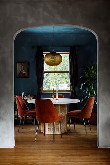 image via rue magazine | design by night palm studio
We’ve talked extensively on dark moody blues and this one is clearly right up our alley. We love those rust colored velvet chairs something fierce, and the hints of brass pulls together the room perfectly (hi, gold-framed portrait of a woman and elegant bar cart. We see you). Head over to Rue Mag see the rest of the home and you will not be disappointed. If the words (from the designer herself) “Spanish romantic with a hint of David Lynch moodiness with soft textures and saturated jewel tones” don’t get your juices flowing, then I don’t know what will.
 image via the design files | design by gratton design
We shared this photo in yesterday’s Link Up article but here, you can see the whole thing via The Design Files (one of our favorite Aussie design sites, FYI). If you are looking for a rustic yet modern beauty, look no further.
 image via apartment therapy | design by sophie donelson
Arlyn really enjoyed getting a peek into Sophie Donelson’s New York pad on Apartment Therapy. Sophie is a long-time design editor (she used to be the editor-in-chief at House Beautiful, for instance), and Arlyn is always curious how OTHER design editors live, being one herself. Are their homes that of a real person, or very designer-y? We are particularly obsessed with Sophie’s paint choices (that master bedroom color is heart eyes). Give us an excuse to play voyeur and we’ll take it.
 image via cup of jo | design by john derian
Jess brought this home tour to our attention last week and boy are we into it. It’s not new, necessarily, but that doesn’t make it any less good. The home of designer and shop owner John Derian, it is full of unique curiosities and is making a huge case for us all to move into a Sea Captain’s house. What exactly is a Sea Captain’s house? We’re not totally sure, but we are hopping on board (pun intended).
 image via lonny | design by aishwarya iyer
 This bright and airy kitchen via Lonny lives in a charming 100-year-old home in Los Angeles, and we couldn’t help but notice the subtleties that REALLY make the whole house. From the arched front door (it’s pink!) to the uber cool bathroom, this one left us feeling inspired yet calm, cool and collected (much like the house itself).
 image via the design files | design by phoebe bell and chris monahan
Here we have your daily dose of what Australians are known for in the design realm: serenely cool and warm. This is the type of house that you know came together over time; a collection of beloved items edited down to outfit a beautiful shell of a home with a RIDICULOUS view. What you’ll find here is a perfectly executed eclectic mix of textiles and just enough color to bring to life various wood tones.
image via domino | design by dan mazzariniRyann loves to peek into homes that have a small footprint but feel like not a single inch more is needed. This NYC apartment (which is in a building that once was artist lofts and rumored to have been used by Jackson Pollock and Diego Rivera) comes in just under 500 square feet (480, to be exact), and she says she’d move into it in a heartbeat. The reason it works so well is because it’s not necessarily designed like a home its size, but rather every furniture piece is special and has a presence. Also, Dan Mazzarini’s design makes a very strong case for how to make a beige, neutral space feel rich and interesting.
 image via the vanderlust | design by yabu pushelberg
And finally, when asking around the office for new tours, Grace nearly jumped out of her seat she was so excited to share this one. It’s not a home (that would be wild), but rather a hotel in New York that’s so dang special. The Moxy NYC Chelsea is aptly named, because this thing has, well, serious moxie. Click through to see a VERY fun idea for a headboard (would be great in a kid’s room), a cafe with a killer color palette we want to steal for a future project and a rooftop lounge that’ll make you want to go on vacation immediately.
Alright folks, now it’s time for the “tell” portion of today’s house tour show and tell. We showed…now enlighten us with house tours you guys have saved/bookmarked recently and are itching to show to someone who will appreciate it (we will).
The post 8 House Tours Worth Taking a Break From Work to See (Because…Monday) appeared first on Emily Henderson.
June 23, 2019
The Link Up: A Vintage-Lover’s Go-To Resource + 10 More Things We Couldn’t Wait to Share With You
image via the design files | design by gratton designThe mountain house shoot is A WRAP (well, the shoot for the magazine, we’ll be going back to get more stuff for the blog rollout). The team is exhausted by exhilarated and we can’t wait to show you. While the team was partly on set, partly in the office, partly on vacation, we still managed to read, discover, and purchase things that we were itching to share with all of you (and hear what you guys are into as of late, too). Let’s dive in.
When Sara saw this garlic peeling hack (that has since gone viral), her mind was blown. Has anyone tried it?! Does it really work? A few of us have tried (and failed) so we are not convinced.
And speaking of garlic, this is not a link (well, sort of) but Arlyn wants to put out a PSA: if you’re not cooking with black garlic, WHAT ARE YOU EVEN DOING? She first used it when she made the “Bet It All On Black Garlic Burger” from the Bob’s Burgers Cookbook and the black garlic aioli that goes on that burger is RIDICULOUS. Here’s the gist: a whole head of black garlic (she buys it at Trader Joe’s usually, but Whole Foods or other “specialty” stores have it), ½ cup of mayo, Sriracha, salt and pepper. Proceed to apply to anything that crosses your path, including old shoe leather and shards of tile, for all the mouthfeels.
Moving on to non-garlic related things, one of Emily’s favorite things to do on a Saturday morning is digging through sites like Chairish just to get the gears churning (she is very into their mid-century modern section recently). While sure, she might find something she would want to buy, it’s also a palate cleanser for her. She sees so much of the same thing on big-box retailer sites, so digging through a collection of vintage and antique pieces displayed in a clean way makes her think outside the box.
Sara finds this entire series on people’s salaries so interesting, informative and just plain juicy.
Grace is obsessed with this moisturizer right now. She says it smells AMAZING and makes her excited to actually wash her face every day/night so she can slather it on her face.
Ryann discovered this Instagram account earlier this week and can’t stop staring at all the beautiful wash basins (and will from here on out always refer to sinks as wash basins).
Another Instagram account: Arlyn, who basically worships Eva Chen, saw her obsessed over Donté Colley’s feed and now she can’t stop but go to it every day to see what he’s up to. If your life needs a serving of uplifting inspiration mixed with humor and actually VERY good dance moves, go follow him ASAP.
Veronica just bought these pants that she says are “sooo comfy and come in three different colors.” She would wear them every day if she could. She suggests going a size up if you want a baggy fit because they do shrink in the wash.
Velinda and her wife Katie bought Katie’s dad this bucket tool organizer to carry his gardening tools and he loves it. It could be perfect for all the handy people in your life, too.
Jess has been non-stop listening to the podcast Where Should We Begin with Esther Perel. You may already know but Esther Perel is an internationally renowned relationship therapist, New York Times best-selling author and all around incredible woman. Her podcast features real-life couples going through counseling with her. It’s heartbreaking, riveting but also hopeful. Jess loves this quote of her’s, “Today, in the West, most of us are going to have two or three relationships or marriages, and some of us are going to do it with the same person.”
Emily (Bowser)’s cousin Leah lives in Charleston, South Caroline and she turned her on to this up and coming local (to her) artist, Katherine Dunlap. If you are looking for colorful and soulful art, look no further! She is particularly drawn to her pool scenes. She also recently did a collab with artist Chambers Austelle and their styles work together beautifully.
Alright, that is all we have for you beautiful people today. A short and sweet Link Up. See you tomorrow xx
The post The Link Up: A Vintage-Lover’s Go-To Resource + 10 More Things We Couldn’t Wait to Share With You appeared first on Emily Henderson.
June 22, 2019
Take 2: How the Goop Wellness Summit Helped Me to Assess Myself & My Company’s “Why”

Turns out being a privileged white woman critiquing or defending a brand who’s demographic is other privileged white women is a lose lose.
Or perhaps, it’s exactly someone like me calling out someone else like me that needs to be happening more.
Yesterday, we published a post with all my thoughts and feelings on Goop and Gwyneth Paltrow, especially in light of my recent attendance of the “In Goop Health” wellness summit. Early on in the day, I decided to pull back the post, not because of the onslaught of negative comments, but more because it made me want to spend some more time and self-reflect on what I wrote. It wasn’t fully flushed out and I kinda knew it, but honestly was too slammed to work on it more. I’ve never unpublished a story but let me be clear, it was not me “letting the bullies win” more so than me wanting to make sure I was saying what I really wanted to say. So consider this a TAKE 2. I’m not changing what I originally wrote (besides a few little edits here and there that I would have made anyway had I spent a little more time on the draft prior to publishing), but I did want to address some of what you called me out on as well as add more thoughts about what prematurely publishing this post led me to realize about myself and my company. So, if you missed the post yesterday morning, keep reading for the whole thing. If you did read it, then feel free to scroll to the end and see what I have to add.
Alright, here’s the original post as it ran yesterday:
“No one is more controversial, polarizing even, amongst women (and many men) as Gwyneth Paltrow and her brand Goop. I know this post might inflame some (a lot) of you—even a mention of Goop in our Sunday links post gets some of you going—but over the course of several years, as a follower of the site and now, after attending this year’s “In Goop Health” health summit, I’ve gone through a bit of a “it’s fine, it’s problematic, it’s good” roller coaster in terms of my stance on it (the brand, not Gwyneth herself, keep reading).
Fair warning that this post is looooong. I have a lot to say here. And while I promise to get to my actual review (and criticisms) of the summit in case you guys are wondering what that THOUSAND DOLLAR ticket buys you, first, I need to take you on my GP + Goop journey to help you understand my thought process about it all.
First off, let’s talk about Gwyneth Paltrow. I’ve gotten into so many heated debates that have ended in arguments not because I feel so passionately about ol’ Gwynnie, but because I think that most of the dislike/distaste for her comes out of close-mindedness, judgement and jealousy, and that’s a trigger for me. I’ve found that my friends who can’t stand her or her brand haven’t ever even gone to Goop.com, certainly haven’t listened to the podcast, and instead, are just reacting to a persona that the media is trashing because of her privilege. Do I agree with everything she’s ever done or said? Of course not. But she’s also just a mom, businesswoman and writer trying to put forth some progressive ideas that aren’t for everyone though meant to be helpful and generally positive. Sure, she was born and raised wealthy and has aspired to turn her career as an actor into a lifestyle brand; people take issue with this, although they would probably never do this for a man.
To be honest I was on board with her from the start even though I couldn’t relate to her (at the time I wasn’t her demographic—when I started following her I was broke and even when I had a TV show, I couldn’t have afforded anything from her gift guide). But I thought she did what she did really well. She found a hole in the market and she filled it, beautifully (her cookbooks were good, her travel guides were beautiful). Did I make the recipes or go to those countries? No, but I thought she did a great job at speaking to her audience and I liked watching. She wasn’t putting garbage out there, but her product wasn’t for everyone. It was (maybe unintentionally) exclusive, and mostly for wealthy women which is inherently alienating. And when someone feels alienated it’s much easier to be angry or dismissive. So I understood where these negative feelings were coming from.
How I saw it though, was like this: if you don’t like her, you don’t have to buy her product or read her content. Goop isn’t for you so just move on. But I also know it’s not actually that simple or straight-forward.
My largest shift in opinion though, happened a few years ago when I found myself turned off by what I was seeing on the Goop site. The fear-based marketing that they were doing at the time had been bugging me for a while, and then one day, an article from Goop with a headline similar to “Are you poisoning your future baby with these toxins?” popped up into my Facebook feed.
I can’t find the article now so full disclosure that might be an exaggeration, but it was inflammatory and the definition of fear-based click bait. I think I was likely pregnant at the time and got pissed. Women are already riddled with guilt about what they are putting in their bodies while pregnant and breastfeeding, now I need to feel guilty about the things I might have put in my body (and thus the future fetus) even before I became pregnant?
It just went too far. I already despised fear-based marketing and was just so bummed that a female-founded company was turning it on us.
This might have been around the same time as vagina steaming. I think we all know that didn’t help her image.
But every now and then something would happen that made me remember she was a human going through human things, all while being judged under a microscope. People freaked out when she rebranded her divorce as “conscious uncoupling” (which she didn’t invent, it’s from the ’70s), I was like “HEY JERKS, SHE IS A MOM WHO IS GOING THROUGH WHAT MUST BE THE MOST PAINFUL THING IN THE WORLD and she wants to give it a positive spin for her kids and take the power away from DIVORCE.” Unfortunately, what it did was make anybody who had gotten a divorce and called it “conscious uncoupling” feel judged. (If you’re curious, listen to Dax Shepard’s podcast with her about it.)
“The general brand did start feeling like they were pressuring women to buy Moon Dust (tried it, gave me anxiety) and jade eggs.”
I kept following Gwyneth and would occasionally like some of the Goop content, but the general brand did start feeling like they were pressuring women to buy Moon Dust (tried it, gave me anxiety) and jade eggs.
To be fair, I consider myself a very open-minded and curious person and love hearing, listening and debating all new theories. When people started buying crystals, I laughed and said, “great, which ones should I get?” (turns out two experts told me the same thing—I shouldn’t carry rose quartz because I’m already too high energy and should be wearing more copper to help ground me). I honestly love this stuff because guess what guys? NOBODY REALLY KNOWS FOR ABSOLUTE CERTAIN.
Last year, my two best friends from Oregon came down to go to the Goop wellness summit, In Goop Health. Let me preface this by saying that these ladies are the most grounded, solid people I know. All of us were raised middle class, all of us have worked our asses off since college and are the dominant financial earners in our families. Do they like face cream and are curious about supplements that help detox the liver? Sure! But being that they are both in marketing, they more so admired the success of the brand and liked a lot of the wellness components and self-improvement aspects of the brand. Me, too.
If you haven’t already started screaming “BUT THE PSEUDOSCIENCE” at your device/computer, I’m getting to it. In case you don’t know what I’m talking about, the Goop has gotten some heat for promoting health and wellness techniques that some claim are pseudoscience, meaning anecdotal evidence at best and not actually founded in scientific method. Many people criticized that what they were promoting was dangerous, which was possibly true. Not everyone should be taking every supplement and certainly trendy diets can be harmful to your health. Plus, buying into anything that feels “science-y” and absolute without much—or any—backing should make your red flags go up.
That said, they’ve since shifted from this mostly, and as a follower, what I’ve noticed is that they rephrase things to be less factual and more “hey, here is a theory,” and they have employed far more scientists and functional doctors than they used to. If you are wondering what a functional doctor is, you aren’t alone. It’s a doctor with a western medical Ph.D. that focuses more on a holistic approach analyzing nutrition and lifestyle and genes in addition to bloodwork to find underlying causes of disease. It’s an absolute no brainer to me as I believe strongly that what you put in your body and your mental health effects and contributes to your physical success. After much analyzing, here is how I stand on this: I drank the alternative life Koolaid/kombucha in addition to my love of western medicine. My kids get vaccinated. We employ medicine when needed. While I previously thought that a lot of what Goop was spewing was pretentious, expensive pseudoscience—particularly when they were using that fear-based marketing I talked about—I’ve actually shifted.
It all has to do with a “spiritual journey” that I’ve been on the last year and a half to well, ha, find meaning and purpose in life (which beyond podcasts and self-help books has included trying new churches – not goop). It’s like my only hobby outside of decorating. I listen to podcast after podcast on divinity (I love the Liturgists), business, spirituality, parenting, and wellness. I buy and borrow so many self-improvement books, all to help me figure out how to live more consciously, feel more connected to everyone and everything on this earth (and above), and essentially have a more fulfilling life.
One podcast that I’ve grown to LOVE and listen to weekly (sometimes I marathon it while I’m cleaning the house) is, yes, The Goop Podcast and it’s really where the opinion shift happened for me (though keep reading for my criticisms, because I do have them). If you are on the side of “ugh, I hate Gwyneth and Goop,” please listen to a few episodes before you comment negatively below.
“Do I agree with everything Goop does? Nope, but how can I denigrate a nice woman, trying to do something new and different in media?”
Here’s why: generally, the guests are experts in their field—doctors, psychologists, psychiatrists, motivational speakers—and they are pretty inspiring. Nobody is telling you to not vaccinate yourself or your kids; it’s more about how you can rewire your brain to create better habits or even heal physical ailments (TRUE), how eating less meat can lead to less cardiovascular problems, or very interesting theories on why auto-immune disorders have shot up in the last 30 years. I know what lectins are now, guys, and my gut is happier. I learn so much and it’s honestly made me strive to be a better person.
Moreover, when Gwyneth is on, you’ll hear how she actually is—a mom, a divorced wife, a newlywed, a business owner, a daughter of a beloved dad who passed, and most importantly, a human being who admits her flaws as much as we do and is just trying to figure it all out and be a good person. She’s refreshingly honest and vulnerable. Again, do I agree with everything Goop does? Nope, but how can I denigrate a nice woman, trying to do something new and different in media? Her brand has inadvertently made people feel bad and that’s their biggest problem.
OKAY, ON TO THE WELLNESS SUMMIT.

So my friends from Oregon (Robyn and Nicole) attended last year, I missed it, but they RAVED about it being this really inspiring and fun day so I, of course, wanted to join. They bought their tickets and flights and we had it all set, but when I went to buy my ticket, I was SHOCKED to find out that it was a $1,000. You read that right, although it seems unbelievable. ONE. THOUSAND. DOLLARS for a one day conference. Woah. Surely I could get a press pass. I knew “influencers” who went last year with 1/10th the following who got passes.
But nope. By the time I reached out they were out. In fact, they were out of tickets entirely and they pulled strings to even let me buy my ticket. So then, I had to make a choice and I figured if I could write it off through the business (by writing this article) I would go to A. not let my friends down and miss a VERY fun day, but B. What could possibly happen in 9 hours that would be worth $1,000??? It became more about marketing and brand research than a girls’ day really.
Held at Rolling Greens in downtown LA (which is a stunning space), the summit was an extremely well-produced event, beautifully decorated and flowed great. We got there at 8 am sharp since we weren’t going to miss a second of our $1,000 day and proceeded to spend an hour and a half exploring. We got our B-12 shots in our bottoms, we watched the tuning fork therapy (which I think can work because I believe a lot of theories about energy healing but a 5-minute session won’t do much and the line was always long). We did a guided meditation to “plant music”…that’s right, there is this guy that has an instrument that takes the energy of plants and transforms it into music. It was weird and silly but if you are game to experience it—you’d have to be in order to be there to begin with—then it’s fun. Goop’s Chief Content Officer Elisa Loehnen (who I love) chimed in to say that “that may or may not be the goopiest thing you do all day” and everyone laughed. They make fun of themselves, they are in on the joke. We ate and drank delicious food and bopped into a lot of fun workshops and tested new products. There were no real hiccups in the production; no Fyre Festival here.

At 9:30, the first session started with Gwyneth and Elizabeth Gilbert, who spoke about grief, fear and creativity in a way that left us almost in tears (and excited to buy her book). Most of the sessions were totally inspiring I took an entire notebook of notes. Lacy Phillips taught us her three easy steps to manifesting what you want in life (I’m currently manifesting a new office space). Most inspiring was Lynne Twist who wrote “The Soul of Money,” a powerful book about the history of money and how we’ve all shifted from citizens to consumers (with the irony being of course that there was a massive gift shop inside the conference). The session with medium Laura Day was so entertaining (I love her) and the final session with Busy Phillips, Olivia Wilde, Jessica Alba and Taraji P. Henson was actually amazing. I was there for the other experts, not the celebrities, but they were all very authentic, articulate and inspiring (FYI, all the speakers become podcasts soon after, so you can tune in to that for FREE).
We left with our 20-pound gift bag feeling utterly inspired and spent the next three days debriefing—how we felt it was as a marketing event for their brand as well as what changes we were going to make in our lives because of it. There was a lot to unpack from it.
Now for my criticism.
I believe a large part of wellness comes from helping others and this conference was certainly SELF-help. Now, nothing is innately wrong with that, but there is something so confronting about being in a room with 600 HIGHLY privileged mostly white women, and there not being one word about helping others (except Lynne Twist). No percentage of the $1,000 ticket sales went towards a cause, and none of the sessions were focused on helping anything but yourself. What I love so much about the podcast is that they do dive into a lot of that, and it was missing from the conference. You have 600 either rich or powerful (press) in the room and boy did it feel like such a missed opportunity to not create a conversation or dialogue about what we can do both macro and micro to change the world for the better. So while we left feeling inspired, we also left feeling a little gross and very guilty.
Give me the opportunity to give back and use my privilege to contribute. Have a speaker that helps us understand how to best help our community and give back and frankly remind these women that it’s the responsibility of the elite to serve others. It just is. But again, that’s not the Goop brand or ethos, which I suppose is my biggest issue. I don’t really know what they value, I don’t understand their “why” beyond creating interesting conversations and recommending the newest organic self-tanner, which is not a bad thing. Hell, I struggle with my “WHY” EVERY. SINGLE. DAY, so I get that it’s not that easy, especially when trying to run a business. They are a self-proclaimed “Modern Lifestyle Brand” and I suppose I just wish it were bigger, more empowering and more responsible, with all their products being sustainable and green.
But listen, this is a “wellness” summit and frankly can’t do everything, nor should it. It was a very clear message, one of self-improvement. I suppose I just want to go to a different conference, one that was less about SELF-improvement and more about improving our communities, what we can do to promote change, etc.
All in all, it was GREAT for what it set out to do, I think I just wanted it to be less about how can I be a better me and more about the earth, community, etc. Will I go again? I’m torn. I mean if I get a press pass, then of course. If my best friends fly down again for girls weekend it will be very hard to stay home, but if they don’t then no I wouldn’t spend $1,000 again.”
That was the original post. In just a few hours, we had over 100 comments and they were coming fast—at Goop, Gwyneth and me. I typically try to have a flushed out diplomatic stance on hot-button topics but I just didn’t have the time to focus and just threw up the post. Not only are there some small tonality regrets in what I said, but more importantly there was a lot that I didn’t say.
I stand by what I wrote, but here is what I’d like to add.
Being one of 600 highly privileged mostly white women in the conference was confronting. I didn’t feel uncomfortable, but throughout the day I felt more and more ashamed and guilty. I realize that I’m one of the “whitest” people I know–not just my skin color, but habits, hobbies, how I talk, what I wear, etc. I’m not necessarily ashamed of this (nor do I want to change who I am) but sometimes embodying a stereotype so perfectly can be embarrassing when confronted by a group who also embody this. I’ve been at blogger events where the racial demographic was the same, but the level of affluence was totally different, so why the change? If you’ve followed along for a while, you might know that growing up, we were the not-rich kids living in a very wealthy community in high school so I’m kinda scarred from that and I’m terrified of raising the kids I went to high school with. I have a bias against the wealthy, despite NOW being one of them. This is not GOOP’s fault. No. I was internalizing my own fear and knew that I was supporting a company that was embracing their wealth and then my fear kicked in that now that I was one of them.
I became self-righteous. “HOW DARE THEY NOT GIVE US AN OPPORTUNITY TO GIVE BACK?” I don’t disagree with my previous statement but I wonder if it was out of my own fear of becoming part of a culture that I have always resisted and less about the logistics and ethos of the conference. I felt guilty for being there so I kept saying “why not at least give 5% to some cause?” But that would be just for show, a token to satisfy someone like me. Do I think they should start creating that conversation within their business? YES, but who am I to ask them to provide me with an easy app or donation box to alleviate my own guilt when I have the power (we all do) to go out and find my own cause and help where I can?
What do I do to help and give back and is it enough? WHO AM I TO CALL OUT GOOP? I try, I do but beyond the Feelgood Flash makeovers, and shelter/Miry’s List stuff, I’m not waking up every day thinking about how I can help my community. A business is not a charity, I get that, but I actually don’t think that a business’ level of success is actually something to value. I listened to a recent podcast (Intelligence Squared) about how corporate “philanthropy” is actually just a mask that distracts from what problems they are creating, so society goes easy on them and applauds them when they try to solve others. Furthermore, we don’t know what Goop and GP herself give or don’t to help others. It’s so self-righteous for me to be like “give me a platform to give back” without even researching whether they do.
So that’s where I’m at. I don’t wish I could go back in time, because I learned a ton from the comments. I agree with what I said, but with more self-reflection, I realize that A. we at EHD could be doing more, and B. publishing a post that isn’t well thought out is good for no one.
The post Take 2: How the Goop Wellness Summit Helped Me to Assess Myself & My Company’s “Why” appeared first on Emily Henderson.
June 21, 2019
GOOP…Stay Tuned
Hey all,
If you are coming for the “All my thoughts and feelings about Goop after going to the wellness summit” post, I’ve temporarily taken it down to rework it. Due to its polarizing subject matter, I want to be extra careful and honestly, it deserved more thought on my part with a clearer thesis and more self-reflection. There were already over 100 comments, so please come back and join the heated conversation. Meanwhile, I’m going to take a deep breath and go to my kid’s pre-school graduation. BRING ON THE KLEENEX. It’s going to be a day, folks. A real day.
Come back tomorrow if you feel like it…hopefully, I’ll have the guts to republish it…there is something about me, a privileged white woman, either defending OR criticizing a brand that speaks to privileged white women that might just be a lose lose. We’ll see …
xx
Emily
UPDATE (because you guys have asked): The original comments won’t be deleted (unless they were mean per our usual comment policy) and the original post will be published almost as it was (a few tweaks like I always do). But additional commentary from me will begin and end the post.
The post GOOP…Stay Tuned appeared first on Emily Henderson.
Unpopular Opinion: In Defense of Gwyneth Paltrow & Goop (Mostly)
No one is more controversial, polarizing even, amongst women (and many men) as Gwyneth Paltrow and her brand Goop. I know this post might inflame some (a lot) of you—even a mention of Goop in our Sunday links post gets some of you going—but over the course of several years, as a follower of the site and now, after attending this year’s “In Goop Health” health summit, I’ve gone through a bit of a “it’s fine, it’s problematic, it’s good” roller coaster in terms of my stance on it (the brand, not Gwyneth herself, keep reading).
Fair warning that this post is looooong. I have a lot to say here. And while I promise to get to my actual review (and criticisms) of the summit in case you guys are wondering what that THOUSAND DOLLAR ticket buys you, first, I need to take you on my GP + Goop journey to help you understand my thought process about it all.
First off, let’s talk about Gwyneth Paltrow. I’ve gotten into so many heated debates that have ended in arguments not because I feel so passionately about ol’ Gwynnie, but because I think that most of the dislike/distaste for her comes out of close-mindedness, judgement and jealousy, and that’s a trigger for me. I’ve found that my friends who can’t stand her or her brand haven’t ever even gone to Goop.com, certainly haven’t listened to the podcast, and instead, are just reacting to a persona that the media is trashing because of her privilege. Do I agree with everything she’s ever done or said? Of course not. But she’s also just a mom, businesswoman and writer trying to put forth some progressive ideas that aren’t for everyone though meant to be helpful and generally positive. Sure, she was born and raised wealthy and has aspired to turn her career as an actor into a lifestyle brand; people take issue with this, although they would probably never do this for a man.
I was on board with her from the start even though I couldn’t relate to her (at the time I wasn’t her demographic—I was broke and even when I had a TV show, I couldn’t have afforded anything from her gift guide). But I thought she did what she did really well. She found a hole in the market and she filled it beautifully (her cookbooks were good, her travel guides were beautiful). Did I make the recipes or go to those countries? No, but I thought she did a great job at speaking to her audience and I liked watching. She wasn’t putting garbage out there, but her product wasn’t for everyone. It was (maybe?) unintentionally exclusive, mostly for wealthy people and inherently that is alienating to many, and when one feels alienated, it’s easy to be angry/dismissive.
How I saw it though, was like this: if you don’t like her, you don’t have to buy her product or read her content. Goop isn’t for you so just move on. But I also know it’s not actually that simple or straight-forward.
That is, until a few years ago when I found myself turned off by what I was seeing. The fear-based marketing that they were doing at the time had been bugging me for a while, and then one day, an article from Goop with a headline similar to “Are you poisoning your future baby with these toxins?” popped up into my Facebook feed. I can’t find the article now so full disclosure that might be an exaggeration, but it was inflammatory and the definition of fear-based click bait. I think I was likely pregnant at the time and got pissed. Women are already riddled with guilt about what they are putting in their bodies while pregnant and breastfeeding, now I need to feel guilty about the things I might have put in my body (and thus the future fetus) even before I became pregnant?
It just went too far. I already despised fear-based marketing and was just so bummed that a female-founded company was turning it on us.
This might have been around the same time as vagina steaming. That didn’t help her image. But I still defended her. My nanny at the time was friends with a nanny whose family was best friends with her and they had only incredibly nice things to say about Gwyneth and Chris, how they co-parented, how they showed up at every activity, just how normal they were. This nanny also had very unlovely things to say about a lot of celebrities so for her to go out of her way to praise Gwyneth felt genuine. Also, when people freaked out when she rebranded her divorce as “conscious uncoupling” (which she didn’t invent, it’s from the ’70s), I was like “HEY JERKS, SHE IS A MOM WHO IS GOING THROUGH WHAT MUST BE THE MOST PAINFUL THING IN THE WORLD” and she wants to give it a positive spin for her kids and take the power away from DIVORCE. Unfortunately, what it did was make anybody who had gotten a divorce and called it just that, feel bad. Listen to Dax Shepard’s podcast with her about it.
“The general brand did start feeling like they were pressuring women to buy Moon Dust (tried it, gave me anxiety) and jade eggs.”
Anyway, I kept following and defending Gwyneth and liked some of the content, but the general brand did start feeling like they were pressuring women to buy Moon Dust (tried it, gave me anxiety) and jade eggs. To be fair, I consider myself a very open-minded and curious person and love hearing, listening and debating all new theories. When people started buying crystals, I laughed and said, “great, which ones should I get?” (turns out two experts told me the same thing—I shouldn’t carry rose quartz because I’m already too high energy and should be wearing more copper to help ground me). I honestly love this stuff because guess what guys? NOBODY REALLY KNOWS.
But last year, my two best friends from Oregon came down to go to the Goop wellness summit, In Goop Health. Let me preface this by saying that these ladies are the most grounded, solid people I know. All of us were raised middle class, all of us have worked our asses off since college and are the dominant financial earners in our families. Do they like face cream and are curious about supplements that help detox the liver? Sure! But being that they are both in marketing, they more so admired the success of the brand and liked a lot of the wellness components and self-improvement aspects of the brand. Me, too.
If you haven’t already started screaming “BUT THE PSEUDOSCIENCE” at your device/computer, I’m getting to it. In case you don’t know what I’m talking about, the brand has gotten some heat for promoting health and wellness techniques that some claim are pseudoscience, meaning anecdotal evidence at best and not actually founded in scientific method. Many people criticized that what they were promoting was dangerous, which was possibly true. Not everyone should be taking every supplement and certainly trendy diets can be harmful to your health. Plus, buying into anything that feels “science-y” and absolute without much—or any—backing should make your red flags raise a little. That said, they’ve since shifted from this mostly, and as a follower, what I’ve noticed is that they rephrase things to be less factual and more “hey, here is a theory,” and they have employed far more scientists and functional doctors than they used to. If you are wondering what a functional doctor is, you aren’t alone. It’s a doctor with a western medical Ph.D. that focuses more on a holistic approach analyzing nutrition and lifestyle and genes in addition to bloodwork to find underlying causes of disease. It’s an absolute no brainer to me as I believe strongly that what you put in your body and your mental health effects and contributes to your physical success. After much analyzing, here is how I stand on this: I drank the alternative life Koolaid/kombucha in addition to my love of western medicine. My kids get vaccinated. We employ medicine when needed. While I previously thought that a lot of what Goop was spewing was pretentious, expensive pseudoscience—particularly when they were using that fear-based marketing I talked about—I’ve actually shifted.
What was the cause of this shift?
Glad you asked. It all has to do with my “spiritual journey” that I’ve been on the last year and a half to well, ha, find meaning and purpose in life. It’s like my only hobby outside of decorating. I listen to podcast after podcast on self-help, business, spirituality, parenting, and wellness, buy and borrow so many self-improvement books, all to help me figure out how to live more consciously, feel more connected to everyone and everything on this earth and essentially have a more fulfilling life.
One podcast that I LOVE and listen to weekly (sometimes I marathon it while I’m cleaning the house) is The Goop Podcast and it’s really where the mental change happened for me (though keep reading for my criticism). If you are on the side of “ugh, I hate Gwyneth and Goop,” please listen to a few episodes before you comment negatively below.
“Do I agree with everything Goop does? Nope, but how can I denigrate a nice woman, trying to do something new and different in media?”
Here’s why: generally, the guests are experts in their field—doctors, psychologists, psychiatrists, motivational speakers—and they are pretty inspiring. Nobody is telling you to not vaccinate yourself or your kids; it’s more about how you can rewire your brain to create better habits or even heal physical ailments (TRUE), how eating less meat can lead to less cardiovascular problems, or very interesting theories on why auto-immune disorders have shot up in the last 30 years. I know what lectins are now, guys, and my gut is happier. I learn so much and it’s honestly made me strive to be a better person. Moreover, when Gwyneth is on, you’ll hear how she actually is—a mom, a divorced wife, a newlywed, a business owner, a daughter of a beloved dad who passed, and most importantly, a human being who admits her flaws as much as we do and is just trying to figure it all out and be a good person. She’s refreshingly honest and vulnerable. Again, do I agree with everything Goop does? Nope, but how can I denigrate a nice woman, trying to do something new and different in media? Her brand has inadvertently made people feel bad and that’s their biggest problem.
OKAY, ON TO THE WELLNESS SUMMIT.
So my friends from Oregon (Robyn and Nicole) attended last year, I missed it, but they RAVED about it being this really inspiring and fun day so I, of course, wanted to join. They bought their tickets and flights and we had it all set, but when I went to buy my ticket, I was SHOCKED to find out that it was a $1,000. You read that right, although it seems unbelievable. ONE. THOUSAND. DOLLARS for a one day conference. Woah. Surely I could get a press pass. I knew “influencers” who went last year with 1/10th the following who got passes. But nope. By the time I reached out they were out. In fact, they were out of tickets entirely and they pulled strings to even let me buy my ticket. So then, I had to make a choice and I figured if I could write it off through the business (by writing this article) I would go to A. not let my friends down and miss a VERY fun day, but B. What could possibly happen in 9 hours that would be worth $1,000??? It became more about marketing and brand research than a girls’ day really.
Held at Rolling Greens in downtown LA (which is a stunning space), the summit was an extremely well-produced event, beautifully decorated and flowed great. We got there at 8 am sharp since we weren’t going to miss a second of our $1,000 day and proceeded to spend an hour and a half exploring. We got our B-12 shots in our bottoms, we watched the tuning fork therapy (which I think can work because I believe a lot of theories about energy healing but a 5-minute session won’t do much and the line was always long). We did a guided meditation to “plant music”…that’s right, there is this guy that has an instrument that takes the energy of plants and transforms it into music. It was weird and silly but if you are game to experience it—you’d have to be in order to be there to begin with—then it’s fun. Goop’s Chief Content Officer Elisa Loehnen chimed in to say that “that may or may not be the goopiest thing you do all day” and everyone laughed. They make fun of themselves, they are in on the joke. We ate and drank delicious food and bopped into a lot of fun workshops and tested new products. There were no real hiccups in the production; no Fyre Festival here.
At 9:30, the first session started with Gwyneth and Elizabeth Gilbert, who spoke about grief, fear and creativity in a way that left us almost in tears (and excited to buy her book). Most of the sessions were totally inspiring I took an entire notebook of notes. Lacy Phillips taught us her three easy steps to manifesting what you want in life (I’m currently manifesting a new office space). Most inspiring was Lynne Twist who wrote “The Soul of Money,” a powerful book about the history of money and how we’ve all shifted from citizens to consumers (with the irony being of course that there was a massive gift shop inside the conference). The session with medium Laura Day was so entertaining (I love her) and the final session with Busy Phillips, Olivia Wilde, Jessica Alba and Taraji P. Henson was actually amazing. I was there for the other experts, not the celebrities, but they were all very authentic, articulate and inspiring.
We left with our 20-pound gift bag feeling utterly inspired and spent the next three days debriefing—how we felt it was as a marketing event for their brand as well as what changes we were going to make in our lives because of it. There was a lot to unpack from it.
Now for my criticism.
I believe a large part of wellness comes from helping others and this conference was certainly SELF-help. Now, nothing is innately wrong with that, but there is something so confronting about being in a room with 600 HIGHLY privileged mostly white women, and there not being one word about helping others (except Lynne Twist). No percentage of the $1,000 ticket sales went towards a cause, and none of the sessions were focused on helping anything but yourself. What I love so much about the podcast is that they do dive into a lot of that, and it was missing from the conference. You have 600 either rich or powerful (press) in the room and boy did it feel like such a missed opportunity to not create a conversation or dialogue about what we can do both macro and micro to change the world for the better. So while we left feeling inspired, we also left feeling a little gross and very guilty. Give me the opportunity to give back and use my privilege to contribute. Have a speaker that helps us understand how to best help our community and give back and frankly remind these women that it’s the responsibility of the elite to serve others. It just is. But again, that’s not the Goop brand or ethos, which I suppose is my biggest issue. I don’t really know what they value, I don’t understand their “why” beyond creating interesting conversations and recommending the newest organic self-tanner. The clothes they promote on their site aren’t even sustainable brands. They are a self-proclaimed “Modern Lifestyle Brand” and I suppose I just wish it were bigger, more empowering and more responsible.
But listen, this is a “wellness” summit and frankly can’t do everything, nor should it. I suppose I just want to go to a different conference.
All in all, it was GREAT for what it set out to do, I think I just wanted it to be less about how can I be a better me and more about the earth, community, etc. Will I go again? I’m torn. I mean if I get a press pass, then of course. If my best friends fly down again for girls weekend it will be very hard to stay home, but if they don’t then no I wouldn’t spend $1,000 again. (FYI, all the speakers become podcasts soon after, so you can tune in to that for FREE).
Okay…now it’s your turn (but remember, this is a place of commentary that is both respectful and constructive; please check your anger and blatant negativity before hitting that “comment” button).
The post Unpopular Opinion: In Defense of Gwyneth Paltrow & Goop (Mostly) appeared first on Emily Henderson.
June 20, 2019
Consider This: The Design Workhorse No One Talks About (That We Happen to Love)
 image via architectural digest | design by thom felicia
Hi, everyone! Contributing writer Laurren here. Today, we’ve got a little something different for you. It’s not so much a trend discussion as much as it is an awesome-furniture-we-don’t-see-enough-people-using discussion. But before we jump in, let’s go back in time for a moment…
Every Saturday during my last year of college, my best friend and I would have brunch at this spot that served $1 mimosas. (Class!) The restaurant was attached to an antique mall, so it wasn’t uncommon for us to mosey our way over after eating. Most of the time, things ended harmlessly enough, but one day I laid eyes on a green secretary desk and, without much thought as to how I’d use it, told the dealer I’d take it. (How I managed to shove it in the back of my two-door Dodge Neon when I picked it up the next day is still a mystery to me.) It wasn’t really something I could afford at the time—and I probably wouldn’t have purchased it without that tiny bit of liquid courage—but I never regretted it. It was the first piece of furniture I bought on my own based on want rather than need, and I felt very cool and adult about it.
 photo by sara ligorria-tramp for ehd | from: the portland project living room reveal
Over the years, as I moved from apartment to apartment and city to city, that impulse buy became a lot of things—bathroom storage, a bar when I wanted a bar cart but couldn’t afford one, a makeshift jewelry cabinet, a desk-shaped junk drawer, lol, and even an actual workspace for actual work. It’s still the most versatile piece of furniture I’ve ever owned, and though I don’t regret finally getting rid of it a few years ago (my style took a more minimal turn), I’ve thought of it a lot since then.
With secret compartments and drawers that can be hidden away by a drop-down or roll-down panel, secretaries fall somewhere between a dresser, hutch, and desk. (Remember when you were young and cleaned your room by shoving everything under your bed? Adulthood is cramming your stuff into a secretary desk.) And these days, with so many styles on the market—from sleek and modern from big box stores to traditional vintage or antique pieces from places like Chairish—there’s really an option for every space. (See the roundup at the end.) All of this is to say we think it’s high time these multi-tasking workhorses (design darkhorses?) get the recognition they deserve. Here’s some inspiration for how you can work one into (almost) every room of your home.
Entryway
 image via house beautiful | design by juan carretero
Entryways are a space known for collecting clutter—let a secretary desk remedy that for you! The interior cubbies were practically made for corralling mail and other things you want to forget about.
Living Room
 image via design*sponge
Thanks to its stealthy design, a secretary desk is an obvious choice for a living room that needs to double as an office. (There’s nothing relaxing about looking at a traditional desk from your couch!) If you have the space, opt for a taller piece with a hutch. Not only does it provide tons of storage, but it also draws the eyes up and brings height to the room. As with anything design related, it’s all about balance. Here, a more traditional style in a rich wood finish (remember when we said brown furniture is back?) is a refined counter to the room’s modern mushroom-y lamp and printed sofa.
 image via domino | design by lynn k. leonidas
An antique secretary desk corrals a collection of books (and hats).
 image via domino | design by lori paranjape
A paint job can be all you need to breathe new life into a tired piece. Here, a pinky-coral is a wild color choice made palatable by the desk’s more traditional shape. It could all be a little much in a smaller space, but it works here thanks to the room’s tall ceilings and otherwise neutral color palette.
 image via manhattan nest | design by daniel kanter
Not all secretary desks are tall and stately, though! A shorty like the one pictured above is a great option for smaller spaces.
Dining Room
 image via lonny
In the dining room, a secretary desk with a glass hutch is a lovely way free up space in your kitchen and display special occasion items. (Because let’s be honest: if you can’t see it you won’t use it.) Utilize the drop-down table as extra serving space when you need it or style it up as a bar cart, as seen here.
Bathroom
 image via the washingtonian | design by darryl carter
No linen closet, no problem! Here, an antique Swedish secretary adds storage in a bathroom. (Pull up a chair—and a mirror—and you’ve got yourself a vanity, too!)
image via architectural digest | design by thom feliciaA honey-colored piece warms up this, large cool-toned master bathroom and also serves as a dressing table.
 image via the makerista | design by gwen hefner
A petite secretary desk, like the one seen here, can go a long way in keeping countertops clear when space and storage is limited. (They’re a great option in a bathroom with a pedestal sink if you can squeeze it in.)
Bedroom
 image via lonny | design by robert passal
Plopped next to a bed, a shorter secretary desk with drawers (something larger could overwhelm a small room) is triple-threat piece, acting as a nightstand, desk and dresser in one.
 image via pink peppermint design | design by tammy mitchell
In a kid’s room short on space, a small secretary desk in lieu of a traditional nightstand carves out a place to do homework.
 image via anthropologie
This piece, with its cream and mint color combo, brass details and mirrored interior is a glam take on the traditional wood secretary desk.
Now that you’re thoroughly convinced to bring back the secretary desk (are you?), here’s a roundup of 39 of our favorites, including some pretty special vintage and antique finds.

1. Fretwork Rattan and Seagrass Wrapped Secretary Desk | 2. IKEA Secretary Desk | 3. Fold Down Secretary | 4. Arian Secretary Desk | 5. Imported English Secretary with Leather Insert | 6. Mid-Century Mini Secretary Desk | 7. ACME Mullener Desk in Walnut | 8. Boone Secretary Desk with Veneer | 9. Drop Front Secretary Desk | 10. Natural Rattan Rashida Secretary Desk | 11. ACME Wyanie Desk | 12. Loring Secretary Desk | 13. Mid-Century Fold Out Desk | 14. Thorton White Secretary Desk | 15. Secretary Desk

1. Mid-Century Hand Painted Chinoiserie Desk | 2. Arts and Crafts Mission Solid Oak Secretary Desk | 3. Gaston Floating Secretary Desk | 4. Covert Grey Secretary Desk | 5. Austin Work Station | 6. 1960’s Danish Teak Secretary Desk | 7. 1960’s Secretary Desk | 8. Eastman Secretary Desk | 9. Amish Mini Secretary Desk | 10. Nolan Secretary Desk | 11. Egon Ostergaard Teak Secretary Desk | 12. Mid-Century Secretary Bureau

1. Traditional Baker Petite Secretary Desk | 2. Exec Secretary Desk | 3. Jace Desk | 4. Covert Grey Secretary Desk | 5. Vintage Baker Mid-Century Ebonized Campaign Desk | 6. 19th Century French Walnut Secretary Desk | 7. Black & Gilt Chinoiserie Desk | 8. Grove Office Armoire | 9. Brass Key Secretary Desk | 10. Italian Secretary Desk | 11. 19th Century French Iron Desk | 12. 18th Century Swedish Secretary Desk
The post Consider This: The Design Workhorse No One Talks About (That We Happen to Love) appeared first on Emily Henderson.
June 19, 2019
This Is For Anyone Who Has Ever Suffered From “Trend” Paralysis
 photo by tessa neustadt for ehd | from: brady’s bedroom makeover with parachute
This is not the first time in my writing history where I talked about my aversion to the term “trend.” Yes, a huge part of my job as a design-focused editor and writer is to cover new things happening (or at least brewing) in the industry. You know…trends. “Trend forecasting” is a very real thing, and to be honest, I pride myself on the ability to call something months in advanced. But that doesn’t change the fact that actually buying into the trend, bandwagoning so to speak, is something I have internal battles about all.the.time. Am I alone here?
Do not read that as me saying anyone who follows trends is somehow wrong or basic. Trust me, I have dived into PLENTY of trends, past and present. If you’ve bought anything for your home that wasn’t purely functional, you have, too. WE ALL HAVE. It’s the natural course of interior design—aesthetics are driven by the time we live in, by what’s occurring culturally or politically (i.e. during the economic turmoil of 2008/2009, everything was subdued, beige, safe because nothing in our country, at least financially, felt secure). Materials, colors, silhouettes are always changing and evolving because decor doesn’t stand still. But what I am saying is that I’ve come to realize that my apprehension for not feeling “creative” or “innovative” enough is problematic. Why should I not consume something that I’m very much drawn to just because I want to be “different”?
Not everyone here today will be able to relate to this, because I understand that I, someone who makes their job out of identifying trends—and non-trends—have a bit of a unique (skewed?) perspective. I’m immersed in it nearly 24/7; my eyeballs are likely oversaturated and what might feel overdone to me is probably just a result of an Instagram or Pinterest algorithm. I recognize that the practice of crossing my fingers that something I really like and am drawn to decor-wise doesn’t become popular so I don’t tire of it is not a normal thing. While professionally, I know finding what’s “next” is important to drive the design conversation forward, personally, I think I’m done caring as much. Let me explain.
 photo by tessa neustadt | from: brady’s living room refresh with the citizenry
I went through a phase during the design of my living and dining rooms where I was committed to doing something “different” so that I wasn’t showing you “just another Pinterest room.” I pushed away the idea of using some specific pieces I had long loved because I saw them too often on my feeds. This was my chance to do something unique…except that it was my home, and I was lying to myself. I was too busy asking “what’s next” before the thing that’s currently here even settled in. Can I relax, please? The pleasure of designing turned into a burden of chasing “cool.” Would the Internet think I was lame if I used a Moroccan shag rug just like so many others before me? What about putting up that gallery wall? Was my home “expected”? My current self is screaming WHO CARES to the version of me from even just a few months back.
There was a moment about a month before shooting that I remember sitting on my couch, looking around and panicking that I didn’t have anything “weird” enough. Everything that had been picked for my living spaces was something I loved, but maybe wasn’t “fresh” or groundbreaking. The chairs I had bought months prior that made my heart literally pound out of my chest were now EVERYWHERE on every platform and in EVERY store. I had completely irrational thoughts that I’m pretty embarrassed to admit here, but, things like “Do I change them for something ‘hipper’?” did cross my mind. Uh…was I INSANE? Yes, for a second there, I was. And like I said, I quickly came to peace with my maniacal thought process and the need to be “tomorrow” not “today” with my design. Where I landed was a place that sure, some might look at and think “trendimus maximus,” but I and my husband love. Pretty always looks good next to pretty, whether it’s the same pretty that your neighbor also has. I live in MY home, not my neighbors’, figuratively speaking, and that’s all I should be concerned with.
 photo by sara ligorria-tramp for ehd | from: jess’ small-space living room makeover
I hereby relinquish the negative hold that trends had over me—I welcome you to, too, if anything I’ve said so far resonated with you—and am reclaiming the fun of design, instead of the burden of constantly trying to be the new-new, especially in my own home. “Trends” will no longer ruin the things I love. Full stop.
In the name of my “I hate trends, wait, maybe I don’t, I do what I want” monologue that just happened there, I’m going to celebrate five very “trendy” things I’ve decided to love that I originally hoped would go out of vogue so I would be free to idolize them. A convoluted thought, yes, but…#designfreedom, friends.
5 Super Pervasive Design Pieces We Still Love Anyway
#1: Serge Mouille-Style Lighting
 image via my domaine | design by vanessa alexander
There has never been a time that I’ve seen this light (or sconce) and haven’t stopped dead in my tracks. I LOVE THIS LIGHT. I’ve loved it for years, and fell particularly head over heels for it when I saw Michelle Adams use it in her home (below).
 image via one kings lane | design by michelle adams
I had this chandelier (well, a knock-off of it which I know is problematic) picked out for my dining room because I needed something that extended out further on one side to balance the table placement, but decided against for all the reasons I’ve already talked about. While I love the Schoolhouse fixture I ended up with VERY much, you better believe I plan on using this baby—hopefully an authentic one—in a future home.
#2: Beni Ourain Rugs
 image via house & garden | design by matilda goad
I fought long and hard against this one when I was rug shopping. You can’t flick one scroll through Pinterest or your Instagram feed without seeing this style of Moroccan rug, but here’s the thing: HAVE YOU EVER STEPPED ON ONE OF THESE? Oh my goodness are they glorious to walk on. The shag nestles into your toes like fine Bahamian sand and they’re so thick and plush, it’s almost like a cloud is underfoot. They also happen to be a perfect neutral but textural (and still visually interesting) backdrop to furniture, as well as other colors and patterns already going on in your design. Bein Ourains are the chameleon of the rug world in that they work with modern designs, traditional spaces, eclectic or bohemian rooms…like the effortlessly cool kid in school, they fit into every crowd.
#3: Pierre Jeanneret Chandigarh Chairs
 photo by sara ligorria-tramp for ehd | from: arlyn’s light & bright rental living room
I’d be lying if I didn’t say I was bummed when I started to see these infiltrate my feeds after I bought them late last year. That’s ridiculous, as these are not new. Designers have long been using these super sculptural vintage chairs in projects, so like…what makes me special? I even remember standing in the Rose Bowl with Emily discussing these…”these are probably going to be everywhere in a second, but do I care?” I said to her. Obviously, I didn’t care enough, because I bought them and do not regret it. Yes, the chair will be very “2019” probably, but eventually, people will move on to something new and I’ll still have the chairs I loved from the moment I saw them.
 photo by sara ligorria-tramp for ehd | from: arlyn’s dark, moody dining room
#4: Gallery Walls
Every now and then, if you have your ear pressed to our office door, you’ll hear someone say “wait, are we still into gallery walls?” Gallery walls are pretty ubiquitous at this point. Many an article has been written about “what’s next after the gallery wall” and you know what I think? Just more gallery walls. Yes, one statement large-scale art piece in place of countless smaller frames is also very, very good, but I don’t think gallery walls are going anyway, and frankly, I don’t mind it. The “salon” style arrangement I did in my dining room is one of my favorite design elements in my whole house, and as long as the art is personal to you in some way, they’ll never feel too “trendy.” Long live the gallery wall.
#5: “California Casual”
 image via alexander m. reid
This last one is less a specific piece and more a general style. “California Casual” (which we wrote about at length a year ago here, here and here), is that expensive, effortless laid-back-but-kinda-eclectic look that so many design enthusiasts and designs themselves emulate recently. I mean, what’s not to like? It’s comfortable, light and airy yet warm and inviting, easy on the eyes with just enough textural moments…it’s kind of the perfect “family home” vibe if you’re “cool.” I tend to go for more eclectic, colorful rooms when I’m pinning and bookmarking because that inspires me greatly, but being IN a California casual room feels damn nice.
 image via all sorts of | design by amber interiors
If you’ve ever been able to grace one of Amber Lewis’ shops (the personification of this style), you’ll probably remember the instant relaxation that came over you. It’ll make you want to instantly ditch your “bold” and “weird” moments for the quietness of linen and rattan and blonde wood. So, while I’ve found myself bucking the look in my own designs because I’m “tired” of seeing it, I can’t lie…it’s wonderful and I hope it sticks around for years to come.
Now, after all that, I’d love to hear from you about your stance on “trends,” whether it’s your thoughts on them as a whole or even some of the five things I pointed out directly here today. Am I overthinking the whole thing? Yeah probably, but this post was kind of a cathartic moment for me, so…sorry not sorry? Anyway, thanks for reading friends, and looking forward to hearing from you.
The post This Is For Anyone Who Has Ever Suffered From “Trend” Paralysis appeared first on Emily Henderson.
Emily Henderson's Blog

- Emily Henderson's profile
- 10 followers

