
Emily Henderson's Blog, page 266
March 26, 2019
The Unexpected Trend We’re Seeing That Makes Any Room Instantly Timeless

Hi, everyone. It’s me, Laurren, here again to talk color. More specifically, brown. A few weeks ago, when we first met and I brought you this post about fun color combos, we didn’t once discuss brown. I’m going to right that wrong today by devoting a whole post to the hue because… IT’S BAAAAAAACK!
Well, maybe it’s not fully back, but its bags are packed and it’s headed this way.
If you’re thinking “But Laurren! Brown has been back for a while as evidenced here and here and here and here…” You’re not wrong! Things have warmed up over the years. We’ve seen a shift from painted furniture and cooler color palettes to spaces that include blonde-toned woods and earthy textiles and paint choices.
But I’m not talking the golden-hued teak credenzas or camel-colored leather sofas of recent years. (That’s all still great though.) I’m talking brown brown…deeper, darker, richer hues, from terra cotta and mahogany to walnut and chocolate and everything in between.
If you never thought this day would come, where we’re taking a deep dive into brown and, dare I say, actually kind of crushing on it all…I didn’t either, despite knowing that in the world of design—both in interiors and fashion—things are constantly cycling, with most trends emerging as a counter-reaction to another. Sure, brown is always around in some capacity. Furniture is, after all, most often made of wood, lol, but shades and tones and the way and quantity in which it’s used certainly fluctuates. I mean, literally everything can come in brown—furniture, floors, walls, upholstery, textiles, cabinetry—and in the ‘70s, everything kinda did.
Things were generally pretty drab before the 1950s. Not devoid of color completely, but it was expensive to dye textiles and plastics had yet to be invented, so things took a VERY colorful turn in the ‘50s and ‘60s as new materials emerged. In the ‘70s, folks were like NO THANK YOU and the motto became “wood panel it all!” The retina-scarring ‘80s ushered in the ‘90s country kitchen shortly followed by the all-Tuscan-everything that shook the early 2000s (SO.MUCH.BEIGE). We’re still recovering from that last one. For a good decade, painted furniture and the all-white kitchen/bathroom/everything have dominated homes and Pinterest boards around the world, so it seems only natural that a big shift is on the horizon.
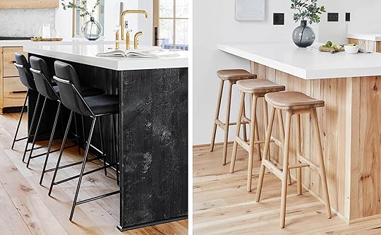
 image source
How do we know it’s happening? We’ve seen some retailers like CB2 beginning to carry darker wood pieces, but fashion is generally the best indicator of what’s on the agenda decor-wise since trends often trickle down from there. And lately, fashion has been all about brown…
 image sources, top row: left | middle | right. image source, bottom row: left | middle | right
As you can see in these images from recent fashion weeks, tone-on-tone is definitely a thing and you’ll never go wrong pairing brown with red, but it’s that brown/teal/red combo at bottom left that really has my heart going pitter patter.
You didn’t come for the fashion, though, so let’s move along. Furniture seems like a logical place to start…
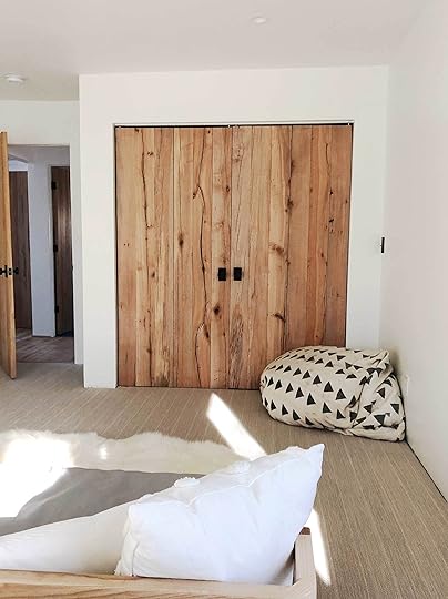
 image source | design by alison davin
In the above image, mismatched pieces in varying wood tones pair with woven accents to create a rustic-boho space that feels decidedly different from the wood-heavy minimalist vibe currently dominating Instagram. (You know the look: matching light wood furniture, sunset hues, ceramics galore.) Not that we don’t appreciate those spaces—we do—but, there is something about exclusively outfitting a room with pieces in a singular tone, material or style that, no matter how carefully chosen, can feel a little “done-in-a-day,” if ya know what I mean. The dining space above might not garner all the internet “likes,” but its sophisticated, collected-over-time feel will definitely help it hold up in the long haul.
 image source | design by katie de stefano
From the walls to the furniture to the textiles, the chic bedroom pictured above, in all its dark, chocolate-y glory, is a glaring style contrast to the more casual dining space discussed at top. It can be hard to get away with SO MUCH of the same hue, but it works here in large part thanks to the visual counter courtesy of that white upholstered headboard. (Imagine, for a moment, if the whole bedframe was iron? Very different story.) The wood finish on that French nightstand is very similar to the grasscloth-clad walls but that sliver of white from the table’s marble top is what keeps the piece from getting lost in the shuffle. It’s the little things in design, you guys.
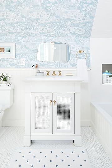
 image source | design by barlow and barlow
If you worry about darker wood furnishings—particularly antiques—feeling stuffy or visually heavy, consider repurposing a piece in an unexpected way. Set against glossy tiles and topped with a bubbly vessel sink, the strong and stately console-table-turned-vanity pictured above tones down the playfulness of the room’s chipper pink-and-green palette.
 image source | design by mandy reeves
If you’d prefer to dip your toes back into brown rather than dive head first, take a cue from the bathroom above: there are a lot of pretty things happening here (That pendant light! That claw-foot tub!) but, upon first glance, your eyes instantly land on that beautiful mahogany china cabinet, am I right or am I right? That’s thanks to the space’s all-white color palette—it provides the breathing room needed for that beautiful antique to become the strong focal point it was always meant to be. (FYI the wall paint is Montgomery White by Benjamin Moore.) I think it’s also important to note that, though an unconventional choice for a bathroom, that Turkish rug goes a long way toward making this whole thing work. (The cabinet is pretty big and could feel a little jarring as the room’s only flash of warmth.)
 image source | design by norm architects
It’s not all about wood pieces, though. Here, a not-quite-terra-cotta sofa teams up with cooler shades of gray to warm up this stunningly stark office space designed by Danish studio Norm Architects for Kinfolk magazine. It’s a surprisingly versatile brown—lighter and redder in shade—and would lend itself to a range of design styles. We particularly love how well it plays with the thread of royal blue found in the two (very different) rooms pictured below.
 image source | design by studio esteta
 image sourceimage source
With the popularity of all-white interiors came, perhaps, the most asked and agonized over question in all of design: should you paint original wood-toned trim/moldings/doors? We get why the thought ruffles feathers, but we also get why someone would want to do it. (Sometimes you just don’t want that much contrast between trim and walls okay?!) If that last sentence made you say to yourself “who let this lady in here??!!!” then you’ll be happy to know times may be a changin’, as we’re seeing more and more folks embracing original finishes and sometimes even choosing to install wood-toned trim where it once wasn’t. And we’ve gotta say: it’s pretty darn dreamy.
 image source | design by case design
Here’s an example in a more minimal design scenario. A big part of why this works is that there is no molding where the wall meets the ceiling to detract from the sleek aesthetic and the gray plaster walls balance all the warmth with a hit of cool.
 image source | design by peter benson miller
Moving on to the topic of flooring, I don’t know that brown patterned floors are a thing, but this space—well, actually this entire home—is so, so beautiful I couldn’t not include it. So let’s just call it…brown patterned floors…they’re happening…ish.
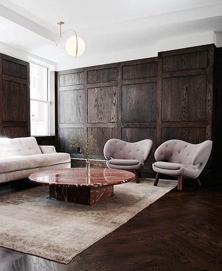 image source
What makes the room pictured above different from all-wood spaces of years past—outside of the fact that it’s, you know, actual wood—is the shift in pattern between the flooring and wall molding and the fact that the wood doesn’t lean particularly warm or cool in tone. A palette of three very “now” hues—terra cotta, blush, and lilac—help to soften the serious, minimally furnished space and the white ceiling lifts everything.
 image source | design by int2 architecture
The kitchen above takes the wood treatment allllllll the way up to the celling—and man is it good. Again, this is in large part thanks to the change up in pattern—it just wouldn’t feel as special or as current without the herringbone design wedged in the middle to break things up. Plus, this is likely real wood (even if just veneer), unlike the faux wood paneling of decades past. Clean, modern finishes in pastel-y hues provide the contrast needed to keep things from going in a more rustic direction.
 image source | design by park & oak
For your noncommittal folks, the kitchen above is a stunning example of how to tiptoe into the wood wall treatment. (Doesn’t it feel like whatever goes on those shelves just instantly becomes EXTRA special?)
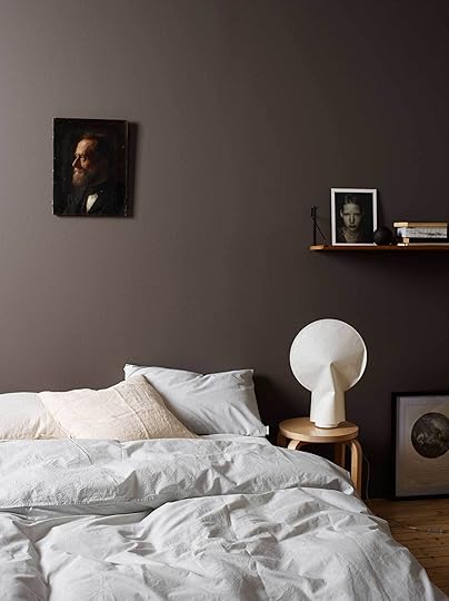 image source
Of course, we’d be remiss to talk color without talking paint. Here, deep brown walls with an almost chalky finish amp up the drama of simple bedding and furnishings.
 image source | design by charles rutherfoord
While the furnishings in the dining space pictured above aren’t something the EHD team typically gravitates toward, the lighter, more cocoa-toned wall color is no doubt very enticing and could definitely translate to a variety of design styles. (The paint is Vicalvi’s Havane in a matte finish, which might be hard to get in the States. Maybe try something like Log Cabin by Benjamin Moore.)
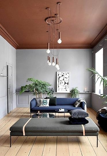 image source | design by ferm living
Here in the living room of “The Home,” the Copenhagen show apartment of the Danish Brand Ferm Living, moody blue-gray walls are topped with a is-it-brown-or-is-it-burgundy? celling. It’s a bold, beautiful treatment best suited for larger spaces. (Though it could feel super cozy in a smaller bedroom.) The blue and gray furniture really perfects the room’s color palette.
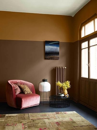 image source | design by dimore studio
Shades of brown + green + steely blue-grey with a hint of pink—I guess I’ll have to file this color combo under missed opportunities, as evidenced by the two-toned space pictured above. It’s both cozy and dynamic.
 image source | design by jdp interiors
We can’t forget about wallpaper! A busy brown print like the one pictured above might be a little much in a larger space, but in a powder room, it feels just right. We’re on board with the neutral palette used here but also wouldn’t hate to see how a bolder pop of color would pair with the print.
 image source | design by kelly wearstler
The color of this abstract graphic wallpaper—it’s Graffito by Kelly Wearstler—is called “salmon” but definitely feels like more of a light cocoa in this photo, so let’s just go with that, okay? The use of color, texture and pattern makes the room feel delightfully rich and layered.
 image source | design by edward bulmer
Because I don’t know where to fold in a discussion about this brown wood-topped bathtub, I’m just going to leave it here as a parting gift to you. : )
Almost 2,000 words later…whew! We made it. Thanks for hanging in there. Are you convinced yet? A brown convert? I just realized I didn’t really touch on cabinetry, but you gotta stop somewhere! Tell me your feelings—do you think brown is back? Do you think it never really went away? Do you have horror stories of brown rooms past? Spill it because while tons of these rooms sell brown hard, we know it works in very specific instances, and all of you aren’t currently running out right now to brown up your spaces.
The post The Unexpected Trend We’re Seeing That Makes Any Room Instantly Timeless appeared first on Emily Henderson.


March 25, 2019
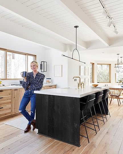
It’s Finally Here: The Reveal of the Mountain House Kitchen

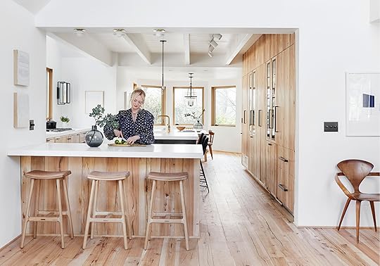
I feel like I’m about to give a wedding toast for my daughter who after four mediocre boyfriends/wedding attempts has now found and married the love of her life. There is a lot of emotion, relief, happiness and SO MUCH PRIDE wrapped up in this kitchen—and you know that’s not that easy for me to say. I pushed myself, ran into obstacles, almost gave up on the dream (remember when the cabinets were going to be a classic shaker?) was rescued (by these folks) and now get to make so much soup inside this rustic-modern-Scandinavian-contemporary-minimalist-kitchen. I feel like the luckiest person on the planet.
There is a lot to get into here and you might just be scrolling past this to see the rest of the photos, but STOP AND RESPECT YOUR FORE-FATHERS/KITCHENS:


Our first inspiration were these:
 image source
 image source
And then we thought we had a plan but as you can see from this post, there was a lot of design work before we even got to those final two.
For the I Design, You Decide, we had it down to two versions, here:

After you all voted for the white cabinet/black island combo, there were tons of comments about how all the little ridges would turn into grease and grime traps and you were right, so we made some adjustments and went with a plain white shaker:

There were a lot of “PLEASE NO!” but also a lot of “YES LOVE IT” but ultimately, it wasn’t what we really wanted. Then…I was SAVED by Ross Alan.
At the last minute, we were able to make it our dream kitchen with their real reclaimed wood on the cabinets and it turned into what it should have been all along:

So after a 3-week renovation and with a budget of $5,700, we turned it into our dream mountain house kitchen!
JUST JOKING WHAT DO YOU THINK THIS IS PROPERTY BROTHERS??? FLIP OR FLOP??
This kitchen, the whole house, took a YEAR, with one lead designer (me) + three design support/project managers (Julie, Grace and Velinda), a GC + many subs and while I don’t know how much it cost, I would say it’s anywhere between $50-$75k just for the kitchen. Yes, I’m very lucky I had some help with product placement (brands we love that we reached out to for product in exchange for exposure) but labor is labor, which is your main cost. Paying licensed, experienced craftspeople what they deserve will simply add up (and it should). I’m only telling you because perpetrating the lies of renovation costs and quick construction timing does nothing good for humanity, your marriage/budgeting nor your general mental health.
They say you can’t have “fast, affordable and good.” You can often have two out of the three, and in this case, ultimately what we got was just the one: GOOD, but to be fair, I love it and will even go as far to say it’s “VERY GOOD.” Our contractor Jeff Malcom (of Malcom Enterprises), and architect John Lyles, did a fantastic job, full of high-quality workmanship. But high-quality takes time, especially when you are working with such custom finishes and appliances.
But enough! Let’s talk finishes…AS A WARNING, there is a lot to breakdown, especially with wordy-mc-wordy here writing it, so today’s post is just about the finishes, and we’ll cover how we integrated all the appliances and the coffee bar/dry bar very soon, as well as all the interior organization of the cabinetry.

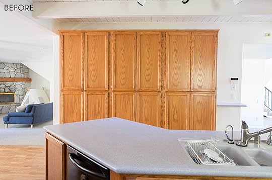
The Reclaimed Wood Cabinets & Flooring:
I have to immediately start this with Ross Alan Reclaimed Lumber, a young family-owned custom reclaimed wood and furniture builder in Los Angeles who made our kitchen (and ceiling/floor) dreams truly come true. We had the layout all done and even some of the boxes built when they came into the picture. This was the original intent for the house, but I had never done wood before nor did I know how to do it, so we ultimately had settled on a classic shaker.
They said “calm down, of course we can put our beautiful reclaimed wood on the cabinet fronts.” What we used here is a 200-year-old reclaimed beechwood from a barn in Ohio and we were able to work with our local cabinetmaker to get them installed and looking, frankly PERFECT.
Ross, pictured below, happened to be up there the day that we were shooting so we got him in a photo (we missed you Georgie!):

But I don’t want this to just be a post of TADA HERE’S OUR NEW FANCY KITCHEN without respecting the process, the design agonies, the decisions, and give you tips on how it works. We touched base with Ross and Georgie so they can walk through the steps you should know about what went into making this dream kitchen a reality (with a big grid of photos of all the “ugly” stuff before it had it’s makeover montage and turned into a prom queen):

Find a local reclaimed wood dealer (or work with Ross Alan, if you’re local—highly recommended). If you don’t want that more typical reclaimed wood (like us), they will need to mill off the top and bottom pieces to get the fresh middle. This is usually out of beams that are really thick and have been de-nailed, and then they use the offcuts for paneling or other projects.
For the cabinet fronts, they planned 1/4″ veneers which were then applied to 3/4″ baltic birch plywood doors (this yielded a 1″ finished product). To create that continuous flow of wood grain from floor to ceiling, they had to take a sample of each piece used when they were installing the top portion of the cabinets back to the shop and find pieces with the same characteristics, coloring and sizing to line it up perfectly with the doors so it looked like one solid piece was used from ceiling to floor. It was tricky, but they made it happen.
As mentioned, the 1/4″ veneers were applied to the plywood doors using glue and 23-gauge pin nails with a nail gun. They then filled in the cracks and crevices with a walnut wood filler.
After the doors were assembled, they were sanded down and received two brush-on coats and two wiped-on coats of a water-based matte finish polyurethane (they sanded between every coat applied). At this point, the doors were ready to be installed onto the cabinet boxes.
All the trim was done on site and applied the same way.
According to Ross Alan, the cost for material ranges between $9-$12.50 a square foot (depending on the accent material chosen). To clad, finish and install the cabinet doors, it was $65 a square foot, and the island cladding installation was $14 a square foot (in addition to the material costs).

For the island, we used Ross Alan’s corral and snow fence boards which were milled to 5/16″. Because that wood is naturally grayish with a lot of variation, we went with an ebony stain so that it would be more refined. The photo on the bottom left was actually us testing out what a heavily textured wood would look like in black, but for the finished product, it was NOT painted.

The wide planks are FULL of texture and character (I wish you could see how great they are IRL), but in all black, juxtaposed with the lighter beechwood throughout makes it SO special and modern. We finished it off with a few coats of water-based matte polyurethane to keep it from losing color and also to protect it from water, kids, etc.

That matte finish means there is NO shine, so all you see is the beauty of the reclaimed wood, and there was barely any color change from unfinished product to sealed product.

The Countertops:
We had a marble all picked out when we thought we were going to have shaker painted cabinets, but once we went to this reclaimed wood, we felt that we had enough texture so we switched to Cambria (in their matte Cliff White) and I literally couldn’t be happier. I know that stone is a lifestyle choice and it’s one that we made for our but I’ll say it again: things that age look better in older style homes (unless you have a full staff to maintain and clean up after you). So for this house, which feels mid-century/brand new, going with a quartz which is far more durable felt like the better move. With the plain cabinets, I was concerned there wouldn’t be enough visual texture, but like I said, once we made the switch to the wood, that opened us up to go with something simpler like a quartz.
This Cambria quartz is so beautiful and far more durable than a natural high-maintenance marble (it’s a composite stone, which makes it stronger). Plus, it looks so clean and refined.
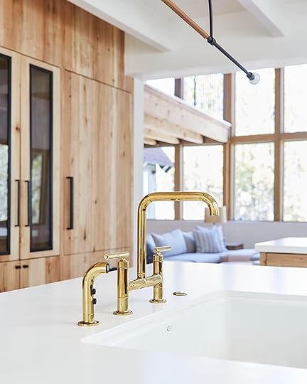
The faucet from Kohler is beautiful and brought in one of three hits of brass in the room (which is just enough for a mountain house). That bridge shape is just so pretty, and I love the Vibrant Polished Brass finish. As a reminder, as part of my partnership with the brand, I was able to preview their finish to order program which means I can personalize select faucets by first choosing a style I really loved and then bringing it to life in a finish of my choice, which is then made to order (you can visit your local Kohler Signature Store or Kohler Experience Center to learn more about the program).
For anyone wondering why we put the sink (also from Kohler) in the island, take a minute and read our kitchen layout post but I will tell you this—it was one of the best decisions I’ve ever made and here’s why:

THE DISHES ARE ALWAYS DONE…mostly because I’m always standing there waiting for my soup to cook, talking to whatever guests are sitting on the stools. So I keep the kitchen clean. all. day. Whereas if it were along the window wall, I would put it off because I wouldn’t be able to talk AND do the dishes at the same time.

The Lighting:
The island pendant is the Ellis Light from Katy Skelton (please note the leather wrapping) and is so beautiful and everyone, LITERALLY everyone, I know wants it. It isn’t meant to give off all the light in the world so we have track lighting for the island and the window wall counter. The sconces are The Urban Electric Co. and bring in that super modern lantern vibe that I love.

The matte black ties in with the island pendant and the brass plays well with the brass plate on the Allied Maker flushmounts over the peninsula (and that Kohler faucet). Because there were a lot of “lighting moments,” keeping everything linear or smaller was important as to not overwhelm the space. Those little mini dome ceiling lights were also great as not to block the view between the kitchen and the living room.


The Window & Door:
The window and door are both white oak, from Marvin and yes, as beautiful in real life as they look in these photos. You will be hearing a lot about them this year because what those windows did for the house was nothing short of transformative. The style (the pretty wood!), the different functions, the insulation, the amount of beautiful natural light in there is just insane because of the windows.
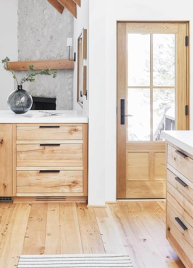
The door (this is a side door that opens up to a set of stairs leading to the driveway) was custom designed by us (which is easy to do with Marvin) and as you can tell, it’s STUNNING.

Speaking of light, look up and you’ll see two skylights (from Velux) bringing even more much-needed light into the previously very dark kitchen. They were covered in snow a week before this shoot but don’t worry, they are absolutely designed to withstand all the elements and when you are standing at the cooktop (more on appliances in another post, but this is from Viking with a built-in, pop-up downdraft that we got via Build.com), it’s the most perfect soft light ever.
The Seating:
The final mix of stools ended up being PERFECT. They both “go away” in the most perfect way, keeping the space feeling as big and open as possible but at the same time, they are BOTH so comfortable! People sit for hours and hours and hours at the island while I cook soup after soup after soup.
Had I gone with a natural wood color at the island, it might have taken away from the wow-factor of the ebony-stained wood, but with the black-on-black stool (from Industry West), they blend in seamlessly. Same goes for the Article stools are the peninsula. The tan leather (which is buttery soft, FYI) and the light wood frame work so, so well with the reclaimed wood cladding.
All the Details:

The Light Switches:
The light switches and outlets are from Forbes and Lomax and I never knew how cool I could feel dimming the lights. It’s not a necessity but if it’s in your budget, it’s lovely to look at and functions so well.

The Hardware:
We used a combination of small and large handles, knobs and ledge pulls that we sourced through Schoolhouse. They are all in the same matte black finish and the mix makes it feel so custom, special and still streamlined.


I think the big star here is Ross Alan and the integrated appliances we sourced through Build.com, which you’ll learn about next week. This kitchen is a warm modern dream of a room and I feel utterly unworthy to be cooking soup in it.
I know the work that went into it was intense. The time and budget weren’t nothing and the help was extreme. So I want to give a huge thanks to Julie, Velinda and Grace for working so hard on this project. It was such a learning curve for me, and I hope to impart all of our lessons to you, if you are interested.

I hope you guys know me well enough to know that when I say I couldn’t love this kitchen more, it’s 100% the truth. I walk into this room and breath a larger breath than I thought my lungs could hold. Nothing is perfect in life but when you get close to it, you would be remiss to not recognize how lucky you are. I can’t wait for the winner of I Design, You Decide to come up here and let me tour you around this house for hours. Speaking of which we are now opening that up to many more winners (not for a full 5 days but for a day visit/party…we’ll reveal more as soon as we start to lock logistics down). I’m just so grateful that this is my job. I kinda want one big EHD reader house party/rager. Stay tuned…
Meanwhile, I know there is a lot to cover so please ask all questions in the comments and if you are so inclined, please share. And if you want even more of the mountain house kitchen reveal, hop on over to House Beautiful who ran an exclusive interview and story on the space.
Resources
Finishes:
Pure White by Sherwin-Williams | Cambria White Cliff Matte Quartz Countertop | Dry Bar & Coffee Bar Countertop by Bedrosians Tile & Stone | Brick Wall Tile by Bedrosians Tile & Stone | Reclaimed Beechwood Flooring by Ross Alan Reclaimed Lumber | Reclaimed Beechwood Cabinetry Cladding by Ross Alan Reclaimed Lumber | Island Black-Stained Reclaimed Wood Cladding by Ross Alan Reclaimed Lumber
Appliances (all via Build.com):
Viking 36″ Built-In Natural Gas Cooktop with 36″ Built-in Downdraft Ventilation | Viking Panel Ready Dishwasher | Viking Panel Ready Ice Maker | Viking Panel Ready Refrigerator | Marvel Panel Ready Refrigerator Drawers | Edgestar Wine Cool | Viking Double Electric Wall Oven
Lighting:
Ellis Pendant Light by Katy Skelton | Vic Sconces by The Urban Electric & Co. | Mini Dome Sconce in Brass and Opal by Allied Maker
Furniture:
Esse Counter-Height Stool in White Oak by Article | Sling Counter Stool in Black Leather/Black Metal by Industry West
Fixtures & Hardware:
Purist Faucet in Vibrant Polished Brass by Kohler | Whitehaven Apron Sink by Kohler | 4″ and 8″ Ledge Pulls by Schoolhouse | Knurled Knob by Schoolhouse | Edgecliff Pull by Schoolhouse | Edgecliff Appliance Pull by Schoolhouse | Switches and Outlets in Antique Bronze by Forbes and Lomax
Windows & Doors:
Sliding Picture Window by Marvin | Custom Side Door by Marvin | Skylight by Velux
*Catch up on all mountain house posts here, and don’t miss the first reveal of the kids’ bedroom here.
The post It’s Finally Here: The Reveal of the Mountain House Kitchen appeared first on Emily Henderson.
March 24, 2019
Summer Is Coming…They Said As They Drooled Over Emily’s Life-Changing Swimsuit
 image source | design by michelle nussbaumer
Happy spring folks! Now that it’s after the vernal equinox, we’re basically required to talk about it as often as possible until it gets so hot, we just roll over into complaining about it instead. Example: After a big ole sunny tease of a weekend (last weekend when it was 85), we were immediately brought right back to reality with the need for sweaters and umbrellas. WEATHER TALK IS FASCINATING, HUH? Anyhow, a happy bright (SPRINGY) spot in our week was the celebration of three EHD team member’s birthdays and us reaching 780K Instagram followers (THANK YOU!). It was great because we were finally ALL together. With all the recent shoots, we’re all damn near strangers with half of the team being out of the office multiple times a week. Needless to say, it was a very happy reunion. 
March 23, 2019
11 Flea Market Things I Regret Not Buying + 1 Thing I Did Buy and LOVE (That You Told Me Not To)
 photo by veronica crawford for ehd
I honestly don’t even think about my method or the science behind how I shop the flea market. It would be like a surgeon explaining how to set a broken pinky finger. You just do it. It’s so easy. But in the March issue of Real Simple, Orlando and I BREAK IT DOWN and help writer Natalia Provatas with the emotional, physical and mental advice of how, why and when to go and how, why and when to purchase. We even talk about our very similar philosophy on haggling which you have to pick up to read.
So I figured instead of the regularly-programmed fashion Saturdays (we did a big fashion post yesterday for anyone who missed it), we’d go through some recent flea market finds (ONE WHICH 79 PERCENT OF YOU HATED) and talk through all the pieces I ALMOST bought.

When I insta-storied this, 79% of you said you didn’t like it. Tell me how you really feel. I didn’t look at the story results until after I purchased but I DO NOT regret it (and it wasn’t cheap, either). I love everything about it: it’s a still life (check), it’s by a Scandinavian artist (check), it’s moody (check), and the colors are so warm and yet still bright.
But even I didn’t know how much I was going to love it until it was in my dining room which you’ll see at the end of the post.
Before I get to that, let’s chat about the things that I almost bought and why. I always forget that this kind of stuff can be a post you guys want to see/read, so I take bad photos and I’m never in them because I usually go by myself at 6 am, but next time I’ll take more and better photos, I PROMISE. In my attempt to not let my new Sunday ritual (church) usurp my old Sunday ritual (the flea), I now have a packed Sunday full of, well, all stuff that makes me feel REALLY GOOD.

This bench is one that you have to have a place for and it has to be perfect, but after I left I realized it could have gone in the entry of this house we shot last week and it would have been PERFECT because the sconces near it were modern. But I didn’t think about it beforehand and in the wrong place, this could look really junky.

This rug (3×7 probably) was only $140 but I didn’t need it so I didn’t hoard, but I probably should have grabbed it for when we’re styling up places to shoot for the book…whoops.

I love a pretty box. This one was $80 so I skipped it, but it is unique and interesting so had it been $30, I would have snagged it. It felt really retro, which could be great in the right space.

Now, I was relieved to hear that this was already sold because I was SO TEMPTED by it, even though I know it’s kinda ugly. A lot of this “1970s office basement” furniture is coming in soon and even I’m not totally ready for it. Think chic-er versions of Lazy Boy recliners. But this one at least had an interesting shape, the tone of the wood was good and the leather was beautiful and OH SHOOT NOW I REALLY WANT IT. Like I said, RELIEVED that it wasn’t an option.

Cool weird art that I didn’t need, but now I wish I had bought as a prop for the book. P.S. we are STILL looking for awesome houses if you know anyone who is a design rule breaker and wants us to shoot their house.

I love a lawyer’s cabinet very much and this one was BEAUTIFUL with a soft finish and interesting yet not too decorative in detailing.
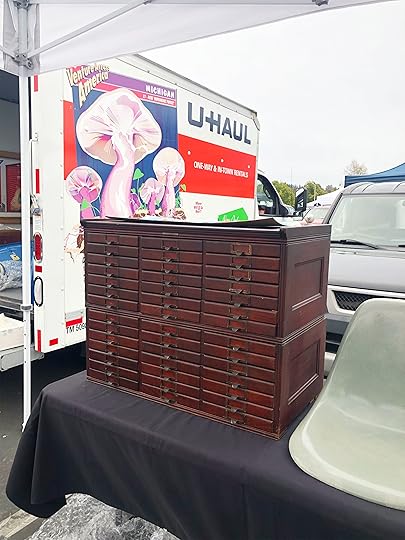
I mean HOW many of these do I need in my life? They literally hold one pencil, but I just love how this vintage office or store filing cabinets look. They evoke this era that doesn’t exist anymore and they make me happy (but I passed this one up because again, I didn’t need it).
I do however need a dog painting, basically always.

I bought the artwork below but skipped the above because I didn’t realize how much I needed it ’til later when I was looking at these photos. SO STUPID OF ME.
Okay, so the below was a debate but I’m so happy I got it:

It’s a Cy Twombly lithograph from a show in Paris circa 1972. I’m a huge fan of his and I’m also in the market for quiet + interesting art for the mountain house. It may just look like a bunch of scribbles, but to me, it’s a piece of an artist I love.

WHY WOULD I NOT BUY YOU, YOU ADORABLE USELESS CHAIR???
Regrets. I was trying to use restraint but now I’m full of regrets. Sure it was a tiny (a child’s chair) and sure I have no place for it, plus yes I see that it’s kinda in garbage condition but IT’S JUST SO CUTE. I will forever be a sucker for Victorian wicker.

Now here’s a sofa that I was instantly drawn to. I sat on it and it was VERY comfortable. I asked about it and it was $600. I said I’d take it, not knowing where it would go but knowing that a $600 sofa in very good condition with modern lines is not something you pass up and it’s a hoard worth risking. But then two things happened: 1. He didn’t take cards. These days, 85% of the vendors take Venmo, PayPal or credit cards. I didn’t have cash. and 2. At the last minute, he mentioned that he got it from an estate with a lot of Restoration Hardware and new brands and he estimated it was three or four years old. While I’m absolutely NOT opposed to buying something new-ish if its a great deal nor do I dislike RH (I love them, in general), the romance did die a bit. I wanted this to be a ’70s or ’90s post-modern chunky sofa that no one else would have in order to justify the hoard. I couldn’t put it in my living room because my new chairs (that you haven’t seen) are in a charcoal wool so this was truly a VERY BIG RISK. Once I found out that it was only a few years old, I didn’t feel like I had found a treasure any longer. Oh the psychology of buying vintage. I KNOW I’m not the only one who has bought something at the flea market only to later find out it’s from HomeGoods or West Elm. All fin, of course, but it’s just not the intent of vintage shopping. You want a one of a kind, in general. You want that feeling of discovering a treasure, a steal, something that no one else can have.

So I told him to release the hold and I’d keep thinking and if someone else bought it, it was fate. I came back right before I left (two hours later) and it was gone which made me happy. Someone else should buy it and I wanted the choice taken away from me.
Alright, now for a little HA I TOLD YOU SO. Like I said, I did end up buying that bottle still life and in my dining room, on a white wall styled really simply, I think it looks so dope and seriously pops:
 photography by veronica crawford for ehd
Here’s the face of a woman who is pleased with her purchase and kind of glad she didn’t see the actual Instagram poll result before pulling the trigger on it because otherwise said woman might have second guessed herself (but probably bought it anyway, phew):
 photography by veronica crawford for ehd
So…what do you think? Smart purchase? Still hate it (if you do, whyyyyy??)?
Overall, was there anything I walked away from that makes you want to shake me and scream “YOU’LL NEVER BE COMPLETE WITHOUT THAT”? Let me know. I’ll probably hit up some flea or thrift situation tomorrow. Another day, another flea market.
The post 11 Flea Market Things I Regret Not Buying + 1 Thing I Did Buy and LOVE (That You Told Me Not To) appeared first on Emily Henderson.
March 22, 2019
My “Casual, Comfortable, Cool” Spring Weekend Wardrobe
 [image error]
The first round of spring fashion is here and while I’m not ready to go all out with florals yet (but will be so soon), this feels like a good transition from winter to spring, with a few staples that I’ve never tried (MOTO JACKET! HIGH TOP CONVERSE!). I wanted this post to showcase some outfits that would be somewhat of a stretch for me, because let’s face it, chambray-all-day habits are hard to break. Luckily, my super stylish friend Suzanne Thune helped pull together some looks that I felt good in and could actually see myself wearing in real life.
Let’s start with my first moto jacket (above) which is a big hit with the French bulldog contingent. I’ve never been that into moto jackets mainly because they never fit me well. I have secret boobs and they always felt so constricting, but this one has more room (but is still tailored) and I have worn it three times since. It edges up any outfit especially a more casual one like this (but I am sure can be easily paired with a dress for a really cool date night look).
Those shoes are my new go-to sneakers and they really up the coolness factor with the platform and I also love how long and narrow they look. Dr. Scholls also has a great pair that is much more affordable (and very comfortable, I own those, too).
[image error]
These shorts are THE NEW SHORT for me. I love them so much I need to buy a backup pair just in case I lose them (or they fall apart…although I still have two pairs from last year that I will wear all the time, too). The top is my new favorite one from Ulla Johnson and while it is a splurge I have a strong feeling it will be like my red one from two years ago that I ended up wearing 100 times and STILL wear. It’s the right amount of boho for me and has that boxy blousy cut that I love. It’s also easy to care for because it never looks wrinkly so all I have to do is throw it on, no ironing necessary, AND works as a casual look with shorts, or a nighttime look with skinny jeans and heels.
[image error]
These overalls are very easy to wear, they don’t hug tightly in the belly (in fact, they fall in a really flattering way) and with the boxy blouse it feels so effortless, comfortable, but definitely looks put together. Plus, it’s not denim colored which is a change for me.
The shoes are new, from Frye, and I LOVE THEM. They are headed into the western trend but not too far (no studs or decorative doodads) and have the perfect amount of heel. Hot tip: pointy toes = longer leg, if you are into that (I am).
[image error]
This blouse is special. It’s from The Great where everything can seem a little basic and the prices are high and you think why would this be this much? but then you put it on and you are like oh, I see. These are actually the best sweats in the world. The shape and fit of everything they make are just so good. So this shirt may not look like much, but it IS. It is triangle shaped (so it’s even wider than the boxy cut—yay for me!) and the detail around the neck is lovely. Suzanne works at The Great so that’s why you’ll see a few of their pieces here (and yes I get a press discount but I do GENUINELY love the clothes and the women behind them). The brand is full of the casual, comfortable, flattering yet modern pieces that I am addicted to. So, if you like a drop crotch as much as I do, then head over to their beautiful store in WEHO and try everything on and tell me what you think. Oh, and ask for Suzanne.
March 21, 2019
Faux Florals & Plants: Yay or Yuck? Let’s Discuss…

Am I the only one that shudders at the mere mention of silk flowers? Look, I’m a child of the ’80s, with most of my formative “childhood home decor” years being in the ’90s, and those decades, for whatever reason (someone, please explain if you can) had a love affair with artificial plants of all kinds. Florals, indoor trees, topiaries, even outdoor plants. I seriously remember visiting some people’s homes in Florida (where the weather is mostly hospitable to greenery year-round, mind you) who had plastic flowers in their window boxes and “planted” along walking paths…WHY?!?!? Just thinking about this makes me sneeze…all the dust that accumulates in those petals. I have a very clear scent memory about that very specific dusty, plastic-y scent that’s hard to shake.
But guess what everyone? We’re now living in 2019, and faux florals and plants have gotten SO MUCH BETTER. Emily told us all a story recently that proves this point, plus had us all in stitches. I was going to regale you with her tale, but actually, it’s just better if she shares it herself:
“Last year, when we were visiting Brian’s parents, I was super impressed with the health of her orchid that she had for two years. When I asked her what the secret was, she said she kept it in the perfect light for orchids and that every time they went out of town, they brought it over to her neighbors to care for it, water it, etc. I felt it. It felt so real and healthy. I rethought the orchid once again, historically not loving it mostly because when it’s dormant it looks like sticks and yet you still have to care for two sticks so that it’ll rebloom eventually. I have two young kids and no time to care for sticks. The next time we were up there, she made the announcement to the family that indeed we had all been the fool of a faux flower conspiracy and that while it looked real and felt so real, it was in fact TOTALLY FAKE.”
I’ve seen plenty of artificial trees that are pretty passable (more on that in a bit), but this begs the question, just because you can, does it mean you should? If you asked me a few years back, I would have given faux plants (especially flowers) a hard pass. Veto. No thank you. But, you see those flowers up there? In that pretty wallpapered room that Emily designed last year? THOSE ARE FAKE. Would I be able to tell in person? Hmm, maybe?? But also…so what? (WHO AM I?). When I was prepping out this story, I asked Emily her opinion on it all as I tried to find my own words for the very important matter, see where she stood on so real vs. faux real (considering the orchid controversy), and here’s what she said:
“My 25-year-old self would look at me with such ‘you’ve changed’ shame. As someone who has historically been more obsessed with flowers than most, it seems quite absurd to be okay with the imitation taking the place of natural flower and greenery. While I historically have hated anything that was faux trying to be real, I’ve been convinced time and time again that IF DONE WELL, the faux can be better than the real: vegan leather is starting to look so good, polyester can absolutely look like linen, we use faux logs in our fireplace. If a fake plant or flower looks actually real then I say it’s fine to use, saves money in the long run and stress trying to keep it alive.”

While I don’t necessarily disagree, I do want to state very explicitly here before carrying on that nearly nothing can replace the delicate beauty of cut florals or real greenery. NOTHING. No one is arguing that here. But…is close enough good enough in some instances? I think my answer is yes. Because WHAT?!? THOSE PEONIES ARE FAKE UP THERE. Stop it. I would have bet a week’s worth of nitro cold brews that that arrangement up there was real. Usually the leaves give it away, but being so densely packed hid a lot in this instance. The slimming black outfit of the floral world?
So…what exactly are those instances, you might be wondering. Let’s dive in…
Here is TOP SECRET, BEHIND THE SCENES information: the roses in Emily’s vines up there…fake. Even the buds. Fake. They were brought in for last year’s 4th of July shoot for Rachael Ray Every Day and unless you looked up close, you’d never be able to tell. Honestly. Now, I’m not telling you all to run around, shoving silk roses and peonies into your bushes and vines, but if you’re after a more lush look in some of your existing plants and maybe having a party of some sort, there’s no shame in helping things along (like false lashes!). The key is using florals that would naturally occur. This is not the time to throw in some Birds of Paradise in a vine they clearly do not belong. It would be like adding hair extensions to a dog. Could you? I mean I guess…but why on earth would you?
 image source
 image source
Both of those photos above are FULL of faux plants. The bookshelves…nearly all artificial, and the lesson here is, it’s totally okay to go faux in areas of your home that are either hard to reach (high open shelves in the kitchen or the top of bookcases, etc.) or you don’t spend a ton of time in but want a natural pop of green for looks. Could all of these potted plants have been real without much fuss + all the benefits living plants offer? Yes, probably, but another thing to think about is pets. So many house plants are actually quite toxic to our cats and dogs (you can find out more about which ones those are here), so this is a good solution if you want the boho jungle vibe without the worry.

Another EHD-approved time that faux florals and greens are 100%A-Okay is when the plant is OBVIOUSLY fake, but in a playful way. Last year, in staging out this bedroom for Target, they had some papier maché-esque cactus and they were very, very cute. These weren’t trying to fool anyone. They were purposefully quirky and such a fun decor piece that would be great in kids rooms or on a “shelfie,” for instance.
 image source
Like Emily mentioned, when the real version and the faux versions are, at least from afar, very passable, and you happen to be a hopeless, negligent plant parent (no matter how much you try), go ahead…go plastic. Hot Tip: Don’t put two of the same faux plant too close together because they likely won’t be varied in shape or drape (they are mass produced, after all). Two same-same arrangements side-by-side would stand out as plainly as a palm tree in Alaska.
 image source
The last instance I want to talk about where artificial plants are perfectly great is with hard-to-care-for varieties. If you’re a master green thumb, by all means bring in air-purifying natural beauties, but some plant species are notoriously finicky, especially if you’re a newbie or just don’t have the right indoor conditions for them (dark rooms, for example). The ever-popular fiddle leaf fig tree…not the most low-maintenance house plant out there, folks, yet people are obsessed with their looks and try regardless. There are actually some really good faux offerings on the market (Apartment Therapy did an in-house test and the most real-looking one they found was from World Market—the second one from the left…it’s pretty darn good).
Do note that you typically get what you pay for here. If you want artificial florals and plants that would fool even Emily, be prepared to spend, typically, several hundred dollars. Like I said earlier, poor quality leaves that look papery or too much like fabric with super plastic-y veins will hardly ever be passable for the real thing (if that’s what you’re going for).
I didn’t want to leave this post without discussing things to avoid when sourcing faux plants, and while the below are mostly extreme examples, there are still lessons to be learned.
 image sources: top left | top right | bottom left | bottom right
-Okay, so let’s start at the top left orchid arrangement. In general, I’d say avoid an “arrangement” to begin with, especially one that is so decorative. Simple is always best as not to attract doubt. The faux artichoke, sticks, wood ball thing…red flags that you’re dealing with a fake.
-Next up…ROSES ARE NOT KOOL-AID BLUE. If you’re considering a faux floral and it looks like it could match a popsicle, step away.
-So…vines like ivy are also tough. There’s something about them that feels especially stuffy and hard to pull off. The print on the leaf usually is just not spot on and there are too many opportunities to spot plastic stems.
-And finally, in the bottom right shot, while the flowers themselves are not offensive, you don’t have to stare too long to tell this is a plastic situation. As per usual, the leaves and stems are a dead giveaway. Florals with much denser petals are easier to pull off because you can pack them together, but with something airier like this…it’s so much harder to pull off.
Again, thank you 2019, because you have brought with you a plethora of very good and convincing artificial plants…
 image sources, top row: left | middle | right, bottom row: left | middle | bottom
With all these plants, I played a fun little game of “real or fake” with some of the team, and no one passed. Muahaha. Mission accomplished.
-The king protea at the top left of the above grid is such a great faux floral. That flower basically always looks fake, even when it’s real. I’ve literally stared at one recently, convinced it was FAKE (oh how the tables turn), and turns out it was REAL. So…solid choice if you want some “natural” vibes without going through cut flowers every week or two.
-The top middle sedum plant from Magnolia is also so so good. I could see it in a dark bathroom, bedroom or a spot like a laundry room where having a plant might be tough, but it just adds that movement so needed in some vignettes.
-That fern from West Elm (top right) has great texture for the faker that it is.
-In the bottom row, the jade plant on the left is probably the most convincing one of this whole bunch. Jade plants are so waxy and, like the protea, already look kind of fake, even when real, while this fiddle leaf fig—the World Market pick Apartment Therapy reported on—has a thick cluster of leaves that are varied with passable veins.
-The snake plant (which is actually a very easy plant to care for, though toxic to cats) fooled me, owner of many snake plants over the years.
Now, it’s time to hear from all of you. There really is no wrong answer here, but I’m itching to know where you stand on this front. Would you let faux florals and plants into your home, or are you staunchly “real or nothing”?? Can’t wait to see what you all think.
The post Faux Florals & Plants: Yay or Yuck? Let’s Discuss… appeared first on Emily Henderson.
March 20, 2019
7 Big Design Lessons (Ahem, My Mistakes) That Can Apply to Every Renovation
In every renovation (or large design project), you have to make 459,000 decisions at the same time and statistically not all of them can be right. Some of them you might notice in the moment, or soon after you move in but there are the things I’m writing about today I didn’t notice for over a year OR TWO. So obviously these aren’t a huge deal, but a huge part of having less regrets is simply experience, and the last three years with three renovations taught me a lot and it’s stuff that I want to share (so you can at least have the knowledge to avoid those same mistakes). Some aren’t a big deal, some are. Some are worth changing, some aren’t.
So here are the seven lessons, with the level of regret, level of annoyance/cost to fix and whether I am going to change it or not.
Lesson #1: Watch the Scale of Your Lighting
I have an issue with scale, which I didn’t realize until recently. The semi-flush mount lights in my master bedroom, the kids’ shared room and the playroom are all too big. While I like the simplicity of these lights a lot (and I would absolutely use them in a different project), they are too big for these rooms mostly because the height of the ceiling is standard and these hang down about 16″ and are 20″ wide. Their presence feels too big when you are in the room and visually they really stop your eye thus making the room look almost smaller. Had they been glass or a fixture with arms instead (essentially less “visual weight”) the size could have worked. I also fear this is trend-driven as smaller light fixtures are trending right now…but I just wish these had less presence and didn’t stop my eye when the windows are really what you want to look at here. We need the light, but I don’t want to see it as much.
Level of Regret (1 being low, 10 high): 6
Level of Difficulty to Change: 3. It’s the cost of the light, of course, + one handyperson labor which would probably be 1/2 hour each light. Hot life tip: BECOME A HANDYPERSON. Boy are good ones few and far between and at this point the going rate in LA for a GREAT one is $60/hour. I’m desperate for one that is actually available if anyone knows anyone. I will NOT share this info if you give it to me, I promise.
Will I Change It? Yes. We are redesigning Charlie’s room right now to be a shared room with Birdie so I will likely switch it out and I’m FINALLY designing the playroom that I’ve put off (much to my own embarrassment because it’s the first room you see when you walk in).
And yes, the sconces are too big so they will also be reconsidered. I will donate everything to Pen + Napkin who will install them in a home of a family who is transitioning out of homelessness. They will go to a good home, I promise.
Lesson #2: Don’t Mix Too Many Flooring Materials…

…thus chopping up the space and making it feel smaller. Let me put a huge caveat on this: older homes with tons of charm have different finishes on floors and in a way, it’s what makes them feel more custom and charming. However, when you have an open floor plan a house will feel more seamless and thus bigger if you reduce anything that stops your eye and chops up a space. Now, does that mean you shouldn’t have tile in a powder bath? Nope. Go for it. But you don’t need to and wood is fine in a powder room as there is no bath/shower. I learned this at the by our contractor because we were going to put tile in the powder room and he asked “Why? It will only chop up the first floor, cost more in labor and materials, and it’s not necessary.” All good points. We didn’t and yes it makes everything just feel more seamless. Do not rip out your 70-year-old vintage tile that you love, but this is something to consider if you are renovating.
In our house, you can see THREE different flooring finishes from the front door—the wood flooring, the penny tile in the powder and the cement tile in the laundry room. After two weeks up at the mountain house, I came back and this house felt small and messy, chaotic somehow and I realized that this is one of the reasons. It could have been more simple. The penny tile is fine but yes white grout on a first level bathroom wasn’t my smartest move. Then in the laundry room, the cats (RIP) would relieve themselves on the floor all the time despite our custom cat box and the porous cement floors are kinda ruined (don’t put cement floors in high dirt/traffic areas unless you really love the aged/stained look).
Level of Regret: 5. I want it all to be the same floor but since I didn’t notice this “mistake” for almost two years, it must not have bothered me that much.
Level of Difficulty to Change: 9. It’s the inconvenience of construction + days or weeks of labor with multiple subcontractors. It requires demo, removing the toilet, vanity, washer/dryer and closet system to put down wood flooring of which I don’t have so not only would I have to buy then stain to match OMG I JUST FELL ASLEEP.
Will I Change It? Nope. It would require so much money, time and annoyance. Besides, it’s just not that big of a deal. But it’s something I think is good for others to consider. Again, also know that if you do the same floor throughout your house and the same tile in every bathroom, it will look contractor grade and basic, so you want to consider all your finishes and make sure you are renovating to get a custom home. But changing the flooring in an open floor plan isn’t always the way to do it.
Lesson #3: Believe in the Pocket Door

I have NO idea what the reasoning was here and maybe we didn’t have space to shove the pocket door all the way back before the support beam, but guys PLEASE make sure that you are using a pocket door whenever possible to save space. And be careful what styles of houses you put a barn door in. I really don’t think that we were allowed to do a pocket door, but I wish that I had come up with some other solution.
Level of Regret: 6
Level of Difficulty to Change: 8.5
Will I Change It? Nope. If anyone can come up with a different solution, please let me know. That whole area is just so awkward. The first thing that you see when you walk into the house is that barn door, the laundry room and the super awkward and always messy playroom. I want to close it all up, straighten out the architecture, add French doors into the playroom and then you are automatically directed into the living room when you walk in and not even tempted to go the other way but Brian Henderson is staunchly opposed to reducing the flow and light of the house. I get it, but I just want it to be less awkward. I can’t really invest the time/money (and honestly the stress) into figuring it out. MOVING ON.
Lesson #4: Don’t Add (or Mix) Unnecessary Finishes (Unless You’re Doing the “Modern” Version of It)

I know that I have overdecorating tendencies (really reigning them in on mountain house). Now, I love paneling, but these walls were plaster and so pretty so why did I put basic cheap beadbeard over it? And when it’s all styled like that, it looks cute, but as many of you know, I feel the 2″ beadboard + powder blue + drapery made it lean more ’80s than I had intended.

Level of Regret: 10
Level of Difficulty to Change: 6. I’ll need to get a team of people to demo it out without (hopefully) damaging the original door and window casing. Then, we’ll see what condition the plaster wall is in underneath because surely it was glued and nailed to it. Then it will have to be repaired, patched, painted, etc. Now, this could be done over spring break so it won’t be too annoying and I think it’s only one contractor (for some reason when there are multiple subs involved, it amps up the annoyance/stress so much).
Will I Change It? YEP, unless you can convince me to just paint it all one color (white…I now know that I don’t love a dark room in this house) and then maybe I’ll calm the eff down. Since I have to design this room for our kids to share anyway (right now there are two twin mattresses on the ground), I want to actually see if I can get to a place where I’m, you know, PROUD of my design and not making excuses for it.
Lesson #5: Consider Exposing Your Original Ceilings Or Utilizing the Height (When Possible)

As you can see, our bedroom is where all those windows are and the roof is peaked (technically it’s considered a “half-hip” roof and not a traditional gable). At the mountain house, we busted through the ceiling in the master bed and bath and BOY DID IT CHANGE THOSE ROOMS. I hadn’t thought of it and our architect suggested it and I’m so glad he did.
Back in the day, the architecture of the exterior was one thing, and the space inside didn’t always utilize it. Or maybe they just liked creepy attics.
Now, this is expensive as you likely will have to move your HVAC ducting, vents, and potentially insulate and re-clad (unless you find that you have amazing original exposed wood, but if so that means you can’t insulate. didn’t have insulation in favor of the exposed ceilings and man was it hot in the summer.
But as you can see, the room isn’t huge and that height would have made it feel so much bigger, although I’m not convinced it would have been worth the cost. The point is I didn’t even THINK about it and that is the lesson. The house we finished shooting this week had an exterior turret (like a castle) but inside it was a flat 8-foot ceiling. So the new homeowner broke through it all and it was just 15 feet of empty space just sitting there ready to be exposed. So if you are renovating, look at your roofline and get into your attic to see if you can use any of that height to make your ceilings taller.
Level of Regret: 3 I really like that room (and barely anything has changed) and its good enough.
Level of Difficulty to Change: 10. It sounds like major construction to me with multiple subs and at least a month of inconvenience.
Will I Change It? Heck no. If I could go back in time, I would have just gone up into the attic (which I’ve never been) to explore and see what we were working with and what the possibilities were. THAT’S the lesson here: just think about the possibility of a higher ceiling and figure out if it’s even possible before getting too far along.
And if not? Do this:
Lesson #6: Add Skylights If You Can (and It’s Appropriate)
The kids’ bathroom doesn’t have a window but I could have put a really pretty (and architecturally interesting) skylight up there. And no, this is not because I have a partnership with Velux so I’m dropping a “you should get a skylight” anytime I can. I just really really love natural light and wish we had put either a window or a skylight in this room, but since we had already dug into the house and the ceilings were so low, a window might have been weird, but a skylight would have helped. A reader pointed that out two years ago, post construction, and I was like SHE’S RIGHT.
Level of Regret: 5
Level of Difficulty to Change: 5 (I think). It’s mostly just a framing issue (one contractor) and then, of course, you have to order and pay for the skylight. My contractor up at the mountain house gave me an estimate of $500 – $750 for framing and installing each skylight (skylight not included) so I don’t know if it’s the same here, but that’s a general ballpark (that didn’t seem too high to me).
Will I Change It? I don’t think so, not because I don’t want it but because I’m so swamped that unless it can just happen without one decision to make from me then I think I should wait until at least after the book. I do think there is something magical about laying in a bath and seeing the sky, but since it’s not MY bathroom and not MY bath, I just have to de-prioritize this project and focus on the kids’ rooms that need my attention.
Lesson #7: Consider Outlet and Lightswitch Placement and Style

The LA house renovation was three months from start to finish (with a month of planning/drawings) which is INSANE but it also means that a lot of opportunities were missed because we didn’t have the time to think or prep for them. Not a big deal, but one of them was outlet placement in the kitchen. The two on the island and the garbage disposals all could have been at least prettier if not relocated to be less noticeable and most of the outlets on the backsplash could have been under the cabinets.
Up at the mountain house, we have these from Forbes and Lomax and boy are they wonderful. I wish that I had done under cabinet outlets instead of the white outlets on our tile, and then for the switches, I wished that we had splurged on prettier versions. Now, I think this is actually a perfect example of something that you can update later and in the midst of so much cost of a renovation, don’t worry about this and know that you can switch it out.
Also, Brian only recently switched out the island outlets to have USB outlets, too.

And yes, I could probably keep going (for instance, not putting a tub in the master bathroom when we had the space, etc.) but those are the biggest seven things in my home that hopefully will help you in your future renovation. We’ll probably work this year on some of the things I noted I’d likely change, so stay tuned for Los Feliz house 2.0 (sort of).
But before we go, I want to know…for anyone who’s ever renovated a home, what things did you step back and look at after the fact and think “ugh! I should have done this instead?” in terms of functionality or better interior architecture? See you in the comments to hear all about it.
The post 7 Big Design Lessons (Ahem, My Mistakes) That Can Apply to Every Renovation appeared first on Emily Henderson.
March 19, 2019
How to Design a Dream Teen Bedroom on a Budget (That Even Grown Ups Will Love)
 image source | designed by athena calderon
It may be the fact that I am now in my 30s and am out of the “teen scene” but it REALLY feels like teenagers these days have stepped up their style game, right? Real life 13 Going On 30. 16-year old puka-shell-wearing Jess would not have stood a chance/is beyond grateful she doesn’t have to. But man do I remember my first “grown-up” teenager room. It is a big deal and feeling stylish is of the utmost importance no matter how uncool you actually are (or feel, because we’re all cool in our own way. It’s one of those moments where you feel like you get to reinvent yourself as the person you want to try to become. Now, back in the early 2000s, young Jess went from a baby pink and zebra print (leopard was too basic for me…HA) themed room to a VERY “sophisticated” pale yellow/ black-and-white toile design. It was my moment to show the world I was grown. But I clearly didn’t do it alone. My mom was instrumental in helping to guide me while at the same time not taking over. She was the best. Designing my rooms (umm through college) are some of my favorite memories with her. It’s such an awesome bonding activity…if you listen to your teenager and consider what they want, too. Otherwise, be prepared for endless eye rolls and tears.
So with all that said, redesigning a room, while incredibly fun, isn’t cheap. I know we have said this 378,943,890 times before, but it can definitely feel extra pricey when it’s for someone who will be leaving the nest in a few years. Don’t cry at that thought just yet because I have three pretty great rooms to show you to help you forget. Great, now I’m rhyming. And wait, if you’re not a teen (or have a teen) and about to click away, STOP. Stay. Make yourself comfortable, because all of these could easily also work for budget seekers, young adults, first apartments, fifth apartments and beyond. Something here for everyone, really.
Let’s start with a simple, modern yet bold design.

Faux Fiddle Leaf Fig Tree | Basket | Bed | Rug | Lumbar Pillow | Bird Art | Bird Art Frame | Sheets | Duvet | Nightstand | Lamp | Throw Blanket | Chair | City Art | City Art Frame | Dresser | Black Bowls | Ceiling Light | Basketball Hoop with Dry Erase Board | Bookshelf | Desk | Desk Chair | Wood Hand | Hourglass | Alarm Clock | Mirror | Laundry Bin
When I put this look together, I was thinking of how I would design my brother’s room in high school if I could design it now. This is by no means just a boy’s room though. This room is great for any teenager who likes darker colors, clean lines and a wooden hand.
March 18, 2019
Mountain House Mondays: How I’m Making Neutrals Work in the Upstairs Guest Bedroom

Welcome to another session of “where we are” in the mountain house, this time up in the guest bedroom. This is the room I was going to do something interesting in because, you know, of its “guest” appearance and while it’s not done, it’s not really showing signs of that right now so it’s time to start thinking about it. But first, one must revisit the past.

This room is upstairs, opposite the kids’ room with a bathroom (now) where that door is above which used to lead to a closet. It had orange peel walls, an odd bump out on the wall on one side and two new-ish but not ideal windows. The closet was MASSIVE and it begged to be a bathroom (suite) instead.

It was carpeted which we secretly loved but otherwise had nothing noteworthy about it. The bedrooms were where we thought we could do some moodier colors. A hilarious story that happens to me twice a year could be titled “You have months to pick a paint color, wait I need to know it right now because the painters are coming tomorrow so what is it?” I knew it was coming. I knew that a decision was going to have to be made. But I pushed it off, and I was out of town when my team picked this blue which I have historically loved.
One of our first posts about the design of the mountain house was talking about moody colors and I did really want to paint some of the bedrooms a tone. But BOTH rooms that we painted are already painted back to white. This one was painted Farrow & Ball’s Hague Blue which I love but it felt SO WRONG. Every time I turned the corner and saw it I thought “oh no. no. no. no.”
Why was it so wrong?
A. The wood doors (from Ross Alan Reclaimed Lumber) and windows (from Marvin) were so gorgeous that I just wanted to stare at them and the darkness really detracted from the beauty of the wood.
B. The rest of the house has such an airy and bright vibe and all of a sudden that felt like a dark cave.
C. I have used that color too much at this point and it reminded me of past projects.
D. It was too dark, and in an eggshell finish, it was too shiny. Plus, with the white ceiling, it was too high contrast which made it feel too chopped and busy.
If you can’t tell, I was REALLY not into it. Brian and my team tried to convince me to live with it for a bit, but every time I walked in there I HATED it.
Plus, we had the flooring issue. If you are wondering if mixing flooring finishes in a bedroom is a new thing, rest assured IT’S NOT. The wood that we used on the flooring throughout was a beech wood from a 300-year-old barn in the midwest and we flat out ran out of it. We could have pieced this room together from off cuts or waited for a similar barn to fall and reclaim. But over the holidays, we didn’t know what to do so we had them put the leftover carpet from the kids room in this room so that it was usable for now. People were SO CONFUSED and I had to explain every time that this is not a “new thing.”

Running out of the wood (temporarily or permanently) was my excuse to carpet this room. After having the kids room in wall-to-wall carpet sold us on the concept for comfort reasons. So we chose a lighter version of the same Stark carpet for this room.
A hilarious behind the scenes insight is that we THOUGHT we ordered the light gray version of it, not this more wheat toned carpet. When I first walked in, I was like “I like it, but DID I JUST LITERALLY PUT BEIGE WALL-TO-WALL CARPET IN A ROOM???” I looked nice, but it wasn’t the plan.
As you can see above, the room is NOT done and no, there is no base moulding for now but will likely be a quarter round. Also, I have a product request for all you wood mills out there: make a squared-off version of a quarter round. I want the function of it (to hide wobbly house seams/gaps) but be more modern than the rounded version.
I’m not really selling the beige here but in person, it’s actually strangely pretty. When I walk into that room, it feels like a winter wonderland. The light is so pretty. The windows and doors are the star. And the carpet makes the room feel really big and bright and soft.

So what is the intent for this room?
Well, everything up there is mostly just a stand-in for what we need (the gold is far too glam for the mountain house). The daybed is from the Portland project by Katy Skelton and while it looks really big I also really love that it provides another twin bed in a room. We have so many friends with a small kid or two, many of which would want to sleep with mama so this would be a room for three or four. Plus, I love that daybed so much, but I MIGHT use it in the play loft instead. We’ll see.
Before I went on my weekend with my Oregon friends, I asked my team to pull together neutrals (if not beige) rooms that I could get behind (and in) and so what you’ll see below is some imagery pulled for me. I’m still not totally sure of the direction, but you’ll get the point.
 image source | design by leanne ford
 image source | design by leanne ford
 image source | design by leanne ford
 image source
 image source | design by kathleen walsh
 image source | design by lisa przystup
 image source
 image source
Can I make a beige and white room interesting? When you are in the room you don’t NEED any color, it truly is so pretty and simple as-is, but I want it to be special and to tell a story.
So that’s where we are with the upstairs guest room. I literally haven’t had a chance to even THINK about what bed, nightstands, lighting, etc., are happening in there but writing this post certainly helped. And yes we designed the windows to perfectly fit a king bed in between so it makes sense to put something tall and important in there.
So that’s where we are with this room.
Questions? Comments? Concerns?
I already know that you guys are going to want to know if we put the thick memory foam under this carpet as well (like we did in the kids’ room) and I’ll tell you YES. I will forever put in bouncy memory foam underneath my future wall-to-wall carpet. Wow. That’s not a sentence that my25-year-oldd self would have EVER written or felt proud of. WELP. Life. xx
The post Mountain House Mondays: How I’m Making Neutrals Work in the Upstairs Guest Bedroom appeared first on Emily Henderson.
March 17, 2019
The Link Up: An Instagram Feed Refresh, Holy Grail Jeans & Viral Pineapple Hacks

 image source | design by peter benson miller via T magazine
It feels like lately, we’ve been starting every one of these Sunday emails with a “whew what a week!” vibe, and well…WHEW, WHAT A WEEK. So. Many. Shoots. You guys, we have so many fun projects in the works (furnishing and trying to shoot and reveal mountain house rooms, styling and shooting amazing homes for Emily’s upcoming book, designing a handful of reveals for MOTOs…we’re not tired, you’re tired). It was a fun week of blog posts for us, too, so be sure you didn’t miss the kids’ room reveal for the mountain house, Orlando’s parent’s family room makeover, or Friday’s big roundup of DIY ideas we got from YOU. Anyway, no need to ramble, it’s Sunday Funday after all, so let’s get to some fun…
-Want some inspirational “hipster minimal” design goodness?? Sara loves Sight Unseen for the newest and coolest on the scene.
-LA is still deep in its rainy season (don’t let anyone tell you it never rains in Southern California…it does) and Emily is thinking of scooping up these Chelsea rainboots from Target that are as attractive as they are affordable.
-So, so many thoughts on this whole college bribery scandal, and this article from Time about social media influencers and whether they have a better chance of admittance to university based on their following is…thought provoking to say the least.
-While we’re on the subject of footwear, Michael is urging you to run out and grab his new favorite Nikes (so cool and timeless). He said they sold out last year and people were selling them on eBay for double their price but THEY’RE BACK. Hurry, hurry!
-We’re all about geeking out over anything astrology, so smoosh that together with decorating, and we’re yours forever. Last month (though we’re just seeing it now…whoops), Refinery29 came out with this fun “colorstrology” piece that claims using colors related to your birth month can bring harmony home. Hmmm…
-Velinda coming in hot with gift ideas (a few weeks back, she recommend this great teen pick and frankly, we want it for ourselves). This week, she’s sharing this under $20 item her wife got from a friend they both really love. “It’s really simple, unique and pretty, plus it opens both beer and wine bottles…just good design.”
-For a new read, Ryann recommends Chasing the Scream. “It’s fantastic. It chronicles the way on drugs and will absolutely change the way you think about addicts and addiction itself. The author, Johann Hari, is insanely smart and even though it’s non-fiction, it reads like a novel.” 20/10 would recommend.
-We’ve all been pretty obsessed with Lostine as of late, but we have extra heart eyes for some of the pieces we’ve used in some recent styling projects, including these swoon-worthy wood boards (those handles…wowza).
-This home tour made Jess’s heart stop (those tiles and antiques!) and was a serious source of inspiration for her .
-Who out there has had a long affair with Nars Orgasm blush? Well, Arlyn said she found a SUPER inexpensive dupe she’s basically obsessed with now after moving away from Nars once they were no longer cruelty-free. This one is from Milani (cruelty-free and Leaping Bunny Certified), about $7, and has great controllable pigment. Save yourself $30 (perhaps to buy this decorative bowl Emily owns that we all still very much love?).
-Instagram feed feeling a little stagnant? Here are some of our new favorite follows: artist Lauren Mckenzie Noel for her striking artwork that feels so fresh, Arielle Estoria for her body positivity and general inspiration, Yellow Brick Home who are always working on some things at home and The Makerista for her constant flow of smart thrifting ideas.
-Another great follow (both on social and in the blogosphere) is Wit & Delight, but did you know they also sell great, affordable prints? Arlyn worked with them recently for art for her home makeover she’s working on. 8x10s are around $40, their paper quality is great and they also have framing options.
-For anyone looking for new “holy grail” jeans, Sara recommends these “wedgie” Levi’s. They’re her new favorite for that “essential ’90s” straight leg look.
-And for a little fun…thoughts on this new “viral” way to eat pineapple?
See you all tomorrow! Xx
The post The Link Up: An Instagram Feed Refresh, Holy Grail Jeans & Viral Pineapple Hacks appeared first on Emily Henderson.
Emily Henderson's Blog

- Emily Henderson's profile
- 10 followers

