
Emily Henderson's Blog, page 60
March 3, 2024
The Link Up: An Amazing Cause Em Hopes You Can Help Support, Caitlin’s Perfect Spring Dress, And An Affordable Body Wash We LOVE

Happy Sunday everyone! What a sweet week getting to see the final room (the guest/baby boy’s bathroom) inside . Such an incredible journey!! Aside from that we are making progress on all of our other projects which makes us pretty pumped. Let’s talk links.
This week’s house tour will likely make you want to move to Barcelona even more than you (and we) already do! It’s a masterclass in small space design that still looks and feels really elevated. The shelf styling is also perfect. We might be adding more yellow into our homes this year:) Check it out!

From Emily: If you are looking for a quick way to give back right now then The Family Promise of Tualatin Valley (the new, lovely, and huge hotel turned family shelter that we are helping to redesign this year) needs financial help for the kids that will be out of school during spring break – Stay & Play Spring Break. They are hoping to be able to set up different field trips and experiences (OMSI, animals, camps) so they aren’t just staying inside waiting for their parents to get home from work or looking for work. Instead, FPTV wants to help take them out, have some fun, and enrich their lives. Everything costs money (including the massive renovation they are undertaking, more on that later) so even a $15 donation could help the faculty have more resources for this spring break. I can 100% vouch for this non-profit, run by Rose Money (best name ever, and has personal experience with homelessness as a child), and I know that they will use it towards the families and kids. If you can give more, please do. I love this organization so much and they are helping so many families. xx
From Gretchen: I house-sat for my friend a few weeks ago and tried out her collection of Saltair shower products, because testing your bestie’s lotions and potions is the best way to know if you need them for yourself. I really fell in love with the Santal Bloom wash and had to snag my own personal bottle. The packaging is beautiful and robust (I think it’s made of metal?) and the scent is just incredible. I also saw they have shampoo, conditioner, dry shampoo and even deodorant, all of which I’ve been wanting to try, since it would really scratch that aesthetic itch to have everything match. Plus I also wouldn’t mind smelling great from head to toe.
From Jess: Last week I completely forgot to tell you what products I got from my Galentines Day “favorite products” swap. I think I lucked out with my three. #1 was the Indie Lee Squalane Facial Oil. So far I’ve loved it and my face FINALLY feels moisturized after a month of dry flakey skin. I also plan on using it with my gua sha. #2 is the Farmacy Melt + Moisturize Minis Duo. I’ve been wary of using a cleansing balm since I wanted to use the squalane (too many oils potentially for my skin??) but my friends insisted I start double cleansing so I use the balm and then my regular face wash. So far so good and the moisturizer is awesome! The last thing I got was the Mediheal’s Collagen Ampoule Pads. The friend who brought these was RAVING about them. You can use them as wipes or as a mask. I haven’t tried them yet since I was trying to get my skin under control but now that it is I can’t wait!
Just wanted to let y’all know that Anthropologie is having an extra 40% sale on sale items! They, of course, have a ton of great clothing and accessory options if you are in need but here are a handful of our favorite home pieces:)


Chaise Sectional | Pedestal Dining Table | Coffee Table


Mirror | Ottoman | Curtain Rod
From Mallory: I live in this black sweater and it’s currently on sale for $19 which is just too ridiculous not to add to cart. It’s an incredible staple, SO comfortable and I’m not kidding when I say I reach for it almost every day. I sized up to an XL because I love it loose and baggy and would definitely recommend going on the bigger size so it’s more comfy. If you’re in the market for a solid black turtleneck sweater snag this before it’s gone – you would NEVER guess it’s this affordable because the fabric, cut, and quality are great!!
From Caitlin: Found a great spring linen midi dress AND it starts at $63! I love the length, the breathable fabric, the adjustable top (show as much cleavage as you’d like!), and the easy-to-adjust sash. It’s perfect for all of your upcoming spring occasions, too – it would be right at home at a graduation, a bridal/baby shower, or an Easter brunch. It looks and feels very Miss Honey (in the best way), don’t you think? (Man, there’s just something about wearing a simple dress in spring that feels so good after a cold winter!)
From: Arlyn: Far and away my daughter’s favorite birthday gift was this little kitchen. I found it secondhand on Facebook Marketplace in amazing condition so it was a major score. It’s the perfect scale for her little two-year-old body (and also for adding to the ever-growing stash of toy storage in our living room). And are you kidding with the green and neutral caned cabinet front? It’s honestly SO cute. We didn’t have to put it together since we bought it used, but the reviews do make it sound like it’s a bit of a pain, heads up. But honestly, if you can muster through, it’s a great gift for a 2, 3, or 4-year-old in your life and will look great in whatever home it lands in (yours, maybe??).
That’s it from us! See y’all tomorrow. xx
Opening Image Credits: Design and Photos by Sara Ligorria-Tramp | From: THE FINAL ROOM: Sara’s Whimsical, Kid-Friendly Front Bathroom Reveal
The post The Link Up: An Amazing Cause Em Hopes You Can Help Support, Caitlin’s Perfect Spring Dress, And An Affordable Body Wash We LOVE appeared first on Emily Henderson.


March 2, 2024
12 Cute, Comfy Easy-To-Wear Spring Break Outfits

I have a “family vacation” philosophy that I’d love to share if you are into random internet people telling you what to do with your lives and how to raise your kids (…most people LOVE THAT). I learned this the hard way: When your kids are infants (under one), go wherever you want because they are mostly mobile and they don’t care/know what is happening. When your kids are toddlers (5 and younger), lower all expectations down to ZERO, get in your car, rent a house near any sort of body of water (crucial ingredient) with another family of similar-aged kids whose parents you enjoy enough to commiserate with and just chill (camping with another family is PERFECT). Do whatever you can to not have to get in a car to start your day, avoid hotel rooms so you don’t get stuck in a “nap trap” sitting in the dark, avoid nice restaurants because toddlers know how to ruin your good time and hell, even avoid going to a city where you want to experience “culture” because you might not actually get to enjoy much of it. I’m sure a million of you will balk at this because I’m sure many of you loved your city + toddler experience. But when we went to Australia FOR THREE WEEKS for Brian’s work, the kids were 3 months and 2 years old. We barely left the house due to nap trap, they ruined every martini we tried to get at our 5 pm dinners and came home saying it was mostly a waste of a lot of money. Same thing when we went for 2 weeks to New York for work around that same time (we went for my work). We were so exhausted and drained and everything was on their terms. Save your $$$. The toddler years require too much work and they are too unpredictable.
Now, when they become school-aged and you want a “vacation” (different than traveling) meet them where they are at and hone in on your shared interests. For us right now, it’s nature, somewhere with water and sun, a sense of adventure, few crowds, and somewhere that avoids screentime for all of us. But for now, our whole family is very happy when we are outside (swimming, zip lining, snorkeling, hiking, animals, horses, farm visits, sitting by a lake and reading, more swimming, etc). Ideally somewhere with delicious food too.
Furthermore… (Yes, I’m still blabbing about my philosophy, I’m a Virgo y’all and an Enneagram 7 so I like to seriously plan my fun). I plan every day the same – the first half of the day is super active (moving our bodies somehow) and the second half of the day is inactive (reading, chilling, reading, sipping on something while kids swim). Last year we were able to go to Costa Rica (far exceeded our super high expectations) and this year we are headed to Kauai (never been so excited). I planned our entire itinerary, including activities, in JULY, like a real mom-boss/psychopath (I’m very grateful to be able to do this with our kids).
But last year I crapped the bed on my Costa Rica wardrobe. I was fine for our rainforest mountain hiking/ziplining days but didn’t bring the right lightweight clothes for the super humid and hot beach time. I felt very sticky/hot in my denim shorts at night. This year I’m planning a bit more (as you will see), and while I’m not bringing all of this (and returning some because I simply don’t need this many clothes) I wanted to show you what I found out there that I’m really loving right now (and per usual I kissed a lot of toads).
My Hands Down Favorite Caftan
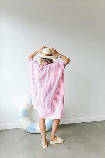
Hat | Coverup | Swimsuit | Bracelet (similarish) | Platform Sandals | Inner Tube
This is the most lightweight, easy breezy cotton (but nice quality) caftan out there. I used to own the same one in blue but longer and loved it. The alternating stripes create a pattern that moves your eye around and thus distracts from what is underneath. You don’t have to tie it either if you want it to be loose (the tie is on the inside). It also comes in other colors (the darker colors aren’t see-through and you can wear it as a dress), but my goodness it’s PERFECT. I feel so cute, comfortable, and not too exposed to belly up to a restaurant at the beach or hotel.
A Shirtdress That Is Actually Has Shape (And So Affordable!!)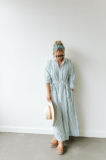

Headband | Sunglasses | Dress | Purse | Bracelet (similarish) | Sandals
This dress is the real winner of the season. It’s from Target and while I love the idea of Target clothes I do find that sometimes their cuts aren’t great on me or the fabric is just meh. This is lightweight (looks heavier than it is), has a seersucker vibe that lends itself to being casual, doesn’t need to be steamed, and has that cute gathering detail at the front but nothing on the back so it gives you a sense of the waist with extreme waist comfort!!!!! Might be too warm for extreme humidity, but it’s absolutely coming with me for nighttime casual dinners. I’m so comfortable and I feel really cute (add a trendy bag to take it down a notch in the mom category).
A Really Good Lightweight Short-Sleeved Blouse
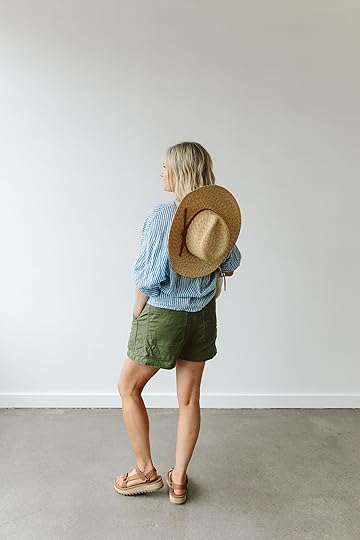
Hat | Purse | Blouse (similar) | Shorts (similar) | Sandals
I feel like I’m not really selling this shirt well enough here, but I’ve had it for years and wear it frequently every summer because of how dang lightweight, comfortable, and wrinkle-resistant it is (or I should say it looks good with slight wrinkles and holds it shape). Emerson Fry makes new ones every year in the same shape/fabric but different colors. HIGHLY RECOMMEND. Big old armpits, cute bell sleeves, thin high-quality cotton. Just glorious. Shorts are from last year (yes, we should have steamed them but they were the last outfit and I was literally out of steam). Comfortable and certainly practical/easy to wear. And while I don’t love that Target has so successfully knocked off Claire V, if Claire isn’t within your budget this bag is so cute (if you have the budget buy from the original designer, IMHO. They just came out with a new color of the grande fanny that the entire EHD team is swooning over). Tevas, always FTW – water shoes for rafting through the canals  Also yes, that is a new WONDERFUL hat and stays on with the tie situation. It’s the best hat on the market if you ask me.

Sunglasses | Top + Shorts | Purse | Bracelet (similarish) | Sandals
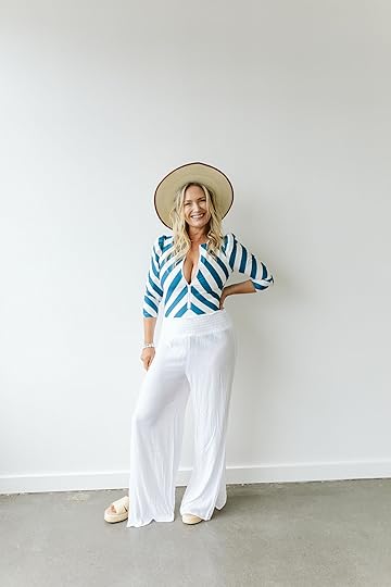
Here is one I bought to show you that isn’t really me, but it is pretty dang good if this is your style… and from Target!!! I’m more of a denim shorts/blouse combo lady, but this linen set from Target is legit very good and my team of Gen Zers (and millennials) LOVE it. I know this is very in and trendy but it’s hard for me not to see them as a pajama set or a dorky dad set (which I know is in, I read the news and “Kramer chic” is everywhere but it’s not for me). The purse helps LOL. If you are into looking fashion forward, like a cool dorky dad, and being really comfortable, this is a great set.
My New Favorite Flowy White Blouse
Hat | Sunglasses | Blouse | Swimsuit Top | Shorts | Bag (similar) | Heels
Now THIS is way more me. Last year’s jean shorts + a new flowy, easy breezy blouse (it’s fairly cropped, too, so you don’t even have to tuck), straw hat, and DONE. I wore it with heels here (which I’m still debating if I should even bring to Hawaii, but they are so cute, comfortable (for being heels), and make my legs look so long!!). Look how trendy I am with my silver bag And way to go Target for that excellent hat. I’m only bringing one hat on our trip because I learned my lesson that wearing 2-3 hats at the airport and on the plane will get you a lot of weird looks and could possibly embarrass your husband and children, especially when people recognize you from social media and perhaps assume correctly that you are weird).

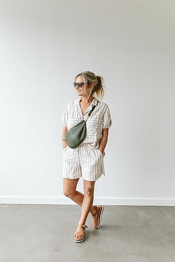
Hat | Swimswuit | Pants | Bracelet (similarish) | Platform Sandals
100% bringing and wearing this outfit. If you haven’t dabbled in compression suits yet but have been curious, might I introduce you to Stylest (TA3 is also excellent and I love Andie and Summersalt too). This one is obviously more of a rash guard which is great for me because I get really bad sun rash if I’m not really protected (and no I don’t tan because any “tan” would just be a burn anyway). I feel extremely good in this due to the shaping compression. I first bought it in the rainbow pattern (which I call my toddler suit). It’s not exactly what I think most men fantasize about, but I feel great in it which is far more important and it’s great for family vacations. These Target pants are AWESOME (those are an XS so def size down). The suit has shelf support, BTW, but you can buy swim bras for underneath which looks like a cute bandeau for extra support. I LOVE this look. The hat has a sweet leather trim detail and the shoes are awesome for the price (I refuse to spend big money on any espadrilles as they never last more than a season for me).
HEADER


Hat | Sunglasses | Coverup | Bracelet (similarish) | Sandals
This caftan might not look that incredible but the fit and fabric are AWESOME. It drapes so beautifully. Despite being so voluminous, even with my big buoys, it lays flattish on the stomach. I wish it came in a million colors – I’d buy this caftan many times over. The fabric is thin and silky but not clingy (I’m not sure how breathable it is, it’s likely a synthetic mix). Maybe it’s the black with a vertical striped floral pattern that makes it so flattering??? Dunno. And if you don’t own Haviannas flip flops get yourself a pair (I like Tkees for nicer ones but they were all sold out). They last forever, come in a million colors, and are strangely comfortable.
A Cute Oversized Cover-Up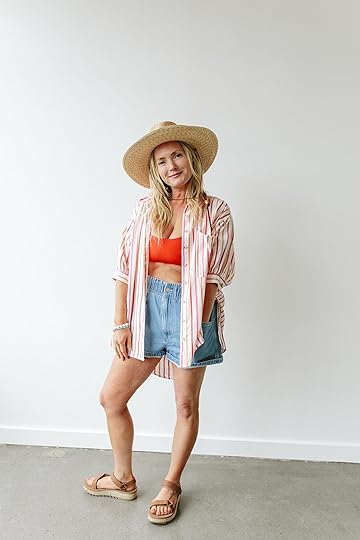
Hat | Button-Up | Swimsuit Top | Shorts | Sandals
I’m really into menswear button-ups as cover-ups but the long sleeve ones can be too hot. Kaitlin and Gretchen convinced me to wear this bikini top underneath but I’m projecting extreme discomfort in it (it’s actually a swim bra that I ordered to go underneath the blue/white striped one piece so that you can unzip it and have a cute swim bandeau showing). The oversized blouse is a pretty cute coverup which I plan to bring and those pull-on shorts were Madewell’s like #1 short last year for good reason. Please ignore the bunion, per usual. May I distract you with the best hat ever (again)!
Wait, Is That A Swim Dress?

Button Down Shirt (similar) | Hat | Swim Dress | Bracelet (similarish) | Sandals
Yep. With Pockets! Another one from TA3 (I’m currently manifesting a patterned collaboration, BTW). It’s corsetted in the back, highly shaping, and definitely more resort wear than swimming, but I LOVE IT SO MUCH. Y’all, I can totally get in with the kids, dry off, go to the bar, grab a drink, and feel cute the whole time!! The sandals are my go-to from last year (still in excellent condition) and still available.
Another Cool “Kramer Chic” Set
Towel | Sunglasses | Button-Up Top + Shorts | Swimsuit | Bracelet (similarish) | Slides
Another set that I know is cute and trendy but I think I’m just too old to not feel dorky in it (I know that this is part of why it’s “cool” because dorky is “in” but some of us just aren’t buying in). But I’m showing it off because my team loves it and thought you might. Now this set (from Topshop) is really thick, so if you are going somewhere super humid this night not be right for you. I love those Nike slides, by the way.
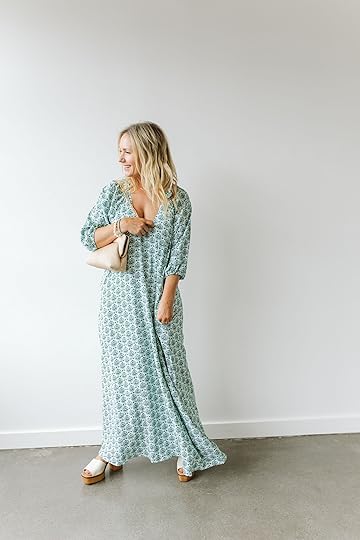
A VERY Comfortable Dress
Dress | Bracelet (similarish) | Purse | Heels
Ok, this dress is soooooo comfortable, drapes really well, and I love that scoop neck. I personally think my “love pillows” are too big for the dress and it does make me feel like I’m hiding a baby in there, so I think it’s better on people will smaller boobs (so it hangs closer on the body). If it were cheaper I’d keep it because it’s so comfortable and still pretty. But if you are tall and smaller up top I really recommend this dress.
Obviously, My Vibe From Head To Toe
Hat | Blouse | Shorts (similar) | Sunglasses | Bracelet (similarish) | Sandals
While denim shorts aren’t exactly great in the humidity, this whole look from head to toe is just very me, and I feel so comfortable and cute in it. Oversized (and rolled) denim shorts, a new blouse that I can’t stop wearing (has a matching long skirt, too), classic birks (oversized brass buckle), and my favorite new hat with the toggle. The shirt is cotton, breathable, and the pattern and ruffles are so fun and playful.
Hope this was helpful for anyone needing some spring break fashion inspo! xx
*Photos by Kaitlin Green
The post 12 Cute, Comfy Easy-To-Wear Spring Break Outfits appeared first on Emily Henderson.
12 Cute, Comfy Easy-To-Wear Spring Break Outfits
I have a “family vacation” philosophy that I’d love to share if you are into random internet people telling you what to do with your lives and how to raise your kids (…most people LOVE THAT). I learned this the hard way: When your kids are infants (under one), go wherever you want because they are mostly mobile and they don’t care/know what is happening. When your kids are toddlers (5 and younger), lower all expectations down to ZERO, get in your car, rent a house near any sort of body of water (crucial ingredient) with another family of similar-aged kids whose parents you enjoy enough to commiserate with and just chill (camping with another family is PERFECT). Do whatever you can to not have to get in a car to start your day, avoid hotel rooms so you don’t get stuck in a “nap trap” sitting in the dark, avoid nice restaurants because toddlers know how to ruin your good time and hell, even avoid going to a city where you want to experience “culture” because you might not actually get to enjoy much of it. I’m sure a million of you will balk at this because I’m sure many of you loved your city + toddler experience. But when we went to Australia FOR THREE WEEKS for Brian’s work, the kids were 3 months and 2 years old. We barely left the house due to nap trap, they ruined every martini we tried to get at our 5 pm dinners and came home saying it was mostly a waste of a lot of money. Same thing when we went for 2 weeks to New York for work around that same time (we went for my work). We were so exhausted and drained and everything was on their terms. Save your $$$. The toddler years require too much work and they are too unpredictable.
Now, when they become school-aged and you want a “vacation” (different than traveling) meet them where they are at and hone in on your shared interests. For us right now, it’s nature, somewhere with water and sun, a sense of adventure, few crowds, and somewhere that avoids screentime for all of us. But for now, our whole family is very happy when we are outside (swimming, zip lining, snorkeling, hiking, animals, horses, farm visits, sitting by a lake and reading, more swimming, etc). Ideally somewhere with delicious food too.
Furthermore… (Yes, I’m still blabbing about my philosophy, I’m a Virgo y’all and an Enneagram 7 so I like to seriously plan my fun). I plan every day the same – the first half of the day is super active (moving our bodies somehow) and the second half of the day is inactive (reading, chilling, reading, sipping on something while kids swim). Last year we were able to go to Costa Rica (far exceeded our super high expectations) and this year we are headed to Kauai (never been so excited). I planned our entire itinerary, including activities, in JULY, like a real mom-boss/psychopath (I’m very grateful to be able to do this with our kids).
But last year I crapped the bed on my Costa Rica wardrobe. I was fine for our rainforest mountain hiking/ziplining days but didn’t bring the right lightweight clothes for the super humid and hot beach time. I felt very sticky/hot in my denim shorts at night. This year I’m planning a bit more (as you will see), and while I’m not bringing all of this (and returning some because I simply don’t need this many clothes) I wanted to show you what I found out there that I’m really loving right now (and per usual I kissed a lot of toads).
My Hands Down Favorite CaftanHat | Coverup | Swimsuit | Bracelet (similarish) | Platform Sandals | Inner Tube
This is the most lightweight, easy breezy cotton (but nice quality) caftan out there. I used to own the same one in blue but longer and loved it. The alternating stripes create a pattern that moves your eye around and thus distracts from what is underneath. You don’t have to tie it either if you want it to be loose (the tie is on the inside). It also comes in other colors (the darker colors aren’t see-through and you can wear it as a dress), but my goodness it’s PERFECT. I feel so cute, comfortable, and not too exposed to belly up to a restaurant at the beach or hotel.
A Shirtdress That Is Actually Has Shape (And So Affordable!!)Headband | Sunglasses | Dress | Purse | Bracelet (similarish) | Sandals
This dress is the real winner of the season. It’s from Target and while I love the idea of Target clothes I do find that sometimes their cuts aren’t great on me or the fabric is just meh. This is lightweight (looks heavier than it is), has a seersucker vibe that lends itself to being casual, doesn’t need to be steamed, and has that cute gathering detail at the front but nothing on the back so it gives you a sense of the waist with extreme waist comfort!!!!! Might be too warm for extreme humidity, but it’s absolutely coming with me for nighttime casual dinners. I’m so comfortable and I feel really cute (add a trendy bag to take it down a notch in the mom category).
A Really Good Lightweight Short-Sleeved BlouseHat | Purse | Blouse (similar) | Shorts (similar) | Sandals
I feel like I’m not really selling this shirt well enough here, but I’ve had it for years and wear it frequently every summer because of how dang lightweight, comfortable, and wrinkle-resistant it is (or I should say it looks good with slight wrinkles and holds it shape). Emerson Fry makes new ones every year in the same shape/fabric but different colors. HIGHLY RECOMMEND. Big old armpits, cute bell sleeves, thin high-quality cotton. Just glorious. Shorts are from last year (yes, we should have steamed them but they were the last outfit and I was literally out of steam). Comfortable and certainly practical/easy to wear. And while I don’t love that Target has so successfully knocked off Claire V, if Claire isn’t within your budget this bag is so cute (if you have the budget buy from the original designer, IMHO. They just came out with a new color of the grande fanny that the entire EHD team is swooning over). Tevas, always FTW – water shoes for rafting through the canals Also yes, that is a new WONDERFUL hat and stays on with the tie situation. It’s the best hat on the market if you ask me.
Sunglasses | Top + Shorts | Purse | Bracelet (similarish) | Sandals
Here is one I bought to show you that isn’t really me, but it is pretty dang good if this is your style… and from Target!!! I’m more of a denim shorts/blouse combo lady, but this linen set from Target is legit very good and my team of Gen Zers (and millennials) LOVE it. I know this is very in and trendy but it’s hard for me not to see them as a pajama set or a dorky dad set (which I know is in, I read the news and “Kramer chic” is everywhere but it’s not for me). The purse helps LOL. If you are into looking fashion forward, like a cool dorky dad, and being really comfortable, this is a great set.
My New Favorite Flowy White BlouseHat | Sunglasses | Blouse | Swimsuit Top | Shorts | Bag (similar) | Heels
Now THIS is way more me. Last year’s jean shorts + a new flowy, easy breezy blouse (it’s fairly cropped, too, so you don’t even have to tuck), straw hat, and DONE. I wore it with heels here (which I’m still debating if I should even bring to Hawaii, but they are so cute, comfortable (for being heels), and make my legs look so long!!). Look how trendy I am with my silver bag And way to go Target for that excellent hat. I’m only bringing one hat on our trip because I learned my lesson that wearing 2-3 hats at the airport and on the plane will get you a lot of weird looks and could possibly embarrass your husband and children, especially when people recognize you from social media and perhaps assume correctly that you are weird).
Hat | Swimswuit | Pants | Bracelet (similarish) | Platform Sandals
100% bringing and wearing this outfit. If you haven’t dabbled in compression suits yet but have been curious, might I introduce you to Stylest (TA3 is also excellent and I love Andie and Summersalt too). This one is obviously more of a rash guard which is great for me because I get really bad sun rash if I’m not really protected (and no I don’t tan because any “tan” would just be a burn anyway). I feel extremely good in this due to the shaping compression. I first bought it in the rainbow pattern (which I call my toddler suit). It’s not exactly what I think most men fantasize about, but I feel great in it which is far more important and it’s great for family vacations. These Target pants are AWESOME (those are an XS so def size down). The suit has shelf support, BTW, but you can buy swim bras for underneath which looks like a cute bandeau for extra support. I LOVE this look. The hat has a sweet leather trim detail and the shoes are awesome for the price (I refuse to spend big money on any espadrilles as they never last more than a season for me).
HEADER
Hat | Sunglasses | Coverup | Bracelet (similarish) | Sandals
This caftan might not look that incredible but the fit and fabric are AWESOME. It drapes so beautifully. Despite being so voluminous, even with my big buoys, it lays flattish on the stomach. I wish it came in a million colors – I’d buy this caftan many times over. The fabric is thin and silky but not clingy (I’m not sure how breathable it is, it’s likely a synthetic mix). Maybe it’s the black with a vertical striped floral pattern that makes it so flattering??? Dunno. And if you don’t own Haviannas flip flops get yourself a pair (I like Tkees for nicer ones but they were all sold out). They last forever, come in a million colors, and are strangely comfortable.
A Cute Oversized Cover-UpHat | Button-Up | Swimsuit Top | Shorts | Sandals
I’m really into menswear button-ups as cover-ups but the long sleeve ones can be too hot. Kaitlin and Gretchen convinced me to wear this bikini top underneath but I’m projecting extreme discomfort in it (it’s actually a swim bra that I ordered to go underneath the blue/white striped one piece so that you can unzip it and have a cute swim bandeau showing). The oversized blouse is a pretty cute coverup which I plan to bring and those pull-on shorts were Madewell’s like #1 short last year for good reason. Please ignore the bunion, per usual. May I distract you with the best hat ever (again)!
Wait, Is That A Swim Dress?Button Down Shirt (similar) | Hat | Swim Dress | Bracelet (similarish) | Sandals
Yep. With Pockets! Another one from TA3 (I’m currently manifesting a patterned collaboration, BTW). It’s corsetted in the back, highly shaping, and definitely more resort wear than swimming, but I LOVE IT SO MUCH. Y’all, I can totally get in with the kids, dry off, go to the bar, grab a drink, and feel cute the whole time!! The sandals are my go-to from last year (still in excellent condition) and still available.
Another Cool “Kramer Chic” SetTowel | Sunglasses | Button-Up Top + Shorts | Swimsuit | Bracelet (similarish) | Slides
Another set that I know is cute and trendy but I think I’m just too old to not feel dorky in it (I know that this is part of why it’s “cool” because dorky is “in” but some of us just aren’t buying in). But I’m showing it off because my team loves it and thought you might. Now this set (from Topshop) is really thick, so if you are going somewhere super humid this night not be right for you. I love those Nike slides, by the way.
A VERY Comfortable DressDress | Bracelet (similarish) | Purse | Heels
Ok, this dress is soooooo comfortable, drapes really well, and I love that scoop neck. I personally think my “love pillows” are too big for the dress and it does make me feel like I’m hiding a baby in there, so I think it’s better on people will smaller boobs (so it hangs closer on the body). If it were cheaper I’d keep it because it’s so comfortable and still pretty. But if you are tall and smaller up top I really recommend this dress.
Obviously, My Vibe From Head To ToeHat | Blouse | Shorts (similar) | Sunglasses | Bracelet (similarish) | Sandals
While denim shorts aren’t exactly great in the humidity, this whole look from head to toe is just very me, and I feel so comfortable and cute in it. Oversized (and rolled) denim shorts, a new blouse that I can’t stop wearing (has a matching long skirt, too), classic birks (oversized brass buckle), and my favorite new hat with the toggle. The shirt is cotton, breathable, and the pattern and ruffles are so fun and playful.
Hope this was helpful for anyone needing some spring break fashion inspo! xx
*Photos by Kaitlin Green
The post 12 Cute, Comfy Easy-To-Wear Spring Break Outfits appeared first on Emily Henderson.
March 1, 2024
FIX IT FRIDAY: See How We Helped Decorate 4 Reader’s Mantels (+ Tips For Sprucing Up Yours!)

Here we are, day one of March, and if you’re like me your mantel is still looking lackluster post-holiday season when it was draped in garland and twinkle lights. Or maybe you’ve never really loved how your fireplace mantle has been decorated and this is the year you are finally going to figure out. In case you’re new to this “Fix it Friday” series we’ve tackled bedding, entryways, and color palettes. The whole idea is that you don’t need to toss out everything you own to love your home, or in this case your mantel, a whole lot more. A little decor can really change your mood, I promise!
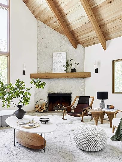 photo by sara ligorria-tramp | from: mountain house living room reveal
I think what’s important to remember is that you don’t need to fill your mantel up with a ton of decor pieces unless that’s the look you want. Like most things in good design, it’s all about scale! Take the mountain house fireplace above. The large piece of art with that cool, graphic vase with large branches looks amazing! That’s just two things. Now, I don’t want to discount that pretty log holder and the two scones flanking the mantel. Those also make the whole look complete. It feels visually balanced with a hit of black in each section, giving a bit of depth to an otherwise light and neutral fireplace.
 photo by sara ligorria-tramp | from: portland project living room reveal
Or see how simple the Portland Project living room’s mantel is?? That grid of art makes such a pretty and quiet statement, doesn’t it? Then I love how those candlestick holders with light blue candlesticks (to add interest and talk to the art) look. It brings a little drama to the mantel while also talking to all of the black in the room.

 left: photo by kaitlin green, from: farmhouse living room reveal | right: styled by getteline rene,
photo by mark weinberg, from: rugs usa launch
But with Em’s farmhouse living room’s mantel, she wanted to go more eclectic, obviously:) The photo on the left is from the original farmhouse shoot. Notice the balance. On the far left is a tall but delicate plant in a wood (popsicle stick) planter. Then she added a trio of leaning art, all in different sizes and mediums. And finally on the left is a visually heavy black vase that’s more of a medium height with those cute little wooden objects at the end. It feels balanced to your eye because the left and right have opposite visual weights at contrasting heights. One is tall and thin while the other plays with shorter heights and chunkier pieces. Then the woods are evenly dispersed in fun different forms.
Then on the right was from the Rugs USA shoot where the very talented Getty Rene restyled the whole thing. She used more of the height but still played with visual weight! The mirror on the left is definitely the heavier piece, while that vase and branches are lighter but taller! Then the mix of materials in between is so great but don’t look at all cluttered (well, neither versions do:)).

 design by velinda hellen for ehd | photos by sara ligorria-tramp | from: sara’s living room & dining room reveal
I think a HUGE lesson is that perfect symmetry in mantel styling is not the answer, at least not to us (except when flanking sconces and grid art:)). For example, avoid having the same-sized candlestick holders on either end of your mantel. Look if you love that wonderful! But otherwise, mix up those heights and visual weights. Sara’s fireplace is another great example of how to do that.
Now, let’s get into these reader mantels and I promise some have TVs above or next to fireplaces:)
No More Itsy Bitsy
First off, what a beautiful fireplace and home! This reader said their style was “colorful modern – hence the rug.” Great! The first issue that I think is contributing to them not loving the styling is the candles. While cute and I’m sure smell wonderful, they are too small, are all roughly the same size, and placed equidistantly. Let’s shake things up and play with some bigger pieces! But before I get into my suggestions, those sconces are awesome and must stay:)

Mirror | Herman Miller: A Way of Living Book | Chair: 500 Designs That Matter Book | Dipped Rust Brown Taper Candles (Set of 2) | Tira Wood Taper Holders | Blue Vase | Storage Basket
Here we are! First things first, I think swapping out the wood-framed mirror with a more modern and sleek option is the way to go. Those sconces are pretty chic and a metal framed mirror with a cool shape like this one will instantly feel more cohesive as well as talk to the fireplace screen. Next, they need a taller vase and since they love color I loved this blue one. Their rug has such an awesome pattern so I think choosing one that has a complementary color in a cool texture, as opposed to a competing pattern, is the way to go. Then placed near the vase, I love the idea of adding in fun MCM wood candlestick holders. Choosing a fun shape will make the mantel more interesting. And since they love color, these clay-toned candlesticks are awesome! They contrast the blue and play off the other warm tones in the room. Then finally, I love their plant! But I think that plant could be sitting on a couple of books to make it more of a statement on the other side of the mantle from the vase and candlesticks:). My only tip when using books on mantels is to make sure they aren’t too thin. Design books are usually perfect since they range from medium thick to thick thick (like the chair book)! To finish it off and add that last touch of warm, I love the idea of adding a woven basket for firewood but it can easily be used for pillows and blankets if they prefer:)
In Need Of Cozy
Another beaut that needs a good dose of cozy. This was what the reader said in their email – “This is a TV room where we hang out sometimes—it is not a high-traffic room. Probably bc it isn’t cozy, but I would love it to be! Not sure whether to put some art on the walls or have things lean on the mantle.” Ok, let’s dive in.
 photo by tessa neustadt | from: how to add style to a neutral living room
Now, I’m not sure what all of the black boxes are but I think that removing the two on the right since they don’t look plugged in is a great start and a perfect place for some cozy pillows (bonus points for a cushion which would likely need to be custom made). I was thinking something along the lines of what Emily did in her first LA home. Staying on the hearth/actual fireplace area, adding in some fun fireplace andirons with firewood (whether you light a fire) would also add some cozy (I do see you have a young kid or kids so obviously do what’s safest for them). Then, to the left of the fireplace, you can add a woven basket for wood or more pillows and blankets! Plus it adds visual warmth:)
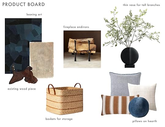
Extra Large Blue Art | Handdrawn Art | Fireplace Andirons | Black Vase | Woven Basket | Chambray Pillow | Cream Woven Pillow | Lumbar Pillow | Ball Pillow
For the actual mantel, staying with the blues, creams, woods, and blacks (a very EHD color palette) would definitely suit the “Spanish/Mediterranean style” they also mentioned in their email! Plus it would work with the colors of the rug they have too. I adore these two pieces of art and think they are perfect for leaning on the left side with your cool wood piece. Then on the right, I want them to go big with a vase and large leafy branches. It looks like the mantel is fairly thin so I tried to find pieces that weren’t too deep. Hope this helps!
Waiting in the 80s
Not only was this reader the first to submit but I could tell they are probably a big EHD fan because of some of the wonderful pieces they have (cough:: the Katie Gong knot ::cough). But it wasn’t the full reason I chose them. I feel like this fireplace setup with the built-ins flanking the fireplace is fairly common. Hopefully, this can help lots of you! Here was their email – “Attached is my submission for Fix it Friday mantle edition. We have this huge mantle that is very difficult to style due to the size and height and large fireplace. We’d love to redo this wall entirely but that is not in the budget. Our style is colorful and modern and leans a little mid-century, my husband collects Paul McCobb furniture, but without trying to make our 80s-built suburban house, ie this wall, not too out of place. Would love y’all’s help!! If you have any suggestions on color to paint the fireplace let me know as well :)”
Yes, you read that right. They have THE DREAM husband. Collecting Paul McCobb furniture is wildly cool and made me definitely lean towards modern, midcentury modern in my recs.
 photo by kaitlin green | from: farmhouse primary closet reveal
First, let’s address the big elephant above the cabinetry…all that open space! I feel for them because deciding how to go about decorating an area like this isn’t easy. First, I would take everything off and start fresh. I’m sure all of those pieces can be repurposed elsewhere in the house and/or some can be incorporated into the shelves. I looked to Em’s primary closet for inspo and after consulting Em we both think it’s a good idea. Adding in a large plant like this and placing it on of the sides would be great and hopefully not too much to keep up with. If they are great with plants add a slightly smaller one so it has a buddy and will look great! I chose complementary planters that have different shapes for interest. Next up is the art. I chose two pretty large pieces that in theory would be neutral enough to not take away from the rest of the room but textured/colorful enough to visually hold up to the fireplace. I’ve been the white one in person and it’s stunning! I know the other is even more expensive so it can be used more as inspiration!

Large Cream Planter | Large Blue Planter | Neutral Cream Art | Colorful Art | Wood Arch Decor Ceramic Curved Sculpture | Black Metal Box | MCM Candle Holders | Natural Wood Knot Decor | Fireplace Paint Color | Metal Handles

 design by velinda hellen for ehd | photos by sara ligorria-tramp | from: sara’s living room & dining room reveal
The shelves, of course, are the next big ticket item. As of now, I think why this reader isn’t happy is because there’s just a bit too much happening and not enough of a consistent color palette. I’m not suggesting to only have books that fall within three colors or turning them around to all be beige, no! But take a look at Sara’s bookshelves. They don’t all perfectly match but there’s just a bit more color cohesion. I also think paring the books back just a little and playing more with orientation like stacking a few with an object on top would make a world of difference. I added a handful of MCM-inspired decor pieces in case they wanted to add in some new pieces:)
 photo by tessa neustadt | from: how we styled our living room to sell
This shelving unit was the “styled to sell” version so it was shot more pared back than normal but it shows some fun styling configurations!
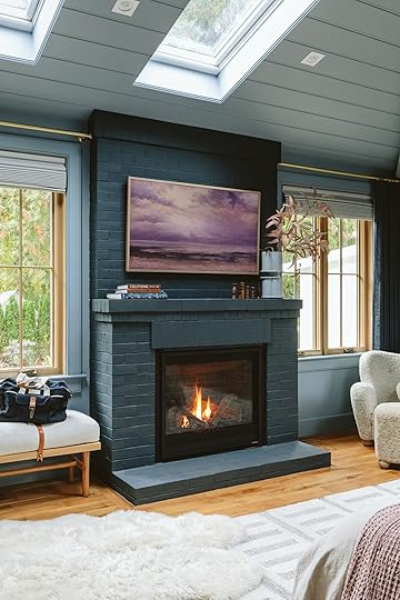 photo by kaitlin green | from: farmhouse primary bedroom
Lastly, this reader asked about a fireplace color. Sadly, it’s impossible to recommend a paint color without testing it in the space but I think something along the lines of what Emily used in her bedroom would be awesome. It’s moody and modern without going too dark. Something like this would be so pretty! Oh, and I don’t want to forget that switching out the hardware to something more modern like these would also be an effective and affordable switch:)
20 Years Is Long Enough!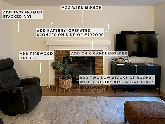
When you get an email like this you have to help! – “I don’t really have a design style other than simple, casual, and/or traditional. I have struggled with this area for 20 years and have never loved it. This space is right off the kitchen and is the main TV-watching area.”
20 years is too long so here we go!

Botanical I Print | Botanical II Print | Battery Operated Wall Sconces (Set of 2) | Over the Mantel Mirror | Modern Log Basket | Curvature Marble Taper Candle Holder | Habitat: The Field Guide to Decorating Book | Decorative Box | Kelly Wearstler: Synchronicity Book | Live Beautiful Book | The New Design Rules: How to Decorate and Renovate, from Start to Finish Book
I think some simple additions will change the game here! First things first, let’s get a mirror over the mantel. It’s easy, beautiful, and will make the space feel bigger. I love the shape of this one because it’s simple but not the norm. Then flanking that wonderful mirror with these battery-operated elegant sconces will really frame the area in a simple but classic way (plus no junction box needed!!). Then in terms of what should go on the mantel, I say let’s keep it real easy. Getting a candlestick holder (with some white candles) like this marble one is the way to go. It’s an interesting shape but in a classic material. But then you need to balance out the whole wall. By adding in two large prints, stacked on top of each other, like these on the left of the fireplace would be great. Just make sure to go larger. We don’t want bitsy art, OK!? Then throw a nice leather wood or blanket holder under the art for some warmth and we’re almost done.
 photo by sara ligorria-tramp | from: 4 ways to style that credenza for “real life” + shop our favorite credenzas
But we can’t leave out that little cabinet! Since there’s a TV above it, any decor must stay low so as to not block the precious device. They currently have some books/magazines but replacing those with thicker books that have more visual weight and interest would be nice. Take Arlyn’s credenza we styled for a shoot, those thicker books make all the difference, don’t they? Just make sure to treat them like all of your other decor. The ones I chose have a neutral color palette and a mix of color and pattern. Books are art too! Then add a box like this great black one on top of one stack and you’re set.
As always, I hope this was helpful and let me know what you’d like next time!
Love you, mean it.
Opening Image Credits: Photo by Kaitlin Green | From: Farmhouse Primary Bedroom Reveal
The post FIX IT FRIDAY: See How We Helped Decorate 4 Reader’s Mantels (+ Tips For Sprucing Up Yours!) appeared first on Emily Henderson.
February 29, 2024
All The Cold Plunge Questions, Answered: Our Cold Plunge Review And What We Love About It
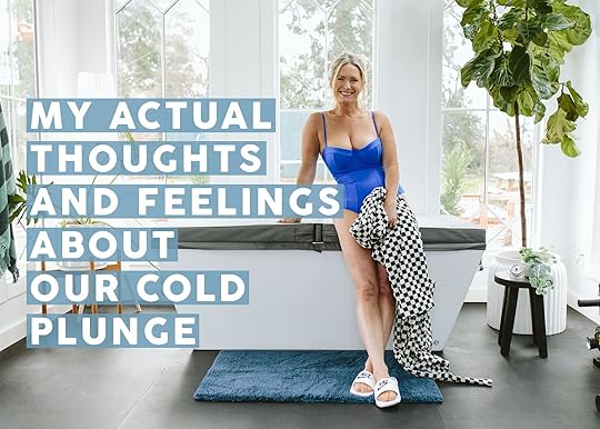
Well, here we are. My job is so weird (and wonderful). Three people, three cameras, shooting me cold plunging, in an admittedly pretty low-cut suit, was once again quite the way to spend a Thursday. There is no perfect career or job and many days are challenging being a small business lady on the social media internets, but this day, I’ll gladly celebrate (despite being terribly self-conscious) as I dunk my body in freezing cold water for your viewing pleasure (and my actual pleasure).
#1 Question: Why Do You Cold Plunge?During lockdown, Brian and I lived in Lake Arrowhead with our house a 20-minute walk to the lake. Most weekdays we’d take turns running down, working out, jumping in, drying off in the sun and running back. It immeasurably helped my low-grade COVID anxiety on a daily basis and simply felt incredible (yes, year-round). I’ve obviously read a lot about Wim Hof (watch the Goop Episode if you are curious) so sure, I know about all the good things it does for your body. But for me, it’s the mood boost that accompanies it (likely paired with the workout endorphins) that has made it something I crave.
So after 2 years up here of ice baths and cold showers, I bought a janky one on FB Marketplace last summer that didn’t end up working for me or my yard (too hot outside, but couldn’t live inside). I was even more hooked and started doing the research for a non-janky plunge. I felt that after 4 years of voluntarily shocking my body in freezing cold water, I could allow myself to invest in one. Brian loved plunging in the lake but not as much as me (he now meets my enthusiasm).

After doing my research, most reviews put Plunge as the best for mid-range cold plunges (plus they are so pretty). There are some that are splurgier, but they seemed more for commercial/spa use and there are some more affordable but with obvious concessions (many are for adding ice or simply cold water due to the outside temperature). I reached out, pitched them admittedly VERY HARD, and struck up a trade. In other words, I would have bought this outright but in full transparency, I didn’t.
The reason I chose this cold plunge is the usual: the great looks + the great function + really good reviews. Stylistically it’s very simple with a lovely shape that obviously looks like a large tub and you can hide the mechanics behind it (their new version that just launched houses the cooling system inside).
Wait, Why Do You Put Your Body In Freezing WATER…IN THE WINTER?
Listen, hot and cold therapy has been used as a healing tool forever – good for inflammation, the immune system, and yes even burning calories. But the reason that I do it is 100% because I love the way I feel, both during and after. It’s a coping mechanism, perhaps even an addiction, and one that I have zero guilt about. They say that it’s 3 hours of a happy dopamine burst from your brain into your body (quoting Andrew Huberman, here). I walk into the house after a workout/plunge and feel like FANTASTIC MR. FOX and ready to work and be a lot more positive. If you are already shaking your head and annoyed with this blonde lady getting all Goopy on you, I get that and this likely isn’t for you. This isn’t just a new fancy fad to spend money on, there is enough scientific and anecdotal evidence showing how beneficial it is to our bodies, brains, and moods. (And they have payment plans, FYI).
I love it year-round, but in the winter when it’s gray outside, I specifically go to it to stave off Seasonal Depression. The last two winters here I spent doing long walks/workouts and ice-cold showers (which also works!) so once we had a place to put this Plunge I felt confident that I would use it enough to warrant having one. Remember, not only is this a financial investment but everything we do/buy has an environmental impact so if you don’t think you will use it frequently, then think hard about getting one. Despite me forcing most people in my life to try it – 2/3rds LOVE IT and others love how they feel afterward (which is a guarantee) but hate the cold enough to not opt for it again. Even my kids are split – Birdie LOVES IT and will ask to do it with me and her friends, Charlie took a big “no thank you bite” and hasn’t touched it since. My brother drives over to our house just to do it, so apparently it’s in the Starke DNA.
How Does The Cold Plunge It Work?
It’s essentially a large bathtub with an electric heat pump next to it (similar to a low-energy AC unit) that is attached to a big tub with jets that filters the water and keeps it around 43 degrees (I think it goes down to 37 which now that I think about it I’m going to set it lower). So yes, IT’S VERY COLD AND YOU WILL MAKE REALLY ODD SOUNDS.
How Long Do You Stay In The Water For?

The length of my plunge depends on how warm my body temperature is (which is determined by how long my workout was). I almost always do it after a workout (even if the workout is 15 minutes Peloton) because having a warmer body temperature makes it so much more enjoyable. If I don’t have much time I’ll just get in for a minute, but most days its the length of 1 or 2 songs (think Kelly Clarkson, “Stronger” or Pinks, “I’m Never Not Going To Dance Again” and YOU BET I SING). Many times I’ve stayed for 9 minutes but it takes a long time for my bones to heat up after that (so best on the weekend when I can snuggle up afterward). I know you won’t believe this, but after the initial shock, it gets pretty easy. Cold, but you stop noticing it, and feels so magical.

Also to note: we have the XL which is lovely, but if you want to save some $$ the smaller version is probably big enough (unless you are super tall). You fill it with clean water and the filter is easy to change (full disclosure, we haven’t changed it yet which I’m sure we need to but it seems fine – we’ve been using it for 3 months, 2 of us 4-5 times a week). It does have a filter and chemicals similar to a hot tub. Also to note: it’s really cut down on my spray tan addiction because I’m prioritizing this and I don’t want orange water for obvious reasons.
 Do You Scream???
At first, I make all sorts of sounds that might sound totally primal and dare I say erotic (sorry – or your welcome – neighbors) TBH, but then I settle in, breathe, and can relax. I keep my hands out because since I need to writer it takes them too long to warm up and then I can’t work. And while I’m done showing people my crotch in life, I clearly have no problem showing off what we will now call “my buoys.”

All the photos of people looking peaceful might look like BS, but again, once you settle in (after about 30 seconds) you get used to it. close your eyes, and belt out Kelly Clarkson. Moving your legs and arms in the water definitely makes it colder/harder and extra credit for putting your head in. I highly suggest going up to your neck (not just your legs) for full effect.


Afterward, you might be like me, bright red, but you will definitely be like me – VERY HAPPY. Your body feels numb in such a good way and you are instantly warm when you get out (your body temp isn’t but your skin is due to the contrast). I usually try to warm up on my own. But if I don’t have the time to wrap myself in a sweatsuit then I’ll obviously take a hot shower in order to not shiver during Zoom calls. Going back between cold and hot is part of water therapy that feels MAGICAL. We don’t have a sauna (yet) but it’s part of my master plan to build out this property for small design + fitness/wellness retreats when I’m “retired”. WHO WANTS TO COME??????

This plunge is mid-priced for what’s on the market, starting around $5k (think hot tub pricing) and the newer version (with the heat pump inside the unit) is more. It’s undoubtedly a luxury for many that are privileged and one that Brian and I are both thankful for daily (yes, he’s obsessed now, too and calls it “liquid creativity”‘” for what it does to his brain and writing directly after). If your first reaction is annoyance about these types of wellness splurges, I get that. Just remember that if a big tech business MAN were touting the benefits of their personal cold plunge (and they do) we’d call it “bio-hacking” and no one would judge. But when a woman with big or small buoys, living an obviously privileged life, does anything like this, it’s chalked up to woo-woo Goopy “wellness” garbage. But y’all, It’s the exact same thing. The world just wants women, specifically in the domestic and “wellness” space, to stand down and be small, and yet let all the men run free, get big, and make all the $$$. Here we are!!
Cold plunges feel great and are good for your body and mental health, full stop. My best advice for whether this is for you is to start with cold showers after a workout, consistently for a month or three. If you honestly enjoy it and get to the place where you even crave it, then you could snag one that doesn’t have the refrigeration mechanism (some are under $200). There are so many more affordable ones on the market, mostly those that work with outside temp in the winter and these are GREAT. Come summer they won’t stay cold, so people put ice in them when using. It’s a great way to dip your toe If the temperature outside is under 40 degrees, then grab yourself an inflatable one or a barrel and give it a whirl. If you have the budget, consider this the same price as a hot tub and go for this one if you can, from Plunge, which I love very very much.
A few common more logistical questions:
How do you drain/change the water? There is a hookup in the back for a hose that will extend outside onto the pea gravel. We haven’t done this yet, but it’s the reason we put it where we did. Can you put it anywhere? From my experience (with the other janky one I bought before this one from FB), just make sure it’s in 100% shade in the summer (we didn’t have anywhere except our front porch which would be admittedly super weird). The other one couldn’t keep up with the outside summer temp (and it was built to drain directly from the bottom, no hose so it couldn’t be inside). You can put this one, from Plunge, inside your house, but just make sure the hose can reach to drain it somewhere. The tub itself is fiberglass so it’s not heavy, but with water it sure is. Also, make sure that whatever floor you put it on is waterproof – i.e. no wood flooring or carpet, obviously. Despite having a bath mat, we drip everywhere and have to clean up the splashes on our rubber floor daily. Can it get hot like a hot tub? I know there are models that do that but we don’t need it to so ours doesn’t. We have the Soake pool (which is a hot tub in the winter) and I have a bathtub. But if you don’t have a bathtub, it might be worth considering getting one that can be both. Just a reminder that going from freezing to hot might take hours and a lot of energy so I’m not sure how often you’d do this, but I like the option. Does it require electricity? Yes, we just plugged it into the wall (you need two outlets for two plugs) and we had this building wired up knowing that potentially a plunge and a sauna would be hooked up to it. You have to keep it on to keep the water circulating so consider that. We saw our electricity bill bump up a bit (but Oregon also surged theirs by 18% starting in January so hard to know what is what). Easy to install? Yep! I didn’t do it, but our handy guy said it was easy. Why don’t you use your Soake pool as a cold plunge? We could, but we’d have to keep it no less than 55 degrees because we don’t want the pipes/equipment to freeze. For a lot of people, this is cold enough! Also, we like to use our Soake pool as a hot tub in the winter so going up and down takes a lot of energy. Also when it’s rainy it’s obviously less wonderful We keep our Soake pool at the recommended 70 most of the time knowing that it takes 3 hours to heat up so we plan ahead. I fully realize we are spoiled and have no need to ever leave the property, like ever. Do your kids like to plunge? Birdie loves it (has done it 4-5 times voluntarily, obviously) Charlie has no interest. Come summer when it’s 95 degrees, we’ll see. Brian does it every day after he works out as well and loves it. Thanks for reading y’all. And thanks to Plunge for partnering on this. For the record, the trade was an Instagram reel and stories on social media, not a blog post here which I gave freely (literally) because I love the product so much. No PR messaging necessary. I just love how this thing makes me feel and how much it’s benefitted our mental and physical health. (If you are near a cold lake, I HIGHLY suggest doing the analog version:))
*Photos by Kaitlin Green
The post All The Cold Plunge Questions, Answered: Our Cold Plunge Review And What We Love About It appeared first on Emily Henderson.
February 28, 2024
Your Whole Home Cheat Sheet To Picking The Right Window Coverings

It wasn’t until I was deep in the design world that I ever really considered any other window covering besides a curtain panel. It was the only kind my parents used in my childhood home (besides mini blinds and the dreaded vertical blinds). And it’s safe to say the majority of the non-design people in my life who are decorating their own homes also use panels as a default. As elegant as they can be, they are not always the best selection for the window you’re trying to cover.
Say you have a small little window above eye height that panels would look silly on. A roller or Roman shade is going to be your best bet. Or maybe you have a beautiful picture window that faces the street where you don’t want to block the view but you also would rather people walking by not see you hours-deep into a Golden Girls marathon. Light-filtering cafe curtains will do the trick.
If you’ve ever struggled with what direction to go with covering your windows, this post is for you. Oh, and you’re going to want to Pin this info to save for later, too, because it’s advice that will never not be useful.
First, here’s an *actual* cheat sheet for you on when and where to use the four most common types of window coverings: Roman shades, pull-down shades (like rollers and honeycomb), panels, and cafe curtains:
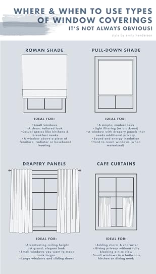
Of course, there is an exception for everything, and these are not die-on-the-hill rules, but I’d guesstimate that they would apply about 90% of the time. And yes, there will be windows where any of the above options would work, and in that case, it’s really just a visual, budget, or maintenance preference. Let’s take a look at all of these more closely to show you examples of why they work where they are pictured (and some other thoughts).
Roman Shades
 design by arlyn hernandez | photo by veronica crawford | styling by emily edith bowser | from: arlyn’s rental kitchen reveal just might have you wishing you had brown—or even cherry— cabinets (yes, really)
First up: Roman shades. Super versatile, clean and tailored and a great option for a lot of tricky spaces.
That’s my kitchen up there (and that cute baby is also mine). I have a giant window in my breakfast nook that frankly was very hard to figure out. I could have done panels, but there isn’t much clearance above the window to hang draperies, plus I didn’t want to deal with panels kissing the floor of a VERY active kitchen (anyone who has ever fed a toddler knows what I mean). In her eyes, they’d be two giant napkins and…a hard no for me. So the next option was a shade of some sort. Frankly, a light-filtering roller shade might have been the most practical solution since I don’t want to block daylight, but I knew I wanted a more decorative look to really spruce this side of the space up, so Romans it was. I went with an outside mount as my sill is super shallow and the shade stack would have protruded awkwardly with an inside mount.
 design by ajai guyot | photos by ellie lillstrom | from: see how ajai transformed her client’s builder grade guest room -get ready for a ton of cozy design ideas & working-mom real talk
How cute is this bedroom? EHD contributor Ajai Guyot had a tiny little window (above a decorative ledge, no less) that didn’t have many options. A Roman is perfect for a window like this since panels would only draw attention to how small it is.
 design and styling by emily edith bowser | photo by sara ligorria-tramp | from: moto reveal: emily bowser’s bedroom “after” is unrecognizable from the “before”
Another spot where a Roman is clutch is above furniture. This is Emily Bowser’s bedroom, and because of the square footage of the room and her home, she really needs to maximize her space. Pulling her dresser out six or so inches to leave room for panels to drape behind was just not a good solution. The drapey Roman she chose is both practical in this application as well as visually soft, not stealing too much attention from anything else in the room.
 design and styling by emily edith bowser | photo by sara ligorria-tramp | from: emily bowser’s kitchen reveal! plus the 8 ways she really maximized her galley kitchen storage
Another Bowser space where a shade (or cafe curtain) was the best move. As I mentioned, there are going to be plenty of times when you have your pick of what to use, and there isn’t a wrong answer. A cafe curtain would feel charming and Old World, while a Roman is polished and fully covers the window when it’s down at night, etc.
Roman Shade Recap
When to use:
On a small window where panels would not work aesthetically or functionallyIf you want a clean, tailored lookIn a casual space like a kitchen or breakfast nookOn a window above a piece of furniture, radiator, or baseboard heatingAs a complement to draperies in a room with a lot of windowsIf you don’t have enough wall space to support drapery rods/panelsDrapery Panels design by arlyn hernandez | photo by sara ligorria-tramp | from: arlyn’s moody dining room reveal is all about the insane power of paint
On to panels. Okay, so this was my old dining room (I MISS YOU!!!) and looking back, I 100% should have opted for Roman shades here. It was one of my first projects, so, as mentioned, panels were my go-to. And look, I love the drama of the deep green velvet panels flanking both casement windows, but could never actually open those windows both because I had stuff on the credenza in front but also because the panels didn’t nest fully to the side of the window so they got in the way. Plus, they collected SO.MUCH.DUST underneath. Pretty, yes, but not practical.
(Hot Tip: If you’re using a Roman shade on a casement window, make sure it’s installed high enough that when the shade is fully up, it doesn’t block the window from opening. It’s not something you need to worry about with a standard single-hung window, but it is for this type.)
 design by arlyn hernandez | photo by sara ligorria-tramp | from: reveal: arlyn’s bright & happy rental living room makeover
I wanted to show you my old living room to talk through two different things: #1 – panels are great for covering a very large window or set of windows you want to make feel like a single window. Honestly, I’m not sure a Roman shade of this width is even a thing (maybe but it would likely have been three instead of one and would have felt choppy). Plus, I wanted to accentuate the ceiling height, which is always a job best done by curtain panels. #2: You see how the panels to the right where the ceiling slopes down don’t line up with the hardware on the large front window? It really wasn’t the end of the world and didn’t bother me that much in person, but panels on the picture window and Roman shades on the two lower, smaller windows would have been a nicer mix, for sure. You live, you learn, (you laugh/love).
 design by arlyn hernandez | photo by sara ligorria-tramp | styling by emily edith bowser | from: 3 years in the making then an unexpected move: arlyn’s bedroom reveal is a lesson in the beauty of “unfinished” design
I guess I can’t stop showing my old apartment. But for real, it’s just easier for me to talk through the “whys” since I know them. In my old bedroom, I picked curtain panels because I wanted a soft, romantic look, which is exactly what drapes deliver. Cafe curtains would have felt too dinky with the large scale of my furniture (plus it wouldn’t have given me enough privacy), and Romans would have been too stiff for my styling.
 design by caitlin higgins | photo by sara ligorria-tramp | styling by emily edith bowser | from: the reveal we’ve all been waiting for! caitlin’s mostly thrifted, postmodern regency deco living room
Here’s Caitlin’s beautiful, eclectic living room. She opted for a combo of woven Roman shades and panels both for texture, privacy, and drama. I love this combination in a space that’s layered and rich. Any material of shade would work if you want the two window covering types, though typically you’ll want to choose something light-filtering and not too heavy.
[image error]design by julie rose for velinda hellen design | photo by sara ligorria-tramp | styling by emily edith bowser | from: a kitchen makeover that focused on small changes for a big impact (julie and velinda did it again!)We’ve yet to see curtain panels on any doors in this post, but if you’re trying to cover something sliding or even French, panels are a great choice. This dining space by EHD alum Julie makes great use of the lengthening power of panels by hanging the curtain hardware all the way up to the ceiling line to match the cabinetry on the wall and give clean, continual lines to the area.
 art direction by emily henderson | photo by sara ligorria-tramp | design and styling assistance by emily edith bowser and julie rose | from: reveal: a budget and rental-friendly living and dining room (with 80% thrifted finds)
This sweet little breakfast nook had just about any option available to it for covering that window, but the panels hung high make it feel much grander and more dreamy than it would have with any type of shade or even a short cafe curtain.
 creative direction by emily henderson | photo by sara ligorria-tramp | design and styling by emily edith bowser | from: this organic, punchy bedroom may be our new favorite makeover
This whole room is literally jaw-dropping, but it’s also an ideal example of how dramatic (yet tailored) panels can be. These are inset into the ceiling so there is no visible hardware. It’s a detail that needs to be worked out in the design and renovation process of a room, but man is it worth it. ::chef’s kiss::
Drapery Panel Recap
When to use:
In any room you want to accentuate ceiling heightIn any room you want a grand, elegant feeling toOn a window you want to make feel larger (by hanging a drapery rod high and wide)When you want to make multiple windows next to each other feel like a single “unit” If you have a large window or sliding/French door to cover Cafe Curtains design by arlyn hernandez | photo by veronica crawford | styling by emily edith bowser | from: arlyn’s rental kitchen reveal just might have you wishing you had brown—or even cherry— cabinets (yes, really)
Surprise! It’s me showing my home again. A lot of you followed my rental kitchen refresh, and those that did will know I swapped out the wood blinds that were in the window above my sink for a cafe curtain (also called tier curtains). I did this both for charm but also for maximum light.
 design by julie rose | photo by sara ligorria-tramp | from: moto reveal: julie’s anything but beige, amazing diy bathroom refresh
Another rental space, this time by Julie in a previous apartment of hers. As renters, your options are limited, and cafe curtains hung on a tension rod are so great in a small window that needs privacy but can also be reverted back to move-in condition.
 design by emily henderson and arciform | photo by kaitlin green | from: the dining nook restyled – an accidental style move back to being eclectic
Of course, we all remember Emily’s farmhouse dining nook where she added in a DIY boro fabric cafe curtain. As she doesn’t have a privacy issue necessarily, she opted for the cafe curtain specifically to add print and impact to the space. Cafe curtains are a great way to use up a small piece of fabric you absolutely love but either don’t have the budget to buy tons of yardage or can’t get more because it’s vintage.
 design by emily henderson and arciform | photo by kaitlin green | from: **introducing** our farmhouse primary bathroom reveal (finally)
Cafe curtains aren’t just for small windows, either. The gorgeous, tall windows in Emily’s farmhouse primary bath let both light and tree views in without letting any ::cough cough:: unwanted views out.
Cafe Curtain Recap
When to use:
In a room you want both privacy and light/viewsIf you want to add some dreamy charm to a space Pull-Down Shade design by emily henderson | photo by sara ligorria-tramp | styling by brady tolbert | from: 14 rules for how we style the perfect bedroom (+ 3 new reveals)
I left the most modern and practical window covering type for last but that doesn’t mean you should. Non-Roman shades are typically roller or honeycomb, though you’ll find a few other types. These are usually interior mounted (so you need at least 2-3 inches of window sill), and come in both light-filtering and blackout. Because they sit tight to the window, they also provide great insulation for both sound and temperature. I opted for a honeycomb black-out shade in my daughter’s room behind pretty panels, and while the shade itself isn’t the most aesthetic thing, it kind of disappears and is immensely functional.
In from a few years back (above), many of the windows went the way of the shade since the architecture of the home was pretty modern and clean-cut. Could you add panels around the window with this type of shade, too? Yup, absolutely, but if you want something simple and unfussy, this is the window covering for you.
 design by emily henderson | photo by sara ligorria-tramp | from: the final mountain house reveal (for now): all the details of my master bathroom
The same applies to the , which was Emily’s take on modern Scandi lodge. The ceilings, windows and views in this house did the heavy lifting, and covering those up with anything that made too much of a statement would frankly steal from that. You can see how minimal they are when fully open above in the spa bathroom and in one of the guest rooms below.
 design by emily henderson | photo by sara ligorria-tramp | from: all the new fall target products we used at the mountain house are now available
Pull-Down Shade Recap
When to use:
When you want a simple, modern lookIf you need privacy with either light-filtering or black-out qualitiesIf you need better insulation of sound and energy for your windowIn a space that needs a low-maintenance and low-profile optionAnd there you have it! I hope that was helpful and useful for you if you’re trying to figure out window coverings in your home. Again, a lot of it is personal preference, but like I walked you through, there *are* right and wrong answers depending on the situation. While drapery panels are the most versatile (read: you don’t usually need to go the custom route like you would for a Roman or pull-down shade), I hope this post opened the window to the world of coverings (pun very much intended here).
See you next time, friends!
Opening Image Credits: Photo by Sara Ligorria-Tramp | From: Portland Project: The Living Room Reveal
The post Your Whole Home Cheat Sheet To Picking The Right Window Coverings appeared first on Emily Henderson.
February 27, 2024
THE FINAL ROOM: Sara’s Whimsical, Kid-Friendly Front Bathroom Reveal

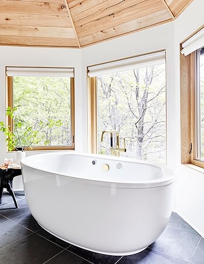
Well, well, well. If it isn’t the whimsical, traditional bathroom that we all knew I was going to choose. Who guessed right?? Whose bummed I didn’t go with floor-to-ceiling checkered tile?! I tell you who isn’t, and that’s my wallet. Designing the bathroom of your dreams is one thing – pricing it out, sadly, is another.
Welcome back to the second installment of this bathroom makeover. If you missed yesterday’s post, you can go back and read it here, but I’m afraid some (all) of the mystery might be spoiled for you. Or maybe not, who knows! That in itself is a mystery enough.

Let’s quickly revisit the 4 design options. An astute blog reader might have guessed I wasn’t going to go with design #1 (top left) because I already repainted my primary bathroom this color. You got a peek of that in my bedroom reveal post! But, If you really know me, you know that in my soul of souls, I’m a green girl through and through. So something about design #4 (bottom right) really captured my heart. And I’d love to tell you why in this short, but dense blog post.

Wallpaper | Wall Tile | Floor Tile | Trim Tile | Paint | Vanity | Faucet | Mirror | Double Sconce | Toliet | Toilet Paper Holder | Brass Switch Plate | Towels | Soap Dispenser | Blue Vase (similar) | Art (vintage) | Picture Chain | Mini Footed Bowl (unavailable)
Whimsical tree wallpaper meets creamy organic tile, while an elegant white oak vanity sits upon timeless stone flooring. Who do I think I am?! Honestly though, I’m just really happy with how this bathroom turned out. And of course, it’s thanks to a few key people – The folks over at Rejuvenation who collaborated with me on all the bathroom hardware and furniture, my dad who did the entire renovation, and my husband for putting up with my insanity.
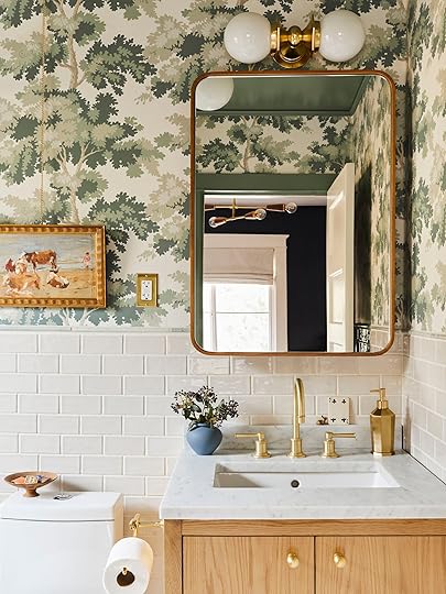
I’m traditionally a walnut wood kinda person, so this time I wanted to push myself outside of my comfort zone and try something new. White oak perchance? We needed a smaller vanity to make the new floor plan work. And this sweet little vanity fit the bill. I customized the hardware and chose a pretty Carrera marble top. We installed the toilet paper holder right onto the side – the benefit of solid wood pieces! I paired the vanity with this white oak bentwood mirror, which I had my dad turn into a medicine cabinet front.

You can see the box he built out behind it here! Just another crazy idea I randomly had, which my dad made a reality.

Choosing the floor tile was the hardest part about designing this bathroom, and I probably had 20 different samples sitting on our dining table at one point. I ended up choosing to go with these green and white stone floors because they felt like a better fit for our home. I decided that anytime I tried to do something more modern or “trendy,” I didn’t like it long term. I really felt that choosing the more traditional option was going to make me happier, and I was right! Know thyself. It was also a much more cost-effective choice, since I picked this flooring up for about $20/sqft.
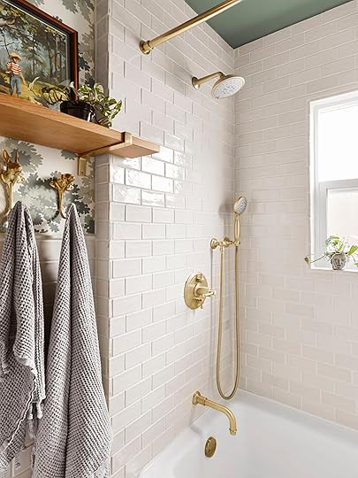

One place I did empty our wallet was the wall tile. I could have sourced a much more affordable, plain, white subway tile. And I did consider it several times. But I really wanted something warmer and more organic. I didn’t want the bathroom feeling sterile (or looking too much like our primary). So I stuck with my gut and got these creamy tiles which have a little more of a handmade look. I think they do a lot to keep the space feeling inviting. It also really complements the brushed brass shower and tub hardware from Rejuvenation. Gotta say, if you have the ability to add a hand shower to your set-up, it’s a game changer. I use it all the time!

Ceiling Light | Shower Curtain | Curtain Rod | Rug
Even with the toilet moved to the other side of the room, this bathroom is still a small space. So having a vanity with plenty of storage was key. Big cabinet space, plus a shelf for storing extra towels makes hiding kids’ stuff easy, keeping the bathroom guest ready. The mirror is so large as well, that it makes a decent-sized medicine cabinet. Room for both baby products and guest use.

A custom, two-shelf niche in the shower gives us a home for shampoo, conditioner, and soap. We even have a tiny window ledge for any overflow, like toothbrushes. And now that we have a bigger, brighter window, it’s the perfect home for a little plant.
The tub is a new cast iron piece that my dad installed. Since our primary bathroom has a shower only, I knew that this bathroom had to keep the tub. Elio loves bathtime and I can’t wait for him to use this tub. Listen, I know that soon this bathroom will be the domain of many primary-colored bath toys. But at least the rest of the room will still be aesthetic. Though, I do have to admit that since becoming a mom, my desire to keep everything “aesthetic” has really diminished. My priority now is really keeping things simple, clutter-free, and sentimental. And if it isn’t a choking hazard, that’s a bonus! Did anyone else experience this revolution once they became a parent?

Brass Dog Hooks | Brass Rabbit Hook | Wood Shelf | Brass Brackets | Triple Switch Plate | Art (vintage)
Now over on the other side of the bathroom, I did want to have a little design vignette. So we installed this white oak shelf from Rejuvenation, with simple brass brackets. Eventually, it might be a place to store extra toilet paper, but for right now we’ve got a little art and plant moment. I didn’t quite measure correctly when it came to picking the shelf size, but since these shelves are beautiful, solid wood, it was easy for my dad to cut the shelf down to size.


I found this sweet little paint-by-numbers piece from the 1950s on Etsy. And the combination of the trees that matched the wallpaper and the sweet little boy with his dog just felt perfect for a little boy’s bathroom. The mixed media collage is actually a piece that Macauley’s mom made for Elio when he was born!
When I saw these brass animal hooks on Rejuvenation’s website I knew they were the perfect whimsical touch for this bathroom. They have three different dogs, a rabbit, a stag, a moose, and a horse. They feel right for a kids space, but they could just as easily live in any adult space. We actually have the horse hook on our primary bedroom door for bathrobes. They feel just a little old world, and I think there’s something so special about little touches like these.
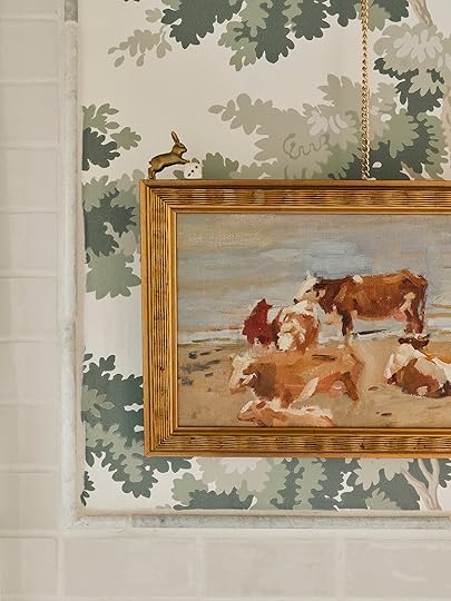
I wanted to keep these little moments going, so where I could I hid fun little details. Like this little rabbit and ceramic die. This cow painting is something I had been holding onto for ages, and it’s finally found a permanent home in this, now, nature-themed bathroom.
This is a great shot to take a closer look at the trim tile we used to bridge the gap between the wall tile and the wallpaper. The tile I chose didn’t come with any bullnose pieces, so we had to find something else, and I ended up finding these pretty green stone pieces while wandering around the tile store. This is one reason it’s always better to go looking in person when you can. You never know what you’ll find.

This might be my favorite shot from the whole bathroom. Something about the way the light is coming in and how you can see just about every element on a macro scale working together – the white oak, the wallpaper, the creamy tile, the brushed brass, the statement door, and the beautiful marble counter. That basket hanging on the door was a wedding gift, and now it’s a little laundry basket for Elio’s sweet tiny things.


Overall, I’m really pleased with how this all came together. Especially considering how fast I was making decisions! If you’ve read my posts before, you know I’m more of a jump first, pay the consequences later kinda designer. There are a lot of little moments that I really love, and I almost enjoy showering here better than in our primary. Especially in the mornings, when there’s sunlight coming in through the window!

This is the last big home project we’ll be doing for a while, and we’ve now officially renovated ! We’ll still always be doing small projects (right now we’re hanging an art rail in the primary bedroom and the dining room) because I’m a plague unto myself and can’t sit still when there are rooms to be repainted or shelves to be restyled. But as far as demo and construction, we’re DONE.
You know, until we’re not.

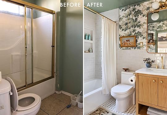
BIG THANK YOU to Rejuvenation, without whom this bathroom wouldn’t be nearly as beautiful. I can confidently say that every single piece we have from Rejuvenation in our home – from the lighting, to the outlet plates, to the tiny cafe curtain bar in our kitchen – are still as beautiful as the day we installed them and feels so authentic to our home. Another thank you to my dad, as always. Best grandpa in the world. And finally, thanks to EHD and all you readers for taking the time to step into my home! Hopefully, even if this wasn’t the bathroom you wanted to see, it won you over.
*Design and Photos by Sara Ligorria-Tramp
The post THE FINAL ROOM: Sara’s Whimsical, Kid-Friendly Front Bathroom Reveal appeared first on Emily Henderson.
February 26, 2024
Sara Gutted Her Front Bathroom! Here Are The 4 Whimsical Designs She Considered

First things first – I did, in fact, have a living, breathing, REAL HUMAN baby. He was born via c-section after a short 60 hours at the hospital. His name is Elio, and I might be biased (probably not though, right?), but he is the most perfect human ever created.
Eventually our front bedroom will be his room, and I can’t wait to make it special for him. But in the most boring reality of realities, right now he shares a room with us. And Macauley’s need for an office supersedes Elio’s need for a bedroom-sized storage container. But the connected front bathroom was something that we wanted to get done before baby. Enduring a large-scale home renovation project with a baby/toddler in the house just sounded like something we wanted to avoid if we could, and the front bathroom was the only area of the house that still needed a full demo and reno. So my dad said, “Let’s get it done.”


And suddenly I was scrambling to design a bathroom on a tight timeline. So today I’m going to take you through my top 4 designs. Let them marinate in your brain, and let me know in the comments which design you would have gone with. And then come back tomorrow to see which one I DID go with.
Alright, so the bathroom has to serve two functions. The first is to be a lovely bathroom that I’m proud – nay, excited – to let guests use. Finally (see above for why). And secondly, it needs to be a functional bathroom for a kid. That means bathtime and storage.

The first thing I wanted to do was change the layout in one big way – by moving the toilet to the other side of the room. The toilet was too close to the shower, but it also made the only free space in the bathroom this awkward little square wedged between the toilet and the sink.
 original floorplan
So to create a more open floorplan, we flipped the toilet to the other side of the room next to the vanity, leaving the whole door side of the room free.
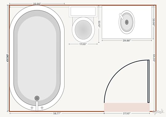 new floorplan
Next, we removed the small transom window that was placed high up in the shower and instead reframed a bigger window, lower on the shower wall. This let more light into the room and just made the shower pretty IMHumbleO.

With the renovation well underway, it was time to get cranking on the design. As I said above, I wanted something that was whimsical and fun for a kid, while also feeling comfortable for an adult to use. If you want to make a bathroom complicated, hire me.
I reached out to one of my favorite brands, used throughout my home, Rejuvenation, to see if this little bathroom project was something they’d be interested in collaborating on. They said yes, and dreams came true. So I pulled together the designs using my favorite Rejuvenation pieces.
Design #1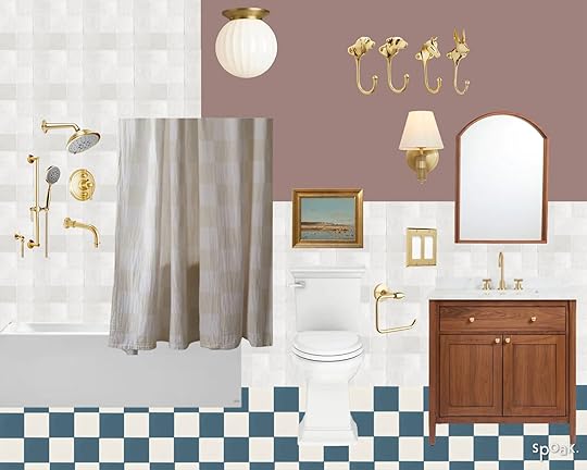
Vanity | Sink Faucet | Mirror | Sconce | Ceiling Light | Shower & Tub Set | Shower Curtain Rod | Double Switch Plate | Toilet Paper Holder | Paint Color | Wall Tile | White Floor Tile | Blue Floor Tile | Shower Curtain | Rabbit Hook | Horse Hook (no longer available) | Basset Hound Hook | Labrador Retreiver
Is pink a gender-neutral color? I think it is, especially when it’s a muted mauve. I really liked the idea of painting a bathroom this fun color called “Sulking Room Pink” by Farrow & Ball. I went with warm wood tones in this bathroom design. I thought a checkered floor would be a cute whimsical touch, so I came up with an indigo and white cement tile floor, to play off the pink walls. And then simple white square tiles for the shower surround and walls.
Design #2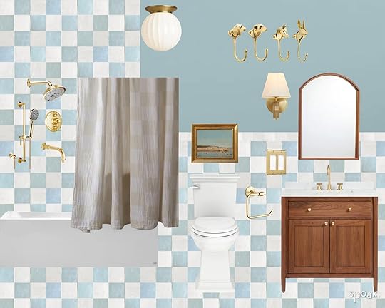
Vanity | Sink Faucet | Mirror | Sconce | Ceiling Light | Shower & Tub Set | Shower Curtain Rod | Double Switch Plate | Toilet Paper Holder | Paint Color | White Floor Tile | Blue Floor Tile | Shower Curtain | Rabbit Hook | Horse Hook (no longer available) | Basset Hound Hook | Labrador Retreiver
For this design, I went even more playful. I’m really into blue this year, and I feel like this pretty sky blue could be a really bright and fun bathroom for an itty bitty child. And for a bold pop, I thought pulling the tile from the floor all the way up the wall and into the shower surround would be cRaZy (in a good way). Again, the warm wood tones feel right for this design. And I’ll never use any color fixture other than gold ever in my life. I tried in our primary bathroom, and I’m still sad that those fixtures aren’t gold.
Design #3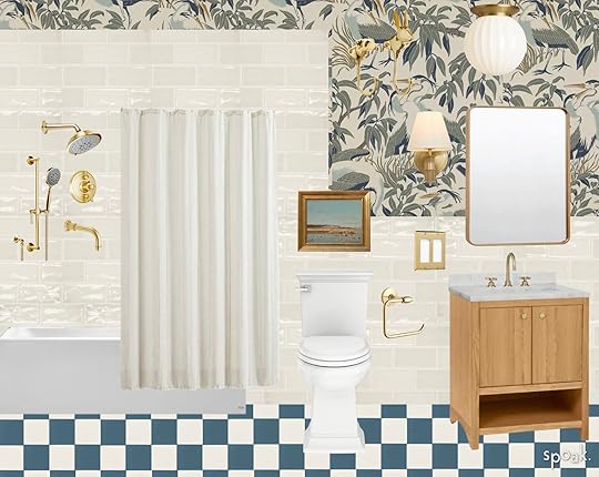
Wallpaper | Wall Tile | White Floor Tile | Blue Floor Tile | Rabbit Hook | Dog Hook | Vanity | Sink Faucet | Rounded Rectangular Mirror | Sconce | Ceiling Light | Shower & Tub Set | Double Switch Plate | Toilet Paper Holder | Shower Curtain
Making the switch to a more traditional style, I kept the checkered floor but elevated the elegance of the design by putting a pretty cream tile on the walls with a fun yet craftsman-appropriate wallpaper. Is putting wallpaper in a bathroom risky? Yes, I was told that directly by a wallpaper installer. But might it be worth ignoring that sage advice? Probably not. We’ll burn that bridge when we get there! I also switched to a lighter wood tone for the vanity and mirror, to help lighten the space.
Design #4
Wallpaper | Wall Tile | Floor Tile | Trim Tile | Rabbit Hook | Dog Hook | Vanity | Sink Faucet | Rounded Rectangular Mirror | Double Sconce | Ceiling Light | Rug | Shower & Tub Set | Toilet Paper Holder | Single Switch Plate | Shower Curtain
Are checkered floors too 2022? I started having some doubts about the floor looking trendy, so I decided to put together a design with a more timeless floor design. Keeping the cream tile and the light wood pieces, I changed the wallpaper up to this whimsical tree pattern. It feels fun, while still feeling vintage.
I knew no matter what, I was going to go with the adorable animal wall hooks, they felt like the perfect fit for the vibe – whimsical fun, elegant execution. And this shower and tub set were the way to go no matter what.
The bathroom is done, photographed, and already heavily used (we tend to shower/get ready in the front of the house at night if baby boy is already asleep in the bedroom). So I can confidently say that the road we took was the right one. But any of them would have been fun!
So…which are you hoping you see when you check the blog tomorrow?
The post Sara Gutted Her Front Bathroom! Here Are The 4 Whimsical Designs She Considered appeared first on Emily Henderson.
February 25, 2024
The Link Up: The Bath Robe Em Is Gifting To Her Friends, The $2 Hydrating Face Mask Arlyn Loves, And TWO Awesome New Lines That Just Dropped

Happy Sunday! Hope you loved Em’s gym reveal and are ready for another pretty wonderful one coming at you this coming week:) No other news to report just hope you having a lovely day. Let’s now get straight into these links…
This week’s house tour home of Emily Adams Bode Aujla and Aaron Aujla, photographed by the great Tyler Mitchell for The World of Interiors March issue, is romantic and playful and just puts a smile on our faces. Here is their last home feature if you want to check out their style shift!
 photo by kaitlin green
From Emily: By far the cutest bathrobe I’ve ever been excited by (and now I buy it for gifts). I’ve got a real beef with bathrobes (or more so my body in a bathrobe). IN NO WORLD is a bathrobe ever flattering on me – I always feel very frumpy and bulky. I guess it’s likely the nature of the robe – a large ass piece of puffy material made to cover so many limbs with nary any structure. It’s like finding the perfectly comfortable dope sofa, I don’t think it’s a hole in the market – I think it’s the nature of the beast that a big old bathrobe can’t be “flattering”. Fine! We can accept this! So when shopping for the cold plunge reveal I decided that if it can’t be flattering it can definitely be fun and distracting in a good way. I looked all over the internet for cute patterned robes and found this black and white checkered one from Amazon and while it’s not like it’s specifically flattering, it’s so cute, fun, and oversized in a way that does in fact make me feel less bulky. And it’s $60. My whole production team loved it and I made a mental note that this is such a great bday present for anyone who likes the black/white checkered look (which I think is probably the most design-forward/trend-loving Gen Z, millennial, and Gen X ladies if I’m allowed to generalize). Anyway, it’s REALLY GOOD as you can see (sneak peek from the cold plunge post!).

The collection we didn’t know we needed! Always excited to see a Sarah Sherman Samuel x Lulu and Georgia line but an outdoor line?? We’re pumped! It’s full of effortlessly cool shapes, pretty materials, and we want it all. Below are six of our favorites but everything is great. Go check it out!
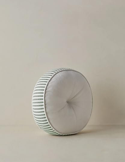

Peggy Indoor / Outdoor Sofa | Littu Indoor / Outdoor Striped Disc Pillow | Marisol Indoor / Outdoor Accent Chair


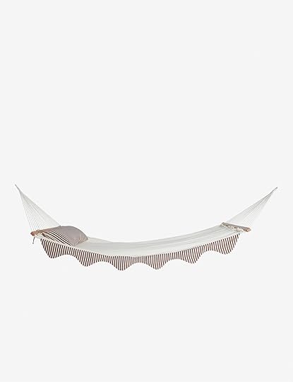
Abbot Indoor / Outdoor Dining Chair | Kibby Lantern | Levata Hammock
From Arlyn: For anyone who remembers my skin journey quandary from a few weeks ago, I’ve started using a few things (will report on anything I deem great after a few weeks or months) but they’re drying out my face big time. Add to that just general winter skin dryness and I’m flake city over here. I had forgotten that I bought these sheet masks back in December before getting on a plane and used one for the first time the other day. WOW these really are hydrating. They didn’t make me break out, which is also a huge plus for my sensitive-skin girlies out there. They come to about $2 a pop, which is super affordable compared to most masks and feel so soothing. Hmm…maybe I’ll do another one tonight.
From: Caitlin: I grabbed this quarter-zip on a whim before my Antarctica trip and expected to return it – I’m not normally the type to splurge on athleisure or loungewear tops – but it blew my expectations out of the water! It’s WAY more flattering than I anticipated – my friends have taken to calling it my “hot girl sweatshirt” – and I love the swingy cut and structured funnel collar. There are a lot of cool little details, too, like a built-in card pocket and cozy thumb holes. I’m a 12/14 top with an F cup and the M/L fits perfectly, so keep the sizing in mind! I know that Lulu can be a little hit or miss quality-wise, but this one’s held up beautifully to weekly washes and drys – I’m really happy with it. Highly recommend!!!
So not only did we get an SSS drop this past week, but we also got a new Leanne Ford’s Crate & Barrel line! Per Leanne’s style, it’s neutral and organic but made some fun tweaks to some classic styles. Go check it out here!


Marmont Accent Chair | Kiln Pasta Bowls | Gig Leather Chesterfield Chair
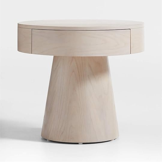


Willy Whitewashed Wood Nightstand | Black and White Marble Decorative Checkered Tray | Fields Whitewash Wood and Cane Dining Arm Chair
From Mallory: Weather-proof, walkable boots are a MUST in NYC, so I recently snagged these and they check every single box. They took a day or two to break in but now they are probably my most comfortable boot!! If you’re in the market for a solid boot go for these.
From Gretchen: I am a huge fan of window film–and not just the colorful kind we did in Elliot’s room. I’ve used window film for privacy in a number of my own projects and it remains one of the easiest, most inexpensive ways to add your own flair (and function) to a space. In my last place, I found this floral film for my bedroom windows, which I thought worked well in the room and played with the light beautifully. My new bedroom windows could also really use some of this privacy, but I’d like to try a different look. I have transom windows which can help with privacy, but they actually look directly into my neighbor’s living spaces and we’ve already had one too many moments of awkward eye contact. So I picked up this window film which (bonus!) looks like reeded glass! I think it’ll feel simple and clean while definitely giving me the privacy I need.
From Jess: This past week was a very special little girl’s birthday (Arlyn’s little perfect munchkin!) which meant I needed to get her something special (read: desperately wanted to). A friend of mine works for this wonderful kid’s clothing line called Post Peanut so naturally I started there and found maybe the cutest legging ever made. Enter the Cha-Cha Leggings. The quality is so good and I just hope she loves them as much as I do. Ha.
Also From Jess: In case you missed Friday’s post, it was all about awesome small statement lamps. But of course, as I was pursuing the internet, I came across so many other good ones that technically didn’t fit the “small statement” criteria but I loved. So if you are a fan of rice paper lamps, I am pretty in love with this floor lamp and this pendant. The shapes are so cool and both are also pretty darn affordable!
Thanks for a great week and see ya tomorrow with a post we know you are going to love:) xx
Opening Image Credits: Photo by Kaitlin Green | From: Introducing Our Home Gym Reveal (+ My Workout Routines & Complicated Feelings About It All)
The post The Link Up: The Bath Robe Em Is Gifting To Her Friends, The $2 Hydrating Face Mask Arlyn Loves, And TWO Awesome New Lines That Just Dropped appeared first on Emily Henderson.
February 24, 2024
Really Cute Workout Gear That I Feel Really Good In

Not all workout clothes are made equally, and I know because it’s kinda all I wear. I mostly live in my Vuori pants, but they can be hot for real workouts. So I went shopping and after kissing so many frogs I found a few that I love. Trying on workout clothes is almost as painful as swimsuits, honestly, and I’m always SHOCKED at how stores (Looking at you Dicks) have the most unflattering lighting and the worst dressing rooms. Some clothes made me feel very bad (hugging in the wrong places, bulging in the wrong places, or just extremely uncomfortable), but all of these I feel really really good in

Quarter Zip Sweatshirt | Leggings | Sneakers
This is the splurgiest outfit with actual performance gear. The pants (medium) have slight compression but not extreme compression (a huge difference to me) and a wide waistband that stays put thus far and doesn’t cut in (if you are in between sizes size up). The pullover is awesome – pockets and cute details on the back. What you can’t see underneath is an excellent $12 workout shirt (seen below) that is super drapey.

If you are into boxy zippies this one is very cute from Nike (and for another budget the Target one below is awesome).

And yes, the seam up the butt in these pants is flattering (and you bet I’m flexing both cheeks here).


Quarter Zip Sweatshirt | Leggings | Sneakers | Blue T-Shirt | Sports Bra
I didn’t see these pants in the sun to attest that they are thick enough to shield from the bumps – I’m still in shock that many brands don’t do that test. What you can’t see is that the shirt has a detail on the back that keeps it loose. And those platform sneakers are definitely more lifestyle than working out but I loved them so I’m wearing them a lot just around town when it’s not super muddy here.

Quarter Zip Sweatshirt | Leggings
Introducing the zippy that I’ve been wearing so many days in a row, from Target!! It’s so cute!! I’m wearing a large, BTW and I like how wide and boxy it is. And the color is so pretty. The leggings are also Target (size small) and the color is awesome.
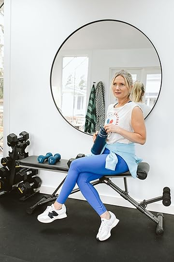

Quarter Zip Sweatshirt | Leggings | Sneakers | T-Shirt | Sports Bra
I don’t love tank tops or tight workout shirts (mostly because I’m stupidly self-conscious) but I love muscle T’s. I love that one from Sundry (my usual favorite T-shirt brand). Like most of their shirts, it’s really thin and drapey with good graphics. And while I didn’t need both pairs of New Balance, both were just very cool.

T-Shirt | Sports Bra | Leggings | Sneakers
These pants (Target) and top (Target) are so fun and cute (despite my modeling, the top might be too boxy for yoga, FYI). And the sneakers are my new strength training shoes because they are super stable on the base (and I love the color). What you can’t see is my all-time favorite sports bra for day-to-day stuff that I just bought. My issue with sports bras, if you have big boobs, is that nothing is supportive enough for running/jumping UNLESS you wear something so constricting that it’s highly uncomfortable and makes it hard to breathe. This one has an overall compression that I love and the straps don’t cut in more than the actual body of it.


I thought this windbreaker was really cute, but it’s super pricey so I’d say unless you run frequently in wind/rain it might be a bit splurgy (I ended up returning it just because I overbought and didn’t realize it was so expensive).

Sweatshirt | Leggings | Socks (similar) | Slides
Probably my favorite outfit that I have worn SO MANY DAYS IN A ROW. The pants are a brand that was new to me – P.E Nation. They are so cute, flattering, and fun without being too loud. I love those slides, BTW.


Sweatshirt | Blue T-Shirt | Leggings | Socks (similar) | Slides
The sweatshirt is EXCELLENT. It’s slouchy and has exposed stitching and really cute details on the front. And the muscle shirt is another great cheap Amazon find (a tank, but loose and flattering IMHO).

Vest | Long Sleeves Shirt | Leggings | Socks (similar) | Slides
Lastly, I dove into the flared leg trend. I tried on like 14 pairs of these y’all and these are hands down the best. So cute, fun, and very flattering IMHO (the proportions of the flare make other parts of your body look more balanced if you are into that).

The blue shirt I’ve had forever from Lululemon (I love the finger holes). The vest is super cute (I love the shoulders coming out farther than my arms) and has big old pockets with zippers for doggy bags and my phone.
There you have it! In case you missed the whole gym reveal head here. Here’s to wearing workout clothes we actually feel really good in. xx
*Photos by Kaitlin Green
The post Really Cute Workout Gear That I Feel Really Good In appeared first on Emily Henderson.
Emily Henderson's Blog

- Emily Henderson's profile
- 10 followers

