
Emily Henderson's Blog, page 62
February 14, 2024
A Bunch Of Really Good Rooms Painted Pink Because It’s Valentine’s Day And We All Deserve It
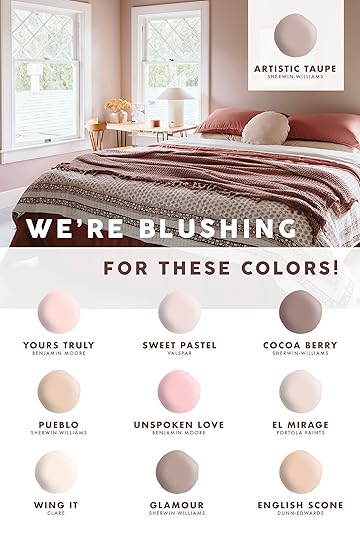
It’s Valentine’s Day so what better time to talk about pretty pink paint colors? Last year we painted our guest room Artistic Taupe and it created such a warm, cozy vibe. This warm mauvey nuanced pink couldn’t be more perfect. While you are about to see some bolder, more daring, pinks below, for my home I want/need something that has a more neutral undertone and one that makes me feel calm. So if you’ve been toying with painting one of your spaces a pink tone here are some that we’ve used and loved. The ones I’ve used I couldn’t be happier with!
Artistic Taupe by Sherwin-Williams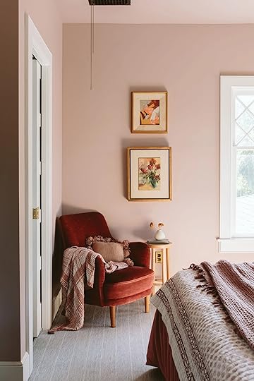
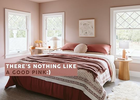
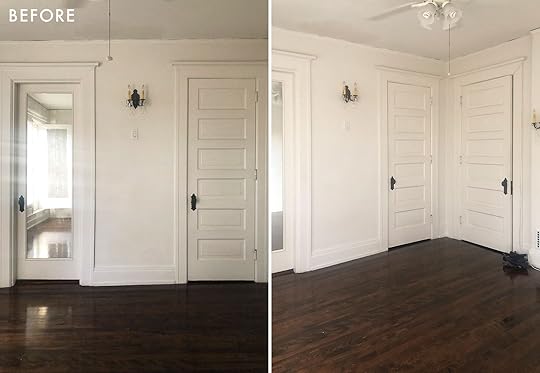
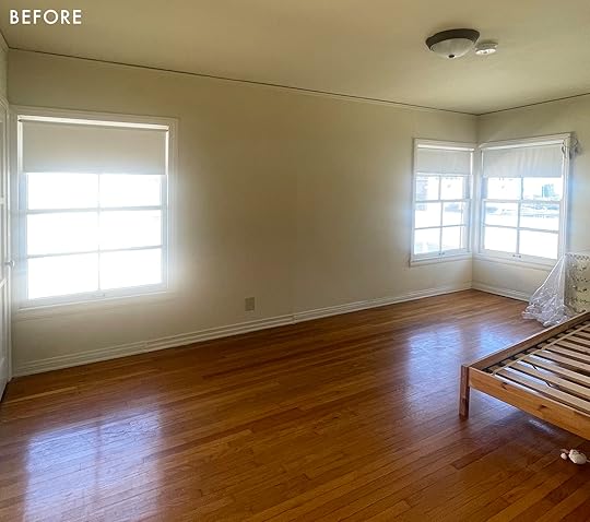
 photos by kaitlin green | from: a *first round* farmhouse reveal – readying our guest room for family to visit
Once I painted this room Artistic Taupe I realized that I am far more of a pink lover than I thought I was – WHEN it’s the right pink. And since I loved this tone so much I felt confident in picking my next pink (the powder bath below) a darker rose/mauve that is two shades darker on the same paint stick.
Cocoa Berry by Sherwin-Williams photo by kaitlin green | from: our farmhouse powder bath reveal – pink and wallpaper and vintage oh my!
The color on the left wall (not under the light) is the most accurate – look how pretty it is! But first, before I chose Cocoa Berry I chose Glamour (only one darker) below:
Glamour by Sherwin-Williams photo by kaitlin green | from: the farmhouse powder bath update (did we stick with the blue walls??)
I caught the painter before he did the second coat and realized that this room didn’t have enough natural light (none) to have this tone – it just wasn’t reading in person. So we took it one shade darker. But this color, Glamour, is SO BEAUTIFUL and I would absolutely use it again in a room that has more light moving around. And we recently painted the lightest color on that same paint stick called White Truffle and it’s SO PRETTY.
El Mirage by Portola Paints design by elspeth benoit and arterberry cooke | photo by alex zarour of virtually here studios | staging by a 1000 X better | from: master class in using color in your home without it feeling like a colorful home (it’s not the decor)
So Gorgeous. Portola Paints are extremely gorgeous (and cost more :)) I love how A 1000 x Better paired this pink with the yellow – so bold.
Wing It by Clare design by orlando soria | photo by sara ligorria-tramp | from: dreams do come true! the londo lodge is now a vacation rental (see all of the fun new updates + tips on renovating with a small budget…)
Orlando has been using pink since we met – it’s almost like a neutral for him. I haven’t been in this pink room yet but V excited for a future EHD team excursion up to Yosemite soon. Also, you can rent it out now so if you are headed to Yosemite stay at his house!!
Yours Truly by Benjamin Moore design by orlando soria | photo by zeke ruelas | from: orlando’s master bedroom reveal
Another Orlando pink. His style is so eclectic, postmodern, and yet always looks like him (and always so cozy).
Sweet Pastel by Valspar design by brady tolbert | photo by tessa neustadt | from: a girl’s bedroom makeover with stokke
I totally forgot about this sponsored bedroom makeover we did with Stokke YEARS ago. Brady did it all, for his niece I believe. How sweet is that room and that soft pink?
Unspoken Love by Benjamin Moore design by erik staalberg | photo by sara ligorria-tramp | from: the pink dining room erik designed before he found his apartment
Our stylist friend Erik Staalberg (he was a frequent freelance stylist on my team for 7 + years) is one of my MOST favorite souls in the world. No one owns himself more than Erik and I so admire his attitude in every way. He is also clearly so bold with his choices and loves embracing color like in his old dining room with this pink.
Pueblo by Sherwin-Williams
 photos by sara ligorria-tramp | design by caitlin higgins | styled by emily bowser | from: the reveal we’ve all been waiting for! caitlin’s mostly thrifted, postmodern regency deco living room
I LOVE this almost coral that Caitlin used in her bedroom that everyone freaked out about (in a good way). Caitlin has such an incredible sense of style and I didn’t see this peach coming, but so glad it came.
English Scone by Dunn-Edwards design by arlyn hernandez | styled by emily bowser | photo by sara ligorria-tramp | from: 3 years in the making then an unexpected move: arlyn’s bedroom reveal is a lesson in the beauty of “unfinished” design
While the world was freaking out about the new Pantone color of the year (peach!) Arlyn’s English Scone is the warmer and more nuanced version of it. Again, I didn’t actually get to see this room but love how her bedroom turned out).
So those are our pink paints! I am clearly very partial to the mauvey end of the spectrum but whatever pink you choose and love will undoubtedly make it a happier space. xx
Opening Image Credits: Photo by Kaitlin Green | From: A *First Round* Farmhouse Reveal – Readying Our Guest Room For Family To Visit
The post A Bunch Of Really Good Rooms Painted Pink Because It’s Valentine’s Day And We All Deserve It appeared first on Emily Henderson.


February 13, 2024
Real-Time River House Decision: What Hardware For The Mudroom Cabinets…

Today, my friends, I wanted to bring you along, in real-time, of us choosing the hardware for the mudroom of my brother’s river house. Listen, the right hardware can take something more builder grade and make it look custom, OR (horror story) something custom and make it look “builder grade” (no offense to builders, I 100% know that their job is to avoid custom at all costs – literally, because it is often too expensive for profit margins). Great hardware isn’t cheap (because it’s usually expensively produced) but it’s FAR cheaper than custom cabinetry – think wearing a dope necklace with a simple dress. For this home, we have custom cabinetry with flat fronts (with vertical grooves) which I haven’t done before but is certainly not brand new. And yet choosing the right hardware was a thing. So here is what we debated and why.
First off, we of course thought about brass and wood, but we ultimately decided that for this space (the mudroom) we wanted it to feel more utilitarian. Besides, the ceiling lights are oil-rubbed bronze from Rejuvenation (which is a really warm black) so going with their ORB finish would obviously tie it all together (I like mixing metals, but we decided this time to keep it simple and streamlined).
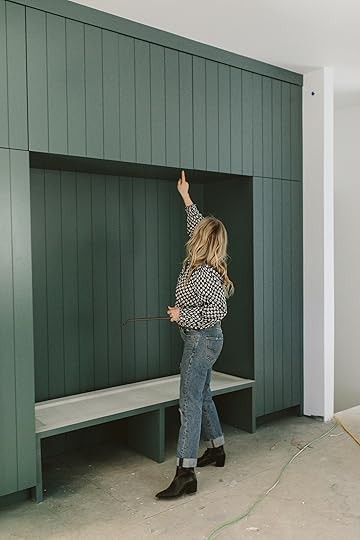
Our Favorite: The Jumping-Off Point
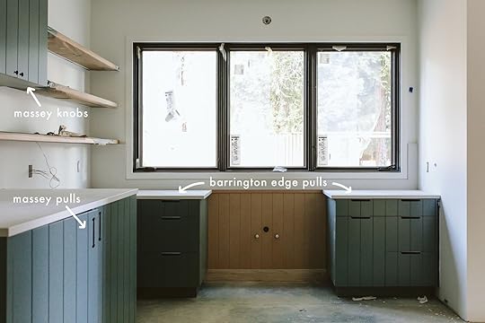
Ceiling Light | 18″ Massey Pulls
These are all mockups by the way, thanks to Gretchen (nothing has been ordered or installed yet). We loved how these 18″ Massey pulls looked on the large broom and coat closets. That little round detail at the top and bottom contrasted so well with the simple lines of the cabinet style and also talked to the ceiling lights. So the Massey was a front runner for the room but can it go everywhere???? (ALSO PAINT COLOR IS AT THE END AND IT’S AMAZING). The upper cabinets will have a push mechanism because there are 5 cabinets (2 sets opening to each other, one that just opens by itself) so unless we centered the hardware they would be spread in a really odd way). Because of that we just decided not to have any hardware up there and keep it clean.
 Option #1: Knob On Uppers + 6″ Handles Everywhere
As you can see on the other side of the room we have uppers, large lower cabinets (washer/dryer), and then drawers (small on top, recycling pullouts on bottom). I really like to mix up the type of hardware in a room – and yet we need to stay within the overall art direction of this house (cozy, contemporary PNW river house with some warmer cabin-y elements – it’s modern but with some sweeter elements throughout making it feel warmer and a little more eclectic/interesting). So this combination is FINE on this side of the room, but then when you see the third wall it doesn’t work as well…
Option #1.5: Vertical Handles on The Uppers
While I knew that we wouldn’t do this I asked Gretchen to mock up the same cabinet wall with the Massey handles vertical on the uppers – a move that I’m sure could work, but is generally not one we do. I like a knob, y’all, and I just really like to switch up the hardware so doing the same thing on all lowers and uppers felt like a missed opportunity (and can also look really good, btw, but in this case, everything is so simple that a mix up is necessary)
On the window side, the “handle over handle” look is fine, but it felt redundant and not as thoughtfully designed as it could be.
Option #2: More Knobs + Handle Combo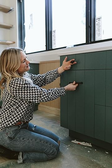

Normally when you have a small drawer over a larger drawer (or a cabinet) you have an opportunity to do address them slightly differently. And I love a knob over a handle on shaker cabinets but the knob in the middle of the cabinet groove just looked kinda dumb (not sure why, but that was our reaction).
Option #3: Knob + Handle + Edge Pull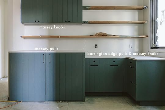
OK. Our first gut choice for this room was to use edge pulls – the ones that just sit at the top of the drawer and look very minimal – like a simple line. So we added them into the combination. We still didn’t like the centered knob on the drawers so Gretchen mocked up another version…
Option #4: Knob + Handle + Edge Pull
WELL OK, HERE WE GO NOW. All of us immediately really liked this combination. This means we are mixing three different types of hardware – the upper knobs, the edge pulls on the drawers, and the vertical handles on the cabinets. Placement on the knobs and handles aren’t for sure (remember, these are just photoshopped mockups). Also in case you are wondering why we don’t do a latch on the uppers (I LOVE a latch) the cabinets are full overlay so the doors but up to each other. I think you can still do a latch but I like them more when they are inset and the cabinet buts up to a fixed exposed piece of wood.
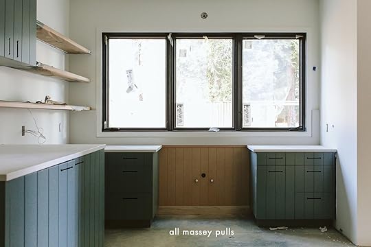
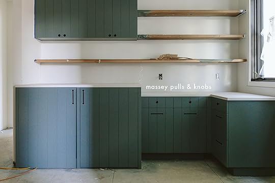
This mudroom/craft room/laundry room is going to be so functional and pretty. I’m so excited for my brother (the sink goes in the middle there – on cute legs and we are painting that paneling behind it, which just got installed). Maybe I’ll even convince my SIL to do a curtain on the sink  All hardware is by Rejuvenation (we aren’t obligated to use RJ in this house but they truly just have the best combinations in so many finishes which really help it all look custom). The green paint color is Rocky River by Sherwin-Williams (it’s soooo good) and the countertop is such a pretty Caesarstone called Airy Concrete (we are adding a return on the right side by the window BTW – it looks weird with that tall skinny piece). The windows are by Marvin.
*Photos by Kaitlin Green
The post Real-Time River House Decision: What Hardware For The Mudroom Cabinets… appeared first on Emily Henderson.
February 12, 2024
Round #2: Caitlin And Jess’ Race To Complete Their Bedrooms (Here Are The Rules + The Design Plans)
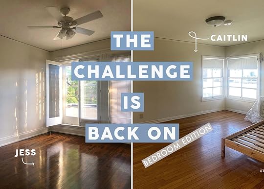
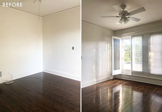
Here we are again! Two gals with two unfinished spaces that clearly need some competitive moral support and a strict timeline to get these suckers done. In case you weren’t around in 2022 or may have forgotten, Caitlin and I (Jess) were wildly uninspired, not knowing what we wanted to write or what any of you would wanted to read. Then a stroke of “genius”! Why don’t we make over our little weird balconies with a strict deadline and see who can finish first? Done. So with a mere 5 weeks to transform our spaces, we were off to the design races. Here’s a reminder of the finished products…
 caitlin’s before and after
 jess’ before and after
So here we are again but now it’s not really about being uninspired (THANKFULLY!) but more that we are grown adults that want finished pretty bedrooms like yesterday. So a little fire under our butts seemed to work great last time and at the end of the day, we love a little healthy competition:) Oh, and I’m ready to have an actual bedframe and Caitlin’s boyfriend (who is moving to LA soon!) would like someplace to put his clothes. Both of those dreams seem pretty achievable.
Let’s get into the plans…
Jess’ BedroomAs a refresher here is my room. I love love love waking up in here but it has soooooo much potential that I need to tend to.
The light is the best and those windows (that lead to my balcony) make me feel like I’m in a dream. Oh and don’t worry that fan is LONG GONE since I didn’t need it anyway.
This is the view from my bed (well from my wonderful mattress from Tuft & Needle). The mirrored door leads to my bathroom and the other is my main closet. And after a lot of back and forth, I’ve decided to keep the “original” sconces:)
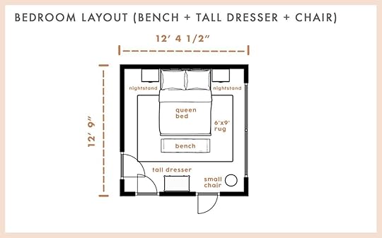
You also might remember my “How To Layout A Bedroom For Optimal Rest: 5 EHD-Tested Layouts + Help Jess Choose Hers” post and ultimately I think this is the best layout for me. I don’t need a ton of storage (I’m lucky that I have a few closets) so a small to medium-sized dresser is plenty. Plus, I can always add another if need be.
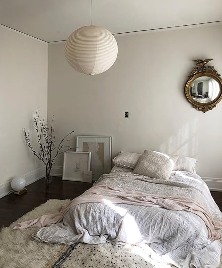
This is still basically what it looks except I bought new bedding that is comically similar. I decided to take advantage of those Black Friday sales because that duvet cover had a ton of holes in it. Not a great look, Jess! Ultimately I still want it to be calm and serene but with more style, more personality, and ideally more vintage:) I pulled a handful of inspiration photos to give you an idea of the feeling that I want moreso than an exact design, obviously (although I love everything in these photos).
View this post on InstagramA post shared by crystal sinclair designs (@crystalsinclairdesigns)
I am truly such a fan of Crystal Sinclair. She doesn’t know this (ha) but I feel like over the years I’ve been following her, we’ve been stylistically going in the same direction. Every time I see one of her finished projects I think, “This woman is in my brain!! I love this so much!” She is always so kind which just makes me love her more. But with this room, I love the juxtaposition between the Old World antique, midcentury vintage, and minimal organic. That is very much my direction. Sadly, I won’t have a large antique tapestry for this room but maybe someday:)
View this post on InstagramA post shared by crystal sinclair designs (@crystalsinclairdesigns)
Another beautiful room by Crystal Sinclair Designs! I love the depth of this green because it’s rich yet calm. I want to have some pops of color that do just that. Actually, the whole design is both layered and cool, but so soothing to look at.
View this post on InstagramA post shared by Maison Cotidiano | Interiors and architecture (@maison.cotidiano)
This living room by Maison Cotidiano makes my heart smile. I love the warmth of the woods, that chic shelving unit, and the pop of the graphic rug! The room is chic but inviting which is how I want my bedroom to feel – not overly fussy, a little elevated style-wise, but most importantly a room I can’t wait to be in at the end of the day and wake up in.
Ok, it’s moodboard time!
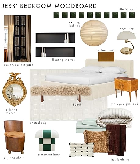
Tile | Metal Shelves | Noguchi Pendant | Bed Frame | Rug | Bench | Statement Lamp | Duvet Cover | Sheets | Velvet Blanket | Gold Pillow | Lumbar Pillow
Is it bold? No. Is it redefining the design world as we know it? Also, no. But it is what I consider a dream bedroom for my life right now (ok, if it had a marble fireplace then it would actually be perfect:)). So as you can see the main pieces are pretty neutral but then I have some fun with the textiles and my most favorite wooden check lamp (non-vintage category).
Ok first things first, I wanted to reuse some of what I already owned and loved – the Noguchi Pendant, my family’s gold mirror, and my $100 chunky wooden chair score from the Rose Bowl 5ish years ago. Then if you read my Etsy vintage finds post, you saw that I got that little vintage Japanese dome lamp (well, 2 of them) for $80 at last month’s Rose Bowl! Oh, and that’s the duvet cover and sheets I bought during Black Friday that I’m hoping will work. Now, it wouldn’t be a Jess Bunge room if I didn’t customize something and/or decide to do a painfully annoying DIY that usually ends up being worth it (my patio tiles, the bench cabinet in my current living room, etc). If you are curious about those green square tiles at the top of the board, I am planning to do some kind of tile border right under crown moulding. The likely painful part will be that I want to attach them (in a renter-friendly way) individually. I feel very passionately about it so I have a lot of trust in myself that I will figure it out and that it will be worth it. Only time will tell!
I also am in talks with one of our favorite custom furniture builders, Buildlane, about making a bed. I honestly want something pretty similar to the style of the bed on the moldboard but with one or two “special but simple” details added. Oh, and I am also completely obsessed with the idea of finding vintage fabric panels to layer over the main curtain. Arlyn, how do you feel about getting out that sewing machine?? The moment I saw that curtain photo I haven’t been able to get it out of my head. It’s such a smart way to add art in an unconventional way.
Some other new pieces I’ve fallen for are those incredible metal shelves. I think they are the perfect modern contrast in both material and style to the other more vintage pieces. I also think that bench is beautiful and the texture is so cool and fun. And of course, I want to use one of the rugs from our rug line! It would be so special. And who knows, maybe I can get one in from launch #2 if they are ready in time???
Finally, let’s talk about those nightstands. They are Italian midcentury modern beauties that I am kicking myself for not just buying. They were pretty affordable until the whole “they ship from Italy” price was added. Hahaha. I’ve been looking every day on Craigslist, Nextdoor, and Facebook Marketplace, and have gone to some shops but understandably I haven’t found anything that holds a candle. If you see any in the continental United States that aren’t crazy expensive, feel free to shoot me an email: jess@emilyhendersondesign.com. Look, A GIRL CAN DREAM!
Well, that’s all from me. Caitlin, take it away!
Caitlin’s BedroomRemember that time that life got in the way and I spent a full year procrastinating on my bedroom design in favor of other real-life priorities? SAME! Last time we chatted, I was catching you up on my black mold nightmare…
You can see above where my wall and moulding were cut out and replaced (just next to the window on the left). After spending about 4 months living on the floor of my living room, having an actual bedroom to sleep in again took priority over my decorating dreams. Plus, in the last year, I’ve paid off all my credit card debt – not a ton, but constant travel racks up the balances higher than I’d like! – and I’ve prioritized living life outside of my home.
But now, my boyfriend Dennis is slated to move in after over 2 years of long-distance dating. (Don’t cry for me too much – we both work from home, so we get weeks of IRL face time almost every month. He’s fixing one of my cat’s toys in the kitchen as we speak!) To that end, I’d like to finally finish this space so we can just hang out and relax in peace.
When I last left you, I had most of the major pieces in place – a 9×12 rug, a king-sized bed, and a vintage 9-drawer dresser. Since then, I’ve added some great Serena and Lily-style nightstands that complement the shape of the bed. On my to-do list? A dresser for Dennis (to fill the space formerly occupied by my old bed frame), a simple wall treatment (paint? Wallpaper? TBD!), some new lighting (ceiling and, potentially, some sconces above the bed), some updated window shades, and art. I think it’s going to be manageable and affordable enough that I am willing to agree to the terms of this challenge with Jess. Wish me luck!!!
View this post on InstagramA post shared by Lucy Interiors (@lucyinteriordesign)
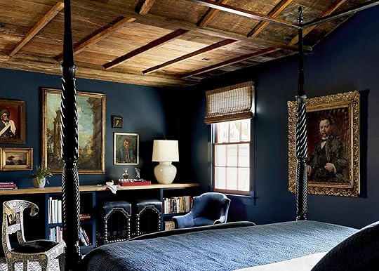
Ironically, none of my bedroom inspiration comes from an actual bedroom. Despite my best efforts, I struggle with things like “restraint” and “minimalism” and “neutrals,” but I’ve come to accept it. This bedroom is going to turn out pretty freakin’ bright, but that’s okay! I’m hoping to keep it partially restrained by focusing on texture and color, without a lighter focus on pattern. I love the vibrancy in this room – it’s based around 4 colors (a deep blue, an olive, a baby pink, and a warm gold) but they have such a high impact.
View this post on InstagramA post shared by Beata Heuman (@beataheuman)
Beata can do no wrong! Similarly, I love the modern takes on classic shapes. (Did you spot the sofa? It’s a fresh, special take on the timeless English roll-arm. I hope my bed is channeling something similar!) I’m also drawn to the subtle color blocking. I wish I could deliver something this tasteful and mature, but we all know I’m going to fall back into my love of whimsy
View this post on InstagramA post shared by domino (@dominomag)
This is my sweet middle ground – a little whimsy, a healthy dose of color, and a few trendy nods. (I see you, squiggle carpet!)
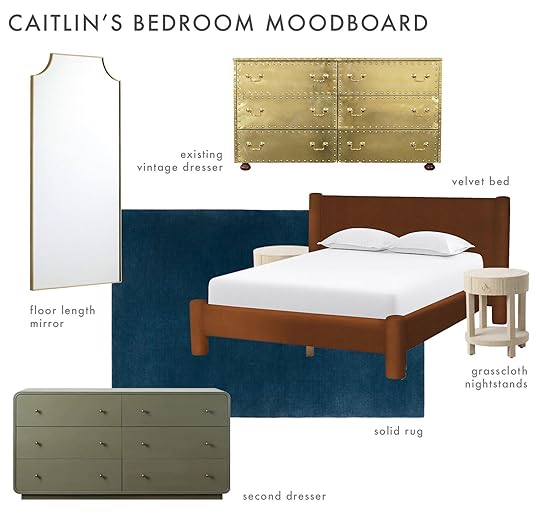
Mirror | Dresser (vintage) | Bed | Nightstands | Rug | Green Dresser
Jess and I often joke that we balance each other out – we’re both Libras and we often find ourselves on the opposite end of any given subject. She’s super warm and conscientious; I can be a little more harsh and numbers-minded. But there’s also a lot of love and respect there, so it’s a productive dynamic instead of a contentious one!
To that end…I am, once again, on the opposite end of the spectrum from Jess, who has a beautiful and actionable mood board. I have no idea what’s going on here, or how I’m going to execute the rest of the room, or what other pieces are going to make it in – but I think that might be okay! The reason? I love vintage, and that makes it a little tricky to form (or stick to) a plan.
What do I know? I’m looking for a dresser that’s about 5′ wide – ideally in olive, like the Studio McGee version above, but I’m open to alternatives! – and a vintage mirror, ideally in brass (and a cute shape, like this Rejuvenation one, would be a bonus!).
I’d love to find a colored light fixture. Which color? No idea! I’d like it to take up a little bit of ceiling real estate – I have a bummer builder-grade fixture in right now, and it’s dwarfed by the size of the room – and I’m open when it comes to the texture (glass? Enamel? Porcelain? Metal? I’ll know it when I see it!). I think that’s the thing I love most about sourcing secondhand pieces for my home – it feels like a collaborative process with the universe. It’s all luck! I love not knowing what I’m going to find, and I love the surprise of falling in love with a piece that I never would have expected.
The downside of vintage? It can make the decorating process feel a little slow, or laborious, or disjointed. It’s frustrating to not know how things will come together! Case in point: I’m putting my paint and window treatment decisions on the back burner while the rest of the furniture pieces fall into place. I need to see what I can find first so I can use the walls and windows as a unifying element, rather than trying to shoehorn vintage furniture into a space where it might just not vibe. I am trusting the process right now!!! And honestly, a deadline will be helpful – Dennis is planning to move in after we finish this challenge, so the timing couldn’t be more perfect. LET’S DO THIS!
It’s Jess again! First off, Caitlin is extremely warm and conscientious lol. But style-wise we are a bit different which we think makes this little challenge all that much more fun (and nice since we aren’t searching for the same things:)). So here’s the deal. We have until April 22nd and need to write at least 1 – 2 update posts along the way. I know having a little over two months seems like a long time but with our burning desire to find cool and affordable vintage pieces that feels like no time at all! Be rest assured that both of us have already started our daily Craigslist/Facebook Marketplace checks so the fire has been officially lit. Wish us luck!!!
The post Round #2: Caitlin And Jess’ Race To Complete Their Bedrooms (Here Are The Rules + The Design Plans) appeared first on Emily Henderson.
February 11, 2024
The Link Up: Em’s New Favorite On-The-Go Shoes, Jess’ Ergonomic Seat Cushion, And SUCH A Great Dress
Happy Sunday y’all and happy Lunar New Year!! Between some exciting meetings, a couple of photo shoots, and the LA rainstorm (well, that one was just for Caitlin and Jess now) it’s been a week! We hope if any of you experienced any big weather you were all safe. Shall we get to these links??
This week’s house tour was one that Caitlin slacked to all of us on Wednesday saying how much she loved the cool high-low mix in this house. It’s cozy yet elevated and the wood panelling is SO GOOD. Go check it out ASAP!
From Emily: One of my dogs (ahem, BUTTER) chewed up the back of my favorite mules which I still wear and pretend it’s not a disgusting mangled mess (they were from Madewell 2 years ago and they should 1000% sell them again). So I was very pleased when Anthro listed these on their site – with a slight toe peep of course, but super comfy, great airport/flying shoes (easy on/off obviously), and everyday life. Admittedly I was also VERY attracted to/repelled by these and wondering if I should buy these for around the house (a la Crocs, but maybe fresher?)
From Arlyn: I loved this blanket so much I bought it twice. One for me, one for my husband. My Internet friend Deema Lopez recommended it ages ago and I scooped one up when it was on sale. After one use and fighting over it with Charles, I went and bought another one. It’s SO WARM and cozy and cushy and…it’s everything a blanket should be in the winter. Do yourself a favor and get the 60″ x 80″ size so you can wrap your whole body in it like a burrito and still have some left over. Everyone that comes over finds their way under that blanket and they always say the same thing, “Omg this blanket! Where did you get it?” so yeah…you won’t regret it.
Also from Arlyn: I doubt anyone out there really needs *more* people to follow on their Instagram account but just in case you happen to be one of those people itching for new entertainment, I wanted to put @kyledidit’s name in the hat for you. I first found him via Apartment Therapy, who shared his kid’s closet redo. He’s a dad who is self-taught in DIY and he’s a beam of light in my day every day. Hilarious, clever and talented, I love seeing what he’s cooking up next (but honestly, I’d follow him even if he halted all design projects because I’ve come to adore him personally and need no other reason than to check in on him daily.
From Caitlin: EHD GANG, RISE UP! I am about halfway through an incredible new thriller by Tracy Sierra, a reader of this very blog, and it is EXTRAORDINARY – if you love a gripping, satisfying story of survival with a home at the center (secret room and all – and yes, Tracy was inspired by her own old home!), this is a must-read. Who needs exercise when your heart is pumping from reading, you know? Highly recommend checking out Tracy’s interview with NPR’s Fresh Air, too – I have a feeling that this release is going to be a BIG one! (Ridley Scott, of House of Gucci and Napoleon fame, has already optioned the film rights.) Congrats Tracy!!!!!
Also from Caitlin: If you’re on the hunt for a sweet Valentine’s gift idea, might I suggest this bouquet subscription? Dennis, the world’s cutest and nicest boyfriend, got me one for Christmas and I LOVE IT. I’m so impressed by the quality, the variety (he lets me pick – they have cool options, I promise), and the longevity (it’s the only bouquet I’ve ever gotten that looks better after 3 days). It truly is the gift that keeps on giving:)PS. If you also struggle with remembering special events, this could be a life-saver – you can change the recipient every month, so you can send flowers to your partner in February, to a friend in March, to a graduate in April, to a parent in May…the options are endless. Much less stressful than scrambling at the last minute, don’t you think?
One of EHD’s go-to tile companies, Fireclay Tile, is partnering again with the Architects Foundation to raise money for the Diversity Advancement Scholarship for Black women pursuing architecture! Their goal is to raise $50k with half of that coming directly from them. If you are able and would like to here is the link to contribute to that goal!
From Mallory: Is Forever 21 making a comeback??? Last weekend I was walking in Soho (bc I’m a lil NYC girlie now!!) and stumbled upon this dress in the window of Forever 21. I was immediately called to it and was SHOCKED at how cute it is on (the photos really don’t even do it justice on the website). The cut of the dress is so cute and looks way more expensive than the mere $25 it actually is…if you’re in the market for a cute winter-to-spring transition dress this is it!! I wear it with knee-high boots or sneakers and it looks v cute with both. Plus I might dress it up when I go to Palm Springs for my mom’s bday!!
From Gretchen: I’ve been hooked on watching this Instagram account, Track Star, where people on the streets of New York are interviewed and tasked with naming the artist of whatever song the host plays for them. Sometimes there is a theme to the music choices and other times it’s totally random. The contestants answer for money, with the stakes starting at $5, then go double or nothing for each answer they get right. It’s addicting to play along and the guests are typically such a joy to watch. The host, too! Often they’ll have on musicians as guessers and it’s so interesting to hear them reminisce on their musical influences as they answer. Just a really fun watch–but I’m secretly tuning in to practice, in hopes of finagling my way on as a contestant someday.
From Gretchen: Also on Instagram, I think I found a potential solution to a lighting problem I’m having in my bathroom. I recently put up extra-long shower curtains that extend down from the ceiling. I think the look is really fun and dramatic (though I’m not 100% convinced I’ll keep them just yet). My main problem is that with no gap between curtain and ceiling, and no light installed inside the shower, I’m just washing myself in the dark. And I don’t love it. At first, I found and installed these waterproof LED strip lights (the color-changing kind) around the ceiling’s perimeter, but now it just feels like I’m showering in a teenage boy’s gaming room. Not the vibe! (I’m hoping to reuse them to light my deck since they’re waterproof!) But I just came across this battery-operated light, shared by a creator who tried it in a similar situation (I wish I had saved the video!) It looked great in her space, like a real, simple, hardwired light, and I’m convinced it’ll be the right solution for me too!
From Jess: So many moons ago, I talked about getting an ergonomic seat cushion for my “beautiful but not super supportive office chair” chair. Surprise, surprise I didn’t actually purchase one until this week because why would I want to protect my body… plus the padding in my current seat finally said. “I can’t do this anymore Jess.” So I decided to buy the Cushion Lab Pressure Relief Seat Cushion and I was shocked about how much better my back felt immediately! Now, by no means am I a doctor so make sure it’s a good fit for you but with nearly 8k 5-star reviews it seems to be worth looking into. They also come in 24 colors with 2 size options. I chose the black so it can blend in with the black leather on my chair and it has gripping material on the bottom so it doesn’t slide all around. Oh, and it has a removable cover so you can wash it in case of spills:)
Thanks for reading and see you tomorrow! xx
Opening Image Credits: Design by Sara Ruffin Costello | Styled by Velinda Hellen & Erik Kenneth Staalberg | Photo by Sara Ligorria-Tramp for “The New Design Rules” | From: This New Orleans Home Has A Secret Passageway That You Have To See To Believe
The post The Link Up: Em’s New Favorite On-The-Go Shoes, Jess’ Ergonomic Seat Cushion, And SUCH A Great Dress appeared first on Emily Henderson.
February 10, 2024
Caitlin Went To Antarctica – Was It Worth It?

I DIDN’T KNOW. That’s the one thought that I keep coming back to: I didn’t know. I thought Antarctica was just going to be a bunch of ice. I thought it’d be desolate and bleak and – if I’m being honest – maybe even a little monotonous. I thought that after spending a few days at the end of the world, I’d be excited to return to the comforts of home. I thought it’d be a nice travel story; a continent crossed off my bucket list; a chance to spend time with my mom, Brenda, in a new place. But here’s the thing: I DIDN’T KNOW. I didn’t know that I could see icebergs so big that they’d warp my understanding of scale. I didn’t know that I’d see new colors – glowing neon blues, crystal-clear turquoises, a yellow-meets-gray that I still don’t have words to describe – or that I’d witness seals and penguins inhabiting old wooden shipwrecks. I didn’t know that a mile could look like a few hundred feet, or that enormous mountains – tall enough to be shrouded in clouds – could rise straight from the ocean. I didn’t know that by the end of my trip, I’d end up on a tiny inflatable boat in the Southern Ocean, working alongside a team of research scientists. But more than anything, I just didn’t know how beautiful the whole world used to look. The big white continent blew my mind, y’all. And hopefully, by the end of this post, it’ll blow your mind a little bit, too.
 buckle up – there’s a lot more where that came fromFrom The Beginning
But wait – how’d I end up here, ogling an iceberg the size of the Empire State Building from half a mile away? (Yes, it is that far! I told you – the normal rules of scale and perception do not seem to apply in Antarctica. Scientists have actually found that time spent here is correlated with brain shrinkage in the area that controls spatial reasoning. They’re still debating the exact cause – monotony? Solitude? – but even our expert guides had to use special devices to measure distances. When I say it “blew my mind,” this is what I mean – it was so big that I still can’t comprehend it.)
ANYWAY. Some quick back story: Brenda (my mom, for those who aren’t familiar) and I have been traveling together for almost a decade. We started off with a few smaller trips – Vegas, Catalina Island, Hawaii – but in late 2022, we found ourselves sailing down the Danube from Germany to Hungary. One night, in Austria, we sat down for dinner with an older couple from the UK who regaled us with stories from their travels around the world. Their standout trip? Antarctica. “It was otherworldly,” they said, and our future was sealed. We started planning (read: “Brenda started planning,” if I’m being honest. Go Brenda!) in June of 2023 and we finally embarked in January of 2024, at the peak of the Antarctic summer.
First Stop: Buenos Aires
 god bless premium economy | a beautiful 83-degree day in buenos aires
Since Antarctica isn’t known for its accommodations, most folks who’d like to spend a few days on the continent get there via expedition ship. The catch? You need to get yourself to Ushuaia, Argentina – the Southernmost city in the world – to board. We started our trek in Philadelphia, where we hopped on a 4-hour flight to Houston followed by a 12-hour red-eye to Buenos Aires. Pro tip: United has the best premium economy option. It’s thousands of dollars cheaper than the lie-flat seats up front, but the seats are BIG – they’re identical to the first-class seats on United’s domestic planes – and they’re really comfortable. I slept the entire time and woke up to breakfast being served 30 minutes before landing. By the time we landed in Argentina, made our way through passport control, boarded our bus, got our belongings, showered, and ate some lunch, it was about 3 PM.
We stayed across the street from the Casa Rosada – the pink (!!!) equivalent of the White House, for my fellow Americans – and the surrounding neighborhoods were charming and fascinating. Bonus: THIS IS A VINTAGE SHOPPING PARADISE. I found an antique mall about a mile from our hotel but on our way, we accidentally found so many more sweet antique shops owned by friendly, knowledgeable people. I can’t wait to go back!
Next Stop: The End Of The World
 our plane to the end of the world | airport entrance, with the martial mountains in the background
The next morning, we trekked an hour back to the airport to catch our charter flight to Ushuaia. This plane was much smaller and hadn’t been cleaned in a while; a few unused barf bags peeked out from seat-back pockets. We settled in for another 4-hour trek, during which I slept so deeply that I alarmed Brenda. The airport in Ushuaia is TINY – only 6 gates, with a petite parking lot – but the views directly outside were breathtaking. We spent some time back in town here at the tail end of our trip and I’ll have more to say, so read on..
The Drake Passage: It *Is* That Bad
 the dock in ushuaia | a view of the town from the ship
We boarded our ship in the early afternoon and began to settle in, but I had a feeling that we might be in for a rough journey when our outdoor “sail away celebration” was canceled. The threat of an impending storm did not stop me from gorging myself at dinner – some crab legs! Some sushi! MULTIPLE DESSERTS! – because I figured it’d be the freshest food we’d have for the rest of our trip. I fell asleep that night to some gentle rocking and looked forward to the next 48 straight hours of sailing. (Because I am a hubristic idiot, I even wished for the “Drake Shake,” hoping to get a taste of what the original Antarctic travelers had to endure. It didn’t feel fair to get to a place like this without some discomfort, you know? I am sure you can guess where this is going.)
But a quick catch up, for those who aren’t familiar: the stretch of ocean that separates South America from Antarctica is called the Drake Passage. (For my oceanographers, you may also recognize it as the spot where the Atlantic and Pacific meet.) The Passage is home to both the most treacherous waters AND the strongest storms in the world – when the weather acts up, it’s no joke. More than 800 ships have sank here and over 20,000 sailors have perished trying to make the trek. It’s a terrifying, powerful body of water.

 the winds | storms – we actually sailed west and looped back around to reduce impact
I grokked the severity of the Drake Shake when I woke up at 1 AM and became intimately reacquainted with the contents of my stomach. Brenda and I were staying at the very front of the ship – the third room back from the bow – and it was brutal. If hugging the toilet in a rocking room for 5 straight hours sounds like fun to you, then I HAD A BLAST. (Good thing I got all that sleep on the plane because I was very much awake for the sailing portion of the trip.)
I did feel a bit vindicated in the morning, though, when we attended our mandatory briefing. (Brenda and I sat in the back, lest we need to make an emergency exit.) Instead of reviewing the itinerary or the rules of the ship, our briefing actually began with a breakdown of the weather, which could be summed up as “green is good, red is bad, pink and purple are VERY bad.” Looks like this little dummy got her wish! (And according to the crew, our Drake Shake wasn’t even that bad! I did not agree, seeing as WAVES were hitting our THIRD STORY WINDOW, but I digress. Turns out these sea legs are far weaker than I thought!)
Land Ho!
 antarctica wasn’t “officially” discovered until 1820! america was founded 44 years before we learned about a continent on our planet!
 After 50 hours of vomiting and bargaining with the universe (“if you transport me home right now, I swear, I won’t be mad, I’ve made it far enough, I’m sorry I tempted fate!“), I spotted my first iceberg. Slowly – and I do mean slowly! About 20 MPH, to be exact – we continued to make our way closer and closer to our first landing spot. It was serene, silent, and absolutely stunning.
 a comfortable observation perch
Our ship provided binoculars in every room, which I loved. A lot of the oceans in Antarctica still haven’t been mapped, so we had to keep a healthy distance from all mountains and icebergs, lest they tip or scrape the ship. At one point in time, we actually had to turn around – our captain could see more icebergs than expected in our path, and he wasn’t sure if the water would be deep enough to turn around if we kept going because there were NO MAPS of that part of the ocean floor! To that end, I loved that the binoculars could still give me a close-up view at the terrain we were passing. These trips aren’t cheap and you can bet I was going to see as much as I could!!!
 look ma, no hands!
 AND SEE, WE DID. After dressing ourselves in our warmest layers, Brenda and I made our way to the embarkation area, where we stepped straight off the edge of the bouncing ship (a wild experience) and down into a zippy, inflatable boat, called a Zodiac. (PS. Your coat, pants, and boots are all provided – ours were waiting in our room when we arrived! – which makes packing much easier.)

 a humpback whale calf plays | a leopard seal checks out the camera
Brenda actually spotted the humpback whales first, while our guide, Sandy, was giving safety instructions! Following her pointed finger, we zoomed over and witnessed a mother whale and her rambunctious, playful calf. I’d never seen a whale before (or a glacier, or even an iceberg!) and boy, seeing this sweet lil’ baby slappin’ their tail and wavin’ their lil’ fins at us felt like a dream come true. (I filmed a video of a this whale breaching and forgot to mute my excited yawps before sending to my friends, so they will confirm that I was SO happy.)
After the whales seemed to disperse, we took off towards an iceberg where Sandy had spotted a seal earlier. We approached to the left – no seal – and began to circle around. And then, as we approached the other side, we spotted him: a leopard seal, lounging lazily and happily patting his belly.

 icebergs glow like this because there’s no air particles in them! this is what totally pure ice looks like.
Every day, the ship sailed to a new location. We stopped at a few islands off the coast of the Antarctic peninsula, but we also got to step foot on the actual continent. Above are two of the only iPhone snaps I grabbed that came close to capturing some of the colors I was seeing in real-time – they were so rich and vibrant. When scientists in Antarctic documentaries say that it’s like another planet, BELIEVE THEM – I mistook their honest testimonials for enthusiasm and passion. It really IS like a whole other world.


 a curious gentoo investigates | a colony perches near port lockroy | we saw it all!!!
I saw my first penguin on the second day. Our room had an operational window, and I’d opened it to enjoy the silence – I’ve never been anywhere so quiet in my life. I heard a little plop from below and grabbed my phone to film, assuming that a few fish were checking out the boat. When I showed the video to Brenda, we quickly realized that they were penguins – I had misunderstood the scale!
 a gentoo warms the young chicks
I can’t recommend January in Antarctica enough. The temperatures are reasonable and there are SO MANY BABIES! We saw enormous colonies penguins everywhere, all the time, but watching them never got old. They’re so curious and unbothered by humans – every interaction felt special. We kept a 15-foot distance, but that didn’t stop them from trying to get closer to us! (For what it’s worth, our ship investigated every piece of clothing that made landfall and we went through a full biosecurity process before stepping foot on land or returning to our cabins. There are a lot of measures in place that prevent tourists from accidentally tracking seeds or sicknesses onto the land, which made me feel more comfortable with our exploration.)

 fur seals quarrel | a molting elephant seal relaxes on a bed of seaweed
Seeing so much natural wildlife in such close proximity was special, but it was a little devastating, too. We were here, at the end of the earth – a place that only a fraction of humans have been lucky enough to see with their own two eyes – and we were watching it decay in real time. (More than that, I felt guilty for contributing to its decay!) I was surprised when other folks on our ship were delighted by the calving of glaciers – that’s the pro term that means “broke off an iceberg into the sea” – and was even more surprised that I felt a lot of grief, which I didn’t expect. The world is really beautiful and we’ve trashed it – our endless pursuit of comfort has placed this final near-pristine habitat in jeopardy.
Have you ever read The Giver? To me, experiencing Antarctica felt a bit like that – suddenly, I saw a layer of the world that I didn’t know existed. For the first time, I had a look at what a totally untouched, unspoiled landscape could have looked like. And I REALLY understood how destructive we’ve been to our own respective environments back home – it breaks my heart to know that this kind of beauty existed across the globe before we trampled and leveled it. I did not expect this trip to leave me feeling in a climate panic-induced spiral, but it has. (CAN YOU BELIEVE I THOUGHT IT MIGHT BE BORING???)

 chinstraps were the most curious penguins i met
A break from the doom and gloom: here are some chinstrap penguins. I LOVE THEM!!!
Get To The Science, Girl
 with the science team | picked up some penguin colony researchers, in blue
And a bright spot! This was hands down my favorite part of my Antarctic experience – I’m still pinching myself that it happened! Brenda and I sailed with Viking, which I would recommend – the interiors were very chic (white oak, lots of blues, thoughtful layouts – thumbs up) and the cabins were comfortable. That said, the clientele on Viking cruises tends to run a little older. According to a presentation on the final day, we had 359 guests on board. In total, there were 39 passengers under the age of 60. What’s a gal of 32 to do?
ANSWER: BEFRIEND THE SCIENCE TEAM! I was lucky enough to meet a group of women, all around my age, who are full-time scientists employed by Viking. I used to work at Red Bull Records, so I love this funding model – we were able to offer artists a ton of creative freedom because the record label wasn’t responsible for keeping the lights on! The same is true here – Viking’s invited a ton of scientists on board and uses some of the revenue from guests to fund their research. It’s a total win/win – scientists need funding and a ride down south, and Viking gets the cred of having a bunch of smart, interesting, kind geniuses on board to educate guests. (As an added bonus, we were on the only ship that doubles as a weather station! We got to help release a weather balloon! Biodegradable, of course – Viking let their scientists splurge on the good stuff.)


 the BRUVS materials | brandi checks the depth | helping assemble the BRUV while totally soaked
One night, I went to a presentation by Viking’s lead scientist, Brandi, and stuck around after to chat. She mentioned that they might have an extra spot on their boat where they’d be deploying BRUVS (“baited underwater research video systems” – basically, tools to see who’s at the bottom of the ocean in these parts!), but she presented it with a caveat: “It will be cold. We will be out there for hours. There’s no water, no bathroom, and it’s freezing. We will go out regardless of the weather conditions. It will smell like fish, and you will be shoving the fish guts into the BRUV.” (This isn’t a traditional “excursion” that you can book, so I was so unfazed by the pitch and excited for the opportunity!)
This may surprise you, but it was AWESOME. We’d sail around for about 3 hours, using a meter reader to find the appropriate depth – since again, the only maps of this area are almost 100 years old! – and then, we’d set up a BRUV by attaching poles, weights, bait, rope, and buoys (labeled only with “SCIENCE,” which was very charming) and tossing them overboard. After an hour, we’d circle back around and haul our BRUVS off the ocean floor so the team could transmit the footage to a researcher at the University of Western Australia. As it turns out, this is TOUGH WORK – the currents were strong and we were deploying BRUVS at 120 meters (about 400 feet) vs. the standard 30 meters. Yanking those 50-pound things back up from the ocean floor while your tiny boat rocks and sways in the swells is a challenge! It gave me a totally new appreciation for the hard work and sweat equity that goes into science. (PS. At one point in time, we discovered an underwater canyon that didn’t appear on ANY of our maps, which immediately ignited an obsession with bathymetry that has not waned in the weeks since my return. It made the world feel magical – I could finally understand the excitement that must have pumped through explorers’ veins before the world had been mapped.)
And Back Again
 edinburgh hill | brenda and i enjoying a final zodiac cruise
On our last day, we stopped by Edinburgh Hill. This was our ship’s first time ever checking out this spot, and it felt like a fitting end – I got to admire some of nature’s best brutalist architecture. I don’t think I’ll ever forget the electric blue water lapping against those black, hexagonal basalt columns (formed by an ancient lava flow – SO COOL).

 a crabeater seal poses | a humpback mouth appears
As we sailed out, wildlife continued to surround our ship; our captain would make announcements when a pod of Orcas or a few Humpbacks had decided to hang out alongside us for a bit. With my binoculars, I could see seals lounging on icebergs. It was heartbreaking to leave it behind. (Coincidentally, the Drake Shake was actually worse on the way home, but the contents of my stomach remained firmly intact. Finally got those sea legs after all, I guess!)
Back To Ushuaia
 wild horses grab a drink | walking through tierra del fuego
After 50 hours of sailing, we made it back to Ushuaia, the home to the Tierra del Fuego National Park. I feel like I need to reiterate here: I have not, historically, been an outdoor gal. I like the inside! But this took my breath away. As we drove through winding roads and forests toward the entrance, we passed hundreds of wild horses and tons of vegetation I’d never seen before. The kicker?


 horses!!!
Immediately after entering the park on foot, we stumbled upon this family of wild horses (with a baby in tow!). They were so calm and unbothered by our human presence, going as far as to lay down and rest in front of us. It was a final pull of the heartstrings: our world really could have looked so much different had our recent ancestors prioritized the collective over the self. We’re in so deep now – I literally saw our planet decaying in real time! – and these glimpses of a harmonious, peaceful world make our current reality all the more disheartening.
The Overview Effect
 weddell seals hang out | a melting iceberg glows from the inside
Astronauts talk a lot about this idea of the overview effect – the feeling they got when they saw the world from space the first time. It’s hard to describe. Some mention a sense of awe, or an understanding of infinity, or a feeling of connection with the planet. And I’m going to be real: I did not go into this trip expecting to come out with a fundamentally shifted view of the world – but that’s what happened. When we landed in Philadelphia, I felt a real sense of loss looking out the window at the brown water and refinery equipment – things I’ve never really absorbed until now, having written them off as realities of city living.
Joni Mitchell had the right idea when she penned Big Yellow Taxi: “you don’t know what you got til it’s gone.” But honestly, I think I’d take that a step further – I didn’t know what I had until I saw it with my own two eyes. I couldn’t know – it was so much more spectacular than any video or photograph could have ever conveyed to me. But now, I’m so thankful that I do. In the weeks since my return, I’ve felt something similar to the overview effect – a newfound hyperawareness of my impacts on the world around me, as well as an increased appreciation for the small, beautiful parts of my neighborhood. Was it worth it? ABSO-FREAKIN’-LUTELY.
For any details on responsible, sanctioned, and monitored Antarctic tourism, please visit https://iaato.org/.
The post Caitlin Went To Antarctica – Was It Worth It? appeared first on Emily Henderson.
February 9, 2024
Five Personal Questions I Get All The Time: Answered Real Quick :)

I’m such an open book if you meet me in person, so I forget that not everyone knows everything about me (admittedly I’ve become more guarded on the internet since the internet became full of trolls that can derail my day). I get the same questions all the time in person, so I figured I’d answer them here (assuming you might also be curious about these things). Each of these could be their own blog posts… ask questions in the comments!
Do You Still Have The Mountain House? Will You Eventually Sell It? Do You Like Renting It Out To Strangers?
 photos by sara ligorria-tramp | left: mountain house living room reveal | right: mountain house primary bathroom reveal
Yes, we still have and it’s rented out year-round (mostly on weekends) when we aren’t there. I can’t imagine a world where we sell this home (the only reason I foresee doing that is if we really financially need to) and we plan on living there 1/2 the year once the kids are in college (while it’s high elevation and gets cold, it’s super sunny, so close to LA, and we loved living there in the winter – jumping in the lake every day, playing in the snow, etc). While I truly love living here in this home in Portland – I love being so close to my best friends and siblings and have an awesome community up here, Arrowhead is so special to me and even if we had endless money I wouldn’t change that house – its location and layout is perfect (Ok fine, maybe being on the lake would be nice but I’d want to be really set back to still feel quiet and private). If you are looking to rent up there for the winter I’m telling you that our house is extremely family-friendly because it’s on a quiet flat street, has 50 acres to play/hike/sled/build forts through the backyard, has a play attic + bunk room, and has a fenced-in flat back yard (this is very rare up there – so many hillside houses stacked next to each other with only decks or lower yard that are disjointed from the main floor). When we are there we rarely need to get in a car – we just walk or bike to the lake, hike out the back door when the kids get restless and the faux pond/stream (less than 14″ deep) keeps kids occupied with frogs for HOURS. When we moved up here and started renting it out (late 2021) the house was booked solid and the rates were high because so many people and schools were still remote so families would come up from LA to get a change of scenery. It’s slowed down because so many jobs are back to in-person and also because the competition with luxury houses up there has exploded. Four years ago there were only a handful of design-forward homes. Sure, there were thousands of vacation rentals (and some so fun/cozy/eclectic) but if you wanted more of a curated experience in a nicely designed home, it was harder to find. Now there are probably 20-30 that I would love to stay at. This is obviously great for the overall community – as it has become more of a destination. Our property management company To Dwell Here manages many of them and they are all awesome (with the BEST customer service, IMHO). But as a mom, I promise that ours is so easy to “group parent”. It’s just so safe, easy, contained, and yet so spacious, and quiet with so much to do for ages 2-16 (and you can walk to the beach club in the summer). Anyway, that’s my plug (especially for winter when you want to play in the snow without having to drive to a sledding hill). The proximity to LA is also incredible – under 2 hours. So yeah, we still have and love this house and while we didn’t go down for Christmas last year we won’t make that choice again and we have three future trips already booked. It’s just so hard to beat life in the woods near a lake and a year-round adventure and Christmas-themed amusement park And yes, I love renting it out – I get to read the guest book with people having SO MUCH FUN and enjoying the hell out of a house that I poured so much love into. If it were just sitting there I’d be sad (I understand this is specific to my personality and not everyone would want this). Also, I think a lot of that has to do with Marie and her team which keep it extremely well maintained and protected, and the guests have all been super respectful.

photo by kailtin green | from: farmhouse living room reveal
That’s an easy answer (and one I might execute this summer). I really wish we had taken the paneling in the living room up to the ceiling, not stopped at the windows, and created so many lines and breaks in a room. I want to just have a more cohesive flow. We have extra paneling so we could do it, but we’d have to pop off the trim piece that meets the window sills because that one is shorter (not a full board). Also, if we took it up to the ceiling it could look odd for one board to be more squat, but maybe just leaving the trim/sill that continues throughout the room and just apply the paneling above it. Could it look totally fine and perhaps quirky/intentional? And then if we are going to put new paneling up and we have to paint anyway then yes, we’d repaint a slightly warmer white (I love the cool white in the rooms with a lot of natural light (like the sunroom, mudroom, and even the kitchen). It’s gorgeous in the living room when there is snow outside reflecting inside, but otherwise, I want it warmer. The reason I haven’t done it yet is expense and how disruptive construction is to our lives, so I might time it with the 2 weeks when we are OOT and Gretchen can project manage. There are a million other little changes, but none that feel so daunting to change as this. Stay tuned
 photo by kailtin green | from: the coziest/easiest chicken soup that my whole family eats
Yes! But not right now. I have no doubt that it will happen (even if I self-publish) but this year already feels so busy and I’m big on extending my timeline in life in order to enjoy the present so this is a 2025 or 2026 endeavor. I have a really good unique idea for it and I’d partner up with a food blogger or chef (I’m not pretending that I’m an incredible cook or any sort of expert, but just a huge soup enthusiast and home cook with a lot of soup passion that can bring a new perspective to the pot). It’s a whole plan/thing, but I’m not pursuing it right now because I know that it would happen and then I’d drop other balls and disappoint my current commitments (or be too busy to enjoy my own life). So stay tuned, and meanwhile, I’ll be souping! Some of my favorite soup recipes are here and here.
What is Up With The Other House On The Property? photo by kailtin green
 from: we bought a (mini) farm!!!! introducing our new/old oregon home
One of the biggest draws of this property (amongst many, honestly) is that there are so many “outbuildings” – aka projects forever. One of them that we’ve barely shown you is the original farmhouse, an 1850s kit house that is DRIPPING with charm and also totally falling apart. We have always planned to restore it, but we need more time to A. know what we want to do with it and B. save $$$$$ for what will likely be a very extensive remodel (it doesn’t have plumbing, electrical or HVAC… sooo…). Somedays I want to just DIY it over 5 years and learn how to do all the things, other times I know that is totally unrealistic and I get excited to hire a team to really execute it professionally and well (there is a big cost discrepancy between the two “plans”). Doing it right with a GC and team could easily cost hundreds of thousands of dollars and we just can’t do that right now – emotionally, mentally, physically, or financially. So that’s another “think about it in 2025” conversation. Meanwhile, we are tackling the garages/sheep’s barn this year so that we can move all our storage from the kit house into the garages and get ready to tackle it in a year or two. As the kids grow up and we think about how we want to use this property as a long-term investment I think more clarity will come as to what this building needs to be.
Do You Miss LA?

 left photo by tessa neustadt, from: the finished patio (with the tile!) | middle from: what i bought (& didn’t buy) at the rose bowl flea market | right photo by veronica crawford, from: how to throw an elevated garden party
I deeply miss my close friends and after a recent friend tragedy, I miss it even more and plan on more visits this year. Besides that, I miss the food (so healthy, so many vegetables), the weather (duh), but mostly my friends, my team, Arrowhead, and (I loved raising our babies in that home). I have a lot of nostalgia for the 12 years we lived there – It was full of chaos and at times I felt like I was drowning, but along that came the sense of opportunity and ambition/hustle that is so part of the LA culture which was undeniably a large part of my success. I also really love and miss playing with our kids outside year-round. Oh, and it’s MUCH easier to create content there (the best light year-round, almost always good weather and longer days in the winter). But no, I do not wish we lived there anymore and I LOVE living in our community in Portland, near my oldest/extremely close friends who feel like family and my actual family. As much as I can appreciate the years of hustle, we sure do enjoy a much slower life in a way that feels far healthier and more sustainable for us long term (especially me). There is no perfect place to live and no perfect life, so all you can do (if you have the privilege of choice) is to get as close to aligning with your values as you can. And when the rain doesn’t stop here, for days and days, I just remind myself about the traffic in LA and how debilitating it can be in different ways (and let’s just say I’ve booked a few Arizona trips this winter). So we traded traffic for rain and we are happy with that trade most of the time (Portland does have some traffic, but not where we live and it’s NOTHING compared to LA, FYI). It’s hard to not want to be here when you see your kids feeding pigs and alpacas at 7 am before we walk to school
Opening Image Credits: Photo by Sara Ligorria-Tramp | From: Living Room Update – AGAIN – Our New Sofa, My Dream Floral Chaise And The Pop Of Red I Always Wanted In My Life
The post Five Personal Questions I Get All The Time: Answered Real Quick :) appeared first on Emily Henderson.
February 8, 2024
Zzzz of Zellige? Here Are 4 Other Tile Trends To Fall In Love With (Oh, & They’re Mostly SUPER Affordable)
As someone who has never embarked on or completed a renovation, I’ve never had to pick a tile for…anything. There was that one time my parents redid the floors in our family home and I tried to advise them against the 20×20 beige ceramic behemoth that didn’t seem to match the sweet Colonial I grew up in. And the time my sister needed help choosing a backsplash for her kitchen. But me personally? Nope. Never.
So, as that “someone” who has never had to pick a tile for themselves, I sure am obsessed with tile. I don’t need practical real-world experience to know how transformative it can be to a room. I love how it can turn a blank box into something worth twirling around in with a smile plastered on one’s face. Some of my favorite trade shows I’ve attended in my life as a design editor revolved around tile, including CERSAIE in Bologna many years ago.
I say all of that to preface what I’m about to dive into today: tile trends I’ve observed in the last several months by studying the many rooms I hoard in my saved folders across all my social media and beyond. Of course, Zellige tile is still the darling of kitchen and bathroom design and I don’t see that changing in the near future. Let’s say you either don’t love the look of Zellige, like it but are ready to try something new, or simply don’t have the budget for the hand-crafted tile…what else is there? I covered a few of them in my bathroom trends post from earlier this year but there’s more to say on the subject.
From Old World blue-and-white tile (or Delft) and basic and SUPER affordable ceramic squares used in interesting ways to even more budget-friendly penny and hex mosaics, there’s a lot to consider beyond Zellige if you’re planning a renovation this year. Let’s take a look, (the incredibly cheesy subheads are on the house).
Delft-initely Trending: Blue-And-White Delft TileI’m going to start with both my favorite and also the most expensive because we should break the heart first and then rebuild from there. For anyone who isn’t familiar with Delft, you actually probably are and just don’t know it. First invented by the Dutch in the 1600s, these tiles commonly depict hand-painted portraits of everyday life, farm animals, florals…anything really. The designs are simple, and humble but unique and tend to have a characteristic crackle in their glaze. I’m most fond of these tiles on a fireplace surround (where they were commonly used centuries ago).
To give you an idea of the price, the Royal Delft company, which has been making these for five centuries, sells modern-made tiles for as much as 277 Euro—each. (Though there are a lot for around 21 Euro, as well.) BDDW commissions custom tiles and full fireplace surrounds for the price of “call to inquire” which always means “you can’t afford this.” And an EHD favorite, Clé Tile, carries their stunning and varied Maiolica de Delft collection for around $45 a piece. You can also find them at places like Etsy (mostly reproductions) and 1stDibs (if you’re looking for original antique Delft tiles), but be prepared to earmark a great majority of your budget for them.
Regardless of their cost, the blue-and-white classic designs are 100% trending. I’m seeing the tiles everywhere lately, both in traditional home designs and crisp modern spaces. It’s such a cool juxtaposition to contemporary style but also feels like a warm hug from your grandmother in a classic kitchen, bathroom, or hearth. Ugh, I just love it so much.
For anyone like me who’s a renter (or just doesn’t have thousands/10s of thousands to spend), you can buy decals or even peel-and-stick wallpaper (like this one from Chasing Paper) to emulate the look.
View this post on InstagramA post shared by Studio Seiders (@studioseiders)
I wanted to start with a very crisp, contemporary installation of Delft tiles from Studio Seiders for anyone scoffing and thinking I’m peddling fuddy-duddy design ideas. Tell me this isn’t beautiful, unique, and something that would draw you in to look at each and every individual tile. These are modern tiles from BDDW (made in the traditional way) and I just love how the designer used them to encircle the hanging shelving unit in the bar area of this home.
View this post on InstagramA post shared by LeeAnn Thornton Interiors (@leeannthorntoninteriors)
LeeAnn Thornton shared this image of I believe her own home this past fall and I immediately saved it because of that stunning fireplace surround. Here, it ties into the more traditional styling (and I find myself quite envious of her collection of blue-and-white dinnerware).
View this post on InstagramA post shared by Merete Coleman (@metacoleman_)
There is so much to take in (in a good way) in this kitchen design by Merete Coleman. I swear I discover something new every time I go back and look at it. But what I saw from the get-go was the Delft tile backsplash and hood surround. I love this more simplified design with mostly just the corners painted because as a singular tile, it looks to be quiet and careful but all together, the sum is far greater than the parts, so to speak.
View this post on InstagramA post shared by Sara Charlesworth (@chalkwhitearrow)
I have personally loved following the progress of the home of Chalk White Arrow’s Sara Charlesworth but nothing has captivated me more than that fireplace. It used to just be a black box of painted brick but Sara transformed it with this super affordable tile (it’s $1.26 per tile) from Milagros out of the UK.
View this post on InstagramA post shared by clé tile (@cletile)
While some of the other inspirations above were more streamlined or restrained, I didn’t want to skip over how intricate and ornate some of this tile can be. This is a design from Clé’s collection and the use in a bedroom rather than a wet space is super interesting.
Bye-Bye Basic: Square Tiles in Unique DesignsOkay, that was painful, but we trudge onward, yes? Falling in love with someone totally out of the stratosphere of what you can afford suuuucks, but I’ve got something that is different but also so fun. All hail the modest 4×4 porcelain tile. If you’ve ever lived in a rental apartment, you’ve likely cursed the cruddy white squares plastered on your kitchen counters (::raises hand::) but it’s capable of so much more than that.
I’ve been noticing people having some fun with these, particularly with mixing up different colors. At their cheapest, you can find them for about $1 a square foot at your local home improvement store, but they also come in some really pretty of-the-moment hues from higher-end tile companies like Pratt + Larson, Bedrosians, The Tile Shop, Tilebar, and beyond.
And before heading into inspiration photos, I do want to point out that some of these are Zellige tiles or higher-end hand-glazed tiles, but the look can be easily replicated with a more affordable porcelain (albeit, without as much visual interest).
View this post on InstagramA post shared by @mercantile_and_merchant
Once upon a time, when I was a marketing director, I creative-directed a photoshoot in the home of Sam Donnelly of Mercantile and Merchant and while the above is not her home, she did design this bathroom (her home, for the record, was ridiculously stunning and had the best-smelling soaps and candles EVER in the guest bathroom we used). There was this soap, this soap, and this one. This was the only candle I could find. Ok, back to this bathroom. I love how she created a checkerboard below the chair rail height by introducing another shade of blue tile. This could easily be reproduced in whatever color scheme you like, but I think it’s especially successful because the two colors are in the same family but have different saturations.
View this post on InstagramA post shared by Ben Willett (@willett)
Okay, yes, fine, you caught me. I’m obsessed with Chef Molly Baz’s quirky, playful, and modern aesthetic. You’ll have to be my level of room stalker to zoom in and notice the butter-yellow ceramic tile backsplash, complete with butter-yellow grout. It’s not an easy look to pull off by any means, but wow does such a straightforward tile look good. The lesson here is a monochromatic kitchen can work, and you can use a cheap 4×4 tile to pull it off.
View this post on InstagramA post shared by Shelbie Cox Studio (@shelbiecoxstudio)
First spotted on Domino’s account, I love the tile choice in this bathroom by Shelbie Cox Studio. It’s similar in vibe to the bathroom by Mercantile and Merchant in that she uses two-tone tiles on only part of the surfaces. And of course, carrying the design from the shower into the floor of the space is top-notch and helps to make a small bathroom feel a bit larger and more cohesive.
View this post on InstagramA post shared by STUDIO BECKY CARTER (@studiobeckycarter)
If you have a good eye for color and abstract design, you can definitely pull off something like the above by Studio Becky Carter. This looks to be about five different colors (a white, cream, dusty blue, gray, and rust) with the added complexity of being hand-glazed Zellige tile where every tile is just a touch different than the next. But pish posh…you can get a similar graphic punch with basic squares.
View this post on InstagramA post shared by Architectural Digest (@archdigest)
Another beautiful and creative tile application by Studio Becky Carter (this one was featured in Architectural Digest). Rows of solid light green squares run parallel to alternating light green and dark green squares to create a basketweave effect. This one is for anyone who loves a checkerboard pattern but is kind of over it and ready for something a bit different.
View this post on InstagramA post shared by Michelle Gage Interiors (@michellecgage)
Who said a tiny little powder bath can’t take up a whole heap of space visually, hm? Certainly not Michelle C. Gage who designed this room. The pastel blue ceramic tile feels darling paired with a mint green bullnose edge. It’s hard to tell if that part of this room has always been there or is a new install, which to me is a sign of something that will look good for decades to come.
A Penny (Tile) For Your Design ThoughtsWe have the wildly popular cottage core design style of the last few years to thank for the resurgence in penny tiles (and hex…keep reading). And while these never really fell out of favor, they’re certainly popping up more and more, especially when used to create a mosaic design of varying colors.
View this post on InstagramA post shared by Ashley Montgomery (@ashleymontgomerydesign)
Let’s start with some solid-colored pennies. I really like how Ashley Montgomery matched the color of the tile to the paint (and grout and some of the floor tile) which creates more of a texture than a boom pow visual punch that this tile type can have if it is installed with a high-contrast grout.
View this post on InstagramA post shared by Heidi Caillier (@heidicaillierdesign)
In all fairness, I noticed after selecting this image for this category that what I thought were tiny little penny tiles are actually super tiny hex tiles but I’m letting it ride anyway because I love Heidi Caillier’s application here and I think it could work just as well in a round penny shape.
View this post on InstagramA post shared by Alma Homes (@almahomes)
Now we enter some light mosaic work. I’ve seen this black-on-white cross a handful of times in different bathroom designs and it’s classic, timeless but still a delight. Alma Homes detailed in the post caption that they created this floor pattern by cutting out the white penny tile where they placed a black penny tile, so it can be DIYed if you have the patience to figure out your pattern, cut out and perfectly place circles where you want a different color.
View this post on InstagramA post shared by Talnua Distillery (@talnuadistillery)
Wouldn’t this be so beautiful in a breakfast nook or small bathroom? Ugh, I love this floor of Talnua Distillery. I can’t imagine something like this can be very easily DIYed but is likely a custom commission (so no, not exactly budget-friendly though certainly worth it).
Put a Hex On Your BathroomIn theory, mini hex and penny tiles belong in the same category as they’re used nearly the same way, but to be technical about it, I’m splitting them apart. I find that small hex tiles are more common in the projects I’m seeing, and while I’m not 100% sure why, I’m guessing it’s a combination of adding a touch of visual interest due to the shape but also they’re more forgiving to install than penny tile (where if you don’t get it right, you see the individual sheets…VPL – visible penny line).
Really, though, it’s a personal choice, as is everything in design, and these are some of the spaces I’ve saved recently that got me excited for their use of hex tiles:
View this post on InstagramA post shared by TERRAMADE (@terramade_)
Cute, right?? Hex mosaics like this in pre-designed sheets seem to be much easier to find than round penny tiles (though it looks like Terra Made may have created their own custom design for this bathroom through Heritage Tile). The center starburst in the shower pan is a great touch.
View this post on InstagramA post shared by Michelle Gage Interiors (@michellecgage)
We’re all familiar with the classic black-and-white hex flower mosaic, yes? You’ll typically find it in more traditional bathrooms but Michelle C. Gage used it to great effect in this powerful modern bath. It keeps the herringbone wall tile from delivering an overly serious look to the space, at least in my opinion.
View this post on InstagramA post shared by JULIA MARCUM · CLJ
(@chrislovesjulia)
Here’s that same cross design except with an additional double box trim, inverted to be predominantly black and in a hex tile instead of a round penny. Chris Loves Julia did a beautiful job in one of their daughters’ bathrooms and it feels graphic and exciting without any color (the power of pattern).
View this post on InstagramA post shared by Pierce & Ward (@pierceandward)
And finally, that same hex flower BUT IN A WHOLE DANG KITCHEN by Pierce & Ward. This is an absolute showstopper and while I typically prefer to just *look* at this kind of thing than live in it, I think I could make an exception here because I love it. And if it’s too much for you, I hope it’s at least an inspiration driver for you to not be afraid to go bold and lean into the classics in new and unusual ways. Think outside the floor (and the zellige).
That’s all I have for you today, folks. I’d love to hear your thoughts on all of the above, for better or for worse, and please feel free to share if you’re also eyeing something you feel is coming up the ranks of popularity and market availability.
See you next time!
Your friend in design, Arlyn
Opening Image Credits: Design by Meet West | Photo by Rett Peek
The post Zzzz of Zellige? Here Are 4 Other Tile Trends To Fall In Love With (Oh, & They’re Mostly SUPER Affordable) appeared first on Emily Henderson.
February 7, 2024
Great TV Watching Chairs If Your Sofa Faces Your TV In Your Living Room And You Need To Sit Sideways (And You Don’t Want A Swivel Chair)
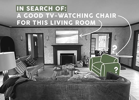
One of America’s biggest design problems is that the “living” or “front” rooms in older homes (1930 for instance) weren’t designed for TV watching – thus forcing designers, homeowners, renters, and parents to struggle to arrange a TV and comfortable furniture in a way that works and doesn’t look dumb. Despite what Orlando says (read our heated debate that ended our friendship here -JK), the TV over the fireplace is often the only real option, with windows and/or doorways chopping up the rest of the room. I’m helping two close friends decorate their new/old homes and they need a lot of the same problems solved. Both want comfortable warm homes, both have 100-year-old traditional, homes and both want them to feel charming yet modern (one is going more “DudeBro PNW Lodge” and the other more “Anthro/Soho Home”). And y’all both have their more “formal” living rooms where the only real configuration is for the sofa to face the fireplace/TV and thus they need side chairs that can either swivel to see the TV or chairs that you can lounge on sideways to see the TV (both have basement TV rooms but their families like to watch tv upstairs together at night). Cue Tom Cruise accepting the mission!!! But with less intensity!!!
So in order to figure out what the formula for this is, I sat on a lot of chairs (not all below, but many). The swivel chair seems like the obvious answer (and just might be the best solution) but one of my friends wanted me to explore other chairs that could simply be laid on towards the TV. The key to this VERY specific need is a supportive yet soft back that leans back (not too vertical) and soft arms. Ok, let’s dive into what I’ve been looking at. FYI, I am going to be referring to my friends as “R” and “N” just to give them some privacy:)
Roswell Chair-And-A-Half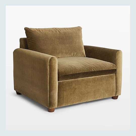
This is the top contender right now for R’s living room – The cushion of the back + height of the arm + large scale means that this is very floppable sideways or normal-ways (technical term designers use). The only thing to think about with this is that since it’s so big your room needs to be able to handle it (and the sofa needs to be big too). We might use this in the corner, easily pulled into the room – but I need to do more measuring to make sure it’s not too big. Boy do those rounded arms look comfy.
Atlanta Loveseat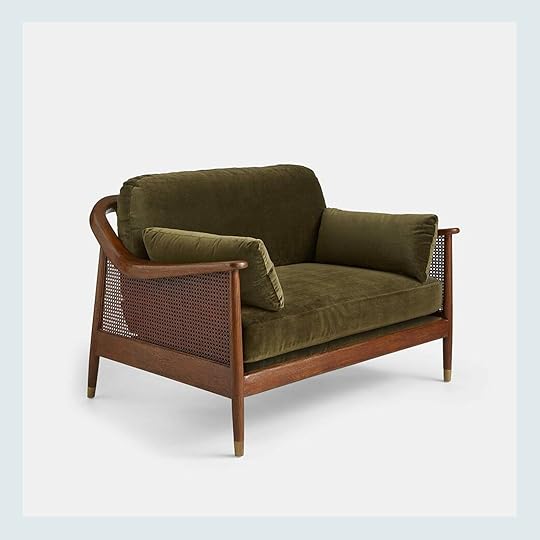
This was the top contender for N’s house, but it MIGHT be too big to allow the pass-through space we need. It’s 48″ wide which IMHO isn’t a loveseat but is def bigger than a normal chair. However, it absolutely looks like the tweens could lay on it sideways to watch TV but is so much more elegant than a lot of swivel or comfy chairs (also V splurgy).
Luanna Swivel Chair
I decided to keep swivel chairs off this list for now (there are SO MANY, so just keeping them separate). But this swivel chair looks like a normal accent/club chair. It’s giving comfy traditional vibes (rather than a swivel chair that looks more cool and clubby). Again, the rounded arms and the lean of the back make this look extremely ergonomic (and the velvet doesn’t hurt, although it comes in lots of fabrics and colors).
Cigar Accent Chair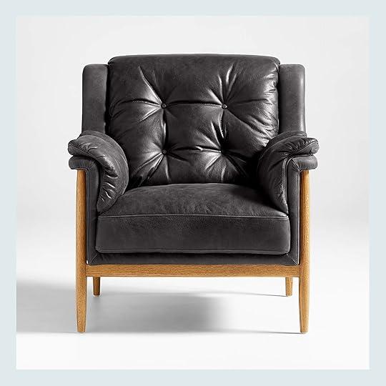
Now the reason I pinned this one was because it reads more as a living room chair which we want in N’s house, but A. you could easily rotate it because it is lighter, and B. the arms would be easy to swing your legs over should you let your kids on chairs sideways to watch TV (we do).
Wythe Oversized Leather Chair
This is another one that can’t be in every room and stylistically it’s very specific (V. “70s basement”), but if you have the space for it, it looks so cool, comfortable, and incredibly easy to flop your legs over the sides of it! The arms look supportive enough to be mini “backs” too. I haven’t sat in this but I’m tempted to run to Crate & Barrel to give it a whirl.
Banks Accent Chair
I’m convincing myself of this one RIGHT NOW. OOH boy that looks comfortable. I’m not sure if it’s really heavy (so hard to angle towards the TV) or light, but def easy to flop sideways on. Oh dear that looks comfy.
Petrie Velvet Mid-Century Chair
The EHD team all agrees that Midcentury is actually coming back already (just as some websites are finally catching on that it was out for a few years LOL) and I’ve sat on this chair many times. It’s very comfortable and could be easy to angle or snuggle sideways on. This is starting to become ridiculous how much I want to be able for these tweens to lay sideways on a chair, but as a mom I get it!!
Crawford Accent Chair
Another cozy chair that is GORGEOUS and would be easy to angle or easy to flop over. Jake Arnold’s collection from Crate & Barrel is incredible.
Lounge Chair And A Half
Admittedly this chair looks pretty simple but in a corner or in a family room, the scale, proportions, and angles lend itself to hours of TV watching. Those of us who like to hang out and chat while sitting crisscross apple sauce will be happy here.
Le Tuco Shearling Accent Chair
I have this chair and while it on the smaller size, it’s extremely comfortable when sitting sideways (with legs over the side) as well as normal:) Add the ottoman and if you have a smaller space that needs filling, this chair is so unbelievably cozy. Just make sure that your sofa doesn’t have a really high back (not over 32″) or will dwarf this chair.
Humphrey Armchair
I also own this chair and tried it out sitting sideways and it was GOOD. The back leans in a way that makes it easy to sit sideways and watch TV. I’ll demonstrate on stories
So that’s what I’m looking at! Stay tuned for more challenges I’m trying to solve. xx
The post Great TV Watching Chairs If Your Sofa Faces Your TV In Your Living Room And You Need To Sit Sideways (And You Don’t Want A Swivel Chair) appeared first on Emily Henderson.
February 6, 2024
Bye Bye, Open Concept: When This Family Couldn’t Build An Addition, They * Added * Interior Walls (+ A Sweet Nursery Reveal)
Just when our kitchen was completed, our deck was done, and we thought we were finally finished with any home renovations for at least a few years, we decided to try for a third baby. Our two perfect kiddos had always been the plan, but my husband and I also always said that a benefit of starting our family while we were young was being at liberty to change our minds.
 design by ilana saul | photo by stephanie todaro | from: a galley kitchen remodel that doubled the size and function (with some big help from actual legos)
One of the things that might have stopped us from trying earlier was that we loved our Los Angeles neighborhood and had no desire to move. (Would you want to give up this view?) But we also weren’t quite sure how a third kid would work in our current space. I’m all for siblings sharing a room, but with a bigger age gap, it felt less than ideal (my older two kids were already 5 ½ and 8 ½ when their baby sister was born).
Our first thought was to add another bedroom to the front of our house to make space for the baby, but when we went to get permits, we found out that most of our front yard is city property (!!!), meaning we didn’t have the space we thought we did for an actual addition. It was a major disappointment, but given our past renovation experience we knew we just had to get creative and find a way to make it work! (We’ve done so much work on our house that my 6-year-old recently requested in total earnest that we build him a new room for his LEGO creations.) Back to the drawing board we went…

Before this round of renovations, our front door opened straight into the living room. I always wished we had a more formal entryway with a good place to drop our shoes and bags. So, with that in mind, we came up with the idea to add interior walls to build a new bedroom and add an entryway at the same time. I have trouble visualizing things on paper, so my husband helped me prop up my kids’ Nugget play couch cushions and some seamless stands to see how everything would look in real life.

As it turned out, adding interior walls was also a huge money and time saver. My husband and his contractor father even did all the framing themselves, and we only had to hire someone to do the drywall, electrical, and paint!

Bookshelf | Framed 3-D Artwork | Framed Hallway Print | Bench | Flushmount Lighting | Sconces | Wallpaper
We got the entryway I always wanted, saved so much money versus a true addition, and made the most out of an underutilized spot in our super-long living room. Necessity really is the mother of invention, isn’t it?

Dresser (vintage from Bananafish Vintage Furniture) | Crib (Facebook Marketplace but here’s a similar one) | Lamp (unavailable) | Side Table (vintage)
I know there are no guarantees when it comes to getting pregnant, but as it turns out we found out we were expecting Story Salinger Saul not long after the new room was completed. We only had the space for a tiny 8×10 room (no closet, so we can’t officially call it a “bedroom” if we ever decide to put our house on the market), but it feels perfect for our family. There will most certainly be a loft bed in Story’s future to free up floor space once she’s out of the crib, but what kid doesn’t think loft beds are super cool?!
Mirror | Dresser (vintage from Bananafish Vintage Furniture) | Pear Basket | Canopy | Wall Hanging (DIY) | Mobile (DIY using wool ornaments from various Etsy sellers) | Changing Pad Cover (similar) | Framed Print (similar) | Play Mat

Mirror | Dresser (vintage from Bananafish Vintage Furniture) | Pear Basket | Canopy | Crib (Facebook Marketplace) | Wall Hanging (DIY) | Mobile (DIY using wool ornaments from various Etsy sellers) | Changing Pad Cover (similar) | Framed Print (similar) | Play Mat
While a small space has its challenges (layout can be super tricky), I find it much more manageable to decorate. I only had an 8×10 room to fill so I was able to focus my energy on a smaller number of really special design details, instead of stretching myself thin trying to furnish a giant room.


The inspiration for Story’s nursery was California Casual-Meets-English-Countryside. Scalloped edges, whimsical details, ditsy florals, and patterns mix with natural wood tones. It’s meant to be perfectly imperfect!


Scalloped Shelving | Quilt | Heart Pillow (no longer available) | Gingham Pillow | Curtains

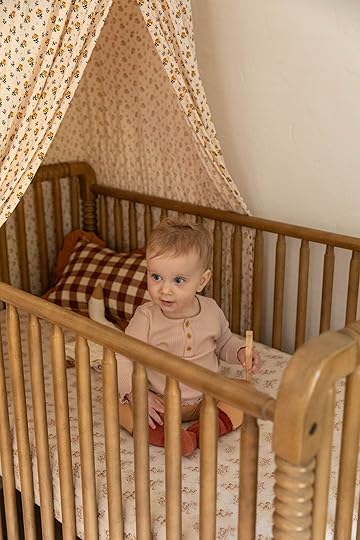

Framed Print (similar) | Baby Wraps | Bookrack (in white) | Switchplate Cover
At this point, I’m big on challenging the assumption that having kids always necessitates more square footage, a huge car, more money, a move to suburbia, or more, more, more of anything. “Want better, not more” is my motto when it comes to design. I hope this project makes a good case for turning a starter home into your forever home, living with less stuff, and taking a leap of faith when something (like that third baby!) feels right.

We care a lot about the planet, so this solution also felt much more in line with those values, too. We shuttle our brood around to ballet, basketball, and gymnastics in a single car. I made a commitment not to buy any brand-new baby items this time and source most of Story’s clothes secondhand. I am a stickler for clearing any clutter and not buying things we don’t really need. I’d rather have a smaller, more efficient space that feels creative, comforting, and full of love.

Want to see more photos of our space? You can follow along here. And thanks to my friend and neighbor Lucia Tran of Her Studio for the beautiful photos!
*Design by Ilana Saul
**Photos by Lucia Tran of Her Studio
The post Bye Bye, Open Concept: When This Family Couldn’t Build An Addition, They * Added * Interior Walls (+ A Sweet Nursery Reveal) appeared first on Emily Henderson.
February 5, 2024
The Bathroom Floor Plans At River House And Why Each Layout Makes Sense

Over 2 years ago Annie Usher, the architect, designed the layout of the house, including the 4 1/2 bathrooms. Max weighed in first on the layout of each bathroom and I have to be honest that I don’t remember how involved I was, so I have to assume “not very” is the answer. I really really trust architects to put the plumbing where it should be to flow (literally) in the house, and while the bathrooms are certainly important they obviously get placed second in priority to some of the other rooms. So today you’ll see where Annie put them and how they are laid out, all differently including some insight or tips on why the vanities and toilets were put where and why that makes a difference.

We have two bathrooms on the 1st floor – the mudroom/downstairs guest full bath and the powder bath. Then upstairs we have…

The kids share a hall bath close to their rooms, there is a proper guest bath for the guest room, and of course, the primary bath – all on the second floor. I think the layout is FANTASTIC and Annie did such a great job.

Two years ago THIS MONTH, we flew down to LA to the Kohler showroom to look at all the fixtures in person. We were all actually there for different vacations (Katie went to a bachelorette, Hendos to Palm Springs for President’s Day weekend, and Max for a fabric partnership) so we set up a shoot because the LA showroom is EPIC.
So many of you will skim by this post, and I get that, but those of you who love knowing how other people like to lay out their bathrooms, hopefully, you’ll find this RIVETING. There is logic, flow (ahem), and style all considered.

The downstairs guest bath is right off the mudroom and may be where kids will run back to pee while swimming in the river (unless they make the more “natural” choice, of course). It didn’t need a shower but felt like a “when in Rome” situation and good to have should they have any crashers (like us) in the family room. It was a more “nice to have” shower, but it’s also very pretty


From Max: “I love using pony walls in bathrooms. It adds a sense of privacy and coziness to a shower, but since it’s waist-ish–high, there’s still a lot of openness and light throughout the room. And it’s nice to give a separation between a shower and a toilet whenever possible. The pony wall in here was another way to show off the awesome tile, since we tiled both sides of it. Another tip is that the shower valve is directly across from the opening to the shower. Instead of under the shower head (where it would typically go). I do this a lot in guest bathrooms, so friends and family who are using this shower can turn it on and futz with the temperature without getting soaked. It also creates an interesting visual, with the faucet trim being such a focal point. There’s another wall ledge in here instead of a shower niche.”

Ya’ll, the powder bath is turning out SO CUTE and rather big. I have the same thoughts as Max re the toilet (aka, not in front of the door). No one wants to look at a toilet.
From Max: “Whenever possible, I try to put powder room sinks and vanities directly across from the door to the room. That way, you and your guests get the nicest view when walking into the room. And if the door is left open, people are looking at a cool vanity instead of a toilet. Since we used a wall-mounted sink and there’s no countertop space, we added a ledge above it to give a spot for soap, etc. This meant we had to bump that wall out a few inches and lose some floor space, but we had the room to do so.”


From Max: “I can’t remember whose idea this was (probably Annie’s!), but originally we had the vanities on the opposite wall under the windows. The layout in this room wasn’t clicking until the vanities were moved across the way. Double vanities are really charming looking. You lose a little storage space compared to one long vanity with double sinks, but it’s worth it in a space like this.”
I think this double vanity situation will be so great for their boy/girl kids. Listen, kids sharing a vanity is not the worst and surely it’s good for them, but my kids do, in fact, fight a lot over space and so having their own just deliniates the space and mitigates the arguments.

I had to force a bathtub into this house – their kids prefer showers so they really didn’t need one, but I knew that for future resale they would need at least one bathroom with a tub. So they chose this lower one that is easy to get in and out of – not a big tub moment. I hope I’m right about this (I feel VERY confident that I am but only time will tell).

This one is small and simple – a vanity, toilet, and shower. The only thing really interesting about the layout is the relationship with the closet across the hall.


As you can see the the pocket door of the bathroom and the closet are aligned perfectly, which was an intentional choice by Annie. It’s just a nice clean flow and good sightlines.

From Max: “The goal here was to maximize the view towards the river from the tub/shower area. Even though it’s a lot of square footage, it’s a super linear series of rooms, and we needed every inch possible to fit all the things in. We had to re-route some things in that shower valve wall so there would be enough space between the shower heads and the edge of the tub. Props to Ken and Katie for really going for it in here; this is a super special bathroom layout. A lot of times when I’m designing a bathroom, there’s overkill on storage, but in this case, it’s more about keeping things open and uncluttered.”

This bathroom is likely my favorite – it’s SO PRETTY and also another one where I basically insisted they have a tub in it. In my opinion, you don’t have this house, and you certainly don’t buy this house (should they ever want to sell it) without a tub. I would never buy a house without a tub since having one – especially in the winter in PNW where it’s a 5 night a week mood-boosting before-bed routine. I really want to teach Katie the ways of the bath – and it starts with a GREAT tub (which they haven’t had before so understandably they aren’t bathers). Sound off in the comments about how important a nice bath is to you because to me it’s an absolute deal breaker.

Clearly, Max is a big old bather. Now please, if you think I did the right thing by forcing one nice bathtub (and one kids’ bathtub) into this house let us know in the comments – SUPPORT MY PRO BATHING AGENDA!! Ken and Katie are still undecided bathers which I get if you don’t have a bathtub you love and if you don’t have a bathing routine you long for every day. For me it’s 20 minutes where I get to escape in the name of “showering” and “cleaning myself” but instead I light a candle, drop in some bath oil, and read my romance novels (or scroll if I haven’t been on social for a couple of days) and then my body feels so good/clean/warm and my mood is boosted. Will you vote with me and be pro-bathtub!!!
*Photos at Kohler by Veronica Crawford
**Photos of River House by Kaitlin Green
The post The Bathroom Floor Plans At River House And Why Each Layout Makes Sense appeared first on Emily Henderson.
Emily Henderson's Blog

- Emily Henderson's profile
- 10 followers

