
Emily Henderson's Blog, page 50
June 9, 2024
The Link Up: Em’s Great Housewarming Gift Idea, Mal’s Trick For Instant Silky Hair, And A Chance To Hang With Emily In Person

Happy Sunday everyone! This was a pretty exciting week on the design front because Emily and the Portland team shot all of the river house empties (photos before any furniture or styling decor). Oh, and did you see the library design pivot and Em’s pretty hilarious reel? Basically things are really cooking and we couldn’t be more excited. Ok, links!
This week’s house tour is brought to us by the brilliant minds of Nate Berkus and Jeremiah Brent, two designers that are incapable of not designing a stunning and soulful home. They even dabbled into a couple of trends but made them look completely timeless. Hello, blue room! Please go check out the full article here or get a little snapshot on Instagram.
From Emily: I just received my copy of For The Love Of Renovating and I can’t believe how informative it is. Barry and Jordan clearly put as much helpful information in here as possible from their years of experience, and it’s truly a wealth of insider tips. If you are renovating (or know someone who is) I personally think that buying both The New Design Rules and For The Love Of Renovating will help you IMMENSELY (of course, I’m biased, but I really think it’s true). Their book is also a fantastic housewarming gift for anyone that is about to embark on a fixer. It can be so daunting, intimidating, and frustrating so a book like this can really be a tool from beginning to end. Great job, guys!!!!
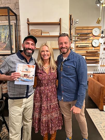

Also From Emily: Wanna hang out in person? Wednesday, June 19th I’ll be co-hosting Barry and Jordan’s book signing at Rejuvenation in Portland and I’m BEGGING all my Portland friends/readers/followers to come!!! It will be a casual Q and A, with food and drinks and these two guys are SO CHARMING. To be honest, I rarely do things like this (because I, like most people, don’t love being on a stage in front of so many people) but these two guys are so wonderful and work so hard that I wanted to support them any way I can and I’m genuinely excited to hang out with them again. Please come hang out with us! Here’s all the info:
Date: June 19th
Time: 6pm
Location: Rejuvenation Portland
RSVP link: HERE
From Mallory: Jess’s hair journey plus my constant hair bleaching inspired me to start taking better care of the hairs on my head. Enter: Amika’s hair mask!! I started using this bad boy once a week and every time I rinse it out my hair feels like butter. I’ve slept in the hair mask before and it’s great to do for 4 hours or more, but I’ve also done it for an hour or less and it has made such a difference for my hair. If you’re also on a hair journey try this guy out!!
From Gretchen: The majority of clothes I own are… just okay. You can find me in a t-shirt, old jeans, and beat-up Birkenstocks on any given day. But lately, I’ve been trying to up my fashion game (a bit, let’s not get crazy now) and our recent trip to Mexico gave me a good reason to add a few new “fancy” staples into the mix. On night one of our trip, I paired this fun & funky black and white patterned maxi skirt from Target with this super flattering puff sleeve top (I love a poofy shoulder) from Abercrombie. I received a handful of compliments from the EHD team while sporting this, and I have to agree with them, I looked damn cute! Dressy enough to wear on a date night, but could easily pair each piece with something more casual–the skirt with a graphic tee or maybe the top with some high-waisted jeans? Now all I need are some new shoes! And a purse. Maybe some better jeans? We’re working on it!
In case you missed it, Jess’ dad, Les, made his annual heartwarming and extremely helpful Father’s Day gift guide. If you take one look at the reviews you’ll know the impact he has had:) One week left!
From Arlyn: Raise your hand if you feel like you could hang your head in shame at how many paper towels you run through on a daily basis. And look, I know they sell reusable paper towels on a roll and all of that, or I could use kitchen towels (which I do…all the time) but any household with kids is a messy household and you’re constantly wiping up SOMETHING. We’ve been using Papaya reusable paper towels recently and we LOVE THEM. They each come with a hook so it can hang to dry to prevent bacteria. You just wet, wipe, rinse, squeeze, and hang and each has lasted us at least two weeks. You can throw them in the washing machine and even the dishwasher, though they recommend you air dry them. It’s hard to imagine going back!
From Caitlin: Asking the audience: are Branch’s ergonomic office chairs worth the price for someone with serious back issues? (Like, “getting quarterly outpatient surgery treatment” serious – I’m not messing around here!) They’re obviously far more affordable than something from Herman Miller, and the aesthetics are leaps and bounds above the sea of black mesh that I’ve been sifting through, but is it too good to be true? Does it hold up over time? Will sitting in this chair reduce the amount of money I pay to my orthopedist every month? (He’s a miracle worker, though – worth every penny.) Please advise!!! I’d love to buy the pretty chair, but I am scared of it not living up to expectations. (Alternatively, if anyone has a favorite refurbished office chair site, I’d love to take a look!)
From Jess: Well, I caved. I bought a Stanely cup and I have to say that I love it. As someone who could easily go days without drinking water, I’m really trying to change that. And for whatever reason, this vessel has immensely helped me achieve that. If you already have a similar type of water jug then ignore this, but I didn’t have one so I got the 30oz size because my friend who has the 40oz says it doesn’t fit into her car cup holder (WHAT?!) and I really love having a handle. The drinking experience is pretty great which I know sounds silly but does make a difference to me. So if you’ve also been contemplating getting a Stanley and maybe are a little embarrassed about how trendy they are (that was me!), forget all that and just do it if you want to. I’ve been averaging 90oz a day! Who am is this hydrated lady!?
Thanks for reading and see you tomorrow! xx
Opening Image Credits: Photo by Sara Ligorria-Tramp | From: All the What’s, Why’s & How Much’s of the Portland Kitchen (+ Big Reveal)
The post The Link Up: Em’s Great Housewarming Gift Idea, Mal’s Trick For Instant Silky Hair, And A Chance To Hang With Emily In Person appeared first on Emily Henderson.


June 8, 2024
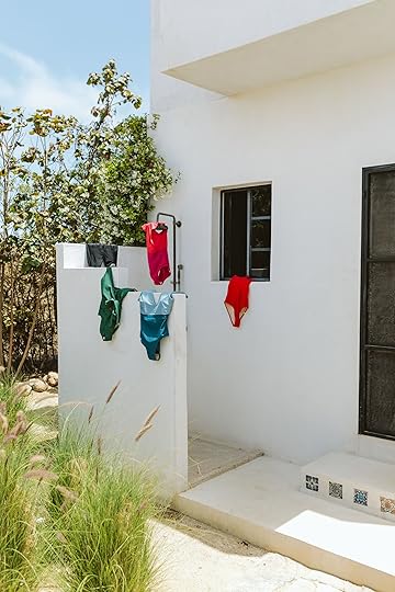
5 Non-Model Women Tested Summersalt’s Swimsuits – Here Are Their Reviews (And No Photoshopping, Ever)

A few months ago we planned our first international team retreat (per my “HR requirements”) and the timing worked well as 10 days before leaving we got pitched the opportunity to try out some Summersalt swimsuits. Now, despite how much “swim-fluencing” we seem to do over here, we are similar to most human women on the planet and don’t jump at the chance to wear a suit on the internet in the middle of the day (without photoshopping, of course). But they/we all love Summersalt, how they fit, and the timing felt perfect. So I pitched it to my team (or moreso Caitlin pitched it to us all) – while we are in Mexico, we’ll rent a dope house, I’ll buy their professional spray tans (some of them their first!), they’ll all make additional vacation dough (in the form of a bonus), get free great suits (duh), and I promised them early in the day margaritas (clutch). This was not a requirement and they could even back out after the shoot if they weren’t comfortable with the photos (and still keep the bonus, I seriously didn’t want anyone to feel pressured – this is NOT A NORMAL PART OF THE JOB). But since most of my team knows Summersalt intimately they all said they were up for it. WHAT A WILD AND FUN JOB WE HAVE 

Y’all. The EHD team all looked so stunning, so empowered, and we honestly had SO MUCH FUN (shout out to Kaitlin Green who really knows how to make us all feel so comfortable in front of the camera in what is typically a very self-conscious situation). What I loved even more was how much our team hyped each other up – everyone constantly telling each other how hot, beautiful, stunning, and snatched they looked. Positivity abounded. Sure it could just be me wearing a couple of suits for a review post like this, but everyone felt it was important to show multiple types of bodies and how the suits look on them in different styles and sizes. (Also that odd texture on my left thigh is the water reflecting on my leg – see? no photoshopping:))

So before we go into our cute suits, a huge shout out to the beautiful Jess, the stunning Gretchen, the gorgeous Mal, and the ravishing Caitlin – AKA the EHD team. WHAT A LUCKY LUCKY LADY I AM.
 Emily (Me!)
I was up first and started slow with my new great cover-up, part of Summersalt’s collab with L.L.Bean (I ordered the navy because the white can get stained from my perma-spray tan). This cover-up is a short sleeve, but a long button-up with pockets and not very see-through (so yes, I could easily wear it on a hot day just around the house or town). The gauzy material is really nice.


The Cloud Gauze Midi Dress Cover-Up (in Deep Sea) | The Ruffle Backflip (in Summer Berry & Spritz)
I ordered The Ruffle Backflip in the Summer Berry & Spritz colorway which has cute little sleeves and a V (but not too deep). I ordered a 6 and will size down next time (it was a bit big on me so if you are in between, size down). But it’s still double-layered which is nice and the color and ruffles were so cute. My knockers were knocking that day.

The Ruched Backflip (in Bay & Seaspray)
I also ordered The Ruched Backflip in size 6 which was a bit big too, but still so comfy and I loved the wide shoulders. It feels almost like a tank top so easy to wear with shorts without feeling super exposed.
Gretchen

The Ruched Backflip (in Sea Urchin)
Look, Ma—I’m on the cover of Sports Illustrated!! Well, at least this beautiful Summersalt suit and international shoot made me feel like I was! What I was worried would be a nerve-wracking experience ended up being so fun and freeing. And it didn’t hurt that I felt SO GOOD in this suit. I hadn’t ordered from Summersalt before so I wasn’t sure how it would work out for me, but I’m declaring it now—this is my suit of summer! I ordered The Ruched Backflip in Sea Urchin and I am just so happy with how it looks on my body, a sentiment I unfortunately don’t say enough. The best way I can sum it up is I just felt COMFORTABLE. I really love the look of the wider straps and where they fall on me. And the front (and back) scoops just enough where I still feel “ooo la la sexy” but still covered up in all the right spots.


The Seascape Sweetheart One Piece (in Sea Urchin) | The Ruched Backflip (in Sea Urchin) | The Sidestroke (in Sea Urchin)
From Mallory: Summersalt suit review here we GO. I ordered two suits – The Sidestroke in Lava (see below) and The Seascape Sweetheart One Piece in Sea Urchin (see above). I was pleasantly surprised when I slipped these puppies on how supported and snatched they made me feel. There’s extra padding for the girls so there’s a good amount of support if you’ve got larger ladies or a little extra bump if you’ve got smaller ones (me). The neckline on the sweetheart is so flattering and I loved how this suit looked with this white button-down and a gold necklace or with a little scarf tied around the waist. All in all it nicely sculpts without being uncomfortable and is super versatile for summer vacays and beyond!!
From Jess: I LOVE this suit and it is probably my favorite of the two I ordered. The wider shoulders almost have a shoulder pad vibe (which if you know me, is MY LOOK) but also it’s just sexy (I mean, you saw it on Gretchen too so case closed!). I feel very chic in this style and love it in black:) Oh, and I totally agree with Em that you could easily throw on some jean shorts to hang out in or walk around town on vacation. You will feel cute.
From Caitlin: It’s what you’ve all been waiting for: an average woman, sitting in a swimsuit! (Stone-cold sober, too! And I lived to tell the tale!!! It’s The Sidestroke, and my full love letter and size details are below.) I did want to offer an analogy, though: have you ever worn a bridesmaid’s dress that makes you feel terrible? It’s uncomfortable, it clings, you’re hyper-aware of your least favorite bits…well, these Summersalt swimsuits are on THE TOTAL OPPOSITE END of that spectrum. There really is a suit for everyone – and more than that, those suits will leave you feeling confident and (dare-I-say?) maybe even joyful! I just love these shots of Mal, Jess, and I – we’re 3 dear friends, in 3 classic styles, with 3 different bodies, but we’re all having a blast together. And that’s kind of what summer’s all about, you know?
Mallory

The Cloud Gauze Boxy Cropped Button-Up Shirt (in White Sand) | The Sidestroke (in Lava)
Okay now jumping to this little red number. Well, I’d like to first address that I used an AD magazine as a prop (obviously we love design around here), but that’s neither here nor there…we’re talking SUITS. I’ve worn The Sidestroke in White Sand before and really love it but I was shocked to realize I love it in Lava EVEN MORE. This color makes me so happy and is such a fun little pop for summer. I paired it with this gauzy button-down cover-up top (which is so universal) and some red tassel earrings to match the suit. The back detailing really elevates this one piece and it’s again sculpting but not uncomfortable. I highly recommend this guy – especially in red!!
 Jess
Jess

The Silky Luxe Short Effortless Shirtdress Cover-Up (in Cloud White) | The Perfect Wrap One-Piece (in Olive)
I’d be lying if I didn’t say I almost didn’t participate in this shoot. I haven’t been feeling super confident, am dealing with some ongoing health stuff, so being in a swimsuit was not at the top of my list of dream activities. I say this not to harp on my insecurities (very boring and dumb) but because it ended up being not only the most fun day, but I really did feel great in my suits and would absolutely recommend them. I ordered a size 10 in both of my suits which felt true to size. I really loved this tone of green and the wrap detail made me feel good. Also, my girls were really out. to. play. which isn’t my typical vibe but I wasn’t mad about it either:) I also want to say that this coverup is a dream! 1000/10. It’s similar in style to the one I got a couple of years ago, a long button-up, but this version has a belt. The fabric however is the same light and almost silky material that is SO soft and drapes so pretty. I’m in a small here because we were told they run pretty big but I do think I would have liked a medium because I prefer an oversized coverup look. But that’s my preference and the small did totally fit. So size down if you don’t want any oversizing:)


The Sidestroke (in White Sand) | The Cloud Gauze Wide-Leg Pants (in Deep Sea)
Are you having swimsuit anxiety? Are you feeling nervous about finding the perfect fit? Does it all feel a little too overwhelming? THE SIDESTROKE IS YOUR ANSWER. Believe me – I’m wearing a wet, white swimsuit on the internet. And I’m eating! Do you know how much trust you have to have in a white swimsuit to shoot it wet? (I did also stain it with watermelon immediately after these were taken, but it came right out in the wash – another point for Summersalt!)
Seriously, though – I’ve tried a few of Summersalt’s suits at this point, but I just love the fit and compression of The Sidestroke. There’s surprisingly great support (36F reporting for duty!) and I really love the way the pleating gives some nice shape, too. And for the record, my suits have held up incredibly to water – the EHD team will confirm that I had to be dragged out of the pool for the shoot – and my older suits still look like new. I was in between Summersalt’s sizes (16 on the boobs, 16 on the butt, 10 on the waist), but ended up ordering a 12LT and the fit is perfect (just a touch of extra length for the assets, you know?).
And I’m totally obsessed with the weight and breathability of the cover-up set, which I maaaaay have worn on a party boat in Cabo last weekend with Mal and Gretch. My only note here would be to size way down – I originally ordered an XL in the top and bottom, but thankfully the Summersalt team advised me to grab both in a medium! I’ve literally never sized down for anything in my life before (“HA,” I chortle, when I read advice to size down) but this is the lone exception. I thought that the white suit and navy pant made a pretty cute outfit, too – WHO IS GONNA INVITE ME TO A 4TH OF JULY PARTY? (I’m wearing this.)

Em again! Y’all. The EHD team KILLED IT, we had so much fun, we felt so supported by each other and perhaps altogether we can highlight the beauty of all of our bodies, our collective curves need to be celebrated. I’m happy to say that a good suit sure can make us all feel confident and empowered. Thanks to Summersalt, again, for helping us have such an awesome swim experience. And feel free to hype them all up even more in the comments. They are not only talented, creative, motivated, and beautiful but doing this and do it with such confidence takes a level of bravery that very few people have. HELL YES.
If you’d like to see all of these suits in one place, the Summersalt team has created an easy-to-navigate landing page featuring all the products we tried right here. They threw in a discount, too! Use code EMILYH10 to take $10 off any order over $95. Cheers to a happy, comfortable, self-confident summer. xx
*Photos by Kaitlin Green – A HUGE THANKS TO KAITLIN! She’s our honorary team member and didn’t want to be in front of the camera (although she looked stunning in her Summersalt suits), but made us feel so beautiful and comfortable. Thank you, K. We love you.
The post 5 Non-Model Women Tested Summersalt’s Swimsuits – Here Are Their Reviews (And No Photoshopping, Ever) appeared first on Emily Henderson.
5 Average Women Tested Summersalt’s Swimsuits – Here Are Their Reviews (And No Photoshopping, Ever)
A few months ago we planned our first international team retreat (per my “HR requirements”) and the timing worked well as 10 days before leaving we got pitched the opportunity to try out some Summersalt swimsuits. Now, despite how much “swim-fluencing” we seem to do over here, we are similar to most human women on the planet and don’t jump at the chance to wear a suit on the internet in the middle of the day (without photoshopping, of course). But they/we all love Summersalt, how they fit, and the timing felt perfect. So I pitched it to my team (or moreso Caitlin pitched it to us all) – while we are in Mexico, we’ll rent a dope house, I’ll buy their professional spray tans (some of them their first!), they’ll all make additional vacation dough (in the form of a bonus), get free great suits (duh), and I promised them early in the day margaritas (clutch). This was not a requirement and they could even back out after the shoot if they weren’t comfortable with the photos (and still keep the bonus, I seriously didn’t want anyone to feel pressured – this is NOT A NORMAL PART OF THE JOB). But since most of my team knows Summersalt intimately they all said they were up for it. WHAT A WILD AND FUN JOB WE HAVE
Y’all. The EHD team all looked so stunning, so empowered, and we honestly had SO MUCH FUN (shout out to Kaitlin Green who really knows how to make us all feel so comfortable in front of the camera in what is typically a very self-conscious situation). What I loved even more was how much our team hyped each other up – everyone constantly telling each other how hot, beautiful, stunning, and snatched they looked. Positivity abounded. Sure it could just be me wearing a couple of suits for a review post like this, but everyone felt it was important to show multiple types of bodies and how the suits look on them in different styles and sizes. (Also that odd texture on my left thigh is the water reflecting on my leg – see? no photoshopping:))
So before we go into our cute suits, a huge shout out to the beautiful Jess, the stunning Gretchen, the gorgeous Mal, and the ravishing Caitlin – AKA the EHD team. WHAT A LUCKY LUCKY LADY I AM.
Emily (Me!)I was up first and started slow with my new great cover-up, part of Summersalt’s collab with L.L.Bean (I ordered the navy because the white can get stained from my perma-spray tan). This cover-up is a short sleeve, but a long button-up with pockets and not very see-through (so yes, I could easily wear it on a hot day just around the house or town). The gauzy material is really nice.
The Cloud Gauze Midi Dress Cover-Up (in Deep Sea) | The Ruffle Backflip (in Summer Berry & Spritz)
I ordered The Ruffle Backflip in the Summer Berry & Spritz colorway which has cute little sleeves and a V (but not too deep). I ordered a 6 and will size down next time (it was a bit big on me so if you are in between, size down). But it’s still double-layered which is nice and the color and ruffles were so cute. My knockers were knocking that day.
The Ruched Backflip (in Bay & Seaspray)
I also ordered The Ruched Backflip in size 6 which was a bit big too, but still so comfy and I loved the wide shoulders. It feels almost like a tank top so easy to wear with shorts without feeling super exposed.
GretchenThe Ruched Backflip (in Sea Urchin)
Look, Ma—I’m on the cover of Sports Illustrated!! Well, at least this beautiful Summersalt suit and international shoot made me feel like I was! What I was worried would be a nerve-wracking experience ended up being so fun and freeing. And it didn’t hurt that I felt SO GOOD in this suit. I hadn’t ordered from Summersalt before so I wasn’t sure how it would work out for me, but I’m declaring it now—this is my suit of summer! I ordered The Ruched Backflip in Sea Urchin and I am just so happy with how it looks on my body, a sentiment I unfortunately don’t say enough. The best way I can sum it up is I just felt COMFORTABLE. I really love the look of the wider straps and where they fall on me. And the front (and back) scoops just enough where I still feel “ooo la la sexy” but still covered up in all the right spots.
The Seascape Sweetheart One Piece (in Sea Urchin) | The Ruched Backflip (in Sea Urchin) | The Sidestroke (in Sea Urchin)
From Mallory: Summersalt suit review here we GO. I ordered two suits – The Sidestroke in Lava (see below) and The Seascape Sweetheart One Piece in Sea Urchin (see above). I was pleasantly surprised when I slipped these puppies on how supported and snatched they made me feel. There’s extra padding for the girls so there’s a good amount of support if you’ve got larger ladies or a little extra bump if you’ve got smaller ones (me). The neckline on the sweetheart is so flattering and I loved how this suit looked with this white button-down and a gold necklace or with a little scarf tied around the waist. All in all it nicely sculpts without being uncomfortable and is super versatile for summer vacays and beyond!!
From Jess: I LOVE this suit and it is probably my favorite of the two I ordered. The wider shoulders almost have a shoulder pad vibe (which if you know me, is MY LOOK) but also it’s just sexy (I mean, you saw it on Gretchen too so case closed!). I feel very chic in this style and love it in black:) Oh, and I totally agree with Em that you could easily throw on some jean shorts to hang out in or walk around town on vacation. You will feel cute.
From Caitlin: It’s what you’ve all been waiting for: an average woman, sitting in a swimsuit! (Stone-cold sober, too! And I lived to tell the tale!!! It’s The Sidestroke, and my full love letter and size details are below.) I did want to offer an analogy, though: have you ever worn a bridesmaid’s dress that makes you feel terrible? It’s uncomfortable, it clings, you’re hyper-aware of your least favorite bits…well, these Summersalt swimsuits are on THE TOTAL OPPOSITE END of that spectrum. There really is a suit for everyone – and more than that, those suits will leave you feeling confident and (dare-I-say?) maybe even joyful! I just love these shots of Mal, Jess, and I – we’re 3 dear friends, in 3 classic styles, with 3 different bodies, but we’re all having a blast together. And that’s kind of what summer’s all about, you know?
MalloryThe Cloud Gauze Boxy Cropped Button-Up Shirt (in White Sand) | The Sidestroke (in Lava)
Okay now jumping to this little red number. Well, I’d like to first address that I used an AD magazine as a prop (obviously we love design around here), but that’s neither here nor there…we’re talking SUITS. I’ve worn The Sidestroke in White Sand before and really love it but I was shocked to realize I love it in Lava EVEN MORE. This color makes me so happy and is such a fun little pop for summer. I paired it with this gauzy button-down cover-up top (which is so universal) and some red tassel earrings to match the suit. The back detailing really elevates this one piece and it’s again sculpting but not uncomfortable. I highly recommend this guy – especially in red!!
JessThe Silky Luxe Short Effortless Shirtdress Cover-Up (in Cloud White) | The Perfect Wrap One-Piece (in Olive)
I’d be lying if I didn’t say I almost didn’t participate in this shoot. I haven’t been feeling super confident, am dealing with some ongoing health stuff, so being in a swimsuit was not at the top of my list of dream activities. I say this not to harp on my insecurities (very boring and dumb) but because it ended up being not only the most fun day, but I really did feel great in my suits and would absolutely recommend them. I ordered a size 10 in both of my suits which felt true to size. I really loved this tone of green and the wrap detail made me feel good. Also, my girls were really out. to. play. which isn’t my typical vibe but I wasn’t mad about it either:) I also want to say that this coverup is a dream! 1000/10. It’s similar in style to the one I got a couple of years ago, a long button-up, but this version has a belt. The fabric however is the same light and almost silky material that is SO soft and drapes so pretty. I’m in a small here because we were told they run pretty big but I do think I would have liked a medium because I prefer an oversized coverup look. But that’s my preference and the small did totally fit. So size down if you don’t want any oversizing:)
The Sidestroke (in White Sand) | The Cloud Gauze Wide-Leg Pants (in Deep Sea)
Are you having swimsuit anxiety? Are you feeling nervous about finding the perfect fit? Does it all feel a little too overwhelming? THE SIDESTROKE IS YOUR ANSWER. Believe me – I’m wearing a wet, white swimsuit on the internet. And I’m eating! Do you know how much trust you have to have in a white swimsuit to shoot it wet? (I did also stain it with watermelon immediately after these were taken, but it came right out in the wash – another point for Summersalt!)
Seriously, though – I’ve tried a few of Summersalt’s suits at this point, but I just love the fit and compression of The Sidestroke. There’s surprisingly great support (36F reporting for duty!) and I really love the way the pleating gives some nice shape, too. And for the record, my suits have held up incredibly to water – the EHD team will confirm that I had to be dragged out of the pool for the shoot – and my older suits still look like new. I was in between Summersalt’s sizes (16 on the boobs, 16 on the butt, 10 on the waist), but ended up ordering a 12LT and the fit is perfect (just a touch of extra length for the assets, you know?).
And I’m totally obsessed with the weight and breathability of the cover-up set, which I maaaaay have worn on a party boat in Cabo last weekend with Mal and Gretch. My only note here would be to size way down – I originally ordered an XL in the top and bottom, but thankfully the Summersalt team advised me to grab both in a medium! I’ve literally never sized down for anything in my life before (“HA,” I chortle, when I read advice to size down) but this is the lone exception. I thought that the white suit and navy pant made a pretty cute outfit, too – WHO IS GONNA INVITE ME TO A 4TH OF JULY PARTY? (I’m wearing this.)
Em again! Y’all. The EHD team KILLED IT, we had so much fun, we felt so supported by each other and perhaps altogether we can highlight the beauty of all of our bodies, our collective curves need to be celebrated. I’m happy to say that a good suit sure can make us all feel confident and empowered. Thanks to Summersalt, again, for helping us have such an awesome swim experience. And feel free to hype them all up even more in the comments. They are not only talented, creative, motivated, and beautiful but doing this and do it with such confidence takes a level of bravery that very few people have. HELL YES.
If you’d like to see all of these suits in one place, the Summersalt team has created an easy-to-navigate landing page featuring all the products we tried right here. They threw in a discount, too! Use code EMILYH10 to take $10 off any order over $95. Cheers to a happy, comfortable, self-confident summer. xx
*Photos by Kaitlin Green – A HUGE THANKS TO KAITLIN! She’s our honorary team member and didn’t want to be in front of the camera (although she looked stunning in her Summersalt suits), but made us feel so beautiful and comfortable. Thank you, K. We love you.
The post 5 Average Women Tested Summersalt’s Swimsuits – Here Are Their Reviews (And No Photoshopping, Ever) appeared first on Emily Henderson.
June 7, 2024
May’s Bestselling Piece Debuted On the Blog 6 Years Ago – Want to See What It Is? (+ The Other 9 Products EHD Readers Loved Last Month)

May is always a real big shopping month. Not only is it the unofficial beginning of the summer (which typically comes with a few new seasonal needs) but it has the second biggest sale day of the year…Memorial Day. Oh, and there’s a WayDay sale (Wayfair’s biggest sale) which is also a HUGE opportunity for some sweet home decor savings. So since it’s such a spendy month, we thought it would be pretty interesting to see what the top sellers were with all of you and share! Per usual, #1 was kinda a big surprise to us. Let’s get to it!
10. Deauville 21” Distressed Table Lamp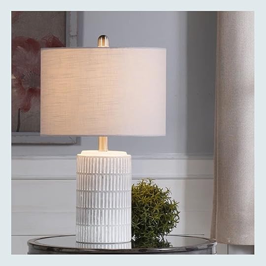
Deauville 21” Distressed Table Lamp
First up, a truly great lamp from Wayfair (actually Kelly Clarkson Home which is fun!). We did a “look for less” post for WayDay and this sweet lamp was a great and affordable alternative to the really pricey neutral ceramic lamps that are all over the market. I love the texture, the brass details, and of course, the price. It’s still on sale for $67 if you are in the market!
9. Wing Arm Accent Chair photo by kaitlin green | from: the really good home decor stuff at target right now (including stools i’m considering for the river house)
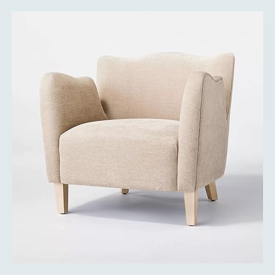
The last time Emily went to Target she was once again so impressed with their newest home decor and this chair was no expectation. It’s from the Threshold x Studio McGee line (no surprise there either) and Em loved not only the price for the scale (it was a really nice size) but also the shape was a really pretty twist on a traditional style. Clearly, a bunch of you liked it too! Here’s the full post where she talks about all of her current Target favorites.
8. Cashmere Mist Deodorant Anti-Perspirant Stick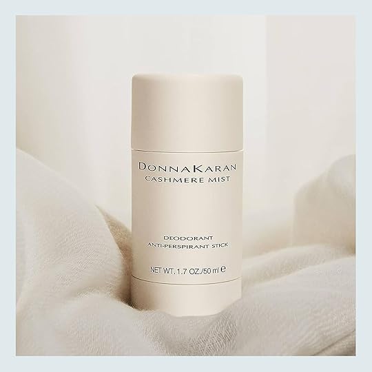
Cashmere Mist Deodorant Anti-Perspirant Stick
Mal Gal has been raving about this deodorant for a while and I get why since I had first-hand experience with it. I needed to borrow it while we were in Mexico (thanks, Mal!!). The hot weather is coming fast if it hasn’t hit you already and for those of us that really sweat, you will not be disappointed with this guy! Hope all of you who purchased it already love it! Here’s Mal’s official review:
From Mallory: I used to be a smelly gal. That is until I found this life-changing product. As warmer months are approaching ahead, it’s time to think about sweat control (especially for us sweaters), so I thought I’d bump my favorite deodorant that literally made me go from queen B-O to a sweet and delectable smelling lass. I cycled through hundreds of deodorants in my life and nothing seemed to work, but this boujee little deodorant stick keeps me smelling fresh even after a full hour of high intensity workout. If you smell like I used to, try this and you will smell INCREDIBLE.
7. Culinary Pull Down Kitchen Faucet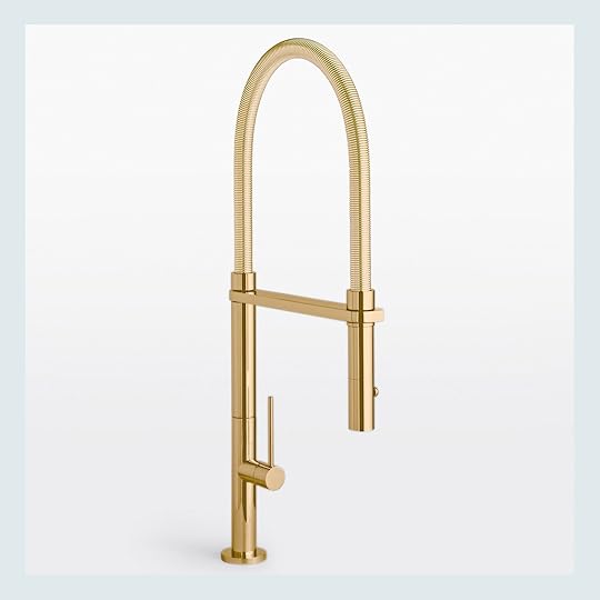
Culinary Pull Down Kitchen Faucet
When Rejuvenation is offering 25% off and you need a faucet, it’s kinda a no-brainer, right?! I totally get why this one was so popular – it’s modern while still feeling appropriate for a more traditional kitchen, Rejuvenation’s brass is the perfect tone (I know firsthand), and you can’t deny how great it is to have a pull-down function. Congrats to all the new faucet owners!
6. The Harlow Jean Short
 photos by kaitlin green | from: 5 good jean shorts i’ll be wearing this summer that aren’t levi’s:)
These are one of two shorts on this list and both are awesome. These are great because while you can totally dress them down (I mean they are jean shorts after all), the cute pleats in the front can also lean a little more polished thus giving the flexibility of dressing them a little up too. Em does recommend sizing up if you are thinking of adding to cart:)
5. Wicklow – The Italian Chino
 photos by kaitlin green | left from: my current favorite lightweight trousers on my body
I was SO happy to see these pants on the list! They are truly so wonderful and I say that owning a pair. I happened to see them on a really good sale in a shop where my dad lives but after wearing them a bunch I would totally pay full price. They do lean a little lowrise (as compared to my normal highrise pants) but they sit on your body so well, the fabric is a dream, and I really love the frayed hem. They look so great on Em (no surprise:)) but I also love them on me too! Highly recommend if you have the budget and were thinking about getting a pair.
4. Monrowe Leather Sofa photo by mark weinberg | styling by getteline rene | from: it’s here! our first ehd collection with rugs usa (+ why now? and why this?)
Another beautiful Rejuvenation piece! So happy that their Memorial Day discount was put to good use:) Em has had this sofa for a long time and only has wonderful things to say about it. I mean look at that color and detail! This is such a good leather sofa if you are in the market.
3. Relaxed Mid-Length Denim Shorts
 photos by kaitlin green | from: 5 good jean shorts i’ll be wearing this summer that aren’t levi’s:)
Relaxed Mid-Length Denim Shorts
The other shorts! But this time it’s all about the cool, casual vibe. I think most people thought, “Oh these are the perfect summer shorts!” and I have to agree with them. The wash is light and happy, the distress is just the right amount and I love love that the back of them are a little bit longer. Em was also a big fan of the last detail.
2. Women’s Long Sleeve Cinch Waist Maxi Shirtdress

 middle photo by kaitlin green | from: 12 cute, comfy easy-to-wear spring break outfits + from: the sisterhood of the traveling $30 target dress (so does it work for everyone??)
Women’s Long Sleeve Cinch Waist Maxi Shirtdress
So while #1 was a little bit of a surprise, this one (#2) was not:) This dress was an immediate yes for us and many of you since it’s been a top-selling item since Em first wore it in her spring break fashion post in March! So much so that we did a post where we each got one and showed its versatility. Plus now at under $30, it’s even more of a steal. So happy so many of you agreed!
1. Bravyn Upholstered Lounge Chair photo by sara ligorria-tramp | from: la living room final reveal
Bravyn Upholstered Lounge Chair
THIS CHAIR is #1!! If you are wondering why we were a little surprised, it’s because we’ve been promoting this chair (or the Target version) for yeeeeaaarrss! At least six. But also it’s just such a great-looking chair that’s extremely versatile and comfortable to sit in. So maybe we aren’t that surprised. It was another pick from our WayDay post and I hope that all the new chair owners out there are just as in love with it as we always have been.
Well, that’s a wrap! Hope this was a fun little read and come back tomorrow for an extra fun and dare I say revealing post:) See ya then!
Love you, mean it.
Opening Image Credits: Photo by Sara Ligorria-Tramp | From: Living Room Update – AGAIN – Our New Sofa, My Dream Floral Chaise And The Pop Of Red I Always Wanted In My Life
The post May’s Bestselling Piece Debuted On the Blog 6 Years Ago – Want to See What It Is? (+ The Other 9 Products EHD Readers Loved Last Month) appeared first on Emily Henderson.
June 6, 2024
A Design Pivot – We Paneled And Repainted A River House Room Two Weeks Before Move-In (…And How I Feel About It)
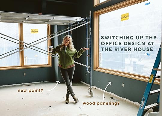
Want to hear a joke I heard on set 20 years ago (by a photographer I’m sure)? “How many stylists does it take to screw in a lightbulb?”. Answer: “Hmm… I don’t know… what do YOU think…??” We are notoriously indecisive and scattered, not to be confused with lack of confidence. It’s not that there isn’t a science to it all, because there can be – but often there are just so many ways to do the same thing/finish a room and therefore I’m not always sure there is just one BEST way to do it. While I’d love to prevent all major design changes, nothing gives me greater satisfaction than changing the design of a room to be better, then walking in after realizing how right that move was.
I recently toured a house of a friend’s in LA that was designed by one of the best, riskiest, and most experienced designers in the world (IMHO) who will remain anonymous for now until they publish the project (it’s insane, in such a good way). Seeing this designer’s work in-person was so incredibly inspiring. I asked my friend if there were any changes near or after the end (likely fishing for any major hiccups to make myself feel better about all mine). She told me what I wanted to hear, that there were a few big changes (mostly paint or window treatments) and explained that while they all approved and agreed upon them during the design process, once it was done it just didn’t feel as good as they all wanted it to feel. This is why it’s different than a mistake – it’s a pivot, an improvement (with a side of reversal). But these changes can be the hardest to make because they don’t NOT work – nothing is “WRONG,” they just could be better. That’s the story of this room, the home office/library at my brother’s river house.
 photo by kailtin green
This room is right off the entry and the living room -i.e. you see it from most angles on the first floor. It has two sets of pocket doors but they are glass (and glass is invisible, so… ).
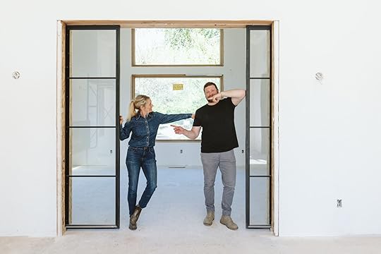 photo by kailtin green
The architect, Annie Usher, and Ken/Katie really made most of these decisions on placement, but when we were choosing all of the paint colors for the house there were a lot of cooks in the office. We were choosing these paint colors right as I was changing a few colors in our house, so I wasn’t feeling terribly confident in some of my decision-making. We hadn’t even THOUGHT about furniture or decor and barely had an overall “look and feel” for the styling (while I’m in charge of the rooms that are heavily partnered, my level of involvement in a lot of the rooms was little to none at that point- I was just too busy so they made a ton of decisions without me). We knew that we wanted warm, contemporary minimalism, family-friendly, PNW-inspired, calm open, and uncluttered, but we didn’t have an overall color palette. Max and I weren’t necessarily on the same page on every color and historically I have really liked a dark office/library (and have designed many). But I was super hesitant to paint this room dark and I voiced that.
 photo by kailtin green
Why was I hesitant? Because I did something like this once and ended up repainting it and this felt really similar. I personally just like bright rooms to stay light or medium and let dark rooms go dark. I also get nervous about a dark room in such an open space plan because it can stop your eye and flow and make the overall design of the house more difficult. Plus it’s a real choice that you’ll see a LOT and the natural light can make whatever color it is look even more bold/bright. I, personally, like my dark rooms to be more contained and cozy (like our family room) and with less natural light, thus leaning into the darkness. BUT I’M ALSO “WRONG” A LOT. And most of this is subjective anyway, there really isn’t any “right or wrong” – it’s all about preferences and how you feel in the room.

 photos by kailtin greenWhat Color Did You Paint It?
 We painted the room Rain Cloud by Sherwin-Williams and the color itself is awesome (dark but with a ton of different tones in it, and rich but not bold). When we first saw it painted we all liked it. Maybe even a lot. The color itself is awesome. I even remember texting Max a “You were right! It looks so good!”. But then there was something I didn’t love about it – not the color, but maybe the blue with the white oak? I didn’t know so I just shoved my feelings down and didn’t say anything to anyone (not even Gretchen or Kaitlin). Ken and Katie seemed to like it, so why make a stink and ask them to spend their money to change it? And change it to what??? White seemed boring, but another color seemed like it would be the same problem.
 photo by kailtin green
The more I looked at these photos the more I realized that I had done what I try not to do (paint a big light room, dark). I KNEW that I could decorate and style it to look good, but I was liking it less and less. But I’m also trying to get better at not changing my mind and just being FINE with the choices that have been made. So again, I didn’t say anything….
Wait, So Why Did You Change It???A few weeks ago we were doing a walk-through for our final punch list. JP, our contractor, said that we likely had to repaint this room because there were so many scuffs and dings from construction that it made more sense than trying to touch it up on smooth walls. My stomach/mind/mouth screamed, “WAIT!!! THEN LETS CHANGE IT!!” Also, one thing you don’t know is that we also painted the pantry and adjoining drop zone niche this color (it is a very good color) and you can see them both at the same time (which I hadn’t really predicted) and that bothered me as well. Seeing the same blue in two rooms felt really contractor-grade and not custom enough for this house. And none of us LOVED that you immediately saw this huge big color when you walked into the house. It was just too much, too fast.
Katie, my SIL, immediately agreed that she wanted it changed, too and she saved the day by asking if we had enough wood to clad the walls instead of paint (!!!!!). My heart raced with excitement. It was always a vision of this house to have a ton of wood, but since there was wood on the floors and ceiling, I guess it was nixed on the walls?? Probably would have been really expensive, too. But once we realized that we had enough wood left over (from Stuga, called Drift – it’s STUNNING) we all erupted in universal agreement.


A week later it was DONE. And honestly, I think it might be my favorite room in the whole house (although I’m LOVING the family room design and that paint color is ridiculous). That Stuga wood on the floors (Shell) and walls/ceiling (Drift) is just soooo stunning. It also made the Blueprint Lighting chandelier pop so much more.
But What Color Do We Re-Paint The Bookshelves??
We all agreed that the blue on the cabinets and shelves was too strong. Katie and I had the same thought at the same time – to choose a taupe that would complement the wood but kind of “go away'” So I chose a bunch of samples and threw them up and stared for an awkwardly long time.

It was super hard because the dark blue of the current cabinets changed the color of whatever neutral was up there, so we tried them on the opposite wall that was just wood to help. We ultimately all decided on Natural Linen (which strangely looks a bit green in this photo and it’s not).
 First Round – Natural Linen
We happened to be at the house confirming other things when we saw that the first coat was done. We didn’t know what we thought about it (which can very well mean it’s fine, but it’s not the BEST reaction). After an hour, I spoke up and said that I thought it was too light, reading almost white (but not at all). The painter had already done a cabinet front so he brought it up from the basement to show us.

I don’t know. All of us just thought it was too white and drew too much attention. Remember our goal was for the wood to be the star and the cabinets and shelves to go away.

So before the second coat went on we asked them to change it to Malabar, which was just one shade darker on the paint deck. We had to choose it quickly without getting a sample, just based on the big paint deck which isn’t ideal, but often what you just have to do.

Our hope was that it would be dark enough to still contrast with the wood but we really didn’t want it to look like it was trying to be the same color otherwise you’d almost just want it to be wood. And no, we weren’t going to redo the cabinets:)
Painted And Done (But iPhone Shots, Sorry)
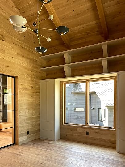
It’s now done and looking awesome. When Katie first sent us photos with everything taped up we were again unsure. The painter’s paper was green and it kinda made it all look muddy and green. But I was in the middle of a four-hour meeting and there was no way to go over and look, and the painter was leaving the next day for a week so we just had to call it. We said let’s go for the second coat and I popped by the next day to see it and thank god we loved it. It’s warm and still contrasts with the wood, but in a quiet way that doesn’t get a lot of attention. I think don’t have a lot of experience in the taupe/beige world so I was teaching my eye. SO happy and excited to be even closer to the finish line. xx
Opening Photo Credit: Photo by Kailtin Green
The post A Design Pivot – We Paneled And Repainted A River House Room Two Weeks Before Move-In (…And How I Feel About It) appeared first on Emily Henderson.
June 5, 2024
The Official Boomer Dad Father’s Day Gift Guide! 17 Gift Ideas Jess’ Dad Swears By

Hello everyone, I’ll be damned, I made another Father’s Day. I hope your Father made another one as well. I live about the same distance from both of my kids (about 400 miles). It’s a good distance because it’s a short flight in an emergency and drivable when time is not a factor…but it’s not an everyday drive. Perfect! I have lived as far away as Paris and New York City. Loved those cities but something inside of me said I was too far. I can only think it was my fatherhood duties that were gnawing at me. I guess it’s a lifetime deal even when your kids are adults. Geez, I was really hoping it would be over with at some point. I guess not (Drat!).

I installed this little infant seat on my kitchen table. I have a family staying at my place while I am traveling and they have three kids, one of which is a baby. I have the baby seat because of my girlfriend’s granddaughter. When I sat at the table next to it I was flooded with memories of my son sitting in that seat at our dinner table (30 years ago) and me discussing life with him. It was a one-way conversation, as he wasn’t talking yet, but that didn’t stop me. It was a very good memory of something that I had long forgotten. Today, my son is happily married. His recent wedding had a Harry Potter theme that you can get a glimpse of in the first photo. I’m not a Harry Potter guy so wasn’t quite sure how it was going to turn out. Well, let me tell you something. I have never had more fun at a wedding. Me, in my robe and wizard’s hat. Ha! Don’t I just love/hate learning something new from my kids. On that note let’s see if I can come up with some not-so-ordinary gift ideas for you.

Rechargeable Mini Flashlight Keychain
This past year I have been carrying around a mini flashlight that stays on my keychain. I cannot tell you how many times I have needed it. It’s called the OLIGHT IMINI 2 and can be purchased at Amazon. It is rechargeable and bright as can be. It sits in a little magnetic holder connected to your key chain so you can just pull it off off its holder anytime. Just plain slick! (Or sick, depending on your age, ha).


Truck Cargo Grabber Reach Retriever Tool
Something else I discovered this year was a truck bed grabber. If your dad or partner has a pickup truck he’ll love this. It is basically a hook that extends from 29” to 74” to grab cargo that has slid to the front of your truck bed. No more climbing into your truck to get crap out. When you’re an old man nothing is better than not having to climb anything. I will never own a house that has anything but one level ever again.
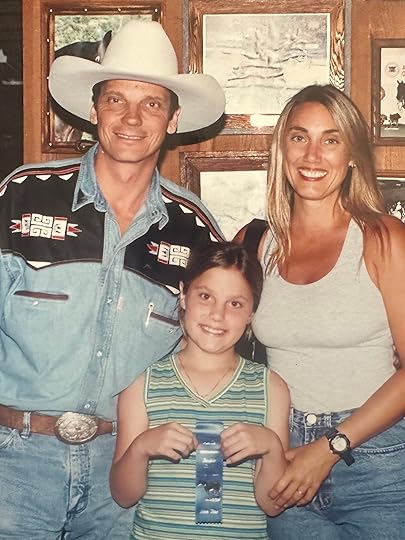

 i guess we were kinda a cowboy family (Jess won a horseback riding award and that was my son’s birthday party outfit. Both were cuter then!)


6x Midnight Cowboy Hat | Stanhope 10x Straw Cowboy Hat | Shasta 10x Premier Cowboy Hat
In my youth, I did some cowboying for a while. I have since retired my cowboy gear. Last week I decided to break out the cowboy hat for a special occasion. I forgot how much I liked wearing that hat. Every man in this country has at one time or another wanted to be a cowboy. Buying your dad a cowboy hat would not disappoint him. A good Stetson or Resistol hat are the only hats worthy of your dad. Straw hats are for summer. Beaver hats are for year-round. I swear I’m almost good-looking in a cowboy hat. I need all the help I can get (getting old is a full-time job). You can also do cowboy boots but that would have to be a gift certificate. “A man has to buy his own damn boots.” (a quote from the man that taught me how to rope upon seeing that my wife brought me a pair of boots).


I bought my girlfriend a 1964 Volkswagen Bug for her birthday. It was missing a lug wrench so I went to replace it and found a folding lug wrench. It was perfect because it doesn’t take up much space which is at a premium in a Bug. But, it is great for any vehicle. We never have enough space. That’s why there are cargo shorts. Yikes! As a kid, I had marbles, baseball cards, a rock or two, and maybe even a frog in my pocket. I am absolutely positive a man invented cargo shorts. Never enough space to put all our stuff!

360-degree Locking Die Cast Torpedo Level
I found some new tools to help me work on Jess’s apartment (geez). There is a level that can adjust to any angle. It comes in real handy when you are trying to duplicate an angle. It is the Milwaukee 360-degree locking die cast torpedo level. Works great in an old apartment building that is leaning one way or the other. Just ask Jess.

1 Gal. 1/2 HP Portable Electric Air Compressor
I also found a small compact compressor made by Senco. It is a 1/2 horsepower 1-gallon compressor. It is small and easy to transport. I have yet to find a job it couldn’t handle around here.

One other item in the tool department is the Telesteps Extension Ladder. It extends to 16 feet but telescopes down to just a few feet for easy storage and handling. It makes my life easier.

Like I have said in the past, if it makes my life easier or makes me look better, I’m in. When it comes to looking better there is a teeth whitening gadget that you can use at home. It’s made by Pola and is easy to use. You do need a dentist to prescribe it but it’s worth it. Dads don’t like to admit it but we hate getting old and have no problem being a little vain at times.

I am the proud owner of “The Green Egg” grill. Never had one before. It was a gift and I was skeptical. But after some practice, I must admit it is a great way to grill. Who knew? I got the baby one, it’s enough I do have my regular grill when I am in a hurry but when I have time I go to “The Egg”.


Sport Peppers | Hot and Mild Giardiniera
Growing up in Chicago you could always get a Chicago hot dog or an Italian beef sandwich. It was a quick and easy solution to hunger. Two of the main ingredients were sport peppers (for the dog) and giardiniera (for the beef). The peppers are a little bit hot, the giardiniera comes in mild and hot. What I have found is that I can use these ingredients for many of my meals. A little imagination never hurt any meal. If your dad is into food that is not boring, it’s a slam dunk. They are made by Marconi or Mezzetta. You can also find them on the “Tastes of Chicago” website.

6 in. 12V Lithium-Ion Brushless Electric Cordless Battery Pruning Saw
For the gardener dad, Milwaukee makes a 6-inch chain/pruning saw. It’s cordless and lightweight. Come in real handy around the yard, and again, makes my life easier.

Rechargeable Magnifying Glass with Light
As does my lighted magnifying glass and is relatively inexpensive.
 kinda studly, right?
Also, I seem to remember mentioning pocket squares in one of my posts. I neglected to add a pocket square pin. I always hated when my pocket square would fall into my breast pocket. It would damage my fashion statement immensely. My solution was using a single earring that I would steal from my mate. Most women have single earrings that just lay on the dresser in a jewelry dish or something. I figured I might as well put it to use. I punch it through the seam just below the top of the pocket and through the pocket square. Works great and looks great (another one of my protocols). Of course, I prefer diamond or pearl studs. Always get a compliment on it. What nicer gift to your dad than to give him one of your personal possessions that he will use? He’ll treat it like the Hope Diamond!


Neck Massager with Heat | Osteo Cervical Pillow
Finally, I discovered an item by trial and error recently. I have been plagued by some severe neck pain recently. I cannot figure it out. Bad pillow, bad sleeping position, old age, or even arthritis. All I know is that I wake up with excruciating neck pain. It seems to be muscular but it has been interfering with my everyday activities and my sleep. My girlfriend bought a memory foam pillow for me. It helped to some degree. It took a while getting used to it but it helped. I then tried a litany of neck massagers. Finally, the Hotodeal Mini Kneading neck massager actually helps in the morning. The foam pillow at night and the neck massager in the morning. Almost back to normal. Yikes! The neck massager is nice for any dad. We do have aches and pains, you know.
 on our way back from the lumbar yard because my kids work me like a dog
Every gift I ever mention in these posts I own. When I am finished writing these I usually am in a very grateful place. I used to think it was because I had all this “stuff”. I have come to realize that the “stuff” doesn’t mean a damn thing. I am grateful because this post reminds me that being a father was/is my best job ever. Judging by my kids I am pretty good at it. It was easier with the help of their mother but I’m doing ok. I will be at my son’s place next month to get his house ready for his first child (my first granddaughter). Both my kids think I work on their houses because that’s what a dad does. That may be true but the real reason is that I get to see them and spend time with them. Don’t lose sight of that. Time is always the best gift. No doubt my son and I will tire of each other as do Jess and I. That’s ok and normal. We all still have our own lives. But I will tell you that when push comes to shove this family is one! No matter what happens, we have that. I wish the same for all of you.
Have a great Father’s Day,
Jess’s Dad
Editor’s Note: Les Bunge loves pretending that my brother and I don’t know that we are the luckiest people on the planet to get to have him as our dad. I’m sure it’s clear that he’s one of a kind and no amount of words could ever fully describe our love and his impact on us. Believe his gift ideas, don’t believe his nonsense:) Oh, and he loves reading the comments (I think that’s why he keeps agreeing to these posts lol) so know that he’s seeing them! H+S, Bungo<3
Opening Image Credit: Photo by Molly Piszczek
The post The Official Boomer Dad Father’s Day Gift Guide! 17 Gift Ideas Jess’ Dad Swears By appeared first on Emily Henderson.
June 4, 2024
11 Aesthetically Appealing Toilets That Won’t Break The Bank (Including One Pretty Enough For Jess’ Home)

About six-ish months ago, I broke the news that my extremely cool but extremely old toilet was on her last flush so to speak. It feels odd to say that I loved a toilet, but I did. Because of that, I waited as long as I could to replace her, despite the daily threat that any day could be her last…potentially causing a likely pretty gross disaster. So before we get into my official choice and the 10 other really great affordable options I considered, here she was below in all of her glory. Wish I had better pics!


Now, if I had endless money I would have replaced her with another vintage toilet (but I don’t, UGH, and I have to frequently remind myself that this is a rental:)). I originally found a beautifully restored option on eBay but understandably my landlord wanted me to go more into the “nice but affordable” route and affordable that one was not. So while I know I won’t live in this apartment forever and I really shouldn’t care so much, I was determined to find one that would fit my landlord’s budget as well as the style of the bathroom (as a reminder, my building is a 100+ year old gal).
 design by emily henderson and arciform | photo by kaitlin green | from: farmhouse gues bathroom reveal
I adore all of the Kohler toilets in the farmhouse. Most of them have the “Kathryn” but in the guest bath (as shown above), they have the “Memoirs Stately” One Piece (both with pretty Rejuvenation hardware). Those were also out of budget but then a reader recommended the Memoirs Stately TWO piece and it was a total jackpot moment! I got it landlord-approved, purchased it, and was able to have it installed while we were on our retreat in Mexico. Perfect timing and something to make me come back home:) Wanna see?!
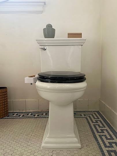

Toilet (White) | Toliet Seat
A BEAUTY! Please ignore the bidet, it’s coming off soon. Aside from that, it has the perfect amount of detailing, looks very special, and I really love the flattop tank for styling purposes (ignore the lack of current styling). My last one had a curved-ish top tank (likely not the official term) which made putting anything on top a hazard. Oh, and it flushes like a dream which is also something I couldn’t say for my last gal! So while the one-piece that Em has would have been much easier to clean since it’s skirted and has fewer nooks and crannies on the sides, the two-piece is about half the price. The black toilet seat is from Amazon and I really love the two-tone look. I think it gives it instant personality and a bit more of a vintage look. I chose the round bowl versus the elongated version because that’s what was there before but it also comes in an elongated bowl too. Thank you to the reader who suggested it!! And for those of you who remember that I wanted to save the vintage lever, apparently, it couldn’t be used on this tank. I’ll be on the hunt for one that will though:)
But as you can imagine I did a decent amount of online research before I landed on this one (and got my wonderful landlord’s approval). This beaut was still a little over $500 and that was without the seat since I had one already. So here are 10 very pretty traditional/vintage-inspired toilets that range from $199 to just over $500.
Miseno Santi Two-Piece High-Efficiency Toilet With Elongated Chair Height Bowl – $264
A very similar vibe to the one I got but at a much lower price! It is currently on sale so not sure how long this price will last so if you love I might not wait too long. It’s also a high-efficiency toilet, meaning it uses 20% less water than a standard toilet and its height is ADA-compliant! Oh, and the seat cover is included:)
KOHLER Elliston Elongated Chair Height 2-Piece – $199
Here we have a super cute Kohler toilet but at an even better price! This price also includes everything you’ll need (at least that’s what the description on the site says:)) The reviews are great, it’s also water efficient but has what Kohler calls a Revolution 360® flushing technology that generates a forceful swirling option to keep the bowl clean longer. I am a fan of anything that keeps me from having to clean my toilet any more than I have to. As for the design, it’s simple but still has enough detail to make it feel special. And while this one comes with a soft close lid, you could always swap out the lid for a black one and/or replace the lever to make it look more custom!
Voltaire Dual-Flush Elongated One-Piece Toilet – $289
Out of all of the toilets on this list, this one would be the easiest to clean I think. It’s a one-piece, fully skirted toilet, that has clean lines (aka fewer nooks and crannies) that still make it feel more traditional than modern. It also has a dual flush which I love but if you prefer to have your flusher on the top of the tank, that’s an option (I just like the flexibility of styling the top of the tank which would be hard if that’s where the flusher was). The seat (which is soft close) is also included!
Chevington Round Chair Height Two-Piece Toilet – $274
Now we’re getting into the real vintage-inspired ones! How sweet is this little guy?? I heavily considered this one because not only did I love the ribbing detail on the base and the tank lid, but it was also a round bowl which wasn’t as easy to find in the styles I liked. If I had picked this one I would have absolutely changed out the lever to make it feel more vintage. Take a look at some of the review photos, it looks great. So while I did really love this one, something about knowing how good Kohler toilets are (since I have a lot of experience with them) made me choose otherwise. Oh, FYI this one doesn’t come with a wax ring but it does come with a seat.
KOHLER Highline Arc 2-Piece Round Toilet – $199
Speaking of Kohler again, here’s another great option that really toes the line between modern and traditional! I think the curve of the tank could be so fun in a more vintage bathroom. What’s great about this one, aside from the price, is that there are two bowl shape options AND two rough-in sizes. It also comes with everything you need and is water efficient too!
Champion Two-Piece Round Chair Height Toilet With Slow-Close Seat – $229

I don’t know what it is about this one but I am into it! It’s a little chunky which I dig while those two “trims” on the base make it feel slightly more refined. This is also a super versatile piece that could work in a vintage or modern bathroom easily. This toilet is not only water-efficient but also has a self-cleaning power wash to prevent against stains??? Not sure if that means every flush will be blue like the photo on the site, but again, I really love the thought that went into not having to clean so much! They tout that the seat is very sturdy which is honestly great because what’s worse than sitting on a toilet and the lid shifting to one side? This toilet also comes with everything you need:) Home Depot really hooks it up in the toilet department!
I’m going to be honest, the next few are all going to be in the same world design-wise as the one I ended up getting but, of course, are all a little different and are at different price points.
Lexington 2-Piece Elongated Toilet – $338
I’m sure you can tell what I love about this one but what’s extra special design-wise is that cute lever. It’s got all the great things I’ve been talking about like water efficiency, a soft close seat, and great design. Oh, and of course that price is pretty great:)
Key West Two-Piece Elongated Toilet – $399

For this one, I really like the look of the tank lid. It’s a little more rounded than the others which feels a little more vintage to me. It doesn’t come with a full install kit so you need to make sure you order what you need and I’m not 100% sure which lever it comes with, I’m assuming the one on the left. But of course that can easily be changed. Now, this toilet has what they call “EcoClean” which is a rimless bowl that uses a powerful, horizontal-swirling flush to thoroughly rinse itself after each use, lessening waste buildup to make cleaning more efficient. A fan!
Town Square S 2-Piece Elongated Toilet (Seat Not Included) – $417

The double lip! So sweet. This toilet is a little more expensive but the design is great and it has an “EverClean surface” which they say inhibits the growth of stain and odor-causing bacteria, mold, and mildew on the surface. Another feature that I feel would be worth it is the “PowerWash rim” that scrubs the bowl with each flush. So while you have to buy a seat separately, it’s a water-efficient toilet:)
KOHLER Tresham 2-Piece 1.28 GPF Single Flush Elongated Toilet (Seat Not Included) – $524
Naturally, I had to end on the most expensive. I also love love this toilet and it was another top contender. I do want to reiterate that this is not even a little sponsored by Kohler. I purchased the toilet I got and my landlord reimbursed me. I just love them apparently, ha. But back to this toilet. The detail on the tank feels fun and unique. I guess the design is shaker-inspired so no wonder I’m a fan. Oh, and that handle is my favorite. The flush is apparently great too and you bet it’s water-efficient! But sorry, the seat is sold separately:/
Well, that’s it! I’m so happy with my choice and if you are in the market for a great-looking but affordable toilet, I really hope this post was helpful. If any of you have these toilets, let us know in the comments!
Love you, mean it.
Opening Image Credits: Design by Emily Henderson and ARCIFORM | Photo by Kaitlin Green | From: Our Guest Bathroom Reveal – A Jewel Box That Makes Me So Darn Happy
The post 11 Aesthetically Appealing Toilets That Won’t Break The Bank (Including One Pretty Enough For Jess’ Home) appeared first on Emily Henderson.
June 3, 2024
Wait, What Are You Doing To Your Barn? The Kids Clubhouse/Art Barn/Flex Progress And The Plan For The Space
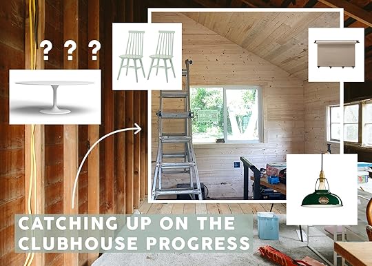
OKAY DOKAY. If you are following on social you might have seen that we are quickly turning 1/2 of the barn into a summer kids’ “clubhouse” (you know, like a treehouse but on the ground surrounded by farm animals). Our kids aren’t really in camps anymore (outside of a few) and we have a great property for lots of neighborhood kids to come over all summer and play. But since Gretchen and I still work from here many of the days they can’t really be running around our house making noise. We always knew that an outbuilding would be where we would eventually work, but the other outbuildings are full six-figure renovations and the barn is a fun/fast fix. So we are tackling it first in hopes of creating some distance between us and our nutty neighborhood kid gang. Elliot had the wise comment, she said “Wait, since you are only two and there are so many kids why don’t you work out here and all us kids get the big house?” and I was like, “Uh…er…” So while we are calling it the “clubhouse,” there is a 30% chance that this will be where I work when kids are over if they aren’t playing outside and an 80% chance that we will work out there in the fall when the kids get home from school. All I know is that it was an empty space that didn’t need a ton of work to make it super functional, so I’m designing it to be a kids clubhouse this summer and flex space long term.

I attempted the clubhouse last year (thus the posters and the crafting stuff) but without electrical and with all the spiders, understandably the kids treated it like a garbage fort (which is fine, but they really could use a place to do crafts and listen to loud music). Our contractor quoted us $5-$10K to add insulation, make the window bigger, add paneling, lots of outlets, add some pendants, and redo the flooring.

It’s pretty dang cute and has a lot of potential. I am being VERY un-precious about how we are doing it mostly to save time and money because we have bigger fish to fry. If Brian were handy or if I had the time we would TOTALLY do this ourselves, but my days are so full as-is, and adding this to my DIY plate would be actually absurd.
I should point out that there is a huge second half of the barn that is big enough for all our feed, hay, and where the animals sleep. It’s one of the reasons we went so basic, rustic, and cheap in here is because if we decide to make it more of an actual working farm then this would be a barn again. That’s why we didn’t want to put up drywall or lay down new flooring.
 Update! And Where We Are Now
Ok, we had a carpenter add insulation and clad the walls with basic pine paneling we bought from Home Depot and Lowes (1x6x10). It cost about $2k in materials. This photo was taken yesterday and I’m just now noticing the framing around the windows which I might have them change to be mitered edges, but overall I’m loving how it looks (think Scandi mountain houses full of all pine and that’s kinda it).


OOH I’m getting SO EXCITED. In the back there I want to do a big craft/work table with some basic benches that we are hacking to fit. Then maybe an articulating sconce and some cute chairs.

We also want a seating area (the kids are obsessed with jamming to AJR, Imagine Dragons, and Olivia Rodrigo) and you know what there won’t be out here? SCREENS OF ANY KIND (except MP3 players for podcasts and music selection). We are STRUGGLING with the whole YouTube and video game obsession (which we feel like we don’t do a lot of, but my god it’s a daily battle that we are not going to engage in this summer). Hell, I might even get them a CD player so they can play all our old Death Cab For Cutie and Modest Mouse CDs. Maybe we’ll have a mini fridge so they don’t bug us for snacks/drinks so much. The plan is that they have to be either outside or in the clubhouse from 9 am-12 pm (when we take most of our calls) and then they can come in to make their own lunch and then back out.

Now I haven’t fully flushed out the design plan (it hasn’t been a huge priority TBH) but here are a few things I’m loving that feel both kid-friendly and cute for us if we work out there. Nothing will be too permanently installed because every space in my entire life has to be a possible shoot space as well, and who knows, we might have a client who wants us to turn this barn into a bathroom with a big tub or a winter wonderland for the holidays:)


More to come soon. And yes it is rustic with lots of seams and knots. This is intentional because it is still a barn (and we didn’t want to spend the dough on clear pine). I think once it’s all done (and the floors are sanded and restained) it’s going to be so pretty, simple, and fun for kids (and basic enough for us to transform in the fall).

Thanks to Ken and JP for helping manage this tiny project while they are so busy doing other projects (like, say, the River House). And no, they typically don’t do this small of scale, but if you have a whole house renovation in Portland I can definitely recommend Sierra Custom Construction (and ARCIFORM obviously for more restoration jobs).
The post Wait, What Are You Doing To Your Barn? The Kids Clubhouse/Art Barn/Flex Progress And The Plan For The Space appeared first on Emily Henderson.
June 2, 2024
The Link Up: The Henderson Family TV Show/Crush, Jess’s All-Time Favorite Jean Shorts, And A GREAT Linen Pant

Happy Sunday and happy June! It’s never not a shock when we hit the half-year point but here we are and boy, are we ready for that consistent warm weather. LA’s had a big ole does of May Gray so the LA gals are hoping for minimal to zero June Gloom. But enough about the weather because we were just very spoiled and spent the most incredible week in Mexico (here’s the recap post in case you missed it!). Ok, here are this week’s links!
This week’s house tour is the home of one of our favorite design writers and editors, Kelly Dawson. Born with cerebral palsy, she needed to make sure her home was truly accessible, fit to her needs, but of course still beautiful. Let’s just say she nailed it. Go check it out here!
From Emily: Our Collective Family Crush. I feel a real duty to share the best family stuff that our entire family loves because we are all just so desperate to have a shared fun experience together without fighting over what to watch. Enter Justin Willman. I ran into Justin over the weekend and after fawning over him in hopefully a nonannoying way (his wife is an interior designer and I knew he follows so I was rather emboldened), my friend was like “Wait, who’s that?” and I was like, “NICOLE, HOW HAVE YOU NOT WATCHED MAGIC FOR HUMANS WITH YOUR KIDS YET???” So that night we watched a couple, catching their whole family up and everyone just LOVED IT because it’s one of the most entertaining, wholesome, delightful family shows ever made. During lockdown we actually bought tickets for two Zoom magic shows that he did and still blew us away (via Zoom, so truly magical and I have no idea how he guessed what he guessed). That’s all to say that A. If you haven’t seen the three seasons of Magic For Humans you are about to be delighted and entertained (it is mostly kid-friendly but one episode talks about the potential nonexistence of Santa Claus so…). After that, check out The Magic Prank Show (Netflix). Then if you are as big of a fan as we are, be sure to catch his tour (we just bought Portland tickets for October, that’s how excited we are). Tickets are here!
From Gretchen: I have been using the same janky pair of tweezers from some stocking stuffer cosmetic kit for YEARS, and tbh they’re just no good. At all. Like the last few times I used them was so infuriating, I just left the house with my whiskers instead. So I finally decided to pull the plug–pun intended–and buy the fancy tweezers. And DANGIT I should’ve spent the $15 forever ago because WHAT A DIFFERENCE THEY MAKE. These actually grip and rip the way I need them to. So now I can leave the house hairless and happy.
From Arlyn: By far the best toy I’ve gotten my two-year-old in the last year has been her Toniebox. I had heard so many good things about it but I wasn’t sure if she was going to interact with it as I hoped because…kids, and…you know. They always throw you for a loop. But it’s the best thing in our living room by far! You do have to buy the Tonie character toppers separately (we have 12 now because we’re addicted) but she just goes, turns it on herself, grabs whichever character she wants to play (both music and books and even some exercise ones!) and listens while she plays happily with her other toys. If you’re looking for screen-free entertainment, buy one immediately. You’ll all love it!
From Mallory: I’ve always loved these little mini Staub cocottes but I finally added them to cart last week because they’re on SALE right now. Imagine making mini apple pies in these this summer!! That’s what I’ll be doing (I bought them in yellow). They would also make an excellent gift!!
From Caitlin: Urgent: I need to share the lightweight, throw-on-and-go cotton/linen pants I’ve been wearing non-stop for the past few weeks. (Seriously – I’ve put them to the test. Horseback riding, multiple cross-country flights, pool days, nights at the bar, brunch with the gals…they can do it all.) I’ve always struggled to find wide legs that actually looked, you know, WIDE LEGGED on my larger thighs and these do the trick perfectly. I love the casual drape (they’re breezy, but not in the crumpled, messy way) and the pockets are ultra-functional. They hold up great to the washer and dryer, too – no fading or shrinking. I’ve been making a conscientious effort to build a more cohesive, easy-to-mix-and-match wardrobe filled with natural fibers (I want everything in my house to decompose one day when I’m gone, including my clothes!), and these check every box. It doesn’t hurt that I’ve gotten a ton of compliments while wearing them, either – even my mom pulled out her phone and asked me to help her find them online so she could order a pair: They come 7 colors, from XXS to XXL, and in regular, tall, and petite lengths – join the club!!! They’re sublime.
From Jess: While now I’m very tempted to try some of the jean shorts Em just posted about last week (THESE ESPECIALLY!), I thought I would throw my favorites into the ring. These Agolde shorts are my favorite jean shorts I’ve ever owned. That is saying A LOT because I’ve always had a fraught relationship with shorts in general. But with the glorious invention of Megababe’s Thigh Rescue (I can’t believe baby powder was ever a thing, WHY?!), I have been able to comfortably wear them. But back to these jean shorts! They are cool, a little slouchy, have my ideal amount of distress, and are midrise. Even when I needed to go up a couple of sizes this year, the bigger size still looked and made me feel great. I can’t say that for any of the others I’ve tried on recently. Quite the opposite feeling actually. So while these are a little splurgy, I live in them when it’s hot so to me they are so so worth it.
Also From Jess: Do yourself a favor and go see the movie Babes! Michelle Buteau and Ilana Glazer are incredible together. It’s hilarious (as they are comedy geniuses), so heartfelt, and I really love the way it was shot. It felt visually nostalgic, like a 90s rom-com in a way. Both my friend and I said we would happily see it again in theatres which isn’t something I say very often if ever? Anyway, go have a great time at the movies and it’s simply a bonus that you’ll be supporting beautiful female stories:)
Thanks for reading and see y’all tomorrow! xx
Opening Image Credits: Design by Isabelle Dahlin | Photo by Kaitlin Green | From: Our Team Retreat In Mexico: A Tour Of The Home Designed By A Designer/Friend
The post The Link Up: The Henderson Family TV Show/Crush, Jess’s All-Time Favorite Jean Shorts, And A GREAT Linen Pant appeared first on Emily Henderson.
The Link Up: The Henderson’s Family Crush, Jess’s All-Time Favorite Jean Shorts, And A GREAT Linen Pant
Happy Sunday and happy June! It’s never not a shock when we hit the half-year point but here we are and boy, are we ready for that consistent warm weather. LA’s had a big ole does of May Gray so the LA gals are hoping for minimal to zero June Gloom. But enough about the weather because we were just very spoiled and spent the most incredible week in Mexico (here’s the recap post in case you missed it!). Ok, here are this week’s links!
This week’s house tour is the home of one of our favorite design writers and editors, Kelly Dawson. Born with cerebral palsy, she needed to make sure her home was truly accessible, fit to her needs, but of course still beautiful. Let’s just say she nailed it. Go check it out here!
From Emily: Our Collective Family Crush. I feel a real duty to share the best family stuff that our entire family loves because we are all just so desperate to have a shared fun experience together without fighting over what to watch. Enter Justin Willman. I ran into Justin over the weekend and after fawning over him in hopefully a nonannoying way (his wife is an interior designer and I knew he follows so I was rather emboldened), my friend was like “Wait, who’s that?” and I was like, “NICOLE, HOW HAVE YOU NOT WATCHED MAGIC FOR HUMANS WITH YOUR KIDS YET???” So that night we watched a couple, catching their whole family up and everyone just LOVED IT because it’s one of the most entertaining, wholesome, delightful family shows ever made. During lockdown we actually bought tickets for two Zoom magic shows that he did and still blew us away (via Zoom, so truly magical and I have no idea how he guessed what he guessed). That’s all to say that A. If you haven’t seen the three seasons of Magic For Humans you are about to be delighted and entertained (it is mostly kid-friendly but one episode talks about the potential nonexistence of Santa Claus so…). After that, check out The Magic Prank Show (Netflix). Then if you are as big of a fan as we are, be sure to catch his tour (we just bought Portland tickets for October, that’s how excited we are). Tickets are here!
From Gretchen: I have been using the same janky pair of tweezers from some stocking stuffer cosmetic kit for YEARS, and tbh they’re just no good. At all. Like the last few times I used them was so infuriating, I just left the house with my whiskers instead. So I finally decided to pull the plug–pun intended–and buy the fancy tweezers. And DANGIT I should’ve spent the $15 forever ago because WHAT A DIFFERENCE THEY MAKE. These actually grip and rip the way I need them to. So now I can leave the house hairless and happy.
From Arlyn: By far the best toy I’ve gotten my two-year-old in the last year has been her Toniebox. I had heard so many good things about it but I wasn’t sure if she was going to interact with it as I hoped because…kids, and…you know. They always throw you for a loop. But it’s the best thing in our living room by far! You do have to buy the Tonie character toppers separately (we have 12 now because we’re addicted) but she just goes, turns it on herself, grabs whichever character she wants to play (both music and books and even some exercise ones!) and listens while she plays happily with her other toys. If you’re looking for screen-free entertainment, buy one immediately. You’ll all love it!
From Mallory: I’ve always loved these little mini Staub cocottes but I finally added them to cart last week because they’re on SALE right now. Imagine making mini apple pies in these this summer!! That’s what I’ll be doing (I bought them in yellow). They would also make an excellent gift!!
From Caitlin: Urgent: I need to share the lightweight, throw-on-and-go cotton/linen pants I’ve been wearing non-stop for the past few weeks. (Seriously – I’ve put them to the test. Horseback riding, multiple cross-country flights, pool days, nights at the bar, brunch with the gals…they can do it all.) I’ve always struggled to find wide legs that actually looked, you know, WIDE LEGGED on my larger thighs and these do the trick perfectly. I love the casual drape (they’re breezy, but not in the crumpled, messy way) and the pockets are ultra-functional. They hold up great to the washer and dryer, too – no fading or shrinking. I’ve been making a conscientious effort to build a more cohesive, easy-to-mix-and-match wardrobe filled with natural fibers (I want everything in my house to decompose one day when I’m gone, including my clothes!), and these check every box. It doesn’t hurt that I’ve gotten a ton of compliments while wearing them, either – even my mom pulled out her phone and asked me to help her find them online so she could order a pair: They come 7 colors, from XXS to XXL, and in regular, tall, and petite lengths – join the club!!! They’re sublime.
From Jess: While now I’m very tempted to try some of the jean shorts Em just posted about last week (THESE ESPECIALLY!), I thought I would throw my favorites into the ring. These Agolde shorts are my favorite jean shorts I’ve ever owned. That is saying A LOT because I’ve always had a fraught relationship with shorts in general. But with the glorious invention of Megababe’s Thigh Rescue (I can’t believe baby powder was ever a thing, WHY?!), I have been able to comfortably wear them. But back to these jean shorts! They are cool, a little slouchy, have my ideal amount of distress, and are midrise. Even when I needed to go up a couple of sizes this year, the bigger size still looked and made me feel great. I can’t say that for any of the others I’ve tried on recently. Quite the opposite feeling actually. So while these are a little splurgy, I live in them when it’s hot so to me they are so so worth it.
Also From Jess: Do yourself a favor and go see the movie Babes! Michelle Buteau and Ilana Glazer are incredible together. It’s hilarious (as they are comedy geniuses), so heartfelt, and I really love the way it was shot. It felt visually nostalgic, like a 90s rom-com in a way. Both my friend and I said we would happily see it again in theatres which isn’t something I say very often if ever? Anyway, go have a great time at the movies and it’s simply a bonus that you’ll be supporting beautiful female stories:)
Thanks for reading and see y’all tomorrow! xx
Opening Image Credits: Design by Isabelle Dahlin | Photo by Kaitlin Green | From: Our Team Retreat In Mexico: A Tour Of The Home Designed By A Designer/Friend
The post The Link Up: The Henderson’s Family Crush, Jess’s All-Time Favorite Jean Shorts, And A GREAT Linen Pant appeared first on Emily Henderson.
Emily Henderson's Blog

- Emily Henderson's profile
- 10 followers

