
Emily Henderson's Blog, page 45
July 31, 2024
What Color Should You Paint House? Thoughts And Feelings On Exterior Paint Color
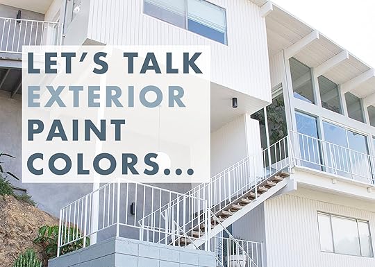
There are fun design decisions (tile color! stone selection! lighting!) and stressful design decisions (tile grout, trim paint, window design), and choosing the right paint color for your exterior falls into “stressful” for me. It’s usually extremely expensive ($10K-$30K+) and you don’t want to have to redo it for decades. It can drastically change your experience driving up to your house and certainly will affect curb appeal and resale (I know we shouldn’t think about resale value all the time but y’all, very few people will buy a lime green house). And yet, doing something too safe can be such a missed opportunity. Portland is FULL of colorful vintage houses which adds so much quirk and charm to a neighborhood. But when do you take a color risk? And when do you go safe? I thought I’d show you the exterior of our houses first so you can get a sense of where my mind is at, and while I’m NOT an expert, I do have experience, thoughts, and feelings.
Glendale House – Before/After – 1950s photo by sara ligorria-tramp | from: our home exterior renovation
White Paint: Calm by Benjamin Moore | Gray Paint: Boothbay Gray by Benjamin Moore
I’m a bit risk-averse when it comes to permanent decisions (which I’m not proud of all the time, actually) which can feel a bit boring in this age of color and pattern. But I’m still so glad that we painted this house a crisp but not too cold white, with the blue/gray and black accents. It was in sunny California, it was TALL (so a darker color could have looked really intense/overwhelming), and it was mid-century so I wasn’t going to mix like 3 colors. It was also west-facing (so any color would have looked FAR more intense when the sun was on it, which it was all the time) and this white felt fresh and very much matched the interior style. There was no setback in this house either – it was on the street so a bolder color could have been a real risky choice for the whole neighborhood. We plastered some of the walls to add some variation, depth, and texture. As you can see we cladded the majority of the house and painted the big stacked cinder blocks. I certainly didn’t want a traditional color (a muted neutral) and while I could have gone with a pretty blue or green, this white felt right and we were super happy with it.
Los Feliz House – 1921 Tudor photo by sara ligorria-tramp | from: my secret front yard is finally revealed
Blue Trim Paint Color: Down Pipe by Farrow & Ball
 left: photo by sara ligorria-tramp | from: my secret front yard is finally revealed
 left: photo by tessa neustadt | from: los feliz patio reveal
 left: photo by sara ligorria-tramp
This house had the original exterior finish (I think a type of stucco?) where the color is mixed into the material and painting it just felt so wrong. So we left the finish and just played with the trim and window frame colors. I really loved how these colors played off each other and made it feel more “me” but what I do regret doing is painting the garage doors the white. Now I don’t remember if they just came white or if we painted them (I feel like I’m like Dory these days – I remember NOTHING unless it’s important), but I think the white got too much attention and the darker blue of the trim would have blended nicer. We chose the gray blue and cream to work with the tones of the plaster and it all felt so appropriate, vintage, and pretty.
The Mountain House – 1970s A-Frame left: photo by sara ligorria-tramp | from: i’ve had my new invisible smart locks for 4 months – here’s an honest review
This house was another sad neutral that needed a point of view. It was a really gray sage which is starting to convince me that medium-toned colors might not be my favorite – that either light neutral, dark neutral, or a color might be more my preference.
 left from: mountain house monday: the exterior update and plan (or lack thereof)
We chose Laurel Woods by Sherwin-Williams and it’s PERFECT. I love this color. It can look really dark at night, but still pretty happy during the day.
 left: photo by sara ligorria-tramp | from: mountain house upper deck reveal
Green Exterior Paint: Laurel Woods by Sherwin-Williams | Door and Back Deck Paint: Tricorn Black by Sherwin-Williams | Front Deck and Exterior Brick (not shown): Iron Ore by Sherwin-Williams
For this house, we did need to get the color approved by the HOA and I guess green isn’t typically on their list (which seems totally weird since it’s a mountain town and full of trees). But we got this one approved. We chose green because I wanted something dark and moody up here, but wanted it to blend into the surroundings, not pop out. It’s surrounded by trees and it’s meant to feel like a modern cabin so a dark green (but not too dark) felt perfect. I still love this color and think it was the right choice (especially with the almost black trim).
The Farmhouse – 1910 left: photo by kaitlin green | from: farmhouse front porch reveal
 photos by kaitlin green | right from: a farmhouse exterior update | left from: our farmhouse back porch reveal – the “1st summer” edition!
Exterior Paint: Pure White by Sherwin-Williams | Old Gray Trim Paint: Online by Sherwin-Williams | Blue Deck Doors Paint: Smoky Blue by Sherwin-Williams
I really struggled with this because Brian was SET on white and I was in the middle of such decision fatigue and self-doubt that I was like “ok, white it is”. Of course, there are a million whites to choose from so I still had to pick a color (we went with Pure White which we love, but it is PURE white so know that it’s bright). Now that all the landscaping has grown in with so much green, pink, and darker tones I’m so happy that it’s white – it feels really appropriate for a farmhouse and very classic.
I took these two iPhone shots recently, now realizing we need to get some new professional photos of the exterior, but you can see how the landscaping pops and it looks really really pretty, IMHO. 
View this post on InstagramA post shared by The Fig House (@thefighouse)
10 years ago I designed – an event space in Los Angeles and we painted it Hague Blue (by Farrow & Ball). It’s still one of my favorite colors. As you can see at night it’s one color and below, during the day it’s far more bright/saturated.
View this post on InstagramA post shared by The Fig House (@thefighouse)
We loved the brightness and I think a lot of people wanted that for their wedding photos, but it’s a good example of how more pigmented colors change in the light.
And now for a few things to think about (that I thought about when we were deciding)…
What Region Do You Live In And What Vibe Is Your Neighborhood?Obviously, Arizona is going to be more neutral, warm, and desert-y (and I would think you wouldn’t paint your house black since it’s so hot there), but then you look at Palm Springs and there are tons of pastels! Another example is that it could be kinda of weird to have a brown house in Key West when the rest of the houses are colorful. So while you shouldn’t let the region dictate your style, I would also want it to feel appropriate and not be the sore thumb.
But even within regions, there are vibes that you can lean into. Portland has so many vintage bungalows, Craftsman, and Victorian houses. Walking through some of the neighborhoods in NW or NE is so fun because of all the colors. If a vintage house has a lot of trim details, railings, moldings, etc – I think it’s a great opportunity to do something really unique (even if you do keep it safe). The more modern approach is to paint everything tonal and I think that can look good, but there is also something to be said for leaning into the whimsy of your house and you can handle it (and not missing that opportunity). I’m dying to do a Victorian house and you bet I’d paint it a few different colors and lean into bringing out the architecture and details.
What Color Are The Windows Frames?A lot of newer houses (1980+) have white vinyl windows and we all know that replacing windows is extremely expensive. So if this is you, I’d try to paint your house a color that would work with your windows instead of making the white pop. My opinion is to go lighter or at least to paint the window trim white so that the vinyl windows recede and don’t become the focus.
Wait, When Can We Go Wacky?Y’all. This is HARD. A wacky house, in a wacky neighborhood can be sooooo FUN. I love the right yellow house (with the right landscaping around it). I love a pink house, red house, cobalt blue, or even lavender (in the right neighborhood) and I don’t ever want anyone to tame themselves if they think they can handle a brightly colored home. Would I personally ever paint a house orange or lime green (or a combo of both?), probably not. But I could definitely see myself doing a blue/pink/yellow/red or green house if it’s a smaller house and the neighborhood could handle it.
The Bigger The House The More Color/Bold You’ll SeeThis is just basic science, LOL. Bigger = more, so while a small swatch might not be overwhelming sometimes the whole house can be once it’s painted. Same with the tone of the color – a color with a ton of pigment will go brighter and bolder with a lot of sun on it (in which case doing a more muted version might get you what you want). Maybe that’s where I’m going – if you have a big house, choosing a safer and more muted color might be the way to go whereas a smaller house can handle a bolder color because there’s simply less of it.
What Do You Think? What Is Your Favorite Exterior Paint Colors In Your Region?I’d love to know your thoughts and feelings. I’ve only lived in New York (where we didn’t own), California, and Oregon. So for those of you looking for more advice please let us know. Do you love having a dark house? Do you regret the color you chose and why?
Opening Image Credits: Photo by Sara Ligorria-Tramp | From: Our Home Exterior Renovation
The post What Color Should You Paint House? Thoughts And Feelings On Exterior Paint Color appeared first on Emily Henderson.


What Should I Paint My House? Thoughts And Feelings On Exterior Paint Color
There are fun design decisions (tile color! stone selection! lighting!) and stressful design decisions (tile grout, trim paint, window design), and choosing the right paint color for your exterior falls into “stressful” for me. It’s usually extremely expensive ($10K-$30K+) and you don’t want to have to redo it for decades. It can drastically change your experience driving up to your house and certainly will affect curb appeal and resale (I know we shouldn’t think about resale value all the time but y’all, very few people will buy a lime green house). And yet, doing something too safe can be such a missed opportunity. Portland is FULL of colorful vintage houses which adds so much quirk and charm to a neighborhood. But when do you take a color risk? And when do you go safe? I thought I’d show you the exterior of our houses first so you can get a sense of where my mind is at, and while I’m NOT an expert, I do have experience, thoughts, and feelings.
Glendale House – Before/After – 1950sphoto by sara ligorria-tramp | from: our home exterior renovationWhite Paint: Calm by Benjamin Moore | Gray Paint: Boothbay Gray by Benjamin Moore
I’m a bit risk-averse when it comes to permanent decisions (which I’m not proud of all the time, actually) which can feel a bit boring in this age of color and pattern. But I’m still so glad that we painted this house a crisp but not too cold white, with the blue/gray and black accents. It was in sunny California, it was TALL (so a darker color could have looked really intense/overwhelming), and it was mid-century so I wasn’t going to mix like 3 colors. It was also west-facing (so any color would have looked FAR more intense when the sun was on it, which it was all the time) and this white felt fresh and very much matched the interior style. There was no setback in this house either – it was on the street so a bolder color could have been a real risky choice for the whole neighborhood. We plastered some of the walls to add some variation, depth, and texture. As you can see we cladded the majority of the house and painted the big stacked cinder blocks. I certainly didn’t want a traditional color (a muted neutral) and while I could have gone with a pretty blue or green, this white felt right and we were super happy with it.
Los Feliz House – 1921 Tudorphoto by sara ligorria-tramp | from: my secret front yard is finally revealedBlue Trim Paint Color: Down Pipe by Farrow & Ball
left: photo by sara ligorria-tramp | from: my secret front yard is finally revealedleft: photo by tessa neustadt | from: los feliz patio revealleft: photo by sara ligorria-trampThis house had the original exterior finish (I think a type of stucco?) where the color is mixed into the material and painting it just felt so wrong. So we left the finish and just played with the trim and window frame colors. I really loved how these colors played off each other and made it feel more “me” but what I do regret doing is painting the garage doors the white. Now I don’t remember if they just came white or if we painted them (I feel like I’m like Dory these days – I remember NOTHING unless it’s important), but I think the white got too much attention and the darker blue of the trim would have blended nicer. We chose the gray blue and cream to work with the tones of the plaster and it all felt so appropriate, vintage, and pretty.
The Mountain House – 1970s A-Frameleft: photo by sara ligorria-tramp | from: i’ve had my new invisible smart locks for 4 months – here’s an honest reviewThis house was another sad neutral that needed a point of view. It was a really gray sage which is starting to convince me that medium-toned colors might not be my favorite – that either light neutral, dark neutral, or a color might be more my preference.
left from: mountain house monday: the exterior update and plan (or lack thereof)We chose Laurel Woods by Sherwin-Williams and it’s PERFECT. I love this color. It can look really dark at night, but still pretty happy during the day.
left: photo by sara ligorria-tramp | from: mountain house upper deck revealGreen Exterior Paint: Laurel Woods by Sherwin-Williams | Door and Back Deck Paint: Tricorn Black by Sherwin-Williams | Front Deck and Exterior Brick (not shown): Iron Ore by Sherwin-Williams
For this house, we did need to get the color approved by the HOA and I guess green isn’t typically on their list (which seems totally weird since it’s a mountain town and full of trees). But we got this one approved. We chose green because I wanted something dark and moody up here, but wanted it to blend into the surroundings, not pop out. It’s surrounded by trees and it’s meant to feel like a modern cabin so a dark green (but not too dark) felt perfect. I still love this color and think it was the right choice (especially with the almost black trim).
The Farmhouse – 1910left: photo by kaitlin green | from: farmhouse front porch revealphotos by kaitlin green | right from: a farmhouse exterior update | left from: our farmhouse back porch reveal – the “1st summer” edition!Exterior Paint: Pure White by Sherwin-Williams | Old Gray Trim Paint: Online by Sherwin-Williams | Blue Deck Doors Paint: Smoky Blue by Sherwin-Williams
I really struggled with this because Brian was SET on white and I was in the middle of such decision fatigue and self-doubt that I was like “ok, white it is”. Of course, there are a million whites to choose from so I still had to pick a color (we went with Pure White which we love, but it is PURE white so know that it’s bright). Now that all the landscaping has grown in with so much green, pink, and darker tones I’m so happy that it’s white – it feels really appropriate for a farmhouse and very classic.
I took these two iPhone shots recently, now realizing we need to get some new professional photos of the exterior, but you can see how the landscaping pops and it looks really really pretty, IMHO.
View this post on InstagramA post shared by The Fig House (@thefighouse)
10 years ago I designed – an event space in Los Angeles and we painted it Hague Blue (by Farrow & Ball). It’s still one of my favorite colors. As you can see at night it’s one color and below, during the day it’s far more bright/saturated.
View this post on InstagramA post shared by The Fig House (@thefighouse)
We loved the brightness and I think a lot of people wanted that for their wedding photos, but it’s a good example of how more pigmented colors change in the light.
And now for a few things to think about (that I thought about when we were deciding)…
What Region Do You Live In And What Vibe Is Your Neighborhood?Obviously, Arizona is going to be more neutral, warm, and desert-y (and I would think you wouldn’t paint your house black since it’s so hot there), but then you look at Palm Springs and there are tons of pastels! Another example is that it could be kinda of weird to have a brown house in Key West when the rest of the houses are colorful. So while you shouldn’t let the region dictate your style, I would also want it to feel appropriate and not be the sore thumb.
But even within regions, there are vibes that you can lean into. Portland has so many vintage bungalows, Craftsman, and Victorian houses. Walking through some of the neighborhoods in NW or NE is so fun because of all the colors. If a vintage house has a lot of trim details, railings, moldings, etc – I think it’s a great opportunity to do something really unique (even if you do keep it safe). The more modern approach is to paint everything tonal and I think that can look good, but there is also something to be said for leaning into the whimsy of your house and you can handle it (and not missing that opportunity). I’m dying to do a Victorian house and you bet I’d paint it a few different colors and lean into bringing out the architecture and details.
What Color Are The Windows Frames?A lot of newer houses (1980+) have white vinyl windows and we all know that replacing windows is extremely expensive. So if this is you, I’d try to paint your house a color that would work with your windows instead of making the white pop. My opinion is to go lighter or at least to paint the window trim white so that the vinyl windows recede and don’t become the focus.
Wait, When Can We Go Wacky?Y’all. This is HARD. A wacky house, in a wacky neighborhood can be sooooo FUN. I love the right yellow house (with the right landscaping around it). I love a pink house, red house, cobalt blue, or even lavender (in the right neighborhood) and I don’t ever want anyone to tame themselves if they think they can handle a brightly colored home. Would I personally ever paint a house orange or lime green (or a combo of both?), probably not. But I could definitely see myself doing a blue/pink/yellow/red or green house if it’s a smaller house and the neighborhood could handle it.
The Bigger The House The More Color/Bold You’ll SeeThis is just basic science, LOL. Bigger = more, so while a small swatch might not be overwhelming sometimes the whole house can be once it’s painted. Same with the tone of the color – a color with a ton of pigment will go brighter and bolder with a lot of sun on it (in which case doing a more muted version might get you what you want). Maybe that’s where I’m going – if you have a big house, choosing a safer and more muted color might be the way to go whereas a smaller house can handle a bolder color because there’s simply less of it.
What Do You Think? What Is Your Favorite Exterior Paint Colors In Your Region?I’d love to know your thoughts and feelings. I’ve only lived in New York (where we didn’t own), California, and Oregon. So for those of you looking for more advice please let us know. Do you love having a dark house? Do you regret the color you chose and why?
Opening Image Credits: Photo by Sara Ligorria-Tramp | From: Our Home Exterior Renovation
The post What Should I Paint My House? Thoughts And Feelings On Exterior Paint Color appeared first on Emily Henderson.
July 30, 2024
The *Ultimate* Guide To Persian Rugs (+ What Makes Them So Dang Good, Desirable & Valuable)

As someone who has been in and written about the design world for the last 15(ish) years, there’s a lot I know about how to put together a room, what architectural styles exist, and beyond. There’s also a lot I don’t know enough about. And after talking to Sheba Khodadad who owns and operates Blue Parakeet Rugs, I realized Persian rugs are one of those topics I needed to seriously study. And boy is there a lot to learn.
Before my talk with Sheba, I didn’t know a heriz from a sarouk, a mahal from a tabriz, let alone that Persian rugs get their names from the region or tribe they were woven in rather than their design (more on that below). Trying to distill down to you what she enlightened me with feels like making a Cliff’s Notes version of the encyclopedia. But by golly, I’m going to try.
First, I want to introduce Sheba, our expert source for this article. Sheba is the proprietor of one of EHD’s favorite rug dealers, Blue Parakeet Rugs. She’s based here in Los Angeles, but ships worldwide (though if you *are* in LA, do take advantage of her rug’n’roll services where she brings some options straight to your home to test out).
Sheba is a wealth of knowledge on the topic, and when I tell you that her heart bleeds for Persian rugs, I’m being serious. Never have I felt such love, such warmth, such light from a person I’ve interviewed trying to educate me on a subject. I left our hour-and-a-half-long conversation practically beaming and also thirsty to learn more. I downloaded everything I could remember to my husband that night at dinner, my head spinning with all the things I wanted to say but couldn’t fully articulate because there was just so.much.to.say.
She grew up around the world of antiques and rugs, her uncle Joseph (a world-renowned rug buyer, dealer, and appraiser) getting her into the business nearly a decade ago. What started as a single Craigslist sale of an Oriental Art Decor rug has turned into a robust company that works with designers and homeowners around the world with a revolving catalog of hundreds of one-of-a-kind pieces.
Bottom line: she knows her stuff. Between our chat and my own research, I hope I’ve put together more information than anyone could possibly need who’s just getting into the Persian rug game. As I mentioned, there’s A LOT to get through, so let’s get started.
 design & styling by emily henderson | photo: kaitlin green | from: my “kitchen kid clutter drop zone” problem, solved (ish)Antique VS. Vintage Rug: What’s The Difference?
Before we dive into what makes a Persian rug so special, it’s important to set the distinction between an antique Persian rug (the gold standard) and a vintage Persian rug. These words tend to be used interchangeably by a lot of people, but there are specific differences, particularly in the Persian rug realm. It’s not an exact year cut off, but typically, antique rugs are from the 1930s and prior (or roughly at least 100 years old) and vintage is anything that’s 30 to 50 years old. I’ll let Sheba share her passionate thoughts on the subject as she says it far better than I would:
“Vintage is a very overused, ambiguous term in the marketplace. People consider 20-year-old rugs vintage. Vintage truly is not 20 years old, it should date back more. So from a technical standpoint, the difference between antique and vintage is age, but more predominantly, it’s what the rug is made from and the techniques used to make it. If I can get poetic about it, the difference between an antique rug and a vintage rug is like comparing a diamond to glass. A myth to a legend. It’s that drastic, the quality, care and materiality used.”
In antique rugs, the weavers would sheer the wool off their sheep, turn that wool into yarn, gather spices, roots and vegetation to create dye baths to dye that yard, then sit from sunset to sundown, sometimes for as long as five years, Sheba told me, weaving these rugs by hand. There was no design to copy and weave it from. The designs were one-of-a-kind. When you look at the preciseness and intricacy of some of these antique rugs, your mind is blown that someone did that from their mind, with their hands, with no machine. Sometimes families would take turns weaving, and that often created a bit of a looser knot style and design. It’s quite unbelievable. It’s a work of art, truly.
 design: velinda hellen design | styling: emily edith bowser | photo: sara ligorria-tramp | from: a kitchen makeover that focused on small changes for a big impact (julie and velinda did it again!)What Makes Persian Rugs So Special?
There is a wide variety of antique rug types: Turkish rugs (made with a double knot rather than the single knot of a Persian), Afghan rugs, Oriental rugs (which Persian rugs are a subcategory of), Moroccan and beyond. But by far, Persian rugs—which come from Iran—are the most prized and often, the most expensive due to their incredible quality, materials, durability, and intricacy of design.
“You’re walking on art,” says Sheba. “Persian rugs are the most labor-intensive hand-woven items in the world. That quality lasts and sustains age gracefully. The dyes soften over time to create a beautiful patina. The colors mellow rather than fade, unlike synthetic dyes that can fade quickly.”
An item that lasts through generations is also, of course, very eco-friendly, especially one that is made strictly from wool and vegetable dyes. “So many of the cheaper commercial rugs out there these days are made of polypropylene, which is literally just plastic. It’s not eco-friendly. The edges start curling up, they just don’t last.”
A quick anecdote on the value of Persian rugs: Sheba mentioned that growing up, her parents never invested their money in stocks or real estate. They had antique Persian rugs. That was where their money was parked, and considering rugs of value can sell for tens of thousands (or even hundreds of thousands) of dollars, maybe it was a safe, non-volatile bet on their financial future.
 design: velinda hellen design | styling: emily edith bowser | photo: sara ligorria-tramp | from: julie’s first lead design with vhd – a primary bath reveal + tips on how to easily blend classic & contemporary stylesHow To Know What You’re Buying
I could go into all the specifics that Sheba shared with me but ultimately, it boils down to this: You MUST find a reputable dealer or seller if you care about authenticity. According to Sheba, most people who sell antique Persian rugs just don’t have the encyclopedic knowledge needed to properly ID and price these things. Don’t be afraid to ask questions such as the age of the rug, what region it was made in, and specifics about its weaving and knot style. Anyone who knows what they’re doing will be able to answer these questions for you.
Other keywords to look for besides details regarding design, motif, and provenance include:
hand-knotted (vs. hand-tufted or machine-made)wool and/or silk (vs. wool blends or synthetic materials like polypropylene)natural vegetable dyes (vs. synthetic, aniline, azo, chrome mordant, or coal tar dyes) design: velinda hellen design | styling: emily edith bowser | photo: sara ligorria-tramp | from: a kitchen makeover that focused on small changes for a big impact (julie and velinda did it again!)Understanding Persian Rug Colors & Price Ranges
One of the first questions I asked Sheba was: “Why are so many Persian rugs predominantly red?” She explained to me that all the natural dyes used were made from natural elements, and one of the most abundant natural resources they had around in the Persian region was something called madder root, which gave off a deep red color. Other colors were harder to come by, and hence today, are much more expensive as supply and demand would imply that there are fewer of these to come by. Here are some of the other resources that were used to create the beautiful colors in Persian rugs:
Indigo: This made dark blue. After weavers dyed their first round of yarn, what was left was a second dye bath of a lighter blue. That’s how we get that beautiful soft French blue, but since it was more labor intensive, it was far less common.Walnuts: Shells were used to create browns and black. Saffron & turmeric: These two create deep saturated yellows and golds.Pomegranate rind: Pale yellow. Pomegranate rind was also added to other color dye baths to create more unique shades like teal, peachier yellows, moss green, bright green, and others.Onion skin: Yellow, orange, rust, and brown.It’s also important to note that in the 1930s and ’40s, demand for red rugs skyrocketed specifically in the US, so those got cranked out from Iran. “Price is going to vary so much depending on that,” says Sheba. “Nowadays, everyone wants a blue rug, which is less common. Yellow is even less common than that. Green…less common. Purple? Forget it, so rare.”
Sheba explained to me that while color is part of how a rug is priced, there are other factors. Ultimately, it all comes down to rarity. “Just to blow your mind a little bit, there are rugs that have sold at Sotheby’s from a certain period called the Safavid for $2 million. You could have a 3-foot-by-5-foot rug that sells for $500,000 or $500. There are certain people and tribes that no longer exist in the world that produced rugs that will never be made again. The people have died out but their rugs lived on. That rug you have today was on the back of a donkey centuries ago. They’re a piece of history from another era. They carry stories and soul. You’re putting that in your home. It’s amazing.”
 design: velinda hellen design | styling: emily edith bowser | photo: sara ligorria-tramp | from: a kitchen makeover that focused on small changes for a big impact (julie and velinda did it again!)The Most Common Design Configurations
Here is where we get into the nitty-gritty. There’s something I learned in this whole research process that wasn’t clear to me before: Persian rugs feature common designs, and within those designs are common motifs, and those motifs (and designs) are common across rug types. So, we have designs, motifs and types. Let’s start with designs.

Left to right: 8′ x 11’4 Late 19th Century Serapi #2403 | 3’4 x 5’4 Caucasian Rug #3170 | 3×5 Vintage Persian French Blue Rug #3336ML | 7×10 Ivory and Blue Persian Mahal Rug #3407
I’m trying to keep things as clear and straightforward as I can, but I do want to say there are a few other distinctions I have glossed over (my thinking is I’ll cover them throughout instead of individually). For instance, a Persian rug can be floral, geometric or universal in design, and tribal/nomadic, city or village but I think I may have already lost you before I even started. How about we stick to my game plan, hm? (She says mostly to herself…)
Okay, so while there are many design types you see throughout rugs from all over the world, Persian rugs tend to fall into these four designs: Medallion, repeating medallion, medallion open field, and allover. There may be a few other outliers but these are fairly common.
Medallion: A rug is classified as having a medallion design when the design is built off a central medallion. This is a symmetrical design and can be made of a variety of motifs. Some are crisp and geometric (like you might see in a Heriz rug), while others are highly decorative and elongated. There are typically additional design elements that surround the medallion.Repeating medallion: Exactly how it sounds: a central medallion that is repeated down and/or across the rug.Medallion open field: Where the medallion design has decoration extended out from the center point, an open field medallion has some breathing room between it and a border. (An open field design in general has more “white space” and solid areas of color, with or without a medallion.)Allover: Sheba opened my eyes to realize this was my preferred design of rug. She said it’s the easiest to style because the design is, well, allover, rather than built off a center point like a medallion, so you don’t have to worry about covering the keystone of the rug. Typically, the motifs are smaller and repeated. design & styling: emily henderson | photo: sara ligorria-tramp | from: experimenting in my living room: trying to find “the” rugWell-Known Persian Rug Motifs
Alright, so we’ve covered design styles, but now we have to talk about the beautiful shapes and patterns that make up those designs. “Persian rugs are really renowned for their design and rich symbolism. These motifs reflect the culture, the history, the artistic tradition, and speak of the regions that they come from,” notes Sheba. “There’s a lot of nature because remember, the majority of these people who were weaving were sitting outside, inspired by nature. So it comes into their rugs, into their art.”
And according to Sheba, her website and the internet at large, there are a plethora of motifs often seen in Persian rugs, many of which have some beautiful symbolism. There are bird and animal motifs, flowers, trees, and others. “Peacocks, deer, fish…all of these creatures in their natural settings have different stylized forms and different interpretations. Art is often interpreted differently by whoever is looking at it.”
Here are six worth noting that are well-loved, but remember, there are so many more!

Top row, left to right: 3’4 x 4’7 Antique scatter rug (#630) at Anthropologie | 6′ x 15’10” Antique 19th Century Mashhad rug #2278 | 2’9 x 5’2 Antique Beshir Turkmen Chuval Camel Bag Face #2297
Bottom row, left to right: 2×4 Vintage Rug / Persian Senneh Rug #2307ML | 7×10 Antique Floral Navy Mashaad Rug #3259 | 3’6 x 5’1 Antique Shirvan Rug #3083
Herati: This popular pattern is named after the city of Herat where it comes from. It’s also sometimes called by its Farsi name “mahi”, which means fish, as the motif is made up of small fish-like weavings. Some descriptions I read mention the “fish” is actually a flower surrounded by acanthus leaves which are shaped like fish. Either way, Herati rugs symbolize abundance and are a “good omen” according to Sheba.Boteh: Farsi for “bush” or “thicket,” we Westerners know this better as paisley. It’s a teardrop or flame-like shape where the bulbous portion is full of vegetation or a cluster of leaves. “This is associated with fertility,” says Sheba. “It symbolizes the cycle of life and renewal—birth and eternity.”Mina khani: Sheba seemed particularly smitten with this motif. It’s a repetitive, allover design made up of small daisy-like flowers interconnected with a network of vines. “I love this design; it has such beautiful appeal, which symbolizes the cycle of life,” she says. Tree of Life: This robust, non-repetitive motif is so rich with imagery. It can have trees, branches, birds and other animals. It’s very naturalistic, but it specifically symbolizes eternal life and growth. Sheba notes that Tree of Life motifs showcase “the connection between heaven and earth. In our very short time that we live on Earth, we want to have enlightenment, you know, so the tree of life kind of symbolizes this sort of self-actualization and life and death, and growth.”Floral: This one is self-explanatory: The patterns that comprise floral motif rugs are made of flowers and vines.Geometric: Geometric designs are crisp, angular and often a tribal/nomadic type of Persian rug. Tribal motifs tend to feel very much like folk art, and if you look at the rug on the bottom right, you might get that sense, too. It reminds me of patterns we tend to see in the Southwest region of the US; almost native.A Few Popular Persian Rug TypesDesigns: check. Motifs: check. Next up: rug names/types.
And if you thought there was a lot to know there, buckle up, because there is SO MUCH MORE. Persian rug *types* are less about how a rug looks (though there are throughlines, of course) and more about where the rug was originally made, which denotes how it was constructed and the materials that it was woven from. Rugs are named after the region they come from or the village/tribe that made them. While I know a lot of us buy rugs specifically based on aesthetics and design motifs, it’s important to understand the makeup of Persian rug types as some are incredibly hard-wearing, some are lower pile, higher pile, wear down faster, floppier, stiffer, etc. You might want to keep those things in mind depending on where these rugs will be going in your home.
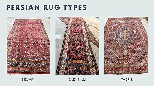
Left to right: 8×13 Tribal Antique Bidjar #2234 | 3’4 x 15’8 Antique 1940s Tribal Runner (#823) | 10×15 Antique Tabriz Rug #2025
Bidjar: Often called the “Iron Rugs of Iran” as they are extremely durable. The people who wove Bidjar’s would use a hammer or mallet to pound down on their knots to create the tightest weave possible. “A stampede of elephants could march on this thing over and over and nothing would happen to it,” says Sheba. Being this tightly woven also means they are incredibly heavy for their size. Their designs are clear and detailed, and have a variety of beautiful colors. Bidjar rugs can last hundreds and hundreds of years without much wear and tear under normal circumstances.Bakhtiari: A nomadic Persian rug, Bakhtiari rugs often have repeated rectilinear floral patterns. They’re thick, solid, sturdy and usually have bright, varied colors. The sheep from the Bakhtiari region were known for their very luxurious wool, which made beautifully soft (but durable) rugs. Tabriz: Tabriz rugs are some of the most “elite” Persian rugs, which makes them wildly desirable, but also quite expensive. They are classified as “city” or traditional rugs. “These rugs are very refined. They’re tightly woven and come from very skilled hands,” explains Sheba. Because the weavers used Turkish knots instead of Persian knots, the resulting designs are often incredibly precise, consistent, and perfectly mirrored and symmetrical. They come in a wide range of colors, including deep red, midnight blue, and even pastel ivories and yellows.
Left to right: 9×12 Antique French Blue Ground Heriz Rug #2857 | 11×14 Persian Kashan Rug #GL1 | 9×15 Royal Blue Antique Persian Sarouk Rug #2562
Heriz: Heriz rugs have grown tremendously in popularity. Sheba says it’s the rug type she sells the most these days because people just love them. They are recognizable by their geometric medallion design with tribal elements. It has fewer knots than some other Persian rugs, making it a bit coarser but very sturdy due to its solid and stout cotton foundation. A similar rug design is the Serapi, which has a tighter knot structure and a more open design. Colors can be bold and saturated or muted like the beautiful blue and rust one above.Kashan: Another central medallion rug design from the city of Kashan in Iran. Like Tabriz, these are fine, highly precise rugs, usually woven in tight, traditional Persian knots with wool and a silk foundation. They are detailed, crisp and intricate florals in shades of red, blue and ivory, predominantly. Sarouk: One of the most distinguishing features of this low-pile rug is the blue 4 from its foundation. That’s mixed with salmons, reds and ivories. Older Sarouk rugs can be found in oranges, browns and champagne. As for motifs, they usually feature a center medallion and an open field of vases, florals or garden-themed elements.
Left to right: 3’6 x 4’4 Antique Yomut Turkoman #1426 | 3’5 x 8’10 Antique Persian Malayer Runner #2342 | 10×14 Antique Worn Persian Mahal Rug #3369
Turkoman: I’m fairly certain I’ve owned a Turkoman rug, found for $20 at a Habitat For Humanity ReStore. It used to be in my kitchen but it’s since in holding in my garage. These are almost consistently known for their repeating geometric patterns in either red or brown, usually in octagonal shapes. They were originally woven by tribes in Turkmenistan, though some lived in Afghanistan and Iran. They typically have a low pile and are soft to the touch. Malayer: Some rugs were woven in large sizes (see below) while others are typically smaller or runners, like the Malayer rug. These are highly decorative and often have a deep blue or French blue field color with an allover, repeating design. Herati and Boteh motifs are common. Malayer rugs have a medium to high knot density and are made of high-quality, soft wool.Mahal: Originally crafted in the Mahallat village, Mahals are known for their intricate designs and coarse knotting style. They tend to be found in large sizes, and in earth tones or muted colors. They can be floppy and low-pile (definitely don’t skip the rug pad under one of these).MY FRIENDS, WE MADE IT! I’m only scratching the surface, but I hope, if you made it alllllll the way down here, that I left you better than you came, equipped with the knowledge to go forth and acquire a beautiful Persian rug of your own in your own budget. Please PLEASE peruse Sheba’s inventory because her prices are extraordinary and her selection is gorgeous.
Thank you again to the wonderful Sheba for passing along your expertise to share with everyone here. You’re a force to be reckoned with, for sure.
Until next time, my friends…
Opening Image Credit: Design & Styling: Emily Henderson | Photo: Tessa Neustadt | From: Our Modern English Tudor Living Room + Get The Look
The post The *Ultimate* Guide To Persian Rugs (+ What Makes Them So Dang Good, Desirable & Valuable) appeared first on Emily Henderson.
July 29, 2024
We Tried A Metallic Wallpaper And Here Are My Real Feelings (+ The FIRST River House Mini Reveal!!)
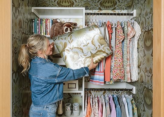
Well, here we are – the first reveal of the river house is a 9-year-old’s closet, but when it’s this cute (and finished!) we figured why not. This year we have a wonderful partnership with Spoonflower which in case you don’t know has an incredible inventory of incredible inventory of wallpaper, fabric, and home decor. Every product is printed just for you in the design of your choice. There are thousands of designs to choose from, all created by independent artists around the world. They just launched a metallic backing to their papers that I’m pretty excited to show you today. It’s not the shiny, glitzy, tinsel metallic, that you might be imagining but actually a really elevated, matte metallic you’ll love. Come see.
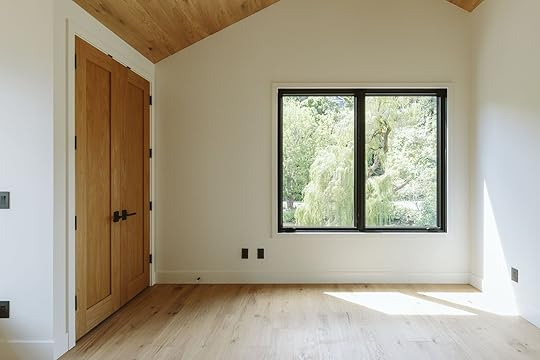
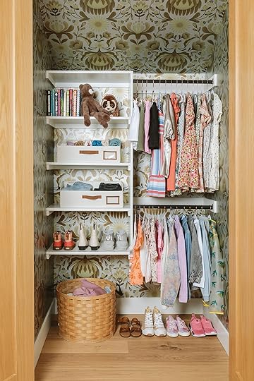
This is my niece’s room and it’s currently super simple, with a lot of wood on the floors, doors, and ceilings. The whole color palette is still TBD but the white in here looks pretty great (It was once a soft pink but she hated it so much, now out of her pink phase. We decided that moving was stressful enough so we had it painted back white.)
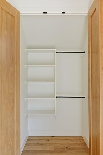
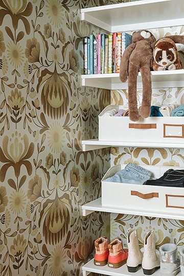
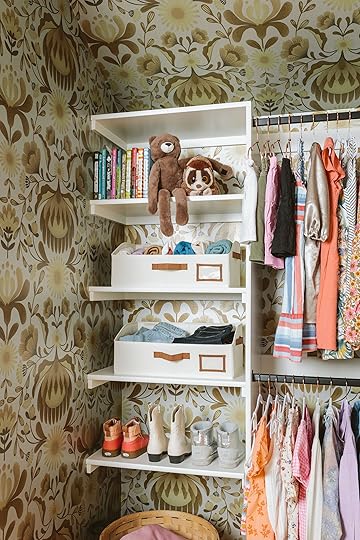
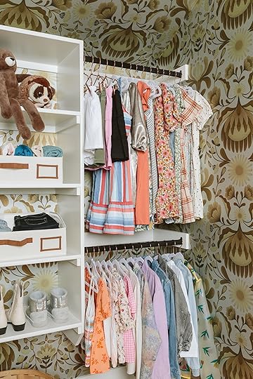
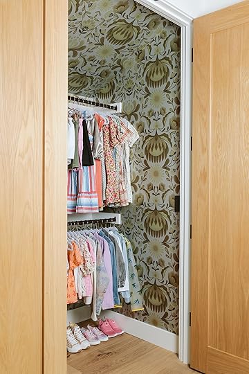
My brother had this closet installed, which is really simple with just a few shelves. While you obviously don’t need wallpaper in your closet, it felt like a great opportunity to make this more fun and whimsical.
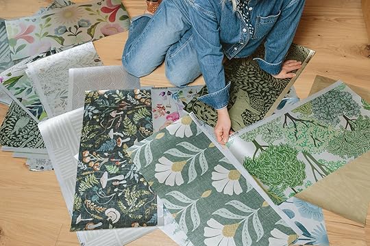
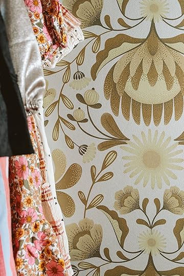
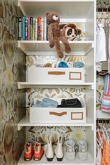
I ordered a ton of samples in the metallic finish and as you can see they are not garish at all – the paper itself has a reflection to it with the silver reading softer than the gold. It’s just a slight reflection versus something that is more mirrored. I was happily surprised at how much I truly loved them. As you can imagine, metallic wallpaper not made well could go very ummm…not great. NOT the case at all with these!
HOT TIP: It’s a good idea to start with about 3-5 samples/swatches before making any big purchases (I clearly really went for it in that department but you definitely can be more selective :)). It’s so important to feel and touch them as well as make sure you are happy with the pattern scale!
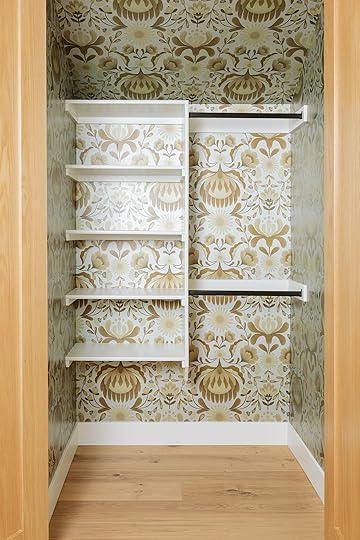
I LOVE this pattern and we were very on the fence about which colorway to choose (it comes in multi-color and tones of blue). It’s by artist Mercedes Cortés, clearly in a Scandinavian vibe and we especially loved how the warm gold/caramel tones worked with the wood on the ceiling in the bedroom.
In case you are new to Spoonflower you can also order all their patterns as peel-and-stick wallpaper and even grasscloth (which we did for some other spaces – it’s so warm and textural). And if you want to go full Wes Anderson you can order full-length curtains or fabric by the yard to create a headboard to match (something we are attempting to do in the guest room). You can see a sneak peek of some of my favorites here – and as an added bonus, all of Spoonflower’s wallpaper is 30% off today.
Canvas Bins | Hangers with Clips | Non-Slip Hangers | Basket (similar)
We put everything back in and styled it all out (thanks Gretch!) and it turned out so sweet, cute, and totally custom.
I hope she smiles every time she opens her closet to get dressed.
Some fun things about Spoonflower – all their designs (they have thousands and thousands!) come as wallpaper or fabric, and within wallpaper, you have peel-and-stick, grasscloth, metallic, pre-pasted, or traditional pasted. For fabric, you can choose from a lot of different weights (linen, canvas, poplin, performance velvet). You can also buy curtains, bedding, or pillows made for you. Everything is custom printed, which sounds like it should have a long lead time but they’re pros – it came fast!
A fun mom hack is that a closet is a great place to let your kids choose something more wild and fun. While I think that this pattern and colorway are actually not that risky, my “clients” were nervous about doing the whole room in it mostly for timelessness. But in here, it’s this burst of fun and light every time she opens the closet, with very little risk (and the peel-and-stick option would make it even less risky).

A huge thanks to Spoonflower for partnering with us on this closet (and a lot more to come this year). I linked up all my favorite metallics here for you to check out if you are into it. And remember – you can grab 30% off ALL of Spoonflower’s wallpaper today. Have any patterns caught your eye? I’d love to hear about it. xx
*Photos by Kaitlin Green
The post We Tried A Metallic Wallpaper And Here Are My Real Feelings (+ The FIRST River House Mini Reveal!!) appeared first on Emily Henderson.
July 28, 2024
The Link Up: Em’s Deeply Hydrating Face Mask, Mal’s Extremely Fun (Adult) Summer Activity, And The Best Travel Accessory

Happy Sunday y’all! The EHD team just got to spend three days together at the mountain house and it was glorious. But more importantly, we CAN’T WAIT to show you our second Rugs USA drop coming this fall!!! But since there’s a little bit of time until we can officially show you, let’s take a moment to drool over Orlando’s kitchen again. In case you missed his post on Monday GO NOW! We just couldn’t be happier for him and may need to book ourselves a stay to properly soak it in:) Ok, let’s get to the links!
This week’s house tour is the epitome of the power of design and color and pattern! These before and afters of India Holmes‘s (former design director of de Gournay) home are incredible. Go check it out here!
From Emily: So technically, this face mask was one that photographer Kaitlin brought to the mountain house for our SECOND RUGS USA LAUNCH SHOOT (y’all I am SO excited about these rugs and the colors!). So our first night we all watched The Bachelorette and put on this face mask. Once we rinsed it off all of our faces felt like baby skin. If you’re looking for a super moisturizing mask we all loved this one. Thank you Kaitlin!
From Jess: I am currently at my sister-in-law’s baby shower as you read this. I’m going to be an AUNT for the first time!! If my niece takes her time we could both be October babies (my fingers are very crossed). Now, the dress code of the shower was “Picnic Casual” since it’s at a park by a river where guests will be swimming. I decided to go deep into the theme with this top and this skort They are so fun and I can easily wear them as separates with other pieces I have. Plus, if you are a pickleballer I feel like this skort would be so cute and perfect for the court:)
From Arlyn: I live in a world surrounded by women with beautifully manicured nails (have you seen the EHD gals?!?). I am NOT that person. TBH, I can’t remember the last time I got a proper manicure, pedicure, or let alone had my fingernails painted. But out of nowhere, I got the itch to grab a new polish as it had been ages since I added to my stash and this lilac is so perfect for summer.
From Gretchen: It was recently my mom’s 70th birthday, and to make her feel extra special for such a milestone celebration, I set out to bring her 70 gifts. But I didn’t do it alone! So many friends and family chipped in and all helped to make her feel so special. The presents ranged from her favorite fancy hair care to dollar store gardening gloves to face masks, flowers and funny socks. Some notable standouts? The incredible tweezers I mentioned a few link-ups ago–a new fave of hers, too. A big box of nostalgic candy from the year she was born (she has been very protective of her Neccos and candy cigarettes), which is just a great gift idea for those milestone birthdates. And finally, an Orgasm…blush duo set. No, I didn’t think the word ‘orgasm’ would come up in a list of gifts I got for my mom either, but this shade is her favorite (and one of Nars’ most popular). I also love that it comes in a more affordable mini set that allows her to try both the cream and powder formulas. And she loves them both! The cream she says works well with her more mature skin, but she loves how buildable the powder version is. All in all, I know she had a stellar birthday, not because of all the gifts but because of the people who gave them. Cheesy but true!
From Mallory: Summer activity idea!! My gal pals and I just did a little wine-tasting hang where everyone brought a bottle and we put them in these bags and then ranked them with this scorecard – it was SO fun. I also bought these small and insanely affordable plastic wine glasses for the party (they’re like $10 for 10) because we did this outside and I did not want to have glass breaking!! It was so cute, grab your gal pals and do this!!
From Caitlin: If you’re a frequent traveller who hasn’t checked out this life-saving hoodie, what are you doing?! A few weeks ago, I took a 9 PM flight from Philly to LA. I was seated in the middle (cool) and my neighbor was the lone person on the plane with her reading light on (double cool!), but I was still able to snooze comfortably for the entire flight thanks to the built-in eye mask. It’s perfectly oversized, ultra-soft, and thoughtfully made – it’s game-changing on long train rides, car trips, or flights. (If you’re not familiar with the brand, they also make THE most underrated convertible laptop tote bag. I’ve been testing mine for a few months and no other classic tote comes close – I love that it can be carried as a backpack and once again, that hidden phone/passport pocket is brilliant!)
Also From Caitlin: A quick niche note for my fellow quilters – you NEED to pre-order this Modern Improv Quilting book by New Song Quilting Co.! Laura’s Instagram account been a major inspiration for me – as a big overthinker, watching and learning from her improv style has been so freeing and empowering. (Her account is a visual treat even if you’re not a quilter!)
Also Also From Caitlin: If you’re a little confused by all the “Kamala is brat” commotion, you’re not alone! This piece will explain everything. Full disclosure: My family will confirm that I’ve been coconut-pilled since July 3rd, when Kamala fancams started taking over my TikTok (those words will make sense after you read the article, I swear). I have a real sense of hope for the first time in years! This week, I set up a monthly $46 donation to her campaign – if you have the funds to spare, you can join me here. Millennials and Gen Z comprise the largest voter bloc in America – together, we really can win. Just make sure you’re registered to vote! (PS. Last but not least, another shameless plug for She Should Run, a nonpartisan organization I volunteer with that helps women run for all types of elected office. If Kamala can run, you can too!)
Thank you for stopping by and get ready for another fun reveal tomorrow. xx
Opening Image Credits: Design by Orlando Soria | Photos by Sara Ligorria-Tramp | From: At Long Last! The Londo Lodge Kitchen Is Ready For Her Close Up FOUR YEARS Later!
The post The Link Up: Em’s Deeply Hydrating Face Mask, Mal’s Extremely Fun (Adult) Summer Activity, And The Best Travel Accessory appeared first on Emily Henderson.
July 27, 2024
These Wear-Forever Pieces Only *Look* Expensive – 25 Timeless Mix-and-Match Picks Under $130

After writing The Great Gatsby, F. Scott Fitzgerald spent the better part of a decade penning articles for Esquire magazine. In one of his more famed essays, The Crack-Up, he wrote, “The test of a first-rate intelligence is the ability to hold two opposed ideas in the mind at the same time, and still retain the ability to function. One should, for example, be able to see that things are hopeless and yet be determined to make them otherwise.”
It’s an idea I’ve been chewing on for the last few months – especially when it comes to my own consumption. In a world of fast fashion and quantity over quality, it can be really hard – or seemingly hopeless – to find thoughtfully crafted, wear-forever clothing without spending a fortune. But I’ve always taken issue with the idea that price and quality are inextricably linked. Long-lasting fashion doesn’t need to cost an arm and a leg, you know? (I mean – the best t-shirts I’ve ever worn are made from all-natural fabric, and they’re only $6 at Target!)
So today, I’m walking you through 25 timeless pieces – all under $130 – that can stand up to the wear and tear of daily life. (As I’ve learned, it’s a lot easier to solve the consumption problem when you don’t need to consume! If businesses aren’t going to fix it, we can fix it ourselves. Thanks for that insight, Mr. Fitzgerald.) ANYWAY. Are you ready to look like a million bucks without spending a million bucks?
Sweater Wrap Coat, $104.30

Every time I wear a sweater coat on a plane, I’m complimented on my professionalism. The reality? I’m bleary-eyed, exhausted, and wearing a socially acceptable blanket in public. This version comes in both black and tan, boasts a removable belt, and is offered in sizes XXS-3XL – you’ll look like a million bucks while feeling like you’re still in bed.
Boxy Oxford, $88

Bye bye, boob gap. This button-up’s boxy shape is relaxed and chic, with more than enough room for any of your assets. Dress it up with a pair of trousers for the office, or pair it with a simple chino and sneakers for a model-off-duty vibe.
Wide Leg Ankle Khakis, $39

Full disclosure: Gap is quickly replacing Madewell as my go-to destination for high-quality pieces constructed with thoughtful materials. Case in point: these $39 pants are made from regenerative cotton, they’re preternaturally flattering on all body types (check out the size 14 model on the site – she looks fabulous!), and – to reiterate – they are only THIRTY-NINE DOLLARS.
Braided Leather Belt, $19.50

Belts can often be prohibitively expensive, but these 100% leather braided beauties won’t break the bank. (PS. These are just the tip of the budget-friendly belt iceberg. There’s also an extra 20% off orders over $100 right now, if you’d like to stock up on a few different silhouettes.)
Washable Silk High-Neck Midi Dress, $129.90
IT’S GIVING ELEGANCE. So pretty, so regal. (Navy and black are pictured above, but the wine red hue is also a total head-turner.) I don’t know of many dresses that can take you from wedding guest to work, but this one fits the bill! Bust out an electric slide on Saturday night, toss it in the wash on Sunday afternoon, and pair it with an oversized crewneck sweater for an office-ready outfit on Monday morning.
Cotton Teddie Sweater, $29.50

If you miss the old-school J. Crew sweaters from the early aughts, you’re in for a treat: HERE THEY ARE! This lightweight crewneck boasts near-perfect reviews, 100% cotton construction, and a silhouette that’s simple to dress up or down. (Did I mention that it comes in 10 different colors and it’s offered from size XXS to 3X?)
Berkeley Belt Bag, $117.60

The look and quality of the iconic Clare V Grande Fanny at only a third of the price? It’s possible, thanks to this 100% leather belt bag from our friends at ABLE. (Added bonus: this one is actually an inch wider, so there’s even more storage space for your daily essentials!)
Tailored Linen-Blend Pant, $90

These breezy linen trousers can take you from work to weekend – they’re a little polished, a little lounge-y, and a dream to wear in warmer months. They’re literal pajama pants you can wear outside. You will be the most pulled-together person in the grocery store, guaranteed. (They come in sizes 23 through 37, too!)
All Day Heeled Mule, $99

You can’t travel faster than the speed of light. An object at rest stays at rest. And whenever Emily posts a photo in which she’s wearing these Nisolo mules, our DMs are flooded with questions about them – these are just a few laws of the universe. I’ve had my All Day Mules since 2019 and they’ve only gotten better with age as they’ve conformed to my feet and developed the prettiest patina. $99 is a steal for a shoe that’s THIS well-made. (They’re aptly named, too – you really can wear these all day.)
Linen Fit & Flare Midi Dress, $79.90

Sometimes, a simple dress is all you need! I love the square neckline, the adjustable straps, the pockets, the 100% linen construction, and the nipped-in waist. You’ll turn to this dress over and over in warmer months for years to come, guaranteed. (PS. The white version is lined!)
Patch Pocket Short, $23.99

Okay, I take it back: Madewell’s still got it. I love the clean lines and tailoring on these shorts, and the patch pockets make them feel far more elevated than their $23.99 price tag. (Pro tip: if you like the cut and fit of the Colette line of bottoms at Anthropologie, you’ll also love the Emmett-branded pieces at Madewell.)
Heritage Barn Jacket, $59.99

A weatherproof, 100% waxed cotton twill body. A cheery olive hue. A timeless corduroy collar. Nothing says “I’ve got my shit together, but I’m low maintenance about it!” like a well-fitting barn coat. (Eagle-eyed readers may remember that I scored and recommended this coat last year in a Link Up post, albeit at a much higher price point – it’s DEFINITELY worth it.)
Two Pack of Open Hair Clips, $18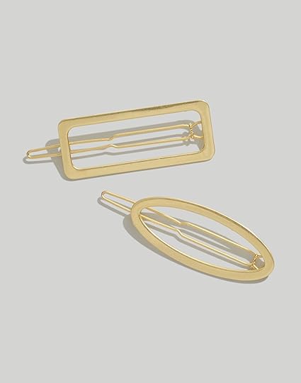
Sometimes, the smallest details make the biggest impression. Swap your bobby pin (or hair tie, for my fellow thin-haired gals) for a modern, graphic clip – it’ll look pulled-together and intentional, even for those who don’t have a ton of time to spend on styling their hair every morning.
Full-Length Colette Pants, $130

The internet’s favorite pants now come in FULL LENGTH and NOBODY TOLD ME? They have a slightly cropped flared bottom, too, which makes legs look a mile long. I’ve long-struggled to find professional, wide-legged pants that don’t cling at the hip and thigh, but these check every box and more. (They’re offered in sizes 23-34 and in tall, petite, and plus sizes, to boot!)
Shaker-Stitch Cardigan, $21.99

Smart, simple, and refined. Toss a classic cardigan over your shoulders to protect from chilly restaurants now; don it all fall for a cool, studied, professorial look. (Added bonus: you’ll be able to pay for that restaurant meal with the money you saved!)
Italian Leather Handwoven Bag, $129.90

In October of 2023, I treated myself to this $485 purse from Clare V in celebration of my 32nd birthday. Do I love it? Yes! But would I rather have a purse with the exact same dimensions, near-identical construction, and an extra $355 in my bank account right now? SURE WOULD.
Fit & Flare Dress, $30

THE REVIEWS! How stunning do those normal women look in this? It’s the ultimate throw-and-go dress – add a cardigan for church; slip on some sneakers for the farmers market; pair it with sandals and statement earrings for vacation.
Utility Barrel Pant, $98

Em grabbed these subtle barrel-legged pants last month, and I mistook them for a MUCH more expensive brand. They’re more comfortable than jeans and the cotton twill looks refined and chic. (You can watch Em’s video review here to see the pants in motion!)
Ballet Flat, $98
Spoiler: the Mary Jane ballet flat is a trend. (A cute one! But a trend, nonetheless.) To that end, DO NOT SPEND $250 on a pair of Loeffler Randall flats. Don’t spend $180 on Alohas! These sweet ballet flats are just as well-made – 100% leather lining and upper – with charming proportions at only a fraction of the cost. (A year from now, you’ll be thrilled that you kept $152 in your pocket. I promise.) And if you’re more of a mule gal, Gretchen owns and loves this tried-and-true backless version!
Drop Waist Midi Dress, $120

If you told me this dress was $600, I would FULLY believe you. The drop waist! The silhouette! The back!!! (The strap is removable, BTW.) It’s so classic and refined without feeling try-hard or contrived – SWOON.
Knitted Waistcoat, $130

Are you speaking on a panel as an authority in your field? Are you the head of your own cool business? Do you just have great taste? Are you one of the lucky few who can actually wake up like this? These are the things people will think when you walk in donning a refined vest, just like this one. (And it’s 100% cotton from Boden, so you know it’s going to last!)
Ivory Dots Button Down, $98

Looking to impress? Swap your white t-shirt for this simple, breezy top made entirely from organic cotton. (The subtle Swiss dot print really gives it something extra, don’t you think?)
Organic Cotton Open-Stitch Crew, $98
 Screenshot
Chilly office? Late-night beach bonfire? Icy movie theater? No problem. This relaxed sweater’s lightweight weave is luxe AND functional. Pair it with bold sunglasses or a chunky pair of earrings for an on-trend, dressed-down look this summer.
New Balance Sneakers, $89.99

New Balances are here to stay. And while you could rock a standard gray pair, I far prefer this indigo suede version! Mix and match these with outfits as you would a denim jacket or pair of jeans – they’ll add some fresh, unexpected color and texture to any look. You can’t go wrong adding this hue to any outfit – it’s a total style hack.
Scalloped Trim Shift Dress, $75.49
Over a decade ago, I bought a scalloped hem shift dress from J. Crew which I wore NON-STOP (to job interviews, to brunch, to the taco truck, to weddings – you couldn’t get me out of it!). But then life happened, and my go-to dress no longer fit. So imagine my utter surprise and delight to find it again, updated in 100% linen fabric with the sweetest button-back details. I love the sunny yellow hue, but I know that I’ll get wear out of the ochre version for years to come. ADDED TO CART!
Any other favorites? Any affordable brands worth checking out? Any timeless pieces on sale you’d like to share with the class? Here’s to building a long-term wardrobe without breaking the budget. We’ll see you tomorrow for an awesome edition of the Link Up, followed by the FIRST River House Reveal on Monday! Have a great weekend. xx
The post These Wear-Forever Pieces Only *Look* Expensive – 25 Timeless Mix-and-Match Picks Under $130 appeared first on Emily Henderson.
July 26, 2024
10 DIYS The EHD Team Kept Sending To Each Other – The Creativity Is SO Good
We’re just seconds away from the weekend so we thought that showing you some extremely cool and inspiring DIYs would be a nice way to enter into your days off (if you have them off that is). We definitely aren’t strangers to a DIY project, I mean look at Gretchen’s incredible fabric wallpaper (see the process here) or that piece of wall art she created in the photo above! But today we are highlighting 10 different DIYs we found on Instagram and fell in love with. The difficulty ranges from easy to um, less easy:) But whatever your skill level (even if it’s zero) you’ll thoroughly enjoy watching the creative process of every single one. LET’S GO!
Striped Stained ShelvesView this post on InstagramA post shared by Joanna | Home decor • Design • DIY (@aimabledesordre)
This is the DIY that inspired this post! I love a stain project and Joanna took what were simple pine shelves and made them into a showstopping moment. I think this looks so sick and could easily be applied to any kind of light wood piece. The world is your wood-staining oyster.
IKEA Custom Entry Cabinet SeatView this post on InstagramA post shared by Astrid Storstein (@astrid.storstein)
This was another find that I knew had to go in this post. Astrid really customized these IKEA cabinets (?) into the cutest entry bench. Not to mention it has a lot of great storage. She actually sells her how-to IKEA HACK guides here! Oh, and 10/10 for that really fun and unique color. It makes the best pop!
DIY Noguchi-Style LampsView this post on InstagramA post shared by SYL Studios
(@s3ndingyoulove)
I have a Noguchi lantern and still, after 6 years love it just as much as the day she arrived. I mean it’s a classic light that in our opinion will never go out of style. But unfortunately, Noguchi isn’t in everyone’s price range so this hack is an easy and super affordable way to take a plain white paper globe and give it the slightly aged, Noguchi glow. Jadalyn just uses hot water and tea to create this amazing result. Read her instructions just so you don’t mess anything up:)
Painted Floral Stencil Patterned WallsView this post on InstagramA post shared by Dan Dean (@sienna.and.i)
Who needs wallpaper when you can painstakingly create the sweetest stencil pattern with paint?? We were so impressed with Dan’s commitment to this kind of detailed project because it is no joke. But as you can see the result was well worth it!
Handpainted (Not Perfect) StripesView this post on InstagramA post shared by Maxine | Home ~ Interiors ~ DIY ~ Upcycling (@maxine.home)
Then for another very laborious but overwhelming wonderful paint project, check out the stripes that Maxine painted in this nursery. I LOVE that they look handpainted and perfectly imperfect. It adds so much soul and whimsy. My cousin did a similar thing in her son’s exposed closet and it turned out SO good.
IKEA Billy Cabinet Chic CartView this post on InstagramA post shared by Seyran (@interiorxlifestyle)
I’m never not impressed by how people continue to hack the BILLY bookcase from IKEA and Seyran really did an amazing job. She made this extremely chic coffee cart with custom push-release doors, additional shelves, and a marble countertop from Facebook Marketplace.
Scallop Wallpaper TrimView this post on InstagramA post shared by alexandra gater (@alexandragater)
This was a reel sent to me by Gretchen and we both loved how sweet this wallpaper scalloped border was and how it beautifully unites the accented wallpaper wall with the single-color painted wall. Alexandra has so many great projects so go check them out!
An Actually Pretty Standing DeskView this post on InstagramA post shared by Sarah Merrell (@sarahflipsit)
There’s definitely a hole in the market for pretty standing desks. Not all of us want that typical modern look. So when I came across Sarah’s hack I knew I had to share it. Not only did she massively expand her surface and storage by adding great-looking drawers, the whole design is so great and elevated (no pun intended:))
Diagonal Striped WallsView this post on InstagramA post shared by Lone Fox by Drew Michael Scott (@lonefoxhome)
If you’ve wanted to go bold with pattern but are afraid of an intense color or potential wall damage then take a look at Lone Fox’s new dining room. That diagonal, neutral, and crisp stripe (made with just tape) is very fun, not too crazy bold, and adds a ton of dimension.
A Glass Shower CoverupView this post on InstagramA post shared by Marco Zamora (@want.zamora)
Do you dream of having a vintage-looking bathroom but are stuck in a modern glass shower of emotion?? Well, Marco is in the process of making his modern bathroom feel older and more soulful so one of many DIYs he’s done so far was adding this shower curtain around his glass shower. It’s mostly for a vibe but does give him more privacy which he’s pumped about!
Stained Patterned FloorView this post on InstagramA post shared by Hannah Jane Langejans (@hannahlangejans)
Ok, so we’ve shown this one before but we are still stunned by it! It needed to be featured again. Plus, I figured I’d start and end with an amazing wood stain project:) Hannah’s work on this floor is too good and I will never not love this project. 1000000/10.
Hope this was the light, fun, and inspiring post we intended. I’ve been putting off a DIY project that I am now even more determined to finish after seeing all of these. Let’s all get to creating, huh? Have a great weekend!!
Opening Image Credits: Design by Gretchen Raguse | Styled by Gretchen Raguse and Emily Henderson | Photo by Kaitlin Green | From: Gretchen’s First MOTO Reveal: A Tiny Bedroom Comes Alive With The Perfect Pieces From Article (And Fabric On The Walls??)
The post 10 DIYS The EHD Team Kept Sending To Each Other – The Creativity Is SO Good appeared first on Emily Henderson.
July 23, 2024
Have A Split-Level Home? Here’s How To Design It So You’ll Actually Love It
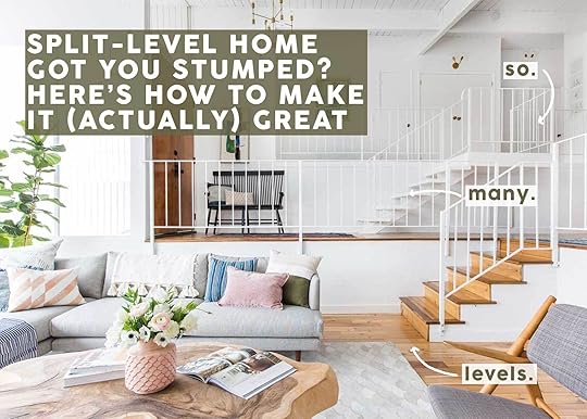
I’m just going to say what some of us are thinking here: Split-level homes are not ideal for a lot of reasons. This isn’t just an empty statement from a design writer looking for something to post about. I know this because I live in one and while it’s mostly fine (and even has its “pros”), it can also be quite frustrating both to live in and also to decorate. So I figured, “Hey, if I struggled with this, maybe some readers out there in a similar style of architecture also do?”
Today’s post is going to walk you through some concepts for how to make a split-level or bi-level house and townhouse look and feel great visually, whether you’re simply decorating or planning on doing some renovations.
But first, a little background about my particular situation:
I live in a multi-level townhouse that we picked because it offered us the number of bedrooms, bathrooms, and workspaces we needed for our family, as well as an ideal kid-friendly community. Those are all things that, frankly, matter more to me than a bit of a funky layout/flow. BUT, it’s not without its flaws (like basically having no real entryway beside a landing strip I carved out of a small slice of a wall).
Every room is essentially on its own level. Garage: one level (bottom). Downstairs office: Door to room at garage level but then four steps down from the door to its own level (also there’s a flight of stairs down from living room/front door). Living room: At main level with the front door. Dining room/kitchen/powder bath: Five steps up from living room. Bedrooms: Upstairs from dining room level. Patio: Three steps down from the living room. Front door: Three steps up from the front walkway which is three steps up from the main street. Are you dizzy yet with all those steps and levels to account for?!?
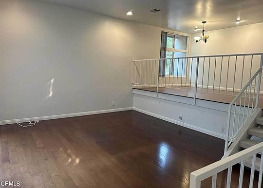
 photos of our main living spaces before we moved in. you can see the railing at the bottom right of the left photo which is a barrier to the stairs down to the garage; then the stairs and railing between the living and dining rooms.
 You’d think my legs and tush would be in much better shape. In all seriousness, my husband and I have serious stairs/level fatigue. Even traveling between living and dining spaces is a chore some days, not to mention how much smaller each space feels because they aren’t open to each other (mostly a problem for my daughter not having enough room to run around, push her little cars and toys, etc.). And don’t get me started on the baby gate situation, which I know is temporary but very much a part of our current life.
When we first moved in, we had a newly minted one-year-old child, so there were three baby gates all within view: right when you opened the front door down the stairs to the garage, at the top of the steps between the living and dining room, and at the opening of the stairs up to the top level (there was a fourth one at the top of the stairs outside the bedroom doors). It was madness. We’ve since taken down the one between the living and dining spaces because our girl can confidently and safely climb up and down those.
But readers, there are some positives here. It is nice to have our dining room fully separated from our living room as someone who works at the dining table, and it’s nice to be a half level above to see out through our windows onto our beautiful street without being directly at eye level with anyone walking by.
 don’t forget that em lived in a multi-level home where the living room was sunken down a half level, the dining and kitchen were on another level, and the family room and bedrooms were on yet another level (none a full story up so not technically two stories). design by emily henderson | photo by tessa neustadt | from: how we styled our living room to sell
Aside from my own pluses, there *are* reasons split-level and bi-level homes came to be so popular. According to this Architectural Digest article on the subject, they started popping up in the mid-century after World War II when families were moving out of cities with all those babies they were having. The suburbs were booming, and developers were squeezing as many homes into neighborhoods as they could. The split-level offered a way to get more square footage into smaller lots, which meant they were more affordable than a larger single-level ranch or even two-story Colonials or Craftsmen. Here are a few other advantages:
Maximizes a tricky lot where homes might be built on a slope or hillMultiple visible levels can make a home feel largerSleeping and living areas are separate, which helps with noise and privacy Different and designated areas that were still “open” to each other (great for light transfer from windows rather than blocking light with solid walls)Now that we’ve assessed my personal history as well as that of the split-level itself, it’s time to talk about how to design around a plethora of railings, staircases, and levels.
Rule #1: Build Cohesion Through Color Palette, Materials & Design StyleI know, I know. This is basically the number one design rule for *any* home, whether it’s on one level or four levels, but it’s especially important in a split-level home since so many of the rooms tend to be visible to one another (similar to an open floor plan house). Having your dining room four feet up from your living room is not permission to go rogue and “try” something new. The key to harmony between spaces and creating a nice flow for both the eye and the mind is to extend style elements between all areas you can see from a single vantage point. Hone in on a color palette and a furniture style and ensure you’re incorporating it strategically throughout.
View this post on InstagramRule #2: Create A Proper Entryway, No Matter How Little Space You HaveA post shared by Ashley Taraneh (@myuglysplitlevel)
It’s safe to say the top reason people struggle with their split-level homes is because they basically have no foyer. You open your front door and have a small landing with the decision to either go up or down the stairs and god help you if you have shoes, bags, and dog leashes to store. I like the route Ashley from My Ugly Split went in her entryway, giving it more of a mudroom treatment with paneling, hooks, and a bench. And don’t underestimate the power of some cute art and decor, of course.
 design by emily henderson | photo by tessa neustadt | from: how to add style to a neutral living room (+ get the look)Rule #3: Float Your Furniture
Before we brought our furniture into our home, I noticed some fading on the wood floors in an unusual direction. Meaning, whatever rug had lived there was oriented in a way I wouldn’t have put it. One visit from our landlord a few months later helped me understand why. “Oh wow, I would have never thought to put our sofa here,” she said to me when popping by to check out an issue we were having. I asked her where she had placed hers and she told me they put it up against the half wall between the living and dining rooms. Their TV console? Well, directly in front of it, blocking the large sliding glass doors. To her, their only option was putting their main seating against the wall, and my friends, there’s another way!
FYF! Float Your Furniture! Release your sofas and armchairs and accent tables from the wallflower fate you’ve forced upon them. You can see in the image above of one of Emily’s previous living rooms in a split-level home that she built her seating area in the center of the room, rather than right up against the wall, effectively opening up a walking path around the sofa. You want to let your living spaces in a split-level breathe as much as possible as oftentimes, they’re smaller and have fewer full walls to work with.
And look. I get that sometimes, up against the railing or pony wall you have is the only viable option for making the space functional, but at the very least, leave about 6-12 inches of space between the back of the sofa and whatever you’re putting it up against.
View this post on InstagramA post shared by Haus_D7 | Julika & Alex (@haus_d7)
View this post on InstagramRule #4: Hang Curtains & Art At Similar Heights Across All Visible SpacesA post shared by Haus_D7 | Julika & Alex (@haus_d7)
This one comes with the following caveat: Only do this if it makes sense as sometimes, windows are at wildly different heights and it would look silly if you forced it. That, or the ceiling angle doesn’t allow for it. But as much as you can create a continuous visual line between rooms with art or draperies, do it!
For example: It’s not the most obvious thing to see in the above two images from architect Haus D7 because I’m kind of cut off at the knees with good images of split-level homes and rooms, BUT I like how they took the art in the dining level up high enough to essentially match the art in the kitchen level just past the slatted wall. To me, it limits all the up-and-down stepping motion your eyes already have to do with moving between rooms.
I don’t have an image to illustrate this for curtains, sadly, but the principle is the same. If it’s feasible to do, try to keep where you’re hanging your curtain rods between spaces with windows at different heights on the same visual line for a really polished and cohesive look.
View this post on InstagramRule #5: Make The Most Of Double-Height RoomsA post shared by SALA Architects (@salaarchitects)
This rule applies whether you’re renovating or just decorating. In the above image from SALA Architects, they brought that fireplace feature up to the ceiling, which really amplified the height of the room and brought your attention through all the levels of the home. Here’s another view so you can see just how many planes there are here:
View this post on InstagramA post shared by SALA Architects (@salaarchitects)
You can accomplish something similar with art, like I did in my own home. I don’t have proper photos of my spaces yet, so I just stood in my dining room and quickly snapped this shot to show you. You’ll have to squint through the baby-proofing mesh on the railing, but imagine that the frames go down to a lower media cabinet.
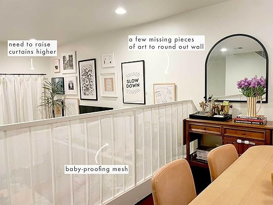
Once I installed this gallery wall (which used to live in my previous dining room), it really made the space feel so much more grand. When I add in the final pieces of art, they’ll essentially blend into the mirror above my bar console in the dining room (see rule #4). Having super tall ceilings in a given space and doing nothing with it is like having an Idina Menzel-like singing voice and only ever humming along to your favorite song. USE IT!
 design & styling by emily henderson design | photo by sara ligorria-tramp | from: a modern and organic living room makeover + get the lookRule #6.1: If You Want More Of A “Closed Off” Floor Plan, Choose Pony Walls Instead Of Railings
Most split-level homes you find are going to have railings, railings, and more railings. This has its benefits (see rule #6.2) but it can also look very busy with all the lines everywhere. Plus, there is a lot of visibility between areas, and sometimes, you just don’t want that. I’m personally a fan of a more moderately closed-off concept so each room feels like its own, which isn’t easy with essentially no walls (or open “walls”). You can see an example of going the pony wall route in the modern and organic home the EHD team styled years ago. From my knowledge, this beautiful house has (at least) four levels, and with low walls rather than railings, each area really stands alone.
 design & styling by emily henderson design | photo by sara ligorria-tramp | from: a modern and organic living room makeover + get the look
Here’s a view from the living room, which is just off the entry (there is a “foyer” pass-through level behind that wall but before the next set of stairs up to the dining room and kitchen). Thanks to wonderful natural light coming from windows high up in the open home, you don’t need the open railings to facilitate light flow. Plus, guests can be greeted at the front of the home without seeing straight back into the kitchen, which is always a blessing in my book as someone whose counters perpetually have open boxes of crackers and cutting boards with chopped fruit and toast crumbs (toddlers always want snacks, evidently).
View this post on InstagramRule #6.2: If You Have Limited Natural Light, Choose Railings (Or Nothing) Over Pony WallsA post shared by Inside Out (@insideoutmag)
Alternatively, there are times when you might want as much unblocked transition between spaces in a split level, whether for light, visibility, or just a general sense of openness. In that case, railings work just fine, but there are also ways to avoid them altogether, like in the room above featured on Inside Out magazine’s Instagram that used steps up between areas carved out of low knee walls with a feature fireplace and planters.
View this post on InstagramRule #7: Don’t Overlook Swapping Pony Walls Or Railings With Wood Slat Partition WallsA post shared by ALLI (@the.hoss.homestead)
This is by far one of my favorite ways to add some really special architectural interest to what’s usually a pretty sad little circa 1970s railing, especially on the level above the entryway. I’ve followed Alli of The Hoss Homestead for many, many years, watching her split-level home get renewed life, and I always loved how she went the route of a partition wall to give the home a decidedly mid-century aesthetic.
 design & styling by emily henderson design | photo by sara ligorria-tramp | from: a modern and organic entry: shelf styling tips + shop the lookRule #8: Consider Sharing A Feature Material Across Spaces
If renovating or doing a heavier redecorating lift, consider bringing a material like wood cladding (on the wall and/or ceiling), shelving, or wallpaper across nearby spaces. Above, you can see that the landing in the modern and organic home we showed earlier has beautiful wood cabinets and shelving, and this material continues up into the dining room and across into the top part of the living room. It acts as a kind of olive branch between spaces to unite them.
—
Honestly, a split-level home can be kind of great in a lot of ways if it’s done right. Buying one that still looks and operates like it’s fresh from 1978 maybe not so much, but employ some creative design and architectural solutions and now we’re talking.
And this is where I leave you for the day friends. I’m curious, though, did you grow up in a split-level home? Are they nostalgic for you or a great big bummer? I’d love to hear if you live in one now or at any point, and any advice you might be able to add to my running list of ideas.
See you around these parts next time.
Opening Image Credits: Design by Emily Henderson | Photo by Tessa Neustadt | From: How To Add Style To A Neutral Living Room (+ Get The Look)
The post Have A Split-Level Home? Here’s How To Design It So You’ll Actually Love It appeared first on Emily Henderson.
July 22, 2024
At Long Last! The Londo Lodge Kitchen Is Ready For Her Close Up FOUR YEARS Later!
I can’t believe it’s been a year and a half since I last talked to you about my kitchen! Honestly, what is time anymore? 2020 feels both like it was 30 seconds ago and that it was 30 years ago. I’m pretty sure this is the longest design project I’ve ever worked on. Four. Full. Years. But it’s done and I could not be more relieved/excited/happy!
The kitchen as it looks today has lived in my head since the moment I first toured the house, almost exactly four years ago (August 2020). I was EXTREMELY lucky in that Londo Lodge was the first house I ever looked at, the first house I ever put an offer on, and the first house I was lucky enough to snag. And the kitchen was really what sold me on the house. The space was large, dated but well-designed, and located at the center of the house. It was obvious from the home’s layout that the family who built this home really saw themselves as kitchen gatherers – my type of people (unless I’m in there trying to cook, in which case, GET OUT!). The layout of the room was really nice. It was spacious, grand, and filled with practical storage. Too much storage, to be honest (which is why I knocked out a wall of upper cabinets in favor of more windows looking out onto the forest).
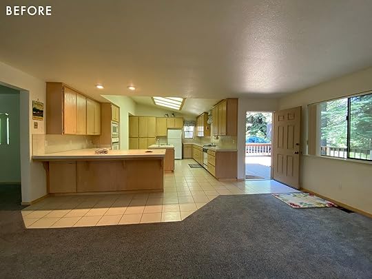
So why did I change it?
Mostly because the kitchen as it was doesn’t go with the style overlay I have planned for the house. The home is pretty much a 90s contemporary box – very simple, efficiently built, but not a lot of artistry, no millwork or details anywhere. I really want this house to feel more like the little cabin in Yosemite where I was raised, which was a 1929 craftsman bungalow. So my goal is to combine Craftsman and Cape Cod elements with some rustic cabin accents to create a home that feels older, more historic, and overall just more romantic. The old kitchen didn’t really go with that vibe. So from the moment I saw it I had an idea in mind for what I wanted to do.
Now, before I get into what I did to transform the kitchen, I want to show you what I did to make it work as-is for the first three years I owned the home. I’m extremely lucky I got to do this renovation and would not have been able to afford it without getting a ton of it sponsored. So I get that a huge renovation like this is not a possibility for everyone. As you can see from the photos, styling can make a HUGE difference to how a space feels. So for those of you out there who aren’t in a position to take on a renovation, just know that there’s a ton you can do by removing dated accessories and adding in objects that update the space. The updates I made midway are probably a full blog post to themselves, but I wanted to share these images to encourage those of you out there (most people, including me if I weren’t a content creator who could attract sponsors) who can’t afford to gut their homes – creativity and a little elbow grease goes a long way!
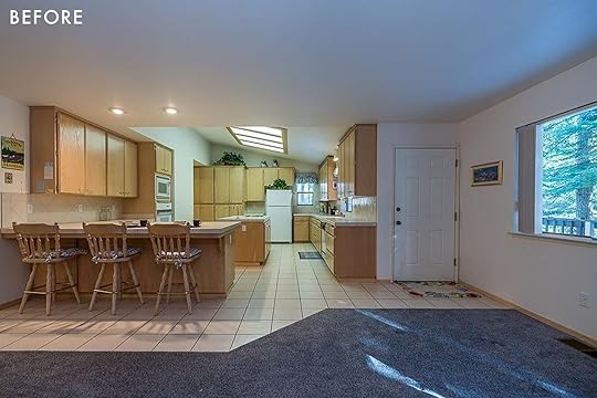
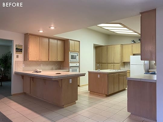
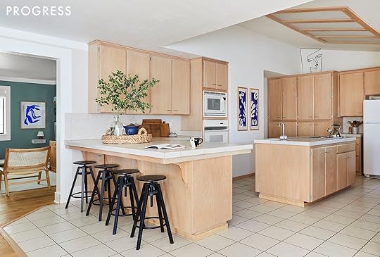
Oh, and for the record because I get this comment every time I post about my old kitchen, the thing on the ceiling is NOT a skylight. It’s a terrible, depressing 90s fluorescent light. So no, I did not remove a skylight to build my new kitchen. I actually tried to add one but I couldn’t find a sponsor for that (maybe someday when I redo the roof!). Okay, onto what I did!
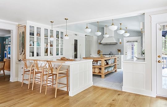
Like a lot of people, I’ve had a thing for Nancy Meyers kitchens for a long time. I love that they are cozy and aspirational at the same time. The goal with this house is to build my dream home, so I definitely wanted the kitchen to feel grand and high-end without feeling pretentious. This is a “cabin” after all, it should feel cozy and down to earth. The goal with renovations at this house is to do them well and do them once, so I decided to go very classic and traditional with my design – I definitely didn’t want to do a trendy kitchen that I needed to renovate in five years. Or even ten years. I want this to last a long time.

Bertazzoni Range | Bertazzoni Hood | Range’s Gold Decor Set | Cabinet Color | Backsplash Tile | Brass Cabinet Handles
The first sponsor that came on board to help with the kitchen was Bertazzoni. I have worked with them numerous times and I love their appliances so I was elated to have their pieces in my home. I decided to base the color palette of the room on the range, Bertazzoni’s Heritage Range (Color: Avorio). I color matched the range with Timeless by Clare Paint to make the range feel integrated with the cabinetry. But I didn’t want the room to be completely devoid of color, so I brought in a faint gray/green/blue in the tile (backsplash is Chain Homme in Mist by Fireclay). Something that’s a little hard to tell from the photos is how warm the room is. Timeless and Avorio are basically a “bone” color. Not bright white, more muted and warm.
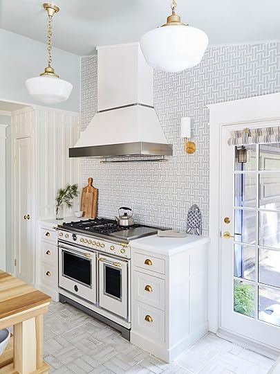
Ceiling Paint Color | Trim, Windows, and Door Color | Door and Windows | Door Handles/Keyless Entry
The inspiration for the backsplash color was the pretty pine trees outside, some of which have really beautiful silvery accents at the tips of the needles (these are called “Silver Tips”). I wanted the kitchen to feel neutral and relaxing but not boring and this color really did the trick. I also added that color on the ceiling, using Clare Paint’s “Rain Check.”
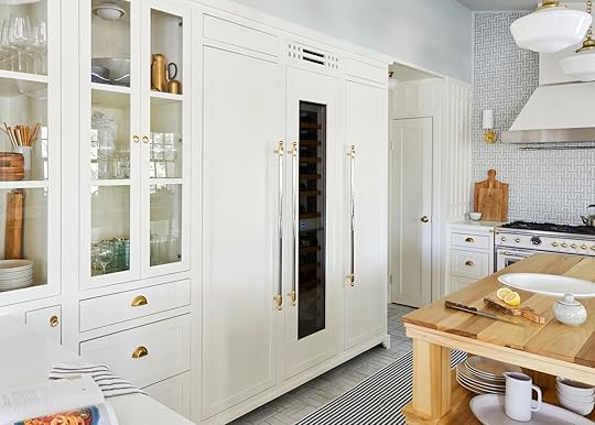
Bertazzoni Refrigerator Column | Bertazzoni Freezer Column | Bertazzoni Wine Cellar Column | Bertazzoni Column Metal Handles
The refrigeration wall is one of my favorite elements in the room. I knew from the get-go I wanted to move the refrigerator and I wanted the whole wall to feel like cabinetry, so I opted for Bertazzoni’s panel-ready columns. I trimmed them out to look like a big armoire and I really love the result. To match the range, I added large-scale Bertazzoni Heritage Handles to the refrigeration wall (which includes 24” Freezer, Wine Fridge, and Refrigerator from left to right).
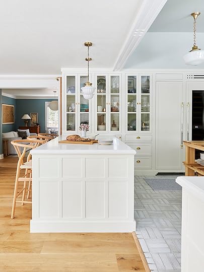
Pendants Over Peninsula | Cabinetry | Cabinet Rings
To keep the refrigeration wall flush I installed a large custom-built china hutch at the same depth. I love the way the whole thing looks and this is one of my favorite vignettes in the room. One thing I may change eventually is the cabinet depth. While it’s great to have the 24” depth to maximize storage, shelving this deep can be a bit impractical because it’s hard to reach all the way to the back to grab things. So I may eventually add a false wall to the back of these cabinets to make them shallower. Or I may leave them the same. They’re a bit hard to style but the depth actually serves a very practical purpose when it comes to renting my house out on Airbnb.
Originally, I’d planned on having these cabinets lock, filled with pretty dishes and my favorite pottery pieces. But that ended up being out of my budget, so what I’ve done with styling is put all the most delicate things in the hardest-to-reach spots. I’m hoping this deters people from using and breaking my favorite stuff while allowing me to have the hutch styled the way I want. So far it’s worked but when you rent your house out to strangers you kind of have to be ready for them to break stuff so I’m just considering that a cost of doing business. I’d love to share all my beautiful dishware with the world, but judging by the fact that guests have already broken/damaged a decent number of things I think you kind of have to assume people are not going to be gentle with your stuff and act accordingly. I want to be generous and share but I also don’t want to be furious when people aren’t careful with things I love. It’s all about balance!

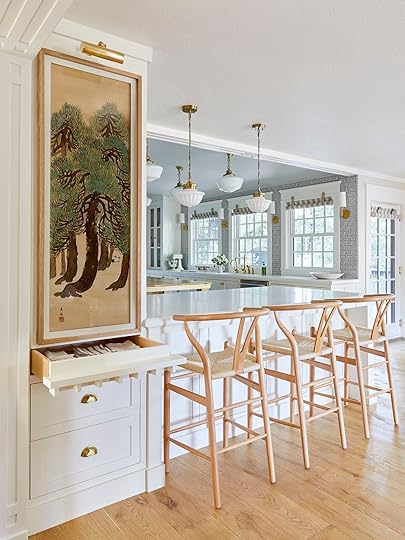
Picture Light | Art | Stools | Wood Flooring (in Smoke)
Another one of my favorite details is the beautiful antique painting I installed on the side of the china hutch. I did this because I don’t love looking at the side of a cabinet and wanted to do something intentional to make the spot a focal point rather than an eyesore. I found the art on Etsy and it was definitely a splurge. It cost $500 and that expense came at a time where I was REALLY running out of money for the project. I’ll do a budget breakdown at some point, either here or in my newsletter, but the overall budget for this kitchen was over $200K (I haven’t finished the tally yet), I put in a bit more than $100K, so I am definitely still digging myself out of a financial hole. Why did I spend $500 I didn’t have on art? Because I knew it would totally define the space. Not only was it in my minty color palette, it speaks to the majestic pines outside the windows. I’m still broke from doing this, but I don’t regret buying the painting at all. I built a frame for it out of scrap wood from a wood flooring project, installed it on the side of the cabinet, and added an art light.
The painting was made in 1923 by Sano Gofu, a Japanese artist born in 1883 and while it is one of a kind, you can find similar works on the Sakura Antiques Etsy shop.
For some reason, it felt a little awkward to just have a painting over drawers, so I decided to disguise the top drawer as an art ledge, which I think really helps ground the painting and make it look like it belongs there. There’s also the added benefit that it feels sort of like the drawer is a secret because it has no hardware on it. And I love any sort of playful hidden design elements like this (someday I want a secret bookcase door).
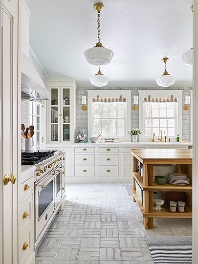
Countertop | Stone Fabricator | Floor Tile

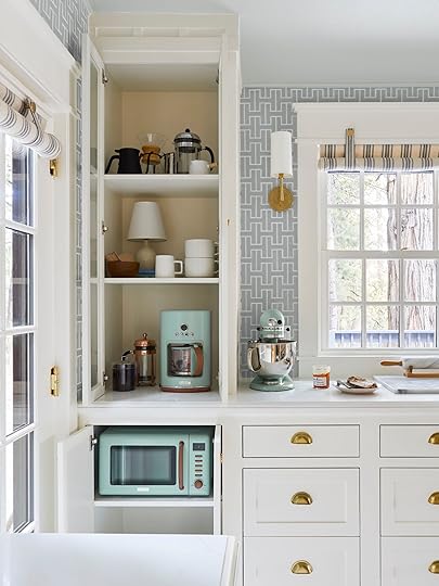
Coffee Maker | Microwave | Mixer
Another favorite corner is the coffee cabinet. I added this cabinet for a few reasons. Firstly, I wanted the three windows to be centered on the sink and there were two extra feet of room on the left. Second, I wanted a place to hide the coffee maker because for as large as this kitchen is, there isn’t a ton of counter space that lends itself to appliances. There’s a huge amount of counter space, but almost all of it is in front of a window or part of an island/peninsula (which would be a weird place to put an appliance). I also loved the idea of a cute little coffee station. Because the look I was going for was historic and traditional (and because I hate looking at them) I decided to do my classic trick of putting the microwave in a cabinet. This is such an easy design hack, I’ve done it in most of the kitchens I’ve ever designed. If an appliance isn’t decorative and pretty like the range, I don’t want to look at it!
There’s so many white/cool tones in the room, so I wanted the island to be a wood finish. I looked into all sorts of ready-made options that were way too expensive but ended up hiring Justin Swaby, the carpenter contractor from my HGTV show “Build Me Up” (and longtime friend) to build a custom island. I designed the island using Sketchup and we made a lot of last-minute changes on-site to elevate it and save money on lumber. For example, I’d originally wanted 4” solid white oak legs, but we ended up doing poplar instead because it was cheaper. And instead of doing solid legs, we fused four planks together. The wood is currently a little green but will desaturate overtime to a more neutral color.

Faucet (in Vibrant Brushed Moderne Brass) | Island Sink | Flushmount
Overall, I really like the way the island came out and it means a lot to me that a longtime friend and collaborator made it for me. Justin also jumped in at the last minute to finish up what the original contractor left unfinished (that’s a story for another day but the original contractor ended up abandoning the job, leaving me to finish it alone for six months until Justin came up to help and get it done). One thing I’m on the fence about is the island styling. Part of me thinks it’s a bit busy. And another part of me thinks it gives the type of “real” that makes Nancy Meyers’ kitchens feel really cozy. If you look at the kitchens in her movies, there’s a LOT going on in the backgrounds. For example, Google the kitchen from “It’s Complicated.” There’s stuff EVERYWHERE. So I’m hoping my island gives a little bit of that “Hey, a person lives a full life here and uses this stuff!” comfort we get looking at kitchens in Nancy Meyers movies.
Faucet (in Vibrant Brushed Moderne Brass) | Beverage Faucet (in Vibrant Brushed Moderne Brass) | Counter Sink | Shade Fabric | Brushed Brass Decorative Wall Hooks | Dining Room Chandelier | Dining Table | Dining Chairs
By the time I got to the window treatments, I’d fully run out of cash. So I asked my mom to help me make a DIY “camp shade” for each of the windows and doors. I actually had these all over the house before I got my glamorous Romans and drapes from Everhem (highly recommended btw I love them). These roller shades are not the easiest to use – you have to roll them up by hand and then tie them back with the straps up top. But because of where this room is, I actually don’t close them at night. They’re mostly for if I leave for long periods and I want to close up the house for insulation. I’ll do a how-to on these soon, they’re pretty easy to make if you have a sewing machine (or a mom who does). And I think they make a great temporary (or permanent depending on how high/accessible the window is) window treatment that looks a lot more chic than those paper blinds people normally use as a stopgap. These windows cost about $20 a piece to cover which is a lot more affordable than custom Romans, which would be around $1500 per window (if you read this blog I’m sure you know by now custom window treatments are not cheap).


Pendant Lights | Sconces | Washable Rugs | Bertazzoni Dishwasher | Bertazzoni Metal Handle
One thing that makes me laugh when I look at the photos of this room is how many lights I put in. In person, you don’t question it at all, it just seems really luxe that there’s all these beautiful fixtures everywhere. In photos though it can look a little busy. I decided when I bought this house that I didn’t want recessed lights anywhere. Controversial opinion: I’m over recessed lights. I think in most cases they are installed in unattractive patterns and the light they provide is very top-down and unflattering. I’d much prefer an attractive small flush mount to a recessed light. But I did want to make sure there was adequate lighting for food prep, so I installed six sconces, eight ceiling pendants, and one cute flush mount. I’m happy with the results as much as I know it looks like I went wild at the lighting store.
Honestly, there are about a million tangents I could go on about this kitchen: Why is there a new door? What happened to my pizza oven/fireplace idea? How did I make the beam that divides the two rooms? Why do I hate recessed lights, who hurt me? Who did all the custom millwork on the sides of the cabinets (me)? Why didn’t I put quartz on the island? Why is that wine fridge so huge? What happened to the contractor? How’d a kitchen cost that much money when so much of it was sponsored? What am I regretting already? And so on. But I think I’ll have to come back another day to explore those (or like I said, perhaps explore them in my newsletter, which you should totally read by the way) because, remember, this was a four-year project and there are literally too many stories to fit into one post without your eyes glazing over as you slowly start to question why you let yourself get sucked into this never-ending rant.
I guess the sentiment I’d like to leave you with is this. I’m very lucky to have gotten to do this project. But I also had to scrimp and save for four years and am currently broke from doing it. It also doesn’t match the rest of my house. Over time, I plan to swap out all the windows and doors to match the new, traditional ones I put in the kitchen, but that will likely take me years to do as I save up and replace them one by one. So you might walk into my house and be like “Wait why is this kitchen a 1929 traditional kitchen and the adjoining room is updated 90s contemporary?” And you’d have a point. Updating your home is messy and can sometimes lead to things feeling disjointed while you save to do the next project.
Most people can’t just do everything at once, if they get to do it at all. And my opinion about all that is that I’d rather save up and spend a lot on something I consider permanent than do something cheaper that won’t age as well. I said no to a few potential cabinet sponsors because I wanted cabinets I could paint by hand. I wanted the texture of the brush strokes and the ability to change them whenever I wanted (and to touch them up given this kitchen is getting a lot of use). Home makeovers often look a lot different than what we see online. Which can sometimes be frustrating to people at home because it makes them feel like their projects are taking forever while everyone else’s are flying by.
If I’m honest, I would have loved it if I could have afforded to do this renovation sooner. And I would have loved it if the renovation itself hadn’t taken a full year, which drove me further into debt because all those months of construction meant I couldn’t rent the house out to help pay for the renovations. Real talk, one of the reasons this project took so long is I kept running out of money. I’d have to stop and wait to save up then start again. And I think this is true for a lot of people. So if you’re stuck in the middle of a four-year (or more, I’ve heard stories!) renovation you’re not alone. At the end of the day having the agency to renovate is a privilege in itself, which is something I tried to remind myself of every time I got frustrated and sick of the project.
The length, complexity, and challenges of this project led to an epiphany for me about the type of content I personally share online and on Instagram. Basically, it’s the job of content creators to make things look fun and enjoyable. We love the type of video where a person walks into a room and snaps and the whole thing transforms. But as fun as all that is to watch, it can become a disservice in that it makes things look a lot easier than they really are. This renovation made me realize that I’d actually bought into the “this is quick and easy!” I’d personally been responsible for promoting. And that has made me a bit more thoughtful about how I present this type of design project online. I want people to have fun and enjoy watching the process, but I don’t want to add to the frustrations people may be having about A. Not being able to afford a renovation in the first place or B. How long their renovation is taking. It’s a hard balance to find as a content creator so I’m trying to find the middle ground between misrepresenting the ease of this type of renovation and being a drag to readers because I am too explicit about the hurdles I had to overcome to get the job done. Overall, I think the kitchen project has helped me be a bit more honest about the hiccups and setbacks that can happen in a renovation like this. I hope that brings comfort to people dealing with the same logistical and financial worries I’ve been struggling with since the start of the pandemic (I know WOMP WOMP we don’t wanna hear that word anymore, but so many people are still struggling).

All that being said, I could not be happier this project is over. I’m actually at the house today working on a few maintenance projects to keep it fresh for my Airbnb guests (installing a new TV, yard work, planning a bedroom makeover, deep cleaning the deck furniture, and so on). I’m glad I have this glamorous Nancy Meyers kitchen now. And I’m even more glad the four years of planning stress and one full year of manual labor that led to it is finally over.
Now, a shameless plug! Would you like to come to my house and use my new fancy kitchen? You can rent it on Airbnb! There are limited slots available for summer but fall is more open as I’ve just released those dates and that is a lovely time to visit Yosemite. Come on over and live your Nancy Meyers dreams!
*Design by Orlando Soira (me!)
**Photos by Sara Ligorria-Tramp
The post At Long Last! The Londo Lodge Kitchen Is Ready For Her Close Up FOUR YEARS Later! appeared first on Emily Henderson.
July 21, 2024
The Link Up: Em’s New Comfort Shoe She Loves, Mal’s Silent Blow Dryer Hair Tool, And A Great Recipe That Whole Family Will Love

Happy Sunday everyone! The riverhouse has officially begun getting shot! Not every room and we’ll be taking our time with the rollout but man are we excited to get it all up. Then we are actually all getting to go to the mountain house next week (YAY!!!). As always we are excited to get in some quality team time while doing something pretty fun we can’t wait to show you. For now, here are this week’s links!
This week’s house tour is a Tuscan-style farmhouse but done in the most beautiful way. It’s textured and whimsical but incredibly calming. Looking at these photos will lower your stress level we promise. Check it all out here!
From Emily: I finally joined the ranks of the Birkenstock clog movement and very happy I did! I was mainly convinced when I saw this lighter blue version that felt more “me”. Now both my eyes and feet are happy:) Excited to wear these with chunky socks in the fall.
From Caitlin: My friend Tommy published a great, smart, important piece in Newsweek this week about the ethnic cleansing of the Armenian people in Azerbaijan. Tommy is kind of a legend in this space – he was the lead attorney on the first-ever successful human rights lawsuit in America against a former head of state (Sánchez de Lozada of Bolivia – check out this book for more!) – and I’m always impressed by his strength of conviction and moral clarity. (PS. You ready to hear some crazy context? 11 years ago, I was slingin’ t-shirts for Tommy’s band on Warped Tour. AND he was an original member of The Get Up Kids. It’s like if Hannah Montana was a world-changing lawyer and not a middle schooler. VERY COOL.)
Also from Caitlin: It’s friend week, apparently! If you’re a Grateful Dead fan, please check out their new collaboration with Rowing Blazers – my friend Mike brokered the deal (partnerships mafia over here!!!) and the pieces are AWESOME. A must-have for any Deadhead, I think
From Mallory: Caitlin has been talking about this for MONTHS and I finally hopped on board and I must second this hair brush tool!! Here’s the deal: I thought that this was one of those little hair dryer brush tools but nay. It heats up and is SILENT. So guys it makes your hair look like you got a blowout but you don’t have to listen to the noise of getting a blowout!! Here’s to getting ready and listening to podcasts/music without the sound of a blowdryer over it!! I’m obsessed.
From Gretchen: When I was camping near Bend a few weeks ago, before I almost chopped my toes off, I popped into my guilty pleasure palace–Walmart! We needed a few bags of ice for the trip and a couple of fishing rods, but somehow I wound up in the clothing section. This only happens every time I step foot in that place. For just $14 I picked up this super comfy sports bra and biker shorts lounge set and I have been full-blown living in it ever since. It is SO soft and stretchy that it feels like a second skin, plus the color is honestly so pretty! I got it in Olive and it almost has an acid-wash-y, worn-in look to it. I love the long-line bra, how high the shorts hit me and the fact that neither piece cuts me in half. Win-win!

 photos by kaitlin green
Denim Dress | Raw Hem Pants (that color is 70% off!! GO NOW) | Denim Jumper
Emily has a deep love for Frank & Eileen. These photos are only a few of the pieces she owns (Jess also has those pants and can’t stop wearing them. So while the quality is so good, this isn’t the most budget-friendly brand. But if you’ve been thinking of getting a piece or two for yourself, we have a special little code that will make things a little easier:) Use code: ESCAPE and it will remove $50 from your cart at checkout – It’s a one-time code to use on any full-priced items (cannot be combined with another code) – Valid through 9/1. Enjoy!
From Arlyn: My household is a big burger household but I don’t always want the richness of beef so I often play around with chicken, turkey, and even salmon. The other night, I threw this recipe together from the NYT (which is subscription base but this one from Skinnytaste looks similar if you skip the breadcrumbs). It was a HIT with myself, my husband, and my 2-year-old. I topped mine with Swiss, a little homemade Thousand Island, whatever veggie fixings we each liked and served with corn on the cob and sweet potato fries. It was summer heaven. Oh, just be sure to squeeze out that zucchini really well or else you’re going to have trouble keeping those burgers together.
From Jess: I know we keep throwing moisturizer recs at you but man do I love Dieux’s New Air Angel Collagen & Peptide Hydrating Gel Cream. I’m also really in love the founder’s story and values which only makes me happier to use their product. One of my best friends has been nudging me to try their products for a while now and for some reason, I always forgot when restocking. Not anymore! This is a light moisturizer that just feels great on my skin and makes me feel glowy. If you want a richer moisturizer they have this one too! I also love following them on TikTok
Thanks for stopping by and get ready for a VERY exciting reveal tomorrow;) xx
Opening Image Credits: Design by Emily Henderson and Sarah Weldon | Styled by Emily Henderson and Emily Bowser | Photo by Steven Mcdonald | From: The Prettiest Green And Pink Kitchen Remodel That We Completed In 7 WEEKS
The post The Link Up: Em’s New Comfort Shoe She Loves, Mal’s Silent Blow Dryer Hair Tool, And A Great Recipe That Whole Family Will Love appeared first on Emily Henderson.
Emily Henderson's Blog

- Emily Henderson's profile
- 10 followers

