
Emily Henderson's Blog, page 132
April 12, 2022
My Best Friend’s Basement Makeover – Starting With The Budget-Friendly Mudroom Reveal
As much as it pains me (and it does) I can’t design all my friend’s or family’s homes when they are looking to hire help. Sure, I’ve done some sponsored makeovers where the partner pays my and my team’s time but otherwise my lack of availability/bandwidth holds up the project immensely. Beyond that, contrary to the ‘hustle culture’ popular belief, one only has so much creativity in their brain, so the more projects we take on, the less good they are (I learned this the hard way). So I made a rule years ago that when friends/family need help and they have a budget, they could hire someone from my team or someone I trust to be in charge and take the lead, thus getting someone’s full attention and creativity, avoiding any friend resentment and still getting me to oversee it. I jump on calls when I can, approve major pieces, negotiate partnerships where appropriate and publish the reveals, but the project moves forward successfully regardless of my bandwidth. So, when my friends Robyn and Ryan were ready to embark on their basement remodel, I shouted fast – ‘OH YOU SHOULD HIRE PRISCILLA!’. Priscilla Frost assisted on the OG Portland project four years ago and impressed the hell out of us – she has the trifecta: design chops, amicability, and work ethic. She has that ‘on-top-of-it-ness’ that makes a project go smoothly. She started this makeover without me and I was brought in as a friend to help guide some decisions, as well as see when and where it made sense to bring in one of my partners. My friends are so happy, Priscilla killed it, the basement is DONE (and they are on to the primary bedroom as we speak!).
THE BASEMENT GOAL:The goal was to totally reconfigure their basement. We would carve out a bedroom for their tween son, design a proper mudroom off the garage, move and remodel the previously carpeted bathroom, and furnish and style it all to be much more inviting, pulled together and grownup (like them). It was full of potential, but still a daunting task which is why they put it off til they just couldn’t any more (a ‘pandemic push’ they needed to take). It took a full year between demo and shoot (livable a few months before we shot it) and the project suffered from the usual supply chain issues and labor shortages. But Priscilla and JP Macy (the contractor) did an EXCELLENT job of absolutely transforming the basement, and thus this home.
They had the space, just needed it to work better for their family. Priscilla and JP worked together on the plans to make sure that they were doing the most efficient and affordable reconfiguration, move as few walls as possible, but make it make sense for the long run. Robyn and Ryan are in that typical position where they love their neighbors, school and community that they don’t want to move just to upgrade and have more space, but they have worked hard and were ready to enjoy their home more.
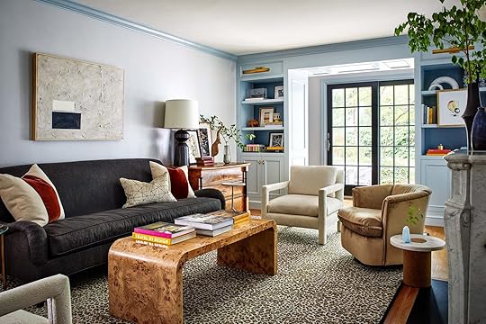
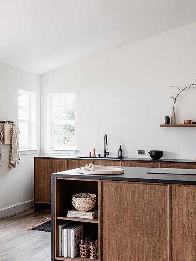
I’m pretty sure the “MUDroom” was coined in the PNW and this room is IMPORTANT if you are lucky enough to have one. Their mudroom was off the garage, below ground, where the boys exit and enter a few times a day. Sure, it’s in the basement with no natural light, and not where guests come in and out but y’all they really wanted it to look more welcoming. They needed to add function (shoe and coat storage), and to have it feel more inviting 
Now while some of the rooms I was more involved with the design (the family room and the tween boys bedroom) this room is almost 100% Priscilla’s work (I gave advice throughout and styled the photos).
Priscilla created a few different design plans for them to see product options and design ideas.

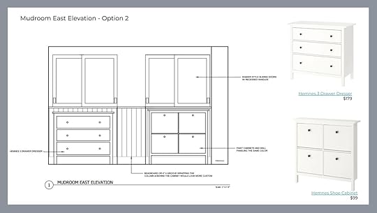
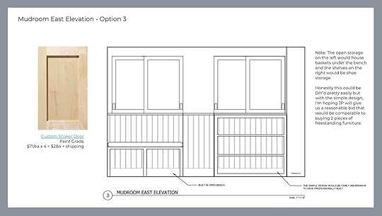

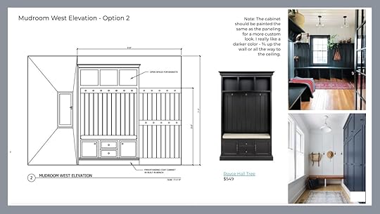
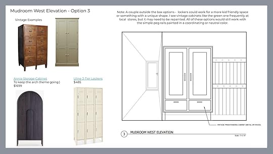


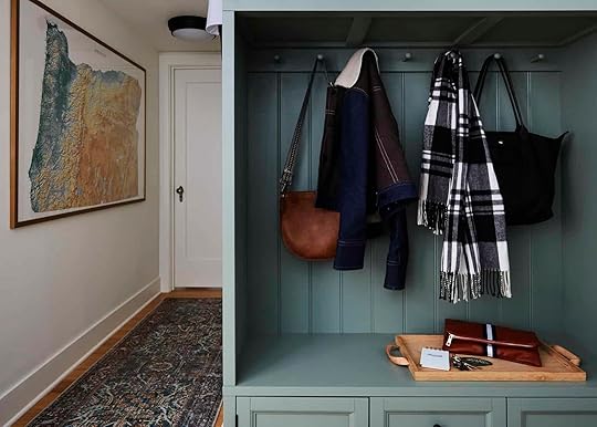
After a lot of options and ideas, they went with the mid-budget idea that Priscilla pushed, that included a readymade piece painted and hacked to look more built-in. It was a great solution that didn’t cost as much as custom cabinetry (which is wildly expensive) but more sophisticated than any ordinary stand alone cabinet. Just a note: Priscilla did charge her time for this but it was less than a typical designer as this was one of her first clients and she was working towards portfolio work – i.e. sometimes the hourly you pay into someone else to do your DIY will add up substantially so it’s good to be upfront to avoid something costing $4k that you might have been able to do yourself

Are you ready? HERE WE GO.

Rug (similar) | Baskets | Paint Color | Cabinet | Remove Shoes Sign | Umbrella Stand | Tray
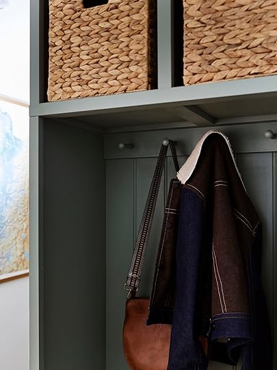
It’s quite the transformation and has brought so much happiness every time anyone walks through that door. This is a proper mudroom. Priscilla created both open and closed storage, peg-rails for coats and bags, and really good durable products to make this space hyper practical and still so cute.

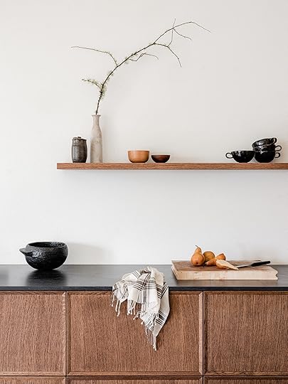
Please note the addition of the same vertical beadboard installed in the cabinet. It’s on on the same line as the peg rail on the perimeter of the mudroom and painted all to match so it looks built in and seamless.


The cabinet painted the same color as the walls, plus the custom peg rails and bead board throughout give it a super high end look. It looks SO GOOD.
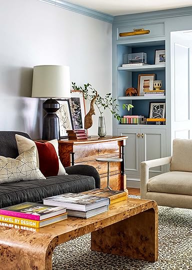
I collected all the hanging baskets from vintage shops around town (a lot of them are for fishing) and seeing them here I HAD to leave them, but expect many more in our home. What we didn’t get to shoot (because it was literally pitch black) was behind those sliding cabinets Priscilla put in more shoe storage – a readymade rack for their backup shoes.

A few notes about the products Priscilla bought – that rug is printed and SO GOOD. It’s affordable, very durable and obviously forgiving when it comes to dirt. The boot tray was one that I had shopped for for a long time – we love how narrow it is which suits the space, but allows for a lot of shoes. Priscilla intentionally brought in these hits of black to keep the space feeling modern – the mirror and umbrella stand really edge up the space.
But what makes a truly practical, functional mudroom?? I am glad you asked..

It is mostly making sure all the things you like to come and go with have specific, easy to access places to store them. This is why we love hooks and peg rails, and why that readymade cabinet is such a good piece for this particular mudroom. And durability is always a plus in a hard-working mudroom
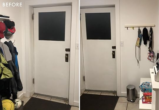
Last but certainly not least, we can’t wrap up without a super satisfying before and after:

Priscilla Frost, you are wonderful and JP Macy of Sierra Custom Construction I enjoy the heck out of your work Stay tuned for more reveals from this project, coming to you in the next few weeks.
*Design by Pricilla Frost
**Styled by Emily Henderson
***Photography by Sara Ligorria-Tramp
The post My Best Friend’s Basement Makeover – Starting With The Budget-Friendly Mudroom Reveal appeared first on Emily Henderson.


April 11, 2022
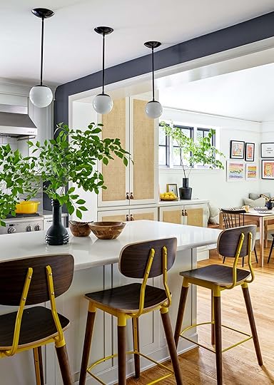
New Home Tour: Susan Tynan Started A Multi-Million Dollar Framing Business – Here’s How She Hangs Art In Her Home

There are few things we love more than a new home tour served with a side of actionable design tips. Today’s home tour is home of Framebrigde’s CEO Susan Tynan, who commissioned Washington DC-based designer Zoe Feldman to refresh her home. If you read this blog, I guarantee you know Framebridge. You’ve seen their frames in Emily’s home and we’ve sung their praises again and again because what they do is make framing and hanging art EASY (something I thought I’d never say). They do custom framing, digital photo framing, and will even help you choose a layout for a gallery wall. So, when Susan shared her home with us, we knew we had to ask her all about her framing philosophies. Where and how does a framing expert like to hang art and what does she deem frame-able? You are about to find out while we tour her colorful, modern traditional home that is dripping with charm and personality.

Wren Black Frame | Heathrow Black Frame | Palermo White Frame | Monterey White Frame
If you’ve ever visited the Framebridge site or store, you know they are up to frame anything from flags, to jerseys, to souvenirs. They really emphasize personal artifacts as art and that is a principle we wholeheartedly support (we love all things budget-friendly and personal). On what Susan deems frame-worthy, kid’s art is up there, as you can see in the gallery wall above her breakfast nook. Going the kid art route means less creative control plus bright colors and shapes, which is very fun and brings so much personality to a space. That said, the frames play a huge part in making the gallery wall feel intentional. “To keep some semblance of order, it’s all framed in thin white and black gallery frames“, Susan says.
Now, if you are anything like me you want all of the gallery wall hanging advice you can get. Susan’s advice is to always take the frame dimensions into account: “If you’re planning a gallery wall with unframed pieces, don’t forget to check the final framing dimensions – the matte and frame add a lot of area to the final art size. The good news is that you get a lot of visual bang for your buck.”
Hanging art isn’t the only way she plays with color in her home as you will see. Paint color plays a huge role, even here in her mostly white kitchen. The sliver of blue paint makes a huge impact by visually breaking up the white surfaces.
While we are on the topic of color we must talk about the barstools. They are, goes without saying, FANTASTIC. Who knew dark walnut and schoolbus yellow would go together so well?? Excuse me while I examine my own apartment to figure out how I can implement bright yellow all around me!!

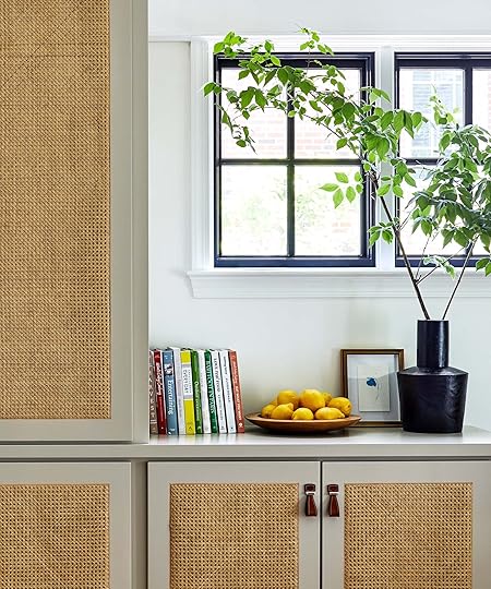
Speaking of making an impact, the cane cabinet fronts with leather pulls bring in a beautiful mix of textures that add a layer of warmth to the space.

The entryway and staircase are painted Georgia Peach by Benjamin Moore and became the perfect canvas for another gallery wall. One question we get a lot is how to mix and match frame styles and colors in a gallery wall. Susan’s expert point of view is, “there are no rules, only guidance.” Each of the pieces here, Susan explains, are full of personal significance which influenced her choice to mix and match the frames: “All of the items have personal meaning to me and were collected over the years, so I used a huge range of frame styles – woods and metallics and bamboos. It is layered and a little crazy – intentionally. I hung it all at once, but I wanted it to look collected over time”.
When you hang items with a personal story behind them, it makes your home feel even more special and unique to you. One item Susan pointed out is the yellow poster in the center of this gallery wall that has a long history behind it. “I have a Corita Kent poster that was in my childhood bedroom that I reframed, of course. I remembered it as a dated, burnt orange print and when I saw it again, I absolutely fell in love with it. Corita Kent is exceptionally cool – she was a nun, a pop artist, and a civil rights activist” she says.


The Little Gift 7×9: Burl Wood | Mandalay: Gold Bamboo Frame | Palmer: Matte Black Scallop Patterned Frame | Bali Black Bamboo Frame | Mercer Slim Clean Black Frame | Olympia Gold Frame | Monterey: Whitewashed Frame

Isaac Portrait | Paloma Portrait
In her formal dining room, color and art play an important role in making it feel both regal and playful. The dark navy paint color, wallpaper, and curtains bring a level of sophistication and the John Young Design House portraits really emphasize the modern traditional style with a hint of sass. The same goes for the pendant light which has a traditional shape and a playful, colorful pattern to top it off.

Again, bright yellow makes another surprising appearance in her built-in shelves. Anyone else utterly obsessed with this color combination??
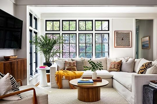
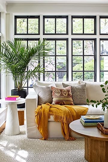
In the living room, natural light plays a huge role making the space feel warm and inviting. For a calming effect, the color palette is mostly neutral with pops of color and pattern sprinkled throughout to keep the playful theme going.
Unexpected places to hang art is always a hot topic around here, so I had to ask Susan where she likes to play with hanging her art. Besides hanging art to be seen in her Zoom background, she also loves to display art on bookshelves. “I love to hang frames over a bookshelf. It looks so English country reading room to me.” she says.
If you thought I’d breeze over the leopard print rug, well then, you don’t know me at all! I am obsessed. As someone who grew up in a “Cheetah Girls” themed bedroom, I’ll always have a special fondness for animal print. The execution here is perfect and on par with Susan’s style: modern, playful, colorful, with a hint of traditional charm.

Leaning art is another beloved EHD styling trick, and one Susan also loves to apply in her home for its ease and simplicity. The larger print is of falling water that she took on her iPhone and the little sketch of a woman she downloaded from Juniper Print Shop, which just goes to show the impact the right frame can make.

When I saw this shot, I was immediately intrigued and had to ask Susan how they executed the piece above the fireplace mantel. It appears to be art layered over another larger piece of art so I had to investigate. Susan explained, “we hung an antique mirror over the fireplace and cut a small circle out of it so we could hang a picture hook in the middle and hang a frame over the mirror, in the center, over the fireplace. It’s awesome and I definitely wouldn’t have gone there without my friend & designer Zoe Feldman.” She is right, it’s awesome and so innovative.
Wallpaper | Mandalay Gold Frame
We love a bold wallpaper moment and this powder room does not disappoint. Wallpaper as animated and playful as this one is perfect for a powder room, because it’s a great place to take risks. This is also a room Susan advocates for playful art. “I always love a fun art print framed in a powder room. You really have free rein in a powder room! If you love something, but you’re a little scared of it, you can always put it in the powder room!” she says.
In the bedroom, paint color plays a role once again but in an understated, calming way which is perfect for a bedroom. The soft blue is gentle on the eyes and is complimented with neutral tones and organic textures. Now, back on the art of framing, Susan says “for art or photos that I’m hanging alone as the focal point of the wall, that’s when I really think about the frame.” For this black and white print, she went with the Lawrence, which is a skinny medium burl wood frame. It contrasts beautifully with the black and white photo to really make the piece pop.

If you learn anything from this post, let it be that you already have more frame-able things than you may think. What I love about Susan’s philosophy is that almost anything sentimental can be art. In fact, when asked what her favorite thing she’s framed is, she answered: “I scanned a few of my parent’s wedding photos and framed them for a few family members. They’re black and white photos from 1968 and I love them. I also have a newspaper front page from Cleveland in 2014 when LeBron James returned to the city. I grew up in Cleveland and it meant a lot that LeBron, a superstar, felt duty-bound to return home. It’s framed in Georgetown, which is a fluted gold frame and I love that it’s a modern sports megastar framed in this pretty little classic frame.” So next time you are struggling to find affordable art (we’ve all been there) look around your home, and take inventory of what’s sentimental to you. Truly, the right piece with the right frame can make all the difference.
I hope you enjoyed touring Susan’s home as much as I did, and take away some helpful art hanging tips. Huge thanks to Susan for sharing her home with us and letting me pick her brain! Now, if you have any questions or comments, please fire away down below. xx
*Design by Zoe Feldman
**Photo by Stacy Zarin Goldber
***Home of Susan Tynan
The post New Home Tour: Susan Tynan Started A Multi-Million Dollar Framing Business – Here’s How She Hangs Art In Her Home appeared first on Emily Henderson.
April 10, 2022
The Link Up: The New Cookbook Emily is All About This Spring, Jess’ New Clean Beauty Finds, And 3 Books Ryann Couldn’t Put Down
Well, we had a pretty good week over here. Did you see Rashida’s dining lounge plans and that she’s asking you a BIG favor? Did you catch Sara’s everyday version of her kitchen? How about Erin Hiemstra’s unreal beach house? Like we said, GOOD. We hope yours had some highlights too and if not let this be your treat to yourself. Let’s link up!
This week’s hour tour is an INCREDIBLY charming farmhouse. Artist Philippa Jeffrey and her husband brought this 18th-century farmhouse back to life. It’s full of color, pattern, texture, and pure coziness. Enjoy!
From Emily: If you’ve never made a salad from an actual cookbook you could be missing out. I started doing this during lockdown (with fresh dressing, interesting nuts/ingredients) and it took my salad game to the next level. I sound so boring and basic writing that, but I LOVE a good salad. So when this book, SALAD FREAK, came out and I read about it in a magazine I immediately wanted it in my repertoire. It has over 100 recipes from Martha Stewart’s personal chef. MOVE OVER SOUP.
Also from Emily: Y’all, I live in Portland now and you don’t walk around SW without a swoosh on…or else. Plus I have many friends who have worked there so I like to support. But I’m more into their lifestyle gear than intense athletic gear, so I found these which have the edge that my checkered Vans did (I can’t find one of them, putting a warrant out for shoe-napping arrest now) and are way more comfortable. At first I was worried about the laces (all the effort!) but I can slip them on and off real fast. They look cool with most outfits and give me a tiny bit of a lift which I like.
From Ryann: I am finally getting back into reading and since I have this rare disease where if I finish a book I have to tell someone or I’ll explode, I figured this would be a good place to share. Last week I read 3 books: 1. My Lovely Wife by Samantha Downing, a thriller about a husband and wife who become serial killers with a pretty shocking twist at the end. 2. My Year of Rest And Relaxation by Ottessa Moshfegh, about a privileged, miserable woman who decides she wants to sleep for a year (it’s funny and dark and I could not put it down – Ottessa is a great writer) and 3. The Silent Patient by Alex Michaelides, a thriller about a psychotherapist who tries to get his patient to speak about her crime after shooting her husband 5 times in the head with seemingly no motive. They were all entertaining, fast reads that I would recommend to anyone who is trying to enjoy reading again. Oh, and I couldn’t have finished them without the help of my trusty rechargeable book light.
From Caitlin: I have a wedding and/or baby shower every month from April 24 through the end of the year (great for traveling and seeing longtime friends, not awesome for someone who’d like to save enough to buy a home in this millennia). If you’re in the same boat and on the hunt for something to wear, I just wanted to call out my all-time favorite event-appropriate dress destination. I bought one of these dresses on sale when the Anthropologie at The Grove was closing like 4 years ago and it’s been a total mainstay since (here’s a glimpse of mine from a wedding in 2019, and I just wore it again at a wedding last month!). The prices are great, the cuts/patterns are all super appropriate, the quality is SUPER high, and it hits the ideal balance where I have never felt under- or over-dressed. I also always feel excited about rewearing mine and never like an ~outfit repeater~, which is the best. HUGE FAN.
Also From Caitlin: “Don’t cross me because I will get my revenge by being marginally less pleasant the next time we meet” – INCREDIBLE. I feel like this is kinda all of us, no? (This part is definitely me: “You’ll be devastated to see I only included six smiley faces when there were clearly seven smiley face opportunities.”)
From Mallory: Chase and I made this pasta al limone for dinner the other night and OMG was it good – we used pappardelle instead of spaghetti because we found a really legit noodle at a local market. The recipe is in the video at around 4 minutes 15 seconds and you gotta watch the tension between that very attractive Italian chef and the host. If you try this let me know! It was delicious
Also From Mallory: Need a vase for some spring florals?? This is literally the only vase I put fun flowers in (because it’s equally as fun as the florals and might be one of the only vases big enough for large bouquets) it’s no secret that I love Jonathan Adler and while it’s splurgy, I love how it makes my space feel
From Jess: I’m really in a vacation mindset… actually I am currently on vacation and feel a bottomless amount of gratitude about it. But these are the last few things I bought. First off, you should know that I’m at a bachelorette and needed a black swimsuit, it was on our itinerary as a requirement. So I headed to J. Crew and bought this “1993 Underwire Bikini Top” and these simple, cute cheeky bottoms. I love that the top is supportive and reminds me of the tops my mom would wear to the beach and the bottoms fit great with just a hint of cheek:) I feel really good in it which is all I can ask for! Mission accomplished. Then I was influenced by Julia from Chris Loves Julia and bought these $25 tortoiseshell aviators. These Ray-Ban aviators are my classic go-to’s. BUT I really don’t want to take a chance losing them, so these are a very cool version that I absolutely plan to keep a very close eye on but won’t be as bummed if something happens to them.
Also From Jess: Since there’s still a little bit of time before the Sephora sale is over, these are the things I bought and why:
Ilia Super Serum Skin Tint SPF 40 Foundation (in Diaz): I wish I would have bought this a long time ago. I had the Kosas Tinted Face Oil Comfy Skin Tint but it ended up making my dry skin even drier which was such a bummer because I loved the coverage. However, this one has SPF and actually seems to moisturize my skin! 10/10 Ilia The Necessary Eyeshadow Palette (in Warm Nude): My neverending quest to be a glowy goodness continues with this eyeshadow palette. It’s so beautiful and I love how it looks. Summer better be ready for Bunge. Ilia Limitless Lash Mascara : Yes, I went on an Ilia shopping spree but when a brand is good, it’s good. I remember Mallory raving about this mascara. And let me tell you that woman knows how to sell a product. The good news is that she’s always right. So I decided to try a sample of this and of course loved it immediately. Naturally, I picked up the full size in the sale.That’s it from us. Happy Sunday and see you all tomorrow! xx
Opening Image Credits: Design by Philippa Jeffrey | Photo by Malcolm Menzies | via Homes & Gardens
The post The Link Up: The New Cookbook Emily is All About This Spring, Jess’ New Clean Beauty Finds, And 3 Books Ryann Couldn’t Put Down appeared first on Emily Henderson.
April 9, 2022
Win A FREE Virtual Design Consultation With Me!!

Y’all. I never do this but I do love a contest and If you’ve ever met me in person you know that I LOVE giving out free solicited advice. When asked, I will dig in, insert myself like it’s my life and my house and really try to solve your problem. The book is coming out in a few weeks and we are so excited (and yes, getting super nervous) to have it out there in the world. I REALLY hope you like it. Sometimes I think I just wrote this book for me because I needed it, and I’m honestly too close to it to have an objective point of view. It’s called The New Design Rules and its a guide to renovating and decorating from start to finish (based on my learnings, experiences and perspective). I really, really hope you like it. So to thank one of you for pre-ordering we figured we’d do a giveaway contest for a free 1 hour (or more – I can really gab) consultation. Here’s how it works: If you pre-order the book (THANK YOU) send us a photo or screenshot of the receipt by emailing to booktwo@emilyhendersondesign.com, you’ll be entered to win a FREE one hour consultation with me. We can discuss (almost) ANYTHING in the design or business realm. Have a design agony that you just can’t figure out? I got you. Want me to look over your kitchen plans and just say yay or nay to your tile? No problem. Or maybe you want to start a blog or get into the design business and just want to pick my brain? GREAT. I have so much to say and HAPPY to get into it with you. And don’t worry – I’ll prep for it, so if you send me your design conundrums and questions with photos/floorplans, mood boards, etc. before hand you’ll get some tangible thought through advice. It will be fun, I promise! I’ve done these for school and charity fundraisers and it’s a blast, actually. I don’t sell consultations as part of a service at all, nor am I with The Expert right now because I have zero hours left in the week. But on special occasions it’s actually so fun to just connect and talk design with a reader.

 PRE-ORDER HERE
 You have now until Thursday May 5th to pre-order the book online and send through the receipt to booktwo@emilyhendersondesign.com. Then we’ll draw one of you and email to set up the consultation (Announced May 8th with the consultation late May, early June). And yes, you can order 3 books and enter 3 times (or more!) OR if you have a friend/daughter or sister who is a big reader and you don’t need the consultation, then you could give your consultation away as a gift to them. Or maybe your sisters want the book but don’t need a design consultation – just bug them to buy and have them email their proof of purchase through and they can transfer the prize to YOU. AND if you already pre-ordered a book OF COURSE you can enter! You would have had to buy online so just find proof of purchase and send it through. Obviously no returning it or canceling
And if you are in the Portland or New York area stay tuned for book signings at Rejuvenation – (the week of May 9th in New York, and the week of May 26th in Portland).
Thank you all for pre-ordering, seriously. It means so so so so so much to me. Thank you
The post Win A FREE Virtual Design Consultation With Me!! appeared first on Emily Henderson.
April 8, 2022
What You Bought Last Month: Some Spring/Summer Essentials + A Surprising Furniture Pick


Hi friends!! It’s Mal again (I know it’s been a minute, how have ya been?). I’ve been tasked to write another EXCITING (no that wasn’t sarcastic, I swear) blog post about what you all bought from our site last month. We genuinely think it’s fun to look back at the numbers and see “WOW everyone LOVES a _____???” (I’m obviously not gonna give away the list quite yet but you know what I mean). Alright, now let’s boogie.
10. Emily‘s Tortoise Shell Print Aviator Sunglasses
Can you guess the price on these?? Anyone? Bueler? (That joke is funny on a blog because I’m just writing which is kind of like talking to yourself since no one can respond to you until later in the comments you know?). Okay, drumroll please…12 BUCKAROOS! What the heck??? If you’re shook just know we all were too. These affordable sunnies look expensive (Emily’s friend literally mistook them for designer) which is perfect for a person like me who is too much of a klutz to be trusted with nice things (especially something as breakable as sunglasses). Onto the next.
9. Emily’s Favorite J.Crew One-Piece Swimsuit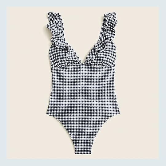
I was shooting Instagram stories while Emily was doing her swimsuit post last year and IMMEDIATELY thought this suit was my favorite of the bunch. It’s classic and has a ruffle (I love a ruffle), plus I think it’s super versatile and can be worn to any event that involves water. I love this suit a lot, and apparently you guys do too!
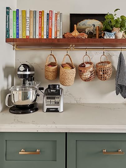
8. Sara’s Brass Rail System
If you’re desperate for extra counter space in your kitchen (who isn’t) then this is the most genius solution & you’ll see why. In Sara’s kitchen she totally maximized her counter space by hanging her fruit bowl, dish towel, measuring cups and more from this brass rod. It’s pretty AND functional (and you know how we feel about that).
7. Emily’s #1 Winter + Summer Cotton Coverlet
This reversible schoolhouse blanket looks good in any home. It’s so classic (Em has had it for YEARS) and it looks amazing at the end of a bed, over the back of your sofa, folded in a basket, or at the bottom of a credenza because the pattern is just that good. We always show you the blue side so if it doesn’t ring a bell, just click the link and you’ll immediately recognize it if you’ve ever been on this site before
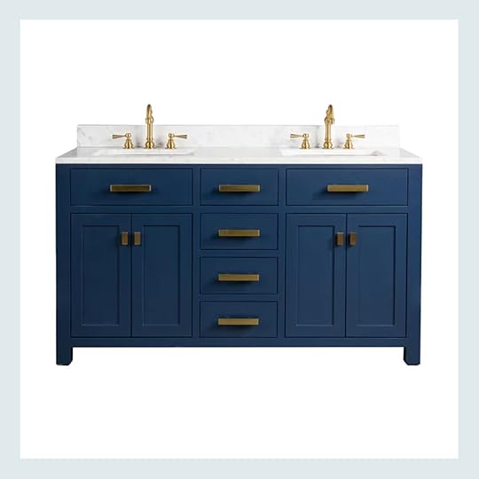
We get a lot of random google traffic (which we love) but sometimes that means people will buy stuff from posts that are old & we have no idea where they came from. Introducing this affordable (and stylish) bathroom vanity! We may not know where we linked her, but she’s a real stunner – and it’s good to know people are doing bathroom renos right now! More bathroom reno content coming your way??? Probably
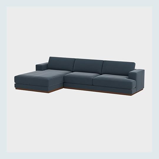
Emily posted this on IG stories so if you didn’t see it SPOILER ALERT – the Hendersons have found their family room sectional for the farm. It’s the perfect depth to lounge AND it’s incredibly comfortable…if you’re looking for the perfect movie watching sectional, we highly recommend this one
Did ya know EXCELLENT jeans don’t need to be insanely expensive?? After being a Levi’s person and a self-proclaimed denim snob (she said it first not me) Ryann just found these incredibly comfortable jeans from Old Navy that fit perfectly. They hug in all the right places, plus they’re great for curvier bodies, especially for those that have a hard time finding jeans that aren’t too tight on the thighs

This sauna blanket was a bestseller once again!! I personally tried this when I was up in Portland and I’m a HUGE fan. I just love saunas in general and this is an awesome alternative for going to a sauna place or installing one in your house (I mean that kind of reno can cost some serious cheddar). Em also wanted me to tell everyone that she recently got the Red Light Face Mask and has tried it a few times and really likes it so far.
2. Mallory’s Striped T-Shirt
Ah I am so happy to run into my favorite t-shirt on here! This tee is so comfy, light weight (just in time for summer) and transitions well between workout and real life if needed (I definitely cross it over from time to time). Plus I like that it’s casual but cute on a zoom call. Throw it on with your favorite denim shorts and some strappy sandals and you got yourself an easy and cute summer look!
1. Caitlin’s Linen Dress
My visceral reaction from looking at this dress was “oh damn that’s cute” so I’m not surprised to see it here in 1st place. Caitlin linked this a few weeks ago in a link up & we’re all in love over here. This dress is breezy and perfect for spring (Easter anyone??) or summer looks. I love linen and this kind of smock style dress because you don’t really need to wear a bra (this is coming from a small boob lady, if you’re bigger up there you can still wear a bra, as the sleeves will cover the straps!) 10/10 and great rec, Caitlin!!
Thanks for popping by friends, we love you all!! Make sure to come back tomorrow for a very exciting announcement!
Opener Image Credit: Design and Photo by Sara Ligorria-Tramp | From: How Sara Course Corrected Her Initial “Clean, Modern, And Very Neutral” Primary Bath Design Plan Into The Actual Design She Wanted – It’s A Suprise Reveal!
The post What You Bought Last Month: Some Spring/Summer Essentials + A Surprising Furniture Pick appeared first on Emily Henderson.
April 7, 2022
Trend Alert: Vintage Murano Chandeliers Are The Next Big Thing (+23 Examples In All Kinds Of Homes)

I think that pretty much everyone on the EHD team will agree that I’m the world’s WORST dispenser of advice. It’s not for lack of caring (or lack of listening. Or lack of trying!) – it’s just that I have one stock piece of wisdom: “what does your gut say?” I KNOW IT’S NOT HELPFUL, FRIENDS. But I’m a lifelong proponent of just trusting your gut – we’re built to notice patterns! Our instincts pick up on things that don’t always jump out at us! – and at the end of the day, it’s never steered me (super) wrong.
So when my gut sees a photo of a Murano chandelier and starts SCREAMING, I do what any normal person does – I run to the nearest computer, hop on the blog, and then I spend about 10 hours accidentally penning a dissertation where I dissect all my thoughts and feelings about chandeliers and artisans and scale and zoning and who knows what else in real-time. JUST LIKE A COOL, NORMAL LADY. Buckle up cuties – today, I want to walk you through what I’m pretty convinced is the next big thing in lighting. (My credentials: in August, I swore that vegetable-shaped dinnerware was the next big thing. You know what popped up at Anthro this week? CABBAGEWARE. There’s a method to the madness!)
But before we get super in the weeds on the inspo, I wanted to show you the two, uh, “livable” photos – you know, the ones that stopped me in my tracks and made me think, “oh, maybe these Murano chandeliers aren’t just for heiresses in centuries-old palazzos or trend-forward Kelly Wearstler clients in high rise buildings.” Stick with me for a second here, yeah?

 left: design by lázaro rosa-violán, photo by ludovic magnoux & martin mendez, via interiordesign.net | right: via journelles
Is there anything goofier than me being like, “here’s a livable space” and then SHOWING YOU A PICTURE OF A TWO-STORY HOTEL LOBBY? The brass desk is what got my gears turning, though – remind you of anything? – and I was pretty immediately enamored with how balanced and fun the metal looks when paired with this MASSIVE glass chandelier. It’s a pretty traditionally “feminine” palette (pinks, metallics, and graphic stripes, oh my!) but it doesn’t feel like I’m being hit over the head with glam, you know?
This space on the right is a bit more livable, though. This chandelier looks like it’s from the 70s (can you tell I’ve saved, uh, a million of these on Etsy recently?), but look how fresh it feels in this space! There are some other awesome vintage elements here – the antique ceiling medallion! The 1950s Flag Halyard chair! – but it just feels new and bright and happy and clean in here. LOVE. That’s what I’m going for, too!!! Now, with all this in mind, LET ME SHOW YOU THE ~DRAMA~ INSPO…
 design by david bromley | photo by mark roper | via homes to love
HUGE. STUNNING. CHANDELIER. I’m in love with how restrained this color palette is – y’all know I’m a lover of a tightly-edited red and blue room! – but I’m most impressed by HOW FREAKIN’ GREAT this enormous fixture looks hanging in a seemingly-average height room. Like, did you even notice that there’s a hole in the ceiling? I DIDN’T! So much patina. So much character. There’s this old Dorothy Draper quote about design that I love – “If it looks right, it is right” – so let this be a lesson to all of us to throw away the rules on traditionally-appropriate lighting scale. We’re just GOING FOR IT in 2022 and filling our homes with things we love, friends!!!
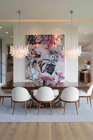
 left: design by lisa park interiors | right: design by jan showers, photo by scott frances, via architectural digest
AHH. (Yeah, I’m like, screaming at my computer while writing this – hope that level of enthusiasm is coming across.) I cannot tell you how much I love this out-of-the-box usage of two *big* Murano chandeliers. We’d normally see a long, vertical lighting fixture over that dining table on the left (you can grab the interior design school-approved traditional dimensions here), but how special do those two petal chandeliers feel? It’s unexpected and beautiful and the symmetry framing the art is just, like, AHHH! (The screaming is back!!!)
I can’t believe how great these fixtures look in this kitchen, too. If I came up to you and was like, “hey, can I hang two uber-glam vintage Italian chandeliers in your minimalist mid-century kitchen,” your answer would probably be “GIRL, PLEASE COOL IT with these insane hypothetical scenarios in every post.” (That’s the long way of saying “no thank you.”) But it makes such a huge difference here – the space is way more elevated by the more surprising light fixture choice. It’s such a great balance, don’t you think?
 design by todd black | photo by ken hayden | via architectural digest
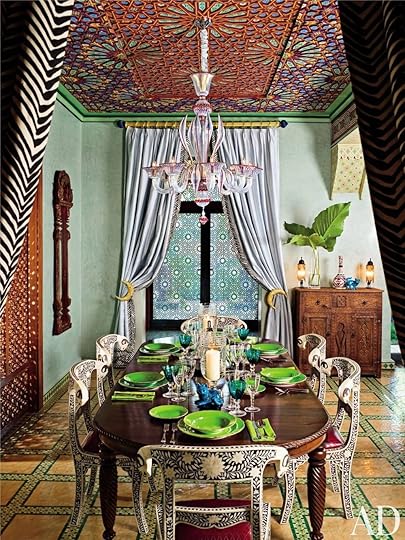
SO well collected, designed, and styled. Everything here is an absolute winner – bone inlay chairs! Tile floors! Stained glass windows! Frescoed ceilings! Even the curtain rod is special!!! – but it all sings together, right? It’s maximalism done right. The chandelier here is so dreamy, too – it’s visually lightweight enough to keep your eye moving through the space, but impactful enough to hold its own in such a bold and vibrant room. It’s simultaneously playful AND chic. GAH. Masterful, guys.
 design by ronald van der hilst | photo by michael james o’brien | via the cut
ARE YOU KIDDING? I’m not normally a Louis XVI chair gal, but I will absolutely make an exception for this sitting room. It’s just so fun – like, I feel like I have a great idea of the person who lives here – and the balance between the classic floors, incredible ceiling, 80s track lighting (look close, it’s up there), milking stool, and SPECTACULAR chandelier literally has me losing my mind over here. I kind of love the reminder that if the bones are good, you can kiiiinda get away with doing whatever you want. It’s nice to not overthink things, you know? (Paint your chairs! Leave your tile floors! Throw a log near your door! It’ll all work out!)
 design by carleton varney | photo by kim sargent | via architectural digest
Traditionalists, rejoice – there’s something for you, too. Picture something more classic here – maybe something in brass with a bunch of arms that all have those little lampshades on them? You know the ones I’m talking about? – and it falls so, so flat compared to all the personality that this green glass chandelier brings to this space. I would put this fixture in my house in a FREAKIN’ MINUTE. I don’t care that it’s huge. I don’t care that it’d be about 4′ off the ground and that I’d have to walk around it every day. It’s worth it.

 left: design by waldo fernandez, photo by roger davies, via architectural digest | right: design by martyn lawrence bullard
Y’all, I gotta hit the lotto. (Can we please manifest it? I’ll throw a party, like Emily did at the first Portland project, so we can all ogle the petal fixtures that I would obviously be investing in.) I just love that they’re simultaneously so quiet and so impactful – there’s not a ton of visual clutter, like you often see with chandeliers that have a ton of arms or a large horizontal presence. These are just so soft and light and GAH. Are you starting to see what I’m seeing? Are you picking up what I’m putting down right now??? These Murano chandeliers look great everywhere, guys!!!
 design by margherita missoni | via architectural digest
Case in point: AN OFFICE. Who needs a semi-flush mount when you could amp things up with a vintage chandelier? And, like, look how those peach-colored walls are reflecting off the mint glass. CHEF’S KISS. Also worth noting is that there is a full-on Mac desktop in this photo, which I literally did not even register until I stared at this shot for about 5 minutes straight. It’s a pretty compelling case for going bold on the lighting, yeah? (It’s also nice to see a fully styled room with some interior soffits – I know that we got a lot of requests around working around more “cookie-cutter” or “white box” home features, and this is just proof that you can add a ton of character and personality with just decor elements.)
 photo by oberto gili | via architectural digest
Or you can add the aforementioned character and personality with architecture that’s supported by decor elements. EITHER WAY. I pulled this shot because I love how these two fixtures interact with each other – I know that picking lighting for an open concept floor plan can be a biiiiit of a nightmare (understatement?), so it’s fun to see examples of two TOTALLY different lighting styles working so well together.
 design by bibi monnahan | photo by françois dischinger | via architectural digest
I know we’re going hard on the color and pattern here, but I love this room because it swung hard in the opposite direction – instead of going huge and filling up all the vertical space, this chandelier is scaled *juuuuuust* right. It’s a little on the smaller side, which is dynamic and interesting in a WHOLE new way. I kind of love how size and scale rules don’t necessarily apply when you’re working with such unique fixtures. Also, this is just such a great use of a super narrow, design-agony-inducing room. Love it all.
 left: design by martyn lawrence bullard, photo by douglas friedman, via architectural digest | right: photo by pascal chevallier, via architectural digest
I MEAN. Hit me with a big, clear statement chandelier over a dining table ANY DAY OF THE WEEK. (I have one of these vintage lucite ribbons going up in my dining room – the vibe I’m going for in there is “disco deco” – but in another world where I have multiple dining rooms for reasons I still cannot imagine, I’d absolutely splurge on a Murano version.) The texture of the chandelier on the right is just unbelievable, too. Like, y’all, SOMEONE MADE THAT. In a boiling hot concrete room! They turned a billion degree hunk of sand into a THAT! We don’t give artisans enough credit. I don’t even have a full set of CUPS in my house and people are out here making massive, one-piece glass fixtures without breakage. UNBELIEVABLE.

 left: design by olga malyeva studio, via 1st dibs | right: design by kelly wearstler, via stone textile studio
These are my two favorite shots in the whole post, I think!!! Y’all, I just ADORE these oversized fixtures. They create such a sense of place, you know? Like, the standard design wisdom is to create zones in your home using rugs to ground each different space – not here, though!!! If adding a rug doesn’t make sense with the layout of your space (like in the shot on the left) or if you’re just trying to let your floors shine (you guessed it – like in the shot on the right), creating a zone by anchoring from the top of your room feels really original and considered and ~designed~. (And while I have you, did you see that book matched stone on the left? ARE YOU KIDDING?)
 left: design by patricia bustos studio | right: design by martyn lawrence bullard
I mean, you get it at this point, right? Check out these side-by-side comparisons real quick, though: one fixture is super high and a little tiny; the other is a liiiiittle wider than we’d normally see at a table of this size. Two pink and green rooms, two different styles of Murano chandelier, two SLAM DUNKS. They always look awesome, pals. (I can’t believe it either. Like, this post should probably just be renamed “the ceiling light style that looks good everywhere,” because it’s true.)

 left: design by dimore studio, via design boom | right: via cote maison
 AHH! (Am I screaming about the color palette on the left? The cutest littlest guy with the cutest littlest legs I’ve ever seen on the right? The super creative use of cord swagging to hang chandeliers in unexpected places? To no one’s surprise, the correct answer is ALL OF THE ABOVE!) Honestly, though – I know firsthand that trying something a little left-field in your home can be intimidating or scary but this feels like SUCH a great and accessible entry point. Like, in my case, I don’t think I’ll be able to afford the 6′ chandelier of my dreams (and I also don’t really have space for it, but that’s neither here nor there) – but this? Swagging a lil’ guy somewhere? I think I can swing this.
 left: design by elsa hosk, photo by max burkhalter, via architectural digest | right: design by eva kaiser, via my scandinavian home
I’VE BROUGHT YOU FULL CIRCLE. We started this post out with two pink chandeliers and that’s where we’re ending it, too! My obsession with Murano lighting started when I was trying to figure out the ceiling fixture for my bedroom – I’m really leaning into the whole “saturated hits of solid color” thing, y’all – and these have been such great inspiration shots along the way. In an ideal world, I’ll be able to source a piece that’s a similar size and scale the one on the left (or, you know, one of you will magically be selling one that happens to be in my price range, which is currently $very low)…but if not, it’s helpful to see that a smaller-sized version would be just as lovely, too.
BUT OKAY. Out of all the things I’ve tried to sell you on over the last few years – weird color combos, weird colors presented as neutrals, dinnerware shaped like vegetables, gifting closets, the list goes on!!! – I have a gut feeling that this one may end up being the favorite. It doesn’t feel particularly attached to any one decor style or architecture – there’s something for all of us! WHAT SAY YOU??? Can you see it? Do you like it, too? Let’s chat. PLEASE?! xx
PS. This is my favorite Italian Etsy store for Murano lighting. I couldn’t leave you hanging. (I wanted to – I don’t need more competition for the affordable ones!!! – but I guess sharing is caring? That’s what I’ve heard, at least. Let me live vicariously through you while I save up for my own chandelier!!)
Opening Image Credits: Design by Lázaro Rosa-Violán | Photo by Ludovic Magnoux & Martin Mendez | via InteriorDesign.net
The post Trend Alert: Vintage Murano Chandeliers Are The Next Big Thing (+23 Examples In All Kinds Of Homes) appeared first on Emily Henderson.
April 6, 2022
Apartment 34’s Erin Hiemstra Had 20 Minutes To Put In An Offer On This Home – Here’s How She Turned It Into The Perfect Elevated Coastal Chic Beach House
Hi EHD Readers! I’m Erin, the founder of the design blog Apartment 34 and I’m so thrilled to be here today to debut what turned out to be my pandemic project. I know how much you all love a crazy renovation before-and-after story, and I really cannot wait to hear what you all think about this one because (spoiler alert!) she’s going to be a vacation rental that you can come enjoy for yourself! But more details on that in just a bit. For now, let’s dive into this roller coaster of a renovation saga.
As the pandemic raged in mid-2020, my husband and I happened upon a listing in an idyllic setting in the Pacific Northwest just an hour outside of Seattle. This beautiful little corner of the world is adjacent to where I grew up spending summers riding the ferry and playing on the beach with my family, who are all still in the area. With the future looking so uncertain, we were looking for a spot to be closer to our immediate family so we dove in headfirst, thinking we’d undergo a quick three-month spruce-up to ride out the rest of lockdown with our nearest and dearest. The bad juju of 2020 had other plans in store.
Just as we were about to get started, the property suffered major water damage from a faulty dishwasher hookup. Floors and walls throughout the kitchen and living room as well as the rooms in the basement below suffered severe damage. Suddenly this project took a whole new turn. We were left with the only option of doing a much bigger gut job. Needless to say, our three-month “spruce up” was blown wide open. Thankfully this isn’t my first rodeo. I spent more than five years renovating and restoring a historic Victorian in San Francisco so I felt adequately prepared to tackle this turn of events. However, there were certainly more uncharted challenges ahead. I thought you’d be interested in some of the other Covid related obstacles this project faced:
We only had 20 minutes to walk the property before deciding whether or not to put in an offer.I got to see it one more time for 45 mins – still fully occupied by the previous owner – before design beganThe entire project was designed and managed remotely as I’m based in San FranciscoI only was on site two times prior to completionContinual supply chain issues pushed delivers back 12-20 weeks longer than expectedWhile my contractor and his crew began demoing water-damaged floors, I was sheltering in place, managing Zoom kindergarten, and selecting finishes and furnishings bundled on the couch in my soft pants, wine in hand. So strange to think I made all these design choices more than a year and a half ago already. Aw, the Covid timewarp is a trip.
Anywho, more than 14 months later, I’m finally able to claim the project complete! Let’s take a ride down the bumpy road to get here.
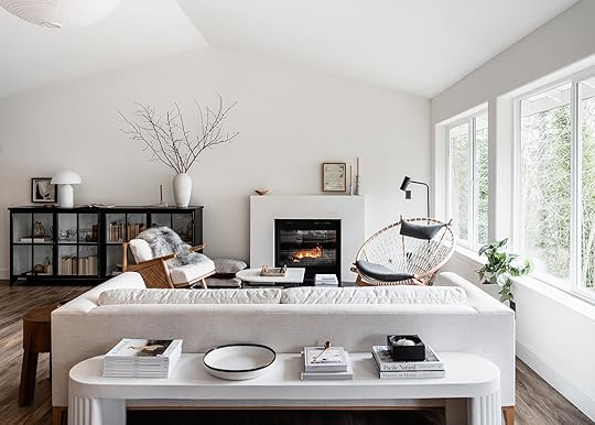
The Living Room The Living Room Before

While (what we lovingly now call the Hood Canal Cottage) has a truly stunning location – the ultimate spot to unwind and appreciate the area’s beautiful surroundings – the house itself offered little in the way of design inspiration. She is your typical late-1990s American builder-grade suburban house – luckily plopped within a little slice of heaven. Things started out….in a bit of a scary place. Pictures definitely speak louder than words with the before situation.
My mission: help this home’s inside match the splendor you enjoy out her windows.
Circle Chair | Floor Lamp | Art | Rug (no longer available) | Coffee Table (no longer available) | Sofa (no longer available)
Redesigning this house was an endless balancing act as we weren’t in the market to make any major architectural changes – as much as I may have wanted to. Instead, I needed to figure out how to work with the existing spaces, but change the vibe entirely. As this house is adjacent to the beautiful beaches of the Puget Sound, it would make sense to define her as a beach house, but I did not want to fall into that cliche. Instead, I wanted to show how you can imbue your own personal style and design aesthetic into any type of space – rather than feel forced into a tired design theme. I set out to achieve what I’m calling Elevated Coastal Chic. I wanted to hone in on a Scandinavian, design-forward influence with perhaps a touch of coastal charm. I can’t wait to hear if you think I succeeded.

The Hood Canal Cottage living room is meant for lounging – however you prefer to do that. Sitting by the fire, watching the sun set behind the Olympic mountains, burying your nose in a good book, or enjoying your favorite glass of wine. I wanted this room to wrap you in a sense of serenity. I tapped one of my go-to resources to achieve the look – the couch, rug, coffee table, and sideboard are all from Lulu & Georgia. You can always head there and find a gem.
I’m also always a sucker for really good chairs – I see them as the jewelry for a room and the Circle Chair from Eternity Modern is certainly that for this space. It was actually the first piece of furniture I selected for the entire room – the rest of my design was really built around the Circle chair.

Accessories in the living room were kept monochromatic and to a minimum intentionally. The joy of being on vacation is to forget about the stuff – literal or figurative – that crams itself into our lives, so I really worked to keep this look as minimalistic as possible without skewing too modern. Stacks of my favorite design tomes and choice decorative pieces from friends, local shops like Shop Coco Kelley and Casa Patina, or artisans I work with regularly, help the space feel curated but also personal.
A few other details to call out – the whole room (and actually the entire house) is enveloped with Benjamin Moore’s Simply White on the walls, ceiling, and trim in a nod to bright white Scandinavian homes. It’s also an anecdote to the Seattle gray – it’s a thing. The idea for the house’s wide plank floors also came from my love of Scandinavian design. I was really happy with the warm wood tone (though they’re vinyl floors shhhh!). The flooring really grounds the space and helps play up the other natural wood elements dotted throughout the room. The fireplace mantel was a quick fix to hide old ugly tile. I simply had my contractor build a box surround that I then lime-washed with a lovely hue from Color Atelier to give it a little more depth and texture. The hearth is a remnant piece of countertop leftover from the kitchen! Love little DIY design wins like that.
Now let’s turn our attention to the kitchen, shall we? If you’re standing in the living room and turn 180 degrees you look right at the house’s kitchen- which is a complete 180 from where the space began!
The Kitchen Before
I have a major kitchen obsession – I mean, don’t we all – and I really wanted to see my dream vision come to life in this space. The kitchen area was the one spot where I actually took down walls during the renovation. If you look closely at the before pictures you’ll notice that the original kitchen was much smaller. There was actually a 6’x6’ enclosed space in the right-hand corner of the room that housed the laundry, a sink, and some random storage. But it took up serious real estate and also broke up the only interesting architectural detail of the whole house – the vaulted ceiling that runs the length of the main living area. As soon as I got confirmation those walls weren’t load-bearing out they went – opening up a fully contiguous living, dining, and kitchen space. (The laundry was easily relocated out in the adjoining garage. Would I put laundry into a garage in a primary family home? Maybe not. But in a house used exclusively for short vacation stays, it is not a big deal to do a load or two out there).

Cabinetry | Countertops | Tray | Pendant Light | Art Print | Floating Shelf | Peg Rail
Opening up the kitchen was the game changer and it allowed me to live out my dream – putting a Reform kitchen into a project! I had been fangirling over Reform for years. They’re a kitchen company out of Denmark that started out making custom fronts for Ikea kitchen boxes. I love their elevated but minimal aesthetic. In the last couple of years, they’ve made the jump across the pond with showrooms in New York and LA. I’ve long been smitten with Reform’s Frame line of cabinets, designed by Note Design Studio – another favorite Scandinavian design house. That’s the kitchen cabinetry you see here. This collection is a set of Reform’s own entirely prefab kitchen cabinets and they are extraordinary. The quality is divine and my contractor could not stop raving about how easy they were to assemble and install.

I wanted this kitchen to feel like it was made out of pieces of furniture which is why there are no uppers and the back row actually floats off the wall on both ends. There is ample storage, however, as all the back cabinets are actually double drawers and the entire island is wrapped with additional storage. The induction range sits atop the island with the oven tucked underneath, keeping the sightlines clean. I custom-designed one set of open shelving in the island to offer a little styling moment and to mimic the display of the floating wall shelf I had custom built by Seattle-based studio Walnut+Oak. The black countertops are actually quartz – Black Tempal made by Caesarstone – but they look and feel just like soapstone – one of my all-time favorite materials. I really could sit and stare at this kitchen all day, I love her so much. I so hope you do too.
The Dining Area
Dining Table (similar) | White Chair | Brown Chairs | Stool | Sconce | Art | Vase
Before you ask why there isn’t bar seating at the kitchen island, that was a very intentional choice. I decided to focus on storage in the kitchen area rather than seating because the dining table is right next to it! When I took out the laundry room, I opened up a lovely long blank wall that now houses the dining area. Again – I may have added more seating in the kitchen if a family was living in this home full time, but as a vacation space, it’s nice to actually sit down at the table to enjoy meals – since you’ve nowhere to rush off to! I demarcated the dining space with a stunning sconce by Allied Maker and an equally amazing art piece I’d long coveted from Canadian fine artist Anna Church.
The Bedrooms Before

Now let’s turn to the bedrooms! Luckily these spaces simply required fresh coats of paint and well-curated furnishings to create that elevated Nordic vibe I was going for. I wanted each room to evoke a sense of calming serenity. To achieve that I designed the primary bedroom with a mix of natural materials and textures in complementary hues. Think a lovely wool rug from Nordic Knots, linen bedding from Rough Linen, a Noghuci paper lantern, and marble and stone side tables from Hay Design and Norm Architects all play beautifully together. I turned to Seattle Art Source for the gorgeous Jennifer Gauthier painting above the Rove Concepts platform bed.
The Primary Bedroom

Bed | Linens | Rug | Side Table (left) | Side Table 2 (right) | Sconces | Pendant light

The one nice thing about working with a suburban house is all the built-in storage! Historic homes don’t have so much of that. The primary bedroom had a walk-in closet, but I wanted to make sure I fully optimized the space, so I worked with California Closets to design the ideal spot to keep all your weekender gear organized. I for one love to immediately unpack and make myself at home anytime I stay somewhere – and this closet definitely makes sure you can do that. There’s plenty of space to stash away suitcases and I can even lock the drawers if I want to keep some of our own things private.
The Guest Room


Credenza Custom | Lamp (no longer available)

Roly Poly Chair | Cashmere Throw | Rug
Ironically, I eliminated the closet in the cottage’s second bedroom. The room was already quite small. Putting in a queen-sized bed was going to make it feel very cramped so I decided to demo the reach-in closet and design a custom credenza to sit in its place. Seattle-based design shop Walnut+Oak built out my vision perfectly – it gives the room a fun punch of personality and guests ample storage. Another Nordic Knots rug, this time in a bold checkered pattern, and a long-coveted Faye Toogood Roly Poly chair add a fun tension between modern and more traditional pieces. I’ve had nothing but rave reviews from our guests about this room thus far.
Now let’s chat bathrooms. Bathrooms can be as overwhelming to design as a kitchen. So many options – so many choices! The only choice I had with the bathrooms in this house was to start over.
The Bathrooms Before

The primary bathroom proved to be a big game of Tetris. Its existing layout of a tiny tub, itty bitty fiberglass stand-up shower and weird cubbies smack dab in the middle certainly could not stay. But it turned out the fireplace chase from the living room was actually in the primary bathroom – I only wish I knew why – so I had to figure out how to work around that.
And here’s how it turned out! I created an extra-long double shower clad entirely in amazing handmade tile from Clé. Now you get to enjoy stunning views out the west-facing window while you lather up. The floating white oak vanity sits on the opposite wall – the round mirror reflecting the views back at you while you brush your teeth. I used a concrete hexagon tile also from Clé across the seamless floor. As for that fireplace chase? I had my contractor encase the lower half and put a Caesarstone counter on top to serve as another surface for storage. Small simple floating shelves create a spot to display some pretties.
Tile | Globe Lights | Mirror | Art
I took a slightly different approach in the guest bath. The layout stayed exactly the same here. It was such a small space it didn’t make any sense to try to switch things up. Instead, I simply made a massive upgrade on all the surfaces – and a total departure from the vibe in the primary bathroom.
Since the guest bath was already small and windowless, I wanted the design to feel really dramatic and bold. To achieve that end, I stuck to a very graphic black and white color palette. Dark zellige tiles from Clé span the floor and run up the wall to cover an existing bump-out. Stacked cement brick tiles from Clé run up the shower walls to help it feel a bit taller. An off-the-shelf glass partition from Ferguson was a budget-friendly solution for the shower. To soften all the angles and strong lines in this little space, I chose a really fun free-standing cylindrical sink, an oval mirror, and two globe lights from Flos. The hall bath may be small, but she gives a mighty big style punch.
Now let’s turn to kid’s spaces!
The Kid’s Space Before


Book Shelf | Wallpaper | Pendant Light | Rug
I turned the cottage’s third bedroom into a haven for the littles. As the mother of a seven-year-old son myself, I was certainly designing this room with him in mind, but also thinking of all of my friends who have younger children in tow. A simple pine bunk bed (which I may still paint someday. On the fence about that one) allows for sleepovers or siblings to bunk up together while a mini Library shelf from my go-to children’s furniture line Oeuf NYC displays books and choice toys. A custom (removable!) world map wallpaper lines the room’s entire back wall, creating fun storytelling opportunities at bedtime. A cozy braided rug from Armadillo softens the floor. My son runs into this room with the biggest on his face and I truly hope other kids will too.
You might think we’ve reached the end of our tour, but I have a surprise for you. While I call this house a cottage, that moniker is more about how the house feels than its actual square footage. Turns out the house had an entire daylight basement with a bevy of (sometimes random!) spaces that I set out to maximize by creating a great room, a play space, a home office/fourth bedroom, and a couple of random spaces that I found some pretty fun uses for – so let’s head downstairs!
The Family Room Before
I’ve never lived in a house with a great room or family den before, so I was excited to create a cozy little haven for movie nights and family hangout time. That’s certainly not where things started. Again words tend to fail me when I look at the before images of this house.

Sectional | Ottomans | Media Storage | Rug | Lamp


Thankfully, after a little spit and polish, I now have the sanctuary from the hectic world that I was looking for. To achieve this, I turned to more of my favorite sources, including Scandinavian designers like Skagerak and Nordic Knots rugs, but also one of my favorite American furniture makers, Room & Board. A curved sectional upholstered in a nubby cream boucle from Room & Board offers the ideal spot for snuggling up in front of the TV. My son also likes to bounce off the matching ottomans. The media console is actually a series of three Keaton media cabinets in ash that I installed edge to edge along the wall as a way to mirror the soffit above. It has the added bonus of offering ample storage for games, AV equipment, and even our turntable and a little vinyl collection. The great room is warmed to an extra cozy degree by the Regency Contura gas stove in the corner that also features a Skagerak Cutter Bench and an original print by Skye Schuchman. I look forward to hanging out in this room after putting my son to bed every single evening.

Desk | Bookcase | Office Chair | Rug | Art
There are some dedicated spaces for kids and grownups alike in the basement. Since so many people can work from anywhere these days I turned the fourth bedroom into a dedicated home office with a pullout sofa to accommodate extra overnight guests. The desk faces the waterfront views though so I can’t promise you’ll be particularly productive.
Shelving | Toy Storage | Garland | Rug | Pendant
On the opposite side of the basement, there was a strange doorless alcove of a room that I decided to turn into a dedicated play space. I immediately knew I wanted wall-mounted shelves for storage in this room as it’s a well-known fact kids only play with the things they can see. I had my heart set on a particular set of shelves from Ikea but in the midst of the pandemic supply chain issues, they went out of stock, never to return. Thankfully, I discovered yet another amazing Scandinavian design studio, Moebe CPH based in Copenhagen after they reached out to me on Instagram. Their Wall Shelving system was exactly what I’d been hunting for. I couldn’t be happier with how that wall turned out. Kids can grab puzzles, blocks, and vintage games from the shelves. On the opposite side of the room, I used the Oeuf NYC Toy Store to corral legos, marble run pieces, musical instruments, and other fun odds and ends that kids of all ages and stages could easily dig through, while an easel and art station creates a dedicated zone for creativity. Another Armadillo braided rug adds the perfect soft spot to sit and play during a rainy afternoon.

Wallpaper | Storage Cabinet (no longer available)
But don’t think I let the kids have all the fun! There was yet another, slightly odd, fairly tiny space in the basement that was crammed floor to ceiling with junk when we originally took possession. But as an avid yogi and a newly minted Peloton enthusiast, I immediately saw an opportunity to carve out a space dedicated to wellness. I worked with York Wallcoverings to envelop the entire room in a gorgeous grasscloth. I set up my ode to all things “woo-woo” in one corner and also stocked up on some more traditional fitness equipment. I have to tell you, having a room within your own house where you can close a door and workout feels ah-mazing. After more than a year of doing Zoom yoga in the middle of the living room, I love having this special space.
Phew. Well, there you have it. She might not technically be an actual cottage, but the Hood Canal Cottage is most certainly a special little escape. She sheltered us wonderfully during this incredibly hard time. And this past winter family and dear friends were able to finally gather around her dining table for holiday celebrations. I see so many more of those get-togethers in her future.
I’m particularly excited to share the Hood Canal Cottage with other design-loving travelers later this summer. For now, be sure to follow @hoodcanalcottage on Instagram to be the first to learn when our booking waitlist will open. And do come follow along at @apartment_34 too! I will be sharing many more behind-the-scenes stories for this entire renovation process and I’m always happy to answer any questions you may have.
Thank you so much Em and team for inviting me to share the Hood Canal Cottage here today. She was truly a labor of love and I hope you all adore her as much as we do!
*Design by Erin Hiemstra
**Styled by Cassandra LaValle
***Photos by Kara Mercer
The post Apartment 34’s Erin Hiemstra Had 20 Minutes To Put In An Offer On This Home – Here’s How She Turned It Into The Perfect Elevated Coastal Chic Beach House appeared first on Emily Henderson.
April 5, 2022
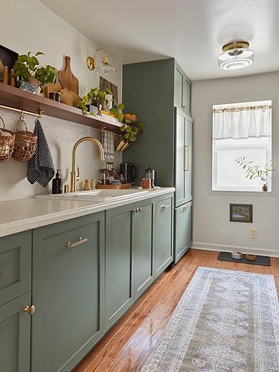
How Sara’s New Galley Kitchen ACTUALLY LOOKS In The Everyday And How It Functions For Their Needs

This post wouldn’t be possible without the support of a handful of amazing brands, who partnered with us. Thanks to KitchenAid, Caesarstone, Kokeena, and Rejuvenation for helping this kitchen come to life.
Two weeks ago I revealed my kitchen reno, and showed y’all the perfectly styled photos. Today I’m going to be sharing a bit more about how the kitchen functions, along with photos that show how the kitchen looks on a more normal day.
As always, I think we need to start with a floorplan review…

When we bought the house in 2018, the only way to get into the primary bedroom was through the kitchen. There was a small laundry-type room between the kitchen and the primary bedroom, where the previous owners had likely kept their washer and dryer, and also housed the entries into both the primary bedroom and primary bath. When we began renovating the house, we decided to close that space off from the kitchen (turning that small space into our walk-in closet), and create an entry into the primary bedroom through the adjacent bedroom (which we turned into our TV room). It’s not ideal to have a whole section of wall you can’t use for anything, in an already small kitchen, because it’s a door.

We also used to have a door to our side yard at the back of the kitchen, and an off-center window that the cabinets protruded into. We decided to close both of these as well, and instead install a single window in the center of the wall.
I wrote so many more more posts about this kitchen than even I remembered. You can see how I went from a $3000 kitchen makeover, to a full-blown renovation, to a functional-but-unfinished space, to the final reveal. You can even check out my unused budget designs. But the post I’d like to direct your attention to right now is this cabinet layout post, where I went through the entire process of deciding how we were going to install our cabinets and plan the use of the space. It’s a meaty post, and included these kitchen renderings Julie helped me with (and by help I mean, did for me out of the unknown depths of her heart):


I had completely forgotten about these! And I have to say, I think the finished product is pretty spot on.
Alright, let’s get FUNCTIONAL.

 left: photoshoot ready | right: everyday living ready
Faucet | Soap Dispenser | Sink | Arched Cutting Board | Brass Rail System | Sconce | Runner Rug | Flushmount | Window Valance | Curtain Rod | Brass Outlet Cover | Rubber Mat
On the left, we’ve got the “picture day” version of my kitchen, and on the right the “everyday” version. I’m sure there were some of you who were expecting them to look WAY DIFFERENT from each other, but the truth is I really tried to keep the kitchen styling for the reveal as close to realistic as I could stand. When it comes to shoots, we usually tear a place apart to create one shot, and then have to put it all back together. I tried really hard not to do that for this shoot (and for my sanity). I wanted to style it using 99% of items I already had or knew I would keep after the shoot.
So let’s spot the differences – Normally, we keep our electric kettle out on the counter and use it throughout the day for coffee and tea day. We got a really pretty, fancy pour-over kettle as a wedding gift (which we asked for on our registry), but realized that while it was beautiful, it just poured water too… slowly? Apparently, you want that when you do a pour-over. And so, we went back to this kettle my mom got for me from Costco. Old faithful. Also, we feed our cats in the kitchen, right under the window. Their bowls are pretty (ceramics that I made), but they’re messy little monsters so we keep a simple rubber mat under their bowls at all times. The cabinets above the fridge are where we store less-used kitchen appliances (air fryer, crockpot, juicer, etc.).

KitchenAid Stand Mixer | Ninja Professional Blender | Brass Bookends | Seagrass Woven Hanging Baskets | Rattan Hanging Baskets | Black Garlic Keeper
Our KitchenAid stand mixer is one of my all-time favorite kitchen appliances, and has a permanent home on the counter. But on a normal day, so does our blender, because I make smoothies just about every day. I also have a slightly more extensive cookbook collection, which was culled for aesthetic purposes on reveal shoot day. And I’ll admit, that basil was still alive for the everyday shoot, but it’s since been all used up.

While we’re only two people, I effectively make enough dishes in a day for a family of four. I make 2-3 meals a day in the kitchen, and I’m not conservative with getting pots, pans, plates, etc. dirty. We go through spoons the fastest. So oftentimes our KitchenAid 44dBA Dishwasher with Panel-Ready Design (wonderfully bestowed upon us by KitchenAid) is working hard. Not having a sink piled with dishes is such a game-changer for my clutter-body, especially when I don’t have the time or energy to cook and then clean. Because I work at the dining table with a perfect view of the sink, it makes my skin itchy to try and focus when the sink and counter are cluttered. You can find additional game-changers by exploring KitchenAid(R) Suite Collections here.

Here’s a quick peek into our “junk” drawer – which is actually fairly organized, no thanks to me. Macauley runs this drawer and is constantly upkeeping it. We’ve got common household repair items (screwdriver, caulk, level, measuring tape, box cutter, etc.), batteries, and first aid. We’ve been taking the drawer organizing game pretty seriously in our house, and you can find us at The Container Store or Target on a Sunday laying out drawer inserts into a measured square on the floor figuring out what layout would work the best. Apparently, there are people you can hire to do this for you if you’re super serious about it, but we prefer to drive ourselves slowly insane instead.


Brass Switchplate | Rattan Tray | Honey Jar | French Press | Countertop
Here’s a closer look at our everyday coffee corner. We’ve usually got the french press out next to the kettle or drying in the sink. And I hang another dishtowel on this side of the sink for easy grabbing. Our counters (from Caesarstone) really shine here, because they’re super easy to clean up, and this area does get a lot of action. They’ve also proven super durable so far.
Having the hanging towel on an eye-level hook next to the sink is a super small change that has really made a difference in my paper towel consumption. My brain doesn’t have to do the mental gymnastics of trying to locate a nearby dish towel and instead just reaching for a paper towel. We keep our paper towels up on the top shelf, where we can reach them in case of cat vomit situations, but otherwise keep them pretty out-of-sight-out-of-mind.
Under the coffee corner is where our pull-out trash cans are, with a little drawer on top to store our aluminum foil, parchment paper, etc. This double drawer and trashcan setup is an amazing way to sneak just a little bit more storage into the space.

Cabinet Fronts | Brass Hardware | 12 Cup Food Storage Container | 2.7qt Food Storage Container | 4.3qt Food Storage Container
Heading over to the other side of the kitchen, let’s see what’s behind each of these beautiful cabinet doors (from Kokeena’s Townsend collection).
At the tippy-top of the tall cabinet is where I store my pantry overflow (bags of flour that had too much flour to fully decant, or items that I use less frequently like coconut flour). Next shelf down is snack foods – cereal, ramen, cookies…
The top shelf of the lower cabinet contains vitamins/coffee/tea/supplements (in a lazy susan type spinner that keeps it all contained), next is the microwave, then a thin drawer for more specialized cooking utensils we don’t reach for as often (meat thermometer, mandolin, etc.), a deeper drawer for mixing bowls and large measuring cups, and then a super deep bottom drawer where we keep all the cat supplies. Having the cat food tucked away in a pull-out drawer right next to the cat food bowls makes for a pretty easy feeding routine.
Next up, our “everyday” pantry items mostly live in the wall-hung cabinet to the left of the oven. We’ll take a closer look at that further down. Moving onto the lower drawers – first is spices, next is baking supplies (pans, racks, etc.), and lastly – my favorite drawer – our dry goods pantry, where I store different kinds of flours, sugars, and the like.
Because our kitchen is a galley shape, we didn’t have space for a walk-in pantry, so I had to get creative with the storage. I reach for pantry items a lot, so I wanted them in easy-to-access spaces. OXO’s biggest containers just happen to perfectly fit into Ikea’s deepest drawers – a match made in kitchen organization heaven.
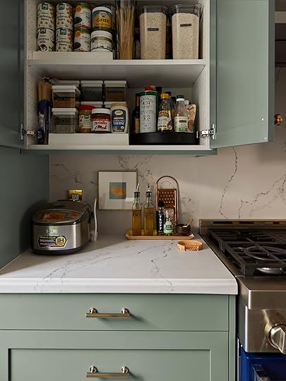

Black Top 16oz Food Storage Container | Rice Cooker | In-Drawer Spice Rack | White Lid Food Storage Container | Large Expand-A-Shelf | Turn Table (similar)
Here’s how our upper cabinets are organized. We’ve got a lazy susan in there for all the oils and vinegars, some leveled risers from The Container Store to make space for canned goods and the like, and some bigger containers for everyday grains and starches.
Our spice drawer makes it super easy to access any type of spice or bullion we’d need during cooking, and the lay-flat design makes it easy to identify each bottle. And as promised, here’s where our Zojirushi lives. We pull it forward when we use it, so the steam doesn’t get trapped under the cabinet, but it stays there full time.


Left – perfectly styled. Right – slightly more chaotic. We always have this large cutting board out on the counter (linking to our new Boos cutting board that we’ve replaced the cutting boards in the photo with since the shoot!), because it’s where I butter toast, chop veggies, prep sandwiches, all of it every day. Right next to our knife block, and a crock filled with a lot more cooking utensils than seen on reveal day.
The floating cabinet on this side houses all our cups, plates (most of our bigger serving ware lives out in the bar cabinet you can see in the dining room). Top drawer is additional cooking utensils and flatware, the middle drawer is cooking pans, and the bottom drawer is stock pots and dutch ovens. And the tall cabinet on the right side is where we keep all our cleaning supplies (you can’t see them but our broom and Swiffer live on the inner left wall). The cleaning supplies rack pulls out of the cabinet, making it super easy to access all of the supplies.
So that’s it – that’s what our kitchen looks like on a normal day versus a styled day. I tried my best to create a space that not only looks nice, but I’m actually able to keep looking clean and organized because the storage is super functional. So far, it’s been working really well, and the streamlining of working in the kitchen is great. I don’t know if we have the “golden” triangle ratio that everyone raves about for kitchens, but having the range and sink directly across from one another is *chefs kiss*, we’ve got plenty of counter space due to the brass rails (from Rejuvenation) and the floating shelf, and almost all of our pantry, dishware, and appliances are stored behind our pretty cabinetry. Admittedly we’re only two people and don’t have kids, so we may have less “stuff” than a larger family.
But this is what works for our family right now, and I’m pretty proud of how functional it is.
*Design and Photos by Sara Ligorria-Tramp
**Styled by Emily Bowser
The post How Sara’s New Galley Kitchen ACTUALLY LOOKS In The Everyday And How It Functions For Their Needs appeared first on Emily Henderson.
April 4, 2022
Introducing Rashida’s Dining Lounge Plan And Our First Ever EHD Reader Nationwide Vintage Hunt (You Bet There’s A Reward)

Hello EHD Loves! I’m finally back. I took a long and much-needed break from in-depth renovations after the kitchen reveal. Honestly, that project wiped me out and I didn’t want any more construction in my home for a while. I think a lot of us can relate to the woes of living through a renovation that took much longer than expected. But is it even a kitchen renovation if it doesn’t take longer than planned?
For today’s project introduction, we’re not going that far away from the kitchen. Actually, we’re stepping just a few feet away from the kitchen and designing what I’m calling our “Dining Lounge”. I live in a row house in DC and everything is narrow. So although this space is dedicated to be used as a dining room, there’s really not that much space to add a table and chairs with enough pull-out clearance. This is why I will utilize built-ins and turn it more into a breakfast nook. I like the term dining lounge more because honestly, that’s exactly what happens in that area. Even though the living room is a few steps away, Jasen (my hubs) and I are always lounging in that area. Whether we’re doing work, eating, surfing the internet, etc we’re always in that dining space. In fact, when we have visitors, they also flock to that area. No one ever wants to sit on our sofa. I think it’s the sunshine that attracts. That area gets THE BEST sun throughout the day, and we as humans just naturally gravitate to it.


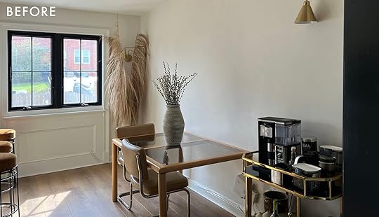
Before I move any further with this post, I want to encourage you to read until the end. I’m going to need your help with something. And there’s a prize involved! But don’t peek and skip to the good part. Promise!?

 left: design board | right: coffee bar
Now I have some pretty cool ideas for this space. I want it to feel like a cafe in my home. Fun fact: I’m obsessed with cafes and coffee bar design. So bringing that same vibe into my space let me know what to search for when looking for inspiration. The first thing I needed to decide on was layout. I knew I wanted a built-in banquette with storage flanking on either side of that long wall. The question to myself was, do I have built-ins going all the way to the ceiling or leave them at counter height. Ultimately, I decided on counter height for a few reasons:
I didn’t want any structural piece interfering with my good sunlight. I need a place to display an accessible and functional coffee and tea bar. Going with the counter height is less work and less money.
 left: design by: decus Interiors, photo by felix forest | right: design by mindy gayer, photo by vanessa lentine
Once I had my layout in mind it was then time to dream a bit about the design elements that I’ve been swooning over for months. Because the wall is now open and a main focal point, I wanted to do a wall treatment. I’m personally not a fan of wallpaper (*hear me out! lol*). I love wallpaper when I see it in other spaces, but in my own space, I tend to get overwhelmed by too many colorful patterns. So instead of wallpaper, I decided to do an artistic wood wall that’s not your traditional paneling or shiplap (like in the photos above). I’ve been gawking over these spaces with abstract shape textured walls, and I want to try that in our space. (shhh DIY coming your way).
 design by paradowski studio | photo by pion studio | via dezeen
 design by studio paolo ferrari
 design by claude cartier | photo by guillaume grasset | via the beauty of design
I decided to go with a round glass table just to filter more light throughout. I love the base of this Crate & Barrel table. It’s so sculptural and will tie in with the black elements from the kitchen.

I saw this wavy headboard in a bedroom and thought this would look beautiful against the wood wall treatment, and add some softness to the space.
 headboard by cuff studio | photo by laurel wood creative
But the disruption for this area will be the chairs. I’ve made it a rule to always have one “disruptive element” in my designs. I love when the eye looks around the room, thinking that it knows what’s coming next but then there’s a design element that interrupts your assumption and makes you pause and think. For this dining lounge, it will be the chairs that will disrupt and interrupt. And now that I think about it, probably the wood wall too!
I want two vintage chairs that of course don’t match (because why not). I’ve had these two chairs (pictured below) on a Pinterest board for a while. I love the chunkiness, but also the simplistic but unusual design of each chair. I know it will be hard to find those exact chairs, and if I did happen to find them, I know it would be crazy expensive. So I’m looking for vintage chairs that are similar or chairs that fit the “chunky unusual” criteria. And this is the part where I need your help!!!

 left: cb chairs by gerald summers circa 1933 via decus interiors | right: arflex botolo armchair, by cino boeri, 1973 via decus interiors
*Trumpet sound* I’m calling all “obsessive Facebook Marketplace browsers”, “vintage shop goers”, and “thrift store hunters” to help me in this nationwide search (hahaha it sounds like a manhunt) for the perfect pair of chairs for my dining lounge. Below are pictures of chair styles from my Pinterest board, and also a graphic of what I want and don’t want in a chair. That criteria is really centered around my dogs. I love them so much but living with two pups that have shed constantly for the past 8 years has taught me what pieces last and look best living with pets.


To sweeten the deal, if I choose the chair or chairs you send me, I will send a surprise Design Lover’s gift box to your home as a special thank you. I know you’re probably wondering, what’s in the box??? It’s a SURPRISE! But if we here at EHD have anything to do with it, then you know it will be good.
I’m so excited to engage with those of you who are willing to participate! To make things run seamlessly, I created an email specifically for this: findthosechairs@gmail.com
If you see something on Facebook Marketplace or other sites, send it to that email. If you see something on Instagram, you are more than welcome to DM me, but I do prefer using the email to keep everything organized. However, it’s a hunt, and time can be of the essence, so DM works if that’s faster and easier for you!
As always, I look forward to revealing this space to you all and I especially look forward to all the beautiful chairs you send my way. You can find me on Instagram @rashida.banks. And again the email for the chair search is: findthosechairs@gmail.com
Until next time…Be well Loves! Happy searching!
Opening Image Credits: Design by Rashida Banks | Photo by Keyanna Bowen
The post Introducing Rashida’s Dining Lounge Plan And Our First Ever EHD Reader Nationwide Vintage Hunt (You Bet There’s A Reward) appeared first on Emily Henderson.
April 3, 2022
The Link Up: Ryann’s Awesome And Affordable $12 Skincare Swap, Caitlin’s Perfect Drink Table, And Our Most Recent CUTE Clothing Purchases

Hello, friends! How was your week? Our team had a GREAT shoot on Wednesday – can’t wait to show you the reveal! – and we closed out the week with a delicious outdoor lunch where we gorged ourselves on so many fries and sweet potatoes that we were all unable to make dents in our actual meals. We also had the best time pulling together our April Fools post, so catch up here in case you missed it! Let’s get to some links though, yeah?
This week’s house tour comes from Atelier Davis – it’s a historic Eichler home that’s been renovated and styled in such a fun, eclectic way. A few things I’d like you to take note of (in order, obviously): the round daybed under those incredible skylights; the incredible symmetry in the living room (who woulda thought English roll arm sofas would look so at home in a mid-century masterpiece?); the light fixture in the dining room; the bright yellow oven; the unbelievable sofa base on top of that broken stripe rug; the masterfully styled eclectic bedroom (that carpet looks GREAT, right?); the STUNNING bathroom color palette (with Katie Gong knots above the tub!); the punchy red-orange hardware against that sky blue vanity; AND the awesome use of unexpected wallpaper patterns. You can follow Jessica Davis on IG here and read more about the space with an Elle Decor subscription right here.
Happy Independent Artists Day! You can take 15% off site-wide at Minted (and 25% off save the dates, for all you folks getting married!) through tomorrow, 4/4, with code FIFTEEN. Check out our favorite picks from the sale here!
From Jess: I finally got my first matching set and I can’t tell you how much I love it! I know we’ve talked about the Abercrombie & Fitch comeback but I am even more of a believer now. It’s blue and linen and CUTE. Here is the top and here are the wide leg pants (YEP! I loooove a wide leg look). Huge fan!
From Mallory: I just bought this dress for an event and it’s PERFECT. Made me feel so classy and for only $90 (which is not horrible for a fancy dress IMHO). If you have any weddings coming up, I HIGHLY recommend adding to cart. I got it in black but they have a bunch of colors.
Exciting collaboration alert: TOV Furniture partnered with Carmeon Hamilton, Nicole White, Don Ricardo Massenburg, Justin Q. Williams, Erika Ward, and Nile Johnson on an AWESOME new collection. We’re especially enamored with this four-poster bed and this organic modern credenza. The prices on all of the pieces are great, too.
One more! Dabito partnered with Mitzi on a fun, fresh new lighting collection. Out of the twelve pieces he created, which is your favorite?
From Ryann: I used to swear by the Dr. Jart Tiger Grass Color Correcting Treatment and I do still think it’s a great product that works really well to reduce redness. But at $52 a pop, it’s an investment (even though the bottle lasts a long time). Luckily, I recently found a VERY good alternative that is only $12!! It’s very gentle on your skin and is all the good things like cruelty-free and vegan-friendly. It’s my favorite beauty product at the moment which is saying a lot!
From Caitlin: I’ve been on the hunt for an affordable minimalist drink table for a while (read: over a year) and I FINALLY FOUND ONE! It’s only $59 (and it’s technically marketed as a plant stand) but the shape and proportions are SO good. It comes in 2 different heights and 4 different colors in case you, too, have also been on the hunt for a piece with a smaller, lighter profile. It’s perfect for a tinier nook or niche in your home (or if you just don’t have room for a full end table between a pair of armchairs, which was my problem). Hooray!
Also from Caitlin: I was obsessed with this piece in The Atlantic this week, which was succinctly and aptly titled “Why Are People Acting So Weird?” (There’s something in the air, y’all.) And while you’re there, this piece about Saturn’s rings disappearing (!!!) is fascinating.
One more from Caitlin because the team put me in charge of this post for the first time ever and I’m a monster who can’t stop oversharing: There’s 40% off select pieces (but like, actual good ones) at Madewell right now with the code YESPLS. Just looking out for my pals!!!
BOY. That’s it for Team EHD today, but this week’s calendar is STACKED. We’ll see you back here tomorrow for an amazing reveal (the first of SEVERAL this week! Can you believe?). Enjoy the rest of your Sunday, pals. xx
Opening Image Credits: Design by Jessica Davis and Gustave Carlson Design | Styled by Glenn Jenkins | Photo by Alanna Hale
The post The Link Up: Ryann’s Awesome And Affordable $12 Skincare Swap, Caitlin’s Perfect Drink Table, And Our Most Recent CUTE Clothing Purchases appeared first on Emily Henderson.
Emily Henderson's Blog

- Emily Henderson's profile
- 10 followers

