
Emily Henderson's Blog, page 130
May 2, 2022
Yardzen Review: Is It Really Possible To Design A Beautiful Yard Remotely?

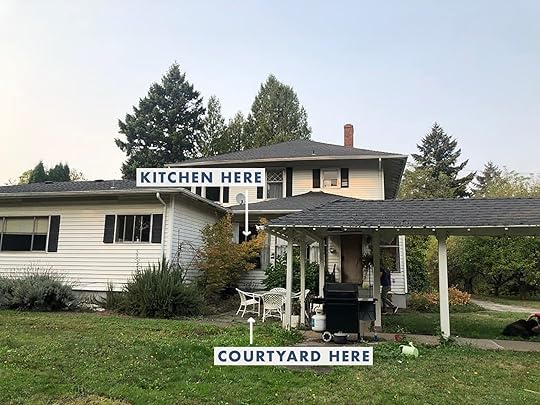
We bought this house for the property. The vibe. The space. It was magical, and the potential was so easy to visualize. We had plans to remodel the house first, then tackle the yard in phase 2 or 3, but some areas are getting fast-tracked so that we can spend time out there this summer and fall (and because the construction and rain turned it into an absolute mud pit and ruined the hardscape/landscape, so, yeah…). I’ve decided to prioritize the “kitchen patio,” with the hopes of enjoying it by midsummer. But my brain space is tapped out with the renovation/river house/book/blog, so I reached out to Yardzen to see if partnering on this smaller area would be a good fit for them — and frankly, I was very curious if a digital design would even work for a large property with more of a traditional vibe like ours. But they were excited to dive in, and I literally can’t wait to show you what it’s going to look like. Be prepared to be blown away. Let’s start back almost 3 years ago — that’s right, a year BEFORE the pandemic, when we first fell in love with the property.


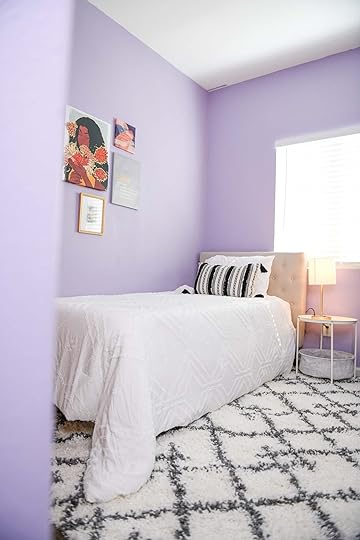
This patio area is right outside the kitchen, and it gets the only afternoon/evening shade on the property, thus it’s likely where we’ll grill and eat dinner while the kids are playing in the yard. The back porch in the summer gets hot, horizontal, western sunlight (we are planting a few trees to combat this), making it less enjoyable to chill…we think. Hard to know until you live there. There will likely be two long picnic tables under the oak tree by the someday-redone sports court, for bigger groups, but this is more for us and possibly another family to enjoy. It’s a sweet little area that feels charming and intimate.

My biggest doubts and questions about working with a digital landscape design team were:
Can Yardzen do a more traditional/lived-in look? We wanted a more custom/special hardscape plan. Will they get the vibe?– Answer: You’ll see for yourself below.
 Will Yardzen know what plants are native to and will thrive in the PNW?
– Answer: Yes. Their design team has a lot of regional knowledge thanks to their on-staff horticulturalists and their plant database. They also have local contractors throughout the United States who help with plant selection. What happens after you have the plan? How do you execute it?
– Answer: You can do it yourself or hire your own team, but Yardzen also has a really wide network of vetted contractors throughout the United States who will install their designs (including ours — which I’ll tell you about after we finish the project, with a hopefully glowing recommendation).Can Yardzen do a full property? For instance, would they do the full 3 acres?
– Answer: They really specialize in functional outdoor spaces for front yards and backyards. For the homestead/farm part of our property, we’ve hired Studio Campo to help figure out the meadowscaping, the paddock, etc., with more local hands-on to the design.
So, I’ll bring you along the process of working with Yardzen, a step-by-step of how you’d get your vision (and the details) across through a virtual platform.
STEP 1: TAKE SOME BASIC MEASUREMENTS, VIDEOS, AND PHOTOS TO UPLOAD
The measurements were easy. I was scared that I was going to need fancy site measurements, but I did it all with a measuring tape. I used my iPhone for photos.
STEP 2: TAKE THE ONLINE QUIZI took the quiz, and it was FAR more fun than I had predicted. I thought that I would have to know a lot of technical stuff, but it was more about choosing pictures that I liked — landscaped backyards, design elements, types of plants, etc. It was actually really fun. It gets less fun when you talk budget (per usual), and you should be prepared for the fact that landscape design is more expensive than you think it’s going to be (mostly due to the time and labor involved). But they have a post to help you understand the cost. Here’s an idea of what the quiz looks like:

These are honestly the same questions someone in person would ask as well. It’s like a style diagnostic — which you know I love. So I submitted everything, and after a few weeks, we got the first version, and we couldn’t believe it. There were things we wanted to change, but our level of excitement was high just seeing Version #1, which I’m going to show you today.
YARDZEN DIGITAL VERSION #1: THE KITCHEN PATIO
This rendering absolutely blew us away — I almost cried. It was a much-needed dopamine hit during a very long renovation (that we are grateful for but…OOF). To see this visual, to know that someday we are going to be able to enjoy the beautiful version of this home that we are putting so much hard work and resources into…was overwhelming in the best way. I almost cried thinking our mud pit was someday going to look like the Yardzen renderings. Thank you, Kevin (Yardzen’s Design Director).

WHAT WE LOVED: The variety of the plants along this wall and how it really softened the space.
OUR NOTES: I think I said that I love purple at some point, but I really just meant the deep, dark purple leaves of some shrubs, not purple flowers. I also wanted a more delicate tree on the corner (I loved the other one at the far end) with less dense leaves.

WHAT WE LOVED: I loved the blossoming tree in the corner.
OUR NOTES: We want to nix having dirt around the house in the patio area and have more space for us to grill. Since we don’t know where the barbecue is going to live, we want more flexibility. Additionally, with all the rain and having a white house, it’s recommended to have as much hardscape as possible along the sides of the house. We also want fewer potted plants, just to keep it simpler and cleaner (but I can see us adding more).

WHAT WE LOVED: We loved the idea of the more random brick pattern with mixed materials (some aged, some reclaimed). It was inspired by a photo we showed them that we are OBSESSED WITH of Ulla Johnson’s backyard (see below).
THE BRICK PATTERN INSPIRATION design by elizabeth roberts and peter marino | via architectural digest
Once again I found myself obsessed with a creative design risk that someone else took and wanted to do our version of it, but also once again, I’m chickening out. When we saw the brick pattern laid out in the renderings, we realized that it was too contemporary for this house, and we actually want something far more classic (e.g., herringbone or a basket weave). We are going to play with borders, but mixing materials and doing a random pattern felt wrong to us after seeing it. Of course, you have to realize that renderings don’t show age and the texture of materials as well as in real life (which is why you need to order and always reference real samples of materials).
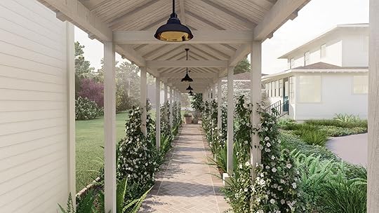
THE ROOFLINE/COVERED PATH PROBLEM
WHAT WE LOVED: The anchoring blossoming tree, the simple grasses, and the ferns — the whole vibe feels natural, simple, and unfussy.
OUR NOTES: Well, after seeing the rendering, it’s becoming increasingly important to figure out the pathway/stairs/roofline awkwardness situation. I thought that Yardzen could design the patio while we figure it out, but it’s affecting the design too much. Essentially the kitchen windows (and cabinetry) were designed with the door moved over, and we didn’t really catch that by moving it, it would no longer line up with the stairs and the covered pathway. Meanwhile, the original overhang was rotted, so it was demo’d months ago for safety. Then we realized that by putting up a new overhang, we were going to lose a lot of light in the kitchen — and that’s a big “no thank you” from us. So the question then became, “Where should the stairs stop?” Do we want to have a landing on the right? It’s a lot.
Here it is IRL:


This doorway/pathway issue wasn’t Yardzen’s problem, really. We (ARCIFORM and I) need to tackle it from an interior/exterior perspective. We’ve since come up with a much simpler solution that I’ll show you next week. But I wanted to flag that and explain it, in case you were wondering what was going on — it’s awkward, and we are on it.
WHAT WE LOVED: The mix of the pebble with the brick border, with the herringbone.
OUR NOTES: We are worried about the tripping hazard of the brick against the lawn so are going to set that down into the soil or flip the brick.
 THE PLANT PATHWAYS
WHAT WE LOVE: The mix of the ferns and the climbers. It is going to be SO DREAMY.
OUR NOTES: Switch to a pink flower instead of white (as long as they are green year-round).
 WHY TWO DIFFERENT PATHWAY MATERIALS?
The reason that we are switching from the brick to a pea gravel path alongside the house is because the gravel element/material will be used throughout the property – in both patio areas and pathways (and larger gravel for the two-lane driveway). We love the herringbone aged brick for the kitchen patio. It’s going to be so classic, elevated, and gorgeous. But we’re not using it everywhere because A. It’s expensive both in materials and labor and B. We love the more rustic/casual vibe of the pea gravel (especially as The reason that we are switching from the brick to a pea gravel path alongside the house is because the gravel element/material will be used throughout the property, in both patio areas and pathways (and larger gravel for the two-lane driveway). We love the herringbone aged brick for the kitchen patio. It’s going to be so classic, elevated, and gorgeous. But we’re not using it everywhere because a) it’s expensive, both in materials and labor, and b) we love the more rustic/casual vibe of the pea gravel (especially as we get closer to the alpacas and chickens). It’s so easy to take this property to the next level and make it like a fancy estate, but the experience that we want for our family is more casual and farm-y (which fits our budget better). So we’ll save money and get the vibe that we want.


Right now we are focusing on the area around the kitchen and the covered path, but I’m sure we’ll plant along the other older house as well.
 BACK TO THE HANG AREA
WHAT WE LOVED: The intimacy and sense of a room that they created with the plants. The vibe is SO GOOD.
OUR NOTES: Fewer potted plants, just to keep it cleaner and simpler. So instead, we pitched them some window boxes — a look we’ve both loved but never had before (besides on the castle playhouse), although we are nervous about them staying maintained when it’s hot in the summer. Yardzen thinks it would be a lovely place to put an herb garden, which we agree with, so stay tuned on that.
OUR NOTES: More classic furniture — thinking about this table or this table, and these chairs or these chairs (but we might go rectangular – still TBD).
WAIT…WHERE IS YOUR BARBECUE?
In case you are wondering where the barbecue is going and why we didn’t plumb it for natural gas, here are our thoughts:
1. A barbecue against a house would likely stain the white exterior walls.a
2. We think in the list of priorities a huge outdoor kitchen isn’t necessary, when the kitchen is right there (would be different if it were a hike to get the ketchup).
3. By not plumbing, we can float a barbecue in the patio (so as not to soot up the walls), and then we have flexibility on where to put it. I didn’t want Yardzen to design around a floating barbecue, so we left it off.
We decided not to hard-plumb it in, since we don’t know where it’s going to go and also because we are limiting our natural gas consumption. So we’ll continue to use a propane barbecue until the electric ones start getting better (they are slowly coming, y’all). Mostly we just want flexibility for now and to save money by not building a big outdoor kitchen that we might not use or need. Now, once we live in the property, we might find that we want an outdoor covered kitchen somewhere near the sports court, and so that might be something we consider, but without living there and knowing what we’ll truly use (versus what is just fun/fancy to have), we are not pulling any triggers.
PLAYING WITH PLANT HEIGHT AND SCALE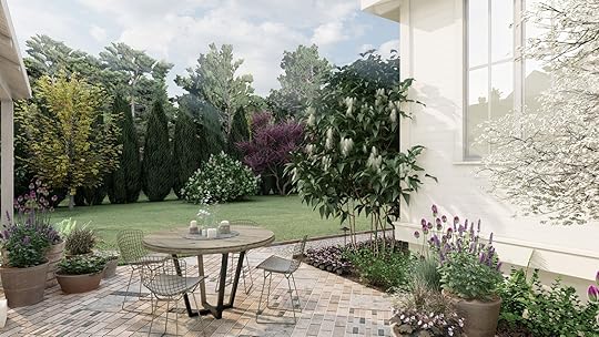


WHAT WE LOVED: I liked the “random” heights of the plantings along the south side of the house (the exterior wall) with a nice up and down cadence.
OUR NOTES: We’d love more medium shrubs to break up the white and soften the lines of the large windows (which are so dreamy).


I can’t tell you how pleased we were with Version #1 of the design. Seeing the Yardzen renderings really solidified some ideas and challenged others — both an important part of the design process. The whole experience has been an absolute total joy and a fun relief from waiting for drywall to dry.
 SO WHAT HAPPENS NEXT?
My Yardzen designer is finishing up implementing our notes into the final round of renderings, and our landscape contractor is finishing up another job before they jump on ours. We are working with a local design/build team that has worked with Yardzen a lot, and once we have the final plan, it will get implemented.

As you can see, the Yardzen team did an incredible job on Version #1. I’m very excited to see and publish post #2. So as a recap, here is what they are tweaking:
1. A solution to the off-center covered pathway and stairs (we’ve already sent them our ideas now that we figured it all out).
2. A more classic brick pattern for the patio floor. Something timeless, but still special.
3. Fewer potted plants, adding window boxes instead.
4. Tweak the variety, color, and style of the trees and plants along the side of the house.
The biggest takeaway for me is knowing the value of having a Yardzen designer take over the creative process, using their design expertise to create an accurate visualization for us — FROM AFAR. It can so clearly help any client, and it gives you the confidence that what you are doing is the right thing (or not). And mostly, it can add a burst of hope and joy into what is often an expensive and laborious renovation process. Actually seeing the potential in renderings, not just trying to imagine it, is magical. I can’t WAIT to see and show you the final version.
The post Yardzen Review: Is It Really Possible To Design A Beautiful Yard Remotely? appeared first on Emily Henderson.


May 1, 2022
The Link Up: Em’s TOP Mother’s Day Gift Rec, Ryann’s Perfect T-Shirt, And The Spring Dress Caitlin Is Wearing To Every Event On Her Calendar

It’s Sunday, it’s the first day of May, and Em’s book comes out in just over ONE WEEK (have you preordered yet?)!! We hope you are about to have an equally exciting week and that it starts off right here and now with this link up. Enjoy!!
This week’s home tour is from none other than the wonderful Hopie Stockman (co-founder of EHD favorite, Block Shop) via Cup of Jo. Her home is magical. Hand-painted walls drench in happy peaches, blues, and greens. Just go experience it. Jess actually has the sweetest story about Hopie. Jess and her cousin went to Block Shop’s studio for an event about 4 years ago and quickly started chatting with Hopie and her sister. After telling them that they were cousins, Hopie sweetly looked at them and said, “So your cousins AND best friends??” Jess and her cousin looked at each other, never really before expressing to each other they were best friends, turned to Hopie and said, “Ya!” Now Jess and her cousin refer to each other as CBF (Cousin Best Friends). She helped them take their relationship to the next level:) Needless to say, Hopie’s sweet and kind spirit emanates from her and her warm home.
From Emily: It’s no secret I LOVE my infrared sauna blanket (my sweaty proof is here). I also was sent their red light face mask and from what I’ve seen on the market it’s a DEAL for this kind of thing. All this to say, for today only they are offering 20% off side wide with code EM20. I thought that with Mother’s day literally one week from today this might be a really nice gift to give (or maybe ask for). I honestly love mine.
Speaking of Mother’s day, we did a massive call-out last year to real moms asking what they ACTUALLY wanted and we did a big ole post about it. We still love that a paddleboard was requested by MANY moms. Bet you didn’t expect that, huh:) So if you are stumped look no further than this post.
From Ryann: When I tell you I am obsessed with these t-shirts please believe that I am not being hyperbolic. I’ve worn it in this brown color 4 times this week, and I have them in 4 different colors (but am going to absolutely buy more). They are the PERFECT baby tee and I love the length of the little cap sleeve. They are also ribbed which I find extremely comfortable. Excuse me while I add like 10 more to my cart!!
From Jess: After listening to this podcast episode about a new documentary called The Business of Birth Control (that I think everyone should listen to) I was immediately intrigued and watched the documentary the same day. They are the same people who did The Business of Being Born if you’ve heard of that documentary. I want to state that I and the people who made this documentary are pro contraceptives and in no way want to diminish the life-changing impact the pill had on the women’s liberation movement. But it’s been 72 years since the first pill was invented and not much has changed which isn’t a good thing. This documentary is purely about asking for better options and educating women (and doctors) by conducting actual studies on the very real and sometimes deadly side effects. I’m feeling very fired up and infuriated at the lack of research on women’s and people with female reproductive parts bodies. We still have suuuuuch a long way to go and I think this film is a really important start to get things moving. FYI it’s $14.99 to watch but promise it’s more than worth it.
From Mallory: Meet my new go-to purse/crossbody bag. I’ve always wanted a grab-and-go, throw over your outfit kind of crossbody that’s shorter than my insanely long crossbody and this one is the DREAM. Parker clay is such a cool brand I just found out about – if you’re in the market for a really good quality leather laptop bag (this one’s my fav) or really any kind of bag (or wallet), their stuff is INCREDIBLE. FUN FACT: I didn’t realize that Em has been onto Parker Clay for years! Makes this rec even more legit:)
From Caitlin: (siren sounds) I JUST FOUND THE BEST SPRING/SUMMER DRESS!!! (more siren sounds). OMG. Here’s the thing: I love a sleeve on a dress (have tattoos, don’t always want to talk about them with strangers, you know?) but it can be really hard to find long-sleeve dresses that are cute, well-fitting, and lightweight enough that I don’t get sweaty and that icky feeling if I’m doing something in the sun. This one is SO flattering (seriously, all the reviews are just like “this is so flattering”) and the construction is SO impressive for the price (like, special hook-and-eye closes in the chest, hooks for your bra, etc.). My weekend social calendar is currently non-stop bridal and baby showers – right now on week 2 of FIVE STRAIGHT WEEKS of said showers, y’all – so I’m so excited that there’s an affordable grab-and-go dress now in the rotation. It’s offered in sizes 00-24 AND in petite and tall and I’m pretty sure that like, EVERYONE would look amazing in it??? 100000/10.
Thanks for joining us today and see y’all tomorrow!!
Opening Image Credit: Design by Hopie Stockman | Photo by Laure Joliet | via Cup of Jo
The post The Link Up: Em’s TOP Mother’s Day Gift Rec, Ryann’s Perfect T-Shirt, And The Spring Dress Caitlin Is Wearing To Every Event On Her Calendar appeared first on Emily Henderson.
April 30, 2022
The Wedding Guest Dresses We Scoured The Internet To Find…Because Wedding Season In 2022 Is About To Go OFF

Since the year began, I’ve already attended two weddings, I have one next month, and then one almost every other month for the rest of the year (including my own). With 2020 and the majority of 2021 postponing weddings left and right, it seems EVERYONE is trying to squeeze their wedding into 2022. I get it, and no one besides a completely unprecedented pandemic is to blame, but that doesn’t take away from the fact that wedding season is about to get pretty nuts. So, because most of us at EHD have been googling “wedding guest dresses” for the past few months, we all decided this is a post we needed to write, in hopes that it’ll help keep a little bit of the attending-a-wedding-stress at bay. So we all got together and pinned the wedding guest appropriate dresses that we would want to wear, and broke them up into their appropriate dress code categories. If you have a wedding (or several) coming up on your calendar, we hope this post will help you check one thing off your list.

1. Flower Print Dress | 2. Knot-Front Cutout Halter Midi Dress | 3. Green Animal Strappy Frida Dress – Curve | 4. Adabell Dress | 5. MISA Mesh Midi Dress | 6. Cowl Neck Slip Maxi Dress | 7. Selkie Princess Dress | 8. Knot Detail Dress | 9. Puff Cottage French Dress | 10. My So Called Life Nightie | 11. The Way to Love Black Floral Print Ruffled Maxi Dress | 12. The Elsa Dress | 13. Betsy Midi Dress – Curve | 14. Gitane Long Sleeve Smocked Linen Midi Dress | 15. Davenport Dress
When it comes to a casual wedding dress code, this is where (I believe) you should get a dress that you would absolutely wear again. It should be dressy enough that it’s not an “everyday” dress, but casual enough that you could also wear it to non-wedding events. I love black so I am extremely attracted to #2 and #4, but if I were a color gal, I wouldn’t skip #13. #7 is also a very sweet option, by a brand called Selkie that I’ve recently discovered and love.

1. Instant Impression Sage Green Asymmetrical Midi Dress | 2. Diana Gown | 3. x REVOLVE Ava Dress | 4. Long Sleeve Roma Dress | 5. Resounding Beauty Dusty Purple Surplice Maxi Dress | 6. Roxanie one-shoulder fil coupé chiffon mini dress | 7. Knotted silk-satin mini dress | 8. Twist Front Long Sleeve Dress | 9. Lilac Vienna Mini Dress | 10. Sierra wrap-effect Dress | 11. Rina Dress | 12. Noah Wrap Dress | 13. x Revolve Camo Dress | 14. Scala layered ruched jersey midi dress | 15. Aaliyah Midi Dress
From what I understand, a cocktail wedding dress code means you can wear shorter-length dress but it must still be fancy and a bit formal. This is actually the most popular wedding attire choice, so here’s to hoping one dress in this category will get you through all of wedding season. I personally love midi dresses so #2, #12, and #15 are all on my list. But for a short option, I can’t help but love a one-shoulder look like #6.

1. Forest Green Midi Dress | 2. Boat Neck Maxi Dress | 3. Evening of Elegance Navy Blue Floral Jacquard Wrap Midi Dress | 4. Black Lottie Dress | 5. Printed Crepe de Chine Gown | 6. Westerly Dress | 7. Niesha Handkerchief Hem Midi Dress | 8. Private Kiss Midi Dress | 9. Midnight Sky Child Midi Dress | 10. Steel Sky Child Midi Dress | 11. Silk Wrap Midi Dress | 12. Meadow Maxi Dress
I think semi-formal is the most confusing wedding guest attire category. Semi?? Formal??? I don’t know what’s happening. But after much research it has come to my attention that it is very similar to a cocktail dress attire, except with semi-formal the length of the dress should be at least below the knee. Also, according to brides.com, a semi-formal wedding calls for “darker, more formal colors for an evening wedding, and light colors and fabrics for a daytime event”. Fair enough. For this category, I am loving #2 but if I were a person that the color yellow looked good on, I would absolutely go for #5. For a nighttime wedding that might get a little chilly, #11 is a great long sleeve option.

1. Sunset Views Midi Dress | 2. Rory Velvet Dress | 3. Burgundy Maxi Dress | 4. Soa Dress | 5. Mara Velvet Maxi Dress | 6. Amelie Dress | 7. Cami Gown | 8. Mina Dress | 9. Tasteful Dress | 10. The Rianna Dress | 11. Embellished Sequin Maxi Dress | 12. Twist Back Cap Sleeve Dress | 13. Summer Cinderella Midi Dress | 14. Simone Maxi Dress | 15. Words of Warning Maxi Dress
A formal dress is either a floor-length gown or a fancy cocktail dress. I think of this category as what you would wear to prom but make it #matureadult. You don’t want your dress to scream “I am in the running for prom queen” but the level of “fancy” is about the same. I wore #9 to a wedding last month and received a ton of compliments on it. It’s very tight and form-fitting, so just know that you have to feel confident about flaunting your curves :). If I had to buy another formal dress though, I’d go for #14 or #15. Which one is up your alley?

1. The Rosabel Maxi Dress | 2. Queen Gown | 3. Sequin Cowl Neck Gown | 4. Sandra Plunge Crepe Trumpet Gown | 5. Victoria Maxi Dress | 6. Drina Gown | 7. Hit the Mark Gown | 8. Velvet Applique Tulle Dress | 9. Magali Pascal Side-Slit Maxi Dress | 10. Multi Tie Maxi Dress | 11. Low Back Slip Mermaid Fishtail Gown | 12. Cape-Effect Metallic Gown | 13. Cayla Side Drape Gown | 14. Off-the-Shoulder Gown | 15. Draped Stretch Satin Gown
Black tie weddings are intimidating. A black-tie dress is a floor-length gown, full stop. If you have a black-tie affair coming up, and don’t see yourself wearing a gown more than once, I cannot recommend services like Rent The Runway enough. It was literally created for instances like this and will save you from buying something you’ll never have the chance to wear again. And they have HUNDREDS of designer dresses to choose from. But if you do have multiple fancy affairs going on, any of these dresses will have you looking perfect for the part. Mallory wore #3 to a formal event last weekend and loves it. It’s affordable but dressy so it’s completely appropriate for black tie events. I am a sucker for black or red dresses so #1, #4, and #11 are living rent free in my head. Oh, and #12 is so chic it almost hurts.
So there you have it. If you are wedding guest dress shopping we hope this post helped to narrow down some options. Cheers to surviving wedding season! 
Opener Image Credit: Photo by Veronica Crawford
The post The Wedding Guest Dresses We Scoured The Internet To Find…Because Wedding Season In 2022 Is About To Go OFF appeared first on Emily Henderson.
April 29, 2022
Our Top 10 Picks From The New Studio McGee X Target Collection (There’s A Mirror We Think Everyone Is Going To Want)
Happy Friday, cuties! First up: we just shared an AWESOME feel good makeover, so be sure to go check that out first. Second up: The new summer Studio McGee collection just landed at Target and it’s destined to sell out in like…I don’t know, probably 4 minutes MAX, so we convened as a team, pulled the 10 best picks, and I’m sharing them with you now. It’s a decor-heavy drop, which RULES as any of these pieces could make a BIG change in the feel of your home for not a lot of cash. Can I show you what caught our eye?
Abstract Framed Wall Canvas

The impact:price ratio on this piece is OFF THE CHARTS, gang. This canvas is huge – 36″ x 36″ – and the whole thing comes in at a sweet $85, which feels really reasonable for such a huge piece of art. The quality is impressive, too – Em actually grabbed this super moody Studio McGee landscape piece last year for the Mountain House last year, and it still looks like a million bucks up on that fireplace mantel. This is a great finishing touch that won’t break the bank – what else could a gal ask for? (PS. If you love the size of this piece but you’re not crazy about the actual art, there are a few more great options right here that are all in the same price range. Well done, product design team!)
Washed Cream Vase

It’s wabi-sabi, it’s luxe, and it’s 10% off through Saturday!!! The vintage-inspired finish on this is so well done – it looks like something that our team would have scooped at the Rose Bowl Flea Market, right? – and the shape is so timeless and classic. This vase is pretty freakin’ big, too, so it’d be a great (and grounding) vessel choice for those looking to style out some big, dramatic branches (aaannnddd here’s our how-to guide that’ll turn you into an expert branch arranger, in case you missed it).
Oversized Cotton Woven Striped Square Throw Pillow
WE LOVE A PILLOW WITH OPTIONS. This one comes in green, blue, and cognac (the blue is pictured above, but the green actually reads pretty gray to me – it’d be a great choice for those who want to try bringing in a liiiiiittle bit of color in their home for the first time!). Its oversized proportions make it SO easy to play with, too – it’ll look great next to any tinier pillows you already have at home. The texture is also even better up close – there are like, 5 or 6 different stitches going on – and the cover is removable, so you can wash it after someone absentmindedly rubs their microwave popcorn butter fingers all over it. (I have never done that.) (I actually may have done that.)
Miringa Artificial Tree Green

I KNOW, I KNOW. If possible, you should buy a real plant! But hear me out on this one for a second: I recently realized (like, within the past 3 months – I was working on an estate clean-out) that there are a lot of folks who don’t necessarily have the mobility or strength to actually take care of plants (like, hauling water around your home gets tough when you’re using a walker, you know?). To that end: do I think that we should all rush out to buy fake plants? NO! But do I think that this is a great, beautiful, cheery option if you aren’t currently in a place to keep up with a real, living thing for whatever reason? Yes! (There’s only one review right now, but they included photos and it does look great IRL, for what that’s worth.)
Light Woven Oval Mirror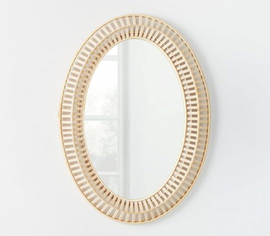

Where couldn’t this go? The more I look at this mirror, the more I think that it may be like, the decor equivalent of the titular pants from the Sisterhood of the Traveling Pants books. It’s classic AND fresh, graphic AND quiet, neutral AND statement-making. It’d look great with any of Em’s new paint choices, or against ANY of the super-loud wallpapers in my home, or in Jess’ elevated modern office, or in Ryann’s dark and moody living room…like, you get it, right? It’s hands down my favorite piece from the new collection – I feel like we’ll be seeing this one in IG posts for years to come.
Sand Dune Framed Wall Art

UM, OKAY. When Jess threw me this link, I for sure thought this 36″ x 24″ piece was gonna be at least ~$200 – the frame and matting and glass alone are worth more than that! – and I was BOWLED OVER when I opened up the product page. I can see this above a credenza in a super high-end mid-century-inspired dining room with lots of bright touches (but it looks great in this living room, too. Also, that’s also the green pillow I mentioned earlier! It reads as gray-ish, right?!). Oh and for those that remember Cup of Jo’s old living room that Em designed there’s a super similar piece on the tv gallery wall!
Striped Gauze Throw Blanket

This one also comes in cream and taupe, but that sage-y/olive-y green is SO good. It can work anywhere! I love the textured finish on the side (it’s easier to see on their website, TBH) and the construction on the bottom tassels looks so luxe – feel like we’d see this blanket marked WAY up in one of the ~fancy~ design stores on La Cienega here in LA. It’s not a big “snuggle up” blanket (I mean, unless you’re into something that’s a little lighter, in which case it may be perfect!) but it’ll be the perfect touch thrown over the arm of some seating or at the end of a bed.
Oversized Cotton Slub Woven Jacquard Lumbar Throw Pillow

I mean, this just feels like CLASSIC Studio McGee to me. An elevated print, a classic neutral, in a goes-anywhere shape…what else is there to say? This would be the perfect finishing touch in any pillow-scape (BRB will I trademark that word).
Oversized Textured Asymmetric Striped Square Throw Pillow

This one’s my favorite pillow from the new collection!!! I love the size, the broken stripe, and the texture is AWESOME. This pillow is enormous – 24″ x 24″ – so while it looks great on a sofa, it would also be a great choice for those looking for a bigger decorative bed pillow. I wish this came in more saturated colors, because I WOULD BUY OUT TARGET’S INVENTORY. (Is anyone listening??? Can I get this in some brights, please???)
Melamine Rectangular Serving Platter

Nothing says “OMG CUTE” like a sweet little irregular edge in a soft blue!!! This feels surprisingly grandmillennial for the collection IMO – like, a little more English-leaning than the CA cool I’ve come to expect from this collaboration – but I LOVE IT. I’m especially stoked that this is in melamine instead of stoneware, because (a.) I have been known to break ceramics and (b.) melamine’s a great, outdoor-friendly, dishwasher-safe option which makes this PERFECT for all your summer soirees. It’s cute to see outdoor-friendly dinnerware that like, doesn’t have a bunch of pictures of flowers or illustrations of bugs on it or whatever. 10/10 MORE OF THIS, PLEASE.
That’s where I’ll leave you – HAPPY FRIDAY, MY PERFECT PALS. I have a bunch of friends in town this weekend (from Vermont and Texas!), but I’m still trying to squeeze a little Target trip in there to grab a few things IRL (mainly that freakin’ mirror!!!). What’s on your docket? (Or we could, like, talk about this decor drop. Either way.) See you down in the comments – LET’S CHAT, YEAH? xx
*Photos via Target
The post Our Top 10 Picks From The New Studio McGee X Target Collection (There’s A Mirror We Think Everyone Is Going To Want) appeared first on Emily Henderson.
The Latest Feel Good Makeover Reveal By Pen + Napkin x CherishedLA Is Here

We always say The Feel Good Makeovers are our absolute favorite part of this job. In the past, we’ve worked with the amazing Pen + Napkin team to furnish and decorate homes for families transitioning out of homelessness, and last year we partnered with them to help these Feel Good Makeover Takeovers go national. Recently our friends at Pen + Napkin wrapped another project where they completely furnished and decorated two four-bedroom houses in partnership with another amazing organization called CherishedLA. If this project sounds at all familiar, you may have seen it promoted on our Instagram stories, and if you are one of the many who donated, THANK YOU.
If up until now you haven’t heard of CherishedLA, I want to first highlight the incredible work they do. I chatted with Kayla, their program coordinator, to get the story behind this organization that changes lives:
She explained, “CherishedLA is a two-year, faith-based residential program for single, female adult survivors of sex trafficking. We walk alongside women on their journey to recovery, healing, and stability. Our Founder, Kate Wedell, is a survivor herself and we emphasize trauma-focused narrative therapy in our programming. Kate started CherishedLA in 2011 with outreach and support groups to help other women in similar situations to what she had experienced. We have since grown to include our residential program and a social enterprise. In the social enterprise, residents receive job training making organic bath and body products, fair-trade jewelry, and clothing.”
After seeing and hearing about the work they do, we were not at all surprised that CherishedLA and Pen + Napkin would make a great team.


When I asked how the two organizations came together, I learned Catie (Founder of Pen + Napkin) saw Kate (Founder of CherishedLA) speak years ago before Pen + Napkin even came to exist. She felt that God was connecting them even back then. When CherishedLA needed help with their two safe houses, Kate spoke with the Pen + Napkin team about what a partnership would look like. She explained the importance of creating beautiful spaces for survivors to have, to do their healing during transition. This sentiment obviously resonated with Pen + Napkin who know how a furnished home can change lives. Catie presented the project to their Pen + Napkin 101 Class that is full of passionate designers eager for project assignments and soon had enough people sign up for both installs. Then they got to work.
Both homes were mostly empty and needed some love. The first home was completed by two design students who go to SFSU (which speaks to the fact that you don’t have to be a professional designer – you just have to be willing). This second home design that you are about to see was led by Catie, with help from CherishedLA and eager volunteers. Together, they created a fully furnished and decorated home for the residents to heal and enjoy.

Poly & Bark donated all the large pieces for the living and dining room. The two sofas and accent chairs create a cozy conversational space that is big enough for all residents to enjoy. A large area rug adds another layer of warmth.


Bright and happy colors were essential to creating an inviting oasis, which was achieved through art, decor, greenery, and of course, paint.
Oh, how CUTE are these place settings? I love the multicolor floral napkins and that flower arrangement centerpiece is a beautiful touch.

Each bedroom is painted a different color because when the project began, several residents who had been with the program for a while wanted to get involved with the design. Each resident chose the color for their room and painted it themselves. Then the designers who helped with the project worked within the color palette to build designs that would be happy and welcoming.


 catie’s daughter, on the right, helped arrange some of the decor
 Catie and the Pen + Napkin team wanted to do more than just furnish the home. Furniture is obviously important in making a house feel like a home, but decor is also essential to bring personality and life to a space. She wanted to transform a generic room to a room that can really provide an environment for hope and healing with beauty and intention. We love the neon light signs and plants that bring literal light and life to the rooms.


Not only is each room a different color, but they are also decorated differently to feel welcoming and personal. Each room has its own display of art including motivational typography, photos of different cities, and abstract paintings.
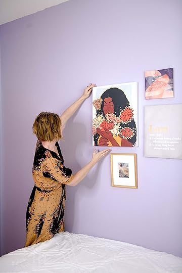
There’s Pen + Napkin’s fearless leader, Catie, hanging some art in one of the bedrooms.


Motivational art and typography are sprinkled throughout the home to encourage the residents to stay positive. This area of the home is equipped with art supplies so the residents can create art and explore their creativity.

This “Never Give Up” neon sign adds a playful touch and acts as an uplifting reminder to the residents.


The last thing they did was create a beautiful garden (unfortunately not pictured) that was a dream of the CherishedLA team ever since they opened the homes. They had a painting of this dream backyard and one of the designers (Jenae Noonan) saw the painting and decided to help make it a reality. She took several of the elements in the painting and created an amazing garden.
It is always our honor to promote Pen + Napkin and share their mission and work with the world, and today that’s especially true because we’ve been introduced to another incredible organization. We know these two homes will bring so much joy and healing to the residents, thanks to the devoted staff and volunteers from both organizations.
Now we’d like to give a huge, tremendous, overwhelming thank you to everyone at CherishedLA and Pen + Napkin for devoting their time, energy, and focus to make the world a better place and for allowing us to have a small part in sharing their incredible work. We cannot sing their praises enough and encourage everyone to follow both CherishedLA and Pen + Napkin, and consider volunteering or donating if you can. You can check out Pen + Napkin’s next project here.
*Lead Design by Catie of Pen + Napkin
**Photos by Mirimage Photography
The post The Latest Feel Good Makeover Reveal By Pen + Napkin x CherishedLA Is Here appeared first on Emily Henderson.
April 28, 2022
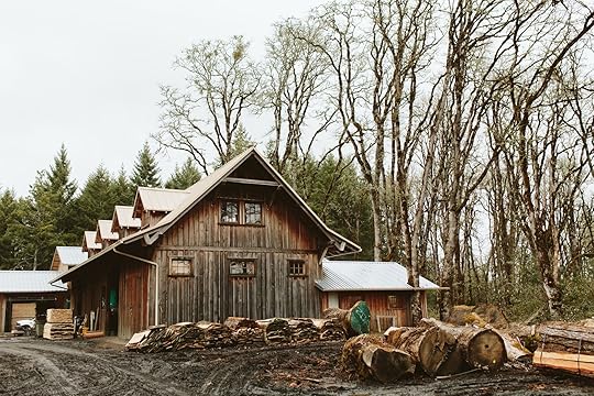
Introducing The Most Beautiful Wood Flooring In The World, By An Oregon Run, Family-Owned, Sustainably Sourced Mill – (Zena Forest Products) For The Farmhouse

When I put out the call last year for sustainably sourced Oregon wood flooring, a couple of you recommended Zena Forest Products, so I went ahead and checked out their site. I immediately connected to their mission (among other things) and requested a sample — despite my doubts that their floors would aesthetically be “the one.” I’m not sure why, but I just thought there was no way it could be the trifecta of what I wanted: sustainable/locally grown, stylistically on point for our home, and milled/assembled to our durability specifications. I had shopped around a lot and met with many other great sustainable companies, but they either shipped from the East Coast (which is fine, but a bit less carbon-friendly) or they didn’t have the species that we wanted (a light hardwood). I just kept thinking, This is Oregon…surely we can buy wood floors made from Oregon trees?!.
When I got the sample, I was like, “Brian, look!” And I have never seen Mr. Henderson want a floor so badly. Why? What’s so great about this flooring? Well, first off, it is absolutely stunning, high quality, and exactly what we wanted stylistically. We dreamt of a more seamless, light, Scandinavian flooring with character and knots, but we didn’t want it to be too rustic. We didn’t know if it was actually possible to get everything we wanted, but it turns out that with Zena, we definitely could. You’ll see for yourself in a bit, but beyond looks, the company is incredible and doing great things for the trees, the community, and the planet. We’re super excited about it…so much so that we made a video:

That’s Ben Deumling, who owns and runs the mill (along with his family that serves as the board of ZFP). We spent the day touring the forest and mill, learning more about the company, their ethos, and seeing what goes into harvesting and making their wood flooring. Brian came, too, and took video of it all while we spent the cloudy day in this beautiful forest, learning about a process I’d always taken for granted.

Let’s get into it, shall we?
Ben literally grew up on the property, which his family has owned and run for generations. This is his childhood backyard, and he’s now raising his kids here, too. To say he cares about the health of the forest is an understatement. He started learning about the forest when he was 5 and knows every inch of it, and his boys will be brought up the same way — I live for stories like this…Zena’s ethos is really beautiful. As stewards of the land, they don’t clear-cut. Rather, they harvest and mill trees when they’re ecologically ready (otherwise known as thinning), always thinking about the health of the forest as a whole. It’s this beautiful process we got to witness firsthand, and it feels intentional, purposeful, and slow. Ben goes around the forest and marks when a tree is ready, based on his silvicultural knowledge. Zena cares about the trees and the planet, full stop.Zena’s forest is an hour outside of Portland, so it’s as local to us as possible, which means I’m supporting and promoting the local economy/community, avoiding shipping consequences, and keeping the trees in their native PNW. (They will sell/ship nationally, too.)Ready for some woo-woo stuff? As you know, I speak “tree,” and these trees are so well cared for and loved. While this might be a stretch for a lot of people I think that careful stewardship gives the wood and thus your home good energy, too. It’s just like how a salad made with ingredients from a carefully tended backyard garden tastes so much better, the meal so much more enjoyable than a ready-made salad in a plastic container from the grocery store. A tree that has lived a full life feels more soulful than one grown just to be hacked down, glued, and shipped for cheap. FSC regulations exist for a reason, and it’s great to support companies that harvest sustainably. But more than just that, Ben and his family love these trees. I know all you plant parents out there can understand the positive energy of a well-cared-for plant — same goes for these trees. (Which is also why I like reclaimed wood flooring, and handmade or vintage anything — good energy of a life well cared for.)Ben and his family believe that when done right, commercial goals (running a business with a healthy profit margin) can integrate with mindful stewardship of our local ecosystems. After studying Environmental Studies and Politics at Whitman College, Ben took the reins of the 1300-acre property to ensure that the forest is harvested right, that the wood is looked after, and that there is as little end waste as possible. They use the offcuts from the milling process to feed the furnace, which then heats their kilns. They also go as far to supply their sawdust to local mushroom farmers, (it doesn’t get more community-based than that). The wood is priced with all these special considerations in mind, but for any of you designers out there, trust me — it’s a bargain considering how amazing it is.
We wanted real wood, white oak preferably, “but their engineered product is highly durable, with a more seamless appearance (plus you can sand and refinish it 4 or 5 times within its lifespan). We’ve done solid wood flooring in all three of our previous homes, and all three times we’ve had issues with them — buckling, warping, swelling, cracking — which are not deal-breakers at all and have solutions (plus they were beautiful), and we might opt for solid wood again in the future. But Brian specifically requested we find beautiful wood that might also have an engineered backing, to avoid these problems. Zena’s engineered wood is assembled with nontoxic glues and has been VOC tested and Declare Label certified. Some engineered woods out there — most, actually — aren’t very good, and the technology is just now coming around. But Zena is leading the way and doing it right.
 BUT HOW DOES A TREE GET TURNED INTO WOOD FLOORING?STEP #1: CHOOSE AND CHOP THE TREE
This was so fun to watch and shoot. Ben chooses the tree based on the health of the forest — a tree might be blocking the light of growing saplings underneath it, or possibly leaning and might fall. We shot this in winter, but in summer the canopy would be large, full of leaves, and creating a lot of shade. He keeps big, healthy old-growth trees, letting them grow and grow until they are ready to come down and open the path for a new canopy to thrive.

It was really special to get to walk the forest with Ben. Brian shot the video while we learned exactly where our wood floors were being sourced from. Lots of good feelings. That’s me, speaking and communing with the trees. Like everything, when they get chopped, the energy has to go somewhere (that’s just physics), and these trees have very happy energy. (Can you tell that’s VERY important to me?)
 STEP #2: MILL INTO PLANKS — HOW A CIRCLE BECOMES A SQUARE
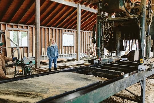
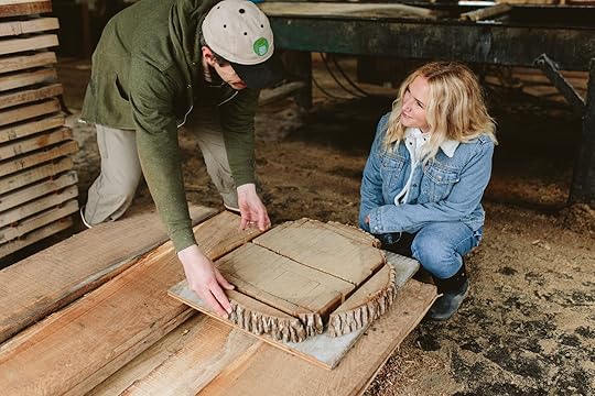
What you see above is how they take that long, round trunk and mill it back and forth through this massive machine, cutting it in the middle and turning it over and over in different directions to get all the planks you see in the cross-section. The idea is to get as much usable wood out of the tree as possible, with minimal waste. The person running the machine has to be really experienced and know how to turn the log just the right way to get the next cut. It’s awesome to watch.

 STEP #3: AIR DRY (ONE YEAR MINIMUM)
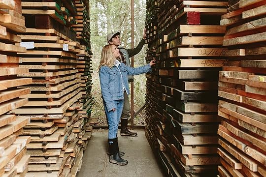
You can’t build with wet wood or it will rot, swell, etc. — it has to be dry to be stable. And the thicker the wood, the longer it will take to be ready to use. (P.S. That is why there was a massive wood shortage last year. It wasn’t that we were out of wood, it’s that lockdown shut down the milling/drying process, which meant once we were out of dry wood, the supply plummeted while the demand surged, until the mills caught up. Thus the quadrupled cost of wood for all of us remodeling.)
STEP #4: KILN DRY IN HEAT
To ensure that all moisture is out of the wood, as well as eliminate any bugs, it is transferred to the kiln and dried until the moisture content is as low as 8%. (They say they are mainly in the moisture mitigation business, lol.)
STEP #5: PLANED AND SMOOTHED OUT — ALMOST READY FOR FLOORING
Planing is where they take the wonky but fully dried board and essentially shave a small layer off the top and underside so it’s perfectly flat, smooth, and almost ready to become flooring.
STEP #6: FINAL PREP FOR FLOORINGWhile you can just lay wood on the floor and call it “wood flooring,” that’s like mixing ice with cream and calling it ice cream. It’s just not how it works. (You could do it that way — it just won’t stay together, may splinter, and will swell, shrink, etc.) For the best flooring product that feels solid and doesn’t come apart, you want it to be milled to connect with a tongue and groove on the sides as well as on the ends, butt to butt (“end-matched”). This makes for an extremely tight and solid fit. Zena does this without a microbevel between the planks, so that when it’s laid in place, it looks extremely seamless. That might not be your look, but it is what we want this time around. (No splinters, no chances of cracks, and no busy lines). Do I lovesolition a 12″-wide-plank reclaimed wood floor? Sure! But I also love a really smooth solid simple surface that is easy to maintain and requires no bandaids for our splintered kid’s toes). Zena then sends out the wood to another local mill for the 4mm hardwood layer to be applied to engineered plywood backing. Finally, their ¾” flooring blanks come back, where those go through the previously discussed tongue & groove + end-match processing, and are bundled/stored in their dryroom for the client.

At the end of the tour we got to see our very own flooring bundled up and we were SO EXCITED. It’s the perfect tone, with all the character and tons of wood grain. Fun fact – a knot is where a branch once was Our wood flooring is Oregon-grown white oak, with “character” (not clear or ‘select’ grade). It’s a mix of 4.25”, 5.25”, and 6.25″ variable widths, once shoved together via the tongue and groove you can’t even see the seams, which we love. They have average lengths of 6-8 feet. They’ll be sanded/stained in place (after installed). Our flooring starts at $10.75 a square foot and the lead time can be as little as 1 week, (if the inventory is in stock), but could be 6-10 weeks if your order requires further accumulation and production of the selected hardwood species…having said that, I am anticipating that after this post they won’t be able to keep their floors in stock so hurry while this gem of a company is still flying under the radar with their truly exceptional products!
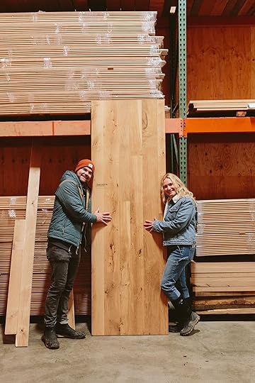
The knots. The grain pattern. The color variation. Does it look like some other white oak out there? Maybe, but it’s not. It’s special, solid, and smooth.

Zena also makes custom wood heat and AC registers and returns, which we are very excited about, and they have wood for stairs and countertops as well (including butcher block).

It was like going on a field trip in elementary school — I learned so much and came home fulfilled in a way that I hadn’t in a long time. Not only was I even more excited about the flooring, but I felt hope for the planet with people like Ben and his family tending to this forest. Please, if you are interested, head to their site and watch the video, learn more about what they do and how they do it, and see what other products they have. Maybe they are the right fit for you, too?
My goal with the post and partnership is to a) create awareness around Zena’s forest and beautiful ethos, and b) remind the world what really goes into making quality products. We are so used to things being cheap and fast, which typically means they aren’t made with people or the planet in mind. And while no one should be shamed for their budget (low or high), I think we have a skewed perception of what things cost, based on home shows on TV and Amazon-priced everything. If this is outside your budget, I totally get it, and I want you to have a home you love, too, so get the flooring that fits your budget. But if you are privileged enough to be renovating with these stand-out factors in mind then I hope you can see that Zena flooring is absolutely worth it.


Head to Zena Forest Products’ site to see more, and watch the video without ads here. Thanks for reading along, folks. I hope you learned even 10% of what I did. xx
*Photos by Kaitlin Green
The post Introducing The Most Beautiful Wood Flooring In The World, By An Oregon Run, Family-Owned, Sustainably Sourced Mill – (Zena Forest Products) For The Farmhouse appeared first on Emily Henderson.
April 27, 2022
The Paint Colors I’m Considering For The Farmhouse (And My New Tactic To Help Me Choose The Right Ones)

My standard “where to start?” advice that I’ve been repeating for over 10 years is simple: “First, ask yourself how you want a room to ‘feel,‘ then how you want it to ‘look.'” And I still stand by this. But lately, I’ve gone even further down the descriptive rabbit hole, adding “What do you want your experience to be while inside this room? What are you going to DO while in this room and then how do you want to feel while doing it?” Essentially y’all, what mood do you want to be in when you are doing the thing you want to do in this room??? Because, your emotional state will be affected by the colors in the room. Once you can lock that down you can back into it and choose design elements, including colors, that support the best version of that experience – or your mood. It’s a great exercise that has really given me some clarity and keeps me focused on what this house should be like, versus what design styles/furniture/colors I’m currently into. Because, while I love every style and (almost) every color out there, the internet often distracts us with incredible inspiration, which causes us to lose focus. Luckily for us, you have almost endless paint color options to support all of your moods. For this home, I’m partnering with Sherwin-Williams to show you where the color palette is headed and give tips on how you can choose colors based on how you want to feel in the room – and with so many incredible colors, we feel very covered.
Some quick notes on color theory – while there are some obvious anecdotal suggestions like “bright red makes us feel energized,” and “muted tones are more calming,” what a color does to you might be different than what it does to me. I might find a blue tone “warm,” even though it’s technically cool and I might find dark brown to be cold and dark, even though it’s “warm.” A lot of it might just have to do with your “comfort colors” (I wrote a whole post about that), and words are just words, so be sure to lean into what makes you feel the way you want to feel.

To help narrow down color selections for the farmhouse, I turned to Sherwin-Williams color samples – both the paint chips as well as the larger (and beloved) peel & stick samples. I got a little greedy with these, knowing that I was going to paint so many rooms in the house (they are mess-free and so much easier to use than wet samples). They have these in their most popular colors, and frankly, they are all REALLY GOOD. I found a lot of comfort in the fact that they had narrowed it down to their most popular colors, it’s how I like to shop “best sellers” from my favorite fashion brands, because you know that many many people have been happy with the product. Since I’m going to be using them for a few months as I choose colors I mostly just peeled off the corner so I didn’t use the entire sticky back. It’s just so helpful to see it on a wall, in a larger format than my fan deck. You can shop their super-affordable peel & stick samples and order FREE color chips online. Still not sure where to start with colors? You can request a free Virtual Color Consultation with one of their experts for some personalized color recommendations for your project.
Overall Mood/Desired Experience We Want In This House: styled by velinda hellen and emily bowser | photo by sara ligorria-tramp | from: in defense of the comfy sectional—a friend’s almost-finished family room
CALM, COMFORTABLE, EASY, AND WARM. On repeat. There are so many rooms I see on the internet that I LOVE and I want them to be mine, but then I remember that what I want is CALM, COMFORTABLE, EASY, AND WARM. These were not my adjectives 8 years ago – it was more light, airy, youthful, fun, etc. But now it’s all comfort and warmth and making sure the house functions for US. This keeps me from buying another sculptural chair that no one wants to sit on or more random tchotchkes that will clutter up a shelf (I have a lot, trust me). It’s been very freeing actually and while I know it’s not everyone’s style, having experienced living in a home that was calm, comfortable, and warm I feel confident it’s what I want. Now, where we might get a bit nuttier is in the kid’s room (they are not into this neutral minimal thing and begged for more color at the mountain house) so stay tuned for some fun color risks in their spaces. But for the main living space, kitchen, family, mudroom, and our bedroom – I’m trying SO HARD to stick to that mood.
The Family/TV Room design by velinda hellen | photo and home of sara ligorria-tramp | from: how to make your smallest room, the coziest room in your home + sara’s tv room reveal
The Desired Experience: To chill and relax, while feeling cozy, warm, snuggly, comfortable as if enveloped by a fluffy bear – and not like Leo did in The Revenant, more like one of those massive stuffed animal bears from Costco. After living here for 7 months I’m dying for a cozy den of a room, especially on the darker wetter days/nights. Here we’ll chill after dinner, play board games when it’s just us, watch family shows/movies, and maybe a Saturday rainy day snooze. I’ve never desired “coziness” and “warmth” so much before and this is the room for it. I’m learning to lean into that winter darkness up here, and embrace my homebody-ness. To do so, I’m choosing a paint color for the family room that will make it feel cozy and warm year-round. It will be a low-energy color, a medium-toned vibration that just feels like that bear hug (probably not as intense as Sara’s in that photo but it’s hard to find inspirational cozy family rooms on the internet). Sherwin-Williams has A LOT to choose from, which you’ll see below.

Quick note – The comfy sectional has been ordered and it’s a denim-y blue – cozy fabric, so I’m still on the fence between just making it tonal (more blues) or contrasting the blue and embracing some warm tones (darker mauves) or going lighter so it’s still cozy but less cave-like.

Here you can see the bare bones of the room – a TV, and stove fireplace with a storage bench underneath it. What you can’t see (yet….stay tuned) is the paneling, the flooring, and of course, the color that we are getting closer to choosing. This room only has one source of natural light (which is a covered porch) so I really have no idea how these paint swatches will look until I get them in the room with drywall. Colors change wildly if/when light hits it (or doesn’t). So while I’m leaning towards a darker tone right now, that mood might be achieved through a medium color (and a dark one might go crazy dark). Another factor we’ve talked about a lot is that you will see this room from the living room when the door is open, so the color in here should look good to your eye when sitting in the living room. Saying that makes me nervous to do a warmer mauvier tone, but I also know that warmth can be achieved through medium/dark blues, warm grays, and greens even though those are technically “cooler” colors.

You know I love blush and copper tones, so in a way these are just really dark versions of that – so warm and fairly neutral. I don’t want a bold burgundy or aubergine, but these in-between colors have a lot of earthiness to them while still leaning on the “pink” side.
I was VERY much leaning towards the color Mink, but I want to wait till we get in the space with the swatch of fabric for the sofa. But that Auger Shell and Intuitive really get me going, too.

Another part of me wants to lean into the blue and make it a full dark blue room – and I just might. I find that tonal rooms where the furniture, walls, and rugs are the same color feel so calming due to the lack of contrast. Your eye doesn’t have to bounce around and figure things out – the room just says “shhhh…blue” to those eyes and then you just sit and the TV is already set to Bridgerton or Love is Blind.

How pretty are those colors? The only one above that I’ve used is Waterloo (Portland house, basement) and it’s EXCELLENT so I have a feeling it will end up somewhere in the house. The rest are excellent options that I am very tempted by as well.
THE MUDROOM design by angela wheeler | photo by stephanie brown | from: ideas i want to steal (but won’t) from another true modern farmhouse
The Desired Experience: I want to feel “pleasantly productive” because a lot of utilitarian and annoying housework will happen in here. I’ve never had a truly functional-sized mudroom/laundry room before so I’m fantasizing that I might enjoy being in here while cleaning, doing laundry, putting stuff away (for hours a day, right? Parents??), and washing the muddy pups. I want it to be pleasant but not precious. In here we are going to have this dark teal tile on the floor and white oak cabinets, that all feel very “Pacific Northwest” to us (green + wood = trees). The question is do we take the color up the wall and put it on the paneling and casings, or go lighter and let the floor be the main color?

The room has a ton of natural light so it could handle a darker color, and we’d likely do it in eggshell so it’s really wipeable for those long-haired post-walk pup shake-offs.
There is something simple and Scandi about just bringing the color from the floor up (think DeVOL), especially if there is contrasting grout in the floor tile showing off the pattern (which I’ll show you later) and then releasing into a solid tone on the walls. So here are the colors we are still thinking about. I think I’m headed towards a neutral on the walls, letting the floor ground the space in a deep color, with the cabinets warming it up with wood but we won’t decide until the cabinets and tile are in.


The back and forth between light and dark will only be solved once we are in the space with tile/cabinets, but I love all the above for different reasons. Once we know how the colors dance (or don’t dance, rude) around the room we can get a lot closer to the tone. While “gray” is never the recommended color in Portland, these have blue and green undertones and I think once light hits it the room will look happier (not gray).
The Powder Room design lauren caisley interiors | photo by sarah griggs | from: powder bathrooms (for the farm) i won’t copy but seriously want to copy…
The Desired Experience: A calm surprise (pink!) that provokes a tiny bit of happiness during the few quiet personal minutes in here for guests. I want it to be simple, not precious, but with some design elements that feel thoughtful and purposeful. I’m surprised at how much pink I’m bringing in the house – not bright or hot pinks (yet… Birdie’s room is TBD) but more muted, rose-y, and mauvey. Where others love taupe, I suppose I’ve always leaned towards blushier neutrals – but have refrained from using any on the walls before….until now. The powder room is the perfect contained space to take a paint color risk.


We are paneling in here (not like the inspiration shot above, although I love it) and that rendered vanity is NOT confirmed, nor is the skirt. The design is still a bit TBD, but I feel 80% sure it’s going to be pink (20% might be a powder blue – depends on the rest of the design).
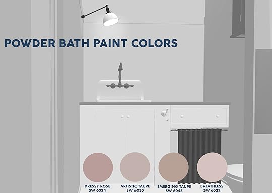

We’ve already confirmed that Dressy Rose and Artistic Taupe are going somewhere – they are very very calming, warm, and pretty. I pitched them to Birdie for her room since she wants pink and she said, very politely with this “I know what you are trying to do” look on her face, “no thank you, mama. I want more colorful.” So expect some hot pinks coming at you sooooon…
The Living Room (Trim/Paneling)
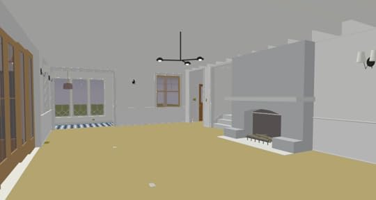
The Desired Experience: “Comfortably fun” or “relaxed enjoyment.” I’m sure in another language there is a singular word for that, but you know, the kind of fun that feels like home – not performed, hard-won, or put on. Fun in your jammies. Sunday – Thursday I want it to be conducive to hanging out with kids while I cook, we listen to Hamilton/Greatest Showman/Encanto, play games at the coffee table, listen to the fire crackle, but come the weekend it will be ready for small lively group hangs with other families. I want people to sink into conversations with areas of design/decor that feels intentional without being distracting or busy. Now, most of this will be achieved through the furnishings/textiles/art as it’s too big of a room for me to paint a strong color (I’ve only done that once, and it was too much for me). So the color, in this case, won’t necessarily create the experience, but it will give it some contrast and design interest. It will be more of a foundational neutral.

Remember that one of our biggest goals in this room was to lighten it up, and it’s a huge room so as of now we are going to paint most of it a really light tone of white (including the ceiling). But don’t worry. We are applying a low wainscot paneling that will be painted a light blue/gray tone, as well as along with all the window/door casings. The intent is that this helps the room feel grounded despite being such a big room, and that it unifies the zones, while also giving it some slight color contrast. I’m seriously considering painting the ceiling but nervous


A fun “fact” about light blue/gray is that almost ALWAYS it’s bluer than you think it’s going to be once on the wall. The undertone of gray is always a different tone, and I usually lean towards the bluer tones. So many times, especially earlier on, I’ve painted a room a “light blue-gray” that turns out totally “baby blue.” So while those above look like “gray” on your screen, they actually have a decent amount of blue in them and will read as such. Not saying I don’t want a baby blue or powder blue because there are times when I do, but I also don’t want too much contrast on the walls to remain more minimal and calm.
THE PANTRY via devol
The Desired Experience: Surprise, joy, and some drama. I’m so excited to have a dedicated pantry and be able to style it out, play with vintage jars, my collection of still lifes fruit paintings, etc. As a stylist, I have so many wooden spoons, platters, footed bowls (!) that I love and I don’t want to clutter up the kitchen so this is my hoarding moment. It feels like a fun opportunity/space to do something that pulls you in and takes more of a risk. You’ll see the pantry through the vintage windows in the kitchen, but obscured enough that you don’t see too much of the mess. My hope is that the dark tone is going to pull your eyes in there, expanding and deepening the space and make you smile. I also think that food packaging might disappear more in a darker pantry – the room might become more of a shadow, than a big bright space where you can see all our jerky wrappers and canned goods.

This is the only room in the house where the paint color has been chosen and there is no going back because we had to give it to the cabinet makers when we ordered them months ago. It’s a color that draws you in and makes you happy, but still works with the rest of the moody tones in the house. And it’s going on all the walls, window casings, and the ceiling. I’m so excited.


The color will be revealed soon (in a “pantry design plan” post) and don’t even try to guess from these swatches. As most of you might know your computer screen will not show accurate paint colors as it can’t really read the pigmented tones correctly. And inspiration photos really don’t do it too much justice because those are often doctored themselves. So our plan is once drywall is up (and possibly primed), we’ll be able to properly hang swatches on all the walls, comparing them to tile, fabrics, etc. You’ll see the whole process, I promise. I generally like to choose paint last if I can because Sherwin-Williams has far more paint colors than there are rugs out there, for instance. So I like to lock down more of my major design elements before confirming the exact color and right now way too much is still up in the air. But now you know where we are headed, what mood we want to be in, and how it has affected our color choices. I’m EXTREMELY excited to get to the point of even thinking about paint colors. It means the end is near, RIGHT? Painting won’t happen till July so I have a bit of time but I wanted to at least figure out where I’m leaning so I can continue to pull together the rest of the design. Stay tuned…
*Farmhouse Photos by Kaitlin Green
The post The Paint Colors I’m Considering For The Farmhouse (And My New Tactic To Help Me Choose The Right Ones) appeared first on Emily Henderson.
April 26, 2022
So You’ve Probably Heard About Brooklinen A Lot… Here Are Our Actual Favorite Products

HELLO THERE, PALS. I’m gonna need you to come with me for a second (going to make a point, I swear, just one obligatory weird analogy first): you know how the Cheesecake Factory menu can get kind of overwhelming? Like, you show up, and you know that you’re hungry, and you know everything there is good, and then they hand you a literal CHAPTER BOOK of options and you’re like…”UH, HOW CAN I CHOOSE when everything here sounds phenomenal right now?” That’s kind of how I feel when I look at the Brooklinen website – it’s a veritable smorgasbord of awesome bedding and bath options.


 photos by sara ligorria-tramp | left: from the new (luxury) bed in a bag | middle: from help erik pick new bedding with 3 great options | right: from this organic, punchy bedroom may be our new favorite makeover
But with incredible choice comes debilitating analysis paralysis (for me, at least – it took THREE DAYS to decide between Percale and Sateen sheets when I placed my first order a few years ago). So today, to mark the start of Brooklinen’s HUGE annual birthday sale, I wanted to gather the team to give some honest feedback about our favorite Brooklinen products – you know, the things we’ve actually opted for in our own homes – peppered with a feeeew extra pieces that we’re also hoping to snag before the sale ends on May 4th. We’ve got reviews of Brooklinen’s linen, and percale, and flannel, and heathered cashmere, and bath sheets, and plush towels, and quilts, and blankets, and comforters, and duvets, and mattress toppers, and SO MUCH MORE. (You may also see some sneak peeks into the bedding we’re planning on using in our upcoming bedroom reveals!!!) So without further ado, let me toss it to the team so we can all walk you through some of our favorite tried-and-true pieces, yeah???
Emily
Super-Plush Robe in White | Super-Plush Hand Towels in Cream | Super-Plush Bath Sheets in Ocean | Flannel Hardcore Sheet Set in Blue Buffalo Plaid | Down Alternative Comforter in All-Season | Heathered Cashmere Duvet Cover in Cream | Lightweight Quilt in Navy and White Graham | Luxe Pillowcase in Cream
Let me start with the duvet insert: I’m sure there are a lot of good ones out there, but Brian and I much prefer this one. I crave it when I’m not in our bed because it’s so fluffy and yet we don’t overheat. I can squish it down between legs, under my armpit, in all my appropriate crevices, and yet it is still big and fluffy. I think the key is good ingredients, but since I’m not a bed scientist I don’t know what those ingredients are (real feathers are annoying to me, but synthetic can be hot and hold more heat). So whatever this is, it’s the perfect “fluffy but squishy” combo because we truly love it.
I’ve also always loved those windowpane printed sheets in percale you can see up above – they’re the ones we also ended up using in our Mountain House primary bedroom because they’re so cool and comfortable – but this buffalo check in flannel is a great alternative for those of us in chillier climates. Similar graphic punch (and that blue is great) but MUCH toastier, which is key when you’re living in a cold and rainy place. I know we’re heading into summer, but after years of talking about percale, it’s exciting to have some different bedding needs and these flannel sheets are a great option.
That lightweight quilt is great at the end of a bed, too. It’s quiet and pretty and a nice weight, if you want just a little extra warmth without overheating. The heathered cashmere cover is so special, too. We’ve historically been a cotton duvet-only family (because Brian doesn’t love linen) so this is such a nice way to bring in some soft, lovely texture. Lastly – we shot those robes and towels late last year and they are truly better than hotel quality. SO luxe and plush. All the colors are easy to mix and match and the size of that bath sheet is awesome if you like feeling totally wrapped up after a bath (I do). Hope this helps!!
Jess
Linen Duvet Cover in Latte Stripe | Linen Core Sheet Set in Haze | Linen Pillowcase in Haze | Linen Pillowcase in White | Lightweight Quilt in Black Graham | Down Comforter in All-Season | Down Mattress Topper | Down Pillow Insert in Plush
So fun fact. I actually haven’t fully designed my own bedroom since college… so over a decade. Either I didn’t have the money or moved too quickly to really make a design dent. However, my bedding was the area that I did always manage to complete since it was the spot in my room where I clearly spent the most time. While I love to make bold statements in my designs, I like to keep my bed simple and look/feel very cloudlike. Who knows maybe a day will come where that will change but as of now I’m strictly pro-cloud bed. I want fluffy. I want light colors. And I most definitely want cozy. So when I’m building a bedscape, those are my main requirements. Don’t get me wrong, I love all-white bedding but I love something that gives me that same feeling but a bit more fun. Let’s start with the inserts. I come from a “down” family. ALL of our inserts were down growing. So naturally, that’s what I gravitate towards since snuggling up on a down mattress topper, with a down comforter (the all-season version since the weather is mild but can get cold in LA), and resting my head on down pillows (plush only) makes me feel safe. And honestly, if there’s one place I want to feel safe, it’s my bed. I would give anything to have my mom make my bed right after she washed our bedding. She performed some kind of mom magic where everything was perfectly fluffed so that you would just melt into it. FYI I made my own bed daily, that was just a special treat:)
So now that the inserts are covered, let’s talk about the pretty stuff. Once I saw that striped duvet cover I knew I wanted to add it to my cart immediately. I love a simple pattern and that light coral-y/tan color is so pretty and soothing to look at. But I didn’t want to make a “pretty but safe choice” and just choose a white sheet set. Instead, I love the Haze color and thought that the undertone of blue really contrasts well with the duvet cover colors. A little unexpected but still soft and light. Then for the pillows, I did add a white pillow to tie in the other stripe color and finished it off with that wonderful lightweight quilt. The scale of the pattern totally works with the stripes, the black string adds some depth, and the white also goes with the white pillowcase. All done! But wait. Let’s talk about linen. Personally, I love it. I love how it feels a little heavier and cozier and simply looks beautiful all the time. You basically can haphazardly make your bed and it looks chic. That’s the real dream:) I love how all of these are so easy to combine and mix and match. They’re my favorites!
Caitlin
Super Plush Robe in Mustard | Super Plush Bath Towels in Aqua Blue | Classic Duvet Cover in Cream | Classic Core Sheet Set in Toffee | Throw Wool Blanket | Weighted Comforter | Classic Pillowcase in Graphite Stripe
I have already purchased pretty much everything pictured here – well, except for that throw blanket, which I’ve been saving up for after spotting it at a friend’s house – and Y’ALL, IT’S ALL EVEN BETTER IRL. (If you’ve been around the blog for a while, you’ve probably have heard me talking about all of these things before…but I just know what I like and I love hyping it up ad nauseam, you know?)
Let me start with the bath: I bought the spa robe in 2020 as a gift for myself, and then I bought one for my mom because I loved it so much, and then I bought ANOTHER ONE to keep for myself at my mom’s house because I missed it too much when I was away. This thing puts hotel robes to shame!!! It’s the best – it’s like, soft and thick and still kind of starchy, so it just always feels clean and fresh and cozy. The bath towels are great, too. I was turned on to these after seeing how Max styled them up in Oregon and the name is SPOT-ON – they are, in fact, super plush. I also love the special edition colors they have right now – this blue is so happy and vibrant
Next up: THE BEDDING. I’m about to celebrate my 2-year anniversary with my weighted comforter (it’s in June!) and I cannot tell you how much this has TRANSFORMED my sleep. I would literally buy this again at ANY PRICE. I’ve long struggled with some pretty gnarly recurring nightmares (not awesome when you’re, you know, a grown adult) and this knocked them down by at LEAST 50%. Weighted blankets can often be kind of big and bulky and, uh, less than aesthetically appealing (sorry, someone had to say it) so finding one that could be camouflaged with a duvet cover just RULES. When it comes to the rest of the bedding, I’m a huge sucker for the classics – the percale sheets are comfortable and sleek and not too hot, which is awesome when you live inside of an oven (and/or old apartment). And man…that blanket??? It’s gotta be seen to be believed – it’s so saturated and colorful without being loud. LOVE AT FIRST SIGHT OVER HERE. (Lucky for you, there are some styled out shots on the product page that are ::chef’s kiss::.) I vouch for everything here 100% – tried it, own it (or almost own it), ADORE IT. You won’t go wrong with any of these, I promise!!!
Ryann
Mulberry Silk Pillowcase in Blush | Luxe Pillowcase in Cream | Luxe Core Sheet Set in Graphite and Steel Oxford Stripe | Luxe Duvet Cover in Cream | Lightweight Quilt in Black Lorimer | Weighted Comforter | Down Mattress Topper | Down Pillow Insert in Firm
If you happened to catch my recent bedroom design agony post, you know that I currently have my bed in the corner of the room, against a wall, just like an angsty teenager is wont to do. Since this layout does feel slightly youthful, I am on a mission to prove beds in the corner can be an adult bedroom trope. The first step to achieving this is with luxury bedding of course.
And what’s luxury bedding without Brooklinen’s luxe core sheet set to start??? The sateen sheets are SO buttery soft and I’m planning to grab a new set in this Graphite and Steel Oxford Stripe to add a mature pattern. I really love cotton bedding and I like my sheets and comforter to be the same fabric, so I also went with the luxe duvet cover. For my pillowcase to sleep on, I very much prefer silk because it’s better for my hair and skin, so I highly recommend the Mulberry Silk Pillowcase in Blush. I’ve always wanted a weighted comforter so, of course, my new bedding plan includes that (and I trust ANYTHING that Caitlin vouches for to be honest). It helps reduce anxiety and promotes better sleep (two things I very much struggle with!). And the lightweight quilt really is light and soft (surprising for a quilt) so it adds a nice cozy layer.
Mallory
Heathered Cashmere Duvet Cover in White | Luxe Core Sheet Set in Graphite and Steel Oxford Stripe | | Linen Pillowcases in White | Classic Pillowcases in Navy | Lightweight Quilt in Navy and White Graham | Down Comforter in All-Season | Down Mattress Topper | Down Pillow Insert in Plush
I’d be lying if I didn’t say I’ve had my eyes on these classic core sheets (my personal favorite texture) in the Oxford Stripe for QUITE some time now, so this sale feels like the perfect time to finally add them to my collection. I’m someone who loves a hotel-feeling bed, so I also love this classic crisp white heathered cashmere duvet cover, especially when it’s paired with some textured but still classic and soft white linen pillowcases.
I LOVE pairing these light colors with some hits of navy (but subtle hits, like these percale pillowcases) to give it a little depth, plus I love the way the navy quilt and the stripe sheet look together. The down comforter, mattress topper, and plush pillow inserts make for SUCH a comfortable base layer too. I can definitely get a full 8-hour night sleep here (maybe more).

 photos by sara ligorria-tramp | left: from erik’s bedroom reveal – love is in the air | middle: from the new (luxury) bed in a bag | right: from mountain house reveal – our calm scandinavian primary bedroom
 OK GANG. (Can you tell that we love using Brooklinen in our shoots AND in our homes? Has that come across yet?)
But seriously – now that you’ve heard about our favorites, what say you??? Hoping that hearing some honest feedback about the best of the best has made you feel more confident in your choices (it’s helped me, for sure – I know that the heathered cashmere duvet cover will be the FIRST thing I grab once I get my king-sized bed this summer!). And remember, you can now grab 20% off now through May 4th. Would love to hear about your bundles or the sheets you have at home – let’s chat, yeah??
Opening Image Credits: Creative direction by Emily Henderson | Design and Styling by Emily Bowser | Photo by Sara Ligorria-Tramp | From: New Reveal: This Organic, Punchy Bedroom Might Be Our New Favorite Makeover
The post So You’ve Probably Heard About Brooklinen A Lot… Here Are Our Actual Favorite Products appeared first on Emily Henderson.
April 25, 2022
A Historic Mid-Century Modern Home That Was Completely Brought Back To Life (Hope You’re Ready For Some COOL Original Details)

Sarah Zachary-Jones has easily become one of my favorite designers. Remember this home and this home?? They are exciting, inviting, and full of custom details (a gal after my own heart) that let you know you are in a home that was uniquely handcrafted for that person or family. They are all different but just have that special touch that makes it clear they are hers. So when I saw this new project start popping up on her Instagram, being the true fangirl that I am, I asked her if we could feature it. As you likely can conclude, she said yes. What’s extra cool about this space is the history behind it. It’s clear from the photos that this house had historic elements so I needed to know the story. This is what Sarah said:
“The house was built in 1951 and designed by Chinese-American architect Gilbert Leong. He studied at USC, worked under Paul Williams before starting his own firm, and designed several buildings in LA’s Chinatown. It is located near the Silver Lake reservoir. The house has some cool original details including the wood and amber glass room divider in the dining room and tv room wallpaper. Also some not-so-cool ones, like ugly giant recessed lights that we removed. The style is mid-century modern with Chinese decorative motifs throughout.”
Well, you are about to see those cool original details? Buckle up!
Wallpaper | Rug | Pendant | Mirror
We are clearly wallpaper lovers over here so this entrance was a big 10/10 in our book. But I know that while a lot of people love design, a big wallpaper moment can still be a scary risk. I asked Sarah what were the things the clients ask for, what did they not want, and what was on their wishlist, and here’s how it went down:
“My clients gave me the greatest gift a designer could ever receive. They literally told me “Just do you!” A dream come true. I figured that they liked color and weren’t afraid to go bold at our initial meeting because I spotted neon Yeezy slides in the entry and one of the clients was wearing orange and yellow tie-dye sweatpants. I sent them some inspiration images with bright colors, tons of patterns, and modern furniture and they let me go for it.“
Emily always says to look in your closet for decor inspo because likely what you put on your body is the same vibe you will like in your home. So what a smart way to figure out if or how much color a client is going to probably like!

Both Ryann and I loved that she took advantage of that ledge and leaned some very cool art that totally speaks to the western motifs of the wallpaper. Also, I always like to ask where designers get their art because I LOVE ART and want everyone’s secrets (and then share them with you all). This is what Sarah said:
“Most of the art in the home is from Lawson-Fenning. A mixture of vintage artists such as a Josef Albers and contemporary artists like Anna Ullman and Todd Magill. The framed pieces in the entry are blueprints and illustrated landscape elevations from the house.“
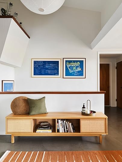
Bench (custom) | Round Pillow (similar) | Green Pillow (similar) | Tray | Hand Sanitizer | Candle
Ugh, how cool are those blueprints?! Especially since it’s such a special home that’s kept so much of its history.
But let’s now look down to the concrete floors. I wanted to know if they were original or if she chose to install them. When I asked she said that they were concrete when she came on the project but in the Redfin photos they were oak floors. So it’s a mystery as to why they were replaced. I’m sure they were in pretty bad shape since the owners seemed to care deeply about maintaining the history. But honestly, I really love how they turned out. I think it balances out all the beautiful warm-toned woods and adds to the modernism of the home’s architecture.


That screen!! It’s just so cool. I couldn’t imagine the clients or Sarah wanting to remove it but I’m just so happy that it stayed. And not just the screen, but look at that railing. Those two features let you know right away that this isn’t your average home.
I think the rice paper lantern was a perfect choice, giving that textured natural and light feel. The screen and railing work with the lines of the rug, the wallpaper talks beautifully to the plants the simple lines of the bench, the accessories and planter add that modern touch, and the elevations give that fun blue pop of color that’s perfectly unexpected. Plus the oranges, rusts, and olive greens work perfectly with the gold film of the screen, making it not shout at you when you first walk in the door. You have a chance to slowly take it all in… which I love.
Ready for the next space??
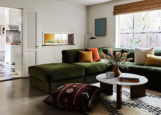
Sofa (custom) | Mustard Square Pillow (similar) | Rust Square Pillow (similar) | Yellow Print Pillow | Table Lamp (similar) | Floor Pillow (custom) | Coffee Table | Striped Box (similar) | Art
Ooooo baby I have to say this might be my favorite room. That sofa is TO DIE FOR. Plus there are a couple of fun surprises I think you will also freak out over in the next couple of pictures. But first, I want to talk about the color palette and how Sarah came up with it. Did the era of the home dictate the palette? Was it the clients? Here’s what she said:
“Not so much the color palette, but definitely the style of furniture. My client actually showed me a postcard (he collects postcards) with a color palette he liked which was a picture of poppy fields with tones of orange, purple, and green. We did a lot of green and hints of burnt orange, but decided to ditch the purple.“
The postcard thing is something you should get excited about. But let’s see more of this room first.

Art (on left)
Simple, cozy, inviting, and has the “Sarah Zachary-Jones Expert Color” touch. The sofa is custom and looks like you just want to sink your whole body into it. Then for the art, rug, floor pillow, etc., she keeps it simple enough that your eyes are at ease but patterned and textured enough to keep the space interesting and fun to be in. Also big shout out to those woven shades. I love the warmth they bring into this home. If you are thinking about a woven shade I say do it!
If you want to see more of what’s on your left, you are in for a TREAT.

Black Tray | Table Lamp | Mural (original to home)
This shot makes my heart stop a little. That custom credenza, that MURAL (which is ORIGINAL), the styling that Bowser did… it’s all perfect. But let me have Sarah tell you all about it:
“This is my favorite piece in the house. I wanted to include some furniture and decor that called to the Asian heritage of the original architect. This cabinet is inspired by the designs of George Nakashima (although he was Japanese American). The cabinet is a custom design for the space made out of walnut and grasscloth. The piece is a whopping 11 feet! It is meant to store the large book collection of the clients. The mural was original to the house or at least installed quickly after completion. The clients still have extra rolls of wallpaper in the original packaging. Here is a photo (see below). It appears to be made by James Seeman and I think it is handpainted. We did minor repairs to the paper where speakers were previously installed and built the cabinet to land right at the base of the tree trunk.“
 the extra wall mural paper
Is it not all just breathtaking? And how cool are these hanging instructions? I love this stuff so much.

See how the lines of the cabinet talk to the lines of the dining room rug?? It’s details like that which will make an open concept floorplan look interesting and unique but still look like that spaces belong in the same home.
But let’s now talk about design challenges because I don’t think there’s ever been a home design project that’s been completed without one. These were Sarah’s:
“We did have to turn a dining room into a sitting room/future screening room. The layout was tough because it butted up to the kitchen and dining room. We decided on a modular sofa with ottomans so it doesn’t feel too overwhelming in the space. We also replaced a lot of the old recessed lighting with pendants and fixtures and had to do quite a bit of electrical and patching work.“
It’s wild to think this wasn’t always the layout because it makes so much sense.
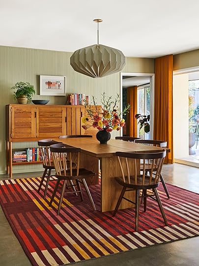
Dining Table | Dining Chairs | Rug | Pendant
Did you gasp when you first saw this shot? It’s so happy I can’t stand it. The color palette makes my heart sing. I grew up in a warm-toned house so maybe I’m partial but regardless it’s so pretty. Now, my first question to Sarah was about that wall treatment. I couldn’t tell if it was wallpaper or special paneling or something else so here’s the 4-1-1:)
“This was here when the clients moved in and from what I can tell it is a brushed plaster treatment that has a ribbed effect. We painted the walls in Ash Grey by Farrow and Ball.“
Also those mustard-colored drapes!!!!

Postcards (vintage) | Postcard Rack (vintage)
Here are the postcards! Collections are such a great way to show off your personality. But the fact that they displayed it how you would buy a postcard usually in a store is truly such a perfect and out-of-the-box way. So while her client already had the holder, Sarah decided to put it in the dining area so that they could be enjoyed more readily. It’s just the coolest and now I want to collect postcards.

What a glorious angle of that screen. That pendant (which Julie also used in her bedroom reveal) calls to the pendant in the entry but has a geometric shape that calls to all of the lines in the dining and sitting room.
Also, I love how Sarah played with a few different wood tones BUT they all have a warm undertone so that’s why it works so effortlessly.

Here you can get a better look at that plaster treatment. I don’t think it’s for every style of home but I love it in this one.
Now let’s enter into the final room that Sarah designed. And as you can see it’s a pretty special one.

Wallpaper | Sofa | Coffee Table
These jewel-toned colors, that sofa (the same one Emily had in her LA house), the blue planter, the coffee table, the everything… At first, I thought this was just the coolest office ever (see next picture) and wanted to know the details of the decision to not wallpaper the ceiling and drop ceiling…
“This is actually a living room with a desk that we haven’t fully shot because a few large art pieces hadn’t arrived. So it’s a really big room with a ton of wallpaper and I didn’t want it to feel overwhelming or for there to be too much reflection of the green from the wallpaper.”

Desk | Desk Chair | Lamp | Art
I also noticed in both rooms that there were recessed drapery tracks for the mustard drapes. SO beautiful and chic. I clearly needed to know more…
“I had never done this before so I’m glad I have this one under my belt now. I had my handyman cut out the drywall and install the tracks flush with the ceiling and then patch and paint the entire ceiling. Then the window treatment fabricator installed the drapery. Some companies will do the entire process, but our window treatment installers do not.”
I think it’s such a nice detail because of how seamless it looks. Especially perfect for modern or mid-century modern style homes.

Shelving Unit (custom)
If you know anything about Sarah she is a custom-furniture-loving gal (which again, speaks to my soul). So I asked her to walk me through all of the custom pieces to make sure we got them all:
“The sitting room cabinet, the entry cabinet, the green sectional, vintage kilim floor pillows, built-in walnut shelf in the living room, blue Moreno Sofa from Lawson-Fenning in Holland, and Sherry performance velvet and drapery.“
Well, my friends, this tour has sadly come to an end. I feel so inspired and I hope you do too. Thank you Sarah for letting us feature this wonderful project! Ok now let’s chat about out favorite parts in the comments:)
Love you, mean it.
*Design by Sarah Zachary
**Styling by Emily Bowser
***Photos by Sara Ligorria-Tramp
The post A Historic Mid-Century Modern Home That Was Completely Brought Back To Life (Hope You’re Ready For Some COOL Original Details) appeared first on Emily Henderson.
April 24, 2022
The Link Up: Em’s New Romance Novel She LOVED, Mallory’s Affordable Evening Wear Line Rec, And The Primer-Highlighter That’s ACTUALLY Worth The Internet Hype
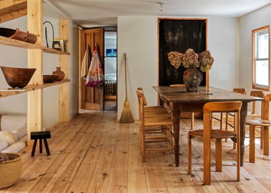
Hi everyone and welcome to this week’s link up!! The EHD team was insanely lucky this past week and got to go on a three day team retreat up in Northern California (Grass Valley and Nevada City to be exact). You may have caught it on Em’s stories. We are going to do a whole post about it but we want to say a HUGE thank you to Holbrooke Hotel and The National Exchange Hotel for making our trip unforgettable. If you are in need of a special getaway these are two incredible options. Now, let’s jump on into the link up!
This week’s home tour is a STUNNING property in upstate New York designed by the extremely talented (and owner of lifestyle concept store Sincerely, Tommy) Kai Avent-deLeon.
Some News! Our EHD Mentee, Key’s show “Rental Redo” has been picked up for a full season! And even better news – they’re casting!! If you’re a renter interested in getting a home upgrade, apply here!
From Emily: We went on a team retreat last week and I was so excited to pull out 2 new fashion pieces I had been excited to wear (and they’re great for going back to the office). First, this work jacket/shirt from Alex Mill could not be cuter & I love that the pockets are big enough for a phone. Next up this boxy button-down from Everlane has my ideal silhouette & I love how comfy it is.
Also From Emily: A super sweet rom-com book that helped me manage my travel anxiety this week (that I read over my 3-day work retreat). The Soulmate Equation (here to order from an independent bookstore and here for your Kindle) is the perfect travel read – light, easy, sweet, hard to put down clever, and comforting.
Also Also From Emily: After I was done with that book I dug into this month’s Atlantic Magazine (Huge fan over here, HUGE) and read this article about how social media has really made us all dumber (not to mention threatened democracy, quelled healthy dissent out of fear, and making us all have anxiety!). There is a lot of new data and even some solutions. It’s a long, but a good read (that can also be listened to).
From Mallory: I went to a fancy event recently and needed another fancy dress but didn’t want to spend a ton of cheddar. I found a Nordstrom gift card I had from Christmas and went a browsing. I was so stoked to come across this beauty – it looks so pretty in person and I felt like the sparkly life of the party! This brand Nightway has a ton of really pretty dresses (and for $100 price range). I was super impressed with them! If you’re going to a wedding or formal event soon, check them or Lulus out for affordable (but still decent quality) dresses!
From Caitlin: IT’S (ALMOST) SHORTS SEASON, which means it’s time for my annual celebration of Madewell’s pull-on shorts. Arlyn introduced these to me when I first started at EHD back in 2019 and I have never looked back!!! They’re under $40 (though you can often snag them for 20% off during sales – I think there should be one this weekend, too), they don’t ride up, and they’re just SO freakin’ comfortable without looking sloppy. I have black and olive, but I am loving the two other colors they rolled out this year!! (And if you REALLY have shorts on the brain, UO is offering 25% off all their shorts this weekend – lots of really great wide-leg options, like these.)
Also From Caitlin: May be a little late on this one, but I’m OBSESSED with this long read about a former US intelligence officer who pulled off the biggest heist of classified intel in American history, made plans to sell the aforementioned documents to other countries for 13 million bucks, and whose entire plot was undone by a TYPO. Make sure to set aside some googling time afterward because you will ABSOLUTELY wanna dig up what happened next!!!
From Ryann: Guys, I bought a real bra for the first time in like 5 years. I’ve been wearing bralettes for so long but lately, I’ve wanted a little extra support as gravity keeps working its magic on my ladies if ya know what I mean. I went to Target with very low expectations, found this one, didn’t even try it on in-store, said what the hell, and bought it. I was SHOCKED how well it fits and how comfortable it is. It’s not a push-up and it’s wire-free but still gives me the lift I needed. Oh, and it’s $15 DOLLARS! I have it in black but have ordered it in tan so I can wear it with white tees. 10/10 folks!!!
From Jess: This is one of my current favorite albums, Drama by Rodrigo Amarante. Songs switch between English and Spanish and it’s just beautiful and soothing. I got to see him in concert and it was incredible. HIGHLY RECOMMEND if he’s performing in your area.
Also From Jess: A few weeks ago I said that I had purchased the Ilia The Necessary Eyeshadow Palette to continue my neverending commitment to “my glow”. Let me just tell you this is my most favorite palette EVER. The colors are so pretty, giving you a natural look with a hint of drama. I also bought the travel size of the Charlotte Tilbury Hollywood Flawless Filter Primer & Highlighter and I really love it. I kept hearing about it and figured the travel size was a safe way to try it. The coverage is light but still evens out my skin tone in the nicest way. If you are curious like I was, I am here to say give it a go! I think it’s worth the hype.
Opening Image Credits: Design by Kai Avent-deLeon | Photo by Chris Mottalini | via Clever
The post The Link Up: Em’s New Romance Novel She LOVED, Mallory’s Affordable Evening Wear Line Rec, And The Primer-Highlighter That’s ACTUALLY Worth The Internet Hype appeared first on Emily Henderson.
Emily Henderson's Blog

- Emily Henderson's profile
- 10 followers

