
Emily Henderson's Blog, page 126
June 8, 2022
The Bathroom Tile Grout “Trend” We Are Trying – Matching Tile To Grout to Create A Monochrome Look
The tile at the farmhouse is being installed and it looks INSANE. It’s going to take about a month because this lady likes things that are complicated, but it looks incredible and I get so excited every single time I am there. When we originally designed this house, 12 years ago, we wanted the bathrooms (the whole house really) to be quiet and more monotone, so when there is color there isn’t also a TON of contrast. At times I’ve questioned and doubted this vision, but I hope that we were right – that there will be enough contrast and interest in the rest of the elements to still look interesting. And now that the bathrooms are coming along, and the tile is almost done, I feel SO confident in that decision (quite a f*cking relief, TBH). It’s not what a lot of designers would do – they would add more color, pattern, etc, but the vibe that we want is a more calm, restrained, simplistic (ha. that sunroom). So for most of our bathrooms, we chose 1 color and used it in different patterns and scales in the same room (mixed with white), with hopes that the grout would not create more contrast. But there is a hole in the grout market and while you can customize grout colors, it cost $200 and takes 2-3 weeks. So today I’m walking you through our grout thought process, how we chose what we did with some sneak peeks at what it looks like now:
Our Desire: MonochromeThis might be boring to you but it’s not to me. It feels simple but special (drink! drink! – anyone else playing the drinking game for how often I use those two words?). There is some contrast of course, but not within the tile and grout itself (note that Heidi’s bathroom has dark tile with a white detail – not totally monochrome).
 design by heidi caillier design | photo by haris kenjar photography
 design by jr corleto | photo by virtually here studios | via cle tile
I know that a lot of people might want MORE, but y’all I’ll style it out, I promise. I just love how the floor just reads as a texture and not too busy – but there is so much movement. So now that you know the “tile vibe” we are going for let’s go grout by grout:
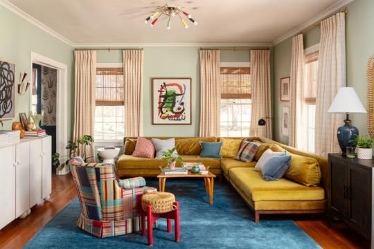
Primary Bath Floor – Our Bathroom
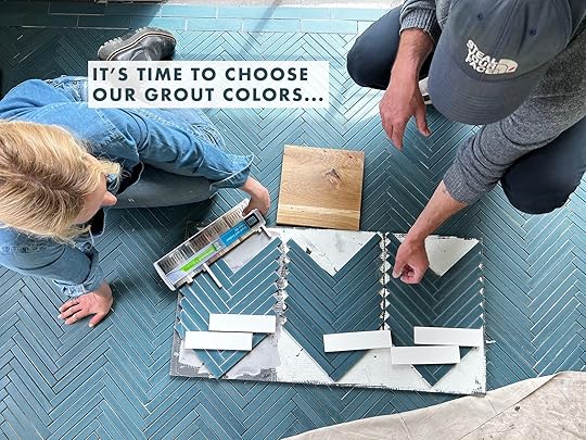
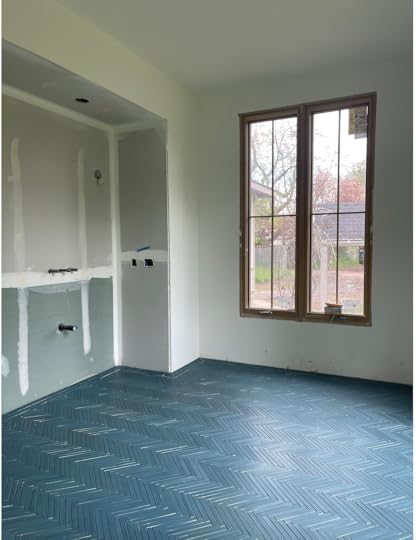
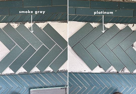
As you can see we chose a 1×8 herringbone, otherwise known as “the gray hair maker”. Our tile team, which was FANTASTIC, loved installing this purely for the sake of the challenge – or so they said. This is from Pratt + Larson, made in Portland and it was an idea I came up, using a custom color just for us – but you can call them and order it, too (if you want to let me know I’ll try to wrangle a discount code for you) Remember: the smaller the pattern = more cuts = make more expensive to install and this mosaic was not netted so it was installed individually. This is not a cheap install (not sure how much as it is all tied in with the overall house tile budget which everyone is shielding me from, but likely a few thousand for just this floor as it took 3 days of labor with two guys, not including prep). We played with spacing a bit since the tile is only 1″ wide we didn’t want the scale of the spacing to get funky…1/16″ you lost some of the impact so 1/8′ felt just right!

It’s absolutely incredible and this is even PRE-grout. So the question is what color do we want for that grout that will enhance the tile, but not distract from it? This seemed like a pretty fantastic time for us to do some sample boards, and by “us” I mean Erik and his Level Plane crew (Sergei! Vlad! Jeremy! – It warms my cold old social media heart to know that these dudes are cheering us on social media)


This is not something any tile setters will just do for you, but you might be able to pay a bit more for this and my goodness I’m so glad we did.

Our first instinct was that the middle (charcoal which leans black) is just WAY too modern and strangely masculine. Then the one on the left was beautiful but we feared that on the entire floor it would be too busy.

So we laid it on the floor in the bathroom and tried to give it more context – really picturing it over the whole floor with the wood to represent the vanity and the white tile that will go on the vanity wall. We still nixed #2 Charcoal, feared that #1 would be too busy, so I guess it’s #3? The one closest to Brian? I’m using question marks because it wasn’t a “hell yes” and I was not going to risk the beauty of this tile by messing up the grout.


So I begged Erik to make one more board and promised to give so much love in exchange. Thank you, Erik!

The second Brian and I saw the “twilight” grout it was a “hell yes”. Not because on the board it was the most dynamic, but because picturing over the floor of the bathroom we felt it did exactly what we wanted – let that color pop, drawing attention to the texture of the tile shape but NOT a busy pattern – almost like a beautiful quite sea of handmade blue texture. Incredible. Plus look how much it brought out the blue?!
The Guest Bath Floor And Walls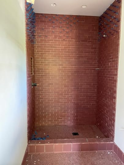
This is the first glimpse you are getting of our guest bath…and as I said we are leaning in on the tone-on-tone grout trend and kinda REALLY loving it. This dusty rose Pratt + Larson tile is such a striking color. The mixture of shape and scale is plenty to make this space feel special without accentuating the grout lines, so we chose to let them “rest”.

Somehow this one matched perfectly! Slightly darker which is GREAT. Isn’t that color just so beautiful and has so much variety! Again it’s a custom color from Pratt + Larson, but one that you can ask for.

The grout is called “Quarry Red” and it’s a warm deep brick color. It was an easy decision and we didn’t need to get boards made.


It turned out SO PRETTY. The grout really highlights the color variation and the texture of the tile, versus the pattern of the tile shape.
The Mudroom FloorWe chose this beautiful blue/green/gray tile with a “brownstone” finish meaning that it’s more rustic, which we thought was so appropriate for a more utilitarian space that feels like a landing spot for mud.

It’s a herringbone in the middle with a border around the outside that is just a staggered brick.
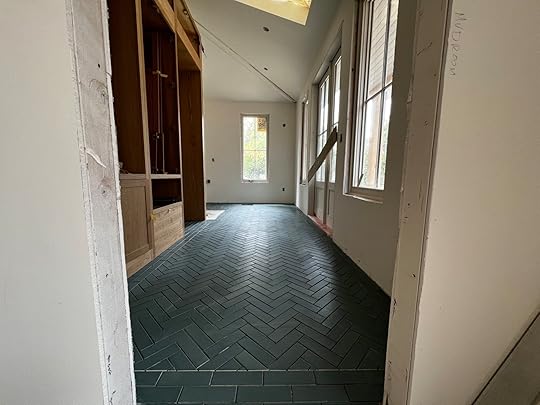
I can’t even express my love for this room. Something about that blue/green with the white oak cabinets from Unique Kitchens and Baths feels so perfectly PNW to me. But what grout? We needed to see this one mocked up as well so…
Erik and crew kindly helped us visualize by mocking up two boards.
There was a pretty quick all-around consensus on this one. We liked both, the “Platinum” (which is strangely the darker grout) was so pretty and again calming. It went on light then dried darker. We felt that it would be way easier to clean since this room will get a lot of mud from the kid’s shoes and dogs.

They had only started grouting here and the grout hadn’t dried yet (will be slightly darker). Right now this is turning out to be my favorite room in the entire house (probably because it’s the closest to being done).
Kids Bath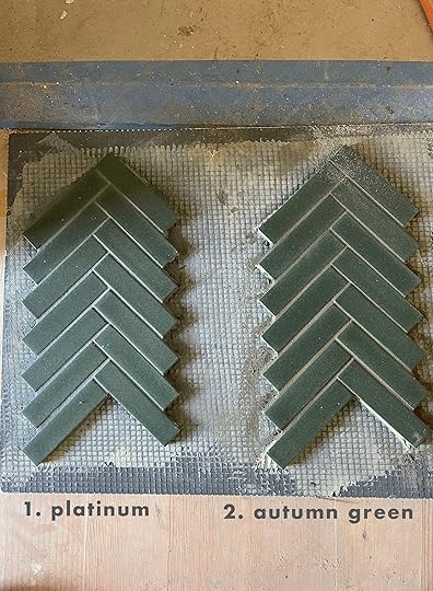
The floor of the kid’s bath was the biggest challenge thus far because this green had nothing we could match with. The closest was “Autumn Green” but as you can see it just read more brown than green.
While in a perfect world we would have ordered a custom grout that matched the green, we didn’t feel like it was important enough to set the project back a few weeks. I’m in the “let’s move in” phase of this renovation, so anything that sets us back too much is a big no-no.
So that’s where we’re at with our grout. It feels more real every day! Lots more content headed your way. xx
The post The Bathroom Tile Grout “Trend” We Are Trying – Matching Tile To Grout to Create A Monochrome Look appeared first on Emily Henderson.


June 7, 2022
Is This The New Wicker? Breaking Down Pencil Reed, Vintage Sourcing Advice + 24 Pieces To Shop Now

Last year, I sat down, wrote a post, and posed a pretty big question: Have I Lost My Actual Mind? At the time, I was concerned about my newfound obsession with cabbageware (and with whimsical home decor in general – wine openers shaped like butlers, tureens shaped like rabbits – you know, the kind of stuff normal people like. Right?? Normal people like this stuff, right???). Thankfully, you assured me that I did still appear to be mostly sane – a blessing, as my love of weirdly-shaped furniture and decor is still going strong – but today, well…just wait until you see my NEW newfound obsession, guys. It’s nearly 8′ tall and 3′ around (again, normal proportions for furniture, right?), 70% of the people I polled on my Instagram told me not to buy it, and I’ve been checking in on it every week for months anyway…ready?
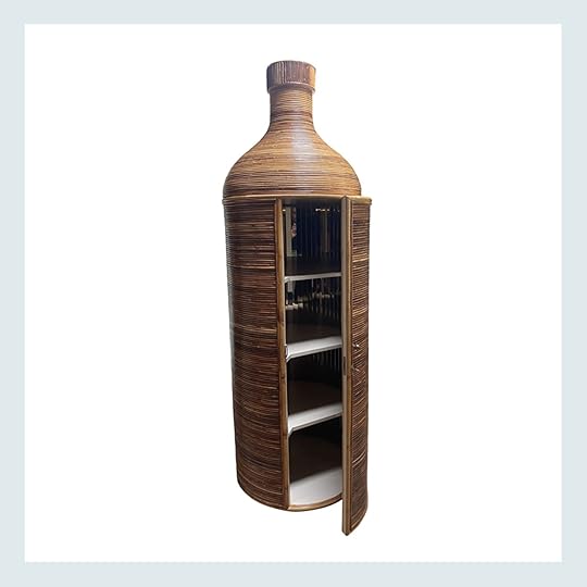
YEAH. I’M LOSING IT. For sure. Yes, this is a giant, bottle-shaped pencil reed bar cabinet with a mirrored interior. Yes, it is a cool $2,000, plus shipping. And taxes. (That means it’s currently cost-prohibitive for me, but maybe it’s for the best?) And yes, I will continue to dream about it for months to come, despite the fact that literally everyone in my life has looked at this and said “ooooh, baby, noooo, what are you thinking?”
But there’s a method to the madness, y’all! I loved the shape, obviously, but I also fell in love with the pencil reed texture – I’m opting for a lot of lucite and lacquer in my apartment, so this felt like an awesome way to bring in a new material without straying too-far from my self-imposed style guideline (“Would this make sense in ‘disco deco’ space?” – me, before making any purchasing decision – it’s surprisingly helpful!).
ANYWAY – I brought my dream cabinet up in passing while chatting with Em, and she mentioned that she, too, had also been loving a lot of pencil reed furniture. I thought I had only been ogling this cabinet, but when I looked at my Chairish favorites, a little pattern emerged – y’all, I had been favoriting NOTHING BUT pencil reed for WEEKS.


And while the prices on pencil reed pieces (or split reed, or rattan – the nomenclature folks use isn’t always consistent) have been rising online, Craigslist and Facebook Marketplace are still PACKED with incredible inventory. We’re still EARLY in this trend, which means it’s a great time to hop on board – like, sure, your home will feel really special and you’ll be on-trend, but prices are also still VERY low on our peer-to-peer buying sites and apps. (If you need them, here are my tips for Marketplace and here are my tips for Craigslist – I’m a seasoned vintage-buying professional! “Coastal” and “boho” also bring up great pencil reed results, too.)
Buuuuut if you’re a little less excited about the hunt but you still want to add some rattan to your home, I’ve also linked up 24 purchasable pieces below (straight from my own Pinterest collection – I’ve been saving my favorites in a folder for weeks). All that said…are you finally ready to see some pencil reed styled out in the wild?

 photo by keyanna bowen | from: reveal – all the details of the primary suite at the real simple home
This modern-classic House of Hackney wallpaper and horizontal shiplap combination could have left this office nook feeling very formal – especially when paired with those luxe curtains and that velvet and brass chair! – but the pencil reed desk brings such a casual and relaxed warmth to the space. It makes a great backdrop for some more whimsical styling, too. (Things I’ll never be able to get over: that little geometric candle next to the chain!)
 design by brady tolbert | photo by sara ligorria-tramp
 A lack of color ≠ a lack of interest! I love how Brady’s new coffee table (a $150 Facebook Marketplace find!!! Can you believe?!) elevates his organic-meets-geometric living room. Pencil reed is an AWESOME choice for those calm color palette lovers – as a material, it brings a lot of texture and sculptural interest without totally dominating a room. This coffee table is huge and pretty dense – in any other material, it would probably feel VERY imposing and heavy! – but it just works in pencil reed.

 left: photo by alex zarour, from: there are 3 design trends in kirsten blazek’s guest house that we love | right: design by erica reitman, photo by sara ligorria-tramp, via the new design rules
An overwhelming majority of styled shots featuring pencil reed pieces are in coastal-leaning rooms (you know, light blue walls, lots of bright white accents…all that jazz) so it’s really exciting and refreshing to see folks choosing to use rattan in new and interesting ways. You may recognize the home on the left from this recent house tour or the home on the right from Em’s book – the vintage coffee table looks incredible in both spaces, doesn’t it?
 design by dee murphy | styled by velinda hellen | photo by sara ligorria-tramp
First: I just realized that the hexagonal burl box sitting on top of that huuuuge blue Surfing book is now sitting on *my* bookshelf – I grabbed it from Em’s garage last summer. (Or, more accurately, Jess allowed me to take it. NEAT, RIGHT?!) Second: this is the best example of how pencil reed plays well with others – in an eclectic space and collected space with tons of different styles, this console holds its own. If you’re uncomfortable mixing woods (full disclosure: I am, even though I theoretically understand the rules for, you know, mixing and matching woods), this is a pretty no-fail way to bring another natural piece into your home.
 design by jane hallworth | styled by michael reynolds | photo by sam frost | via architectural digest
This vintage Gabrielle Crespi reed and brass lantern does a great job of connecting the organic and earthy kitchen table setup (that’s a Perriand table with Berthet chairs – Google if you want to experience near-paralyzing sticker shock) with the uber-luxe kitchen in the rear (yeah, those are bronze cabinets paired with an all-marble surround of, uh, literally everything). A metal lighting choice here would have felt over-the-top; paper would have felt too light; glass would be too fussy – pencil reed brings the perfect mix of nature, weight, and glam.
 design by caroline rafferty interiors | photo by carmel fasano brantley
But wait – it isn’t just for folks with $40,000 kitchen table setups! (Had to drop the number in here somewhere – knew you all weren’t going to Google it!) Pencil reed can be styled in an achievable and livable way, too. This shot is one of my favorites because everything in here has a buddy – like, the mint Prouve-style chairs speak to the art; the shape of the art is echoed in the table and pendant; the texture of the rattan pendant balances all the sleek and minimal surfaces. Thoughtful AND cheery – what else could I ask for???
 design by alex morrison interiors | photo by dave wheeler | via est. living
Jess sent this shot to me and man, it’s a showstopper!!! Don’t you love how the lines of this formal travertine console are balanced out by the wavy, free-form mirror? Squiggles are trending right now – they’re huuuuge with Gen-Z, in case you missed it – but this feels like the mature, grown-up version of that trend.
 design by mary patton | photo by molly winters culver | via martha stewart
This shot has been particularly inspiring for me – I’m eyeing a similar shade of pink for my living room and I’m loving how that captain’s chair at the head of the table shines against this peachy tone. Big fan of the mix-and-match here, too – like, who would have guessed that a coastal reeded chair with chintz fabric would work so well with sharp-angled Jeanneret-style dining chairs, a stone and lucite table, glam sconces, and Ikat curtains?
 design by studio db | via coco kelley
Another huge swoon – look at the paint finish on the ceiling! (Gotta appreciate the little things, you know?) But take a look at how much depth this scroll coffee table brings to this room – the whole space is pretty devoid of pattern (outside of the rug and that sweet little pillow!), but it’s still really dynamic and warm and comfortable. Any other coffee table would fall pretty flat in here, don’t you think? (Also, check out that sweet Murano sconce!!!)
 design by studio ko | photo by francois halard | via architectural digest
FLAMINGO ESTATE. If you’re not familiar, check out the full tour of this home – the entire place is unbelievable and thoughtful and layered and it’s such a treat!!! The history, of both the home (a former adult film studio) and the stuff in it is fascinating, too (case in point: the homeowner saw that elephant chair to the right in a hotel restaurant in Ibiza and was like “hey, I want to buy this,” even though it wasn’t for sale – INCREDIBLE). To that end, this rattan coffee table with a richer, deeper finish is the perfect grounding piece for this eclectic collection, right?
 design by nickey kehoe | photo by roger davies | via domino
So many good things and hidden gems in here (looking at you, plaid bedskirt), but my favorite ~design element~ is how the shape of the headboard is reflected in the curve of those bright red light fixtures AND that vintage chandelier. (It reminds me a lot of the fixtures from the Holbrooke Hotel, actually!) The contrast between the granny William Morris wallpaper and the 70s pencil reed is so special, too. BIG HEART EYES.
 design by james farmer | via laurel bern interiors
I wanted to share this one because it’s absolutely the most traditional example I could pull – pencil reed has a tendency to feel a little casual, but doesn’t it SHINE in this more formal space? A mahogany or four-poster bed would have looked a little more heavy and serious – which is also beautiful, don’t get me wrong!!! – but this French rattan feels light and whimsical, especially when paired with those charming duck/bird/unidentified avian creature (someone who knows birds, help me out?) prints.
Now – if you’re ready to add some pencil reed to your home (and if you’re not interested in, you know, digging through the flea market or trolling the depths of Facebook Marketplace), I’m here with a few of the pieces I personally have been pinning…
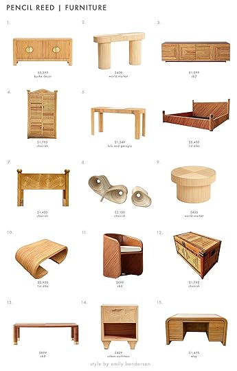
1. Claire Sideboard | 2. Oval Natural Rattan Console | 3. Reflect Rattan Credenza | 4. Coastal Armoire | 5. Antonia Desk | 6. Pencil Reed & Brass King Bed | 7. Swirl Queen Headboard | 8. Crespi Style Chair & Ottoman | 9. Round Natural Rattan Coffee Table | 10. Waterfall Coffee Table | 11. Amato Dining Armchair | 12. Vintage Trunk | 13. Edie Rectangular Coffee Table | 14. Caroline Nightstand | 15. Pencil Reed Desk
Here’s the deal: pencil reed ain’t cheap, but there are a few sources with awesome deals. I’m really impressed by the price and quality of World Market’s offerings (#2 is a great deal that I’m considering for my house!), and CB2 often has some sales where you can scoop their rattan pieces at a discount. (#3 and #13 stand out to me, but there are LOTS of options on their site – highly recommend checking it out if you want to capture this look on a “budget.”)
And then a quick little lightning round of vintage feedback: #6 is my dream bed (albeit not at my dream price, WOOF!); I’m especially taken by #12; you may recognize #8 from Kacey Musgraves’ house (check out our review here!); #15 is actually a pretty good deal, IMO.

1. 36″ Round Mirror | 2. Rattan Wall Rack | 3. Alona Tray | 4. Riverwalk Mirror | 5. Ria Table Lamp | 6. Hanh Wall Multi-hook | 7. Hanh Wine Rack | 8. Freeport Table Lamp | 9. Italian Dome Chandelier
Before spending the big bucks on pencil reed decor, pleeeease be sure to check out your local thrift or flea! The savings will be worth your time, I promise. That said – I have been loving #4 since 2018 (the shape is so good!) and #9 is such a freakin’ dream to look at, don’t you think?
That’s a wrap from me today – WHAT SAY YOU? Any pencil reed listings you wanna share with the class? Is this trend a yay or a nay for you? Would YOU put my massive dream bar cabinet in your house?! LET’S TALK ABOUT IT ALL, ok??? xx
Opening Image Credits: Design by Dee Murphy | Styled by Velinda Hellen | Photo by Sara Ligorria-Tramp
The post Is This The New Wicker? Breaking Down Pencil Reed, Vintage Sourcing Advice + 24 Pieces To Shop Now appeared first on Emily Henderson.
June 6, 2022
How We Are Restoring Our Vintage Doors + Splurging On Some Special Salvaged Doors

Today’s post is for the real design enthusiasts – as not everyone is as interested in doors as we might be. But boy does a good door make a subtle but strong impact. So when we bought the farmhouse we went through it with an eye for what could be refreshed not replaced – and there wasn’t as much as you’d think, but the doors on the second floor were wonderful five-panel solid ladies, so we started there. But once I started shopping for vintage doors to supplement I was HOOKED and wanted every door to be “special” which was quickly reigned in by Brian (seriously, thank god for that guy being so involved in this project). So today I’ll show you how we are rescuing the vintage doors and salvaging others to make the house feel special.
The Original Lead-Filled Doors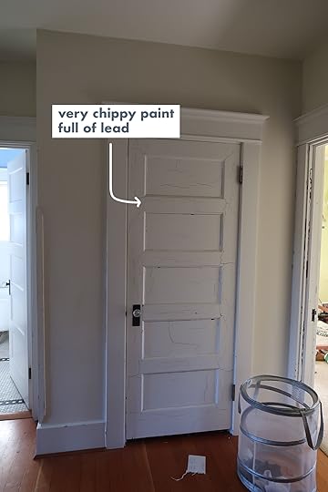
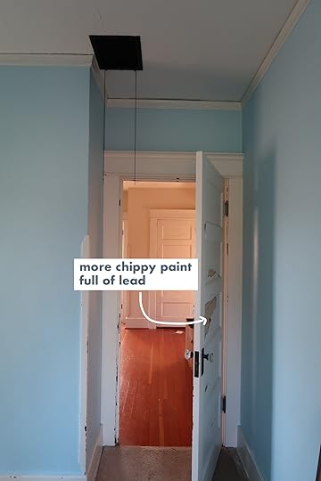
Those vintage five-panel doors were great and solid, but the paint was falling off and technically full of lead. So the ARCIFORM team pulled them off and stored them in hopes of us wanting to reuse them.
The original upstairs layout looked like this…with 4 doors opening into the second floor landing.

This is the layout now…

With the new layout, we needed 7 more doors upstairs…we wanted them to play nicely with the originals and the style of the house which meant we needed to go vintage…first stop was Aurora Mills.
Shopping For Doors At Aurora MillsAurora Mills is my happy place…the excitement, the thrill of the potential find feeds my soul. They have an abundance of REALLY special salvaged doors and we are ecstatic with what we found.

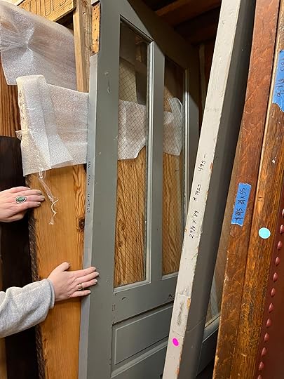
We shopped for these in February 2021 – almost literally a year and a half ago hahaha!!! Funny not funny! ARE WE STILL SAYING THAT??!! Aurora Mills (as well as other salvaged stores in the city) have rows of old doors. They are for this exact type of project – an older home that can handle (or needs) the age and character that vintage doors can bring. They sell from anywhere from $80 – $800 each, each PAIR of ours were between $300-$400 (I forget the exact price either because it’s been so long).

We added a laundry closet upstairs, so instead of getting new five-panel doors, we found a pair of these guys (they are red on one side and blue on the other as you’ll see down further).
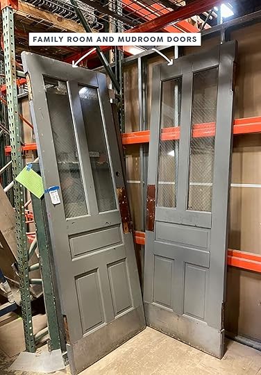
This pair will go downstairs one to the family room as a pocket door and the other to the mudroom…I imagine peeking through the windows to check on the dogs as they lounge on the warm floors in the Mudroom after a bath…eeek so excited!
Salvaged Doors at ArciformSo in addition to the statement doors from Aurora Mills we also needed some other closet doors to match our five-panel doors for the upstairs, so ARCIFORM found a few at an auction.

I didn’t know that Stephyn had found these doors, so I went for a visit to the ARCIFORM warehouse to see them for myself. Some of them are abnormal sizes which we had to decide whether that was a good thing or a bad thing – the bathroom door was only 24″ wide (which is so sweet, but let’s just say not ADA compliant) and the kids closet doors are shorter. We ultimately decided that this would be fun and cute. Also, they were done and signed off on for framing so we’d have to re-source them all and then reframe. The ARCIFORM team found these at GREAT prices – I think they were all under $100, some as low as $60 (from my memory).

We added double doors to all the closets upstairs so we had to find pairs. Again, these are hilariously small, only 6′ tall but absolutely perfect and quirky for a kid’s closet and I smile every time I see them.
The rest of the closet doors didn’t match perfectly but they were five-panel and solid, so we are into them.
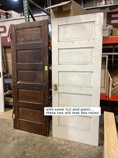
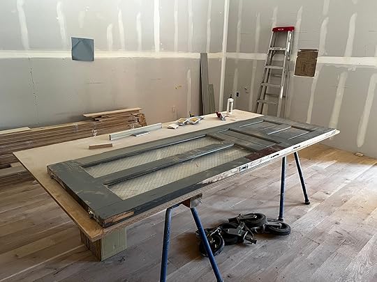
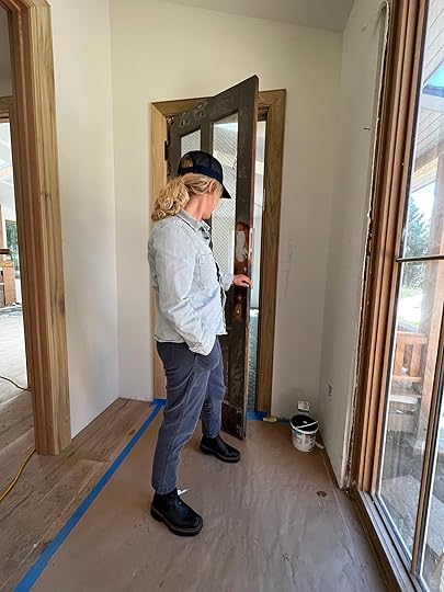
Now The Hard Part…Time To Refurbish Them!The vintage/salvaged doors needed repair…holes filled, damaged pieces replaced, and everything sanded to be ready for paint.
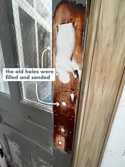

So while the cost of a door this special is much cheaper than new doors, the refurbishment is still time-consuming and laborious. I’d estimate (based on nothing) that it took about 3-4 hours to restore each door, at $90/hour so that gives you an idea of what you might be in for). If you are handy this might be something you can do yourself, too. These guys are pros so they knew exactly how to do it and even had to replace some of the trim work and wood details.

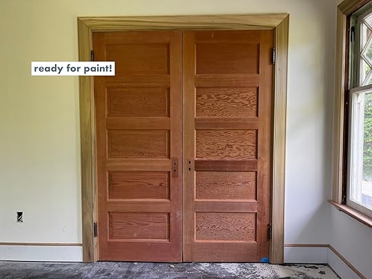
 Where We Are Now – Installed and Ready to Paint
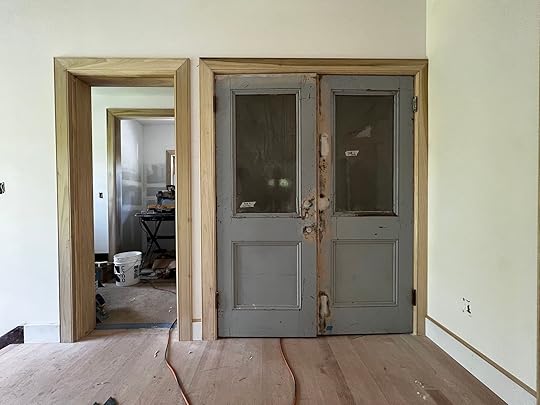
The new laundry closet doors look great and will be EVEN better when they are painted (the inside is the painted red you saw above). Again, although the doors are salvaged and cost about $300 each, it is important to always account for the cost of labor to get salvaged doors in tip-top shape if you go in this direction. We love how unique they feel they are definitely the focal point of the upstairs landing at this point…let’s see if they can hold that title after the floor is painted! We are actually planning on color matching that blue color because we love it so much.
In case you forgot, the landing used to look like this…

Can’t wait for everything to be painted!

This is the narrow door we had modified to become a pocket door for the guest bath, it is so sweet and wee and allowed for wall space in the room for a piece of art or a little moment. We plan on painting it one color on one side, another on the bedroom side.
Here ARCIFORM used a couple of the original closet doors to create a pair in one kid’s room and they look GREAT. We are actually using all of the original hardware on these, too.

These are the “mini” ones… which makes us smile/laugh. It might bug people that they are shorter and that the casings don’t line up – and I’m not sure it bugs me, yet, and if it does it’s frankly not my room (it’ll be one of the kids – unsure yet) so I’ll be able to easily ignore it.

The doors I’m most excited about (along with the laundry closet doors upstairs) are these two pocket doors – the mud room here and the matching family room/living room pocket door.

A huge thanks to Jamie and the ARCIFORM team for managing all these moving doors – it’s so much easier to scrap and buy all new – to not deal with the idiosyncrasies of older doors with weird widths, trying to get them to match, odd sizes, etc. But I think it’s worth it in the end to have this soul and charm injected back into the house. Now to choose paint. Coming at you asap…
The post How We Are Restoring Our Vintage Doors + Splurging On Some Special Salvaged Doors appeared first on Emily Henderson.
June 5, 2022
The Link Up: The New Show That Has Emily INTERESTED, The Affordable Makeup Primer TikTok Convinced Jess To Buy, And Our Favorite Jeans Are Back

Happy Sunday and we hope the weather is nice where you are! We wanted to continue something that we tried a couple of weeks ago when we added a few photos of the jewelry and clothes Em was recommending in the post. Did you like that? Now, we won’t have photos of everything but when we do we thought they would be nice additions and show you the IRL version. Let us know what you think! In the meantime, let’s get to this week’s links…

 design by we are duet | architecture by ajh+ | styled by megan morton | photos by anson smart | via est living
This week’s house tour is SO FUN. Caitlin’s exact words were, “Omg this whole house rules”. Designed by We Are Duet, this home is bursting with modern color combos and bold patterns. The extra cool part is that the home style and architectural details are pretty classic European. Just go and see for yourself!
From Emily: I read Under The Banner of Heaven three times (Local and Kindle), which is A LOT for a non-fiction. This is partly due to being raised Mormon but also because John Krakauer is the Shakespeare of non-fiction storytelling/journalism. So you can imagine how happy I was when the tv series launched. While I’m only 3 episodes in (What? I go to bed at like 9 pm and they are 2-hour-long episodes!), I’m LOVING IT. Anything that tells the story of the early religion OR relates to how I grew up I find endlessly interesting. Of course, my perspective is skewed, but I find myself being both defensive and critical of so much of the storytelling/history. Regardless of your views, it’s so far an excellent show with interesting sets, fantastic acting, and so much mystery.
From Mallory: I recently found out about this workout class called P.volve (they have a few locations around the US) and then I also found out they have an online version!! Really love this for a low impact workout that gets your heart rate up:)
From Ryann: I recently upgraded my every day jewelry collection with these earrings and this bracelet. They are from a black-owned jewelry brand called Ten Wilde that I have been admiring from afar for a while. I finally hit the purchase button and am so happy I did! The pieces are quality, very cute, and pretty affordable. I will definitely be buying from them again!
 the jeans in action
From Caitlin: I just got the email that my favorite flare jeans are back in stock at Madewell! They went missing from the site for like, a full year, and I am THRILLED that they’ve returned!!! (You may be, too – they were one of our bestselling items in all of 2021.) I have them in this light wash – and the EHD team will attest that I wear them nearly every time we meet up in person – but I am SO SO SO excited to fiiiinally replace some of my worn-out dark wash skinnies with these guys. My only note is that they have an 11″ rise, which I absolutely LOVE, but it may be kind of high if you don’t love your pants like, being on or over your belly button.
Also From Caitlin: Coming in hot with another Rajiv Surendra-style recommendation, y’all!!! (You know – educational, but in a charming/friendly/accessible way.) My boyfriend just introduced me to Architecture with Stewart, a YouTube channel where an architecture professor (multi-hyphenate – he does A LOT in the field) breaks down architectural concepts and ideas in SUPER fun and interesting ways. I’d recommend starting with something like The Architecture of Curb Appeal or Why Architecture Today Lacks Character, but my first foray into his channel was this week’s upload about The Secret Weapon of Great City Design, which I looooooved. HIGHLY RECOMMEND. (PS. If you like watching something while you’re eating, these are the perfect length. Hooray!!!)
From Jess: As I’ve said many times, I am not a full-face everyday makeup lady. But when I do put in the extra effort I want it to stay put instead of disappearing within a matter of a few hours…literally. Example: In an attempt this week to feel a little better/put together, I decided to put on makeup for a team brainstorm Zoom call. When the call started everything looked great but 3 hours later it was noticeably not as good! Luckily, I had already ordered this primer that the TikTok makeup gals swear by. They say it’s the way more affordable dupe of Milk Makeup Hydro Grip Hydrating Makeup Primer. I tried it for the first time on Wednesday night when I went to my friend’s book signing (GO BUY HER BOOK IT’S SO GOOD (Local and Kindle) and I can attest it gripped! Sorry, I forgot to take pics. I will mention that if you have really sensitive skin it might not feel awesome. I had a little itchiness but it did go away. Just an FYI:)
We hope you have a restful Sunday and see y’all tomorrow. Oh and don’t forget Father’s Day is coming up! If you need some ideas here ya go🙂
Opening Image Credits: Design by We Are Duet | Architecture by AJH+ | Styled by Megan Morton | Photo by Anson Smart | via Est Living
The post The Link Up: The New Show That Has Emily INTERESTED, The Affordable Makeup Primer TikTok Convinced Jess To Buy, And Our Favorite Jeans Are Back appeared first on Emily Henderson.
June 4, 2022
15 Really Good Father’s Day Gift Ideas

Last year for our annual Father’s Day post, my dad was the author. I highly recommend you take a peek at that one too. FYI, writing it was his idea (confidence has never been his issue). So after a couple of drafts and a thumbs up from Emily, we all got to hear his great father’s day gift ideas. Honestly, I was both surprised and relieved by his list. Nothing was over the top but totally useful. I guess why I was a little surprised because he loves giving gifts which then makes me feel like I need to find some one-of-a-kind thing that will knock his socks off. My dream is to buy him a luxury vacation. Maybe someday. But 8/10 times I end up totally screwing up by not getting him anything or something belated because of the pressure I put on myself. SO DUMB. So this year I challenge all of us to not overthink our gifts too much and keep it simple. We don’t need to reinvent the wheel, we just need to think about what they might like. So here are 15 gift ideas that have been dad-approved by the dads/guys in our lives.
Selfcare Is Important For Everyone
Theragun | BOOM 3 Portable Wireless Bluetooth Speaker | Shiatsu Neck and Back Massager with Heat Deep Kneading Massage
While the words “self-care” and “dad” aren’t as synonymous as it is with “self-care” and “mom”, dads need to have things that relax and recharge them too!
Theragun: I gave my dad this a couple of years ago for Christmas and he loved it. I was over the moon, to say the least. Honestly, everyone I know who owns one has nothing but amazing things to say about it. There are a bunch of different kinds so check them out if he doesn’t have one yet.
Wireless Bluetooth Speaker: Sarah, Em’s new Portland design and social assistant, says that her husband (and her family) love this speaker. They use it everywhere, don’t have to worry about it getting wet because it’s waterproof, and say the sound quality is tops!
Shiatsu Neck and Back Massager: Another Sarah rec (actually she gave us a lot which is awesome because who doesn’t love new gift ideas that are tried and tested!). She couldn’t stop singing this massager’s praises. Not only does her husband love it, but again, the whole family uses it all of the time. And at $45, that sounds like a great investment.
Because Coffee Is Great (And Maybe Necessary)
Breville Bambino Plus Espresso Machine | Capresso Infinity Burr Grinder | Ember Mug² Temperature Control Smart Mug
Is your dad or “father person” in your life a coffee lover? Mine too. Here are our top coffee lover recommendations:
Breville Bambino Plus Espresso Machine: You guessed it! A Sarah rec. Another machine that her husband (and she love). She said that within 4 months of making delicious lattes at home and not going to a coffee shop that it paid for itself. Plus it looks really nice!
Capresso Infinity Burr Grinder: What’s good coffee without a great coffee grinder?? This one is EHD approved and will last you. A great add-on if you are getting a coffee maker.
Ember Mug²: This one I added because SO many of you raved about it specifically in our Mother’s Day gift idea call out. It is kinda a genius gift for any hot drink drinker. This is a great stand-alone gift or the ultimate last piece to the coffee lover’s trifecta gift:)
All The Best Basics
I can’t remember if this was Emily’s or her brother Ken’s idea, but regardless it’s awesome. What’s the gift you may ask? It’s a total refresh of your dad’s basics. It’s no secret that men tend to keep things like socks a little too long. We are all about wearing your clothes for a long time but there comes a point when too many unfixable holes means it’s time to part ways. So if you are buying for your dad maybe you might just do socks and shirts but if it’s for your husband, maybe some fresh underwear would be really appreciated! Let’s get into the favs:
T-Shirt: Brian loves this t-shirt and here’s why – “It fits really well – it’s more snug on arms and chest and loose in the belly, if you know what I mean. Plus it’s really soft and stretchy and doesn’t wrinkle easily (Emily says that’s from the Modal in the fabric).” For another rec, Sarah’s husband is a huge True Classic fan.
Underwear: Nothing like asking your boss and coworker’s what their dude’s favorite underwear is…But here are favs. First up (and pictured) are from Uniqlo. Sarah’s husband loves them and thinks they are a perfect fit. He also likes the boxer briefs from True Classic. Mallory’s boyfriend is a Calvin Klein guy through and through. All are pretty affordable!
Socks: Brian talked about his deep love for Bombas socks in his Christmas gift guide and he continues to love them. They have A TON of designs so go take a peek. Also for a more affordable option, Ryann’s fiance loves these ones from Uniqlo. They also come in so many awesome colors.
Work It Out HARD
The MYX II | TRX Fit System Suspension Kit | FightCamp
Does your dad or husband love fitness? Well Sarah’s husband and Brian do so here are their top recommendations:
The MYX II: This is basically a more affordable Peleton! Both Sarah and her husband LOVE it, love the classes, loved the lower price, and use it all the time. Emily would like to mention that she and Brian do love their Peleton too. Dealer’s choice!
TRX Fit System: Sarah’s husband also loves these TRX bands. He says they are super easy to use and are the best for traveling since they hardly take up luggage space.
FightCamp: Brian’s review – “This is, no joke, the best purchase I’ve made in the past like, ten years. I was never into boxing, I’d either go for runs or drive to the gym, but the instructors and classes on FightCamp are insanely good and insanely fast.” I don’t think anything else needs to be said:)
Do We Have A Grill Master On Our Hands?
Probe Thermometer | Grill | Cuisinart Deluxe Grill Set
Look. We know that getting dads grilling stuff for gifts may feel kinda stereotypical but hey, does your dad, stepdad, grandfather, or husband like to grill? The EHD men do so stereotypes be damned.
Probe Thermometer: Another rave review from Sarah’s husband. They use this digital thermometer all of the time and think that every household should have one. For $23 we are in.
Grill: This is what Sarah actually got for her husband for father’s day this year so this might be the most “father’s day approved” gift on this list. Like many of the gifts on this list, this grill is also a gift that keeps on giving…delicious meals.
Cuisinart Deluxe Grill Set: This is one of the only gifts we haven’t owned or tried but Em requested I find a good one. So what did I do? I went to the man himself, Bob Villa. Plus there are 14,000 4.5-star reviews AND it’s under $50. Win-win-win. Happy grilling!
Well, that’s it, folks. We hope that you found a gift or it inspired the perfect gift idea for the father figure in your life. Obviously, time spent together is the best gift so we hope that you get a version of that. I also know that holidays like mother’s and father’s day aren’t easy for everyone. So regardless of how you spend the day, I hope it’s great and that you take care of yourself too.
Love you, mean it.
Opening Photo Credit: Photo by Suraya Barbee
The post 15 Really Good Father’s Day Gift Ideas appeared first on Emily Henderson.
June 3, 2022
One Tiny Change: 26 Rooms Where Curtains Made All The Difference
Can curtains REALLY change the entire look and feel of an entire room? That’s what I found myself wondering this week as I attempted (and failed, for the record) to select window treatments for my soon-to-be pink living room (!!). Like, sure, we all know that the correct placement and length and width of your curtains will make your windows look better – here’s a refresher on those rules, if you need it – but can a single curtain panel actually take your design from “wow, this looks pretty good” to “holy crap, this is phenomenal?”
At first, I was a little skeptical – I mean, a pretty room is a pretty room, you know? Does it really matter if the curtains are gray or purple if they ~go~ with the rest of the space? And, well, spoiler alert: IT DOES MATTER. When I looked more closely at what made certain rooms sing, or what made homes feel finished or polished or well designed…well, y’all, it was the window treatments, EVERY SINGLE TIME. Sometimes it was the color (or the lack of color); sometimes it was the proportion; sometimes it was the pattern – but every time, the curtains were the piece that cemented each room’s look and feel. Can I show you what I mean? (This first example is my favorite.)
Bring In Some Color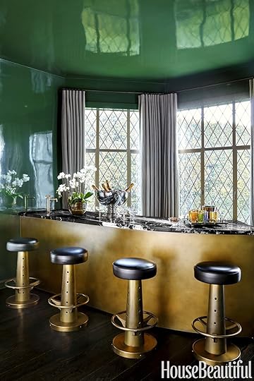
 left: design by ricky strauss, photo by trevor tondro, via house beautiful | right: design by martyn lawrence bullard, photo by jaime kowal, via trendland
The bones of these rooms? Incredibly similar. Both are located in Hollywood, both have green lacquered walls, both have lots of brass with hits of black and classic glam elements (veined marble on the left and leopard on the right – my favorites!).
The feel of each room, though, couldn’t be more different. The gray curtains on the left feel a little more masculine and formal, while the magenta window coverings on the right leave this lobby feeling cheery and open. With a few easy (and affordable!) styling swaps, you could totally change the look and feel of each one of these spaces. NEAT, RIGHT???

 left: design by rachel chudley, photo by michael sinclair, via house & garden | right: design by beata heuman, photo by simon brown, via clever
Here are two more examples of single-color, high contrast curtains that totally transform each of these rooms. A monochrome look in either space would have fallen a little flat, don’t you think? The contrast feels intentional and bold and special – it’s a little detail that adds SO much. (Speaking of little details, check out that copper curtain rod on the left. BIG swoon.)
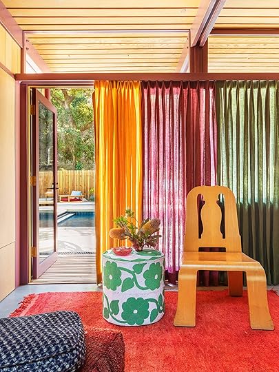
 design by reath design | photos by laure joliet | via architectural digest
You may recognize that shot on the left – this house tour went very viral – but do you see how Frances Merrill, the mastermind behind Reath Design, continued to play with tonal curtain panels throughout the entirety of this California home? It’s a fun and fresh idea if you’re looking to add a LOT of visual interest without layering in a ton of busy or competing patterns.

 left: design by waldo works, photo by michael sinclair, via yellowtrace | right: design by matilda goad, photo by yuki sugiura, via house & garden
Take your hand and cover up the yellow curtain on the left for a second. The room feels a lot colder and a little darker, right? Opting for a bright yellow curtain and adding those warm, saturated pillows makes ALL the difference in the world. On the right, a bold pop of orange velvet brings a lot of vibrance and youth to this otherwise-traditional nursery.
Keep It Simple design by jett projects | photo by christian harder | via elle decor
If pops of color aren’t your thing, that’s okay! Quiet and tonal curtains can be total showstoppers, too. If you’re looking to draw attention to a view, consider opting for window treatments that are a near-match for your wall color – do you see how your eyes are drawn straight to the windows and to the view outside when everything else in the home lives within a tightly restrained color palette?
 design by jett projects | photo by christian harder | via elle decor
Who DOESN’T want to take a nap in here? It’s like an adult version of a nursery – so restful and calming and serene. The weight of these curtains, in particular, is so lovely – they have the perfect level of light-filtering ability, don’t you think? A velvet in here would have weighed down the space and made an already-narrow space feel a little claustrophobic. Keep your materials AND colors in mind, gang!
 design by edel legaspi | photo by roger davies | via architectural digest
Keeping it simple doesn’t necessarily always mean going all-tonal, though. See how the ombré curtains above work to blend the shades of several pieces in this room? An all-white curtain in here may have felt a little boring, but a pattern would have taken away from the quiet sophistication – this light-to-dark faded drape was the right choice to keep things interesting.
Play With Proportion
 design by reath design | photos by laure joliet | via remodelista
I KNOW. You came in here with a full knowledge of the rules of curtains and now I’m here to tell you that soooometimes, it’s kind of fun to experiment with breaking those rules. EEP.
Case in point: both of these rooms were completed by Reath Design, and I am really taken with the different approaches they took to outfitting two sets of arched windows. On the left, you see a more traditional rod placement paired with a fun, cropped curtain. On the right, though, we have a traditional length with a less-traditional placement, which allowed room for some modern sconces on either side of the window. It’s cool to take chances and play with your design!!!
 design by wesley moon | photo by pernille loof | via architectural digest
LONG LIVE THE CAFE CURTAIN. I think a lot of folks would have opted for roman shades here, but this little curtain adds SO much charm while drawing your eye straight to those painted grilles. (Personal update: I was eyeing romans for my kitchen, but this shot alone swayed me to look into something smaller that only covers the bottom half of my windows. It’d be quaint and sweet, which feels like a perfect match for my lemon-printed wallpaper!)

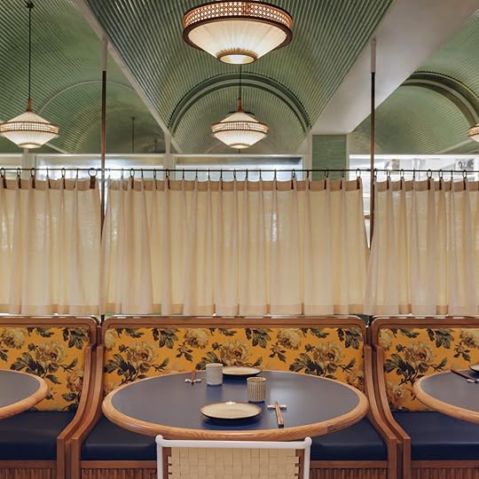
 design by studio gram | photo by jonathan vdk | via yellowtrace
Okay, okay – I know this is a restaurant, but LOOK HOW COOL THIS CURTAIN PLACEMENT IS. It’s a tiny piece of fabric that creates such a sense of space and place around each booth – could you do anything similar in your home?
 design by linehouse | via sfgirlbybay
One more from a restaurant – I know, I know – but sometimes, it’s fun to look for inspiration outside of homes. These above-booth curtains create such a sense of privacy without sacrificing light or aesthetics. Maybe this will inspire you in some way, too 🙂
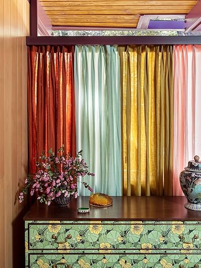
Opt for Some Pattern design by reath design | photo by laure joliet | via architectural digest
Alright – we’re wrapping it up with my favorite section and kicking it off with one of my favorite photos: it’s time to POWER CLASH, baby. This is another room from the viral multicolor-curtain home that we peeked at earlier and it’s a masterclass in mixing and matching (the tiny print on the rug! The medium scale wallpaper! The large block print on the window treatments!). Let this be today’s reminder that Em’s classic advice of “pretty looks good next to pretty” is, well, PRETTY SPOT ON. Bring on the pattern!!! You got it!!

 design by matilda goad | photos by yuki sugiura | via house & garden
I adore Matilda Goad’s home for, uh, about a BILLION different reasons…but her use of window treatments is pretty high up there on the list, TBH. I love how the stripe breaks up those long curtains on the right (and this could be a GREAT idea if you need to extend the length of some drapes you already have – attach a different fabric at the bottom!). And on the left, man – that bold cabana stripe makes SUCH A DIFFERENCE. Seriously – cover it up with your hand – it’s the finishing element that makes this room feel fresh and new.
 design by charlap hyman & herrero | photo by laure joliet | via architectural digest
A little extra? Yes. VERY fun? HELL YES. It’s not totally uncommon to match your wallpaper and your window treatments – it’s actually super common in more traditional homes – but this version, with a storybook print and custom bed and leopard carpet, is really exciting and one-of-a-kind. (That said, you don’t have to try this only with wallpaper – do you think you could achieve a similar effect with paint?)
 design by jacquetta wheeler | photos by isabel parra | via architectural digest
Pattern can be a little subtler, too. First off – both of these rooms are in the same home and I love how cohesive they feel, despite the variation in color palette and architecture. Second off – a big part of said cohesion is owed in part to these simple horizontal-stripe curtains, which bring a hit of visual interest while weaving a common thread through each space.
 design by meta coleman | photo by rett peek | via domino
 How freakin’ HOME-Y does this feel? It’s designed, but it’s also lived in and cozy and un-intimidating. (Like, you’d feel comfortable eating a snack in here, you know?) The big patterns in this room are pulled towards the front of the shot – the plaid piano bench, the striped ottoman, the gingham chair – and the curtains in the background provide a great balance for those strong patterns in the foreground. The layering of wooden roman shades is really really lovely, too.

 left: design by beata heuman, photo by simon brown, via domino | right: design by laura gonzalez, photo by stephan julliard, via 1stdibs
Primary color shades, partially painted wall, bold hits of color – is this my new favorite bathroom formula? While I actually think that both of these spaces would look just as great with a solid shade (who am I?!), the bold stripe adds something dynamic to each space – it’s the perfect finishing touch that makes it feel ~designed~.
 design by meta coleman | photo by rett peek | via domino
Last but not least – this is one of my favorite room reveals of 2022. Everything in here is incredible – the palette! The rug! The deep sectional! The wicker stool! The casegoods! That patchwork chair! – but those gridded curtains are the icing on the freakin’ cake. They speak to the other colors and patterns in the room; they add quiet interest; they bring depth and warmth. (The rod placement is perfect, too.) It’s a nice reminder that pattern doesn’t always mean in-your-face – sometimes it can just be a liiiiiittle something that makes your home feel polished and considered.
So, uh, WHAT SAY YOU? Let’s talk about our window treatment woes and wins, yeah??? xx
Opening Image Credits: Design by Meta Coleman | Photo by Rett Peek | via Domino
The post One Tiny Change: 26 Rooms Where Curtains Made All The Difference appeared first on Emily Henderson.
June 2, 2022
Ryann’s Personal Deep Dive Into Wabi Sabi + 5 Ways To Get The Look In Your Home
A few months ago, I started what I am now calling my design identity crisis. I am usually drawn to vintage, moody, old-world, dark academia inspired interiors. My whole living and dining room design is based on that fact. But what happens when there are neutral, minimalist interiors that stir something in me, making me reconsider the deep moody green walls in my apartment?? It seems I am being confronted by my attraction to two opposing styles, causing me to rethink my whole design aesthetic.
It all started when my fiancé Rocky and I were looking for bedroom inspiration. We were both very drawn to an aesthetic we’ve been calling “Monastery chic” and through searching for that inspiration Rocky came across wabi sabi design. I had heard of wabi sabi before but had never researched what it really is. Rocky is a quarter Japanese so he resonated with this ancient philosophy right away, and when he showed me photos I was immediately hooked. We both share an admiration for Japanese art and culture so learning more about wabi sabi felt natural. Pretty quickly, our research into it turned into a deep appreciation and desire for a wabi sabi-inspired home (and life).
The kick is our current design aesthetic is quite the opposite. We have dark green walls, a huge gallery wall, books stacked from floor to ceiling, and collected items on every surface. In short, we aren’t minimalists. We both like decorating with a lot of things. But when wabi sabi crossed our radar we both felt extremely drawn to the philosophy, style, and practice of it.
 design by boris vervoordt | photo by jean-pierre gabriel | via house and garden
After some introspection, we came to the conclusion that we can’t scrap everything we already have and replace it with a wabi-sabi design. In fact, that would go against a lot of the tenants of the philosophy itself. Instead, we realized we can have a mindful wabi-sabi mindset, apply it to parts of our home, and still accept the things we already have in our home.
If you want to learn more about the history of wabi sabi as we did, just know you will have to practice patience because its history is hard to track down. According to Wabi Sabi – The Japanese Art Of Impermanence (a book I highly recommend on the subject), “wabi sabi as a product of the Zen mind, can find its earliest roots in Zen’s forerunner, Taoism” but the exact time it popped up is nearly impossible to pinpoint. The closest timeline is during the Song Dynasty (960-1279) which is when art started to show some of the ideals of wabi sabi. But no matter the exact timeline, there is no doubt that it has influenced art and design for centuries.
Speaking from an American, English-speaking point of view, wabi sabi can be an elusive, mysterious concept because it has no clear translation. Again, it’s ironic because the whole idea is to embrace imperfection. So with that in mind, I can tell you that wabi roughly translates to “things that are fresh and simple” and sabi is defined as “things whose beauty stems from age” but the truth is, those are imperfect translations.
From a design perspective, one definition of wabi sabi is “a Japanese aesthetic concept that finds beauty and serenity in objects, landscapes, designs, etc., that are simple, imperfect, and impermanent.” This definition is easy to comprehend but can be hard to put into practice. Can we find beauty in anything and call it wabi sabi? Maybe, but the trick I’ve found is knowing that it might look slightly different to everyone. It’s an idea, not a tangible thing you can point to. You can look at a room or photo and feel like it’s wabi sabi-inspired but it might be hard to articulate why. Of course there are certain elements that speak to it, but they are not uniquely wabi sabi in nature. There is no rule book on how to achieve a wabi sabi design because the point is to create something unique, personal, tranquil, and imperfect.
But don’t worry, we don’t have to guess or go at it blindly. To guide us, there are 7 principles of wabi sabi:
1. Kanso – Simplicity
2. Funkinsei -Asymmetry
3. Shibumi – Beauty In The Understated
4. Shizen – Naturalness
5. Yugen – Subtle Grace
6. Datsuzoku – Freedom from habits
7. Seijaku – Tranquility
To apply these terms to design isn’t futile, it just might take thoughtful practice. Like I said, a key pillar of wabi sabi is embracing imperfection so if you want to attempt this style, there won’t be a perfect “How To” to get you there. So am I attempting to do the impossible by providing tips on how to get this look in your home? Yeah, pretty much. But since I am trying to apply it in my own home and life, I’m willing to share a few things I’ve found useful.
1. Go For Textured Walls design by andrew trotter and gianni emiliani | photo by salva lopez | via yatzer
Step one is live in a very very old building, preferably an old abandoned castle if you can swing it.
Oh wait, your not Axel Vervdoodt?? Okay then, well, you can also use different wall finishes to add texture to your walls. Limewash, heavy plaster, basic plaster, or Venetian plaster can create an aged, imperfect look.
Highlighting anything old or aging is common (and necessary) with a wabi sabi-inspired design. Have peeling walls? Wabi-sabi will have you embracing them! The point is to accept what you have and find the beauty in it. Instead of trying to erase naturally aging elements in your home, try embracing them (as long as it’s safe of course). In our apartment, we have peeling paint and instead of hating it I am learning to embrace the natural deterioration that happens to all things.
 design by andrew trotter | photo by salva lopez
Limewash walls are a staple of modern wabi sabi design because it can make plain, uniform walls look textured and antiquated. A rough, uneven surface is welcome in wabi sabi design and actually preferred over a smooth surface. This is a trick I am excited to try in my own home and will report back on how it goes 
 design by andrew trotter and gianni emiliani | photo by salva lopez
Wabi sabi is about impermanence. Nothing stays the same forever so a key component is holding on to objects that have meaning and admiring signs of natural age. Wabi sabi will teach you to hold on to your things for as long as possible instead of replacing them with something new.
If you are going for a wabi sabi-inspired design, avoid shiny, uniform objects and instead look out for naturally aged, organic decor pieces that show the passing of time. A cracked pot or tarnished vase is beautiful, and finding these used objects to decorate your home is also sustainable and good for our earth.
 design by andrew trotter and gianni emiliani | photo by salva lopez | via yatzer
Natural wear and tear is meant to be shown according to wabi sabi philosophy. So to achieve the look you should opt for organic materials that show age over time. Wood, clay, brick, and stone will age imperfectly and gracefully. I write this from my wood dining table that I bought used from Facebook Marketplace. It’s over 100 years old and has some new cup rings that I am not proud of but if I had to choose my favorite piece of furniture this would be it. The flaws and age make it unique and (you guessed it) imperfect.
3. Embrace Simplicity design by soar design studio and architect chen-tien chu | via dezeen
As someone who loves ~things~, this is a hard pill to swallow. But to truly achieve the wabi sabi aesthetic, you need to let go of clutter and rid your home of anything that is not significant or useful to you. Wabi sabi teaches us to detach from material things and focus on tranquility. Unfortunately, there is nothing tranquil about busy or cluttered surfaces (she says to herself).
 styled by joseph gardner | photo by anson smart
To embrace wabi sabi you are not required to get rid of all things and live like a monk. Instead, look at what you do have and consider its purpose or importance to you. If it’s useful or meaningful you don’t have to give it up. The point of the simplicity component is to create a sense of peace with your surroundings, which can be hard to do if there is clutter around you.
4. Opt For Earthy, Muted Colors image via potters house mallorca
Color (or lack thereof) is highly effective in creating peaceful surroundings. Avoid highly saturated colors if you want a wabi sabi look, and instead opt for muted colors you would find in nature.
 design by axel vervdoodt | photo by jan liegeois | via the design files
One main quality of this aesthetic is an austere look and feeling. This is where a light moodiness comes into play (and likely where my main attraction to it comes from). Despite many wabi sabi interiors being neutral and minimal, the color palettes associated with this style are often a shade darker than most neutral rooms. Gray, brown, light brown, white, and even black are often present in this style. The darker tones create a lived-in, austere vibe as opposed to a warm, comfortable vibe. This is not to say that wabi sabi interiors can’t be inviting, but they are often a bit rougher around the edges.
5. Lean Into Asymmetry design by andrew trotter and gianni emiliani | photo by pia riverola | via yatzer
Anything too uniform disrupts the nature of wabi sabi. The point is to embrace imperfections so if a room has all of the above elements but feels very symmetrical, then it won’t be perceived as wabi sabi. In my home, I plan to apply this by having one nightstand instead of two, hanging a small piece of art off-center, and embracing our fiddle leaf tree that has sadly lost 90% of her leaves.
 design by louisa grey | photo by rory gardiner | via dezeen
Another way to incorporate asymmetrical lines is with furniture placement. You can arrange your furniture with uneven space in between each piece and this will create an unbalanced yet pleasing look. In the above bathroom, the stool and sink are closer together and the chair is farther away in the corner. This creates asymmetry without doing anything permanent to your floorplan or walls.
As I said before, this is not meant to be a perfect “How To” on wabi sabi design but if you are looking for small ways to incorporate it in your home, I hope these 5 tips help. If you want to learn more about the subject, I loved pouring over this book, and I hear this is another great resource on living the wabi sabi-inspired lifestyle.
Thanks for coming along this journey with me, and bearing witness as I unpacked my feelings about this ancient, beautiful, simple yet intoxicating design aesthetic. I may not have articulated it perfectly but that is, dare I say, a great lesson in wabi sabi. xx
Opener Image Credit: Design by Axel Vervoodt | Photo by Jake Curtis
The post Ryann’s Personal Deep Dive Into Wabi Sabi + 5 Ways To Get The Look In Your Home appeared first on Emily Henderson.
June 1, 2022
Our Sunroom (Dining Room) Design Plan And What Table And Chairs We FINALLY Chose
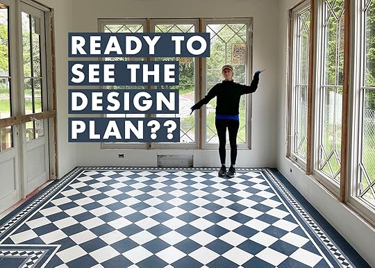
There were only a few rooms where I knew that we would need to shop for – that our furniture just wouldn’t work. This room is one of them, and boy am I glad that I waited to pull any triggers on the furniture until the tile went down last week. This room is the new addition that is going to be this dreamy victorian indoor/outdoor vibe that is super special. It’s definitely a different style/feeling from the rest of the house but it works because it’s separate enough and looks/feels like a conservatory addition (think a sunroom attached to the back of a brick house in England). We clad it in brick instead of wood siding to keep it feeling separate (but will paint it white). It’s just awesome. Functionally I’ll use it to work/write, gather, entertain, etc. Aesthetically, it’s the eccentric English grandma side of me who can get inspired here, write fun blog posts, then retire to her calm house to eat soup.
On Building the Sunroom (Aka My Writing Studio)
I dreamed it up and ARCIFORM drew it up, handed it off to an engineer to get approved, etc. And then we dug out to pour the foundation and built it up like a legit room. It took months and months, multiple subs during a very high demand time. It’s hard to know how much it will cost in total but definitely over 100k. Luckily, since we “work from home” this will be my “writing studio” we can at least write off a bit through the company. It’s not free money, but it helps.
 The Biggest Changes – After The Design “Indecision”
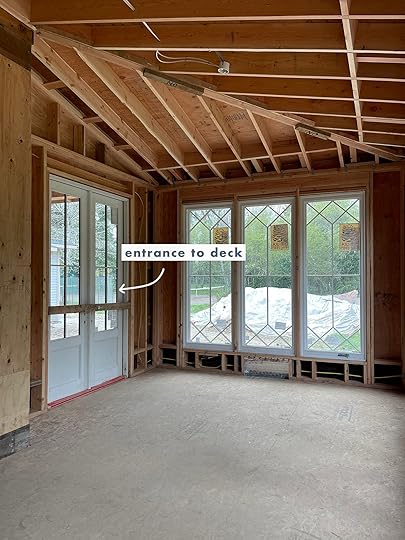
Originally, it was supposed to have windows or french doors on all three and half walls, with the east wall being french doors onto the front porch. But then I realized that we literally had no wall space, like in this whole house, which is fine in a lot of ways (we opted for windows instead which we are so happy with) but that also means no storage furniture to even hold paper or office supplies. Whoops. We also really didn’t NEED access to the front porch. The front door was right there and we aren’t lacking entertaining areas in this house. So we decided to close up this wall instead, brick the outside like the rest of the sunroom and make it big enough so that I could have a credenza or a hutch. This way we could also create a sitting area on the front porch (with a sofa since it’s covered) whereas the french doors limited that.

During this time, the back deck became a covered porch – to wrap it around (which we love) and give us some outdoor sitting areas during the rainier days. All fine and good, but it did limit the light coming into the french doors of the sunroom.

 More Skylights. Always More Skylights.
Also during this time (months ago), we nixed the skylights in this room fearing that installing them on what was supposed to feel like an older conservatory might be weird, especially from the exterior. So after the custom diamond patterned windows were installed (which came in without a middle shadow bar and are being replaced as we speak thanks to Sierra Pacific‘s excellent customer service), we walked into the room and strangely it wasn’t as bright as we had hoped. To most people, it’s bright enough. But because it faces north to a line of tall trees and we had covered the porch as well as gotten rid of the east sliding door, we needed more light. So right before drywall, we made the call that made us both feel like crazy people – but yes, we decided to put the Velux Skylights back in and luckily for us the framing and the electrical made it easy. We also realized that driving up to the house you are so far down that you really can’t see the top of the sunroom roof – like a tiny bit but hardly! So right now the ceiling is ripped open waiting for the tile installers to be done so we can throw those suckers back up there. (We had them already ordered and I had planned on putting them in the future “workout barn”).
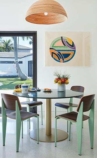
 Oh My Gosh, The Tile Install!!
 Ok so now we are down to tile install – and BOY OH BOY is it exciting. The tile from Pratt and Larsen is so high quality, the colors are PERFECT – bright, happy, energetic, and the install details are so thought through by the ARCIFORM team. It’s a custom color (much brighter in person) but if you want it just request it. The border ended up needing to be troubleshot to make sure that we were dividing the triangles in half equally (not an awkward cut). The border along a long straight run is easy to figure out (says me) but once you turn it you have to troubleshoot how that works and often the math doesn’t pan out. But the guys from Level Plane (Erik, Jeremy, Alex, Sergei) cared SO MUCH and we spent hours mocking it up before setting it permanently.
Furniture – The Dining TableI have been pinning for this room for a year – fantasizing about quiet writing days and energetic dinner parties. I started looking for vintage as that is my general preference but after a year I’ve officially called it on finding the right vintage pieces and here is why:
The scale of the table we need is hard to find – 11′ long by 40″ deep. Any deeper and it can look like a conference table (42″ could have been fine, but honestly with 8-10 chairs it’s a lot). There were so many “harvest” tables that were 30″ wide (very narrow) or had a deep apron that you can barely get your legs under and I love those. Unfortunately, they just aren’t practical for 8 people to chill around. The few tables that I did fine on 1stDibs were in Europe and over 10k. Even if I had that kind of money, it just felt unwise to buy it sight unseen and spend $2k having it shipped, etc. What if it’s wobbly and janky. Although like art, some of the ones I loved were by important makers and their work does appreciate but that’s assuming that we’ll take great care of them and well, that just felt unwise. We wanted light wood to warm up the tile (so not white, black, marble, etc). We wanted timeless and classic but not too shabby chic. We still wanted a bit refined but not pretentious.So to be expected the tables that I was most attracted to were custom made, in America, pricey, and frankly gorgeous.

1. Oval Penn Table | 2. Mt. Lebanon Shaker Work Table | 3. Penn Table
For those of you looking for more affordable versions that aren’t the length that we needed (proving to be the most difficult part) here are some others that I loved.

1. Hargrove Expandable Dining Table | 2. Provence Farm Table | 3. Shaker Dining Table
So here is the table we just ordered, after staring at it for almost a year:

Reclaimed Wood Oval Farm Table
And here’s why she is the winner: The design of it is perfect – classic and timeless, but casual. That turned leg is so pretty, with a scale that is delicate yet big enough and you know how I prefer an oval (especially against all those squares). We also love that it’s made out of reclaimed wood, in this beautiful waxed pine finish, made in California, and totally customizable by a woman-owned company. BOOM. We ordered it without the middle leg so we had flexibility with chairs, and changed the dimensions to 11′ long, 40″ deep, and 30″ tall. We had to pay a 20% upcharge for the customization, which seems totally fair and in total it cost us around $5k. This is a lot for a table, I realize, but after looking for the size for over a year I feel that it’s fair and we are getting exactly what we want in every single way. And no, this is not gifted or even discounted, but they are offering free shipping and have a ton of really beautiful pieces if you’d like to check it out. Just imagine it in here:

 Now For 8 Vintage Dining Chairs?? Hard To Find
 I shopped for the table and the chairs at the same time, waiting on the right one to pull the trigger that I knew would affect the other. But that wasn’t before I spent a year looking at dining chairs. Again, I’m so glad that I waited because once the tile was installed, we realized that we wanted fewer lines, and less finishes – the tile is the STAR, so the chairs need to be the supporting character. Also remember, I need 8-10…that’s a LOT of chairs so they need to be relatively affordable. But before then here is what I considered:
The Comfortable Upholstered Chair – As you know we believe in comfort so I tried pretty hard to get chairs that were going to be cushy for long dinners. Eight to ten of these are virtually impossible to find vintage (where I could afford or love enough). So here are a few that I debated on the market right now:

1. Vaquero Dining Chair | 2. Wolfgang | 3. The Allen Dining Chair
The Shaker Spindle Back Chair – Oh how I love these and will forever, and while the busyness of the lines with the tile could be totally fine, ultimately it’s just too much. But these were the ones I loved:

1. Bowback Chair | 2. Rian Dining Chair
Wicker, Rattan Bistro – We’ve seen these for years and years, but it’s because they are a great look, they are affordable, and have that casual indoor/outdoor vibe. So here are the ones I was considering:

1. Linton Scalloped Side Chair (Set of 2) | 2. Rustler Woven Dining Chair | 3. Sunwashed Riviera Dining Chair

Captain Chair | Side Chair | Pendant | Dining Table
I keep apologizing to people when I show them the chairs (that I still need to buy but feel pretty great about them) because they aren’t this crazy new design or anything. But as you can see in the mood board below they really do look awesome, pulled together, and let the tile shine. Plus they work with the rest of the vibe of the house (lots of wood tones, Scandi and casual). I might do a fun chair for me (peacock? upholstered wingback?).

So here is where we are at!!! The floor is the star. The chairs and table are so pretty and casual (but quiet), and the light fixtures are elegant which works so well with the floor. The custom windows from Sierra Pacific are incredible (the frames are lighter than what you see above) and that hutch is insane (although it might live near the kitchen instead to bring color in there). I’ll of course add some plants and style it all out.
Figuring out the border was hard to make sure that we cut the diamond perfectly in half and stretched the border so that the corners matched up perfectly without messing up the running pattern. Head to stories to see more on that (and huge thanks to ARCIFORM, Pratt and Larson, and Level Plane for doing an incredible job). I’m SO EXCITED about this room I can’t even tell you. I hope we all love it as much as I do in my head
The post Our Sunroom (Dining Room) Design Plan And What Table And Chairs We FINALLY Chose appeared first on Emily Henderson.
May 31, 2022
Designing With A Partner? See How This Celebrity Couple Designed Their Dream Home Despite One Major Opposing Style Preference

A question we get A LOT is how to combine different styles with a partner. Honestly, it can be tricky but completely doable. I mean, it was the whole basis of Em’s HGTV show, Secrets From a Stylist, right? It’s about finding the style connections (shapes, colors, materials, etc.), incorporating both styles with pieces that have those connections, and of course, some good ole fashion compromise and understanding. That’s precisely what Glennon Doyle and Abby Wambach did when designing their new family home in Southern California and were starting from scratch. Well, first I should say that this house was half designed when they bought it (go read the AD article for the scoop) but luckily they loved the cozy vibe that designer, Katie Lester, had already established. Personally, I think that was a MASSIVE blessing given that decision fatigue is very real (just ask anyone that has gone through any kind of renovation). But here’s the deal, it sounds like Glennon has much more of a love for colorful interiors than Abby. Abby even said that had it been up to her initially, she likely would have gone for way less color. Sounds tricky, right?? What do you do when one partner wants color and the other doesn’t? Well, I’m going to walk you through how Katie and Glennon (who was mostly in charge of the decisions) made this cozy home both colorful yet calm and airy so that everyone was happy.

I’m sure when you look at this photo you aren’t thinking “whoa, this is a wildly colorful room!” BUT, at the same time, it doesn’t feel like a totally white/neutral “California causal” living room either. Here’s why. First off, the room has a lot of texture and pattern which automatically makes it feel more alive. You have the brick walls, mixed with the paneling, mixed with the stone, and all of the fabric patterns. Then within those fabrics, you have that saturated indigo, hints of deep purples, reds, yellows, and other tones of blue. Also, those warm camel brown bench cushions do such an incredible job of livening up the room. Lastly, never underestimate the power of books and how they are an easy and sneaky way to bring color and personality into a room. Take the books out you have a pretty room. But with the books in? You have a personalized room.

Moving over to the dining area, the colors are classically neutral but baby do we have some texture! The chandelier, those woven chair backs and leather cushion straps, the black table to contrast and ground the space…all help to make the open concept plan feel warm but not too colorful because…
Y’all the kitchen is a beautiful bright blue. If you ask us (and DEFINITELY Emily), blue is a neutral in our book. So incorporating blue is a total no-brainer if there’s a couple that’s on different ends of the color-loving spectrum. Plus this blue, in particular, is so cheerful. Then by adding that beautiful warm-toned wood extension off the end of the island, brass pendants, and brass hardware it’s an irresistibly welcoming space. It feels both well designed but really approachable. That was their goal for the whole house and they achieve it.
Please note the mix of patterned counter stools and a solid leather cabinet bench. I think I’m into it! Also, note that they are all upholstered and have backs which is an EHD requirement for ideal comfort when sitting for a while. This kitchen was made for hanging out in:)
Now we are cookin with some “conversation piece” gas. The first things that catch your eye are those vintage chairs because A. the shape is amazing and B. they have that fun and unexpected leopard print fabric. Then for me, my eyes go right to those notched bookcases. GAH, I love them and they remind me of the CB x Lawson-Fenning bookcase that I have not been able to get out of my head. To finish it off, you see the modern and graphic pedestal table that helps make this house more “cool eclectic” than “California cool”. Oh, and see that colorful railing to your left??

Yikes, I ADORE that railing color choice. It’s subtle but so impactful! The railing equivalent to “I’m not a regular mom, I’m a cool mom”. This may feel like a design risk but what an easy way to bring in a subtle color that will make your home feel so cozy and unique. A perfect compromise for a colorful moment that doesn’t scream “color”. Plus, again you have more books and a beautiful muted toned runner to add color in a way that feels decorative and not permanent (so less scary to the color averse if you are trying to ease them into it).
Oh, and I love a gallery wall and all of those different toned frames add a ton of dimension. Also notice that they carried the paneling throughout the house but varied the scale and orientation.

As you are about to see they really leaned into highly patterned wallpaper that’s colorful but doesn’t feel super saturated. If you can’t tell that’s how I think they balanced their differing love of color in their interiors. I don’t look at this very cute powder bath and think this is an overwhelming color. I think the wallpaper (by EHD fav Rebecca Atwood) is the perfect amount of color that’s still calming, with a pattern that’s playful but not too visually overstimulating. It’s also balanced by that beautiful warm wood vanity base, a simple white marble counter, a modern sconce, and a natural woven roman shade and floor basket.

Moving onto the primary bedroom. I really love this room. It captures the love of color and pattern but also feels like a very calming space because of the more muted tones. The choice of the tall chair rail with the pink and purple wallpaper at the top was a great way to add in a fun wallpaper but have it not take over the space. Imagine if the walls were floor-to-ceiling wallpaper…not as calming right? What I also love are those burlwood nightstand dressers! They add so much warmth and with their natural pattern, balance out the wallpaper. Are you wondering why the roman shade pattern and wallpaper pattern work right next to each other? Different pattern scales! The wallpaper is a larger scale and the roman shades are medium. That’s the secret to mixing patterns. Just mix up the scales. Lastly, the bed, bedding, and chandelier are incredible.


Their primary bathroom is definitely on the more neutral side but I think that’s ideal for this kind of space. They carried the paneling from the bedroom which nicely ties those two rooms together but then went ham on the white marble. I love the large slabs of book-matched marble on the walls and that extra-long bench! Then on the floor, you can see they chose marble tiles. This is a great way to still have marble floors but in a more cost-effective way since large slabs are pricey. I also love that the shower it totally enclosed. Both Emily and Brian are big on a fully enclosed shower as opposed to the large open-air style that’s been super popular. They like to stay warm and that other style can bring in a lot of cold air. This one is a marriage of the two! It’s large and almost looks like an open-air shower but isn’t.
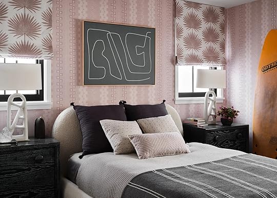
This is one of their daughter’s bedrooms and that bed is so pretty! I love the contrast of delicate pieces (wallpaper, shade fabric, bed, pillows) with the more graphic ones (art, side tables, lamps, blankets). Perfect for a teenager to grow into and then a great potential guest room. The surfboard makes it even cooler.

Another dream teenage room! The color palette is similar to the rest of the home but through fabric and pattern choices feels a bit more fun and youthful. I love those pink and maroon pillows and that roman shade fabric is my favorite in that whole house. Please also note that the ceiling is painted black. I can’t get enough. Maybe this is my favorite room?
While not all of us need a podcast studio in our homes, a lot of us can relate to needing an office. This space looks like it would be a dream to work in. That built-in bookcase is incredible and I love the two-toned wood paired with those beautiful sconces and cool brass knobs. I mostly love all of the books and collectibles that really make it personal to them. However, those awesome chairs and travertine side table don’t hurt either:)

So as you can clearly see this is a home that is filled with love, family, happy but muted colors, and A LOT of great patterns that all make it the cozy, welcoming, lived-in home they were hoping for. The view also helps:)
So do you have a favorite room? Any tips on designing with a partner with a different style? Let chat xx
Love you, mean it.
*Design by Kate Lester
**Styled by Amy Chin
***Photos by Douglas Friedman
****via Architectural Digest
The post Designing With A Partner? See How This Celebrity Couple Designed Their Dream Home Despite One Major Opposing Style Preference appeared first on Emily Henderson.
May 30, 2022
The 2022 Memorial Day Sales We Wanted And Got (So Yes, The Best Ones On The Internet)

HI, HEY, HELLO. Happy Memorial Day, gang! Below, you’ll find a roundup of today’s best sales in a (hopefully?) new-and-improved, easy-to-navigate format. I’m usually a pretty big yammerer (“yeah, we know,” said the daily readers), but in an attempt to keep this sleek and streamlined, let’s just JUMP ON IN. Without further ado, I hereby present to you the best deals of summer 2022…
& Other StoriesThe Sale: 15% off orders over $175, 20% off orders over $250, 25% off orders over $350 through Monday, 5/30.
Best Deals: This flowy midi dress with sweet sleeves, a lightweight linen dress that’s perfect for summer events, and these on-trend high waisted trousers.
Note: You can see a few of these in action in our affordable dress review!
The Sale: 20% off site-wide, plus free shipping on all orders through Monday, 5/30.
Best Deals: THE SHORTS. (And if you have a bigger butt, the Curve Love fit will change your life.) There are a ton of great affordable dress options, too – A&F has gotten SO GOOD (who saw that coming?) and it’s a great spot if you’re also at a loss of where to shop right now. (Like, why does everything either look like it’s from 2000 or like I’m about to embark on the Oregon Trail? Did brands forget there was a middle ground between crop tops and like, a shapeless gingham sack???)
The Sale: Up to 40% off select sofas, accent chairs, outdoor furniture, and more through Monday, 5/30.
Best Deals: You’ll find the best savings on rugs (in person, this one looks like it should cost WAY more), table lamps (this one is so chic!!!), and accent chairs.
The Sale: 20% off in-stock items through Monday, 5/30 with code MEMORIAL22.
Best Deals: The rug we literally can not stop using, these cordless roller shades that won’t break the bank (I know how hard they are to find!), and this modern, textured, easy-to-clean indoor/outdoor rug with a perfect rating.
Note: No joke – we literally JUST used that rug again in another room makeover. It’s that great.
The Sale: Extra 40% off all sale items through Monday, 5/30.
Best Deals: In order – the home selection is incredible, the accessories are VERY fun (albeit a little winter-heavy, inventory wise), and I recommend sorting the clothing by picking your sizes in the sidebar – it’s a little hit/miss, but still worth exploring.
The Sale: 15% off site-wide, 20% off orders over $2,999, and 25% off orders over $3,999 through Tuesday, 5/31.
Best Deals: This streamlined (and cute!) queen-sized sleeper sofa, a comfortable velvet sectional that can ship in 3-5 days, and one of my all-time favorite upholstered beds.
Note: The lead times here are pretty unbeatable, so keep this spot in mind if you’re ever in a pinch!
The Sale: Up to 15% off select chairs, lighting, sofas, and more through Monday, 5/30.
Best Deals: This Mouille-style plug-in sconce, Sara’s go-to sofa (case in point: her apartment, her mom’s house, her mom’s house second update, and her own house), and a great rattan daybed for those trying to recreate Birdie’s nursery look on a budget.
The Sale: 15% off site-wide through Monday, 5/30.
Best Deals: THE BEST ROBE. I’m telling y’all – people think I’m nuts until they try it on and then they’re like, “oh, I do feel like I stole this from a fancy hotel.” Also, the weighted comforter that transformed my sleep (way less nightmares, and I can change the duvet cover! So much better than a weighted blanket!) and Em’s all-time favorite windowpane-printed sheets.
Note: We each reviewed/rounded up our Brooklinen favorites right here! (You know, in case you’re looking for more opinions. I get it.)
The Sale: Up to 25% off select coffee tables, credenzas, consoles, and WAY more through Tuesday, 5/31.
Best Deals: This is truly the best-curated selection of furniture and decor on the entire internet with unbeatable sales. (Seriously. That’s my #notsponsored and #neverbeengifted opinion, too!) My current favorites: this super modern leather sofa, this ivory sofa that looks like a hug, literally all the coffee tables, this simple-meets-industrial media console…I mean, the inventory is just STACKED with great stuff, guys.
The Sale: Up to 30% off outdoor furniture and accessories, up to 20% off in-stock furniture, and up to 60% off sale items through Monday, 5/30.
Best Deals: This quick-ship pencil reed desk (spoiler: pencil reed is the next big thing – I’m working on a post about it now!), a chic and modern bed frame with all sizes available for $500, and this AWESOME and sculptural leather-loomed lounge chair. (Also, my brass bistro table is on sale! Still holding up great after a year outdoors.)
The Sale: 20% off site-wide through Tuesday, 5/31.
Best Deals: HUGE savings on chandeliers and pendants, but I’m particularly obsessed with these traditional-with-a-twist sconces and this brass articulating library sconce.
The Sale: Up to 20% off outdoor furniture and decor and up to 60% off sale items through Monday, 5/30.
Best Deals: This half-priced statement coffee table, a 2022 version of the safari chair for under $1,000, and be sure to check the decor section for great small styling pieces and affordable curtains, too.
The Sale: 25% off over 400 summer-ready styles through Monday, 5/30.
Best Deals: These breezy pull-on linen shorts, a super flattering sleeveless top you can grab in 16 (!!!) different colors, and this simple scoop-neck tee (great if you’re trying to show off your collarbones!).
The Sale: 20% off site-wide through Monday, 5/30 with code MDW22.
Best Deals: The classic sauna blanket (of course), the newly-introduced blanket insert (so you don’t need to sweat through your pajamas anymore – you can enjoy your sauna au natural!), and the red light face mask.
Note: Emily wrote a review of her sauna blanket after using it for a year, and you can read about her experiences right here.
The Sale: 20% off everything custom, plus 15% off decor through Tuesday, 5/31.
Best Deals: You’ll save the most on sectionals, but I’m currently obsessed with the new Lowen collection of channel-tufted sofas, chairs, and more.
The Sale: 15% off site-wide through Monday, May 30 with code SAVE15.
Best Deals: These bold and organic bar stools, this tortoiseshell rattan hall tree (again – it’s about to be the next big thing, I swear!), and don’t forget to check out their vintage and antique inventory!
The Sale: 30% off (almost) everything, plus an extra 60% off all sale styles through Monday, 5/30 with code SUMMER.
Best Deals: The dresses! The skirts! The SWIMWEAR!
Note: Broken record here, but J. Crew Factory’s inventory is also SO GOOD and SO CHEAP.
The Sale: 20% off site-wide through Monday, May 30.
Best Deals: Guys, my order for this bed has officially been placed – anyone wanna match with me? Alternatively, you couuuuld grab Jess’ comfy sofa (designed by an EHD alum!) or one of these gorgeous rugs.
Note: You may have already shopped this sale (gotta love when a brand kicks off their promotions early!) but if you haven’t, I rounded up a few of the best picks right here!
The Sale: 25% off site-wide plus an extra 30% off sale through Monday, 5/30 with code LONGWEEKEND.
Best Deals: I recently tried on this dress in-store and was shocked that it looked SUPER cute (usually my boobs don’t play well with tent-style dresses). Also, these are the BEST alternatives to skinny jeans and this dress is SO flattering in person (if you’re between sizes, size down!).
The Sale: 15% off sitewide (excluding fine art) through Tuesday, 5/31 with code MEMORIALDAY22.
Best Deals: Pro tip: this much art can be overwhelming, so the best way to search is by scrolling to “art” and then hitting “shop by style” – it gets WAY easier once you can narrow down the types of pieces you like, I promise!
Note: My whole hallway is Minted, and I STILL FREAKIN’ LOVE IT. Steal my entire professionally-designed gallery wall (because obviously, I had their art stylist help me out) if you want – dimensions are in the post!
The Sale: Up to 60% off TONS of styles through Sunday, 6/5. (It’s the Half-Yearly Sale!)
Best Deals: Biggest savings are on shoes (I un-ironically love these Tevas, guys), bags (the shape of this one feels so fresh!), and swimwear (like this VERY cute striped swimsuit coverup).
The Sale: 25% off site-wide through Monday, 5/30.
Best Deals: The quick-ship section is a goldmine right now – so many pages of great pieces without mind-boggling lead times! I also love this elegant single-cushion sofa and this navy raffia nightstand with storage.
The Sale: 20% off site-wide (including furniture!) through Monday, May 30.
Best Deals: The nightstands are like, Architectural Digest-worthy. Also, check out the dog beds (cute!!) and the BEST extra-long bolster pillow insert (it’s the perfect finishing touch for those who don’t love a lot of clutter when they’re making the bed!)
The Sale: Up to 70% off select furniture, outdoor, bedding, and more through Monday, 5/30.
Best Deals: These indoor/outdoor lanterns (the shape feels a little special, right?), this minimalist upholstered bed frame with sleek little legs, and this textured rug that looks like the comfiest knit sweater.
The Sale: Up to 70% off select lighting, hardware, furniture, and more plus site-wide free shipping through Monday, 5/30 with code FREESHIP.
Best Deals: The hardware is a given, but also be sure to peek at the pendant lighting, the dining furniture, and the planters – there are SO many great deals.
Note: If you ever want to see Em’s Rejuvenation favorites in one place, you can check out her official partnership landing page right here!
The Sale: 15% off select outdoor items through Wednesday, 6/1.
Best Deals: This cheery flush mount light fixture, this simple and beautiful walnut cutting board, and this classic midcentury-style planter with a stand.
The Sale: 20% off site-wide through Tuesday, 5/31 with code WAVES.
Best Deals: Dining chairs, baby! Stay tuned for a post from Em next month – she’s eyeing some chairs from Serena & Lily for the sunroom. (Any guesses on which ones she loves?) The dressers/chests and coffee tables are worth checking out, too.
The Sale: Up to 50% off select items through Monday, 5/30.
Best Deals: Over 7,000 pieces are on sale! Head right here and sort by size to prevent Say Yes to the Dress syndrome (you know, like, when you fall in love with something only to realize that you can’t have it – there are TONS of cute pieces, but available sizes are ALL over the place).
The Sale: 20% off orders over $1,000 through Tuesday, 5/31 with code NATURALWONDER20.
Best Deals: You can’t go wrong with the Amelia, the Neva, or the Gabriel.
The Sale: Up to 40% off patio furniture and decor, up to 30% off furniture, and up to 30% off clothing for the family through Monday, 5/30.
Best Deals: Check out the kitchen items – you can get an extra 10% off with code MEMORIAL10. You should also peek at the rugs and the entryway furniture/organization section – there’s a lot of deeply discounted stuff in both!
The Sale: Up to $500 off mattresses and up to 15% off bedding through Monday, 5/30.
Best Deals: The newly-redesigned Mint mattress, of course! (Internally, our team is split about 3:1 for the Mint vs. the Hybrid, just FYI. Both are great options!)
The Sale: Up to 50% off site-wide, plus an extra 40% off sale items through Monday, 5/30.
Best Deals: The home section is a veritable treasure trove of great graduation/birthday/going away gifts for Gen Z’ers. I’m also loving this cartoony dining chair (for indoors OR outdoors, honestly), Sara’ living room side table, and these awesome checkerboard taper candles.
The Sale: Up to 70% off select rugs, outdoor furniture, seating, and more through Monday, 5/30.
Best Deals: A sweet and simple cocktail ottoman, his glam sofa that’s nearly $2,000 off (!!!), and this jute-braided ottoman that’s perfect for adding a hit of texture to your home.
The Sale: Up to 70% off select outdoor, bedding, furniture, and more through Monday, 5/30.
Best Deals: A sweet and on-trend fluted end table, this organic and streamlined sectional, and this sleek and warm entryway console.
The Sale: 15% off in-store pickup orders through Monday, 5/30.
Best Deals: The outdoor selection here is AWESOME. Also, check out this cabinet with a geometric brass-inlay and this upholstered swivel chair with great proportions.
As always, if you’re a small business owner, feel free to leave sale details in the comments below! Have a great day – see you back here tomorrow with your regularly scheduled design content. xx
Opening Image Credits: Design by Sarah Zachary | Styling by Emily Bowser | Photo by Sara Ligorria-Tramp | From: A Historic Mid-Century Modern Home That Was Completely Brought Back To Life (Hope You’re Ready For Some COOL Original Details)
The post The 2022 Memorial Day Sales We Wanted And Got (So Yes, The Best Ones On The Internet) appeared first on Emily Henderson.
Emily Henderson's Blog

- Emily Henderson's profile
- 10 followers

