
Emily Henderson's Blog, page 125
June 17, 2022
What’s The Best Layout For A Pass-Through Dining Room? Caitlin Explores In Her Own Home

I have made a mountain out of a molehill. I have thought myself into a corner (literally. Twice!). I HAVE GIVEN UP. (Well, almost, at least.) The culprit behind my impending demise and omnipresent tension headache? My apartment’s 10′ wide, 15′ long pass-through dining room. She’s beautiful, she’s enormous, and y’all, she is FILLED TO THE BRIM WITH DOORS AND OPENINGS AND WINDOWS. Every time I’m like, “oh, maybe this is a good dining room layout to try,” there is an architectural feature in the way!!! (Such is life when you have a pass-through space, I guess.) But here’s the thing: even having a dining room in LA – much less one of this size! – is an incredible privilege, and I’M TOTALLY BLOWING IT. So today, I am throwing my hands in the air and humbly asking for your layout feedback. I’m breaking out some embarrassing, unstyled, unfinished photos of a room whose aesthetic can currently best be described as “Toontown-meets-flea market…but, like, not in a cute way” in the hopes that, well, maybe we can talk through my final three layout options together. THE INDECISION ENDS TODAY. Ready?
Current Layout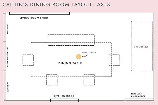
Some context: The dining room is the heart of my railroad-style apartment. There’s a 6′ opening that connects it to the living room; there’s a wall of windows with a door to the balcony; there’s a swinging door that opens to the kitchen (usually closed); there’s a door to the hallway (ALWAYS open because I’m STILL obsessed with ogling that paint color). You ready to see some actual progress shots?

 left: looking in from the living room, the kitchen door is closed | right: after 5 years, the 80s credenza is gettin’ the boot!!!
AHHH. Sometimes I hear politicians say things like, “wow, I’m so humbled by (award/honor/something that would be an ego boost, if anything)” and I think ALL of those people should have to post photos of their in-progress houses for critique because THIS IS ACTUALLY HUMBLING. I can get kind of touchy and embarrassed about sharing my space as it is right now (like, in person, too) because I feel insecure about the discordance between my job and my actual life. It feels weird (and sometimes fraudulent, if I’m being super honest) to write about design while sitting in the middle of a room that doesn’t look cohesive or finished yet, you know? BUT I DIGRESS. Gimme a second to pull my head out of my literal butt and then we can talk about what’s working and what’s not. Got a little too earnest there for a second, huh???
My main gripe – outside the haphazard collection of much-loved vintage chairs and case goods that have been relegated here as placeholders – is that the furniture layout just kinda sucks. And by “kind of,” I mean that THIS LAYOUT BLOWS CHUNKS, guys. If there was a textbook about how not to arrange furniture in a pass-through dining room, my current dining room configuration would be a contender for the cover shot. You know what happens as soon as anyone sits down at ANY of the chairs? ADIOS, WALKWAY. Catch ya later, ability to open doors. And since my credenza is so big, my dining table is sliiiightly off-center from the light fixture above. There’s more that drives me nuts, but it’s reductive. The TL;DR: It’s like death by a thousand little design agony cuts in here. BUT…

 left: july 21, 2019 (thanks for remembering, instagram!) | right: the view from the hallway – this is normally where the credenza is
 There have been good parts, too! I’ve been REALLY slow in purchasing for this room, but I’ve also been much more intentional with what comes in here. It’s not glamorous (she said, staring at a sea of 1980s laminate – I had a long postmodern phase, y’all) and collecting pieces for this long is VERY anti-climatic – I wish I could be a One Room Challenge type! – but deep down, I know it’s going to lead to a result that I’m much happier with in the long term.
Case in point: I purchased this lucite ribbon chandelier for a song at the Long Beach Flea in July of 2019 and from the moment I saw it, I knew it would live in my dining room one day. 3 years have passed, but I’m just as excited about hanging it up today as I was back in 2019. (“My affections and wishes have not changed” – technically Mr. Darcy, but also my internal monologue when I think about this light fixture getting installed.) I love how its tubular ribbons speak to the chimes of my doorbell and how the brass echoes the gold in the wallpaper. If taking a long time to design a space means that all of these elements I love will get to shine together, well…I’m glad, I guess 🙂 To that end, I’ve landed on 3 final layout configurations and I’m ready to get all of these pros and cons out of my head…READY?
Option 1: With A Twist
GROUNDBREAKING STUFF, I KNOW. In this layout – the easiest switch of the three – I’d nix the larger credenza, center the dining table and chairs in the middle of the room, and I’d opt for a smaller storage piece near the window (ideally probably about 40″ wide and fairly narrow, if I’m putting wishlist specifics out into the universe).
The Pros: This is pretty easy! I’d probably keep an eye out for the burl version of my current dining table on Facebook Marketplace (the stark white is pretty jarring to me against the wallpaper – does it stand out to you, too, or am I too in my head?). I’d reclaim my vintage waterfall bench for seating – it’s currently in the corner next to the window and it looks SO good with the curve of the table base, guys!!! – and while I’d love to search for 4 new chairs to tie everything together, I thiiiink I’d just reupholster the 1970s Italian chairs from above in a punchy seat fabric (got them for $1 each on Craigslist about 4 years ago – still can’t beat that price!!).
The Cons: I hate this plan. I mean, it’s…fine? It opens up the space a bit, but it’s pretty uninspired. It also doesn’t solve my current pain point of “OH MY GOD, why did I put a table in the middle of the room and now I have to speed walk and zig-zag around an obstacle while trying not to drop 30 bottles of Kombucha, oh no oh no oh no.” I really, really, really wanted to find a way to connect the living room entrance with the hall and kitchen doors to make my schelpping (of food, but also of suitcases and decor and furniture and goods of all kinds) a bit easier. That brings us to…
Option 2: The Banquette
NOW WE’RE TALKING. This one’s a little harder to grok (seeing as you don’t also, you know, live in my apartment with me while spending hours every day thinking about my dining room layout), so let me show you what I’m dreaming of a little more closely, yeah?

 it’d be cute and cozy, right?! (the blue tape is where my dining table would end, if i were to center it in the room)
I’ve been obsessed with this banquette for a minute – it was actually the piece that spawned my dissertation on banquettes – and I’d love to see it right underneath the doorbell. It feels fun and a little more intimate than the previous layout option – I like that the idea of the dining area being tucked away a little bit, instead of just floating out in the middle of the room. (Why am I writing this like I live with a ton of people and need privacy???) I recently ordered 10 fabric samples, but I’m most leaning towards a nice lil’ pink shade – the living room is gonna be pink, too 🙂

Here, I’d love to see a tall dry bar with two visually lightweight stools…though literally anything would be a massive step up from this ill-sized bench, which was moved to this spot for a shoot and remains because (a.) my cat loves napping here and (b.) IT’S SO CUTE WHEN SHE’S NAPPING HERE. Anyway – I’m on the hunt for a dry bar like this one above in particular – I love the brass details, the mix of rattan and steel, and the sheer and delicate framing. I like that it’d be the primary piece visible from the living room – it feels inviting, like it’d draw folks into my apartment – and I also love how it speaks to the color palette from the doorbell. The kicker? The shipping alone for this piece is $1,500 (she wrote, weeping) – if anyone spots a similar piece in the continental US…well, I’ll be here, sitting and waiting, with my uShip account at the ready.
The Pros: I am going to copy this verbatim from my own personal notes: “I like it. I like bars. I want to be able to lay down while eating.” SIMPLE. THOUGHTFUL. COMPELLING.
The Cons: I can’t find a freakin’ table, you guys. In a dream world, I’d find a pedestal table that’s around 40″ x 52″. In reality, that does not seem to exist (in my price range, at least). I have considered a few other options to make it work – getting a vintage table base and cutting my own top is the frontrunner right now, but I’m also intrigued by the idea of 2 smaller round tables – but that’s actually not my only concern: is there going to be a weird and/or off-putting amount of space in the center of the room now? I have to admit that I do kind of like that from a functional perspective – I have a rower and my air conditioner is in the dining room, so it’d be great to have a space big enough to work out in next to the A/C – but I worry that guests will look at my rower-less space and be like “uh, hey, why is there a literal ballroom’s worth of empty space between your furniture, dummy???”
Option 3: The Other Banquette
Which brings us to the final possible configuration – an ~8′ straight line banquette, paired with a standard ~6′ table and two regular dining chairs. I’m still not totally sure how I feel about this – I’ve been thinking about it for weeks and I still can’t figure out if it’s my favorite option or if I totally hate it.
The Pros: A full-sized table could fit and the whole setup could hold WAY more people than the L-shaped banquette (like, twice as many, I think). I think this one may be the best use of space (if my goal is seating as many people as possible, which it seems to be). The path to the kitchen and hallway is super clear, too, which would make pushing furniture around the apartment SO much easier.
The Cons: And again – I will quote this straight from my personal notes: “Still too much weird space in the middle? Will chair backs be close to the door? I think I’m spiraling.” (Pretty self-aware, at least.) I’m still concerned about the gaps in the middle of the room, but the general flow of these banquettes just feels better to me – what do you think? I know we’ve gone over a lot today, so I want to leave you with a full overview of where we are and where we’re going – ANY feedback, thoughts, ideas, suggestions, questions, comments, quips, well-wishes, etc. will be VERY appreciated.
WHAT SAY YOU??? Please help. What kind of layout would you opt for, if this was your home? Any furniture suggestions? Am I overthinking? (Maybe don’t answer that one. We all know that I absolutely am!!!) Anyone else struggling with an unassuming room that has slowly but surely morphed into a design agony? Let’s all commiserate. I can’t wait to get outta my head and into the comments – SEE YOU DOWN THERE 🙂 xx
The post What’s The Best Layout For A Pass-Through Dining Room? Caitlin Explores In Her Own Home appeared first on Emily Henderson.


June 16, 2022
This Affordable Old/New Decor Trend Is Probably Hiding Inside Your House

I had a bunch of different ideas about how I wanted to decorate my beloved turret window. I wanted something fun but not over the top, architecturally appropriate but still cool. One of the ideas (based on seeing it popping up more and more on my many feeds) was decorative wall plates! Of course the ones I was looking at were over $100 a pop because even with “a trend” that is primed to be SO AFFORDABLE, I have a gift (or curse) of still making it expensive. But y’all it doesn’t have to be! And it can bring a ton of personality and life into your space no matter your style. There’s a reason variations of this look have been around forever. Let’s get into it…
It’s Affordable! (If You Want It To Be) design by ayse archer-coité | photo by francesco lagnese | via elle decor
Let’s talk about why it can be almost ridiculously affordable. First, you might have some beautiful old plates hiding on a top shelf of a cupboard, in an attic or basement, or even in your garage or family storage unit. It doesn’t get more affordable than FREE. The only thing you will probably need to buy (if you aren’t just leaning them again the wall) are plate hangers. I love the idea of this one because it basically puts a hanger on the back of your plate. No visible wires! But a classic plate hanger is also great. To each their own. In the photo above it looks like designer Ayse Archer-Coité used both types so there really are no rules.
 design by melissa cattaneo fontaine and monica stewart of the misfit house | photo by kristin karch | via domino
But maybe you’re like, “Jess, I simply can’t put one more hole into my wall.” To that, I have a very easy solution…the plate stand. Look how great and simple that plate looks in the shelving nook. I love how it ties in the greens and beiges of the space. Plus it adds the perfect amount of pattern! If you need a couple of stand recs, I really like this brass one and this iron one.
 design by lucy williams | photo by chris horwood | via house and garden
Hold on. We need to talk more about the affordability. If you’ve ever been to a flea market or thrift store you know there are almost an infinite amount of great looking plates. It will likely take some digging but the deals you can score are priceless.
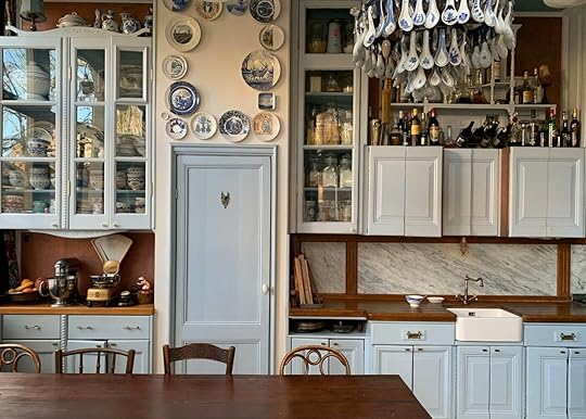
Now to be fair I don’t know if the plates in the photo above are vintage but they make this kitchen look so much more interesting, layered, and inviting. It’s got some soul, baby.
 photo by sara ligorria-tramp | from: working with what you’ve got – an $8k budget kitchen makeover with a lot of vintage charm
While we LOVE vintage plates, buying new ones that might better fit your style is still a great option because there are so many affordable plates in bigger box stores too. Again, these small plates in this laundry room could easily be vintage but for the sake of my argument (and the fact that they look more on the modern side), newer-looking plates can also have a ton of fun visual impact. I now can’t imagine this room without them.
A Great Way To Display Family Heirlooms design by emmy ellison | photo by jones crow | via clever
Okay, so not only is it the most affordable option to go searching through unused family heirloom dinnerware, but displaying them adds such a special and meaningly element to your home. Aren’t the best homes filled with storied pieces??

 photos by sara ligorria-tramp | from: working with what you’ve got – an $8k budget kitchen makeover with a lot of vintage charm
I know that the tricky part can be finding heirlooms that work with your style. I know I don’t have a lot of those pieces. But if you have wedding china that you are too afraid to use but love, get a few pieces out and throw it up on your wall! Or for easier access, lean some on a shelf.
The moral of the story with this trend is to look at what you have first, then go shopping. We obviously recommend thrifting or buying from artists first:)
Unexpected Placement – Mix It Up! design by alvin wayne | photo by nick glimenakis | via clever
One very fun thing about this “trend” is that the possibilities are endless when it comes to placement and configurations. As shown above, in Alvin Wayne’s dining nook, he used those great modern plates and hung them in a diamond shape (which is no surprise given that this man is an absolute gem:)). Oh, and notice the variation in plate sizes for more dimension. Unexpected/3-D art, people!
 design by sophie rowell | photo by yuki sugiura | via domino
Ah, I love a little off-centered quirk! This baby gallery wall moment is so sweet but also kinda breaks some design rules which is why it’s so great.
 design, photo, and styling by helma bongenaar | via remodelista
Now, this collection over the door is likely a set given how the white borders on the plates align. But you definitely don’t need a perfectly matching collection to create something this cool. I love the rectangle layout and the difference in plate size and shapes. Point being you can have fun with your plate configurations.
Can Add Humor And Whimsy To Any Room design by lucy williams | photo by chris horwood | via house and garden
For me, this is my favorite part of this trend and what makes it “new” again. Traditionally, I am VERY particular about typography in art. Look, if you have a “live, laugh, love” sign in your home or something of the sort, that is TOTALLY fine. Personally, I go for typography that’s a bit more ironic or humorous. I want to say “edgy” but that sounds extremely obnoxious…but it’s not not true… In the photo above, I love the simplicity of the two red-rimmed plates side by side next to the sink. Also, that plate location is awesome. These ones aren’t particularly “ironic or humorous” but they are simple and not “too cute” if you know what I mean.
 design by leila sanderson and tony espie | styling by annie portelli | photo by caitlin mills | via the design files
Now, the middle plate on the right above the door is right up my typography alley. It looks like a beautiful blue patterned plate but then you take a second look and it says, “FUCK YEAH” in the center. I think the real trick with plates and typography is for them to look cool they need to also look handmade/painted. But that’s my preference:)
 design by jacques grange | photo by stephan julliard | via elle decor
I promise that I’m not advocating exclusively for you to display curse words on your plates! I also think that wonderful florals, animals, fun faces, etc are perfect for adding whimsy to an otherwise minimal or traditional style home. I love how the plates in the photo above not only add color and dimension but add a ton of playfulness (well maybe the roosters are in first place but they are a close second).
 design by rita konig | photo by miguel flores-vianna | via architectural digest
By no means would I consider this room “too traditional”. But hold up your finger to take those two plates out…not as fun right?? They just add that final touch of “I don’t take myself too seriously” that I really think is wonderful.
Adds Color, Pattern, Shape, And Dimension design by melissa cattaneo fontaine and monica stewart of the misfit house | photo by kristin karch | via domino
If you thought you could get through an EHD post that didn’t talk about the importance of color, pattern, shape, and dimension (or texture), I hate to tell you that you were wrong. It’s just SO important! And honestly, plates are an easy-breezy way to add all of those elements to your room. Look at that sweet pop of green and pattern on that vintage plate. It’s another type of art that helps to keep things visually interesting.

 design by neal beckstedt | photos by stephen kent johnson | via architectural digest
And give me a break with how creative this plate display is! It brings your eye up and adds a ton of color and dimension that isn’t at eye level which doesn’t make it too overwhelming. It’s just fun. This border-style display was the one that I was considering the most in my turret above the moulding. Who knows maybe I’ll throw a plate or two up there for the final final reveal:)
An Awesome Collection Looks Awesome design by roman and williams and romanek design studio | styled by colin king | photo by yoshihiro makino | via architectural digest
There is A LOT of visual power in collections. See this home tour for further proof. So if you love the idea of wall plates, consider really going for it! As shown in Gwyneth Paltrow’s stunning kitchen, the impact of all those blue and white plates is incredible.
 design by louise roe | via domino
This is also a great way to display a full set of family heirloom dinnerware or even wedding china! This way you can choose to use them only on special occasions but enjoy looking at them every day. How wonderful is Louise Roe‘s collection above??
 design by jean-philippe demeyer | photo by miguel flores-vianna | via architectural digest
Ok so this one is a small collection but I am nearly obsessed with those large handpainted platters on the self. Well actually I’m obsessed with this whole kitchen but I digress. This kitchen really toes the line between modern and cozy traditional. I think that’s why it’s so visually stimulating. But having those colorful, playful plates (and other dinnerware) really helps to balance the modern lines/elements and makes it a kitchen I desperately want to be in! Are you “team display plates” yet??
Well if you are here are some of my favorites that I found online! But please don’t sleep on a thrift store, your wallet will thank you:)

1. Blossom Hand-Painted Ceramic Fruit Plate | 2. Bird Watching Platter | 3. Ceramic Cabbage Charger | 4. Elokuun Varjot Plate | 5. August Wren Dinner Plate | 6. Neptune’s Voyage Vide Poche Plate | 7. Casa Nuno Blue and White Dinner Plate (set of 2) | 8. For You Plate | 9. Reese Side Plate | 10. Hand-Painted Italian Campagna Plate | 11. Large Ceramic Plate | 12. Floral and Gold Dish | 13. Decorative Plate | 14. Haveli Dessert Plate | 15. Ceramic Dessert Plate
So thoughts? How many of you have plates on your walls or shelves? Big collections displayed? Any funny ones? Are you now considering playing with placement? Do you even like this idea? Let’s talk!
Opening Image Credits: Design by Lucy Williams | Photo by Chris Horwood | via House and Garden
The post This Affordable Old/New Decor Trend Is Probably Hiding Inside Your House appeared first on Emily Henderson.
June 15, 2022
Our Kids Shared Bathroom Design Plan – A Tile Border? A Dresser As Vanity? And Just Maybe Not Enough Storage…

She’s a big post today – full of vintage dressers-turned-vanities, a tile “border” (!!), and a claw foot tub. Today we have the official kids shared bath design plan for you and now that it’s 2 months away from use (ACK) I can tell you firsthand that it’s going to be so awesome (scroll to see sneak peeks). It’s in the hall, on the second floor, shared by a 6-year-old girl and 8-year-old boy who have no idea how much their mom has sweated over this bathroom for them. They both agreed on “green” and that’s where we started…
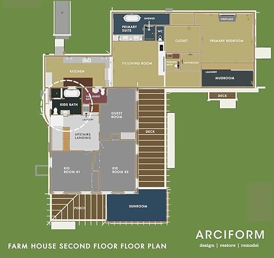 The Original Bathroom
 The upstairs bathroom had a nice layout before its latest renovation in the 80s or 90s, which we were able to work with…this is ALWAYS the goal with bathroom renovations because as soon as you start moving plumbing your budget takes a nice hit, so we were thrilled. They had redone it in the 90s and they did a tasteful job. Admittedly this bathroom could have been just updated, but once we looked closely there were some quality issues with the tile install (not a big deal, but a pet peeve of ARCIFORM) and for me I selfishly wanted it to go with the rest of the house. Once we realized that the whole house was to be gutted for all new electrical and plumbing, we felt that this room should be updated too. I’ll be honest in saying that this is not the earth-friendly decision to make, but it’s simply what we wanted to do. It just didn’t feel like it was of the same quality as the rest of the house. Hopefully, we can all agree (ha) that we made the right decision.
We kept the identical layout to A. save money and B. because we liked it.


We also felt that having a separate bath and shower is cute (and my preference) and it seemed right for two kids (even if they don’t bathe at the same time – we designed this bath when the kids were 4 and 6 so hilariously now that they are 6 and 8 we have exited the era of shared baths or showers). I love an enclosed shower room, and a freestanding tub, obviously – not only is this visually the most interesting, but it feels vintage and sweet.


We were able to salvage and donate the toilet, pedestal sink, and medicine cabinet and we are reusing the tub somewhere special that I can’t wait to tell you about (it involves a hose and cold plunging).
The Layout
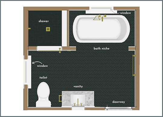
Since we weren’t relocating any fixtures and plumbing we were left with focusing on the aesthetic design vs. layout design. We knew we wanted it to be a little whimsical but still simple, airy, and quiet. The kids were insistent on color so we brought in this dark green they both loved.
With our wish list in hand, ARCIFORM came back with the first round of designs. I knew I wanted to do this elongated picket from Pratt + Larson because it mimicked the diamond pattern in the original windows.
First Round Of Designs
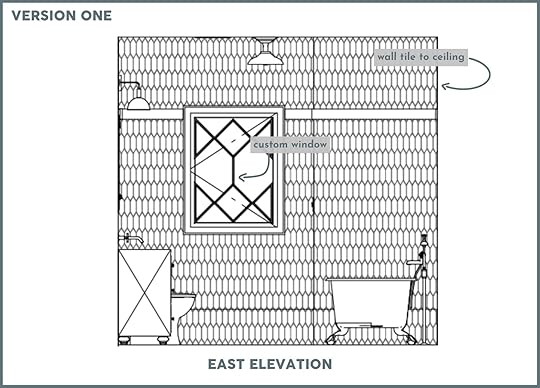

It was a LOT of tile in that picket shape that I felt mimicked the diamond pattern of the original windows on the second floor. The windows in this room were simple and on the smaller side so we had plans to customize them to be more special.
There was a lot to love from the first round of designs but we wanted and NEEDED to change a few things. This is typical…So often something that looks FANTASTIC in your mind’s eye but doesn’t land when put to paper (or computer) so this back and forth process of plans and renders is so helpful.

 The Custom Window Debate
The window on the left is not original to the house, but it’s real wood from the 1990s when they renovated (we think) and in fine condition. They might have added the one behind the tub as it’s kinda awkward from the exterior (but there weren’t really architects back in the day to help guide those decisions so maybe that was the original location from 1910). As we were designing this room I really wanted bigger better windows (this is a pattern with me) and I wanted them to match the wood of the original windows that we were keeping. Anne helped design these stunning windows in the renderings and I obviously approved them. We sent them off to be quoted by their other company Versatile, who would have executed them to match the originals. We know that super customized windows can be VERY expensive, so when they came back at $5k each we should have not been surprised. So we thought about it for a cool 10 minutes and realized that this room would be beautiful either way and that we simply didn’t have $10k in the budget to spend on windows in our CHILDREN’S bathroom. So while I was sad to see them go, and I think the room would have been more beautiful with them, we simply couldn’t do it. Also installing new windows isn’t free either – so it would have cost another $1k – $2500 in labor to reframe the wall to handle larger windows and then install them. No new windows in this room (and yes at times I regret not finding a vintage diamond picture window for behind the bathtub like I did for a couple other spaces – oh well).
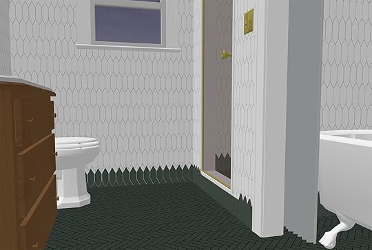
A Bathtub Niche
We also brought the tile down to the height of a wood railing (about 3/4ths up the wall). We felt that this just broke it up and allowed us to have a peg rail in certain areas of the room.
YES, there is a tile border on the bottom, almost like a baseboard…but with teeth 🙂 I came up with this idea a year and a half ago – to bring the floor up into the wall a bit and give it a bit of whimsy. Sometimes I fear that some of my early ideas live in a different house now, but other times I’m so excited to have some rooms look more special with some risks. In-person we love it (head to Instagram stories to check it out).

Now that I’m looking at the niche with the curtains it does seem like it’s going to be crowded in there, hmmm, but I can always nix the curtain. I could have kept it open without the casing around the opening to create the niche but I like the idea of it being a little cozier. We’ll see 🙂 Right now that curtain looks super boring but I have plans for it to make it fun and whimsical.
 Shower Room

 The Vintage Vanity
We talk a lot about design rules and how sometimes you need to break them. This is because when done right, the unexpected design choice can be the one that makes the whole design feel special, feel GAH! So, that being said, we have this vintage chest, and as you can see it has gotten A LOT of love and use in our home over the years. It’s pine, with sweet little key holes and for whatever reason, I decided a year ago to make it our vanity. It’s going to be SO CUTE, if not a little impractical (not a ton of storage) but they’ll live.


Now some of you may have a hard time with what you are about to see…so prepare yourselves. We had Jamie from ARCIFORM template out a space for an undermount sink, cut a hole in the top of the dresser, and brace a sink from below. I promise it will be worth it!!! We will lose the full use of the top drawer and 1/2 of the second drawer to house the sink and plumbing, but will still have storage for the everyday items in the sides of the second and bottom drawers. I hope. How much storage do kids actually need right???


One of the many things we love about this piece is the curved corners and beveled edge and we wanted to figure out a way to keep that profile. Enter Anne with a clever and cool idea. She suggested we KEEP the original top and ADD a stone top with the same curved corners and beveled edges but inset 1/2″ creating a tiered effect/a RAD but subtle design moment. I also REALLY wanted a stone backsplash somewhere in this house because it is so classically “English Farmhouse” and this bathroom was the only one that stylistically made sense (but we have gone back and forth on this).

Since the top is so special we felt the backsplash should be too, initially the design had it going the length of the vanity with a small curved shelf ledge at the top like this …


It didn’t feel quite right, so then Brian had a great idea during one of our design meetings that everyone agreed worked…so this is the final backsplash design…special, unique, and works so much better with the lines of the room. We had a momentary red flag this week that we’d need to nix the stone backsplash as it might push the wall-mounted faucet out too far but Jamie re-measured and we are all good. We could absolutely have had the faucet come straight out of the tile but this way it looks more like a basin, like a found piece.


The stone for the top and backsplash is a beautiful calm Carrarra Marble from BEDROSIAN. We went back and forth on what type of material to use and ultimately decided although it is a natural material that will require some care and maintenance, marble would really look the best. I do want to warn you that there is VERY little counter space. We’re going to add some vintage wall mount cup holders for toothbrushes/toothpaste and Elliot might need a vanity in her room when she gets older. Likely going to get a train rack for above the toilet to add storage, too.
Medicine Cabinet/MirrorThe way they framed behind the vanity wall only allowed for a 14″ wide medicine cabinet and we didn’t want to have to reframe and re-drywall (and there are so few medicine cabinets that wide) so we nixed it and will find a mirror. Stay tuned on that.
Kids Design Plan Product Board
1. Fairview Two-Light Wall Sconce | 2. Eastmoreland 4″ Fitter Semi-Flush Fixture | 3. Kohler Kathryn Toilet | 4. Tolson Wall Mount Faucet | 5. Tolson Toilet Paper Holder | 6. Tolson Single Hook | 7. Lewis Push-Button Switchplate | 8. Double-Ended Clawfoot Tub | 9. Tolson Single Towel Bar | 10. Large Picket Tile
The lighting and plumbing are all from Rejuvenation and I love how playful this Tolson line is (while still being solid). The tub is not silver – it’s brass. We have a herringbone on the floor of the bath, a hex on the floor of the shower, and an elongated picket throughout (in green and white). All from Pratt and Larson.
I’m loving how it’s coming together and I have a few surprise design elements.
That border in person is a real surprising yet subtle moment that I’m so glad we did. I almost nixed it a few months ago, worried that this bathroom would be really different than the others, but the tile and the plumbing all work together, so doing an element like this is just extra fun for a kids bath.
I feel like I’ve shown you too much but don’t worry – again, we have a few surprise elements. Besides I’m sure that many of you are going to be very curious if this whole tile border thing will actually work IRL. Here’s to taking some design risks and hoping they pay off!
The post Our Kids Shared Bathroom Design Plan – A Tile Border? A Dresser As Vanity? And Just Maybe Not Enough Storage… appeared first on Emily Henderson.
June 14, 2022
Rules For Picking a Coffee Table (+ 85 Of Our Favorites for Every Space UPDATED)


We were noticing that this was a post that a lot of people have been looking at recently so we thought let’s just put it up at the top of the blog again! Picking out a coffee table is something that you think you just instinctually know how to do… until it’s time to find one. That’s why we made this post so you don’t have to guess what size, shape, or type you need to make the perfect sofa match. Enjoy this quick little republish with updated shippable picks. xx
The coffee table. So functional, so often an afterthought. Sofas get all the living room glory, and sure they keep us comfortable. But the coffee table is the workhorse of the living room. It holds our drinks, remote controls, beloved tech devices, treasured trinkets, and, for better or worse, our take-out dinners at the end of a long day. It occasionally doubles as a stool (which we’re not endorsing, for legal reasons, but we won’t deny having done on occasion), a desk, or a craft table. With such a big, diverse job, you’d surmise that it would be one of the first furniture pieces you thought about when moving into a new place and/or re-decorating… except it’s usually not.
How many hours do we put into choosing the perfect sofa, the perfect rug, the perfect chairs for our living room…only to throw in a hand-me-down coffee table that used to belong to Aunt Susan? (bless her heart). Okay, we don’t all go down the who-cares-about-a-coffee-table route. Plenty of you have definitely belabored the choice of a table, we’re sure, but regardless of what side of those scenarios you find yourself, you might need some guidance or inspiration in the coffee table shopping department. What size and shape go with what sofa size and shape? It might feel like a shot in the dark, but fear not, we’re here to help. We’ve put together a shopping guide with all the best coffee tables we could find—round, square, rectangular, oval!—and a few rules to keep in mind (with a diagram!) when choosing a coffee table.
First up: rules. While you can, of course, go with whatever shape and size you like, to have an ideal relationship between your coffee table and sofa, here are some general things to keep in mind: Your coffee table should be at least half the length of your sofa (but no more than roughly ⅔ the length) and should sit at about the same height as the seat, give or take 4 inches (i.e., if your sofa is 90-inches long and 20-inches tall, you should look for something, no matter the shape, that’s around 45 to 54 inches wide and 16 to 24 inches tall). However, if you have a sectional with a chaise, and your table is going within the open L-shape that sofa shape creates, that 1/2 to 2/3 guideline applies better to just the length of the horizontal seat, rather than the full length of the sofa. Here’s a quick graphic to show you what we mean, as well as a breakdown of ideal shapes by sofa configuration:

For more living room-specific tips, see this post where we broke down tons of super helpful tips like how much space you need around a table, rug size rules, lighting guidelines and more.
Once you figure out the right size and shape, after that, it’s more about making the right design choice for your space. Rectangular and oval-shaped coffee tables can almost be interchanged, depending on what kind of flow you’re looking for—same goes with round and square. Let’s break it down a bit further (with the bonus of our favorite shopping picks):
Rectangular photo by tessa neustadt | from: mel’s living room reveal
Consider rectangle (or oval but more on this shape next) if you have a standard sofa (or an extra-long sofa with chaise) so everyone can have easy access to their coffee, cocktail, or late-night snack of choice. This is also a great choice if you have a narrow space with minimal walk-around clearance. If you’re a household with more remotes or tech cords than you can count, think about getting a table with some functional but still sleek drawers like #1, #4, #18, or #21. It’s hard to see in the photo, but the table at #2 has a shadow box top (that’s great for putting in your favorite curiosities and trinkets but still having plenty of surface area for you know…real life stuff. Oh, and if you regularly eat in front of your TV (whether by choice or because you don’t actually have a formal dining area), a lift-top coffee table is super useful for not having to hunch over your plate (#10 and #20).
1. Shaw Walnut Coffee Table | 2. Shadow Box Coffee Table | 3. Pedestal Wood Coffee Table | 4. Tvilum Diana Coffee Table | 5. Logan Industrial Coffee Table | 6. Marisol Coffee Table | 7. Mabel Coffee Table | 8. Grey and White Marble Coffee Table | 9. Savi Striped Inlay Coffee Table | 10. Naya Pop-Up Coffee Table | 11. Blake Raffia Coffee Table | 12. Corbyn Coffee Table | 13. Elemental Layers Coffee Table | 14. Turned Leg Wood Coffee Table | 15. Nordcasa Coffee Table | 16. Lakin Recycled Teak Coffee Table | 17. Gold Metal And Glass Aurora Coffee Table With Shelf | 18. Bios | 19. Leon Burl Wood Coffee Table | 20. Mid-Century Pop-Up Storage Coffee Table | 21. Rosamonde Coffee Table
Square photo by zeke Ruelas for ehd | from: ginny’s living room reveal
If you have a large comfy sectional or the traditional conversational set up with a sofa and a couple of chairs (kind of like Ginny’s living room above), a square table is a great choice. It fits perfectly in the L-shape nook of your sectional or the big space in the middle of your chat zone. The best part of a square table? You get the most styling space bang for your buck. Who doesn’t love a well-styled coffee table vignette? We really like the mix of the square top and round base of table #1 or #18 for a play on shapes. Similar to the shadow box table we talked about in the previous section, #2 from IKEA has a drawer with four sections, and the glass top lets you see all the pretty things you decide to store (definitely not the best option if you know you’ll just end up junking up that drawer with remotes and catalogs, though).

1. Square Flash Table | 2. Liatorp | 3. Profile Square Coffee Table | 4. Plywood Grid Cocktail Table | 5. Blake Rafia Square Coffee Table Indigo | 6. Vena | 7. Vaneri Wood Corner Table | 8. River Heights Square Wooden Coffee Table | 9. Streamline Square Coffee Table | 10. Rebar Coffee Table | 11. Gridiron Stainless Steel Coffee Table | 12. Chadwick Mid-Century Square Coffee Table | 13. Cabot Square Coffee Table | 14. Reclaimed English Beam Square Coffee Table | 15. Square Metal/Glass Open Shelf Cocktail Table | 16. Handmade Cube Low Square Coffee Table | 17. Lisabo | 18. Culver Square Coffee Table
Round photo by sara ligorria-tramp | from: reveal: arlyn’s bright & happy rental living room makeover
For anyone living in a small space where every piece of furniture counts, think about cutting corners (literally) and going with something round. It’s also a good choice to pair with a sectional or sofa with chaise since it’s a good “nook” shape, i.e. it fits into a little nook of space nicely like in my (Arlyn’s) living room. Another hot tip if space is at a premium or if your room is already busy is to consider a glass top like #9. This helps things appear more visually open—if you don’t see it, is it really even there? Speaking of smaller spaces, storage is NEVER unwelcome in a tight room, which is why we really love #10, #11, and #17 for their deep, hidden-away storage (great for stashing hobby items, toys, and more). Round coffee tables also seem to have a bit more fun (the blondes of the table world??), so why not cash in on the availability of options for something more sculptural like #4, #6, #16, #20, and #21? But also look at those rattan stunners – #2, #7, and #15 (does this one ring a “trend bell”??)

1. Noir Tiered Coffee Table | 2. Rosie Coffee Table | 3. Gweneth Round Coffee Table | 4. Turn Coffee Table | 5. Shaker Coffee Table | 6. Spoke Marble Coffee Table | 7. Pyronia Rattan Cage Coffee Table | 8. Cap Ivory Cement Coffee Table | 9. Round Glass And Metal Ilene Coffee Table | 10. Drum Storage Coffee Table | 11. Burl Rotating Coffee Table | 12. Cala Hammered Coffee Table | 13. BORGEBY | 14. Milking Table LAX Series | 15. Round Natural Ribbed Rattan Cyrus Coffee Table | 16. Betania Petite Coffee Table | 17. Turning Table | 18. TROMSO | 19. Annabel Round Mango Wood Coffee Table | 20. Anya Travertine Coffee Table | 21. Santoro White Quartz Coffee Table
Oval photo by tessa neustadt | from: experimenting in my living room: trying to find “the” rug
Oval is a good call if you have some small humans running around and want to attempt to avoid any face-to-table sharp-edge encounters (round is also good for this). If your living room is a high-traffic area (like, do you have to walk through it to get to another space like the kitchen or dining room?), a more sinuous shape helps with visual flow, as well. It accomplishes the same look as a rectangle but softens a really angular or modern sofa. The classic mixed marble and wood design (#1) is a favorite around here (check it out in Emily’s living room here). The thin legs keep it light and floaty (which balances the heavier wood at the bottom). Of course, the Platner table (#5) and the brass table from Brady’s living room (#7) are perfect if you love a modern design classic. However, if you’re into making a bit more of a statement, check out the table from West Elm at #11; it has a postmodern-inspired vibe that could add a serious cool factor to a simple, stripped-back living space.

1. Thomas Bina Olivia Coffee Table | 2. No No Table | 3. Bordeaux Coffee Table | 4. Palais Ovale Coffee Table | 5. Platner Coffee Table | 6. Wood Coffee Table | 7. Massenburg Coffee Table with Tray Top | 8. KÅSEBERGA | 9. Mid-century Modern Coffee Table | 10. Nova Oval Coffee Table Black | 11. Organic Modular Table | 12. Olivia Storage Coffee Table | 13. Stockholm Oval Coffee Table | 14. Nero White Marble Oval Coffee Table | 15. Clairemont Oval Ebonized Coffee Table
So…what else do you wish you had guidelines for? We’ve done a handful of posts with tons of rules by room, but how would you want us to drill down deeper? What do you struggle with regularly while decorating that you want some signature EHD how-to post action on? As always, let us know in the comments.
Since you’re already riding high on design guidelines, here are some more posts that might be helpful:
Design Mistakes: Hanging Curtains All WrongLiving Rules to KnowDining Room RulesBedroom Design RulesMy Top 3 Design Rules. Ever.Check out more HEREOpening Image Credit: Photo by Tessa Neustadt for EHD | From: How to Add Style to a Neutral Living Room
The post Rules For Picking a Coffee Table (+ 85 Of Our Favorites for Every Space UPDATED) appeared first on Emily Henderson.
June 13, 2022
How To Make Your Kitchen Look And Feel Better With These Easy Decor Swaps
Jenny Han once wrote, “Everything good, everything magical happens between the months of June and August.” As a true blue Gemini (my birthday is actually today if you can believe it) I couldn’t agree more. Summer is where it is at. It’s the only time of year that you’ll see me happily chopping veggies for a summer salad and humming to myself as if I am in a silly little rom-com. For me, summer is, against all odds, the one time of year I really enjoy being in the kitchen. It’s truly magic because any other time of year I actually avoid being in the kitchen at all costs, hating the act of even turning on the stove to make an over-easy egg. But since summer is officially here, I am in the kitchen more (hold for applause) and it really got me thinking…How can I enjoy this time more and potentially learn to enjoy cooking once fall is around the corner? The answer I found is simple. I need my kitchen to look better. You know the saying “look good feel good”? Well, surely if my kitchen looked a little prettier, I’d feel good about spending more time in there, and in turn, become an amazing cook overnight. It’s SCIENCE.
As a renter, I am nowhere near renovating territory, but the goal is to make the kitchen look better, not perfect. I (and you!) can style and decorate a kitchen so it looks good despite dated tile and overhead lighting that is unfortunately here to stay. How you ask?? That’s what past EHD projects are here for, so we can study and learn from the best. So are you ready for some styling tricks that are guaranteed to make your kitchen look better? Me. too. Let’s get into it.
SWAP: Use A Rug Instead Of A Mat design and photo by sara ligorria-tramp | styled by emily bowser | from: sara’s galley kitchen “update” turned into a Full renovation (and the result is well worth the wait)
I remember when I finally got the right rug for my living room. It instantly changed the look and feel of the room and made it feel more complete. Do you mind if I say that rugs are like a good pair of shoes?? Because just like shoes can make an outfit, a rug can really pull together a room. So, while a waterproof kitchen mat totally works, you can replace that mat with a durable rug and just like that your kitchen has a new pair of shiny shoes!
The kitchen gets a lot of traffic and life teaches you that spills do in fact happen, so you should opt for a forgiving color and pattern. We suggest vintage Persian rugs because they have a perfect, worn-in look which can help hide stains and general wear and tear. There are also really great non-vintage options like this one that can eliminate the fear of total destruction and make your kitchen look (you guessed it) so much better. Rug tape is also key so that you can keep the rug from sliding around, and a rug pad underneath will make your feet feel like they are stepping on a soft buttery cloud (which is much deserved when washing dishes).
 design by velinda hellen design | styled by emily bowser | photo by sara ligorria-tramp | from: velinda’s first freelance client reveal: molding the ‘builder-grade budget’ + where they saved & splurged
I love the above kitchen by Velinda Hellen Design for so many reasons and that rug choice is one of them. They chose a rug that incorporates the cabinet colors and other accent colors that pulls in the decor from the rest of the room. If you have colored cabinets, adding a rug is a nice way to accent that color to make them pop even more.
Here are some great vintage-inspired options but for real vintage rugs head here.
1. Hand-knotted Brown Rug | 2. Julianne Hand Tufted Rug | 3. Kamran Hazel Rug
SWAP: Replace Your Regular Fruit Bowl With A Footed Bowl design and photo by sara ligorria-tramp | styled by emily bowser | from: sara’s galley kitchen “update” turned into a Full renovation (and the result is well worth the wait)
If you have the space for a fruit bowl on your kitchen counter, it’s a great way to add color and depth (I love using lemons and oranges). A low bowl is still cute and will get the job done, but we highly suggest a footed bowl because it will add height and a more interesting shape. A regular bowl can sometimes look like a bowl that’s been left on the counter for unknown reasons until you see the fruit in it, whereas a footed bowl always looks intentional. In the above kitchen, Sara went with a wooden footed bowl which adds height, texture, and warmth. A triple whammy!
 design by velinda hellen design | styled by emily bowser | photo by sara ligorria-tramp | from: velinda’s first freelance client reveal: molding the ‘builder-grade budget’ + where they saved & splurged
I’ll award bonus points if you go with a marble-footed bowl like the one in the above kitchen designed by Velinda Hellen Design. Indeed, the great thing about these bowls is there are so many sizes, shapes, and textures to choose from. Here are some of our favorites:

1. Corbin Footed Bowl | 2. Lotta Pedestal Bowl | 3. 10.1oz Rubberwood Pedestal Serving Bowl
BONUS TIP: Don’t Forget To Style The Space Above Your Cabinets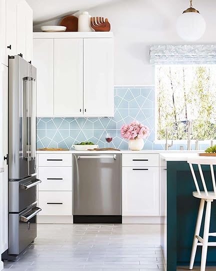 design by orlando soria | photo by zeke ruelas | from: the casa soria kitchen reveal (+ 5 things i would have done differently if it were my kitchen
Last year, Mallory blew all of our minds by posing the very brave question “what do you do with the space above your kitchen cabinets?” It is a space that is oft forgotten about but it can be a great place to display collections, art, beautiful bowls, books, plants, you name it. I have definitely noticed that my kitchen gets the least amount of styling attention but in reality, there are so many fun ways to (say it with me) style, play, every day in your kitchen. If you have less counter space but an ample amount of space above your cabinets, don’t skip this styling hack.
 photos by tessa neustadt | from: emily’s kitchen reveal
Another great thing about above the cabinet styling is it will draw your eye up and make your kitchen look bigger. It can also simply act as storage space if you put a wicker or wooden basket up there like Emily did in her Glendale kitchen. That’s what we like to call style and function, my friends.
SWAP: Hang A Mirror In Place Of Art design by jess bunge for ehd | photo by sara ligorria-tramp | from: jess’ kitchen reveal
You probably know by now that you shouldn’t skip art in the kitchen. In fact, one of Emily’s favorite unexpected styling hacks is to hang art over a tile backsplash (you can learn more about that here). But if you want to change it up a bit or if you simply have a killer wall mirror you want to display, why not hang it in the kitchen? It’s unexpected and can help a darker kitchen feel brighter or make a small kitchen seem bigger.
 design by with love from kat | via domino
 We love a leaning art moment and lo and behold, a leaning mirror looks just as good (if not better). If you want to try the mirror look here are some great picks:

1. Asymmetrical Mirror | 2. Moroccan Mirror | 3. Peruvian Wall Mirror
BONUS TIP: Use A Tray For Everyday Cooking Items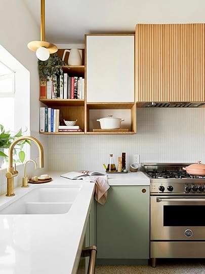 design by velinda hellen design | styled by emily bowser | photo by sara ligorria-tramp | from: the 3 best ways to save $$$ on your kitchen reno (+ our ehd alumns’ first reveal as a new boutique team)
We are big advocates for trays in every room. Have a coffee table? Put a tray on it! Your dresser is looking a little dull? Put a tray on it! Similarly, if you want your kitchen counter to look nicer and spark some joy, a tray can really help get you there. Minimalists might disagree, but we like having our olive oil, salt, and pepper out because they are used so often. This can appear messy and cluttered but a tray can make it look styled and intentional. Another trick? Put your olive oil in a clear glass decanter and watch magic happen before your eyes as your kitchen counters look instantly more chic.
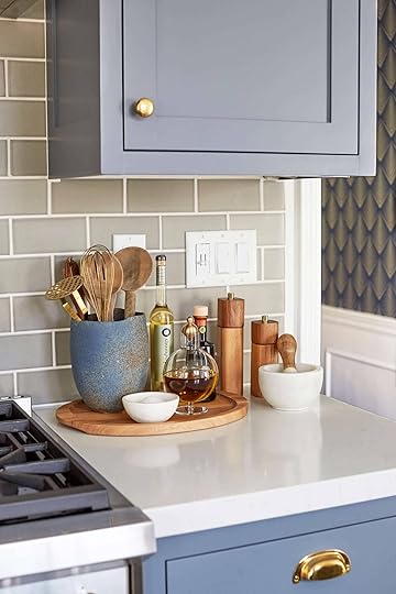 photo by zeke ruelas | from: modern deco kitchen reveal
Again, a tray can make everyday items look styled and sophisticated. If each of the above items were simply placed on the counter near each other someone might think “hey, how about putting some stuff away??”. But with a tray in place, it is clear that those items are exactly where they should be. Also, how incredible is that oil decanter? I am drooling.
If you are looking for a pretty tray, here are some great ones:
 SWAP: Add Greenery With Fresh Herbs Instead Of Cut Flowers
 design by cassandra laValle | photo by ellie lillstrom | from: cassandra laValle’s basement kitchen reveal
Plants will liven up any room but in the kitchen specifically, fresh herbal plants add a hint of greenery and are very useful to have on hand. Having a mini indoor garden of fresh herbs will make your kitchen feel good too. Imagine this: you are making a homemade pesto sauce and you simply pluck from your fresh basil plant to create the delicious concoction?? That’s heaven.
SWAP: Ditch Always Using Your Overhead Lights And Get A Cute Lamp design and photo by tessa neustadt | from: the reveal you didn’t know you were waiting for
Remember when I alluded that I have very dated ceiling lighting in my kitchen that is unfortunately here to stay? Well cat’s fully out of the bag because it’s true. We have very aggressive looking track lighting that I am not the biggest fan of. So it goes. What I did to mitigate this was add a cute lamp to distract and it really did help with the look and overall feel. The track lighting is harsh and bright but our lamp gives off a calmer, more subtle light which I love. A lamp is a cute accessory and can help soften the light in the room if that’s what you are going for.
 design by laura stephens | via domino
How great is that lamp?? If that shot doesn’t make the case for lamps in the kitchen I don’t know what will.
Here are some lovely options:

1. Polyresin Mini Table Lamp with Circle Base | 2. Scrunch Table Lamp | 3. Seta Wicker Table Lamp
BONUS TIP: Create Some Open Shelving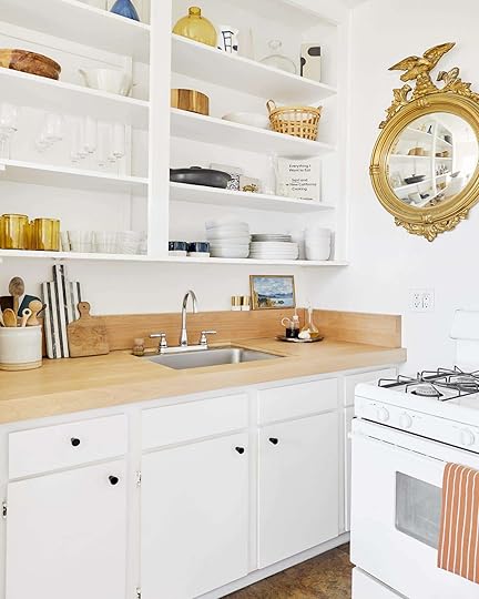 design by jess bunge for ehd | photo by sara ligorria-tramp | from: jess’ kitchen reveal
I will likely never stop talking about this hack by Jess. She took the cabinets off in her rental kitchen to create some open shelving. It’s so innovative and is something pretty much anyone can do which is why it’s my favorite trick. All you need to do is take off the hinges, sand and paint over the holes and what you’ll end up with is a place to display all your pretty cups, bowls, and even tiny pieces of art. It’s low risk and will give your kitchen a custom look for so much less.
 design by corre marie | styled by velinda hellen | photo by sara ligorria-tramp | from: the new design rules
If you want to keep your closed cabinet space because your dishes aren’t all display-worthy (same here) then you can always consider adding a few ready-made shelves. In general, it’s nice to have a mix of open and closed storage because it can make the space feel more airy and create visual interest.
Here are some shelving options we love:

1. Luciana Wavy Wall Shelf | 2. Marble Wall-Mounted Shelf | 3. Linear Raw Mango Wood Shelf 2FT
9. Treat Yourself With New Hand Towels design by jess and tyler marés | photo by jess marés | from: a diy kitchen renovation in two parts
At the very least, if you just want to make a small but effective difference in your kitchen new hand towels can do wonders. Is your kitchen feeling a little bland? Get some colorful floral towels like the above kitchen to bring in some pattern and a pop of color. If your current towels are a little dingy and sad (same here) replacing them with fresh new ones might just spark a newfound love for washing and drying dishes (ha!). And old hand towles are great cleaning rags so dont throw them away! Here are some fun options:

1. Pienet Elokuun Varjot Kitchen Towel | 2. Baker Stripe Dish Towels, Set of 4 | 3. Dusen Dusen Set of Striped Hand Towels and Washcloth
Now that’s a wrap ladies and gentlemen. I am off to go chop some veggies, throw them in a bowl, and call it a salad. I hope you now feel confident and prepared to make your kitchen look not just better, but feel GOOD. Because honey, you deserve it not only this summer but all the seasons to come. Happy Monday! xx
Opener Image Credit: Design by Velinda Hellen Design | Lead Designers: Grace De Asis & Julie Rose \ Styling by Emily Bowser | Photo by Sara Ligorria Tramp
The post How To Make Your Kitchen Look And Feel Better With These Easy Decor Swaps appeared first on Emily Henderson.
June 12, 2022
The Link Up: Em’s Early Summer Reading List, Caitlin’s “Nora Ephron” Breezy Pants, And The Sustainable Shoe Brand We Are Buying From

Well, we just had A BLAST at The Meridian Experience Weekend that the incredible Albie single-handedly organized. It was a HUGE undertaking and to no one’s surprise, she nailed it. We couldn’t have been more grateful to be a part of it and meet so many truly inspiring new friends. If you were curious about it/wanted to go, we highly recommend going next year. We hope that y’all also had a good week and are now ready for some links…and pics:)
 design by heidi caillier design | photos by haris kenjar
This week’s home tour is designed by the incredible Heidi Caillier. In this single photo, you can see four spaces and while they are all so different, they perfectly talk to each other with the use of similar colors, woods, and shapes. It’s just an awesome and inspiring home that we highly highly recommend you take a peek at:)
From Emily: I have three summer/beach, easy, can’t put down novels that make you feel warm and happy (should you feel like reading about love and romance). I recently fell in love with Christina Lauren which FUN FACT is actually two people – friends, one’s name is Christina and you guessed it, the other is Lauren. These books have really good banter and wit – not LOL but just people who I like to think I’d be friends with. I wonder if having two friends writing together helped it read better and dare I say even deeper. Not that it goes super literary, but it’s just efficient and yet thoughtful in the right ways. They are rom-com style books, not overly erotic but no creepy dead child mystery which I find is the best for my anxiety (I don’t have anxiety typically but a lot of those “girl in the window across from the lake” style thrillers would make me feel unsettled before bed so I just don’t go there anymore). I think that this duo writes books that I can jump into within the first page, and get lost in. I started with The Soulmate Equation (Kindle and Local), then Love and Other Words (Kindle and Local), and just started Something Wilder (Kindle and Local) this week. Don’t worry – I mixed in Malibu Rising (Kindle and Local) in the middle (which I LOVED), Book Lovers (Kindle and Local), and am starting Seven Husbands of Evelyn Hugo (Kindle and Local) after this one. There is no shame in my summer kindle novel game
From Caitlin: OH BABY. This week I met up with a friend who looked SO chic and relaxed and pulled-together – like a character in a Nora Ephron movie – and I lost my mind over her gauzy textured pants, which were SO soft and lightweight and flattering. I thought they’d be pretty expensive (they looked luxe, despite the tie-waist) and I was THRILLED when I learned that they were under $100 and that they come in 5 different colors, 3 different lengths, and in sizes XX-small to XX-large. They’re breezy and perfect for summer but they don’t necessarily wrinkle in the same way that linen does, which makes them even better in my book. I ordered a pair in black buuuuut I have my eyes on the sage, too (fingers crossed they go on sale soon!).


From Mallory: My sister eloped in Vegas last weekend (IT WAS SO MUCH FUN) but I realized I didn’t have a good clutch that would hold my phone, lipstick & credit cards…I realized I was running out of time to grab one in-store, but thank god this $11 purse showed up in the nick of time. If you’re going to a fancy event and thought about your purse way too last minute (and you don’t wanna spend a lot of money because you already bought a new dress/outfit…) then this one is for you (I got it in apricot but it comes in like 10 different colors too). If you want deets on my dress and shoes I also go them VERY last minute from Amazon (honestly this whole look was “primed”). The dress was $50 and I got it hemmed for the vegas look. It did in fact shed A LOT and the feathers will get stuck in your armpits if it’s hot but I don’t think I could have found a better dress for a Vegas elopement. Then the shoes I really would recommend…super affordable and great for summer! They got me through the wedding to the reception and to the vegas clubs and a late-night taco bell cantina. All in all a very successful outfit for a very fun time:)
From Ryann: I cannot stop making this sandwich that has been all over my Tik Tok feed. It’s called the Grinder salad sandwich and is a) easy to make b) delicious and c) tricks my fiancé into thinking I am a good cook. I’ve had versions of this type of sandwich many times at sandwich shops but when I realized I can make it so easily at home and it actually tastes restaurant quality, my mind was a little blown. You can really use any kind of cheese and cured Italian meat but I’ve been doing turkey, salami, and spicy salami but the real star is the salad dressing that’s just mayo, red wine vinegar, garlic, oregano, salt, and pepper. You mix that all together with iceberg lettuce, red onions, and banana peppers and layer it on your sandwich and wow… it’s unreal. I think you can easily make it for a bunch of people and would be perfect for a pool party or beach day. I don’t know what else to say other than try it and thank me later!!
 the dress! and the mess i need to sort through…
From Jess: Speaking of weddings, a huge and exciting shift on the wedding guest dress plan! This past weekend was a big step in my adulthood (she says very begrudgingly) because I was forced to get a storage unit. More on that in a minute. One very exciting outcome was finding one of my mom’s old dresses that’s perfect for my friend’s wedding (shown above)! So since my dress was now going to cost $0, I decided to get a very dreamy pair of shoes. I really wanted a camel-colored shoe and ideally one with a cool shape. Enter these puppies. I love the weird heel (that won’t sink into grass), the square toe, the delicate straps, and the cool chain strap detail…so all of it. FYI I really wanted an ankle strap because I am a dancing queen at weddings and a mule wasn’t going to cut it. I know you won’t see most of it since the dress is long but these are FUN going out shoes that can work with a ton of different outfits. Also, I love the brand’s (Alohas) sustainability mission. If you don’t know about them I highly suggest you check them out! Em’s blue cowboy booties are from them too:)
Also From Jess: So yes, I now have a small storage unit because my dad is downsizing his company’s warehouse where all of our family stuff has been for years. Honestly I’m lucky to have had access to it for as long as I did. But without a home large enough to hold the things I still want (ie family heirlooms, photos that I plan on digitizing this year but still will keep, American girl dolls, etc.) I needed to get over the idea of paying for storage for an unknowable amount of time. Cool cool cool. Now, I NEED ADVICE! Any tips on the best way to store clothes? Vacuum Sealed bags? Any other general long-term storage tips? I want to do this right and preserve everything as best I can.
That’s it for this week. Hope the rest of your day is great and see y’all tomorrow. xx
Opening Image Credits: Design by Heidi Caillier Design | Photo by Haris Kenjar
The post The Link Up: Em’s Early Summer Reading List, Caitlin’s “Nora Ephron” Breezy Pants, And The Sustainable Shoe Brand We Are Buying From appeared first on Emily Henderson.
June 11, 2022
All The Questions Answered About How I Get My “Natural” Looking Spray Tan…

This was a post I wrote waaaay back in early 2020! It was meant to be “winter content” as it’s harder to get a tan from the actual sun when it’s cold outside. But as I’ve been talking with my team we just aren’t into the whole “sit in the sun and bake” idea anymore. Protecting our skin and health is pretty important to us but that doesn’t mean we want to totally forgo that tanned glow, right? So we thought that reposting this VERY important and practical content might just be what some of y’all want. Enjoy:)
My team has heard me reference spray tanning for years and when we were brainstorming our lifestyle content for February, they all begged me to do a post about it because they are all curious and want try, but they are scared. So today I’m answering all their questions about how I get my “natural” spray tan in the middle of winter, for under 4 minutes and around $16. I’m not saying you should do this, nor encouraging the idea that tan skin is better than pale – no weird skin shaming here. But, like covering grays or straightening hair, it is something that some people do and even more people are curious about. And while it’s innately driven in a superficial (literally skin deep) way, I think most of us can relate to the confidence boost we get when we are looking healthy and pulled together – whatever that looks like to you. I’m an expert in it (the spray tan, not the “pulled together” look), so get ready because I’m about to drop some spray tan knowledge.
Let me walk you through it all …
WHAT IS A SPRAY TAN?A spray-tan is a liquid formula with DHA that when sprayed evenly makes you look like you’ve been in the sun and you feel all glowy. There are many levels and tones and indeed you might want to experiment before say, your red carpet walk or your wedding. The same formula can also be in a lot of tanning lotions (we’ll get to that later).
There Are Two Types Of Spray Tans: “Airbrush” And “Booth”.Airbrush means a real live person actually sprays you *naked* either in a pop-up booth in your home ($50 – $100 depending on where you live and level of experience) or at a salon ($60 – $80). It’s highly embarrassing but you will get a much longer-lasting tan that might look more natural and it’s, ahem, thorough. If you are in LA, I recommend Brittany from Be Bronze Studio.
A “booth” is literally a vertical booth that you stand in and nozzles go up and down and spray you evenly on your front and back. It is faster and more affordable – I have a $60/month membership at a non-fancy place and I go once a week (thus the $16 – it’s likely around $30 if you just buy one). It takes me between 4 – 7 minutes from start to finish (I know because I’ve timed myself SO MANY TIMES while I’ve made Brian wait in the car). There are two major brands of booths – Versa and Mystic. As I’m writing this I literally had no idea how much of an expert I am. I much prefer Versa because it’s more natural and much faster. There are typically 3 different levels of Versa that differ in intensity (and differ from booth to booth). I typically do level #2 bronze (the difference between bronze and clear is that they both give you a tan but “bronze” gives you an immediate glow that will yes, get on your clothes and sheets, and “clear” doesn’t show up for 8 hours, but since I like instant gratification I get bronze).
What do I do before a spray tan? Any prep?You want to be clean, but not crazy exfoliated because it won’t stick as well. Around the ankles and wrists it will stick more because those areas are less smooth for whatever reason. Ideally, you shave the day before but I’ve shaven the day of one million times.Don’t spray tan and then mani/pedi or get a blowout, or do anything that has to do with water or it will take the color off your hands/feet/calves and neck…Do NOT get your first spray tan before an important event like a wedding. They can be uneven, too orange, or too dark so test it out, go on Yelp, ask for recommendations. For any special occasion, I get a custom airbrush done to guarantee that it’s a natural tone and it’s even (again, you have to make an appointment, it takes at least 20 minutes and costs about 4 times the cost of a booth in LA, otherwise I would do it all the time). They can even vary from booth to booth within the same brand so test out that particular booth first.You need to wear a loose-fitting dress afterward so it doesn’t stick to your body and rub off your tan (it also feels incredibly gross to put on tight skinny jeans after this – you are sticky and damp for hours). No combat boots either. Think flip-flops or loose sneakers.
There I am the day before the shoot, consider this a “before”. Those are the four poses that you are supposed to do in the booth, and no I’m not psyched that I had to publish those on the internet. I also waited until my last spray tan was totally gone as you can see to do this post, which was QUITE the sacrifice.
 What Happens Once In The Spray Tan Room?Put your barrier cream on your hands and feet (see IGTV on Instagram). Apply liberally, but if you want to do it perfectly google some videos. I’m not the best at it.Put on your hairnet and make sure it’s not too far onto your forehead (true story – I had like a full 1/2 inch tan near my hairline on my whole face once for an entire day). In the winter, I usually put a hairnet on my face too, so that only a bit of it gets on my face. This can make it pretty uneven between my face and my chest, but I don’t love a super tan face in winter (or ever on me). I really just want a tan body, not an orange face.Take off jewelry, at least your necklaces and bracelets (I leave my rings because I always have those on so those tan lines don’t matter).Step on a towel or buy the little foam things to stand on or else the bottom of your feet will be orange for weeks.Get into the booth – NAKED or with whatever clothes you want (but you’ll have SEVERE “tan” lines).Press the button and wait for the robot lady to tell you to move into the above four poses as the sprayer goes up and down 4 times. It then dries you on both sides.
 What Are The DOs And DONT’s After Getting A Spray Tan?You can’t take a shower for 8 hours – that’s the minimum amount of time for it to “activate”.If you see it looking REALLY DARK then wash your face and chest. I think it sticks faster there and it can look dark and really unnatural. I usually don’t shower the next day because I like it to keep activating and get even darker, but you kinda stink and it’s pretty gross.Most people shower the next morning but don’t scrub and don’t use a rag. Just let the water run and you’ll see the brown water of the bronzer go down the drain.You should be careful about having sex for 8 hours, too. I’ve NEVER been in this situation before but I’ve heard from an airbrush person that if “certain liquids” get on it it will indeed take it off if under the 8 hours within that region. That “tan line” is harder to explain in a bathing suit the next day at the pool…You should expect that it will get on your sheets, jammies, pillowcases, and towels. Mine always comes out, but I can’t vouch for your spray tan (it’s the same with most tanning lotions). I will say that if you like your sheets crisp white then you should likely need to bleach them, but again it’s not a huge problem for me.You can go swimming, get a massage, sit in a hot tub, steam room, or sauna but all those things will reduce how long it lasts. I tell you this because usually people spray tan before vacation, so just know the consequences of your fun 🙂 I feel like one day in a chlorine pool takes mine totally off (If I’m on vacation I use St. Tropez at night on my legs and I’m happy – use the mitt).THE NEXT DAY (or 8 hours later):
Yep. There she is. You might say that my legs are tanner than my face and you are right. I could use bronzer on my face if I wanted to even it out, but I wanted to show you what it looked like. That color will last for 2 -3 days with minimal showering.
As a reminder – here you go:

I consider it makeup for your body. It’s not that big of a deal but it does make me feel more comfortable at least wearing shorts. Head to the video to watch the video of the process which is both entertaining and yes, embarrassing but super informative.
If the booth spray sounds like too much to you (or you just want a good at-home product) here are our favorites:
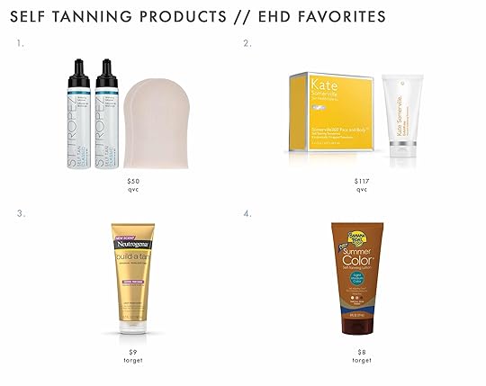
1. St. Tropez Set of 2 8 oz. Classic Self Tan Mousse with Mitts | 2. Kate Somerville Glow Duo Tanning Towels & Exfolikate | 3. Neutrogena Build A Tan Lotion | 4. Banana Boat Summer Color Self-Tanning Lotion
I’ve used the St. Tropez for years and love it (I opt for the booth because it can get back, butt, and is just more even but if I ever just want legs done I use this). Kate Somerville wipes are great if you have some color already but just want a glow, and Julie and Sara both love the Neutrogena and Banan Boat options.
We would love your suggestions in the comments – especially if there are any new organic brands (or booths) we should try.
xx
Emily
The post All The Questions Answered About How I Get My “Natural” Looking Spray Tan… appeared first on Emily Henderson.
June 10, 2022
7 Last-Minute Ways To Freshen Up Your “Gross” Outdoor Patio For Summer
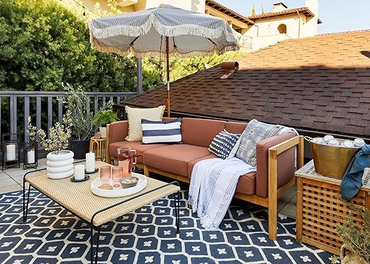
We’ve all had the “oh shit” moment when you have people coming over on a beautiful day early in spring/summer and your outdoor area looks like it’s been through 12 winter storms (because it probably has). I get it…having an outdoor space can be a real emotional rollercoaster. Let me explain: you invest time and money designing and installing the space so that you and your friends and family can actually use it, then each year the space starts to deteriorate little by little. In the winter you might not notice, but when the heat starts picking up and your heart mind and body are telling you to lounge outside, it can be a devastating blow to realize the weather has ripped your beautiful space out of your soon-to-be sweaty little hands. Luckily, we can easily turn that lounge upside down, I promise. Here are 7 small things you can do right now to bring your outdoor space back to life so you can actually enjoy it by the time those friends of yours come over in a few days…or hours.
If you have an outdoor space you know that there is one major problem child: the cushions. Let’s start with where to buy or DIY new cushions if yours are a goner, how to clean existing ones, and how to store them so they last longer…
1. Refresh Your Outdoor Cushions photo by melissa oholendt | from: a foolproof way to create an outdoor room with target
The easiest way to make your furniture look new again is to make your cushions look new again (and there are a few ways to go about this). If your cushions have been outside for a few years, maybe it’s time to get some new ones (you can call your local upholstery shop to get some or get some premade ones online if they’ll fit). As a lot of you probably already know, this can be incredibly costly and oftentimes can be close to the same price as getting a new piece of furniture which is wild. If you want a quick fix to get you through one or two more summers (or your impromptu family gathering happening at your place tomorrow) add just a few pillows to make your space feel fresh (that’s what I did for this budget lounge I created in 2020 –– we got the furniture set second hand from an awesome reader but the cushions were not in the best shape ever and this really did the trick for 2 seasons).
The last thing you can try to do to freshen up those cushions before summer is powerwash & spot clean them. I love this video to show you how!

 photo by mallory wackerman | from: mallory’s budget backyard (built from scratch for less than $1,000)
Another thing you can do is DIY some cushions (definitely more labor-intensive but it will save you TONS of money). This post from A Beautiful Mess is super clear and easy to follow if you wanna give it a go! If you go this route, we definitely recommend using some Funbrella fabric since it will last the longest and won’t fade as quickly. Speaking of making cushions last, the other thing you should do is invest in a shed or some sort of cushion storage place for when you’re not using the space. It will make your cushions last SO much longer and you won’t have to deal with the expensive nature of replacing them (which is also much better for the environment!!)
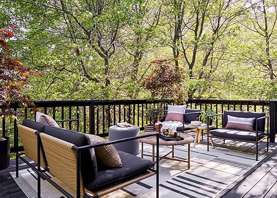 photo by sara ligorria-tramp | from: after three years we can finally use our mountain house upper deck
Here are some shoppable options:
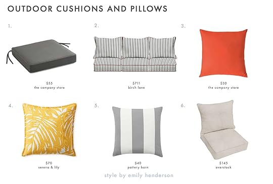
1. Sunbrella® Replacement Chair Cushion | 2. Mathew Deep Seating Indoor/Outdoor Sunbrella Seat/Back Cushion | 3. Sunbrella® Indoor/Outdoor Toss Pillows | 4. Palm Pillow Cover | 5. Classic Striped Indoor/Outdoor Pillow, 20 x 20″, Chambray | 6. Sunbrella Indoor/ Outdoor Deep Seating Cushion and Pillow Set
2. Resand Furniture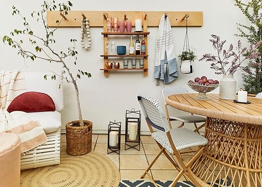 photo by sara ligorria-tramp | from: jess’s communal patio reveal
It’s sad but true: wood furniture outside is incredibly high maintenance. My parents bought a bunch of teak furniture years ago (which they still have now and it’s great) and while it’s lasted for forever, that’s only because they have spent SO many summers resanding and taking care of it. Watch this video on how this guy transformed some teak furniture he found in the trash. It’s proof that you can bring wood furniture back to life!
 photo by sara ligorria-tramp | from: the portland outdoor living spaces and a lot of styling tips
Here are some options if you are starting from scratch:

1. Samwell Teak Brown 4-Piece Wood Patio Conversation Set | 2. Saldano Rectangular Teak 63″ Dining Table | 3. Round 2 – Person 27.5” Long Bistro Set with Cushions | 4. Mesa Teak Chair | 5. Lithonia Acacia Wood Outdoor Club Chairs with Cushions, Set of 2 | 6. Chelsea FSC® Eucalyptus Rectangle Seating Set
3. Zone Out Your Space With A Fresh Rug Or DeckIf outdoor cushions are the problem child, the outdoor rug is the cushion’s problem cousin. It’s QUITE the task to keep them lasting for years and years so to freshen up your space you can either replace the rug (there are lots of affordable options out there since they don’t always last the longest) OR you can rethink the rug and instead invest in zoning your space with a more permanent deck or tile. The floor is always a good place to add some fun pattern or texture, so if you’re looking for an affordable deck/flooring option, you can do something like these IKEA tiles (Jess DIY’d them in her skinny outdoor balcony) or you can really invest in some fun tiles this summer like the ones on the patio at Emily’s last house. Not a quick fix but a worthwhile one:)
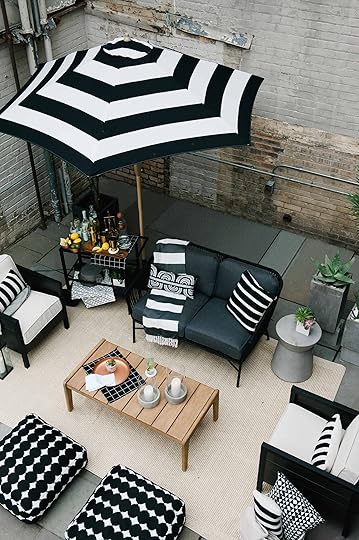 photo by melissa oholendt | from: a foolproof way to create an outdoor room with target
Here are Jess’s IKEA tiles in action!
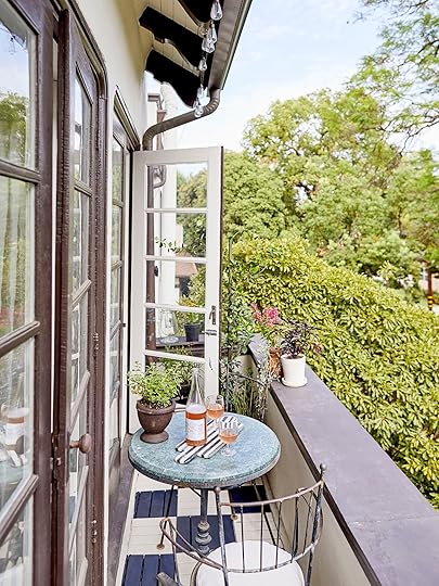
 photo by sara ligorria-tramp | from: jess’s balcony reveal
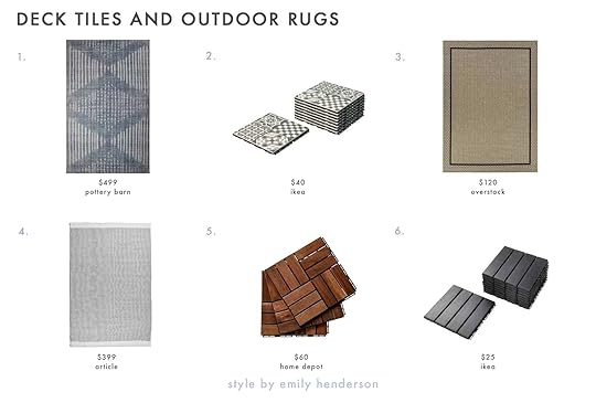
1. Shibori Eco-Friendly Indoor/Outdoor Rug | 2. Mallsten Tiles | 3. Loft Gracie Border Natural Design Indoor/Outdoor Rug | 4. Redondo Rug | 5. Square Interlocking Acacia Wood Quick Patio Deck Tile | 6. Runnen Tiles
4. Add PlantsAnother easy and relatively affordable way to make your space feel new again for summer is by adding plants around the space. It does WONDERS to bring in the life of a plant + it creates the feeling of “walls” which is important to do when you’re zoning out an area of your yard or patio.
 photo by sara ligorria-tramp | from: how to style out your outdoor space so you’ll actually use it
I love a succulent because they really do last forever and you hardly need to water them (which is good to get you through the summers and beyond) but if you want to try something else and don’t know a lot about plants (I can’t say I’m the plant expert)…see this article called 15 Impossible-To-Kill Outdoor Plants.
 photo by sara ligorria-tramp | from: how to style out your outdoor space so you’ll actually use it
1. 2 Succulents | 2. Cacti and Succulents | 3. Outdoor Minimalist Collection | 4. Large Majesty Palm | 5. Large Fiddle Leaf Fig Tree | 6. 5’ Travelers Palm Artificial Tree in Tall White Planter
5. Add String Lights Or An Umbrella To Create A “Ceiling”So we briefly chatted about using plants to create “walls” but what about creating a ceiling?? It’s always a good idea to try to basically replicate an indoor room, so options for your ceiling include using string lights (which are great for nighttime) or an umbrella (which is great for shade in the daytime). Either one (or both together) is a solid option, so it really depends on how you use it. By the way, I have used the solar string lights before (which is great if you don’t have a plug in your yard) and they work really well in my opinion!
 photo by sara ligorria-tramp | from: jess’s communal patio reveal
1. Plante 108” Octagonal Market Umbrella | 2. St. Tropez Beach Umbrella | 3. Solar ST38 String Lights | 4. Outdoor 20 ft. 10 Socket LED Solar Edison Bulb String Light | 5. Solar 10L String Light With Black Metal Cover And Plastic Bulb | 6. Capri 9′ Umbrella with Bronze Aluminum Pole – Water-Resistant Canvas Natural with Ink Blue Piping
6. Add A Little Fire For AmbianceThe newest hottest thing on TikTok is this tabletop fire topper product where you basically burn rubbing alcohol or a gel to get the feeling of a firepit without spending thousands of dollars. I haven’t tried the rubbing alcohol one personally (I’m worried they’ll smell weird so let me know if you’ve tried them and what your experience has been) but they are WILDLY affordable (like $20-$40 ish). I did, however, give this one as a gift to my boyfriend’s dad for father’s day last year I believe and they use it ALL the time, it burns for hours and hours and it’s so easy to use (and doesn’t smell). I highly recommend getting one for you or a friend, you can also roast marshmallows on it which rocks.
Beyond the tabletop fire pit, there’s a whole range of small to large gas or electric fire pits that will really set the vibe outside. Also, don’t forget about candles and lanterns…they always get the job done, too 🙂
 photo by sara ligorria-tramp | from: jess’s communal patio reveal
1. Forestbrook 36 in. x 20.75 in. Round Outdoor Concrete Wood Burning Fire Pit | 2. Indoor – Outdoor Portable Tabletop Fire Pit | 3. Bangor Outdoor Wood Burning Fire Pit
7. Waterproof SpeakerThe last thing you’ll need to refresh your outdoor yard to be party/vibe ready is some music! I love the google home speaker that connects to each other so you can play the same music throughout your whole house, but the only downside is you have to bring it in and out of your backyard since they’re not waterproof (yet). If you don’t mind having different music in your backyard vs your house then you can also get a waterproof speaker so you don’t have to worry about any water that might come near it…Sarah on our team highly recommends this waterproof one (and it would make a great father’s day gift FYI).
 photo by sara ligorria-tramp | from: caitlin’s balcony reveal
1. JBL Charge 3 Waterproof Portable Bluetooth Speaker | 2. Boom 3 | 3. SoundLink Revolve+ II Bluetooth® speaker
That’s all for this post, folks! If you have any more outdoor yard housekeeping tips, please comment them below. CHEERS TO ANOTHER AMAZING SUMMER UP AHEAD! Xx
Opening Image Credits: Photo by Sara Ligorria-Tramp | From: Jess’s Communal Patio Reveal
The post 7 Last-Minute Ways To Freshen Up Your “Gross” Outdoor Patio For Summer appeared first on Emily Henderson.
June 9, 2022
5 “Decor Rules” That We Think Should Be Broken And How To Do It

Welcome to round two of our design “rule breakers” series. Last time, Emily wrote about bathrooms and it was pretty freaking inspiring to see the designers from her book really show off the real visual benefits of saying “Rules? Who needs ’em?!” And look, while I will never not love looking crazy cool bathrooms and kitchens, ya girl is a renter and will be for the foreseeable future. So my decor is really the only thing I can truly “break some rules with” without breaking the rules of my lease. The whole idea of Em’s book is to teach you the rules/lingo and then show you how to make informed design decisions (and maybe break some rules) to make your house unique to you. So let’s go over some of our favorite (and easy-breezy) ways you can let your inner design rebel out. Shall we? The first one might hurt your brain…
Too Small Rug
 design by william hunter collective | styled by velinda hellen, erik kenneth staalberg, emily edith bowser, and julie rose | photos by sara ligorria-tramp
GASP! I know. We have written ad nauseam about “the right” rug size for every room and we still stand by our rules. Most of the time a rug that is too small for a room looks like an accident and not an intentional decision. But as we have also stated, rules are meant to be broken if you can nail them. So above we have a room designed by William Hunter Collective and styled by the ole EHD alum styling team, Velinda, Erik, Emily Bowser, and Julie. While I don’t know the exact reason behind this rug choice I have some ideas. But before I do that here is the general rule when it comes to choosing a rug size for a bedroom from our Bedroom Rules post:
RULE: Ideally your rug should have at least 24″ on all three sides of your bed. Our typical sizing rules are: for a Twin go for a 5’x8′, a Full 6’x9′, a Queen 8’x10′, and a King 9’x12′.
As you can probably tell this rug does not follow that rule. Now, first off this isn’t just a bedroom which I think is important to point out. It’s a guest room/office. So a large plush, soft-under-your-feet rug would be a nightmare to have under an office chair. This rug is also heavily patterned so if it were a lot bigger it might overwhelm the space and compete with the gallery wall. The size actually helps to create a divide between the bed and desk zones. Basically, it just works!
Also, this stunner is vintage which also makes it prime rule-breaking material. Let’s talk more about that…
 photo by michael sinclair | via ad italia
In this bedroom (not in the book), you don’t have the same need to zone out different areas in the same room like the one before. Instead, they were like “we don’t care if this rug is too small OR that it’s running vertically not horizontal. It looks cool!” I think this really works because of the relaxed style of the room and also because the rugs are vintage. I feel like there’s an unspoken rule that when it comes to vintage rugs the rules do really apply. They’re the cool kids that do what they want.
 home of allison pierce | styling by velinda hellen & erik staalberg | photo by sara ligorria-tramp | from: the no-reno house that looks completely renovated
Now to end this WILD topic, let’s touch on living room rugs. Here’s our rule…
RULE: Your area rug should be large enough for at least the front legs of the sofa and all chairs to rest on top of it.
Again, this rule is a great way to make your living room look and feel great. However, it’s not the only option, Take a look at Allison Pierce’s living room rug. It’s not large enough to fit under all the front legs of all the pieces of furniture BUT it works. Why? Well, it does go under the front legs of that gray side chair and then it gets real close to the sofa and pink accent chair’s legs but still leaves a couple of inches for breathing room. If you like this “almost touch the sofa legs” look we highly recommend leaving that tiny bit of space (but not too much) because if the rug butts up against the legs it’s going to look like you chose a rug that was too small instead of it looking like an intentional design choice. Embrace some negative floor space.
Huge Sectional In Small RoomI’m sure you’ve heard a hundred times that you shouldn’t put big furniture in a small room. “DON’T OVERWHELM THE SAPCE” they say. So it may seem counter-intuitive to put a big sectional in a small living room, right? But there’s a way to do it so it looks and feels more intentional and “custom”.
 styled by emily bowser | photo by bethany nauert | from: all your living room styling questions answered (plus some furniture & decor reviews)
Take Emily Bower’s living room that she styled for a shoot last year. In her actual, everyday setup she has a non-sectional sofa and it looks awesome because she designed it and she’s a professional. But when we saw this cream beauty we realized that if you choose a sectional that nicely fits in a corner against two walls, and you don’t fill the rest of the space with a ton of other pieces, it looks like it was made for the space. Plus it’s more seating for guests (and two beds if needed for sleepovers:)).
 design my melanie burstin | photo by tessa neustadt | from: mel’s moto reveal – it’s the breath of minimalist, uncluttered air we all need
Mel also chose a sectional for her new living room but her’s was custom because she’s a girl after my own heart. Now, choosing a light-colored fabric isn’t “a rule” but it does help a sectional in a small space look and feel airier. But hey! Maybe a deep blue velvet sectional in your small living room is exactly what it needs. Just make sure that you have it pushed into a corner out of the way of any pathways so that it looks really intentional. Can you tell we can’t get enough of “intentional” design?? Or saying it?? 😉
“Too Many” Statement Pieces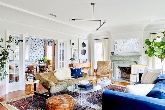 design by dee murphy | styled by velinda hellen | photo by sara ligorria-tramp
I know, I know. We are BIG on saying to not have every piece in a room be a statement piece. Because if you want your space to feel balanced and interesting (and you don’t have a ton of experience) it’s a pretty good rule of thumb. But then you see a room like Dee Murphy’s living room and you start to rethink everything. I mean look at each piece…they are all “statement” or “conversation” pieces. However, they do balance with each other. First off, I think having white walls and white curtains was a great choice since they are really some of the largest “pieces” and the foundation of the room. Then she used color sparingly but with impact. I’m talking about the saturated blue in the sofa, pom throw pillow, and parts of the rug. Everything else is fairly neutral in color but super-rich in shape and texture! I also love how she spaced out green with the two trees (notice the variation in leaf size) and that beautiful mint fireplace mantle. The last thing I’ll say is how perfect that lucite and glass coffee table is. It’s super cool, unexpected in this space, and since it’s clear it feels weightless. Basically, a solid coffee table could have made the whole space feel too visually heavy. This one is a quiet statement that lets the other gals shine.
Art PlacementBoy, do we love talking about “unexpected” places to hang art. I mean it’s fun and soooo easy. But when it comes to gallery walls we do have a no-fail formula. But let’s look at what Scott Horne did for his gallery wall…
 design and home of scott horne | styled by velinda hellen & erik kenneth staalberg | photo by sara ligorria-tramp
I will never forget seeing the photo for the first time. I was shook! I loved it so damn much and could not get over it. I have since calmed down (barely) and am excited to talk about why it sparked all that joy. First, I love that 90% of the art is aligned on an imaginary line. Almost like they are sitting on a shelf but not…because they are nailed into the wall. Then smaller pieces are filled in to make the top have varied heights which makes it cool and interesting. But Scott did not stop there. Those bottom two, “out of line” pieces really make it for me. They somehow make the whole collection seem so much wider but really it’s just two extra medium to small pieces. It just looks cool and is a configuration I hadn’t thought of. I’m pretty inspired to get creative with any future gallery walls!
 design by sara ruffin costello | styled by velinda hellen and erik kenneth staalberg | photo by sara ligorria-tramp
This next one isn’t about a gallery wall and it’s the opposite of the under-the-window art placement (another personal favorite of mine). It’s a reminder that art can, and maybe should, go literally anywhere…even over a doorway. This may not be the first time you’ve seen this but I know I don’t see it a lot and that’s a shame. It’s such a cool spot, especially if you have tall ceilings! But if you don’t and have shorter ceilings, how cute would a little mini art piece above a door be?! Point is, try new things when it comes to art. Command strips exist for a reason, so test things out then make your holes:) Decorating should be fun.
Non-Matching PendantsI know but hear us out.

 design by ben medansky | styled by velinda hellen and erik kenneth staalberg | photos by sara ligorria-tramp
This concept was definitely something I hadn’t really thought of before. But why do pendants need to match? Well, they don’t! Now, the ones above do match in shape but the colors are ombre’d. Get outta here Ben! This is a very easy way to have some fun. But if you wanted to hang two totally different pendants next to each other we say, yes. We do recommend that they have some materials or colors in common if the shapes really don’t talk to each other. But for the final time, if they don’t match at all in any way but you love them and think they work, GO FOR IT.
Hope this was a fun read that has your creative juices flowing. Sometimes all we need are some different ideas to get our minds thinking differently. Happy Thursday!
Love you, mean it.
Opening Image Credit: Design and Home of Scott Horne | Styled by Velinda Hellen & Erik Kenneth Staalberg | Photo by Sara Ligorria-Tramp
The post 5 “Decor Rules” That We Think Should Be Broken And How To Do It appeared first on Emily Henderson.
June 8, 2022
The Bathroom Tile Grout “Trend” We Are Trying – Matching Tile To Grout to Create A Monochrome Look
The tile at the farmhouse is being installed and it looks INSANE. It’s going to take about a month because this lady likes things that are complicated, but it looks incredible and I get so excited every single time I am there. When we originally designed this house, 12 years ago, we wanted the bathrooms (the whole house really) to be quiet and more monotone, so when there is color there isn’t also a TON of contrast. At times I’ve questioned and doubted this vision, but I hope that we were right – that there will be enough contrast and interest in the rest of the elements to still look interesting. And now that the bathrooms are coming along, and the tile is almost done, I feel SO confident in that decision (quite a f*cking relief, TBH). It’s not what a lot of designers would do – they would add more color, pattern, etc, but the vibe that we want is a more calm, restrained, simplistic (ha. that sunroom). So for most of our bathrooms, we chose 1 color and used it in different patterns and scales in the same room (mixed with white), with hopes that the grout would not create more contrast. But there is a hole in the grout market and while you can customize grout colors, it cost $200 and takes 2-3 weeks. So today I’m walking you through our grout thought process, how we chose what we did with some sneak peeks at what it looks like now:
Our Desire: MonochromeThis might be boring to you but it’s not to me. It feels simple but special (drink! drink! – anyone else playing the drinking game for how often I use those two words?). There is some contrast of course, but not within the tile and grout itself (note that Heidi’s bathroom has dark tile with a white detail – not totally monochrome).
 design by heidi caillier design | photo by haris kenjar photography
 design by jr corleto | photo by virtually here studios | via cle tile
I know that a lot of people might want MORE, but y’all I’ll style it out, I promise. I just love how the floor just reads as a texture and not too busy – but there is so much movement. So now that you know the “tile vibe” we are going for let’s go grout by grout:
Primary Bath Floor – Our Bathroom
As you can see we chose a 1×8 herringbone, otherwise known as “the gray hair maker”. Our tile team, which was FANTASTIC, loved installing this purely for the sake of the challenge – or so they said. This is from Pratt + Larson, made in Portland and it was an idea I came up, using a custom color just for us – but you can call them and order it, too (if you want to let me know I’ll try to wrangle a discount code for you) Remember: the smaller the pattern = more cuts = make more expensive to install and this mosaic was not netted so it was installed individually. This is not a cheap install (not sure how much as it is all tied in with the overall house tile budget which everyone is shielding me from, but likely a few thousand for just this floor as it took 3 days of labor with two guys, not including prep). We played with spacing a bit since the tile is only 1″ wide we didn’t want the scale of the spacing to get funky…1/16″ you lost some of the impact so 1/8′ felt just right!

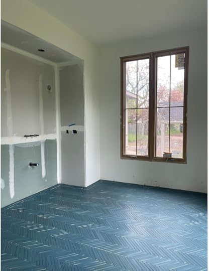
It’s absolutely incredible and this is even PRE-grout. So the question is what color do we want for that grout that will enhance the tile, but not distract from it? This seemed like a pretty fantastic time for us to do some sample boards, and by “us” I mean Erik and his Level Plane crew (Sergei! Vlad! Jeremy! – It warms my cold old social media heart to know that these dudes are cheering us on social media)


This is not something any tile setters will just do for you, but you might be able to pay a bit more for this and my goodness I’m so glad we did.

Our first instinct was that the middle (charcoal which leans black) is just WAY too modern and strangely masculine. Then the one on the left was beautiful but we feared that on the entire floor it would be too busy.

So we laid it on the floor in the bathroom and tried to give it more context – really picturing it over the whole floor with the wood to represent the vanity and the white tile that will go on the vanity wall. We still nixed #2 Charcoal, feared that #1 would be too busy, so I guess it’s #3? The one closest to Brian? I’m using question marks because it wasn’t a “hell yes” and I was not going to risk the beauty of this tile by messing up the grout.


So I begged Erik to make one more board and promised to give so much love in exchange. Thank you, Erik!

The second Brian and I saw the “twilight” grout it was a “hell yes”. Not because on the board it was the most dynamic, but because picturing over the floor of the bathroom we felt it did exactly what we wanted – let that color pop, drawing attention to the texture of the tile shape but NOT a busy pattern – almost like a beautiful quite sea of handmade blue texture. Incredible. Plus look how much it brought out the blue?!
The Guest Bath Floor And Walls
This is the first glimpse you are getting of our guest bath…and as I said we are leaning in on the tone-on-tone grout trend and kinda REALLY loving it. This dusty rose Pratt + Larson tile is such a striking color. The mixture of shape and scale is plenty to make this space feel special without accentuating the grout lines, so we chose to let them “rest”.

Somehow this one matched perfectly! Slightly darker which is GREAT. Isn’t that color just so beautiful and has so much variety! Again it’s a custom color from Pratt + Larson, but one that you can ask for.

The grout is called “Quarry Red” and it’s a warm deep brick color. It was an easy decision and we didn’t need to get boards made.


It turned out SO PRETTY. The grout really highlights the color variation and the texture of the tile, versus the pattern of the tile shape.
The Mudroom FloorWe chose this beautiful blue/green/gray tile with a “brownstone” finish meaning that it’s more rustic, which we thought was so appropriate for a more utilitarian space that feels like a landing spot for mud.

It’s a herringbone in the middle with a border around the outside that is just a staggered brick.
I can’t even express my love for this room. Something about that blue/green with the white oak cabinets from Unique Kitchens and Baths feels so perfectly PNW to me. But what grout? We needed to see this one mocked up as well so…
Erik and crew kindly helped us visualize by mocking up two boards.
There was a pretty quick all-around consensus on this one. We liked both, the “Platinum” (which is strangely the darker grout) was so pretty and again calming. It went on light then dried darker. We felt that it would be way easier to clean since this room will get a lot of mud from the kid’s shoes and dogs.

They had only started grouting here and the grout hadn’t dried yet (will be slightly darker). Right now this is turning out to be my favorite room in the entire house (probably because it’s the closest to being done).
Kids Bath
The floor of the kid’s bath was the biggest challenge thus far because this green had nothing we could match with. The closest was “Autumn Green” but as you can see it just read more brown than green.
While in a perfect world we would have ordered a custom grout that matched the green, we didn’t feel like it was important enough to set the project back a few weeks. I’m in the “let’s move in” phase of this renovation, so anything that sets us back too much is a big no-no.
So that’s where we’re at with our grout. It feels more real every day! Lots more content headed your way. xx
The post The Bathroom Tile Grout “Trend” We Are Trying – Matching Tile To Grout to Create A Monochrome Look appeared first on Emily Henderson.
Emily Henderson's Blog

- Emily Henderson's profile
- 10 followers

