
Emily Henderson's Blog, page 129
May 9, 2022
“Biggest Design Mistakes Ever,” As Told To Me By Our Favorite Well Known Designers

My book comes out tomorrow (EEK Preorder here if you want! EEK! And come to a book signing this Thursday in New York!! I’m very nervous). It was a long process and 2 years ago, mid “fantasy-writing-mode,” when I thought I could somehow fit 900 pages of design information into this book, I reached out to all of my favorite (and famous) designers and surveyed them on their best design advice. My goal was to include their answers in the book, crediting them and even creating cute charts, infographics, and illustrated design data. However, this whole concept got cut due to the eventual lack of space. Thank goodness I have a blog to share it all. We have the information because these great designers took the time to fill out the questionnaire, so today we have a pretty epic post for you – a curated list of their biggest design mistakes to avoid. Be sure to follow them if you don’t, too 
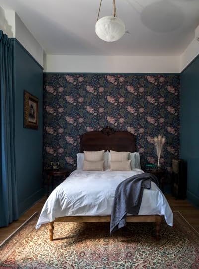
 design by orlando soria | photo by zeke ruelas
Make sure to have a lighting grid and ensure you have enough lighting sources to illuminate a room during various intervals of the day. – Mikel Welch
Do not decide on exact placement for statement fixtures in great rooms BEFORE furniture is truly placed. Leave the wiring behind the ceiling drywall and then drill and pull it through once furniture is in place. – Brian Patrick Flynn
I think one big mistake when it comes to lighting is doing recessed cans everywhere. It feels builder grade. – Heidi Caillier
A common hardwired lighting mistake I have seen is fixtures not hung at the right location. i.e. with sconces, you should always consider what’s going around them like mirrors and draperies. – Ginny Macdonald
I literally lose my mind every time I encounter a room with no overhead light. Please please please give us light on the ceiling, every single time. – Megan Hopp
A common lighting mistake I’ve seen is having them too high, or having too many! You don’t want to hit your head on it, but a dining room pendant ought to hang about eye-level. I generally don’t like recessed lighting, unless it’s in new construction. Even then, a central light fixture with lamps around the room is always going to be a nicer ambiance than a bunch of can lights up above. – Daniel Kanter
Lining up the pendants and the can lighting in the kitchen is hard. You usually pick the locations prior to cabinets going in and if you don’t account for where the upper cabinets will be, your lights will all be wrong. Mark the cabinets out on the floor and use a laser to figure out where your lights should be. – Jasmine Roth
Lighting is so worth a splurge to me. It’s painful to see a brand new expensive room with the cheapest, trendiest lights from the hardware store. Always include your lighting in your mood board and never let it be an afterthought. – Elsie Larson
Make sure your kitchen has plenty of lighting! Install ceiling cans if your sconces and pendants don’t provide enough illumination. You’ll be glad you did when you catch the hair hiding in the mousse you made for your mother-in-law, before you serve it to her! – Anne Sage
A common mistake I see is over lighting a room. LED lights are SO MUCH BRIGHTER than incandescent. You do not need as many. – Carly Waters
Make sure you measure your heights/drops very carefully. Make sure the scale is right for the room – it’s common for people to undersize fixtures. Confirm the size of your junction box. Some fixtures require a smaller junction box and you end up with a big hole to cover in the wall. – Victoria Sass
Biggest Mistakes: Laying Out The Kitchen design by rosa beltran | photo by sara ligorria-tramp
As annoying as it may be, I like to know what larger appliances I’ll be working with before designing the kitchen. The biggest mistake is thinking all appliance options are “standard” and forgoing measurements. Chances are you will find an appliance that you love, but doesn’t quite fit your “standard” measurements. Measure the appliance first, so you can get what you really want and not be a victim of “basic kitchen syndrome.” – Mikel Welch
Adding too many statement elements into a kitchen results in the look being too busy and so therefore I usually decide on ONE element that should stand out more than the others and let the remaining elements support it visually. – Brian Patrick Flynn
I find a common mistake to be not considering where everything should live and what needs to actually be stored. Kitchens are the most functional room in the home and cabinetry should be laid out for functionality and efficiency. I always recommend taking a lot of time up front to consider all of the details and every item you’ll want to store in your new kitchen. – Laura Hodges
Really consider your main appliance locations. Functionality is key in a kitchen. You want to make sure the main 3 are in a triangle together (sink, fridge, and range) but also consider how you use the kitchen. Make sure your fridge opens in a direction that you can grab something and then pivot to use it for example. You don’t want to have to squeeze past your fridge door ten times a day. –Melanie Burstin
Never put your kitchen sink in a corner. It is bad for flow and functionality. – Shelly Lynch-Sparks
One of the biggest kitchen design mistakes is worrying too much about resale. Design it for you and your family, period. There’s no sense in guessing what a mystery future owner might want.- Daniel Kanter
I can tell you the mistake I’ve made a few times and really really regretted – forgetting to build in trash pullouts. If you have a brand new kitchen, but then have to find a spot for a trashcan and recycling bin…in my opinion that’s a FAIL. – Jasmine Roth
If possible, don’t put your dishwasher in a corner. It might look good in theory, but once everything is in place, you’ll realize when the dishwasher is open (if the handles don’t hit, which can be a whole additional problem) it will be blocking cabinets that you need to open to put dishes away. – Jasmine Roth
Save yourself so much trouble – don’t install wood flooring in the kitchen. Luxury vinyl plank has come such a long way, as has wood-look tile. With a sink, dishwasher, and fridge, at some point in the life cycle of your kitchen, you will experience a leak. Ripping out flooring from under cabinetry and appliances is a nightmare. – Laurie March
Biggest Mistakes: Cabinetry design by heidi callier | photo by haris kenjar
One thing I’m not sure is recognized as a mistake but is something that irritates me beyond belief is when cabinetry just stops a few inches from the ceiling leaving a little gap to cast shadows and collect dust. It’s something contractors do all the time and is so easily remedied by a trim piece. It’s common because it’s easier to make your cabinets fully level if you float them off the ceiling but I hate that it leaves a useless, dark space above. – Orlando Soria
Too many cabinets and not enough drawers – Heidi Caillier
Never never leave a gap between your cabinets and your ceiling. Even if you have to fill it with a trim piece, build it out all the way to the ceiling height. – Rosa Beltran
The biggest mistake people make when designing cabinetry is going with anything that is too trendy or popular from a certain time. They’ll become timestamped quickly and feel less special. I’m a firm believer in navy blue cabinetry, walnut cabinetry, or anything painted in a new neutral such as sage green or blue-grey. – Brian Patrick Flynn
I think the most common mistake is scale and balance when it comes to kitchen cabinetry. You must take into consideration the heights of the ceiling, width of the room, etc. to make sure the cabinet depths and heights are proportionate to the rest of the kitchen. Another common mistake is forgetting about small add on’s such as hidden trash/recycle cans, specialty roll-out pot lids cabinets, built-in Lazy Susan’s, electronic ports (location, location, location), etc. These tend to be afterthoughts that can make you have buyer’s remorse in the end when you have to head to The Container Store and make unnecessary purchases. – Mikel Welch
The biggest mistake I’ve seen is not fully contemplating functionality. You want to think in excruciating detail about what you want to store and where. Are you a big baker? A wine connoisseur? Need a large pantry to feed a big family? Those storage decisions will make or break the functionality of your kitchen. – Erin Hiemstra
Many people opt for replacing just the cabinet fronts as opposed to replacing the cabinets entirely. While this will definitely cut down on upfront costs, refaced cabinets don’t last as long. We always advise clients to think about the long term, and whether it’s more important to cut down on immediate costs, or to get the most out of their renovation over time. There isn’t really a right or wrong answer – it’s more about balancing needs and expectations so there aren’t any surprises down the line. – Terri Lee
Think about what will be going into the cabinets as you’re designing them. This will help guide you on the best size for each cabinet. On that note, be sure to make sure you think about “closed” storage space. Open and floating shelves look great but you don’t want to forget that you’ll want to high some cookware items behind cabinets too.- Haley Weidenbaum
Functionally, not enough drawers. Aesthetically, getting too swayed by trends and forgetting what house you’re in! In the last few years, we’ve seen a profusion of beautiful, high-end kitchens that feel very influenced by classic British kitchens exemplified by companies like deVOL. Classic shaker style cabinetry is versatile and works nicely in a lot of spaces, but it has to feel related to its context. That kind of kitchen just doesn’t feel right in a modern house or one with a more distinct style. – Daniel Kanter
People often design cabinets, where the doors open, and you pull out pantry inserts from inside that. Just skip the doors! A modern kitchen should be 80% drawers, 20% cabinets, with dedicated spaces for your small appliances, like air fryers, mixers, and dehydrators – to live. – Laurie March
The corner cabinet with the rotating lazy Susan inside is the biggest mistake ever! People think that they’re maximizing storage space when they install them, but it’s actually a real pain to crouch in the corner and find things in there. It ends up being the cabinet where Tupperware goes to die. – Anne Sage
Forgetting to run the cabinets all the way to the ceiling if your ceilings are taller than 8 feet. People (and designers) can often overlook the small details – like whether a corner cabinet will hit the drawer pull on the adjacent drawer (whoops learned that lesson the hard way). I think people also neglect to think about how cabinets will hold up/how easy they will be to keep clean. – Carly Waters
Biggest Mistakes: Windows And Window Treatments design by victoria sass | photo by sara ligorria-tramp
I think people install windows sometimes without thinking about how they’ll be covered by window treatments. Like a crescent window super high in a bedroom. How do you cover that in a way that isn’t ugly? I haven’t found a solution for that. – Orlando Soria
Do not install vinyl windows in old homes. It breaks my heart. Do quality windows! – Heidi Caillier
Be aware of the domino effect. If you replace one window, you should replace them all or it’ll look patchy. – Ginny Macdonald
Consider your furniture layout when deciding window locations. You can avoid awkward walls that won’t fit furniture this way. You can see if the window treatment would end up taking over an entire wall and be an impractical use of space. Also, make sure you are matching the exterior of the house. Exterior window symmetry is really important so balancing these two interior and exterior needs will lead to successful placement. – Melanie Burstin
When selecting and placing windows on the side of a home, ensure that you are taking the neighbors into context. Often a high clerestory window is a better option in these locations, which allows light in and maintains privacy. – Jenny Guggenheim
Curved windows are not the easiest to cover so if you have a choice in the matter don’t put curved or rounded windows in rooms that must have window coverings. For example, a great room or living room that is meant to be flooded with light with grand windows but privacy is not of great concern is a perfect opportunity for curved or round windows. – Haley Weidenbaum
When it comes to windows, bigger is better. Everyone likes natural light – there is hardly a negative to more large windows. – Megan Hopp
Fenestration matters! Keep window styles consistent across the house, and sizing that feels intentional. My area is full of side-hall style houses, and the bathroom often ends up in the street-facing room above the front door. The window in this room should be the same size as the adjacent windows on the same level, but SO MANY people reduce the size of this window dramatically when renovating the bathroom. It completely ruins the facade of a house and has negligible functional benefit. – Daniel Kanter
Ohhhh, I’ve been waiting for this question! The biggest mistakes I’ve made with windows are 1) buying wood-clad windows and then painting them white. I should have just bought white extruded windows for a fraction of the price (never mind the time and labor to paint them) and they would have had zero maintenance. We put curtains and shades in front of them anyway, right? 2) using custom windows when I could have used standard. For new construction or for a renovation, if you can use standard window sizes it’s much less. Talk to your contractor about framing “standard size window openings” so you can save some $$$. – Jasmine Roth
When you have wood windows that are stained on the interior, make sure to get an extra container of your stain color so that you can touch up after the paint crew comes through. And make sure the caulking matches the windows! Nothing ruins a trimless, foxy, black window like white caulk. – Laurie March
Installing windows that are too small. I’ve never walked into a room and said- wow, that window is too big. – Carly Waters
Be thinking about window treatments as you are choosing the windows – are you going to have motorized shades? You’ll need to design a cavity to house the mechanism. Do your windows open inward and does that impact your plans for drapery, etc? Do you have the appropriate space above and around the window for the type of window treatment you want? If you want inset window treatments, are your window casings deep enough to accommodate? – Victoria Sass
Biggest Mistakes: Plumbing And Electric design by laura hodges | photo by jennifer hughes
 Make sure that what is behind the walls is in good working order, i.e. plumbing, electrical, venting. Now, of course, fixtures, fittings and finishes can become expensive quickly, but those are choices, the rough-in quality in my world is none negotiable. – Anne De Wolf
The most common plumbing mistake non-designers make when designing a bathroom is not paying attention to where the infrastructure is. One needs to vent a toilet with a 3″ stack and this is often overlooked when placing the toilet. Also paying attention to where the drain is and how that will get from point A to point B – especially when working on second floor bathrooms. This can lead to plumbing runs not having the “grade” in order to drain and/or having issues with clogs and backups. It can also lead to unsightly soffits or work on the floor below. – Josh Salinger
I have two! 1) they rough in the sink too high. Everything looks too low during the rough-in stage and people second-guess themselves. 2) Placement of the shower valve! If it’s possible to plumb away from the showerhead, I love that solution because you can turn the shower on without getting all wet! – Daniel Kanter
A common mistake I see is one that I’ve also made. When renovating a bathroom, just like left and right-handed golf clubs, tubs have to be ordered with the drain on the left or the right. If you order the wrong tub, you’ll have to send it back and wait for the correct one and TRUST ME, that’s not fun! – Jasmine Roth
Everyone wants a rain head shower but NOT every plumbing system can accommodate one! Especially in old homes, the existing pipes are narrow and won’t supply the water pressure necessary for a true rain head experience. – Anne Sage
Biggest Mistakes: Colors And Patterns design by dee murphy | photo by sara ligorria-tramp
 A lot of rooms have too much white. Rooms need to have depth and warmth and it’s difficult to achieve that when the walls and ceilings and trim are all stark white. – Corre Marie
The number one color mistake I see is people using colors that are too saturated. I always tell people to think of the color they like then take the saturation down 50% (basically add 50% gray to it). Usually, that ends up getting you a color that feels pretty but not too sickeningly saturated. – Orlando Soria
Tile design is the biggest selection that can make a bathroom feel dated. Unless you know that you’ll love it for a very long time and are not planning to move anytime soon, I suggest selecting tile colors and patterns that are either based on a timeless and classic style or are easily modified to feel different with an updated paint color. – Laura Hodges
Doing anything too trendy will date your space. If your furniture is “millennial pink” or whatever the popular new color is it won’t stand the test of time because you can tell immediately by looking at it when the chair was probably purchased. – Emma Beryl Kemper
I think people can feel timid about color and or pattern and as such end up often doing things halfway. A color, but something muted that isn’t really the shade that inspired them in the first place or a pattern, but something on a smaller scale or used in a smaller way. In the end, you get these sort of false starts or half-baked ideas and your design falls flat. The real kicker is that it can then turn people off because of a less than ideal outcome, where had they done what they really wanted in the first place chances are they would have loved it.- Megan Hopp
Scale is important! A large room with a very small scale pattern wallpaper can feel overwhelming.- Molly Torres Portnof
Relying completely on paint. There’s nothing worse than a room with rust orange walls but everything in it is black or gray. It’s so sad. – Daniel Kanter
The biggest color mistake I see is using a gray paint for the walls that has too much blue in it. Nothing can make a house feel cheap and cold faster than a blue-hued gray on the walls. – Jasmine Roth
Mixing patterns of the same scale is a common mistake. Mix patterns to your heart’s content, just make sure they’re contrasting in size so that your eyes can digest them. Otherwise, you’re just creating visual noise. – Anne Sage
Thank you to all the designers who took the time to fill out the survey and dropped us this wisdom. While I wish my book was peppered with this specific information, just know that it’s full of a lot more – and more to come on the blog, too. Follow them! And if you want to buy the book and meet me IRL, come to the book signing this Thursday in New York if you are around. I’d love to say hi and likely tell you inappropriately personal things about my life
Opener Image Credit: Design by Heidi Caillier | Photo by Haris Kenjar
The post “Biggest Design Mistakes Ever,” As Told To Me By Our Favorite Well Known Designers appeared first on Emily Henderson.


May 8, 2022
The Link Up: Emily’s New Face Product She Loves (And Has Kept Her MIL’s Skin super Glowy), Jess’ Affordable Morning Drink, And A Nail Biting Read
Let’s kick this puppy off by saying Happy Mother’s Day! We hope that all who are celebrating are getting to have the day they deserve and for those not celebrating for whatever reason, we also hope that you are taking the time to do something caring for yourself. So again Happy Mother’s Day, Happy Sunday, and Happy Link Up<3
This week’s house tour is the actual perfect mix of new and old. Often when people attempt “Italian” or “French” or *insert European country* it lacks the age and soul of what they are striving to achieve. It’s usually not an easy feat without lots of funds and the right materials. However, when artist Yolande Gray purchased her two-apartment property in 1998 she wanted it to be Puglian-inspired. We’d say she nailed it (and used A LOT of recycled materials…like the 10,000 white bricks she got from a 1930s block in Bondi Beach). Go see for yourself.
From Emily: My Mother-in-Law has beautiful skin (she’s 75) without getting one thing done, so I finally bought these vitamin C/hyaluronic acid vials that she and a couple of her friends swear by (she has put them on every boomer gift guide we’ve written). And y’all they make your skin glowy and happy. It’s a clear difference. I put 1/2 on every morning (per the instructions – but you have to break the glass vial – it’s very scientific) and my skin looks fresh and stays glowy all day. I will say that I have very dry skin (even up here) and I’m not great at putting on multiple creams a day, but this feels effective and just controlled in a way I like. Maybe it just feels so rigid and serious, which makes me want to open and pour on that vial more than just another lotion/cream/serum.
Also From Emily: I’m constantly impressed with my friend Joy for putting her efforts into projects that make the world a better, happier place. Her new kid’s book, A Kids Book About Confidence just came out and that subject is one that comes up a lot over here. How to raise confident, happy, and not empathetic kids is hard! This is a great book for your kids (and a great gift).
From Ryann: When you read this I will be in Rome, Italy (baby’s first trip!!). One thing I am SO happy we remembered to get before our trip is a good neck pillow. I famously have the hardest time sleeping on planes so a neck pillow is key and this pillow is top-notch. It’s 100% memory foam and shaped in such a way that it supports your neck at all angles. It feels really fancy but it’s pretty affordable at $20. I am a fan!
From Caitlin: OH MY GOSH. Stop what you’re doing, grab a little beverage (or a snack. Maybe even a beverage and a snack?) and settle in for this long read about a self-proclaimed serial killer expert who told folks his partner had been murdered, parlayed said tragedy into book deals and TV appearances and general fame, and who was then…well, you gotta read the rest, but it involves a group of determined internet sleuths discovering the REAL truth. (I bet you know where this is going.) SO GOOD, so interesting – it’s for sure my favorite long-form piece of 2022 so far.
Also from Caitlin: I’ve written about her before in this post about gel-x nails, but I literally do not understand how Nia, my manicurist-turned-friend, does not have a million followers. She’s incredible at nail art and her feed is so full of inspiration! This is my most recent manicure and here’s the one I got back in March. If you’re in LA, you should make an appointment (it gets better: her studio has a private parking lot, too!!!). If you’re not in LA, you should follow her anyway to see what she cooks up next – and then keep an eye out on her feed, because my May appointment is on Tuesday.
From Jess: I don’t know what prompted this shift but about three weeks ago I decided to kick my daily cold brew to the curb and started drinking iced oak milk matcha lattes. YIKES, that’s a mouthful to say. But spending $8 after tip daily, even for me, felt like too much of a luxury when I could easily make them at home. So I called my matcha-loving cousin to ask for her favorite matcha powder and she delivered. She loves this big 16oz can that’s only $25! And since you only use a teaspoon (at least with the recipe I use), it’s going to last me a while. So much $$$ saved. I also bought this matcha whisk and have been really enjoying the ritual of it.
From Mallory: I’ve always loved this marble bowl from CB2, but unfortunately, a $300 catch-all just isn’t a purchase I can get behind…so this dupe (that’s definitely not marble but looks pretty still) from Target is a really really solid option and the $300 turns to $30… I just saw it in person the other day and I love how lightweight it is!!
Opening Image Credits: Design by Yolande Gray | Architecture by Jose Garcia Negrette | Kitchen Design by David Whittaker | Styling by Tess Thyregod | Photo by Alisha Gore | via The Design Files
The post The Link Up: Emily’s New Face Product She Loves (And Has Kept Her MIL’s Skin super Glowy), Jess’ Affordable Morning Drink, And A Nail Biting Read appeared first on Emily Henderson.
The Link Up: Emily’s Face Product She LOVES (And Has Kept Her MIL’s Skin Glowing For Years), Jess’ Affordable Morning Drink, And A Nail Biting Read
Let’s kick this puppy off by saying Happy Mother’s Day! We hope that all who are celebrating are getting to have the day they deserve and for those not celebrating for whatever reason, we also hope that you are taking the time to do something caring for yourself. So again Happy Mother’s Day, Happy Sunday, and Happy Link Up<3
This week’s house tour is the actual perfect mix of new and old. Often when people attempt “Italian” or “French” or *insert European country* it lacks the age and soul of what they are striving to achieve. It’s usually not an easy feat without lots of funds and the right materials. However, when artist Yolande Gray purchased her two-apartment property in 1998 she wanted it to be Puglian-inspired. We’d say she nailed it (and used A LOT of recycled materials…like the 10,000 white bricks she got from a 1930s block in Bondi Beach). Go see for yourself.
From Emily: My Mother-in-Law has beautiful skin (she’s 75) without getting one thing done, so I finally bought these vitamin C/hyaluronic acid vials that she and a couple of her friends swear by (she has put them on every boomer gift guide we’ve written). And y’all they make your skin glowy and happy. It’s a clear difference. I put 1/2 on every morning (per the instructions – but you have to break the glass vial – it’s very scientific) and my skin looks fresh and stays glowy all day. I will say that I have very dry skin (even up here) and I’m not great at putting on multiple creams a day, but this feels effective and just controlled in a way I like. Maybe it just feels so rigid and serious, which makes me want to open and pour on that vial more than just another lotion/cream/serum.
Also From Emily: I’m constantly impressed with my friend Joy for putting her efforts into projects that make the world a better, happier place. Her new kid’s book, A Kids Book About Confidence just came out and that subject is one that comes up a lot over here. How to raise confident, happy, and not empathetic kids is hard! This is a great book for your kids (and a great gift).
From Ryann: When you read this I will be in Rome, Italy (baby’s first trip!!). One thing I am SO happy we remembered to get before our trip is a good neck pillow. I famously have the hardest time sleeping on planes so a neck pillow is key and this pillow is top-notch. It’s 100% memory foam and shaped in such a way that it supports your neck at all angles. It feels really fancy but it’s pretty affordable at $20. I am a fan!
From Caitlin: OH MY GOSH. Stop what you’re doing, grab a little beverage (or a snack. Maybe even a beverage and a snack?) and settle in for this long read about a self-proclaimed serial killer expert who told folks his partner had been murdered, parlayed said tragedy into book deals and TV appearances and general fame, and who was then…well, you gotta read the rest, but it involves a group of determined internet sleuths discovering the REAL truth. (I bet you know where this is going.) SO GOOD, so interesting – it’s for sure my favorite long-form piece of 2022 so far.
Also from Caitlin: I’ve written about her before in this post about gel-x nails, but I literally do not understand how Nia, my manicurist-turned-friend, does not have a million followers. She’s incredible at nail art and her feed is so full of inspiration! This is my most recent manicure and here’s the one I got back in March. If you’re in LA, you should make an appointment (it gets better: her studio has a private parking lot, too!!!). If you’re not in LA, you should follow her anyway to see what she cooks up next – and then keep an eye out on her feed, because my May appointment is on Tuesday.
From Jess: I don’t know what prompted this shift but about three weeks ago I decided to kick my daily cold brew to the curb and started drinking iced oak milk matcha lattes. YIKES, that’s a mouthful to say. But spending $8 after tip daily, even for me, felt like too much of a luxury when I could easily make them at home. So I called my matcha-loving cousin to ask for her favorite matcha powder and she delivered. She loves this big 16oz can that’s only $25! And since you only use a teaspoon (at least with the recipe I use), it’s going to last me a while. So much $$$ saved. I also bought this matcha whisk and have been really enjoying the ritual of it.
From Mallory: I’ve always loved this marble bowl from CB2, but unfortunately, a $300 catch-all just isn’t a purchase I can get behind…so this dupe (that’s definitely not marble but looks pretty still) from Target is a really really solid option and the $300 turns to $30… I just saw it in person the other day and I love how lightweight it is!!
Opening Image Credits: Design by Yolande Gray | Architecture by Jose Garcia Negrette | Kitchen Design by David Whittaker | Styling by Tess Thyregod | Photo by Alisha Gore | via The Design Files
The post The Link Up: Emily’s Face Product She LOVES (And Has Kept Her MIL’s Skin Glowing For Years), Jess’ Affordable Morning Drink, And A Nail Biting Read appeared first on Emily Henderson.
May 7, 2022
We Spent 3 Days In California’s Coolest Up-And-Coming Getaway Destination (Here’s What We Thought About Our Historic Hotels)

Grab some coffee and settle in for your Saturday morning long read, friend! Today’s post is some GOOD OL’ FASHIONED BLOGGING: 50% super dramatic before-and-after shots, 30% design and history education (but like, in an exciting way), 20% anecdotal firsthand experience (again, hopefully in an exciting way), and 10% PURE EXCITEMENT. We have a little bit of everything: massive boutique hotel renovations! Repurposed vintage finds! Prohibition-era secret passageways! A sofa from the set of Alfred Hitchcock’s The Birds! The best french fries I’ve ever had in my life (not pictured, but I will absolutely describe them at some point)! Drag Queen Bingo night! Quiet, layered, neutral spaces, AND maximalism galore!
Here’s what went down: we lucked out, basically. Earlier this year, Em headed out to Nevada City – an 1800s gold-mining town about an hour away from Sacramento and Tahoe – for a relaxing weekend trip with Brian. Like all bosses (sarcasm – I literally think Em may be the only boss who has ever done this), she LOVED the aesthetics of the two hotels she’d visited and was like, “you know what would make this romantic weekend trip with my husband better? If I, like, invited my design-obsessed team to spend a few days with me, so we can all stand in a huddle underneath a chandelier and scream about this 170-year-old original light fixture for an hour and a half. That would really take this trip to the next level.”
So that’s how your favorite blog staff (I hope) found themselves in the Burbank Airport on a Tuesday morning in late April. It was a quick hour-long flight up to Sacramento and an easy Uber trip to Grass Valley and Nevada City, an area in which we spent the next three days taking notes from the design team who just pulled off a HUGE restoration of two historic properties. We learned, ate, drank, and laughed a lot and I can’t wait to share it all with you – ARE YOU READY TO SEE???
Hot TipIf it works with your schedule, a mid-week visit is absolutely the way to go - there’s a ton to do and explore every weeknight. To that end, we wrangled our readers an exclusive 20% discount on stays booked Sunday through Thursday, PLUS complimentary cocktails for two at the National Bar. You can find the booking link at the bottom of the post! We want you to have as much fun as we did.
The Holbrooke Hotel in Grass Valley, CA
 then | now
Enter: The Holbrooke Hotel in Grass Valley, CA. Let me give you some neighborhood context, first (yup, here comes the history!) – about $400 million dollars worth of gold was extracted from the mines in this area starting in about 1850. That means that Grass Valley/Nevada City was the spot back in the day – like, the richest mining town in California, which basically made it the heart of the gold rush – and to that end, THIS BUILDING HAS SEEN SOME STUFF. Cowboys! Gunfights! Famous robbers! It actually even burned down twice – the current structure is from the 1860s – and it’s since played host to a ton of historical figures, like several presidents, iconic boxers, and even writers, like Mark Twain! (Spoiler: One of us even got to stay in Mark Twain’s room!) (Double spoiler: IT WAS ME AND I LOVED IT!!!)
Before we go inside, I wanted you to take a peek at this tasteful outdoor restoration, though. My favorite part of this weekend was seeing how the design and architecture teams really embraced the structures they were renovating – they worked to highlight and embrace the existing features. It feels a lot more welcoming now, doesn’t it?
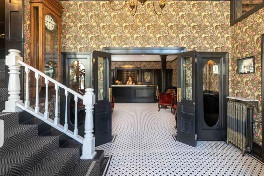
WELCOME IN, GANG. Stylistically, it’s like classic gold rush-era Americana meets timeless, collected, eclectic design. You see the double doors to the left of the stairs? That’s the front entrance from the street. The check-in desk is located in a dreamy little niche under the stairs, and that’s the saloon through the arch on the left. There’s a TON to take in, so let me point out my three favorite details:
The lighting in this place is IMMACULATE. That chandelier is actually original to the hotel, and you’ll see similar fixtures scattered around the property. (I had one in my room, too.) Keep an eye out in the rest of the photos as I was SO inspired by the lighting – picking fixtures for open concept spaces can be a doozy, but the lighting here was so thoughtfully chosen and everything works SO well together.You see that wrought iron and glass cage on the left? That’s the OG ELEVATOR. It is AWESOME. The quieter, more neutral updated design really gives it room to sing and shine. The Holbrooke is a MASTERCLASS in designing with texture. Original stone walls on the right! Copper-clad saloon walls on the left! Not to mention all the leathers, velvets, hides, glass, stone…every space is so luxe and considered.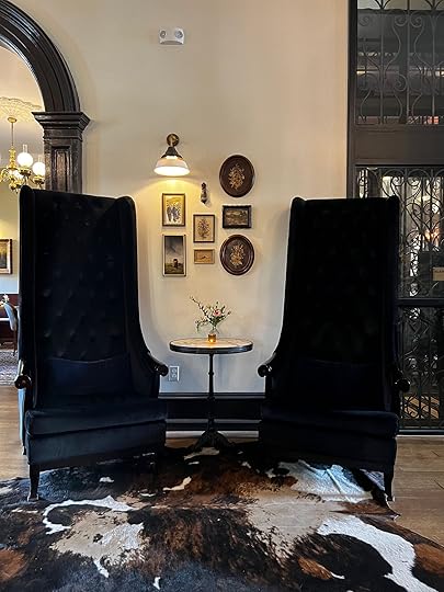

These are some of our iPhone shots – how sweet is the vignette on the left with that off-center sconce over a mini gallery wall? The scale of those navy chairs is so exciting and unexpected, too. My favorite piece in the lobby was this circular seating – it was custom designed to be authentic to the period! – and the styling up top was SO good (vessel heaven, y’all).
The aforementioned check-in niche under the stairs with a to-die-for floral arrangement wasn’t too bad, either :). I think you can get a good idea of the vibe of the hotel from these quick snaps – it just felt so comfortable and relaxed in here. Next up, please allow me to escort you into the saloon…


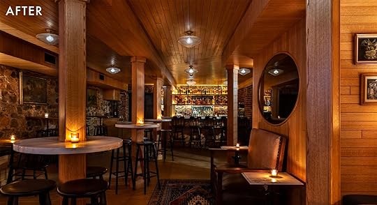
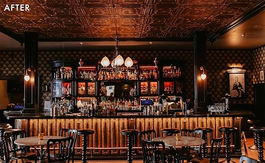
HELLO, beautiful restoration before and after!!! It’s rare to see a place that feels more period-appropriate after a renovation, but this room, in particular, BLEW ME AWAY. My favorite change was actually up on the ceiling – look at those now-exposed coffers! It’s such a tiny change that makes a world of difference, don’t you think? I’m also still swooning over the new bar seating – look how much visual clutter was removed by nixing the spindle-backed chairs! – and I’m enamored by the pendants above the bar (plus, gotta adore the new ceiling fans – they really let all the other features take center stage).
Speaking of center stage – WE GOTTA TALK ABOUT THAT BAR IN THE BACK. It’s original! (The onyx pillars almost made me pass out!) As a long-term, long-time lover of vintage, I was just bowled over by all the history attached to this piece – like, I get so weirdly moved when I see old features. I just start thinking about all the people who’d been here, and their lives, and all the conversations that transpired while looking at those little lotus lights reflecting in the mirror, and like…it just DOES SOMETHING TO MY HEART. Being in here felt great.


The entire team ended up sneaking down here early in the morning to grab some more shots of these copper walls. They’re breathtaking, guys. Also breathtaking: the DELICIOUS DRINKS IN THIS PLACE. After flying up on Tuesday, enjoying a quick team lunch, and hammering out some work on the blog (there are private meeting rooms available!), we met in the Saloon to grab a drink before embarking on the BEST tour of the Holbrooke with Anne L’Esperance, the lead designer, and Amanda Miller, a docent who knows ALL the history of the hotel and the area. But now, I want to show you the other side of the saloon. We’re going to the dining room, gang!


I know there’s a lot to take in from an architectural perspective, but I literally could not stop gushing about those seashell sconces being used as picture lights! The Holbrooke is a pretty traditionally ~masculine~ space, so there’s something so soft and sweet about balancing that aesthetic with a whimsical lighting choice.
I also loved the mantle swap in here – this smaller piece (still vintage, and from the correct era!) opened up the space a TON, right? The windows feel much bigger now, too, since they aren’t being dwarfed by a huge wall fixture.

Back to a team iPhone shot! On Tuesday night, after our fun tour of the property, our tiny squad tucked into the area just between the fireplace and window for the most DELICIOUS dinner. (Full disclosure: we actually ended up eating FOUR meals in here in less than 24 hours because the food was too good.) If you’re in the area, this is a MUST-VISIT. If you’re not in the area, well…this is also still a MUST-VISIT. I can drop all of our meal recommendations in the comments if anyone is interested! (I think we ate our way through like, a good majority of the menu. I’ll be returning at some point to finish the job.)

After dinner (and after I had sprinted upstairs to make some 9 PM changes to the next day’s blog post, ha), our team headed into the basement for Soul Supreme at the Iron Door, which is probably the closest we’ll ever get to spending an evening in a Prohibition-era speakeasy. It’s hard to tell in these shots, but there’s a SUPER thick iron door *just* to the left of the bar. In the 1800s, it led straight into the local bank, and it was also where ladies of the night would enter and leave the hotel!!! The transformation in this space is unbelievable – I just kept telling Anne, the designer, that she’d taken a design agony (those black poles) and transformed them in SUCH a genius way.
We had such a great night catching up, drinking wine, and befriending some locals down here – everyone was so generous and friendly. (If you’re as social as we are and you come down here for a drink, you will absolutely hug a stranger while saying your goodbyes at the end of the night.)


Here are two more iPhone shots of the original iron doors down in the lower level. One of my favorite things about The Holbrooke is that it’s so self-contained – I absolutely could have spent, like, 3 straight days on the property without going outside. There was beautiful indoor space, great outdoor space (Em’s room, Ryann’s room, and my room all had balconies!), incredible food, and fun entertainment. The whole place was just such a treat, you know? (Maybe that’s normal for boutique hotels, but it’s new to me.) Now, I want to show you a room that maaaaay look a little familiar to you. READY?

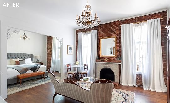
Here’s a peek at Em’s room. Can you believe this transformation? The previous carpeting, wallpaper, and paint left the space feeling dated (and, like, not in a cute/vintage-y way). This updated, more neutral design feels WAY more “modern wild west town” and way less “Victorian leftovers.” One of my favorite things to note: do you see that sweet settee? It’s original to the property. The design team worked to breathe new life into TONS of the already-existing pieces on site, which I loooved from a sustainability perspective. Another case in point…
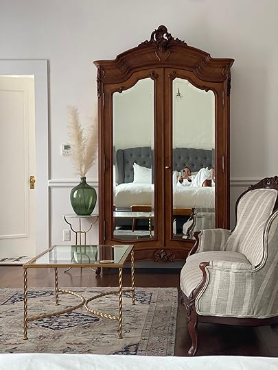
…is this STUNNING vintage armoire. (If this is really ringing a bell, it’s because this is where Em shot her selfies for our annual swimsuit review post!) I also fell in love with all of the vintage rugs in both properties, which the design team sourced from the fine folks at Revival. (You know, in case you’re trying to get this look at home, too.) All the rooms felt SO light and bright and collected – I loved it.


WELCOME TO MY ROOM, also known as Mark Twain’s former haunt (it’s room number 2, in case you also want to stay here!). Y’all, I had one of the best sleeps of my LIFE in this bed – I sprawled out in the middle and woke up around 3 AM with my arms and legs fully stretched in both directions. (I also cried when I walked in for the first time because it was SO beautiful and I was SO excited.) There was so much character and history in here and my balcony out front had a full dining table set up – it would have been the BEST spot for a late-night team hang if we hadn’t befriended half the town down in the Iron Door. I can’t wait to come back again.
It’d be such a fun space to share with a partner, but it was also a GREAT room to buckle down and get some work done. I was very productive in here (thanks, spirit of Mark Twain). And stylistically…man, what a difference some new carpet, fresh paint, and repurposed vintage goods can make. So much lighter, brighter, and layered, right?
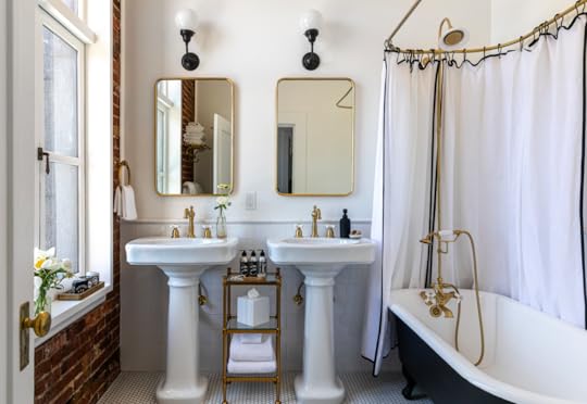

The bathrooms in The Holbrooke were also an absolute DELIGHT – that’s Em’s bathroom on the left and another on the right. Those are the original tubs, too, which the designers refinished and re-installed. The penny tile flooring, brass accents, hits of black, and restrained color palette made these bathrooms feel SO relaxing and rejuvenating. A bunch of us woke up early on Wednesday morning to take baths and they were wonderful
Around noon on Wednesday, we bid adieu to the Holbrooke, hopped in a minivan, and drove about 10 minutes down the road to Nevada City and our next destination: The National Exchange Hotel.
The National Exchange Hotel – Nevada City, CA
And BOY, we were in for a visual FEAST. If The Holbrooke is a cool, neutral, masculine little brother, The National Exchange (or “The Nash,” if you’re ~in the know~) is the bold, refined, self-possessed big sister. It opened in 1856 and at the time, it was essentially the heart of the town – a major stagecoach stop was right outside; it was home to Nevada City’s first telegraph office; the USPS set up shop inside for nearly 100 years.
Over the years, proprietors transformed The National to fit their needs – balconies were added and removed and a FULL, HIDDEN ROOM was even discovered behind a brick wall in the middle of a renovation. It’s AWESOME. Ready to go inside???
YEAH. I KNOW. It’s literally awe-inspiring, y’all. Welcome to the lobby – those are the main stairs on the left and the front desk straight ahead. Get a load of the original radiator on the right! Look at the patina on that nearly-200-year-old clock! Ogle those pill-shaped windows and the sweet double doors! The tile floor and wallpaper combo are just to die for, too. Can I show you my favorite part real quick?

These are the sconces on the wall when you move a bit further into the lobby, closer to the main desk. They’re original to the property – almost 170 years old!!! – and I’m still basically crying at the logo on the shade. I can’t believe something so delicate has lasted this long, you know?
It would have been so easy to write these off and to instead swap in some new lighting fixtures, but the care and attention to honoring the history of the building just speaks VOLUMES. Another example of going the extra mile is inbound (buckle up, because it’s stunning)…

THIS BAR. Do you see that golden texture in the front? Those are the old radiators from the hotel, which the designers repurposed in here. The wallpaper and tin ceiling and general energy in this space was UNMATCHED. We rolled in on a Wednesday afternoon for a little lunch, spent some time snuggling up in a booth together for a little brainstorming (unplanned, but we were too comfortable to leave!) and then returned to the National Bar later that night for Drag Queen Bingo, which was for sure my favorite part of the trip. (We’ll get into it more below.)

But first: here’s some photographic evidence of us working!!! I still can’t believe we got to be together in person in such a comfortable, beautiful space (Sadly, Mal couldn’t be there and she was DEFINITELY missed!). More importantly, though, how great is that fringed pendant in the window? The wallpaper is an absolute dream, too. (And those booths are such a great pop of color – it’s a jewel box in here.)
Now, I can’t wait to show you some DRAMATIC before and afters – I want to show you where we slept at night, but first, you NEED to see what the team was working with when they kicked off the restoration in 2018…


AND, WELL, WOW. Those are some BONES. (Confusing bones. Disorienting bones. But bones nonetheless!) There are some keeper pieces here – like, please note the original bed frames – but even I, an ardent lover of color and wallpaper and power clashing, can see that this hotel was in desperate need of a cohesive, loving hand. Buckle up and prepare yourself for one of the most satisfying afters of all time
PHEW. It’s so much better, y’all. There are 38 rooms in The National Exchange, and each has its own special design. Every room is packed with repurposed vintage pieces and they all now feel expansive and fresh and clean. Our rooms were all a bit different – ready to see?
This was Em’s room (and that’s a few of us, posing for a selfie in a HUGE antique mirror). The marquetry on the vintage commode next to the bed was STUNNING, and the whole room was so serene and quiet and pretty. Also, how great does that bed look against that William Morris wallpaper? Around 4 PM on Wednesday, we all took an hour of alone time in our rooms to rest and recharge our batteries – can you imagine decompressing in here?

That’s my room on the left and Jess’ on the right, and I loooooved seeing how the design team styled out wallpapers in different ways. (I also loved seeing Cole & Son’s Thistle print in the wild – my kitchen and dining room wallpaper are also from Cole & Son, so I’m a huge sucker for all of their patterns!)
See how they leaned into a deeper color palette with the green velvet and wood in my room and then went a little brighter with orange velvet and white nightstands in Jess’ space? It’s SUCH a far cry from where these rooms started out and such an impressive and thoughtful restoration.

I also had to show you this room – same wallpaper, but in a different color with a totally fresh vibe. The hotel had stunning public spaces, but leaving our little individual oases was TOUGH. We experienced a little bit of weather on our trip and let me tell you: the sound of raindrops hitting the original wavy glass windows was SO relaxing and comforting. After we all took some time for ourselves, we gathered as a group for another Happy Hour design tour with Anne and Amanda, who walked us around the property and explained the history and the renovation process.


And, well, it’s just phenomenal. This was the back staircase near Jess’ room, and it may be my favorite transformation of the entire post. William Morris’ Meadow Sweet is one of the wallpapers I eyed for my own bedroom, so I loved seeing it covering the hallways across the property. I just can’t even imagine how much work went into bringing The National back to life during the three-year renovation process – like, can you imagine stripping that white paint off each baluster? (Also, please note the little sitting area at the bottom of the stairs – those pieces are all original to the hotel, which is SO COOL.)


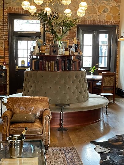
On the second floor, you’ll find this MASSIVE goldenrod sectional, a sweet little bar with incredible stone and a gorgeous ceiling (this is also where breakfast is served!), and a really beautiful private event room. Amanda told us that this is a super popular spot for weddings – they can host up to 80 – but we just loved lounging in here.
This huuuuge sofa was split into zones – you can see that they peppered a few coffee tables and bistro tables in different areas – and it felt like such a bold and creative alternative to a more traditional, segmented seating situation. ADORED IT. (If any one of you ever gets married at The Nash, can I come?)

After our tour, we headed downstairs for an INCREDIBLE team dinner at Lola, the in-house restaurant. We were all blown away by this custom lighting – it was designed by Doug Washington and it’s a SHOWSTOPPER. That two-sided banquette is even more vibrant in person if you can believe it. Also, make sure to note the mirror-backed sconces that line the walls. And those Italian Chiavari vintage-style chairs, too!!! SO GOOD.


Had to break out the iPhone shots to really highlight the impact of that arched lighting, obviously – it’s beautiful from the front and the side. For our dinner, we sat right in front of that big window on the left and Pascal, our waiter, was SO MUCH FUN. I threw back my first-ever oyster, we laughed over steak tartare and caesar salads, and we wolfed down two orders of the best gnudi in the world. I think we ended up sitting here for nearly three hours (apologies to our fellow patrons) because it was just so lovely in here – like Paris meets Westworld (but in the good way, like, before the robots rise up). If you’re headed to Lola for the first time, you’re in for a GREAT time and a real treat.

After dinner, we headed back to the National Bar for DRAG QUEEN BINGO – it’s a joint drag show AND bingo night, which is THE BEST IDEA IN THE WORLD. This happens the third Wednesday of every month and I literally do not have words to describe how much fun it was. I literally could not (still can’t, TBH) believe that such a beautiful hotel could also have SUCH a great restaurant and SUCH fun in-house programming – like, HOW IS THIS NOT THE BIGGEST TOURIST DESTINATION? Being here really felt like we were visiting the next ~hot spot~. Get in early while you can! (PS. After bingo had ended, the entire bar started singing Cher’s “Believe,” so it’s a fun place no matter what’s happening.) Afterward, we all dragged ourselves up to bed – team EHD packed a lot into two days! – and we prepared to fly back to Portland and LA the next morning.

I gotta be honest: leaving on Thursday was TOUGH. I wanted more time at The Nash!!! (I also love spending time with our team in person, but I just really loved soaking in the aesthetics of this hotel. I noticed something new every time I looked!) I also wanted to spend more time staring at this sofa, which was pulled straight from the set of Alfred Hitchcock’s The Birds – Em and I were both on the third floor, so we got to walk past it every time we made our way to our rooms. Doesn’t it work so well with that original light fixture? (And I think we all could have written a second post about the art in this hotel – the owl painting is a stunner, right?)


Before we leave, I just wanted to show you one of my favorite restoration shots just to highlight the dedication and effort laid forth by this team. This is the Good Morning Supply Co., located JUST off the lobby, and it really speaks for itself, doesn’t it? The room on the left could have been an office anywhere, but the renovated space on the right is pretty breathtaking.
They discovered that huge black archway during the remodeling process (awesome) and it took a team of 6 men to haul that black vault on the left from the original lobby into this space. It’s a renovation that honors the history, embraces the spirit, and ensures that generations to come will be able to have fun behind these walls, too.
Closing out today’s novel with a picture of my CUTE AND SWEET team. That’s Ryann, our new hire Sarah (everyone say “hi,” please – she’s Portland-based, a mom of 2, and so much fun!), big boss Em, and Jess. (I took this picture because their outfits all ~went together~ and I dress like a 90s-era Limited Too store exploded.)
Thank you to Em for bringing us up to Nevada City, to the Holbrooke and The National Exchange Hotels for being such gracious and generous hosts, and to YOU for embarking on this little journey with us. I hope we made good companions with your morning cup of coffee Did you also love looking at this thoughtful, careful, and intentional restoration? (I sure hope so!!!)
Again – if you’re interested in visiting the area, I can’t recommend these two properties enough. As promised, this link will grab you 20% off stays booked Sunday – Thursday PLUS a complimentary cocktail for two at The National Bar. The offer is valid through September 1, so you have some time to book your travel. (The promotion is called “Emily Sent Me,” in case you run into any trouble.) Maybe we can all go together sometime??? LET’S PLAN OUR MEETUP IN THE COMMENTS, yeah? xx
The post We Spent 3 Days In California’s Coolest Up-And-Coming Getaway Destination (Here’s What We Thought About Our Historic Hotels) appeared first on Emily Henderson.
May 6, 2022
The Styling Tricks I’m Still Doing 9 Years Later (Because They’re That Good)
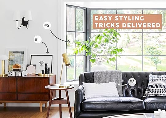
I’m apparently a 6 trick pony. And while I, of course, add new tricks every year (to varying degrees of success) I still really love these when done right. The thing with these isn’t that you need new stuff, it’s that you arrange the stuff that’s already in your house in a cooler way. It’s like how fashion stylists show you how to peek the edge of your sleeve under your rolled-up blazer or wear a belt haphazardly to look disheveled in a cool way. These tricks I use are all impermanent, easy to do, and just make your house look more stylish and interesting. If nothing else it’s worth a shot, no?
Huge Statement Branches From Your Yard photo by sara ligorria-tramp | from: 14 rules for how we style the perfect bedroom (+ 3 new reveals)
I’ve been styling with backyard branches for over a decade – flowers are often just too expensive for our shoot’s prop budget. I remember when Brady clipped that branch, in the photo above, for a bedroom in the and even I was like, “Woah, she’s aggressive.” I didn’t say anything because I honestly loved how he went for it, using his creative expression, and didn’t want to dampen it. Then a year later, Real Simple asked if they could use that image on the cover of the magazine. While it might be too extreme for every day it certainly was editorial enough to be cover-worthy.
 photo by sara ligorria-tramp | from: mountain house reveal: our light-filled neutral & textural living room
The whole is covered in backyard branches – and some can last WEEKS and then dry out, lasting months! No seriously, some of the manzanita (the branches above) dried to look real and are still there 2 years later (which as I’m writing this sounds gross but it’s not I promise).
 photos by sara ligorria-tramp | from: mountain house reveal: our soft yet secretly sultry downstairs guest bed + bath
Don’t forget about the sweet little “sprig”. Of course, we put one on the ledge of the bath (and most wouldn’t need to) for our shot, but the vanity is a great place to add something organic.
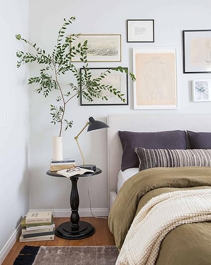 photo by tessa neustadt | from: 1 bedroom 4 ways with the citizenry
Another huge one to dress up is that tiny nightstand – which might not be advisable on a day-to-day basis, but think of the places where you can put a big statement branch that makes sense for your life – for me, it’s the dining table, mantle and entry table.
Hang Art In Unexpected Places photo by sara ligorria-tramp | from: my friend’s carpeted basement bathroom gets a budget makeover (with a lot of readymade products and the transformation is insane)
We recently styled this painting on the tiled wall which I loved in theory but was terrified to do myself. But Priscilla used a tile drill bit and it was so easy (for her). Mostly for hanging tile on art I use Command strips but only if they are smaller pieces and no glass in them.
 photo by sara ligorria-tramp | from: working with what you’ve got – an $8k budget kitchen makeover with a lot of vintage charm
When we shot Allison Pierce’s home, Velinda and Erik hung some art on her kitchen backsplash tile, which I think can look really sweet and unexpected. They used the Velcro kind of Command strips and Erik swears by them.

 photo by sara ligorria-tramp | styled by emily bowser | from: sara’s galley kitchen “update” turned into a full renovation (and the result is well worth the wait)
If this scares you or feels impractical think about just leaning it or even putting it in the back of your cabinetry (a fun unexpected hack). That is typically what I do in a kitchen.
 photo by david tsay | from: a spanish living room
Now the “art under a window” move can be really polarizing people because it’s breaking so many rules, but I still like the brazen rebelliousness of it. The point is – think about unexpected places to hang art. It’s super noncommittal (command strips!) and shows a lot of personality.
 photo by sara ligorria-tramp | styled by emily bowser | from: sara’s galley kitchen “update” turned into a full renovation (and the result is well worth the wait)
Sara and Emily B. joined this rebellious gang and hung that art under her window, like a real baller.
Dress Up The Back Of A Sofa photo by zeke ruelas | from: l.a. bungalow makeover
A move that is far less rebellious but has super high impact is the colorful or patterned throw on the back of a sofa – especially when the sofa is floating and you see the back. To make this work long-term you don’t throw it over the back cushions but instead, tuck it behind the cushions and drape over the back, thus covering likely some seams in the sofa (if it’s a sectional).
 photo by sara ligorria-tramp | from: mountain house dining nook reveal
If the back of your sofa is prominent don’t let it be naked. This is especially a good move if you like pattern but don’t want to commit to a full upholstered sofa – you can switch it out so easily, obviously.
The Easiest Way To Style A Bed…The Lumbar Pillow
 left (LOTS of pillows): photo by david tsay , from: master bedroom makeover | right (the perfect amount of pillows): photo by veronica crawford, from: our bedroom update (also how i feel about having a tv in the bedroom)
I may never go back to 5 throw pillows on a bed after the invention/discovery of the long lumbar. They can be more expensive, but the one-pillow party is a simplified, practical, and really stylish look.
 photo by sara ligorria-tramp | from: moto reveal: emily bowser’s bedroom “after” is unrecognizable from the “before”
Bowser’s kitty cat, Daffy, approves (also how dope is that headboard she made? SO DOPE).
 photo by sara ligorria-tramp | from: mountain house primary bedroom
Remember when I shot that leather lumbar from Target and then it sold out so fast and you were all enraged? Good news! It’s back!!
The Layered Art Lean photo by sara ligorria-tramp | from: a modern and organic entry: shelf styling tips + shop the look
I guess I like to play a lot with art placement – but “the lean” is one that those non-committal types out there can really embrace. All you do is literally lean the art instead of hanging it. It’s a strong yet casual move.
 photo by sara ligorria-tramp | from: reveal: a budget and rental-friendly living and dining room (with 80% thrifted finds)
If you want to do something riskier like we did here, you can lean it against a window (WHAT??) thus giving this side of the room some love.

 photos by sara ligorria-tramp | from: portland project: the living room reveal
HOT TIP: Just make sure you vary the sizes (and types) of art! If you look at the credenza above, we leaned three different pieces of art – all different sizes, two framed but different colored frames, and one unframed with a totally different texture (because it was a painted piece of wood).
 photo by sara ligorria-tramp | from: makeover takeover: jess’ long awaited (small space) living room reveal
Jess leaned her art on the floor with a graphic sculpture in front of it (good move, J). That gallery wall is pretty darn epic, but that unexpected piece on the floor is pretty awesome.
I MISS STYLING – ugh, I can’t wait to style out the farmhouse. I’m desperate to come up with and show you some new “moves” (although next week’s basement reveal is pretty wonderful if I do say so myself). Have a fantastic weekend and if you want more design and style hacks feel free to pick up my new book
Oh, and if you’re in the New York City area next week, I’m doing an intimate book signing at Rejuventaiton and would love to meet you! Get your ticket HERE. There will be food AND an open bar too!
Opening Image Credits: Photo by Sara Ligorria-Tramp | From: Portland Project: The Living Room Reveal
The post The Styling Tricks I’m Still Doing 9 Years Later (Because They’re That Good) appeared first on Emily Henderson.
May 5, 2022
The 8 Clever Storage, Clothing & Doggy Solutions I’m Excited About for Our Farmhouse Mudroom/Laundry Room

I’m pretty sure most family psychology experts will concur that the advent of the mudroom is the best thing to happen to Moms since electricity, sliced bread, and if you are in my family, ketchup. Listen, I’ve been mudroom-less my whole life and I didn’t starve, instead, I had a thriving rainy childhood in Oregon full of secure attachments and a high school diploma. So having a mudroom is not a necessity nor an indicator of adult “success”. But BOY, when you live in particular climates, this room quickly becomes one of the more useful, functional, and thus coveted rooms in your home. I wrote even more about it in my book, The New Design Rules (and if you landed here from Cup of Jo, welcome!). Living in a rental in Portland for the last 7 months with the only exterior entrance/exit opening directly into the living/dining room has created a huge coat, shoe, and dog mud issue that has become my #1 priority in life to solve. As a disclaimer – our new farmhouse is a major renovation job, where rooms could get moved, and privilege abounds – so my goal today isn’t to show you all fancy stuff we are doing for fun, it’s hopefully to offer some clever, helpful solutions if you are thinking about going the mudroom route, too (should you need one) or if you have a space you can carve out to solve some problems. We wrote about ‘the mudroom-less entry’ in our last house, as well as some great storage solutions in our small laundry/mudroom in LA. But today is all about THE FARM…(if you are new, head to this post about how we bought a little farm in Portland during the pandemic and moved back home to Oregon)
The Original Mudroom Placement
Let’s go back 1 year shall we? The original placement of the mudroom (seen here) was the most ideal for the function of that room and at times I regret it still not being there. The kids would come home from the car/school through that back door, drop their garbage and it would be out of sight of the living room. Their soccer clothes would be peeled off and immediately thrown in the washer/dryer (ha). But we realized that we were giving this mudroom the best natural light in the whole house, starving the kitchen and living room of that precious resource that we are irrationally obsessed with. So we moved the kitchen back to that corner which meant that the mudroom had to be relocated (and y’all the kitchen is DREAMY AF so I’m glad we did it).
Then Our Mudroom Became A Pantry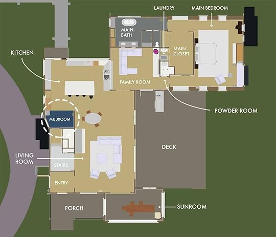
Version 2 (or maybe 92). Next, we decided to move the kitchen back in that corner and add a “mudroom door” in that tiny little area, sharing it with a pantry. Would that have worked? Sure! But look at the size of our bedroom!! I mean…absolutely unnecessarily huge. So we reconfigured it one more time. The level of indecision was high because the problem is that in the Pacific Northwest every entrance or exit needs a drop zone in which to de-shoe (a mini-mudroom so to speak). We struggled to decide which is more important – the entrance to the car/path for every day in and out, or to the backyard where they will be playing and stomping through alpaca poop. Ultimately we decided on…
Our Mudroom Location Now

We put the mudroom on the wing of the house, exiting to the backyard. We have a tiny drop-zone in the kitchen under the big window where the kid’s daily pair of shoes, coats, and bags will likely still sit but the rest of the clutter will be in the mudroom. This is because the mudroom isn’t just a dropzone, it’s the dog washing station/drying zone and the laundry room. This room is going to be EPIC. Now, I realized about a month ago that what would have even been potentially better is swapping the locations of the mudroom and the main bathroom (where the 1960s laundry room was – hahaha). It’s all good, but I suppose if I could go back in time that would make the most sense – the kids would just hop over one entrance to the mudroom when they come in, leaving the kitchen clutter-free. My plan is to use the time-tested mom strategy of “keeping the door locked” so that they have to walk around. Can such habits be formed? What if I literally put a piece of candy on the doormat every day until they have the Pavlovian response and automatically come through the mudroom? Moms have done much worse, right?…
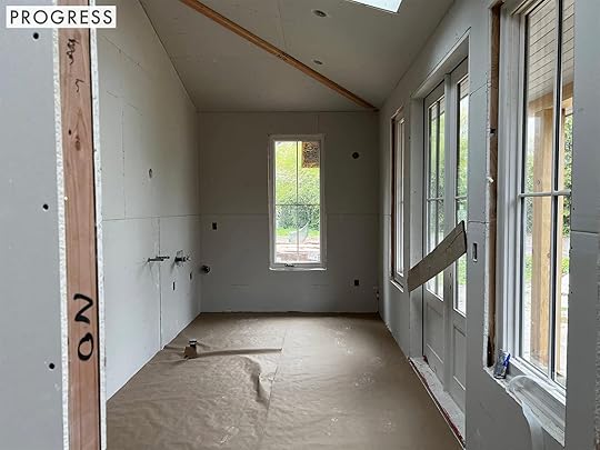
So now you know where we are in the house and OH MY GOSH IT’S DREAMY. The drywall is up and the natural light with the skylights, double doors, and windows make the room this insanely bright, gorgeous space already. Sadly there are still 3 months of work to be done in here…
Cabinetry Designed For Our Needs
As you can see we didn’t just “order cabinets”. No. We worked with Unique Kitchens and Bath to customize for our needs. Do you need to go to this extent? Only if you are doing custom cabinetry like we are. If you are going the more readymade (IKEA, Lowes, etc) then ignore this section. But when in Rome.
Smart Vaccum Storage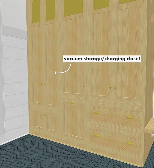
So the far left is our vacuum storage – both our cordless (with an outlet) and making sure it is wide enough for our fatter floor vacuum.
Pullout Pet Food Storage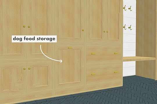
I avoided getting dogs for a while because they create such a mess and are so hard on your home. I don’t know whose idea it was to get TWO LONGHAIRED dogs before we moved to Oregon, but I’ll find out and they’ll be fired. So when designing the cabinets we figured we’d put in a pull-out cabinet “drawer” for a dog food bin in the hopes of not having it just floating in the room.
Dog Washing Station
I would prioritize this dog washing station over our kids shower at this point – or perhaps the kids could just bathe in here? I need to show you what those mutts look like after 5 minutes of running around outside so you’ll understand the importance of this dog washing station. The faucet has changed and we are doing more stone detail, but you get the idea. We even measured our dogs to make sure that they’ll fit, at one point putting them inside our farmhouse sink to see how much extra space we would need. I mean if you are going to customize a whole DOG WASHING BATHTUB you sure as hell better make it as functional and useful as possible. To be clear, it is also our utility sink for mops and filling flower buckets for arranging. It’s going to get USED as we think we’ll need to do nightly baths if we let them outside. While I still plan on walking them 3-5 miles a day, which I do right now as we are sans-yard, they miss chasing each other around and we can’t live on a farm and deprive them of that joy). FYI they are the sweetest pups in the world which makes it very much worth it:)
Shaker Pegs For Coats And Leashes
Still leaning into the shaker farmhouse vibe, we have this room lined at coat hook height with peg rails both for function and style. Leashes, coats, hats, sweet little handmade artisanal brooms that we never use…all will abound these cute little pegs. OH, the color scheme is wrong here. The floors and wood cabinets are right, but the paint colors are wrong (and we aren’t wrapping the beam – just painting white).
Heated Floors To Warm The Space And Dry The Dogs And Boots
This is something we’ve gone back and forth on a million times. I believe that if you are remodeling putting in radiant heating under your tile in rooms that are typically cold or where you are typically barefoot is a good move. But this room? Is it necessary? Last Thursday we made the final call to do it. It was a cold and rainy day and we walked through the future day to day motions – the kids would come in from school, immediately take off their raincoat and boots, left in thin little socks to walk through the mudroom into the family room. And you know what they say about kids who suffer cold toes in the winter as children? They turn out to be unlovable psychopaths. Well, that can’t be! Then we pictured our nightly bathing off of the mud pups…all wet and shivering…OOF. We seriously considered putting in a commercial-style hairdryer like they have at groomers (I’m not kidding – my brother kept sending me models that were affordable). We figured that having the floor be warm, to dry their little tummies would be a good thing. As I’m writing this I’m annoyed at myself for how spoiled we are all going to be. But when it’s been pouring rain and cold for 6 months, and your contractor turns to you and says, “for an extra day of labor and $1500 – $2k you can have warm toes year-round? eh?” You find yourself saying, “just do it” with both enthusiasm and shame.
*By the way, radiant heat flooring has come a long long way, and it is so much easier and cheaper than it used to be – definitely something to consider if your climate warrants it. We installed it in two bathrooms at and while you barely noticed that it was on (just that you were comfortable), you sure as hell felt the freezing cold tile when you stepped into the guest bathrooms where we didn’t do it. We had to put more bath rugs in there because our stone tile felt like ice in the winter and our guests were politely putting towels on the floor for their middle-of-the-night trips.
Open And Closed Storage For Often Used Coats And Less Often Used Coats
Now back to the approachable practical ideas … Visually I love closed cabinet storage, but we all know that kids don’t (1.) open up a cabinet (2.) pull out a hanger (3.) hang their coats on said hanger and then (4.) reach up and (5.) hang the coat. If they could do that I wouldn’t waste my time being a designer, I’d send them to Oxford to become astrophysicists!! The talent and sheer intellect of such a storage sport surpass any testing they could do at school. Nay. Our special little humans need easy-to-reach hooks or baskets. So as you can see we have a closet for closed storage (our less used coats) but Brian planned out our jacket usage and it’s anywhere between 2-4 a day depending on the weather, which does change all day long. 1. Cold morning walk to school = fleece, 2. A brisk power walk with dogs = slim down parka. 3. A mid-day walk in the rain = rain jacket, and 4. Afternoon basketball session = hoodie or windbreaker. Once he broke it down to me I realized he was right – that we needed hooks galore. So the closed cabinetry is for winter coats or less used cute jackets and the double set of hooks is for everyday in and out use. I actually think we are doing shaker pegs there but I’m not totally sure. Sometimes jackets don’t hang on pegs as well as we’d like them to so we might do double hooks like you see in the rendering to make sure our intense coat and jacket consumption can be accommodated.
Affordable Curtain To Cover Washer And Dryer
You know I love a sweet little curtain and this is the perfect opportunity to sew one up from one of the million vintage yards of fabric I’ve been collecting since birth. There’s enough that I can switch it out all the time like a crazy stylist – my spring floral, my fall plaid, my holiday skirt, my easter skirt? You get it. We’ll use a slim little brass rod, install it somehow (assuming to the wood on top that the stone will sit on), and attached clips to it, maybe with pleats, maybe not. But if you have an exposed washer dryer anywhere, know that the skirt is in fashion and is extremely affordable to rig up. I love to comb thrift stores for vintage tablecloths or even weird patterned sheets. Or get some great deadstock fabric yardage on Etsy

Lastly, we incorporated a bench under the coats that just floats with open shoe storage below. Again, I love closed storage, but when it comes to shoes, if you want the kids to not complain about not being able to find them, then design them to be easily found. You could say that this is coddling, but I prefer to frame it as ” causing fewer battles and less daily nagging”. Why set yourself up for a rough morning just to have a slightly more beautiful mudroom? Make it easy on them (and you) with open shoe and open coat storage.
My level of excitement about this room is palpable, the dopamine is rushing through me as I write this. I hope some of these tips are at all helpful to you. When you see it styled out you’ll see some of the other smart features we put in here (inside the cabinetry and some laundry ideas).
I’m feeling incredibly grateful that we will eventually get to use it and that maybe our children and pups won’t bring all of the mud from the farm into the house.
Sources:Cabinetry – Unique Kitchens and Bath (in natural white oak)
Windows – Sierra Pacific Simulated Divided Lites in Aspen – primed ready for paint.
Paint – Sherwin Williams – colors TBD
Lighting – Rejuvenation – this one over the dog washing station and these as hanging pendants.
Skylights – 3 from Velux that are EPIC!
Tile – Pratt + Larson (custom color and pattern I can’t wait to show you).
Build Team – ARCIFORM
The post The 8 Clever Storage, Clothing & Doggy Solutions I’m Excited About for Our Farmhouse Mudroom/Laundry Room appeared first on Emily Henderson.
May 4, 2022
My Best Friend’s Basement Remodel – On Finding Their Perfect U-Shaped Comfortable Sectional

Finding the perfect family room sectional can feel daunting. Not only is it a large initial investment but if you get it wrong you are STUCK with a very physically large mistake, staring at you daily, mocking you for your poor decision. And it’s not easy to “switch out” a sectional. Today will help, especially those of you looking for specific configurations that are difficult to find readymade. My sectional philosophy is to lean hard into comfort while of course insisting on style and quality. For this project, my best friend’s basement (also seen here and here), we needed the perfect U-shaped configuration which in this case was particularly specific – but good news, we found it and it’s WONDERFUL.
THE “BEFORE” BASEMENT AND SECTIONAL
Here we have the before – a well-loved family room – for two grownups and two young tween boys. I feel like we all know this basement. It serves a lot of purposes for the family (movie room, game room, study room, escape room, etc) and it totally works. But while spending so much time down here in lockdown, and with some savings due to canceling vacations/life, they finally decided to make it a space they would LOVE to be in.
OUR SECTIONAL WANTS AND NEEDS
They loved how comfortable their sofa was and the fact they could really spread out on all three sides. But they wanted a newer version (they and their dogs loved that one for 18 years) so it was ready to give to another friend’s basement so they could upgrade theirs. Here were their new sectional needs:
It needed to be U-shaped, but where one side is a sofa with back and arms, and the other side is a chaise so that you can see the TV over your feet. The fabric needed to be dark, cozy, and really family and pet-friendly. They still desperately wanted it to be comfortable, but less overstuffed than their previous one, more stylish, and streamlined.
Let’s get specific. The biggest challenge was finding a “U with a chaise” sectional as their TV was off to the left of the fireplace. They liked that on one side of the “U” there was a full back and arms (so people could sit and lean facing the chaise/tv) while the other side was a chaise, allowing you to see the TV without having to look over the sofa arm. I scoured the internet making sure there wasn’t one readymade for them and sure enough there wasn’t one that fit the bill that we liked – it was pretty specific and we still wanted it to look modern and fresh. So I immediately went to one of my favorite sources, Interior Define, and found not one but multiple sofas that could be customized into this configuration. We landed on “Winslow” and “Gaby“.
NARROWING IT DOWN TO TWO SECTIONALS: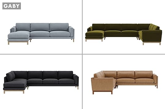
From Top Left Clockwise: Gaby 3-Seat Left Chaise Sectional | Gaby Corner With Left Chaise Sectional | Gaby Leather 4-Seat Corner Sectional | Gaby 4-Seat Sectional Sofa With Left Bumper
Both sectionals could be configured to work in the space – both stylistically and size-wise.

From Top Left Clockwise: Winslow 3-Piece 4-Seat U-Sectional | Winslow 3-seat Right Bumper Sectional | Winslow Corner With Left Chaise Sectional | Winslow 4-Seat Leather Right Chaise Sectional
So Priscilla, lead designer, threw them in a mockup to see if that would help our decision – the blue against the wood looked SO GOOD (there are SO many fabric options).
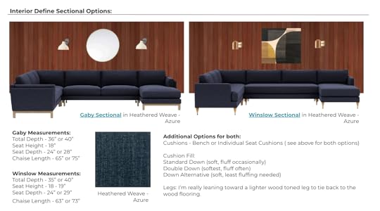
They are both awesome and honestly, I didn’t have much of a preference. The Winslow is slightly more squared off and streamlined as opposed to the Gaby which is slightly more rounded. I used to have the Maxwell (another sofa from them) which was SO comfortable and durable (I gave it to a Pen and Napkin makeover and there have been many times where I’ve really missed it).
As you might have guessed, we were designing this basement mid-lockdown so there was no way to “test-sit” these sofas then, but I knew that I could attest to the comfort, quality, and durability of the fabric of the one I had. Basically, I trust them when they say a fabric is kid/pet-friendly.

With anything custom you want to live by the “measure twice, cut once” philosophy… or in our case “measure twice, put those measurements into a design program, and order once with total confidence”. So Priscilla plugged in two sizes of each sofa – the Winslow and the Gaby mostly to make sure that the clearances for walking as well as the fireplace.
THE WINNER: THE WINSLOW FROM INTERIOR DEFINE
We decided to go more modern/streamlined and choose the Winslow. Then we had to choose the fabric and they have a TON of options. They were leaning strongly towards dark because they wanted to lean into the coziness and be more dirt/stain friendly. While a lot of the fabrics are performance, I think we can all agree that we somehow “feel” like darker colors are more dirt-resistant or at least more “dirt forgiving.” Again, they have two tween boys and a pup so this room will get a LOT of use and this sofa fabric and room need to really work for them.


We narrowed it down in this order:
Configuration: Corner Sectional with Right Arm ChaiseFabric: Heathered Weave in the color Azure (a cozy Heathered navy)Seat Configuration: Bench seat versus individual cushions (we chose a bench cushion on the long side)Leg options – We chose the wood midcentury but they have a lot of options (see above)Cushion Fill: Down Alternative (which is soft but you don’t have to fluff a lot and is good for allergies).OK, ARE YOU READY??? We have the full reveal coming next week (SORRY) But look! A sneak peek!
Sneak Peek Of The Finished Sectional and Room
This room turned out far more cozy, comfortable (and beautiful) than I think any of us imagined. I can’t wait to show you the full room reveal next week (and more of the sectional). Check out their site for all their style options – and yes they have chairs and smaller sofas, too.
And guess what?? Interior Define is having a 15% off Customization 101 Sale which starts 5/5. So if you are in need of a new sofa, start customizing it now and purchase starting Thursday for this deal.
*After Photo by Sara Ligorria-Tramp
The post My Best Friend’s Basement Remodel – On Finding Their Perfect U-Shaped Comfortable Sectional appeared first on Emily Henderson.
May 3, 2022
How To Add An Addition To Your House Without It Feeling TOO New (+ A Classic Yet Trend Forward Kitchen Island Extension You Need To See)

Things can get tricky when you add an addition to a home. I think Emily can attest to that with the farmhouse. The added space is awesome but you need to make sure that it doesn’t feel too “new build” so that it looks like it still belongs with the original structure. Well, that’s exactly what designer Rosy Alexander did for her clients with this kitchen/living room addition.
As is the case with most desired kitchens, this one needed to be practical for their large and frequent family gatherings but also have it look really well designed (I mean why else hire a talented designer like Rosy?). So they decided on an airy, Scandinavian-inspired design and that’s exactly what they got. Oh, and just wait until you see the island table extension:)

Pendants | Blue Cabinets (in Night Sky) | Limewash Wall Color | Tile (in Weathered White) | Countertop | Faucet | Skylights
Since we are BIG skylight people let’s talk about that first. We are of the opinion that if you can put in skylights, DO IT! I love how high the ceilings are in the addition and those skylights somehow make them feel even taller in the best way. Nothing compares to natural light and especially if you want an airy, Scandinavian feel to your space. These ones are from Velux which Emily used in her mountain house bedroom and is using A LOT of them in the farmhouse.


How cool are these process shots?
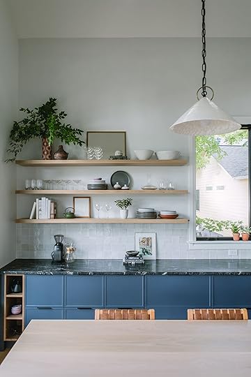
But let’s get back to how Rosy made sure this addition didn’t feel too “new”. First off, look at the window mouldings. While they aren’t super decorative, they still feel a bit more traditional (likely speaking to the original structure) and keep it from feeling too modern. They easily could have leaned hard into the Scandinavian look like Emily did with their windows which only have a light wood interior frame. That same look would have completely worked with this room but probably doesn’t work with the rest of the home’s original design.
HOWEVER, look at the perfect distribution of the light wood accents. You can’t tell as easily in this photo above but those floating shelves help to keep the overall design feeling light and they visually balance and complement the dark blue cabinets on the other side. Plus according to Rosy, it was the perfect place for her client’s collectibles and everyday essentials (AKA a great place to show some extra personality). Now please notice that little white oak cubby nook on the far lower left. THEN notice that sweet white oak trim on the top of the tile and around the bottom of the hood (those you can see better in the photo below). There’s more but we’ll talk about that in a sec.

Now onto some other details like the wall paint and tile choices. I know it’s a little tough to see in these photos but that is limewash on the walls in just a pretty warm white tone. I don’t know if you’ve ever been in a room with that wall treatment but it’s pretty spectacular. It’s this secret texture that doesn’t necessarily scream out at you at first but once you realize it’s there, you kind of can’t take your eyes off of it. I’m sure that’s what it feels like when you are in this room.
Then of course you have that stunning handmade zellige tile (these are the same as the one’s in Emily’s LA kitchen). If something is handmade it is nearly guaranteed that it will only add warmth and texture to your space which is exactly what this tile does and did to this kitchen. Would a classic white subway tile have been pretty? Absolutely. But would it have evoked the same visual texture? No. It just depends on the look and feel you want.


Range | Fridge | Wall Ovens | Drawer Pulls | Cabinet Knobs
See that hood white oak trim detail??
When I asked about the choice to go with a stovetop and separate wall ovens, Rosy said “The clients host and cook a lot, so they wanted versatility and multiple cook stations.” As NOT a cook myself, I’m always curious about the appliance choices people make and why. How do you all feel about this combo instead of a full range? Em did talk a bit about it in our 2022 kitchen appliance trends post if you’re curious.
I also figured they were big entertainers because of their wine fridge
Ok, I think it’s finally time to get into this kitchen table island extension…
 design by amber interiors | photo by tessa neustadt | via all sorts of
This table is my favorite part of the kitchen. The joinery!! It is a custom piece so naturally, I asked if they had any inspiration shots and this kitchen island above was their jumping-off point. I also asked why they decided on doing an extension in the first place:
“The tabletop was created out of necessity. My clients love to gather around the table and the kitchen. In Indian culture, family gatherings are very much about sharing food together, and the clients want their family and friends to have spaces to gather while they’re cooking. We commissioned Jacob Wolfe of Daswolfe from Charlotte, NC to create the table extension, and he exceeded our expectation with the island fronts and tabletop.”

While I love the Amber Interior’s Island (and everything they design), I adore what Jacob came up with. Simple but oh so special. EHD’s favorite descriptors;) That cutout and beam really have my heart fluttering. I also love that it’s the same height as the counter (the multi-level island has been popping up more on my feeds) and that it’s narrower. This way there’s room for stools without it overwhelming the space and it feeling super crowded when family is around it.
Actually, the entire island is custom which is something they were able to afford since they used Semihandmade cabinet fronts. It made their budget a bit more flexible to splurge on these custom elements.

Ah, I haven’t even talked about the cabinets yet! Well, I love that giant wall filled with different-sized compartments. I think it makes it look a bit more interesting than the simpler floor-to-ceiling single panels. They also almost went with a black color instead of this blue. Black would have been pretty but the midnight blue is so inviting. However, they still get that color drama with those beautiful black-honed countertops and black hardware.
Wanna see the other side?

I loved that she took the details of the island and put them in the cabinetry on the other side of the room. I love the subtle patterns of textures of the textiles. HOP TIP: For a large space don’t be afraid to layer rugs! Jute rugs are usually much more affordable so you can use that as your “BIG rug” and then layer a smaller (and softer) rug you love on top.
Also, I love that chair almost too much. The contrast to all the other lighter and softer tones helps to ground and have a slight edge to the space, plus balances all the dark tones in the kitchen.
So there you have it! Some addition and texture tips, beautiful kitchen island inspo, and a chair that is likely knocking your freaking socks off. Happy Tuesday!
Love you, mean it.
*Design and Photos by Rosy Alexander
The post How To Add An Addition To Your House Without It Feeling TOO New (+ A Classic Yet Trend Forward Kitchen Island Extension You Need To See) appeared first on Emily Henderson.
May 2, 2022
Yardzen Review: Is It Really Possible To Design A Beautiful Yard Remotely?

We bought this house for the property. The vibe. The space. It was magical, and the potential was so easy to visualize. We had plans to remodel the house first, then tackle the yard in phase 2 or 3, but some areas are getting fast-tracked so that we can spend time out there this summer and fall (and because the construction and rain turned it into an absolute mud pit and ruined the hardscape/landscape, so, yeah…). I’ve decided to prioritize the “kitchen patio,” with the hopes of enjoying it by midsummer. But my brain space is tapped out with the renovation/river house/book/blog, so I reached out to Yardzen to see if partnering on this smaller area would be a good fit for them — and frankly, I was very curious if a digital design would even work for a large property with more of a traditional vibe like ours. But they were excited to dive in, and I literally can’t wait to show you what it’s going to look like. Be prepared to be blown away. Let’s start back almost 3 years ago — that’s right, a year BEFORE the pandemic, when we first fell in love with the property.


This patio area is right outside the kitchen, and it gets the only afternoon/evening shade on the property, thus it’s likely where we’ll grill and eat dinner while the kids are playing in the yard. The back porch in the summer gets hot, horizontal, western sunlight (we are planting a few trees to combat this), making it less enjoyable to chill…we think. Hard to know until you live there. There will likely be two long picnic tables under the oak tree by the someday-redone sports court, for bigger groups, but this is more for us and possibly another family to enjoy. It’s a sweet little area that feels charming and intimate.

My biggest doubts and questions about working with a digital landscape design team were:
Can Yardzen do a more traditional/lived-in look? We wanted a more custom/special hardscape plan. Will they get the vibe?– Answer: You’ll see for yourself below.
Will Yardzen know what plants are native to and will thrive in the PNW?
– Answer: Yes. Their design team has a lot of regional knowledge thanks to their on-staff horticulturalists and their plant database. They also have local contractors throughout the United States who help with plant selection. What happens after you have the plan? How do you execute it?
– Answer: You can do it yourself or hire your own team, but Yardzen also has a really wide network of vetted contractors throughout the United States who will install their designs (including ours — which I’ll tell you about after we finish the project, with a hopefully glowing recommendation).Can Yardzen do a full property? For instance, would they do the full 3 acres?
– Answer: They really specialize in functional outdoor spaces for front yards and backyards. For the homestead/farm part of our property, we’ve hired Studio Campo to help figure out the meadowscaping, the paddock, etc., with more local hands-on to the design.
So, I’ll bring you along the process of working with Yardzen, a step-by-step of how you’d get your vision (and the details) across through a virtual platform.
STEP 1: TAKE SOME BASIC MEASUREMENTS, VIDEOS, AND PHOTOS TO UPLOAD
The measurements were easy. I was scared that I was going to need fancy site measurements, but I did it all with a measuring tape. I used my iPhone for photos.
STEP 2: TAKE THE ONLINE QUIZI took the quiz, and it was FAR more fun than I had predicted. I thought that I would have to know a lot of technical stuff, but it was more about choosing pictures that I liked — landscaped backyards, design elements, types of plants, etc. It was actually really fun. It gets less fun when you talk budget (per usual), and you should be prepared for the fact that landscape design is more expensive than you think it’s going to be (mostly due to the time and labor involved). But they have a post to help you understand the cost. Here’s an idea of what the quiz looks like:

These are honestly the same questions someone in person would ask as well. It’s like a style diagnostic — which you know I love. So I submitted everything, and after a few weeks, we got the first version, and we couldn’t believe it. There were things we wanted to change, but our level of excitement was high just seeing Version #1, which I’m going to show you today.
YARDZEN DIGITAL VERSION #1: THE KITCHEN PATIO
This rendering absolutely blew us away — I almost cried. It was a much-needed dopamine hit during a very long renovation (that we are grateful for but…OOF). To see this visual, to know that someday we are going to be able to enjoy the beautiful version of this home that we are putting so much hard work and resources into…was overwhelming in the best way. I almost cried thinking our mud pit was someday going to look like the Yardzen renderings. Thank you, Kevin (Yardzen’s Design Director).

WHAT WE LOVED: The variety of the plants along this wall and how it really softened the space.
OUR NOTES: I think I said that I love purple at some point, but I really just meant the deep, dark purple leaves of some shrubs, not purple flowers. I also wanted a more delicate tree on the corner (I loved the other one at the far end) with less dense leaves.

WHAT WE LOVED: I loved the blossoming tree in the corner.
OUR NOTES: We want to nix having dirt around the house in the patio area and have more space for us to grill. Since we don’t know where the barbecue is going to live, we want more flexibility. Additionally, with all the rain and having a white house, it’s recommended to have as much hardscape as possible along the sides of the house. We also want fewer potted plants, just to keep it simpler and cleaner (but I can see us adding more).

WHAT WE LOVED: We loved the idea of the more random brick pattern with mixed materials (some aged, some reclaimed). It was inspired by a photo we showed them that we are OBSESSED WITH of Ulla Johnson’s backyard (see below).
THE BRICK PATTERN INSPIRATION design by elizabeth roberts and peter marino | via architectural digest
Once again I found myself obsessed with a creative design risk that someone else took and wanted to do our version of it, but also once again, I’m chickening out. When we saw the brick pattern laid out in the renderings, we realized that it was too contemporary for this house, and we actually want something far more classic (e.g., herringbone or a basket weave). We are going to play with borders, but mixing materials and doing a random pattern felt wrong to us after seeing it. Of course, you have to realize that renderings don’t show age and the texture of materials as well as in real life (which is why you need to order and always reference real samples of materials).
THE ROOFLINE/COVERED PATH PROBLEM
WHAT WE LOVED: The anchoring blossoming tree, the simple grasses, and the ferns — the whole vibe feels natural, simple, and unfussy.
OUR NOTES: Well, after seeing the rendering, it’s becoming increasingly important to figure out the pathway/stairs/roofline awkwardness situation. I thought that Yardzen could design the patio while we figure it out, but it’s affecting the design too much. Essentially the kitchen windows (and cabinetry) were designed with the door moved over, and we didn’t really catch that by moving it, it would no longer line up with the stairs and the covered pathway. Meanwhile, the original overhang was rotted, so it was demo’d months ago for safety. Then we realized that by putting up a new overhang, we were going to lose a lot of light in the kitchen — and that’s a big “no thank you” from us. So the question then became, “Where should the stairs stop?” Do we want to have a landing on the right? It’s a lot.
Here it is IRL:


This doorway/pathway issue wasn’t Yardzen’s problem, really. We (ARCIFORM and I) need to tackle it from an interior/exterior perspective. We’ve since come up with a much simpler solution that I’ll show you next week. But I wanted to flag that and explain it, in case you were wondering what was going on — it’s awkward, and we are on it.
WHAT WE LOVED: The mix of the pebble with the brick border, with the herringbone.
OUR NOTES: We are worried about the tripping hazard of the brick against the lawn so are going to set that down into the soil or flip the brick.
 THE PLANT PATHWAYS
WHAT WE LOVE: The mix of the ferns and the climbers. It is going to be SO DREAMY.
OUR NOTES: Switch to a pink flower instead of white (as long as they are green year-round).
 WHY TWO DIFFERENT PATHWAY MATERIALS?
The reason that we are switching from the brick to a pea gravel path alongside the house is because the gravel element/material will be used throughout the property – in both patio areas and pathways (and larger gravel for the two-lane driveway). We love the herringbone aged brick for the kitchen patio. It’s going to be so classic, elevated, and gorgeous. But we’re not using it everywhere because A. It’s expensive both in materials and labor and B. We love the more rustic/casual vibe of the pea gravel (especially as The reason that we are switching from the brick to a pea gravel path alongside the house is because the gravel element/material will be used throughout the property, in both patio areas and pathways (and larger gravel for the two-lane driveway). We love the herringbone aged brick for the kitchen patio. It’s going to be so classic, elevated, and gorgeous. But we’re not using it everywhere because a) it’s expensive, both in materials and labor, and b) we love the more rustic/casual vibe of the pea gravel (especially as we get closer to the alpacas and chickens). It’s so easy to take this property to the next level and make it like a fancy estate, but the experience that we want for our family is more casual and farm-y (which fits our budget better). So we’ll save money and get the vibe that we want.


Right now we are focusing on the area around the kitchen and the covered path, but I’m sure we’ll plant along the other older house as well.
 BACK TO THE HANG AREA
WHAT WE LOVED: The intimacy and sense of a room that they created with the plants. The vibe is SO GOOD.
OUR NOTES: Fewer potted plants, just to keep it cleaner and simpler. So instead, we pitched them some window boxes — a look we’ve both loved but never had before (besides on the castle playhouse), although we are nervous about them staying maintained when it’s hot in the summer. Yardzen thinks it would be a lovely place to put an herb garden, which we agree with, so stay tuned on that.
OUR NOTES: More classic furniture — thinking about this table or this table, and these chairs or these chairs (but we might go rectangular – still TBD).
WAIT…WHERE IS YOUR BARBECUE?
In case you are wondering where the barbecue is going and why we didn’t plumb it for natural gas, here are our thoughts:
1. A barbecue against a house would likely stain the white exterior walls.a
2. We think in the list of priorities a huge outdoor kitchen isn’t necessary, when the kitchen is right there (would be different if it were a hike to get the ketchup).
3. By not plumbing, we can float a barbecue in the patio (so as not to soot up the walls), and then we have flexibility on where to put it. I didn’t want Yardzen to design around a floating barbecue, so we left it off.
We decided not to hard-plumb it in, since we don’t know where it’s going to go and also because we are limiting our natural gas consumption. So we’ll continue to use a propane barbecue until the electric ones start getting better (they are slowly coming, y’all). Mostly we just want flexibility for now and to save money by not building a big outdoor kitchen that we might not use or need. Now, once we live in the property, we might find that we want an outdoor covered kitchen somewhere near the sports court, and so that might be something we consider, but without living there and knowing what we’ll truly use (versus what is just fun/fancy to have), we are not pulling any triggers.
PLAYING WITH PLANT HEIGHT AND SCALE


WHAT WE LOVED: I liked the “random” heights of the plantings along the south side of the house (the exterior wall) with a nice up and down cadence.
OUR NOTES: We’d love more medium shrubs to break up the white and soften the lines of the large windows (which are so dreamy).


I can’t tell you how pleased we were with Version #1 of the design. Seeing the Yardzen renderings really solidified some ideas and challenged others — both an important part of the design process. The whole experience has been an absolute total joy and a fun relief from waiting for drywall to dry.
 SO WHAT HAPPENS NEXT?
My Yardzen designer is finishing up implementing our notes into the final round of renderings, and our landscape contractor is finishing up another job before they jump on ours. We are working with a local design/build team that has worked with Yardzen a lot, and once we have the final plan, it will get implemented.

As you can see, the Yardzen team did an incredible job on Version #1. I’m very excited to see and publish post #2. So as a recap, here is what they are tweaking:
1. A solution to the off-center covered pathway and stairs (we’ve already sent them our ideas now that we figured it all out).
2. A more classic brick pattern for the patio floor. Something timeless, but still special.
3. Fewer potted plants, adding window boxes instead.
4. Tweak the variety, color, and style of the trees and plants along the side of the house.
The biggest takeaway for me is knowing the value of having a Yardzen designer take over the creative process, using their design expertise to create an accurate visualization for us — FROM AFAR. It can so clearly help any client, and it gives you the confidence that what you are doing is the right thing (or not). And mostly, it can add a burst of hope and joy into what is often an expensive and laborious renovation process. Actually seeing the potential in renderings, not just trying to imagine it, is magical. I can’t WAIT to see and show you the final version.
The post Yardzen Review: Is It Really Possible To Design A Beautiful Yard Remotely? appeared first on Emily Henderson.
May 1, 2022
The Link Up: Em’s TOP Mother’s Day Gift Rec, Ryann’s Perfect T-Shirt, And The Spring Dress Caitlin Is Wearing To Every Event On Her Calendar

It’s Sunday, it’s the first day of May, and Em’s book comes out in just over ONE WEEK (have you preordered yet?)!! We hope you are about to have an equally exciting week and that it starts off right here and now with this link up. Enjoy!!
This week’s home tour is from none other than the wonderful Hopie Stockman (co-founder of EHD favorite, Block Shop) via Cup of Jo. Her home is magical. Hand-painted walls drench in happy peaches, blues, and greens. Just go experience it. Jess actually has the sweetest story about Hopie. Jess and her cousin went to Block Shop’s studio for an event about 4 years ago and quickly started chatting with Hopie and her sister. After telling them that they were cousins, Hopie sweetly looked at them and said, “So your cousins AND best friends??” Jess and her cousin looked at each other, never really before expressing to each other they were best friends, turned to Hopie and said, “Ya!” Now Jess and her cousin refer to each other as CBF (Cousin Best Friends). She helped them take their relationship to the next level:) Needless to say, Hopie’s sweet and kind spirit emanates from her and her warm home.
From Emily: It’s no secret I LOVE my infrared sauna blanket (my sweaty proof is here). I also was sent their red light face mask and from what I’ve seen on the market it’s a DEAL for this kind of thing. All this to say, for today only they are offering 20% off side wide with code EM20. I thought that with Mother’s day literally one week from today this might be a really nice gift to give (or maybe ask for). I honestly love mine.
Speaking of Mother’s day, we did a massive call-out last year to real moms asking what they ACTUALLY wanted and we did a big ole post about it. We still love that a paddleboard was requested by MANY moms. Bet you didn’t expect that, huh:) So if you are stumped look no further than this post.
From Ryann: When I tell you I am obsessed with these t-shirts please believe that I am not being hyperbolic. I’ve worn it in this brown color 4 times this week, and I have them in 4 different colors (but am going to absolutely buy more). They are the PERFECT baby tee and I love the length of the little cap sleeve. They are also ribbed which I find extremely comfortable. Excuse me while I add like 10 more to my cart!!
From Jess: After listening to this podcast episode about a new documentary called The Business of Birth Control (that I think everyone should listen to) I was immediately intrigued and watched the documentary the same day. They are the same people who did The Business of Being Born if you’ve heard of that documentary. I want to state that I and the people who made this documentary are pro contraceptives and in no way want to diminish the life-changing impact the pill had on the women’s liberation movement. But it’s been 72 years since the first pill was invented and not much has changed which isn’t a good thing. This documentary is purely about asking for better options and educating women (and doctors) by conducting actual studies on the very real and sometimes deadly side effects. I’m feeling very fired up and infuriated at the lack of research on women’s and people with female reproductive parts bodies. We still have suuuuuch a long way to go and I think this film is a really important start to get things moving. FYI it’s $14.99 to watch but promise it’s more than worth it.
From Mallory: Meet my new go-to purse/crossbody bag. I’ve always wanted a grab-and-go, throw over your outfit kind of crossbody that’s shorter than my insanely long crossbody and this one is the DREAM. Parker clay is such a cool brand I just found out about – if you’re in the market for a really good quality leather laptop bag (this one’s my fav) or really any kind of bag (or wallet), their stuff is INCREDIBLE. FUN FACT: I didn’t realize that Em has been onto Parker Clay for years! Makes this rec even more legit:)
From Caitlin: (siren sounds) I JUST FOUND THE BEST SPRING/SUMMER DRESS!!! (more siren sounds). OMG. Here’s the thing: I love a sleeve on a dress (have tattoos, don’t always want to talk about them with strangers, you know?) but it can be really hard to find long-sleeve dresses that are cute, well-fitting, and lightweight enough that I don’t get sweaty and that icky feeling if I’m doing something in the sun. This one is SO flattering (seriously, all the reviews are just like “this is so flattering”) and the construction is SO impressive for the price (like, special hook-and-eye closes in the chest, hooks for your bra, etc.). My weekend social calendar is currently non-stop bridal and baby showers – right now on week 2 of FIVE STRAIGHT WEEKS of said showers, y’all – so I’m so excited that there’s an affordable grab-and-go dress now in the rotation. It’s offered in sizes 00-24 AND in petite and tall and I’m pretty sure that like, EVERYONE would look amazing in it??? 100000/10.
Thanks for joining us today and see y’all tomorrow!!
Opening Image Credit: Design by Hopie Stockman | Photo by Laure Joliet | via Cup of Jo
The post The Link Up: Em’s TOP Mother’s Day Gift Rec, Ryann’s Perfect T-Shirt, And The Spring Dress Caitlin Is Wearing To Every Event On Her Calendar appeared first on Emily Henderson.
Emily Henderson's Blog

- Emily Henderson's profile
- 10 followers

