
Emily Henderson's Blog, page 131
April 22, 2022
Our Vintage and Antique Pieces For the Farm From Rejuvenation… Sustainable and Soulful FTW :)
One of the reasons I partnered up with Rejuvenation for the farm (beyond the locally made, timeless, high-quality lighting and furniture), was also because this company has continued to curate and invest in their vintage and antique lighting, furniture, and decor department. It’s pretty unique and as far as I know, the only larger retailer who does this. When you can manufacture new goods – a scalable business, I imagine dealing with one-offs can be hard to remain a priority (I know this first hand from when I had the online flea e-commerce store). But Rejuvenation’s roots were founded in helping people restore their homes, so vintage is part of their DNA, and they are thinking about sustainability in every way. We all know that buying vintage/used/antique is really the best thing you can do for the planet (and your home) and frankly it makes the most personal and soulful home. So three big local cheers for their renewed efforts here.
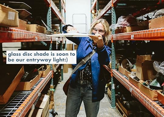
They invited me down to the factory which is where they assemble all the lighting, and also where they keep all the Rejuvenation Vintage inventory and have their antique and vintage restoration studio. My dopamine soared just thinking about it, and needless to say, it was an absolute dream day.

They were founded in 1977 in Portland, Oregon (two years older than me, ha) as an architectural salvage, lighting, and hardware restoration shop — and they have been dedicated to the process of authentic restoration ever since. I remember shopping there as a teen and got the same sense of the hunt when I was there for this trip. They are re-launching today (happy Earth Day) and really leaning into the importance of appreciating vintage as being highly sustainable. So on to what I really really want (and have) for the farm from their Rejuvenation Vintage Collection.
Our Dining Nook Table
They had aisles and aisles of vintage everything – chairs, tables, pots, cutting boards. Many of which are just launching today on their site. Somebody needs to snag that coffee table. I think it’s too small for either of our rooms, and have thought about it for the kid’s playroom (while they share a bedroom), but it’s too splurgy to get glitter glue all over it. But it’s excellent, made of pine, which I’m really into right now, and has round legs.
This trestle table had just come in and is still on hold for me for our dining nook. Right now I’m thinking we might need something with a single base (like a pedestal) but it still might work. These are on 1stDibs for $2-3K but mostly in Europe (they are Swedish or Scandinavian trestle tables) so to be able to find it locally was huge (and not deal with customs – trust me, you don’t want to – I’m still waiting on my hutch).

That dining nook shrunk a bit because the track from the sliding doors was wider than predicted (so the walls came into the room more). The table might still work, but an oval might be better. Either way, I LOVE that trestle table and if it’s not mine they’ll put it up for sale, and could be yours.
Our Dining Nook SconceFor the sake of matching/ease/affordability, most of our light fixtures are new from Rejuvenation, but we wanted to add a few vintage pieces where it made sense (and where we didn’t need multiples, although sometimes they do stock multiples).

I absolutely panicked once I saw this on their site. It is INSANE and yet exactly what we needed. The sconce in the rendering was just a placeholder for height, as this is a perfect opportunity to do an articulating sconce over the dining nook. Something casual and vintage was exactly what I had in mind.

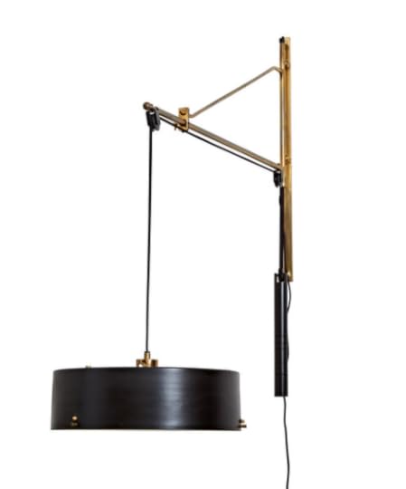
Here is why it works so well, our dining nook is going to be in the great room where the ceilings are exposed, so while we can rig up a fixture and hide the cord in a conduit (which we are doing in the middle of the room for our chandelier) I LOVE the idea of this sconce coming out from the wall, instead. We can lower it when we are puzzling, and raise it up when we are eating dinner there. I forget if we decided to hardwire it or leave it as a plug-in, but trust me that it’s going to be amazing.

I love that it marries the black and brass that we have in the other Rejuvenation light fixtures, while being vintage and totally unique. Just picture it where the brass double sconce is now… Killer (and no, we haven’t designed the nook yet – all TBD and on my list for next week to start tackling).
Our Entry Light
Then I found this incredible milk glass disk, that they are going to hardwire onto a stem with a vintage triple bulb fitting (and of course, we’ll put pretty bulbs in it since they’ll be exposed – RJ has an incredible bulb selection). It’s so simple, classic, pretty, and appropriate since our entryway is really small.

They have loads and loads of vintage lighting parts to be able to assemble them together and look authentic. It was totally thrilling to watch.

The profile for that pendant is much flatter than the rendering but you get the idea. Brian was underwhelmed by it until he saw it with the vintage brass fittings and pictured it with the pretty light bulbs. I LOVE IT. Super simple and understated, utilitarian yet unique. Plus being so high and flat it doesn’t compete with that stunning window pattern.
 Our Vintage Kitchen Pendants
Once we chose that main fixture we went back to look for our kitchen island pendants a couple of weeks later – and we found three of these smaller versions that could hang together. I LOVE THESE, but I’m slightly worried about scale because while I love a micro-pendant even over huge islands, our sconces are normal scale so I wonder if they are going to feel off… or maybe just awesome.
These could be tricky for a few reasons, but I really want to try them. Our island is a freestanding piece and we aren’t sure where it’s going to exactly land yet so we have decided to do just one J-box in the middle of the ceiling and then swag the fixtures. So we aren’t sure exactly how long the twisted cords should be. We are going to do a mockup with cardboard and rope as soon as the drywallers are done. Possibly like this:


I know stuff like this (antique lamp parts) might not get most people going, but it sure does me. The fact that they are so invested in restoring period lighting – fixtures that aren’t in production anymore which old home purists obsess over, gives them so much credit in my book. I nerded out hard with Jordan and Justin, from the Rejuvenation Vintage team on all things vintage, makers, and told them what I’m on the hunt for, etc, while I plotted to get their job. They literally scour the world for vintage goodness to curate, and believe me I’ve pitched many many shopping trips together  France? Italy? Sweden? RoundTop?? C’mon!!

Charlie would LOVE that trunk, but I hit my trunk quota – 5 – last week…soooo). It has a hand-painted ship on the inside and was so playful and whimsical. I’m still tempted…

I’m obviously not done shopping for vintage pieces for our home, (I may never be) and I’m always on the hunt to find the right piece – so I’m VERY PLEASED that Rejuvenation is not only continuing to invest in vintage, but doing it with a renewed efforts.

Today they are launching a huge new collection as well as re-launching the whole Rejuvenation Vintage Collection, so we shopped and rounded up my favorite pieces – things I’m seriously considering for the farm unless you buy them first

1. Antique French Large Folding Table | 2. French Factory Lockers | 3. Antique Oval Mirror on Scissor Arm | 4. Vintage Primitive Side Table | 5. Danish Curved Couch | 6. Mountain and River Framed Painting | 7. Antique 2-Door Cabinet | 8. Antique Adjustable Sconce | 9. Traditional Single Drawer Desk | 10. Lyhne Task Lamp | 11. Double-Sided Vintage Sign | 12. Pair of Upholstered Chairs | 13. Bamboo Coffee Table | 14. Victorian Drop Leaf Table | 15. Mid-Century White Oak Coffee Table | 16. Worn Vintage Workbench | 17. Danish Black Leather Sofa | 18. Vintage Industrial Copper Pendant

A huge thanks to Justin and Jordan from the Rejuvenation Vintage team as well as the lovely Rejuvenation marketing team (Negina!), for a real dream day. Nerding out with other vintage furniture and lighting lovers, dishing about what past makers we are collecting, and witnessing how they are restoring pieces (that they’ll continue to add to the website) is truly a dream. Head over and see the pieces for yourself, and if you are an online vintage shopper like I am make sure to add them to your list of online sites to check. xx
*Photos by Kaitlin Green
The post Our Vintage and Antique Pieces For the Farm From Rejuvenation… Sustainable and Soulful FTW :) appeared first on Emily Henderson.


April 21, 2022
We Had A Lot Of Thoughts And Feelings About This Celebrity Home Tour (And Wait Until You See What’s On The Bathroom Walls)


HEY Y’ALL. Once again, an EHD team meeting was slightly derailed by a new Architectural Digest home tour. As interior design lovers (read: nerds) we’ll admire and dissect home tours like we are scholars studying a very serious topic. Usually it goes like this: One person will innocently say, have you all seen _____’s new home tour?? Once that can of worms is open we start gabbing about what we love or think is interesting, inspiring, or unexpected. It’s our job to have our fingers on the pulse of interior design (we say to ourselves) as we stare at each photo and contemplate each design element. So, because we spent a decent amount of time admiring and commenting on Kasey Musgraves’ Nashville home designed by Lindsay Rhodes, we figured we’d share with you all (and ask to hear your thoughts, too). It’s a wonderful mix of high end and lived-in homey-ness, with some fresh design trends throughout. And as a fun side note, I think we should do a globe pendant count, because there is one in almost every room. Whoever gets the right amount in the comments wins!! Okay, now let’s explore.
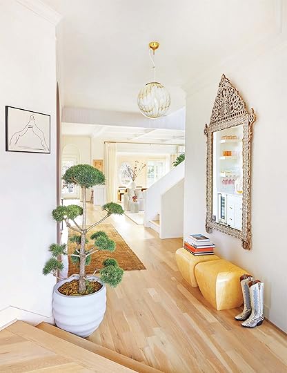
Do we spy a vintage Murano glass pendant?? Yes, we sure do. When Caitlin predicted they might be the next best thing in lighting, we trusted her gut so an appearance here is a welcomed, happy surprise. We all love the tree and how it brings in a layer of playfulness and it juxtaposes nicely with the ornate mirror that is very luxe and regal. Already, you can tell there is a lot of mixing styles so the overall style of the home is truly hard to pin down. Oh, and cowboy boots are officially decor, right?

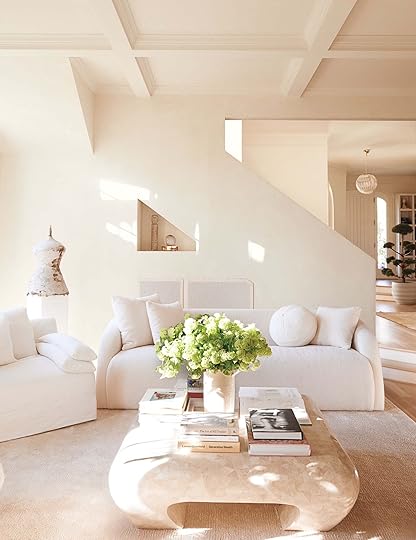
As you’ll see, this home is full of rounded edges and shapes which was definitely intentional. The coffee table, sofas, pillows, and side table all have a roundness that really softens the space and makes it feel uber inviting. Also, we love they actually showed a TV in the living room. Stars, they’re just like us!!
Emily pointed out that the sofas are cool and look comfortable too. I kept saying that it really feels like a human being lives here as compared to other celebrity homes that can sometimes feel cold and museum-like.
Emily immediately noticed the two rectangles behind the sofa while I was stuck admiring that odd mannequin-looking statue. At first glance, the rectangles almost look like a vent, but we are pretty sure it’s understated minimal art. If that’s the case, the placement is really unexpected, and definitely aligns with the angles of the wall cut out and built-in shelf (the inverted shapes are another special touch).
Caitlin made a good point saying that this home tour is a great inspiration if you have an 80s-style house and Emily agreed.

We all want to know all your opinion on this kitchen. We absolutely love the lime wash walls, the island, the seamless-looking range hood, and the square patterned globe pendant. It’s a very simple farmhouse-style kitchen, that isn’t totally aligned with the style of the rest of the home but feels homey and inviting. It makes me believe that someone who loves to cook and entertain lives here. What do you think??

We all love the Frank Gehry Wiggle Stool and a tiger rug is the perfect playful accent for this art room.

Jess noted that almost all the windows throughout this home look original, especially that oval window because it’s not often that we see oval windows nowadays. Also, you’ll notice there are not a lot of window treatments throughout this entire home, but we love that they chose to add curtains between the living and dining room to add some movement and softness to the space.

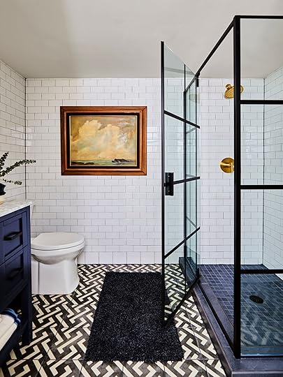
Oooh, THE SIMPLICITY. Would you want your bathtub to feel more cozy? Jess said yes she would, but I think it’s cool and very spa-like so I am pretty down. We are all very into that floor tub faucet for its minimal shape and vintage brass look.

Oh yes, there is a lot to love here. That antique gilt French bed frame is awesome, we love how tall the windows are, and we all wish there was a close up shot of the wall art. Jess pointed out that the rug placement is interesting, and made us think that there must be more going on on the other side of the room that we can’t see. Or it’s just there for the shot

We all loved this shot and it’s a good reminder that the checkered rug trend is still happening. That accent table is stunning and the round bottom shelf accents really well under the arched window. Are you keeping track of all the globe pendants?? This one might be my favorite placement.

The primary bedroom has a lot of elements that are shown throughout the home. The rounded edges, the globe pendant, simple shelf styling, playful plants and trees, are all elements we keep seeing again and again (and love).
Did you catch those bulb sconces built into the headboard?? It’s our favorite hotel-inspired small bedroom hack. I’m also very into the extremely simple monastery chic bedding. Oh, and do you recognize the nightstands?? They are Leanne Ford for Crate and Barrel and we LOVE them. Julie even used them in her best friend’s room makeover a few years ago. We are BIG fans.

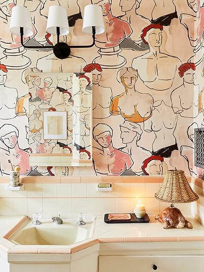
OKAY, this is powder bathroom dreams. The “wallpaper” was done by hand by Louisa of Pierce and Ward in 2014 (!!!) and we are all pleasantly surprised at how well it holds up. It’s all nude sketches by a local artist named Hazel King and it’s so unique and cool. (I might be a little too obsessed–like I want to replicate it immediately). We always say that a powder room is an excellent place to take risks and this one definitely speaks to that.

Emily noted that this room looks like it’s from a different home altogether and we didn’t disagree. It’s very serene and has a full-on California casual vibe. I am normally not the biggest fan of reverse book end bookshelf styling, but I’ll make an exception because the neutrality is extremely calming here.

Built-in vanities was one of our 2022 bathroom trend predictions so it’s always fun to see them come to fruition. Jess’ eagle eye spotted the bulb sconces and we all agreed they are a very special touch. It’s all the little details for us, like the mini knob non the medicine cabinet, the ornate mirror over mirror styling, and the sherpa rug to add a layer of warmth and texture to an otherwise white bathroom.

The off-center tiny sink is adorable and the camel is rad (and made by Kavey Musgraves herself!).
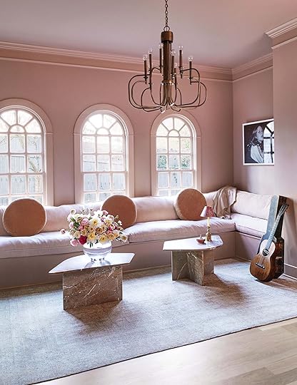
This was everyone’s favorite room by far. The pink walls are an exciting shift from the white and off-white colors throughout, and the chandelier is perfectly modern and retro. Jess really loved the placement and scale of the round pillows. If you are wondering if that is a candle with a lampshade on it, you are not alone. I, too, wondered the same so we did a little investigating and found out that candlestick style table lamps are in fact a thing. It’s a very cute decor element here that adds a hint of playfulness.

Do those pink curtains remind you of anything??? Jess’ WFH room reveal perhaps??? Guys, pink is having a real comeback (stay tuned for a post on that). Aside from that, Emily loves the chair and confirmed pencil reed is having a moment, another bulb sconce makes an appearance, and the low placement is an unexpected lovely choice.

All of us “Ooooooooh’d” at this shot. I am pretty sure we all want a 4 ft tall head bust. Is that too much to ask???
So, now you’ve peeked inside our brains, we’d love to hear your thoughts. Sound off in the comments below (but as always, please be nice and considerate :)).
*Design by Lindsay Rhodes
**Photos by Lelanie Foster
***via Architectural Digest
The post We Had A Lot Of Thoughts And Feelings About This Celebrity Home Tour (And Wait Until You See What’s On The Bathroom Walls) appeared first on Emily Henderson.
April 20, 2022
My Friend’s Carpeted Basement Bathroom Gets A Budget Makeover (With A Lot Of Readymade Products And The Transformation Is Insane)

Whoever thought wall-to-wall carpet in a bathroom was a good idea, was well, I don’t know what they could possibly have been thinking. This bathroom bummed them out more than any other – a room I actually never even saw because guests didn’t really go downstairs. Once they decided to renovate and give it a grown-up look, Priscilla (the designer) took the style/architecture of the house (Tudor revival) and designed this to be a budget/modern version that worked well in that style. She did an incredible job – I had almost nothing to do with it except the “I love it’ product approvals and styling the photos. Everything was affordable and ready-made with no major hiccups. But I’ll let Priscilla take it away.
Hi everyone, Priscilla here! I’ve been a long-time reader of the blog and was so excited to get the chance to work on another project with Emily. We originally met via Rejuvenation (I used to work in-store design there) and was leaving to go back to school when she was looking for help on . When she reached out at the start of the pandemic about her best friend’s basement, it was an easy yes. Today I’m excited to share with you the bathroom remodel and get into all the ins and outs of the design process for this space.
THE PROJECTThe house is a 3-story, 1930s Tudor in SW Portland. The top 2 floors have a ton of charm with a lot of the original character intact. The basement, however, was another story. It had gone through a pretty rough renovation in the 70s. Think Graceland cabin but with asbestos tile and carpet in the bathroom (why was this ever a thing?).
Like so many families during the pandemic, the clients were looking for more usable space. While the goal of the renovation was to make the basement more functional for the whole family, they also wanted to carve out a dedicated room for their teen son. During the initial space planning process, we came up with the idea of minimizing the bathroom into the old laundry room footprint. By downsizing the bath, it opened up the space to add in the bedroom they needed.

Cavernous and choppy, the original bath was tucked in a back corner of the basement down a hallway. It felt weirdly inaccessible and disconnected from the family room. By reconfiguring the original layout, it provided privacy for the new bedroom and allowed the bathroom to be more centrally located in the space. Double win!
THE DESIGN PROCESS
Wall Sconces | Mirror | Faucet | Vanity | Towel Ring
Basements can often be tricky to design, with a lot of mechanical systems overhead and height limitations. This basement was no exception and had a lot of budget-consuming, un-fun tasks that took priority, like waterproofing (we live in Portland, after all), floor leveling, and duct moving. This meant we needed to get creative with the finishes in each space.

Cabinet Hardware | Hand Towel | Vase | Soap Tray | Match Holder (similar)
With a limited budget, we wanted to find materials that felt high-end without the price tag. Nodding to historic elements while incorporating contemporary details, our goal was to create a bathroom pretty enough for guests, but durable for a teen boy. Our color palette for all the basement spaces was either blue or green (always and forever blue and green for me). Playing off the green mudroom outside the bathroom door, we wanted to contrast it by pulling in soothing blues and neutrals for the bathroom.
We played with a lot of different options to get the right balance between pattern, white space, and metal finishes. Below are some of the early mood boards and inspiration pics we pulled from. Initial ideas ranged from more nautical/youthful to simple/clean to more traditional. Once we landed on doing wood trim in the mudroom, it helped push us toward fully tiling out the bathroom so the finishes had variety as you moved through the basement.
*Disclaimer on prices: We were designing this at the beginning of the pandemic so pricing is, sadly, different now.
Option 1: Graphic, Playful, Nautical Option 2: Classic, Simple, Clean Lines
 Option 3: Traditional, Tudor
 TILE
TILEWith no natural light in the space, the idea was to bring in energy with a graphic floor tile. Something to draw your eye down and help distract from the low ceilings. The pattern and strong lines of the tile helped create movement which gave the room a more expansive and open feeling. Utilizing the vertical space on the wall and installing floor-to-ceiling subway tile also helped to give the illusion of a taller ceiling above. The choice of a shiny tile (instead of a more matte option) was intentional to reflect light and create as much warmth as possible.

Floor Tile (sold out-similar) | Wall Tile | Baseboard Tile | Toilet Paper Holder | Bath Towels
Shower Enclosure | Shower Floor Tile | Curb Tile | Shower Plumbing Fixture

 FIXTURES
Part of our cost-saving strategy was to go with ready-made fixtures instead of doing the custom route. We picked a deep navy vanity that came with a Carrera marble top and had much-needed storage…both open and closed. The clients wanted a glass shower so we found this fun enclosure that felt higher end, but less than custom glass would be. We debated between matte black or brass on the plumbing. In the end, we decided to go the brass route just to have those extra pops of warmth. Trying to find low-cost brass plumbing that doesn’t look cheap can be super challenging. We sampled a variety but liked the look of the Pfister Contempra collection the best. I think the key to a good, affordable brass is to stay away from the tones that have a lot of green in them. (They look the cheapest IMO). If you’re designing a teen or kid’s bathroom (or sharing with one), do yourself a favor and install a self-cleaning toilet. We were joking (but not) that it’s the highlight of the space. It’s Kohler’s self-cleaning model and really keeps the bowl super tidy and fresh smelling. Seriously, life-changing:)

Toilet | Bath Mat | Landscape Painting (vintage)
DECORAs a nod to the Tudor style, we picked an arched mirror that we found at Target. After trying a couple of different shapes, when we held this one up, it was the clear winner. You can’t go wrong with a classic arch. The client knew she wanted double globe sconces (they give off such great, even light). We sourced these ones from Anthropologie and loved the matte shades and subtle brass finish. The decor developed organically. I found this amazing landscape at Artifact (a fun vintage shop) in Portland. The pop of wood and soothing colors along with Emily’s styling magic pulled it all together.

Hooks | Bath Towels | Side Table (sold out)
I hope you enjoyed all the details and behind-the-scenes decisions that went into this space. I’d love to hear your thoughts in the comments. Til next time, lovelies…
*Design by Priscilla Frost
**Styled by Emily Henderson
***Photos by Sara Ligorria-Tramp
The post My Friend’s Carpeted Basement Bathroom Gets A Budget Makeover (With A Lot Of Readymade Products And The Transformation Is Insane) appeared first on Emily Henderson.
April 19, 2022
Beyond the Breakfast Nook – 24 Banquette Ideas For Rooms Of All Sizes (+ 3 Rules To Know)

PSA: BANQUETTES ARE NOT JUST FOR SMALL SPACES. I know that maybe that’s obvious to you – and honestly, it should have been obvious to me, a person whose job is literally looking at pictures of houses – but it didn’t really click in my (seemingly) egg-smooth brain until last week. Here’s the deal: when I moved into an apartment with an actual dining room for the first time, I promptly purchased and plopped an appropriately-sized dining table in the center of the room. It’s been three years and it’s held up fine.
But it’s never felt like an awesome layout, if that makes sense. The room is 10′ wide by 15′ long – palatial by LA standards, and still pretty big anywhere else, I think? – but it also has three different doors, a wall of windows, and a 6′ cased opening that leads to the living room. A table in the middle of the room hasn’t necessarily been conducive to the best flow – I don’t love zig-zagging around seatbacks in my frantic attempt to carry 30 bottles of kombucha to the fridge in one trip – and it can feel a little bit cramped when folks are actually sitting at chairs, as the walkways can get closed off.
Enter: THE BANQUETTE.
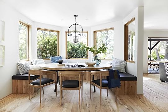 photo by sara ligorria-tramp | from: mountain house reveal: the dining room built-in dilemma
When it comes to banquettes in larger dining spaces, Big Boss did it best in the Mountain House. (Yes, I do call Emily that name to her face. Yes, I am a very annoying direct report. Yes, Em does have a lot of patience.) And when I thought about it a little longer, I realized that EHD had been singing the praises of banquettes for a LONG time – Bowser has one! Arlyn has one! Anita has one! Bunge had one! Rashida’s building one! Lea’s is coming together as we speak! – and I, finally, have been converted.

 I’M NEXT!!!
Over the past week, I’ve spent a lot of time digging around and trying to figure out the easily-reproducible magic formula that makes banquettes work in spaces of ANY size (shocker, that doesn’t sound like me at all!!!) and I’ve landed on three golden rules (or at least, like, suggestions for you to consider):
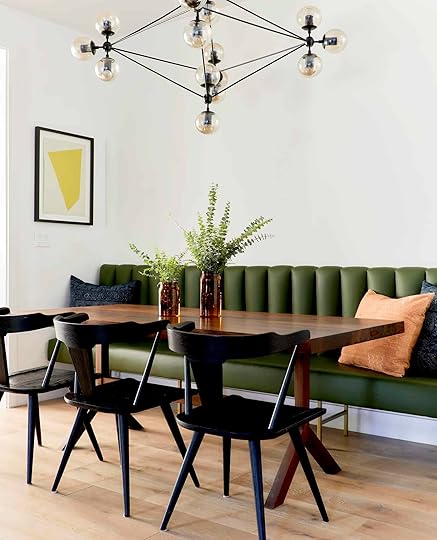
Helpful Tips for BanquettesHow wide should my table be? If you’re going with a straight banquette, have fun with whatever width table you’d like. (Lucky.) But if you’re opting for something L-shaped, there’s an easy rule: you want a table that’s just a little narrower than the shortest leg of your banquette. Example: if I buy this three piece banquette – it’s a 48″ bench, a 36″ bench, and a corner piece – the widest I can go with my dining table is 36″. Your tabletop should overlap each bench by 3″-4″, so a 36″ table should look as if it’s perfectly scaled for your banquette setup. How deep should my banquette be? You want to aim for 18″ of depth. If you’re designing from scratch and want a thick back cushion, keep that in mind – you’ll need to make a super deep frame. What kind of table do I need? The shape is totally your call, but try to look for a pedestal base. If you’re squeezing a table into a tight space, the last thing you need are FOUR legs in the way. (I’ll point this out in detail in a second.) Beyond that, it makes sliding in and out way easier for both you AND your guests. There are some exceptions here – and I’ve shown a few of those too! – but when in doubt, go for a pedestal table.As always, I’d love to kick it off with my two recent pieces of inspiration…

 left: design by dabito, via old brand new | right: design by project m plus and joy cho, photo by bethany nauert, via oh joy
HELLO, FAMILIAR FACES. Dabito’s space on the left is actually what got my wheels turning – he created a super spacious dining area that still feels pretty light and welcoming and uncluttered. When you’re rockin’ such a busy wallpaper, it’s kind of brilliant to not have a million table and chair legs also contributing to the visual chaos. This banquette is about 74″ x 74″ (made out of two 48″ bench pieces with a corner bench – yes, I stalked everything in this room) and its been paired with a 48″ table, per the suggestions above. That said, this is a great example of saying “screw the rules” – while a pedestal base would have allowed for more overlap, the impact of this 3-legged table is pretty incomparable. Let this be your daily reminder that pretty looks good next to pretty, no matter what the rules say
And man, Joy’s space is just so happy and cheerful and on-trend. That fluted base on the seating is great. The pedestal table is great. The chairs are great. The color scheme is a dream, too – it’s bright without being overpowering or loud. (And that brass toe kick on the base of the banquette? Great, thoughtful detail.)
 design by cecilia casagrande | photo by sean litchfield | via boston globe
I would like to see about 40 more photos of this home, please. (The client’s sole design request was essentially just “no white,” so the few photos on the Globe’s site are a masterclass in mixing and matching super-saturated tones.) BANQUETTE TALK, THOUGH: I love the traditional profile on these built-in boxes paired with a super-modern (and not white!) tulip table. Also, do you see how the benches extend out a bit past the edges of the table? It makes sliding in and out way easier (trust me on this one, guys).

 left: design by gachot, photo by nicole franzen, via living etc. | right: design by matthew caughy interiors, via casa vogue
I know I said “beyond the breakfast nook” – and we’ll get there in a few more scrolls! – but OH MY GOSH, PLEASE LOOK AT THESE CUTE BREAKFAST NOOKS FIRST. I can’t help but think back to all the years I spent cramming illy-sized dining tables and chairs into that weird no-mans-land at the end of my kitchen when I could have been lounging on a sweet lil’ sofa instead. (If you live in LA, you may be able to commiserate. If you don’t live in LA and would like a visual reference, seemingly every kitchen in a pre-1960s building has a “dining space” like Jess‘. She opted for a banquette and it looked DYNAMITE.)
 design by chiara de rege | photo by max burkhalter | via architectural digest
This is my favorite shot in the post!!! I WANT TO MOVE IN. These poufs (with back support!) are the perfect scale for this petite table – something with a more traditional profile or geometric shape would have felt too big or boxy in this confined space. (PS. I didn’t cry when I saw the price tag on those chairs, but I also didn’t NOT cry. One day, y’all.)

 left: design by batiik studio, photo by bertrand fompeyrine, via clever | right: design by simone mcewan, via hunker
These are the last two tiny setups I wanted to show you today – both are SUCH examples of how to use really tight spaces. I love how sleek the built-in banquette is on the right, because it really lets that custom table and vintage chairs shine. (Pro tip: this blue tabletop was custom made from MDF, which is a great way to get a high-end look on a budget.)
And, I mean, who WOULDN’T want to relax in this moody nook? So intimate. So luxe. The design here is so good that you totally forgot that red and green scream “it’s Christmas!!!” in literally any other setting, right? Clock those pedestal bases on both tables, too – when you’re navigating close quarters, the last thing you need are four legs taking up SUPER valuable real estate.
 design by crystal sinclair designs | photo by sean litchfield | via home adore
I encourage you to click through and peek at all the photos of this room – there’s SO, SO, SO MUCH function in a pretty reasonably-sized living room. The layout is phenomenal and inspiring (like, enough to make me reconsider my entire living room – it’s awesome). The choice to extend the banquette all the way to the wet bar is brilliant, too – like, sure, it provides extra seating, but it also just looks so finished and polished and considered.

 left: design by olivia botrie, photo by angus fergusson, via house & home | right: design by basic projects, photo by kirk robert, via garden and gun
Coming in hot with two more leather inspiration shots for all my practical cuties out there!!! Upholstery is obviously pretty freakin’ important when you’re, you know, EATING and DRINKING and SPILLING HAPHAZARDLY (just me on that last one?). If you’re not going to opt for a stain-resistant fabric, leather or vinyl will be your best bets for easy cleanup.
 photo by julie ansiau | via marie deroudilhe
Y’all, I pinned SO MANY joint-dining room/libraries when digging around for this post. Is this like, the next big thing? (Don’t vote yet, there are two more below!!!) This one reminds me a bit of Arlyn’s dining room, though – if you’ve struggled at all with your floating dining table taking up too much space in a room, why not try to bring it closer to the wall so you can open up a wider walkway? Banquettes to the rescue!!
 left: photo by sara-ligorria tramp, from: afraid of designing a boring home? | right: design by sceg architetti, photo by barbara corisco, via architectural digest
TWO MORE STRAIGHT BENCHES FOR YA. Since this is pretty reminiscent of a classic dining setup – like, a rectangular table with seating on both sides – the “opt for a pedestal base” rule (read: suggestion) no longer applies here. Don’t go crazy with your table length and be sure to leave enough space to slide out (on BOTH sides!), but otherwise…the world’s your oyster, baby. Enjoy your unlimited table selection.
 design by raphaël le berre and thomas vevaud | photo by
stephen julliard
| via veranda
design by raphaël le berre and thomas vevaud | photo by
stephen julliard
| via verandaI have had this pinned for YEARS and it still hasn’t gotten old. What a freakin’ GENIUS solution for an ultra-narrow, design-agony-inducing dining room!!! I’m not normally a glass dining table fan (in case I haven’t made it clear, I am the world’s messiest eater and I lack the tolerance to handle smudges on an all-glass surface) but this airy table and those neutral oak chairs really let the banquette and wallpaper shine. I can’t help but imagine this as like, a blank box when the homeowners first moved in – I don’t think ANYONE could have dreamed that such a tight spot would one day comfortably fit a dining table for 8+ people. (And before you scroll, peep the Seletti monkey sconce in the back!!! It’s all just so fun!!!)

 left: design by giancarlo valle, photo by wim wenders, via architectural digest | right: design by kevin dumais, photo by eric piasecki, via elle decor
We have OFFICIALLY reached the ~large and in charge~ portion of the roundup, friends. Both of these rooms could have happily housed a whole bunch of dining chairs…but like, don’t the banquettes just look better? The room on the left just feels so clean and uncluttered; the banquette on the right allows the dining table to line up JUST RIGHT with that doorway (if there were regular chairs instead of this leather bench, the table would have needed to go way further into the room so the person in the middle could reach their seat!).
 design by d’apostrophe design | photo by william waldron | via architectural digest
WHAT. A. STATEMENT. Without the banquette, this table and these chairs would have felt dinky and aimless (they’d just be floating in the middle of nowhere, guys!!!). If you’re looking for high impact without a ton of stuff, consider opting for a huge piece of furniture that can anchor your space. Everything here is minimal and quiet, but it also feels finished and intentional. (I could never pull this off – BRB, can’t stop putting color everywhere – and that makes the restraint displayed here even more impressive to me.)

 left: design by celerie kemble, photo by christopher sturman, via house beautiful | right: photo by marc von praag | via living etc.
Two more U-shaped banquettes for ya! Notice the return to the pedestal base – if more than half of your family/friends/whoever’s at your house will be seated on the banquette, it may be wise to at least consider getting those table legs out of the way. On the left, please clock those pull-out drawers underneath the bench seating. On the right, please clock another dining library (!!!).
 design by beata heuman | photo by simon brown | via living etc
And to think – I allllllmost made it through a post without a Beata Heuman photo. I wrote about this one a little bit when I tried to externally process how to put furniture in front of a window, but I had to share it again here – look how the moulding runs across the base of the banquette! SUBLIME. It’s also pretty fun to see a banquette being used at the short end of the table, don’t you think? (Also, please notice that the outlets on the right haven’t been Photoshopped out, which is not relevant but still VERY COOL!)

 left: design by hadley wiggins, via 1st dibs | right: via barlow & barlow
And before I let you go, I just wanted to make sure that you felt empowered to go REALLY long with your banquette bench seat. I know that end chairs can feel pretty confusing when it comes to built-in seating – like, “do I need them? Will they look weird if my chair overlaps my bench?” – so let this serve as evidence that your end chairs will look GREAT, no matter where they fall. (And get a load of that third little library vignette on the right!!!)
But now, I gotta know – WHAT SAY YOU? Any pro tips to share with the audience? And maybe most importantly of all – which one of these is your favorite??? (My top 3: the Beata Heuman yellow sofa/pink chair combo, the super narrow dining room with the blue banquette, and obviously the little nook with those $$$ flower poufs.) Let’s all crown a winner…or we could also, like, talk more in-depth about the subject at hand. (Either way.) I’ll see ya down there! LET’S CHAT? xx
Opening Image Credits: Design by Sarah Zachary | Photo by Sara Ligorria-Tramp
The post Beyond the Breakfast Nook – 24 Banquette Ideas For Rooms Of All Sizes (+ 3 Rules To Know) appeared first on Emily Henderson.
April 18, 2022
Is Your Home In Need Of Some Affordable Personality?? Vessels Under $50 (+ Our Tricks On How To Style Them Like A Pro)

One thing we do when we brainstorm is we ask each other what we are all shopping for in terms of decor. Is it pillows, curtains, rugs, lettuceware? But my thought this time was “what do you look for on vacation?” since I had just gotten back from my first real vacation since pre covid. For me, it almost always ends up being a small vase or some kind of vessel. So when I was in Mexico City last week, I “accidentally” bought two vases. The design gods took the wheel and my hand tapped my credit card. It was utterly out of my control. But truly, a unique vase (or vases) adds in that extra layer of “special” and dimension to a finished room. Think of every room Emily or any team member has designed… there’s a minimum of one vase, right? (Tell me which rooms came to mind first in the comments:)). And IF there’s only one it’s usually in a bathroom or a room that is very minimalist. So today I not only wanted to take a little deep dive into how we’ve styled them in the past, giving you some fun ideas on how to style yours, but also round up our favorites under $50.
That’s the beauty of this magic piece of decor, it can be so affordable with just a little research or in-person digging. We always encourage you to go out to your local vintage shops, garage sales, Craigslist, etc. since there are so many steaming hot deals out there and it’s the most sustainable way to shop. But for those who want to know which affordable vases we have our eyeballs I’ve got you at the end. But first, style school y’all!
 photos by sara ligorria-tramp | from: living room update – again – our new sofa, my dream floral chaise and the pop of red I always wanted in my life
It only makes sense to start with the home of the expert herself, Ms. Emily Henderson. This was the final version of her living room in her LA house and man it was my favorite (her’s too). But we are here to take about vases. Let’s start with the coffee table. I love love love these two white vases together. This is what we mean by “cousins not siblings”. They are completely different in shape (one angular and one circular), have different visual weights (I mean one is a literal hollow circle), are different heights (very important), and yet they are the same color so they don’t visually compete. They’re just buds.
Then on the shelves, Em mixed it up real good. Here she played with pattern and texture more (but also shape because she always does). All three vases have rounded shapes which makes them visually play nice together. For the Jungalow glossed, striped beaut, it adds a really fun bold pop of pattern which is then balanced out by the two natural wood vases. Then as you can see the two wood vases are different tones, sizes, and shapes, making them also “cousins not siblings” and able to be placed so close together. Three is most definitely company.
 photos by sara ligorria-tramp | from: our guest room/office basement suite reveal … + how to make a basement (office) feel warm, happy and functional
One more Emily room before we move on! This basement made us all (us and y’all) swoon. They are a lot of reasons why but one was that shelf situation on the left. For these vases, Em really focused on the blue color palette. You have the medium cream vase, the large light blue vase, and of course, that incredibly awesome saturate vintage turquoise cutie. The cream and turquoise are similar sizes but totally different shapes. Then adding in that large light blue one, it helps to mix up the scales and tie in the simplicity of the cream one and the color of the turquoise one. Another dream team.
But what if you aren’t styling a bunch of shelves and you just want a cute vase for your desk? Well depending on the look you want, we like to recommend contrasting the style of the room or area you are styling. Like with this desk. It’s beautiful and has a traditional style so Em chose an awesome graphic vase for contrast and a little bit of design tension. Cool, right? And very easy to replicate. Just have fun with different shapes and styles.
 styled by velinda hellen and emily bowser | photo by sara ligorria-tramp | from: in defense of the comfy sectional—a friend’s almost-finished family room
This next tip/exploration is right up my alley (which will be further proven in the next photo. Basically don’t be afraid to “go for it” in the number of vases if you have the space like on this shelving unit. Pick a color palette, vary the sizes, vary the shapes, and have at it. Just as you add take a step back (literally) and look if something needs to be added, taken away, or moved. Make sure it’s visually balanced so your eye is happy. See how on there’s a set of 3, a set of 2, and one lone large one (with a plant for added “muscle”:)). It would look too uniform and overwhelming with 3 sets of 3 and potentially, depending on the pieces, too sparse to only do one in each section.
 photo by sara ligorria-tramp | from: jess’ moto: you have to tee how the hacked her rental kitchen with diys
Lastly, we have my vase extravaganza from my last kitchen. I never didn’t love looking at my collection. I just tried to stay within my colors, mix up shapes, textures, styles, heights, and price points to make it feel really eclectic. I also think only one of those was over $50, maybe two. Each of them was hand-selected by me which made it all the more personal and special to me. O and they are also staggered to help with that visual dimension too:)
Shall we get into these affordable vases??

1. Ekua Ceramics Midnight Vase | 2. Abstract White Vase | 3. Pastel Looped Bud Vase | 4. Elise Vase Mirror | 5. Light Woven Vase | 6. Callia Vase | 7. Michaelo Grecian Bust Pot | 8. Zuri Vase | 9. West Elm Retired Blue & Off-White Vase | 10. Voir Clear Glass Vase | 11. Yaan Vase | 12. Brown Ceramic Pedestal Bulb Vase | 13. Davis Vase | 14. Flower Vase | 15. Joss Deep Teal Vase | 16. Large Ceramic Vase | 17. Terracotta Cylinder Vase | 18. Dial White Shiny Vase | 19. Single Handle Vase | 20. Kadoma Vase | 21. River Rock Vase | 22. Amel Vase | 23. Ryker Jug | 24. Handmade Ceramic Vase
I also handpicked all of these so I clearly love them all. However, if there was ever an OG Emily-style vase I think #1 is the winner. It actually reminds me of the vintage blue lamp base in Birdie’s nursery. I rarely met a handled vase I didn’t but #3 and #15 really do it for me personally. Then if texture is what you are after #6, #13, and #24 are pretty special. But you get it. Whichever vase you choose, just make sure you love it and it brings some life into your home. Never forget to mix it up!
Love you, mean it.
Opening Image Credits: Styled by Brady Tolbert and Emily Bowser | Photo by Sara Ligorria-Tramp | From: A Modern and Organic Entry: Shelf Styling Tips
The post Is Your Home In Need Of Some Affordable Personality?? Vessels Under $50 (+ Our Tricks On How To Style Them Like A Pro) appeared first on Emily Henderson.
April 17, 2022
The Link Up: Emily’s Stylish Windbreaker, Caitlin’s Favorite Wide-Leg Jeans (On Super Sale) & A New Online Store We Love

Hello friends! Welcome and Happy Easter to those who celebrate. But it’s also Sunday so you know what that means. It’s link up time! Let’s hop (get it?) right into it, shall we?
Today’s home tour is home of TV producer Shonda Rhimes and goes to show when you are the showrunner, creator, head writer, and executive producer for 18 seasons of Grey’s Anatomy you might just get a dreamy NYC apartment like the one above. But TV credits aside, this home tour will have you embracing chinoiserie wallpaper, pops of yellow, and ornamental accents in no time.
From Emily: I’ve been “windbreaker” shopping for a while, looking for something that is a thin layer, with pockets, that doesn’t look schlubby or too athletic. Found it  and love it. It feels cool and stylish, has huge pockets, and nice details. Comes in a few colors (I wish more). Size down (I’m wearing an xs and I’m a size 6) but I don’t want to layer anything bulky underneath it, so if you do I guess get the normal size. Also, it’s not a rain jacket (says the reviews) although I’m sure it can handle sprinkles. But for those of us who go on long walks and don’t want to be weighed down but still want a layer, this jacket is awesome.
From Ryann: It seems all I ever recommend lately are jeans and makeup products, and for that I am sorry. But not that sorry apparently because I have two more coming your way. First, these dad shorts that I am never taking off. I feel like I am living my middle school dreams because I can finally afford Abercrombie, and their whole rebranding has really gone in my favor. These shorts are stupidly good. They actually have legroom and the perfect rise and length. Again, never taking them off. Next, I have to recommend this bronzer. I left my makeup bag at my parent’s house 3 weeks ago so I have been facing the world (very bravely I might add) without any product. But when I had an engagement dinner to go to, I wanted to prime my face a little but wasn’t going to buy all new makeup. Long story longer, I was looking for a bronzer but also wanted a little blush and found just that in this incredible product by Benefit. It’s basically bronzer, blush, and highlighter all in one and it’s GORGEOUS. I put it on my cheekbones and high points of my face and it just gives the best color. It instantly became a new fav. 10/10!!
From Jess: Fashion designer Carly Cushnie just completed her first interior design project and it’s beautiful! Airy, elegant, and very Parisian-inspired which you know has a big piece of my heart. Also, Caitlin is UNSTOPPABLE with her trend predictions. Do you see those murano glass pendants?? Go take a peek:)
Also From Jess: As I said last week, I went on vacation and part of that was on a beach:) And I don’t know about you but my hair loooooovvvveesss to tangle at an Olympic level, especially after I go swimming. So when I was at Sephora, before the trip, I snagged the mini version on this leave in conditioner and it was a dream. I honestly might get the full size for regular use.
From Mallory: I met a cool new friend who works at this amazing store…their stuff is vintage-inspired and INCREDIBLE. Plus the founder comes from the family behind Amsterdam Modern. Definitely check out both, they’re the design lover’s dream stores
From Caitlin: My favorite wide-leg jeans are on super sale right now!!! If you have a butt and/or wide hips and you’ve also struggled to find a pair of wide-leg jeans that aren’t tight on your thighs and then wide everywhere else, THESE ARE THE ANSWER. I linked up the wash that I own and it’s such a good everyday/relaxing weekend jean. I took a nap in them last week (on purpose!!!) – THAT’S how comfortable they are. A million stars from me!
Opener Image Credit: Design by Michael S. Smith | Photo by Michael Mundy | Via Architectural Digest
The post The Link Up: Emily’s Stylish Windbreaker, Caitlin’s Favorite Wide-Leg Jeans (On Super Sale) & A New Online Store We Love appeared first on Emily Henderson.
April 16, 2022
6 Easy and Affordable Last Minute Easter Decorating Ideas

Happy Saturday sweet friends. In case you haven’t checked your calendar, yes it is already Easter weekend and if that fact has caught you by surprise you are not alone. This month has (say it with me) flown by so if you haven’t had the chance to even ~think~ about Easter decorating, no one should blame you. If that is the case, but you still want to bring some festive touches into your home this Sunday, we have your back. These are six easy and cost-friendly hacks that we’ve done ourselves, and each one will have Easter Sunday brunch feel bright and happy in no time. Let’s get into it.
Use Dyed Eggs As A Center Piece photo by dylan + jeni | from: my pastel easter brunch
If you are celebrating Easter with young ones, you are probably planning on dying eggs. You are already halfway there! All you need now is a footed (or regular) large bowl, your dyed eggs, and voila you have a centerpiece that is colorful, affordable, and festive.
Forage For Spring Flowers styling by julie rose and velinda hellen | photo by sara ligorria-tramp | from: it’s time for warmer, pastel inspired gatherings
Spring, as they say, has sprung. Foraging for flowers and branches is an everyday styling trick that we here at EHD will do any chance we can. It saves so much money, is good for the environment, and it makes for beautiful, rustic flower arrangements. We love all types of wildflowers, but if you have cherry blossoms or daffodils near you, talk about the perfect Easter flower arrangement.
Spray Paint Branches To Make An Easter Egg Tree image source
Emily successfully did this craft with her kids for the past two years (sorry no pics). All this entails is a few branches from outside, white paint or spray paint, a pretty vase, plastic or paper eggs, and some string. If you don’t have any plastic eggs, you can cut egg shapes from construction paper or even a paper plate. Or, nix the eggs altogether and hang little pom–poms. This is just a fun, easy-to-do DIY that can act as a pretty amazing centerpiece too.
Use Greenery For Your Tablescape
 left: styling by julie rose and velinda hellen | photo by sara ligorria-tramp | from: it’s time for warmer, pastel inspired gatherings | right: photo by tessa neustadt | from: chic and affordable rustic tablescape
Name cards add a special touch of thoughtfulness to any gathering and this one is SO simple to DIY. We used dried flowers from Target, a real leaf, the name written with white sharpie, and a piece of twine to tie it all together. It’s a DIY even I could do. On the right, you’ll find a sweet little DIY that Emily did all the way back in 2014 (!!). All you need is a napkin, gold wire, and a rosemary sprig. It’s so easy, so chic, and will elevate any tablescape.
Grab Some Pink (Or Pastel Colored) Taper Candles design by eddie ross | via house beautiful
If you are really in a pinch and just want a pop of color, almost any craft store will have taper candles, and a few pink ones (or other cute pastel colors) sprinkled throughout will feel festive and intentional. Add this to your tablescape with a few spring flower arrangements and you are in business.
Add A Dose Of Gingham styling by julie rose and velinda hellen | photo by sara ligorria-tramp | from: need some at-home easter brunch inspo?
When in doubt, go with pastel gingham. It’s a pattern that screams spring and is very playful. If you don’t have a pastel gingham tablecloth lying around, do not sound the alarm just yet. You can replace the full table cloth with a fabric square and angle it on your table so covers most of the table, but still shows some of the pretty wood underneath.
And there you have it. Hopefully, this post helped you find some fun, low-maintenance Easter decorating ideas if that’s what you are looking for. Have a great weekend everyone (speaking of the weekend, please enjoy my favorite video clip). xx
Opener Image Credit: Styling by Julie Rose and Velinda Hellen | Photo by Sara Ligorria-Tramp | From: Need Some At-Home Easter Brunch Inspo?
The post 6 Easy and Affordable Last Minute Easter Decorating Ideas appeared first on Emily Henderson.
April 15, 2022
The 13 Renter-Friendly Hacks We Swear By (And Have Done Ourselves)

I can think of about 10 pros that come with renting and all of them have to do with not being responsible for home maintenance. As a temporary lodger, it is technically not my fault when the garbage disposal breaks or windows start leaking when it rains. When that happens, I call up Mr. Landlord and say “We’ve got a problem that’s really your problem so please come fix it”. This lack of responsibility is one big reason why I’ve been a renter for 7 years now and will be for the foreseeable future. And yet, there can be no pros without a few cons. My apartment is temporary no matter how long I plan to stay, so I can’t go around breaking down walls or ripping up the tile in the bathroom. And even if I could, my bank account would suffer, and I’d be a dummy for spending so much time and money on something that is not mine. Herein lies the plight of us renters. We deserve a home we love but at what cost? What’s worth it to upgrade and what are we doomed to live with?
Over the years EHD has done the work in figuring out just that. These are tried and true hacks that are mostly low cost, low maintenance but always guaranteed to make you and your rental happier together. Grab your hard hats and let’s get started with the lowest lift…
Replace That Old (Or Boring) Hardware photo by sara ligorria-tramp | from: sara’s living room & dining room reveal
This is the most low-lift yet impactful hack out there and happens to be a classic EHD design move. We encourage replacing doorknobs, cabinet pulls, towel racks, dresser knobs, switch plates, you name it. It can be very affordable and the best way to change up the style on a piece of furniture or in a room. All you need is a screwdriver and the hardware of your choice and you’re in business. Look at you go! Recently, Sara did this (above) with her Ikea entry cabinet and it upgraded a plain piece of furniture to have a modern Scandinavian feel.
If you are in the market here are some ones we love:

1. Perles Knob with Round Backplate | 2. Emerson Cabinet Knob | 3. Tumbled Brass Tilden Drawer Pull, 4″ | 4. Gateway Ring Pull | 5. Revitalize Cabinet 5 1/16″ Center to Center Bar Pull | 6. Hive Knob | 7. Classic Hardware Cup Pull | 8. Edgecliff Pull | 9. Classic Hardware Knob | 10. Luna Cabinet Knobs | 11. Classic Hardware Thin Pull | 12. West Slope Cabinet Knob
Painting (We Promise It’s Worth It) design by ryann miller for ehd | photo by sara ligorria-tramp | from: ryann’s moto reveal: living and dining room
There is a reason we talk extensively about paint colors around here. Being trapped within walls that are not your ideal color is depressing. Luckily, this is a pretty easy fix and hiring help is not necessary. You will likely need permission from your landlord to do this (or, some of us rebels maintain the philosophy that it is easier to ask for forgiveness than permission). As long as you paint it back to the same color before you move out, you should be in the clear. I mean look at the transformation Arlyn’s dining room made with a coat of paint.
P.S. A bunch of paint companies are delivering paint cans right to your door. Head to this post to see which ones are our favorites.
Install Temporary Wallpaper For A Hint Of Personality photo by sara ligorria-tramp | from: a home office makeover with threshold removable wallpaper
Removable wallpaper is alive and well, my friends, and good thing because it can add so much charm and intrigue to your rental. We love adding temporary wallpaper and murals in nooks or small spaces because it can make the space pop. Also, it can create the perception of different “zones” even in the smallest spaces if you don’t cover every wall.
 design by caitlin higgins for ehd | photo by sara ligorria-tramp | from: caitlin’s first moto revel – a vintage bathroom gets a modern update
 We aren’t going to lie, wallpaper can be labor-intensive, but nowadays there are some great options out there that are easy to install and remove. Here are some of our favorites:

1. Tropical Wallpaper | 2. Birds of Paradise Wallpaper | 3. Honeysuckle Wallpaper | 4. English Rose ~ Watercolor ~ Black and White Wallpaper | 5. Blossom Botanical Wallpaper | 6. Striped Wallpaper | 7. Scenic Tree Toile Removeable Wallpaper| 8. Rose King Protea Art Deco (forest green) 18”Wallpaper | 9. Minimal Floral Wallpaper | 10. Waves Removable Wallpaper | 11. Floral Chinoiserie Wallpaper | 12. Avenie Warped Checkerboard Removable Wallpaper
Or make your own wallpaper using pages from a vintage book or pieces of unframed art!
 image source
This reminds me of my childhood bedroom except my makeshift wallpaper strategy was cutting out pictures from fashion magazines and pasting them all over my walls. I am thrilled to discover that there is an adult version of this. I can imagine recreating this look with vintage botanical guides, drawing books, magazines, or postcards. The best part is you can simply use double-sided tape or even putty to avoid doing harm to the walls.
Install Window Treatments That You Love photo by sara ligorria-tramp | from: julie’s huge (and diy packed) bedroom upgrade
Good window treatments don’t feel necessary (especially if you have blinds that came with the space). But we PROMISE that installing curtains or roman shades like Julie did will make your house feel like a home. It feels like a magical transformation. Now, most of the time it’s very doable to find affordable options but sometimes you might need to go custom (weird windows) like in Jess’ apartment, but if you can swing it will make all the difference. And if knowing how to hang them is holding you back, we’ve got you.
O and if privacy/sleep is REALLY important to you, then we really recommend blackout shades.
Replace Those Ugly Light Fixtures To Light You Up photo by sara ligorria-tramp | from: reveal: arlyn’s bright & happy rental living room makeover
 photo by tessa neustadt | from: house tour: mel’s new place makes us want to declutter immediately
This is a more advanced move and we advise acquiring the help of an electrician unless you are confident in your wiring abilities. But do not skip this step if you can help it because it’s so impactful. I mean talk about a custom-looking home. Do yourself a favor and replace that chandelier from 1985 that you can’t stand to look at. It’s worth the labor and you can always bring your light fixtures with you when you move (just make sure to save the original one to reinstall).
Hot TipIf you have an exposed hanging cord, wrap it in twine or some patterned fabric.

1. Lucent Pendant Light | 2. Holt Leather Pendant | 3. Cedar & Moss Conifer Pendant | 4. Blair Pendant | 5. Bruna Walnut Wood and Linen Pendant | 6. Wicker Globe Pendant | 7. Sculptural Metal Pendant | 8. Bahama Pendant with Light Rattan Dark Bronze | 9. Hakka Conical Rattan Pendant

1. Amber Glass Cyra Wall Sconce | 2. Shana Sconce | 3. Wood And Black Metal Dome Adjustable Bryce Wall Sconce | 4. Flynn Single Wall Sconce | 5. Leap Black Sconce | 6. Piffle Black Wall Sconce
Ugly Floors? Install Peel & Stick Vinyl Tile photo by tessa neustadt | from: brady’s kitchen reveal
Remember Brady’s insanely affordable vinyl floor hack?? It cost under $50. No, I am not kidding. And guys, this kitchen is so good looking you’ll be shocked that it is a rental. The best part is if you follow his steps you don’t have to touch the original tile at all. It basically entails measuring the space and putting down tile “stickers”. Here are some more of our favorites:

1. Woven Marble 12″ x 12″ x 1.5mm Luxury Vinyl Tile | 2. Mexican Diamond Vinyl Tile | 3. Self Adhesive Floor Tile-Navy Pearl-20 Tiles/20 sq ft | 4. Tiles for Kitchen/Bathroom Backsplash -Montecito | 5. Retro 12″ x 12″ x 1.5mm Luxury Vinyl Tile | 6. Salon in Red Earth Vinyl Tile Sticker Pack
Replace Outdated, Grimey Faucets photo by zeke ruelas | from: brady gives a refresh to his vintage bathroom
This step might seem intimidating but thanks to Youtube there are thousands of videos that can walk you through it, step by step. And the labor is worth it. I personally love a matte black or brass faucet and the difference they make in an otherwise run-down bathroom or kitchen.
You can also go the route that Brady did and overhaul the whole sink, toilet, and mirror with your landlord’s permission. But unless you plan to spend years in your rental (which Brady has), it’s not the most financially sound option.

1. Widespread 2-Handle Bathroom Faucet in Matte Black | 2. Brass Linden Lever Handle Widespread Bathroom Sink Faucet | 3. Single Hole Bathroom Faucet with Pop-Up Drain Assembly | 4. Widespread Bathroom Faucet with Pop-Up Drain Trim – Less Valve | 5. Positano Standard 1.2 Gallons Per Minute GPM Widespread Faucet | 6. Ladera 8 in. Widespread 2-Handle Bathroom Faucet in Spot Defense Brushed Nickel | 7. 1-Handle 4-in centerset Bathroom Sink Faucet with Drain with Deck Plate | 8. WB-0300B Widespread Bathroom Faucet with Drain Assembly | 9. Victorian Bathroom Sink Faucet
Replace Toilet Seat Cover (Easy, Peasy) design by julie rose for ehd | photo by sara ligorria-tramp | from: reveal: moto reveal: julie’s anything but beige, amazing diy bathroom refresh
We love any easy bathroom hack because rental bathrooms don’t get enough love and respect. If your bathroom is your least favorite place to visit, you probably are not giving it the attention that it deserves (she says to herself…). Replacing the toilet seat is so simple to do (plus was an EHD 2020 bathroom trend prediction) and Julie did it in her last place. The act itself will feel like a small step towards more self-care. Oh, and while we’re on the subject of self-care, you can get real fancy and install a bidet, too. Both Jess and Bowser love theirs. There are some great, affordable options out there that some of us have and love love love.
Install A Pretty Countertop Cover photo by: sara ligorria-tramp | from: jess’ moto: you have to see how she hacked her rental kitchen with diys
Who could forget Jess’ DIY countertop cover?? She used alder plywood and employed the help of her very handy dad to create this stunning and chic cover (inspired by Sarah Lonsdale) and it immediately modernized the space. Though she had some assistance, it’s a pretty straightforward process and if you are curious, be sure to head to her kitchen reveal for all the deets. In fact, head there no matter what because the whole kitchen is SO good and full of tons of other renter-friendly hacks.
 Remove Cabinet Doors To Create Instant Open Shelving
Jess’ rental kitchen happened to come without closed cabinet storage up top, but seeing this photo reminded us that this can easily be done in any kitchen. Removing cabinet doors can open up your space and give you an opportunity to display all your favorite kitchenware (and could be a unique place to sneak in some art).
Hot TipTo make the inside of your cabinets display ready, paint or use removable wallpaper for a solid glow up.
Install A Temporary Backsplash design by anita yokota
Backsplashes are sadly overlooked in rentals. We generally don’t replace kitchen backsplash tile because of the time, energy, and money that it requires. That’s a job for homeowners, we say! But, this is not to suggest that you are destined to be stuck with ugly backsplash tile or no backsplash at all. Tile is not the only option for backsplashes. Take it from Anita Yokota (who you might remember from this #ShowEmYourDIY post) who installed Rebecca Atwood wallpaper to make her backsplash pop. (Also, take a closer look at the countertop…it’s contact paper! Another countertop that is super affordable (like $40 affordable))
We also love this scalloped backsplash by Matilda Goad (which you may remember from this post). She tested it out with cardboard and when she felt satisfied with the look she turned to a local stonemason and had them cut out the shape in a granite slab that matched the countertop. This might be advanced for a rental, but in hopes that one of you might be able to come up with something just as intriguing I had to share.
Can’t Make Any Holes In Your Walls? Try these… photo by sara ligorria-tramp | from: sara’s tv room reveal
 Drilling 50 different holes into your wall to create the perfect gallery wall is not advised, but we certainly understand that it happens. Like I said before, sometimes it’s easier to ask for forgiveness than ask for permission. But might I suggest an alternative: Take notes from Sara’s TV room and even opt to hang art unframed as one way to avoid the drill (hint: she used putty). It’ll save you money and the time replastering holes when your lease is up and happens to look really cool. Win-win, my friends. But whether you want to use a frame or not, here are our favorite damage free, no hole making, picture hanging tools:
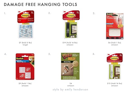
1. Command Medium-Sized Wire Toggle Hooks | 2. Large Black Command Picture Hanging Strips | 3. Mounting Squares | 4. Scotch Mounting | 5. Quakehold! | 6. Large White Command Picture Hanging Strips
Alright, that is all I have for now. I hope if you are in a rental (or even not) that you feel that making your home feel more like yours is very possible. And if you are very DIY-minded, have you done any of these hacks in your own rental? Are there any other rental-friendly tricks that we missed?? Tell me everything.
Opener Image Credits: Design by Ryann Miller for EHD | Styled by Emily Bowser | Photo by Sara Ligorria-Tramp | From: Ryann’s MOTO Reveal: A Moody Multi-Functional Living And Dining Room With A Lot Of Soul
The post The 13 Renter-Friendly Hacks We Swear By (And Have Done Ourselves) appeared first on Emily Henderson.
April 14, 2022
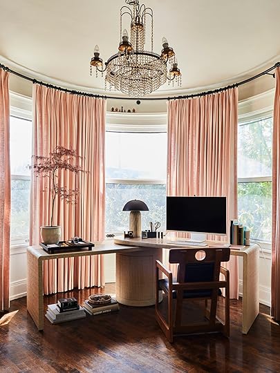
MOTO Reveal! How Jess Made Her WFH Office/Living Room Totally Multifunctional (With Big Help From The World’s Most Beautiful Smart Monitor)

Welcome to INSIDE my home! Well, a small but extremely important part of my home. FINALLY, A GLIMPSE! It’s kinda wild how different it feels revealing an outdoor space vs. an indoor one. I forgot how much more intimate it is. And this particular space is actually where you and I connect the most. Our hangout spot if you will because this office area is my personal EHD command center. This is where the magic happens:) BUT given that I live in a one-bedroom apartment, I need my office (*cough* living room) to be multifunctional. So it’s also my entertainment center and sometimes my dining room but we’ll talk about the latter, later. And boy oh boy did this office/entertainment center get a MASSIVE upgrade thanks to that beautiful Samsung monitor you are currently laying your eyes on. But we’ll talk about that in a little bit too.
I think to truly honor this current space we need to start from the real WFH beginning… .
 left: photo by sara ligorria-tramp, from: jess’ diy kitchen reveal | right: august 2020
I can’t believe I’m putting that right photo on the internet but hey who doesn’t love a real deal design journey?? Pictured on the left was how God, me, and my father (the builder) intended my banquette to be seen and used. You know, as a dining space for food eating and lively conversating. Well, that clearly came to a halt in March of 2020 since no one was allowed near each other and I needed a workspace ASAP. This WAS NOT how it looked all the time. I must have felt compelled to snap a photo on one of its grosser days. Also, I’m 99% sure this was taken soon after we had to clear out our old office, hence all the random home accessories piled together. Excuses, excuses.
But then the wonders of the universe swooped in (and my wonderful friends/neighbors, Franchesca and Ben) and I moved into this fairytale apartment. But since I didn’t have a desk to bring, I “borrowed” this folding table from Em’s prop garage. I technically still have it but am more than happy to return since getting my dream desk… and chair:)
WAIT. Before we get into the beautiful photos that Sara took, I had a pretty surreal experience of shooting a video… like a professional cinematographer, Dominic López, came to my home so I could talk about the gloriousness of the Samsung Smart Monitor M8 (and my office set up:)) Just wait for the ad to play and enjoy!
Curtains and Hardware | Desk | Desk Chair | Monitor
Since it was the topic of my most recent blog post… THIS IS THE CHAIR!!! It’s just. It’s just the coolest yet still practical chair I’ve ever had the pleasure of setting my eyes on. That circle cut out physically changes my eye shape into hearts every time I look at it. For those of you who were begging me to get an ergonomic chair, I promise I heard you but we needed to compromise. I needed to get a chair I loved looking at since this is also my living room and not in an office I can shut the door to. So ergonomic seat cushions have been ordered, but TBH the padded cushions on this chair are really comfortable. However, since I am sitting on it for many hours a day I know that a special butt and back cushion will make my butt and back happier. Then when I’m done for the day, in the closet they will go so I can just stare at the perfection of this chair. And if me needing this chair says anything, it’s that I was trained by Emily Henderson and Brady Tolbert:) IYKYK. It’s got both of their names written on it. I can’t thank Bassman Blaine enough for gifting it and Noir Furniture for always designing insanely cool pieces. It’s absolutely a forever piece.

Now to this desk that I will also never stop talking about. I don’t know who at Crate & Barrel got ahold of my design dream journal but they couldn’t have designed a more perfect desk for me and this window. We were all MADE for each other. For a little review, here are more reasons why it’s the perfect match:
1. It’s a desk that doesn’t read: DESK when you first look at it. This was important to me since it’s such a main piece in the space.
2. Both sides independently twist from the center so I can have them angled, straight, or nested together. This means it can also work as a skinny dining table if I want to have a dinner party! (For the full living room reveal I talked to Bowser about styling it both ways! It’s going to be so pretty.)
3. Has stunning textures. The majority of the desk is covered in seagrass and arrowroot grasscloth but the top and structure are white oak and engineered wood certified sustainable by the Forest Stewardship Council (FSC). So it’s beautiful and doing good for the earth. Win-win!
4. IT HAS STORAGE. The center is a full-on cabinet. Oh but if I don’t want to see the cabinet door for some reason I can twist it around to the back. See ABOVE for that little peek:)
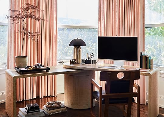
What is an office in 2022 without some beautiful technology?? When Samsung reached out asking if we had a project where their new Samsung Smart Monitor M8 would be a fit, my hand went up as fast as humanly possible. Why? Well, since we were told that it was not only a 32″ monitor (much bigger than my previous desktop) but also that it easily and wirelessly connects to our computers, AND it would give us a Smart TV Experience. It was the multipurpose device I needed! Not only that but it’s SO BEAUTIFUL and SO SLIM. And look, I’m not someone who loves looking at tech devices in general. Also, I’m sure it’s a surprise to no one that I’m kinda (read: VERY) particular about how my home looks and what’s displayed in it. So if I’m going to have one, this is the one I want to look at. Even the back has a subtle herringbone pattern. They thought about everything! Since I already had these incredible curtains by Decorview, I chose the warm white color. However, there are three other really beautiful colors to choose from – Sunset Pink, Daylight Blue, and Spring Green. Caitlin has her eyes very set on the Sunset Pink. Imagine how incredible it would look with her wallpaper?! This monitor was designed for people who love design.
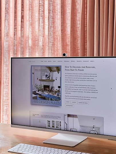

This baby also has moves! Up and down and forward and back (aka tilt). This is great for me since I’m kinda on the shorter side. BUT if you are on the taller side, you are also covered. Another customizable feature is that cute camera. It’s attached with magnets so you can leave it on (with a removable cap) or easily take it off when you aren’t using it or want the monitor to look more like a TV after work hours. Again, the design was so well thought out.
Oh, have you seen Emily’s book landing page? Have you preordered her new book? Well, here’s a peek displayed magnificently on this screen:)

Tree (Japanese Maple)
A beautiful monitor not only deserves to be on a beautiful desk and be accompanied by a dope chair, but it also needs beautiful desk friends (aka accessories). Let’s start at the bottom. Those books and accessories on the floor have been styled like that for at least a month and are things I’ve had for years. The fact that the great Emily Bowser only slightly rearranged the contents in the tray made me almost too excited. But the rest of the styling was all her. Duh.
What’s crazy about that ridiculously good large black tray on the desk (that I immediately ordered after the shoot), is that it hadn’t occurred to me to put a tray on my desk until Bowser popped it in. The reason why that’s wild to me is that we EHDers are “tray people.” We suggest and use trays all the time. We like to CORRAL things. Just goes to show that it can be easy to miss the most simple pillars of styling. So here’s my/our PSA… Could a tray help your desk? Your coffee table? Your credenza? Your bathroom counter? The answer is likely yes. Learn from my mistakes.
Now let’s move up and talk about these curtains. My heart is full every time I step into this room and see that perfect soft pink fabric framing my beloved turret. To be honest, I was nervous about my pink choice up until they were installed. I tend to have a super cute habit of second-guessing every. single. decision. I. make. until it’s in place. It’s not exhausting, don’t worry about it. But once they were here I was pretty over the moon. Also, I could stare at the custom rod all day long. Remember how it looked before with those sad three little hand-bent “rods”? Maybe scroll back up to remind yourself. Needless to say, these curtains are perfect, the process was perfect and perfectly seamless. Decorview makes you realize what quality service is. I’m serious. There aren’t enough thanks to Laura (my consultant), Joe (my installer), and everyone on the team!
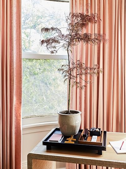
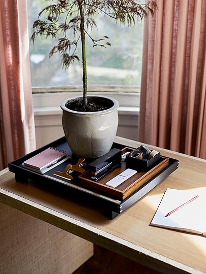
Large Black Tray | Pocket Notebook (similar) | Brass Clips | Brown Wood Tray (similar) | Stapler | Black Box (vintage)
That stunning tree is a Japanese Maple that Bowser found and the tonal moodiness really gets me in the right editorial director headspace:) That brown tray (#traysontrays) was snagged on one of the greatest days of my adult life… the day we got to have a shopping spree in Emily’s prop garage. I love how the warm wood contrasts the black tray but ties in the wood tape dispenser (see below) and the wood of the chair. But then she added that black iron box I got for $5 in Joshua Tree and the black stapler to tie the color palette all together! (#boxesontraysontrays) I knew buying something I didn’t technically need at the time would pay off. JUST KIDDING. Don’t do that…but also when a slammin deal on a cute box presents itself…
Please note the remote because it might be one of my favorite parts of this Samsung collaboration but more on that later.

Now let’s talk about that striped ceramic masterpiece before you. This lamp is not only one of my favorite lamps of all time but it comes with a cool story. Back when we had our studio, next door to us was the architecture design firm that renovated the building we were in. A wonderful and talented designer named Alexandra Cadiz worked for said firm so we got to know each other a little when we would pass by or be prepping our lunches at the same time. Fast-forward a couple of years, her husband, Micah Blyckert, started making these incredible ceramics and these lamps. These two have dare I say too much talent. Their company, Ceramicah, is absolutely booming. How could it not be? These lamps are incredible. And this one in particular added the perfect amount of texture and pattern.
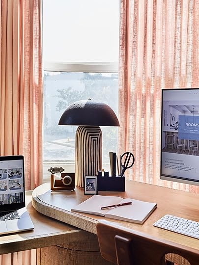
Wood Tape Dispenser | Photo Stand | Desk Tool Holder
Here’s another angle of the lamp. I KNOW. But let’s talk about these accessories. A desk needs to be functional. Duh. But personally, I need to work in a relatively uncluttered space. If it’s cluttered I will either A. Not be able to concentrate properly or B. Procrastinate on work and declutter (Emily doesn’t read this blog right? :)). So we kept it simple. That tape dispenser was another Bowser prop that I also immediately ordered. I love that little polaroid holder so I can have a little personal life reminder (that photo was actually from the last New Year’s Eve before Covid, so it’s both a happy and surreal memory). Then lastly, that super cool pen and office tool holder that Artifox generously sent is so good. I love that the shape is super modern but it’s wood so it also looks and feels earthy. Plus it’s in theme with the hole in the chair… or at least it is to me. Oh, and the pegs are removable and are magnets! A cool pen holder is such an easy way to add personality to your desk. This one is a 10/10 for me.
Okay. Now that I’ve talked through the design, let’s really get into the star of the show…


Black Metal Bookend | Mable Candlestick Holder (similar)
If I’m honest, I wasn’t totally sure what monitors did or were necessary for. But once I saw this one, learned a bit about it, then got it in my home I was like, “OOOO this is awesome.” To be fair this is a particularly special one given its “smart” capabilities. Let’s start with the “day/work” functions. If you are someone that really only needs to email and browse the internet, you don’t even need a separate PC. This monitor connects to the internet itself and you can connect your Bluetooth mouse and keyboard! So if you feel like browsing a super cool site like StyleByEmilyHenderson.com, all you need is this stunning monitor.


But if you are like me and need to use programs like Photoshop then you can connect your laptop or desktop wirelessly (via screen mirroring) or with hardwiring. What’s also so great is that this monitor works with all PC brands. So I use all of my Apple products that I already own. No need to have everything be Samsung! What a dream!
With working from home, video conferencing is pretty key, right? Without a PC, this monitor can support Google Duo. If you are a Zoom user then you just have to Zoom from your PC device and use the screen mirroring function. I love seeing my gals on the big screen.
Ok, it’s 5:30 pm, right? Work is done for the day so let’s watch some TV.

Day to night, baby. This is where the real gamechanger is for me. I don’t have a great spot in my kinda awkwardly shaped living room. Above the fireplace is way too high and also the idea of having another screen on some kind of stand in my living room bums me out aesthetically. So this puppy is the best two in one. And because it’s Samsung, the sound is great with its built-in speakers and options for different sound modes. There are also different picture mode settings based on what you are watching (ie filmmaker, movie, dynamic, and standard). I’ll get to the apps in a minute but with this monitor, you get Samsung TV Plus subscription free. So you can watch the regular news, free movies, and shows. It’s such a nice perk.
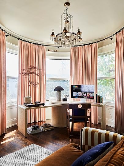
Sofa | Throw (similar) | Pillow (similar) | Rug
This is where I actually sit when I watch TV on my perfect sofa Since the screen is such a great size, it’s a really comfortable viewing experience (as opposed to my old desktop which was much smaller).

This shot is more accurate in terms of how close it is when I’m watching something. And this is where my love letter to this remote comes in. I’m a lady of convenience when it comes to technology. It’s what it’s “technically” there for right? But with my old desktop, there was no remote as most (all?) desktops don’t. So when I wanted to change what I was watching or if say Netflix rudely asked me “Still watching?” I would have to get up from my comfortable seated position, under my cozy throw and tell Netflix that I was most definitely in fact still watching/binging Schitt’s Creek for the 3rd time that year. But aside from having all of the apps you could ever want already embedded into the home page, this magical remote has a quick button for Netflix, Disney+, Prime Video, and naturally, Samsung TV Plus. They somehow made it even easier to stream. It’s the best.
FYI I did not plan on matching my sofa, but also not mad about it. At least I’m consistent.
There’s actually a lot more you can do – you can try workout classes with cool features, you can game your heart out, and you can control all of your smart devices via Voice Assistance regardless of the brand. Is Alexa alive in your house? That’s great. Is Bixby boppin around? Well, that’s a Samsung product so it’s obviously a friend. All in all, it’s just a super awesome device that I feel super lucky to have in my home. She’s beauty, she’s grace, she’s Miss Samsung Smart Monitor M8!

Not a bad before and after, eh? Oh, I almost forgot to mention my little wooden finials on my window ledge. I had the pleasure of getting a trip to Portland where I got to do a little vintage shopping with Em. This antique store had a bunch of them and I decided they would be pretty perfect for my window. Just wanted to share in case you were wondering.

Well, there’s me in my finally finished Home Office+ TM. The other side of the room is coming along slowly but surely and I can’t wait to show you all. Hope this was a welcomed “part room” teaser and that you may have gotten some ideas for your home office.
Thank you again to Samsung for sponsoring this post and letting me try the coolest and prettiest monitor out there:)
*Design by Jess Bunge (me!)
**Styled by Emily Bowser
***Photos by Sara Ligorria-Tramp
**** Video by Dominic López
The post MOTO Reveal! How Jess Made Her WFH Office/Living Room Totally Multifunctional (With Big Help From The World’s Most Beautiful Smart Monitor) appeared first on Emily Henderson.
April 13, 2022
The 20 Year Long Architecture Trend That *Almost* Took Over The World

I’M NOT AN ARCHITECT. (“Duh,” said you, and me, and literally everyone I have ever met or spoken to or even glanced at). But I am someone who spends way too much time looking at old houses on the internet, and today I want to introduce you to my all-time favorite type of architecture: Art Nouveau. It’s going to be a pretty high level overview, but I’d love to hear from some trained architects in the comments if anyone would like to expound!!!
Here’s the deal: Art Nouveau was a FLASH IN THE PAN. It came out of nowhere in the 1890s and it was florid and futuristic and sculptural – in modern terms, it’s kind of like The Hobbit meets Vogue. Art Nouveau picked up steam and spread across the globe for 20 years like wildfire, but its ornate aesthetic was too expensive to justify during the First World War. Instead, we saw the rise of Art Deco, which was a simple and streamlined version take on Art Nouveau – deco’s geometric shapes and straight lines were more affordable to produce than all of nouveau’s whiplash curves. BUT THAT’S ENOUGH HISTORY (for now, at least), LET ME SHOW YOU A BUILDING!
PS. There’s no Gaudi in this post because (a.) he’s already world-renowned and (b.) less famous places from my incredibly dense Pinterest board deserve some shine, too. I’ll link up some of his work at the bottom if you want to explore more in this style, though. OKAY NOW HERE’S A BUILDING!
 via explore brussels
WOW WOW WOW. Y’all, welcome to the Hotel Tassel (not actually a hotel, tragically – just a townhome that bears the name of its former owner) in Brussels, which is coincidentally the #1 spot on my travel list. The home was built in 1893 by an architect named Victor Horta – we’re gonna see a lot of his work later – and when it was unveiled, it literally BROKE PEOPLE’S BRAINS. No one had ever seen anything like this – it was like a period-appropriate art had come to life on a massive scale (scroll through this primer really quickly and you’ll be like “oh my gosh, art really DID inspire this architecture!”).
There are a few classic motifs that we’re gonna be looking for over and over as we stare at all of these photos – exotic woods, luxe stones, detailed mosiac tiles and frescoed walls, stained glass, curved metals, and lots of unexpected and organic whiplash curves. Let me show you one more of my all-time favorite storefronts before we get into the nitty gritty…
 source unknown
WHEW. I love this story! This 1896 shopfront in Brussels sat abandoned for years before a florist named Daniel Ost was like, “hey, I’m going to fix this.” And, I mean, MISSION ACCOMPLISHED. Box checked. I can’t really think of a more idyllic setting, can you? Art Nouveau was really big on embracing art and beauty in everyday life and it just feels fitting and fascinating to see that ethos celebrated and maintained nearly 130 years later. (Also, word on the street is that the Belgian royal family gets their flowers here, which is pretty neat.) OKAY. Now that we know what we’re looking at, buckle up, pals – I’m about to walk you through a few of my favorite nouveau architectural features…starting with entrances, OF COURSE
 via architectural digest
Let me set the scene: this residence (29 Avenue Rapp, in case you want to add it to your bucket list) is a 10 minute jaunt from the Eiffel Tower. It was built in 1901 and the home was super controversial at the time – turns out that a lot of folks in the neighborhood weren’t super jazzed about a seven-story building covered with partially and/or fully nude figures – but it actually ended up winning an award for the city’s most beautiful façade later that year, so things worked out. This is actually still an occupied apartment building – like, can you believe people get to LIVE here?! UNREAL.

 left: photo by arnim schulz | right: via archi
There’s just something about these entries that’s freakin’ magical, right? That door on the left is located in Barcelona. I know it’s hard to tell from this angle, but even the glass is etched! This saturated palette is unbelievable, too. (Who knew pistachio, cobalt, and hot orange could look so good in such a tight space? If you’re in need of some color inspiration, I highly recommend searching for “art nouveau interiors” on Pinterest – so many fresh and unexpected combinations!)
And get ready to have your mind blown: this home on the right is a NEW(…-ish) CONSTRUCTION. Take a minute and scroll down through all of the shots of the interior and exterior right here – everything in this home has maxed out form AND function. It’s all decorative without being super austere or intimidatingly formal – like, there’s a certain amount of fun that’s imbued by this architecture style, if that makes sense. I’m FASCINATED.
 source unknown
GAH. Another Barcelona gem, guys! This one is the Casa Comalat and it’s the kind of thing Disney princess dreams are made of. Every single thing in this photo was so thoughtfully designed – the floor moulding! The gradients on the doors and casing! That stained glass! The wall treatment! That ceiling moulding! And do you see that super thin gilded line on all of those recessed cutouts on the door? MASTERFUL. I love old houses, guys!!!
Windows + Floors
 left: source unknown | right: photo by daniel hoppe, via cnn
 Next up: ALL TYPES OF WINDOWS. This building on the left is in the heart of Mexico City – it was actually constructed in 1899 as a department store (gotta say, probably a good thing stores no longer look like this becuse I would ~bankrupt~ myself), but it’s now the site of the Gran Hotel. The ceiling was actually imported from France (!!!) and that big tube back there was the first iron and concrete elevator in Mexico City, which is SO FREAKIN’ COOL. Added bonus: only big nerds like me (and maybe you?) are THIS excited about imported Tiffany ceilings, so there’s not a ton of hype around the hotel and it’s pretty shockingly affordable. SHOULD WE ALL GO???
And if that formerly-abandoned department store on the right looks familiar, it’s because it’s actually the real-life set of The Grand Budapest Hotel. (Get some glimpses in the trailer right here – the transformation is pretty incredible.) Fun personal fact: I told the man I have a huuuuge crush on that I was gonna be blogging about Art Nouveau architecture and HE was the person who actually flagged this location for me – is this a green flag or the world’s GREENEST flag?? That’s keeper material, right?!

 left: photo by frederik vercruysse, via christies | right: source unknown
OKAY, OKAY, OKAY. BACK ON TRACK. Let’s look at some more windows, yeah? And while we’re at it, maybe we’ll stare at some of these painstakingly detailed mosaic tile floors, too. This space on the left is actually in the Horta Museum in Brussels – remember, he’s he guy who started this whole movement – and the craftsmanship in this space is straight-up astonishing. The window shape is so good! The built-in space for curtains! The symmetry! The curved AND tiled walls! This puts all of our 2020-era arches to shame, TBH.
The home on the right is the Maison Coilliot, which is about an hour and a half outside of Brussels (and 2 and a half hours from Paris, if you’re planning on embarking upon a European Art Nouveau tour). It’s pretty famous for its exterior – part of it is made from ENAMELED LAVA, GUYS!!! – but I just love this entryway vestibule and these interior windows. Have you ever seen a space look so sparse and so finished all at once? IT’S INCREDIBLE.
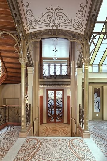
 left: source unknown | right: photo by , via elle decor
If you’re SUPER eagle eyed, you may recognize that mosaic flooring on the left – this is actually the entryway to Hotel Tassel, which we all (hopefully) freaked out over earlier. It’s really fascinating to me that four pretty definitively different windows (one window on the bottom right, the door in the center, one window up top, and that stained glass ceiling above!) all work together so well – here’s to finding some mixing and matching inspiration in the weirdest places, yeah?
BUT OH MAN. This space on the right is the entryway to the Hotel Hannon in Brussels, which is currently gearing up to reopen to the public as a museum. (Hooray!!!) I love this home because there is SO much going on that still feels kinda relevant – like, get a load of that SUPER veined marble on the steps!! That’s on trend, right?! It’s just so fun and maximalist without being overwhelming. (“Where am I going to put a pattern? Oh, uh, literally every possible place,” – Brunfaut when designing this home, maybe.)
Special Stairs + Iron
 left: photo by frederik vercruysse, via christies | right: photo by sophie voituron, via architectural digest
We’re finally putting pieces together – are you starting to clock some of these repeated design elements? (Because if not, I’m always happy to scream some more about stained glass windows and tile floors!!!) Both of these were also designed by Horta – the left is at his museum; the right is a smidge up the stairs from the earlier shot we just looked at! – and they each still feel fresh and unexpected and delightful. Art Nouveau is big on the whole “bring the outdoors inside!” messaging and the use of twisting iron REALLY captures that vibe, don’t you think?
 photo by siméon levaillant, via curbed
THIS MAKES ME WANT TO CRY. I cannot be the only person who goes completely bonkers when looking at a curved wooden staircase and this one is SO, SO, SO GOOD. Look at the way the balusters are curved inwards a little! Look at how even the bottom of the stairs have been finished with care! This home is called Villa Majorelle and it was built in 1902 as a dual residence and showroom for Louis Majorelle, who was a super cool furniture maker at the time. This dude was pioneering WFH abooooout 120 years ahead of the curve while living with the world’s most beautiful staircase, guys. I’M INTO IT.
 left: source unknown | right: photo by fred romero
WHO NEEDS A NEWEL POST? I’d like a newel art installation, PLEASE. I’ve always been partial to the building on the left – it’s the Gorky Museum now – because the architect was TWENTY SIX when he built it and everyone was like, “uh, this is nice, but it doesn’t really work as a house and it makes no sense.” But look at it now, baby!!! Iconic. The theme of this staircase is ~ocean~ (God, I love architecture with a theme!!!) and that’s a Medusa x Jellyfish lamp at the bottom. (Collab of the century, I think.)
The stairway on the right is so dreamy, too. (It’s like a tole chandelier come to life!) These stairs are located in the Reök Palace in Hungary and if you have 3 minutes to spare, I cannot recommend this quick little video tour enough. (When I broke my back in late 2020, I was pretty justifiably freaking out because I couldn’t move my legs. My doctors doped me up to get me to calm down, but they should have just played that video on repeat. Emotional Xanax, if you will. It’s SO soothing.)
Fireplaces
 left: photo by siméon levaillant, via curbed | right: photo by frederik vercruysse, via christies
We’ve seen these houses before!!! (Any guesses before I remind you?)
This room on the left is in the Villa Majorelle – yeah, the showroom/house combo – and it actually feels kind of livable and modern, right? It’s still a little out there, but it doesn’t feel as tied to the period as some of the other spaces we’ve looked at. Like, I could see someone designing something inspired by this in a 2022 renovation, couldn’t you? The fireplace is so whimsical without being childish or over the top – SUCH a great balance.
And yeah, the space on the right *is* still in the Horta Museum. That tiling just gets more and more astonishing and impressive, doesn’t it? Check out that built in, though – that little fireplace at the bottom is SO SPECIAL. I love how the stone surround is also used in that stripe around the lower perimeter of the room – it all just feels so cohesive and thought-out and bespoke and AHHHH!!! JUST WONDERFUL. (Let’s all seriously go to Brussels after we check out that affordable hotel in Mexico City.)
Carved Woods via architectural digest
Last but not least, I just really wanted to show you two of these SUBLIME examples of woodcarving and classic Art Nouveau shapes. This shot is from Maxim’s in Paris (fun fact: Wolfgang Puck worked here!) and in the mid-1900s, it was the most famous restaurant in the world. Today, there’s a little museum upstairs with an even bigger collection of furniture from the late 1890s-early 1910s, too. (And if you’re in the mood to live vicariously through others, the photos on the TripAdvisor page are enviable.)
 via art deco boutique
And now, I gotta leave you with ONE MORE from my boy Horta. This is Hotel Solvay and it kinda has a little bit of everything we talked about, you know? It’s currently a UNESCO heritage site (along with my favorite, Hotel Tassel!) and it actually just started accepting visitors twice per week, which is AWESOME. At the time of its construction, the owner of this home was incredibly wealthy. He gave Horta total design freedom, so my favorite architect went pretty HAM on the creative process – he created everything from the doorbells (!!!) to the furniture – and the whole place is decked out with like, tropical woods and onyx and some of the most incredible marble flooring I’ve ever seen in my LIFE. If you click through on that earlier link, you can actually take a Matterport tour of part of the home (I will confirm that it’s WAY better than taking Matterport tours of 400 square foot teardowns in LA).
THIS CONCLUDES YOUR WORLD TOUR FOR TODAY. I said this to Em on a call last week, but I’ll say it again here: I still can’t believe I get to play show-and-tell every week on a professional level. (And to be clear, I am fully aware that I am also approaching the nuances and intricacies of architectural discussion with about as much knowledge as a kindergartner participating in show-and-tell!!!) Hope you liked ogling with me – let’s do it again sometime??? xx
PS. This video is visually awesome for all you Gaudi fans. I’ve been to Barcelona and will concede that he does live up to the hype. And if I haven’t fried your brain, this video is awesome if you’re interested in the engineering behind Sagrada Familia. HAVE A GOOD WEDNESDAY!
The post The 20 Year Long Architecture Trend That *Almost* Took Over The World appeared first on Emily Henderson.
Emily Henderson's Blog

- Emily Henderson's profile
- 10 followers

