
Emily Henderson's Blog, page 128
May 19, 2022
Brick Flooring 101: How To Lay It And Take Care Of It From Someone Who Has Done It Herself

Brick floors have always been my jam. I used to work for a designer in Los Angeles who had a ton of clients with Spanish cottage-style homes in Montecito. We practically drove up there twice a week for onsites, and after checking in on these projects, we’d have lunch at the cutest little spots in town on our way back to Los Angeles. I loved these onsites most. Even though these homes were large in size, I always loved how the architectural details made them feel so quaint. One of those details being their brick floors. To be honest, back then, I was always given the task of choosing the pattern in which the brick would be laid and leaned more into the aesthetics side of the flooring. It wasn’t until my second design position at an architectural firm in Santa Monica, where I would truly learn the importance of specifying materials for their durability and sustainability. I would have never guessed it would take seven years until I’d fully understand the install side of brick flooring and the maintenance that comes with it (experiencing and having the flooring in my own home).
We know that brick is typically used to build walls, and for outside areas like gardens, driveways, roads, and walkways, but in recent years I’ve seen brick floors reemerge in the interiors of homes. This has been made possible by companies creating brick materials specifically to be installed inside of homes. These come in the form of brick sheets that are designed to make the installation of interior brick floors as easy as it can possibly be. They even come in the form of a herringbone pattern, so that the labor to install them doesn’t have to be so intense/expensive.
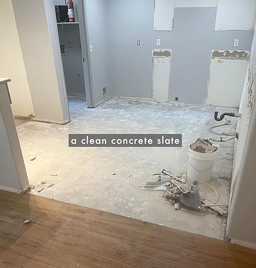
All that to say, here I am, three months later, after having our kitchen remodeled and I can finally give you an update on how our brick floors have been holding up, but first, let’s talk install.
INSTALLATIONNeeded Brick Flooring Materials: Cement board (sometimes), Mortar, Grout, and Tile/Stone Sealer

A client of mine was kind enough to give me the leftover brick from a mudroom I worked on a while ago, and this was a big reason as to why I decided on the brick flooring for my kitchen. I had a large amount of the brick tiles already and knew I’d be saving a lot on flooring by purchasing the remaining amount (on top of applying my trade discount). Another big reason I chose to go with the brick was because of all of the water damage we found in the previous flooring. There was water underneath the wood laminate and it was a tad bit moldy. After removing the laminate, we realized there was tile underneath it and still had some small puddles of water sitting on top of it (in between the laminate and tile). Then when pulling up the tiled flooring, we found concrete.
HOT TIP: I’ve done my share of research on brick flooring and found that cement board is for waterproofing over wood. Since concrete was already on the subfloor in my home, waterproofing was not needed here – we were able to do without the cement board.

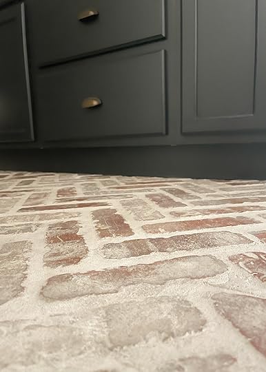
Let’s talk grout! I think the key is to have a brick mason and a tile installer when installing brick floors. My contractors had both come in to do our kitchen floor. Both presented me with a few application options as to how I’d like the floors grouted. The application I loved most was that of a German Schmear. A German Schmear is when a mixture of wet mortar is troweled or painted onto the surface of the brick. Afterward, before the mortar is completely dry, some of it is wiped off to expose parts of the brick. Think of it like spreading peanut butter onto a piece of toast, then realizing you’ve added a bit too much, and wiping some off…just enough until it is to your liking. Maybe that’s a bad analogy, but it makes sense at this moment (as I’m eating a piece of peanut butter toast). Moving on, I chose this grout application for a few different reasons; one being that during the transport of the brick tiles, a few arrived with some cracks in them (thanks to my hubby haha).
I didn’t want to throw away the cracked pieces and figured filling them with grout would do the trick. Plus, I don’t mind the character the cracks bring. Secondly, I chose this application because I didn’t want dirt and food to collect in between the grout. The third reason I chose this application, is because I wanted the floors to feel more leveled and smooth when people walked on them, and lastly, I wanted the floors to look like they had been there for ages. I love it when architectural details have a bit of rustic character. As for the actual grout, I decided to go with this Ultracolor Plus FA #93 Warm Gray Grout.


Congruent with the grout, I needed to decide how I wanted the brick tiles to lay. I played around with so many combinations but ultimately decided I wanted a border around the entire floor and the herringbone-patterned tile to fill it in. I was able to use the OldMill Castle Gate Herringbone Thin Brick Panels for the inside floor design and the Castle Gate Thin Brick Panels for the outside border design. The last decision I had to make was regarding the tile sealer. I wanted to make sure this brick was sealed and prepared for all of the spills I knew my one-year-old (and hubby) would be presenting it with. I ended up having it sealed with two coatings. It really only needed one, but there will be a renter here soon, as we are moving back to Los Angeles this year. I really wanted to make sure I did my due diligence with sealing off these brick pores. That leads me to my next topic, durability.
DURABILITY
Fun Fact: Fired clay bricks are one of the most durable and strongest construction materials known to man, with some examples dating all the way back to 5000 BC. How intriguing is that?! This is definitely a floor that can stand the test of time. Such a durable material, along with the grout chosen, the application, and the layers of sealer, all make for a great pairing.
We’ve already spilled wine and black paint on the floor and wiped it up like magic (only using soap and water). I should also mention the first dishwasher we received was drug throughout the kitchen when it arrived (wasn’t happy about it) – let’s just say the floors won and the dishwasher lost. Fire clay bricks can also withstand extreme heat and is more resistant to damage from fire than other types of flooring. This was a huge plus in our case, as the previous floors suffered from burn marks – not quite sure what the previous owner was up to in the kitchen.
SUSTAINABILITYI’m doing my best moving forward to consider each material’s sustainability. The more I become educated about our environment, the more I want to make sure I do my part. In the past, I’ve made plenty of design decisions that resulted in meeting my own needs, yet compromising the ability of future generations to meet their needs. When I was going to school for interior and architectural design, I learned about LEED and how I could responsibly design. I still would like to be LEED-certified at some point, but in the meantime, I’m trying to make better decisions when it comes to design projects and selecting materials. I really do want my baby boy and all of the other people inheriting our world after me to inherit something good. That said, clay and shale are naturally occurring materials that are available abundantly. Though it takes much energy to fire brick, their extreme durability and longevity means that no extra energy is required to replace them in the long run. Bricks are also recyclable.
MAINTENANCEHow I maintain my brick floor has been the talk of the town! Well, via my social media it has lol. I’ve been sharing tidbits of me doing so, but now I’ll get to the nitty-gritty with how I keep them up. To be honest, after hearing lots of folks’ experiences with their brick floors, I was a little anxious of what was to come with mine, but after three months, I truly do not have any woes or regrets. It’s been much easier than I thought it would be and I’d credit this to how it was installed and what materials I chose during that process. In addition, here’s how I keep a clean brick floor:
Vacuum Regularly
I use a robot vacuum every morning (you heard me right). Every morning, I put up the baby gate, and I let the vacuum do its thing. It’s easy to capture crumbs because there are no cracks for them to get into (this was in large part due to the application process and the grout I chose). The grout is wonderful because it reduces surface absorption to help repel water, dirt, and grime before penetrating grout joints. To reiterate, the grout is basically the same level as the brick and all of the cracks in the brick have been filled with grout as well (German Schmear) therefore, crumbs and dirt do not accumulate. This makes for a smoother surface as well, while still keeping a bit of its texture.
Mop WeeklyMy husband and I make sure to mop our kitchen floor every Sunday morning. This means I mop it once every two weeks and he mops it once every two weeks. It doesn’t feel like a lot of work to us. We just put on a good podcast, pull out a mop and a natural mix, then get to work.
HOT TIP: Here are a few natural cleaning solutions I found via The Spruce: 1 part vinegar mixed with 10 to 15 parts of water, or 2 tablespoons Borax mixed with 1 gallon of water, or 1 to 2 tablespoons baking soda mixed with 1 gallon of water. Soap and water are a hit too!
I’ve experimented with all the above and I like using the soap and water mix the most… just happens to be my preference. My husband likes using the vinegar mix.
Clean Spills Immediately With A ClothThis one just requires me quickly grabbing a cloth and using soap and water to clean the spot that has been spilled on. Most of the daily spills are coffee, oat milk, and water.
We Do Not Wear Shoes In The House (Unless They Are Brand New Or House Slippers)
I have a little one who likes to eat off of the floors and basically just lay his face on the floor whenever he feels like it. I’ve also seen way too many documentaries about all of the germs that live on the bottom of our shoes. That said, in my home, we don’t wear our outside shoes inside. This also contributes to why our floors do not get very dirty.
Now let’s get to the thing everyone has been waiting for – are the floors even comfy?
COMFORT
We really got a good level on our brick, and the grout being almost as level as the actual brick tile makes the floor feel much smoother. We get just enough texture that per my momma, “it feels like a bit of a massage when walking on the floor.” It really meant a lot for my mom to have a positive experience with walking on the floor, as she has feet and knee issues. Trust, my mom is a straight-shooter, and would gladly let me know if she found the floors uncomfortable. She mentioned that she’d take her slippers off each time before entering the kitchen, looking forward to walking on it.
My father also enjoyed walking on the floor, and with a recent hip surgery. There’s also the opinions of those outside of my family, all sorts of contractors (plumbers, wall-patchers, electricians, HVAC servicers, etc.) who have no skin in the game, yet all brought to my attention how surprised they were at the comfort of walking on the floor (I don’t allow shoes in our house, so they were able to feel the floors this way). In addition, in terms of comfort, brick is inherently warmer than other tiles with retaining heat properties. My husband, one-year-old, and I also love walking on the floor. I guess you can officially deem us “brick people”.

At the end of the day, it’s all about how dedicated you are to the material. Will you spend the time putting together the perfect combination of materials and recipe for install? Are you okay with vacuuming your kitchen floor every day, deep cleaning once a week, and refraining from wearing your outside shoes inside? Would you want to walk on textured floors every day? How do you feel about adding texture and warmth to make your space feel more quaint and cozy – which can also take on a sleek modern look when combined with the right materials. Ask yourself these questions, and many more before you decide on a brick floor. In my experience, hearing from those who’ve opted for brick flooring in their home, they either hate it or love it. I’m a lover of brick. It brings an interesting, rustic aspect to any genre of design, it’s quite unique and I especially love it in a kitchen. I’ll more than likely be using it again in our next home.
*Design and Photo by Ajai Guyot
The post Brick Flooring 101: How To Lay It And Take Care Of It From Someone Who Has Done It Herself appeared first on Emily Henderson.


May 18, 2022
A Design History Lesson – 20 Famous Vintage And Iconic Chairs You Should Know (And Keep An Eye Out For While Thrifting)

OH, MAN. Here’s a fun thing about me: I currently have TWENTY-TWO CHAIRS inside my 1,100 square foot apartment, where I live alone. I absolutely do not need and cannot possibly fathom why or how one person can somehow amass TWENTY-TWO CHAIRS, but, well…I just love them. (To be fair – and also to maybe prove that I am mostly sane – I am in the midst of cutting ties with about half of them because I’d like to enjoy activities like “walking without bumping into something” and “opening my closet door without completing a round of calisthenics.”)
But all this chair hoarding means one thing: when it comes to seating, I know my stuff. So today, I want to walk you through the actual names of 20 iconic chairs – some you’ll know, and some may be new to you – along with some fun facts, so you can talk to your friends like you’re one of the experts on Antiques Roadshow. (“Please stop talking about furniture all the time,” your friends will beg, but they’ll love you anyway, because that’s what friends are for.) And to be clear, we’re NOT talking Adirondack chairs, or Peacock chairs, or Butterfly chairs, or any of the chairs that everyone can name – these are the design deep cuts. YOU’RE GONNA LEARN SOMETHING AND YOU’RE GONNA LIKE IT. (I hope.) Let’s go, yeah?
Up Series 2000 design by arent&pyke | photo by anson smart | via house & garden
Starting this off with one of my all-time favorites: the Up Chair (or the Up5, if you want to get really specific), which was designed by Gaetano Pesce in 1969. It’s so modern and fun and cheery and playful and…oh wait, it was actually designed to look like “a female figure tied to a ball-shaped ottoman, symbolizing the shackles that keep women subjugated.” DIDN’T SEE THAT COMING, DID YA?
Womb design by shelby girard | photo by kylie fitts | via clever
Some fun history: Eero Saarinen (yeah, like, the guy who figured out the whole “tulip base” thing) first designed the Womb Chair at the request of Florence Knoll, who was tired of sitting in “one-dimensional” and “narrow chairs.” “I want a chair I can sit in sideways or any other way I want to sit in it,” Knoll said, and like…girl, SAME HERE. Florence gets it, you know?
So the Womb Chair – originally just called the “No. 70” – was finished and released in the 1940s, but it didn’t adopt the now-famous nomenclature until Saarinen hit the media circuit with this talking point: “It was designed on the theory that a great number of people have never really felt comfortable and secure since they left the womb.” NOW YOU KNOW.
Klismos design by remy renzullo | photo by isabel parra | via elle decor
KLISMOS! I’m sure you’ve seen them in the wild for years, but the actual name may be new to you. Think of Klismos chairs like the Windsor chairs of ancient Greece – there are tons of different styles and colors and cuts, but the actual shape (flared leg, curved back, concave backrest) remains the same. This type of chair dropped out of favor for over ~2000 years (NBD), but Klismos popped back on the ~design~ scene during the 18th-century neoclassical movement and slowly worked their way back into homes around the world. (If you really wanna break your brain this morning: it’s kind of wild to imagine chair shapes from today still being popular in the year 4022, right?)
Ekstrem design by patricia bustos | photo by catherine gratwicke | via the westmoreland gazette
I know that Ekstrem chairs are a bold statement piece that can inspire some pretty adverse reactions – to no one’s surprise, I am on team #obsessed – but are you ready for the plot twist? THEY WERE DESIGNED TO BE ERGONOMIC. The designer, Terje Ekstrøm, wasn’t just trying to lean into the 80s postmodern movement, as many assume – he actually made the prototype for the Ekstrem in the 1970s in an attempt to create a chair that’d be BETTER for how people actually need to sit, instead of relying on how chairs of the 40s and 50s allowed people to sit. It took him about 12 years (!!!) to find a manufacturer willing to take a chance on the Ekstrem, and now they’re an iconic piece of design history.
Etcetera design by simone haag | photo by timothy kaye
 You know when people just like, have it? (Like how Jonathan Safran Foer, a guy who didn’t even want to be a writer, turned his Princeton senior thesis into one of the biggest debut book deals of all time?) That’s what happened with the Etcetera chair – the designer, Jan Ekselius, created a prototype as part of a workshop at the Royal College of Art in London in the 1970s, and it quickly became THE hot ticket item of the decade and a go-to piece for decorators worldwide. (Above is the “lounge chair” version – it’s my personal favorite – but if you ever see an Etcetera chair with a more compressed shape, that’s the traditional “easy chair” option.)
Panton design by lyndsay caleo | photo by paul raeside | via architectural digest
This may be one of the most ubiquitous chairs on the list – we’ve all seen the cheaper knockoffs (usually marketed as “S chairs,” because of the shape) AND the newer wicker interpretations, right? Let me fill you in on some fun backstory (you know, so you can annoy your friends by spouting off esoteric design facts all the time): in the late 1950s, plastic was picking up steam in postwar Europe and Verner Panton was OBSESSED with the new material, because it could be moulded into any shape AND mass-produced. He really wanted to figure out how to make a chair that was just one piece, but it took 15-20 “no’s” from other furniture manufacturers before Vitra decided to take the plunge and produce Panton’s dream chair. It took 10 prototypes to nail down the construction – plus, the actual materials used in each chair shifted a bit as technology advanced) – and now there’s a huuuuge secondary market for all kinds of rare, vintage Panton chairs.
Camaleonda design by emma abrahams | photo by caitlin mills | styling by annie portelli | via the design files
Fun fact: Mario Bellini’s Camaleonda sofa was one of the first-ever modular sofas to break through to the mainstream! It actually made its debut in a 1970 exhibition at MOMA in New York, so it was in high demand by the time it was actually brought to market a few years later. It was originally only in production through 1979, but it was brought back in 2020 and is now being manufactured once again. (PS. I’ve been taking Duolingo Italian for about a year, and can finally identify that “Camaleonda” is a portmanteu of “camaleonte,” which means “chameleon,” and “onda,” which means “wave.” Thank you, Duolingo owl, for bullying me into learning vocabulary words every day.)
Pumpkin design by fawn galli | photo by jeff holt | via architectural digest
This is the first of a few of Pierre Paulin designs and it has a GREAT story. In the late 1960s, the French government wanted to breathe new life into a slowly-dying design industry, so the Minister of Culture ended up hiring Paulin to design the President’s private residence in Elysée Palace. (Can you imagine anything like this happening in America today? I can’t.) At the time, the chairs were referred to as “Elysée chairs” (you know, because of the location) and after becoming a cult favorite, the Pumpkin chairs we know and love were finally reissued in 2007.
Jaymar design by bells + whistles | photo by madeline tolle | via the new york times
First: I have one of these in my house, guys! Mine is clad in a leopard-print fabric (“shocker,” said absolutely no one) and it’s UNBELIEVABLY comfortable (in addition to being my cat’s favorite place to snooze). Jaymar’s a Canadian brand that’s been around since the 1950s, but these 1990s-era chairs – sometimes referred to as “cantilever chairs” or “Jaymar tongue chairs,” though they’re inspired by the work of Louis Durot – picked up a TON of steam within the last 4 years as postmodern-style furniture has returned to the mainstream. Jaymar chairs are still kind of affordable (mine was about $350 in 2019, which is a steal compared to some of the earlier $5,000-$10,000 chairs!) but becoming more and more popular/valuable by the day. If you’re into this style of furniture (and you like, actually want to enjoy sitting on said furniture), this is a great option.
P3 design by tigmi trading | photo by alicia taylor | via sight unseen
So simple, so striking, SO GOOD. The P3 was a 1960s design by Tito Agnoli, a Peruvian-born architect who moved to Italy for school and worked under a few iconic industrial designers before hitting his stride as a furniture and decor designer. The P3 was designed to be ergonomic (can you believe how many of these chairs were intended to be both beautiful and comfortable?) and it’s stood the test of time – we’ve been noticing a huuuuge uptick in the wicker/rattan trend, so I have a feeling you’re about to see a LOT of P3s in high-end house tours over the next year.
Togo design by rachel castle | photo by caitlin mills | styling by annie portelli | via the design files
Ah, yes, the internet’s current cult obsession. (When your furniture has a hashtag, you know you’ve made it. #togotuesday is VERY fun on Instagram.) Togo debuted in 1973, won a bunch of prestigious design awards, and it’s been manufactured and sold ever since – that’s a SUPER rare feat (in case you hadn’t clocked a bunch of the earlier pieces going in and out of production). Michel Ducaroy, the designer, once said his inspiration was “a tube of toothpaste folded on itself like a tuba and fixed at both ends,” while the Togo was also described as having “a crumpled, ‘newborn’ appearance with Shar-Pei wrinkles.” Seeing as I, too, could be described as a “crumpled newborn with Shar-Pei wrinkles,” I have a real soft spot for this one.
LCW photo by grant harder | via dwell
Something classic for ya! We all know the eponymous Eames chair, but I wanted to put a name on this little guy – say hello to the LCW. (That stands for “Lounge Chair Wood,” which is a hilarious and concise abbreviation that I love.) Ray and Charles Eames (a married couple, not brothers!) have a fascinating and prolific history, but in the 1940s they were manufacturing plywood leg splints for the US armed forces during World War II (plywood was lighter and more pliable and comfortable than metal, which had been used previously). After shipping nearly 150,000 splints and mastering the plywood bending-process, the duo resumed work on the LCW…and the rest, as they say, is history. The chair came to market in 1946 as a near-instant hit (it was lighter and sleeker than all the popular upholstered chairs at the time), was sold until 1957, and was brought back into circulation in the mid-1990s. NOW YA KNOW. (PS. The man I have a crush on sent me like 5 pictures of LCW chairs – including this one! – after I mentioned them, which obviously made me have a BIGGER crush. I’m living my design blog dream right now!!!)
Groovy design by sally mackereth | photo by stephan julliard | via vogue living
Our guy Pierre Paulin is back with another iconic furniture design!!! He created the first version of this chair (technically called “the F580”) in the 1960s, and then spent nine years tweaking the design till he released the official Groovy chair in 1973 (whose official name is “the F589,” in case you’re wondering!). Can you believe ONE GUY had so many incredible and groundbreaking designs in that noggin?
Chiclet design by sarah sherman samuel | photo by jason frank rothenberg | via domino
Oh man, these are modern and fun and cheery and playful and…JUST KIDDING, I wouldn’t do that to you again. There’s no catch here! The Chiclet (probably the most well-named chair in this bunch, I think – it just fits, you know?) was designed by Ray Wilkes in the 1970s, and it was JUST recently reissued. Wilkes once said this about his design process, which I love: “The fact is, I like total simplicity. It’s the philosophy of my life. An architect once told me that I was a true minimalist. And minimalism isn’t just straight lines – the most important thing is the form, and the simplicity of making it.” BIG FAN, Y’ALL. (PS. Wilkes’ Rollback chair is my DREAM desk chair and if anyone has one, I’ll buy it from you. I may need a payment plan, but it’d be worth it.)
Cesca design by jocelyn o dickson | photo by greta rybus
Get ready for a surprise: This chair was first created in the 1920s. WHO KNEW, RIGHT? It’s still so modern and fresh – the MoMa has described it as one of the 10 most important chairs of the century – but it was actually first manufactured by Michael Thonet (spoiler: there’s a 90% chance you’re pronouncing his name wrong) based on a design by Marcel Breuer, who was SUPER inspired by the construction of his bicycle. The name “Cesca” didn’t come along until the 1950s, though, when a new manufacturer named the chair after Breuer’s daughter, Francesca. CUTE, RIGHT?
Clam design by oliver m. furth | photo by roger davies | via elle decor
OH MY GOSH. Get a load of those little baseball bat-lookin’ legs, guys! This is another one of my favorite stories – for a really long time, NO ONE KNEW who the heck had designed this chair, and it was selling at auctions for pennies (spoiler: pairs of these chairs are now selling at auctions for like, a downpayment on a house. Maybe even a full house, depending on where you live, if houses are sold for $220,000, which is how much a pair of these chairs went for in 2013!!!).
After a lot of research and years of misattribution, someone finally figured out that the Clam chair was designed in 1944 by Philip Arctander, a random Danish architect who worked on affordable housing projects. (When asked about Arctander, a prestigious auction house expert had this to say: “He’s known for basically nothing at all in terms of design.”) Does that make anyone else literally laugh out loud? Like, a totally normal guy is accidentally responsible for one of the most sought-after chairs in the design world. WE LOVE TO SEE IT.
Bočan design by the archers | photo by laure joliet | via the wall street journal
BEAUTIES. Remember the Pumpkin chair’s political history (with the President of France, and all that?) – well, these have a similar pedigree: Czech architect Jan Bočan designed these chairs for the Czechoslovakian Embassy in Sweden in the early 1970s. We’ve seen this curvy cane and bentwood silhouette pop up more and more frequently over the past year or two, as Bočan chairs can shine in both pared back, neutral spaces and in bold, art-deco inspired rooms.
Wiggle design by josh and jenna densten | photo by eve wilson | styling by annie portelli | via the design files
What do you do when you’re hired to design an artist’s studio on, uh, basically NO budget? You figure out how to make furniture out of corrugated cardboard – or, at least, that’s what Frank Gehry did, after stumbling upon piles of cardboard outside of his office. (The original version? Affordable and recycled. The new version? A liiiiittle less affordable, if you catch my drift) Gehry spent 3 years working on his cardboard collection, which he called “Easy Edges,” but he eventually stopped production and ceded the rights to the Wiggle chair as he felt it was overshadowing his architectural work. The more you know!
Rey design by atelier davis | photo by alanna hale | via elle decor
Let me set the scene: you’re on Jeopardy, and you’re answering the last question (you know, like, the one where you have to write in the answer?). You’re ready to put it all on the line, and whoever is hosting now says the following: “This chair, designed in 1971, is the most successful Swiss chair of all time.” You know what would happen? YOU’D WIN, because you’d write in “What is the Rey chair,” and you would have been so confident in that answer that you would have wagered all your earnings (it was already a lot, because you’re very smart to begin with), and now you’re a hometown hero. Seriously, though – the Rey chair, designed by Bruno Rey, is simple and iconic. It’s minimalist and clean, but still trend-forward, which is such an impressive balance to strike. (When in doubt, this is a GREAT go-to option for dining chairs.)
Sorianadesign by kelly wearstler | photo by the ingalls | via design-milkHow could I close out a post without a photo of the Santa Monica Proper, which is basically like Xavier’s Gifted School for Youngsters but for famous chairs? (If you’re like, “Hey lady, what the heck are you talking about” – that’s the X-Men school where all the superheroes learn stuff, and if it’s any consolation, I also had to google what it was called because I didn’t want to write “it’s X-Men school for famous chairs” like a dope. MY POINT: Basically every famous chair is in the lobby of the Santa Monica Proper.)
TO THAT END: The Soriana chair was born out of urgency. Tobia and Afra Scarpa (another famous design couple!) got a call in November, asking them to have a new chair ready for Cassina booth at the Cologne trade show in January. They came up with a piece of furniture that’s ALL foam, held together solely by the upholstery and structurally supported by the small metal frame, and ended up winning an award for its “visual complexity achieved with simplicity.” Sometimes things just pan out, you know?
OKAY – I’ve shared 20 chairs and I’m already pushing 3,000 words, so I’m going to wrap it up here today. (Do I have another blog post draft with even more iconic chairs raring to go in our backend? OF COURSE!) There’s nothing I love more than talking about vintage furniture – “duh,” said everyone – so if *you’re* ready to gab some more about design history, then *I’m* ready to rumble with ya. In the interim – were any of these 20 new to you? (Was it Klismos? I have a feeling that may be the frontrunner when it comes to the whole “chairs I’ve seen but didn’t know the name of” thing.) Do you have one of these at home? Do you like it as much as I love my Jaymar chair, or is it more of a “look but don’t touch” thing? LET’S TALK ABOUT IT ALL, OK? xx
Opening Image Credits: Design by Kelly Wearstler | Photo by The Ingalls | via Design-Milk
The post A Design History Lesson – 20 Famous Vintage And Iconic Chairs You Should Know (And Keep An Eye Out For While Thrifting) appeared first on Emily Henderson.
May 17, 2022
What Is Happening At The Farm?? EVERYTHING
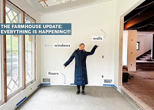
Some very exciting stuff has been happening at the farm, but I’ve been too busy with the book (and making decisions) to blog about it till today. After months of MEP (mechanical, electrical, and plumbing) we passed inspections and it was time to close up the walls. It’s a graduation of sorts – a proverbial moving of the tassel to never go back just staring at wood and wire. With drywall up, we can actually see the rooms, design the furniture that could go in them, and picture our lives here. So here’s what is happening…
Drywall Went Up…I was going to do a Drywall 101 post and perhaps I still will, but you want to see the farmhouse progress so here’s what you need to know…
There are five wall finish levels – “1” being basically just sheetrock with gaps and “5” being a smooth wall, like baby butt smooth. The higher the scale the more expensive and time-consuming it is. These days most new construction stop around “3” so they can spray orange peel, which is super forgiving, and can mask the seams really well. This is far faster and therefore cheaper, but it’s not most of our desired look. The whole thing sucks but it aligns with all of life – high quality/well done/refined anything…costs more. Cool!

Now what we’ve realized is that doing a simple, subtle “skip trowel” look is regional…and it’s not a thing in Portland. We did it at the mountain house and loved it. It’s a bummer they don’t do it here because it’s such a subtle look that is so much cheaper both in the application and in maintenance – it’s extremely forgiving for dings and future touch-ups. But you only want to do this if the drywall contractor actually knows how and their team is trained in this method. In our case, ARCIFORM, hadn’t worked with a drywall contractor who had done skip trowel – it’s not a thing in this region – so they weren’t willing to take the risk in a high-profile project. You can imagine if done wrong and heavy it would look bad. I wish I had reached out earlier in the process and found a drywall contractor that did do this in Portland – if they exist – but by the time we got around to this conversation, we were locked in and frankly needed to get going. So that’s all to say that this “skip trowel” subtle texture over a level 4 is regional. If your area does it, like at , it can be far cheaper than smooth walls. However, in our case, it was going to cost us more with a lot more risk, unknowns, and variables because our high-end contractor specializes in smooth wall finish.
Before you start or even get a quote you should be sure about what walls (or portion of walls) you actually need a smooth coat or what can just be “fire taped”. When you can just “fire tape,” you don’t need to go through the laborious, messy process of “mudding” (more on that below) if you are putting anything substantial over the top of it – like paneling or tile. So walk through the house and mark them. Otherwise, you are spending time and money on walls that just need sheetrock and fire tape. Do keep in mind wallpaper requires smooth walls in case that may be a “someday” want. Arciform did say that some areas or homes might not even require fee tape so just talk with your contractor!
After you have made your decision here’s what they’ll do:
The Step By Step Of Drywall
1. They hang sheetrock (just say “rock” if you want to be cool) – also sheetrock is just a brand name of drywall – like Kleenex to tissue.
2. They tape and mud the seams, essentially spackling them with mud to make the seams disappear.
3. They sand the mud down flat, this makes a big-ole mess…
4. They mud again.
5. They sand again, more mess…
6. They use flashlights and black lights to make sure that they are super, super flat and smooth.
7. They prime the walls, ready for paint in like 3 months 
All the fine particles that are created during the sanding can really clog your HVAC system, so it is wise to turn it off during this process and then to have your ducts cleaned and filters replaced when it is all done.
Our house took 2 weeks for this process and I’d say that 30% of our house is paneling or tile (or windows – ha). So of our 3800 square feet, not all of it is sheetrocked.

The sheetrock totally transformed the house – we now have rooms! We can imagine the space. It is so exciting and relieving.

OOH MY. The white oak interior Sierra Pacific Windows and doors are basically the more traditional version of the farmhouse that we love – that wood on the inside is everything.
Windows And Doors Skylights
 The kitchen and primary bedroom specifically are so bright it’s incredible, thanks to the Velux Skylights. Hilariously, we decided to not put them in the sunroom because we thought it would be bright enough, but due to the way it’s facing and the fact that the doors open to a covered porch it’s not as bright as we had hoped so we are putting in two skylights post-drywall (not ideal, but it’s only a day’s work since the framing worked with the size of the skylights). Lesson learned – ALWAYS put in skylights (and we have been using Velux for years). I was scared that you’d drive up and see them on the exterior of the sunroom and it would distract from the charm of the brick and windows, but the grade is so much lower that you don’t really see the top of the roof even up close.
Primary Bedroom

 Cabinets Are Going In!
 The cabinets arrived from Unique Kitchens and Bath and they are SO BEAUTIFUL. I’ve only seen the mudroom and the pantry thus far – they are waiting on the flooring to be installed before doing the kitchen cabinets, but they are solid, high quality, and just beautiful. The mudroom is white oak and the pantry is painted Slate Tile by Sherwin-Williams.
 Wood Flooring Has Acclimated
We have our Zena Forest floor that had to acclimate for 10 days in the house, post drywall, to ensure that it doesn’t expand and contract with the weather. It is now being installed and looks SO PRETTY.
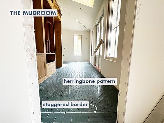
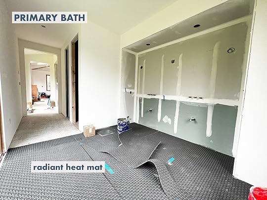
 Tile Installation Has Begun
The tilers came in and as soon as the drywall was done, they were in pouring the subfloor, putting in radiant heat in the first floor tiled areas, and prepping all areas. It’s the eye candy we’ve been waiting for and is extremely satisfying in every way.
The sunroom tile needed some troubleshooting with the victorian border but oh my goodness it’s going to be so insane. It’s happy and bright and while it is busier than the rest of the house, it feels quarantined into this space – like it were a conservatory addition that feels special in its own right. Once we get some natural wicker, a big wood dining table, and plants in there it will be this fantasy indoor/outdoor year-round happy room that I’ll work out of.

The mudroom tile is so awesome – you can see the brownstone texture that Pratt + Larson does so well – which feels more utilitarian than a smooth finish.
 The Kids Bath Tile
The kid’s bath (whose design plan I haven’t even shown you yet) is the only one that came on a net so it was a bit easier to install – the kids collectively chose the green and I love it. Just wait till you see the wall tile.

The main bath has yet to be started with the tile but they prepped and leveled the floors, laid the radiant heat (we are doing electric not hydro), and we showed the tile setters what we are doing and he said, “I have two gray hairs right now, I’ll have 40 by the time I’m done with this.” And YET…he was super excited!
 How Are We Doing??
 I’m feeling ready to move in, trying to manage my impatience, dealing with decision fatigue, endlessly grateful to be doing this, excited about the future, bursting with joy seeing our decisions to come life – all of the feelings. While I was in New York, Sarah and the ARCIFORM team were there troubleshooting everything which I’ll show you on stories, as it’s all happening fast now. It’s amazing and yet we are still a few months out from living there. I want to publicly thank Jamie, our site lead, Adam and the rest of the build team, for dealing with the insanity – both my border line pathologies as well as managing all the subs. We are at the mutual frustration point in the renovation process that is inevitable. The months near the end where the client/homeowner is like “wait, it’s going to be how much longer?” and then proceeds to manically push and push, questioning the timeline, desperate to find the “off” nozzle for the firehose that is just shooting out cash so hard it could knock over a tree. And as a result, the GC and building teams are frustrated right back at the client (not us of course, we “get it”, we promised them we’d be “such good clients” – hahaha), because there are so many moving parts to renovating a house. Things take a lot longer than they look, high quality costs a lot and rushing the process isn’t good for the quality of the result. For those of you mid-construction or about to be – just remind yourself daily, “it is a privilege to be renovating, it is a privilege to be renovating”. It can be so hard, long and feel never ending. I see you. But it’s going to be worth, I promise and we are so lucky to be doing it. More to come soooooon. xx
The post What Is Happening At The Farm?? EVERYTHING appeared first on Emily Henderson.
May 16, 2022
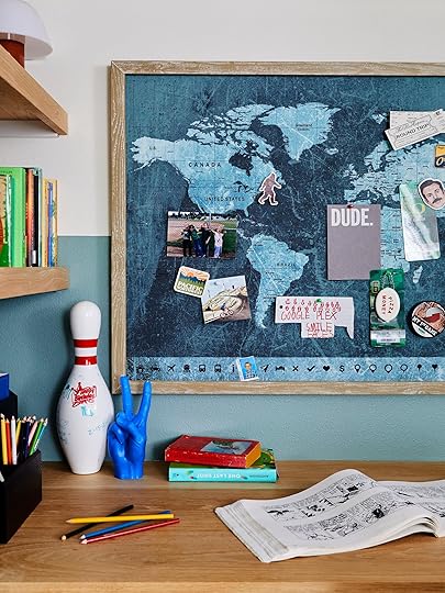
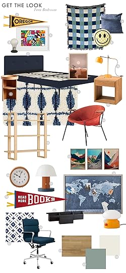
A Teen Bedroom Reveal! + 7 Budget-Friendly Ideas Gen-Z Loves

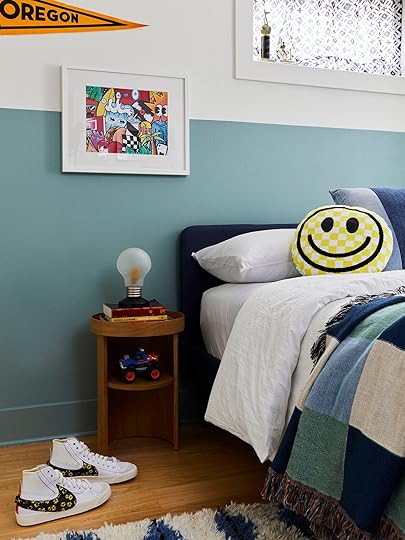
Hi friends, Priscilla, here again, to share the final Tudor basement reveal! This time we’re taking a tour of the teen bedroom Emily and I collaborated on. It’s part of a larger basement remodel (see mudroom, bathroom, and living room posts here). The client is Emily’s best friend Robyn, and her family. They are super lovely, very down-to-earth, and outdoorsy (very Portland in the best way:). So it was not surprising that their 12-year-old son, J, wanted a look that highlighted his love of mountain biking and the Pacific Northwest for his new room. These nods to the outdoors became a jumping-off point for the theme and colors in the space. Never having worked on a teen room before, I felt a little nervous about making it feel youthful enough. Emily was great at steering us toward bold patterns and prints that felt fun and age-appropriate. Ready to get into all the details?

Bed | Round Nightstand | Vintage Light Bulb Lamp | Blanket (similar) | Oregon Pennant | Graffiti Artwork | Curtain Fabric
REMODELRemodeling a basement in the Pacific Northwest often involves waterproofing the exterior. That was the first step in the process of addressing the moisture issues the clients had been dealing with. Our contractor JP Macy, also installed a sump pump in the closet to ensure that water would be pumped out to the storm drain and not leak into the space during a heavy rain. Step 2 – change the floorplan. The room was originally a carpeted bathroom. This initial footprint was too large to be a bathroom and too small to be the bedroom we needed, so we had to borrow some square footage. The adjacent storage room had plenty of space, easily allowing us to carve out an ample closet and built-in desk for J’s new room. To ensure the space was up to code, JP installed an egress window for some natural light. Once permitting went through, we had a bedroom! After a little door shuffling, the final layout was so much more functional for how the clients wanted to move through and use each space.

If you wanna see the full finished basement so you can get a better sense of the floorplan, watch this video (just wait for the ad to play!)
J has a fun sense of style and was up for going bold on the colors throughout his room. We initially wanted to do a color block design on the walls. The color blocking originally started out as a two-tone idea (see below for the inspo), but once we got some samples in the space, it felt like there was too much going on. Scaling it back to one color and lowering the line somewhat ended up being the look that felt right. J was drawn to the blue/green hues and picked out a really fun color…Sherwin Williams Jasper Stone. It reads more blue in person but has enough green to feel tonal with the overall basement color scheme. This is such a fun and affordable way to add a ton of personality to a room.

When thinking of who to hire to paint the space, Renee from Some Kinda Landscape immediately came to mind. She worked in visual display at Rejuvenation and Anthropologie and is amazing at tricky painting techniques. I knew she would make the effort to get a perfect line (guys, painting an even, level line over a textured wall isn’t easy). If you’re in the Pacific Northwest and need a room refresh, I can’t recommend her enough!
For anyone interested in DIY-ing this project, here are Renee’s tips for getting a crisp line:
Invest in a good laser level with a suction mount, something like this.Use a quality painter’s tape (like FrogTape) in long strips…about the length of your arm. Make sure you really press the tape down to get out air bubbles (especially important on textures like orange peel).Once your tape is in place, roll the paint on, making sure to cover the tape but not go above it. A small foam roller works well for this.Let the paint fully dry before removing the tape. Like 24 hrs minimum.Touch up any unevenness with a small art brush.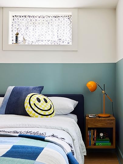
Happy Face Pillow | Denim Pillow (similar) | Sheet Set | Duvet Cover | Yellow Task Lamp | Square Nightstand
DECOR/COLOR PALETTETo make the room feel taller, we tried to keep the furniture lower and slimmer in profile. We chose warm wood tones to bring in some visual warmth (and to offset the gray Portland days), as well as help ground all the color and pattern. By using a variety of shapes in the furniture and decor we hoped to make the space feel a little more dynamic and youthful. Like having one nightstand be round and the other square. The color scheme was blue & green with pops of yellow, orange, and red to bring some energy and provide contrast. The yellow–y orange Schoolhouse lamp against the wall paint may be my favorite element…love that color combo!

Vintage Hoop Chair (similar) | Bookcase | Check Pillow | Rug

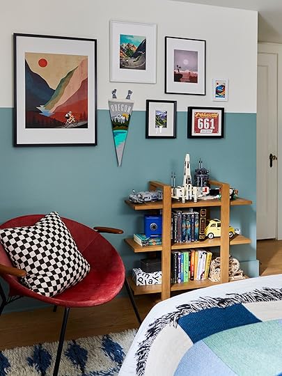
Artwork (Set of 3) | Mountain Bike Print
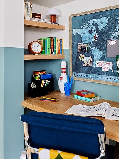
Functionality in a teen room is all about controlling clutter. J had a lot of smaller items he wanted to display so we tried to fit in as many surfaces as possible. Though space was tight, we were able to get in 2 nightstands, a built-in desk, and shelves to showcase his collections. The bookcase was originally going to be wall-mounted, but we ended up liking it next to the chair. With the wall freed up, we used the space to hang up J’s guitar and create this fun art wall.

Chair | Pinboard (similar) | Tieg Lamp | PRead More Books Pennant
The built-in desk and shelving were done in white oak planks and finished with a matte wax. We wanted the space to feel bright and happy so we kept all the wood tones on the lighter side and introduced some variations throughout. By using a variety of white oak, red oak, and birch woods, the bedroom has a warm Scandi-vibe but with a little more depth.
Mini Lamp | Clock | Black Organizer | Hand Candle
The paint line wrapped the whole space including this fun nook which made the room feel larger and more cohesive. Artwork and shelving were intentionally placed off-set from the paint line or intersecting it. This helped keep your eye moving around the room and made the decor feel whimsical. (HOT TIP: When doing a built-in desk don’t forget to add in holes for your cables in an out-of-the-way place. Cord creep is real, folks:)).

It was a blast designing and installing this bedroom. The space feels really fun and playful. I hope you enjoyed reading about it and got some ideas if you’re tackling a teen room in the future. Chat me up in the comments if you have any questions. Talk soon xx.
1. Oregon Pennant | 2. Graffiti Artwork | 3. Vintage Lightbulb Lamp | 4. Blanket (similar) | 5. Happy Face Pillow | 6. Denim Pillow (similar) | 7. Upholstered Bed | 8. Round Nightstand | 9. Rug | 10. Vintage Hoop Chair (similar) | 11. Utah Bike Print | 12. Yellow Task Lamp | 13. Square Nightstand | 14. Bookcase | 15. Set of Three Cycling Art Prints | 16. Clock | 17. Mini Lamp | 18. Read More Books Pennant | 19. Pinboard (similar) | 20. Desk Organizer | 21. Tieg Lamp | 22. Minted Plus Fabric | 23. Desk Chair | 24. Kahrs Tapa Engineered Wood Floors | 25. Green Paint: Sherwin-Williams Jasper Stone | 26. White Paint: Sherwin-Williams Alabaster
*Design by Pricilla Frost and Emily Henderson
**Styled by Emily Henderson
***Photography by Sara Ligorria-Tramp
The post A Teen Bedroom Reveal! + 7 Budget-Friendly Ideas Gen-Z Loves appeared first on Emily Henderson.
7 Teen-Approved Design Ideas You AND Your Wallet Will Love For Their Bedroom (+ A Reveal!)
Hi friends, Priscilla, here again, to share the final Tudor basement reveal! This time we’re taking a tour of the teen bedroom Emily and I collaborated on. It’s part of a larger basement remodel (see mudroom, bathroom, and living room posts here). The client is Emily’s best friend Robyn, and her family. They are super lovely, very down-to-earth, and outdoorsy (very Portland in the best way:). So it was not surprising that their 12-year-old son, J, wanted a look that highlighted his love of mountain biking and the Pacific Northwest for his new room. These nods to the outdoors became a jumping-off point for the theme and colors in the space. Never having worked on a teen room before, I felt a little nervous about making it feel youthful enough. Emily was great at steering us toward bold patterns and prints that felt fun and age-appropriate. Ready to get into all the details?
Bed | Round Nightstand | Vintage Light Bulb Lamp | Blanket (similar) | Oregon Pennant | Graffiti Artwork | Curtain Fabric
REMODELRemodeling a basement in the Pacific Northwest often involves waterproofing the exterior. That was the first step in the process of addressing the moisture issues the clients had been dealing with. Our contractor JP Macy, also installed a sump pump in the closet to ensure that water would be pumped out to the storm drain and not leak into the space during a heavy rain. Step 2 – change the floorplan. The room was originally a carpeted bathroom. This initial footprint was too large to be a bathroom and too small to be the bedroom we needed, so we had to borrow some square footage. The adjacent storage room had plenty of space, easily allowing us to carve out an ample closet and built-in desk for J’s new room. To ensure the space was up to code, JP installed an egress window for some natural light. Once permitting went through, we had a bedroom! After a little door shuffling, the final layout was so much more functional for how the clients wanted to move through and use each space.
If you wanna see the full finished basement so you can get a better sense of the floorplan, watch this video (just wait for the ad to play!)
J has a fun sense of style and was up for going bold on the colors throughout his room. We initially wanted to do a color block design on the walls. The color blocking originally started out as a two-tone idea (see below for the inspo), but once we got some samples in the space, it felt like there was too much going on. Scaling it back to one color and lowering the line somewhat ended up being the look that felt right. J was drawn to the blue/green hues and picked out a really fun color…Sherwin Williams Jasper Stone. It reads more blue in person but has enough green to feel tonal with the overall basement color scheme. This is such a fun and affordable way to add a ton of personality to a room.
When thinking of who to hire to paint the space, Renee from Some Kinda Landscape immediately came to mind. She worked in visual display at Rejuvenation and Anthropologie and is amazing at tricky painting techniques. I knew she would make the effort to get a perfect line (guys, painting an even, level line over a textured wall isn’t easy). If you’re in the Pacific Northwest and need a room refresh, I can’t recommend her enough!
For anyone interested in DIY-ing this project, here are Renee’s tips for getting a crisp line:
Invest in a good laser level with a suction mount, something like this.Use a quality painter’s tape (like FrogTape) in long strips…about the length of your arm. Make sure you really press the tape down to get out air bubbles (especially important on textures like orange peel).Once your tape is in place, roll the paint on, making sure to cover the tape but not go above it. A small foam roller works well for this.Let the paint fully dry before removing the tape. Like 24 hrs minimum.Touch up any unevenness with a small art brush.Happy Face Pillow | Denim Pillow (similar) | Sheet Set | Duvet Cover | Yellow Task Lamp | Square Nightstand
DECOR/COLOR PALETTETo make the room feel taller, we tried to keep the furniture lower and slimmer in profile. We chose warm wood tones to bring in some visual warmth (and to offset the gray Portland days), as well as help ground all the color and pattern. By using a variety of shapes in the furniture and decor we hoped to make the space feel a little more dynamic and youthful. Like having one nightstand be round and the other square. The color scheme was blue & green with pops of yellow, orange, and red to bring some energy and provide contrast. The yellow–y orange Schoolhouse lamp against the wall paint may be my favorite element…love that color combo!
Vintage Hoop Chair (similar) | Bookcase | Check Pillow | Rug
Artwork (Set of 3) | Mountain Bike Print
Functionality in a teen room is all about controlling clutter. J had a lot of smaller items he wanted to display so we tried to fit in as many surfaces as possible. Though space was tight, we were able to get in 2 nightstands, a built-in desk, and shelves to showcase his collections. The bookcase was originally going to be wall-mounted, but we ended up liking it next to the chair. With the wall freed up, we used the space to hang up J’s guitar and create this fun art wall.
Chair | Pinboard (similar) | Tieg Lamp | PRead More Books Pennant
The built-in desk and shelving were done in white oak planks and finished with a matte wax. We wanted the space to feel bright and happy so we kept all the wood tones on the lighter side and introduced some variations throughout. By using a variety of white oak, red oak, and birch woods, the bedroom has a warm Scandi-vibe but with a little more depth.
Mini Lamp | Clock | Black Organizer | Hand Candle
The paint line wrapped the whole space including this fun nook which made the room feel larger and more cohesive. Artwork and shelving were intentionally placed off-set from the paint line or intersecting it. This helped keep your eye moving around the room and made the decor feel whimsical. (HOT TIP: When doing a built-in desk don’t forget to add in holes for your cables in an out-of-the-way place. Cord creep is real, folks:)).
It was a blast designing and installing this bedroom. The space feels really fun and playful. I hope you enjoyed reading about it and got some ideas if you’re tackling a teen room in the future. Chat me up in the comments if you have any questions. Talk soon xx.
1. Oregon Pennant | 2. Graffiti Artwork | 3. Vintage Lightbulb Lamp | 4. Blanket (similar) | 5. Happy Face Pillow | 6. Denim Pillow (similar) | 7. Upholstered Bed | 8. Round Nightstand | 9. Rug | 10. Vintage Hoop Chair (similar) | 11. Utah Bike Print | 12. Yellow Task Lamp | 13. Square Nightstand | 14. Bookcase | 15. Set of Three Cycling Art Prints | 16. Clock | 17. Mini Lamp | 18. Read More Books Pennant | 19. Pinboard (similar) | 20. Desk Organizer | 21. Tieg Lamp | 22. Minted Plus Fabric | 23. Desk Chair | 24. Kahrs Tapa Engineered Wood Floors | 25. Green Paint: Sherwin-Williams Jasper Stone | 26. White Paint: Sherwin-Williams Alabaster
*Design by Pricilla Frost and Emily Henderson
**Styled by Emily Henderson
***Photography by Sara Ligorria-Tramp
The post 7 Teen-Approved Design Ideas You AND Your Wallet Will Love For Their Bedroom (+ A Reveal!) appeared first on Emily Henderson.
May 15, 2022
The Link Up: Emily’s Designer Clog Dupes, A YouTube Series We Unexpectedly Love, And The Comfiest Dress On Our Bodies This Week


IT’S….TIIIIIMMMMEEEEEE (*said in boxing announcer voice*). Welcome, welcome everyone to another rendition of the Link Up from Style by Emily Henderson – HA. We’ve had a week, and I’m sure ya have too, so let’s dive right in and check out some fun links we’ve gathered for ya on this fine Sunday.
FIRST OFF. This week’s home tour is the home of the amazingly talented broadway legend, Sutton Foster. She worked with Michael Ostrow, co-founder of Grace Home, to pull together an incredibly charming, collected home. The space is STUNNING and we’re huge fans of the green lacquer room…don’t skip this one. What’s your favorite part of the home??
From Emily: I finally found an outfit to wear on Good Morning America, if you tuned in THANK YOU. It was all about this dress layered with this shirt underneath, then I wore this bag from parker clay (it fits a laptop perfectly which I love) paired with this strap from Clare V. While live TV is wildly nerve-wracking, at least I felt dressed for the occasion See the segment here if you’d like to see me in action with Michael Strahan.
Also From Emily: Ooh yah. Guys – Emily Henry’s new book “Book Lovers” (buy local here and Kindle here) came out last week and became an immediate New York Times bestseller. I felt strangely emotional reading her Instagram post about it. As someone who started out as a literature major, obsessed with all things Faulkner and Hemingway, I too have diversified and find such glee in watching women buck the system, shed the expectations that they had of themselves in college and write something that taps into the women’s emotional market in such a funny, insightful and entertaining way. I started the book this week and I’m loving it (I saved it for the plane home where instead I wrote a 6-hour article about the happiness conference Brian and I attended). I can’t wait to finish it. While I read a lot of romance novels both contemporary and regency, her voice is the one I relate to the most. And fun fact, she is a reader and follower:) Now we DM because listen, if this social media has one healthy thing to offer it’s connecting us with the people we admire. If you are looking for an immediate hook of a novel, one that settles the part of your brain that is busy and makes you want to “go to bed early” then pick this up.
From Mallory: I tried on this dress at Madewell for yesterday’s post and I’m highly considering going back and ordering it…it’s SO comfortable and super stylish. It’s tight in all the right places and loose in the other places and I’m a huge fan. Plus the fabric is VERY SOFT. I went into my closet yesterday to pick out what to wear and I literally thought “booo I wish I had that Madewell dress because I would totally put that on right about now” So yeah, it’s good.
Also from Mallory: IT’S BACK. My favorite coffee flavor in the world, Iced Coconut was a limited edition last year and I loved it so much that during the “last call” for iced coconut, I bought 10 packs. Jess and Ajai both witnessed it and thought I was insane. It’s so delicious I have no shame, now Jess drinks them too in the smaller pods! It’s so delicious I cannot stop talking about it… hey @nespresso sponsor me!
From Caitlin: May be late to the party on this one, but I’ve just discovered Rajiv Surendra’s YouTube series with HGTV and y’all NEED to check it out. I originally clicked on this 17-minute video of him thrifting in Chicago on a rainy day because I was like “HEY, that’s the guy from Mean Girls! I wonder what he’s like in person,” and I’ve been BLOWN AWAY. The closest comparison I can think of is Bob Ross – he has such a calming energy and such a gentle way of educating viewers (oh, and Rajiv is like, SUPER smart too – he knows all about furniture and decor history!!!). His house tour is so cool – you GOTTA see what he did with chalk, it’s incredible – and it’s just been so fun stepping into his thoughtful, intentional, sustainable little world. I hope you enjoy his videos as much as I do
From Jess: If you’ve been following this blog for a while, I’m sure you also have at some point coveted Emily’s Rachel Comey clogs. They are the coolest and understandably not cheap. I have good news though! As I was browsing for wedding guest shoes, I stumbled up these more affordable bomb dupes that are good! Just a little tip from me to you:)
Also from Jess: I just got a new candle from Target that I really love! It’s Palo Santo and Thyme and it’s a just a nice spring scent. Plus it’s a big one that’s only $14.
That’s all for this week! Thanks for tuning in, it’s been a blast. See you in the AM xx
Opening Image Credit: Designed and Styled by Michael Ostrow | Phot by Chris Mottalini | via Architectural Digest
The post The Link Up: Emily’s Designer Clog Dupes, A YouTube Series We Unexpectedly Love, And The Comfiest Dress On Our Bodies This Week appeared first on Emily Henderson.
May 14, 2022
Affordable Spring Dresses That We Would Actually Wear (And Most Are Regular Bra Compatible!)

At least three times a week, I look in my closet hoping to find an easy-to-throw-on spring dress where I feel put together yet extremely comfortable. It’s the same thing as opening your fridge for the fifth time with the blind hope that something delicious will suddenly appear. But unfortunately, I don’t have a magical closet or a secret personal shopper that puts new clothes in it…so I come up short every time. I’ve also just been on the hunt because I’d like at least a few options to choose from which also means I’m going to need them to be affordable. Since I was having this issue, I thought some of you must be dealing with the same – wanting a couple of new spring-appropriate dresses but at a reasonable price. So I decided I would go to all the retailers that we love (that are on the affordable side) to find dresses that are under $150. But honestly, most are under $100 (lots under $50)! I also really tried to find dresses that are pretty bra-friendly. Maybe we should do a strapless bra review because I want to know the best ones! Any recs??
Now, this past Tuesday, Caitlin, Mal, and I went to go see Em’s new book in the wild and have a celebratory lunch (Ryann is currently in Italy and we aren’t jealous at all:)) Since we were at a mall, I was like, “Hey! Let’s try on some dresses so we can see and show how they actually look on our bodies!” So that’s exactly what we did. I broke the dresses down into four sections in case people had a dress type preference. Here’s type one!
Long Dresses Without Sleeves (AKA Below The Knee)
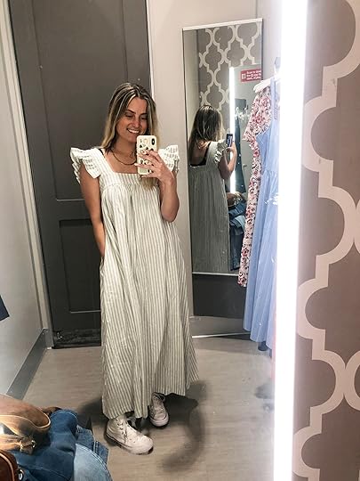
Naturally, we started at Target and this was the first dress both Mal and I tried on. We both really loved it! The ruffles were super cute and extremely on-trend this year as you will see throughout this post, the pattern was fun but timeless, and of course, we were into the pockets. Normally I’m not a ruffle person as I mentioned in the swimsuit review post but I liked it on this dress. I probably could have gone up a size to a medium so my boobs were less pronounced but all in all, this is a great throw-on-and-go option at $30.
 i apologize for all my “trying to feel cute” faces smh
Another Target dress that was really cute and really affordable! Personally, it’s not totally my style but I think it’s a really great option if it’s yours. I will say that you might need to either go braless or strapless because my bra was showing too much when I had it on. Both the first and this dress also come in other colors and patterns if you are into the cuts. Actually, A TON of the dresses I picked have multiple color options so if you like them click through to see what’s up.


Another stop we had to make was Madewell (duh). These dresses are a little more expensive (a little over $100) but boy did we like them. Mal LOVED this dress. The fit was great and she loved how soft the fabric was. Plus look at that cute tie-back!

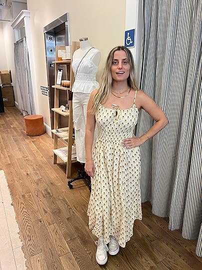
Two more cuties (with pattern!). Mal is again rocking that cut and I am being a creep in the background. This is what she had to say about this dress: “SO comfy I didn’t wanna take it off. I love a dress that has that ruching thing at the top so you don’t have to wear a bra (at least you don’t if you’ve got smaller ladies). My only thing was that the sleeves had a STRONG ruffle, which was cute but not my thing since I already have big shoulders…but super flattering, insanely comfortable, and all in all a SOLID dress.”
As for my dress, I liked it a lot. Also super comfortable, loved the cinching at the waist, and thought the pattern was springy without being too springy. I’m not wearing a bra but would for sure wear a strapless with it (I just only had a black bra with straps…a real no-go with this dress).
Let’s see more options, shall we?

1. Women’s Short Ruffle Sleeve A-Line Dress | 2. The Softest Ribbed Tie-Shoulder Maxi Dress | 3. Sophia Cami Midi Dress in Wild Calendula Block-Print | 4. Contrast-Bodice Dress | 5. Button-Down Cotton Poplin Dress | 6. Women’s Sleeveless Sundress | 7. Women’s Plus Size Sleeveless Tie-Back Tiered Dress | 8. Side Slit Dress | 9. Mini Floral Print Dress | 10. Cinched Neck Slip Midi Dress | 11. Ruffle-Strap Tiered Midi Dress | 12. The Softest Ribbed Maxi Dress | 13. Lucie Smocked Tiered Midi Dress | 14. Women’s One Shoulder Sleeveless Tiered Dress | 15. Smocked Bodice Easy Maxi Dress
I am fully obsessed with #2 and #12. I want them so bad and might pull the trigger on one of them. I just think they are so cute, Spanx-friendly, and to my surprise are made by Summersalt. I trust they are high quality after trying on their swimsuits. I also love the very subtle sexiness of the small side cutouts on #8. Often side cut-outs are too big and end up showing stuff you may not want to show off. So these look like the perfect size to just say a little “hey hey”. Lastly, gingham print and springtime are two peas in a pod so #7 and #15 are perfect spring dresses (and look very normal bra-friendly!)
Wanna show a little leg? I’ve got you.
Short Dresses Without Sleeves (AKA Above The Knee)

Unfortunately, we didn’t find any of the short dresses without sleeves I rounded up below while we were out in the wild. However, I happened to have this dress (see above) that I bought last year and it’s still available in some sizes at Nordstrom Rack. I really love it! The cut is great, I love the faux wrap because really wrap dresses NEVER work on my body, and the print is so fun.


This dress isn’t the exact one as #4 below but similar enough that I thought it could still be helpful to visualize. What I love about it (aside from those awesome shoulder pads) is that it’s an easy dress-up or dress-down piece. These aren’t the best photos but you get the idea. Also, I had this one hemmed because it was pretty long on me and I wanted it more as a going-out dress. I’m sure the one on the model is longer than this one but it’s always a good idea to check those length measurements too.
Ok, now let’s see what the internet has to offer us…

1. Stripe Dress | 2. Flower Embroidered Denim Dress | 3. Halter Linen-Blend Mini Dress | 4. Shoulder Pad Dress | 5. Print Slipdress | 6. Floral Print Mini Dress | 7. Tiered Floral-Print Mini Cami Swing Dress | 8. Sami Mini Dress | 9. Vichy Check Dress | 10. The Luxe Pima Tiered Mini Cover-Up Dress | 11. Floral Minidress | 12. Fit & Flare Knotted Cutout Jean Cami Mini Dress
Again, not a ruffle gal but #1 is also making me reconsider. How cute is that dress and 100% bra approved! Personally, I love a high-neck halter so #2, #6, and #8 are right up my alley. #3 and #9 are definitely more going-out spring dresses and make me want to go on a tropical vacation.
But hey, maybe you love sleeves and I am here to deliver.
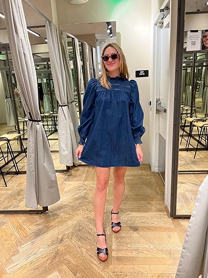
Short Dresses With Sleeves


Y’all this is the dress that Caitlin recommended a few weeks ago in the link up and she is not wrong. IT’S AWESOME!! We all looked and felt great in it. I maybe wouldn’t style it with high-top sneakers but that’s just my personal shoe regret of the day. They only had it in black in the store but it comes in a couple of other more “spring-forward” colors so there are options baby. A real sisterhood of the traveling dress if we do say so ourselves.


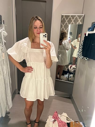
Mal Gal really rocking these two little numbers and here’s what she said about them: “This white J. Crew dress was so soft and comfortable and I love that it has pockets (kind of an essential for any dress for me now). The top part is a tiny bit see-through so just make sure to wear a skin-colored bra with it. The pink dress was SO fun but I think I should’ve sized down. It felt a little big in the sleeves but otherwise, it was such a fun party spring dress and I almost never wear pink (but it’s trendy rn) so what a fun shake-up. Plus the pattern is CUTE.”
And here are her thoughts on these cute dresses: “This denim dress from & Other Stories was so good that I didn’t want to take it off (and I’m highly considering going back for it). I loved the way it looks with these new sunglasses I got, plus the little ruffle detail on the sleeves and collar are a hard sell. The only con is there are no pockets. This white Target dress was super cute, but the sleeves are BIG. Like you could wear them down or up (this is them up), and I think it looks cute but is a lot of fabric. I would’ve sized down in this, and also I LOVE the back. Plus it passes the pocket check!”


Again, THOSE SNEAKERS ARE KILLING ME. Why did I not wear a cute pump?! Anyway, I feel like I look like a member of the Peanuts gang in that Madewell dress on the left but if I changed my shoes and hemmed the dress a little I think I would be 100% into it. And it was SO soft. I will say to size down if you like a tighter fit like I and the model below are sporting though. Then the dress on the right is a great easy breezy dress option if you like a long sleeve and a fun pattern. With the right shoes and accessories, this could be a really awesome spring look.
Here are the rest!

1. Cinched-Waist Cotton Poplin Dress | 2. Women’s Short Sleeve A-Line Dress | 3. Elastic Waist Mini Dress | 4. Ruched Detail Dress | 5. Printed Dress with Balloon Sleeves | 6. Smocked-Waist Mini Dress | 7. Crochet Knit Dress | 8. Flower Fields Floral Long Sleeve Minidress | 9. Striped Shirt Dress | 10. Collared Puff-Sleeve Mini Dress | 11. Cotton Voile Tiered Button-Down Beach Dress | 12. Voluminous Denim Mini Dress | 13. Collared Mini Wrap Dress | 14. Short Linen-Blend Dress | 15. Puff-Sleeve Smocked Mini Dress
Again for me, I like a good cinch of the waist so #1 (duh), #3, #6, #8, #10, #13, and #14 all fall in that category. Actually, I did purchase #8! It really looks like a versatile dress that could also easily be worn well into the fall with some tall boots. Also maybe a good first date dress??
Long Dresses With Sleeves

We made it to the final category and are starting out with a dress that both Caitlin and I really loved! We both are thinking of going back and getting it (except I really loved the solid red version. See below!). It’s a really nice linen fabric that cuts in so nice at the waist and really does good things for the girls. We weren’t wearing bras and were fine! I really liked when I put the puff sleeves off the shoulder on the red one for a different vibe (again see below. Sorry!) Plus the slit is just enough without being too much. 10/10.

From Mal and her PERFECT dress: “I’m in love with the shape of this dress – it’s the PERFECT ‘any occasion’ dress and could truly work for a billion different things. It’s got a cute lil slit on the side to break up the pattern and has a good neckline/sleeve situation.”

1. Midi Floral Print Dress | 2. Puff-Sleeve Fit & Flare Smocked All-Day Midi Dress | 3. Printed Button Up Midi Dress | 4. Women’s Balloon Long Sleeve Dress | 5. Plaid Print Dress | 6. Embroidered Cotton Dress | 7. Colorblock Floral Dress | 8. Women’s Flutter Short Sleeve Tie-Back Dress | 9. Short Sleeve Midi Dress | 10. Midi Shirt Dress | 11. Off the Shoulder Colorblock Dress | 12. Striped Cotton Dress
I really love all of these dresses and what is probably the best part about them is the fact that you can “bra it up” with zero concern. It’s the dream! For my style, I’m really drawn to #1, #3, #6, and #7. But boy am I drawn to the colors and patterns of #5, #8, and #11. Lastly, I have a version of #4 (same fabric) and it’s VERY comfortable and has pockets!

Well, I really hope this was helpful and that if you are also needing some dresses, I also hope that you found something that will make you feel awesome while keeping your bank account intact. Of course, never forget about second-hand shops, ThredUP, The RealReal, Poshmark, etc. for both sustainability reasons and hot deals! Have a beautiful rest of your weekend and see y’all tomorrow.
Love you, mean it.
The post Affordable Spring Dresses That We Would Actually Wear (And Most Are Regular Bra Compatible!) appeared first on Emily Henderson.
May 13, 2022
These New Spring Collections Are Excellent – Check Out Our Favorites From Them All
It’s never not the coolest feeling when the people you know and/or EXTREMELY admire come out with a new design collection. Even though you had literally not a single thing to do with it, you can’t help but to beam with pride and want to shout about it from the rooftops…which is exactly what we are doing today. The only difference is that I am writing instead of shouting which I think we can all agree that is a far better way to share any kind of news. Now clearly most of these “friends” are friends of Emily (except a very special one at the end). But I have been a big ole fan of these designers for a while so in my dreams they are my friends too:) Creepy? Maybe. Anyway, buckle y’all because your blood sugar is about to rise with all this eye candy you are about to consume…
CB2 x Lawson-Fenning Collection
 photos via cb2
This one nearly knocked me off my chair when I saw the announcement. I am a FANGIRL of Lawson-Fenning. Every time I’m on their site the word “someday” is on repeat in my head. I was introduced to them through Emily and have never looked back. Remember her sofa? She’s purchased many things from them over the years but that one was the showstopper. Actually, our good friend Sarah Zachary-Jones, works for Lawson-Fenning and uses their pieces all the time! If you haven’t seen her latest project GO NOW.
This collaboration with CB2 is “modern California” at its best in my opinion. You get the organic materials with really cool, modern shapes. The collection is huge and it was very hard to narrow down my favorites but these are at least some of them. But please go look at the whole spread.

1. Ventura Notched Tall Oak Bookshelf | 2. Cojo Bullseye Travertine Tray | 3. La Piedra Backless Brown Leather Bar Stools | 4. Palo Verde Travertine and Walnut Wood Floor Lamp | 5. Anacapa Saddle Leather Lounge Chair | 6. Altadena Oak Coffee Table | 7. Tenon Wood Bed | 8. Fallon Round Leather Tray | 9. Inyo Salton and Mojave Wall Art (Set of 3) | 10. Capistrano Wood and Glass Flush Mount Light | 11. Muir Grey Woven Swivel Chair | 12. Monte Nido Oak Secretary Desk
As soon as I saw that bookshelf (#1) I frantically looked around my apartment to see if I had a place for it. Sadly, I don’t nor does it totally work with the style of my vision, but BOY is it a magnificent piece. If someone gets it can you send me pics of how you styled it?? The stools are perfection, that coffee table is quiet yet SO SICK, and the secretary desk is very reminiscent of the vintage cabinet Sarah used in her client’s dining room. Now you can get something very similar if you too fell in love with that piece. I’ve had to stop myself multiple times from buying both of the trays. Those holes and the leather accent on the wood one are so good. And I really have my eye on the blue art piece for my living room (they also are sold individually). Can you tell I like this collection? So while it isn’t inexpensive, it’s far more budget-friendly than shopping at Lawson-Fenning itself. I love that it’s a little more accessible but of course still beautiful.
Crate&Barrel x Leanne Ford
 photos via crate&barrel
Not her first collection (obviously) but Leanne just doesn’t know how to miss. I love this new collection. It’s still in that classic California Causal style we all love from her but with some real knockout pieces. Everything she designs just makes me feel at ease. So let’s take a collective deep breath and relax into this collection.

1. Haldeman Pine Wood Bookcase with Cabinet | 2. Ziggy White Upholstered Office Chair | 3. Black Ceramic Table Lamps with Woven Shade | 4. Pebble White Indoor/Outdoor Concrete Coffee Table | 5. Cortez Charcoal Credenza | 6. Dahlia 23″x23″ Boucle Thin Stripe Outdoor Pillow | 7. Noon Floor Lamp | 8. Martini Boucle Backless Counter Stool | 9. Haldeman Pine Wood Credenza
Another bookshelf that put me in an overstimulated design state. Those feet! AH! The cool thing about this bookshelf, in particular, is that you can add to it to make it as big as you want. Fill the whole length of your wall if that’s your heart’s desire. Again, if you get this please send pics. Then get a load of that boucle chair. The shape is insane. It says it’s an office chair but I think it could also be a cool accent chair. Oh, and the boucle counter stool! How chic. Now, I don’t know how easy it is to clean but for a child and dog/cat-less house I’m in. Also, it’s no surprise that the lighting in this collection is the coolest. Leanne knows how to design lighting. If you are in need of some texture, baby, grab either of these awesome fixtures.
TOV Furniture x The Voice Collection
 photos via tov furniture
It was my first time hearing about TOV furniture when these designers started posting about this collaboration. I can’t tell you how excited I was to check it out and let me tell you it’s such a special one. There’s an incredible array of styles and designs yet they all really work together! I’m sure most of you are aware of the great Carmeon Hamilton and Justin Q. Williams from DesignStar: Next Gen, but all six designers are incredibly talented and it very much shows in each of their collection of pieces. So before we get into their designs, let me introduce you to them so you can go and follow them!

 photos via tov furniture
Carmeon Hamilton | Nile Johnson

 photos via tov furniture
Nicole White | Don Ricardo Massenburg

 photos via tov furniture
Justin Q. Williams | Erika Ward

1. Etta Black Coffee Table by Carmeon Hamilton | 2. Ava Four Poster Bed by Erika Ward | 3. Adu Snow White 4-Drawer Chest by Carmeon Hamilton | 4. Durwin Champagne Velvet Bed by Don Riccardo Massenburg | 5. Simone Chocolate Brown Credenza by by Carmeon Hamilton | 6. Mavis Cinnamon Velvet Bench by Nicole White | 7. Ayanna Midnight Velvet Accent Chair by Don Riccardo Massenburg | 8. Abreeyah Beige Velvet Sofan by Nile Johnson | 9. Alon Espresso Media Console by Justin Q. Williams
I mean it’s good, right?! And this is only a sampling. While I love pieces from all the designers, Carmeon’s pieces really spoke to my style. I LOVE her coffee table (that also comes in a side table version too). Sculptural, minimal but perfectly bold. The same goes for her white drawer chest and brown credenza. Now let’s talk about these statement beds! That four poster bed by Erika Ward is so awesome. I love the mixed materials, the fluted, AND those finials on the top of each post are awesome. So much detail yet sleek and modern. The other bed by Don Riccardo Massenburg is post-modern heaven! Those oversized tubes are too freaking cool. And for that price, it’s a steal. Again, it’s all GOOD.
West Elm Kids x Sarah Sherman Samuel photo via west elm kidsphoto via west elm kids
Like Leanne, the only thing surprising here is that she was able to do another collaboration (you saw her massive Lulu and Georgia one, right?) this year. However, this time it’s for the kids but if I’m honest here’s a fair amount that could easily go into a *cough* adult’s room. It’s beautiful, whimsical, and of course trend-forward. Let’s dive in…

1. Scalloped Nightstand | 2. Mobile Chandelier | 3. Faux Fur Star Pillow | 4. Samuel Rainbow & Clouds Mobile | 5. Snake Rug | 6. Arches Bunk Bed | 7. Organic Shapes Sconce | 8. Scalloped Crib | 9. Forest Swaddle Set
This collection makes me want to design a nursery so bad. This color pallet is so dreamy to me. Also, the crib with the scalloped detail (that’s also convertible to a toddler bed), that mobile, star pillow, SCONCE. It’s all so freaking cute. I also don’t know what I would have done as a child (or now) if that had been my bunk bed. It’s INCREDIBLE. Sarah just continues to design such cool and special collections. What will she do next?!
Fülhaus x Brady Tolbert photo via fülhaus
 photos via fülhaus
SURPRISE! This was the collection where I could say I ALSO knew the designer! It’s not just in my head:) Here our very own EHD alum, Brady Tolbert, expertly curated three collections with the brand Fülhaus. What’s even more special is that if you love any of these pieces but can’t swing the full price, you can rent them! Don’t let the prices below deter you if they are out of your current budget. So yes, you can get a home curated by the one and only Brady but for a price tag that’s potentially much more doable. We are all so pumped for him so let’s get into some of these pieces…

1. Lyla Chair | 2. Vanda 1-Drawer Nightstand | 3. Busaba Matte Black Table Lamp | 4. Arc Matte Black Floor Lamp | 5. Natalia Bed | 6. Aliza End Table | 7. Dandria Pillow | 8. Orson Gray Sofa | 9. Omni Dining Table
That chair is so simple and cool (and comes in a sofa version too)! We also all know the struggle of finding a great nightstand with storage and this one is very chic, has storage, AND is only $58. Win-win-win. Speaking of bedrooms, can you handle that modern rattan bed?! The contrast of the natural, textured rattan paired with those modern delicate black curves is stunning and totally what Brady’s style is all about. It’s all just beautiful and there’s lots more so head to his collection page asap. CONGRATS, BRADY!
The ODells x Oh Joy! photo by lily glass | via oh joy!
 photos via oh joy!
It’s not just all home decor today because we couldn’t not include OhJoy’s newest clothing collection with The ODells. First off, we love Joy Cho and I technically met her once at this very cool Pinterest event the EHD team went to back in 2018 (this was the hotel we got to stay at where all my design dreams came true). I just remember she was talking about her home renovation which she either hadn’t yet or just announced to the world. Time really just flies! Anyway, Emily is actually friends with Joy and it is always so fun to see the incredible things she creates…including this line of clothing. Not only that but I personally LOVE The ODells brand and used to live right by their shop in Silver Lake. Their pieces are quality and I know this collection is exactly that and equally as cute. Let’s talk about some of these pieces.

1. Angie Dress | 2. Courtney Cardigan | 3. Nicole Skirt | 4. Coco Top | 5. Bobby Pant | 6. Jess Dress
Probably my favorite piece of the collection is the Courtney Cardigan. It’s timeless, fun, and just looks cozy. On the site, it says that it pairs well with the Jess Dress which I don’t disagree:) Do I need to buy the dress since it’s named after me?? Just kidding, it’s not named after me but it is super cute and looks like the perfect dress to throw on, go, and look great. I also really love the Coco Top which I’m assuming was named after her daughter since the matching skirt is named the Ruby Skirt (her other daughter’s name). So sweet! Go check out all of her collection to see the rest!
That’s it! Hope you enjoyed seeing all these inspiring pieces as much as we did. And if you are decorating and need some new pieces we highly recommend looking at these first. So what do you think? What are your favorite pieces?? Let’s talk!
Love you, mean it.
Opening Image Credit: Photo via West Elm Kids
The post These New Spring Collections Are Excellent – Check Out Our Favorites From Them All appeared first on Emily Henderson.
May 12, 2022
10 Bathrooms Design Risks – How To Break The “Rules” In A Way That Works

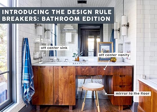
Welcome to another “Made it into the book but kinda got cut” blog segment – specifically about bathroom “rule breakers”. It’s about those creatives that said “yeah, we know what we are supposed to do when designing a bathroom” and then did whatever the hell they wanted, knocking it out of the park. They are seriously inspiring. So today I’ll show you some photos that are in the book by these creatives (comment if you like these kinds of posts!). But I’m writing specifically about “the rules” that were broken – to help inspire and empower you to break the rules, should you feel up for it. I’ll be honest that rule-breaking, when it comes to permanent finishes (tile, flooring, custom pieces), makes me VERY nervous and I’m far more restrained than I wish I was. So seeing rooms like these, proving that the risks are very much worth it, is something I NEED in order to muster up the bravery.
 design by william hunter collective | styled by velinda hellen, erik kenneth staalberg, emily edith bowser, and julie rose | photo by sara ligorria-tramp
William Hunter’s work is throughout the book. Remember that house that we staged to sell in Eagle Rock, CA? Well, the reason we agreed to do that (beyond the great portfolio work) was to get our cameras on his rule-breaking because it was GOOD. This is their hall bathroom in a vintage bungalow house. He sunk in a farmhouse utility sink (so chunky), and then the simplest yet most genius move here is hanging the vintage trifold mirror over the installed more builder-grade mirror. Lastly, he did a more contemporary cut-out handle for the vanity I suppose with hopes of not adding more to the space, keeping it quiet. So we have unlikely styles mixed together, exciting decor, and an oversized sink. I just LOVE IT.
 design by corbett tuck | styled by velinda hellen, erik kenneth staalberg, emily edith bowser, and julie rose | photo by sara ligorria-tramp
This is my best friend’s bathroom and it’s NUTS. Her best move by far is suspending that mirror in front of the asymmetrical window – thus balancing the space. Also, talk about some AWESOME natural light when getting ready in the morning.
A less risk-averse person might have either put the vanity on the wall to the right, made the vanity smaller (bummer), or maybe have made the window shorter so that the mirror was attached to the wall like the one on the right. All seem sad/wrong options after seeing how absolutely incredible it looks as is.
 design by william hunter collective | styled by velinda hellen, erik kenneth staalberg, emily edith bowser, and julie rose | photo by sara ligorria-tramp
This is the bathroom from the opener shot – again by William Hunter: Let me go ahead and call out all the rules broken:
1. NOT a double vanity – GHAAST. Yes, this is the primary bathroom and he opted for a single off-center sink and countertop space versus shoving two small sinks in there or even just one but centered.
2. Floor to ceiling mirror behind the vanity – I almost stole this move for our primary bath and am kinda regretting not doing it right now. But Brian and Anne thought it was too contemporary for our house (I still don’t think so). But boy does it looks awesome.
3. Tiled Ceiling – So sick. This is partly so awesome because it’s arched and might not have had the same impact if there was a clear ceiling line. By arching the ceiling, tiling over it, and bringing the mirror up to the arch – it creates this incredible sense of space. William is an architect if you can’t tell. I proposed tiling our ceiling in our bathroom and they quoted an additional $5k in just tile labor to do it, so we opted out. HOT TIP: anything done on the ceiling takes a lot longer and therefore is a lot more expensive in labor costs.
4. Side niches and side sconces – Not a rule-breaking moment but I just want to call out those details that keeps the mirror view unobstructed and likely creates enough vanity light.
5. Also please note the chunky furniture feet on the vanity. I love that so much.
 design by project m plus | styled by velinda hellen and emily edith bowser | photo by sara ligorria-tramp
Cleo Murnane of Project M Plus designed their small ADU with a separate toilet room (WC) – the door slid to cover either the shower room or the toilet room. At least one is always exposed! But they look so cool that it just adds to the visuals of the small space and makes it feel bigger. It’s all out on display which is definitely breaking the “hide the toilet” rule which is awesome. Please note that crazy rope light fixture hanging over the toilet. Love it.
 design by ben medansky | styled by velinda hellen and erik kenneth staalberg | photo by sara ligorria-tramp
Speaking of bathrooms being on display, Ben Medansky, genius ceramicist, has a very open concept bathroom. Walls? Who needs them. I think the look of his floating toilet on the pony wall to his shower looks super cool. Also, how cool is it that the shower just opens up to an outdoor space? Brian and I are big on enclosed showers to stay warm but I can only imagine how awesome it is to shower on a hot LA summer day.
 design by åsom home | styled by velinda hellen, emily edith bowser, and julie rose | photo by sara ligorria-tramp
My friend, Annie of Åsom Home forewent the wall in her bedroom suite for a slatted wall which provided light, created an architectural moment, and connected the two spaces.
 design by åsom home | styled by velinda hellen, emily edith bowser, and julie rose | photo by sara ligorria-tramp
This is the powder bath of my friend Annie’s house and as you can probably tell the lady likes her patterned tile. I am here for it! But what is special and “rule-breaking” about this tile combo is that she used two bold patterns in one bathroom. I always preach to keep your permanent fixtures safe (like tile) and take risks on decor. Well, Annie makes a very good case against that advice if you are someone who really loves pattern and wants to “go for it” design-wise. These two work particularly well because they are within the same color palette but are different enough pattern-wise that they don’t blend together visually. It’s just so cool.
Oh and check out that dark blue stone! Such a risk and SO GOOD.
 design by william hunter collective | styled by velinda hellen, erik kenneth staalberg, emily edith bowser, and julie rose | photo by sara ligorria-tramp
Wood flooring in a bathroom is definitely not the norm because you know, water. Take that up a notch by adding a clawfoot tub. But man, it’s so beautiful and looks so classic. Probably not a great kid’s bathroom option but aside from that, I’m a big fan. This is another William Hunter design so it’s no surprise it’s awesome and risky:)
 design by sara ruffin costello | styled by velinda hellen and erik kenneth staalberg | photo by sara ligorria-tramp
No mirror over the vanity? When you have a cute window like this, why not enjoy it and just put a mirror to the side. I like that Sara Ruffin Costello chose to put up a long mirror so that whoever is using the bathroom can also do a quick outfit check. Basically, you don’t have to put your vanity against a wall just to have a mirror above it. Break the rules.
 design and styled by emily edith bowser | photo by sara ligorria-tramp
Now, this isn’t technically a “rule that’s been broken,” but it’s an out-of-the-box idea that almost anyone (homeowner or renter) can do. The DIY master, Emily Bowser, decided to maximize her storage space by adding shelves in front of her window. While it may block out a little light, it looks so cute and will make your bathroom WAY more functional if you are lacking counter space. Bonus points for decanting in matching bottles:)
So there you have it. Some fun and rule-breaking ways to take some design risks if you are renovating. There should never be pressure to take a risk unless you want to because it can be an expensive regret. BUT it could also be a priceless reward:) Just try not to stress too much and have fun (she whispers to herself). xx
Opener Image Credits: Design by William Hunter Collective | Styled by Velinda Hellen,
Erik Kenneth
Staalberg, Emily Edith Bowser, and Julie Rose | Photos by Sara Ligorria-Tramp
The post 10 Bathrooms Design Risks – How To Break The “Rules” In A Way That Works appeared first on Emily Henderson.
May 11, 2022
My Best Friends 1970s Basement Gets A Comfortable, Cozy Makeover – Wood Paneling And Wall-To-Wall Carpet Included

It’s a design project reveal day and one that honestly turned out far better than I had ever predicted. If you are popping over here after seeing me on Good Morning America then “Hiya Thanks for coming and welcome (and I hope I didn’t say ‘um’ 19 times).” If you just want to buy the book, then head here (and thank you :)). But this reveal is pretty great, so I think you should keep reading. Today we have a basement makeover that I hope inspires all of you who suffer from “neglected basement disorder.” You are not alone. The basement has historically been relegated to leftover overstuffed furniture, dated wall paneling, and popcorn encrusted wall-to-wall carpet (and ceiling). My friend Robyn’s was no different, and yet during the pandemic, it was the most utilized room in the house – thus inspiring the transformation. But the thing is they liked a lot of the 1970s elements because a lot of them do provide the cozy vibe that you want in a colder climate basement – Those “dated” elements are great ways to make an underground space feel warm. I will defend wall-to-wall carpet in a cold room until I die. They hired the wonderful Priscilla Frost to lead, plan and design the whole basement renovation (check out their mudroom and bathroom), which was pretty extensive. I stepped in on this room to co-design it with her – involved in the furniture and lots of vintage shopping/styling. I was highly invested emotionally in making sure that Robyn and her husband Ryan retained the comfort and coziness that they loved, but it just needed it to be BETTER. And I’ll be honest with you I could tell Ryan was scared that we designers were going to make it less comfortable, less functional, just fancier, and more pretentious. And I get that! But not me. I’m in the “comfortable/cozy” portion of my life and will advocate for those elements before aesthetics for a basement TV room every single time.
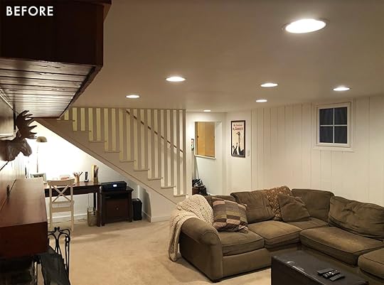
Ok so as a reminder – this room needed to function for two parents, two tween/teen boys, a dog, and a lot of winter sports watching. We needed durability, extreme comfort, and kid/pet-friendly fabrics and materials. They loved the wall-to-wall carpet and there was a decent heated debate about the paneling.
TO PANEL OR TO PAINT THE “ORIGINAL” PANELING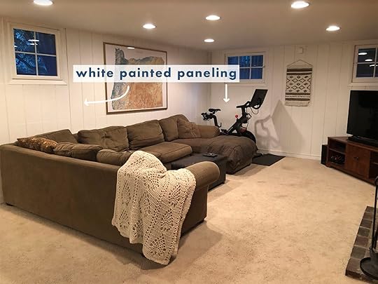

This was a pretty hefty debate that Ryan felt strongly about (with a decent amount of pushback). He liked the wood look of the paneling and didn’t want it painted, but the two paneling treatments were different – one already white and one a 70s orange wood (Doug Fir, Pine, or Cedar – stained). An easy update would be to paint the entire room a darker cozy color and leave the paneling as it was. But they wanted to do more waterproofing and some foundational work on the exterior walls which meant that the interior walls were going to have to be torn out and replaced anyway. So, once we knew we had to open up the walls the options then became to simply drywall and paint or replace the paneling altogether. Finding the right wood took MONTHS and we considered everything from T and G wood flooring (applied vertically) to simple cedar or Doug Fir boards.
We were all pretty darn nervous that the Doug Fir would turn out orange despite messing with the stain colors. In my experience, anytime people try to make Doug Fir look like a hardwood such as walnut it does not look too bad. Priscilla had some excellent inspiration images that gave me hope and it could have worked out, but I felt nervous. Robyn and Ryan were both “is this going to look 70s and dated?” and I couldn’t guarantee them that it wouldn’t!
 the ross alan wood, before being sealed
So before we committed to the risk I reached out to Ross Alan Reclaimed Lumbar to see if we could partner up on this room (discount for PR and photography). Because they trust that we’d make it awesome (and because they are smart and wonderful business people), they agreed and sent us some samples. The second we got the sample we all were like, “OH, THIS!” It was a very easy/fast decision despite this being higher than the original budget (this is black walnut and splurgier, but as you can see worth it).

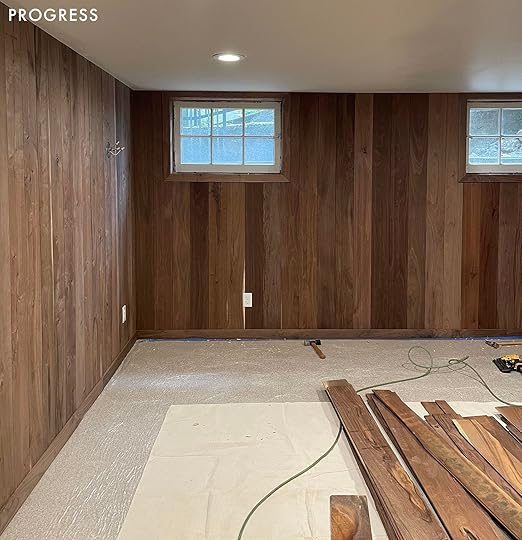
You should know that reclaimed wood will have more cracks and imperfections so you’ll need ample overage and a skilled yet flexible installer. JP Macy’s crew did a great job of installing it as you can see. We were blown away – it’s just so stunning. This is the seal we used!
OK now on to the full reveal … but before all the pretty photos, here’s a video walkthrough where I tour ya through the space (just wait for the ad to play!)
The Cozy U-Shaped Sectional
This room consists of very few pieces of furniture so what we chose had to really work. I wrote a whole post about customizing the sectional with Interior Define last week and it’s EXCELLENT. It’s very comfortable, has great proportions (deep enough to lounge, not too deep to sit upright), easy to maintain, and can fit so many people (or lounge the entire family). We styled it out with pillows from City Home (local and awesome), Rejuvenation (local and awesome), and Bloomist (sustainably sourced and so beautiful).

Coffee Table | Rug | Tray | Box (vintage) | Matchstriker (similar) | Mug | Coasters | Book
The coffee table is from Rejuvenation and works perfectly with the dark moody vibe of the room (and the roundness fits beautifully inside the U-shaped sectional).
The Vintage Art Gallery Wall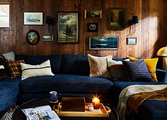
Sconces (painted shades black with fabric paint) | Art (vintage)
I’ll always have a sentimental attachment to these vintage art pieces as I shopped for them during the rainiest month of my life – November 2021. The adventure was a real mood booster. I couldn’t really shop/buy for the farmhouse yet and at the time I was missing our life in Lake Arrowhead badly but the one thing that Arrowhead doesn’t have, and Portland thrives at, is vintage/thrift/antique shops. So strangely collecting all of these pieces made me so very happy. I just went for it and didn’t ask for approval, knowing their style pretty well (authentic, collected, warm, grandpa-vintage inspired). There were a few they didn’t respond to as much but we all agreed that Priscilla and I would finish the wall and then if they didn’t like the finished project they could replace a few (I didn’t charge then for the pieces until I knew what they’d like – a privilege of knowing that my business model is not residential clients, but blog content). I would say those pieces ranged from $15 – $150 – and frankly, I love SO MANY of them for myself, but can happily visit them when I come over to Robyn’s.
Pillows And Throws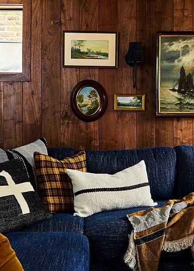
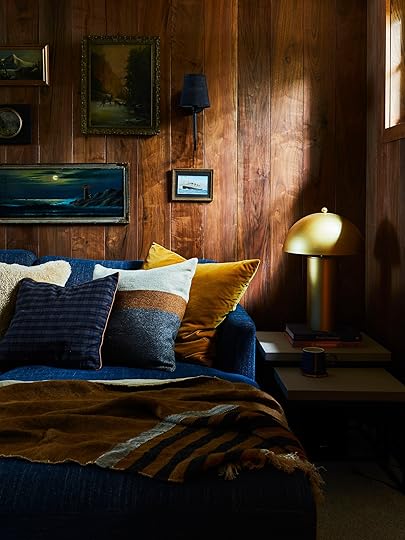
Cross Pillow | Black and White Woven Pillow | Yellow Plaid Pillow | Lumbar Pillow (similar) | Faux Fur Pillow | Blue Plaid Pillow | Color Block Pillow | Velvet Pillow | Throw Blanket | Gold Lamp | Nesting Side Tables
Once I knew this project was going to be very “reveal worthy,” I started reaching out to companies I loved for accessories. On the sectional we have a pretty darn epic mix of City Home, Bloomist, and Rejuvenation – all look so cozy together and all are companies worthy of our support. That throw is not necessarily the curl-up and snuggle throw, but goodness it’s just so pretty. The lamp is from City Home as well.
Hold up: I want to give a huge shout out to City Home – a small local chain (3 total) of furniture and home decor stores in Portland that – get this – you can purchase and take home furniture pieces the same day. I feel like no stores do this anymore and is likely why they are thriving right now what with long lead times. The people who own it are lovely, they have awesome stuff, and just know that you are supporting a local retailer if you opt to shop with them.
Wait, What’s Up With All The Ducks?
You may notice that there are a lot of “ducks” in this room and it’s not an accident. We believe in ducks. Robyn met Ryan, and I met Brian in college at U of O and, he’s a HUGE duck fan (our school’s mascot in case you aren’t up on all college mascots). Ryan really didn’t have very many style requests outside of function for this room, but once said, off-hand – maybe something with a duck? And I took it and waddled. It’s like how Anna Wintour says, “Meh, I don’t really like purple right now” and then all of a sudden the brief to the entire Conde Naste universe is “don’t you dare put purple near her person or print a shade of it in the magazine” – except the opposite. I only had “duck vision” from there on out. He wanted ducks and I was going to shop for and give him DUCKS. Thus my obsession with decoys began and has yet to wane. That painting is an awesome duck painting, there are a few decoys on the fireplace mantel, and I feel the duck behind the sofa says, “Oregon Den” without screaming “FOWL DUCK.”

Wooden Chain | Mirror (vintage) | Art (vintage) | Ceramic Frog Block | Decoys (vintage) | Blanket Ladder | Top Plaid Blanket | Bottom Plaid Blanket (vintage)
The TV Wall
The TV had to be set off to the left of the fireplace because over the top would be too high (read this post if you are curious how to layout a tv and fireplace in one room). It works great here, especially since the walls are dark and it just disappears. Priscilla found them that awesome media console from Article that again, recedes, letting the wood and the general “vibe” be the focal point. We styled out the top of it but I kinda wish we had just left it with a couple of books, diminishing the busyness. Look at that sectional there – so comfy and cozy.
The Wall-To-Wall Carpet
Dog Bed | Carpet (color: cold winter) | Media Console | Checkered Box
Clyde is really stealing our wall-to-wall carpet shot – but the truth is we didn’t really get one. Priscilla and Robyn picked it out, I approved, it was installed, and then covered up til we brought in the furniture so we didn’t get any “carpet only” shots. This is from the brand Shaw, the Cozy Harbor II collection in color, Cold Winter which is great for the price, then they put it over a 1/2″ memory foam carpet pad and it’s very cozy. I think it’s a great medium-priced cozy carpet.
 The Layered Rug
I will testify on the stand for this rug – I’ve used it many times and for good reason. It is neutral yet patterned making it very kid/pet friendly and forgiving. It’s plush but not a shag – making it so comfortable and cozy. We layered it to add coziness and protect the wall-to-wall carpet. It’s WONDERFUL. It goes with every style imaginable. I will likely have it at the farm because I love it so much. It’s called the Citra rug from Dash and Albert.
 The Sofa Table + WFH Desk
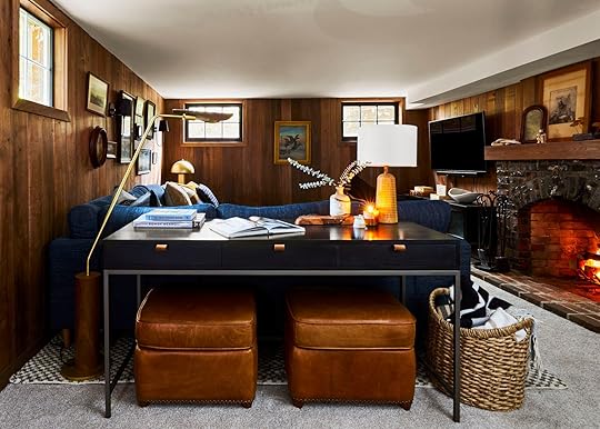
Floor Lamp | Desk | Table Lamp | Leather Ottomans | Basket
I love this vignette so much (visually and functionally). We found the desk, lamp, and ottomans all at City Home (so excellent) and they tuck under just wonderfully. That floor lamp is leather brass and wood = my trifecta of favorite materials. What I love about this desk is that it can act as a sofa table (with lamp, etc) and a place to store extra seating as it is right now. It can act as a buffet for popcorn and snacks if they were to entertain, too. But, here’s the real genius move, it’s deep enough to be a good-sized desk, which was an added plus as Robyn needed a better WFH office.
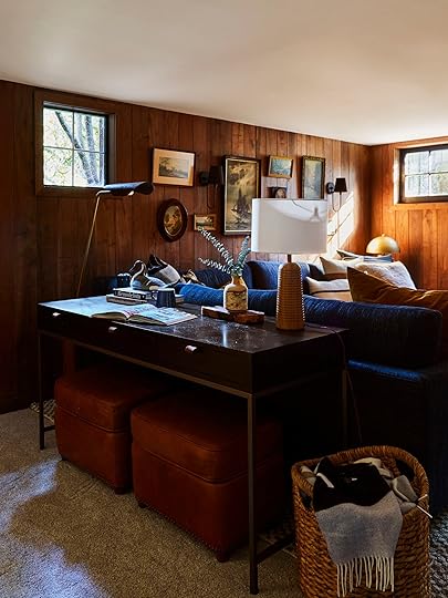

I think that the desk as sofa table should be a way more popular move – I would use it all the time. There are so many nights where the kids want to watch something but I’d rather be pinning but near them. It’s a great hack to add an extra desk area without screaming “I’M AN OFFICE”.

Wood Vase (handmade gift) | Matchstriker (similar) | Candle
I’d like to give another shout-out to Taylor, a carpenter on the ARCIFORM team for carving me that wood vase from a piece of wood on the property that he collected on the first day of the job. I honestly hadn’t been that touched in so long – a gesture completely out of the blue that made me feel so good. I took it home with me after the shoot (obviously) but was so excited about it that I wanted to show it off. That table lamp is from Rejuvenation and it’s wood with beautiful modern carved striped into it – an absolute classic that will never go out of style.

I want to call something out real quick – Sara photoshopped out the recessed lighting – something I noticed immediately. I didn’t ask her to but yes, totally appreciated it photography-wise. So no, the ceiling didn’t change (although I wanted to clad it so bad) and the recessed lights remain. I would never suggest doing a family room without some good overhead lighting – I know we use ours all the time for crafting, puzzles, and games.


A big shout out to Priscilla Frost (on the left) who took the lead on the construction and did all the project management. Because partners were involved I was more heavily involved in the design and styling of this room, but she did the bulk of the construction and application of the finishes. If you are an architectural firm in Portland and looking for an in-house designer/project manager this girl is for you (she is currently pursuing that route so she can build her experience and skills, rather than taking on residential clients).
I hope you enjoyed the whole basement process and reveal. We have one more – the 14-year-old tween boys reveal (and y’all there are like no teen boys inspiration on the internet so come back for it).
Oh, and if you want an Interior Define sectional or sofa of your own, they are offering a one-time discount of 15% off through May 24th, 2022. Just use code: HENDERSON15
*Design by Emily Henderson and Priscilla Frost
**Styled by Emily Henderson
***Photos by Sara Ligorria-Tramp
The post My Best Friends 1970s Basement Gets A Comfortable, Cozy Makeover – Wood Paneling And Wall-To-Wall Carpet Included appeared first on Emily Henderson.
Emily Henderson's Blog

- Emily Henderson's profile
- 10 followers

