
Emily Henderson's Blog, page 122
July 17, 2022
The Link Up: The Riveting And Eye-Opening Article Em Is Recommending To Literally Everyone, Mal’s $7 Flower Arranging Hack, And Three Summer Dresses We All Love

Here we are in mid-July! Em’s at the mountain house, the team is getting in their summer vacations, and farmhouse posts are coming in HOT! We are grateful to have you with us as always and hope you are getting into those summer activities too. But right now it’s time for LINKS!


This week’s house tour is home of Lyndon Cormack, one of the founders of Herschel Supply Co, and designed/renovated it with Mark Burkart of Little Giant Studio. As a mountain lover who grew up snowboarding, Lyndon’s dream of owning a log cabin was realized with this home. We LOVE the THICK logs, the black wood kitchen, and the juxtaposition of all the modern art and whimsical lighting. It’s all just very cool and very cozy. Go check out the rest of the house here!
From Emily: I found this article about being non-binary, RIVETING, and highly educational. It’s by Brock Colyar and it’s for anyone who doesn’t feel like they grasp non-binary identification (i.e. a lot of people). IF you find yourself resisting this and feeling frustrated by this shift in gender norms, then this is a good non-lecturing entertaining way to learn about it. It really surprised me, gave me strange relief (not sure if that’s just through feeling educated), and generally helped me understand those who identify as non-binary and more importantly why they identify that way (and some things we should and shouldn’t do). It’s great.

From Caitlin: Grabbed this sweet linen-blend dress on a whim earlier this month when I was outlet shopping in Rehoboth (tax free, baby!!!). I had pretty low expectations (read: no expectations) when I headed into the dressing room as this cut isn’t traditionally my favorite – the tiered cut usually reads “maternity” on me because of my bust + hips – but I was SO pleasantly surprised. It’s weirdly flattering (expected it to be more “babydoll,” but it definitely came in a bit closer to my actual waist) and it has tie-shoulders, which means I could customize it to show less cleavage (or more cleavage, if you wanna flaunt the ladies. Not judging here!). The reviews say it works great for smaller chests, but my 36Fs felt great in it, too. BIG FAN! Who woulda guessed?!?!
Also From Caitlin: I BOUGHT AN AIR FRYER. I really struggle with cooking – it’s not a skillset I ever picked up and it’s something that makes me really frustrated as an adult (there’s a vicious cycle of “I’m so bad at this, and I don’t want to practice, because I’m SO BAD AT THIS”) – but I gottttttttta cool it with the delivery fees, you know? This is the one I got (suckered by those Prime Day deals!!!) – does anyone have any tips, links to favorite recipes, words of encouragement, etc.? Books or Youtube channels? Pro tips? ANYTHING? Please help – I’m floundering over here:)
 photo by stephen kent johnson | via vogue

 photos by stephen kent johnson | via vogue
Look at this brand-new hotel! Jess and her friend Casey got to have a quick little tour of the new Nine Orchard hotel in LES, NYC and they were stunned. A former bank built in 1912, this building has been beautifully restored. The details are out of this world. If you are in or going to New York anytime soon, it’s a must-see.
From Mallory: I just got influenced to buy this flower frog (which I had never heard of before, but apparently, it’s a commonly used tool to do Japanese Ikebana – which is a type of artistic floral styling). I saw it in this video and it makes your flowers look SO beautiful and I can’t wait to try it and incorporate it into my own home. It’s also very affordable at only $7 for the piece, then you can put it in whatever pretty bowl you want.

From Ryann: I have three weddings left to attend this year (including my own–wild) and I know I am not the only one experiencing wedding fatigue. So if you are looking for a wedding guest dress for any upcoming nuptials, allow me to introduce you to the dress I wore to a wedding a few weeks ago and received so many compliments on. It has a super cute criss-cross halter neck line (eliminating the need to wear any necklaces), and is comfortable, flirty, and a little sexy. I got it in the dark brown color and feel it’s perfect for a semi-formal wedding or event (and on sale!).
From Jess: I’m back on the thong train but the last thing I wanted to do was spend a bunch of money on underwear. While out to dinner, my friend happened to tell about these no-show ones! You get 5 for $15 and they are comfortable. I got my normal size but when I first put them on they were a little tight. However, after a wash they slightly stretched out making them perfect.
Also from Jess: I recently heard about this new inclusive makeup line called GUIDE Beauty that actress and MS/disability advocate, Selma Blair is now the Chief Creative Officer. The founder, Terri Bryant, is a celebrity makeup artist who was diagnosed with Parkinson’s disease and lost the dexterity in her hands. So out of a desire to help those like her have better/usable products she created her brand. They have an incredible line of inclusive brushes, with a new set coming out soon, as well as a few makeup products. In Terri’s words, “From the novice to somebody who has challenges with movement or strength and even the professional makeup artist on set, GUIDE’s products enhance the lives of makeup users everywhere.”

 the final look. these were the only photos i have with the shoes showing. clearly was a great time:)
Also Also From Jess: As I spoke at length about, I recently went to a dear friend’s wedding on the east coast a couple of weeks ago. It was a blast and my mom’s dress/shoe selection all worked out perfectly (see above:)). But one of the bride’s cousins was wearing THE CUTEST dress and it’s taking every ounce of me not to buy it because I technically don’t need it. But if you are looking for a cute wedding guest dress, this one is great (and not at all as shiny as it shows on the site!)
Well, that’s it from us today! See y’all tomorrow. xx
Opening Image Credits: Design by Lyndon Cormack and Mark Burkart of Little Giant Studio | Photo by Ema Peter | via Clever
The post The Link Up: The Riveting And Eye-Opening Article Em Is Recommending To Literally Everyone, Mal’s $7 Flower Arranging Hack, And Three Summer Dresses We All Love appeared first on Emily Henderson.


July 16, 2022
My Favorite Comfortable Pull-On Summer Shorts (An Honest Review … But Mostly My Favorites)

Like our kids, I only want to wear “play clothes” this summer. Sure I have all my Levi’s shorts uniform that I wear in public or to BBQs, but for the most part, I’m either sitting and writing, working out/walking dogs, or playing with the kids (in water). We are down in Lake Arrowhead, and I thought I packed well but every day I find myself not wanting to wear any of my “hard shorts” (jean shorts), opting for my one pair of running shorts (that are excellent). It’s hot. I want to be comfortable. I’m either sitting at a desk or super active. And while I could just size up and buy new Levi’s shorts so they aren’t so tight (look, mom! I’m still growing!! ) I just want cute but highly comfortable right now. So I went online and found a few, reached out to a brand that I’ve wanted to try, and then Mal from my team brought some up when we had a different shoot here earlier this week. I kissed A LOT of frogs, y’all. While doing so I realized that there are some clear requirements that I was looking for, and not settling.
So here are my requirements:
1. They can’t cut in at the waist. Shorts should fit so that they don’t create a bulge at the top. C’MON. This is both really unflattering and highly uncomfortable. They should sit nicely on your waist or hips. Full Stop. I’m SHOCKED by some of these companies that clearly did not ever put them on a real person.
2. They must fall or drape nicely – i.e. don’t bunch in the crotch or butt. If they are cheaply made, the seam placement can become a problem. The right seam placement can make it super flattering and the wrong can give you all sorts of embarrassing bulges. NO thank you. I want a flat front, not adding volume in the front, duh.
3. I want to look cute, like I care, or have some sense of style. I like looking/feeling sporty, not schlubby. There are a lot of cotton drawstring shorts out there, of which I tried but many looked more like cheap pajama shorts to me and I felt really frumpy in them. Many were super see-through. I already have my favorite summer pajama shorts. I want shorts that still feel like could be part of a stylish outfit – even if it’s just at the beach or on a workout.
I didn’t have the time nor the energy to show you all the ones that I didn’t like (also I’m not down to denigrate brands, some of which I typically like), so here are all my winning pull-on shorts that I LEGIT LOVE and hit all three of those categories.
Here’s a fun little video we put together of some of the shorts I tired on – just wait for the ad to play 🙂
Delight Shorts

When I first got these I thought they were pretty expensive for how simple and lightweight they are. They are virtually weightless. Then I put them on and, y’all, I love how they sat – flat on the front, with a little flare out (making legs look slimmer) and they are loose but don’t fall off. I have worn these frequently with my swimsuit on the boat or at the beach, acting as a cute easy cover-up. The slit up the side is cute/sexy and I even swim in them which is just wonderful. I really try to be that mom that doesn’t dread swimming/playing with my kids out of self-consciousness but sometimes the full crotch reveal is a lot to strangers or, like, your brother-in-law. These shorts don’t feel like a middle-aged cover-up – they just feel cool, sporty, and dare I say “hip”. I wear it with my sculpting suit and feel pretty great about jumping in with my kids. I’m between a 4- 6 right now, and these are a size small.
Onzie Rib Biker Shorts

I tried on 5 biker shorts and liked 2, with these being by far my favorite. They are SO comfortable (I sized up and got the M/L and highly recommend it). They are high-waisted, don’t cut in and the busyness makes them VERY forgiving – nary a lump, roll or bump in sight! I wear these with a sports bra to work out or with a sweatshirt and my sneakers by the fire at night. I could live in these shorts. I feel cute, fun, and comfortable.
Invigorate Colorblock Shorts

Oh, these are so cute. They have a wide waistband that does NOT cut in at all and sits nicely low on the hips. There are cute buttons on the side that unbutton to give it a little flair, and undershorts for a cute look that is also sporty and modest. These are on the shorter side and have a short inseam, so might not be awesome for all my long-torsoed friends out there. But I love them (see below my friend wearing them). I think the colors make them fun but am aware that this color palette might not be for everyone. I also wear these over a swimsuit with this mesh pullover and my leopard Teva-like sandals (similar) and feel cute/confident at the beach (if not totally 80s).
Hiking Shorts

These feel like you are naked – they are so lightweight. They are 100% polyester so you can really throw them on and are so cooling on hot days and don’t wrinkle so they are very packable. They are a good length for the days that I don’t want to go super short. They have cute pockets and a buckle, which is unnecessary but cute! My MIL wore these when I forced them all to do my morning workout/jump in the lake routine and she was able to swim in them comfortably. These are a small, which might run big because Free People has that weird sizing where there are like xxxs, xxxxs, xxxxxxxxs, etc. So again, I’m between a 4-6 and I went with the small. I’m also just generally sizing up with these because again, the whole point is comfort and baggy shorts are “in”. These look cute rolled a little like the kids are doing 🙂
Dark Ribbed Bike Shorts

Mal brought these up for me to try in a few different color-ways and styles and these were the only ones I felt were both flattering and comfortable. Y’all a lot of cheap trendy biker shorts show EVERYTHING. If they are too thin or light colored you can see every lump, every bulge, and it can be a LOT OF CROTCH, no thank you. These are thick but didn’t constrict at the waist (they are super high-waisted), and the ribbing is super forgiving. I love the pockets on both sides. I bike a lot up here so I actually do want/need biker shorts (Skypark here we come!). These are on the more expensive side, but worth it to me, because buying cheap clothes that you hate wearing and make you feel gross is dumb.
Vuori Dash Short

I’ve wanted to try these Vuori shorts for a long time, so they sent a few for me to try. I really, really liked them for their fit, quality, drape, and softness. Next time I’ll size up to a medium. I liked all the pockets, the wide waistband, and how lightweight they were, but just want a bit more space and length. GREAT for swimming or using as a sporty swim bottom. They are tiny, too snug on me but wanted to give them some love because for the sportier types out there I think they are great to work out in and long-lasting. (I LOVE their famous joggers, too, which I finally ordered and don’t need to size up in).
Vuori Halo Performance Short

These are almost the exact same review as the nylon running shorts. Excellent quality, great features (zipper, wide waistband), and flattering. I just want to size up to give myself a little more “post-burrito” room. They do have longer inseams on their site, I just chose the short shorts, but am switching these out for mediums.
Madewell Pull-On Denim Shorts

I tried on these a few weeks ago when I had a partnership with Madewell but didn’t buy as they were supposed to send them to me to shoot. They sold out and I never got them, but they are back in stock. When I tried them on in the dressing room I loved them and had I not thought they were on their way I would have bought them. These are a small. My only beef with these is that I like to do a little tuck and the elastic waist didn’t tuck too well – the fabric is thin at the elastic waist and showed the T-shirt too much underneath – looking bunchy. I like a really flat front tuck. But if you wear a shorter top or don’t need to tuck these are super comfortable, cute, and definitely wearable in public (but not workout or swim).
Affordable Mid Rise Knit Shorts

Coming in at $14.99 I was skeptical about these, but they are so comfortable and soft. These are great for around the house, on walks (not for workouts or swimming as they are thicker) but legit so soft and cozy. Mal has these and convinced me to try them. For sizing, I asked her to grab a medium for me but could have probably worn a small.
Target Stretch Woven Shorts

These are GREAT. They rival my Lululemons you’ll see next. These are $25 and have a cute boxy cut, pockets with a zipper (which I use every day for my ID, but a phone would be too heavy), and a wide waistband. The waistband is a bit stiffer (i.e. I have to push it down on my hips so that it doesn’t gape at the top) but for the budget price, it’s GREAT. And yes, you can totally swim in them. Again I’m loving this sportier swimsuit with nylon baggier short look for the beach. It’s a hipper alternative to the tankini – spoken like a true mom! I’m still cool I promise!!
Lululemon High Rise Lined Short

These are my go-to’s that I wear many mornings for my morning routine. The waistband sits nicely and stays put (but zero cutting in as it sits higher). There is a little flair which I find flattering, has pockets for my beach card, and after I work out, I jump in the lake and swim around and they are GREAT swim bottoms. Oh, and it has built-in red underwear (sounds weird, but excellent for being active). Again, I feel like these shorts with a swim top or tank would look cool and sporty at the beach, and just feels less exposed for daytime swimming with the kids. I wear them with my red swimsuit, mesh pullovers, and Tevas, and not to sound like quite the dorky mom, but I do feel like it looks cool while secretly I’m VERY comfortable and confident.

Last weekend we had some houseguests that I forced to do my morning routine with me (because I feel like the luckiest person on the planet and want people to start their vacation days like this, too). They didn’t bring “workout/swim shorts” so let them borrow all of the new ones that I love and they were a HIT.
Suz, My MIL
Suz, here, is working the longer nylon hiking shorts. She loved them and said she would even wear them golfing and wanted a pair. Who thinks Suz needs to do a fashion post?? ME!!!!
Crystal, My Brother In Law’s Girlfriend
Crystal went for the color-blocked shorts and also loved them. Worked out and swam in them. It’s the sisterhood of the traveling shorts and we all agreed these are GREAT for the sportier type.
Ella (who is 14 and I didn’t want to succumb her to modeling on the blog) wore the patterned biker shorts and a workout sports bra/tank which looked so cute! Again, comfortable, and stretchy but not cheap. And she swam in them just great both in the morning and on the boat later in the day. All of these dried relatively fast (whereas cotton or denim obviously wouldn’t have) so I feel good recommending them for fun/mellow water sports, too.
I think you can sense my passion for these. I think wearing any of these with sneakers, a graphic T-shirt and, a baseball hat is also an acceptable “running errands” outfit. Now I’m on the hunt for bralettes for larger ladies, because I can’t seem to wear an underwire anymore but still want the support and the cheap ones I have bought are simply not cutting it. I’m living in this sports bra right now which is super comfortable (not supportive enough for running or jumping if you have big boobs), so if you have any supportive non-underwire bras leave them in the comments. I’m desperate 🙂
The post My Favorite Comfortable Pull-On Summer Shorts (An Honest Review … But Mostly My Favorites) appeared first on Emily Henderson.
July 15, 2022
How To Make Your Room Brighter If You Don’t Have Overhead Lighting: 5 Rental Hacks


Hey guys! Mal here back to share a common problem that has some easy solutions. It all started when my sister’s new husband (who is from New Zealand) came to America and said “why do so many apartments in LA not have overhead lighting?!” I absolutely could not answer that question but I, too, have been baffled by this. I found this out the hard way with my very first apartment in college – we toured the apartment, said “well this’ll do,” signed the lease and moved all of our stuff in. It wasn’t until around 6 pm when I tried to turn on my light in my room, because it was getting dark, that I realized there was in fact no light switch/overhead light fixture (cool). I remember rushing to a HomeGoods to secure literally any lamp. Not ideal, clearly. So after all that, I realized this was an issue for a lot of people, ESPECIALLY in LA. So, if you’re in a new space and just realized you have no overhead lighting OR if you want to get more lighting in your space that’s easy and renter-friendly (aka non-invasive). This post is for you. Let’s begin.
Types Of LightingLet’s get down to the basics, shall we? There are 3 types of lighting to add to a space: general/ambient, task/directional, and accent lighting. Let’s break down what each of these are:
General/Ambient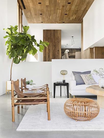 photo by sara ligorria-tramp | from: a modern and organic living room makeover
This type of lighting is mainly overhead, recessed, or other lighting that provides a lot of light in a room in a diffused way. Oftentimes, you’ll notice general lighting is on dimmers. Also, ambient can be considered general lighting which is soft lighting that emits an overall warm, hushed glow. Think about your favorite softly lit wine bar/restaurant or a cozy, dim living room (PS if you’re reading this post, this is the type of lighting you likely don’t have much of, especially if you’re in the “overhead/recessed lighting-less” apartment crew).
Task/Directional photo by sara ligorria-tramp | from: mountain house living room reveal
 photo by sara ligorria-tramp | from: charlie’s big boy room reveal
This one will shock you. A task light refers to a light that’s specific to a task (wild, right?). Basically, a lamp that emits light in one direction (kinda like a spotlight). Think lamps on your nightstand, on a desk to help you work, a light fixture over a bathroom vanity that only emits light in one direction, a floor lamp in a cozy reading corner, you get the idea. This section is pretty quick and easy, onto the next 🙂
Accent Lighting photo by genevieve garruppo | from: a 120 year old barn makeover with the frame tv
Now accent lighting usually would be considered purely decorative lighting since these lights typically do not bring a lot of general diffused light to a room but more serve as an accent piece or have exposed bulbs which can often be harsh to look into. Accent lighting really just helps add a extra light and style. Now let’s briefly chat about how to create a plan to use each type of lighting!
How To Create A Lighting Plan Without Overhead LightingSo while this post is going to focus on lights you can add to hack your space, and not necessarily how to create a lighting plan, let’s chat briefly about the strategy you can use to get an overall general lighting feeling in a place with none.
1. Figure out how you want to use the space (how much light do you need/want?)
2. Decide which areas you want to “zone” ie: dining table, kitchen island (plug-in pendants are great for those)
3. Add task lighting for places that need it (ie: lamp for a desk, lamp by a bed, floor lamp for a reading corner)
4. Sprinkle in accent lighting literally anywhere that makes sense (we’ll go into specific accent lighting hacks below)
5. You should have light coming from at least a few different heights to help evenly disperse the light throughout the room.
HOT TIP: Not all lighting is created equal. Opaque glass, fabric, or paper shades will give you a pretty, ambient glow that can illuminate a space nicely while lighting with metal shades + exposed bulbs can be more directional + harsh (especially when it’s at eye level) but can be great for task lighting.
Now that you know where to start, here are some of our favorite hacks (and shoppable picks) to get non-invasive, extra lighting in your space:
Renter-Friendly Lighting HacksWall Washer Sconces
 photos by sara ligorria-tramp | from: our calm scandinavian master bedroom
 These guys help illuminate a wall SO MUCH. Em used them in their Mountain House bedroom and I LOVE THEM. She literally said they give off the prettiest glow and that I had to include them. These are basically sconces that illuminate a whole wall and light upwards (and sometimes downwards too). They add a great soft, warm glow to a space which is important when you’re looking for more light. The easiest way to maximize your lighting is to pick lighting that diffuses light OUT versus getting metal shades that are too directional + don’t spread the light well.

1. Hattie 1 Light Wall Sconce (we all love this sconce SO much) | 2. Step Wall Sconce (perfect for a home with a lot of organic neutral tones and materials) | 3. Bram Reflector Sconce (modern and chic!)
Battery Operated Picture Lights design by weil friedman architects and cece barfield | styled by colin king | photo by max burkhalte | via architectural digest
These are IDEAL to add to a space with no overhead lighting because they bring a warm glow that draws your eye upwards which is critical in a space with no lighting overhead! Plus they look super intentional and will bring attention to your beautiful art or bookshelves:) Other than a pendant light, these will be the tallest lights in your space most likely.

1. Battery Operated Picture Light (the perfect mix of modern and traditional) | 2. Slim-LineWide Antiqued Brass Battery LED Picture Light (in love with the slim arm!) | 3. Cordless Remote Control LED Picture Light (affordable and comes with a remote? sign me up)
Speaking of pendants…
Plug-In Pendant Lights design by jack ceglic and manuel fernandez-casteleiro | photo by tim williams | via architectural digest
Like I said in the last point, getting light close to your ceiling really will make all the difference when it comes to illuminating your space. Big bonus if you get a paper, frosted glass, or fabric pendant light to diffuse the light evenly.
HOT TIP: If you aren’t into the plug-in look, there are TONS of battery-operated light bulbs on the market now, so you don’t need to hardwire ANYTHING.

1. Bamboo Open Weave Orb Pendant Shade (love this shape and material) | 2. Pendant Light Ceramic Plug In (so cute! and very modern farmhouse) | 3. Single Drum Pendant (a perfect classic)| 4. Carson 12″ Plug-in Pendant (that pop of color and shape is awesome) | 5. Lantern Geometric Pendant (love the shape and two different rattan colors) | 6. Rice Paper Shade (another classic that gives off the best light)

1. Modern Brass Cord Kit (love that brass accent) | 2. Cord Tie For Plug-In Light (a very chic way to tame your cord) | 3. Electrical Cord Swag Kit (love this color and price) | 4. Minimalist Cord Keeper Hook For Swag Pendant (another stylish cord swag solution that also comes in a bunch of colors) | 5. Apartment Plug-In Pendant (not cheap but so pretty) | 6. Matte White Plug-In Simple Swag Pendant (a great dupe for the Schoolhouse option)
The Plug-In Sconce
 photos by sara ligorria-tramp | from: our guest room/basement office reveal
One of Emily’s favorite items to add (rental or not) is the plug-in sconce. She used these two in her LA house and just got TWO AWESOME vintage ones for the farm that are going to absolutely crush. When dealing with cords, it’s important to treat them like a sculpture/part of the light. Trying to hide a cord with a cord cover can often make a space look less designed (depending on where/what the fixture is), so think about how you can wrap the cord in something cool, pick an interesting color cord, OR hang it in a unique way to integrate it into the space instead of pretending like it’s installed into the wall when it’s not.

1. Mantis Swivel Wall Sconce (modern and organic) | 2. Faye 1 Light Plug-In Sconce (love the length and modern luxe vibe) | 3. Flores Plug-In Wall Sconce with Pleated Shade (ummm stunning?) | 4. Crane Swing Lamp Mini (love the all wood look) | 5. LEAP (affordable twist on a great classic) | 6. SIMRISHAMN (for my ultra-modern loving design pal that’s on a budget)
LED Strips Under Cabinets and Furniture
 left: via the diy playbook | right: image source
Maybe my favorite hack…this is SO affordable to do and adds such a nice glow/ambiance if you’re strapped for lighting. I have LED strips under my kitchen cabinetry & it’s so functional for when you’re cooking/cleaning/really doing anything in the kitchen. You can also get really creative with where you put LED strips: behind or under furniture (bed, credenzas, TVs). So many options truly. My biggest piece of advice is to try not to make it the MOST obvious that it’s there (read: I’m not suggesting you put a ton of LED strips surrounding the perimeter of your room like Gen Z does). But there are ways to make it look classy, and for not a ton of $$$!! Check out these options:

1. LED Puck Light (admittedly pricier but so pretty and comes in black!) | 2. Wireless Under Cabinet Light (affordable and cordless) | 3. Carollton LED 2″ Under Cabinet Tape Light (the most discrete and can go anywhere)
That’s all for this post! Hope you enjoyed it + hope it helps!! ALL MY LOVE TO YA & WE WILL SEE YA TOMORROW!!! xx
The post How To Make Your Room Brighter If You Don’t Have Overhead Lighting: 5 Rental Hacks appeared first on Emily Henderson.
5 Non-Invasive Lighting Hacks To Brighten A Space With ZERO Overhead Lighting
Hey guys! Mal here back to share a common problem that has some easy solutions. It all started when my sister’s new husband (who is from New Zealand) came to America and said “why do so many apartments in LA not have overhead lighting?!” I absolutely could not answer that question but I, too, have been baffled by this. I found this out the hard way with my very first apartment in college – we toured the apartment, said “well this’ll do,” signed the lease and moved all of our stuff in. It wasn’t until around 6 pm when I tried to turn on my light in my room, because it was getting dark, that I realized there was in fact no light switch/overhead light fixture (cool). I remember rushing to a HomeGoods to secure literally any lamp. Not ideal, clearly. So after all that, I realized this was an issue for a lot of people, ESPECIALLY in LA. So, if you’re in a new space and just realized you have no overhead lighting OR if you want to get more lighting in your space that’s easy and renter-friendly (aka non-invasive). This post is for you. Let’s begin.
Types Of LightingLet’s get down to the basics, shall we? There are 3 types of lighting to add to a space: general/ambient, task/directional, and accent lighting. Let’s break down what each of these are:
General/Ambientphoto by sara ligorria-tramp | from: a modern and organic living room makeoverThis type of lighting is mainly overhead, recessed, or other lighting that provides a lot of light in a room in a diffused way. Oftentimes, you’ll notice general lighting is on dimmers. Also, ambient can be considered general lighting which is soft lighting that emits an overall warm, hushed glow. Think about your favorite softly lit wine bar/restaurant or a cozy, dim living room (PS if you’re reading this post, this is the type of lighting you likely don’t have much of, especially if you’re in the “overhead/recessed lighting-less” apartment crew).
Task/Directionalphoto by sara ligorria-tramp | from: mountain house living room revealphoto by sara ligorria-tramp | from: charlie’s big boy room revealThis one will shock you. A task light refers to a light that’s specific to a task (wild, right?). Basically, a lamp that emits light in one direction (kinda like a spotlight). Think lamps on your nightstand, on a desk to help you work, a light fixture over a bathroom vanity that only emits light in one direction, a floor lamp in a cozy reading corner, you get the idea. This section is pretty quick and easy, onto the next 🙂
Accent Lightingphoto by genevieve garruppo | from: a 120 year old barn makeover with the frame tvNow accent lighting usually would be considered purely decorative lighting since these lights typically do not bring a lot of general diffused light to a room but more serve as an accent piece or have exposed bulbs which can often be harsh to look into. Accent lighting really just helps add a extra light and style. Now let’s briefly chat about how to create a plan to use each type of lighting!
How To Create A Lighting Plan Without Overhead LightingSo while this post is going to focus on lights you can add to hack your space, and not necessarily how to create a lighting plan, let’s chat briefly about the strategy you can use to get an overall general lighting feeling in a place with none.
1. Figure out how you want to use the space (how much light do you need/want?)
2. Decide which areas you want to “zone” ie: dining table, kitchen island (plug-in pendants are great for those)
3. Add task lighting for places that need it (ie: lamp for a desk, lamp by a bed, floor lamp for a reading corner)
4. Sprinkle in accent lighting literally anywhere that makes sense (we’ll go into specific accent lighting hacks below)
5. You should have light coming from at least a few different heights to help evenly disperse the light throughout the room.
HOT TIP: Not all lighting is created equal. Opaque glass, fabric, or paper shades will give you a pretty, ambient glow that can illuminate a space nicely while lighting with metal shades + exposed bulbs can be more directional + harsh (especially when it’s at eye level) but can be great for task lighting.
Now that you know where to start, here are some of our favorite hacks (and shoppable picks) to get non-invasive, extra lighting in your space:
Renter-Friendly Lighting HacksWall Washer Sconcesphotos by sara ligorria-tramp | from: our calm scandinavian master bedroom These guys help illuminate a wall SO MUCH. Em used them in their Mountain House bedroom and I LOVE THEM. She literally said they give off the prettiest glow and that I had to include them. These are basically sconces that illuminate a whole wall and light upwards (and sometimes downwards too). They add a great soft, warm glow to a space which is important when you’re looking for more light. The easiest way to maximize your lighting is to pick lighting that diffuses light OUT versus getting metal shades that are too directional + don’t spread the light well.
1. Hattie 1 Light Wall Sconce (we all love this sconce SO much) | 2. Step Wall Sconce (perfect for a home with a lot of organic neutral tones and materials) | 3. Bram Reflector Sconce (modern and chic!)
Battery Operated Picture Lightsdesign by weil friedman architects and cece barfield | styled by colin king | photo by max burkhalte | via architectural digestThese are IDEAL to add to a space with no overhead lighting because they bring a warm glow that draws your eye upwards which is critical in a space with no lighting overhead! Plus they look super intentional and will bring attention to your beautiful art or bookshelves:) Other than a pendant light, these will be the tallest lights in your space most likely.
1. Battery Operated Picture Light (the perfect mix of modern and traditional) | 2. Slim-LineWide Antiqued Brass Battery LED Picture Light (in love with the slim arm!) | 3. Cordless Remote Control LED Picture Light (affordable and comes with a remote? sign me up)
Speaking of pendants…
Plug-In Pendant Lightsdesign by jack ceglic and manuel fernandez-casteleiro | photo by tim williams | via architectural digestLike I said in the last point, getting light close to your ceiling really will make all the difference when it comes to illuminating your space. Big bonus if you get a paper, frosted glass, or fabric pendant light to diffuse the light evenly.
HOT TIP: If you aren’t into the plug-in look, there are TONS of battery-operated light bulbs on the market now, so you don’t need to hardwire ANYTHING.
1. Bamboo Open Weave Orb Pendant Shade (love this shape and material) | 2. Pendant Light Ceramic Plug In (so cute! and very modern farmhouse) | 3. Single Drum Pendant (a perfect classic)| 4. Carson 12″ Plug-in Pendant (that pop of color and shape is awesome) | 5. Lantern Geometric Pendant (love the shape and two different rattan colors) | 6. Rice Paper Shade (another classic that gives off the best light)
1. Modern Brass Cord Kit (love that brass accent) | 2. Cord Tie For Plug-In Light (a very chic way to tame your cord) | 3. Electrical Cord Swag Kit (love this color and price) | 4. Minimalist Cord Keeper Hook For Swag Pendant (another stylish cord swag solution that also comes in a bunch of colors) | 5. Apartment Plug-In Pendant (not cheap but so pretty) | 6. Matte White Plug-In Simple Swag Pendant (a great dupe for the Schoolhouse option)
The Plug-In Sconcephotos by sara ligorria-tramp | from: our guest room/basement office revealOne of Emily’s favorite items to add (rental or not) is the plug-in sconce. She used these two in her LA house and just got TWO AWESOME vintage ones for the farm that are going to absolutely crush. When dealing with cords, it’s important to treat them like a sculpture/part of the light. Trying to hide a cord with a cord cover can often make a space look less designed (depending on where/what the fixture is), so think about how you can wrap the cord in something cool, pick an interesting color cord, OR hang it in a unique way to integrate it into the space instead of pretending like it’s installed into the wall when it’s not.
1. Mantis Swivel Wall Sconce (modern and organic) | 2. Faye 1 Light Plug-In Sconce (love the length and modern luxe vibe) | 3. Flores Plug-In Wall Sconce with Pleated Shade (ummm stunning?) | 4. Crane Swing Lamp Mini (love the all wood look) | 5. LEAP (affordable twist on a great classic) | 6. SIMRISHAMN (for my ultra-modern loving design pal that’s on a budget)
LED Strips Under Cabinets and Furnitureleft: via the diy playbook | right: image sourceMaybe my favorite hack…this is SO affordable to do and adds such a nice glow/ambiance if you’re strapped for lighting. I have LED strips under my kitchen cabinetry & it’s so functional for when you’re cooking/cleaning/really doing anything in the kitchen. You can also get really creative with where you put LED strips: behind or under furniture (bed, credenzas, TVs). So many options truly. My biggest piece of advice is to try not to make it the MOST obvious that it’s there (read: I’m not suggesting you put a ton of LED strips surrounding the perimeter of your room like Gen Z does). But there are ways to make it look classy, and for not a ton of $$$!! Check out these options:
1. LED Puck Light (admittedly pricier but so pretty and comes in black!) | 2. Wireless Under Cabinet Light (affordable and cordless) | 3. Carollton LED 2″ Under Cabinet Tape Light (the most discrete and can go anywhere)
That’s all for this post! Hope you enjoyed it + hope it helps!! ALL MY LOVE TO YA & WE WILL SEE YA TOMORROW!!! xx
The post 5 Non-Invasive Lighting Hacks To Brighten A Space With ZERO Overhead Lighting appeared first on Emily Henderson.
July 14, 2022
The Farmhouse Painting Has Begun – Some Blue And Pink (Plus The Two Things Brian And I Didn’t Initially See Eye to Eye On)

A LOT is happening at the farm while we are in California. We always planned on going to Lake Arrowhead for the 4th of July, and then when ARCIFORM told us that painting and sealing the floor would happen on July 11th we figured we’d stay until most of it is over. The plan is for us to move into the house mid-August and live upstairs until the downstairs is ready. It won’t be a construction zone and might even be ready, but either way, we will be living there. Before we left we chose paint colors for the entire house (eek) and they started upstairs. Now as a recap – we are trying to basically create a farm version of the mountain house – a quiet, calm, Scandinavian home full of warm minimalism but less contemporary and modern, more traditional. We want more color and pattern than the mountain house – not a ton, but more. So today I’m taking you upstairs, where it’s all painted and ready to show and tell/give my thoughts and feelings after seeing it all done.

A caveat – I typically like to choose paint colors last – after I’ve chosen rugs, furniture, etc. My philosophy is that there are more paint colors than there are rugs, and knowing what those major pieces are will dictate the color on the wall. But for this house, we haven’t even lived here yet. And I’ve been so focused on the renovation that I haven’t even thought about the decoration part yet (fine, I’ve thought about it, but I’m just taking it much much slower this time). I want to live there, use what we have, integrate vintage, etc, and that all takes time. We aren’t even totally sure if the kids are going to share for a while, or have their own separate rooms. So I did have to choose paint colors with the knowledge that some of them might need to change. We played it relatively safe with a lot of white upstairs but figured it’s easier to paint a light color darker than a dark color lighter. We almost left the walls just primed but it would save us so little money (the prep work is always more than the actual painting) and it would be chalky so we just let them actually finish the job, knowing that we are hanging wallpaper in Birdie’s room and likely painting Charlie’s room a color (should they stick to their claim that they no longer want to share a room – during the day they want their own rooms then at night they say they aren’t ready).
 upstairs landing beforeBlue Doors – All Around
This is the landing – it has 3 bedroom doors, a bathroom door, and two laundry closet doors – so it’s really “door heavy”. The floor here will be painted (doing it last and not sure what color) and I might even paint a harlequin pattern on it in two tones later down the road. We decided to do all the casings and baseboard white semi-gloss, and then painted most of the doors up here in a super soft sweet blue called Upward by Sherwin-Williams. We are EXTREMELY happy with the color both in photos and in person when I saw them drying right before we left. Brian and I decided on this color quickly and he was firm that it was the right one. The light is not accurate up here because the skylight and all the windows are covered on the exterior, but Kaitlin was able to shoot it in a way to get a fairly accurate reading.


When I first saw the photos my immediate reaction was OH, WOW I LOVE THAT COLOR. Then I was a little, hmmm did I play it too safe? Should we have done the casings and baseboard? But knowing that the floor is going to be painted as well makes me feel like we did the right thing. And there are 5 doors on the landing so painting the casing the same blue would have looked great in photos, but I fear that it would have been a lot in person. Maybe not, but I think that using restraint was probably smart.
The Kids Bedrooms: Shared or Separate? We Don’t Know.
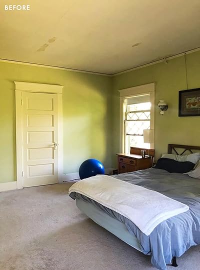 upstairs bedrooms before
As you can see we didn’t change much up here – just improved it all – bigger closets, new carpet (eventually), simpler moldings, new ceiling…oh yah and we installed electricity :). Note how the cords for the only light fixtures, the pull string sconces, coursed outside the wall through the ceiling. Remember when Brian and I were like “we can restore this ourselves, like a YoungHouseLove DIY project!”. Haha. The upstairs didn’t really have lighting and each room had like 2 outlets. And not to digress too much but you know what happens when you start opening up the walls of a 110-year-old house… ANYWAY, that was over a year ago. Look where we are now!

All the doors are vintage 5-panel that were either original to the house or salvaged at an auction to match. We are putting back on the original hardware (which are vintage crystal knobs, I believe). Now seeing the photos, I kinda wish we had sourced a new knob…But between decision fatigue and not wanting to be wasteful, we were like, “just put those cute knobs back on”.
For two of the bedroom’s walls and ceilings we went with Sherwin-Williams Extra White – in a matte finish (a slightly higher sheen than flat), which is supposed to be super wipeable but virtually no sheen. Then for the casing, baseboards, and doors, we chose the same color in a semi-gloss which I haven’t done in a long time. Semi-gloss for all woodwork is super traditional due to its durability and washability (baseboards can get dirty with scuff marks) but the world was leaning away from shiny paint for a while, myself included. For this house, I thought that the shinier finish would be just classic and pretty, not to mention reflect light and be easy to clean. I can’t really tell a difference here, tbh. Always a reminder that the things you obsess about often go unnoticed. I’m curious if in person the gloss of the paint will make me happy.

What you don’t know is that these rooms are getting wall-to-wall carpet – similar to what we did at the mountain house with the 1/2″ memory foam carpet pad underneath. More on that later, but trust me – it’s going to be so Scandi and so cozy.
If you are wondering why those closet doors are so short it’s because ARCIFORM found those doors at an auction for $50 and thought they would be great for a kid’s reach-in closet. They are pretty hilarious and if they were in our room I would have switched them out, but for a kid’s room, we think it’s quirky and makes us smile every time.

The painters spent days prepping those windows around the diamond pattern. DAYS. Which is probably a good thing because turns out painting the entire inside of a house after renovation is one million dollars. So part of me is glad that it’s clearly more laborious than I had thought, therefore worth the high price, while the other part of me is nervous about how long the downstairs is going to take. It’s a big job, I know, and so far from what I can tell they are doing a fantastic job.
Debate #1: To Panel Or Not To Panel The Ceilings
Whether to panel either the walls or ceilings in these bedrooms was a huge debate, for months. I wanted paneling, always, but Brian felt it was unnecessary. The windows are SO pretty, the light is good, the ceilings are high and the doors are so cute. He felt that it was enough and that we’d be spending likely around $5k per ceiling (including wood + labor) and even more to paint it. So when you put it like that, that paneling the ceilings would cost nearly $20k…it was an easy decision. BTW if you did it yourself of course it would be MUCH cheaper. We kept reminding ourselves that we have certainly splurged in other rooms (our room haha) and that these kids don’t need paneling on the ceiling. But do I wish that someone else would have surprised us with free paneling on the ceilings? Of course!
 Y’all – The Pink Guest Room
While we don’t totally know whose room is whose, we really think that this is going to be the guest room because it is attached to the new little bath. That bath has the dark rose/mauve tile so we wanted to tie it in. This color is called Artistic Taupe by Sherwin-Williams and it’s incredible – so warm, so calming, so soft. We painted both the walls and ceiling in the pink and while I haven’t seen this in person I’m VERY into it in these photos.
Debate #2: To Paint the Trimwork, Casings, and Closets Pink Or White
The one thing I questioned is whether we should have done all the casing, windows, and baseboards the same color but with a different sheen. I wanted to, but Brian was a hard “no”, and he is generally far more classic than I am because he’s not on the internet looking at trends like we are. I personally love this look and have not regretted it in the past. But erring on the side of classic and timeless is certainly not a bad thing. He tends to be right, long-term (not always btw). I let him take this one, but when I saw the photos I kinda wished it was all pink. I showed them to him and he still said “absolutely not,” which I appreciated. I trust him a lot and think his instincts are good. So while my preference would still be to paint everything the same color, I also know that this looks so good. Also, all of the windows are totally covered up on the exterior so this room is actually far brighter than it looks, meaning that the contrast between the pink and white is even less than it looks here. It’s a really really light hue.
This room is getting the same carpet and I think it’s going to be VERY VERY DREAMY. I’ve always wanted a pink room and I have a feeling that this is going to be the coziest room in the house because of that color.
For downstairs we have more colors coming at you soon – some soothing, some moody, none are too saturated, but all make me so very, very, happy. xx
*Photos by Kaitlin Green
The post The Farmhouse Painting Has Begun – Some Blue And Pink (Plus The Two Things Brian And I Didn’t Initially See Eye to Eye On) appeared first on Emily Henderson.
July 13, 2022
All The Ups And Downs Of Emily Bowser’s Front Yard Renovation (Part 2!)

I’m baaaaaaack. Here with part 2! I left you with a cliffhanger (aka a place to take a break) with my garage doors being installed and absolutely hating everything about them. Picking up where we left off, at this point, it’s May 8th 2021. We started this journey on April 19th 2021. Within those short few weeks, my contractor Ron and his guys got a lot finished. They ripped up the whole front yard (because every inch was covered in concrete), removed and replaced the sewage line and the water line (BORING), ripped up the fence along the left side of the driveway, ripped out the insides of the stairs and patio (all rotted), had the whole area graded away from the house, brought plumbing and electrical to the front yard (outlet and faucet to the right of the gate for eventual irrigation for the green space and an additional outlet on the patio), installed a french drain along the front of the garage, poured a new driveway and walkway to gate and stairs, built a new wall where the fence was along the left side of the driveway and a half wall in an L shape to separate the driveway from the (eventual) green space, pulled the garage out to the depth of the stairs and then (finally) the garage doors went in. Dun dun dun…

I mean, no comment necessary I guess. Maybe I should be happy that the workmanship up to this point seemed good? I shouldn’t have been too surprised though. Going even further back, in May of 2018 we had our front gate/fence ripped out and replaced:
 Before, 2016
  After, 2018
The gate they installed in 2018 was good for like, 6 months? And then every 2 months we would have to have them come out and shave it down or move the hinges. It would constantly get stuck (one time resulting in our tenants being unable to leave the yard) or be too loose and bounce open. I’m not a door scientist but I believe the issue was that the frame of the gate was made with wood. Probbbbbably because I couldn’t afford anything else at the time and my contractor knew it so he didn’t give me an option. In 2020 at some point, my husband had had enough and got a recommendation from a friend of ours and had this new and improved gate made:
 Photo was taken literally as I’m writing this.
Let this be a lesson: better quality is always worth it.
Unless you’re broke and you just need a gate for 2 years while you save up.
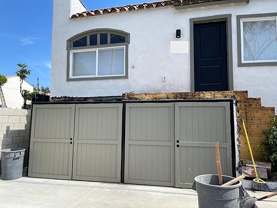
Alas, It’s been there for 2 years and we have not had one issue. So when Ron slipped his slippery self into my life again, I was clear: the garage doors need to be just like the side gate. And I meant *like them* in that they need to be in a steel frame and also in the same style. Simple vertical wood planks, no fancy business. So now let me show you a side-by-side of what I asked for vs. what I got:

 Photo I sent to Ron for reference vs what I got
Ugh. Although I will say, the framing of the garage doors is great, it was the execution of, well, everything else. What I asked for isn’t hard so they actually seemed to go out of their way to make this as bad as it was. To me, if they had never added the border – that I did not ask for – it would have been fine. I *think* they added it because there is a steel frame on the inside of the door that follows the same lines of the border, around the outsides and through the middle. I think they thought it would be easier to attach the wood to the frame if they could drill straight through the wood into the frame and then cover their screw holes with the wood. They didn’t think through how the handles would work and were just like “F it”. I complained right away but even though they were able to do that huge list of things above in 2.5 weeks, the handles wouldn’t be remedied for MONTHS. Oh, we’ll come back to this saga. Spoiler: it gets worse before it gets better.
Back to May 8 2021…


This is the patio and stairs in the process of the rotted wood being dealt with. I wish I had more pictures but I had a job and missed a bit of the demo. The garage doors used to be in line with the house, but as you can see above, they have been pulled out to the width of the stairs. Before, the patio acted as a natural cover for the right side of the garage which we found helped with the flooding in that garage and helped protect the wood on that garage door better (because the overhand was covering it). The patio, or really just a landing to put your stuff down and unlock the front door, was also very skinny, just the width of the stairs (40”). So we decided to extend the patio out 2 feet to match the line of the planter you can see here.
And unfortunately no, that jasmine plant didn’t make it through all the upheaval, although not for lack of trying. Worry not, I planted a new one.
The next phase was stucco-ing the concrete walls, seen here:

And framing out the stairs and patio:

Photo out our front door:

Where we were in mid May 2021:

This process was painstakingly slow. The framing happened in mid-May. The first week of June they stucco-d, put in the bases of the railing, and waterproofed.

First week of June:
 the red substance is the waterproofing
I was out of town for a huge chunk of June/July visiting both of our families that we hadn’t seen in literal years. Probably why they didn’t feel a rush to get things done. It’s now July 12th. While we were gone they came by to “fix” garage gate 2021…y’all. Y’ALLLL. You’re going to die:

I l.i.t.e.r.a.l.l.y. thought I was being punked. HARK! They even reinforced the border I said I hated and wanted removed. All I did was text Ron that exact photo with zero explanation. Apparently, he came by the next day to look at it. More on that later…
Once we were back in town they installed a simple railing which I chose using this super-secret insider design tip: Legal, Least Offensive, and Cheapest.
 Cat tax for reading thus far.
Next, I started thinking about tile. I had a good amount of leftover tile from our back patio and made my husband pull it all out with me so I could see how much more we would have to order to do this space as well. For all you wondering, yes, we tiled the back patio. Last I checked in with you we had painted it temporarily until we could save up for the tile I wanted. No, there’s no formal reveal yet but you peep it on this Halloween post from last year, OR I’ll save you the extra click and you can see it on this BTS from that shoot:

The chaos represents my life. The tile is pretty though 🙂
 V professional tile math happening here.
The waterproofing burned off in the hot hot summer heat, which is why it is no longer red in these photos, and they had to reapply. But back to the tile for a second because I know people want the down and dirty on it. It is the Cross 2 and Circle by Tierra y Fuego. It’s gorgeous and handcrafted. It is not cheap and it was not free. The cost to do both spaces was a little over $5,000 and if you include custom sanded grout, probably around $5,500. I drove to San Diego to pick it up because it saved me a bit on shipping. It was an easy process and they are a lovely small company. The tiling cost was included in the $60,000 budget for this space and when we talk back yard I’ll pull up the info on the labor and we’ll visit all of this again.
 Note the red hue coming up off of that waterproofing
*insert big sigh here* We’re at the place in the story when I realize both how arduous and long this was (and still is. Spoiler alert: it’s been a year and we aren’t done folks!) and also feeling pretty proud that we have really scraped this ish together. We are both freelancers, we never know where money is going to come from or if it will come and every time we do something like this it’s a huge leap of faith that jobs will come from somewhere to pay for it and for our very expensive Los Angeles life. However, it’s also why sometimes these things get stretched out. Ron “fixed” the garage doors (we’ll call it good enough), I’ll save the close-up for Instastories today because I only have video of it, but you can see a little in this pulled-back photo. All Ron needed to finish what we had paid for was the tile and we simply couldn’t afford to buy the materials. Delta hit and so did our work. My husband lost a job he was supposed to be on for a month a couple of days before it was supposed to start, and production for me came to a screeching halt as companies tried to adapt to what the new variant meant for business.
We had spent $60,000 and our house was still kind of, well, depressing. Don’t get me wrong, Andrew was enjoying a little extra breathing room in our garage and it was nice to know that scary things (like an exploding sewage line) were taken care of, but we didn’t really want to be out there. For some reason having a big dirt patch screams to people “DUMP YOUR SH*T HERE” and we were constantly dealing with other people’s trash in our yard. It was uninspired, to say the least.
Summer turned into fall and the house remained the same. I remember one day, after another person had dumped their trash in our yard, I had a surge of energy to try to make the space the best it could be and to stop wallowing that it wasn’t “done”.
We spent a weekend removing the huge chunks of concrete and some leftover construction junk from the eventual green space and it’s funny, as soon as we did that people stopped dumping. It’s the Disneyland idea I guess: if you keep it clean, people won’t throw their trash on the ground. Even though the patio was a weird pinkish hue from the waterproofing wearing off, I put two of our CleverMade Tamarak chairs onto the patio and started enjoying the space for what it was, not what it would be. Not unlike when our backyard was dirt for 6 months because we couldn’t afford landscaping yet.
During this time is when I started thinking about what I wanted from the 16’x16’ tiny plot of dirt down by the driveway. I had finally hopped to it and started harvesting from our orange tree out back and leaving a crate of oranges with Target bags (from our many Target shoots in 2021) for the neighbors to take when they walked by. Andrew and I both really enjoyed how excited people would get (especially kids) and how fast they would go. There are only so many oranges we can eat and we were happy to share.
 *Target did not approve of nor are they responsible for these oranges
I decided that between the backyard and the front patio, we really didn’t need any more hanging-out spots. I *may* have briefly considered hedging the thing in and putting a hot tub out there but alas, that sounds expensive (and a little weird?). We could just landscape it and make it pretty, but why not make it pretty AND edible? Maybe I was still inspired by the Ron Finley Masterclass I devoured in the summer of 2020 about the importance and reality of urban gardening. I mentioned in my backyard post that I thought maybe we can fit a small raised garden on the side of the back patio, but now sitting on the front patio looking down, I realized it made way more sense to put it out here and go bigger. The back patio would be better suited for more hanging out space (or mayyyybe a wood fired hot tub HIIII Goodland, slide into my DMs please).
This is a lesson that sometimes taking your time on a renovation can help you make more thought-out decisions. That’s my reframe of this YEAR PLUS journey anyway. I’ll come back to the urban gardening thought. Let’s get back on chronological track…
 My cleaned up but unfinished front yard, complete with Tamarack Chairs, a dirt patch, and my brand new (used) minivan! Look at the jasmine plant that just wants to live!
Around October 2021 I started to get concerned about our rainy season. The patio was meant to have tile on it so it wasn’t weather-appropriate as is. Yes, I know, it’s absolutely nuts that we started this journey in April 2021 and at this point we are in October 2021 and it. Had. Not. Rained. Isn’t that wild? 13 years in Los Angeles and it still surprises me. October 25th 2021 came the first real rain. Why do I know the exact date, well, wouldn’t you know, MY GARAGE FLOODED.
Are
You
F*cking
Kidding
Me.
I think I went catatonic and didn’t speak or feel things for days. The drain that ran from the left side of my house to the street failed. Greatly. The water built up on the back side of the wall because the drain was not big enough to handle the water that we have learned, funnels from both of our neighbors directly into our yard. It was over 3 feet deep and needed to go somewhere. Water finds a way. It finds a way. I went into my side of the garage (left) and it sounded like a faucet was running. It found a crack and pushed its way through the side of the house, something that had not happened before. It’s hard to see water in photos, but we’ll post some videos on Insta-stories.
*insert even deeper sigh here* We dried out the garage, luckily it didn’t last longer than a day, and patched the side of the house:

After it flooded AGAIN AND WORSE a couple of months later, we drilled a couple of ugly holes in the wall itself so the water could go down the drain and through the holes. It’s not pretty but it gets the job done. Yep, not sure how to reframe that one. Luckily my side of the garage has seen a lot of flooding so everything is in bins but Andrew’s side is NOT so, yeah, that was super fun.
In January of 2022 (yes we are finally in 2022 at this point in the story) we pulled the trigger on buying the tiles and I had done a bit of research and decided we should invest in painting our home with Tex-Cote paint. We had painted when we moved in in January of 2017 and we had major issues with cracking on both houses. Apparently, most houses need to be painted every 5-7 years anyway (I had no idea) but we had patched and painted the house a number of times and the cracks just kept coming. I started looking into it because the paint job from just a few months prior was already having issues of chipping and cracking. Tex-Cote is supposed to help with that, along with the apparently proven claim that it saves energy and reduces cooling costs. If that’s true, it would be great since our back house is black and pretty much a sun magnet. I was most taken with the idea that I would never need to paint my house again and the lifetime guarantee that if we did have a problem they would come out and fix it free of charge. We used CAT Exteriors and had a good experience. It was $22,000 (both houses plus all exterior stucco walls) and they have financing options, which we are doing, obvs. We actually don’t even start paying on it until November 2022. The original plan was to pay it off when we refinance. With interest rates going up, it may not be worth it since the interest rate on it is 5.99%. We’ll see where mortgage rates land when we are ready. Side note: our mortgage rate is ok, but we pay mortgage insurance because of how little we put down, which is the main reason we would refinance. You can read about all our boring mortgage stuff here if buying a house for only $22,000 down interests you (get it?).
So next I picked up the aforementioned tile and the custom grout was delivered in early February, nearly 10 months after we started this journey. Tiling started right away…
 View out the living room window
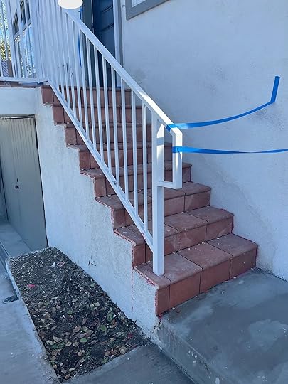
Yes, the railing does come into our window view, unfortunately. “Safety” and “codes” ya know?? My hope and prayer is that the new jasmine plant wants to live as much as the last one and climbs all over the railing eventually. This is the main reason why I didn’t care too much about the style of the railing, I’m hoping it gets more or less completely covered in the next couple of years. You will notice this is where we said goodbye to our old jasmine plant. It had some damage from all the construction, my landscape guy said it was probably because some of the branches were bent when at different times it had to be pulled away from the house. Also, I wanted the painters to be able to get this spot easily.
 For context, how much of the railing we see from our couch. Also, DAFFY.
Unfortunately, I had a death in the family and flew to Maryland last minute to be with loved ones, so I completely missed the paint transformation. Andrew had to stay behind to oversee all of that because it was quite a production. The prep to the finished product can take about a month (hence the price tag). I’m not educated on it enough to give you a full lesson on how Tex-Cote works but I do know it requires an intense blasting of your house to expose (and worsen) any cracks, so they can get in there and deeply repair the weaknesses. Then there are multiple layers of product to paint on, and the end result (if you could look at it apart from the house) is a thick, malleable substance. It’s as if you took 10 layers of gaff tape and stuck them to each other. The bendable quality is what allows the house to move a little without causing cracks. Only the last layer is the color of your house.
 One of the cracks on the back patio after being exposed even deeper
 The back house mid-process before becoming black again
The “after” of the paint probably isn’t going to look as amazing as it feels because we didn’t do anything drastic but believe me, it’s so much better. Cracks are gone and everything looks so smooth. Another great thing about the paint that I’ve learned is that it is WAY easier to clean. For example, if a bird poops down the side of your white house, you just have to spray it with a hose. Ready for the “afters”?
 Peep Daffy 🙂
Tile! At last! Just a little sneaky peek before the furniture and plants are added. I hope to add a tall planter on the far end with plants that create a privacy wall so it doesn’t feel like we’re trying to look over our neighbor’s fence and into their yard. It’s a slim space, from the house to the inside of the railing is only 5 feet wide but the whole space is 17 feet long. It’s been a challenge to figure out furniture for sure, but we’ll come back to that at a later date.

She’s still a sillylooking girl, but she’s mine. The crack that just would not give up, where the new wall on the right (gate side) connects with the house, is gone and has not come back. All of my doors open and close and lock with ease. I don’t worry every time I flush my toilet. The garage is yet to flood again (still suspicious) and we have a lovely patio on which to watch the sunset. It’s hard to tell from this angle but there is a gate that closes at the top of the steps that we just need to add something to so Daffy can’t walk right through. When we do, we can sit out here with her and not worry about her wandering off. Puck does whatever he wants and would jump right over it but Daffy, not so much. She’s can’t do such dextrous things.
This is a good place to pause. I thought I would get to the garden but that actually doesn’t happen for a couple of months (and is still in process). So up next: we will talk about my 16’x16’ box, what I plan to do to cover the backside of my neighbor’s fence, how my newly planted jasmine is doing, a cheaper way to do irrigation, what it’s like to shovel literal TONS of gravel in 100-degree heat, and lots and lots of garden goodness with Eden of Down to Farm.
I’ll leave you with this photo of the box right after we had soil added and did some boring drainage stuff that we’ll talk about next time.

To be continued…
The post All The Ups And Downs Of Emily Bowser’s Front Yard Renovation (Part 2!) appeared first on Emily Henderson.
July 12, 2022
A Sneak Peek Into The Pantry Design Process (I’m So Excited I Could Cry)

Like most middle-aged lady moms, I get really excited about “pantry potential”. Dreaming of where I can hide the Instant Pot, fantasizing about displaying my Easter platters, thinking about the hours I’ll spend decanting and labeling almond flour. I started cooking seriously 4 years ago, and lockdown really escalated it from a necessity/hobby to a daily activity that truly fulfills me. Most nights I put on my apron and a podcast, shift from work mode to chill mode and try new recipes that my kids will likely complain about. On a good day I cook twice a day, and we hope to entertain small groups of friends every weekend (so I don’t have to ever leave the house), which means that this kitchen needs to function well (duh) and have proper food storage and prep space. Now granted this pantry (this whole renovation) isn’t exactly exactly normal – I fully recognize our privilege and feel so lucky. But regardless of budget hopefully some of the ideas or choices can help you if you are updating your kitchen or simply thinking about your own pantry dreams. And listen, this is my job so I had the extra motivation to make her look really, really pretty. Like the mud room, the pantry is a hard working space and a lot of people have pantry woes (us included). I feel extremely grateful to call this panry design “work”, but please know that you don’t need a pantry like this to be happy 🙂

The pantry lives near the kitchen, obviously, close to the back door (for easy grocery drop) and opens down into the basement (where I’ll store my canned apples, jars of tomatoes and potatoes once my homestead life really takes off :)) I LOVE that it’s very accessible but not visible from the living room because while this pantry will be pretty, she will likely still be messy and full of jerky bags, boxes of broth, goldfish and strewn with coffee grinds. I have a feeling I’ll have pantry pride and treat it with respect, but it’s still life.
The Inspiration design by deVOL kitchens | via remodelista
  design by deVOL kitchens
While most rooms in this house will be bright and airy (a holdover from living in CA for 12 years) this room and the family room both had the opportunity to be dark. Not only do I love the idea of that color pulling you in and surprising you, but I think that considering the ‘stuff’ that will be in there, the dark will make it look cooler and almost mask much of the packaging (I hope).
But what about function?But the thing is that this room needs to work hard, so having everything hidden away, or so deep that things could get hidden wastes its utility. So I went on the hunt for pantries that were within our size that looked really functional. Here’s what I found:
 design by rachel parcell | via the rp blog
This one functionally really fits the bill. I love the combination of lower cabinets, counter space (this is where our toaster, microwave, and coffee maker will be), and upper easy-to-access open shelving.
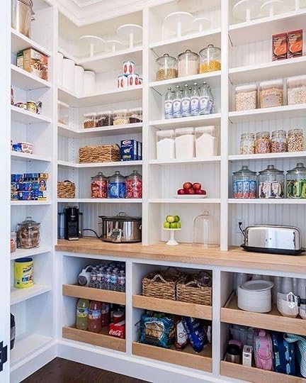 image source
I love how these have pull-out drawers for the lowers – especially for how deep these cabinets are (24″) so you don’t have to try to reach in and find something in the back. We designed ours differently but with the same function.
Our Cabinetry


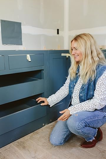
As you can see the shape of the room itself is odd with a triangular corner, so to maximize it we worked with Unique Kitchens & Baths in addition to our kitchen cabinets and utilized every inch (on the bottom). Now we didn’t need to do this (a cute vintage hutch could have been awesome in there), but I’m sure happy we did as they look AWESOME. We chose a dark blue from Sherwin-Williams called Slate Tile and had it painted in a satin finish.
Designing Your Pantry For Your Family

When we designed this we really thought about our family’s needs. What are our biggest ‘pain points’ (hello marketing speak) and what problems do we want to solve? What do we reach for the most and what is the most annoying to deal with? So I’ll show each and point out what is going where:
Coffee/Toaster and Microwave Area – The “Morning Wall”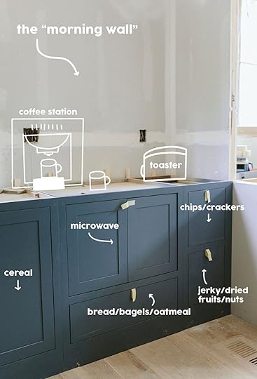
This side will be for all things “morning” – coffee for us and breakfast items for the kids. They are in charge of their own breakfast so we designed it to be easy for them to do – i.e. the cereal boxes in the lower cabinet and the toaster on the countertop. The microwave is hidden inside the cabinet and the doors retract back as they did at our mountain house coffee station and bar. The drawer underneath it is for bread, bagels, and packets of oatmeal. The far-right has two deep drawers for bagged kids’ snacks – chips/crackers on top and jerky/dried fruits and nuts on the bottom. These kids have ZERO excuses to not make themselves their own breakfast or pack their own dry snacks.
General Food Storage and Appliance Wall
On the other side, we have 24″ deep cabinets that are a straight run so we have more opportunity to use it as a counter if needed (but likely won’t). The two pull-out drawers will house broth (measured the height to fit) and canned goods (all the heavy stuff) and we are putting really pretty hardware on it (stay tuned for that). The drawers above are likely for extra cooking utensils as they are more shallow. The far cabinet on the right will be for extra appliances with a pull-out lazy susan situation (I forget what it’s called) that will house our Instant Pot, bullet, etc. The two tiny drawers turned out smaller than I had imagined because since they are inset drawers the drawer mechanism is INSIDE those dimensions. It’s hilarious. They are so cute but not sure what to put in them. Paper Straws? Chopsticks? Salad Servers? Dunno.


 Oh, she is so proud of that drawer. What is happening above? What type of shelving??
First off, we have a really pretty horizontal large-scale bead board going up throughout the space that I can’t wait to show you. It’s gorgeous. We didn’t want upper cabinets in here as we didn’t want to hide the food that we need to grab, plus it would then just be a small room of cabinets. I fell in love with the monochromatic painted wood bracket look and that’s what we are doing.

These look chunky right now but once painted out the color of the wall (still TBD) they’ll disappear a bit, plus we are getting smaller versions than what I’m holding here. We will also likely add some shaker pegs to hang baskets of garlic and onions. All the things. ALL THE THINGS.

These shelves will start about 22″ off the counter and be 12″ deep with a 10″ bracket for support – giving us counter space if desired. This is really the max depth you want as stuff behind it will get lost, but we wanted flexibility here so we went for 12″ (the same as the inside of upper cabinets). Since it’s running the length of the room (60″ or so) we are putting in 4 brackets to ensure it can hold whatever we put up there. Hopefully, this doesn’t look too busy but I really want to be able to put stacks of platters or jars of rocks if I want to. Maybe this is where I want to put my ankle weights. Who knows? Then there will be another shelf on top of that, 16″ above the top of the first one. So two shelves with pretty details that I’m excited to show you once we lock them down.
 She senses he’s ‘ready to be done’ as their fingers brush against each otherThe Shallow Back Wall
This area is again only 16″ deep and it’s front and center walking into the pantry so I’m not totally sure what I’m going to put here. Here are the options floating around in my head:
A hanging shaker cupboard on peg rail – maybe for extra sauces or ugly condiments? Plate rail for my pretty platters – Oh how I do love to show them off…Art, vintage mirror, or family calendar. This will also be a good mail drop zone so the smart mom in me would set it up for that. Now that I’m writing that maybe I should do the shaker cupboard but inside we have key hooks, checkbooks (??), pens, and then we drop the mail underneath? I may wait until after we move in to design this area (the shaker pegs can be screwed in at any time).Pantry Countertop Material
I put off this decision for a LONG time. too long. So right before we left (the day that we shot) we had to pull the trigger. The options were:
Leftover Carrera marble – the same material as the perimeter counters in the kitchen (it’s a really white carerra with a ton of negative space and warm and cool veining – from Bedrosians and gorgeous). We had just found out that we had enough leftover and it was already at the fabricators. This would be the easiest choice, but not necessarily the cheapest. Around $1500 for fabrication (I reckon this is on the more expensive side, FYI). Butcher Block – While working with Zena Flooring they told me that they are making custom countertops out of unfinished stainable maple. We liked the sample and were very tempted. They could deliver and have it cut on sight by our team (aka not as expensive as fabrication). Made in Oregon. Wonderful company. Affordable (unsure of the price but likely in the hundreds). We wouldn’t really prep or chop in there so it’d be more of a nice wood tone. A dark stone (yet to source, buy, or cut) – That’s right, a third option was what we really wanted which was a dark stone to make it moodier and to make and to be the most forgiving. The coffee area especially can get super messy and coffee is acidic, so I was very fearful that we would regret marble over there. But we could have put down a board under our serving area. She finally catches his eye, desperate to steal his attention from the maple sample
We chose #3. We were excited to lean into a dark pantry and loved the functionality of the granite. I could have gone any direction because they all had their pros and cons. Brian and Sarah pushed me into #3 which I was surprised by and appreciated their confidence. When Brian is willing to spend more on something he usually is right. He kept saying, “Emily this is your original vision, just do it”.
My Favorite Detail – The Vintage Windows
When I was sad, in the spring when the rain wouldn’t stop, I would look at the renderings of the pantry and the idea of those vintage windows flanking the opening flooded my brain with dopamine. I’m not joking. These vintage windows are pleasure-inducing and cheered me up when I was down (which is why I’m likely supposed to do this for a living). If you are just catching up, we took two of the original windows from the downstairs that we had to replace and flipped them vertically to fit here, flanking the doorway. We designed the pantry with these in mind. I’m so excited. The window in the back didn’t exist but we framed it in and bought a non-operable window from eBay for $200 that worked with the design. They will both be painted on the interior of the pantry in the same color as the paneling on the walls.
So that’s where we landed last week (as I was writing this post) and then on Friday they sent me updated photos where they finished the paneling, the stone, and the windows!! So more to come VERY VERY SOON.
Photography by Kaitlin Green
The post A Sneak Peek Into The Pantry Design Process (I’m So Excited I Could Cry) appeared first on Emily Henderson.
July 11, 2022
Malcolm’s Dining Room Intro: How He Plans To Prioritize Vintage And Secondhand Pieces + An Exciting Personal Announcement

If you’ve been following along with my home renovation journey here on Emily’s blog, you know that I’ve accomplished quite a bit in my home over the last couple of years. I’ve completed a primary bedroom renovation, a somewhat unexpected bathroom overhaul, a life-changing home office makeover, and a slew of smaller projects that have made this house really feel like home. And now… to shake things up a bit… I’M MOVING TO LONDON.
A little unexpected after all the momentum I’ve gained here, huh? Well, I’ve decided to take the opportunity to travel to Europe for a period of time. Starting this summer, I’ll be moving to London (woo!) and leaving my house here in Virginia in the hands of a tenant (and a property management company) while I’m away. I’ll definitely be returning here to Virginia (I have a lot more plans for this house and my heart is still in this area), but the stars have aligned for me to take this journey across the pond, which is something I’ve always wanted to do. So, cheers to that!
I’m excited to learn how European design, old-world architecture, and the British lifestyle will influence my ever-changing design sensibilities. I’m always looking for different ways to create memorable experiences through intentionally-designed spaces, and I think this adventure will give me a new outlook on different ways that might be possible.
HOWEVER, before I ship out in a couple of months, there are a handful of things I want to do (and a few things I NEED to do) in this house before renting it out. Namely, completing my final room makeover before I leave: the dining room!


Now, planning this dining room redesign has been a little tricky, for a handful of reasons. For starters, while I’m mindful of the fact that I won’t be in this house much longer to enjoy the room in the short term, I still want the space to feel intentionally designed and consistent with the rest of my house. Additionally, while I would normally be open to buying new furniture/housewares/accessories for this space, it seems a little weird to buy brand new things that’ll just be put into storage in a couple of months. To those ends, I’m focusing on making quick changes that won’t be as labor-intensive as other makeovers I’ve completed (and that a renter will appreciate), collecting secondhand and vintage items to use in the space (that I’ll be able to enjoy when I return stateside full-time), and making changes that allow the room to flow seamlessly with the rest of my home (in an effort to create a boutique experience for my future tenants).
“QUICK” CHANGES design by heidi caillier design | photo by haris kenjar
Typically, my renovations in this home have included a feature, large-scale DIY project. In my primary bedroom, it was a wood and marble headboard. In my office, it was custom-designed built-ins with concrete countertops and Semihandmade door fronts. While I don’t quite have the time or the resources to take on a massive project for the dining room, I’d still like the space to feel as custom and tailored as the rest of my home. Enter… a “simple” wainscoting project (those quotation marks are very intentional…).

I completed a similar project in my last home, so I was confident that I’d be able to knock it out in a weekend or two for the dining room. And that would have been the case… had I not driven my FINAL NAIL FOR THE INSTALL into a wire behind the wall and cut power to my entire house. I wrote about the full story on Instagram, so I won’t repeat it all here, but to summarize: the problem has been fixed, it forced me to learn about the faulty electrical wiring in my house (eek), and this dilemma was a reminder that everything happens for a reason.
 image source
BUT, I digress. With the wainscoting figured out, it’s time to move on to choosing paint! This has been a tremendously hard decision to make, which would be the case under normal circumstances, but intensified this time because of my forthcoming move. Do I choose a bold color, or might that turn away renters? Do I go with a safe and neutral option, or will that be boring and unsatisfying? Ultimately, I do need to be mindful about making my house as rentable as possible, but I do think there’s a middle ground to be found (sick rhyme, bro).
 design by renovation husbands
And, my friends, I think that middle ground is wallpaper.
Stick with me. Pun largely intended. On the surface, wallpaper seems like a moderately permanent and style-specific treatment that might go against some of my previous points. But… What if… I can install it in a VERY impermanent way? I’m thinking of some version of large-scale artwork that gives the impression of wallpaper without any of the permanence of the actual thing. Even less permanence than sticky, removable wallpaper. I’m still working through the mechanics of it all, but it’ll likely include this William Morris print from Rejuvenation and a large piece of Sheetrock. Stay tuned.
 design by studio lawahl | via yinji space
Another quick change to the dining room will be switching out the old ceiling light for a new one. I’ve been itching to change up the lighting in here for quite some time, but couldn’t quite settle on the type of fixture that felt right for the space. Then, one day, I stumbled across this Kichler chandelier and pretty immediately felt inspired by it. The lines of the piece feel energetic, but not too out of pocket. The scale of it feels just right, and you know I love me a brassy moment. And the best part is: I scored it secondhand! Which brings me to my next point…
UTILIZING SECONDHAND AND VINTAGE PIECESI was lucky enough to find the Kichler light fixture at Community Forklift: a salvage warehouse here in the DC area. I’ve always loved supporting Community Forklift—they uplift the local community by making home repairs affordable, reducing waste, promoting reuse, and creating green jobs. On top of all that, they just always have the coolest stuff. I love perusing the warehouse on a Sunday and just seeing what they have in stock.
I also found this vintage secretary’s desk—which I’ve upcycled as a little bar cart—at Community Forklift about a year and a half ago! This will make its way into the dining room as well and will store cups, napkins, and other barware essentials. I love the fluted detailing on its sliding doors, the long tapered legs, and the marble slab I’ve added to the inside shelf.

Also, let me tell you… I’ve gotten REAL lucky on Facebook Marketplace recently. The manifestation for this dining room has been real. I’ve always admired the design of these Broyhill Brasilia dining chairs, and I was recently able to score five of them for a reasonable price on Marketplace. Crafted in the 1960s, the Broyhill Brasilia line was inspired by the style of mid-century Brazilian architecture. I lived in Brazil for some time as a kid, so I have a bit of a personal connection to this line in particular. But, also, these chairs are just sexy, quintessential examples of mid-century modern design. They’ll require some reupholstering (I’m not sure that the toile fits either my style or the style of the chairs), and I’m still deciding between a light and a dark solid fabric. Thoughts?! Let me know what you think.

I was also able to snag this Paul McCobb dining table (!) on Facebook Marketplace, which was manufactured in 1950 and matches the vintage of my new Broyhill chairs. The finish/color of the table is notably different than that of the chairs, but I think they work VERY well together… The lighter striations in the wood framing of the chairs speak pretty well to the blonde coloring of the table, and the similar vintage of it all creates a very copacetic pairing.
 design by heidi caillier design | photo by haris kenjar
Procuring vintage furniture and accessories for this space really feels like the right thing to do, for a number of reasons. Firstly, I’ve been increasingly aware of the importance of using secondhand items whenever possible. There’s SO MUCH COOL STUFF already out there in the world, and it behooves us to take advantage of that. I certainly have never been perfect about reducing, reusing, and/or recycling, but there’s no time like the present to start, right? Secondarily, since I’ll be putting most of my belongings into storage fairly soon, it doesn’t feel totally appropriate to buy too many new things just for them to be stored away. Additionally, I’ve curated quite a few vintage objects over the years, and these Broyhill chairs and this Paul McCobb table are great additions to that collection. And… that point naturally brings me to my next thought…
CREATING A SEAMLESS DESIGN EXPERIENCE THROUGHOUT THE HOUSE design by studio lawahl | via nordic design
I’ve often described my overall design style (for now, anyway) as classic, collected, and tailored. To that end, I’ve collected lots of interesting and vintage furniture over the years—from the aforementioned secretary’s desk to a family-owned sewing table in my primary bedroom, and a secondhand barrister bookcase in my office. I’d like to continue collecting meaningful objects—regardless of my upcoming move—because while I only have a couple of months left in this house, for now, these objects will probably be in my possession forever. And there’s something very heartwarming about the notion of that.
 image source
 Contrarily, however, there are some elements of the dining room that I can change now—that’ll stay with the house in my absence—that a renter will be able to enjoy while I’m away. In a PERFECT world, I would list my home as a short-term rental and brand it as a boutique lodging experience, but my HOA doesn’t allow for it and won’t let me be great. BUT, I can certainly make it feel that way as much as possible, right? At some point in the future (manifesting it now, ok?!) I plan to develop a motel/boutique lodging experience, so why not let this situation be practice in some small capacity?
 design by joanna laven | photo by erik lefvander | via est living
 Two small elements that will make that possible will be wall plates and window treatments. When I redesigned my bathroom, I started to use these brass Rejuvenation wall plates for the outlets, which I then continued into the office. I’ve been slowly replacing all of the wall plates in my house over the last year to match, which I think is an easy way to create a seamless design experience throughout a home. I’ll be using the same wall plates here in the dining room, which will help the room speak the same language as other spaces in the house. Side note: I personally think high-quality wall plates are worth investing in. We see and use them every day, so why not make that experience a beautiful one? I’m also in the process of updating/streamlining all of my interior door hardware with Rejuvenation’s help, which will help to create an even more intentionally-designed home.
 design by cab architects | via dwell
I’ve been thinking hard about the window treatments for the dining room, and how they’ll fit into the narrative throughout the rest of my house. Should everything match? Will a renter expect the same blinds everywhere, or is there space for creating unique treatments in each room? What would YOU expect, as a renter? Let me know.
 design by and studio | via the nordroom
Otherwise, I’ll be paying a lot of attention to stylistic choices in the dining room to ensure that they make sense with other decisions I’ve made throughout the house. Making sure the wainscoting aligns with the other millwork in the house, painting the walls similarly to how I’ve painted other rooms, and choosing finishes (namely, brass) that call out to other spaces will all be key to making the whole house feel like a fully-realized experience.

Now, the biggest challenge about designing the dining room to feel consistent with the rest of my home is that it sits adjacent to my kitchen, which is designed quite differently than the rest of my home. I haven’t touched it since I moved in two years ago, and there isn’t anything wrong with it, objectively. It functions well, its appliances are great, and it has more than enough storage space. The easiest way I can think of to bridge the dining room with the kitchen—for now—will be to switch out the ceiling mount fixture in the kitchen to be more consistent with the dining room. But… I have BIG PLANS for the kitchen at some point in the future, after I gain some European design sensibilities. 😉
While I’m excited about my upcoming move, I’d be lying if I said I wasn’t also heartbroken to leave this home behind for some time. We exist in a world of dualities, do we not? I’ve poured my blood (literally, sadly), sweat, and tears into my efforts of making this house a home, and it feels…weird…to hand over the keys to a stranger. However, I know [or at least hope] my efforts will be enjoyed by somebody else in the meantime. And, either way, I’ll return as a much better designer to finish realizing my vision for her.
Her, being my house.
In the meantime, let’s get this dining room in proper order, shall we?! We shall. Which part are you most excited to see come to life? For me, personally, the wallpaper project I’m conceptualizing is very exciting and has the potential to be a monumental idea for renters. Make sure to follow me on Instagram for regular updates about how this room takes shape!
Opener Image Credit: Design by And Studio | Photo by Nicole Franzen | Via Domino
The post Malcolm’s Dining Room Intro: How He Plans To Prioritize Vintage And Secondhand Pieces + An Exciting Personal Announcement appeared first on Emily Henderson.
July 10, 2022
The Link Up: Emily’s Vacation Shorts, Cute AND Comfortable Sandals & A Super Soft Bralette That’s Worth The Hype

Happy Sunday and welcome back!! How is everyone doing? Did you guys catch all the farmhouse updates on Instagram this week?? So much exciting stuff is happening FAST so if you want all the BTS be sure to follow along on Instagram. But right now it’s link up time so let’s get straight into it starting with a little design eye candy:

 home and styling by kerrie-ann jones | photo by: alicia taylor
This home tour is just so beautiful (cries). The bathroom has risky (but awesome) stone flooring, there’s a wild marble + arched kitchen island. OH, and to top it off? An ocean view…it’s pretty much the American dream on steroids.
 shorts
From Emily: I’ve been LIVING in these shorts on vacation (update, if that link didn’t work for you try this…some browsers had technical difficulty!). They are super lightweight and they have a nice wide waistband that does NOT cut in (I size way up in Lululemon and these are a size 8 so def size 1-2 sizes up). They are short, yet flowy, which is wonderful for running but they have built-in underwear so no one will see your butt cheeks. PLUS they are EXCELLENT to pull over a bathing suit and yes I swim in them almost every day when I jump in the lake. Plus they have a pocket with a zipper (not big enough for a cell phone, but good for ID and keys). But again, it’s mostly because they stay put while also being comfortable (again them not cutting in is crucial for me). I’ve been looking for a great pair of pull-on shorts (“soft shorts” as my Levi’s are feeling a little snug for all-day wear). I have a few more to order if you guys want a “pull-on shorts” review let me know. They are all I want to wear this summer while playing with kids.
From Ryann: I am so obsessed with this buttery-soft bralette that I actually never want to take it off. I can hardly tell I am wearing anything under my shirt which is wild. That’s how comfortable it is. I have it in the color “pebble” and it’s the perfect bralette to wear under white t-shirts and even racer back tanks. 1000/10.

From Caitlin: I have been #emfluenced (yes, it happens to our team, too) and I AM GLAD. After reading Em’s glowing review of her new TA3 swimsuit, I grabbed two of my own (the Plungey, which she recommended, and the Lacey, which is a little more covered up – that’s the one I’m wearing up there) and both are AWESOME. I love swimming/the beach/the pool and don’t have a ton of swimwear-induced agony – like, I’m at a place with my body where my general feeling is “it is what it is” – but these suits made me feel SUPER comfortable AND cool. They were both incredibly supportive (the lace-up back is NO JOKE – you’re in TIGHT, in a good way!) and held up awesome after hooooours and hours in the ocean. My friends and I are renting a blow-up waterslide later this month and I can’t wait to wear this one again for the whole day


From Mallory: Caitlin turned me onto Farm Rio in a real way – so now any time I go to Nordstrom or anywhere that sells it, I always check their rack first, and I always find something incredible that’s kinda splurgy (but worth it) UNTIL I saw they came out with t-shirts. I just picked up this one and haven’t taken it off (gross I know) but I love the boxy cut, I sized down so the sleeves don’t feel as long and it’s all in all super high quality, and very comfortable. I can’t wait to rock it literally all summer and beyond. It’s THAT graphic tee.
Also from Mallory: And while we’re on the subject of Farm Rio, my dream in life is to go somewhere beautiful in Mexico and wear this dress. If you’re planning a trip, go get it. Live the dream
From Jess: I found REALLY cute and comfortable summer sandals! I’ve already been wearing them a bunch and sooooo far no blisters. They are the perfect balance of casual and structured so they can easily be dressed up or down. I got them in brown but they also come in black. Huge fan and I got them at Nordstrom Rack so they were under $50!
As always have a great rest of your Sunday, and see you back here tomorrow! xx
Opening Image Credit: Home and Styling by Kerrie-Ann Jones | Photo by: Alicia Taylor
The post The Link Up: Emily’s Vacation Shorts, Cute AND Comfortable Sandals & A Super Soft Bralette That’s Worth The Hype appeared first on Emily Henderson.
July 9, 2022
What Our Kids Are Watching This Summer: Our Favorite Guilt-Free Summer TV Shows (For The Whole Family)


I feel like I can solidly call myself an expert in a few different categories: 1. flea market shopping/thrifting, 2. sunless tanning, and 3. best family-friendly shows/movies. We have a pretty loosey goosey Summer TV policy – they get some in the morning while we work (unless they are in camps) and we watch family TV many nights of the week if we aren’t out (we do this year-round actually). We have found that we care less about the quantity and more about the quality of the shows they watch and want to do it as a family (we hate them on individual iPads). So today I wanted to throw out a few that the whole family likes (for the most part) and some that you might not have seen yet. I have found that the ones that inspire them to do something after they watch the show are the most valuable – craft shows that make them want to make something, science shows that make them want to experiment, or shows that show them how to be kind. TV is just so good these days, you’ll see…
Hello, Jack! The Kindness Show
Jack MacBrayer is a national treasure and knowing him personally (yes, I’m bragging) I can tell you that he is so lovely in every single way. He pitched this show a few years ago – essentially a modern-day Mr. Rogers and it finally got made. It’s EXCELLENT. It made me cry with how pure its intentions are and then laugh because it’s funny. The world needs more family TV shows like this. Thank you, Jack and Apple TV for creating such a wonderful family-friendly, and legit ENJOYABLE show.
Making Fun
By far the freshest design/competition show on Television. That shot of the dinosaur doesn’t really do it justice. It’s about 6 old curmudgeon carpenters who have to ‘make’ something a child asks them to – like a 16′ unicorn that poops rainbows. They use engineering, welding, carpentry – all different types of fabrication to create these INCREDIBLE inventions. It’s HILARIOUS and you get the sense that the producers are laughing or stoned when doing the graphics. YOU will love this, not just your kids. I PROMISE. So far only one season and the Hendersons are excited for the next.
 Weird But True!
This isn’t one that we all watch, but our kids love the heck out of this show, learn a lot and always want to do experiments afterward. This isn’t one of our nighttime family shows (it’s def more geared for kids) but it’s solid, they learn a lot and it entertains them.
Brainchild
Another great Science show (with my friend Ali Ward who is awesome). Excellent science in an approachable way for kids.
Get Out Of My Room
Kids designing each other’s rooms!!!! I just discovered this and I think it’s only one season, but it’s so cute! These two (Hi Claire!!) work with two siblings to make each other’s rooms fully decked out. The whole family started watching this and it’s pretty darn cute. Warning: they will then want insane rooms, with crazy/fun/expensive ideas. I love how inspired they got after watching it.

It’s LITERALLY JUST ABOUT CUTE ANIMALS and how their ‘cuteness’ keeps them alive. Y’all it’s ADORABLE, innocent, and educational.
Making It
THREE SEASONS of wonderfulness. These people are so talented, so creative and so nice to each other. The hosts are hilarious, and the talent is top-notch. IF YOU LOVE DESIGN BLOGS YOU WILL LOVE THIS SHOW. We have to start it early because they always want to make something afterward.
Before I go: I feel like I can’t publish this post without calling out our other favorite shows that I know I’ve talked about multiple times but want to collect them all here:


1. The Great Pottery Throwdown (6 seasons!) – EXCELLENT, kind, talented, and wonderfully produced. (I’d say 5 and up on this one). Both of our kids wanted to take pottery classes after this and they did 🙂
2. Nailed It – Less educational, more fun, and hilarious. A cooking show that our whole family LOVES.


3. Full Bloom – The flower competition show that had some spectacular moments (but the level of waste is hard to watch at times).
4. Blown Away – INCREDIBLE talent and really exciting to watch.
5. Master Chef Junior – Super impressive kids cooking competition show that inspires our kids to cook. A fun Friday family night would be to watch an episode at 4pm and then make a big meal together.


6. Lego Masters – Duh. So fun. So talented. So many seasons.
7. Domino Masters – They tried to double down on the lego masters and it’s good, but trying to find as many people who are experts in dominos I think proved hard for the casting producers 🙂
8. Holey Moley – Brian and the kids love this one far more than I do – lots of falls, silly gags, etc. But the hosts are super funny and like I said, the kids and Brian LOVE IT. 5.
The post What Our Kids Are Watching This Summer: Our Favorite Guilt-Free Summer TV Shows (For The Whole Family) appeared first on Emily Henderson.
Emily Henderson's Blog

- Emily Henderson's profile
- 10 followers

