
Emily Henderson's Blog, page 120
August 5, 2022
What You Bought Last Month: All The Practical Summer Staples
HAPPY FRIDAY FRIENDS. We are back with another crowd favorite, the “What You Bought Last Month” sales data-driven extravaganza! It’s our fun way to pull back the curtain a bit and share what the top selling items are and see how demands shift month-to-month. What’s July’s theme?? I think I can tie it all together with two words: summer fashion. The items that hit include TONS of shorts, easy breezy clothing picks, and practical shoes. But as always there is a surprising item that hit to keep us all on our toes 🙂 Wanna see what made the top 10?? Why, I’d be more than happy to take you down the list. Let’s giddy up!
10. Ryann’s Favorite Drinking Glasses
Coming in at #10 are these drinking glasses that I recently bought and love. They are solid, have a great shape, and still bring me so much joy. When I first recommended them, I mentioned they are perfect for my iced coffee in the morning and even better for a hefty cocktail in the evening. Now I’ll add that they are my go-to glasses for all liquids including wine, milk (for milk and cookies duh), water, smoothies, and my all-time favorite: diet coke on ice. Who else bought these in July?? I am so honored to be drinking glasses twins 🙂
9. Emily’s Go-To High-Rise Lined Short
If you haven’t seen Emily don these shorts on Instagram stories then honey, you aren’t paying attention! She’s talked about the quality and drape of these for months and most recently sang their praises in this pull-on shorts review post. Here is what she had to say:
These are my go-to’s that I wear many mornings for my morning routine. The waistband sits nicely and stays put (but zero cutting in as it sits higher). There is a little flair which I find flattering, has pockets for my beach card, and after I work out, I jump in the lake and swim around and they are GREAT swim bottoms. Oh, and it has built-in red underwear (sounds weird, but excellent for being active). Again, I feel like these shorts with a swim top or tank would look cool and sporty at the beach, and just feels less exposed for daytime swimming with the kids. I wear them with my red swimsuit, mesh pullovers, and Tevas, and not to sound like quite the dorky mom, but I do feel like it looks cool while secretly I’m VERY comfortable and confident.
8. Springville Wood Executive Desk With Drawers
I love when a furniture pick makes its way onto our top seller list. We are an interior design blog after all and we recommend a ton of furniture here daily, but a lot of times big furniture items don’t sell as much simply because they cost more than small decor items and clothing. But this desk is clearly an exception for good reason. It’s from the Studio McGee x Target line and is on sale right now for $300!! If you are looking for an affordable and solid MCM desk with great details (those knobs!), you gotta snag this one if you haven’t already.
7. Caitlin’s Effortless Summer Pant
You may remember these from last month’s roundup because they were #1 on the list baby! Caitlin first saw her friend wearing them and explained “she looked SO effortless and cool, like, she had the energy of a young Diane Keaton in a Nancy Meyers kitchen”. With that description, she had me (and apparently many of you) SOLD. They are also under $90 which, according to Caitlin, is surprising once you feel the quality and construction of these bad boys. SO, who snagged themselves a pair?? I want to hear your thoughts down below!
6. Emily’s Favorite Sneaker
Although this was Emily’s link, I also have these sneakers and LOVE them. They are classic and cool and go with any outfit (even dresses!). Emily first mentioned them all the way back in April when she wrote, “I found these which have the edge that my checkered vans did and yet are way more comfortable. At first, I was worried about the laces (all the effort!) but I can slip them on and off real fast. They look cool with most outfits and give me a tiny bit of a lift which I like.” More recently you all saw Emily wear them in the shorts review post, so I can see why they are back on everyone’s radar. They also come in a ton of other colorways and are on sale right now 🙂
5. High Waist Bike Short
As someone whose current favorite outfit is bike shorts and an insanely oversized T-shirt, I am delighted to see some quality bike shorts on this list (because I might just snag myself a pair). Look, I know bike shorts aren’t for everyone but clearly, Emily sold a lot of you with her honest review of these:
Y’all a lot of cheap trendy biker shorts show EVERYTHING. If they are too thin or light colored you can see every lump, every bulge, and it can be a LOT OF CROTCH, no thank you. These are thick but didn’t constrict at the waist (they are super high-waisted), and the ribbing is super forgiving. I love the pockets on both sides. I bike a lot up here so I actually do want/need biker shorts (Skypark here we come!). These are on the more expensive side, but worth it to me, because buying cheap clothes that you hate wearing and make you feel gross is dumb.
4. Mallory’s Farm Rio Dress
Should we all take the time to thank Caitlin for introducing us to Farm Rio many moons ago?? Now, anytime one of us mentions anything from Farm Rio on this blog, it’s bound to get a ton of clicks and I think I know why. Everything they sell is so colorful and FUN, and you can tell they aren’t a brand that chases trends. They make exciting and fresh pieces like the gorgeous embroidered color block dress. They are a great company that we all stan HARD and it looks like you all do too 🙂
3. Mid-Rise Knit Shorts
In case you haven’t noticed, the shorts review post was a huge hit! This is another pair that Emily reviewed and I can see why so many of you clicked and bought a pair. Here is Emily’s (#notsponsored) review:
Coming in at $14.99 I was skeptical about these, but they are so comfortable and soft. These are great for around the house, on walks (not for workouts or swimming as they are thicker) but legit so soft and cozy. Mal has these and convinced me to try them. For sizing, I asked her to grab a medium for me but could have probably worn a small.
2. Emily’s Stripe Linen Shirt
I personally love a button-up for summer. Need a swimsuit cover-up? A button-up is the chicest way to go. Going from day to night?? Well, a button-up is the perfect transitional piece! This particular one is Emily’s latest favorite shirt because it drapes great, is made of lightweight linen, and is super breathable. Those are three boxes I want all my shirts to check so it’s no surprise this shirt made this list (and for the second month in a row!).
1. Target Stretch Woven Short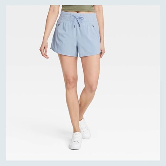
Yet ANOTHER pick from Emily’s shorts review. It is no surprise these clock in a #1 because the price and quality are hard to beat. Here’s Emily’s endorsement:
These are GREAT. They rival my Lululemons you’ll see next. These are $25 and have a cute boxy cut, pockets with a zipper (which I use every day for my ID, but a phone would be too heavy), and a wide waistband. The waistband is a bit stiffer (i.e. I have to push it down on my hips so that it doesn’t gape at the top) but for the budget price, it’s GREAT. And yes, you can totally swim in them. Again I’m loving this sportier swimsuit with nylon baggier short look for the beach. It’s a hipper alternative to the tankini – spoken like a true mom! I’m still cool I promise!!
Well, my friends, this is where I leave you. I hope you enjoyed this short and sweet look insight into the month of July. Have a great weekend! xx
Opener Image Credit: Design and Photo by Keyanna Bowen | From: Blue Walls Be GONE! Key’s Totally Transformed Office Reveal – Maybe The Most Dramatic Before & After Ever (?)
The post What You Bought Last Month: All The Practical Summer Staples appeared first on Emily Henderson.


August 4, 2022
A Dark Attic Becomes The Most Joyful Bedroom For THREE Kids – Thanks To Velux Skylights And Some Clever Storage Solutions

Today we have a room makeover reveal, for three kids, in one sweet attic space who are part of the most lovely and grateful family in Seattle. We did this in partnership with Velux Skylights, one of my favorite partners who continues to put so much thought into their makeovers and truly change the lives of families. If you need a boost of happiness, want to understand the power of a skylight, or simply want to see some excellent space planning and styling then this is a post for you. I enjoyed every single second of this makeover (besides Covid pushing it off constantly for almost three years) and can’t wait to show you how my team, led by Julie Rose, nailed this design.
If you have a second check out this beautiful video the Velux team made, with quite possibly the best kid’s reaction ever (and that is usually so hard because there are cameras in their face and they are typically in shock). I will forever watch it and feel so grateful for this job 🙂
The Family:
You might not remember but right before Covid/lockdown, we did a call out for another Brighten Up Any Room surprise makeover for a deserving family. We received a lot of submissions and while I tried to stay local in L.A., Dina’s family in Seattle felt like the right fit in every way and I really connected to her story. After a very traumatic third birth of her lovely daughter, she was left with little time, energy, and resources to figure out how to turn the kids shared room, to now house three kids – 4, 2, and, a newborn. It was such a good challenge for us to solve and this room was perfectly in need of some Velux skylights. As you can see it was very dark and like most busy moms, overwhelmed with how to design spaces, Dina needed advice on how to even start to tackle this room. Listen, my kids both slept on mattresses on the floor for over a year because I didn’t know how to lay out their shared bedroom and I’m literally a professional with a team of help, so I had a lot of empathy for Dina. It is hard!!!
 look how little these kids were when we started!
At the time Julie was full-time on my team and had already begun the design. Then life moved us to Portland (she is in LA) so now she works for Velinda Hellen Design (also former EHD! so fun) and we blog about their projects. I begged her to stay on this project as a freelancer. She of course agreed and did such an incredible job, as you’ll see. 🙂
The Design And Functional Needs And WantsDina and her kids were lovely and realistic in their needs and wants:
Beds for three kids – 1 twin, 1 toddler, 1 crib. Over the three years that this got pushed it changed to three twin beds :). And remember the ceilings were too low for bunk beds. Additional bed for when mom crashes up there or guests – So yes, FOUR BEDS 🙂 Good luck, Julie! Storage – Again three kids in one room, so we really had to maximize storage for clothes, books, toys, etc. Room to play, read, do art, and live – While that seemed impossible, we really didn’t want it to just be a room of beds…thus the challenge.Stylistically they wanted:
To brighten it a lot – The Velux Skylights obviously did this immediately. More on that below. Playful and colorful – The words “treehouse” and “room of clouds” were thrown around. Gender-neutral – With two girls and a boy, we wanted to make sure it felt flexible. First up – The Velux Skylights!
During Covid, we arranged to have the skylights put in since it only involved 1-2 people over 1 day (whereas our crew was large, would be there for a week, and necessitated traveling). I was happy that at least Dina and her kids had a brighter room while they waited for the world to be safe enough for us to come up. As you can see it totally changed the space already.


It was such a sweet space, with so much potential. The angled ceilings now with two windows and two skylights made it ripe for decorating. We just had to figure out how to make it work for the changing needs and wants of three growing kids.
Julie created a few mood boards, I narrowed it down to the one I loved the most, and we showed Dina some peeks just to make sure that she loved the furniture layout and wallpaper. As a mom, I wanted her to be able to see any red flags for how her specific kids lived. She was a complete and utter JOY to work with – just so grateful, trusted us so much, making it a really really fun creative process. And those kids…their reaction literally couldn’t have made us feel any better.
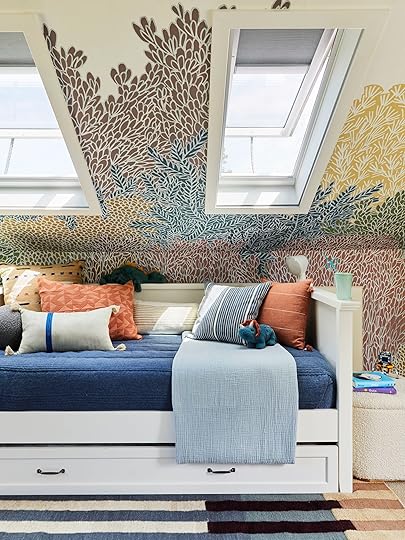
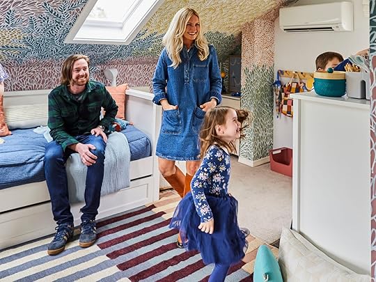
THE REVEAL!!!!!
Storage Bed | Corner Unit | Twin Bed with Trundle | Cloud Comforter | Wallpaper
It’s quite possibly the cutest and best-shared bedroom for three young kids that I’ve ever seen. I can say that because Julie Rose and my team are responsible for nailing it so well. Between the wallpaper, the Velux skylights, the rug, the incredible layout, and the styling – these kids got a dream bedroom and the EHD family feels so proud to be a part of it. Julie Rose was the lead designer, Emily Bowser styled it, and it was shot by Sara Tramp – it was a real reunion of the best kind and they did such a good job I could cry (and have).
The Velux Skylights – Room Darkening Shades In The Bedroom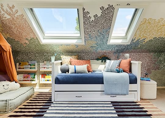
The Ballow Ball Pillow | Gauze Blanket | Geometric Pillow Sham | Silk Mono Stripe Pillow Cover | Woven Dash Indoor/Outdoor Pillow | Lumbar Modern Stripe Decorative Throw Pillow | Silk Mini Stripe Pillow Cover | Square Textured Stripe Tassel Decorative Throw Pillow
This whole makeover was in partnership with Velux, as I’m a massive believer in how much natural light can change/improve a room – and the more the better in the Pacific Northwest. Now, let’s break down how these Skylights work:
Ideally, your ceiling would be vaulted, and if not then more construction is required to install them (but doable). So second-floor bedrooms are great, or first-floor if there isn’t a second story. These skylights are solar-powered (you don’t need to change any batteries). I’ve never had one issue with them and we use ours at the mountain house A LOT. They can open and close like a window – which is incredible for airflow in a second-floor bedroom. They have room darkening shades that block 99% of the light. I’m very sensitive to “light leak” and have zero problems with these in our bedroom. As you can see below it really blocks the light. They can be controlled via a remote or an app. So easy, I promise.
Below you can see the different functions of the Velux skylights. We shot them fully open to allow airflow, closed with the shades 1/2 down, and fully closed with the shades all the way down. Again, I have used Velux skylights in 4 projects now, have zero complaints, and will use them forever. They absolutely change the room for the better and are such a good product. Obviously, they come with the Velux No Leak warranty and while they can get dusty, the specialized glass is super slick, so rain washes most of it away. You honestly don’t really notice it. It’s not something that bothers us at all.

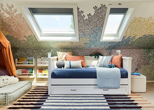
 open | closed with the shades 1/2 down | fully closed with the shades all the way down (no light leak!)Sleeping 4 In A Room Without Bunk Beds – The Layout And Creating “Zones”
So as you can see there are two twin beds as an “L” in the corner for the girls, then a twin bed with a trundle on the right for their son and if/when any parents crash up there. The design totally maximized the space, opened up the middle floor area, and created areas of play space.
I also want to point out that beautiful roman shade from Everhem. It’s the perfect complement to the space, where it helps to frame the window, adding coziness, but doesn’t overwhelm the room at all. I love their quality. Then I, of course, also love how Bowser added the flower light garland to make this room even more whimsical.

Storage Bed | Corner Unit | Sconces (similar) | Mattress | Cloud Comforter | Unicorn Pillow | Flower String Lights
That corner piece is made for this configuration – it gives the book storage and surface area for a “nightstand”. Julie even added those cute sconces so they can control their own light. These two beds had drawers for storage – utilizing every square inch of storage space for these three kids.
The Sweetest, Most Perfect Mural Wallpaper
Butterfly Pillow | Yellow Pillow Cover | Pillow Insert | Face Pillow | Sorry! Vintage Book Edition | Candy Land Vintage Bookshelf Edition | Rainbow Basket | Ballerina Doll
This wallpaper from Rebel Walls is so incredible in a million ways – the color palette, the movement, how it climbs up the wall and engages the vault so it looks like it’s growing organically. It truly felt like a treehouse and brought the room so much magic. Not just any wallpaper would work in here. It’s a small space so we couldn’t choose anything too busy or anything too “linear” or graphic. This wallpaper has a lot of power (obviously) but it has organic movement and actually doesn’t have a lot of contrast.


Rainbow Sheet Set | Woven Blocked Stripe Throw Blanket | Desert Pillow Cover | Face Pillow | Stripe Pillow Cover | Monkey Doll | Magee Monkey Doll | Beehive Toy | Hammerhead Pillow | Octopus Pillow
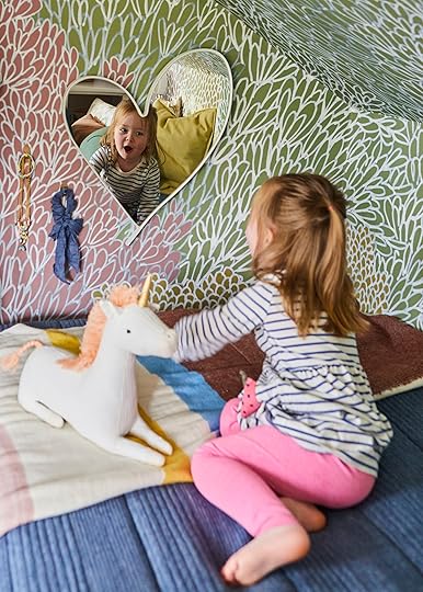
Emily Bowser really thought through all the styling details (the heart mirror, the necklace hooks) and those pillows add so much playfulness and coziness.

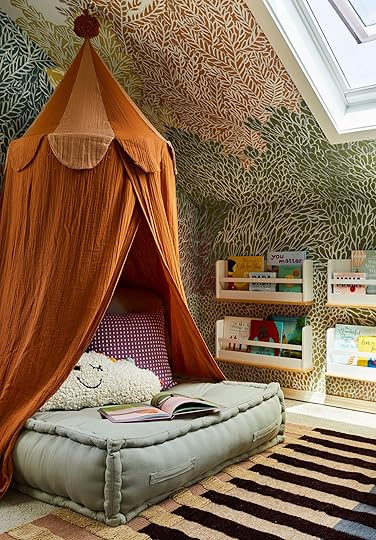
Sloan Shelves | Rug | Canopy | Floor Cushion | Dot Pillow | Cloud Pillow | Wall Bookshelves
We created this cute little reading zone under the canopy and added vertical bookshelves (that my kids loved when they were little) so they could see the books easily and again maximize the wall space.
 That Incredible Rug
Basket | Whale Pillow | Daybed And Trundle
I’ve wanted this rug from Lulu and Georgia since the second it came out last year. It’s incredible. That pattern, those colors, and it’s super soft and cozy. This side of the room houses the dresser and an art space in the corner. We ordered a beautiful hutch from Anthropologie that didn’t get there till the day after the shoot to go where the dresser is. The dresser that’s there was supposed to go under the AC until so Emily B., Sara and Lauren improvised and put hooks and shoe storage for the shoot 🙂

Stacking Bins | Painted Wood Hooks | Quilted Backpack | Umbrella
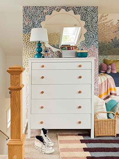
I love that mirror so much – all the details were nailed and every corner was addressed for function and style.

Marker Caddy | Wave Mirror | Dresser | Dresser Knobs | Lamp | Sheepskin Rug | Floor Cushion
Serving Tray | Linen Plain Towel
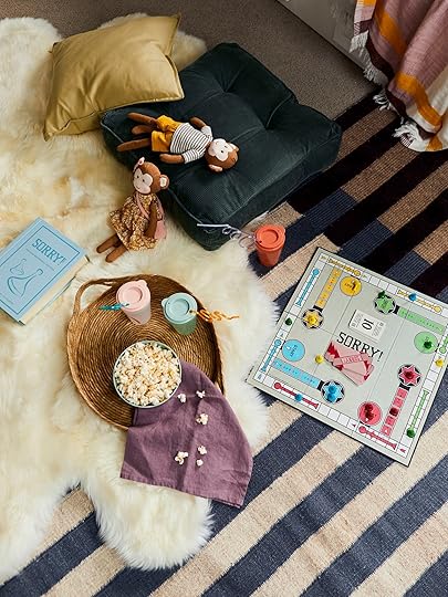
While this is a perfect and adorably styled shot, the floor pillows and my all-time favorite sheepskin rug from Article, add the perfect amount of coziness for the kids to play on.

Ottoman | Table Lamp | Tufted Floor Cushion
I also love that there are plenty of pieces that don’t look “little kid” and will age with them – like that awesome boucle ottoman from Article. Trend-forward but in a quiet way that just adds more texture to the room.
The Family’s Reaction!!


Just ridiculously cute and happy. And Sara did such an incredible job capturing the space and their energy.

Dina and her husband now have this incredibly bright room that really meets the needs and wants of her kids. As a mom, I know how life-changing that can be.
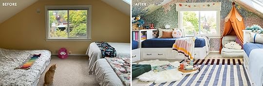
The transformation was so good that we added a ton of before and after side by sides:)


Thanks to Velux for giving the EHD team an opportunity to design such a fun space for such a lovely family. Truly a dream partnership.

1. Velux Skylight | 2. Canopy | 3. Wallpaper | 4. Roman Shade | 5. Rainbow Sheet | 6. Cloud Comforter | 7. Storage Bed | 8. Face Pillow | 9. Yellow Pillow Cover | 10. Stripe Pillow Cover | 11. Flower Lights | 12. Butterfly Pillow | 13. Magee Monkey Doll | 14. Monkey Doll | 15. Floor Cushion | 16. Dot Pillow | 17. Cloud Pillow 18. Sloan Shelves | 19. Rug | 20. Rainbow Basket | 21. Octopus Pillow | 22. Dresser Knobs | 23. Marker Caddy | 24. Wave mirror | 25. Dresser | 26. Sheepskin Rug | 27. Mattress | 28. Daybed And Trundle | 29. Woven Dash Indoor/Outdoor Pillow | 30. Silk Mono Stripe Pillow Cover | 31. Geometric Pillow Sham | 32. Lumbar Modern Stripe Decorative Throw Pillow | 33. Silk Mini Stripe Pillow Cover | 34. Square Textured Stripe Tassel Decorative Throw Pillow | 35. Woven Blocked Stripe Throw Blanket | 36. Linen Plain Towel | 37. Serving Tray | 38. Basket | 39. Ottoman | 40. Floor Cushion | 41. Whale Pillow | 42. Painted Wood Hooks | 43. Stacking Bins | 44. Quilted Backpack | 45. Umbrella | 46. Table Lamp
*This post was in partnership with Velux Skylights, but all designs and words are our own. Lead design by Julie Rose | Styled by Emily Bowser and Assisted by Lauren Day | Photography and Production by Sara Ligorria-Tramp.
The post A Dark Attic Becomes The Most Joyful Bedroom For THREE Kids – Thanks To Velux Skylights And Some Clever Storage Solutions appeared first on Emily Henderson.
See How This Dark Attic Becomes The Most Joyful Room For THREE Kids – Thanks To Velux Skylights And Some Clever Storage Solutions
Today we have a room makeover reveal, for three kids, in one sweet attic space who are part of the most lovely and grateful family in Seattle. We did this in partnership with Velux Skylights, one of my favorite partners who continues to put so much thought into their makeovers and truly change the lives of families. If you need a boost of happiness, want to understand the power of a skylight, or simply want to see some excellent space planning and styling then this is a post for you. I enjoyed every single second of this makeover (besides Covid pushing it off constantly for almost three years) and can’t wait to show you how my team, led by Julie Rose, nailed this design.
If you have a second check out this beautiful video the Velux team made, with quite possibly the best kid’s reaction ever (and that is usually so hard because there are cameras in their face and they are typically in shock). I will forever watch it and feel so grateful for this job 🙂
The Family:You might not remember but right before Covid/lockdown, we did a call out for another Brighten Up Any Room surprise makeover for a deserving family. We received a lot of submissions and while I tried to stay local in L.A., Dina’s family in Seattle felt like the right fit in every way and I really connected to her story. After a very traumatic third birth of her lovely daughter, she was left with little time, energy, and resources to figure out how to turn the kids shared room, to now house three kids – 4, 2, and, a newborn. It was such a good challenge for us to solve and this room was perfectly in need of some Velux skylights. As you can see it was very dark and like most busy moms, overwhelmed with how to design spaces, Dina needed advice on how to even start to tackle this room. Listen, my kids both slept on mattresses on the floor for over a year because I didn’t know how to lay out their shared bedroom and I’m literally a professional with a team of help, so I had a lot of empathy for Dina. It is hard!!!
look how little these kids were when we started!At the time Julie was full-time on my team and had already begun the design. Then life moved us to Portland (she is in LA) so now she works for Velinda Hellen Design (also former EHD! so fun) and we blog about their projects. I begged her to stay on this project as a freelancer. She of course agreed and did such an incredible job, as you’ll see. 🙂
The Design And Functional Needs And WantsDina and her kids were lovely and realistic in their needs and wants:
Beds for three kids – 1 twin, 1 toddler, 1 crib. Over the three years that this got pushed it changed to three twin beds :). And remember the ceilings were too low for bunk beds. Additional bed for when mom crashes up there or guests – So yes, FOUR BEDS 🙂 Good luck, Julie! Storage – Again three kids in one room, so we really had to maximize storage for clothes, books, toys, etc. Room to play, read, do art, and live – While that seemed impossible, we really didn’t want it to just be a room of beds…thus the challenge.Stylistically they wanted:
To brighten it a lot – The Velux Skylights obviously did this immediately. More on that below. Playful and colorful – The words “treehouse” and “room of clouds” were thrown around. Gender-neutral – With two girls and a boy, we wanted to make sure it felt flexible. First up – The Velux Skylights!During Covid, we arranged to have the skylights put in since it only involved 1-2 people over 1 day (whereas our crew was large, would be there for a week, and necessitated traveling). I was happy that at least Dina and her kids had a brighter room while they waited for the world to be safe enough for us to come up. As you can see it totally changed the space already.
It was such a sweet space, with so much potential. The angled ceilings now with two windows and two skylights made it ripe for decorating. We just had to figure out how to make it work for the changing needs and wants of three growing kids.
Julie created a few mood boards, I narrowed it down to the one I loved the most, and we showed Dina some peeks just to make sure that she loved the furniture layout and wallpaper. As a mom, I wanted her to be able to see any red flags for how her specific kids lived. She was a complete and utter JOY to work with – just so grateful, trusted us so much, making it a really really fun creative process. And those kids…their reaction literally couldn’t have made us feel any better.
THE REVEAL!!!!!Storage Bed | Corner Unit | Twin Bed with Trundle | Cloud Comforter | Wallpaper
It’s quite possibly the cutest and best-shared bedroom for three young kids that I’ve ever seen. I can say that because Julie Rose and my team are responsible for nailing it so well. Between the wallpaper, the Velux skylights, the rug, the incredible layout, and the styling – these kids got a dream bedroom and the EHD family feels so proud to be a part of it. Julie Rose was the lead designer, Emily Bowser styled it, and it was shot by Sara Tramp – it was a real reunion of the best kind and they did such a good job I could cry (and have).
The Velux Skylights – Room Darkening Shades In The BedroomThe Ballow Ball Pillow | Gauze Blanket | Geometric Pillow Sham | Silk Mono Stripe Pillow Cover | Woven Dash Indoor/Outdoor Pillow | Lumbar Modern Stripe Decorative Throw Pillow | Silk Mini Stripe Pillow Cover | Square Textured Stripe Tassel Decorative Throw Pillow
This whole makeover was in partnership with Velux, as I’m a massive believer in how much natural light can change/improve a room – and the more the better in the Pacific Northwest. Now, let’s break down how these Skylights work:
Ideally, your ceiling would be vaulted, and if not then more construction is required to install them (but doable). So second-floor bedrooms are great, or first-floor if there isn’t a second story. These skylights are solar-powered (you don’t need to change any batteries). I’ve never had one issue with them and we use ours at the mountain house A LOT. They can open and close like a window – which is incredible for airflow in a second-floor bedroom. They have room darkening shades that block 99% of the light. I’m very sensitive to “light leak” and have zero problems with these in our bedroom. As you can see below it really blocks the light. They can be controlled via a remote or an app. So easy, I promise.Below you can see the different functions of the Velux skylights. We shot them fully open to allow airflow, closed with the shades 1/2 down, and fully closed with the shades all the way down. Again, I have used Velux skylights in 4 projects now, have zero complaints, and will use them forever. They absolutely change the room for the better and are such a good product. Obviously, they come with the Velux No Leak warranty and while they can get dusty, the specialized glass is super slick, so rain washes most of it away. You honestly don’t really notice it. It’s not something that bothers us at all.
open | closed with the shades 1/2 down | fully closed with the shades all the way down (no light leak!)Sleeping 4 In A Room Without Bunk Beds – The Layout And Creating “Zones” So as you can see there are two twin beds as an “L” in the corner for the girls, then a twin bed with a trundle on the right for their son and if/when any parents crash up there. The design totally maximized the space, opened up the middle floor area, and created areas of play space.
I also want to point out that beautiful roman shade from Everhem. It’s the perfect complement to the space, where it helps to frame the window, adding coziness, but doesn’t overwhelm the room at all. I love their quality. Then I, of course, also love how Bowser added the flower light garland to make this room even more whimsical.
Storage Bed | Corner Unit | Sconces (similar) | Mattress | Cloud Comforter | Unicorn Pillow | Flower String Lights
That corner piece is made for this configuration – it gives the book storage and surface area for a “nightstand”. Julie even added those cute sconces so they can control their own light. These two beds had drawers for storage – utilizing every square inch of storage space for these three kids.
The Sweetest, Most Perfect Mural WallpaperButterfly Pillow | Yellow Pillow Cover | Pillow Insert | Face Pillow | Sorry! Vintage Book Edition | Candy Land Vintage Bookshelf Edition | Rainbow Basket | Ballerina Doll
This wallpaper from Rebel Walls is so incredible in a million ways – the color palette, the movement, how it climbs up the wall and engages the vault so it looks like it’s growing organically. It truly felt like a treehouse and brought the room so much magic. Not just any wallpaper would work in here. It’s a small space so we couldn’t choose anything too busy or anything too “linear” or graphic. This wallpaper has a lot of power (obviously) but it has organic movement and actually doesn’t have a lot of contrast.
Rainbow Sheet Set | Woven Blocked Stripe Throw Blanket | Desert Pillow Cover | Face Pillow | Stripe Pillow Cover | Monkey Doll | Magee Monkey Doll | Beehive Toy | Hammerhead Pillow | Octopus Pillow
Emily Bowser really thought through all the styling details (the heart mirror, the necklace hooks) and those pillows add so much playfulness and coziness.
Sloan Shelves | Rug | Canopy | Floor Cushion | Dot Pillow | Cloud Pillow | Wall Bookshelves
We created this cute little reading zone under the canopy and added vertical bookshelves (that my kids loved when they were little) so they could see the books easily and again maximize the wall space.
That Incredible RugBasket | Whale Pillow | Daybed And Trundle
I’ve wanted this rug from Lulu and Georgia since the second it came out last year. It’s incredible. That pattern, those colors, and it’s super soft and cozy. This side of the room houses the dresser and an art space in the corner. We ordered a beautiful hutch from Anthropologie that didn’t get there till the day after the shoot to go where the dresser is. The dresser that’s there was supposed to go under the AC until so Emily B., Sara and Lauren improvised and put hooks and shoe storage for the shoot 🙂
Stacking Bins | Painted Wood Hooks | Quilted Backpack | Umbrella
I love that mirror so much – all the details were nailed and every corner was addressed for function and style.
Marker Caddy | Wave Mirror | Dresser | Dresser Knobs | Lamp | Sheepskin Rug | Floor Cushion
Serving Tray | Linen Plain Towel
While this is a perfect and adorably styled shot, the floor pillows and my all-time favorite sheepskin rug from Article, add the perfect amount of coziness for the kids to play on.
Ottoman | Table Lamp | Tufted Floor Cushion
I also love that there are plenty of pieces that don’t look “little kid” and will age with them – like that awesome boucle ottoman from Article. Trend-forward but in a quiet way that just adds more texture to the room.
The Family’s Reaction!!
Just ridiculously cute and happy. And Sara did such an incredible job capturing the space and their energy.
Dina and her husband now have this incredibly bright room that really meets the needs and wants of her kids. As a mom, I know how life-changing that can be.
The transformation was so good that we added a ton of before and after side by sides:)
Thanks to Velux for giving the EHD team an opportunity to design such a fun space for such a lovely family. Truly a dream partnership.
1. Velux Skylight | 2. Canopy | 3. Wallpaper | 4. Roman Shade | 5. Rainbow Sheet | 6. Cloud Comforter | 7. Storage Bed | 8. Face Pillow | 9. Yellow Pillow Cover | 10. Stripe Pillow Cover | 11. Flower Lights | 12. Butterfly Pillow | 13. Magee Monkey Doll | 14. Monkey Doll | 15. Floor Cushion | 16. Dot Pillow | 17. Cloud Pillow 18. Sloan Shelves | 19. Rug | 20. Rainbow Basket | 21. Octopus Pillow | 22. Dresser Knobs | 23. Marker Caddy | 24. Wave mirror | 25. Dresser | 26. Sheepskin Rug | 27. Mattress | 28. Daybed And Trundle | 29. Woven Dash Indoor/Outdoor Pillow | 30. Silk Mono Stripe Pillow Cover | 31. Geometric Pillow Sham | 32. Lumbar Modern Stripe Decorative Throw Pillow | 33. Silk Mini Stripe Pillow Cover | 34. Square Textured Stripe Tassel Decorative Throw Pillow | 35. Woven Blocked Stripe Throw Blanket | 36. Linen Plain Towel | 37. Serving Tray | 38. Basket | 39. Ottoman | 40. Floor Cushion | 41. Whale Pillow | 42. Painted Wood Hooks | 43. Stacking Bins | 44. Quilted Backpack | 45. Umbrella | 46. Table Lamp
*This post was in partnership with Velux Skylights, but all designs and words are our own. Lead design by Julie Rose | Styled by Emily Bowser and Assisted by Lauren Day | Photography and Production by Sara Ligorria-Tramp.
The post See How This Dark Attic Becomes The Most Joyful Room For THREE Kids – Thanks To Velux Skylights And Some Clever Storage Solutions appeared first on Emily Henderson.
August 3, 2022
Bowser’s Front Yard Part 3: Building A Garden, Embracing Slow Living, And A Wood Burning Hot Tub Debate

Well well well, here I am with another process post. I swear one of these days we are going to get to some reveals but this is what happens when you have too many projects and limited time…and money. Honestly, though, it’s more than just that, I prefer to be a little slower and more thoughtful with my life in general. I like to process, to mull, to Marco Polo with my five closest friends, before going into action. I’m not indecisive, in fact, I’m quite decisive which is something that saves me, especially because my job is making on-the-ball, problem-solving decisions basically all day. I would say that I am…considered? Deliberate? Reasoned? I like to think things through. Funny enough, I typically think about things for a while and then at the last minute, make an off-the-cuff, gut decision that may be the opposite of what I had been thinking through. It’s hard to explain but I think that it’s easy for me to do that because I have thought through every possibility so when it comes to a decision, I can be like “YES, THAT”.
I digress. Point is, my personality type IS slow living. Like, not #slowliving #selfcare but real, true, slow living. Have you ever talked to your BF for an hour about the best way to strip your sheets? Does it take you 4 hours to do your morning routine, 4 hours to do your nighttime routine, and then you wonder how you are supposed to get everything else done in your remaining 4 hours? Do you know 5 different ways to clear your lymph nodes – AND practice them?? You may be a self-pres 9 on the Enneagram. IT. ME.
It’s interesting that I live in a city and I’ve always loved them. I think cities help balance me in a weird way. I don’t know if it will always feel that way, but I think for my 20s for sure, and for the time being, living in proximity to fast-paced energy is good for me. That said, I have had to create a haven around me to stay grounded, especially in the past couple of years. My home is my safe space, whether it was a tiny apartment or (a just as tiny) home (ha). Even though I don’t live in the mountains or hand dye all my homemade clothes with ingredients from my garden, I picture myself wearing an apron with kittens popping out of it, being followed around by a deer and a bird that adopted me (DO YOU FOLLOW @brownhikingtrails??? Some people have all the luck…). Maybe by the time you’re reading this, I will be though. God, what a dream. ALAS, the point is, my continual quest is: how can I bring that “I have a deer friend” energy to my life, here & now?
That’s the theme of today’s process post. We’re talking urban gardens and *drum roll* GOODLAND WOOD FIRED TUBS. You know if you were in the comment section last time 🙂
Let’s start where we ended last time, it is May 9th and we were here:

Here’s our empty plot (if 16’x16’ can be considered a “plot”) of land. She is smol but if you’ve lived in a city and especially if you have lived in an apartment for long periods of time, 16’x16’ can be a farm, and today folks – it IS. Well, it’s on its way to being one anyway, let’s dig in (pun intended).

I had my landscaper bring in the dirt because I also needed him to do some draining along the front wall. It’s not very exciting and I don’t have pics because I was working, but basically, he dug out the front wall area (6” wide), put some chicken wire and weed barrier down, and filled it with rocks. That way when it rains and the water needs to go somewhere it will filter through there and won’t clog the drainage holes that are in the front wall with dirt.
As you can tell from the pictures, adding in the dirt and leveling it brought it up pretty high, a lot higher than I was expecting. The front wall that is along the sidewalk is 29” high, and now the dirt comes up so it’s only 10” high on our side of the wall. In ways this is good, when I plant something along the front wall it won’t have to grow as tall to create that half wall/half greenery thing I was going for, however, I knew I wanted to put in a raised bed and now it is going to be a lot more raised than I was expecting. Also, there’s now a feeling like you could trip and fall out of the yard and onto concrete. Hmm…
AH WELL, this is what we’re working with now.
So next I ordered ¾” del rio pebbles. I told them the size of the space and how many inches deep I wanted them and Y’ALL they gave me SO. MANY. ROCKS. I think I was swindled. They are not returnable and they wouldn’t buy back so now Sara Tramp (who came over and took the excess) has too many rocks.

It blew my mind that the dump truck guy couldn’t figure out how to dump them INTO the space, causing us to have to shovel them in 100-degree heat, but I guess since we only used half that’s fine.

We bought some heavy-duty landscape fabric from our local ACE Hardware to help with weeds growing through the rocks and put in a simple 2” edging to keep them in place. I went for this one simply because it’s easy to install.
Next, we shoveled and shoveled and shoveled. I’m not joking when I say it was 100 degrees. We were having a wacky early heat wave and unfortunately Down to Farm was coming the next day to build the planter so we just had to get it done. No joke: I would shovel 25 scoops, go inside, drink water, and do house chores for 15 minutes, and then come out and do it again. That’s all you could do at one time. We worked on this from 11 am-8 pm.
 so hot.
 fin! made an indent where I thought the planter would go
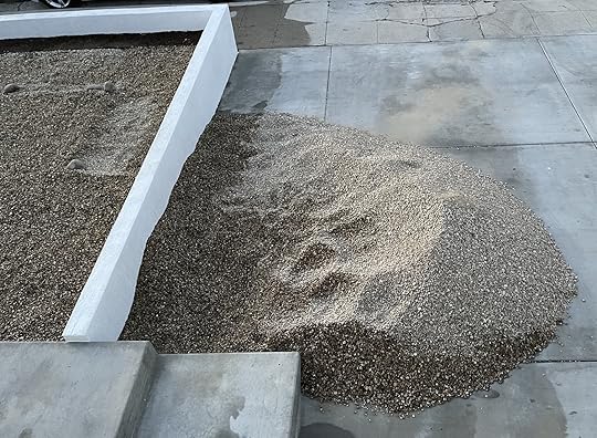 so many leftover rocks
Let’s talk about Down to Farm for a minute. I found out about them through Barrett Prendergast when Sara and I shot her kitchen last year for the blog. I noticed she had a beautiful raised bed in her backyard and asked her about it. I’ve kept Down to Farm in the back of my mind ever since. Their mission is to “make growing food fun, not overwhelming. Make your garden bed a happy place, not a chore. Most importantly, make growing food part of your life”. Eden (I know, how could she NOT run an urban farming business with that name) is newer to farming. She hasn’t spent her whole life doing this which makes her feel approachable when you have 100 dumb questions (there are no dumb questions but you know what I mean) and also makes you feel like it is possible for you to be successful as well. DTF offers an array of services, from just setting you up with raised beds, to basically hand holding your way through the entire process (guess what I’m going to go with).
When I decided the front would be a perfect space to do some planting, I reached out and Eden came by to check out the space. She recommended an 8×3′ L-shaped planter and a few potted plants that wouldn’t grow as well with others (think mint, blueberries, and a lime tree). I kept an eye out for a few weeks to see what the sun did out there so we could know where to put it. Initially, we were thinking the L would go on the right front side (if you’re looking at the house) but as I paid attention, the left got more solid sun because the fence would block the other side at a certain point. I expressed that I wanted something to cover up the backside of the neighbor’s fence but I didn’t want to continue the hedge. Mostly I didn’t want to have to constantly trim it because I didn’t want it to get that high out front. Also, I thought it would be nice if everything in the front was edible, just as an exercise. Eden thought a passion fruit vine would be a good choice as it grows very quickly, has fruit (obvs), and is a nice-looking plant. Being that I am from Maryland, when I moved to LA 13 years ago there were quite a few plants that blew my mind, but passion fruit was probably the most insane to me. Have you seen the flowers??

 passion fruit flowers and fruit. there are many different variations of flowers and colors of fruit, the purple (first) one seen here is what I see most often.

I have no idea what I will do with that much passion fruit (probably give it away) but if you’re telling me it will cover up the backside of the fence quickly, I’m in.
On May 16th the DTF team came and started building the raised bed and I stalked them from my window 🙂
 they used solid redwood so that it will last a long, long time.
They ended up scraping the rocks away in that area (oops) and it was around this time that it dawned on me that the planter was going to be higher than the wall. Remember when I said I liked to think things through? Oops. It’s not going to be a problem along the front wall because there will eventually be plants there but we put the bed right against the edge (on the right in these photos) to give us as much real estate as possible in the 16’x16’ square. Hmmm…ah well. I’ll have to figure out a way to make that look more purposeful. The good thing about the bed being high is that it gets more sun. The fence, and when the wall was taller (before we added dirt), cast more of a shadow early and late in the day than you would think.

This is the final stage, they’ve added dirt and they are attaching the top piece of the frame. Apparently, they work with a guy who specializes in dirt. It’s like dirt gold that is ideal for growing the most delicious and nutritious food. Speaking of, we are going to take a sojourn and talk about composting and dirt.
During the pandemic, I decided I was going to start composting, as one did during that time. Los Angeles has a terrible sanitization system in my opinion. It is WAY behind the curve of similar big cities in the world. For example, my friend Lauren who lives in Seattle has been composting through the city for YEARS and in fact, you can be fined there if you don’t separate your recycling/trash/compost properly. I did a little research and bought a tumbling composter which I thought would be better for keeping animals and smells at bay. It works, but it works too slowly. The smell isn’t too bad, but it’s not great either. I have to keep it on the side of my house so when the juices inevitably leak from it, they leak onto the concrete which isn’t ideal. This would be helped greatly if it could be on grass or mulch but we simply don’t have a space where it could live and not be an eyesore or too close to windows where people may catch a whiff. At this point it has been completely full on both sides for a year and still hasn’t turned into compost I could put in my garden. I’m going to have to do some further research on how I can speed up that process with worms or adding bacteria or something but all in all I would say it’s a quasi-fail and isn’t going to answer my urban composting problems.
This led me to some deeper googling where I found the GoFundMe for the Lomi composter and became a backer. I totally forgot about it until I got an email late last year saying mine was on its way. I NOW AM A LOMI SPOKESPERSON. Not really, but I should be. All I can say is, check it out. I’m in love. It lives on my washing machine which is close to my kitchen and I use it every other day, if not more. I’ll show you on my Instagram stories today.
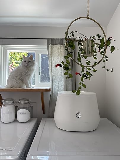 she’s cute (and I don’t *just* mean daffy)
Back to the raised bed…
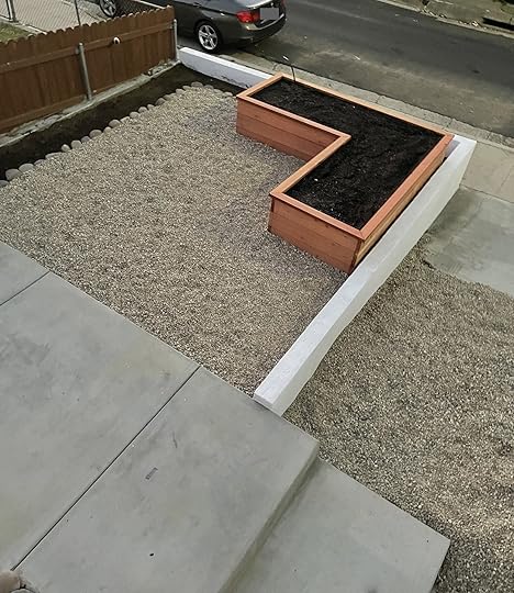

Fin! Just LOOK at how many rocks Sara’s husband Macauley and her brother Shade had to shovel out of my driveway. Good God what an annoying job. Luckily DTF did use some of the leftovers inside the planter for drainage purposes. We have a bunch of those bigger rocks we used along the edge in our back yard because you can only buy them by the ton and when we landscaped back there we had a surplus. Adding them on top of the edging we put in made it so we could bring up the depth of the stones to 3-4 inches instead of 2. If you’re wondering why we went with stone here and not grass, it really just came down to cost. I think once everything along the edge has green things in them it won’t feel so sad.
Speaking of, they came back on May 22nd and planted the garden in the raised bed…

I told Eden to plant what she thought would live. We were getting a bit late in the season, plus we were having some heat waves that made it more difficult to keep things alive. She planted a mixture of: tomatoes, green beans, squashes, chards, peppers, basil, cilantro, oregano, sage, rosemary, thyme, and chives.


Eden put the irrigation in herself. It’s connected to my hose (which is to the right of the back gate) with a timer and can handle the whole front yard area.
I’ll be honest, not all the plants have made it. We lost the marigolds that were planted to keep the bugs away, the green beans, a couple of squash plants, and the cilantro went to seed immediately. When the passion fruit went in this week we cleaned out the dead and are nursing some back to health after being fried early on. The tomatoes and peppers are producing and I enjoy picking off herbs when I need them in the kitchen. Shockingly the chards are doing OK. They fried early on but seem to have rallied. We’re going to pivot and start planning for a fall planting but I think for a first go at it, a little late in the season, we are doing ok! These photos were taken two days ago…


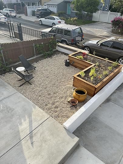

As you can see, the passion fruit and wire have been planted and installed. They put in 2 plants and from what I understand, they will grow in so extremely fast that hopefully by the time we shoot the reveal, you’ll barely be able to see the fence. Honestly, even that amount of green is making me so much happier.
Playing with pots I already own, I’m trying to figure out what I can use and what I need to find. I’m hoping to collect vintage pots from the flea markets this month. I’ve also been looking at Veradek’s planters, I especially like the corten steel ones, if I need something with a bit more volume.
Now we haven’t talked about this awkward amount of space I have on the concrete “landing” once you go up the steps…

You can see plainly here that I need to continue the planters on this side so no one trips and falls face-first into my driveway. I thought the Veradek planters may work here to act as a barrier near the steps and to fill the far right corner you see here as well (near the chair). Don’t pay attention to the hose situation near the gate. I clearly need a hose holder to organize everything over there. The jasmine by the steps is doing ok, my landscaper is supposed to come this week and install wire on the stucco so it can spread out before it grabs onto the railing. The rosemary and sage I planted next to the jasmine aren’t too happy because there’s a grasshopper that is living there and eating it. He’s too cute for me to kill but I should probably transplant him 🙂

Here’s a straight-on shot, it’s actually very nice to have the wide stairs and walkway up, especially when two people are walking to the back at the same time, but the back-right corner is a waste. Maybe this planter?


I think it would be a good way to use the space, it’s not quite big enough for furniture, but too big for the purposes of walking. Speaking of furniture, this setup is temporary. I’ve decided I want a round table, 48” or below with an umbrella. I think it would be nice to have a small surface when working in the garden and also some shade. I just got this cute umbrella from Sunday Supply Co which I think would be so sweet with the terra cotta roof and tile patio
Turns out finding the right size table, in a style I like, that has to be wood or white because the sun will make it so hot otherwise, WITH an umbrella hole, has actually not been the easiest feat. Suggestions are welcome below.

Look at that hedge. Now that the passion fruit is in, we need to decide on what to plant along the front wall and mulch everything. My landscaper thought bay laurel would be good because it makes a great hedge and is edible (bay leaf) but 1. Who in the hell needs that much bay leaf and 2. I don’t want it to be too hedge-y and grow too tall and block light. I’ve been looking into different plants that attract pollinators and keep other veggie-eating bugs away, even if they are flowers. I’m going to run this by Eden to get her opinion and then I think we will be planting those ourselves, hopefully in the next week or so.

The area in question is about 18” wide, by 16’ long, 15’ if we assume the passion fruit will take over that corner. The edging here needs to be adjusted, clearly. I’d love the plants to come no higher than the fence on the end which is about 3 feet from the dirt. I imagine we would need about 7-10 plants to fill out the area and I’d love it to be a mix. Stay tuned.

It’s coming along folks. Slow living in its literal sense 🙂
Ok, NOW, let’s talk about Goodland! In my last blog post, I made a serious joke about considering making this front space a completely hedged-in garden with a hot tub in the middle. I still think that is an amazing idea, especially considering the luck I’ve had with hedges. However, walking out my front door in a bathing suit, hearing passerbyers on the sidewalk while trying to relax, I don’t know, seemed like a lot unless I wanted to also bring in a 6ft locking fence with hedges all the way up to my front door. That said, I have been eyeing Goodland’s wood-burning hot tubs for months and months. I even reached out to them a few months ago asking how far away the tub needed to be from my stucco house as I considered putting it on my back patio. The problem with the back patio is that we need more lounging space back there and the tub would take up way too much space. I did think about building a small deck by our bedroom window on the other side of the patio though, but quickly considered it a pipe dream because I would have to pay for the construction of the patio to put it on AND the tub. It just wasn’t in the budget for us, no matter how much my husband complained about our teeny bathtub.
So, I make this joke about Goodland sliding into my DMs and Goodland responded in the comments, my friends!! Well well well…I have about 37 projects happening around the house at the same time, should I really take on another one (financially)? Probs not. BUT HOW COULD I DENY GOODLAND??
As I’m sure you understand, but may not think of often, is that these collaborations where companies send through products, it is not “free stuff”. It is in exchange for the very real work and cost of creating content. It costs me my time, my energy, and very often (I would say in 100% of my circumstances) my money. This project, for example, I will need to pay for supplies and pay for someone to build me a platform for the tub. It’s not a DIY situation. The ground is not level and the tub is over 2400 lbs when full, so we will definitely be bringing in a professional. Construction prices are high and literally, as I’m writing this, I’m fielding questions from a company I had come out to give a quote. They just told me that teak is $47-$50 a square foot. READ THAT AGAIN. Western red cedar is $22/square foot but actually not recommended because it’s too soft. I need 75+ square feet. What am I going to do?? I asked them about Ipe, Kebony, and Thermory and I’ll report back obvi. Suggestions are also welcome here. But let’s look at the potential space, and say hello to an area of my house that I don’t think anyone has laid eyes on other than me and Andrew:

The wall to the left, the one that has our irrigation control on it, is the primary bedroom’s closet and it separates this area from the patio on the other side. Take a look at this photo from wayyyy back in 2020 for reference.

The area is back behind that pop out. Wow, my jasmine has really grown in nicely…Anyway! The good thing about this location is that it feels pretty private. It’s not even super easy for my tenants to spy on us (j/k Hope and Daniel) because the trees are in the way. The window in that area is this window in my bedroom:
 photo by sara ligorria-tramp | from: moto reveal: emily bowser’s bedroom
You can also see the closet here, and as long as we’re trying to manifest product collaborations: HMU Container Store. I need a closet makeover 🙂
That’s Puck’s favorite window and the window our third cat, Gremmy, recently escaped. He’s been gone for 10 days, it’s a saga, you can catch up on my saved stories “Gremmy” if you’re one of *those* cat people. I say it here because that is why the door to go under the house is removed–we are trying to trap him under there in the middle of the night. It’s a whole thing. We also can’t begin construction on this area until we trap him. Back to this photo:
oh look! It’s the composter! yes, that is the tree from jess’ office. i’m keeping it “alive” and YES I DO OWN TO OLD TIMEY CARRIAGE WHEELS SO SUE MELet’s talk about the tape. I’m thinking that the platform is going to have to come out to the edge of the house (towards the irrigation controller). That’s 5 feet. That would give you space to step onto the platform, have a little wiggle room and step into the tub. The footprint of the tub is 91.5″ x 37″ x 28.5″H (with chimney 95″). So if it’s 5 feet deep, that will leave about 2 feet to step out onto. Because the ground is super uneven and because I want to avoid covering up the access under the house, the solid pink line around the house is where I think the bottom of the tiny deck should be. Yes, there is access to get under the house in 2 other areas, one in Andrew’s garage and one by the front gate/trashcans but something still feels weird about covering it up more permanently, if not only because the door is like a grate and I feel like the bottom of the house needs to breathe? Is that weird? We have a lot of issues with it getting so wet under there when it rains it just feels like I shouldn’t put the tub blocking it. The dotted line is how high up the tub will come. It’s hard to tell from this angle but the irrigation is totally fine where it is but we will move the electrical socket that is currently below and to the right of it as it would be too close to the tub. So if the deck comes to the edge of the house, even with the closet, there would be a step in front of that on the concrete. The step will go across and stop at the edge of the house on the other side, you can see two tape lines that come right up to the dirt. Because the ground is uneven, that step will start very low and get taller, if that makes sense. More importantly, where you would naturally step onto it and off of the dirt, the step will be about 8 inches off the ground and 8 inches to the patio. God, it would be helpful if I could draw. Let’s look at the tub:

Isn’t she pretty? From Goodland’s lips: “Crafted in Canada, our Wood Burning Hot Tub is made from durable, 100% recyclable materials including marine grade aluminum and western red cedar as well as oak and raw brass detailing. Thoughtfully designed with sustainability in mind, this soaking tub is suited for both saltwater and freshwater.” The chimney will be on the right side, like in this picture so it is further from our house. It should not make sparks or even smoke much if you are using it correctly. Goodland recommends being 10’ away from combustibles (grass & trees), which it will be about that far from the orange tree, which we are having to cut back a lot this month to make it safer/easier to get to the tub. Craig (Goodland) himself said 5 feet away from my stucco house should be fine. The deck will extend out to the right. But how far? We’re still figuring that out. The chimney will be 5’ away from the house. The big negative to this spot is that if we ever move we would have to take it down as we will be building too close to our fence. Funny enough, the front half of the house is only about 18” from the fence but was built before this was a rule and therefore got grandfathered in. Our bedroom was added later, (the 50s we think?) and that’s why it’s further from the fence. We will talk to our neighbors before making the final decision but based off of past conversations with them I doubt this would be an issue, especially if it’s no closer than the front part of our house.
I know I’ll have some pushback about putting in a wood-burning tub in an area affected by drought. We wouldn’t use it as a hot tub during burn bans (although we could use it as a plunge pool!), but this is a much safer situation than having a firepit; which are totally legal in Los Angeles as long as bans are not in place. That said, I’ve become uncomfortable with them and have recently turned my fire pit into a water feature, but that’s for another post 🙂 I’m drawn to the other pluses of this tub: it’s sustainable, I can use the water for my thirsty plants, it’s chemical free and on top of all that the company is lovely and I stan their ethos: “The GOODLAND brand ethos intersects good design, human connection, and nature. We’re all about enjoying the moment and forgetting the noise. Rewarding ourselves in simple ways and seeking moments to break away from life’s hustle.” Clearly, we are still thinking this through and getting quotes, etc. This is just one option but I wanted to process it with you all.
That’s where I’ll leave you today. I have a lot of things going on over here. The next post will probably be about the back house’s outdoor space or possibly a final reveal of my back patio (that looks very different than it did two years ago in the photo up there!). Depends on what comes together first. I’m also in the trenches of a kitchen/laundry room reveal, but there’s a couple of things I’m waiting on for that. Look out for it in the next 6ish weeks. Of course, we will also be continuing updates on the urban garden. We will get a little more into the details with Eden when we do planting for the fall and finish the irrigation and plants along the edges.
A couple of things I’m considering that I’ll take some feedback on if they are interesting to you all:
1. Revealing our his/hers garages. My side would probably turn into a post that deep dives a little into what it’s like to peek under the hood of a freelance stylist. I’m doing a massive clean-out of my side at the moment. Sara and I will be at the Rose Bowl in October (come say hi if you can!) so it would probably be after that because it is bursting at the seams right now.
2. I also truly do need to make better use of my bedroom closet, so Container Store or not, that will be happening on some level.
3. Third and final is a DIY headboard for the office. It’s always been the plan, I just haven’t gotten around to it.
You can give me your opinions below, as always I’ll see you there!
The post Bowser’s Front Yard Part 3: Building A Garden, Embracing Slow Living, And A Wood Burning Hot Tub Debate appeared first on Emily Henderson.
August 2, 2022
The Process of Designing Our Farmhouse Kitchen – Some Questions I Asked Myself And Where I Chose “Style Over Practicality”


If you have ever stressed about your kitchen design and want to nail the coveted “practicality versus style” formula, then this post is for you (and know that you aren’t alone). In my recent book (which you should pick up if you are remodeling) I talk about asking yourself these questions before tackling a kitchen design, so I figured today I’d answer them myself. I kinda wish I had done this before, hilariously, because doing so I realized some things about us…here we go.
How Much Do You Truly Cook? And What Do You Make The Most? photo by sara ligorria-tramp | from: #janstewary: how soup changed my life (& body)…really
This question is to basically help you figure out how high a priority different things in your kitchen should be in regards to space, storage, layout, and material choices. A big cook or a big baker requires more amenities, more easy-to-access serving pieces, more pots and pans, harder working (or very specific) surfaces, and for big entertainers, you might want full double ovens, a speed oven, and a larger 36″ fridge, for instance. If you cook once a week then you don’t need a 48″ range and don’t need to stress about how far away your pantry is from your counter. What you don’t want to happen (which still might) is to go through a kitchen renovation and realize that it’s not working for how often and what you cook. A great exercise is to go through an average week (with a partner if they are involved) and really notice what you NEED or better yet WILL USE FREQUENTLY versus what you just want. Think about how often you reached for something and where you wished something had been. Here it is for us:
We make salads most days for lunch (thus the larger 30″ fridge column) full of tons of fresh produce. A lot of washing and chopping is involved. For this reason, we thought about where the sink was in relation to where I would want to chop, and how close the compost is. It’s not ironclad, I don’t HAVE to chop my veggies there but it was good to think about a day in my life and how I want to use the space. (I also don’t know where I’m going to want to be in this kitchen at different times of the day because I haven’t lived there, which is a disadvantage for sure). I cook an easy meal probably 3-4 nights a week. Usually involving a lot of chopping and stirring, then a more kid-friendly side for them. We are big seasonal grillers so we’ll likely cook on the bbq a couple of nights a week (which doesn’t exist yet because we don’t know where we’ll want to be grilling). We rarely bake (as of now). Not because it’s not wonderful to have baked goods, I’m just not good at “science” or “details”, and I’m SO MESSY/clumsy (making cookies with the kids is always a disaster), and if I’m being honest I don’t want baked goods around every day. If you are a big baker you are going to want a marble island, and well, I don’t know what else you need because I’m not a big baker :). As I write this it all feels so dumb and common sense, but it’s not I promise. You see all these kitchens in magazines and you might just say “let’s do that” but it might not be for you.I will also say that Brian and I don’t need a super space-efficient kitchen for crazy fast meals. I actually don’t think that most families should prioritize this so much. The mountain house has the fridge off to the side (so we could have a prettier layout) and it has never once bothered us. Those layout necessities (like the triangle) are often not that big of a deal. I have put a fridge in the pantry before and it never once bothered the family. It’s literally 3 more feet, two steps, that’s it.
Do You Entertain A Lot? photo by sara ligorria-tramp | from: all the what’s, why’s & how much’s of the portland kitchen
 Yes and No. The only time we entertain is when we have daytime outdoor casual family parties – i.e. Easter and the 4th of July. We do not have large formal dinner parties and I’m not sure we ever will. I get hosting anxiety when it comes to sit-down meals (unless you are a very, very close friend) but we have friends with kids over ALL THE TIME and I “make food” or we grill. I’m a homebody and prefer them to come to me and love nothing more than my close friends sitting at the island, sipping some wine with me while I throw together a soup. Rarely are there multiple courses. It’s more about casual gatherings with easy-to-make snacks and meals. This means we don’t need things like warming drawers, a 60″ range with different fancy tops, or a prep sink (one sink is enough). We could deprioritize that stuff in favor of other things.
If you entertain a lot you might want to be near everyone else so you don’t feel left out of the party (me!) so an open concept kitchen might suit you better. Or maybe you like quiet cooking time with a friend and want to shut off the visible mess (also me?) so no one can see. There are pros and cons to both, obviously.
Are There Often Multiple Cooks In The Kitchen? photo by tessa neustadt | from: emily’s kitchen and dining room reveal
 OMG LOOK AT THOSE BABIES!! I don’t know the answer to this! I enjoy being in the kitchen more than Brian and I cook with an apron, mocktail (or wine), and music – like it’s 1950. But he is far better at it than I am and does all the grilling or joins me. During lockdown, we would have our pod neighbor family over on Saturday nights. We took them “around the world” (Lake Arrowhead has no cuisine except “American” and pizza) so Brian and I would do 3-4 dishes from a specific country (Vietnam, Argentina, China) just to have a different flavor profile for our bored little tastebuds. It was SO MUCH FUN. We also had a lot of time on our hands on the weekends in the winter. Since then we haven’t really invited friends over to our rental house, so I’m not sure how our entertaining style will change in regards to us actually cooking real meals together. Why does this matter? Well, technically you might need more space if there are two people and you might want it to be a more open concept. You might want the stove burners more spread out, for instance, or dedicated prep space for each person. During these fun quarantined nights we realized that we wished that our island didn’t have a sink in the middle so that we had more space to spread out and not just each have 24″ on either side. Not a big deal, but again going through the motions of a week or two of your habits will help you make some decisions that only you can answer. If you have a smaller kitchen with less than 36″ clearance between counters, then stagger your major cooking areas – sink and stove so you aren’t in each other’s way the whole time. Also let me be clear, bumping bums with your partner while making homemade bolognese can also be an adorable flirty way to start a date night at home…
Do You Have Kids? Or Are you Planning On Having Kids Here? photo by sara ligorria-tramp | from: keeping the good of last year: new family (and kid-only) activities
Ok. This involves way more follow-up questions and if you have lots of kids then these will be obvious to you, but if you don’t then this is what you need to consider:
Put dedicated kid stuff low so they can reach it themselves (both food, snacks, and plates/cups). Frozen food is our friend – ample freezer space (or a garage freezer) will save you many nights. You can’t hoard fresh produce like you can frozen vegetables, so don’t deprioritize the freezer. Our freezer in Lake Arrowhead is smaller than we’d like and so for the farm, we have a 30″ wide fridge and a 24″ freezer column. If you go much bigger than that and things can get lost easily, btw. Unless you can handle a lot of maintenance or love patina (age), then really consider your island materials. Real stone is not for all of us and THAT’S OK. Quartz is great, and some porcelains are so pretty these days that even I’m fooled! Painted wood can chip, whereas stained wood will dent (which is less noticeable). You can see below what we chose and why, but don’t let that affect you – this is a strictly personal decision. Here is a post to help guide you.Think about dumb stuff like size and location of cereal box heights (allow at least 16″ on those reachable shelves), ample Tupperware storage (ooh, sexy), and again easy to access bowls, plates, and flatware. Make your life easier and put them in lower drawers, not upper cabinets.We have two kids (almost 7 and 9!!) and that’s it, but since we both work from home (and don’t get a lot of takeout) it just feels like our kitchen gets so much use, and so much wear and tear. See below for what practical things we sacrificed in the name of style.
Will Your Island Be Used For Eating?
For us, only sometimes. This seems like a dumb question, but I see so many islands with either no overhang or only 2 counter stools at the end, opting for storage. We went through this issue when we chose our vintage furniture island (no overhang yet). But In order for people to gather around an island comfortably, you want a decent overhang (14″ at least). We are big on nightly dinners together, so no, we won’t be eating at the island because all of us facing the same way is not our preference (the people on the ends never see each other!). Brian loves to feel like he’s at a diner counter at all times so he’ll eat there for lunch (I’ll be in the sunroom) and I would imagine some breakfasts, as the kids eat much earlier than us, but not at night. Thus our cute 4-6 person homework area/family nook in the corner (really hoping that works as planned). Remember we have the sunroom as a dining room but for everyday nights this will be our eating nook.
ALSO, if four people are going to be eating at your island you likely don’t want a sink or range on it. Keep it clear for serving. Our island at the mountain house is solely for hanging out while cooking, maybe having chips and guac, but not actually dining. There are many times when someone has been sitting there and I’ve splashed them with rogue dishwater (accidentally). So if you plan on eating meals there then think about not putting a sink or stove and keeping it clear.
How Clear Do You Like Your Countertops? I.e. How Much Visual “Stuff” Can You Handle?
Very little for us. You might be surprised to know that I don’t love a lot of stuff on my counters on a day-to-day basis. We have a tray of everyday spices, a wooden bowl for onions/garlic, a basil plant, and a butter dish (we like room temp butter), but otherwise, I want it all hidden. If you are like me then consider an appliance garage (for a toaster, microwave, coffee maker, blender) or build those things into your pantry (like we are). Our kitchen in LA was so lovely, but it was on the smaller side and we had to have our coffee maker on the counter and it was just so messy every single day.
But I want art in my kitchen, pretty oils and spices, which is why we have two shelves flanking the range (which you’ll see next week). I just want them off the counter if that makes any sense. We are going to use your vertical space for those “moments”.
Where We Chose Practicality OR NOT photo by sara ligorria-tramp | from: it’s finally here: the reveal of the mountain house kitchen
This is the biggest question that we all ANGUISH over when it comes to the kitchen. This didn’t use to be a thing – kitchens were at best utilitarian and warm, not the design center of the home. It’s like we’ve all been poisoned by seeing too many beautiful kitchens out there and now having a boring one feels like a missed opportunity. And it is if I’m being honest. But it’s such a personal decision as you are the only one using it. So we chose our stylish moments carefully, weighed the pros and cons endlessly and I hope we made the right decisions. But to be honest this kitchen might not be as practical as this mountain house. I think it’s just easier to make a more contemporary kitchen more practical than one that is designed to be more charming and old-world.
Let’s be clear, we would rarely if ever, choose an element that is ugly and practical. There are just too many great options out there that are both.
Where we chose style over practicality:
Countertops – After months of indecisions (and starting with quartz), I just wanted real stone in this house. I love our quartz in our 1970s contemporary mountain house (above), but for an older, classic home we personally were willing to sacrifice some practicality for the organic pattern. We decided to only put it on the perimeter counters and we are comfortable with it aging. I hope. Vintage Island – Now, this does have a lot of functioning drawers so it’s practical in that sense (versus a freestanding table or just a shelf). The top of the table is wood and gorgeous and we didn’t want to cover it, but I am pretty concerned about how it’s going to age and what our wear and tear will do to it…and so is Brian. We are adding an overhang to it to match the wood, but does that mean our friends have to use coasters?!!!! Or will it be sealed so that it can be totally wipeable? If so, will it be shiny? The piece itself will be worth it, I KNOW IT, but I have concerns about how the top is going to age and if we will have to constantly maintain it. Maybe that’s something I’d actually like to do? Listen, if it bugs us we’ll put marble on top of it. The reason that we didn’t do that now was because there were no more slabs left (without a massive brown streak in the middle). But we can always put the honed granite on top if this wood drives us nuts. The Unlacquered Brass Faucets – We went with practical aged brass or polished nickel for the rest of the house, every other bathroom or mudroom, but for this kitchen, this gorgeous kitchen, I really really wanted patinated brass. Yes I will have to use the right soap and polish or it will tarnish and eventually have to be replaced (see this post where I demystify the unlacquered brass) but I feel confident this will be worth it.Where we chose Practicality over Style:
Cabinet Layout and Material – Not everyone agrees with this philosophy but I’d rather have stained wood that might dent than painted that might chip. We went with painted in the pantry but we are hoping that stained wood cabinetry in the kitchen won’t show the wear and tear as much. We obsessed over the cabinetry layout and functionality with Unique Kitchen & Baths so we feel very set that we have what we need (and some cute drawers mixed in :)).Lighting – We have four sources (sconces, art lights, pendants, and recessed), but the hardest one to put in stylistically were the recessed lights. They just aren’t my favorite in older homes, but we have learned like the rest of you that kitchens and baths need to be well lit simply for utility. We chose windows over upper cabinets (because we have the storage space in the pantry and the basement) and are putting electrical into the island for outlets.So those are some of the considerations we applied to our kitchen design layout and if you are also renovating I hope these questions help you too. Stay tuned for the full design plan coming next week. xx
Opener Image Credit: Photo By Sara Ligorria-Tramp | From: It’s Finally Here: The Reveal Of The Mountain House Kitchen
The post The Process of Designing Our Farmhouse Kitchen – Some Questions I Asked Myself And Where I Chose “Style Over Practicality” appeared first on Emily Henderson.
August 1, 2022
How To Make Your Laundry Room Look Better (And Actually Enjoy Laundry Day)

In the next edition of our “How to Make Your _______ Better,” (see here for living room, bedroom, kitchen, dining room, shower) I thought it was time to tackle the laundry room (or closet). I have yet to live in a home with laundry in-unit post moving out of my parent’s home 17 years ago. However, I do remember not loving the visual experience. To be fair it was in our kinda scary and dark garage. Now, I also remember getting to do laundry at Emily’s old LA house while housesitting a couple of times, and let’s just say it was a TOTALLY different experience. I was excited to do laundry because it was so happy in there! And while we may not all have an Emily Henderson-level laundry room, there are some easy ways to make the whole experience prettier and more enjoyable. Let’s start with the most important step…
Deep Clean (And Get Products You Love The Smell Of)This is a given but it’s a must if you really want that laundry area feeling fresh and new. I think almost everyone has hardened old detergent somewhere on their washing machine. For GREAT tips, go check out Carolina McCauley. This woman has a cleaning hack for everything. This is how she cleans her washing machine filter. As my father (via my grandmother) always says, “where there’s soap, there’s hope.” 🙂 As for cleaning products, sure there are some that may not have your dream scent but they work for the tough stuff. But for the everyday sprays, detergents, etc. Make sure you really love the scent. I know that sounds dumb and grabbing the most affordable or what you grew up using makes the most sense, but I PROMISE it will change the experience for the better. When I started buying this dishwashing soap, I honestly started to enjoy washing dishes more. As for laundry products, I personally love this detergent and for all-purpose sprays, I love this one and this one. Drop your favorites in the comments!
DecantThis tip is pure eye candy but makes ALL the difference. While some laundry products can’t be decanted, things like laundry detergent or pods, fabric softener, dryer balls, dryer sheets, etc can and will make your laundry space look less cluttered. Might as well have the items you use most easily accessible and looking pretty. This is also a great opportunity to go to your local sustainable zero-waste refill shop if you have one in your area! That way you can bring in your own container and you’re all set. Decanting also helps you to know when you need a refill as opposed to finding out the moment you really need to wash those jeans ASAP.
Here are some of my favorite options:

1. Half Gallon Glass Pump Dispenser Bottle | 2. Glass Storage Canister with Wood Lid | 3. Glass Vintage Beverage Dispenser | 4. Marie Kondo Large Modular Glass Canister Ink Black Lid | 5. Empty Laundry Liquid Dispenser Set | 6. Extra-Large Glass Canister
ShelvesUse that wall space! Let this be the push you need to finally just put up a few shelves (especially if you have one or two top loading machines). It’s an easy way to add storage and style. Look at the two laundry spaces below! On the left, you have Velinda’s laundry corner just off of her kitchen. The light wood shelves with the white brackets add a warm modern touch to a mostly white space. And since this area is next to her kitchen they provide useful and pretty storage. Then on the right is Emily’s old Glendale laundry closet. Look at how pretty and sleek that slim white metal shelf is?! It perfectly adds to the wallpaper without competing. Plus the double level for maximum storage space.
BONUS TIP: Get yourself a little trash bin for lent like Em did. Makes life a lot easier in the moment:)

 left: design by velinda hellen, photo by veronica crawford, from: velinda’s under-$20,000 diy kitchen (& laundry room) gut reno | right: photo by tessa neustadt, from: laundry closet makeover
These are a few great options for shelves:

1. Wood Wall Shelf with Reversed L Bracket | 2. Walnut Brown Wood 4 Tier Floating Wall Shelf | 3. Over the Washer Storage Shelf | 4. 3-Tiered Floating Lines Metal Wall Shelf | 5. Rattan Wall Bath Shelf | 6. No Stud Floating Shelf
BasketsI would be remiss if I didn’t remind you all about the power of “the basket”. Let this not be confused with the larger laundry basket. Maybe you don’t want to decant. Maybe you have laundry tools you want to not have to look at every day but don’t have any closed storage. That’s when a cute bin or basket will be your best friend. See how cute the ones from the Portland Project look?
 photo by sara ligorria-tramp | from: how we designed a family-friendly laundry room in the portland project
My personal favorites:
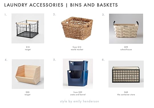
1. Small Natural Wood Handles Milk Crate | 2. Natural Hyacinth Piper Utility Basket | 3. White Ash Basket | 4. Paulownia Wood Potato Bin | 5. Dark Blue Metal Stacking Storage Bin | 6. Marie Kondo Ink Black Shoji Bamboo Bin With Liner
Drying Rack Or BarIf you don’t have either a drying rack or bar may I HIGHLY recommend you fix this immediately. I remember the days before my drying rack, with clothes hanging all over my bathroom and bedroom and boy did it bum me out. Plus air drying your clothes will make them last longer! There are a few different options – a wall rack that folds into itself when not in use, a collapsable rack for the floor that you can tuck in a closet or in-between your washer and dryer, and lastly a bar. The bar is in my dream laundry room so if you have the space I highly recommend this one! It will get you the most space for your clothes (plus you can get pretty hangers like these). Of course, if you have a yard and generally have good weather where you live, hanging them on a clothesline outside will really give you space and you can dry everything!
 photo by sara ligorria-tramp | from: how we designed a family-friendly laundry room in the portland project
These are the ones I would pick:
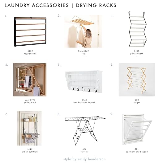
1. Bridgeport Modular Add-On Folding Drying Rack | 2. Wall / Ceiling Mounted Clothes Drying Rack | 3. Gabrielle Organizer Wood Drying Rack | 4. The Beadboard Drying Rack | 5. Accordion Drying Rack | 6. Rubber Wood and Stainless Steel Drying Rack | 7. Over-The-Door Drying Rack | 8. Greenway Folding Drying Rack | 9. Small Folding Wall-Mount Drying Rack
HampersHampers are kinda essential in the laundry game. If you have an actual laundry room and/or live in a single-level home, hampers with wheels are the way to go! Being able to roll and not lug feels like the ultimate luxury. Hampers are also another easy way to up the style in your space. We have also been a fan of the Steele canvas laundry baskets you see in the Portland Project but we have some other options (both with and without wheels) for you to check out:

1. Uashmama Modular Snap & Separate Laundry Bag | 2. Bamboo Eco Storage 3 Bag Laundry Sorter | 3. Steele 3 Bushel Canvas Laundry Bin | 4. Steele 2.5-Bushel Olive Vertical Rolling Laundry Hamper | 5. Wire Rolling Laundry Hamper | 6. Rounded Weave Basket
Storage Cabinet (Mostly Standing Ones)If you have the space may I suggest a storage cabinet? It’s so nice to have both open and closed storage to hide away clutter and just have more places to put things away properly. And not only is it great for laundry products but you can use it for daily household cleaning supplies (even a vacuum if it’s the right kind!).
These have my vote:

1. Mason Pantry Cabinet | 2. Shelf Storage Cabinet | 3. PAX | 4. White Wood Convertible Armelle Kitchen Pantry Cabinet | 5. Gillian Sliding Door Wall Shelf | 6. Narrow Storage Cabinet with Pull Out Cart
TrayRemember when I talked about decanting things like laundry detergent? Well, if you really want to make it look like a designer/stylist came into your home, get a tray. After the tray is purchased, arranged your decanted products on top, and voila, a perfectly styled laundry room! They will instantly elevate the space, I promise. Just make sure they are easily wipable as it’s inevitable that some deterrent will get all over the tray:)
 photo by tessa neustadt | from: how our new laundry room came together
Check these cuties out:

1. Hilo Lava Stone and Resin Tray | 2. Decorative Marble Rectangle Tray | 3. Oslo Wood Tray | 4. Beveled Metal Decor Tray | 5. Acacia Wood Adirondack Tray | 6. Cast Metal Round Tray
ArtAhhh the power of art does not exclude the laundry space! Look at Allison Pierce’s home below. Those four pieces of art (minus the plates) really make this room unique and look alive. I wish I could do laundry in there too! I also think choosing playful art for laundry rooms and bathrooms is the only way to go. Show your personality and choose art you love looking at.
 photo by sara ligorria-tramp | from: working with what you’ve got – an $8k budget kitchen makeover with a lot of vintage charm
These pieces spoke to me but if they don’t do it for you check out the sites they come from. I bet they will have something that’s perfect for you!

1. Cotton Candy Leftovers by Cathy Sunu | 2. Shapes and Lines Framed Wall Arts (Set of 2) | 3. Minimalist Fine Art Print | 4. “Good Things Are Coming” Digital Print | 5. Summit | 6. New Day by Alisa Galitsyna
Extra Credit: Wallpaper And/Or PaintIf you want to add a little extra elbow crease, paint and/or wallpaper your laundry area. As you can see in the photo above and Em’s old wave wallpaper it can really make everything come to life. Plus since it’s usually a smaller room those things will be a little more affordable since you won’t need a lot. Win-win.
Is your laundry room better yet? Just kidding. But truly I hope these were helpful and good reminders that any room in your home can be made better. Any other tips from you? Let us know in the comments.
Love you, mean it.
Opening Image Credit: Photo by Tessa Neustadt | From: Laundry Closet Makeover
The post How To Make Your Laundry Room Look Better (And Actually Enjoy Laundry Day) appeared first on Emily Henderson.
July 31, 2022
The Link Up: The Mountain House’s New Comfy Sectional, The Haircare Brand That’s Changed Caitlin’s Hair, And The Easiest Way To Apply Fake Eyelashes

Happy Sunday everyone! It’s the last Sunday in July, the Hendersons are back in Portland (and moving into the farmhouse in TWO WEEKS!), and the rest of us gals are trying to enjoy as much of summer as possible…without melting. Anything good happening with you? We hope so:) Let us know in the comments. It’s important to talk about the happy things too. Shall we get into some links first?
This week’s home tour is a wonderful, airy home FULL of interior windows (our favorite:)). This was definitely a tricky layout to figure out for them but the design team came up with a beautiful plan and fun yet soothing color palette. Fun fact. The lead designer got the idea of the color palette from an outfit her husband was wearing one day. Inspiration really can come from anywhere;) Go check it out here!
 goodbye frustrating vintage beauty
 oscar and buttercup approved
From Emily: It’s a very long sad, humiliating story, but we had to put down our vintage sectional this week. The back cushions would fall off every time someone tried to, you know LEAN ON IT unless they were in the corner. I spent hours every other month trying to carpet tape it back together, which would work temporarily. During this trip, having so many guests every weekend, unable to sit on our GD sofa, I became so frustrated and embarrassed and finally decided to do something about it. Brian begged me not to overthink it. He said, “we just need to order something relatively affordable, long-lasting, EXTREMELY comfortable, still cool looking, with a good vibe that wasn’t a 10-month lead time.” I trust Article in comfort and proportions (I’ve had their Burrand for 8 years and LOVE IT) so I looked online, picked the BETA, and literally 2 weeks later she arrived and it’s SO VERY VERY GOOD. I’M SO HAPPY I COULD SCREAM. A huge sense of relief flooded me knowing that I would never have to apologize again for my dumb expensive vintage sectional that no one could sit on (it needs to be in a corner or against a wall and it would be fine, FYI, and yes I’m selling it). Our living room was usable again!!! It came the night before we left so I haven’t properly shot it yet for you, but trust me that it is SO comfortable. The cushions are soft, but not too bouncy, the fabric is so soft and reflects the light beautifully, it’s deep but not crazy deep. I couldn’t be happier. And a big shout out to Article’s delivery and customer service (they were so professional, friendly, set it all up, and took all the boxes away). This sectional is new so there weren’t any reviews yet so if you are in the market trust me this one is EXTREMELY comfortable and cool. Perfect for a media/TV room, too. Again, full gushing blog post coming at you (but maybe not til spring when I can get back down there).

 left: eny on the left with her famous lamp | right: table lamp from her collab
First Dabito, then Tali Roth, and now Eny Lee Parker!? Mitzi is KILLING it with their lighting collaborations. If you don’t know Eny Lee Parker, I promise you know her work. Her collection is stunning and this lamp really might be our favorite:) Go check it all out!
From Ryann: I haven’t gone to the dark side yet aka I haven’t started getting eyelash extensions (due to $$$ although I really want to). BUT I, of course, yearn for long eyelashes. So whenever I have a semi-formal event to attend I always attempt to put on my own fake eyelashes. It almost always goes south because eyelash glue is SCARY, messy, and really hard to put on. However, my cousin just introduced me to this clear eyelash glue pen and it’s so easy to use and works really well. I used it before a night out and the lashes stayed on all night plus the glue wasn’t sticky or hard to take off the next day. It’s so good that I am no longer afraid of putting on my own fake eyelashes!


From Mallory: I have a thing for sundresses with dainty yellow flowers on them (yea, it’s specific) and J-Crew has two EXCELLENT ones right now. This dress would absolutely CRUSH on a vacation (and if I were going on one soon I would certainly buy it) but for a more everyday dress, I’m HIGHLY considering popping this one in my cart.
From Caitlin: I FOUND A HAIRCARE BRAND AND I’VE TRIED A BUNCH OF STUFF AND I LOVE IT ALL AND YOU NEED TO KNOW ABOUT IT. My hairstylist Lizzie (she’s the best, highly recommended if you’re in LA!) mentioned this copper color treatment to me a few months ago at my last haircut – my hair can get a little blond in the sun, which isn’t necessarily my preference – and y’all, IT RULES. They have a ton of color options available – a purple treatment for platinum hair, a light caramel, a bunch of reds, and even a chestnut brown! – and if you’re trying to save money on salon color services (or if you’re just trying to make your hair look LESS like a dishrag and MORE like your friend just spent 3 hours covering up all your blond, in my case), this is an AWESOME option. Throw this on for 3 minutes and BAM. NEW GAL. (Also obsessed with their dry shampoo, which adds a ton of volume that actually stays all day, and these tiny shine drops, which make my hair look SO shiny without being greasy or piece-y.) I’ve never really been a big haircare person, but this is my new go-to brand. It’s really, really, really good stuff. 10000000/10!!!

From Jess: I have been cooking up a storm and needed some more storage containers. Look, I still love my glass ones but unfortunately, a good amount of them have chipped too much around the edges to safely use (FYI I probably need to store them better). So I decided I would go back to plastic. I have a couple of plastic ones that I’ve had for YEARS so I actually think they are less wasteful for someone who is kinda clumsy. Naturally, I want them to be pretty (but affordable) so when I saw the CLJxRubbermaid collab it was an easy design decision for me. I have a Rubbermaid container that I love so I trust the quality and I really LOVE the sky blue top color. They are going to look very cute in my fridge, not chip, and help me on my “liking to cook” journey.
Also: I’ve been on a romantic/rom-com kick lately and my two ABSOLUTE favorites have been Persuasion and Heartstopper (I know I’m late on this one). My friend (who is a massive Jane Austen fan) did NOT feel the same way about Persuasion. But I’ve never read the book so I was clenching my chest nearly the whole time and didn’t know the parts that had to be cut out. Heartstopper was also chest-clenching! It’s the sweetest and best series I’ve seen in a minute and one I wish I could watch it again for the first time. But there’s going to be a season two:) ENJOY!
Thanks for joining us again and have a wonderful rest of your weekend. See y’all tomorrow. xx
Opening Image Credits: Design by Elina Mussakulova | Photo by Sergey Krasyuk | via Domino
The post The Link Up: The Mountain House’s New Comfy Sectional, The Haircare Brand That’s Changed Caitlin’s Hair, And The Easiest Way To Apply Fake Eyelashes appeared first on Emily Henderson.
July 30, 2022
10 Necessary/Useful, Not Ugly, And Affordable Dorm Accessories Everyone Should Get

If you’ve been around since 2019 you might remember the post I wrote with Caitlin and Mallory about designing our dream dorm rooms. Needless to say, there were A LOT of things we would do differently if we could do it all over with the knowledge and style preference we have now. Ha. At the time, I couldn’t find any photos of my dorm room since they were in a box somewhere deep in my dad’s warehouse. Well after 20 years, we cleared out the warehouse and now have I think ALL of my and my family’s photos in my apartment (my hallway may never be bin free again). However, I did find some very incriminating photos that are going to snap you back so hard to 2006 that your head might actually spin-off. This was my exact slack to Caitlin after I found them: “Ok pleeeease be honest. Are these too embarrassing/personal to put on the internet?” To which she proclaimed, “Omg no!!!! These are cute!!!” Cute is debatable but fun to look at and relatable? Sure. So since I have a deep knowledge of the single room, two twin beds, no kitchen, shared floor bathroom, cinderblock box, classic dorm experience, I know what is and isn’t useful to buy. FYI an all-in-one eggs benedict maker is not useful. Lesson very much learned. I also think that isn’t imperative to buy things that you or your college student can use for at least a few years after they move out of the dorms. We gotta think long-term right? That’s why today I picked 10 of the top items that will make a dorm function well, look great, AND be filled with things to grow with. But first, let’s take a trip back to 2006 at San Francisco State University…

This is the widest shot that I have and there is just so much to unpack. First off, I’m on the left. Why I didn’t make my bed BEFORE taking this photo is one of my personal great mysteries. But aside from the unkept bed of an 18-year-old Jess, I clearly wanted things colorful… and peaceful hence the garland:) I honestly think this is the most colorful rooms I’ve ever had. I really wanted to distract from the sad gray walls, but in hindsight, it was a bit of a misstep since I moved out into an apartment the following year and reused very little. Not great, Bunge. But as you can see, I have red bins, binders, and lots of picture frames on my shelving unit. I definitely could have maximized that spaces better. I can’t get over my faux orchids, iHome, iPod, and that TV. I don’t think we ever watched anything on it. Thankfully it came from home so it wasn’t a new purchase. If you are wondering what that thing sitting on top of my and my roommate’s shelves…it was a Les Bunge original.

It’s a blown-up picture of the San Francisco skyline. If I haven’t said it before, he owns a trade show installation & dismantle business and knows lots of trade show booth builders (one being my godfather). So my dad thought it would be cool to have my godfather build a metal frame that could sit on top of our shelves (no damage) and then velcro two large printed pieces making a large art installation we could enjoy while laying in bed. My roommate was afraid of her side falling on her so she put her side of the picture on top of the frame. Fair. It was a WILD idea but for one year was kinda fun (even if it was kinda wasteful). But my parents always made sure that my brother and I had rooms we felt happy and comfortable in. I’m pretty positive that’s why I’m so passionate about it:)

This is where I really start to cringe! Those photos and frames, the peace sign, the Thoreau quote, and the kids’ gummy vitamins because even to this day I have a hard time swallowing pills lol. Oh and please note the stack of blank CDs that I guess I needed to burn cool mixes on??? This could have been much more organized and less cluttered.

And while we aren’t talking about appliances today, a mini fridge and an electric kettle are MUSTS in my opinion. Clearly, I was super into drinking tea if you look at my desk again but hot water is useful for so many things. That was one of the few things I kept for a long time so if you spend a little more on that item it will likely get years of use. I like this one and this one personally:) And for a mini fridge, this one is a great standard but this one is very cute. I highly recommend getting one with a little freezer. What I would have given to have ice on hand. Plus if you choose one you like too, when they move out of the dorms and into an apartment, that mini fridge can come back and live in your house:)
Ok now let’s about the functional decor your soon-to-be college dorm room dweller will want.
Bed RisersIt depends on the type of bed that comes with the room and how high they want their bed raised, but a little extra height even if it’s just for under-bed bins is so nice. My roommate and I decided to keep our beds low but my best friend and her roommate wanted to store their fridges and dressers under their beds and put their desks by their window. Lots of options…

1. Solid Wood Round Riser (not a ton of height but super cute and timeless so can be easily used in the future) | 2. Carbon Steel Ultimate Height Bed Risers (great if they want that bed high and they also come in black) | 3. Rustic Pine Bed Risers (again, timeless, and versatile) | 4. Life Bed Risers (simple, strong, and gives a good medium height) | 5. Light Wood Bed Risers (simple and easily painted or stained in whatever color they want!) | 6. Dormify Powered Bed Riser (more “dorm” looking but you can’t beat those extra outlets)
 photo by sara ligorria-tramp | from: a bedroom & closet reveal with target’s made by design lineUnderbed Bins
This is a give-in, right? And while I had plastic bins, I personally think fabric is the way to go. They don’t break and are prettier. Here are my picks:
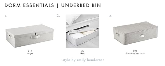
1. Underbed Fabric Bin with Lid (an EHD favorite and love the hinged lid!) | 2. STUK (affordable and cute) | 3. Under The Bed Storage Bag (a sturdy option with zippers)
Shoe StorageWhen I asked the gals what they thought was a dorm essential, shoe storage was a BIG one. First, and as best you can, try to convince your college goer they don’t need all of their shoes. It’s so tempting but the best way to stay organized is to just have less stuff. If they miss some of their pairs they can grab them when they come home for the holidays. Here are our shoe storage picks:

1. Jenny Over-The-Door Shoe Organizer (super fun pattern yet practical) | 2. Under Bed Shoe Storage Organizer (elegant black border and great if they aren’t using the under bed space for only clothes) | 3. 6-Tier Shoe Rack (a great option to put under their bed if they raise it high enough) | 4. Rolling Shoe Rack (perfect if they raise their bed just a little) | 5. 16-Compartment Under Bed Shoe Organizer (another great under-bed option) | 6. Over The Door 26 Shelf Mesh Shoe Organizer (another EHD favorite that Emily owns, uses, and holds A TON of shoes).
Bedside CaddyA bedside caddy is genius if they have a raised bed or are on the top bunk (aka when the nightstand is inaccessible). No one wants to climb in and out of bed more than they have to.

1. Bedside Drawer (probably my favorite because there’s a drawer to reduce clutter and you have a solid surface for a drink!) | 2. Recycled Ultimate Footboard Storage (look at all of those pockets) | 3. Dormify Non-Slip Bedside Caddy ( I really like that there’s a space for a power strip)
 styled by emily bowser | photo by sara ligorria-tramp | from: a home office makeover with threshold removable wallpaper by target
Bins
Bins are a lifelong essential, no? So might as well get decent ones from the jump that they can use for many apartments after.

1. Metal 2-in-1 Wire Basket with Wood Handle (so stylish, versatile, and comes in a bunch of sizes) | 2. Jute Storage Basket (love the texture and minimal pattern for added personality) | 3. Sliding Storage Bin Felt (simple, sturdy, and chic) | 4. Large Wood Crate (classic and totally customizable) | 5. Felix Square Folding Storage Crate (love the super cool modern take on this classic crate) | 6. KUGGIS (cool, stackable, and comes in different sizes)
Power StripsThis may seem like a silly one but they will need at least one power strip so why not pick a cute one? My only tip that they will be thanking you for is choosing one with USB ports. I don’t know about you but I lose those little boxes way too often. This solves that:)

1. 6 AC outlets with 3 USB Ports Circle Power Strip (love the shape and the faux wood) | 2. 6-Outlet Surge Protector with 6′ Extension Cord (I think the color is pretty, the braided cords are awesome, and that the USB ports have extra length) | 3. 12ft. Rose Gold Braided Extension Cord (pretty color and love the alternative ball shape) | 4. 6 ft. Cord 6-Outlet Braided Power Strip (no USB ports but great color and cord) | 5. 4′ 2 Outlet 2 USB 2.4A Extension Cord Braided (upgraded classic) | 6. 6-Outlet Surge Protector Power Strip (great neutral color and nicely slim)
Laundry BagWhile I wish a traditional laundry basket could work, they are bulky and annoying to travel to the laundry room with. A bag is the absolute way to go and I really like these ones:

1. Backpack Laundry Bag Tote (looks great and is also a backpack for easy carrying) | 2. Myla Laundry Bag (ok, there’s a drawstring on the top and it’s cute enough to not hide in the closet) | 3. Hanging Laundry Hamper with Zipper (if there’s door space this is a great, easy access option) | 4. Scrunchable Round Laundry Hamper (super affordable and cute) | 5. RPET Essential Laundry Backpack (stylish and easy to carry) | 6. MagicLinen Laundry Bag (can a laundry bag be chic? If so, then this one is)
 design by emily henderson | styled by emily bowser and julie rose | photo by sara ligorria-tramp | from: how to pull off “quiet maximalism” with target’s new opalhouse spring lineRolling Cart
While I would have needed a slender one like #5, I wish I would have had a rolling cart. It’s so functional. It can be used for food/prep stuff, school supplies, makeup and hair products, etc. Especially if they raise their bed high and have more floor space, this is a great dorm room addition. Also, they could easily take this to their first apartment!

1. Bamboo Rolling Kitchen Cart (natural material, love the leaf option, and great for future kitchens) | 2. Rolling Utility Cart (solid, utilitarian, and love the deep shelves) | 3. Metal, Wood, and Leather Bar Cart (A little glam that adds a ton of style and obviously a great bar cart when they turn 21:)) | 4. Gold Round Storage Cart (love the round shape and matte gold) | 5. Rolling Slim Cart with Handle (perfect for an extra small room and for a future bathroom) | 6. Essex Rolling Cart (so much storage and function!)
Shower CaddyA necessary evil for those sharing a bathroom with an entire floor. So if it’s necessary, might as well be cute.

1. Recycled Classic Shower Caddies (comes in a bunch of colors but love the coolness of the black) | 2. Felix Folding Storage Caddy (fun color and a great storage bin for after the dorms) | 3. Lexi 7 Pocket Shower Tote (loves the long strap to be able to hang on a hook) | 4. Shower Caddy (unbeatable price and cute) | 5. Portable Toiletry Bag Shower Tote (great option for someone who doesn’t have a lot of products and can travel with it in the future) | 6. Jenny Hanging Shower Organizer (fun pattern and great for someone who doesn’t like putting their stuff on the wet ground:))
 styled by brady tolbert | photo by sara ligorria-tramp | from: my dream dorm roomLighting
 A lamp is such an easy way to add personality to a dorm room! Plus they are pretty imperative for late-night homework/studying. I don’t miss that! I chose mostly clip lights since they are so versatile but regular table lamps are equally as great. I did add a LED Strip Lights because regardless of my feelings about them, gen z is obsessed. Maybe I would have been too back then. Who knows?!

1. Dormify Multicolored LED Strip Lights (here it is and I’m sure your kid will love it) | 2. Gold Clamp Lamp Light (so affordable and a fun gold twist on the classic) | 3. Multi-Joint Metal Clamp Black Desk Lamp (utilitarian and pretty cool) | 4. Hubble Clamp Light (style for dayzzz. Look at that fluting?!) | 5. Desk Lamp with USB Ports (gives off the prettiest glow and is a great price) | 6. Shine-On Clip Task Light (pretty and perfectly classic)
Well my friends, we made it to the end. Hope you enjoyed my walk down millennial memory lane and found some great pieces for the college-bound person in your life (or even you!) There are definitely other things that make the dorm room experience a little easier so let’s talk about them in the comments.
Love you, mean it.
Opening Image Credits: Styled by Brady Tolbert | Photo by Sara Ligorria-Tramp | From: My Dream Dorm Room
The post 10 Necessary/Useful, Not Ugly, And Affordable Dorm Accessories Everyone Should Get appeared first on Emily Henderson.
July 29, 2022
The Best Places To Buy Vintage Furniture And Decor Online (You’re Going To Want To Bookmark This One)
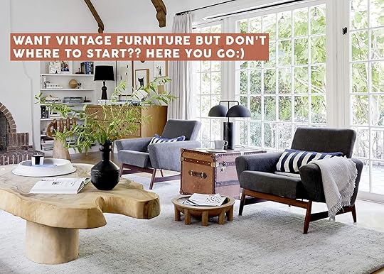
And before I lose you, it’s NOT just like, “Facebook Marketplace” and “Etsy.” I mean, those are included here – it wouldn’t be a comprehensive list of where to buy vintage furniture online without them! – but today, I’m walking you through WAY more than that. Gang, we’re talking about the 23 best spots to source vintage without leaving your house. There are small business deep cuts. There are new little start-ups! There are stores I considered pulling from this list because I’m a little nervous that I’m creating competition for myself. The takeaway is this: THERE’S SOMETHING FOR EVERYONE. I’ve patronized pretty much every retailer here (I mean, other than the one with $80,000 flatware – you’ll know it when you see it) and I’m really hoping that you’ll discover your new favorite store, because I genuinely love each of these companies and I’m pretty blown away by all the inventory they’ve saved and shared. So…are you ready to do some treasure hunting? Eager to score a steal? (Because, like, I don’t know if it’s translating, but I’m REALLY excited for you.) I’m going to kick it off with one of my all-time favorites, so buckle up…
AES of LAI’ve been shopping with AES of LA since 2019 – I grabbed my 1970s tubular lucite coffee table on their site for a freakin’ song – and it’s been my best-kept vintage resource (until now, I guess). AES specializes in auctions and estate sales in LA (who woulda thought?) and their inventory is incredible, high-quality, and always changing.
Shipping or delivery can be arranged with AES, but I’d also recommend searching for similar auction and estate sale operations in your own neighborhood. So many of these businesses have a lower public profile as their main clientele are pickers, store owners, and estate sale fanatics…but y’all, if you can find them, there are GREAT deals to be found. If you happen to find a comparable company in your own area who also shares their inventory online, please drop it in the comments – I’d love to check them out. 🙂
Amsterdam Modern photo by sara ligorria-tramp | from: sara’s living and dining room reveal
A brick-and-mortar vintage store that ACTUALLY shoots and posts EVERY SINGLE PRODUCT in their inventory? IT’S A LITERAL DREAM. On Amsterdam Modern’s site, you’ll find pages upon pages of well-curated vintage lighting, furniture, and decor (seriously – there’s 23 pages of just seating) in great condition. (And if it’s not in great condition, you can work directly with Amsterdam Modern on refinishing or reupholstering – those pieces that need a little extra love are all clearly marked and fairly priced, too.)
Remember those dreamy mid-century dining chairs from Sara’s house? Sourced from the one-and-only Amsterdam Modern, baby!!!
AptDecoThe bad news: AptDeco currently only serves the Northeast US and the San Francisco Bay-area. The good news: lots of you live in those locations, so this may be a great choice for you! (The other good news: maybe if we send them a ton of traffic, they’ll grow faster and expand to more areas!)
AptDeco’s model is a dream, though – all sellers and buyers are vetted AND their team offers free white glove delivery and assembly on each order. They measure each item upon pickup, alert the buyer to any differences between the listing and the actual product (so if there’s an unmentioned scratch or if the piece is even an inch bigger, you’ll be able to back out painlessly). It’s the vintage buying solution we need right now and I CAN’T WAIT TIL THEY’RE IN LA.
Chairish
 left: photo by sara ligorria-tramp, from: living room update – again – our new sofa, my dream floral chaise and the pop of red i always wanted in my life | right: photo by sara ligorria-tramp, from: a teen bedroom reveal! + 7 budget-friendly ideas gen z loves
I mean…you already know it. I already know it. We all already know it. But, like, how could I write a post about the best online vintage sites and not include Chairish? As they’ve scaled, their offerings have grown, too – you can now find a ton of SUPER affordable decor (I rounded up my under-$50 picks a few months back) along with one-of-a-kind pieces from dealers and regular folks worldwide. Their search can’t be beaten, either – being able to sort by dimensions is INCREDIBLY helpful.
Their shipping costs have come down a TON, too – Chairish’s special rates almost always beat the private shipping quotes I receive – and a bunch of sellers have set up their accounts to instantly accept offers that are 20-30% off the listed price (that’s a pro tip, straight from me to you!). If you’re on the hunt for the perfect finishing piece, poke around Chairish for a second – you may just find it 🙂 (Case in point: the red balloon chair from Em’s living room, which later found a second life in this teen bedroom. SO GOOD.)
CraigslistBefore starting at EHD, I spent about a year flipping rugs and furniture on Craigslist to pay the bills (really leaned into the whole #funemployed thing, you know? You can catch up on the whole saga here, if you want!). While the inventory has dropped off a little bit – Facebook Marketplace is kiiiiiinda eating Craigslist’s lunch when it comes to secondhand home goods – there are still a few steals to be found! I bet it’s been a minute since you last checked the furniture listings…who knows what could be sitting there, waiting for ya?
eBayeBay: the final frontier. It’s the internet’s original auction site (launched in September 1995, can you believe?!) and if you’ve never given it a good look, you may be missing out. They’ve majorly upgraded the experience over the last few years and sellers are now able to offer exclusive deals to those who have favorited their items – like, I recently got an email from a seller offering me 60% off the price listed on eBay. INCREDIBLE. Start saving your favorite items and let the discounts roll in, baby! (And while you’re at it, you can also grab deeply discounted new items – remember when Sara decorated her entire home for Halloween with eBay finds? It’s a treasure trove right under our noses, guys!!!)
Etsy
 photos by sara ligorria-tramp | from: jess’ (long-awaited) small space living room reveal
I mean…Etsy is pretty much the gold standard of vintage shopping on the internet, IMO. The search functionality is amazing AND there’s still some level of serendipity – like, is there anything better than stumbling upon an ambiguously-titled table or chair that’s priced WAY below market value?
If you need a jumping-off point, Ryann shared a few (or, like, 46 – that’s a few, right?) of our all-time favorite Etsy sellers right here.
Everything But the HouseYesterday actually marked my fifth anniversary of shopping with Everything But The House – this Navahand rug was my first purchase of many and while it’s not a fit for my current apartment (it’s chillin’ in my closet as we speak), I don’t think I’ll ever be able to part with it. (It doesn’t hurt that the rug appraised for about 6x the purchase price, either. :))
While the shipping costs can get a little high, the HUGE savings on furniture and decor more than make up for it (and if you’re in the market for a new-to-you vintage rug or piece of art, there’s no better site). I still remember how excited I was to grab this lithograph for $18 – the same piece is selling on eBay right now for, uh, WAY MORE. New auctions are launched daily and the stylistically diverse inventory is REALLY GOOD, guys. EBTH is one of my favorite apps to cruise every night before bed – can’t recommend it enough.
Facebook MarketplaceThese days, this is where I have the most luck. I’ve written at great length (understatement of the century, probably) about the best tips/tricks/search terms to really maximize your FB Marketplace shopping experience, so go give that a lil’ look if you REALLY wanna immerse yourself in the ~vintage fan club~.
InstagramFirst: yeah, WE’RE ALL TIRED OF REELS. Second: OMG. The proliferation of Instagram reels has made my love of vintage-sourcing on Instagram an absolute NIGHTMARE. Third: to amp up your IG experience, go to Chairish, hit an arbitrary category (“furniture” is good), tighten up your search radius (I like 50-100 miles, but sometimes I go a little further than that), and see if any of the sellers whose inventory appeals to you happen to have an Instagram page. Check out who they’re following, too – I have a finsta (fake Instagram) that exclusively follows vintage dealers and it’s a really fun feed to scroll.
If that feels like too much work (because, uh, it kinda is), I’ve also collected a bunch of my favorite vintage IG accounts right here – maybe it’s time for an update to that post?
Jayson Home
 left: photo by tessa neustadt, from: our modern english tudor living room | right: photo by sara ligorria-tramp, from: living room update – again – our new sofa, my dream floral chaise and the pop of red i always wanted in my life
BIG SWOON. Remember that gorgeous vintage chaise from Em’s living room? It was sourced by the fine folks from Jayson Home and y’all – THEY HAVE GREAT FINDS. The curation here is so impressive and there’s something for every style – vintage shearling sofas, mahogany cupboards, rattan settees, African stools, Suzani textiles, framed art…it’s all in here. (As a side note, Jayson Home’s huge summer sale ends on 8/1 – highly recommend giving it a scroll before it’s over! There’s tons of eye candy, even if you’re not in the market for anything in particular.)
Kaiyo photo by sara ligorria-tramp | from: ryann’s moto reveal – a moody multi-functional living and dining room with a lot of soul
We’re huge fans of Kaiyo over here – it’s where Ryann sourced that incredible gingham wingback chair in her living room. They started out in New York, but they’ve recently expanded to LA and y’all – I’M EXCITED ABOUT IT, from a buying AND selling perspective. As a seller, you submit photos to Kaiyo and if your pieces are accepted, they’ll come and pick things up for you. (Anyone who has ever posted a furniture listing with a caveat like, “you must carry this out, please bring help to lift it” and then had a buyer show up like, “I don’t have any help, I thought you and I could lift this 300 lb credenza together,” – REJOICE. NO MORE TOMFOOLERY. Kaiyo will just handle it. Plus – and this is my favorite part – you can pick to get an instant cash offer after your pieces have been picked up OR you can wait and get paid out after your piece sells (like consignment for the 21st century).
And from a buyer’s perspective, every piece is inspected and cleaned, and delivered with white glove service. Huge, huge, huge fan of this business model. We’re pretty spoiled with these amazing businesses out on the coasts – hope that they can make their way inland soon!
LiveAuctioneersWELCOME TO THE RABBIT HOLE. I have a crippling LiveAuctioneers addiction and I’m not sorry!!! Their tagline is “let’s go treasure-hunting” and WOW, THAT COPY IS SPOT ON. I suggest doing a good amount of preparation before jumping into any auctions – like, you have to register for each one, plan your max bid, calculate the amount you’re willing to spend on buyer’s premiums (that’s the auction house’s cut), put out feelers for shipping costs, etc. – but the work is worth the reward. Over time, you’ll discover your favorite auctioneers and auction houses (Billings‘ quarterly auctions are my personal favorite!) and it’s just REALLY FUN. (Should we do a bigger post on auctions? Asking for myself, because like…I kinda wanna write more about this whole process.)
LoveseatThis is LA’s best-kept secret and I can name at least one VERY expensive vintage store who used to source A LOT OF INVENTORY from Loveseat. Like, A LOT OF INVENTORY. (I won’t name names, but like…if you want to take a guess, maybe you’ll be right?) Loveseat started out in LA, expanded to San Diego, and their auctions are now available down in San Antonio and Austin, too.
Loveseat’s grown to offer primarily dead stock or returned items (so like, if you’re in the mood for a new $80 sofa or $40 refrigerator, this is absolutely the site for you – you’re welcome for the tip) but they do still occasionally have some awesome vintage and one-of-a-kind pieces up on consignment. Check-in once a week and see what’s listed. There are some really impressive deals to be had, you know?
OfferUpI gotta be honest: I am reluctantly posting about OfferUp. The app is kind of a nightmare, the ads are weird, the spam listings can get out of control, and the user experience is kind of…bad? But man, there are some steals buried on there – I’m talking $19 campaign nightstands, $10 wrought iron chairs, $100 dining sets, and more. Proceed at your own risk. (I usually have fun searching for about, uh, 10 minutes, before rage quitting after seeing local furniture stores spamming sofas everywhere. Sometimes I find something great; other times, I force close the app and consider chucking my phone across the room. Am I doing a great job of selling OfferUp? Are you excited to try it???)
One King’s LaneSo, uh, One King’s Lane vintage selection isn’t cheap. It’s stocked full of products from vendors who know what they have and who have priced those objects accordingly…so if you’re on the hunt for a deal, this may not be the best site for you.
It’s like Em’s classic advice: you can’t have cheap, fast, AND good. You’ll be able to grab beautiful, ready-to-ship pieces here – but you will need a bit of flexibility in your budget (that’s my nice, euphemistic way of being like “yo, stuff here costs like, $7,000“). If you are one of the folks who’s been blessed with a flexible budget, though, GO WILD. It’s really fun to buy a piece from a knowledgeable seller who can teach you something about where your furniture resided previously, you know?
PamonoPamono, pre-August 2021: Europe’s version of Chairish. Pamono, post-August 2021: acquired by Chairish. You may have noticed a proliferation of European dealers on Chairish over the past few months, and this is why. That said, the OG Pamono site is a real treat – it’s SO educational (the content on the front page is beautiful AND informative!), the layout is easy to use, customs fees are included in the prices, and shipping fees are clearly stated upfront (it averages out to about $900 bucks to get furniture from Europe to LA, which is actually a pretty impressive deal – my uShip account could never compete!!!).
If you’re someone who loves trends, I can’t recommend Pamono highly enough – it’s a nice little vintage microcosm where you can get a real feel for what’s coming up next. There are so many listings on Chairish that these little Euro-centric pieces can get lost, so it’s really nice that they have their own place to shine. (And if you’re trying to nail your designer vocab, there’s truly no better place to learn. Big fan!)
Rejuvenation photo by sara ligorria-tramp | from: portland project – the living room reveal
HELLO, FRIEND. Rejuvenation relaunched their Antiques and Vintage category earlier this year and I couldn’t be more excited – could you imagine the impact it’d have if more major retailers dedicated time and manpower to preservation? Like, Rejuvenation’s restoration studio (a team!!! For vintage!!!) restores over 3,000 antique and vintage pieces a year – it’s a pretty gargantuan undertaking and IT’S SO COOL.
There’s something for everyone here – rugs, lighting, furniture, and more – and if you’ve been staying up-to-date with Em’s Instagram stories, you may have noticed that she’s been digging around the Rejuvenation warehouse. She’s sourced a few SUPER special pieces from the antiques and vintage section and I can’t wait for y’all to see how she styles them in the Farmhouse…we’re all in for a treat. 🙂
Ruby LaneRuby Lane is kind of like Chairish with a twist – while you can’t make an offer on a piece directly on their site, but you can send a note to the vendor directly to negotiate a deal. As an added bonus, several retailers also offer free shipping (they’ll note this in the item description) and layaway plans (the amount of time on these varies, but it’s a nice option!).
Items on Ruby Lane are generally pretty fairly priced (so you’re probably not going to have one of those “holy crap, I just found a $4,000 table for $60 bucks!” moments) and the UI can feel a little dated, but it’s still a great resource to explore. (And again, if you’re one of those folks with a flexible budget…well, Ruby Lane’s your oyster, pal. Enjoy!)
Scout Design Studio photo by sara ligorria-tramp | from: caitlin’s first moto reveal – a vintage bathroom gets a modern update
SIGH. This is another one of my secret sources and I’m 50% excited to share it and 50% sad that I’m increasing competition for myself. C’EST LA VIE. I’ve long loved Scout Design Studio for their new furniture and decor pieces (like, that absolutely wiiiild Greek bust in my bathroom was a Scout purchase!) but their vintage section is something else.
We’ve got burl case goods (that are more affordable than their modern counterparts!), brightly-lacquered credenzas and sideboards, classic marble commodes, consoles, art, and SO MUCH MORE. Everything can be customized, too – I highly recommend shooting them a follow on Instagram to see their finds as they arrive. Scout does a great job of toeing the line between affordable and out of reach, too – nothing here is cheap, but pieces do feel really fairly priced. I’m saving up for a few things as we speak!!
Sotheby’s Home photo by tessa neustadt | from: staging my dream hotel suite with sotheby’s
I mean…it’s Sotheby’s, guys. $17,000 tapestries, $8,000 candlesticks, $150,000 rugs, $87,000 water pitchers…you get it, right? Pour yourself a nice (or, uh, average) glass of wine (I’ll have the $11 Sauv Blanc from the Walgreens next to my house, thank you #Nobilo4ever), snuggle up on the couch with an iPad, and enjoy a fun little escapist scroll.
Urban AmericanaTHE BEST ANTIQUE MALL ON THE INTERNET. (Unless you know a better one, in which case – I’m all ears, baby!!! Lay it on me!!) We’ve actually visited as a team – it was one of our last outings before Em headed up to Oregon – and it’s one of my favorite spots in the LA area.
Urban Americana does a REALLY impressive job of documenting all the inventory in its facility. It’s a pretty gargantuan undertaking (especially when you have that many little shops, filled with constantly shifting pieces!) and I just can’t think of another mall that puts this much care and effort into supporting its vendors. Also, they have delivery available within a 100-mile radius AND they are lightning fast at pulling up shipping quotes! Well-priced pieces sold by really nice and thoughtful people? Done. I AM A HUGE FAN. 1 MILLION STARS FROM ME.
1stDibsLast but not least: our sweet, reliable, high-end friend. You’ve seen Em’s latest 1stDibs find – that sweet, patinated Swedish blue cabinet – and there’s WAY more where that came from. I’ve recently become obsessed with their Auction section as there are some awesome deals to be found (who knew?!) but my real favorite page is their iconic designs section, which is a veritable treasure trove of famous products – I treat it like the random article section on Wikipedia, where I arbitrarily click on a product name and then get to learn all about its history (and its pricing). It’s fun! It’s free! I like it!
THAT’S ALL SHE WROTE. (“Thank God,” – you, probably, after making your way through this whole novel. We’re way over 3,000 words, which is, uh, a LOT.) Anyone have any thoughts? Feelings? Good Etsy shops to recommend? A favorite estate sale business, perhaps? A vintage-selling Instagram account you love to follow? I’M ALL EARS, CUTIES. Happy Friday – see ya down there, yeah?? xx
Opening Image Credits: Photo by Sara Ligorria-Tramp | From: A Quick Update: The Changes I’ve Made to My LA Living Room
The post The Best Places To Buy Vintage Furniture And Decor Online (You’re Going To Want To Bookmark This One) appeared first on Emily Henderson.
July 28, 2022
Designing With My Very Involved Daughter – And The One And Only Wallpaper We BOTH Love!!!

I walked into this room design process fully willing to let Birdie’s creativity lead. I would NOT try to control her effervescent light. But much like Halloween costumes, you can only impose your wants for so long before their “youthful” choices and tantrums dominate. The first few years you dress them in a costume that makes you and your friends laugh, like Mario Batali, “Weekend At Bernie’s”, or Dolly Parton (true stories). But around age 4-5 they want to be Elsa and Spiderman and you swallow your disappointment, embrace their generic choice, feign enthusiasm, and “Ok! ELSA IT IS!!” Again!! Big kid rooms are the same, unfortunately, but different because a dumb $18 one-night-a-year costume has far less implications than a full room design. As I wrote about last week, Birdie is extremely enthusiastic about design and color, she feels confident she will be an artist when she grows up, she wants a room that is full of her personality and will not settle. Not sure where she gets it from:) It’s exhilarating to be her mom. So I sat down with her, innocently, on Pinterest ready to find the “jumping-off point” when she said, “let’s just google unicorn wallpaper”. Against my better judgment, I typed that death wish on the keyboard and it all went off the rails.

She squealed and screamed, “I want that! THAT!!!!”. These aren’t even “wallpapers” for your wall, they are digital art for your computer (mostly) but they are full of incredible energy and color and, y’all, that’s what she wanted. OOF. ROOKIE MISTAKE. I did my best “cool” mom act and said, “oh yeah, that’s so fun…but what if it was more like …” and then I plugged in “Scandinavian pink girls room”. Here’s what came up:
She responded in the most adorable voice on the planet, “Oh no thanks, mama. That is what you like. That’s not enough color. I want ALL the bright colors. ALL of them.” and then the kicker, “even orange and purple…”. I was quick to stammer, “of course, sweetie, it’s your room and I want you to love it,” while I panicked inside.
Then over the next few weeks, I used my brain and more developed manipulation skills and pulled up only sites where I loved all the options. i.e. House of Hackney, Schumacher, Hygge & West, Minted, etc. She made me pin every single one that she loved which was 99% of them with strong saturated bright colors. I tried my hardest Oscar-winning performance to show them all equal enthusiasm, while I obviously had my preferences.
Meanwhile, we were working on her dollhouse together. I told her that she could be the lead designer and that I would be her assistant. She could design it HOWEVER she wanted. We went to the craft store and bought “wallpaper” full of donuts, ice cream, unicorns, and 10 different flower patterns. She chose the paint colors and gems for all the furniture and I went to town making them all. I matched her enthusiasm at every turn because honestly, it was SO MUCH FUN doing this with her. As I in Tuesday’s post, cultivating a shared interest is an extremely important thing to me as I can see the potential for decades of fun, together (if I don’t mess it up).


She would scream with delight, so excited when the donut wallpaper went up in her dollhouse bedroom. She wanted to hang paper butterflies in the corner like a mobile and I helped her figure out how to do it. Here and there I would try to teach her about focal points, balance, “restraint” (ahem), etc, and she changed some things but I honestly tried to bite my tongue and let her lead. I’m SO GLAD that I did. I feel like if we hadn’t had that dollhouse experience/experiment I wouldn’t know the extremes of joy that her own creativity induced in her. SCREAMS OF JOY. She was having the same reaction as I did to the pantry vintage windows and there was NO WAY I was going to deny her and myself that joy in her future, real bedroom. Lesson learned. This room is hers and we are going ALL OUT.
But at the same time, we talk a lot about waste and landfills in this house. They know that we won’t support buying anything that doesn’t have longevity. Not that we have to keep everything forever, but it can’t be plastic $8 LED unicorn lamps from Amazon that would break or that she’d hate next year. Further research and exploration were necessary:
So we listed what she loves and they were as follows:
Unicorns. (fine, for now – we can bring them in…. somehow)Flowers (!!!!!))))Butterflies (!!) Birds (and all animals really) (!!!!)Hearts 🙂 Candy/sweetsFor colors she wanted the following:
PinkPurpleTealBlueGreen“All the colors in the rainbow mama, except gray”.It gave me a great jumping-off point. I pitched an idea, that for her real bedroom I would be the designer and she would be my client. I walked her through the process, how I would present her ideas and she would get to choose. To be clear, she is super opinionated but also strangely reasonable and can compromise. She loves so many different things, I could easily convince her of the next thing if I felt like it didn’t work. Sometimes it’s like looking in a mirror. Maybe she trusted me because of the dollhouse experiment? She agreed to our arrangement so I narrowed down the wallpaper choices that I really hoped she would love.
As I was shopping I thought about the following:
It HAD to be very very colorful and fun, or she would just say “No, mama”. Note taken. It had to last for a decade. Nothing too silly or young (like unicorns or donuts) and nothing cheap or too trendy. It had to work relatively well with the rest of the house and the other bedrooms upstairs. Nothing too cartoony, dark, random, or crazy busy.
1. Queen’s Flight Panel Set | 2. Butterflies Wallpaper | 3. Simons Äng White | 4. Rabarber | 5. Midsummer Eve | 6. Garden Party Trellis Wallpaper | 7. ARTEMIS Wallpaper | 8. Exotic Butterfly | 9. Millefleurs
I felt pretty good about presenting all of the above to her. Just like a designer, I had my favorites, for sure. As much as I love busy patterns in photos, I don’t love living with them as much. So I was hoping that she wasn’t adamant about a few of them.
She nixed some immediately (for not being bright enough). She considered the unicorn wallpaper (oops not shown) but agreed that she didn’t know if she would still love them in 3 years (one of her formerly unicorn-obsessed best friends is 9 and no longer as into them). I may have stacked the cards a bit because the only physical sample that I bought at the time was the Butterfly Baudin from Schumacher because that is the one that I wanted. I felt that it checked the boxes that I wanted. Proof of said boxes:
Light, bright and airy – it had a decent amount of negative space that kept it from being too dark, heavy and busy. While I love so many dark patterns, for these three bedrooms on the landing I want it to flow relatively cohesively. It’s feels kinda vintage-y and classic/traditional (versus a more contemporary butterfly or animal pattern). It’s full of so many wonderful colors. This girl wants everything in the room to be a bright color. So we have been collecting vintage/thrifted dressers to paint. While she loves neon and some lime green, etc, with this paper as our guide she has a ton of colors to choose from – all approved by her designer (me). The flora and fauna vibe still feels “Oregon farmhouse” appropriate. I loved how the pattern would interact with the diamond pattern of the original windows. while some graphic patterns could have worked I liked the juxtaposition of this more organic pattern next to the straighter diamond pattern. I could picture it from the landing and it just made sense with the house. Walking up the stairs and seeing through those light blue doors just makes me so happy and feels right.
For me, the colorway was a no-brainer, but I put it on social media and the all-pink version was the winner. Not us. The “Never Bright Enough Henderson” team wanted the teal/yellow and pink version. I tried my best to conceal that it was my favorite until she made the decision herself. It was SO enthusiastic. I think she feels really proud that her choice was the one that a professional designer would have chosen. And it was a shared celebration that we had found the most perfect wallpaper (and WE ARE STICKING TO IT!!).

So we are off with an incredible jumping-off point that is making the room feel very clear and cohesive to me as her designer, and so wild and fun for her, my adorably involved and totally spoiled/sweet client. I had zero intention of even thinking about the kid’s rooms yet but she was so excited about the design and talked about it all the time. It’s such a fun way to spend time together. So y’all we are doing it. WE HAVE OUR JUMPING-OFF POINT!!!
Opening Image Credits: Design by Julie Rose for EHD | Photos by Sara Ligorria-Tramp | From: A Little One’s Mid-Century Magical Bedroom Reveal
Photo of Emily and Birdie by Kaitlin Green
The post Designing With My Very Involved Daughter – And The One And Only Wallpaper We BOTH Love!!! appeared first on Emily Henderson.
Emily Henderson's Blog

- Emily Henderson's profile
- 10 followers

