
Emily Henderson's Blog, page 136
March 6, 2022
The Link Up: Emily’s $12 Sunglasses That Look Designer, Mallory’s Favorite Striped T-Shirt, And The Sunscreen That’s Viral On TikTok

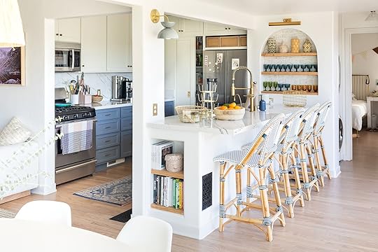
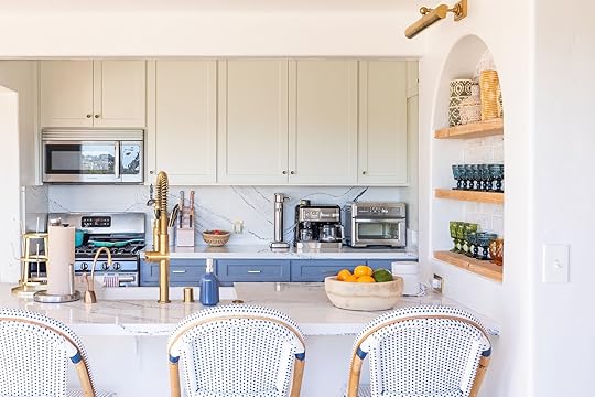
This week’s home tour is a gorgeous California cottage designed by Corine Maggio. It’s cozy, coastal, and everything you’d want your dream cottage to be.
From Emily: I wore these sunglasses the other day and my friend asked me who they were made by…she couldn’t believe they were only $12 from target because they look really high quality and have a great shape. I also bought these $15 RayBan dupes while I was there (I’m just now finding out they’re technically “men’s” glasses) but I think they also look awesome. Definitely recommend 
From Caitlin: Um, excuse me, is this the cutest spring dress I have ever seen??? HOW IS IT ONLY $38? This thing looks like it should be, like, $160 at Madewell. Good for St. Patrick’s Day, Easter, and general warm weather festivities. It’s pretty modest (though there is some flexibility if you wanna show more chest), so it’s probably great for parents who need something comfortable to run around in. (Or, like, even people who just like wearing dresses, I guess? I’m single. I don’t know what parents need)
From Jess: I got this clay-ish colored lip + cheek stick a couple of weeks ago and love it so much! You can put it one light or heavy depending how dramatic you want it and it looks great regardless.
Also From Jess: This is a friendly reminder to buy (if you are out) some sunscreen. I’d been out of mine for two months despite knowing how important it is to wear ALL YEAR. For my face I love Supergoop! Unseen Sunscreen and this time got the bigger size.
From Mallory: This t-shirt is my absolute favorite because it fits so well on the shoulders and then drapes really nicely (it’s not too tight at all). It’s also incredibly soft and on sale right now for over $40% off. If you’re in the market, this is my go-to!
From Sara: This sunscreen is my absolute favorite because I put it on last every day, it doesn’t pill with any of my other products, it doesn’t leave any white on your face and it doesn’t feel greasy. It’s also blowing up on the Tiktok (but I was into it before it was popular  )
)
From Ryann: The Target in Eagle Rock just added an Ulta inside and it’s one of the best (or maybe worst?) things that has happened to me. Basically, every time I shop there, which is a lot because it’s right by my house and my gym, I leave with one beauty product. My latest trip ended with me buying multiple products by The Ordinary and I love them all, but this one I am truly obsessed with. I use it day and night and it’s easily my favorite step of my beauty routine. It’s supposed to help with signs of aging, but honestly, it just makes my skin feel really good.
That’s all for today and for ways to continue to support the people of Ukraine head to last week’s post. See y’all tomorrow. xx
Opening Image Credit: Design by Corine Maggio | Photo by Carley Page Summers| via Domino
The post The Link Up: Emily’s $12 Sunglasses That Look Designer, Mallory’s Favorite Striped T-Shirt, And The Sunscreen That’s Viral On TikTok appeared first on Emily Henderson.


March 5, 2022
Where To Buy ALL The Best Swimsuits (Affordable, Black Owned, AND Size-Inclusive) – Because I’ve Been Heavily Insta-Marketed, Believe Me


It’s that time of year when you buy one swimsuit and then swimsuits flood your feed on every platform for months. Funnily enough, I actually love this because swimsuits are one of the few things you have to buy online (unless you are near a Pac Sun or other virtually non-existent in-person swimsuit stores). So today we listed them all out for you if you are on the hunt for spring break (or summer). I’m seriously trying to not hoard any new clothes, but when it comes to swimsuits if you find one that makes you feel comfortable and good, I give myself full permission to go for it. Also, I’ll be sure to lather up with my favorite spray tan foam

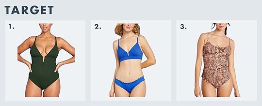
1. Aerie Triangle Bikini Top + Aerie Bikini Bottom | 2. Ribbed Wrap Strapless One Piece Swimsuit | 3. Printed Banded Wide Strap Scoop Bikini Top + Printed Crossover High Cut Cheeky Bikini Bottom
Price Range: $10-$75
Size Range: XXS-XXL
Ryann here! I love Aerie swimsuits because they are surprisingly great quality for the price and they last for years. They have the best high cut high waist bottoms on the market that hug in all the right places. They’ve also started making their bathing suits with REPREVE® fibers made with recycled plastic bottles.

1. Ruffle V-Neck One-Piece in Gingham | 2. Ruched Halter Bikini Top in Polka Dot + Hipster Curved-Waist Cheeky Bikini Bottom
Price Range: $45-$275
Size Range: XXS-XXL, 0-24
Last year when I did a swimsuit review post, I reviewed the Ruffle V-Neck One-Piece in Gingham: “The delicate ruffle strap and the texture of the fabric are so great. My only beef is that the straps are “adjustable” but they come at their max point (the ruffle makes the strap too thick to go through the piece of hardware to tighten it). Now I loved this suit so much beyond that that I’m going to likely sew it tighter to bring the ladies up. But if you have a long torso I’m sure it would fit just fine (I ordered a 6). I still felt supported (but after two kids I enjoy higher support). The legs didn’t cut in, the double-layered fabric masked my layer of tummy warmth (tummy cellulite + belly button indention) which by the way is MY thing, feel free to show that off, I just feel more comfortable with it a big disguised”.
My favorite striped one-piece (no longer available) is still in good shape despite me wearing it SO MUCH last summer in the lake. J. Crew has surprisingly great swimsuits, but I haven’t tried all of them so I can only attest to the striped one and ruffle one above. I do love that their size range is much more inclusive than other big swimwear brands.

1. Textured-Rib Bandeau Swim Top for Women + High-Waisted Ribbed Bikini Swim Bottoms for Women |2. Textured-Rib Square-Neck French-Cut One-Piece Swimsuit for Women | 3. Tie-Shoulder Ruched Deep V-Neck One-Piece Swimsuit for Women
Price Range: $5-$50
Size Range: XS-5X
Jess here! While it’s been a minute since I’ve purchased an Old Navy swimsuit, I ALWAYS loved how they fit (especially for the cost). Plus lots of our readers last year recommended Old Navy so if you are on a budget it is not to be missed. Oh and not to mention they are size-inclusive!
1. Ribbed Plunge Front V-Wire One Piece Swimsuit | 2. Ribbed V-Wire Bikini Top + Ribbed Ruffle Cheeky Bikini Bottom | 3. Women’s Tunnel Keyhole One Piece Swimsuit
Price Range: $15-$120
Size Range: XS-XL
The blue bikini is awesome because the top has an underwire and is sized by bra cup size so it actually fits and is super supportive. I also love the bright cobalt blue color (but it comes in other colors, too).
It’s Jess again. You may remember that I bought two (and kept) swimsuits from Target last year because they were great and made me feel great. I am truly a fan and have actually owned a different Target suit I love for about 5 years. The prices and styles are unbeatable.
1. Jenna High Leg One Piece | 2. Skylar Top + Barcelona High Waist Bottom | 3. Sea Snake Jenna High Leg One Piece
Price Range: $86-$325
Size Range: XS-XL
That blue one that I reviewed last year is STILL one of my favorites. The seams/lines across the bodice pull you in and make your waist look smaller (if you are into that). Size up, I’m in a medium or 6 and it’s still tight (and cheeky).
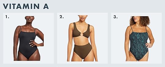
You guessed it…it’s Jess. So Vitamin A‘s suits are quality. They feel like butter when they are on your body and they famously carry one of Emily’s all-time favorite one-pieces. My only beef with them is that their XL is hardly that. I wouldn’t call this brand size-inclusive. I got their XL and it just fit. I was around a size 10/12 at the time. I REALLY hope they make more sizes because the suits are definitely special.
The New Favorites
1. Lailani Belted One Piece | 2. Amanda Plunge One Piece | 3. Crossover One Piece
Price Range: $55-$135
Size Range: XS-3X
Averie is a brand I discovered because Instagram heard me talking about swimsuits. They make really high-end-looking bathing suits that are unique. This would be a great brand to try if you are going to a resort where you will be swimsuits 90% of the time, and they aren’t crazy expensive either.

1. Sweet Victory Top + Wear To Bottom | 2. Pool Days Top + Hi Tide Bottom | 3. Peak Suit
Price Range: $85-$170
Size Range: S-XXL
Here’s another brand I was highly marketed on IG and Facebook. Their suits are cute but made specifically so you can actually swim, surf, or just be active in them. They are comfortable (according to them, the fabric feels like butter but is still compressive) and have medium coverage so you don’t have to worry about slippage. I really love the variety of colors and styles they carry, too.
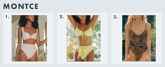
1. Fruity Floral Kayla Bikini Top + Paulina Bikini Bottom | 2. Lucy Bikini Top + Paula Tie-Up Bikini Bottom| 3. Dainty One-Piece w/ Belt
Price Range: $98-$218
Size Range: XS-XL
Montce is a very fashion-forward swimwear brand that again, Instagram shoved on my feed. I really like their fun prints and they look very cute, but I wish they were more size-inclusive.

1. Maci Neon Pop | 2. Gretta Ville | 3. Cece
Price Range: $69-$109
Size Range: XXS-XL
Hey, it’s Mallory! I’m obsessed with Triangl’s sparkle suits because if you’re into the sparkly swimsuit look, then you might know it’s hard to find one that looks like it’s good quality. I also love that they come as a set so you don’t need to buy the top and bottom individually which I find annoying. Plus, in some of the styles, you can choose a “cheeky” bottom on non-cheeky (I have the cheeky which is honestly not that cheeky, certainly not like a thong, so don’t you worry). I just think it’s nice to have the option and I’ve never seen a swim company do that

1. Bexy | 2. Paloma | 3. Cara + Cassandra
Price Range: $48-$228
Size Range: XS-XL
I bought this one and like it a lot. I bought it in red, too and the fabric was weird so I returned it, but the stripe is pretty flattering and elongating (I am short torsoed).
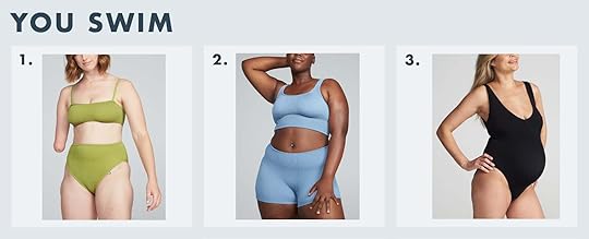
1. Poise High Waist Two-Piece | 2. Verve Shorts Two-Piece | 3. Eva One-Piece
Price Range: $139
Size Range: Seven sizes in one – will comfortably fit U.S. 2-14 or UK/AUS 6-18
Ryann here! I have a two-piece from You Swim and it’s actually magic. It really does stretch to fit all the way up to a size 14 (but it doesn’t look stretched out at all) and the top is surprisingly supportive without having any padding or underwire. I always get compliments when I wear it which is such a great feeling. This is the best swimsuit to invest in if your weight tends to fluctuate!
Black-Owned Brands
1. Mona Mustard Bikini | 2. Adan Purple One Piece | 3. Akacia Long Sleeve Bikini
Price Range: $140-$210
Size Range: XS-XXL
Caitlin bought a swimsuit from Andrea Iyamah last year (sadly it’s no longer available) and said this about it: “After like, two years of recommending clothes and undergarments by writing, “I have 36F boobs and a big butt,” it feels kind of surreal to be like “AND HERE THEY ARE!” But now, please let me tell you about Andrea Iyamah (aka the only place I will be purchasing swimsuits for the rest of my life – also a Black-owned business!). The Caitlin of yore would have been feeling insecure about posting bikini pics at her highest-ever weight but the Caitlin in *THIS* swimsuit DOESN’T GIVE AN F. Like, uh, WHERE IS MY CABANA BOY? Where are my grapes???? Someone fan me!!! I love it – I’m very pale and the color doesn’t make me look like I’ve recently climbed out of an ice chest in a morgue. PLUS the detailing just feels so special and the top is really sturdy. This is definitely more of a “Vegas suit” (read: to be worn while you’re standing around or sitting in a hot tub) but it makes me feel really good. I got an XL top and XL bottom (which is supposed to be high-waisted, but I have a really long torso, so it tried to be high-waisted and just fell short). Highly recommended.”

1. Nero Top + Talus Bottom | 2. Noa Top + Crev Bottom | 3. Ari Top + Crev Bottom
Price Range: $89
Size Range: XS-3XL
It’s Ryann again. I just have to say I have a similar body type to the model above and she’s making me feel real confident about wearing a string bikini. I have issues with showing my stomach but honestly, I am looking at all three of these bikinis and feel empowered to rock them!! I also love that they go up to a size 3XL and are all $89 which is pretty affordable for swimwear.

1. Top Priority Bikini-Abstract Print | 2. Never Let Go Bikini | 3. Surfside Swimsuit
Price Range: $12-$34
Size Range: S-XL
It’s your girl Ryann again. Icon Swim makes really affordable and stylish swimsuits that will 100% turn heads. I love that even their medium coverage suits like the Never Let Go Bikini are still sexy and form-fitting. I just ordered their Top Priority Bikini-Abstract Print so I’ll report back with my review!

1. Neon Pink Shell Bikini + Neon Pink High Waist Bikini Ruched Bottom | 2. Gatsby Palm Two Tone Swimsuit | 3. Simone Spice Gradient Bikini Bra + Simone Spice Gradient Bottom
Price Range: $98-$248
Size Range: XS-XXL
It’s Jess again (for the last time). I just ordered this swimsuit (#3) and I LOVE it. The cut of this top is super flattering and has an underwire for support and the bottoms are great too but definitely cheeky. I just feel sexy in it and the size guide was spot on. These suits aren’t cheap but they are high quality and beautiful.

1. Sena One Piece | 2. Cava One Piece | Yara One Piece
Price Range: $80-$245
Size Range: XS-XL
Jade Swimsuits are not only extremely cute, they are also committed to sustainability. They make simple but not at all basic swimwear that are designed to be worn day to night. I can definitely see this one being cute at the beach and also worn with cut-offs for a casual dinner date.

1. Nunu Deep V Belted One Piece | 2. Zala Pouf Top + Zala High Waist Bottom | 3. Lena Triangle Top + Lena String Bottoms
Price Range: $95-$275
Size Range: XS-XL
It’s Ryann again. I have been a fan of Lem Lem for years now. They make interesting, bold, and well-made pieces but their mission as a brand is what I am most impressed by. They are an artisan-driven brand of beautiful women’s resort wear made entirely and responsibly in Africa, with a core mission of preserving the local art of weaving in Ethiopia and inspiring economic growth on the continent.

Price Range: $35-$85
Size Range: XS-L
Mint Swim was founded by actress/entrepreneur, Draya Howard with all shapes and sizes in mind. You can tell each style is made to make you feel confident and sexy, no matter your size.

1. Rio | 2. Baja Sleeve Set | 3. Amalfi
Price Range: $90-$175
Size Range: XS-L
If any brand can make a case for the swim skirt it’s Rielli. They make swimwear that is more than just a bathing suit. Their swimwear is thoughtfully made in small batches at the home of the founder, Arielle Claudine Baril, so you know you are getting something that is one of kind and special.
Size-Inclusive Brands
1. Malibu | 2. The Lagos | 3. The Sicily
Price Range: $35-$125
Size Range: XS-3XL
I just bought #1 in red and LOVE IT (I bought a medium which was too big so reordered a small). It has a shelf, ladies – which is all most of us want to know – DO YOU HAVE A SHELF FOR MY LOVE PILLOWS? Yes, ok thank you. Hey swimsuit brands, can you just be more clear about the level of support for our ladies?
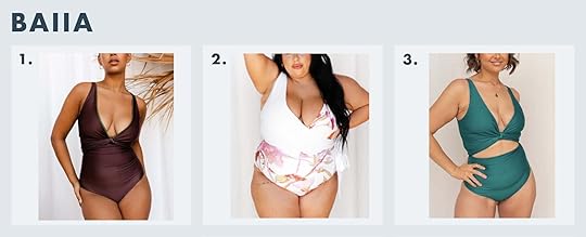
1. Reversible Wrap Top + Reversible Bottoms | 2. Reversible Wrap Suit | 3. Jasmine Reversible Wrap Top + Jasmine Reversible Bottoms
Price Range: $99-$129
Size Range: 2-18
Baiia is another brand I discovered via social media promotion. Their swimsuits are award-winning for their innovative and sustainable designs. I was drawn to them immediately because of their fresh colors and the wrap suits, but I am now a bigger fan because of their sustainable practices. Also, all their swimwear is reversible so you can wear them again and again.

1. Saldana Suit | 2. Halter Cross Top + Cusp Bikini Bottom | 3. Delta Duotone Suit
Price Range: $48-$198
Size Range: XS-3XL
Ryann here! I’ve loved Chromat ever since I saw breast cancer survivor Erika Hart walk the runway for them. Their designs are cool and fresh but I am also drawn to them because of their brand ethos and inclusivity.

1. The Balconette | 2. The Plunge | 3. The Scoop
Price Range: $68-$98
Size Range: 30A-42H, XS-3XL
Caitlin here! Guys, I LOVE my Cuup bras – they’re the only brand I wear. I have literally pulled a bra out and shown it to the entire team because they’re SO lightweight but they somehow do SO MUCH for your boobs. The cuts are awesome – they do a really great job of covering my lil’ armpit boob (is there a name for that area? Armpit crease?) and they give a pretty sturdy, comfortable amount of lift. Seeing them expanding into swimwear is just like…a total dream. The only con here is that their shipping is nightmarish and their customer service is not the best…but guys, I’m telling you that it’s worth it for this stuff. Order now and you’ll have your suits when it starts to heat up! (Just be wary that it’ll take 3-4x longer than any time they quote you in your original order confirmation email. It’s frustrating, but you’ll look amazing in the end. Every order experience I’ve had has been a fiasco and I’m still here admitting that they do make incredible stuff. I’m adding one of these to my collection, too.)
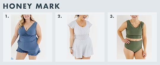
1. The Ginger | 2. The Pepper | 3. The Caraway
Price Range: $119-$152
Size Range: XS-3XL
We learned about Honey Mark last year when we asked our readers to share what swimsuits they love. From one of our readers, Tiffany: “I am a currrrrvy girl and finding a swimsuit I feel good and comfortable and confident is the hardest thing for me. In fact, last year I didn’t swim at all because I didn’t have a swimsuit I was comfortable in. FAST FORWARD to this year and the brand Honeymark! Not only is the owner the most darling person I have ever seen, she’s made her line super size-inclusive and perfect for me. For anyone. This swim romper is super modest, comfy, and darling. Every single thing on her site is! I’ve never spent as much money on anything as I did this swimsuit. Not even my wedding dress (honestly) and I’m so excited to play at the splash pad and play in the swimming pool and at the beach in this little thing! “

1. Bright Delight Swimsuit | 2. Bright Delight 2 Bikini | 3. Bright Delight Bikini
Price Range: $120-$130
Size Range: S-3XL
If you are looking for something fun, bright, and exciting, look no further than Naki Muli. Their bright, color-block styles are hard to miss plus they are another black-owned, size-inclusive brand!

1. The Ruched Backflip | 2. The Long Torso Ruffle Backflip | 3. The Ruffle Oasis Bikini Top + The Ruffle High Leg High Rise Bikini Bottom
Price Range: $45-$145
Size Range: 2-22
I bought #1 (amongst others). I returned some of them but kept that one as it’s very flattering (the cut pulls in your waist). The straps are supportive and it has a shelf (could use more support, but I’ll take a shelf). This is a great “playing with kids” suit, plus it’s Brian approved.

1. Plungey | 2. Lacey | 3. Hi Cut Plungey
Price Range: $178
Size Range: XS-3XL
OH GOODNESS. I finally ordered this internet famous suit with the ropes in the back and y’all – I LOVE IT. Especially if you want to wear it with shorts – it absolutely corsets in your waist. Now I know that the word “flattering” is problematic and of course, we shouldn’t be coveting the unattainable “hourglass” figure, but if that’s what you want – then this suit does deliver. I carry more tummy weight than you’d think so it really flattened it and made the waist smaller (and no, it doesn’t make it disappear it just pushes it out the back sooooo…. ). I ordered the red plunge in medium and it’s pretty tight, FYI. xx
Now, there are a billion swimsuit brands out there so there’s no way we scratched the surface but I hope this helped you make some good swimsuit buying choices. If you are looking for even more recs, we’ve reviewed quite a few here, here, and here. xx
The post Where To Buy ALL The Best Swimsuits (Affordable, Black Owned, AND Size-Inclusive) – Because I’ve Been Heavily Insta-Marketed, Believe Me appeared first on Emily Henderson.
March 4, 2022
Ask The Audience: Caitlin “Purchased” The Dresser Of Her Actual Dreams But Now Needs To Pick A Bedroom Color Palette…HELP

I think that every single piece of interior design advice on the big, wide, infinite internet can be summed up as follows:
Find a jumping-off point.Jump.And sometimes, it is that easy. Maybe you’ll fall in love with some wallpaper, or an antique rug, or some textiles from a flea market, or a big piece of statement art. And then, maybe you’ll look at your room, and you’ll just know – a mirror here, a chair there, a gallery wall to the side, rug underfoot. Today’s post is NOT about one of those times.

 photos by sara ligorria-tramp | from: caitlin’s long, dark hallway makeover
Because, like, what happens when your so-called “jumping-off point” is more of, say, a pretty unintelligible map to an area with lots of bridges? WHERE DO I GO FROM HERE? That’s the situation I’m finding myself in right now as I attempt to design my bedroom (pictured above…kinda). Let’s actually get inside the room, yeah?

 the listing photo | move-in day
That’s better. (Is it really, though?) Here she is in all of her long, beige, freshly-rented glory. This room has it all: an inconveniently-placed wall A/C unit! The world’s tiniest original closet (pictured)! A second, slightly larger closet (not pictured) designed by someone who wanted to put as many gaping holes in the wall as humanly possible! But wait, there’s more: tough proportions. JACKPOT, BABY!
Here’s the thing: 16′ x 11′ is palatial. Opulent. Grandiose, even! IT IS ENORMOUS. Like, guys. I am a person who has slept pretty comfortably in a full bed (admittedly, my feet hang off the bottom which does bring up some latent monster fears, but still – mildly comfortably) for ~2 decades. And now, you expect me to fill out this ARENA-SIZED ROOM with my dinky, child-sized furniture? It felt like a pretty gargantuan task – especially when I had clear jumping-off points for every other room in this place – so the bedroom fell to the back burner, where it’s been set on a low simmer for ~3 years. THAT ENDS TODAY! (Hopefully.)

But first, a refresher. Back in August, I wrote about how this 1970s Sarreid dresser would be my first splurge if money were no object. Sarreid pieces aren’t impossible to find, but they are usually way out of my price range. (Case in point: $2,800 chest; $2,200 nightstand; $3,800 nightstands.) The full-size piece that I’d identified at the time and was saving up for was listed for $3,600, which actually seemed like a pretty great deal – I’ve seen these go for as much as $6,800!!!
The timing didn’t work out, though. First, someone grabbed it before I’d saved the full amount. Second, I also regained some of my sanity. (I almost put a four thousand dollar dresser on my credit with no planning, guys!!!! It wouldn’t have even been the best credit card for the purchase, rewards-wise!!! And it was four thousand dollars, most of which I did not have on hand to spend on DRESSERS!!!)
That’s the dichotomy of vintage: you can get it now and pay a premium, or you can get it later. (“Later,” in this case, could be any amount of measurable time, depending on how your budget changes. Next month? Next year? At some point in your human existence? Who knows?)

In my case, “later” meant six months and three days. (This was far preferable to the “at some point in your human existence” option.) When this near-mint condition dresser showed up at LA’s premier multi-story vintage destination, I was the first person in line to bring it home. List price: $2,495. Price after I employed my favorite vintage-swapping tactic? VERY, VERY AFFORDABLE.
I still can’t believe it. Like, I have acquired my dream dresser for a beyond-reasonable price AND in exchange, some dudes are going to come to my house, carry it upstairs, drop it off, and then haul all the other furniture that I couldn’t sell online. (“NO, I CANNOT HELP YOU CARRY THIS 300 POUND CREDENZA,” – me, ad nauseam, trying to find one single buyer on Marketplace with a friend.) IS THIS REAL LIFE?
But that brings me to my conundrum: how do you design a room around a brass piece of furniture? Everything goes. Nothing goes. It’s so versatile that it’s paralyzing. Which brings us to…


 loden | goldenrod | cognac
The bed. I started hunting for an extra-wide bed (we’re talkin’ 8′ headboards here!) back in March of 2020 – it was my lockdown hobby. I found a few frontrunners that were ultra-modern (Arlyn ended up getting this one) or SUPER traditional (this has been pinned for a while), but I still couldn’t find my Goldilocks.
Until last week, that is, when Mal walked us through Lulu & Georgia’s new Sarah Sherman Samuel collection. The brand shots featured the above bed in an ivory boucle – a fabric that you could not pay me to have in my house!!! I would destroy it SO QUICKLY!!! One bottle of Gatorade could ruin your room!!! – but I yawped (literally) when I saw that the bed came in velvet options, too. It’s an 8′ wide, saturated, modern take on a classic wingback bed. SOLD. I will be getting one of these…but which one? Paired with the brass dresser, they could all go in pretty disparate directions. Let me show you where my heads’ at – PLEASE ADVISE.
Option One: Loden + Brick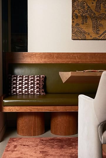
 left: design by studio roslyn, photo by lauren zbarsky | right: design by smith hanes, photo by tim lenz
OK, CLASSIC COLOR PALETTE. I see you.
The Pros: This feels like a pretty no-fail option. Like, a dusty green with wood, brass, white walls, hits of black, soft lighting, and some warm hits of color? (Maybe even some leopard, if I’m feeling adventurous.) WRAP IT UP. Let’s go home. I feel like I could have this room finished in a few days if I go this route (well, not including shipping times for the bed, but you get it).
The Cons: Green, wood, brass, white walls, and hits of black feels like the “florals, for spring?” formula for interiors. Seeing as I am a regular left-ish brained person and not some, like, creative mastermind (*cough* Brady’s famous headboard *cough*), I don’t know if I can make anything that feels really special and unique to me.
 design by india mahdavi | via vogue
I am kind of interested in this color mix – it feels a little fresher and kind of discordant (in a good way!), but I’m torn when I try to picture it in my own home. My dining room’s at the opposite end of the hallway and it’s rockin’ a pretty bold pink, green, and orange wallpaper – maybe this would be a nice balance?
Option Two: Goldenrod + Bold Blues
 left: design by beata heuman via house and garden | right: design by beata heuman, photo by simon brown, via clever
“Beata Heuman photos in a post by Caitlin? Groundbreaking,” – you, now as Miranda Priestly, mocking me. But OMG, THESE DO IT FOR ME.
The Pros: The yellow bed is probably my favorite. I think this room would make me the cheeriest, which I like (the green bed would be more neutral and calming, I think).
The Cons: Is there such thing as TOO much yellow and gold? I keep trying to imagine my dresser replacing that chair and table in the space on the left, but it’s not cute in my mind. I don’t want to feel like I’m living in that all-gold apartment in Trump Tower, you know? It’s just a big commitment to have two anchor pieces that are like, “HEY I’M YELLOW!!!”
 design by commune | photo by spencer lowell | via dezeen
 I’m in love with these draperies – I’m planning something similar to cover up that wall with my A/C unit. It does feel so happy in here, right? And if I went blue and yellow, my kitchen would have a friend! That’s nice, isn’t it?
Option Three: Cognac + Desaturated Blues
 left: design by anthony george home, photo by brittany ambridge, via domino | right: design by neal beckstedt, photo by stephen kent johnson, via 1st dibs
I dropped like, 10 pages on my love of blue and red bedrooms, so I’ll spare you here (you’re welcome). The cognac in question leans a little more orange/rust in person – Jess has the same velvet on her sofa and it’s a total stunner – but I’d still like to pair it with some smoky, desaturated blues.
The Pros: This one actually looks best in the little mockup I did. I also like that it can read as leather from a distance – it feels like a pretty responsible, flexible choice.
The Cons: Do I trust myself enough to believe that my mockup is ACTUALLY what this room will look like in person??? Am I the type of person to own a cognac-colored bed? (In my mind, people with cognac-colored beds are like, eating a nutritious breakfast in bed – off of one of those trays with legs, you know? – while wearing a really luxe robe.)
 design by emilie bonaventure | via martyn white
SEE WHAT I MEAN? All this is is missing is a bougie person in a fancy robe with a fancy breakfast. Anyway – this one’s a little more mustard-y, but I love these rosewood nightstands and am probably going to shoot for something similar (mid-century inspired, though maybe a little more regency. Maybe a campaign nightstand to tie in some brass?).
So there we have it – I don’t have a jumping-off point, so now I’m trying to make my own. Forge my own path, choose my own destiny, ALL THAT JAZZ. This all brings me to my final question: LODEN, GOLDENROD, OR COGNAC? Annnnnnd a few subsequent follow-up questions (if you have time):
What colors do you have in your room? How do they make you feel?If you’re workin’ a classic, more-timeless color palette in your house, do you enjoy it? (Remember, you’re talking to the “creamed corn and melon” bathroom tile owner over here, so standard color palettes don’t really exist in this apartment.) Is putting ~64′ cubic feet of yellow velvet next to a 6′ brass dresser a recipe for feeling like I’m inside a Big Bird costume? Is Cognac the secret responsible choice? Does anyone else have any Sarreid inspo pinned? I have found a whopping 2 (two) photos on Pinterest and am always interested to see how other people styled their space. It’s nice to have some bumpers up, you know?Is it weird that I am wholly torn and will fully be relying on your feedback to make my final choice? I have velvet samples en route but once they’re here…we’re off to the races, guys.As always, thanks for your help. Wouldn’t want to externally process and overanalyze with anyone else! Have the best weekend. But first, LET’S CHAT?? xx
Opening Image Credits: Photo by Sara Ligorria-Tramp | From: Caitlin’s Long, Dark Hallway Makeover
The post Ask The Audience: Caitlin “Purchased” The Dresser Of Her Actual Dreams But Now Needs To Pick A Bedroom Color Palette…HELP appeared first on Emily Henderson.
March 3, 2022
Design Mistake – Fireplace Edition: A Guide To Gas, Wood, Pellet, Bio-Ethanol And Yes, Even Electric Fireplaces

Remember the year when I had to design 6 fireplaces with zero experience? Well, I learned the vocabulary quickly, but it wasn’t until recently that I learned some of the implications of the type of fireplace you choose if you are renovating, because there are things that I wish I had considered earlier on and knowledge that would have changed some of my choices. So I’m going to walk you through my current knowledge of the different types of fireplaces and the pros and cons of each + my big fireplace design mistake.
 photo by sara ligorria-tramp | from: mountain house reveal: our light-filled neutral & textural living room
I’ll start with my mistake because I think it’s super important and it’s juicy. I literally had no idea I was doing anything wrong until a few months ago when I spoke with Josh Salinger from Birdsmouth and Brian Stewart from Electrify Now (I’ll call them my “home sustainability consultants”). First off, they want you to know that all fireplaces, except electric fireplaces, are not good for the environment. It’s a real bummer and I do have a case to defend the intentionally chosen and not-oft used fireplace below. But first my mistake.
For the fireplace at the mountain house, in the living room, I wanted a roaring flame but didn’t want to have to deal with wood, ash, etc. So we did the easy/fast choice – It was already plumbed with a gas line so we bought gas logs and boom, it was a gas flame with faux logs. Sounds fine, right? Well because it’s not a direct vent (with glass encasing) the heat actually gets sucked out of the room and pushed out of the chimney. It produces very little actual heat and even worse it’s just burning fossil fuels, emitting fumes into the house – lovely interior air pollution.
 photo by sara ligorria-tramp | from: our scandinavian (and easy, mess-free) holiday living room reveal + how i finally figured out my biggest styling problem… and solved it
The fact that I didn’t know that, that I cavalierly chose “gas logs” without walking through the internal and external implications tells me that clearly there isn’t enough information on the market. Y’all, there are a lot of lobbyists involved so it’s really hard to avoid misinformation. Brian and Josh both told me the same thing – it ups your energy bill while not providing heat, polluting your home, and burning fossil fuels! My gas bill the first month of quarantine when we lived there full time… was $400. FOUR HUNDRED DOLLARS. I couldn’t believe it until I tracked my behavior. I really just leaned into anything that felt cozy. I would light it in the morning and basically, it served as my own personal ambiance for a few hours a day (while the heat was on – oy). The gas companies have done an excellent job of rebranding “natural gas” as not bad to use in excess. I didn’t know. We immediately reduced the usage drastically and now only use it if we are snuggling around it or if the power goes out (it does provide some heat if you are sitting right on the hearth).
DON’T BEAT YOURSELF UP!Now before you go into a shame spiral because you are realizing that your current fireplace is also an open gas log flame heat sucker air polluter, just know that this was the norm for decades to install, done before the information was available. It’s not your fault. My advice would be not to demo it out tomorrow UNLESS you use it for heat in which case you are likely spending so much money on heat and fuel in the winter that you might want a better solution. For now, we are keeping ours at the mountain house, just using it very sparingly – like a special occasion. Remember replacing something has a lot of pre-consumer energy spent, too – it’s not always the right solution. Using less often might be a better one.
HOWEVER, if you are building or remodeling now and haven’t made your fireplace decision, consider not doing gas logs with an open flame (you’ll see your other options below). If not for environmental reasons then think of your gas and energy bill. A lot of contractors don’t know this or aren’t really thinking about it. So you are going to have to advocate for your home/bills/planet. And listen, I know that the open flame is awesome – more real looking, more romantic than gas and so much easier than wood. It felt like the perfect middle til I realized it is definitely not.
 photo by sara ligorria-tramp | from: portland project: the living room reveal
A BIG CAVEAT – I have done a ton of research but I only have personal experience with some of these fireplace types. Real information (especially the “cons”) is hard to find as so many of the articles that come up are “written” by fireplace companies. So I really cobbled together the information in hopes that it’s as accurate as possible, but please do your due diligence before making a choice. And my job here is NOT to make anyone feel bad for their fireplace choices, just give information so you can make the best-educated one for your house and family. I love having a fireplace more than most people I know. I now understand that it’s not environmentally friendly, but it’s also not really an option to not have one in Oregon in the winter in an old farmhouse. We are still deciding on what we are using where (and if our living room is grandfathered in for wood burning) so this isn’t me saying don’t have a fireplace. For those of us in long winter climates, it’s important for warmth and frankly a big winter mood booster. I just love having the information to make the best and smartest choice when remodeling. It’s like buying winter boots – we don’t need them to survive, but the right pair in the winter can certainly make a difference in your life. But if we are going to invest in boots or shoes, let’s do it with our eyes open, and don’t wear them in the summer
 design by scott horne | styled by velinda hellen and erik kenneth staalberg | photo by sara ligorria-tramp | from: the new design rules
Oh man. It’s kinda hard to beat. It’s a true crackling, romantic fireplace that makes the house feel insta-cozy and “MAN” has been obsessed with sitting around it for centuries, understandably. It’s nature’s television and no one has ever been bummed to sit around one.
The Pros: It’s the best flame, it produces a lot of heat that warms your house and shadows that dance around (ambiance and romance is at a 10). You don’t have to deal with installing a gas line or a high bill in the winter if you use it a lot. The wood is really affordable to burn (especially if you cut your own). It is not a fossil fuel and you don’t have to buy an actual fireplace thus making it less of an initial upfront investment. I also love that there is zero tech involved. No electricity, no remote, nothing to date the house.
The Cons: Actually making a fire from scratch isn’t always easy to start or keep going – it requires some time, skill, maintenance, kindling, etc. So much so that you might not do it very often as it might not be worth the work. It also creates ash which you have to clean frequently and chimney maintenance/care. And lastly, the smoke is bad for both your interior pollution (especially if you have asthma) and exterior air pollution (different than burning fossil fuel, but still if we all did it it would be very smoky outside). Also, chimney cleaning and repair can be expensive and high maintenance. And yes, of course, you have risks of catching your house on fire (This just happened to Rachel Ray). So technically it’s less safe.
Also just logistically you might not be able to install a wood fireplace NOW, per state codes. I think it’s more of a question of if you have a working wood-burning fireplace should you keep it or convert it to gas (this is truly a personal and lifestyle decision – see above and below).
Log Lighter: AKA Real Wood Logs, With A Gas “Assist” design by ashley coelho | styled by velinda hellen and erik kenneth staalberg | photo by sara ligorria-tramp | from: the new design rules
This is an exact combo of both gas and wood, and the pros and cons are kinda obvious. This is a fireplace that looks like a normal wood-burning firebox (it is) that burns wood, but it is plumbed so that natural gas can be turned on (via a key) and lit (with a lighter or match) to start the fire. It’s a big rush of flames that you keep on for 2-5 minutes or until you feel confident that the wood has amply caught fire. We recently stayed in two houses that had gas assists to help start the wood fire and honestly we LOVED IT and it might be changing our mind about our wood fireplace.
The Pros: Smell! Ambiance! Real Flames! And if I didn’t mention it above, wood fireplaces with real wood are the prettiest fireplaces visually to look at (no metal or glass obstructions, or faux anything). Now you still have to put in a gas line and for the minutes you are “assisting” you are burning gas, but it is way less gas than leaving it on the whole time. Once it’s started you get all the pros of a real wood fire (see above for those pros). It’s easier than building a normal wood fire, just as pretty and doesn’t use gas the whole time, and provides great heat.
The Cons: You still have the gas line, gas burning, gas bills – (same gas fireplace, see below) but just far less of it. But you also have the same risks of a real fire, and the maintenance of the firebox and chimney (see real wood fireplace cons). The wood doesn’t chop and stack itself, so you still have to make sure to buy and store dry wood logs. And check your state laws and codes – in a lot of states you can’t install a wood-burning fireplace, only direct vent gas or enclosed wood stoves. So this might not even be an option for you.
Gas Insert Into A Wood Firebox (AKA Converting Wood To Gas) design by renovation husbands
This is likely what many of you remodeling or updating older houses (not building or a huge remodel) are searching for. You keep the fireplace structure and dimensions but essentially add a more shallow gas “insert” to convert it from wood to gas and then you buy gas logs, not real wood. It would turn off via a switch or remote.
The Pros: These are easy to use, will heat the room, and are not complicated or expensive to install. You will still need to bring a gas line over and the expense is determined by how far it is away from your gas meter. You get the ambiance and the heat that you want from a fireplace without having to buy/store wood or build a from-scratch fire. You can usually control the level of flame and the heat.
The Cons: There are a lot that look super fake (not like that pretty one above from Heat & Glo). If you are in a traditional style home get the real logs, not the blue crystals, please. You are still burning gas so be frugal with when you have it on.
Gas Fireplace – Direct Vent photo by sara ligorria-tramp | from: mountain house reveal: our calm scandinavian master bedroom
I have two direct vent gas stoves at the mountain house and seriously love them both. If you are building new or renovating extensively, like we are at the farm, this is likely your best option for heat, ambiance, ease, and budget. You build the fireplace with the specs of your “gas firebox” in place. You choose the style and color of the firebox, the surround, the logs and its installed as a unit.
The Pros: Great heat. We turn ours (by switch or remote) on level #5 for 15 minutes and the room is WARM. If we want less heat and less usage, we might leave it on flame height 2 or 3 for 30 minutes. It provides enough heat that you can’t leave it on for long which is fine – you heat the room to a comfortable temperature then flip it off. These burn gas, but at least they provide great heat. They can look really nice (I love ours) and are just super easy to use. When the power went out we used it for heat and it did such a great job – it is an electric ignition (most are) but you can disable it and light it with a lighter since it’s still natural gas. These aren’t crazy expensive – they do need to be near an exterior wall or go through the ceiling to use exterior air to circulate. Also, “direct vent” means that there is glass and it doesn’t pull air from your house (losing air) NOR emit fumes into your house – it’s totally sealed up. You still need a vent outside, but not a typical chimney so you need an exterior wall or to go out the roof. These are a great option if you are renovating enough to create a larger firebox, not just converting a wood fireplace to gas with an insert. Some of these can be in a typical fireplace frame with a mantel, etc, and others could be in a stove (We are getting both for the farm from Heat & Glo and I am SO excited).
The Pro/Con: The logs don’t look like real wood logs, but so many look pretty great, and for the convenience and ease, many find it worth it and opt over wood (we have).
The Cons: Not real wood, for those of you who are purists. They run on natural gas which is a fossil fuel. See below on how I’m rectifying this in my brain.
STAY AWAY FROM “NON-DIRECT VENT”A word about non-direct vents: Listen, I’m not a scientist but from what I’ve read (and what common sense tells me) you need to have a vent in order to not pollute your home when burning gas. You can buy these online as some sort of convenient alternative but don’t. Many fireplace stores won’t sell these, actually. They aren’t safe (again, from what I’ve read).
Gas Stove Style Fireplace – Direct Vent design and photo by jaegersloan studio | via remodelista
This is the same as a direct vent gas fireplace but shaped like a stove – a freestanding metal box with a “flu”. I haven’t used one before but am likely in the family room of the farmhouse.
 design by christopher howe and jonathan rhind | photo paul massey | via remodelista
The Pros: Same as above: Super convenient, ease, heat, very little maintenance, and real flame ambiance. It’s a real middle ground of ease + good ambiance/heat. They are safe (no access to flame or fumes) and they also take little to no electricity to burn. These can be pretty small and come in a lot of different colors and styles (old-fashioned or super mod) so are easy to integrate into any design. I think these are a great solid choice. They will still heat a LOT so you can’t just leave them on for ambiance or your house will be TOASTY but great to warm up the room and then be comfortable.
The Cons: The glass can get hot and they run on natural gas.
Wood Stove Style Fireplace
 left: design by christian siriano, photo tim lenz, via architectural digest | right: design and photo by our food stories, via devol kitchens
 I love a wood stove, especially if there is a glass front. I’ve never bought or used one and I think there are a lot of codes around them. I’d imagine they have the same pros as wood (above) but provide a ton of heat through the actual surface of the stove (so like not near kids). I would be careful to put one in now as they are crazy hot (we almost burned our house down when we were little).
Electric FireplacesOK. So this is what many environmentalists will say is the future and in many ways I get it – it cuts out any fossil fuel burning. There are many areas, neighborhoods, and houses that aren’t tied into a gas line so this is your only option. And that’s ok!!! I’d rather sit by an electric fireplace than none at all and I’ve seen some in more contemporary new builds that were nice. I’m actually super curious if any of you have the Hollis model that is carried at Crate & Barrel and Pottery Barn because it is SO CUTE. But here you go – my opinions on the electric fireplace.
Wait – What Are Electric Fireplaces?
 via pottery barn
They are relatively new and the technology is still improving every year (thus my hesitation). There are a few different technologies employed to create the “flame” but mostly water vapor/steam with colored lights. If that sounds like a Halloween decoration to you, you aren’t totally wrong. Some of them do look like that (thus my hesitation to full-on recommend them) but others can be a good solution for ambiance without gas.
The Pros: No gas lines or burning of fossil fuels. It DOES provide some heat (not a ton) and ambiance (just don’t look it in the eye). The free-standing stoves or fireplaces that are integrated into a mantel or piece of furniture are movable, so you have some flexibility as to where you want to put them (they just plug into a wall outlet). I’ve never had one so I honestly can’t talk too much about them functionally, but when I’ve been in rooms with them I’m glad they are there but I’ve wished they were gas or wood.
The Cons: These don’t look like real flame, which can be fine for a restaurant wall (for ambiance) or a contemporary loft, but for an older home (like the farm) I fear that they would date it immediately and look cheap. We shopped for one – I was determined to do the “right thing” so I dragged Brian to a couple of stores, but even the higher-end models that I saw in person were a fast “hell, no”. Now I haven’t seen a lot of these in person because since they are relatively new to the market, so many of the “best” aren’t in store yet but there MIGHT be some out there that are good!!!
My advice? Buy this one – The Hollis and wait a few years for this to all shake down – technologically. I would be scared to permanently install a cheap one OR invest in an expensive model knowing that the technology might get so much better and then replacing it would be HARD. Get one that is movable so that should the technology get wildly better and you want to replace it in 10 years you could still move it into a less used room (even a kid’s room or dining room would be nice). I will say this – I think that electric fireplaces are the wave of the future, but I don’t know if we are there yet so I am personally wary to invest in the current technology in a permanent way in my home. Now in the victorian house or in our barn (which we might turn into a studio for the next few years), I could totally see it going there with less regret/ramifications as we need heat and sure, some ambiance. But again, I fear it would it’s too new of technology to install so permanently into an old farmhouse.
Pellet Fireplaces
 via decoist
Again, NO EXPERIENCE HERE, so I feel odd even writing about pellet stoves, but it is a new alternative that is not a fossil fuel and is a newer option that people are talking about.
The Pros: It’s electric so way fewer emissions and you can set and leave it with a controlled temperature all day. Also, the actual pellets are usually made from recycled wood waste and burn cleaner than regular wood which is also a great perk.
The Cons: Because it requires electricity it will go out if the power goes out so you will need to get a generator if you want to avoid that. They are also apparently more expensive to buy (but less expensive to install. They do require a direct vent or a chimney system). Lastly, they need to be cleaned more often.
Bioethanol Fireplaces design by delia kenza interiors | photo by sean litchfield
I’ve never used one so I have zero experience, but I have done a decent amount of research (although most of the “studies” or articles are by fireplace companies that sell it). You probably need a quick explanation of what this even is before we get into the pros and cons. Bioethanol fireplaces are a new option on the market touting the most eco-friendly title. They run on fuel made from wheat, corn, sugar, starch so they are proposing that it burns really clean, emitting nothing dangerous at all into your home, despite no chimney or venting. They are pretty modern so shoving one into an old farmhouse doesn’t feel right, but for a new build or a more contemporary/postmodern space it could be an option.
The Pros: They do provide heat although it’s unclear how much – is it just warmth or if your electricity was out would it heat the room? You don’t need a chimney, venting, or gas lines so you could literally just buy one and shove in a room that needs warmth/ambiance (there are many freestanding versions). It is a REAL flame, unlike electric fireplaces so it dances, produces shadows, etc.
The Cons: It’s new and therefore under-researched for long-term safety both with combustibility and emissions/fumes, IMHO. I saw one study where it was concluded that it did emit dangerous toxins into the room, but then I realized that it was a study done by a wood lobbyist which is hilarious. Another con is that currently they look uber-modern and are harder to integrate naturally into more traditional or older style homes. It doesn’t burn a fossil fuel (that we know of as of now) so it is technically environmentally friendly, but I don’t know, when it comes to burning anything I think there are ramifications – like how do they make it in the first place? Is that process friendly? But the biggest con to me is the cost of the fuel – it’s $110 for 4 gallons, which is about 60-70 hours worth of fire (It took me a while to do the math on that one, I don’t think it’s a well-publicized con). You might think that 64 hours is a lot, but in the middle of winter if you are chilly and wanting to watch a movie with it on, you’ll go through that in a month easy. Assuming you only use it 6 months a year, it could still add up.
So there’s all my fireplace shame and research bundled up nicely into one post. I hope this was helpful and if anyone has any more info please share with the class! Just remember to be kind. We are all still learning which makes these conversations and we handle ourselves in them that much more important. xx
Opening Image Credits: Photo by Sara Ligorria-Tramp | From: Mountain House Reveal: Our Light-Filled Neutral & Textural Living Room
The post Design Mistake – Fireplace Edition: A Guide To Gas, Wood, Pellet, Bio-Ethanol And Yes, Even Electric Fireplaces appeared first on Emily Henderson.
March 2, 2022
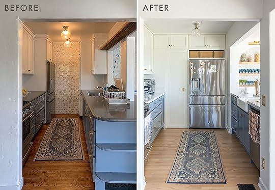
A Galley Kitchen Remodel That Doubled The Size And Function (With Some Big Help From Actual LEGOS)

My husband Mark and I went on our first date when I was a sophomore in high school, and he was a senior—almost 19 years ago! While it may be true that I didn’t even know how to drive a car at the time, what I did know is that I had found a good thing, and I saw no reason to let it go. We’ve stayed together through high school and college and beyond, getting married, having kids, growing up, and evolving as a unit.
 at our senior prom, circa 2005
Much in the same way that we have remained committed to our very first loves, we both fell in love with a “starter home” duplex we bought together with my now-sister-in-law in 2009. The house, which was built in 1939, hadn’t had many major upgrades since the 1970s. Each unit was one-bedroom, one-bath. The yard lacked any landscaping and was a literal urban jungle of many strange artifacts (animal bones, buried doll heads…) and weeds. But with the help of my contractor father-in-law, we were able to bring a couple of condemned staircases up to code, add in central air and heat, and in true fixer-upper cliché fashion, we pulled up ancient carpeting to reveal original red oak flooring underneath. About a year later, we added on a primary bedroom and bathroom, giving us more ample square footage and room to grow.
We both grew up in the Valley but ended up in Silver Lake by a combination of fates, one being that it was still rather inexpensive to buy here. (My fellow Angelenos likely spit out their coffee upon reading this—knowing that the median home price in our neighborhood now hovers somewhere around 1.4 million.) I truly hadn’t spent much time in Silver Lake prior to moving here. I suppose it could have gone the other way, but as it turned out we quickly fell in love with this neighborhood. Our home is perched high on a hill, overlooking much of the city with a particularly good view of the Hollywood sign, the Griffith Observatory, and the Silver Lake Reservoir (the “lake” for which Silver Lake was named).

Kohler Faucet | Knobs | Pulls
But back to our house‚ which even with the addition was still quite modest in size—about 1,200 square feet. Things felt a bit smaller when my daughter, Eden, was born in 2014, and a bit smaller still once our second baby, Arlo, was born in 2017. But of course, the walls really closed in on us once COVID hit. It was now, as we spent months huddled up inside as a family of four, that we started to feel we had a decision to make. Either we begin to look for a larger space in a less expensive area, giving up that billion-dollar view and all that we loved about our neighborhood, or we allow our home to continue to grow and evolve with our family. I had complained about our galley kitchen for years, but suddenly cooking 21 meals a week and nurturing a newly acquired sourdough bread baking habit, the need for a bigger kitchen became much more urgent. Taking advantage of the historically low-interest rates, we refinanced our home, taking enough cash out to cover a kitchen remodel while only modestly raising our monthly mortgage payments.
 the galley kitchen, before
With my contractor father-in-law as a resource once again, we were able to come up with a layout and design without hiring an architect. My father-in-law drilled many, many holes in our walls to find out which walls were structural, and Mark used our kids’ LEGO blocks to build 3-D models. We figured out that we’d be able to reuse almost all of our old cabinets and appliances, which meant we had a little more budget to allocate toward the fun stuff (in my opinion, at least) like countertops and light fixtures. The last time we renovated, my father-in-law was still working full time, so our project took the backseat to his paying clients and mostly came together on weekends. He retired a few years ago, however, which meant he was able to be extremely hands-on this time. He hired laborers for the demo and subcontractors for things like our flooring, electric, and plumbing, but he was there working basically every single day over the course of two months. He even personally built the new cabinets we needed! I lucked out in the in-law department for a myriad of reasons, but this is definitely one of them.
 lego modeling
Runner (sold out) | Cane Basket | Woven Baskets | Counter Stools


 eden enjoying her first walk-in pantry, which is now a favorite hiding place for both kids
While it turned out there was a structural column in the kitchen we did have to keep, we were able to move one side of the kitchen from the inside to the outside of said column, taking the kitchen from galley to U-shape and almost doubling it in size. This meant that we were also able to add a small walk-in pantry with a pocket door (something we never had before!). We barely lost any countertop space and gained some serious square footage in the kitchen! All thanks to playing around with LEGO blocks…
 our back wall before (you may notice, we also re-stained our floors during the renovations)
Goblets (vintage) | Picture Light | Florish Sconce
We were also able to push our back wall out a couple feet onto our deck, and while a structural support column remains from the old wall there as well, this meant we could install folding Panoramic Doors along the entire length of the wall, something we had talked about doing for years. This opened our entire back wall up to our deck, for a truly dreamy indoor-outdoor living situation. I will share that the Panoramic Doors were not cheap. These doors slide along a track and then only flip out at the end, which means that, unlike typical bifold doors, they do not encroach upon your deck space until the very end of the track. The doors ate up about half of our entire reno budget, but I have zero regrets there. We enjoy them every single day.


Florish Sconce | Kohler Faucet

Countertop and Backsplash | Knife Block | Pastel Knives
When it came to fixtures and finishes for the kitchen, I played around with a Pinterest mood board that ended up evolving into a whole PowerPoint presentation, and also consulted Sarah Sherman Samuel via The Expert toward the end, when I felt like I could use a professional opinion on things. We chatted on Zoom for less than an hour, but it was extremely helpful! I totally recommend that as a great option for my fellow amateur designers who love the hands-on process of designing their own space, but still have a few questions or need a second, more experienced, set of eyes. I sent Sarah my PowerPoint ahead of time so that she could look through it if she had time, and then came prepared with a set of questions I was still pondering: “Will an arched shelf work in our space, if we don’t already have arches in our home?” and “Should I do a tile backsplash or have our countertop slab continue onto the backsplash?” She gave me her opinion and reasoning behind each answer and suggested some specific products that were still TBD—like a plug-in pendant light for over our dining table. (I somehow hadn’t even thought to look at Urban Outfitters for that! Ours is sold out, but they still have a great selection.) I also just wanted to make sure she didn’t see any red flags with the design we had planned (luckily, she did not!).
 the beginnings of the arch

My favorite design element is the open arch shelf. I love a good arch and was excited to see that idea come to fruition. My husband and father-in-law originally doubted the idea since arches were not already an “architectural feature” in our home, but everyone ended up admitting I’d been right about that one. (Plus, Sarah was on my side!)


Here are some before and afters:


If you’re curious to see more of the process, I saved a “Renovations” highlight on my Instagram profile. And of course, I am more than happy to answer questions.
P.S. We also may be looking to do a home swap in London for a few weeks in July, so if you might be interested in trading spaces and coming to L.A., feel free to let me know!
*Design by Ilana Saul
**Photos by Stephanie Todaro
The post A Galley Kitchen Remodel That Doubled The Size And Function (With Some Big Help From Actual LEGOS) appeared first on Emily Henderson.
March 1, 2022
The New Crate & Barrel Collection Is Giving Beach Vacation Vibes And We Are Here For It

Crate and Barrel’s new modern and mindful coastal collection does not come to play. Never has a collection embodied a relaxing beach retreat as much as this one does. Every piece oozes simplicity and understated elegance, so I can’t help but think of an extended coastal vacation (preferably in Greece). You can tell each piece was thoughtfully crafted, and many of the products featured are made from FSC ®-certified wood from forests that are responsibly managed to be environmentally sound and socially beneficial. We love to see big brands shift towards sustainable practices so with that good news, let’s get to our favorites from the collection:
Calypso Glass and Natural Wood Cabinet
When I first laid eyes on the collection, I was immediately attracted to this cabinet. I love the chunkiness of the wood, the asymmetrical cabinet doors, and the light and airy elm wood finish. It’s both modern and timeless which is not easy to achieve. I can see this in a dining room stocked with vases and dinnerware or in a living room displaying collections of books, sculptures, and other curated decor pieces. I will also, I am sure, be seeing it in my dreams.
Twist Ash Rotating Desk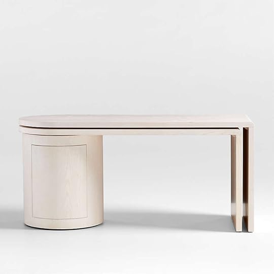


I’ve loved this desk ever since Jess chose a version of it for her MOTO (Makeover Takeover). It’s probably the coolest desk I have ever seen because it doesn’t scream “desk”. In fact, the shape and round hidden cabinet storage are unique on their own, but please note how both sides twist outward from the center so they can be angled, straight, or nestled. It’s so versatile and can be a focal point in a room which is hard to achieve with an ordinary desk.
Nichols Chair
One theme I saw over and over in this collection is the emphasis on organic lines and textures, hence the modern coastal vibe. The rounded angles of the Nichols Chair are so inviting and the rounded block base makes it a contemporary statement piece. Oh, and did I mention it swivels??
Terra Natural Oak Bed
I know I have a pretty bold and eclectic style but when it comes to bedrooms, I always find myself drawn to very minimal, neutral designs. So much so in fact, that I have been searching for a simple wood bed frame for my own bedroom. I am drawn to less busy, more comforting, and calm bedrooms so this bed frame really speaks to me. The shape is simple and to the point, and the natural grain of the oak is stunning and timeless.
Terra Natural Oak End Table File Cabinet

This chunky block file cabinet is the perfect companion for the above bed. It is also made of oak but I like how the grain differs from the bed frame so it wouldn’t look uniform, just complementary. The square legs are a refreshing shift from the taper legs we see everywhere and the lack of hardware is minimalism at its finest.
Juni Bleached Ash Dining Chair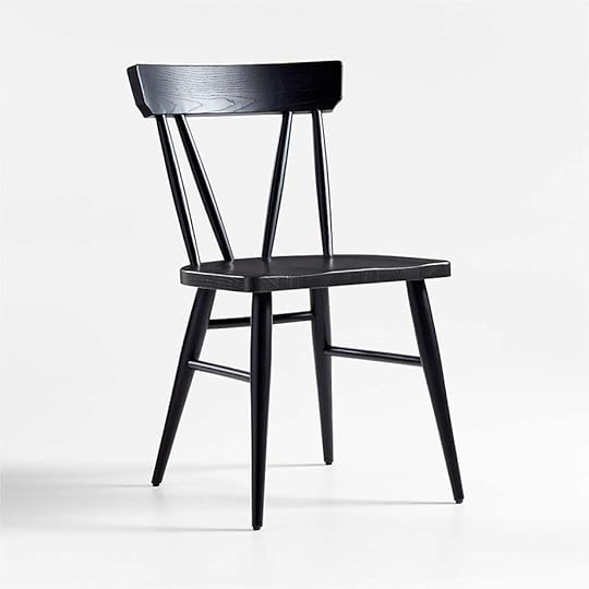

This entire collection is giving me so much inspiration for my parent’s dining room makeover. They want a modern-farmhouse-meets-california-casual refresh and these dining chairs are really speaking to that for me. The black option would be a great contrast for a neutral dining room, but I have to admit, the light bleached ash tone is stunning. This is what I would call a perfect dining chair.
Mercer Blue Rim Dinner Plate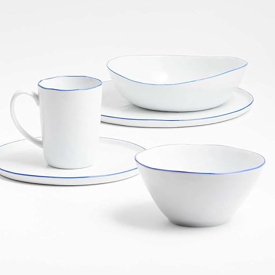
I never thought I would say this about dinnerware, but look at those curves! Again, organic lines reign supreme in this collection. The porcelain and blue trim detail make this collection feel refined and rustic, so it could be used every day or for special occasions. I vote for every day but that might be because I am ready to replace my goodwill coffee mugs with something a little more elegant.
Large Woven Floor Vase
Floor vases are grossly underrated. Sometimes, you just need a stand-alone piece that looks good on its own and this is it. The woven detail would be a great addition to any room and is a great vessel (pun intended) to add texture.
Remi Natural Linen Table Lamp
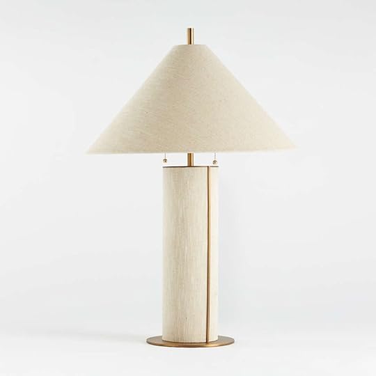

If there’s one thing I will take away from this collection, it’s that I want to see more linen table lamps. In a neutral room, you want to add a lot of textures to the mix and a linen lamp will certainly add an unexpected texture. I also love the brass finishes which add a layer of elegance to such a simple piece. The more I look at it, the closer I am to clicking “add to cart”. The question is, do you prefer the bold blue version or the simple white? I’ll let you vote on that below.
Katin Wood Centerpiece Bowl

This bowl is so simple but SO good. I love the very subtle block pattern and the low pedestal. Like so many pieces in this collection, it marries chunky block shapes with then lines and I just can’t get enough. This one I might actually add to cart and BUY.
Alright folks, those are our top 10 picks but if you haven’t stalked the entire collection, you must do so here and let us know your favorites down below. Happy shopping! xx
Opener Image Credit: via Crate & Barrel
The post The New Crate & Barrel Collection Is Giving Beach Vacation Vibes And We Are Here For It appeared first on Emily Henderson.
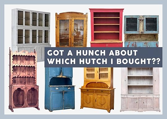
Farmhouse Update – My New Antique Hutch From Sweden, Some “Rules” Of Mine That I’m Breaking, And Y’ALL THE SHOPPING HAS BEGUN
When I moved to New York at 21 I had been exposed to zero good design. I thrifted and garage sale-d my way through Coos Bay Oregon, and I DIY’d a lot for 4-H but that’s where anything home decor related started and stopped. This is before the internet. No Pinterest. Small town America in 1980 wasn’t dripping with trends outside of coloring a blue square on the back of your white sneakers to pass as Keds because your parents refused to buy them. We drove to Eugene, 2 hours away to go prom dress shopping (which is hilarious as it wasn’t a fashion mecca – it simply had an Express). So when I moved to New York after college and started assistant styling (aka shopping and decorating sets for a living) I had a huge learning curve of what was “good”. If you’ve never shopped for a club chair before how do you discern a “cool one” from a “generic one”? With my narrow exposure, I liked a LOT of things – all of them really – as they were all new to me at the same time (thank god Cindy, my boss/mentor guided me and told me where to shop). My apartment looked like a vintage/thrift store threw up – I just loved it all. But now, I stare at the internet all day every day and I know where every chair is from. I’ve literally seen them all and the more affordable it is, the more “everywhere” it will be AND THAT’S GOOD! I appreciate how the internet has democratized good design and exposure for everyone. But when you’ve seen the same _________ over and over and over it becomes simply less exciting to you, and that’s ok and to be expected. A chef doesn’t want to cook the same meal that they’ve tasted a million times even if it’s delicious – they want to create their version of it. And listen, there is something comforting about seeing the T-shirt you have from J. Crew being worn by Natalie Portman – it’s a nice validation. But for the red carpet – everyone wants their dress, their look to be unique and unrepeatable. It’s part of pushing ourselves creatively and our homes are a display of our style and personality so understandably the deeper you get into being a designer, the less you can/want to just “throw a room together” with stuff off the internet.

 same esters chair | photos by sara ligorria-tramp | left from: final la living room reveal | right from: mountain house living room reveal
Now there are some things that I LOVE regardless of how much I’ve seen them like the esters chair, my schoolhouse quilt, a Noguchi lamp, etc, etc. When you find a gem that works over and over and over you keep it. While shopping I have found really good dining chairs, coffee tables, nightstands, etc at big box stores that I love, but I’m just not willing to pull the trigger YET because the guttural excitement isn’t there. I’ve simply seen it too much or, I’m ABOUT to see it so much (likely because it’s really good and priced well). And again, THAT’S OK. I’m not saying I won’t buy those things if needed (I’m likely buying a set of dining chairs you’ve seen for decades for our sunroom), but right now as I’m in the early stages and not desperate for anything, I’m waiting for my stomach and wallet to agree, and when my stomach freaks out about something – I know that it’s good. I usually do a big intake of breath and my heart pounds. Then I show it to Brian and if he loves it (often without showing him the price) then I let myself seriously consider it.
So on my quest for uniqueness (ha) I’ve only been pulling triggers on vintage pieces because by nature of being vintage, they are barely or rarely repeatable (and more affordable than custom – the other choice designers usually go for). Of course jokes on me as most big box stores just literally do the cheap version of the OG 1970s Scandinavian maker that I’m stalking and then sell for 1/100th the cost. But that’s ok, too. And after dealing with customs on a few pieces from Scandinavia I’m frustrated enough to try to find it within the states. That’s all to say that I have started buying vintage pieces and I thought it would be fun to do a show and tell on one very special piece.

So I’d like to introduce you to my new old hutch. This lady was built in 1870, from Sweden, and is 100% pine, with original paint on it (that is quite patinated and faded as you can see). I actually broke a rule of mine which is don’t buy something just because you love the finish as the finish can always change, the shape you often can’t. And listen, I do love the shape (simple/classic) but it’s that aged bright blue that absolutely GOT ME. OH, it’s just so perfect. It’s bright but since it’s old and faded it doesn’t feel too bold to me. And even if in person it is much brighter we all know that blue is the “bright color” that feels almost like a neutral to me. Both kids have requested more color in this house than and living in Oregon, I’m drawn to having more color as well. I will still likely lean more neutral than bold, I’m slowly pulling triggers on some pieces that are indeed colorful.

I also broke another rule of mine which is “know where it’s going to go before you buy”. But here’s the deal – I have four different places it can go. And one of my OG rules from styling was “pretty always looks good next to pretty” which may not always be true, but that’s what stylists tend to do – not “design a room” but collect awesome stuff and put it together. This hutch could go one of two places in the living room, in my writing room/sunroom (on the solid wall) to house office stuff for me or servingware, in the upstairs landing as a linen closet, and I’m not above putting it in a bedroom. If it would fit in a bathroom it would be awesome. I even thought about integrating it into the custom pantry that we are having made, but you can’t put this baby in a pantry. NO.

So the annoying part is that I don’t have it yet – it’s stuck in customs. Y’all customs paperwork is annoying and while it’s not a deal-breaker, it’s a true Achilles heel for me. I hate paperwork to the point of it being debilitating. It’s why I don’t have a car (a new lease – I just can’t do the paperwork) or a lawyer (WME’s lawyers look over my larger contracts, but otherwise I just sign anything in front of me). It’s a huge part of adulting that I fail at and thankfully have people (Caitlin) to ensure that I’m not signing away my life. So I tried to do this myself, but kept getting it wrong and finally sent it all to my accountant who also does my bookkeeping, HR, and will handle anything in the “annoying paperwork” realm, for a fee, obviously. But you should be warned that buying from Europe will A. take a couple of months and B. make you track down paperwork you likely have filed away as a normal person but I don’t. Also, I’m sure mine is trickier because I bought it under my business so I could write it off which made it more complicated. I’ll let you all know when it comes.
So How Much Was It?She wasn’t cheap and honestly, it’s one of those things that I might have been able to find at Round Top Texas for $1500, but I pulled the trigger because I couldn’t stop thinking about it and picturing it in our home. I saw it styled out in future shots, that burst of patinated blue making me so very very happy. Also, it’s not lost on me that buying vintage is green, yes, but shipping from Europe is NOT. But I’ll use and appreciate it long term. It was listed for $2700 and I offered $2250 which was accepted by the dealer. It cost $1200 to ship from Sweden which was to be expected. So all in, it was around $3500. It does coincide with my rule on what to splurge on – it’s NOT the functional sofa (there are so many great affordable ones these days – see this roundup and review) and it’s NOT the dining table you eat at every day. No, I splurge on conversation pieces, furniture, or decor that makes your/our house unique and for me, that’s likely something vintage or custom made. A piece like this elevates everything else near it – so you can mix it with normal internet-famous big box furniture and it just makes it look cooler. IMHO
So that’s where I’m at and I’m feeling really good about it. xx
Opening Image Sources: Chairish and 1st Dibs
The post Farmhouse Update – My New Antique Hutch From Sweden, Some “Rules” Of Mine That I’m Breaking, And Y’ALL THE SHOPPING HAS BEGUN appeared first on Emily Henderson.
February 28, 2022
Clever Organization Hacks – A Linen/Guest Closet And The Smartest Vanity Org Products
When we first brainstormed for organizing stories I ranted about my biggest pain points in the mountain house – (the ‘no mudroom entry’ which we already covered) followed shortly by two more – my lack of a proper linen closet, and my exploding products in the vanity. You’ve seen it on my stories, likely – and it’s nothing to be proud of, but it’s also just the reality for those of us who don’t have the right systems or products to meet our more “challenging” personalities.
So these two projects were inspired by my struggles, styled with 100% Target (not my old sheets or products like you saw in stories since we already moved) to give you an idea of what you could do if you also have these issues.
A “Custom” Guest Room + Linen Closet, Without Any Nails Or Screws
Big Cubby Shelf (coming soon) | Queen Linen Blend Quilt Mauve | Reversible Printed Voile Ditsy Floral Quilt Off-White | Bed Pillow | Suitcase | Duvet Cover (on bed)
It’s so simple and yet full of clever ideas. We used the simple white cubes with linen bins to store linens for each room – I’M DOING THIS FROM NOW ON. Each bin is one room’s sheets/pillows and backup sheets pillows. You might have more flexibility, but likely if the beds are different sizes you want them labeled or put in a bin so you aren’t guessing just to be wrong. Up top, we stored any extra blankets, seasonal linens (Christmas/easter tablecloths), and pillows.


Horizontal Shoe Shelf (coming soon) | Vertical Shoe Cubby (coming soon) | Large Woven Milk Crate | Short Rectangle Basket | Large Navy Travel Pouch | Green Loaf Bag | Black Dot Pencil Case | Steamer | Lint Roller | Round Multi Weave Rattan Tray | Black Sneakers | Red Slip Ons | Tan Mules | Black Leather Mules | Woven Water Hyacinth Rectangular Basket
The system is totally modular so you can customize how you put it together, and yet once stacked to your liking it looks custom and intentional. The more horizontal shelves with the linen bins act as drawers for your guest, while the shoe cubbies give them somewhere to unpack those should they be that type of person. It’s such an easy system that once set up is simple to repeat and maintain.


Felt Hamper | Pink Waffle Towel | Underbed Fabric Bin with Lid | Silk Eyemask | Light Pink Pajamas | Graphic T-Shirt | Racerback Tank Top| Tie Dye T-Shirt | Fabric Bin with Lid Light Grey
The basket on top holds any other guest personal items (cosmetic bags, for instance, and Emily B even included a steamer and lint roller (I want to be her guest).
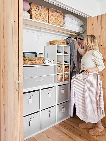
Hangers | Striped Shirt | Black Striped Shirt | Black Pink Shirt
I was extremely excited to hear that we didn’t have to return these samples to Target and I got to keep this system. I feel like a better human being already to offer this to our guests as well as keep it so organized. This could also be great for toys, seasonal clothes like sweaters/snow clothes.
[image error]How To Organize Your Exploding Vanity
Vase | White Branch Stem | Soap Pump | Candle | White Wood Tray
It always looks good from the outside, but for me, without any organizational tools, it always was exploding, especially since quarantine where I stocked up on all things ‘self-care’ and have more products than usual. We shot this in our guest bathroom, but you get the idea.

Wood Handle Tiered Slide Out Organizer (coming soon)
So satisfying. Here’s why this works:
We used all the same basket, black metal with wood handles, just in different sizes and functions. We dedicated certain baskets to ‘every day,’ ‘backup,’ ‘hair product,’ ‘hair tools,’ and ‘cleaning supplies’. The system on the left is removable, so the top ”every day’ basket can be pulled out to use on the counter then stored back on the shelf. So genius.

Bottom Left Drawer: Black Metal Tumbler | 3pk Medium Green Storage Trays | Polish Remover | Olive & June Nail Buffer | tenoverten Non-Toxic Nail Dryer Drops + Vitamin E | tenoverten Nail Polish – Clif | tenoverten Nail Polish – Austin | tenoverten Nail Polish – Jane | Trim Cuticle Nipper | Black Metal Tumbler | Sonia Kashuk Professional Complete Brush Set | Milani Cheek Kiss Cream Blush | Honest Beauty Luminizing Glow Powder | Jason Wu Beauty Hot Fluff Lipstick | Benefit Cosmetics 24hr Brow Setter Clear Eyebrow Gel | JAPONESQUE Extreme Eyelash Curler | NYX Professional Makeup 3-in-1 Eyebrow Pencil | NYX Professional Makeup Jumbo Eye Pencil All-in-one Eyeshadow & Eyeliner Multi-stick | Pixi by Petra Eye Reflection Shadow Palette Natural Beauty
Top Right Drawer: Acrylic Drawer Bin | Native Sensitive Fluoride Natural Toothpaste | Native Limited Edition Holiday Sugar Cookie Deodorant | Toothbrush | Black Metal Tumbler | Hey Humans Body Lotion | Sun Bum Mineral Spray Sunscreen
Bottom Right Drawer: Odele Volumizing Shampoo | Odele Volumizing Conditioner | Odele Smoothing Shampoo | Odele Smoothing Conditioner | Anomaly Deep Conditioning Treatment Mask | Hey Humans Body Wash | Kristin Ess Weightless Hydration Daily Scalp + Hair Mask
The two-tiered system is designed to fit on the left side of the plumbing, which works well in most vanities. Again the top acts as a shelf, with the bottom more of a pull-out drawer. The little plastic bins are designed to work so well with this (and come in different colors). The larger pull-out drawer is perfect for well, larger products. You’ve got options!

Counter Basket: Hydrating Watermelon Sheet Mask | Fruit Enzyme Pineapple Sheet Mask | Vitamin C Cherry Sheet Mask | Urban Skin Rx Vitamin C + E Glowing Moisturizer | Versed Day Maker Microcrystal Exfoliator | Versed Skin Soak Rich Moisture Cream | Cocokind Resurfacing Sleep Mask | Cocokind Probiotic Acne Serum 1.5% BHA | Gua Sha Tool | Cotton Rounds | 4pk Small Green Storage Trays | Pixi Clarity Cleanser | Versed Back-Up Plan Acne-Control Body Mist | Sonia Kashuk Lip Scrubber | Sonia Kashuk Rose Quartz Roller | Sonia Kashuk Facial Dry Brush | Cocokind Organic Rosewater Facial Toner | Versed Baby Cheeks All In One Hydrating Milk
The basket on top of the “shelf” (as we styled it) is for your everyday routine so that you can easily pull out and then store neatly – not a million products on your vanity top (true story). It has handles that make it easy to transport and the shelf system was designed to have room for tall things on top in most vanities.

Top Left Basket: Black Wire Basket | Mrs. Meyer’s Lavender Liquid Hand Soap Refill | Rustic Palo Santo Candle | Cider and Oak Candle
Bottom Left Basket: Black Wire Basket | Seventh Generation Toilet Bowl Cleaner | Grove Co. Reusable Cleaning Glass Spray Bottle with Silicone Sleeve – Bright Lime | Grove Co. Reusable Cleaning Glass Spray Bottle with Silicone Sleeve – Polished Gray | Grove Co. Reusable Cleaning Glass Spray Bottle with Silicone Sleeve – Sparkling Orange | Grove Co. Multi-Purpose Cleaner Concentrates – Orange & Rosemary | Grove Co. Glass Cleaner Concentrates – Orange & Rosemary | Grove Co. Tub & Tile Cleaner Concentrates – Citron & White Rose | Ultra Strong Citrus Tall Kitchen Trash Bag
Top Right Basket: Black Wire Basket | Welly Flex Fabric Bandages Block Geo | Multi Salon Clip Set | 4pk Small Green Storage Trays | Scunci Barrettes | Kristin Ess Dry Finish Working Texture Spray | Kristin Ess Weightless Shine Leave In Conditioner | Phone Cord Hair Coil Set | scunci 2cm No Slip Jaw Clips | Kristin Ess Satin Skinnies | Cantu Style Carbon Fiber Combs
Bottom Right Basket: Wood Handle Tiered Slide Out Organizer (coming soon) | Conair Double Ceramic Hair Dryer | Kristin Ess 3-in-One Flat Iron
I love how they all work together, you can see through the wire so you know what you have, but it still looks cohesive. The ‘hair tool’ basket is also a drawer unit which means that you can use it as a shelf if need be.

Greenery With Rustic Ceramic Pot
On top of the toilet, Emily Bowser created the loveliest assembly of feminine needs – which Target all sells, which I kept and am so proud to offer to our guests. It has all the needs – Ibuprofen, feminine wipes, panty liners, and tampons (all earth-friendly). Yet discreetly displayed Let’s make this more normal, kay?

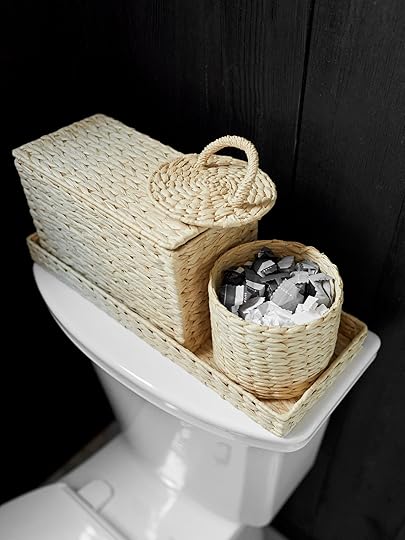
Rectangle Woven Basket with Lid | Woven Canister | Woven Vanity Tray | Cora Organic Cotton Tampons Mix Pack | Cora Organic Cotton Ultra Thin Super Fragrance Free Pads with Wings | GoodWipes Flushable Down There Rosewater Cleansing Wipes | Room Spray Brown, Vetiver and Cedarwood | Ibuprofen
We styled out the rest of the bathroom with some new products that we love.

Bath Rug | Chambray Shower Curtain | Waffle Bath Towel Set | Medium Scallop Basket
How cut is that basket??? The vanity tray, vase, and faux branches are also excellent for styling and look really high-end.

I always use January to reorganize my whole house and reset, and I know I’m not alone. I hope some of these tools, products, and ideas can help you guys feel a little more in control, reduce the chaos in your life and make your home and brain calmer after the holidays. Happy organizing. xx
*Art Direction by Me
**Photos by Sara Ligorria-Tramp
***Styled by Emily Bowser
The post Clever Organization Hacks – A Linen/Guest Closet And The Smartest Vanity Org Products appeared first on Emily Henderson.
February 27, 2022
The Link Up: The Coziest $17 Sweatshirt Birdie Won’t Take Off, A $12 Practical Home Upgrade, Plus Some Ways To Help Ukraine

The events that have occurred this week are absolutely terrifying and heartbreaking. We are saddened by the devastation that has hit Ukraine and will be sharing some resources throughout this post for ways we can do our part and help. Our hearts go out to the people that have been so tragically impacted by this, and we’re watching very closely with hopes this gets resolved as soon as possible. We’re sharing our regularly scheduled link up this week, but know that our hearts are with the people whose lives have been lost and those who are amidst a very scary and devastating environment. Here are some ways we can help:
Revived Soldiers UkraineThis organization funds medication and medical supplies for field and army hospitals at the front lines of eastern Ukraine. Revived Soldiers Ukraine was founded in 2016 and has since brought 50 wounded Ukrainian soldiers to U.S. hospitals for care. Donate here.
SavelifeSavelife is a nonprofit that provides material and technical assistance to the Armed Forces in Ukraine, as well as indirectly influences the Armed Forces and other state institutions, strengthening the capabilities of the army and developing society as a whole. Donate here.
Voices of ChildrenVoices of Children helps children affected by the war in eastern Ukraine. Thanks to you, we provide psychological and psychosocial support to children. It helps them overcome the consequences of armed conflict and develop. Donate here.
International Medical CorpsThe Los Angeles-based organization provides emergency relief to those struck by conflict, disaster, and disease. When an emergency has ended, the organization shifts its response to long-term medical support and training. The organization has been operating in eastern Ukraine since 2014, delivering primary healthcare and mental health services to communities affected by the ongoing conflict. Donate here.
Direct ReliefThe Santa Barbara-based organization distributes donated medicine and medical supplies. Direct Relief has supplied Ukrainian healthcare providers with more than $27 million in medical aid. It recently sent a large shipment of diabetes supplies and is offering its Ukrainian partners IV fluids, antibiotics, medications for anesthesia, sutures, and cardiovascular medication, among others. Donate here.
Thanks to everyone for donating and helping out. For more ways to donate head here or here. Now, on with some links.
This week’s home tour is an incredible home renovation by the Novogratz pair. They did a gut-reno to an incredibly charming and historic Spanish home in the Bird Streets of the Hollywood Hills (THE DREAM). They leaned heavily on the modern, while keeping some traditional Spanish elements of the home, and all in all, it’s very beautiful. If you have Dwell+ here is an article that shows more before/afters. What do you think?
From Emily: My kids really like to be cozy (as represented previously by their obsession with their “cozy blankees“) so when I brought home this quarter zip 3 weeks ago Elliot immediately put it on and hasn’t taken it off. It’s not just fleece on the outside, but super soft on the inside so it’s like wearing a “cozy blankee” (I hate it when the inside has annoying seams or is just normal fabric). She also loves that there are thumb holes (like mine). I paid full price ($30) but it’s down to $17 now (we went for the light pink colorway). Not sure if it’s going to last years, but she sure is getting a lot of wear out of it right now (and with kids’ clothes, “lasting years” is often impossible anyway).
From Ryann: I finally bought myself a silk pillowcase and will never look back. In case you didn’t know, sleeping on a silk pillowcase is better for your skin and hair and prevents breakage. They are also just very comfortable and feel good on your skin. My only fear was a silk pillowcase doesn’t really go with my bedding but I came up with a solution. I simply keep that pillow in the closet until it’s time for bed! This way it stays clean and far away from my dog and his paws, too.
From Jess: I might be the last breast owner to have tried a sheer bra but now I am on the train. This bra from Target has been my gateway. It’s so pretty but simple and I just love it. I have the burgundy color but now want it in a couple of others:)
Also From Jess: One of my best friends, who was born in Ukraine, has been posting about some incredible organizations that support Ukrainians in this horrifying/extreme time of need. I know it’s easy to feel helpless but there are some ways we can all actively be of assistance. Here is a link to a comprehensive guide with direct links and here is an Instagram post with other great organizations to support. If you’ve been paying attention at all you know how dire this help is needed.
From Caitlin: I have finally discovered a product that lives up to the hype: these un-shreddable, un-snaggable, super sturdy sheer tights. There’s truly a fit for everyone – they carry footless styles, colors, high rise, semi-opaque options, and more. (My personal favorite is actually the polka dot sheer, which are currently more than 50% off. THEY’RE SO CUTE.) They’re more expensive than a regular pair of tights, but these puppies DO NOT RIP. I can’t wait to wear them for the rest of my winters, springs, and falls:)
Also From Caitlin: On Our Watch is an NPR podcast that lifts the curtain on internal police investigations in California. It’s pretty tough to listen to – I could only stomach an episode a day – but it’s a pretty extraordinary piece of journalism. Policing is a pretty polarizing topic, but there’s no “gotcha” angle here – just really insightful, heartbreaking, thorough reporting. Highly recommend.
From Mallory: A very simple $12 purchase has made my life at least 12% better on a daily basis. Maybe 20% even. We all have that one outlet that’s located in such a convenient spot that it gets used and it gets used HARD. I was tired of not having enough space to plug in Chase and my laptops, apple watches, and other random stuff that seems to always need charging at once so I went powerstrip hunting (wow that’s some real adult shit right there). And guess what? I found the one…the prettiest powerstrip I ever did see. I hate powerstrips that just dangle down from the outlet and lay on the floor, so this one is great because it holds all of your plugs up and off of the ground. It also lets you plug in up to 6 items at a time so no one’s fighting for the outlet anymore! Also, it says it’s a surge protector and UL listed so seems to be safe & I’ve been using it on the daily and I’m in love.
Opening Image Credit: Design by the Novogratz| Photo by Amy Neunsinger | via Tatler and Dwell+
The post The Link Up: The Coziest $17 Sweatshirt Birdie Won’t Take Off, A $12 Practical Home Upgrade, Plus Some Ways To Help Ukraine appeared first on Emily Henderson.
February 26, 2022
Winter To Spring Transitional Outfits We Want To Wear Right Now

Not to pull back the curtain too much, but a lot of our posts are born from the things we would want to read. So the other day at a team lunch, we were sitting outside while it was 55 degrees (freezing by our standards) and we were talking about winter to spring transitional outfits. I often forget that layers are a thing, and I will go from full winter clothes to wanting to wear denim shorts and a tank top just to protest cold weather. But transitional outfits are indeed a thing and the key is layers. So we thought it’d be fun to pull together some winter-to-spring looks to inspire ourselves and you.
So who wants to play imaginary dress up?? I’ll start.
Ryann
1. Marieta Top | 2. The Siena Tank | 3. Stan Ray Painter Pant | 4. Stan Ray 4-Pocket Shop Jacket | 5. Square Toe Leather Boots | 6. Line Dangle Earring | 7. Initial Necklace | 8. Organic Ono Ono – Multi-Benne Stain
I fully love men’s utility pants and especially love wearing them with feminine pieces. For my first imaginary look, I chose these painter pants and matching shop jacket, and a fitted tank top layered under this mock neck that I have been coveting for quite some time. For accessories, I am very into these western-style boots, a gold initial necklace (from this new brand that I LOVE), drape-y earrings, and a bold lip. It’s taking a lot of restraint to not click purchase on every one of these items.

1. Marquise Linen Dress in Micro Polka Dot | 2. Brenna Over-The-Knee Boots | 3. Badass Iconic Lipstick | 4. The Long Mac Coat | 5. Medallion Pearl Necklace | 6. CZ Lock Huggies | 7. Wave Ring
My more dressed-up look is inspired by the tall boot trend and this photo that I saw on the internet. I’ve been wanting to experiment with trench coats too, so why not throw that in the mix. All the jewelry is from this Black-owned jewelry brand, Ten Wilde, that I can’t get enough of. They make really elegant, unique, and actually affordable jewelry and I want basically everything. The dress is by the brand Sleeper that makes the most beautiful pajamas I have ever seen but they also make sweet prairie dresses like this one. The boots are something from my dreams (and a splurge) but boy are they beautiful.
JessI always say (or at least think) that I want more fun colors in my wardrobe but have only kinda been successful at it. So despite my desires, I realized that I’m simply not a natural at actually putting together outfit looks that are in line with how I want to dress. Hence why putting these two outfits together took me a comical amount of time. But honestly, I’m really happy with them and really want them on my body ASAP. Practice makes perfect? Or a little better at least?

1. Denim Faux Shearling Trim Jacket | 2. Iga Personalized Pinky Ring | 3. Basit Ring | 4. High Rise Dad Jeans | 5. Daelyn Lug Sole Short Boot | 6. Satin Lace Top | 7. Battenberg Cardi | 8. The Sydney Zip-Top Crossbody Bag | 9. The Gidi Chain | 10. Initial Lock Necklace | 11. Romee Necklace
So with this “casual look”, the fun is in the details. Those shearling cuffs and collar on that denim jacket are so cute (and the darker denim makes it a great nighttime jacket too). Then I’ve been eyeing those jeans for a minute and might just do it. They look so cool, are high-waisted and rigid denim which I’ve really been wanting. Pretty over the stretch. Anyone else? The next thing I fell for was that sweater (#forevercheckered). It’s hip but not too in your face with it and since it’s a cardigan, I thought that pretty pink satin cami could be a great pop of color if I wanted it unbuttoned or have it be a great “night” option where you could just ditch the sweater if I wanted to feel a little sexier. Can you say layers?? I also love that cute yellow crossbody (I wish I liked clutches but I hate having to carry them) and those boots are riiight up my alley. They aren’t necessarily a “night shoe” but with a quick change, this is easily a day-to-night outfit. Oh and let’s not forget the jewelry! I love necklace layering and all of these pieces are SO GOOD. I am also a ring lover but somehow I misplaced my collection (or they got stolen) on my last big trip in 2019. Needless to say, I need to replace them because I miss wearing them.

1. Sherpa Jacket | 2. Iga Personalized Pinky Ring | 3. Basit Ring | 4. Melody Leather Crossbody | 5. Shoko Sweater | 6. Essential Chelsea Boots | 7. Strappy heeled sandals. | 8. The Gidi Chain | 9. Harris Reed Star Crossed Pearl Necklace | 10. Romee Necklace
Let’s dress up but still keep it casual. I’m not fully at the point where I’m really dressing it up for super fancy parties or outings. But I do love to dress up a little and wearing a dress is my way of doing that. I have loved this dress for soooo long. I ordered the sleeveless version last summer but it was the wrong size and I decided that I didn’t really need either at the time. So I didn’t exchange it despite my heart wanting me to. But I will say the quality is incredible and it has a great weight to it. Welp, I might have talked myself back into it. Oh, and can you tell I love denim shearling jackets? I like how this one is a little longer and a lighter wash for springtime. Now, if I wanted to wear this outfit for a more casual day or night event I would choose those blue boots. See, color! But for something a little fancier, I really love those green heeled sandals (which happen to work perfectly with that cute little green bag that looks like it can actually hold the essentials). I did switch out one of the necklaces to dress this look up. I love all of the jewelry from that brand.
Mallory
1. Sweater | 2. Gold Ring | 3. Gold Ring Set | 4. Asymmetrical Jeans | 5. White Booties | 6. Dope Leather Jacket | 7. Bucket Bag | 8. Gorjana Necklace
Ah, welcome to the look of my dreams. I’d feel like a billion dollars walking into a lunch date dressed like this!! Also, who do I think I am to put a $600 leather jacket in here? I’m just a girl who’s been wearing a $90 leather jacket for 7+ years and it’s officially shedding its leather so I’m in the market for a new one and a girl can dream OKAY!? And this one is truly perfect. I’ve been eyeing checkered sweaters like this ever since I saw Julie and Sara wearing one that they bought from a local LA boutique that was unfortunately out of stock (I looked!!). This one is very affordable and I’m obsessed with it…hoping they get more sizes in soon (or if you know of any similar ones please comment because I’m ready to add one like this to cart). I’ve been eyeing these Urban Outfitters boots ever since we did the tall boot post (these are the short version of one of the tall boots in the roundup). Lastly, the asymmetrical jean trend is one I am ready to hop aboard on. What do you think?? And I heard Abercrombie has made a comeback (especially in the denim department!). Oh and PS I have this necklace and wear it ALL the time!
1. Balconette Bodysuit | 2. Ring | 3. Gold Ring Set | 4. Pants | 5. Shoes | 6. Earrings | 7. Blazer | 8. Clutch
This one is certainly the ‘risker’ look out of my two outfits. I’ve been SUPER into this font-slit pant style but have yet to buy a pair of my own because it feels like a big commitment for a trend that will go out of style eventually (especially since it’s more of an ‘occasion’ look versus the more everyday but still very ‘trendy’ asymmetrical jeans in the last look). The lace bodysuit is SO cute (I’ve been eyeing it for a while and even tried it on at the Fleur Du Mal store!) It’s very comfortable and good quality, plus it’s beyond flattering for all kinds of body types (both of the employees there were wearing it when I came in). I’m in love! Overall though, what do ya think of this look? Would you wear this risky but cool outfit or something similar??
Caitlin
1. White Top | 2. 9″ Rise Skinny Jeans | 3. Swing Coat | 4. Heart-Shaped Purse | 5. Boyfriend Bold Chain Necklace | 6. Gumball Pearl Ring | 7. Floral Flats | 8. Lip Color
Those shoes were my jumping-off point – they’re SO. FREAKING. CUTE. Kate Spade keeps targeting me with ads and let me tell you – they’re working. I’m a sucker for a super dark wash jean, an oversized white top, and those two pieces of jewelry are already my go-to daily pieces. I even own the purse already (thanks, mom, for nailing it this Christmas)! I’m obsessed with Jennifer Diederich’s quick escape coats – I splurged on one last year and know that it’ll keep making me smile for years to come. This one is expensive, but it’s so timeless and cheery – I’ll be saving up to add it to my closet this year!

1. Collared Mini Dress | 2. Rattan Woven Bag | 3. Clogs | 4. Lip Color | 5. Pearl and Diamond Necklace | 6. 3 Ring Set | 7. Oversized Rattan Barrette
First off, let me sing the praises of the long-sleeved dress as a transitional piece. I don’t know how they keep me SO much warmer than their short- and 3/4-sleeve counterparts, but there’s some magic going on there. Plus, if you’re extra chilly, just throw a bodysuit or leotard of choice on underneath. MAGIC. Beyond that, these clogs are my current go-to pair of shoes – they’re loud (appearance-wise) but super comfortable, and they look awesome paired with a similar red/pink dress I own. I’m going through a huge rattan accessory phase right now, too – this bag and barrette are so fun. And in case you’re not familiar, The Lip Bar’s products RULE – this liquid lipstick is only $14 and it blows my Mac Russian Red + NARS Cruella outta the water. (They’re also a Black-owned business! Check them out!)
Well, I hope was as fun for you as it was for us! Here’s to hoping we all are more prepared for the winter to spring transition. xx
Opener Image Credit: Photo by Veronica Crawford | From: New Fashion On My Body: The One Where I Dressed Like A Fisherwoman, Wore 6 Great Coats, AND An All Star Pair Of Boots
The post Winter To Spring Transitional Outfits We Want To Wear Right Now appeared first on Emily Henderson.
Emily Henderson's Blog

- Emily Henderson's profile
- 10 followers

