
Danny Dorling's Blog, page 25
October 6, 2018
Heavy price paid for war in Afghanistan (letter)
The 17-year war has been a costly disaster, deepening the country’s crisis and helping to spread violence across the region and beyond, say actors including Mark Rylance, MPs including Imran Hussain, and other campaigners
Guardian Letters, Fri 5 Oct 2018 16.39

Afghan civilians hold pictures of the victims and damage caused by US airstrikes, during a protest in Kunduz, Afghanistan. Photograph: Najim Raheem/EPA
This weekend marks the 17th anniversary of the US coalition’s invasion of Afghanistan, triggering a war that has lasted four times as long as the first world war.
Some 3,546 Nato soldiers have been killed in Afghanistan, 456 of whom were British, while a conservative estimate suggests 217,000 Afghans have died as a direct result of the fighting.
During each of the past 17 years, Afghanistan has continued its descent into poverty, violence, environmental degradation and instability. It is one of the poorest countries in the world, and one of the most dangerous.
Donald Trump has increased US bombing and, therefore, civilian casualties have risen too. The July 2018 UN assistance mission in Afghanistan (Unama) report described fatality rates in early 2018 as being “the bloodiest on record”, at an average rate of 28 Afghan civilian casualties per day.
Despite this, and the fact that neither the US nor the UK have a plan for Afghanistan, more British troops are joining 15,000 US and 6,000 other Nato forces in Afghanistan.
Like all the other recent western military adventures, the war on Afghanistan has been a costly disaster, deepening the country’s crisis and helping to spread violence across the region and beyond. We demand that the UK government withdraws its military and instead concentrates on helping to bring stability and peace to Afghanistan.
Mark Rylance
Actor
John Pilger
Journalist
Emma Dent Coad
MP
Jonathan Edwards
MP
Ben Lake
MP
Caroline Lucas
MP
Angus MacNeil
MP
Imran Hussain
MP
Liz Saville Roberts
MP, and Leader of Plaid Cymru’s parliamentary group
Hywel Williams
MP
Chris Williamson
MP
Kevin Courtney
Joint general secretary, NEU
Lindsey German
Convener, Stop the War Coalition
Murad Qureshi
Chair, Stop the War Coalition
Maya Evans
Co-ordinator, Voices for Creative Non-Violence
Kate Hudson
General secretary, Campaign for Nuclear Disarmament
Mairead Maguire
Nobel peace laureate
Miriam Margolyes
Actor
Kika Markham
Actor
Jemima Khan
TV, film and documentary producer
Francesca Martinez
Comedian, actor and author
Andy de la Tour
Actor and author
Victoria Brittain
Author
Danny Dorling
Professor of Geography


September 30, 2018
So, when was this series of “periodic bad winters”?
The author of a recent BMJ editorial claims that: “In summary, the general deceleration in mortality improvements in many high income countries since 2010 has been compounded by periodic bad winters.“
ONS have reported the deceleration to be greater in the UK than all other 20 affluent countries they compared, with the sole exception of the USA. In many of those countries there was no deceleration and, in some, an actual acceleration of previous improvements. The Conservative MP Robert Court and others responded to this news by suggesting a natural plateauing was occurring and that there are many complex factors at play including cold winter weather since 2010.
In the winter of 2011/12 UK “temperatures in the UK were 0.9 °C above the 1971-2000 average.
In the winter of 2012/13 UK temperatures were “0.4 °C below the 1981-2010 average.” However, note that the baseline had change (to 1981-2010), and the largest rise in excess deaths had not yet begun by 2012/13.
In the winter of 2013/2014 UK temperatures were “0.5 °C above the 1981-2010 average.”
In the winter of 2014/2015 UK temperatures were “0.2 °C above the 1981-2010 average.”
In the winter of 2015/2016 UK temperatures were “1.8 °C above the 1981-2010 average”
In the winter of 2016/2017 UK temperatures were “1.3 °C above the 1981-2010 average.”!
In the winter of 2017/2018 UK temperatures were “0.2 °C below the 1981-2010 average”. However, in the December of that winter, when that year’s rapid rise in deaths began: “temperatures 0.4 °C above average”.
So, when was this series of “periodic bad winters”?
I am a professor of Geography. I understand how to measure the weather.
I sincerely hope my colleagues from epidemiology, social statistics, public health, social policy and virology will help explain what else in this article needs to be questioned. But for a start, please let us know when this series of periodic bad winters in the UK began and when it ended during the 2011-2018 period?
Danny Dorling
School of Geography and the Environment
Oxford University Centre for the Environment
South Parks Road
Oxford, UK.
Read more and link to a PDF and the original response in the BMJ here.
Or listen to a rant given at the Oxford literary festival on the many excuses presented for the unprecedented peace-time rise in mortality in the UK:
September 27, 2018
Dying quietly: English suburbs and the stiff upper lip
The English suburbs are dying. Years of austerity have slowly changed the landscape. Poverty is now common in the suburbs. Since 2014 life expectancy has been falling across most of England, especially in the suburbs. Now infant mortality rates are also rising year on year (unlike anywhere else in Europe). In hindsight it is not surprising that the majority of suburban English people voted Brexit, most noticeably in the Home Counties. Middle England is understandably angry. No more fortitude in the face of adversity and the hiding of emotions. The stiff up lip has slipped. Change is in the air.
The New Suburbs
Mustn’t grumble. Mustn’t make a fuss. England’s suburbs are slowly dying and changing. The elderly are now dying faster than before (Figure 1). Cuts to meals-on-wheels, social worker visits, day centres, bus routes, post-offices and many other suburban staples have hastened their exit. The few elderly in densely packed terraces living nearer the centre of cities can more easily look out for each other. In old age it is in the suburbs, far away from your children (if you had children), that you now much more often live and die alone in England.
The mantra that there is no such thing as society, just families and their children, rings both true and hollow in the suburbs. The suburbs are becoming places in which the elderly who have not quite made it into the best-off echelons reside. Not rich enough to decamp to idyllic villages, to private health care and eventually an exclusive retirement complex, those who did well, but not exceptionally well, face an isolated suburban old age. Their grown-up children live in another suburb far away, or have not yet escaped the central city and renting – still waiting for the inheritance that is their ticket to suburbia.

Detail from an original artwork by Joseph P. Kelly
The suburbs are changing more quickly today than they have changed in decades. The centres of cities are increasingly reserved for the young, the successful and those who can afford to avoid long commutes. Out of town villages are where the very affluent go when they age – the idyllic cottage in the country, ideally with one of the few remaining village schools nearby, geographically reserved for the children that England’s upper middle class now have so very late in their lives. The most successful hop over the suburbs when making their jump from Notting Hill mews to North Oxfordshire cottage; from dinner parties to country suppers.
England accommodated its loss of empire by accepting rising economic inequality. After the 1970s the country as a whole became relatively poorer in comparison to the rest of the world and with most of Europe, but in the 1980s, 1990s and noughties those at the top took a greater and greater share of the pie each year. As they did so they took more and more from the poor and from suburban middle England, from the places where the majority lived, the places that saw progress stall.
Loft conversions in the city and barn conversions for a few in the countryside contrast with a spreading mediocrity for the majority in what had been the great suburban new hope of the 1930 to 1970 era. The suburbs were supposed to be safe. The suburbs had been where life’s winners went. Suburban schools were ‘good’, suburban jobs were plentiful and well paid. Suburban doctors were not over-worked; hospitals were accessible – always there for when you needed them; until the money began to run out and the waiting lists began to grow.
The money began to run out in the 1970s. After that decade there was less and less building of new suburbs. Home building had fallen from a UK peak of around 400,000 new units a year in the 1960s to around 200,000 a year by the 1980s after which it never recovered and slumped further after the 2008 crash. As of August 2018, levels of building are still below 200,000 a year despite the now huge pent-up need for more housing in the most overcrowded places.
At first there was little complaint from the suburbs where house prices rose and rose and homeowners began to think they were becoming richer and richer; but the real riches were being made by those who could lend huge sums to aspiring home-owners, or who could buy and then rent out property. And older homeowners were not “doing well”. In early 2018 the worse rise in mortality in England and Wales was seen since that of the Second World War….
Read more here including open access to the full paper in the journal Political Quarterly and the manuscript as submitted with a little more information about the USA.
Or listen to a lecture given on this subject on the day this paper was published to the Staffordshire Geographical Association in Stoke on Trent on September 26th, 2018:
September 21, 2018
You may see now (and the UK) as normal – but that badly colours how you think
I came home this evening to hear the local BBC news begin with the headline ‘Oxford hospitals NHS trust suspended midwife services‘
On Friday 21st of September 2018 it was revealed that, on the Thursday evening of that week, the county’s NHS midwives had only been on duty at the John Radcliffe Hospital. All services at five other maternity centres across the county of Oxfordshire had been suspended and all home births were cancelled due to lack of midwives and other staff making it impossible to provide a safe service other than in one single place.
That day I had been showing civil servants from across the government economic service and social research groups the most recent data on rising infant mortality in the UK in recent years, especially mortality around the time of birth when access to good midwifery services that are not over-stretched is essential.
Nowhere else in Europe is falling so quickly down the ranks.
Nowhere else has seen infant mortality rise, significantly, for two years in a row now.
On the 13th of October 2017 the Official for National Statistics produced the following visualisation to try to bring the situation home.
The graphic below does not include the effect of two years or rising infant mortality since 2015 (especially rising neonatal mortality in England), but what it shows is bad enough:
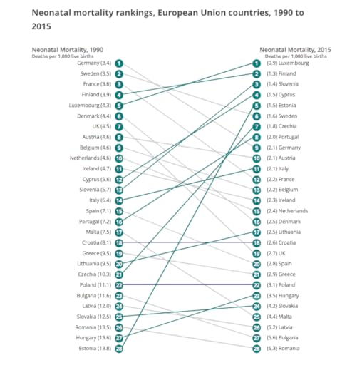
Neonatal mortality rankings, European Union countries, 1990 to 2015
When I was born in Oxfordshire the county had one of the lowest infant mortality rates in the world. It had some of the first baby incubators. A child born in Portugal had a chance of dying in their first year of life that was several times that of a child born in England. Now Portugal (and at least twenty other European countries) have a far better record.
This is what happens when things fall apart.
No excuse can be given for what has happened.
Until we accept that it is inexcusable and entirely self-inflected we will not even begin to address the worse deterioration in infant health, as well as older adult health, to have been recorded in the UK since the Second World War.
I didn’t know about the disastrous news in Oxfordshire when giving the following twenty minutes speech in London.
If I had I would not have included any jokes:
Diversity of Place:
“You may see now (and the UK) as normal – but that badly colours how you think”
A talk given by Danny Dorling at the Government Economic Service and Social Research
Annual Training Conference, 200 Aldersgate, St Pauls, London September 21st 2018
September 17, 2018
Linking mortality to the past – solving the geographical problems
Audio recording of the Keynote Lecture given by Danny Dorling at the annual British Society for Population Studies conference, Winchester, September 12th 2018
The lecture is illustrated, parts are largely speculative, but they can be understood without the slides. It includes speculation over what we might expect in future over trends in infant and neonatal mortality, especially given possible effects of the restriction to the movement to the UK of midwives and others who help maintain the social reproduction of society. I am hopeful that there might be someone in the audience, possibly now in the mid-twenties, who might think these questions are worth looking into in greater depth and better than I am able to.
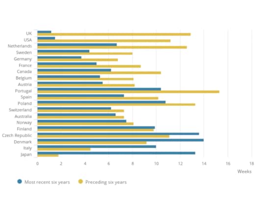
Changes in life expectancy in men in the six years up to 2016 compared to the six years before, first published by ONS in August 2018
The graph above shows the UK experiencing the slowest rise in life expectancy when averaged over the period 2010 to 2016. Since 2014 life expectancy in the UK has been falling for both men and women. Given the large rise in deaths in 2018 we should expect 2018 to be the worse post-2014 year yet when life expectancy for that year is eventually reported.
In 1994, as an overconfident postgraduate researcher, roughly half the age I am now, I gave a talk with this arrogant title at the annual BSPS conference in Durham. I thought it was then possible to explain the UK north/south divide in mortality by looking at lifetime migration patterns. In short, people in the South of England lived longer because those that did not were more likely to migrate to the North before they died, and the South attracted more healthier migrants than the North did.Today health officials tell us our woes are largely due to influenza.But influenza epidemics take this form:
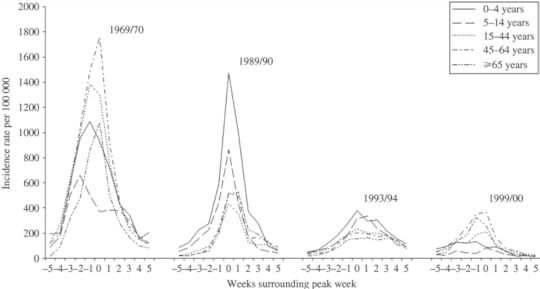
Typical length of time and severity of influenza epidemics in England, 1960-2000
In this talk I expand on earlier ideas to consider the importance of migration from and to the European mainland for trends in mortality within the UK. To what extent have mortality rates in the South of England been kept low because of the arrivals of so many young Europeans from the mainland, mostly in much better health than the incumbents, and how has the outflow of more elderly people from the South of England, especially to the European mainland for retirement, contributed to the relatively good health of Southern England?
Note: shows proportion of people dying each year in England at quarter 1 rates
Finally, how much worse would the current health crisis in infant mortality and all age mortality (shown above) have been were it not for the migration of health young people from the European mainland in such large numbers in recent years? Can the fast rise in UK life expectancy for men and women from 2004 to 2010 be partly, if not largely, attributed to that in-migration? To what extent has the rise in mortality since 2010 been caused not just by austerity, but by the rising hostile environment to in-migrants who not only helped staff our health and social care services so well, but who were also more often less ill themselves?
September 9, 2018
After the Fall [in Life Expectancy]
‘And you, my father, there on that sad height,
Curse, bless, me now with your fierce tears, I pray.
Do not go gentle into that good night.
Rage, rage against the dying of the light’
(Dylan Thomas, 1947)
Brian Ridsdale suggests that life expectancy in the UK isn’t declining so much as increasing at a slower rate (LRB Letters, 30 August 2018 ).
On 7 August the Office for National Statistics (ONS) released a comparison of mortality trends in twenty countries.
It revealed that life expectancy in the UK peaked in 2014 at 82.99 years for women and 79.25 years for men.
Both figures fell in 2015 and dropped lower still [than 2014] in 2016.
Figures for 2017 are not yet available.
The ONS report also showed that the UK and US had the worst recent record of all twenty countries.
Life expectancy is still rising in the other 18 countries that have released data for 2016.
It has been rising most steeply in Finland, Norway and Denmark for men, and in the Czech Republic, Denmark and Japan for women.
Danny Dorling
Oxford
Letter, first published in the London Review of Books, September 13th 2018 – available on line and as PDF.
For more details of the rise in mortality and the inquiries that are beginning click here.
Note: shows proportion of people dying each year in England at quarter 1 rates
September 2, 2018
Public Inquiry into rising mortality in England announced
In June 2018 the UK Office for National Statistics (ONS) released data for England that revealed mortality rates to be rising across the country. This rise in mortality rates had occurred even after having taken out the likely impact of population ageing. In other words, more people were dying and that was not because of a greater proportion of people becoming older.
On August 1st 2018 the BBC reported this news under the headline “Why did more people die in the depths of last winter?” and also announced that the Department of Health were still to announce the terms of reference of an official inquiry into the deaths although it is ‘understood they will cover areas like excess winter deaths and deprivation.’ This was not very reassuring given the much longer list of possible causes that had been published almost two months earlier in the Journal of the Royal Society of Medicine.
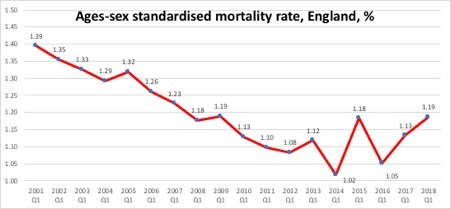
The rise marked the end of a longer period of improvement that had lasted from long before the Second World War through to around 2012. As the figure taken from the ONS report below shows, there had been the occasional very small rise before, as occurred in 2005 and 2009 .
Note: shows proportion of people dying each year in England at quarter 1 rates
Source of graph: ONS
According to the Met Office the winter of Quarter 1 2009 was the coldest since 1995/6 in England and Wales. Partly as a result of the unusual cold there was a slight rise in age-sex standardized mortality between Q1 2008 and Q1 2009. Similarly, in Q1 2005, there was a great deal of snow. More recent winters have been much warmer. There has been no unusually cold winter since at least 2011. The cold does not account for what has happened recently. It did not become very cold until late February in 2018.
The recent rises in mortality rates were also not due to influenza. As the ONS commented in June 2018: ‘influenza activity remained at medium levels throughout the whole of January and February 2018.’ No influenza epidemics have been recorded in any recent year; the rapid rise in mortality in England is not due to influenza.
ONS published analysis in June 2018 that concluded that the change in the mortality trend could be shown to have occurred between 2011 and 2012 for the age groups that were most effected. So we now know when whatever has happened began to happen.
Data is available on the number of deaths that occurred in each area of Britain in Quarter 1 2018 and Quarter 1 2016. This is the period shown in the graph above in which the greatest rise in age-sex adjusted mortality rates occurred most recently. There will also have been changes to the age structure of the population in these areas, but these are likely to be slight. The table below shows the 22 local authority districts in which at least 100 additional people died in the same quarter of 2018 as compared to 2016, and in which there was also at least a 25% rise in mortality rates.
Table 1: The areas of England which experienced the greatest
relative increases in mortality, Q1 2016 to Q1 2018
Increase
in deaths Q1 2018 Q1 2016 %rise District
129 411 282 46% South Staffordshire
125 419 294 43% West Lancashire
123 418 295 42% Preston
143 510 367 39% Huntingdonshire
182 655 473 38% Hillingdon
111 402 291 38% North Kesteven
134 508 374 36% Suffolk Coastal
117 454 337 35% Stafford
100 390 290 34% Gedling
110 431 321 34% Wycombe
171 687 516 33% Central Bedfordshire
205 883 678 30% Stoke-on-Trent
106 460 354 30% Eastbourne
126 564 438 29% South Tyneside
109 489 380 29% Waveney
123 557 434 28% Wealden
115 546 431 27% Harrogate
135 642 507 27% Bexley
100 476 376 27% Chichester
182 873 691 26% Wolverhampton
116 558 442 26% Northampton
104 512 408 25% Redcar and Cleveland
Source: ONS
The diagram below shows what the pattern of an influenza epidemic looks like in terms of severity and duration based on the epidemics that did take place in England in the winters of 1969/70, 1989/90, 1993/94 and 1999/2000. If we were to suffer an influenza epidemic this is the most likely pattern in terms of severity rising rapidly over the course of less than five weeks and then falling equally rapidly again. An influenza epidemic (in winter 2018/2019 say) on top of what has already been happening would be devastating.
The weekly incidence of Influenza-like illness (ILI) by age for a selection of the more severe epidemics over the last 40 years. Age-specific rates are for the weeks surrounding the peak week of all-age incidence (week 0)
Typical length of time and severity of influenza epidemics in England, 1960-2000
Source: Fleming, D.M. and Elliot, A.J. (2008) ‘Lessons from 40 years’ surveillance of influenza in England and Wales. Epidemiology and Infection, 136, 866-875.
By larger geographic area the greatest absolute and relative rise has been in the county of Lancashire. The table below shows in which counties and regions of England and Wales the rise has been the greatest where at least an additional 100 deaths occurred.
It is worth noting that the rise tends to be lower in areas with fewer older people, such as Inner London and some of the Northern Metropolitan Counties. The overall rise was 16% in England, an additional 20,907 deaths in the first three months of 2018 as compared to the first three months of 2016.
Table 2: The Regions England and Wales, sorted by increases
in mortality Q1 2016 to Q1 2018
Increase
in deaths Q1 2018 Q1 2016 %rise Region/County
726 4030 33,04 22% Lancashire (County)
2,259 13,992 11,733 19% EAST MIDLANDS
2,738 17,399 14,661 19% WEST MIDLANDS
2,788 17,825 15,037 19% EAST
3,519 25,105 21,586 16% SOUTH EAST
20,907 153,635 132,728 16% ENGLAND
1,395 10,502 9,107 15% WALES
2,839 21,987 19,148 15% NORTH WEST
1,100 8,662 7,562 15% NORTH EAST
2,012 16,066 14,054 14% YORKSHIRE AND THE HUMBER
2,113 17,651 15,538 14% SOUTH WEST
732 6,289 5,557 13% West Yorkshire (Met County)
859 7,411 6,552 13% Greater Manchester (Met County)
483 4,571 4,088 12% Merseyside (Met County)
1,539 14,948 13,409 11% LONDON
392 4,637 4,245 9% Inner London
Source: ONS
The table above is from the same source and shows mortality numbers rose the most in the Midlands Regions (just below Lancashire’s slightly higher relative rise). Incidentally, rises tended to be higher in areas that mostly strongly voted Leave in the 2016 referendum. Mortality rose by national average rates in the North West; but much more in more rural and older (aged) Lancashire than in urban Merseyside. The rates rose the least in London, especially inner London. Inner London has the highest proportion of migrants from overseas.
The inquiry will have its’ work cut out explaining why middle Britain was so badly hit and why almost all of England also suffered so much. The final table below shows the few areas of England which experienced a fall in mortality between these two years. A fall is what would normally be expected everywhere, and a larger fall than the very small reductions in some of the areas listed below. Finally, note that the City of London, Oxford, Kensington and Chelsea, and a tiny number of other southern boroughs and towns appeared to be the only areas of England to be almost entirely unaffected by what has just occurred and is presumably still occurring throughout 2018 and into 2019.
Table 3: The few areas of England with a
fall in mortality Q1 2016 to Q1 2018
Increase Deaths in three months
in deaths Q1 2018 Q1 2016 % rise District
-1 192 193 -1% South Bucks
-3 496 499 -1% Milton Keynes
-2 180 182 -1% Tamworth
-4 352 356 -1% Fareham
-14 326 340 -4% Haringey
-24 444 468 -5% Colchester
-28 446 474 -6% Bath and North East Somerset
-20 298 318 -6% Hackney
-11 160 171 -6% Epsom and Ewell
-18 252 270 -7% Oxford
-1 11 12 -8% City of London
-27 209 236 -11% Kensington and Chelsea
-2 6 8 -25% Isles of Scilly
Source: ONS
Read a pdf of original article here.
And a link to the July/August issue of Public Sector Focus it was published can be found here.
September 1, 2018
London’s highly inflated housing market is entering a period of equalisation
Britain in 2025 will be very different from today. London and the UK reached peak inequality in 2018. That was when income inequalities at the very top were first seen to fall. We are past the peak of income inequality today. House prices have been falling in London since August 2016. They fell first and hardest in the more affluent parts of London. Salaries near the top in London have stalled. For the highest paid chief executive officers who live in the capital they have fallen by around a million pounds per man (they have fallen a little less for the few women in such posts, but this is only because gender inequality at the top is declining).
In April 2018, the European Banking Authority revealed that there had been a 10% drop in the number of bankers in Europe being paid a million Euros in 2016 alone (from 5142 in 2015 to 4597 in 2016). Almost all of this was income lost by bankers working in London, as almost all of these bankers lived and worked in the capital. The pound had fallen; but more importantly it was almost exclusively the London banks that began paying their ‘top talent’ less.
By 2016, even before the vote for Brexit could have had any effect, London had past peak banker pay. And since 2016, it has slumped further. After all, you don’t pay somebody more in London when you are trying to persuade them to relocate to Dublin, Frankfurt or Paris.
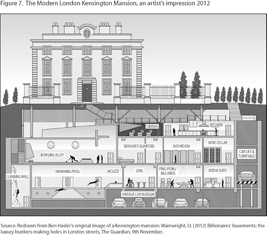
Figure 7 from “All that is Solid: The Great Housing Disaster (Penguin, 2014)
If you are a London-based architect and you were wondering why the commissions were a little thin on the ground, it is because there is less money out there than there was, and far greater uncertainty. Falling house prices is another reason why fewer people might ask you to come and redesign their ground floor and bedrooms, knock all the walls out here and put an extra basement room in there. Suddenly they start to worry about the equity. Suddenly it’s not play-money anymore. Suddenly that kitchen can last a few more years. The conservatory can wait. Let’s not buy up those two flats and knock them into one – not quite yet.
The effect of economic changes on London housing has been witnessed through history. London’s housing today mostly reflects the tribute received at the heart of the world’s largest empire. Tribute that allowed the first great underground train system to be built and metro land to expand. But as the Empire waned, and was then lost, Lonodn’s housing changed. The last time London hit a peak of income inequality was in 1913. Back then, monied families would arrive in the capital with their servants for the season. Servants lived in the basements and attics of the grand houses and the families lived in the middle floors.
Then everything changed. It was not just the First World War, or the Russian Revolution, or the agitation of trade unionist, or the rent strikes, or the women who won the vote, or the general strike, or the economic crash, or the depression – it was everything. Soon the most common job for women in England ceased to be a servant. In fact, within just a few decades there were almost no servants. And almost no gentry.
In turn London housing was transformed. By the 1960s and 1970s many – if not most – of the grand houses had been subdivided into flats to house several separate households. New housing was being built for families to be allocated on the basis of their need rather than ability to pay. Most of London’s social housing came late to the capital in comparison to the rest of England. By the end of the 1970s, housing across England was distributed as fairly as it had ever been. There was the least overcrowding and the least underuse of property. When income equality was at its highest across the UK we had the fewest unused bedrooms and the least empty property in the capital.
But then people forgot what they had won, and inequality began to rise again. During the affluent 1980s, social housing began to be sold off to tenants who, in turn, sold it on to new private landlords. Suddenly, a maisonette that had been a home to a happy family of four became the rented living space for a disgruntled single ‘professional’. Inefficiency in the use of housing increased greatly when the market was allowed to let rip. By the time of the 2008 crash, the flats had often been knocked though, and the grand houses restored, although more often than not for someone who flew in from Qatar or Moscow for the season – with their servants.

Figure 1 from “All that is Solid: The Great Housing Disaster (Penguin, 2014)
Now, the UK government is running out of money and history risks repeating itself, but never quite as before. In the past it was through introducing very high income tax that government found the monies it needed in the 1920s and 1930s as inequalities then fell. Today there will need to be new taxes, as more money is locked up in wealth than income. Property taxation is the most obvious way to tap the wealth. Council tax levies across London will one day soon be equalized, so you no longer pay the least if you live in the poshest of boroughs, and the council tax and will be extended up to band Z.
Empty homes will be double or triple taxed. Tenants will be given rights – three-year tenancies says the current (Conservative) government. This is a good first step, if they actually implement it, but it is only the first step along a very long road towards greater equality and the UK becoming a normal European country. In normal European countries private tenants have far better rights than in the UK and housing cannot be used be so many speculators. All those people who brought property in the capital thinking it is a safety deposit box for their money are about to get a rude shock.
The 1960s and 1970s were a time of young families, whereas the future more equitable London will be a London of older people and more people living on their own. That future London is today’s Tokyo or Stockholm. London’s mansion blocks will morph accordingly. They will be divided into smaller, more affordable spaces that can be owned by a more equal society in London. They will be rented out at fair renst and the quality will have to be high – not awful as is so often the case today. This raises all sorts of questions as to how architecturally London housing can be adapted.
How to you fit all the doors that are needed onto the front of the former London mansion block, to accommodate entrances to the sub-divided spaces? How do you connect them to the lifts that will be required to take people with old hips to their carved out comfortable liveable pocket of what was once wasteful decadence? And what do you do with all those subterranean basements built many floors beneath the city now? Collectively they are the height of hundreds of Grenfell towers. While we have been failing to build new social housing for those in most need, the richest have bene adding huge home cinemas and swimming pools beneath the ground. How can they be adapted to turn them into part of a real home?

Grenfell Tower, Autumn 2017
We are at the very start of what is a very positive change. We are beginning to leave a time of madness when simply owning property earnt someone more than working in a year. We are realising that the market is the most inefficient way of allocating housing. Letting the market rip leaves thousands sleeping rough on the streets and millions living in dwelling unfit for human habitation. If you want a challenge to think about take a look at Bishops Avenue, just to the north of Hampstead Heath. Take the time to walk along that road one weekend and think – what would be the best use of this space in London in the future?
—
Read a slightly shorter version of this article that was published in Icon Magazine in August 2018: here.
August 24, 2018
A Talk on Peak Inequality at the Book Fringe, Edinburgh, August 22nd 2018
In early 2018, Britain reached a peak of income inequality. The last peak was in 1913, and so much goes so wrong when inequality peaks.
The rich, like viruses, have developed resistance to redistributive taxes. They have used their wealth and power to lower tax rates and change the law. Partly to protect their offshore tax havens, they funded the vote for Britain to leave the European Union. But they also sowed the seeds of rebellion through their greed and their success.
The chasm between rich and poor has had dire implications for our health, housing, education, demography, and politics. Today more than 99% are losing out. So how do we become more equal this time? Inequality may have reached a peak, but it never falls without a fight.
Danny Dorling speaking at the Book Fringe, in the Lighthouse – Edinburgh’s Radical Bookshop, August 22nd 2018.

Danny Dorling speaking at the Book Fringe, in the Lighthouse – Edinburgh’s Radical Bookshop, August 22nd 2018.
August 16, 2018
Improving life expectancy used to be the UK’s forte – now it’s falling behind
Despite the evidence DHSC claims “..generally people are living longer.” The government’s response is not sufficient. Persistent concerns from academics, doctors, professional bodies, and public health experts have been consistently disregarded by the DHSC
Improving life expectancy used to be the UK’s forte – now it’s falling behind
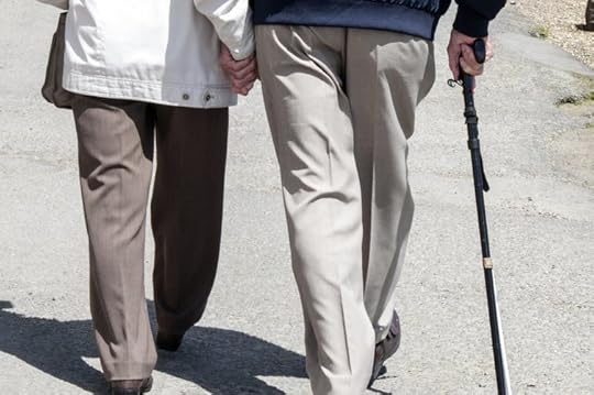 Dying younger?
Shutterstock.
Lucinda Hiam, London School of Hygiene & Tropical Medicine and Danny Dorling, University of Oxford
Life expectancy is one of the most important indicators a country can produce about the health of its population. Any deterioration in it is a marker of significant underlying societal problems.
In early August, the Office for National Statistics (ONS) produced two alarming reports on life expectancy confirming that something is very wrong with health in the UK. The reports analysed changes in mortality rates across the UK and internationally, comparing 20 countries from 2001 to 2016. They show that life expectancy in the UK increased for a number of decades before 2011, and then stalled between 2011 and 2016.
The UK and US had the slowest improvement in life expectancy of all 20 countries in the period 2010 to 2016. Prior to this, in the period 2004 to 2010, these two countries were among the top five and were seeing the fastest improvements. This is a very sudden change.
By 2016, only three of the 20 countries analysed had lower male life expectancy than the UK: Poland, the Czech Republic and the US. The other 15 are all doing better and many of them showed little or no slowdown in their rising life expectancy.
Women in the UK saw the greatest slowing of life expectancy: annual improvements reduced by 90% from 12.9 weeks to 1.2 weeks per year between 2011 and 2016 and the six years prior to that.
According to the ONS, female life expectancy at birth in the UK in 2014 was 82.99 years; in 2016 it was 82.84. (For men, it was 79.25 years in 2014 and 79.18 two years later.) In addition to the Czech Republic, Poland and the US, Germany also fared less well for women.
 Women: average annual increase in period life expectancy at birth, selected countries.
Office for National Statistics analysis of Human Mortality Database
Portugal and the Czech Republic would do better if they didn’t lose so many of their young people through migration to the UK. The influx of young, healthy migrants makes the picture in the UK look better that it really is. For example, in 2015, which saw the greatest increase in mortality in the UK since 1968, the only age group that didn’t see mortality rates rise was that aged 25 to 29 – which benefited from the largest net inflow of 60,000 migrants.
Even more recently, there has been a steeper drop in the number of non-UK nationals from the EU working in the UK, with the total falling to 2.28m by April to June 2018. As migrants to the UK from the rest of the EU tend to be young and healthy (compared to the population they join) we should expect to see this affecting the reported health of the UK in future. However, the new ONS statistics clearly show that the peak of life expectancy in the UK was reached in 2014 and has been lower since then, long before the UK voted to leave the EU, and before EU migrants stopped arriving in the numbers that they had been.
The MP Robert Court has suggested the slowdowns are simply human life expectancy reaching a natural plateau. But the data do not support this. Things are not only still getting better in some countries, but getting better even faster than before. The top three countries for improvements in recent years for men are Japan, Norway and Finland, while for women they were the Czech Republic, Denmark, Japan and Italy.
It could get worse
Worryingly, these data are so far only available internationally to 2016. The last two years, 2017 and 2018, have shown an even greater increase in deaths in the UK, with 10,375 extra deaths in the first seven weeks of 2018 alone when compared to the average for the last five years. A quarterly mortality report published by ONS in June, showed a statistically significant increase in mortality rates of 5% for January to March 2018 when adjusted for age changes of the population. These figures suggest the next report on life expectancy will be an even greater cause for concern, and the one after that will be worse again.
Read more:
Rapid rise in mortality in England and Wales in early 2018 – an investigation is needed
The search for a cause is narrowing. When exploring the increase in deaths in 2015, we proposed four possible causes: an epidemic, a natural disaster, errors with the data, or problems with the function of the health and social care system. There has been no natural disaster or environmental event. The suggestion of influenza or cold weather causing the increase in deaths is no longer a plausible hypothesis. This is not a blip, but a sustained, consistent reversal of previous health improvements. Cuts to health and social care under the guise of austerity since 2010 coincide with increasing mortality, and now not only slowing of life expectancy improvements, but for some, worsening life expectancy.
When asked to respond to the latest ONS figures, a spokesperson for the Department of Health and Social Care said: “The latest stats show that life expectancy is increasing and we are committed to helping people live healthier lives.” The response refers to the fact that overall, there was a small rise in UK life expectancy for both men and women between 2015 and 2016. Yet, when asked if the government was concerned that life expectancy in 2016 still remained below the level reached in 2014, the spokesperson said: “The number of deaths can fluctuate each year but generally people are living longer.”
The government’s response is not sufficient. Persistent concerns from academics, doctors, professional bodies, and public health experts have been consistently disregarded by the DHSC. When , people in the UK said their health was getting worse, year on year, from 2011 to 2014. Yet they too were ignored.
The poor life expectancy record of the UK between 2010 and 2016 is shocking, especially when contrasted with how fast life expectancy was improving in the six years before then. Out of the 20 countries that the ONS compared, only the US has a worse trajectory. The new statistics, and the timing of the trends, with deteriorating health occurring after 2010, suggest that the US and UK handled the financial crisis of 2008 very badly compared to countries that have had better health outcomes. The question this raises is – why?
These figures are not just numbers. They are human lives. The government can no longer ignore all those who are calling for them to act. The time for excuses and empty statements has long passed – urgent action is needed.
Lucinda Hiam, Honorary Research Fellow, London School of Hygiene & Tropical Medicine and Danny Dorling, Halford Mackinder Professor of Geography, University of Oxford
This article was originally published on The Conversation. Read the original article.
link to pdf an original post of article: here.

Danny Dorling's Blog

- Danny Dorling's profile
- 96 followers

