
Danny Dorling's Blog, page 14
August 23, 2020
Geography and the Shifting Ratios of Inequality – University, A levels and GCSEs in 2020
Why should the exam debacle of 2020 matter to Geographers? One answer is that Geography is likely to be especially affected by the rise in intake in universities that will now occur. This is because even a very small increase in people from less affluent backgrounds taking Geography at University will have a larger effect on this subject than any other in terms of university inequality statistics. More young people from poorer backgrounds will now be admitted in 2020 across the country. There may also be a knock-on effect in two years time when students with higher GCSE grades apply to university. First, a little background.
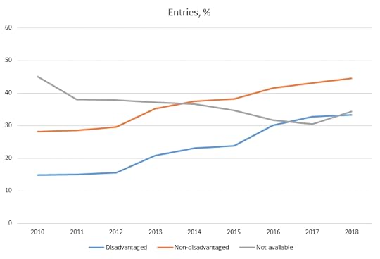
Entry into GCSE Geography study by Free School Meal Status
GCSE Geography Entry rates in England for students from advantaged and disadvantaged backgrounds (measured by proxy of who receives Free School Meals). Source and copyright: Royal Geographical Society (with IBG)
The graph above, kindly provided by Steve Brace and Catherine Souch of the Royal Geographical Society (RGS-IBG), shows that the gap in those choosing to take a GCSE in Geography in England from disadvantaged compared to advantaged backgrounds narrowed between 2015 and 2016 after Geography was included as a subject in what is known as the English Baccalaureate (EBacc) and schools were encouraged to increase the proportion of their pupils taking Geography. This came about largely because fewer children from disadvantaged backgrounds – defined here as qualifying for free school meals (FSM) – had traditionally taken Geography. However, we did not then see a narrowing in the social divides of who went on to take Geography at A level; and the social divide in who carried on to study Geography at University (which was already wide), widened further for the cohorts who took Geography more often at GCSE (up until the 2019 entry year).
The graph below is also drawn from work currently being undertaken by the RGS-IBG which shows both the expected and actual A-level uptake per FSM quintile. The data show the outcome once all other associated factors have been stripped away, with geography as a subject underperforming. This means, for instance, that although a black student living in the inner city may be much less likely to enrol in A-Levels anyway, if they enrol at all they are even less likely to enrol in geography. This obviously has implications for the longer term ‘pipeline’ when it comes to diversity in university cohorts. In the graph below the point labelled ‘Q5’ represents pupils from the fifth of schools with the income poorest students; about 2% of the pupils in such schools would be expected to take an A level in Geography, but the actual proportion is nearer to 1.5% or about 6 times fewer than from the best-off fifth of schools.
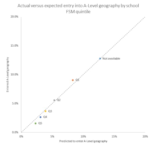
Expected vs actual entry into A-level by Free School Meal Cohort
Actual versus expected entry into A-Level geography by school free school meal quintile. This measure is taken once all other affecting factors have been removed. Source and copyright: Royal Geographical Society (with IBG)
The ratio of inequality between the quintiles can be seen to rise between GCSEs and A levels in England, up to a six-to-one inequality. That ratio of inequality then rises again when we look at who manages to enter university to study Geography. The statistics shown next are divided between Physical Geography and Human Geography because UCAS uses different course codes. Geographers have known for a long time that their subject in England has been tending to attract fewer young people from disadvantaged backgrounds than it should. Interestingly, shows that if the more physical environmental and sustainable sides of the subject are highlighted (and the word Geography is emphasised less) this bias is reduced a little.
When it comes to the study of Geography at all UK universities: in 2019 – of all UK domiciled 18 year old students who were accepted to study human geography – only 4.23% were from the poorest fifth of neighbourhoods by educational achievement as compared to 50.78% who were from the most affluent fifth of such areas (areas which are also home to the most private school pupils). Or, to put it another way, an educationally affluent 18 year old was 50.78/4.23=12.00 times more likely to be accepted to study human geography than a poorer 18 year old in the most recent year for which data is available.
Of 86 other mainstream subjects studied at any UK university, no other has a ratio of social inequality by entry as high as Human Geography had in 2019 – the year before the pandemic. The respective figures for Physical Geography were 6.49 and 41.59 or a ratio of 6.41 (very similar to the A level ratio). That is better, but still not normal for university access in the UK. For studying Mathematics, the ratio was 4.64; Music: 2.71; Sociology 2.10; Social Policy: 1.03. Since this statistic was first measured in 2007 it has worsened, with Human Geography’s social inequality ratio being highest in 2019. If we combine the two sides of Geography the ratio becomes 8.72, less exclusive than Economics but more than European Languages (see table below).
So, what will happen following the debacle of 2020 when both GCSE results and A level results were awarded on teacher recommendations (thankfully) rather than by algorithm? My guess, and at the moment is this:
More young people will study Geography at University in 2020, or with a place deferred until 2021, because more will have been awarded the A level grades allowing them to do this
Almost all the students from the most advantaged fifth of areas would have been going to University anyway so this increase in grades across the board will narrow the access inequality ratio.
The inequality ratio in 2020 for Geography may well narrow by more than most other mainstream subjects as just a tiny number of additional students can alter the ratio so much.
Human and Social Geography (“L7”) is very unlikely to top the list in 2020 when the equivalent figures to those shown in the table below are calculated by UCAS.
Next in the pipeline: more students will stay on at sixth forms in England and take A levels given the large increase in GCSE grades awarded in 2020 (an extra 1 in 10 passing).
This will again have a disproportionate effect on Geography as, again, just a few extra students from backgrounds more likely to be awarded low GCSEs greatly alter graphs such as those above.
Scepticism over the normal work of the exam boards will grow in the coming year. It will be hard for universities to reverse this trend and ignore teachers’ views in future.
For Geography at UK universities, the tide towards greater inequality and less diversity may have turned in 2020, but to ensure it has will take more work. Admissions officers must take more note of what teachers say about pupils from schools and neighbourhoods and social groups that are traditionally at a disadvantage. Geography departments in England must make lower tariff offers to such students, as already now happens in Scotland. The alternative will be a return to the situation in 2019.
Table – 86 subjects ranked by Polar 5 to Polar 1 ratio in 2019, UK universities age 18
Rank
Polar 1
Polar 5
Polar 1
All Students
Ratio
Degree Accepted to Study in UK in 2019
1
4.23%
50.78%
95
2245
12.00
L7 – Human and Social Geography
2
4.65%
51.16%
30
645
11.00
A2 – Pre-clinical Dentistry
3
4.83%
46.90%
35
725
9.71
D1 – Pre-clinical Veterinary Medicine
4
5.15%
50.00%
35
680
9.71
Q8 – Classical studies
5
5.05%
47.05%
270
5345
9.32
L1 – Economics
5.32%
46.36%
230
4325
8.72
L7 and F8 combined (all Geography)
6
6.02%
51.20%
50
830
8.50
R9 – European Languages and Lit
7
6.54%
47.06%
50
765
7.20
RR – Combinations within European Langs…
8
6.34%
45.32%
335
5285
7.15
A1 – Pre-clinical Medicine
9
4.46%
30.36%
25
560
6.81
B5 – Ophthalmics
10
6.67%
44.10%
65
975
6.61
V5 – Philosophy
11
6.49%
41.59%
135
2080
6.41
F8 – Physical geographical sciences
12
7.21%
45.19%
75
1040
6.27
Y Combs of social studies/bus/law with langs
13
7.01%
41.82%
135
1925
5.97
Y Combs of soc studies/law with business
14
6.12%
36.05%
45
735
5.89
F6 – Geology
15
7.06%
41.00%
290
4110
5.81
L2 – Politics
16
7.60%
44.13%
285
3750
5.81
Z Combs of 3 subjects, or other general…
17
6.45%
36.13%
50
775
5.60
F7 – Science of aquatic & terrestrial environ.
18
7.27%
36.82%
80
1100
5.06
N3 – Finance
19
7.39%
35.80%
95
1285
4.84
K2 – Building
20
8.14%
37.74%
360
4425
4.64
G1 – Mathematics
21
8.51%
38.65%
120
1410
4.54
H8 – Chemical, Process and Energy Engineering
22
8.69%
39.26%
455
5235
4.52
N2 – Management studies
23
8.89%
40.00%
60
675
4.50
Y Combs of languages
24
8.65%
38.78%
135
1560
4.48
LL – Combinations within Social Studies
25
8.84%
37.83%
285
3225
4.28
Y Combs of soc. Stud./bus/law with arts/hum.
26
9.35%
40.00%
540
5775
4.28
V1 – History by Period
27
9.10%
38.40%
365
4010
4.22
H3 – Mechanical Engineering
28
8.29%
34.46%
160
1930
4.16
H2 – Civil Engineering
29
9.27%
37.86%
290
3130
4.08
F3 – Physics
30
8.84%
35.99%
205
2320
4.07
B1 – Anatomy, Physiology and Pathology
31
7.61%
30.98%
70
920
4.07
D4 – Agriculture
32
9.38%
37.50%
60
640
4.00
Y Combs of phys /math/comp sciences
33
9.38%
36.42%
380
4050
3.88
C1 – Biology
34
9.09%
34.32%
200
2200
3.78
N5 – Marketing
35
9.94%
36.77%
530
5330
3.70
N1 – Business studies
36
10.25%
37.63%
290
2830
3.67
Y Combs of languages with arts/humanities
37
9.93%
36.14%
265
2670
3.64
H1 – General Engineering
38
9.57%
33.91%
220
2300
3.54
K1 – Architecture
39
10.13%
34.97%
310
3060
3.45
F1 – Chemistry
40
10.47%
35.39%
500
4775
3.38
Q3 – English studies
41
10.07%
33.68%
145
1440
3.34
H6 – Electronic and Electrical Engineering
42
10.25%
33.50%
205
2000
3.27
H4 – Aerospace Engineering
43
11.03%
35.29%
75
680
3.20
VV – Combinations within Hist & Phil. studies
44
11.11%
34.87%
145
1305
3.14
Y Combs of phys/math with soc. Stud./bus/law
45
11.30%
34.46%
100
885
3.05
L6 – Anthropology
46
10.75%
32.64%
285
2650
3.04
C7 – Molecular Biology, Biophysics & Biochem
47
10.84%
32.79%
630
5810
3.02
NN – Combs. within Business & Admin Studies
48
9.74%
27.01%
285
2925
2.77
N4 – Accounting
49
11.84%
32.03%
425
3590
2.71
W3 – Music
50
10.70%
28.79%
275
2570
2.69
B2 – Pharmacology, Toxicology and Pharmacy
51
10.04%
26.25%
130
1295
2.61
C9 – Others in Biological Sciences
52
11.54%
29.80%
740
6410
2.58
W2 – Design studies
53
12.14%
31.07%
125
1030
2.56
C3 – Zoology
54
11.34%
27.53%
140
1235
2.43
Y Combs of social studies/law
55
12.30%
29.53%
910
7400
2.40
I1 – Computer Science
56
12.11%
28.13%
155
1280
2.32
P5 – Journalism
57
12.65%
28.77%
1660
13120
2.27
C8 – Psychology
58
12.11%
27.21%
425
3510
2.25
P3 – Media studies
59
13.64%
30.30%
90
660
2.22
WW – Combs. within Creative Arts and Design
60
12.67%
28.02%
1485
11725
2.21
M1 – Law by Area
61
13.61%
30.00%
415
3050
2.20
W6 – Cinematics and Photography
62
13.29%
29.11%
105
790
2.19
Y Combs of arts/humanities
63
11.48%
25.14%
105
915
2.19
B8 – Medical Technology
64
12.18%
26.24%
615
5050
2.15
B9 – Others in Subjects allied to Medicine
65
12.96%
27.23%
640
4940
2.10
L3 – Sociology
66
13.44%
27.97%
305
2270
2.08
N8 – Hospitality, leisure, sport, tourism & transport
67
13.77%
27.29%
285
2070
1.98
Y Combs of science/eng. with social studies/bus/law
68
12.68%
24.88%
130
1025
1.96
M2 – Law by Topic
69
14.23%
27.64%
175
1230
1.94
Y Combs of science/eng. with arts/humanities/languages
70
13.49%
25.12%
145
1075
1.86
W1 – Fine Art
71
13.51%
24.66%
200
1480
1.83
Y Combs of med/bio/agric sciences
72
14.42%
25.80%
450
3120
1.79
W4 – Drama
73
14.25%
24.97%
1130
7930
1.75
C6 – Sport and Exercise Science
74
13.35%
22.89%
420
3145
1.71
X1 – Training Teachers
75
16.09%
25.29%
140
870
1.57
I3 – Software Engineering
76
14.60%
21.17%
100
685
1.45
I2 – Information Systems
77
15.89%
22.43%
85
535
1.41
II – Combinations in Computer Sciences
78
17.48%
23.79%
180
1030
1.36
D3 – Animal Science
79
16.53%
21.49%
100
605
1.30
W5 – Dance
80
15.28%
19.82%
505
3305
1.30
X3 – Academic studies in Education
81
17.01%
19.23%
1150
6760
1.13
B7 – Nursing
82
19.20%
20.40%
240
1250
1.06
F4 – Forensic and Archaeological Science
83
20.27%
20.95%
150
740
1.03
L4 – Social Policy
84
19.14%
19.47%
290
1515
1.02
M9 – Others in Law
85
21.84%
19.16%
285
1305
0.88
I6 – Games
86
21.53%
14.85%
435
2020
0.69
L5 – Social Work
Note: data rounded to nearest five in the original source files to preserve anonymity. And a combined geography total added (unranked).
Source: Kernohan, D. (2020) % POLAR4 Q1 vs % POLAR4 Q5 – 2019 cycle by JACS principal subject, UCAS Acceptances, UK domiciled 18 year olds, Public Tableau of UCAS data, July 6th, https://public.tableau.com/profile/david.kernohan#!/vizhome/Principalsubject-POLAR/Sheet1
About the Author: Danny Dorling is the Halford Mackinder Professors in Geography at the University of Oxford. He is a social and political geogrpaher with a particular interest in inequalities. He is an Academician of the Academy of the Learned Societies in the Social Sciences, was the Honorary President of the Society of Cartographers for ten years and is a patron of Roadpeace, the national charity for road crash victims. Much of Danny’s work is available open access (see www.dannydorling.org) and his most recent book is Slowdown.
Suggested further reading
McIlwaine, C, Bunge, D. (2019). Placing diversity among undergraduate Geography students in London: Reflections on attainment and progression. Area. 51: 500– 507. https://doi.org/10.1111/area.12506
Dorling, D. (2019). Kindness: A new kind of rigour for British Geographers. Emotion, Space and Society, 33, 100630. https://doi.org/10.1016/j.emospa.2019.100630
Wyse, S, Page, B, Walkington, H, Hill, JL. Degree outcomes and national calibration: Debating academic standards in UK Geography. Area. 2019; 52: 376– 385. https://doi.org/10.1111/area.12571
geography, diversity, Covid-19, coronavirus, a level, GCSE, OFQUAL, socio-economic background
for a PDF of this article and a link to where it was first published click here.


July 7, 2020
Generational change: breaking the silence of the old
The COVID-19 crisis has coincided with worldwide Black Lives Matter protests following the death of George Floyd at the hands of police in Minneapolis on 25 May 2020. They triggered the resolution of a long-standing controversy over a statue of Cecil Rhodes in the English city of Oxford. Danny Dorling, Halford Mackinder Professor of Geography at Oxford University, detects in this a major and promising acceleration in the demands for change among the young.

Intergenerational Foundation Logo
Around the year 1936 or 1937, when my grandfather was an undergraduate at the University of Oxford, he was told by the tutors in his college that war was coming. He was also told not to say anything to frighten those outside the college walls – locals, who should not be concerning themselves with such matters. The University then considered itself to be a place above. Oxford staff and students thought of themselves having minds far more advanced than those of lower mortals. Eugenics was then the common view of many of the young men in the University – they were told that they were special, as was the Empire that had their university at its intellectual heart.
Superiority complex
Young men in the 1930s did not make the running. They knew their place, kept their mouth shut and did what older men told them to do. Young women were to be seen and not heard. You can easily look back to see the intersection of the way we used to look down on the young so much more than we do today, with how we looked down on the “weaker sex” of women, looked down on people of “lower” social class, and of what were commonly called “inferior” races.
It is much harder to see our prejudice today; but it is always less clear in the moment, often as much because of what is not said than what is said.
I work in a university which operates an honour code of silence, a kind of omertà among its senior, older, staff. In this the University of Oxford is not unusual in British society. Part of that unwritten code states that no head of an Oxford college should comment on issues pertaining to another college. Thus – ever since the issue of the statue of the racist imperialist Cecil Rhodes on the High Street arose many years ago – while mainly younger people and especially students have called for the statue to fall, every head of every Oxford college kept their mouth shut, more than three dozen of them at any one time. At times, it felt that not much had changed since my grandfather’s day.
It helps to know your history to understand how the honour code of silence arose, but it is beginning to break and that is partly an intergenerational change. I think that this small story of one statue on one wall in a very small city in the English midlands in June 2020 is telling us more than merely that the Black Lives Matter campaign won and “Rhodes Will Fall”. It is telling us that the young will not blindly accept the silence and connivance of the old any more, not with pandemic heaped on Brexit, heaped on inequality and climate change.
It was during early June 2020, under the strain of the debate over Cecil Rhodes, when I read on Twitter that a master or provost (a head of a college) said “There has never been, to my mind, any question but that the statue honouring a slaver and colonialist should be removed,” but I could not find those words as a public statement. Another apparently said “I personally now support the proposal of the Leader of the Oxford City Council…that the statue be removed to a museum,” but – again – their words could not be found outside of reports on the Twittersphere. If even the most radical of the old establishment are too afraid to speak out, too bound to convention, too timid, then it is time for the young to take back control.

A fallen dinosaur: Photo by Vitor Fontes on Unsplash: https://unsplash.com/@fontesvitor
Gravitational shift
People not based in the University of Oxford were far more happy to say what they thought, as were city councillors and others who were a long way from Oxford. For instance, the Mandela Rhodes Foundation issued a public statement in which they said “To use the partnership to justify the continued display of colonial symbols is to fundamentally misunderstand it.” The Foundation was referring to ill-informed attempts to defend the Rhodes statue using the name of Nelson Mandela made by some senior University officers. Similarly, Valerie Amos, Baroness Amos, when speaking to the BBC said: “We don’t have to glorify those people by keeping their statues up there.” Soon Valerie will become the Head of University College, Oxford – but until that day, she is free to speak out (and perhaps she may decide to keep speaking out after that day).
So why the reticence of senior people in Oxford University to speak up publicly if they oppose the statue remaining in its place on the High Street? And why did a few of the old guard think they could speak out in favour of it and expect not to be condemned for doing so? I think they missed the change in the mood. Because of COVID-19, Oxford was empty of students in June, and empty of tourists. The people, almost all young, who marched to the statue and called for it to be removed were locals. They are the people who make the city work, including those who clean its hospitals, and streets. Many of them were black. It had been a long time coming.
Between my grandfather’s time, as a student, and mine as a member of staff, a great deal has changed. At times, especially in the 1960s, there were signs of great progress being made; but then a retrenchment began. We can see this both internationally in how the young are so badly treated today, as well as in this one event in this small city at the height of a pandemic when what had been deemed impossible became possible and the governing body of Oriel college agreed that the statue should go.
How are we to see the importance of this event and how it fits into a wider pattern of change? I have one suggestion which is, of course, from my view point, but also from a friend and colleague of mine who is older enough to have seen great change before. Sally Tomlinson and I have very recently updated previous analysis and suggest that from the 1980s onwards, as Britain became progressively economically more unequal, the University of Oxford began to appear to become progressively more and more elitist. This became most clear last year when all the key contenders for the race to become leader of the Conservative Party were “Oxford men” and the undergraduate products of the decade of the greatest growth in inequality in Britain.
As wealth inequalities grew even greater worldwide, people with sometimes dubious back-stories but huge amounts of wealth, and often a desire to improve their image, began to make greater and greater donations to the University of Oxford. No wonder we again hear so much silence in public. To critique the keeping of a statue celebrating a man who claimed his race was superior opens up a huge can with the worms stretching from Empire legacy to the creation of the present-day Prime Minister.
Mea culpa, and redress
Once you start, at what point do you stop apologising? As the former head of the African Studies Centre at Oxford said in that June 2020 week of most activity, when trying to explain why Rhodes must fall: “I do not say this because I enjoy criticising the university – I spent the happiest years of my life there – but because I know it can do so much better.” The more that energetic students and radical junior staff continued to speak publicly about these issues, frequently to their potential peril, the more that the silence from above became deafening.
None of us are without fault. My own post at the university is named after a racist murderer, just one far less well known and whose actions killed far fewer people, than Cecil Rhodes (and, yes, my job title should be changed too). But we can learn from the past. My grandfather went to fight in that war that he was told was coming when he was a student and which began in 1939. And when he came back his generation of young people threw out the old that had taken them to world war twice in two generations.
In recent years there have been many small signs that the University of Oxford, the country of England it is set in, and in some ways the world were changing course again, perhaps in line with a change in the prevailing sentiment. You know change is real when the statues actually come down; and until they come down you will know that little of any lasting significance will have dented the attitudes of arrogance and superiority that they, and the oh-so-cold silence surrounding them, represented.
The COVID-19 has helped to focus minds. The young should not wait their turn while the old act in such folly.
Tags: Cecil Rhodes, COVID, Mandela, Oxford, statue, students, Young people
Click play below for a talk partly about Rhodes and for a PDF of this article and a link to where it was first published click here.
Danny Dorling: The scales of narrative, Rhodes Humanities Forum 2019, Rhodes House, Oxford, November 16th, 2019.
June 29, 2020
So what do we know now about Covid-19 in the UK?
It need not have arrived first in Europe in Italy. The disease could have arrived elsewhere on this continent first, and it could have arrived much earlier than it did. Over the course of the past few weeks I have wondered how different the story would have been if a businessman (or woman) from Wuhan, infected but largely asymptomatic, had arrived on New Year’s Eve in Edinburgh and gone for a drink in a packed pub that night. Chance events alter the fate of whole countries, not simply the fate of individuals.
For a ten minute talk discussing the graphs shown here click play below and then scroll down as the talk plays
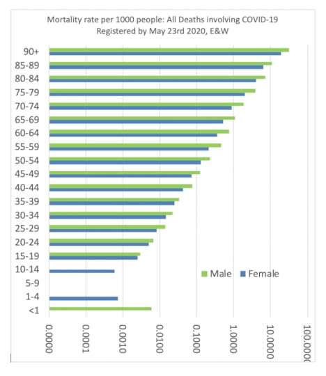
We know so much more today than we knew when I last wrote in this magazine at the start of the pandemic two months ago. Most importantly we now better know what the risks of mortality are and that, above all else, those risks are related to age. Of all those whose 42,173 people in England and Wales whose death had been registered by May 23rd 2020 as having occurred with Covid-19, some 96% were aged 60 or older. Only 4 people under the age of 15 had Covid-19 mentioned on their death certificate. Some 263 people aged 15-39 had died with Covid-19 or, 0.6% of all those who died (99.4% were 40 or over). Men were more likely than women to die, or putting is another way, men are about as likely to die as a women aged 5 years older than them.
Two graphs are needed to show how the mortality rate varies by age and sex. The first uses a normal scale, which shows clearly that 3% of all men aged 90 or over, and 2% of all women of the same ages, had died with the disease by late May 2020. The second uses a log scale to illustrate just how predictable the rate of mortality is by age.

Mortality rate per 1000 people: All deaths involving COVID-19 registered by May 23rd 2020, England and Wales
Mortality rate per 1000 people: All deaths involving COVID-19 registered by May 23rd 2020, E&W – log scale
A huge number of reports have been published to give us some idea of what matters other than age: living in an overcrowded household, having to work in a job with close contact to others, living in a part of the country to which the disease came first, being Black or Asian (especially as older Black and Asian people so much more often live in cities to which it came first), and having an underlying poor health condition. However, most important above all is age, and secondly after that – living in England or Wales. The number of people who have died in Scotland or Northern Ireland is much lower. After that, the further you lived away from an urban centre the lower were the mortality rates around you as the next figure shows. It also illustrates that regional mortality rates peaked in London in the week ending April 10th; peaking the next week in the North West of England, but still being almost as high in the week ending April 24th across the less urban South East and South West of England.

Deaths with COVID-19 by region and week of occurrence, E&W rates per million people, by week ending on the date given in the key
The amalgamation of these ten regional curves (even sharper ones that can be seen in particular cities) means that the national epidemic curve for Covid-19 has an elongated shape. The numbers of people dying falling more slowly than they rose, as the next national graph shows. The graph also suggests that social distancing before the lockdown, and partly the lockdown itself, will have affected the shape of this curve. However, there have been no times when there has been a sudden fall in mortality number that could be attributed to a particular change in policy occurring two or weeks earlier. In hindsight, given that the first recorded deaths where Covid-19 is mentioned occurred in very early March all around the country, the disease was clearly widespread in February in both England and Wales.
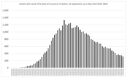
Deaths with COVID-19 by date of occurrence of death, all registrations up to May 23rd 2020, E&W
The point of maximum acceleration in mortality nationally was March 31st, the day when Dominic Cummings (an advisor to the Prime Minister who has now achieved something of a public profile) arrived in Durham having fled London with his family. The graph below illustrates why, up until March 31st 2020, had you been privy to the mortality data that has subsequently been released, you might well have concluded that mortality rates were then rising exponentially, especially in central London.
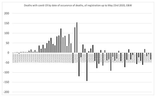
Change in the daily number of deaths with COVID-19 by at of occurrence, all registrations up to May 23rd 2020, E&W
Not everyone who died with Covid-19 mentioned on their death certificate will have died primarily due to Covid-19. At the same time some people will have died of the disease without it have been mentioned on their death certificates, especially early on. The next graph below shows how ‘excess deaths ‘ are estimated by comparing deaths in one year with an earlier year. It shows we had not returned to normal in May but might do by June.
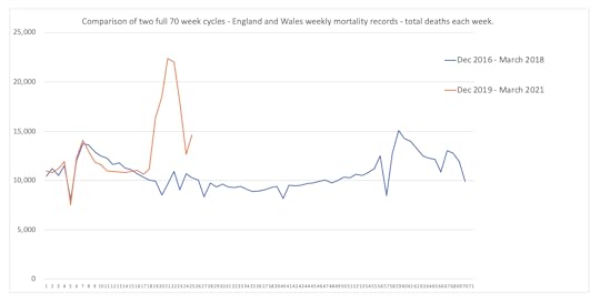
Comparison of two full 70 week cycles – England and Wales weekly mortality records – total deaths each week (all causes)
The disease first peaked in week 13 or 14 of 2020 in the following 13 districts: Broxbourne, Ceredigion, Chiltern, Erewash, Fareham, Lambeth, Newport, Rochford, South Bucks, South Holland, South Staffordshire, Tunbridge Wells, and Wolverhampton. That peaking is shown below in a graph which also highlights the effects of discharging patients from hospitals back to care homes.
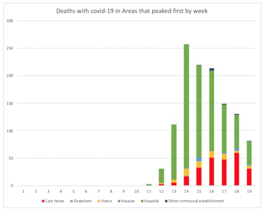
Deaths with COVID-19 in areas that peaked first by week, England and Wales
The disease peaked a week later in places such as Liverpool and Brent; but did not peak in Cornwall until week 16 of the year; whereas in County Durham the numbers dying peaked in week 15 but also in week 17; before falling more slowly than elsewhere. Quite why calamity was spread unevenly, and why the numbers dying rose and fell faster in some places will take time to assess. But every bar in these graphs represents a pillar of tragedies and for everyone who has died many others will have survived but been greatly harmed.
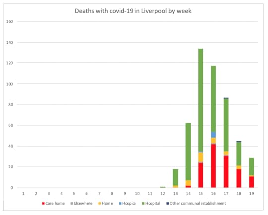
Deaths with COVID-19 in Liverpool by week
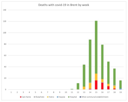
Deaths with COVID-19 in Brent by week
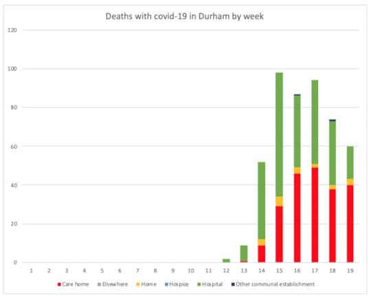
Deaths with COVID-19 in Durham by week
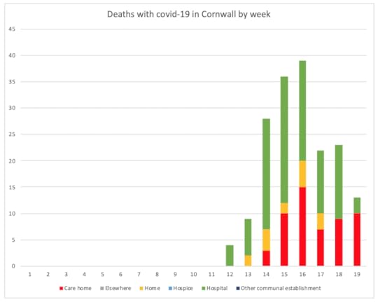
Deaths with COVID-19 in Cornwall by week
All the data used here was released by ONS and was the most recently available at the time of writing towards the end of May 2020. The final graph, below shows the rise and fall of deaths of people who were living in Westminster Borough, in the heart of London and where so many politicians caught the disease.

Deaths with COVID-19 in Westminster Borough by week
In hindsight, it has now become clear that mortality rates fell at the start of April when the number of infections fell at the start of March, because people (long before central government began to express any sense of urgency) began to change their own behaviour. Twenty five days after the full lockdown was imposed, mortality from the disease in the middle of London had almost halved. The same pattern can be seen in Brent above. This disease was brought under control despite the actions of central government, not because of them; although it may turn out to have been national policy (or lack of it) which lead to so many patients being discharged into care homes with the disease.
For a PDF of this article and a link to the original source click here.
The Geography of Slowdown: The End of The Great Acceleration – Keynote Address
Great economic inequalities will be hard to sustain during and following slowdown. As things change less, it will become much more difficult to make money out of a shrinking and ageing population who may also become savvier and harder to fool with the allure of the “new”.

Conference Programme Title-page
Slowdown means goods lasting longer; it means less waste. It means that many of the things that we currently think of as great social and environmental problems will not be problematic in future. We will, of course, have new problems—most of which we cannot even imagine right now.
The following Keynote Address was given by Danny Dorling at the International e-Conference on Borderless Growth, Equality and Sustainable Development: The Pathway to Human Welfare, Isabella Thoburn College, India, (via zoom), on June 29th 2020. Press play to hear.
June 23, 2020
Rule Britannia: from Empire to Brexit to Covid-19
It’s a pity that in early 2020 the Conservative party and its leader were not more alert. Greek scholar Boris Johnson should have known that hubris – excessive pride and boasting – annoys the Gods and can lead to nemesis – downfall and divine punishment. After months of triumphant claims that Brexit was ‘done’, that ‘we’ had taken back control, and that Britain would become Great again, came the unexpected reckoning. The Covid-19 pandemic eclipsed discussion over leaving the European Union and future trade deals.

Rule Britannia: Brexit and the end of Empire
After the December Tory election victory, the government and much of the media appeared to forget that 2019 had been a year of panic and chaos as votes were lost in Parliament, and promised deadlines were repeatedly missed. There was panic buying of food and toilet rolls in March 2019 when fears of a chaotic EU exit on the 29th approached (which might explain the shortages of these when panic buying began again almost exactly a year later when lockdown loomed).
The political low-point of 2019 was the illegal prorogation of Parliament and then the spreading of lies blaming or applauding northerners for swinging the leave vote. We easily forget that it has just been six months since a Prime Ministerial adviser (Cummings) was appointed who wanted to employ weirdos and misfits in Downing Street, to sack civil servants, and take control of government decisions. After he fled to Durham in March 2020, and was duly reprimanded by most of the public, it became apparent that he (and Boris Johnson) did not think that rules applied to him.
To recap briefly about the votes, elections and lies: the most careful academic study to date of voting in 2016 referendum to leave or remain in the EU found that an association of voting leave with deprived areas was negative. It was adults in wealthier areas in the south and south-east of England that predominantly voted to leave. Nowhere in the northern areas were there as many leave voters as in the south. While the nastiness around the Brexit campaign, which included the murder of MP Jo Cox a week before the vote, seemed to be overlooked and snide comments were made about ‘remoaners’, on what terms the UK would ‘leave’ the EU had still not been decided four years later.
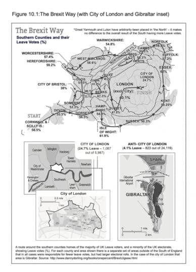
The Brexit Way (with City of London and Gibraltar inset)
It is not that Theresa May was any better than Johnson. She had insisted on presenting Bills to Parliament which were rejected. Almost everything she did was rejected. The whole Cabinet supposedly agreed to the ‘Chequers Plan’ in July 2018, but two days later Johnson (then Foreign Secretary) and David Davis (Brexit Secretary) claimed that the Plan was so awful they had to resign. A vote on the withdrawal agreement was finally held on 15th January 2019 leading to the worst defeat ever suffered by a British government. On 29th March we should have left the EU, but didn’t.
In local elections in May, the Conservatives lost 1,330 local councillors, and Labour lost 84. Jeremy Corbyn, Labour leader who had increased party membership to half a million, continued to be demonised in the media and by opponents in Britain and overseas. In June Theresa May resigned and thirteen candidates stepped up to be leader, eight of them having attended Oxford University. A poll found that only 10% of the public would trust Boris Johnson to babysit their children, but he was chosen, just by Conservative Party members, to be the Prime Minister. He presumably then celebrated with his girlfriend, who gave birth to either his 6th or 7th child nine months later, while he was still married to his second wife.

Seats lost in the May 2019 local elections
In September 2019 Johnson attempted to stop parliamentary scrutiny of a Withdrawal Bill by proroguing Parliament. The Supreme Court Judges unanimously declared the move unlawful. Johnson called an election “to get Brexit Done” on 12th December and the Conservatives were triumphant, gaining a huge majority of 80 seats. Claims that Labour under Corbyn had suffered the worst Labour defeat ever were misleading, as he gained a 32% share of votes. In 2010 Ed Miliband as leader only secured 30% of the vote, Gordon Brown in 2009, 29% and 27% had been secured by Michael Foot in 1983. Labour carried out some soul-searching and eventually elected Kier Starmer, former Director of Public Prosecutions, as their new Leader.

Conservative lead over Labour in the September 2018 to November 2019 opinion polls
Business prospects for Britain were already dire throughout 2019, long before their dramatic collapse in spring 2020. The Office for National Statistics reported in March 2019 that spending on education had fallen for three years in a row, productive output in the economy had fallen in all areas, as had business investment. The balance of payments was in free fall. Borrowing had risen and it was clear much of the work in Britain was being done for low and precarious wages. New immigration laws were proposed (and agreed in June 2020) along the lines of an Australian points system, with lower wage migrants largely excluded and Home Secretary Priti Patel acknowledging that her parents would not have been allowed into the country under these rules.
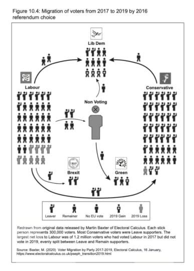
Migration of voters from 2017 to 2019 by 2016 referendum choice
By March 2020 hubris reigned supreme. An airline, Flybe, had collapsed, forerunner of a general collapse of the airline industry, stock markets slumped and while the world economy sank, the UK economy sank faster. Locking the entire population down in their homes from 23rd March was too late to rapidly control Covid-19, and consequently locked the economy down for longer and led, by mid-June, to calamity – despite government attempts to temporarily fund many workers. The OECD forecasts were that the UK will suffer the deepest downturn of all advanced economies.
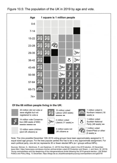
The population of the UK in 2019 by age and vote
The pandemic showed which citizens were more valuable as workers and to the economy. A majority of the Key Workers keeping the public fed, cared for and nursed were the very low paid workers deemed unacceptable as migrants. While all health workers were praised for their devotion and there was a regular Thursday clapping for their efforts, the reality was that many died due to an absence of personal protective clothing. Black and Asian staff, often working in the health care jobs where this happened most, died in greater numbers than white staff. Many thousands of residents in Care Homes and people who were disabled died needlessly without relatives around them.
Anyone expecting the government to take responsibility will be disappointed. Ministers from the Prime Minister down sought to blame scientists for giving them the ‘wrong’ advice, to blame China for spreading the virus, and eventually low paid workers – for taking or not taking public transport. By mid-June it seemed that footballers were making the kind of ethical political decisions that Ministers shied away from. 22 year old Marcus Rashford from Manchester United successfully intimidated the Prime Minister to U-turn on a decision not to give vouchers to poor children who would probably go hungry over the summer. Over a million children benefited. The virus has made it clear that, for the current government, the old, the disabled, poor children, black and other minorities are first in the line-up of disposable citizens.

Lady Hale delivering the judgement of the Supreme Court, 2019.
As if the government had not got enough to ignore, lie or bluster about, they were also faced with a ‘Black Lives Matter’ uprising of citizens of all ethnicities and classes globally, outraged at the murder on 25th May of an unarmed black man in Minneapolis, USA by white policemen. The establishment argued against the toppling of statues of men who made money through slavery and treating black people as sub-human. Boris Johnson warned that Britain cannot “photoshop” its long and complicated cultural history by removing public monuments and to do so would be a “distortion” of our past, perhaps forgetting the times he had photoshopped his own past, and his cultural history of insulting and demeaning black and minority people in Britain and abroad.
Covid-19 will pass; but it and the shenanigans of Brexit will affect our society and economy for years to come, but there is hope that an abject lack of knowledge about Britain’s imperial past may begin to be recognised. There is hope that the overt and covert racism, exacerbated by the Brexit vote, will diminish as a more honest presentation of the imperial past is presented to the whole country.
It may be hard to persuade singers at the Last Night of the Proms that, however much we hope that Britannia will rule the waves again, the most we can do is a couple of pointless aircraft carriers with no planes, and the land of hope and glory will not have its boundaries spread wider and wider, especially as the Union of its four countries may be in danger of breaking up. Hope for the future will not mean ‘taking back control’ of a lost empire or gaining a superior place in the world.
Sally Tomlinson is Emeritus Professor at Goldsmiths University of London and an Honorary Research Fellow in the Department of Education, University of Oxford. Her latest books are (with Danny Dorling) ‘Rule Britannia: Brexit and the end of Empire’ (Biteback 2019) and ‘Education and Race from Empire to Brexit’ (Policy Press 2019). Danny Dorling is Halford Mackinder Professor of Geography at the University of Oxford. This article is based on the 2nd edition of Danny Dorling and Sally Tomlinson “Rule Britannia: Brexit and the end of Empire” being published by Biteback on June 23rd 2020.
For a pdf of this article and a link to the original posting click here.
June 16, 2020
Slowing Down: Better Policies for Better Lives
The human world is slowing down and has been for some time. It has been slowing in many ways, and this can be seen most easily in OECD (mostly richer) countries. The slowdown includes not only demographics, as we have fewer and fewer children, but also economics as rates of growth each decade are now slower than in the decades before, especially in countries where they were highest in the 1950s and 1960s.
We have a tendency to ignore long-term trends and to fixate on short-term events. Short-term events transfix us; but a post- (or low-) COVID-19 world will be a world where the future is just as determined by the long-term slowdown already underway. In this way, this coronavirus differs from previous rapid infection pandemics such as those of influenza in 1918, 1951, 1957 and 1968/69. All of those previous, sudden pandemics happened in the era of acceleration. This is different. I have drawn hundreds of charts to show that when it comes to demography, innovation, social trends and economics, the period from the 1820s up to 1968 was one in which there was not just more each year – the rate of growth itself was often accelerating. Animations of just of these charts can be found here. The charts can initially be difficult to understand, but for people who have just lived through a pandemic, concepts of acceleration and deceleration are more at the forefront of our minds. So if you want to understand those other slowdown charts first consider this one:
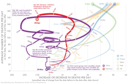
The spread of the 2020 pandemic in 7 countries up until April 4th
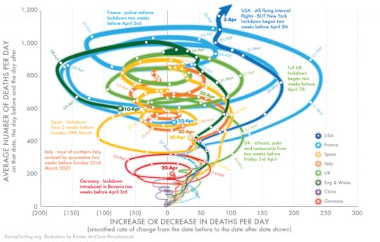
The chart above shows the rise and then fall in the number of reported deaths in China, the USA and five European countries due to COVID-19. At first, the lines rose from the origin (0,0), all to the right, as not only do the number of deaths rise each day, but so too does the rate of that increase (each and every day at first). During the middle of February 2020, the pandemic began to be brought under control in China, so the trendline then shifts to the left of the vertical axis signifying falls after the initial slowdown. Germany, too, appears to have falling numbers just a few weeks later than China. The data is smoothed to take out the effect of fewer deaths being reported at weekends, but also because trends are always easier to see this way. The “looping down” in China also happened elsewhere, but later. Slowdown is often not smooth.
The next chart below shows what happened next. The numbers of deaths rose unexpectedly in Germany between 4 and 8 April; but that was dwarfed by what appeared to be uncontrollable acceleration in the rest of Europe and the United States. Lockdowns were imposed just before most of these rises. At this time, the trend in France seemed to be the worst in Europe because it was able to include counts of the numbers who were dying in care homes. It turned out later not to be the worst; you can often only see the full picture in retrospect.
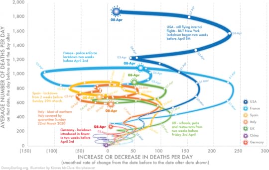
The spread of the 2020 pandemic in 7 countries up until April 8th
Slowdown is completely different from acceleration. It is the time when the phenomena is still rising, but the rise appears to be coming under some kind of control. Just as this happens in all pandemics, it also happens in almost every other aspect of our lives – but usually over a matter of years or decades, not just weeks. That is why we find the larger slowdowns in our lives, or the slowing pace of change, much harder to appreciate and accept than the abating of a pandemic. We are impatient, almost always absorbed by what is happening right here and right now. Never more so than when there is something very new to grab our attention.
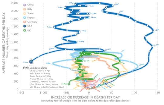
The penultimate graph below shows how the pandemic began to end in Europe while it was still rising in the United States. Shown again are the seven states of the world which, at this time, recorded the most deaths worldwide. These were places the pandemic came to first, and most quickly, and which also had very many elderly people and very crowded cities. Data for England and Wales is also included on this third and final graph because, by then, care-home deaths were being included but only for those two countries within the UK.
The spread of the 2020 pandemic in 7 countries up until April 20th
For many months, possibly years, we will be talking about how different nations within the OECD dealt differently with the emergency. But these charts help illustrate just how similar the shape of the trends were in all European countries. Soon, all the European lines will be back very near to the 0,0 origin of the graph, where China is already; and where later in summer of autumn the USA will hopefully be.
Now that you know what a slowdown looks like when drawn out, you can look at many other trends in this way. I have only found four trends prior to 2020 that were not only rising but also accelerating annually: air passengers worldwide, global carbon emissions, planetary temperature, and the number of university graduates. High resolution open access images of these four and over 60 others can be found here and hundreds of others can been seen within the 67 spreadsheets made available here.
In the short term, you may be worrying about flights and wondering when it might be possible to fly again; but the numbers had to stop accelerating, and this would have occurred at some point regardless of the pandemic. So, too, carbon emissions would have at some point decelerated; the next temperature increase would not rise as fast; and we would also educate more graduates locally, with less acceleration in that as well. There is an absolute limit to the proportion of young people in the world who will go to university, when one day we treat going to university as we do going to secondary school today; however long before that day, the annual rise in graduates will have slowed.
The pandemic has caused huge suffering. But it will also have widened our imaginative horizons. What you thought was not possible just a few months ago clearly is. And the world does not end just because so many of us now consume less, pollute less and worry more about what really matters most – others’ and our own health.
This pandemic, terrible as it is, will not dent the trend in rising global life expectancy that has been rising since 2010, but at a slower pace. It will alter our patterns and volumes of trade, but not the deceleration in the rise of how much we each consume by weight in rich countries – a slowdown that had already begun some time ago.
What this pandemic could do, if we so choose, is help us begin to see more clearly what was already there if only we had stopped and looked. For now, for a time, we have been forced to stop; we should use that experience wisely.
The spread of the 2020 pandemic in 7 countries up until May 31st
Danny Dorling
Author; Professor of Geography, School of Geography and the Environment, University of Oxford
Danny is a geographer who now mainly writes books. In 2018 he published “Peak Inequality”. In 2019, with Sally Tomlinson: ‘Rule Britannia: Brexit and the end of Empire’. In 2020: “Slowdown: The End of the Great Acceleration—and Why It’s Good for the Planet, the Economy, and Our Lives. And, later this 2020 year, jointly with Annika Koljonen: Finntopia: what we can learn from the world’s happiest country. He is a patron of the road crash charity RoadPeace, and in his spare time he makes sandcastles
For a PDF of this post and a link to the original posting click here.
June 12, 2020
Hitting the population brakes
Popular wisdom has it that everything is speeding up, including population growth. Danny Dorling shows just how wrong that is – and argues that we are actually in a time of slowdown. A tour of future population prospects for key hotspots:
In early 2019 awareness that human population growth was ending began to spread more widely. To much acclaim, Darrell Bricker, the chief operating officer of the polling firm Ipsos Public Affairs, and his colleague John Ibbitson published the book Empty Planet: The Shock of Global Population Decline. As one journalist put it: ‘It is full of fascinating speculation and written with an energy that degenerates only occasionally into jauntiness.’
Bricker and Ibbitson had amassed a wealth of evidence for their central claim that the United Nations had simply got its future projections very wrong. In particular they quoted Jørgen Randers, a Norwegian academic who in 1972 had predicted a sharp rise to an unsustainable world population of 15 billion people by 2030, but who has now changed his assessment because fertility rates have fallen so rapidly recently, saying: ‘The world population will never reach nine billion people… . It will peak at eight billion in 2040, and then decline.’
Randers, a professor of climate strategy based in Oslo, now believes that birth rates will decline faster than UN demographers currently project. Randers is no utopian.
Despite his belief that there will be around three billion fewer people than the UN demographers project in the next fourscore years, he notes that ‘the world will [still] be well on its way towards a climate catastrophe in the second half of the 21st century,’ with CO2 emissions peaking in 2040, resulting in temperatures passing two degrees above what was recently normal by 2050.
Suggestions that even more rapid population growth slowdown will occur in the very near future are not predictions that all will soon be well. This is because the pollution problem was never a population problem.
Bricker and Ibbitson concentrated on population growth decline, not the wider picture, and so are far more optimistic. They reported that Wolfgang Lutz, one of the world’s best-respected demographers, along with his colleagues at the International Institute for Applied Systems Analysis in Vienna, now believes that the global human population will stabilize by 2050 and then begin to fall because the human slowdown is currently accelerating.
In 2018 Lutz and his colleagues stated that they would now forecast the world population peak to occur shortly after 2070. Their projection would mean between two billion and three billion fewer humans by 2100 than the UN currently estimates.
A growing body of opinion believes the UN is wrong. We will not reach 11 billion by 2100. Instead, the human population will top out at somewhere between eight and nine billion around the middle of the century, and then begin to decline.’ – Darrell Bricker and John Ibbitson, 27 January 2019
It has been obvious for some time to a small group of demographers that the human population slowdown began many decades ago, but just how rapid that slowdown is has been apparent only very recently. This is true when people are counted across the globe as a whole, but the slowdown began even earlier in certain countries and, especially when it comes to very low birth rates, within a few cities in those countries.
The global point of greatest change, the international pivot point, came around the year 1968. The evidence that slowdown is upon us with a vengeance is now so strong that Bricker and Ibbitson were able to quote a recent Deutsche Bank report by Sanjeev Sanyal that suggests the peak in human numbers on Earth will be reached at just 8.7 billion in 2055, and decline to 8 billion by 2100.
There is currently much criticism of many of the more dramatic population slowdown scenarios. The criticism is often aimed at the assumption that slowdowns will simply happen automatically, without further encouragement, such as the role and effect of expanding access to good-quality, free secondary education. I would add expanding free access to tertiary education, which appears to be the most effective contraception of all – not urbanization, as is often claimed.
Perhaps the strongest criticism of these low projections of growth is that they assume no world war in the next few decades, no great famine, no (very lethal) pandemic, no new disaster that upsets our established social orders, which would all probably have, long term, the opposite effect.
The idea that we will somehow avoid any such calamity in the 2020s, 2030s, 2040s, 2050s and 2060s seems like wishful thinking indeed, in these times of Covid-19, although compared to pandemics such as the 1918-19 influenza only HIV/AIDS begins to compare in terms of magnitude, but over many more years.
We find impending disaster captivating because it fits our current favourite (but probably incorrect) theory that the near future will be very different from the recent past. In 2018, 770,000 people died of HIV-related illnesses in the world – that was ‘old news’ and received very little attention. At the time of writing we have no idea of the total numbers that will succumb to Covid-19. But if you have any faith in our ability to learn from past mistakes, in the power of a far better educated global population than we have ever had before, and in more and more women securing positions of power, then you can have some hope.
THE SLOWDOWN IN WORLD POPULATION
Because this fact is so very important, it is worth reiterating that the slowdown in global population was evident some time ago, and it has been well known among demographers for all of this current 21st century. I was a little late to catch on: in 2013 I wrote a book titled Population 10 Billion. The publisher added the dramatic subtitle The Coming Demographic Crisis and How to Survive It, which did rather detract from the main point of the book – that there was no crisis, and that we could reasonably expect never to reach a global population of 10 billion. What I thought most likely at the time was that we would see a maximum of 9.3 billion around the year 2060, dipping perhaps to 7.4 billion by 2100.
I made the mistake of putting that crucial information on page 350. Almost no-one reads as far as page 350 in a book like that. I should have put the news on the cover. To be honest, though, I was a little worried about sticking my neck out. I had previously published those estimates in 2011 in an obscure statistical magazine. Statistical magazines are good places to hide things you are not sure of, just in case they turn out to be wrong. Even fewer people read them than get to page 350 of a book! So my estimate was that global human population would peak a little higher than the Deutsche Bank researcher Sanjeev Sanyal now estimates, but would also fall faster than many now think it may fall.
As events transpired, I was glad I had hidden my predictions. In the very week that Population 10 Billion was published, the United Nations upped its estimate of the future 2100 global human population total from 10 billion to 11 billion. I would have looked a little silly had I put the words ‘7.4 billion – don’t worry’ on the cover, but that would have been better than suggesting that the UN methodology was robust. In 2015 the UN published a revision that said the global population would reach 11.2 billion by 2100, and then in 2017 it suggested exactly the same number.
It almost seemed as if the organization was getting better and better at this guessing game, but it turns out it wasn’t. The UN’s demographers were simply becoming surer of themselves. The same issue remained, one that I and many others had spotted years before: the UN’s demographers had ignored a baby boom.
Their models did not take into account the fact that birth rates between 2011 and 2019 were high because these were the great-grandchildren of so many people born worldwide shortly after the Second World War – the original peak was simply working its way through the generations. The UN also failed to recognize what had made fertility so high in African countries in recent years (on which more below) or that the world was still experiencing a huge cultural shift regarding the rights of, and respect for, women.
You might have thought that demographers would know all about baby booms (if not about cultural shifts), but that is not how their international models work. To be fair to the UN’s demographers, the crucial baby boom was not well monitored in most of the world. At the time of the partition of India (1947) and the Chinese communist revolution (1949), there was enormous loss of life, but also many more babies were born than usual. When things appear to be going wrong, and when there is turmoil, we have more babies.
When they go well, we have far fewer. When we feel really safe, we have even fewer than that. When you can trust that society will look after you, then you can more happily choose to have no babies, or just one. You do not need the insurance policy of having children to look after you in the future – or a great number of children (which people have when their children’s individual chances of survival are poor). And when women are able to make their own choices about whether to have a child and how many to have, then – everything changes.
It will soon become clear who was right and who was wrong. However, the slowdown that the UN’s demographers have already reported, the slowdown to their current prediction of 11.2 billion by 2100, is clearly dramatic enough. The timelines in this article use the UN projections that lead to 11.2 billion 80 years from now, even though I believe they are overestimates. I use them because they still show rapid slowdown and because I think these are conservative estimates – the greatest that future growth will likely be.
RUNNING OUT OF PEOPLE?
Population growth was enormous worldwide in the 1940s, 1950s, and at the start of the 1960s: the growth rate itself was growing! But then, quite suddenly, but also remarkably smoothly, the rate of growth began to slow, almost as if someone had pressed down on a giant brake pedal. Between 1980 and today, global human population growth rates became stable at around 80 million more people being added per year.
This stable growth is attributable to a combination of fewer births and, crucially, growth mainly because the people alive at that time were living longer. Next, because there are limits to the amount that life expectancy can increase, from 2020 onward that rate of worldwide population growth is itself projected to fall. The UN thinks that it will fall very steadily, to 70 million a year being added in 2030, 60 million in 2040, 50 million in 2050, 40 million in 2060, just over 30 million being added each year in 2070s, and then a little slowdown itself in the rate of slowdown. Why? Because the UN demographers currently believe that the whole world will move toward a two-child norm.
However, that key assumption has no historical or scientific basis. This, above all else, is why we should not necessarily expect to peak in our numbers as a species at the population maximum of 11.2 billion people in the near future. Everything has changed so much that choosing to have no children, or just one child, is for the majority of women worldwide now just as easy as – if not easier than – choosing to have two.
Sometimes insight can be found in the most unlikely places. Commenting on a February 2019 story in the British Daily Mail newspaper, sensationally headlined ‘Will the world run out of people?’ ‘Paul’ noted that there is no question that this is true, and that it has been obvious for a long time to anybody with a population chart and a basic understanding of mathematics. He said that the ‘negative second derivative of population (namely, a decline in growth) is as clear as day and must lead eventually to a negative first derivative (a decline in population itself),’ concluding, ‘Why otherwise intelligent people (eg Stephen Hawking) can’t/couldn’t see this is astounding.’
Stephen Hawking’s warning had been made a year before: ‘Humans must leave Earth in the next 200 years if we want to survive.’ The human species is not, of course, neatly divided into two camps of remarkably clever and remarkably stupid people. We are mostly pretty average, and all of us are capable of being quite stupid from time to time. But occasionally someone, with time and space to think, is lucky enough to be in the right place at the right time to be the one to whom exceptional insight is later ascribed.
Were we cleverer, we would not do this ascribing so frequently. We would not be so quick to put a few people – the brilliant – on pedestals and claim that the rest of humanity is largely incapable of insight. The readers offering comments under this Daily Mail article will have been drawn from the most literate and highly educated tenth of the world’s population. The observations that followed Paul’s included: ‘The world will be a better place once all humans are gone’; ‘Over-population is becoming an issue, but Divine intervention will save the planet.
God, in His infinite mercy and wisdom, will address this as always with famine, war and plague. Have faith!’; ‘Genghis Khan killed so many people it cooled the planet (so it’s believed). Maybe he had the right idea?’; ‘I think Obama started this. We are doomed’; and (one of the nastiest) ‘Only partially true. The world will just run out of whites.’
Don’t despair. Just don’t expect great demographic insights either from the people who spend their lives studying the Big Bang and black holes, or from the tiny minority of men (and very occasionally women) who splash their rapid-fire views, like graffiti, in the comment boxes underneath online newspaper articles. Neither group has put their minds to the matter of human population numbers for very long. Although occasionally a few, such as Paul above, have thought a little more carefully than others.
BOOM AND INVASION
If you look carefully at Figure 1, you’ll see that all but the most recent 170 years of human demographic history squeezes into the bottom 11th of the graph. Since that point, we have always had growth. The growth took off from around 1850, when the British Empire was beginning to approach its zenith. By this point Britain had already invaded some 171 of the present 193 members of the United Nations, although most were not yet actual countries. The effects of these invasions were devastating. The British were not alone in this kind of endeavour, or the first to undertake these practices, but they were certainly the most effective.
If you invade a continent that had previously been largely or entirely left alone, such as Australia or the Americas, you fundamentally disrupt societies every bit as much as if they had been invaded by aliens landing from outer space with unbelievable weapons, incredibly lethal attitudes, and the deadliest of previously unencountered germs. At first there is rapid population decline in the territories that are invaded. The decline is so great that overall worldwide human population slowdown occurs.
Look carefully at the decade prior to 1850 to see proof of this. The ‘scramble for Africa’ took place long after the rise of the European slave trade, which was established to populate the Americas with free labour (free in terms of not wage-paid). The transatlantic slave trade devastated Africa. After the initial shock and destruction, the social structures and norms that had developed over centuries across the continent (and everywhere else in the world that was invaded and colonized), norms that had before produced relatively stable populations, broke down.
FIGURE 1 World: total population, years 1–2100.

World: total population, years 1–2100.
(Data from the Angus Maddison Project Database 2018, hosted by the University of Groningen,
updated using data from UN Department of Economic and Social Affairs,
UN World Population Prospects: The 2017 Revision)
Then acceleration set in. That acceleration resulted in the huge human population growth, worldwide, from the 1850s to the 1930s. In terms of total population Figure 1 shows that most of the slowdown is yet to come, but we know it has already begun because fertility has already fallen, and population continues to rise only because people are living longer. Figure 2 highlights the growth that comes after devastating events, including the invasion of the Americas and colonization of Africa.
World War Two, which began in 1939, brought a temporary halt in the then acceleration of population growth. Not only did many people die, many others avoided having children then, or were unable to have children because they were physically separated. Across Europe and North America fertility rates had fallen rapidly in the 1930s; then just a little later during the war, they plummeted. But once war was over, many couples that had delayed starting a family quickly began to have children.
This baby boom extended across the postwar rich world, but also in China (following the turmoil of the revolution), and in India (following the terrible death toll in the time just after the partition of 1947). A second, smaller baby boom in the 1960s prolonged the acceleration, but in the late 1960s the rate of growth began to fall (shown by the circles in the graph beginning to bunch closer together), with the last spurt of acceleration petering out when the grandchildren of that first postwar baby boom generation were born in the 1980s and, finally, most recently, when their great-grandchildren appeared. It becomes clearer if you redraw Figure 1 on a log scale, as the timeline in Figure 2 shows.
FIGURE 2 World: total population, years 1–2100 (log scale).

World: total population, years 1–2100 (log scale).
(Data from the Angus Maddison Project and UN World Population Prospects 2017.)
Don’t despair. Just don’t expect great demographic insights either from the people who spend their lives studying the Big Bang and black holes, or from the tiny minority of men (and very occasionally women) who splash their rapid-fire views, like graffiti, in the comment boxes underneath online newspaper articles
Figure 2 actually employs a log-log scale. Not only is the total population number logged, but so too is the change. Three major interruptions in the growth of the global population become evident: the slowdowns from 1500 to 1600, 1820 to 1850, and 2020 onward. The first two ended in population explosions due partly to the great disruptions of those years.
If more frequent global estimates had been used, more interruptions would have been evident, such as those due to the Antonine plague of 165 CE, the plague of St Justinian that started in 541 (when around a sixth of the world’s population died), and the Black Death which reached Europe in 1347 and wiped out about half of the population.
However, it is the impact of the diseases that Europeans brought to the Americas that show up most clearly. These resulted in the first sustained global slowdown in population growth, from 1500 to 1600, and are all too evident in Figure 2. The second occurs with the colonization of the majority of the world by Europeans at the start of the 19th century. The third great slowdown in the Earth’s human population rise is taking place right now, arguably having begun with the faintest of signs in 1968, but with the greatest deceleration of all set to occur from 2020 onward.
You may look at Figure 2 and conclude that history could repeat itself. The current global slowdown could rebound again after 2100. Stephen Hawking may turn out to be correct after all, and within the next 200 years humans will leave the Earth and begin to expand rapidly in number again (on other planets). However, this third great slowdown is a slowdown of our choosing, rather than one forced upon us or occurring without us realizing why, and the vast majority of people doing the choosing are women. Incidentally, successfully colonizing other nearby planets is also almost impossible – we are stuck on this one for some time to come.
Space travel, in the main, is an archetypal modern boys’ dream. Choosing to have no children, or just one or two children, is largely a female prerogative, although for women to be able to exercise that choice, the circumstances have to be right. The circumstances are now right, although they differ in different places.
What we worry about (when we worry about population growth) is not growth, but death. We worry about too many people resulting in famines – because we have yet to learn that famines were never caused by there being too many people, but by politics. We worry that population growth will lead to mass migration – because we lack the collective imagination to see that migrants will be in huge demand and we should be afraid of having too few migrants, not too many. We think ‘too many people’ leads to war.
But it is just a very small number of men who start wars, and sadly it takes many people and usually the loss of many lives to stop wars. We worry that such a large mass of human beings could lead to the spread of new diseases, completely forgetting how deadly diseases used to be to us even when there were far fewer of us.
We are not going to escape the demographic time bomb by moving to outer space, not just because that is impossible, as there is not anywhere near enough to usefully get to, but because – there is no demographic time bomb. There never was a demographic time bomb. It is worth repeating that the projections given in this article are the UN’s 2017 published ‘most probable’ estimates and that they had almost all been reduced in size slightly already when the UN numbers were updated in June 2019. There are many reasons to suspect that the slowdown in world population will be much faster than that first official downward revision.
QUE SERA? A TOUR OF FUTURE POPULATION PROSPECTS FOR HOT SPOTS
CHINA
China’s population is now expected to peak in 2030 at 1.44 billion and then drop to below 1.4 billion in 2044, dip below 1.3 billion by 2060, below 1.2 billion just after 2070, below 1.1 billion in 2086, and fall below 1 billion around the year 2104 – but only if current projections turn out to be accurate. It could drop faster, since the relaxation of the one-child policy has not resulted in a substantial rise in births. Cultural attitudes to family size have changed in a way that would now be hard to reverse.
China’s population growth has been slowing down since 1968, and the country will experience an absolute fall in just a decade from today. In contrast to the United States, China is still growing rapidly economically, although its economic growth is also, inevitably, slowing down. Furthermore, China’s birth rate is currently dropping far more quickly than either the UN or official Chinese projections had envisaged.
In 2018 there were 15.2 million births in China, two million fewer than in 2017. This has resulted in the national population growth rate dropping from 0.53 per cent to 0.38 per cent in just one year. The slowdown is fastest in the cities to which people continue to migrate. Continued internal migration also brings more rapid slowdown to rural areas of China.
In Qingdao in 2018, a small city (of ‘just’ nine million people) in Shandong province in the populous east of the country, the number of births recorded between January and November fell by 21 per cent against the same period in 2017. Qingdao, the most economically successful city in its province, is a key eastern node on the current government’s planned ‘One Belt, One Road’ economic route of prosperity. Progress means fewer babies.
AFRICA
By 2020 Africa’s population will have grown to 1.35 billion people, which means it will still be less than that of China at 1.42 billion. However, very soon after 2020, as China slows down, and as most African countries are expected to continue to experience population acceleration, the continent as a whole is projected to far outstrip China in population. This will be the first time in many thousands of years that there will be more people living in Africa than in China.
The projected future rise of the population of so many African states relies on a demographic model that is beginning to look very questionable. It is certainly true that Africa is home to many of the countries that currently have the highest fertility rates in the world. But the supposition that birth rates across Africa will in future slow down only at a pedestrian pace is dubious. It assumes that what is going on in the rest of the world will have little effect on the continent.
With much of the rest of the world approaching a population shortage, out-migration from Africa may well rise in future in response to the growing need for younger people around the rest of the planet. This would further dampen the rate of acceleration of population growth across Africa below that which is currently predicted by the UN. With higher adult out-migration from Africa, fewer children would be born within Africa.
Furthermore, migrants who leave countries of high fertility tend to have fewer children over the course of their lives than those who remain. This, of course, also assumes that removal (by emigration) of some fraction of a peer group has no effect on the pace of fertility decline among those remaining. But what if conditions for those remaining also improve, access to secondary and tertiary education improves, and the reasons so many people had for leaving are reduced?
Recent years, 2000-15, had seen unusually high population growth across Africa. It is the projection forward of that unusual and very recent high rate of growth that drove the UN projection model published in 2017.
There is growing evidence that the most recent years in Africa have been an aberration. In February 2019, research published in the Proceedings of the National Academy of Sciences was widely reported around the world. The researchers found that it was most likely a disruption in access to decent education in many African countries in the 1980s, especially for girls, that led to young women having more children, producing this recent (and very possibly temporary) aberration in what had previously been a faster rate of slowdown.
In the past 20 years, access to education for girls across Africa has improved markedly. None of this is taken into account in the UN’s models. The disruption to education in the 1980s was during the worst recorded period of economic decline that the countries of Africa had ever collectively suffered, a decline that occurred under the structural adjustment policies introduced by the International Monetary Fund and the World Bank. Girls who couldn’t attend school in the late 1980s and early 1990s due to structural adjustment became women who on average had children earlier and more children overall. Poverty, despair and ignorance increase fertility. The damage wreaked on the continent by those structural adjustment programmes was devastating.
INDIAN SUBCONTINENT
Improved infant survival chances after Indian independence meant that the population of the new state of India grew by more than 20 per cent every decade from 1951 onwards, right through until 2001-11, when growth slowed to just under 20 per cent in the final 10 years for which we have an accurate count. The population of Pakistan grew by just as much but slowed to 20.1 per cent growth between 2001 and 2011, and it has been estimated to be decelerating throughout the most recent years. Most important, Bangladesh has slowed down the fastest, with its population growing by only 16.9 per cent between 2001 and 2011, mostly due to people living longer, rather than more births, and with its rate of population growth also falling each year within that period due to the decline in births.
The period of acceleration of the population growth of the Indian sub-continent as a whole ended in 1995, when 24 million people were added in just one year. The slowdown has already begun. It started a quarter of a century ago in India, but it is currently projected to be a slow slowdown, with growth falling below the addition of 20 million people a year in 2020, below 10 million a year in 2043, and reaching zero growth – peak Indian subcontinent population – in 2063 (or 2059, according to the 2019 UN estimates).
After that, the 2017 UN projections suggest the population will shrink by more than seven million people a year for the first time in 2094, when the total is still above two billion people, one billion having been reached in 1987. However, there are very good reasons to believe that the slowdown could be quicker than that, with the very recent falls in fertility being the most obvious sign that the UN’s projections, those made in both 2017 and 2019, overestimated future population in its ‘most probable’ outcome. But the stories of other countries are telling, too. We can learn much from the recent past of other countries – as long as we look.
UNITED STATES
In 2006, when good quality data on the movement of peoples around the world first became available, my colleagues and I started to draw hundreds of world maps of the differences between countries and changes over time as part of what became known as the Worldmapper project. At that time we noted that most of the migration into the US that had taken place between 1990 and 2017 came from neighbouring Mexico (12.7 million people).
This resulted in Central America and the Caribbean accounting for just over 47 per cent (22.4 million) of the total migration to the United States in that period. Mexico was followed by China, India and the Philippines in importance, each contributing over two million people to the in-migration count. Six other countries contributed more than one million people to the US’s immigration numbers: Puerto Rico, Vietnam, El Salvador, Cuba, South Korea and the Dominican Republic.
US politicians reacted to this acceleration with sanctions. The Illegal Immigration Reform and Immigrant Responsibility Act (IIRIRA) was signed into law in September 1996. After IIRIRA came into effect, deportation from the United States went from being a rare phenomenon to a relatively common one.
In 2016 journalist Dara Lind explained: ‘More immigration enforcement is one big reason why there are so many unauthorized immigrants in the US today.’ People were actually more likely to remain in the United States because of the difficulty they encountered going back and forth to their country of origin, and obtaining legal status became much more problematic.
Population growth did turn from acceleration to deceleration in the United States upon the passing into law of IIRIRA, which really was an especially nasty piece of legislation, but that is coincidental. What sustained the deceleration in the wake of the IIRIRA was fewer and fewer births.
Unlike the rest of the Americas, in 2100 the US is still predicted to be growing in population size. However, far from being the land of the free when its demographic record is examined, the United States may well become a less popular place for migrants to try to reach in the near future when the legacy of the Trump era strikes.
I suspect the UN projections are especially over-optimistic as far as the United States is concerned and its population will actually fall at some point during this coming century.
This article is from the April 2020 issue of New Internationalist.
For a PDF of this article and link to teh origin publication click here.
June 8, 2020
Why coronavirus death rates won’t fall as quickly as they rose
Coronavirus deaths shocked us with how rapidly they rose from a base of none at the start of the year, to many thousands within the space of mere weeks. At the peak for England and Wales on April 8, more than 1,300 people died in a single day (as revealed later when all death registrations were reported).
But the other side of the peak will look very different: death rates will fall much slower than they rose.
The latest data for England and Wales shows that 44,401 people had died with COVID-19 mentioned on their death certificates by May 22. For the majority of these people, the disease will have been the primary cause of death.
The first graph below shows the number of deaths daily by date of death in England and Wales as a whole. There has been no sudden break in slope. This is because the national curve is an amalgam of many smaller, local curves.
Most of these local curves will be symmetrical, with deaths falling at the same rate as they rose, but with the outbreak affecting different areas, at different times, together they create the long tail we see in the graph below.

Deaths registered by to 22 May 2020 with COVID-19 mentioned in England and Wales
To illustrate how the overall national trend will fall more slowly than it rose, I have taken all 339 local authority districts in England and Wales for which data has been released and sorted them into groups by the week in which COVID-19 deaths peaked.
Doing this gives us seven groups, starting with the week of March 21 to March 27 and ending with the week of May 2 to May 8. The first such grouping is of those districts which recorded their highest number of coronavirus-related deaths in the first of these weeks.
The places in which COVID-19 peaked first are a disparate set of areas, only one of which was a London borough, which indicates just how widespread the disease had become by March. They included Wolverhampton, Lambeth, Newport (in Wales), Chiltern, Fareham, South Staffordshire, Broxbourne, Erewash, Rochford, South Bucks and Tunbridge Wells.
Grouping local authority districts by the week in which mortality with COVID-19 peaked helps break down the national pattern into a series of smaller, local curves. Only the first four graphs are shown as 92% of all deaths occurred in these district groupings. Each appears to be very similar to the next except that the vertical scales on each graph vary because more areas saw deaths peak in early April.
The numbers of deaths in these different sets of districts rise quickly and then fall slightly more slowly over time. But they do not fall as slowly as the first graph shown in this article.
Local coronavirus deaths grouped by time of peak
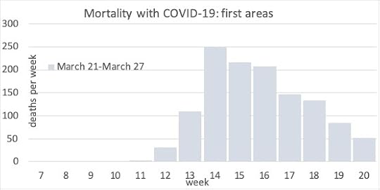
Areas Peaking first

Areas peaking a week later
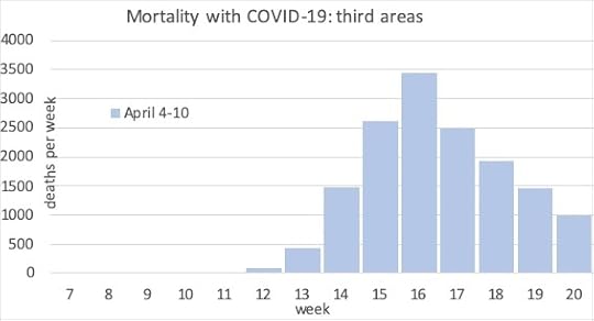
Areas peaking in the third week
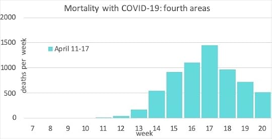
Areas in which mortality peaked in the fourth week
The full lockdown in England and Wales began on March 24, during the week in which deaths peaked in the first set of areas shown above. People were already social distancing to some extent before that date, so we should not expect to see any sudden drop in mortality two or three weeks after that date in the graphs above, and we do not.
The final graph in this series shows the regional distribution of the spread of the pandemic. The regions are sorted from lowest overall rates of mortality (south-west England) to highest (London). Rates have fallen the most in London because – by region – the disease peaked there earlier. It fell more slowly in south-east England.
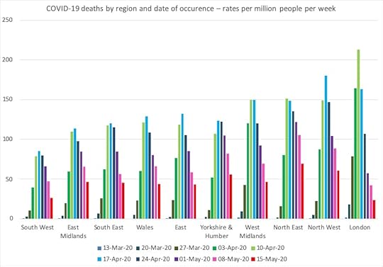
The rise and fall of deaths with COVID-19 by Region in England and for all of Wales
Slowly the pattern is becoming more clear. Deaths are falling slower than they rose, but they are falling steadily. Only very occasionally does an area report a rise in mortality and almost always, the week after, numbers fall again very rapidly.
Despite fears of an immediate second wave there are no signs of this yet from the mortality data that is being released each week, and no sign that we should greatly fear one in the coming weeks.
The degree of surveillance of COVID-19 is unprecedented in comparison to previous epidemics. In this article I have only considered deaths from the disease, but there is also close monitoring of hospital admissions, testing, even internet searches for symptoms. Much of this effort has been criticised as not being enough, but it should be good enough to spot a second wave beginning, if one does.
As lockdown is only lifting now, many people wouldn’t expect to see a possible second wave yet. But the fact that we have not yet seen second waves in similar countries that locked down earlier than the UK, such as France, Spain and Italy, should give us some hope.
The disease will fall away more slowly than it rose. But at least it is now safe to say that it is falling everywhere.
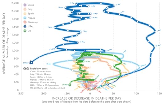
Mortality reported daily for seven countries from COVID-19 smoothed over seven days up until the end of May 2020
For a link to the original posting or a PDF of this article click here.
Rule Britannia: Looking back at getting Brexit done
Ahead of the publication of Rule Britannia in paperback, authors Danny Dorling and Sally Tomlinson take a look back the past two years of electoral chaos and what that might mean for Britain going forward.
Who now remembers 2019, a year of panic and chaos, in which so many Brexit deadlines were missed, promises to die in ditches were not kept, and eventual claims were made that Brexit was ‘done’ and ‘we’ had taken back control? The first edition of this book ended in January 2019, when all this was to still come.
After the fireworks and triumphal gong-banging came a global pandemic that wiped Brexit off the headlines and out of minds. This edition of Rule Britannia is an updated version, revealing the truly sorry story of 2019 and the first half of 2020, a time when notions that Britain could embrace a new post-imperial identity, and that a civilising process could begin, rapidly disappeared. The low points of 2019 included the appointment of a special advisor in No. 10 who planned to employ ‘weirdos and misfits’, and the spreading of a now demonstrably false narrative that people in deprived northern areas had won the Leave vote.
Cover of the 2nd edition of “Rule Britannia” published on 23 June 2020
This is a hopeful book. However, for those who relish misery we point out that, long before the word pandemic was uttered, every sector of the British economy was in deficit; more and more British children were growing up in poverty; homelessness had become normal; the nation was living on borrowed money with increasingly poor mental health; and Iain Duncan-Smith’s universal credit was revealed to be a cruel universal failure. The British state was already in crisis.
It was a year of elections, votes and lies. The Conservatives lost 1330 local councillors in the spring elections, while Labour lost just 84. Nevertheless, this was reported by the BBC as ‘voters delivering a stinging rebuke to both parties’. And at this time (the last time local elections were held anywhere in the UK), despite claims that far right movements were rising, in fact support for the far-right was declining rapidly in Britain. This good news was overtaken on 24 May when Theresa May resigned.
The Tory leadership contest which followed demonstrated again the influence of an elite, the same group whose forbears were used to running an empire, with all the feelings of entitlement and self-interest that entails. Most of the thirteen candidates were privately schooled Oxford alumni, and a man whom only 10 per cent would trust to babysit their children was elected leader of the Conservative Party: Boris Johnson.
The Labour Party under Jeremy Corbyn had expanded its membership to over half a million, but the leader continued to be demonised. His support for the two-state solution in Israel-Palestine was behind the campaign to paint him as an anti-Semite. It was ironic that the spending programme on which Labour was defeated in the general election in December 2019 was adopted and then doubled in size, at least in scale, by the Tories in spring 2020, when billions were promised to shore-up a locked-down population and economy. It turned out that such generous spending was possible.
The Conservative government continued its imperious trajectory. MPs defeated in the general election were elevated to the House of Lords. Dominic Cummings, who had been found in contempt of Parliament in March for refusing to appear before a select committee, was appointed special advisor. Privy to insider information, when he fled London for Durham he made clear what he thought of those he left behind, those who continued to follow the lockdown instructions he had help devise.
This is not a book about the Covid-19 virus, of which hundreds of books will be written. Instead this book tries to explain why Brexit is so closely mixed up with a particularly abject lack of knowledge about Britain’s imperial past and a deep anxiety about Britannia’s place in the world, combined with a nostalgia for days about which we do not tell ourselves the truth. The British have been presented with lies about their future out of the European Union, by people who are so used to lying they may not know remember what it is like to speak honestly.
This book ends with the good news. There is hope for the future, but it will not involve taking back control or rekindling a lost empire.
Rule Britannia is available to pre-order now as a paperback and will be out on 23 June. Take a look at it here!
WHEN EMPIRES CRUMBLE, WHAT HAPPENS TO THOSE LEFT IN THE RUINS?
In Rule Britannia, Danny Dorling and Sally Tomlinson argue that the vote to leave the EU was the last gasp of the old empire working its way out of the British psyche. Fuelled by a misplaced nostalgia, the result was driven by a lack of knowledge of our imperial history, by a profound anxiety about Britain’s status today, and by a deeply unrealistic vision of our future.
At a time when close relationships with our near neighbours are more crucial than ever before, Britain has opted to surrender its remaining influence and squander international goodwill.
And yet, there is hope. In this wide-ranging and thoughtful analysis, now fully updated to cover the fallout from Brexit and the impact of coronavirus, Dorling and Tomlinson argue that if Britain can reconcile itself to its new place on the world stage, a new identity can be born from the ashes. Rule Britannia is a powerful call to leave behind the jingoistic ignorance of the past and build a fairer Britain, eradicating the inequality that blights our society and embracing our true strengths.
For a PDF and link to the original posting of this article click here.
And for a discussion about how the Brexit government has tried to deal with pandemic press play below:
May 20, 2020
The Pace of Change
Did you think that the rate of innovation was rising and that more and more was being invented every year? Did you pause to question the claim, if you ever heard it, when, on January 23, 2018, at Davos, Justin Trudeau said: “Think about it: The pace of change has never been this fast, yet it will never be this slow again.” Did you stop and think: Really—is that true?
If you step back and think what the phrase “the pace of change” means, then you might well conclude that it was not faster in 2018 than any year before, almost no matter how you choose to define it. That is because you could quite easily find earlier years and earlier decades in which it had been faster.
If you prefer to listen (rather than read) click play above for a discussion on Slowdown on Also Digital on May 16th 2020
The pace of change was faster in the past in terms of how quickly knowledge developed. Your grandparents or great-grandparents may well have faced huge dilemmas in terms of what to believe—if you compare what was understood in their childhoods to what had become common knowledge when they were old. At school in England in the 1970s and 1980s I was taught that an ice age was coming while being made to sing church hymns at school. We now know that the planet is (and was then) heating up at an unprecedented rate; and most schools in most countries are a little more careful today how they handle religion and small children. Although I may think that a great deal changed in my own lifetime, in the first half century of my grandparents’ lifetime, the pace of change was even greater, from the first airplane to the first nuclear bomb and moonshot.
There is great dispute over which decade in the last century saw the greatest rate of invention. When electricity was still relatively new to us, there was much more to be invented. We easily forget how just over a century ago most fields in most rich countries were ploughed by horses, or that the 747 airplane is now over half a century old. We think the internet is new, but I have used it for almost all my working life, and I am as old as the first 747.
The timing of individuals’ contributions to innovation has become later and later in their lives; as the low hanging fruit, the easier innovations have already been secured. As Benjamin Jones wrote in a 2005 paper titled “Age and Great Invention,” “the mean age at which innovators begin making active contributions has increased by about 8 years over the course of the 20th Century” rising from twenty-three to thirty-one, and “innovators are productive over a narrowing span of their life cycle.” And note, this was fifteen years ago now.
There are many explanations as to why innovation rates, along with productivity, have been stalling for decades. The simplest is that there is less that is new to be discovered; that we are on the downslope of an age of discovery. Another is that a prerequisite of innovation is incrementally mastering knowledge, such that mathematics education “recapitulates the order in which concepts were discovered in human history,” and so (despite specialization) “there would theoretically come a point at which so much has to be learned that there is no time remaining for innovation” as Alex Mesoudi put it in 2011.
In mathematics there will always be new theories to prove; but the most beautiful, simple, and elegant have (most probably) all been discovered—the low hanging fruit. Leibniz and Newton were around at the right time, were of the right gender for their time, were born in the right parts of the world, and were lucky—and clever. The person today as clever, lucky, well-located, and supported who proves the next great theory in math may never become well known because what they discover will not be that interesting.
The slowdown in the rate of the increase in efficiency is not always for the worse. For instance, what would we use faster and faster computers for? Moore’s law, which suggests that the speed of computing continuously rises, is finally breaking down (processors no longer double in speed every few years); but long before that law stopped being a law, we should have begun to question the utility of what we were using faster and faster computing speeds for. Artificial Intelligence is still largely pattern recognition; but it is constantly said to promise revolution just around the corner. I am skeptical because it has been “the next big thing” at least four times in my lifetime. However, rather than be skeptical, we should be thankful for what we are no longer achieving the rates of acceleration to be able to do. When I began my research studies, in 1989, the world’s fastest computers were still being used to simulate nuclear explosions to make bigger and better bombs. In many ways it is good that we have slowed down. And there are other ways, ways that we do not currently value enough, in which we could collectively think in better ways if we were to begin to think more slowly and carefully. Relearning the old lessons of a pandemic to be much better prepared for the next time would be a good place to start in being differently innovative. Less haste and more care are needed.
Finally, asking why innovation is slowing is a little like seeing a cannon ball fall and asking, “why is it falling?” Eventually almost everything that first goes up falls back to earth. The questions should be: Why did it suddenly rise up so fast in the first place? What fired it upward and how? Why did innovation rise as much as it did? Was it the enclosure of land, then the use of coal power instead of horse power? Why was there suddenly a flurry of thinking over new political ways of being once we began to doubt religion and the power of kings? Why then? And why was such innovation not snuffed out?
The slowdown in the pace of change is not an end of history; it is just an end of great leaps in certain areas that we currently value very highly—which we value because the pace of change within them has recently been so very great that we are still in awe.
For a PDF of this post and a link to the original article click here.
Danny Dorling's Blog

- Danny Dorling's profile
- 96 followers

