
Danny Dorling's Blog, page 12
February 24, 2021
Who should be vaccinated before others?
In late January 2021, when I wrote these words, a debate was raging as to whether people working in particular occupations should receive COVID-19 vaccines before people working in other jobs, and possibly even before some much older people. That debate may still be raging when this piece is published.
On the 25th of January 2021 the Office for National Statistics produced a report entitled ‘Coronavirus (COVID-19) related deaths by occupation, England and Wales: deaths registered between 9 March and 28 December 2020’. The report began by explaining that COVID-19 had contributed to 7,961 deaths of people aged 20-64 during this whole period, an average of 27 deaths a day.
COVID-19 had contributed to the deaths of almost ten times as many people over the age of 64 in that same ten month period. COVID-19 is a disease that is fatal mainly in older people. Many people, most especially older people, who recover also suffer long term illness from it. On that same 25th January day, one sufferer from the disease, Paul Garner, (Professor at the Liverpool School of Tropical Medicine and Director of the Centre for Evidence Synthesis in Global Health and Co-ordinating Editor of the Cochrane Infectious Diseases Group) wrote in the British Medical Journal: ‘I write this to my fellow COVID-19 long haulers whose tissues have healed. I have recovered. I did this by listening to people that have recovered from CFS/ME, not people that are still unwell; and by understanding that our unconscious normal thoughts and feelings influence the symptoms we experience.’ He was explaining that even those, like him, who had been badly affected but were not very old often recover. He was doing this because the fear of the disease was so great at this time.
COVID-19 is a terrible disease, but it affects some people much more badly than others. Just as ten times as many people had died of the disease aged 65 and over, as compared to those of working age in 2020, so dramatically fewer aged under 20 had died partly (or mainly) due to COVID-19 in the same ten months being compared – just some 21 people in England and Wales, mostly young children. In contrast, almost 4000 children had died of other causes in 2020.
Some 99.5% of the people aged under 20 who died in England and Wales in 2020 did not have COVID-19. Some 90.5% of all the people aged 20-64 who died in 2020 did not die due to COVID-19. One occupation where the risk of mortality was almost identical to the national average was teaching. Among people working as teaching and educational professionals, 89% of the deaths that occurred in 2020 had nothing to do with COVID-19. However, many people of working age certainly feared this disease above anything else that year. Only one third of those aged 20-64 who did die of COVID-19 were aged 20-54; and only one third were women.
By occupation it was men who worked in the very lowest paid occupations, classified as elementary jobs, such as cleaning, who had the highest rate of deaths (699 deaths) and next those men working in caring, leisure and other service occupations. Women in those occupations also had some of the highest rates for women, but faced roughly half the risk men faced.
We do not yet know why men of any given age and job were twice as likely to die as women. In some occupations where there are many more women working than men, the mortality rate is higher for men, but more women die overall. For example, as ONS succinctly put it: “Men (79.0 deaths per 100,000 males; 150 deaths) and women (35.9 deaths per 100,000 females; 319 deaths) who worked in social care occupations had statistically significantly higher rates of death involving COVID-19 when compared with rates of death involving COVID-19 in the population among those of the same age and sex.” And we do know that “Rates of death involving COVID-19 in men and women who worked as teaching and educational professionals, such as secondary school teachers, were not statistically significantly raised when compared with the rates seen in the population among those of the same age and sex.” That last finding provoked much anger, but not a great deal of reflection.

ONS report on mortality by occupation for men
A website, The SKWAWKBOX, claimed that the ONS figures were misleading because they did not include people whose occupation was teaching but were aged over 64. Perhaps their reporter did not know that death certificates record last known occupation, but don’t actually record whether someone was working recently or was long since retired when they died? That website went on to explain that: “…the National Education Union (NEU) revealed that Department for Education data showed that rates of infection among education staff is between twice as high and seven times as high as in the wider population.” Given all this it was hardly surprising that many teachers were in such fear. However the ONS figures are the only ones that are comparable with other occupations and which are actually about people at work (not adding in also those who are retired) – and they very clearly explain that working teachers had average chances.

ONS report on mortality by occupation for women
It is not hard to see why the ONS statistics were so contested. For someone who was a teacher, the fact that they were a teacher did not significantly increase their chance of dying of this disease compared to anyone else (although most did not feel this). Logically, if they were near retirement age it is that risk they should have been worrying about far more; twice as much if they were male. After that, they should probably have worried about whether they lived in a big city, in an overcrowded household and/or in a poorer area (where rates of the disease have tended to be much higher). In hindsight, given the statistics released in 2021, they should have worried if they already had (or were at risk of developing) diseases affecting the lungs, heart, kidney, liver, brain, nervous or immune systems, or had diabetes or were very obese; and actually worry more about all the other risks of those conditions and less about the increased risk if they caught COVID-19.
The geographical and occupation patterns largely explain why people of Black or South Asian ethnicity were more likely to be at risk of the disease. For people of working age, dying of COVID-19 in 2020, once age, sex and geography had been accounted for – was mainly a question of social class – and this was as true among the public sector workforce as among the private sector. The more posh your job, the less likely you were to catch the disease, or possibly fall ill from the disease if you did catch it, or die of the disease if you did fall ill. The two graphs below illustrate this very clearly. They show how, all else being equal, that the man who cleans an office was four times as likely to die of this disease in 2020 than the professional who decided when the office was cleaned. And the woman who worked on a production line in 2020 was more than four times as likely to die from the disease than a woman working in an associate professional or technical occupation (such as teaching).
If COVID-19 is still rampant when you read this, take a look at the map of your area on the government’s dashboard. I have included an example for Oxford here. Had there been space I could have included a map of deprivation in Oxford, but I really don’t need to as this map of the disease is almost identical.
Finally, who should be vaccinated before others, after the older priority groups? Clearly the occupations that are poorly paid are most at risk – but they have few in the public eye to argue their case, or political parties that are bothered about their votes, as opposed to the votes of those much less likely to die, and always more likely to live for longer.
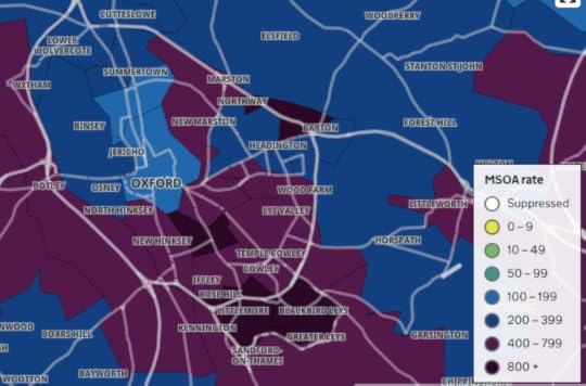
Figure 3: rates of infection from COVID-19 in and around Oxford in late January 2021.
Source: Government dashboard.
Currently the plan is that everyone over 18 should be offered the vaccine and hopefully most will accept it. The quicker that is achieved, the better. But we cannot condone the 48-year-old doctor in Texas who stole nine doses of COVID-19 vaccine to give to his friends and family first. In the UK the current government has been much criticised for getting its priorities wrong, for being keener to benefit its friends and associates than openness, transparency and the greater good. It will be interesting to see what decisions they make after the oldest and most at risk groups have all been vaccinated.
The poorest in our society do not grieve less when a close friend dies. If they do not die, but suffer from long-term disability due to COVID-19, they cannot retire on medical grounds and get a pension, but are at the mercy of our mean social security system.
We are all fearful of the pandemic, but need to consider the whole of society, not just ourselves. It is very unlikely that COVID-19 will be eliminated in the foreseeable future or even very long term future. Once all adults have been offered an initial vaccination, we will probably vaccinate everyone on leaving school, and older age-groups periodically. The risks are so low for school children that we may never vaccinate them (and no current vaccine is licensed for use with children).
For a PDF of this article and a link to the original source click here.


February 1, 2021
Finntopia: A Long Read
Finland is rarely mentioned as an example by leftists and Greens who want to build a better future. Yet this little-noticed country is one of the most equal, peaceful and happiest on the planet. Danny Dorling and Annika Koljonen explain how Finland came to demonstrate the benefits of investing in people – and suggest what its model might have to offer the rest of the world.

For the third year in a row, Finland topped the UN’s World Happiness Report in 2020. Credit: Kostiolavi/Pixabay
Finland has become the ‘by way of contrast’ country, as the British Medical Journal described it in 2018. Finland is the one place that shows that something much better is possible than the status quo. That is a weighty responsibility. Of course, Finland is not Utopia, but today it offers one of the closest approximations.
In 2018, when Finland first achieved its top placing in the UN’s World Happiness Report, a UK newspaper reported the news with the caveat: ‘… even though its GDP is below that of the US and Germany’. When Finland overtook Norway to take first place in the World Happiness Report, it did so with a GDP per capita that was more than a third lower than that of Norway; and it then went on to hold that top-ranked position in both 2019 and 2020.
The World Happiness Report ranks countries according to GDP, life expectancy, generosity, social support, freedom, and corruption levels in each country to evaluate the quality of their current lives on a ladder scale ranging from 0 for the worst possible life to 10 for the best possible life.
Finland is the country that most clearly shows how it is possible for world-beating happiness to be achievable without becoming ever richer, and while having living standards in terms of material wealth that are below those in the most affluent parts of the world, including its more affluent Scandinavian neighbours.
Recent research conducted in Finland has established that ‘well-being is to a significant extent conditioned by the position one occupies in the social structure and by the welfare regime one lives in’. However, that research also found that Finland is unusual in one other way, namely when it comes to the thoughts and feelings of recent migrants to the country.
Finland is the country that most clearly shows how it is possible for world-beating happiness to be achievable without becoming ever richer
In affluent countries, immigrants usually tend to be more optimistic than the natives of their new country. When the UN measured the happiness of immigrants for the first time in their 2018 report, Finland scored the highest of any country being compared. However, in general in Nordic countries, including Finland, where people’s well-being is generally so high, being of an immigrant background is an adverse factor, when all else is taken into account. It is possible that it is very hard for outsiders to fit into a society that is already so equal and cohesive.
If you turn up in London or New York as an immigrant, you are just one of many similar others in cities full of immigrants. What is more, you have just arrived in a society that is deeply divided. The rich do not trust the poor, and the poor have good reason not to trust the rich. Almost everyone is an outsider in one way or another. Many, if not most, people you meet will be migrants like you, or their parents were. The same cannot be said of Finland or of other countries that top the list of most happy or most politically stable places.
The Fragile State Index (previously the ‘Failed State Index’) has been published annually since 2005. It ranks 178 countries across 12 indicators that attempt to summarize the key risks and vulnerabilities faced by individual nations. Currently, Finland ranks highest overall in this index, as the least fragile state in the world. It also ranks highest on many components of the index, including on low group grievance, on high (as well as socially even) economic development, on good public services, and on low demographic pressures – all as compared with the other countries in the top ten shown in the table.
At first it appears quite remarkable that as well as performing very strongly on so many other international rankings, Finland ranks highest of all 178 countries for political stability. However, international rankings are very positively correlated with each other. It is easier for your people to be happy if your state is not fragile, your press is free and responsible, your schools are cohesive, the health of your infants is good and the health of the population as a whole is improving rapidly from what used to be quite a poor record.
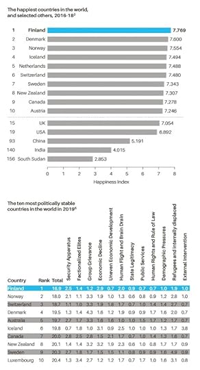
The happiest countries in the world and the fragile state index
Finland today is one of the few environments on earth that replicates most closely the situation in which we are most content: when we are caring for each other and not competing; where we are each valued very similarly, and where no one is greatly elevated or diminished. In another affluent country that is in many ways Finland’s opposite, in today’s UK, 1 in every 200 people are homeless. In Finland the proportion is at least four times lower and almost no people are to be found actually sleeping on the streets.
Countries that care less count less carefully. Crude estimates by the UK government show that the number of people who were street homeless rose by 169 per cent between 2009 and 2018 in England. In Finland over the same time period, much more precise estimates revealed that long-term homelessness fell by 35 per cent, and rough sleeping was all but eradicated in Helsinki, where only one 50-bed night shelter now remains. In recent years, every week on the streets of England, three people die because they have nowhere safe to sleep. The BBC recently reported that Finland was ‘the only EU state not suffering from a housing crisis which is the result of Finland’s Housing First initiative which started in 2008… in Finland housing is seen as a right, not as a reward, as it often is in other EU countries. The Finnish system is financed by public funds and Finnish slot machines’, and the Finnish government is considering using new (including online) gambling taxes and licences as well. Finland is abandoning transitional and temporary housing for the homeless. Instead, they are given a normal apartment, immediately.
However, as news spreads of Finland’s success across so many areas of public life, there is a risk of success fatigue setting in, of Finns resting on their laurels, and of people who would like lower taxes proclaiming that enough has already been achieved. On the other hand, success also encourages success, and Finland has a reputation to maintain.
As a small nation, Finland inevitably pays a lot of attention to its high ranking on many international indices. The general population is aware of the country’s prominent position in such measures, and the Foreign Ministry shares news of its success frequently via social media.
Finland’s high rankings appear to help draw attention to the value of Finnish institutions. The current government tends to speak of restoring honour to the Finnish education system (by investing once again, rather than cutting). In a more theoretical sense, happiness or achievement is always relative; you value good times more when you’ve had bad times. In one of his best-known works, Eino Leino, a pioneer of Finnish poetry in the late 19th and early 20th century, wrote ‘he who has happiness, should hide it’. Jukka Ukkola, whose columns in the weekly newspaper Suomen Kuvalehti are typically satirical, quoted this line when Finland was first proclaimed the world’s happiest country, and joked that because Finns can no longer hide their happiness, they should learn to market it. As with the PISA educational rankings, he suggested, perhaps researchers will soon start arriving to ask how Finland has become so happy.

The leaders of Finland’s five coalition parties in power in December 2019.
This image was widely circulated in a tweet that ‘went viral’ upon Sanna Marin becoming Prime Minister on 10 December 2019. People around the world immediately commented on all five being women and four being in their early thirties. Four remain in these positions but Katri Kulmuni resigned as Deputy Prime Minister in June 2020 and as Centre Party leader in September (replaced in the latter role by Annika Saarikko who is also female and in her thirties). Original collage: Tuomas Nisakangas
The good news for the rest of the world is that Finland will not always be at the top of the rankings, because its achievements are not an unobtainable extreme. In Finland, as elsewhere, there are always things that could be better. And Finland has only a fairly modest amount of natural resources, no unusual historical advantages, no innate national characteristic, no special trick or magic word to account for its current position.
To treat each other with respect is to be human; not to do so is inhumane. Regrettably, all of us are capable of both. By choosing the right path more often when there was an option, Finland has shown that any nation could do as well. And by doing so well it achieves so much else as a by-product of greater equality.
HOW FINLAND ESTABLISHED ITS MODEL –
AND THEN CHALLENGED IT
Progress, it is often said, is the battle to remember in a time of forgetting, including remembering some lessons learned over a century ago. Finland’s equality was not a gift given by the profits from natural resources, or the spoils of an empire. Finland does not have Sweden’s larger population and legacy of imperial wealth, nor does it have the petroleum riches of Norway. It cannot use geothermal activity to smelt aluminium as in Iceland, or use its proximity to the rest of Europe to its advantage, as Denmark does. Nor did Finland have equality imposed upon it, as was the case in Japan, and to a lesser extent in Germany, after 1945.
Many of the policies that are fundamental to Finland’s success have come out of compromise. One of the first major interventions by the state into social and health services was accomplished many decades ago in 1937 with the Maternity Grants Act by a government made up of the Social Democratic Party and Agrarian League (now the Centre Party) – the country’s first left-right coalition since the civil war (and dubbed a ‘red-mud coalition’). Even before this, land reforms passed into law in 1918 which enabled the rural proletariat to purchase small holdings of land immediately after the most bloody of civil wars, required the Social Democratic Party to approve private ownership which it had previously opposed, and the bourgeois parties to accept that parts of larger estates would have to be sold off.
By no means did Finns put acute civil-war tensions behind them quickly, but, as author Kjell Westö explains, Finns were pragmatic and worked together despite their history of both internal conflict and oppression from outside. Policies that emerge from compromise between parties of different ideological stripes can also become policies that are broader, more innovative and stronger than those forged by any single political party. Problematic elements of how a society is organized, such as maintaining segregation in education, can then be discarded later when empirical support emerges for action, as comprehensive education reform following the 1968 Basic Education Act illustrated.
People in Finland were no doubt influenced greatly by what was occurring elsewhere in the world, not least the radicalism of the 1960s in the US and to a lesser extent in the UK, France and Germany at that time. Finland’s most significant student protests in that era, which are not widely known outside of the country, occurred in 1968 when the Old Student House in Helsinki was occupied. While it may be overstating the case to suggest that Finland had a ‘summer of love’, nevertheless Finns travelled and brought home useful stories. From the 1960s onwards, a vision of what the greater welfare state could achieve became a widely shared dream. That dream became a reality through establishing common ground and common agendas between political left and right. This alliance helped all of Finnish politics to (in fits and starts) drift leftwards.
It was also during the 1960s that Finnish activists created the anti-authoritarian November Movement, which advocated for stigmatized peoples, among them the disabled, LGBTQI+ (referred to in Finland as ‘rainbow people’), prisoners, alcoholics, the mentally ill and the homeless. The movement’s goal was to reduce the pressure for uniformity in society.
When viewed from a British or American standpoint, a Finnish conservative today is likely to look very much like a socialist. Finland avoided the alternative that often arises when Social Democrats are dominant for a time and introduce a more wishy-washy welfare state, one that could have been more easily eroded. Instead, the left in Finland in the 1960s and 1970s managed to establish in the national mindset the idea of social investments and from there, the idea of investing in people entered the normal practice of the National Coalition Party, the country’s moderate right. In this sense, Finland’s practice of investing in universally good schooling, health insurance, and the only genuinely comprehensive safety-net housing system in Europe, were not conceived of as social transfers from rich to poor, but as sound macroeconomic policy. The Finns are, above all, pragmatic.
When viewed from a British or American standpoint, a Finnish conservative today is likely to look very much like a socialist
The Finnish welfare state developed through consensus politics in a parliamentary democracy; it has never been an idea owned by a single party. However, in the past few decades political parties on the right (by Finnish standards), such as the National Coalition Party, have advocated for greater outsourcing and privatization. They have called for greater choice and decision-making capabilities being given to citizens with regard to public services; this would represent an ever-so-small step towards the US model for healthcare and other services that is in marked contrast to the aims and norms of welfare-state provision.
Finland may be the pre-eminent model of the Nordic welfare state. But there are, of course, Finns who find fault with that model. They might well point out that, until very recently, Finland had been moving away from this model, and they might argue that this shift was for good reasons. The government in power in Finland until early 2019 had made changes reminiscent of the British, or in some cases the US, model. These changes included the attempts to further outsource healthcare services, and levying fees for university tuition for non-EU students, unlike say in Germany, where university education remains essentially free for all. However, Finland is still to a very large extent the exemplar Nordic welfare state, even if the foundations of those ideals have been under recent attack.
In the past couple of decades, like acid rain eroding the façade of a once-beautiful building, neoliberal arguments and reasoning have etched scars deep into the surface of the body politic of Finland. This would not have happened had all been well in paradise, or if those outside of Finland had not wanted to change the direction in which it was going. In recent years rightwing think tanks in the UK and US have been targeting Finland, as have far-right parties and politicians who hate and fear the Nordic model. Many of those think tanks are almost certainly largely funded by US businesses and billionaires but they claim to present independent research and their funders hide behind a dark veil of anonymity.
In the not-so distant past, and still occasionally today, some far-right and extreme-right groups have lauded Scandinavia as the home of the ‘white race’. The notion of the true Aryan home of the white master-race is an extreme fantasy that never quite goes away. Because eugenic practices, including the sterilization of those deemed unworthy to have children, were permitted in Sweden – right through to the 1970s – Scandinavians have partly lived up to their bit-part in this fantasy. Thankfully, however, Scandinavians and the Finns then looked out to the rest of the world. They saw the criticism of eugenics and reacted. Just as importantly, they saw how else society could be arranged, especially when children are not allocated to schools based on eugenic assumptions about inherent ability.
Due in part to recent policy proposals running counter to established Finnish practice, such as the previous government’s plans for privatization, the more leftwing parties now in power have become steadily more vocal in their opposition to conservative economic policies. Their positions are far more critical than those heard from, for example, today’s UK Labour Party, and are emphatically far to the left of the US Democratic Party. Today Finland is arguably the antithesis of what the world’s political right admires, and the government elected in 2019 is moving Finland again in the direction of greater equality.

A vintage poster aimed to attract tourists to Finland.
INEQUALITY AND TAX
Improving competitiveness in global markets is currently high on the Finnish political agenda, just as it was in the post-war reconstruction era. Finland is not just aiming for international competitiveness in economic terms, but achieving it with due concern for its social values and institutions.
With significantly higher taxes, but little wage stagnation and much lower income inequality than, say, the UK, Finnish political parties rarely emphasize social transfers from the rich to the poor as their fundamental aim. Instead, they focus on how health, housing, education, financial security are of benefit to the whole community, not just the present recipients. This is easier to achieve in a parliamentary democracy where compromise and consensus are essential and there is widespread use of public services, than it is in countries where two-party systems prevail. Ideas such as transfers from the rich to the poor being beneficial to all don’t necessarily sell as well abroad to a set of people who have yet to encounter the results of such choices.
Wealth inequality has been increasing in Finland and is higher than income inequality, which, despite a small increase since 2017, has remained relatively low and stable after a rise at the end of the 1990s. Wealth inequality is probably greater than official measurements indicate given the wealth that is hidden in tax havens, and it has become more difficult to measure accurately since the abolition of the wealth tax. But if inequality is considered from the perspective of post-tax national income, then the share of the richest one per cent decreased from the year 2002 (when it was 7.2%) to 2016 (6.1%).
Finland’s high levels of happiness and contentment can be understood partly in relation to the accepted social norms and expectations of what is possible in Finnish society. These norms are good due to excellent public services and low levels of inequality, particularly in comparison to the conditions prevailing today in all other countries, including most other affluent societies. We know that Finns are happy and contented with their lives, although they are often disinclined to show it. Public displays of emotion of any kind are rare. This may be part historical, reflecting the former dominance of Russia and Sweden, and has now become cultural. It is also possible that both Finns’ reserve and their contentment makes funding excellent public services easier, as higher taxes are more accepted.
Today employees in Finland still contribute some of the highest proportions of their personal income in tax. In 2016, when the take in income of Finland’s richest 1 per cent was less than 6 per cent of the country’s total (compared with 15 per cent in the UK and 22 per cent in the US), the tax collected from personal incomes in Finland made up 13 per cent of GDP. In Chile, one of the rich world’s most unequal countries, it amounts to just 1.8 per cent of GDP by OECD estimates. As the mass protests (and police repression) of late 2019 demonstrated to the rest of the world, the toll taken by Chile’s economic travails have for many years been falling most heavily on its badly paid, indebted and politically voiceless majority. When income is more evenly spread, overall taxation is far more effective, public services can be far better, and civil unrest is very rare.
A huge proportion of Finns, 79 per cent, say they are ‘happy to pay their taxes’. An astonishing 96 per cent, when asked, agree that ‘it’s important to collect tax to maintain the welfare state’. The tax bills of everyone in Finland are public documents, although individuals earning above €100,000 ($119,000) a year can, as of 2019, request to opt out of their tax information being released on the list of high-income earners provided to the media (4,400 such requests were successful in 2020). Individual tax records remain public and can be found, but this list facilitates the media’s commentary on income and wealth distribution. This publicity has made it harder to hide corruption and tax evasion. In an equitable country with well-run public services, tax avoidance is rightly seen as no different from shop-lifting.

A vintage poster carrying a satirical message.
TRUST IN JOURNALISM – AND CRITICAL THINKING
Part of how Finland avoids fatigue is the robustness of its press. Ed Miliband, a former leader of the Labour Party in the UK, has been a passionate and early campaigner on climate change and helped steer his political party to becoming both greener and more democratic, with every party member having the opportunity to vote for the next party leader. As a result, Britain now has a far more Finnish-style party in its Labour Party than it would have had if it were not for Ed; but Ed was often subjected to personal attacks in place of criticisms of his policies. His successor, Jeremy Corbyn, was attacked even more relentlessly, and in particular during the 2019 election, where he was misrepresented and demonized by both privately-owned media and the state-owned BBC.
It is true that the Labour Party has recently proposed some policies that would be too leftwing for Finland. For instance, in November 2019 the Labour Party proposed nationalizing the largest broadband company in the UK and providing free broadband for all. However, it is more often the case that Labour’s policies, including most of those when Corbyn was leader, are significantly to the right of Finnish public policy; in its 2019 election manifesto, the UK’s Labour Party proposed raising spending on public services, but only to German levels, rather than those of Finland. You would know little of this from reading the British press.
Recently featured on Ed Miliband’s podcast ‘Reasons to be Cheerful’, Vesa Häkkinen, the director of current affairs communications at Finland’s Ministry for Foreign Affairs, spoke of the anti-disinformation campaign that was launched in Finland in 2014. The campaign encourages critical thinking and awareness to increase people’s ability to spot fake news, from training election officials to reforming the education curriculum. When Miliband asked at what age Finnish children were educated about identifying disinformation, Häkkinen mentioned seeing a children’s television show featuring a teddy-bear that was critical of the news during its adventures. To prevent cynicism rising, a good press and an aware citizenry are both vital.
According to Reporters Without Borders, Finland rose back up the global freedom of the press ranking from fourth place in 2018 to second place in 2019. Finns typically see press freedom and responsibility as a more serious matter than citizens of other states do. Finland is in the minority of countries where freedom of the press is characterized as good.
In 2018, Presidents Vladimir Putin and Donald Trump, arriving for a summit in Helsinki, were greeted with billboards and posters created by Finland’s highest-circulation daily newspaper, Helsingin Sanomat, welcoming them to the ‘land of free press’.
Even in Finland, though, things could be better. A concern raised by the Centre for Media Pluralism and Media Freedom’s annual Media Pluralism Monitor is the concentration of media ownership in Finland, and the lack of government regulation of that ownership. The centre’s 2017 report found that the four largest companies in Finland’s television-broadcasting sector together claimed a 92-per-cent audience share and 72 per cent of revenues; in radio the figures were 94 per cent and 87 per cent respectively, and in the newspaper market it was 55 per cent and 71 per cent, respectively. Another concern raised by the report is the lack of proportional access to airtime by Finland’s minorities. Media ownership became even more concentrated in February 2020 when media conglomerate Sanoma acquired another major media company, Alma Media. Although concerns were raised over the decreased media pluralism, the deal was not considered a significant risk to competition in the media market by the Finnish Competition and Consumer Authority.
UNIVERSAL BASIC INCOME
When we think of Finland as a role model for other countries, one initiative that comes up often is the idea of introducing a universal basic income (UBI). Universal basic income could represent a major shift in the current welfare state model of the West. Pilot experiments have recently been run in the city of Seattle and the Canadian province of Ontario, and in 2016 the Finnish government launched a basic-income experiment involving 2,000 participants. UBI is not the only proposal for reforming social security in Finland. Most of the country’s political parties have their own models, and the experiment itself was targeted rather than universal. Dutch historian and journalist Rutger Bregman stated that universal basic income ‘is all about freedom’ at the 2019 World Economic Forum annual meeting in Davos.
The first Finnish Basic Income trial, which ran from 2017 to 2018, was initiated in response to the changing nature of work and the fact that a greater proportion of the population are now employed in temporary and part-time jobs. The participants, who were unemployed when they began the trial, received a basic income of €560 ($665) every month for two years regardless of any other income and regardless of whether they were actively seeking work. The trial aimed to assess whether the existing social-security system could be simplified, and whether the alternative basic-income system encouraged employability, since currently benefits diminish on starting paid employment or on receipt of other sources of income. The theory was that because basic-income payments alone are not necessarily sufficient to cover all living costs in the long term (such as holidays), it therefore would not discourage recipients from finding work. One participant, journalist and writer Tuomas Muraja, responded to critics of the experiments saying:
Concerns have been voiced about the high cost of the basic income model. But free school meals, free basic education and universal basic healthcare are expensive too… The system requires more investment to boost the minimum income level, to improve the level of financial incentives and to simplify it. Critics fear that basic income will make people lazy. However, limited evidence from several basic-income trials from around the world prove that people use basic income to improve their quality of life and not as a license to do nothing.
The results published in 2019 showed that the intervention did not increase the number of people who found employment, but neither did it reduce it. Some attributed this to the design of the experiment; but even with these results, Rutger Bregman argued that other outcomes of the study warranted attention – namely, that participants reported higher levels of well-being, less stress, and greater overall happiness.
The experiment was criticized on the basis that in addition to including unemployed youth, the pool of participants was limited to primarily the long-term unemployed who would benefit more from services to help with health issues or outdated skills rather than from financial incentives. In addition, taxation was not taken into account, and halfway through the experiment the ‘activation model’ was introduced, which skewed comparisons with the control group – that is, everyone else who was unemployed.
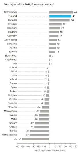
Trust in Journalism in 2016
One thing worth bearing in mind about the early results of the trial is that increasing employment need not be a major aim of basic income. If people in Europe are to consume less, and pollute less, then they need to also produce less and learn to live on lower incomes than they currently do. A basic income makes it possible to live on a very low income and spend your time doing what you really want to do, including useful unpaid work. If you need a little more money, you can work, but it need not be high-paid work. If Finland is to remain one of the happiest countries in the world, it won’t be because everyone works for as many hours as they can, for as much money as they can get.
ONE DAY…
One day, a country will provide a universal basic income (UBI) to everyone. Finland may not be the first to do so, but it will experiment further and remains very open to similar new ideas. Many people say that UBI is unaffordable. But how much more unaffordable is it than the practice in the UK and especially the US of keeping large numbers of people in overcrowded prisons, with plans to build more prisons and calls for more and longer sentences? A universal basic income would not be compatible with wasting money on antisocial activities such as locking so many people up. It would, however, be compatible with massive reductions in carbon emissions, as those who chose to consume less would be able to. They would not have to drive to work if they chose not to work, and a basic income means exactly what it says – basic. A universal basic income is only unaffordable if you think it is necessary for some to go hungry, cold and homeless to keep many of the rest of us at the grindstone of paid employment, much of which is of little ultimate benefit to society.
One day, a country will have no need for prisons; and Finland already has very few prisoners. People find the idea of no prisons strange, because when it is suggested they think of a future society that is just like their current society, but without jails. However, as a journalist based in the Bronx in the United States, Alice Speri, explains: ‘in a society that is tackling things like white supremacy, economic deprivation, toxic masculinity, and that is providing connections between people, and where communities are responsible for each other, I actually don’t think it would be weird at all. You wouldn’t even need the things that we now think of as elemental parts of our society, like the local jail.’ One day, a country will have no homeless people. Finland is very nearly that country.
One day, no one will die prematurely. This utopian vision is at least two centuries old. In Western countries it is best remembered through the words of mill owner Robert Owen, and his address to the inhabitants of New Lanark in Scotland on New Year’s Day 1816: ‘What ideas individuals may attach to the term ‘Millennium’ I know not; but I know that society may be formed so as to exist without crime, without poverty, with health greatly improved, with little, if any misery, and with intelligence and happiness increased a hundredfold; and no obstacle whatsoever intervenes at this moment except ignorance to prevent such a state of society from becoming universal.’
Finland is not Utopia and its people are well aware that there is much that could still be better. However, they also know that they live under a flexible system in a pragmatic country that will permit better ways to be found and further improvements to be made. Knowing that things are going to get better, especially for the less well-off, is often more important than how the situation is today. We will always worry, but we also need to be able to hope.
Finland’s recent history can give us all hope. On 20 March 2020 it was announced – for the third year in succession – that Finland was once again the happiest country in the world. The report in which this was declared included a chapter dedicated to the Nordic countries which concluded: ‘There seems to be no secret sauce specific to Nordic happiness that is unavailable to others. There is rather a more general recipe for creating highly satisfied citizens: ensure that state institutions are of high quality, non-corrupt, able to deliver what they promise, and generous in taking care of citizens in various adversities’.
Of course, Finland excels at much more than just happiness, and we should learn more about how and why the Finnish recipe works in practice – because it urgently needs to be made more widely available in the world.
Danny Dorling is Professor of Human Geography at Oxford University; Annika Koljonen is a recent Politics And International Relations graduate From the University Of Cambridge who Lives in Helsinki. This is an edited extract from their book Finntopia: What We Can Learn From The World’s Happiest Country (Agenda Publishing, 2020).
For a pdf of the full long read, and a link to where it was originally published, click here.
January 27, 2021
Foreword to: S. Cohen et al. (Eds) Europe’s top 10% and income inequality,
There are times when it appears to be that almost everything is changing. Now might well be one of those times. This excellent and very comprehensive report details the concerns and desires of the best-off 10% of people in four European countries as measured before there was any hint of the current crisis caused by the 2020 pandemic. It combines careful quantitative and qualitative evidence to make a series of well-grounded and place-sensitive policy suggestions. The eight authors explain how the best-off in Europe are yet to be at all convinced that their take is disproportionate, or that their taking so much causes huge problems for others. It explains that Europe’s highest paid and otherwise remunerated are much more sympathetic to issues such as racial inequality, gender inequality, and wealth inequality; and that making reference to these issues was more likely to garner some sympathy from the top 10% rather than directly pointing out the inequities of some people being paid so much more than others. We have been taught to believe that ‘we are worth it.’
It is, of course, pointless to suggest that a single individual should sacrifice themselves, returning a portion of their income as some show of their piety. Apart from anything else, who would much notice? What brings income inequality down both effectively and equitably is greater proportional taxation or equivalent universal caps on extravagance. And when this is done, when the top 10% become less well-off together, they hardly notice it. They can live in the same houses, still hold the same rank position, but with less money, they are less wasteful. As this report shows, they are also safer, in Sweden the top 10% weathered the 2008 crash far better than elsewhere in Europe.
As this report goes on to show in great detail, the top 10% rely on public services as much, if not more, than everyone else. Without public higher education, their businesses could not function, their children would not be educated, their lives would be less enriched. This is the group who make by far the greatest use of public health services because they live the longest and are least likely to die a quick death at a younger age. Instead it is the best-off 10% who stagger on for the greatest time with the highest number of comorbidities. We at the top might wish for a more equitable future if those of us in this group thought a little more about how our final year of life might be like; often being cared for by people in the lowest 10% pay band in care homes (our successful children having migrated far away).
Finally, on top of all the recommendations made in this very detailed report I would like to add one more. That people in the top 10% are encouraged to think of their future grandchildren or great-grandchildren, or their great nieces and nephews if they do not have children. And think of the one that has least luck in life, who is ill on the day of the exam; whose marriage falls apart; who starts a business the year before unforeseen economic events bring it tumbling down. Rising into the top 10% is as much a matter of luck as falling a long way out of it is. Even if you do not give a damn for anyone you are not related to, a more equitable future society will protect both you in your old age, and your family long after you are dead. The alternative is not just inequitable – it is ignorant.
Professor Danny Dorling
University of Oxford, June 2020.
For a link to the full report and a PDF click here.

Cover of the Foundation for European Progressive Studies (FEPS) and TASC report on Inequality and the top 10% in Europe
Houses not homelessness
I wrote this chapter because homeless in my home city of Oxford had become not just a local crisis, worse than it had ever been, but also part of the national scandal. As I wrote at the end of April 2020, at a time of crisis, 90% of the people suffering homelessness in this city of Oxford have been housed by the local council and many are being helped to move on and off the streets and out of hostels after the pandemic; and again in January 2021.
If we can do this during the crisis, we can do it in more normal times too.

Bedding used by people sleeping rough outside the gates of Trinty College Oxford, June 2019
The death of Sharron Maasz, though the subject of a coroner’s inquest, would probably otherwise have passed unnoticed. I knew Sharron well. I taught her when I was head of her middle school. Her father, a single parent, was a friend and was for a number of years a governor. Sharron was a bright, lively and sensitive girl. She was a keen cyclist and an all-round athlete. This may be her only obituary.
She is quoted as saying: ‘I just want to get my life sorted … I always wanted to get clean.’
She didn’t get sorted or clean. Instead, she died in a short-term home, a last refuge provided for those in desperate need. She had been living alone on the freezing streets of our leading university city.
I do not have solutions. I only know that the dreams that Sharron, a lovely child, had until her death, have perished in the wreckage of an austerity programme that has literally killed her and her like. (Roger Pepworth, Headteacher, Marston middle school, Oxford 1983–91)
This letter, one of many in recent years, was published in The Guardian newspaper on 3 February 2019 (Pepworth, 2019). It stands out because, unlike the majority of articles or obituaries written about people who have died while experiencing homelessness, Sharron Maasz was named.
Anonymizing people who have died while experiencing homelessness, or shortly after having been homeless, has become commonplace, but is a practice that does more harm than good. Understandably, the families of the deceased do not want their loved ones to be remembered for having died on the streets or in a halfway house, but while we name those who have died in almost any other circumstance, we attempt to forget those for whom society has failed to provide adequate safety and security.
Furthermore, these deaths are often attributed to proximal causes, not the underlying pervasion of poverty or severe lack of adequate housing that evidence suggests create and exacerbate other health problems that lead to death. In doing so, we fail to recognise that UK housing policy has exacerbated homelessness by creating an environment of precarious inequality. Acknowledging this is the first step towards making progress. From there, we can use evidence and data to reverse the policies that have created the current situation. If we do not, there is a great danger that simply monitoring the situation (and reporting the numbers) is perceived as action that will only continue to support the status quo. Roger Pepworth, Sharon’s former teacher, ends his letter above by saying, ‘I do not have solutions …’. He should not have to; others should already be putting them in place. We know from other social policy fields that better use of evidence and data can lay the foundations to create tangible change.
Understanding the numbers
On 31 January 2019, the Ministry for Housing, Communities and Local Government (MHCLG) reported that an estimated 4,677 people were now sleeping rough on any one night in England, almost three times as many as in 2010 (MHCLG, 2019). These figures have long been disputed, with the true number estimated to be at least twice as high. In the same timeframe, the number of families housed by local authorities in temporary accommodation rose significantly, but at a lower rate, from 50,000 in 2010 to 78,000 in 2018. In London alone, there are 225,000 ‘hidden homeless’ people aged 16–25 arranging their own temporary accommodation with friends or family (Fransham and Dorling, 2018).
Reporting on its own rough sleeping initiative (RSI) in the same publication, MHCLG claimed: ‘There were 2,748 people recorded as sleeping rough across the 83 RSI areas in autumn 2018, this is a decrease of 639 or 23% from the 2017 figure of 3,387 (MHCLG, 2019). As the total figure for England hardly changed over this time period, there will have been a similar rise in those areas where the initiative was not undertaken. This could have been for many reasons, which might include people being displaced away from the 83 RSI areas to be homeless in other areas of England. MHCLG’s report on itself continued:
An evaluation of the Rough Sleeping Initiative will be published this year to help understand the impact of the range of activities in these areas on the number of people sleeping rough. There are a range of other factors that may impact on the number of people sleeping rough including the weather, where people choose to sleep, the date and time chosen and the availability of alternatives such as night shelters.
The government ministry did not mention its overall approach to housing as a potential problem, let alone that it is in fact one of the most significant factors. This is not surprising. If they realized that they were part of the problem they would surely have done something about it by now – unless the view of the ministers in charge is that some level of homelessness is necessary or inevitable.
This is not a phenomenon limited to the MHCLG. In 2017, there were estimated to be 527 deaths of homeless people in England and Wales (ONS, 2018). The Office for National Statistics (ONS) reported these numbers in December 2018, and said that:
Understanding a problem is the first step to solving it, and producing these statistics will help society make better decisions to tackle homelessness and stop homeless people dying in our communities (Brimblecombe et al., 2019). These statistics aren’t just numbers, behind each death is the story of some of the most vulnerable members of society. (Humberstone, 2018)
So what is the next step? Counting the rising number of deaths with increasing accuracy is certainly essential, but only illustrates how large the underlying problem has become. It does not tell us where the causes of that problem lie or what can be done to prevent it from happening again. The same can be said of the myopic focus on rough sleeping. Read the above quote from the ONS again and think whether you notice anything strange about the wording.
The phrase that struck me as most odd is, ‘stop homeless people dying in our communities’. Implicit in that phrase is an apparent assumption that people who are homeless have always been with us. But when I was a young boy living in Oxford, there were almost no people experiencing homelessness. What has changed in that time?
While officially supporting the target of ‘halving rough sleeping by 2022 and ending it by 2027’, in truth, policy-makers are unlikely to meet these goals if the default is to blame the weather (recent warmer winters mean that the weather has not been the cause) and suggest that a few more night shelters could help. Despite acknowledging that street homelessness is just the tip of the iceberg, in England the decision was taken not to focus on the root causes. In Scotland, the approach is different and takes all forms of homelessness into account, not just rough sleeping. Neither of these two UK governments go into detail about evidence underpinning their plans or how the impact of policies will be evaluated – a missed opportunity. These government documents are an important source of evidence for other parts of the sector, and their choice of language and areas of focus affect which issues are dealt with or ignored.
Unexplained but not suspicious
In general, policy suggestions on homelessness only address the most precarious and heart-wrenching cases. While this is useful to galvanize sympathy, it unintentionally implies that by helping those whose need is greatest, the problem can be eradicated. This is wrong. It can also create negative side effects among the wider population who, when confronted with endless terrible individual stories, begin to feel that things will never change, becoming apathetic, desensitized and fatalistic.
In spring 2018, in one of the streets where I used to play as a child, a homeless man died in a council-funded hostel. The newspaper report was brief: ‘The 61-year-old was found dead in a room in Marston Street in East Oxford on April 20. The city council said it believed there was nothing suspicious about the man’s death’ (Staff Reporter, 2018).
In autumn 2018, the same paper reported:
A homeless man who was found dead in a graveyard had been sprayed with paint three days earlier in a separate assault … someone uploaded a video onto social media of the homeless man being sprayed, with a voice in the audio that could be heard saying: ‘This is how we deal with beggars on the street’ (Press Association, 2018).
Just before Christmas 2018, a homeless man in his 30s was found dead on the main thoroughfare between Oxford rail station and the city centre. Four days earlier, a man who had been homeless died in the centre of town, in McDonald’s, where local school children go to meet. The same code words were used as in previous reports that imply nothing unusual has happened: ‘Police said on Monday that his death was being treated as “unexplained but not suspicious”’ (Roberts, 2018).
Sharron Maasz died in January 2019 (Aziz, 2019), and two more deaths were reported in the month after. The only thing that connected the three was that they were all experiencing homelessness. We have long become accustomed to such deaths, and an unhelpful tradition has developed whereby it is deemed sufficient to express shock and horror instead of using these tragedies as an opportunity to learn and improve.
Perspective matters, because unless we can be confident that we are framing the challenge in the right way, we may be misusing vital resources and wasting precious time and energy. To achieve real, lasting change it is vital that we take a much wider view of homelessness, one that considers the bigger picture of the drivers and root causes of the issue as informed by current evidence and an historical context and understanding. In 2018, the Centre for Homelessness Impact advocated exactly this approach in a report that went on to suggest that we must also better understand ‘how housing equity is connected to opportunity and life chances’ (Teixeira et al., 2018).
We have come to approach homelessness as a question of how to mitigate, subdue, and tidily deal with the symptoms of our social illness. We have learnt to cope saying these deaths are not suspicious, when in fact they are. We express horror and spend ample time ‘raising awareness’, but this is not good enough.
To achieve a step change in our efforts, a new evidence-based approach to homelessness is needed, one that aggregates evidence from other countries and our own former successes in addition to generating new research. What did we do in the past that meant fewer people were once homeless, and do we have all the evidence we need to address the most pressing questions that need answering today? What are the impact of our current interventions and what would have happened without them?
Luck matters most
Generating and utilizing the right kind of evidence also requires that we ask more complex questions, like why it is that more men die homeless. The superficial reason is that there are simply more men ‘sofa surfing’, in hostels and on the streets. And the reasons for that? Women are more likely to be parents with young children and thus have a right to be housed, while men are more likely to take to drinks and drugs to an extent that leads to homelessness. But the explanations are more complex still.[1]
The number of people dying while experiencing homelessness is now so high that it is possible to break the figures down by the characteristics of those who die and the immediate, if not underlying, cause of death. Only one in six of those who die while experiencing homelessness are women, but the women in England and Wales who die while experiencing homelessness are, on average, two years younger than the men (42 rather than 44 on mean average). Some 21 years ago, as homelessness was starting to become normalized in the UK, Mary Shaw and I made similar calculations and found that the death rates of male rough sleepers aged 16–29 years were almost 40 times higher than those of the general population. For all men aged 16–64 years, this number is about 25 times greater (SMR=2587). Very little has changed in these death rates even while the numbers of people experiencing homelessness fell, and then rose (Shaw and Dorling, 1998).
The picture for women is a little different. Back in 1998 there were too few women on Britain’s streets to be able to calculate their mortality rate by age. The latest data suggests that the number of younger homeless women is on the rise. Homeless men die 34 years earlier than most men, homeless women 39 years earlier than most women. People who are homeless are at highest risk of death where they are most numerous: in London and the conurbations of the north-west of England and, more recently, in Oxford. In early 2019, Oxford had the second highest mortality rate for homeless people in the UK,[2] with the majority of those who died having grown up and gone to school in the city or a village within a ten-mile radius (Brimblecombe et al., 2019; ONS, 2018).
A third of the deaths of people experiencing homelessness in the UK are now attributed to drug poisoning. Doctors know that the cause they write on the death certificate is not the true underlying cause. If they knew the person and were permitted to write a more nuanced description, a few might write something far more useful. Like Roger Pepworth’s obituary for Sharron Maasz and Shaista Aziz’s later tribute and explanation (Aziz, 2019), this could give a human face to people who would otherwise become statistics and present a more honest picture of the structural causes of death for people experiencing homelessness. Here is a hypothetical example:
Died of drug poisoning after intermittent spells without a safe home. An imaginative young man who did well at school. A chance event aged 16, lead to the loss of his nearest sibling in a car crash. The resulting family breakdown began the path to heavy drug use and periods of living on the street. But he survived for some time. Had he been luckier, his overdose would not have happened. Had his local rehab centre had just one extra free space, he would not be dead now, but its funding was cut. Had he been born a few years earlier, before heroin reached his home town, he might have resorted to drink instead and not suffered this overdose. Had he been born in another European nation under otherwise identical circumstances, there is a good chance he would still be alive. But he was born in England, in the mid-1970s, and is now dead, aged 44, coincidentally at the exact mean age that people die nationally. He had rotten luck.
Luck matters above all else to individuals, but at the aggregate level all the good and bad luck is ironed out. At the aggregate level the evidence is not about luck at all. At the aggregate level it is perception that matters most and the biases inherent in the interpretation and presentation of statistics. This is always the case. Individuals all operate with a worldview that they carefully structure their evidence to support. This means that simply gathering more evidence is not enough. To accelerate progress, the sector must be prepared to put its basic assumptions to the test on an ongoing basis, and to ask whether what it is doing is fundamentally improving the situation or instead is perpetuating a bad system, while superficially appearing to help.
What constitutes good evidence?
Just a few centuries ago it was possible to amass a large quantity of evidence to show that the Earth was at the centre of the universe. Just like the moon, the sun appeared to revolve around the earth, so too the planets and the stars orbiting us reassuringly in the night sky. What it took to change that view was not simply a better telescope, it was a better way of thinking. Rooting oneself in a mode of thinking can only sustain the prejudices of your times and place.
The current pervading narrative places the responsibility for homelessness on the individual. But the causes of homelessness do not lie with the people that it affects. Consequently, the solution to the underlying problem is not just intervention on the streets. Neither is it limited to the ‘payment by results’ of ‘local social enterprises’, or the issuing of ‘social bonds’. Individual interventions may be well-meaning, but they can often be merely only superficially and very short-term successful. That is why it is vital to both address the dearth of causal evidence (as highlighted by the Centre for Homelessness Impact Evidence and Gap Maps), while also ensuring we take the bird’s eye view of homelessness and what really causes it to rise.
We know from other fields, such as public health, that to truly use evidence to drive improvements at a population level, taking a systematic and wide approach is crucial. The fitting of gastric bands, for example, may solve obesity in individual cases, but it does not have any effect at the societal level. Obesity will not be eradicated until the whole environment that makes a population fatter is dealt with.
When the ONS released their first estimates of the number of homeless people dying on the streets on 20 December 2018, section seven of their report was titled ‘Proportion of deaths of homeless people that are due to drug poisoning has increased by 51 percentage points relative to the overall number of drug deaths over five years’. The next day the title of that section was changed to, ‘Drug-related deaths of homeless people increased by 52 per cent over five years’.[3] This attention to detail and correction of a single statistic by one percentage point gives the impression that what matters most when gathering evidence is statistical exactness, and then issues such as drugs – the precise drug that lead to death is identified in individual cases. In 2018, the ONS notes that one person experiencing homelessness died from smoking cannabis, while 115 died while under the influence of opiates.[4] The fact that somewhere a doctor noted cannabis consumption as a potential cause of death while homeless may well be the least useful piece of information ever released by a government-funded agency.
The ONS should not be singled out here. The same could be said of much of the literature on homelessness. A report from Housing First England (2019) cites ‘A long history of alcohol dependency, heroin and crack use and anti-social behaviour’ as the main cause of homelessness for one of its service users.
The language used by leading sector organizations matters. Simple statements can, when repeated again and again in aggregate, frame a story, shifting focus from the causes to the symptoms of a problem. With homelessness, the emphasis is so often on how the people affected suffer from alcohol or drug misuse, have ‘high/complex needs’ or all of the above, while forgetting that the evidence suggests most people affected by homelessness never come into contact with the homelessness system, and can therefore not easily be labelled under any of these categories. They are in so many ways no different from you or me.
In its 2018 annual accounts, Homeless Link describes roughly £5 million of spending in a year and begins:
The Government’s commitment to halve rough sleeping by 2022 has set the policy agenda during the year. Homeless Link has made a full contribution to the Government’s process of developing a strategy to implement this commitment, with representation on the Rough Sleeping Advisory Group and all five ‘Task and Finish’ groups set up to work on components of the strategy. We welcome the appointment of Jeremy Swain, who steps down as a Homeless Link Trustee, to lead the Government’s Rough Sleeping Initiative and we are confident that the sector will play its part in reversing the shocking increases in rough sleeping we have seen in recent years. However, these worthy commitments can only be achieved with significant additional resources and we look forward to the publication of the finalised Government strategy later in the summer. (Fielden, 2018)
The call for ‘significant additional resources’ is a recurrent refrain in the sector, when in fact the massive injections of funding every decade or so have probably contributed to the problem. While adequate resources are key, throwing money at the problem does not necessarily mean those affected by homelessness will benefit. In the last fifty years, the (largely English) charity homelessness system has grown in complexity and is more costly than ever, yet the impact of the work has not reduced the scale of the problem. For this reason, the sector needs new types of evidence – particularly causal and comparative – in addition to greater accountability and transparency to ensure policy-makers are indeed drawing on bodies of knowledge when developing policy. We know from other social policy fields like international development and education that better use of data and causal evidence can help accelerate progress and help target resources more effectively.
Progressing policy
Preventing homelessness in the UK requires significant reformation of housing policy. In most areas, it is currently not fit for purpose. It is not just those who are homeless who suffer as a result. Millions of others pay exorbitant rents for low-quality homes over which they have insecure rights.
In this instance, we would do well to draw on evidence from the past and look at similar failures in public policy where an emphasis on the symptoms, not the causes, has prevailed. Acknowledging systemic problems is a rare occurrence in current UK public policy and government often focuses on treating the symptoms of a problem for short-term gain.
In the past, the UK government has tried to address the prevalence of babies with low birth weights by focusing on the health and wellbeing of individual mothers, rather than addressing the systemic factors that mean that the UK has one of the worst records for underweight infant births and highest neonatal mortality rates in western Europe (notably Scotland is now bucking this trend and infant mortality rates are now falling there and are already much lower than in England today as its government has recently begun following the prescription from Finland). The British government has looked at the individual cases of children excluded from school, instead of the wider social issues that mean school exclusions are rare elsewhere in Europe and were quite rare in the UK in past decades; but no longer. It has designed measures to address poverty that mitigate only the worst effects of living on a low income, rather than acknowledging that it is tolerance and exacerbation of high levels of income inequality that is fueling the problem. The British government, from 1979 continuously through to 2019, has treated the issue of long-term unemployment and sickness as if it were the result of work-shy individuals who should be sanctioned for not trying hard enough, rather than understanding that its organisation of the national economy results in greater sickness and wastes human resources.
Without new mechanisms to instigate change, this status quo will prevail. In a complex system, better use of evidence to identify how to prioritize things that do the most good and stop doing what does not work (or causes harm) is vital.
What is to be done?
It is not just housing policy, but social policy in general that has exacerbated homelessness by creating an environment of precarious inequality. Reliable evidence at the micro and macro levels needs to be collected and acted upon more promptly. We need to know what works in the short term, but also keep our eyes on the long-term prize. A piecemeal approach that seeks to improve one area will have little overall effect if other areas of public life are not also improving.
There are opportunities to learn from what we did better in the past, from other areas where social policy has been effective, and from other European countries with more successful social policies than our own (Dorling, 2016). While we may look back and idealize solutions that would no longer be effective, like the mass provision of traditional council housing, an evidence-based approach would clarify exactly why this is the case.
Council housing worked so well at first because of a slum sector that existed below it from which a council house provided an escape. Those are no longer the times we live in, but we can learn from knowing that. It is vital it is to learn faster and fully embrace technological and social developments, what people will need in the future will be different from what worked well for their grandparents in the past, for instance because people now live longer we need far more dwellings without stairs in future. There is a danger that the timings of research seldom work for practitioners and policy-makers. To give another example that would have meant little in the recent past, many young people, including young people who are homeless, will go without food before they go without phone credit. Knowing that is useful.
In the UK, we seem unable to scale up promising interventions, largely because three is often no real will and they are thus so often never subject to rigorous evaluation, meaning that projects then close down as and when the fashion passes. The root causes of new homelessness are almost never treated as a political priority. In England, there are a few new schemes being piloted that have fared well in Nordic nations, like ‘Housing First’. In Finland, ‘Housing First’ as a policy was successful predominantly because of Finland’s stronger social safety net – one that the UK has now largely lost. We do not yet know if it will fail in the UK, but the omens are not good given the cuts that have occurred to other services in the UK. We also know that very large numbers of people who are homeless sleep in public toilets in Finland, but at least they can sleep in public toilets (and those toilet are heated).
We should recognise that all European countries now have lower income inequality than the UK and also enshrine more tenant rights into law. Rent regulation is a vital part of that. It is the only defence against arbitrary eviction.[5] In Germany half of all householders rent privately. Often they rent using standard leases, which permit tenants to live in a property for the duration of their lives (Hickey, 2016). Rent caps are enforced to stabilize rates for all tenants, and closely monitored to ensure they do not increase too quickly. Tenants’ groups organize to complain when landlords are not penalized for breaking the law.
In Sweden, private sector rent levels are set through negotiations between representatives of landlords and tenants in a very similar way to how trade unions and employers negotiate pay. In 2014, the whole of Stockholm was limited to increasing rents in a year by only 1.12 per cent as a result. In the Netherlands, monthly rental fees are fixed by government. Government officials inspect properties for quality and decide rents accordingly. Denmark has two forms of rent regulation and does not suffer homelessness on the scale of countries with a supposedly more ‘free market’. ‘Free’ housing markets serve only to benefit those with the most money.
In France, a new set of rent regulations came into force in the capital in August 2015, stating that private rents ‘must be no more than 20 percent above or 30 percent below the median rental price for the area’. Of course, the rules prompted anger among property agencies and landlords, who claimed they would deter investment. But the evidence from less equal countries is clear: landlords charging whatever rent they choose does not result in more housing becoming available. The USA and its enormous rate of homelessness amply demonstrates what leaving housing to the free market produces. In contrast in the European mainland These controls have helped reduce rent inflation as firms and European agencies move parts of their workforce to Paris during the Brexit process.
The dominant narrative in Britain, and especially in England, remains one that always focuses on the apparent deficits and perceived failures of people who become street homeless. Victim-blaming is an area in which much of western society excels, but at which the most economically unequal societies such as the UK and USA excel the most. Thankfully, there is now growing evidence that this may be changing, and that attitudes in the UK are finally beginning to alter (Dorling, 2018). Changing old habits will not be easy, but nurturing a learning sector that acts more promptly on existing knowledge and tests its assumptions about what works will improve the positive impact of our efforts. Much more importantly than that, though, is electing a government made up of people who both care and understand.
Sharron Maasz was one of so many who could, and should, be alive today.
References
Aziz, S. 2019. The death of Sharron Maasz shows why domestic abuse services are vital. The Guardian, 26 November. https://www.theguardian.com/cities/20...
BBC News. 2019. Homeless deaths nine times higher in deprived areas. BBC News, 25 February. https://www.bbc.co.uk/news/uk-england....
Brimblecombe, N., Dorling, D., and Green, M. 2019. Who still dies young in a rich city? Revisiting the case of Oxford, The Geographical Journal, DOI:10.1111/geoj.12336, Accepted Article published online on 12 November, 2019. https://rgs-ibg.onlinelibrary.wiley.c...
Dorling, D. 2016. A Better Politics: How Government Can Make Us Happier. London: London Publishing Partnership. http://www.dannydorling.org/books/bet....
Dorling, D. 2017. The Equality Effect. Oxford: New Internationalist. http://www.dannydorling.org/books/equ....
Dorling, D. 2018. Peak Inequality: Britain’s Ticking Time Bomb. Bristol: Policy Press. https://policy.bristoluniversitypress....
Feilden, P. 2018. Introduction to company account 25 July 2018 authored by Homeless Link: Reports and Financial Statements for the year ended 31 March 2018. http://apps.charitycommission.gov.uk/....
Fransham, M. and Dorling, D. 2018. Homelessness and public health. British Medical Journal, 360. https://www.bmj.com/content/360/bmj.k214.
Hickey, S. 2016. Would a rent cap work for tenants facing £1000 a month rises? The Observer, 1 May. http://www.propertyinvesting.net/cgi-....
Housing First England. 2019. Life Stories. https://hfe.homeless.org.uk/life-stories.
Humberstone, B. 2018. ONS reveals the number of people dying homeless. https://blog.ons.gov.uk/2018/12/20/on....
Kraemer, S. 2017. Notes on the fragile male. Extension of (2000) ‘The fragile male’ British Medical Journal, 321(7276): 1609–12. Extended notes online only: http://sebastiankraemer.com/docs/Krae....
MHCLG. 2019. Rough Sleeping Statistics Autumn 2018, England (Revised). London: Ministry of Housing Community and Local Government. https://assets.publishing.service.gov....
ONS. 2018. Deaths of Homeless People in England and Wales: 2013 to 2017. London: Office for National Statistics. https://www.ons.gov.uk/peoplepopulati....
Pepworth, R. 2019 Harsh reality of life and death on the street below dreaming spires. Letters. The Guardian, 3 February. https://www.theguardian.com/society/2....
Press Association. 2018. Homeless man found dead in graveyard had been sprayed in paint attack. Oxford Mail, 14 September. https://www.oxfordmail.co.uk/news/nat....
Roberts, J. 2018. Man in thirties dies on Hythe Bridge Street, Oxford. Oxford Mail, 7 December. https://www.oxfordmail.co.uk/news/172....
Shaw, M. and Dorling, D. 1998. Mortality amongst street sleeping youth in the UK. The Lancet, 29 August: 743, http://www.dannydorling.org/wp-conten....
Staff Reporter. 2018. Homeless man found dead in Marston Street hostel, Oxford. Oxford Mail, 2 May. https://www.oxfordmail.co.uk/news/161....
Teixeira, L., Russell, D. and Hobbs, T. 2018. The SHARE Framework: A Smarter Way to End Homelessness. London: Centre for Homelessness Impact. https://uploads-ssl.webflow.com/59f07....
ENDNOTES
[1] The consultant child and adolescent psychiatrist Sabastian Kraemer collated the evidence and has found that in a surprising large number of aspects of life men might be more likely to ‘succeed’, be promoted and be higher paid, but they are also more likely to do badly as compared to women. His examples ranged from male humans being more likely to being miscarried as a foetus, to failing to gain any qualifications at school, through to dying earlier. In the detailed notes to his analysis he made it clear that women often do very badly too and suffer systematic discrimination in society. Sabastian summed up the fundamental difference as ‘Men die, women suffer’ (Kraemer, 2017).
[2] On 25 February 2019 the BBC reported that Blackburn had the highest death rate among people who were homeless by area, followed closely by Oxford and then Camden (BBC News, 2019).
[3] Section 7 ‘Drug-related deaths of homeless people increased by 52 per cent over five years’ (ONS, 2018).
[4] Ibid, Table 1: Drug poisoning deaths of homeless people (identified) by substances mentioned, persons.
[5] This section is based on work done for the book The Equality Effect written by the author of this chapter published by New Internationalist (Oxford) in 2017; see: http://www.dannydorling.org/books/equ....
For a PDF of this chapter and link to the book it is published in click here:
January 25, 2021
Employment: in Brexit and Beyond
Where have we come from?
Unemployment has not always been with us. In fact, the term was hardly used at all before 1900, and that was because the concept of being unemployed only began to take form in the early 1880s depression. Before then there were paupers, who were often assumed to be work-shy and lazy. Unemployment scarcely exists without unemployment benefits of some kind. The word unemployment is most mentioned in books scanned by Google in 1936 and 1984; the heights of the great depression of the 1930s and the great recession of the 1980s.
Employment is not the opposite of unemployment. Many adults can be neither employed or unemployed. They can be retired, caring unpaid, studying, or sick. Also people can be underemployed, or entirely dissatisfied with their work. By 2020 the majority of children living in poverty were being cared for by parents in poorly paid work which was not the case in the 1980s.
Where are we now?
Towards the end of 2020, unemployment and redundancies were on the increase, as ONS reported in November. At the very same time, the number of employed people living in the UK who had been born abroad began to fall rapidly; by 717,000 between March and September. At first commentators thought that such a rapid change must be due to changes in how the statistics were recorded, but then they realised that the pandemic had led to an exodus. The majority of those leaving were EU citizens who had been in employment before April. People who were unemployed were more likely to stay, but in total, 915,000 adults who were not born in the UK left the UK between April and September. Of those who stayed, 88,000 more were unemployed.
Where are we heading?
Employment levels, and the quality of jobs, are partly a political choice. It is not ‘the market’ which mainly determines how many people are in work, but the extent to which people are encouraged to be in paid work or not. A government can decide to make it more or less attractive to employ people. A highly progressive tax rate can make it more attractive to employ more people at a good wage, rather than fewer at a higher wage, resulting in an increase in overall employment rates.
Governments that impose punitive sanctions on those deemed not trying hard enough to find work can force the unemployment rate down. Governments can directly create employment themselves through jobs paid for by the state. Within Europe, this can be 50% higher in some countries as compared to others. The diagram below shows the extent of variation in unemployment rates within Europe and how the UK had chosen (by 2019) to be at one extreme of that distribution, copying the USA by ensuring that as few people as possible resorted to unemployment benefits. Many took inadequately paid jobs, many had to do multiple jobs, many in the UK did not like their jobs.
What may happen next? Often the most sensible predictions are also the dullest and most depressing. The UK could continue along the route it has taken in recent years. Work becomes more mandatory and more precarious for the majority. Unemployment benefits are further reduced (in real terms they are already half what they were in the 1970s). Millions of people in the UK are forced to take even more demeaning work, increasingly acting as servants for the better-off: delivering take-aways, cleaning their homes, walking their pets. Inequality rises.
I do not think the above scenario will play out. This is because of the 2020 pandemic. Rather like the second world war, it has weakened right-wing devil-take-the-hindmost politicians. Once you have to ask everyone to be ‘in it together’, once you rack up an enormous bill to pay for the war or pandemic, once you start to use the language of having to make individual sacrifices for the greater good, it is then very hard to return to a rhetoric of there being no such thing as society — just individuals and their families. A pandemic shows just how false such thinking is.
UK unemployment has been low compared to the EU27
Unemployment rates among 20-64 year olds in the EU, EEA and UK by country of birth, 2019.

Unemployment rates among 20-64 year olds in the EU, EEA and UK by country of birth, 2019.
[Note: EU-born and non-EU-born figures unavailable for Bulgaria, Hungary, Romania, Slovakia. EU-born figures unavailable for Latvia, Lithuania, Malta and Poland. EU-born figures for Croatia and Slovenia have low reliabiality. Non-EU-born figures for Croatia, Lithuania, Poland and Czechia have low reliability.]
What I think is more likely is that the UK fills up with even more of its ‘ex-pats’ returning; especially the older ones. Young, cheap and efficient workers leave these shores because they do not have equal rights, because the pound drops even further, and as their prospects dwindle. The UK middle-class is squeezed; their graduate children have no work of the kind which a (now very expensive) university degree was supposed to deliver. Above all else there is a need to take back control from those who actually took it — the richest people in Britain who took a greater share of income in the UK than that group takes anywhere else in Europe.
The UK will level out rather than level up. Taxes will rise, especially for the better-off. Government will have to create jobs. The ‘fifth option’ — to not be forced into paid employment — will return, perhaps through tentative steps towards a universal basic income, mimicking the tentative steps towards paying unemployment benefit of just over a century ago. The stigma of having to rely on benefits will decrease. And, just as has happened several times before in British history, those at the top will know not to ask for a pay rise and those at the very top will accept permanent reductions in their pay — as the FTSE 100 CEOs already have started to, albeit only slightly so far. And so Britain outside the European Union will slowly begin to look ever so slightly more like an average employment/unemployment level European state.
For a PDF of this chapter and a link to the report it is included in click here.
December 18, 2020
Please sir, can I have more?
On the 25th of November 2020 the Chancellor of the Exchequer decided that, in the public sector, there would be no increase at all for many and a real-terms pay-cut for millions more in 2021. People doing jobs such as teaching in classrooms and emptying our bins, people recently defined as essential workers, would have less to live on next year as compared to this year. The question is, why did the Chancellor, Mr Sunak, do that?
Luke Bartholomew, a Senior Economist at pension manager Aberdeen Standard Investments, explained to the BBC, that this was a particularly ‘disappointing’ choice given that it was made in the wake of the news that not one but three vaccines had been found to be successful in their initial trials in the weeks immediately before the Chancellor’s statement. Luke said:
“The exceptionally good news on vaccine development means that we can now start to look beyond the Covid crisis. It seems clear to us that the main problem facing the economy at that point will be one of insufficient demand and rising unemployment. In that context, it is disappointing the chancellor is already looking to prioritise public sector pay restraint. The economy would be much better helped by supporting the spending power of public sector workers. With interest rates exceptionally low, and very likely to stay that way, it is quite simply wildly premature to turn towards deficit reduction measures.”
The size of the pay cut to be suffered by public sector workers will depend on how high inflation rise to during 2021. As the prices of many basic goods are expected to increase when tariffs and other impediments are placed on them, following Brexit, we should not expect inflation to be very low.
The chancellor said that he “could not justify an across-the-board increase when many in the private sector had seen their pay and hours cut in the crisis.” This is an odd line of argument as neither he nor any of his Conservative predecessors ever said, in years when average private sector pay was rising in Britain, that the public sector should also see a commensurate rise!
The chancellor’s argument is also unusual because the conventional conservative argument that would be proffered is that “the country cannot afford this”. However Mr Sunak has been able to afford all kinds of things, including an enormous increase in military spending announced just a few days before the spending review. Even he did not have the gall to claim that affordability was the key issue. He could have chosen to ensure that public sector pay at least rose to be commensurate with inflation if he had wished to; it was just that he did not wish to. But why?
Mr Sunak, Chancellor of the Exchequer
So as not to be disingenuous, it is worth looking at what else the Chancellor gave as a justification, other than his key claim that it was only fair to level down public sector pay if people had been badly hit in the private sector. He said he wanted to protect jobs, with the implication that more jobs could be created, or fewer lost, if most people working in the public sector took a pay cut. However, the Chancellor will know, and as Luke Bartholomew explained on the day of the Spending Review, that if you reduce the average spending power of public sector workers by reducing their pay in real terms, they will spend less in the economy and that reduction in demand for goods and services will reduce the number of jobs overall, especially jobs in the private sector – so preserving jobs cannot be the real reason.
It is possible that the Chancellor is convinced that there will be less to go round in future and he wants to ensure that those working in the public sector consume less: less food of a high quality; less space in the homes they occupy; fewer holidays in future; and so on and on. Cutting public sector pay in real terms will dampen demand in general and there will be fewer jobs in the private sector in future and pay cuts there as well, all resulting in reduced spending on those same quality items. He may think this is all inevitable and reasonable. And he may want to try to pitch private against public in a false argument to turn attention away from the real choices he has made – choices he made before the day of the spending review and choices he will presumably continue to make.
The chancellor decided to spend more on defence just before the spending review. Military spending creates relatively few jobs per pound spent, but can of course create misery is it bolsters arms manufacturers, whose weapons eventually often maim and kill people, and not necessarily by our own armed forces. It may have been because he didn’t want these issues being raised on the day of the spending review that he announced the very large rise in military spending days earlier. Such a deliberate and manipulative separation of issues is common in politics.
In terms of future choices he has to make, the key ones concern taxation. There is a group who are not like most public sector or private sector workers, who could easily afford to pay more in taxation. That group could, for instance, easily pay taxation at the customary European rates for their income levels. Admittedly if that group did pay more in taxation, they would not be able to afford quite as much of the luxuries and extravagance that the rest of us never had, quite as many homes as they currently own, and quite as many holidays a year as they normally took – that group is people with very high incomes, very high wealth, or both: the rich.
The word ‘rich’ does not appear once in the text of the Chancellor’s 2020 spending review statement, nor does the words ‘wealthy’ or ‘redistribution’ or ‘fair’ other than ‘to ensure fairness between the public and private sectors’. The Chancellor’s statement was instead full of paradoxes, for instance promising both “The biggest ever investment in new roads” and “…the greener future we promised.” It included promises to raise the National Living Wage for a full time worker by £345 a year, or just under a pound a day. He did not explain that the wage is still not one you can reasonably live on and hence a misuse of the term ‘Living Wage’. The statement cited lower paid workers five times; because the Chancellor wants to say how much he and his government was doing for the lowest paid. It never mentioned the highest paid.
So, to conclude on the question I began with – why did Mr Sunak do this rather than, say, suggest a small public sector pay rise of 1% and make a point about how generous he thought that was being (even if that too would be a real terms cut)? The only plausible answer to the question this short article began with is that he wanted to provoke discord between people in the private and public sectors, to keep up the pretence that that is the choice he had – to support one or the other – because he wished to distract people from the real choice he has made – to protect the rich. We can get perhaps gain a better sense of his priorities form his actions rather than simply concentrate on his words, For instance, it is now well documented that his largess during the Covid crises had already enriched many of his, and fellow Conservative MPs friends through preferential dubious contracts.
And why would Mr Sunak wish to protect the rich, and why would the Prime minster and cabinet and Conservative party support him in that? I can only conclude that it is because of whom they really represent – themselves and their even richer backers.
A copy of the spending review speech can be found here.
And a study which suggests parallels in the USA is here.
for a pdf for this article and a link to its original publication click here.
December 16, 2020
Should you visit your family this Christmas? Three experts weigh in
For the third of society who live within a few miles of their parents, not seeing relatives at Christmas will make little sense if you see them most weeks anyway.
Should you visit your family this Christmas? Three experts weigh in
 Roman Samborskyi/Shutterstock
Lena Ciric, UCL; Andrew Lee, University of Sheffield, and Danny Dorling, University of Oxford
Faced with rising infections and a new, more infectious strain of the coronavirus, the UK government has come under pressure not to relax COVID-19 restrictions over the Christmas period. Despite this, the government has said that the rules allowing three households to mix are “unlikely to change”. But is this wise? Here, three experts discuss the risks of mixing over Christmas, and whether celebrating separately might be better.
Lena Ciric, Associate Professor in Environmental Engineering, UCL
My answer is a definitive no. Cases are on the up and relaxing the rules will lead to a new peak in the new year. We know close contact leads to transmission, but Christmas in the UK does not lend itself to social distancing. For a start, the weather is not going to favour outdoor activities.
Spending the holiday with your family means a number of rules that we have lived by for the past nine months will have to be broken. Various generations – older ones at high risk and some too young to adhere to distancing measures – will congregate in one another’s homes. It is virtually impossible to keep one to two metres apart at home.
We then throw into the mix indoor spaces with inadequate ventilation to prevent viral transmission. We know face coverings offer some protection, but it’s unlikely that families will wear coverings throughout the holiday, especially with the amount of eating and drinking that will take place. Indeed, a Christmas Day gin and tonic or glass of champagne is likely to make us more confident in breaking the distancing rules. For me, the risk isn’t worth it.
 The control measures we’ve become used to are unlikely to be practical at Christmas time.
DisobeyArt/Shutterstock
Danny Dorling, Halford Mackinder Professor of Geography, University of Oxford
For the third of society who live within a few miles of their parents, not seeing relatives at Christmas will make little sense if you see them most weeks anyway. If Grandad and Granny normally look after the toddler on the days when you go out to work, you are hardly going to improve their chances of avoiding the virus by not seeing them at Christmas.
But for the third whose elderly relatives live many miles away, if they have been isolating themselves already, you may be less likely to meet up. With the vaccine now being rolled out, people in this group are more likely to think: why risk being Wilfred Owen, who died a week before the Armistice? For the other third somewhere in between, there may be more of a conundrum.
No one knows the exact proportion of people who are in each group, just as no one knows the actual risk of pulling a cracker round the Christmas table – with or without gloves and masks on. What we do know is that people aged over 70 are at a much higher risk than others and have already altered their collective behaviour to reduce risk the most. In the latest ONS survey, COVID-19 infections among over-70s in England had reduced from 0.80% at the end of October to 0.48% by the start of December. And according to the latest REACT-1 survey, across roughly the same period infections among over-65s almost halved. More than 99.5% of elderly people are currently not infected.
So what is to be done? Here is a simple rule: ask the oldest person(s) what they want to do. The risk to them of meeting up is many times greater than the risk to everyone else combined. They have spent a lifetime assessing and taking risks, possibly ranging from driving a car to having a smoke, and (by definition) they have so far been more successful than you have at doing that. They might be unsure and want to talk about it, possibly even wanting to know the odds. Ultimately, Christmas means different things to different people, and their decision should be respected.
The worst Christmas is often the first one after a loved one has died. That too can change the calculus of the costs of spending Christmas alone.
 Older family members are more at risk, so they should decide whether to celebrate in person or not.
DisobeyArt/Shutterstock
Andrew Lee, Reader in Global Public Health, University of Sheffield
At its peak, there were 25,000 new cases of COVID-19 per day nationally during the second wave. The second lockdown then reversed rising trends and brought infection numbers down to 15,000 per day by the end of November. In comparison, there were less than 1,000 cases a day in the summer. However, since restrictions have lifted, those numbers are rising worryingly again. This matters, as a proportion will translate into hospitalisations and more deaths.
Winter is always a challenging time for health services, which are stretched to the limit. The added burden of COVID-19 ill health will worsen the situation. It is also likely that the need to treat COVID-19 cases will displace non-COVID healthcare. That means delayed hospital investigations, procedures and treatments for non-COVID medical problems, which could have serious consequences.
Allowing households to mix at Christmas is akin to adding fuel to the fire and boosting the spread of infections. Households are the highest risk setting for transmission of COVID-19 – if someone is infected, early research suggests those around them have just under a 20% chance of then catching the virus.
Moreover, household mixing cannot be made risk-free. Infections in a household can lead to household-level outbreaks that are likely to disproportionately affect vulnerable family members. In turn, rising numbers of infections will then spill over into other settings, such as schools, care homes and workplaces, causing wider socioeconomic disruption.
With the promise of vaccine protection on the horizon, every effort now should be focused on buying time for the NHS to vaccinate as many of the vulnerable as possible. Allowing families to mix at Christmas is an unnecessary risk to take and comes at a price in lives lost, which is not worth paying for the few days of relaxed restrictions.
Lena Ciric, Associate Professor in Environmental Engineering, UCL; Andrew Lee, Reader in Global Public Health, University of Sheffield, and Danny Dorling, Halford Mackinder Professor of Geography, University of Oxford
This article is republished from The Conversation under a Creative Commons license. Read the original article.
For a PDF of this article or a link to the original click here.
December 11, 2020
Letter: Social infrastructure is also vital to recovery plan
UK chancellor Rishi Sunak plans to set up a national infrastructure bank to “channel billions of pounds into capital projects” (Report, November 21).
We write to urge the chancellor to broaden his vision. The regeneration of Britain’s “national infrastructure” must include investment in “social infrastructure” such as childcare, schools and universities, regional theatres, orchestras, common spaces and local sports.
The pandemic has shown these economic activities are just as vital to society and the economy as the physical infrastructure of asphalt roads, green energy and safe bridges. And research demonstrates that investment in care has multiplier effects many times those of investing in construction, while generating far fewer greenhouse gas emissions. Furthermore, these investments can be kickstarted in less time than construction projects.
Under-investment in social infrastructure before the pandemic was a false economy; it would be even more so as we move into the recovery phase. Channeling money into Britain’s social infrastructure and especially into its care, education, arts and training sectors would create jobs, generate income for workers, the Treasury, and the wider economy, and contribute to a more robust and sustainable economy.
Patrick Allen, Danny Dorling, Susan Himmelweit, Ann Pettifor, Robert Skidelsky, Carolina Alves, Daniela Gabor, Stephany Griffith-Jones, Will Hutton, Michael Jacobs, Sue Konzelmann, Natalya Naqvi, Kate Pickett, Josh Ryan-Collins, Guy Standing, and Jan Toporowski (Council Members of the Progressive Economy Forum London NW1, UK)
December 11th, 2020
For a PDF of the letter and a link to where it was published in the Financial Times click here.

Image of men in hard hats used in the original Financial Times Report to which this letter is a response
December 2, 2020
Why is COVID-19 more severe in the north of England? The story in four graphs
Danny Dorling, University of Oxford and George Davey Smith, University of Bristol
England has emerged from lockdown and entered the second phase of its tier system – in which different parts of the country are placed under a different set of coronavirus restrictions. The scheme has been controversial, with many pointing out that the system is more heavily applied in the north of the country, which has been hit hard by the disease.
What are we to make of the geographical differences in infections and deaths from COVID-19?
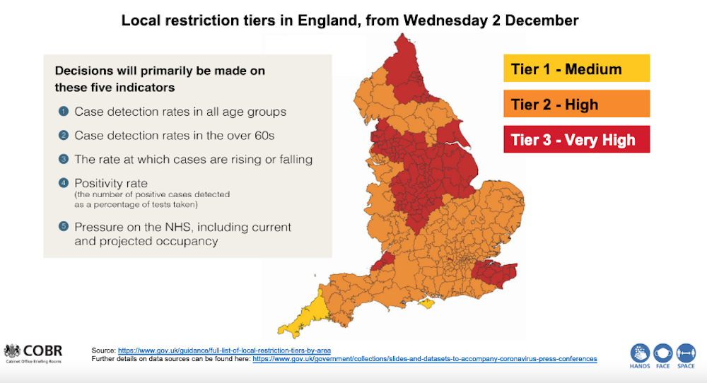
gov.uk
You would expect that when the proportion of people testing positive for COVID-19 rises, the number that subsequently die will also rise – but this article illustrates that, following the first wave and the fall to low numbers of daily cases in summer, it has been only since autumn that this can actually be seen to be occurring clearly, and then only for people aged over 70. More than 80% of all those who died in England with COVID-19 mentioned on their death certificate have been in this age bracket.
To help us understand the geographical relationship between testing positive for this disease and dying from it, it is helpful to concentrate on these over-70s. One reason for this is that modelling has suggested that at younger ages cases may rise, but the total number of deaths fall if those younger people mix less with older people; and young people, once infected, have a significantly lower chance of dying from COVID-19.
Since May 2020, researchers working for the Office for National Statistics (ONS) have been conducting a COVID-19 infection survey which reports estimates of the proportion of people infected in each region of England. We can use this data to shed some light on the issue of geographical differences in the spread of coronavirus.
How COVID hit the north first
According to ONS data, in the first two weeks of September only 84 new infections were found in the English survey out of almost 90,000 households that were being tested each week at that time. But as the number of people sampled rose to more than 200,000 households per week, and as the disease spread more rapidly, just over 1,000 new infections were being recorded in the middle two weeks of October.
The first graph below shows there was no clear geographical relationship between the proportion of people aged 70 or older who tested positive for COVID-19 in the four weeks to September 19 and the numbers who were recorded as having died with COVID-19 mentioned on their death certificate in the week after. Both the disease and deaths from it had become rare in August and September, but that situation would quickly change.
 Regions key – WM: West Midlands, EM: East Midlands, SE: south-east, SW: south-west, NE: north-east, East: East of England, YH: Yorkshire and Humber.
Danny Dorling, Author provided
Exactly two weeks after the situation described above, the picture was very different. Indeed, we had to update the horizontal and vertical axis scales on our graph due to the increases in cases and deaths in the north.
By October 3, cases had risen the most in the north-east of England (the most northern region in the country); by almost as much in the north-west (the next most northern); and by half as much in Yorkshire and Humberside. Deaths in all three of these regions rose similarly in the week starting October 3.
 Regions key – WM: West Midlands, EM: East Midlands, SE: south-east, SW: south-west, NE: north-east, East: East of England, YH: Yorkshire and Humber.
Danny Dorling
Did the rates of infection rise most in the north of England because autumn starts earlier further north? We do not know. The rises in COVID-19 this autumn have been geographically distinct; but then so too is the onset of autumn. As all gardeners know, autumn always begins in the north of England and sweeps down to the south-west, arriving there last of all.
Other factors to consider are regional variations in susceptibility by the autumn – in August 2020 the ONS found that only 3.9% of people in the north-west were found to have antibodies to SARS-CoV-2 as compared to 10.0% in London, meaning that in London there were more people with higher levels of immunity. COVID-19 may also have spread more quickly in the north-west because there are more essential workers in these regions who cannot do their jobs from home. More may live nearer to their elderly relatives and rely on them for childcare, or be medically more susceptible to catching or dying from the disease.
What we do know is that when the proportion of people over 70 who tested positive rose in the four weeks before a particular date in a region, the proportion of people of that age who died in the week after that date similarly rose. This relationship is also stable, but not quite as strong, if you move that four-week window back by two weeks.
A clearer picture
It is what happened in the subsequent two time periods which most clearly suggests that there is a now a strong and strengthening geographical relationship between infections among the elderly and mortality overall.
Every two weeks, as another batch of survey data was released, the picture became more convincing because it is repeated with independent ONS data, collected for a new time period along with data from the Imperial College London REACT study.
In the four weeks before October 17, there is still not much of a pattern between cases and subsequent deaths in more southern regions where fewer than 1% of those under the age of 70 tested positive at that time. But the northern regions of the country showed a strengthening relationship.
 Regions key – WM: West Midlands, EM: East Midlands, SE: south-east, SW: south-west, NE: north-east, East: East of England, YH: Yorkshire and Humber.
Danny Dorling, Author provided
The most recent picture is shown in the graph below. Now there is an even stronger correlation between prior positive tests and subsequent deaths. The north-east has fallen back one more place, and both Midlands regions are rising slightly. It was on the day before the end of this most recent period, on November 5, when the UK entered its second nationwide lockdown.
 Regions key – WM: West Midlands, EM: East Midlands, SE: south-east, SW: south-west, NE: north-east, East: East of England, YH: Yorkshire and Humber.
Danny Dorling, Author provided
By early November 2020, when 1% of people aged over 70 tested positive for the disease in a month in any region, as many as 200 per million people of that age group would die in the next week. That proportion could be lower if people who are more likely to catch the disease are less likely to take part in the ONS survey (which is very possible). Infections had risen most in the north, and then in the Midlands.
What happens next is unknown – the testing data up until November 14 has already been released, suggesting a possible fall in deaths in the eastern, east Midlands and Yorkshire and Humberside regions in future weeks and a plateauing in the north-east, north-west and London.
There are many reasons for why this might occur, including both a possible fall in the proportion of people who are most susceptible where the disease has already spread the most, and possibly also greater voluntary isolation of people aged over 70 as it has spread. But as England exits full lockdown and re-enters tiers, the full effects of colder weather are yet to come.
Danny Dorling, Halford Mackinder Professor of Geography, University of Oxford and George Davey Smith, Professor of Clinical Epidemiology, University of Bristol
This article is republished from The Conversation under a Creative Commons license. Read the original article.
For a PDF of this article and another link to the original source click here.
November 29, 2020
Want to understand the Covid map? Look at where we live and how we work
It’s social, not medical, science that tells us most about the disparate spread of this pandemic.
Why does the late November map of the three-tier system in England look so much like a depiction of the north-south divide? In one sense, the explanation is simple: the tiers are principally set according to prevalence of the disease in each area and that is higher in much of northern England.
But why is the disease currently more common in the north? Why, in early autumn, were you more likely to be infected if you lived there? In part, this might be due to the seasonal nature of the virus and autumn comes first to the north. However, that does not explain why North Yorkshire and Cumbria are not now in the highest tier.
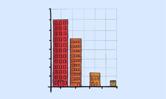
Social science links how we live to Covid rates. Illustration: Dom McKenzie/The Observer
The greater truths are that in poorer, more often northern, parts more people have jobs that cannot be done from home and more use public transport. Frequently, childcare is provided by the extended family who live nearby – wages and benefits are usually too low to allow other childcare options. There is less early retirement and more pensioners need to work too. Further, overcrowding in homes in cities is more common and anyone out of work exacerbates that.
There is also the question of taking a test. People are often not sure whether they have symptoms or not. If the implication of volunteering to take a test is that you and your family are then trapped in a small home for two weeks, that your older children cannot go out to work, that your school-age children will be trying to learn at home with whatever computer you have (if any), and that you and any partner you have also cannot go out – would that influence whether you thought a test was worth it? Of course it would.
The picture is different in the more leafy suburbs of southern towns. People are less likely to have relatives who live nearby and with whom they mix. They are less likely to have work that requires them to have frequent contact with many others. Indeed, they are less likely to be out of work and have time that can only meaningfully be filled by human contact. If they take a test and the result is positive, they can more often carry on working. What’s more, their children might all have their own bedrooms and their own parents might not be reliant on them popping round.
England’s new lockdown measures
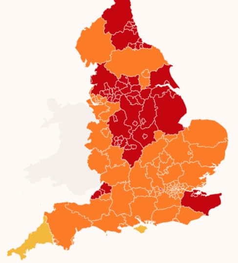
The Geographical Tiers for COVID_19 rules coming into effect on December 2nd 2020
Measures coming into effect on 2 December:
Tier 3 (RED) Very high alert
Indoor household mixing banned. Pubs and bars closed except for takeaways. Indoor entertainment venues closed. No unnecessary travel outside area
Tier 2 (ORANGE) High alert
No indoor household mixing, including hospitality. Pubs and bars can only open to serve alcohol with ‘substantial meals’. Indoor entertainment venues open. Restricted spectator sport resumes
Tier 1 M(YELLOW) Medium alert
Rule of six applies indoors and outdoors. Pubs and bars can serve just alcohol. Indoor entertainment venues open. Spectator sport less restricted than in tier 2
In short, the geographical map of the disease today is a product of various factors, many of them deeply embedded in the diverse ways Britons live their lives. But in the discussions around Covid, social scientists – those who look at people’s lives in the round – are too often absent.
We need to look, for instance, at the economies that have evolved in different places and the networks of care – to look, in short, at the extent to which there is a close-knit and well-connected society in each place. It’s not just about examining individuals and their small, nuclear families. So, socially and economically, much of Kent, south Gloucestershire and northern Somerset is a little more like the north of England than other parts of the south; it is therefore not so surprising that these areas have been placed in the highest tier.
In the next few months, before both the warmth of spring and the distribution of vaccines kick in, the pattern we see today might change little. While we wait, some people can afford, and are able, to isolate and distance far more easily than others. Because of this, southern counties will tend to report lower rates of infection and remain in lower tiers (or be put in them earlier).
There are, however, complications to the geographical story. We also need to know why rates of transmission in London, which contains some of the poorest places in the UK, have remained so low. Perhaps because the virus can no longer spread as easily there as it did initially. Again the explanation is, in large part, sociological.
…
When Covid-19 first arrived in the UK, it did so disproportionately in the home areas of those who had skied in Italy in February – largely, affluent districts of southern England. (At one point, there was a lot of Covid-19 in Kensington and Chelsea.) However, it quickly spread from those areas and to the rest of London more than any other place in the UK.
London has by far the greatest density of population and, in February and March, it experienced the most travel in and out. London had the most social mixing and, very likely, the highest rate of infection before voluntary social distancing began. (We will never know for sure, as surveillance testing of the population did not begin until months later.)
Today, London is a little less crowded and much less busy, but we know, from the Office for National Statistics’ (ONS) survey of large random samples of the population, the proportion who have antibodies. That figure is at its highest in the capital. London is also very well served with hospitals per person (compared with the rest of England) and has a relatively small elderly population. Last week, the ONS revealed that its central estimate for the proportion of people aged 70 or over with the disease in the capital had fallen slightly to 0.55% and was lower than in every region in the north. It had never risen above 0.58%.
Like London, the Liverpool City region is now to be in tier 2 because transmission rates there are now falling. This is only speculative as yet, but perhaps it is because so many people recently had the virus in Liverpool that, as in London, susceptibility might have fallen, at least enough to make a difference in reducing transmission.
It is inevitable that national and local politicians will want to claim credit for any fall in disease rates. However, it is worth being patient and waiting for the longer-term, cross-national studies to emerge. These will, hopefully, reveal which political approaches and specific interventions helped most, which were largely irrelevant and which might have made things worse.
What’s certain is that the key to understanding the map is the underlying social and economic geography of England. To understand the changing medical geography of this pandemic, you must first understand how the country lives and works.
• Danny Dorling is Halford Mackinder professor of human geography at Oxford University. He is the author of All That Is Solid, Injustice: Why Social Inequality Still Persists and A Better Politics.
For a PDF of this article and a link to the original publication click here.
Danny Dorling's Blog

- Danny Dorling's profile
- 96 followers

