
Danny Dorling's Blog, page 10
April 27, 2022
The Trickle Up of Fear
Slowly and strangely the world changes. We adapt, but it changes us too. We are not the people we were. It is not just that we have aged, but also that the context has changed. When we think back to a past where some of us worried less – it was because we had less to worry about. But it is hard to quite remember that old world clearly enough not to think that you might be deceiving yourself, and that it has always been like this.
Before 2008 we were living with great income inequality, among the highest in Europe, but average incomes had been steadily rising for decades. Since austerity was introduced in the UK in 2010 (to a degree unlike any other European country) average incomes have fallen and now the forecast rise in inflation means that we are not expecting the average British person in work to be any better off than they were in 2008 until at least 2027 (see Figure 1). Even that forecast may be over-optimistic.
Figure 1: The average person in work is £11,000 a year worse-off due to slump
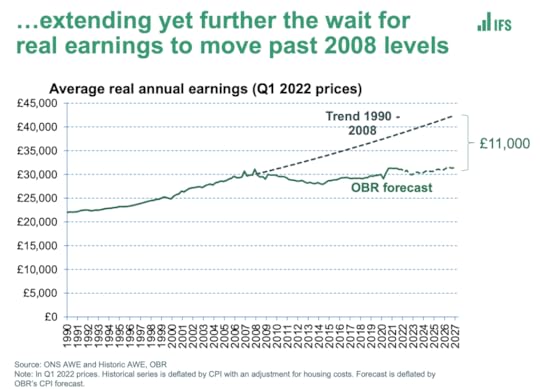
The average person in work is £11,000 a year worse-off due to slump
Click here for: Source
When the March 2022 Spring Financial Statement was released the Financial Times’ headline read: ‘Britain’s poorest left to bear brunt of squeeze on cost of living’. Their subtitle was ‘Chancellor focuses support towards working families and middle- and high-income earners’. And they went on to report the conclusion of the government’s own Office of Budget Responsibility (OBR) which claimed that what we would now see ‘…would be ‘the biggest single financial-year fall in living standards since records began 66 years ago.’
The savagery of austerity, bolstered by a government that channels money towards those at the top, is unremitting. We have to travel back much further in time to find a precedent. The economist Geoff Tily, posted an updated graph of how the current pay squeeze compares to all others, showing that the slump in living standards we have now lived through, and are now forecast to continue to be living through, most closely compares to that seen between 1798 and 1822 (Figure 2)
Figure 2: This is already the worse squeeze on pay for over 200 years

This is already the worse squeeze on pay for over 200 years
Source: Geoff Tily, Senior Economist at the TUC, March 23rd 2022.
A footnote in Geoff’s graph explains that we were too optimistic before. An error in the estimation of Average Weekly Earnings (AWE) in 2021 meant that the pay squeeze did not even come to a temporary halt then. It has been unremitting now for the entire lifetime of children sitting their first formal exams this summer. It is expected to continue to be unremitting from here onwards. All previous forecasts of its ending soon have been wrong.
Fear trickles up slowly. At first it was the very poorest in the early 1980s who were hit hardest when mass unemployment came and benefits began to be slashed. Then, in the 1990s, those just above them saw their wages stagnate. Next, in the 2000s, what had been the relentless growth in wages for those in the middle, ended. But then, in the 2010s, real wages for most people fell as well. Now those who are better-off than average are beginning to see their living standards suffer as gas and food prices rise. Even after the Chancellor had made those changes in spring 2022, reducing fuel duty and raising national insurance thresholds in ways that most favoured the already better-off, the average person will be struggling more by 2025 and even the better-off are now seeing sustained overall falls in their living standards, for the first time in any of their lives.
The Resolution Foundation produces the most comprehensive graphs of all, which in stunning technicolour reveal just how bad the current situation is (see Figure 3). Most families, between 2019 and 2025 will suffer a fall in incomes last only experienced by the very poorest in the early 1980s and an even smaller number in the early 1990s recession. Back then it was those thrown out of work that suffered in this way. Now it will be almost everyone. And most of that 2019-2025 fall in incomes has already happened.
Figure 3: The ‘Worst Parliament Ever’ graph of household incomes 1966-2025
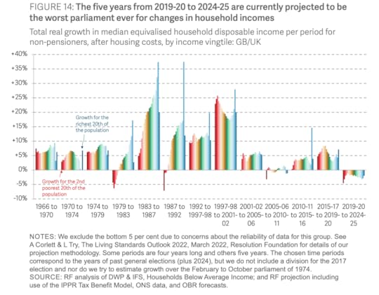
The ‘Worst Parliament Ever’ graph of household incomes 1966-2025
Source: Torsten Bell et al. (2022) Inflation Nation: Putting Spring Statement 2022 in context, March 24th.
Why is the Chancellor of the Exchequer continuing to make changes that will most badly effect the poorest in a society, those already suffering the greatest pay squeeze for over two hundred years and why is he doing this when the UK already has the highest income inequalities in all of Europe? More and more people will come to conclude that he is trying to pander to fear, trying to seek favour from those who have more than average by showing them that even when everyone is suffering, and the poor are suffering the most, he will try to reduce some of the taxes and costs of the better-off so that at least their drop in living standards will not be quite as sharp as the plummeting experienced by the minority who already have the least.
In the 1980s we were told that income and wealth would trickle down from the top to the bottom. We were told not to worry about the huge rise in income inequality then because – apparently – it would eventually ‘work its way through’ lower down. It did not, but something else started then. A new fear began, at first among the very poorest, that their children would have worse lives than they had. That fear slowly spread upwards over the decades and has now come to be true for almost everyone. That fear is greatest of all amongst the people who have the most to lose – like the Chancellor of the Exchequer, Rishi Sunak, himself.
Rishi Sunak is playing on our fears. He is hoping that the increase in our fear of each other that comes with rising inequality and falling living standards will pit family against family and worker against worker. Sunak is hoping and expecting that most people will never look at the kinds of graphs shown in this brief article, let alone understand them. He tells people that he feels and understands their pain – and in a way he does, as he is using that pain. He wants the general public, or at least a majority of the better-off half of the general public, to believe him when he says that there is no sensible alternative. He will say that what has happened was inevitable; but that he and his colleagues are doing, and will in future do, whatever they can to soften the blow.
The alternative, to actually soften the blow, would require people like him to give up their North Yorkshire Georgian mansions, the ones that they only use some weekends, and to share most of the rest of their wealth and property with others; the properties they hardly ever visit. The alternative would be for the dividends on the income from the shares they own to be reduced, and for the people who work in the firms they own (by dint of those shares) to be paid more. The alternative would be for the richest to be taxed as the rich in other European countries are taxed, and for welfare benefits to be made more decent (as they are in most of the rest of Europe). The alternative would be for more people like the Chancellor to use the schools and hospitals that everyone else uses. That alternative, for these extremely wealthy people, is – to them – terrifying. And so they work hard to try to ensure that you and I do not even imagine it, do not speak of it, and do not win it.
For a link to the original article and a PDF of this article click here.

Who ate all the pies?


April 12, 2022
The never-ending pandemic
The pandemic is not ending—and it may not end in our lifetimes.
There are already improved treatments for Covid-19 and associated mortality will probably be lower in future. As our immunity wanes, however, most of us are likely to carry on catching this illness, again and again. Others may well feel obliged to shelter—especially those who are most vulnerable and even among those repeatedly receiving booster vaccinations.
This is the reality we are now having to face, worldwide and across Europe. We know this because of random surveys of the prevalence (current burden) and incidence (new cases) of infection.

Alonafoto/shutterstock.com
One of the first surveys to test a random sample was in Spain between April and May 2020. It discovered that by then just over 10 per cent of the population of Madrid had caught the coronavirus and 5 per cent across Spain as a whole. A longitudinal survey in Portugal found that as of March 2021 17 per cent in that country tested positive for viral antibodies.
Between those two studies, at least another 23 were organised across Europe. They reported hugely varying rates of infection. These ranged from less than 1 per cent of blood donors in one part of Germany to 23 per cent of people in the Lombardy region of Italy, especially hard hit early on.
Small-area data
A weekly survey began to report in England, with data being made available for small areas from November 2020. Figure 1 shows the proportion of a random sample who tested positive for the disease each week in England during the second wave.
Figure 1: people in 116 areas of England with Covid-19, November 2020 to March 2021 (%)
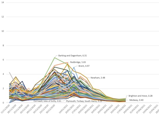
Source: Organisation for National Statistics Coronavirus (Covid-19) Infection Survey
The figure helps explain why the one-off surveys carried out across the rest of Europe varied so much. The four labelled places with some of the highest rates were all parts of greater London where, at its height, as many as 6 per cent of the local population were estimated to be infected in one week during the second wave. Cornwall and Plymouth are remote parts of the south-west of England, with very low rates at this time.
Figure 2 extends the time series. (When rates of infection became low, in the summer of 2021, they were not released for these small areas and so there are gaps, as also over Christmas 2020 and 2021.) One can see why some thought the disease might be eliminated when it became less prevalent and that vaccines would greatly reduce transmission (not just symptoms). The right-hand end of Figure 2 shows this was however not to be the case.
Figure 2: people in 116 areas of England with Covid19, November 2020 to March 2022 (%)
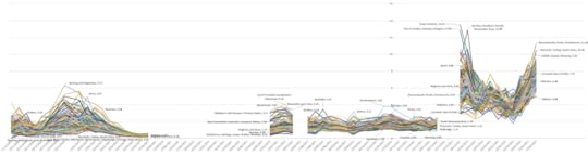
Source: ONS Coronavirus (Covid-19) Infection Survey
New waves
The story of this pandemic is usually told in terms of different variants arriving in different parts of Europe at different times, each starting off a new wave. We are beginning to realise that, even without new variants and even with vaccines, the disease will continue to circulate and new waves will form, rise and fall as immunity within local populations rises and falls, depending on how recently that population has been infected. Europe is, and will continue to be, a changing patchwork of waves varying over time and across space.
As many do not know they are infected, random testing is the only accurate way to measure the spread of the virus. Reported case numbers are an extremely poor substitute, as these depend on individuals coming forward and on a test being available. Lockdowns and other measures to reduce infection can slow the ascent of a new wave. But the longer rates in a locality have been low, the more immunity will diminish.
‘Living with’ Covid-19 will mean living with a large burden of illness for a long time. This does not take account of the long-term effects for some or the impact on health and other services disrupted by the continued contagion. ‘Endemic’ means the virus is here to stay—not trivial or minor.
Figure 3 illustrates graphically what this implies. The proportion of people in England who were infected grew rapidly in December 2021. Shortly after the Christmas holiday far more than a tenth of the population of poorer parts of London—such as Tower Hamlets, Hackney and Islington—were infected, as was also true of poorer towns in the north-west of England: Burnley, Bury and Accrington (in Hyndburn) are identified here.
Figure 3: people in 116 areas of England with Covid-19: October 2021 to March 2022 (%)
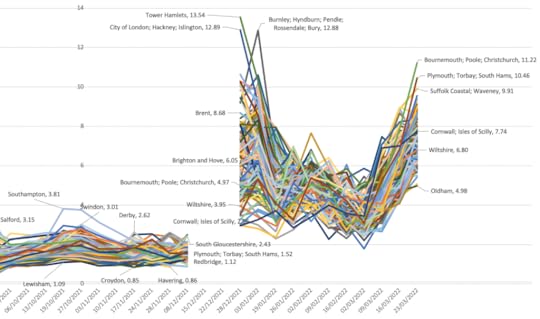
Source: ONS Coronavirus (Covid-19) Infection Survey
Rates fell in January 2022 but the fall slowed in February and they rose again in March. Now rates became highest in those areas which had had the least infection before—coastal retirement areas such as Bournemouth, Plymouth and along the Suffolk coast. It is hardly surprising, given this geography, that deaths from Covid-19 have risen again in England in April 2022.
Endless debate
There will be endless debate for years to come about the best ways to mitigate the pandemic. When cases and deaths appear to fall in particular parts of Europe, politicians may well claim credit, suggesting that the virus is ‘under control’; when these rise again, they may find some external factor to blame or prefer not to talk about it. When pressing events—such as war—intervene, public concern will, for a time, itself wane.
Mortality records will make it appear the virus is abating, because we are becoming better at treating the symptoms and preventing death and because most people will have at least some degree of immunity, making death much less likely. Yet we might come to expect a prevalence of about one in 25 in most places at most times and more than one in ten in particular places at particular times.
The virus has died down in both of the last summers. But with more contagious strains, far fewer controls and an exhausted tolerance for social distancing, that might not happen this year. It could be many years before a more-or-less-regular seasonal pattern emerges and it could be several decades before it is seen as a less serious disease because our immunity, especially among the now young, has grown.
We have no useful historical analogue. There is speculation that some previous pandemics thought to have been of influenza actually introduced a novel coronavirus (one of the current common-cold viruses). This remains however speculative and none is more recent than 120 years ago, when there were far fewer elderly and other causes of death were very much more common. Back then a Covid-19 equivalent would thus have killed or rendered seriously ill many times fewer people.
Not over
Far too many think the pandemic is over—or at least coming to an end. The prevalence rates revealed by the various surveillance surveys negate that. Close population monitoring is thus imperative.
In England infection is now highest in those areas touched least in the last two years. In more dense urban populations and among poorer areas incidence has gone up and down many times. Within my tiny home city of Oxford, at the height of wave two in January and February 2021 people living in the poorer parts of the city were eight or more times as likely to catch the virus (and die if elderly) as those in the more affluent neighbourhoods.
Yet it will get to the more affluent eventually—just less often. And we do not know what that might mean. It all depends on how quickly immunity wanes.
The affluent tend to live much longer than the poor, so there are proportionately far more better-off people today living to very old age. The virus may harm the poor more but in terms of absolute numbers more better-off homeowners have died than key workers. Men have been (and will continue to be) much more harmed than women.
Political effects
What effects all this will have politically in the medium term are hard to gauge. But life has suddenly become more dangerous for those more disposed to vote in elections who also more often vote for conservative parties. How might the elderly react to gung-ho, ‘libertarian’ political leaders of this stripe in future?
We should plan for the disruption caused by the pandemic to continue. We should not talk of when it will be over—not yet. It may end so slowly that this is only declared (and evident) many years from now.
Around the world calls for a ‘people’s vaccine’ might reduce as it becomes evident that (outside of China and North Korea) most people have now been infected at least once. Instead there might be growing recognition of the need to target vaccination on the elderly and those otherwise most at risk, especially the elderly in poorer countries.
Growing threat
Figure 4 shows who has mostly died in England and Wales, based on mention of Covid-19 on their death certificate. Although this in some ways overestimates deaths, as not all were primarily due to the virus, that is offset by lack of such mention before recognition, especially early on in 2020. The rates are also crude because they ignore the effects of ageing and migration—but again this would not alter the figure much if corrected. Most importantly, the first 12 weeks of 2022 (for which we have data) are extrapolated to give an annual estimate for this year.
Figure 4: crude annual mortality rates from the pandemic in England & Wales, 2020-2022, by age and sex

Source: ONS Coronavirus reports of deaths shown as a proportion of the mid-2019 population totals
On those assumptions, by the end of 2022 one in six (15 per cent) of all men aged 90+ in 2019 in England and Wales will have died because of the disease and one in ten (10 per cent) of all women aged 90+. Those death rates are more than 100 times as high as for those aged 40-45 and much more than 1,000 times the rates for the 25-29 age group.
Even as mortality rates for the elderly reduce in future, many of us should expect that in our old age this will be a growing threat we shall face.
…
This article was written as part of the ‘Reconstruction beyond the Pandemic’ project at the European Trade Union Institute, with an edited volume due in early 2023.
For a PDF of this article and a link to the original posting click here.
March 9, 2022
The Decimation of the NHS
Geographers should be interested in what is happening to the NHS because it is through making geographical comparisons with other countries that we can see that its current decimation is unnecessary. The claim that there is no alternative but to spend less can be disproved by considering how other very nearby countries manage to spend more. Furthermore, there is a geography to the cuts that have taken place in the UK which reveals where is prioritized and where is not. Finally, very local geographical stories, such as a two briefly told here from Oxford and Glasgow, can also help reveal what is going on.
Over a year ago, on January 9th 2020, the BBC published a new story entitled ‘11 charts on the problems facing the NHS’. The second of those charts is produced here and shows how cuts in spending increases for the NHS began in earnest in the late 1970s, were briefly reversed for thirteen years after 1996; but then began again after 2009. All of these changes were political choices, as the labelling of the graph makes clear, although there had been something of a political consensus between 1955 and 1978 when spending increases were usually above 4% a year regardless of the political party in power in the UK.
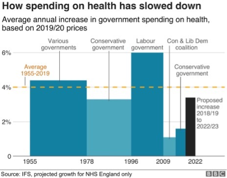
How Spending on health has slowed down
Reproduced from BBC source
A spending increase of 4% a year does not mean an actual improvement in service, it often means just holding the line. This is especially so today when the population is ageing far faster than it was in the 1960s or 1970s. That BBC article went on to show that spending on health care in the UK is much lower as a proportion of GDP than it is in France and Germany, and that is even the case when private health spending is included. It also showed that there was little difference in outcomes in the different countries of the UK, almost certainly because spending across them varies so little as compared to spending across Europe. In 2017 health spending in the UK as a whole, including all the spending on private hospitals was almost identical to the EU average. Today it will almost certainly be less than that average, not least as other countries in Europe have responded with a larger increase in emergency spending due to the pandemic. This is alongside the now usually higher increases in health spending that most other European countries are making as they bolster up their health services more widely. In contrast, the UK government plans to reduce public spending overall once the pandemic has subsided, as illustrated by the submissions it has made to the International Monetary Funded on planned future public spending.
The final graph the BBC published in their series of eleven illustrates one theory as to why these choices have been made. That graph was entitled ‘Patient satisfaction with the NHS’ which was falling until 1997, then rose as public spending rose, to a high of 70% being ‘very or quite satisfied’ in 2009, before falling again afterwards. Satisfaction with the NHS tends to track how well the NHS is able to cope, which in turn is largely determined by how well it is funded and organised.
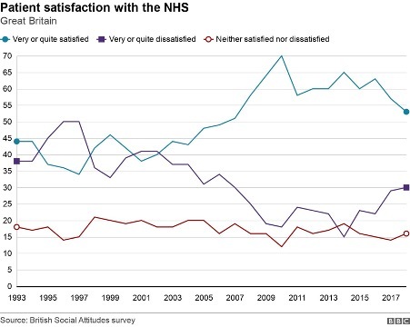
Patient satisfaction with the NHS
Reproduced from BBC source
Why would some politicians instigate changes in funding that inevitably result in a fall in satisfaction with the NHS? These politicians often say that a continuation of funding increases could not be maintained. That clearly was not the case as other countries in Europe chose differently despite suffering similar economic shocks at particular times. Geographical comparisons are a key way in which you can determine if the politicians are lying to you about what is possible, as compared to what they are choosing to do.
Of course, there is always some part of the UK that is receiving a greater increase in health funding, or less of a decrease, at any one time. Politicians tend to point to the increases to say that they are doing something substantial. It is well known that the UK government has promised “40 new hospitals” in England. What is less well known is that hardly any of these hospitals are new, most are extensions to (or rebuilding on) existing sites; but even here there is a clear geographical pattern to what is planned as yet another graph, this time published by the BBC on December 1st 2021 makes clear. The forty planned projects are concentrated in the South West of England; although as the BBC story that accompanied that graphic made clear, there are now doubts as to whether most of those will happen on time. More importantly, even if the planned projects were to all be completed they would not reverse the decimation that has been occurring more widely or even begin to address the increase in need that comes as we age and become more frail overall. Neither would they begin to cope with the health legacy of a pandemic and a disease which is becoming endemic, resulting in greater levels of illness than before for an as yet unknown number of years to come.
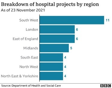
Breakdown of hospital projects by region
Note the numbers sum to 40. Reproduced from a BBC source.
What is going on? I grew up in the city of Oxford in England at a time when the NHS was well funded and in a city with a surfeit of public hospitals. I left the city when I was aged eighteen and returned nine years ago. One of many shocks on returning was discovering what had happened to the old ‘Manor’ ground where Oxford United used to play. It now housed a brand new private hospital, built walking distance from the old public hospitals so that consultants who chose to do part private work could walk over with ease. Before the private hospital had been built, there had been much less opportunity to expand the private health sector in the city. Later I discovered that some Oxford colleges offer to fund private health insurance for their academic and other staff. Something dystopic was happening, however slowly and gradually so that each of us can tell a story of the dismantling of public health care, but few of us can see the overall orchestration underlying this.
In January 2020 it was quietly announced that a new £20 million private hospital had been opened just off the Old Govan road in Glasgow. The ‘Ross Hall Clinic Braehead’ was described as “state-of-the-art” by the Daily Record. Nestled on an industrial estate between an accountancy firm, a computer shop and opposite a new charging station for electric cars, “The new hospital includes 17 new consulting rooms, a new MRI scanner alongside new respiratory, colposcopy and urodynamic departments. The inclusion of these key additions will mean that an extra 200 outpatients a day will be able to receive care from clinical specialists”. But of course only a few people will be able to afford to use these services, and others will rely on the NHS sending them there, if it is able to do so.
The pandemic could have begun a sea-change in the direction of health care and health care spending across the UK. Many private hospitals would not have survived it had they not been supported by state contracs and emergency funding to keep them solvent. We could have nationalised most of the new private facilities, at almost no cost – given that they were no longer solvent. Instead they were supported, kept alive for when they could beginning full-operating again; and new private facilities were built during the pandemic.
In relation to the growth in need, health care spending has been decimated across the UK. One reason this is allowed to happen is because small but growing proportion of the population can afford to by-pass the ever-lengthening waiting lists; they do not have to worry about what will happen to them if and when they fall ill. They receive an increasingly better level of service as compared to what most people can access. And the politicians who have presided over this growing social and health divide are not unaware of this. In fact they are often lobbied by private health care companies or have even more direct involvement than that.
Why should British geographers care about any of this? One reason, perhaps the most trivial, is that it will affect the maps of health outcomes for many years to come. To the extent that differential health and social care is part of the reason as to why people live shorter lives in some areas rather than others. A less trivial reason is that even if they are not worried about the direction their society is travelling in generally they could worry about themselves. A recent RGS/IBG survey found that 51% of students who go on to study Geography at University do so because they rank “earning a good salary” as important (while only 19% said they ranked “doing ‘good’ through my job” as important). However, only a minority, even of that 51%, will ever earn enough to be able to afford private health care.
For a PDF of this article and link to where it was originally published click here.
February 25, 2022
The ever ending never ending pandemic
How little we knew two years ago and how little we still know now. If you keep a diary, or more likely an electronic calendar, look back to January and February 2020. Compared to today was your diary more full back then? Did you have friends visiting from far flung places? Were you attending numerous meetings, travelling more then, even if only around the town or city you might live in? What did you do in the evenings and was it different? Was your calendar a jumble of commitments and (what we now call) ‘in-person meetings’. It was not quite pre-war; but it was certainly pre-pandemic. For my generation our lives will be divided into pre-pandemic and post-pandemic.
Now look back a year or so to January and February 2021, as the second wave peaked. I am a Geographer and so the story I will tell here is geographical. By late 2020, the ONS weekly surveillance survey of a random sample of the population had become large enough, and the disease was widespread enough, that estimates could be published of how many people in small areas of England were infected at any one time. These rates were both higher than the widely reported daily case rates and more reliable, as many of the people tested were positive but asymptomatic. Figure 1 shows the trends at this time. It uses a log scale because the variation between areas was so wide. Most of December 2020 is missing as, at that point, ONS were unsure that the data was reliable enough to publish.
Figure 1: People in 116 areas of England with COVID19: November 2020 to March 2021, %
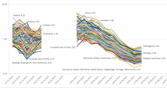
Figure 1: People in 116 areas of England with COVID19: November 2020 to March 2021, %
Source: ONS Coronavirus (COVID-19) Infection Survey, data normally in table 1m when data not missing.
In autumn 2020, as wave 2 rose up, at any one time around 1% of the population were infected, but this varied from 4.25% in Salford to only 0.25% in Reading (and its surrounds). These estimates were smoothed by ONS and so the full extent of the variation cannot be seen here. The smoothing may well have made the declines seen in most of January and February 2021 appear smoother than they really were. But during those dark and lonely winter lockdown months a year ago disease rates really were plummeting everywhere. I have labelled a few of the areas to give an idea of what kind of areas were most and least effected at different times.
In the late spring and early summer of 2021 the disease in the UK abated. ONS then stopped releasing surveillance data for small areas until the end of June. In July, as Figure 2 shows, as the disease rose up again at the start of a third wave, rates became highest in Northern cities and lowest in more remote southern English districts, but also in Hull which caught the third wave later on. This wave peaked just South of the River Tyne and on the River Wear when at one point 4.1% of the population were infected. The peak was almost ten times lower in parts of Suffolk that were least effected, but even there a peak was discernible.
Figure 2: People in 116 areas of England with COVID19: July 2021 to October 2021, %

Figure 2: People in 116 areas of England with COVID19: July 2021 to October 2021, %
Source: ONS Coronavirus (COVID-19) Infection Survey, data normally in table 1m when data not missing.
Again ONS did not publish local rates for a few weeks in early August 2021, but started the series up once more towards the end of that month. Now it was smaller northern towns that had the highest rates, with Hull topping the league table for many weeks. Remoter parts of Norfolk and Suffolk had some of the lowest rates at this time; but it eventually rose and fell everywhere. Most importantly, it never fell that much again – anywhere. Only very rarely did fewer than one in one hundred people succumb in any week in any place. During one week in September rates suddenly diverged, up higher where they were already high and down lower where they were already low. I have no idea why. The sample size did not appear to fall.
By the end of this period Southampton headed the table and Lewisham was at the bottom, but the gap between the extremes was much smaller than before, and the overall trend was upwards. The disease was no longer almost disappearing in some places and at some times, it was becoming endemic. Endemic does not mean that the peaks and troughs will end. They almost certainly will continue, just as rates of the endemic common colds wax and wane over time. As yet we are a long way away from any regular pattern emerging.
The final period for which we have data is the most up to date that we have, and overlaps with the last one. Figure 3 shows this latest data and, again, there is a break in the data at one point. I suspect this occurred when ONS wondered if the numbers they were producing during December 2021 could be reliable because they were rising so quickly – doubling or even trebling at times in a week in particular areas as the latest, Omicron, wave arrived.
Figure 3: People in 116 areas of England with COVID19: October 2021 to January 2021, %
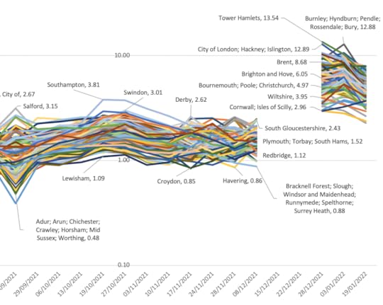
Figure 3: People in 116 areas of England with COVID19: October 2021 to January 2021, %
Source: ONS Coronavirus (COVID-19) Infection Survey, data normally in table 1m when data not missing.
Figure 3 looks to be complex but it actually has a simple message: rates in autumn 2021 were high but flat; then jumped suddenly in December; have fallen slowly in January 2022 but have not fallen that far. It is possible that they may again plateau before again rising during 2022 – we do not know, but a rise does not require a new variant. What we are learning is that levels of this disease rise and fall differently, in different areas, over time, partly as local rates of immunity wane. So far, after each rise abates, it leaves in its wake an ever higher plateau. The lowest rates at the end of Figure 3 were not dissimilar to the highest rates seen at the peak of wave 2, those seen at the start of Figure 1.
What does this all mean for the delivery and planning of public services? Of course, deaths and hospitalizations have fallen greatly; but this disease shows no medium-term signs of going away – from anywhere in England. The story in the rest of the UK is almost certainly very similar, as it is across almost all of the world outside of China and a few other countries. At some point we will start to talk of post-pandemic. At present we are still very much in the midst of the pandemic. As far as the trends over time and space in infections are concerned, we are not, as yet, even on the downwards slope.
For a PDF of this article and the link to the original publication click here.
December 17, 2021
Christmas Socialising: three health experts explain how to interpret new advice
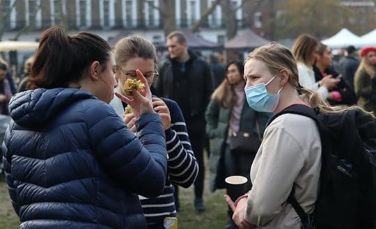 Texturemaster/Shutterstock
Danny Dorling, University of Oxford; Peter Sivey, University of York, and Sarah Pitt, University of Brighton
Omicron cases are rising fast, with fears that the UK could soon record a million new infections a day. In response, the chief medical officer for England, Chris Whitty, has asked the public to cut down on socialising to slow the spread. But how should people respond to this suggestion – and does the chief medical officer’s request go far enough? We asked three health experts for their thoughts on how to interpret his guidance.
Sarah Pitt, Principal Lecturer, Microbiology and Biomedical Science Practice, University of Brighton
Early data suggests omicron is very infectious – spreading between 2.5 and four times as quickly as delta in the UK. This means that we could see a very large number of cases in the coming weeks.
Vaccines appear to offer good protection against serious illness, but some people with omicron are still requiring hospital treatment. Even if only a small proportion of people get seriously ill, if cases spiral out of control, this could mean a lot of hospitalisations this winter, which might overrun the NHS.
So we need to do everything we can to stop the spread of the virus. Boosters are one tactic – they raise protection against omicron significantly. Even so, they’re estimated to be only 75% effective. It also takes time for immunity to build up after they’re given. So other actions are needed too – and this is why Whitty’s call to reduce social contact is sensible.
 Modest Christmas celebrations are the way to go this year.
Roman Samborskyi/Shutterstock
To be most effective, aim to limit close contact to people who are in your household or you would normally meet with, such as close friends. People should also consider meeting their families in smaller groups than they were planning to – perhaps by having several small festive meals rather than one big one.
And although lateral flow devices don’t pick up every infection, they’re still useful for identifying cases – so if you have them, use them before meeting people. Even if negative, if you have any symptoms that you think might be COVID, don’t socialise.
Peter Sivey, Reader in Health Economics, University of York
The spread of omicron in the UK is mainly worrying because of the speed of the increase in cases, which could potentially lead to a rapid increase in associated hospitalisations.
Even if, as expected, this wave peaks earlier than previous ones, a large number of patients needing hospital treatment all at the same time risks extreme stress on the NHS over the next few weeks, at what is already an very difficult time.
However, there’s an expectation that in a country such as the UK, with very high levels of COVID immunity from vaccination and prior infection, that outcomes will not be as bad as in prior waves. We can see using evidence from the first country to identify omicron, South Africa, that the increase in cases and hospitalisations has been very fast compared to previous waves, but that both cases and hospitalisations seem to have levelled off at lower points.
The chief medical officer himself said it best by warning that uncertainty is very high about the implications of omicron for the NHS. There is hope that patients’ disease will be less severe and they will spend less time in hospital than in previous waves. But time will tell.
Overall, it seems prudent to warn people that social contact risks increasing the speed of omicron’s spread. But high levels of immunity in the population, including from a recently expanded booster programme, are likely to blunt the omicron wave compared to previous ones prior to vaccination.
Certainly, more drastic lockdown measures – as advocated by some – are not justified in my view.
Danny Dorling, Halford Mackinder Professor of Geography, University of Oxford
It is not easy putting yourself in another’s shoes. I don’t know you and you don’t know me, but we are both getting familiar with this pandemic. Early on it was thought that we would see a V-shaped recovery, which always occurs after influenza pandemics. We have learnt that the embedding of a new coronavirus doesn’t happen in the same way at all.
Last Christmas I suggested a simple rule to apply when thinking of meeting others: ask the oldest person what they want to do. The risk to them of meeting up is many times greater than the risk to everyone else combined in any gathering.
This year the oldest person may well be double-jabbed and have had their booster some time ago. They might want to see you in person despite you being very worried about seeing them. You don’t have to see them. But this year particularly, you should try to see the situation from their point of view.
Or you might be that oldest person – someone whose social world has disintegrated in the past two years. You may have seen almost all of the communal activities you took part in end. You may have been living in near isolation for many months. Today, even a very occasional visit to the cinema might be off-limits because you don’t have a smartphone and can’t upload a pass. You may feel that you are alive, but not living. Next Christmas may be too far away.
We often have very strong views about what others should do – only rarely do we honestly appreciate what it feels like to be someone else. We’ll all have different opinions on how far to take Whitty’s suggestions on mixing – and because of this, we should try to be sympathetic to other people’s views.
Danny Dorling, Halford Mackinder Professor of Geography, University of Oxford; Peter Sivey, Reader in Health Economics, Centre for Health Economics, University of York, and Sarah Pitt, Principal Lecturer, Microbiology and Biomedical Science Practice, Fellow of the Institute of Biomedical Science, University of Brighton
This article is republished from The Conversation under a Creative Commons license. Read the original article.
For a PDF of this article and link to the original source click here.
Public sector spending and Living Standards in the long run
After the Chancellor delivered his Autumn Budget of 2021, the detailed papers were released that attempted to explain and defend his decisions. They contained at least one quite new graph. Chart 1.10, shown here as Figure 1.
If you are a loyal reader of this column you may recognise the spending part of the graph from 1980 onwards. I drew it using IMF sources in the May/June issue of this magazine. Now, thanks to the work of the Treasury team, you can see both the longer term trend and the receipts (taxation) trend. When receipts are below spending the shortfall is covered by borrowing.
Figure 1: Taxation and Public Spending from 1955 to 2026
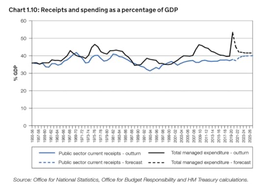
Taxation and Public Spending from 1955 to 2026
Source: https://www.gov.uk/government/publica...
The Treasury officials went to a lot of trouble to extend this graph back in time. The paragraph (in yet another document) describing the various sources used to construct it, and why they are comparable, runs to 225 words! The reason they went to so much trouble was to produce headlines in the Financial Times (and elsewhere) which read “Public spending and taxation both set to rise to highest levels in decades”. The publication of Chart 1.10 allowed Financial Times journalists to make the following comparisons with the 1970s and the period following World War Two:
“The yearly real-terms increase of 3.3 per cent in day-to-day spending on public services will, together with changes to in-work benefits, take total government spending from 39.8 per cent of gross domestic product before the pandemic to 41.6 per cent by 2026-27. This means public spending will be at its highest sustained level since the 1970s — before the privatisations of the Thatcher era when large parts of the economy were still nationalised. The rise in spending has been more than matched by higher taxation. The increase in corporation tax and freezing of income tax thresholds announced in March, together with the new health and social care levy, will drive the tax burden up from 33.5 per cent of GDP before the pandemic to 36.2 of GDP by 2026-27 — the highest level since the postwar period.”
So, are we back to the heady days of the 1950s, 60s and 70s when governments increasingly shifted spending from private greed to public good? Sadly, no. But to understand that you need to look closely at Chart 1.10 and also compare what it shows with another analysis carried out in the wake of the Autumn Budget, this one by the Resolution Foundation.
What Chart 1.10 shows is that the 1964-1970 government lead by Harold Wilson increased public spending sharply. What it does not show is that this was spending on housing, schools and hospitals (not nationalizations as those happened much earlier). Next, under Conservative Prime Minister Edward Heath, spending was cut back; before rising again when Harold Wilson was re-elected in 1974. Importantly, this was again public spending in Britain on public goods. Wilson had chosen not to take part in America’s war in Vietnam.
Chart 1.10 then shows huge public spending cuts throughout the 1980s and early 1990s which were accompanied by cuts in taxation (receipts) to reach a new low at the point John Major took over from Margaret Thatcher in the early 1990s. Public spending did rise a little under New Labour in the early years of this century, but part of that was funding for the Iraq war, and taxation was not increased for the wealthy by New Labour (the blue line in Figure 1 stays flat). Then, in 2008, public spending jumped hugely to bail out the banks. Unlike the spending of the 1960s and 1970s, this jump did not improve most people’s standards of living. In fact standards of living fell.
Chart 1.10 then goes on to show the austerity cuts that took place from 2010 for a whole decade, and then the rapid pandemic spending rise to pay for furlough, track-and-trace and more. Again, although partly necessary, this spending did not improve living standards. For instance, those on furlough had to live on 80% of their normal income.
But surely, you might suggest: it’s a trade-off isn’t it? You might think that higher public spending and higher taxation to pay for such spending comes at the cost of lower real household disposable income . And it would not be surprising if you did think this, as you are constantly told this is the case. Thankfully, the Resolution Foundation produced a table after the Autumn Budget to help illustrate that this is not true. That table is shown in Figure 2 here. The key column to look at is the annual growth column as that allows each time period to be compared and can also be compared to figure 1 in this article.
Figure 2: Growth in real household disposable incomes from 1955 to 2024
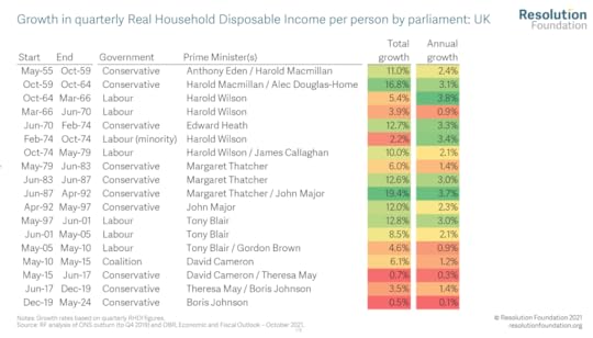
Growth in real household disposable incomes from 1955 to 2024
Source: https://www.resolutionfoundation.org/...
So how could public spending for the common good rise in the 1960s and 1970s so much and annual growth in real household disposable income also rise at the very same time? Disposable income is what you have after paying your taxes and receiving benefits. Real disposable income measures that after taking into account prices rises (inflation).
The common answer is that “productivity was higher in the past”; but obviously it was not. We built cars by hand back then, not by robot. Inefficient typing pools were common (as men did not type their own letters). Manual work was most common and usually physically back-breaking. The better answer is that back in the 1960s and 1970s we squeezed the rich (see Figure 3). The average person’s disposable income might have risen as public spending also rose; but the disposable income of the very well-off fell rapidly in those decades when both public and private life became so much better for the majority.
In contrast, today Figure 1 shows that we are facing both higher taxes to come and a lowering of public spending; while Figure 2 shows living standards are expected to increase at their lowest rate ever measured in the coming years. They may even actually fall if prices rise faster than incomes. Meanwhile, the richest will be protected by government measures such as the social care cap. Figure 3 shows that back in the 1950s, 60s and 70s the richest were having to give up their mansions to pay their taxes and we had become the most equal large country in Europe by 1974. Today we are the most unequal of all, even the smaller countries, other than (occasionally) Bulgaria.
Figure 3: The fall and rise of income inequality in the UK 1910-2019

The fall and rise of income inequality in the UK 1910-2019
Source: The book, ‘Inequality and the one Percent’, Third edition, London: Verso (2019)
For a PDF of this article and link to where it was first published click here.
December 2, 2021
When will life return to normal after the pandemic
 Jacob Lund/Shutterstock
Danny Dorling, University of Oxford
No one can ever know for sure when life will return to normal after a particular event, not least because what’s normal keeps on changing, even in normal times. Nevertheless, it’s a question we can’t help pondering – particularly when new COVID developments, such as the emergence of the omicron variant, keep on shifting the pandemic’s goalposts.
It’s a question that Britain’s Office for National Statistics (ONS) has been pondering too. On March 27 2020, the ONS began asking a large sample of the British population when they thought life would return to normal. This was very shortly after the first wave of the pandemic had begun, with COVID cases and deaths quickly rising. Britain was just days into its first lockdown.
The ONS surveyed people that day and for the next ten days. Only 15% at that time said they were unsure when life would return to normal, and just 11% of the population thought it might take a year or more. The remaining three-quarters thought that life would be back to normal within a year of March 2020.
No one back then thought that life might never return to normal. The majority thought normality would return within six months. We humans are (usually) an optimistic bunch.
 Data from the ONS.
Author provided
Over the subsequent 20 months, the ONS carried out a further 76 surveys, usually one every week. They asked the same question in each survey about when people in Great Britain thought that life might return to normal.
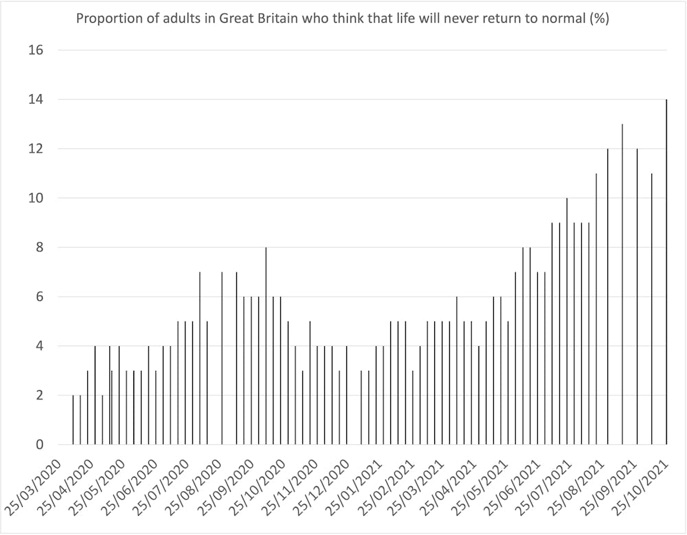
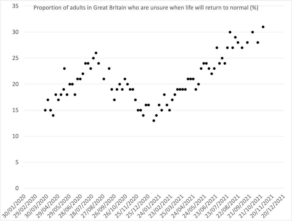
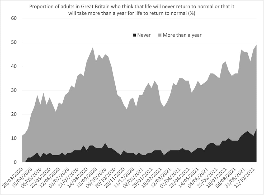
By the time of the 77th survey, which ended on November 14 2021, the proportion of people who said they were unsure when life would return to normal had doubled to 31%. The proportion who thought it would be at least a year before there was a return to normality had tripled to 35%. A further 14% thought that life would never return to normal ever again. And the proportion who thought that life would return to normal within a year had plunged from three-quarters to just a fifth. Our faith in a return to normality has collapsed.
So far the great rise in uncertainty has come in two waves. The first uncertainty wave peaked in August 2020, when COVID cases and deaths were almost zero. After that our levels of uncertainty fell, linearly, to mid-January 2021. At this point, more of us thought we knew what might happen next than at any other point across the 77 surveys. However, after that we slowly but surely became increasingly more unsure as to what the future might hold. Wave two of being unsure may not yet have peaked.
 Data from the ONS.
Author provided We define our own normality
At some point, a way of living that most of us describe as normal will arrive – it always does. But it will be a new normal. The pandemic in our mind has very different twists and turns to the pandemic that is measured by cases, hospitalisations and deaths. Because it exists in our heads as well as in the physical world, the pandemic is partly about us – how we each individually feel. The return of normality therefore won’t be marked by life returning to what it was before 2020, but by us feeling that things are normal again.
In the most recent of the 77 surveys, three in five adults said they had “avoided physical contact with others outside their home in the past seven days”. Two in five reported that “only their immediate family had been in their home in the past seven days”. Neither of these measures had changed from the previous survey. If, for instance, this pattern of behaviour continues similarly unchanged, it’s possible that in time, this will come feel like normality.
On the other hand, the question the ONS has now asked 77 different groups of people (all chosen at random) is not specifically about the pandemic – it is about “life” in general. It’s very probable that at first most people replied to the question with the pandemic foremost in their mind. However, as time has passed, other aspects of life will have shifted too. Things are always changing. People’s answers may have come to reflect this, and regardless of the pandemic, may be defining normality as a past that can’t be recovered.
 Data from the ONS.
Author provided
We’re now very close to a point where the majority of adults believe that it will take at least a year (into 2023) for normality to resume – or that it will never return. And of those who don’t think this, the majority of them are increasingly unsure about what will happen.
At some point, the majority of us will become used to how things have changed, and we will begin to see our changed world as normal. For those of us who have lived through the pandemic, it will be in our minds forever. But how we look back and remember the pandemic, and the times before March 2020, will keep on changing.
Danny Dorling, Halford Mackinder Professor of Geography, University of Oxford
This article is republished from The Conversation – For a PDF of this article and a link to the original source click here.
October 29, 2021
Who are the unvaccinated and what is happening to them?
On 21st September 2021, the Office for National Statistics (ONS) produced a report with the cheery title: “Deaths by vaccination status, England”. The purpose of the report was to ascertain how well the vaccines against Covid-19 were working, given that their primary aim was to prevent death. The conclusion was unequivocal, 99.1% of all deaths that occurred in England between 2nd January and 2nd July 2021 that had involved coronavirus, occurred to someone who had not been double vaccinated for at least 21 days.
The bulk of the ONS report understandably concerned the very small chances of dying from COVID-19 that double vaccinated people still faced. While these chances are miniscule, because most adults are now double vaccinated a growing proportion of deaths involving coronavirus would be expected in future in those who are double vaccinated.
As there is reticence among certain groups of people to take the vaccines, it made sense for the ONS report to concentrate on the relative risks. One could then work out how much less likely people are to die of this disease, if they are vaccinated. But to be able to do that you have to both be aware of where the data is behind the report and know something of how age-sex standardized mortality rates are calculated; a skill which only a tiny proportion of the population of England have ever been taught.
When the ONS report was published, a newspaper noted that: ‘Only two-thirds of black over-50s have been vaccinated compared with more than 9 in 10 white over-50s. People are four times more likely to not be fully vaccinated if they live in the most deprived areas, compared with those living in the least deprived areas.’
But what else can we work out about the group of people who are still largely unvaccinated? This is estimated to include about a million people aged over 60 who are not fully vaccinated and, because of their age, are now at the greatest risk from COVID-19.
The ONS report suggested that in England, irrespective of their age or sex, in the two weeks ending 2nd July 2021, completely unvaccinated people were ten times more likely to die of the disease, as compared to fully vaccinated people. By the end of those two weeks, 23.3 million people had had their second dose but 9.5 million adults were still unvaccinated. These included a very large number of younger adults, some of whom were only just being offered an appointment for a first dose.
The story above is perhaps what you might expect to read, if you had been following the reports and news, and knew something of vaccination, acquired immunity, and also how immunity wanes over time. However, what was perhaps more surprising was not the mortality rates from the disease, but the mortality rates of people dying in these same two weeks of something not at all connected with COVID-19. In the two weeks ending 2nd July 2021, people who were unvaccinated were between 1.6 and 1.8 times more likely to have died of a cause entirely unrelated to COVID-19, as compared to those who had been fully vaccinated.
Weekly age-standardised mortality rates by vaccination status, per 100,000 people, England, 19 June to 2 July 2021
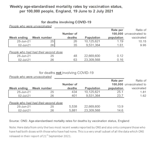
Weekly age-standardised mortality rates by vaccination status, per 100,000 people, England, 19 June to 2 July 2021
Source: ONS: Age-standardised mortality rates for deaths by vaccination status, England
Note: This is a very small subset of all the data on the first six months of 2021 which ONS released in their report of 21st September 2021. It covers only the last two weeks and also only compares those who were fully vaccinated with those who had had no COVID-19 vaccine.
No one has suggested that the vaccines are protective against other diseases, so why are people who have taken the vaccines so much less likely to die of other causes (after having taken their age and sex into account)? The answer is almost certainly mainly ‘deprivation’ – the overall most important cause for increased mortality and reduced life expectancy. People who have not taken the vaccines are also so much more likely to be poor, on average, as compared to those who have, which is why their chances of dying in general are almost twice as high as for the fully vaccinated.
In the two weeks ending 2nd July 2021, some 11,419 fully vaccinated people in England died of something that did not involve COVID-19 at all, as compared to 111 where COVID-19 was mentioned on their deaths certificate (but not necessarily as the main cause of death). In contrast, in those same two weeks, 835 non-vaccinated people in England died of a cause unrelated to COVID-19 as compared to 21 who died with mention of COVID-19 on their death certificate. These latter numbers are lower because far fewer people are unvaccinated and the unvaccinated tend to be younger. However, once those factors are allowed for, the unvaccinated are not just 10 times more likely to die of COVID-19; but they are also 1.6 to 1.8 times more likely to die of something unrelated to COVID-19!
Why then do some people, and especially poorer people, not take the vaccine when offered? The reasons will vary greatly between individuals and are likely to be complex in some cases; but a general distrust of authority may well be key. Why trust a government that so clearly does not have the interests of poorer and marginalised people at heart in so many other ways? When they suggest you do something not just to help yourself but for the greater good, why trust them? If the government are clearly not very interested in people like them, some will ask: does it have an ulterior motive here?
We also have to consider fear of vaccines, beliefs in conspiracy theories, and a dislike of coercion. But with a disease that has now become endemic, the case for taking the vaccine, especially if you are old, becomes stronger. However, you must balance that with poorer people’s actual experiences. Some might say that given how much more likely they are to die young of so many other things, why bother? In those two weeks, less than 2.5% of deaths in the unvaccinated saw any mention of COVID-19 on the death certificate. If you are poor, and struggling to cope, and have many more things to worry about, taking a vaccine offered by authorities who appear to be doing so little to help in so many other aspects of your life, is not an obvious priority. I would urge people to take the vaccines when offered; but I can easily see how mistrust can grow.
for the original article, and links to where first published, click here.
August 30, 2021
Geographical and social Inequalities in health in England across two centuries
In July 2021 the BBC published a series of maps of child mortality in England and Wales in 1850 to compare with maps of Covid-19 mortality rates in 2020-21 and reported that the: ‘pattern of “deeply entrenched” deprivation and ill-health stretches back at least 170 years, according to the chief medical officer for England. “If you had a map of Covid’s biggest effects now and a map of child deaths in 1850, they look remarkably similar,” Prof Chris Whitty told an NHS conference in June. Experts say the problems of crowded housing, insecure work and poor underlying health are echoing down the centuries.’
Almost 180 years ago, in 1842, Edwin Chadwick published his ‘Report on the Sanitary Conditions of the Labouring Population of Great Britain’ which demonstrated that poor sanitation conditions were associated with poor health. Chadwick’s work was so controversial at the time it was published that the Poor Law Committee, which commissioned him to produce the report, disowned him. Nevertheless, his work laid the groundwork for the introduction of the 1848 Public Health Act. This was the key piece of legislation which saw improvements in sanitation designed to tackle the causes of infectious diseases and which resulted in significant improvements in population health for both rich and poor, but especially in urban areas.
Table 1: 1842 Average age of death for occupation group of head of household by geographical location
Location Professionals Tradesmen Labourers
Rutland 52 41 38
Leeds 42 27 19
Liverpool 35 22 15
Manchester 38 20 15
Bolton 34 23 18
Source: https://www.sciencedirect.com/science...
The key table in Edwin Chadwick’s report showed that people in the households of tradesmen lived, on average at least eleven years less than those in the households of people in the professional classes of that day (see Table 1 here). Then, in turn, the average age of death of Labourers was between three and eight years less than that of tradesmen in each city and county. A large part of these differences was due to the different chances of children dying in each social class.
What was most surprising about Chadwick’s finding was that it was not just social class that mattered but also where you lived. 180 years ago infectious diseases mattered so much that Labourers in the rural county of Rutland lived, on average, three years longer than the members of families of the professional classes of Liverpool. Again, deaths among children would have driven these divides, although the inequalities between adult mortality would also have been in the same direction due to exposure to infectious disease.
Three years ago, two colleagues and I updated the key table in Chadwick’s report. What we found was that before the pandemic hit despite life expectancy having nearly doubled since the 1840s, there is still a strong link between where people lived, their social class, and how long they lived. One of my colleagues at the time commented that: “It is remarkable that after 175 years, mortality rates in Liverpool are still higher than in Rutland within each occupational group. What this demonstrates is that living in certain locations offers very different life chances and health outcomes for people within the same occupational groups.”
After almost two centuries had passed the main differences between mortality rates were now between adults aged 16 to 74. Table 2 below shows that a man in a low social class occupation in Manchester in recent years was 22 times more likely to die in the years 2010-2012 than a women of a high social class in Rutland in those same years. This is the most extreme difference in that table.
Table 2: 2012 Relative death rates by occupation of people aged 16-74 by geographical location
Men Women
Location High Mid Low High Mid Low
Rutland 2 3 9 1 2 2
Leeds 6 8 14 3 4 7
Liverpool 6 7 14 3 3 6
Manchester 7 8 22 4 4 7
Bolton 6 6 12 3 4 6
Note: The rates are multiples of the lowest rate for women of high social classes in Rutland who had a mortality rate of 46.1 per 100,000 between aged 16 and 74 in the years 2010 to 2012.
Source: https://www.sciencedirect.com/science...
It is partly because mortality is now so rare before age 74 for better-off women in affluent counties like Rutland, that the relative differences shown in Table 2 are wide. People in Northern English urban areas of all social classes are still more likely to die younger than in Rutland. However, the underlying reasons have changed from infections and infant health, to wealth inequalities determining who can and cannot live in certain areas, alongside increased segregation along housing tenure lines.
The pandemic of 2020/21 saw a return of infectious diseases as part of the explanation for mortality differences between areas. The final map shown here of part of the North of England is taken from the government Covid-19 dashboard in July 2021. It shows the proportion of adults who had received a second dose of vaccine by July 2021. All the areas in Chadwick’s’ original table are included in this map apart from Rutland which had a second dose vaccine rate of over 90% by the July.
Proportion of adults who had had a second doses of vaccine in Northern England, July 2021

Proportion of adults who had had a second doses of vaccine in Northern England, July 2021
Source: https://coronavirus.data.gov.uk/detai...
One reason why the centres of the cities stand out in the map is that they contain more younger adults who were vaccinated later and so were not yet eligible for a second dose. However, a part of the reason for this map showing such a distinctive urban/rural pattern is that more people in urban areas are distrustful of the authorities. This is perhaps not surprising after almost two centuries of such persistent inequity. However, it also means that adults in the summer of 2021 are least likely to be vaccinated where overcrowding is greatest; where people cannot afford to leave the city for some country retreat; where people most often have work in jobs that require close contact; and where people are most likely to have poor underlying health as a result of high social inequalities; and where there are the most children.
For the original published article and a PDF click here.
July 28, 2021
House prices: should we welcome a crash?
British governments don’t deliberately do things that negatively affect house prices. Instead, the booms that they have bolstered have usually inflated prices. We tend not to think about the long term problem this creates. But we should reflect on it, because government actions that push prices higher make falls (rather than stability) more likely in the long term.
The British public today believes that house price falls are very unlikely. The last time there was a sustained drop in house prices over a period of as long as four years was after September 1989. That is such a long time ago that few people remember it.
Indeed, few adults today know that the average UK house price did not return to its autumn 1989 level until 1998 – almost nine years later!
The superficial reason for the fall in house prices after 1989 was ‘overheating’ in the UK, accelerated by a rush among some home-buyers to purchase property before a particular form of tax relief for couples (MIRAS) was withdrawn by the government. It was a very British house price crash.
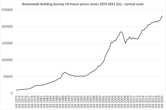
Nationwide Building Society UK house price series 1973-2021 (£s) – normal scale
In contrast to 1989, the falls that came with the global financial crisis of 2008 are today better known and remembered.
In the UK, prices fell from a high average price of £184,000 in late 2007, to a low of just under £150,000 in early 2009. They did not return to the higher level until mid-2014. Nevertheless, this was a faster ‘recovery’ than in 1989.
More importantly, the cause of the falls in 2008 was viewed as both external and unlikely to be repeated because – so it was said – the world would ‘learn the lessons’ of the banking crash.
Why do house prices matter politically? It may be coincidental but both the ending of 18 years of Conservative rule (1979-1997) and of 13 years of New Labour rule (1997-2010) occurred in the aftermath, or midst of, house price falls.
The current UK government and the previous coalition which they dominated have so far been in power for ‘only’ 11 years (2010-2021). The current government’s period in office might come to an end without a fall in house prices; or there could be a fall in house prices and its rule might not end there.

Credit: WPA Pool / Pool / Getty Images
Nevertheless, if there were a drop (which would probably be described as a crash if it were anything but minimal) the Conservatives would be in trouble. It might also be foolhardy to ignore the impact of even a slight future fall given how important house prices are now to many people’s sense of how well-off they are – and to their sense of wellbeing.
It is no coincidence that support for the Conservative party is highest in areas where house prices are high and where a high proportion of people own their home or have a mortgage.
For a very large and growing number of people, of course, increasingly high prices are the bane of their lives, forcing them to rent privately well into middle age and preventing them from being able to save because rents are so exorbitant.
The very high house price differentials across the UK also hinder geographical mobility, which in turn hinders social mobility.
As I write in 2021, we seem to have forgotten that house prices can fall, and they can fall without an external international trigger. Many people now shrug off the idea of house prices reducing evenly slightly in the UK.
After all (they might say) a global pandemic came and they did not fall: so if even Covid-19 can’t dent the rise in the cost of buying a UK home maybe nothing can?
But at some point (and we can’t know when) house prices will eventually stop rising and start falling in real terms. For the UK this could be a very long time in the future. Scenarios can be modelled where they do not fall for decades.
Alternatively, this event could happen in a few months’ time. But eventually house prices always do drop after reaching a peak. Furthermore, that fall need not be short-lived or slight; it could be substantial and enduring.
How do governments keep house prices high?
Rising house prices have been seen as politically advantageous by all governments since the 1980s. Home-owners have seen it as evidence of both good national economic management and of their own individual success.
In contrast, in periods when house prices were falling – 1989-1993 and 2008-2011 – public confidence in government was far lower. John Major never really regained that confidence despite winning the 1992 general election; and the Coalition government that won in 2010 used the memory of the falls from 2008 onwards to successfully paint the Labour party as economically incompetent.
We should not underestimate just how important it has been for UK governments to keep house prices high and, if possible, rising; or at least to try to steady and quickly reverse any fall. The New Labour government did this in 2009-10 by diverting £1 billion from what had been their regional economic programs to support the housing market.

Credit: WPA Pool / Pool / Getty Images
This included ‘HomeBuy Direct’ – loans of up to 30% on a new-build, interest free for the first five years, for first time buyers. Since then, various versions of ‘Help to Buy’ have been used to prop up prices at the bottom of the market if they ever look to be in danger of falling.
The Help to Buy schemes we have seen since 2009 have not been intended to make housing costs cheaper for ‘the many’. To lower housing costs requires, among much else, two things to happen in the rental sectors.
First, ensuring enough good quality social housing is available to prevent private sector rents rising rapidly: inadequate social housing provision ensures a limited rental supply. This then encourages people with access to a lot of money to buy up family homes and rent them profitably on the private rental market – thereby preventing families from buying those homes.
Second, renting in the private sector must be made secure enough that families do not feel compelled to buy for fear of being evicted from their home should their landlord want to sell or raise the rent. If this has the effect of deterring people from becoming private landlords, then that would also help increase affordability for those who want to buy the home they live in.
When in opposition in 2015, 2017, and 2019 the Labour party talked about some of these options. In particular, Labour suggested introducing better rent regulations. But that party has not yet dared suggest that house prices are too high – and when they were in power they did nothing to help renters.
In contrast to Labour, the Conservatives do not even seriously discuss making renting less precarious and expensive.
Instead, they prefer to talk about how schemes such as ‘shared ownership’ might allow someone to get part of a foot on the lowest rung of a ladder. When it comes to action, apart from the huge financial commitment of introducing ‘Help to Buy’ schemes, their main endeavour has been to tinker in order to raise prices further.
Credit: Christopher Furlong / Staff / Getty Images
In recent years, stamp duty cuts have increased UK house prices by reducing the costs to buyers – encouraging sellers to increase their asking prices. But what might they do if the current very high prices lead to a loss of sentiment in the market and a slump in buying?
When the 2008 crash hit, the New Labour government introduced the Mortgage Rescue Scheme (MRS) for homeowners with a mortgage who were unable to sell but also unable to keep up payment on their mortgage due to changed personal circumstances.
Mortgagees could ask for help in reducing their repayments to their bank or building society. However, if those repayments were considered by government to be unsustainable, then a housing association would be permitted to purchase and rent back the property to the borrower on a three-year assured shorthold tenancy at 80% of the market rent (or purchase with shared ownership if there was some equity in the property).
In 2008 the government also introduced Homeowners Mortgage Support (HMS), whereby the state would underwrite up to 80% of the losses of a bank or building society that showed some leniency to a mortgage holder unable to pay their full mortgage due to a fall in income.
At the time, the belief was that MRS could be taken up by up to 6,000 borrowers, while a lender-led assessment estimated that HMS could directly support up to 42,000 borrowers.
In the event, the numbers of families resorting to these schemes was much lower, although it is thought that their existence helped deter banks and building societies from repossessing properties at the rates seen after the 1989 crash.
Thus it was New Labour, just before they left office, that first instigated policies to try to ensure that when house prices did fall, they did not fall far. This included pledging government funds to underwrite potential private sector banking losses in the event of any price fall, and so encourage banks to keep on lending.
The intention of New Labour’s 2008 and 2009 housing policies may have been partly to help families that might otherwise have found themselves homeless, but it was not only that. It also set a precedent for the UK government to intervene significantly in the private housing market to ensure that prices did not fall, or only ever fell by a small amount.
The first ‘Help to Buy’ housing loans were issued by the Coalition government in 2013. The previous schemes, HomeBuy Direct, MRS and HRS together helped a modest number of families (around 15,000 across the three schemes).
In contrast, a huge number of people, living in 280,000 households, had had their purchase of a home underwritten with ‘Help to Buy’ by summer 2020. In 2021 a new scheme was introduced under which the government will lend up to £25 billion directly to home buyers – the expectation being that this whole sum would be loaned by 2023.
However, even before the UK government began to spend that £25 billion, prices began to rise even more quickly than before in 2020 and 2021. So, too, did sales, rising to nearly 140,000 a month by late spring 2021. Covid-19 has, of course, had its own impact on the housing market. It is often said that the pandemic has increased the demand for larger properties in more rural areas. However, this is questionable.
Instead the sad reality is that it may have resulted in an unusually large number of such properties coming onto the market and so altering the mix of those that were sold very recently. The large majority of people who died in the pandemic were elderly, leading to an unusually large number of properties being put on the market when their occupants died.
This in turn altered the balance of what was being bought and sold during late 2020 and early 2021, changing the mix of housing transactions. That then resulted in prices appearing to rise faster as the reported prices were not ‘mix-adjusted’.
And that, in turn, boosted confidence amongst sellers to ask higher and higher prices. The headlines in June 2021 simply suggested a ‘race for space’, not how the space became available (see Table below)
Table: The Housing News on Tuesday 1 June 2021
Financial Times: (Valentina Romei): ‘UK house prices rise at fastest rate since 2014:
Growth in May surpasses expectations driven by stamp duty holiday and demand for larger properties. The average house price grew by 10.9 per cent compared with May last year…’
Telegraph (Rachel Mortimer): ‘UK house prices spike 11pc despite looming tax rise:
Surging value will continue even when stamp duty increases, experts say as properties jump at fastest pace for seven years. House prices rose 10.9pc in the 12 months to May with double-digit increases expected to continue well into the summer…’
This is Money (Ed Magnus): ‘House prices will boom before crashing in 2026: We speak to the man who forecast the last two slumps, but will his 18-year property cycle be right again?’
BBC (unnamed journalist): ‘House prices jump 10.9% as ‘race for space’ intensifies… England, Northern Ireland and Wales extended relief to the end of June. After that in England and Northern Ireland, the nil rate band will be set at £250,000 – double its standard £125,000 level – until the end of September.’
The Guardian (unnamed journalist): ‘…But Guy Harrington, CEO of residential lender Glenhawk, predicts that the pace of growth will slow, especially if a third wave of Covid-19 cases hits the UK. “The disconnect between the UK housing market and economic reality appears as great as ever. Government stimulus has created a false sense of consumer confidence.”’
Sky News (Ed Clowes): ‘House prices soar 10.9% to seven-year high in ‘race for space’. A buying frenzy in the wake of the pandemic has driven house prices to a near-seven year high, amid warnings activity could stall.’
Bloomberg (David Goodman and Marc Daniel Davies): ‘“It is shifting housing preferences which is continuing to drive activity, with people reassessing their needs in the wake of the pandemic,” said Robert Gardner, chief economist for Nationwide. “Given that only around 5% of the housing stock typically changes hands in a given year, it only requires a relatively small proportion of people to follow through on this to have a material impact.”
The Independent (Ben Chapman): ‘UK house prices 10.9% higher in May than a year earlier on average… Anna Clare Harper, CEO of asset manager SPI Capital, said: “Some will see 10.9% annual growth in the year to May as a boom, to be followed shortly by a bust, but what tends to happen in the housing market is different from other purchases and investments..”’
Estate Agent Today (Graham Norwood): ‘Tidal Wave: some house prices up as much as 48 per cent in a year’
The Express (Emily Hodgkin): ‘Property boom: The town where house prices have risen 48 percent in a year… House prices have surged in St Mawes in the South West by 48 percent. The area, in Cornwall, has seen average prices jump to over half a million pounds. The average house prices have jumped from £339,912 to £501,638.’
Stoke on Trent Live (Hayley Parker): ‘House prices across Stoke-on-Trent and Staffordshire sky rocket through lockdown… Across the UK, house values have been rising at their fastest pace since August 2008, and Stafford has seen prices rocket by the most locally in the past year.’
Credit: Carl Court / Staff / Getty Images
Who loses when prices tumble?
So, to come back to the question this piece began with: who really suffers when house prices fall?
Landlords suffer as the value of their assets falls. New first-time buyers benefit, if buying after the fall, which should help some tenants. That in turn should reduce the demand to rent, reducing rents a little. Home-buyers who have just begun a mortgage lose out, as they might end up with negative equity. The government also loses out, as it has underwritten so many loans. Home-buyers who own outright or who have paid off a significant part of their mortgage do not suffer directly; but those looking to inherit from them might.
In April 2020, the Institute for Fiscal Studies produced a report estimating the expected variation in lifetime inherited income of households.
Someone born in the 1980s into the best-off fifth of households can expect to boost their total household lifetime income by 30% from inheritances, mainly from parents and grandparents. These anticipated inheritances are larger than for previous generations and mainly the result of housing gains. It is hardly surprising that so many people are obsessed by house prices given what this figure shows.
But just as governments appear to give many people money when house prices rise, so it will appear to many that that money has been taken away if prices are allowed to fall to the detriment of those expected inheritances.
Figure 2: Median inheritance as a percentage of lifetime (excluding inheritance) net income, by parental wealth quintile and decade of birth
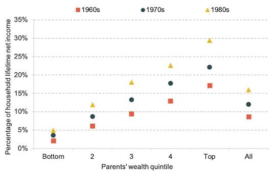
Source: https://www.ifs.org.uk/publications/1... Pascale Bourquin, Robert Joyce and David Sturrock
It is very hard to predict what the wider reaction to a fall in prices might be because, until recently, inheritances from housing were so much smaller.
Many people born in the 1960s are yet to inherit. Those born in earlier decades on average inherited far less as a proportion of their lifetime income. The implication is that the future effect on political sentiment of any house price falls could be much higher than in the past because many more people are now banking on it holding or increasing its value.
Politicians are very much alive to these issues. Government ministers and MPs often own more than one home, partly because of the necessity to have a base in London. A high proportion are also landlords. They will not be unaware of the importance of housing for their own and their children’s plans.
So, while they may talk of wanting to make housing more affordable, they may also realise that doing so could be politically and personally disastrous for them and their children.
Politicians cannot say that they are content with the status quo, so they most often talk about house building as the solution to the affordability crisis. However, as long as the social distribution of home ownership remains so uneven; as long as an ever-growing proportion of property is owned by landlords and by people who have second homes; and as long as a significant and growing proportion of property is at least partially unoccupied, then it does not matter how much more is built.
Prices do not fall when more is built – especially when they are propped up by so much government policy to prevent them from falling. All of this racks up the stakes, making housing more and more unaffordable to the majority who have to live somewhere. Increasingly this is in their parents’ homes because younger adults can only afford to leave the family nest later in life.
The political implications of house price falls
When house prices in the UK eventually fall, we are likely to ascribe that to a particular event, such as a fall in demand from the young adult population as a result of migration patterns altered by Brexit; or a change in demand away from city locations as a result of Covid-19.
Whatever the reason, we should remember that governments were actively forcing prices higher and higher in the first place. So when the fall comes, remember it was always going to happen and the trigger of the moment will not be crucial but coincidental. What though will happen politically when the fall happens?
In the 1992 general election, the Conservative vote fell more in areas where home-buyers were experiencing negative equity than anywhere else. This was not enough to ensure that the Conservative party lost that election. But the damage done to the confidence of Conservative voters contributed to some degree to the huge defeat the party suffered in 1997.
UK governments, and most obviously Conservative governments, try to prop up house prices because they are scared of the political implications of allowing them to fall.
For ordinary people ‘the economy’ means jobs, wages, the consumer price index and especially house prices. In the 2019 general election, 86% of Conservative seats had above average home ownership, compared to 82% of Liberal Democrat seats and only 26% of Labour seats.
It is likely that there will come a moment when prices will fall regardless of what a government does. In September 1989 it was the ending of that tax loophole called ‘MIRAS for couples’. But it could be anything that does it.
For example, any government increasing social protection for tenants of private landlords could risk introducing the measure that triggers this fall – which might partly explain why the current government does not implement better rights for tenants.
Another possible trigger could be the effect of Brexit reducing inward migration, having other harmful economic consequences and reducing housing demand.
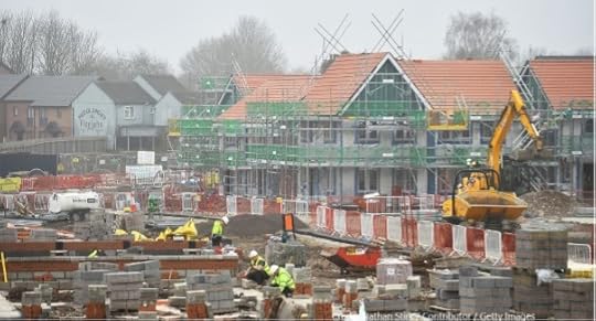
Credit: Nathan Stirk / Contributor / Getty Images
Once prices start to drop, confidence in the market can fall even faster. People might hold off from buying a house. Banks may become very wary of lending to landlords to buy more property and begin to worry about their balance sheets. At the extreme, a fire-sale may begin. That occurred in Japan in the early 1990s. In 2005 house prices in some parts of Tokyo were still only half what they had been in 1991!
What happens next, is extremely uncertain, even if the price falls are only small. Peoples’ dreams begin to be dashed. Affluent couples dream of trying to buy a home only to find that sellers are not willing to accept the new, lower, market value. Tenants dream that their child does not have to move school only to find that their landlord is suddenly forced to evict them in order to reduce their property portfolio.
But the largest disappointment will be for people who thought that the property their parents owned, or that they had only recently bought, would be worth a given sum.
We only have a few examples of falling prices in the past, and each scenario is unique. But the big difference next time will be that the dashing of future inheritance gains for many individuals will be far greater.
A future government might seek to blame pessimists in opposition parties for the fall; or if there has been a recent change in government, it could blame the previous administration and its policies.
One recent commentator suggested that interest rate rises in future might slow price rises concluding that ‘[m]aybe rates will rise slightly over that time, but not by enough to trigger a housing crash. That cannot be allowed to happen: the economy and Tory politics say so.’ However, that assumes that the market can be managed.
At times the market has a mind of its own.
Conclusion
The social divisions of Britain, with the widest income inequalities in all of Europe (apart occasionally from Bulgaria!), are most clearly defined by housing.
Countries in Europe with much more equal income distributions tend to have far better housing policies and better housing outcomes. In an odd way, it may not be the banking crash of 2008, or Brexit, or Covid-19, that will have the most enduring impact on Britain this century. It may yet be the house price falls to come.
What else could drastically reduce our regional economic divides, which are also amongst the widest in Europe? The current government’s ‘levelling up’ agenda is little more than a cosmetic exercise with hints of pork-barrel politics.
Finally, consider again the graph this article began with, but now re-drawn using a logarithmic scale. That scale ensures that equal percentage changes are represented equally on the vertical axis of the graph. The peaks and troughs are identical to the first graph shown above, of course, but the slope of the price curve is different to that previous graph.
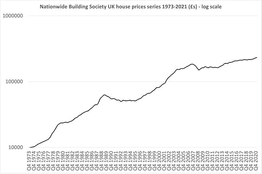
Nationwide Building Society UK house price series 1973-2021 (£s) – log scale
On a log scale, a doubling of prices appears as an identical increase regardless of the actual prices. Looked at in this way, rises in housing prices have been slowing down over the entire 1973-2021 period.
The graph is steepest in the late 1970s, when general inflation was also very high. Then again in the 10 years from 1980 to 1990, when prices increased by 150% in that decade. It took the 15 years to 2005 for prices to increase by 150% again. In the 16 years between 2005 and 2021 prices have ‘only’ risen by 50%, from £153,000 to £232,000.
What does this final graph portend? When house prices next stutter, or fall, or crash, the political implications may be even greater than they were in the years before the 1997 election and in the years before the 2010 election.
What may well be different next time is that they then never recover fully, and possibly (at some point) might even not keep up with general inflation. Who would then buy property as a speculative short or medium term investment, rather than as a home?
What a different country the UK might become. Perhaps a better one.
By Danny Dorling, Professor of Geography at the University of Oxford.
For the link to the original article on-line and a PDF click here.
Danny Dorling's Blog

- Danny Dorling's profile
- 96 followers

