
Danny Dorling's Blog, page 16
April 7, 2020
The NHS has been run on the goodwill of its staff for too long
April 7, 2020
Lucinda Hiam, Martin McKee and Danny Dorling
On 31st January 2020, the chief medical officer (CMO) for England confirmed the first two cases of novel coronavirus (covid-19) in the UK. The prime minister, Boris Johnson, addressed the nation at a press conference on 3rd March 2020. Johnson said the UK was “extremely well prepared”: “And let’s not forget, we already have a fantastic NHS… we will make sure the NHS gets all the support it needs.”
Healthcare professionals did not share his confidence that the NHS was prepared. One survey asked doctors, “Do you feel the NHS is well prepared for Coronavirus?”—less than 1% said they did. Meanwhile, news bulletins are reporting health workers’ concerns that the supply of personal protective equipment, or PPE, is inadequate, obsolete, improvised, and in some cases, dangerous, leaving staff, some now threatening to quit, feeling “betrayed.” Much remains unknown about how the pandemic will affect the UK, but what is clear is that a decade of under-funding has left the NHS extremely vulnerable. Worse, repeated warnings about this vulnerability have been ignored.
It is not surprising that those on the frontline feel the NHS is unprepared. Before the first case of covid-19 in the UK on 31st January, data for the preceding four weeks revealed that the highest number of patients had waited in A&E for more than four hours “since records began.” 2,846 people waited more than 12 hours to be seen. These figures represented increases of 20.4% and 353.9% respectively above the same period last year.
Yet, January 2020 was not an exception. Rather, it was the continuation of a trend of worsening health outcomes over the past decade. Our review of health trends in the UK between 2010 and 2020, before covid-19, led us to conclude that things are falling apart. The state has been failing in its most basic duty, to protect the health of its people. Life expectancy has stalled, and for some fallen. So-called “deaths of despair,” from drug overdoses, alcohol related conditions, and suicides are rising in 45-54 year olds. Health inequalities are widening, access to healthcare is worsening, and the number of people who are homeless has risen. The UK was simply not prepared for an epidemic.
Successive governments since 2010 have made their priorities clear, no more so than in the months since the pandemic began. Although Downing Street has contested it, The Times newspaper reported sources claiming that the chief advisor to the prime minister, Dominic Cummings had said “…if that means some pensioners die, too bad”. He is not alone in his reluctance to accept the action the pandemic requires. Similar hesitance to act has been seen in the Trump administration, as one columnist put it: “On Wednesday night the global pandemic met US nationalism.”
The same people that have been in power in the UK for the last decade are now discussing the under-funding and resulting crisis in the NHS as if they had nothing to do with it. Jeremy Hunt, the Health and Social Care Secretary from September 2012 to July 2018, said in a BBC Newsnight interview: ‘”In retrospect, the cuts to social care were…the most silent but also the most devastating.” The devastation was not silent, people did complain loudly—but the British government had not been listening.
NHS workers have, as ever, risen to the challenge, moving away from their families, returning from retirement, working outside of their normal roles, and more than 500,000 others have signed up to be NHS volunteers. The NHS has been run on the goodwill of its staff for too long. For now, we must join together to support the crucial work of all those fighting to control the pandemic. But once this is done, there must be complete transparency about how the NHS came to be left in this exposed position, how social care had been stripped away, and how those in power will be held accountable.
Lucinda Hiam, GP and Honorary Research Fellow, London School of Hygiene and Tropical Medicine. Twitter: @lu_hiam
Danny Dorling is the Halford Mackinder professor of Geography, School of Geography and the Environment, University of Oxford
Martin McKee is professor of European public health at the London School of Hygiene and Tropical Medicine. Twitter @martinmckee
Competing interests: None declared
Read PDF of this opinion or see link to the version on the BMJ website here.
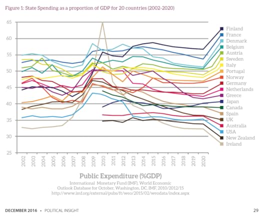
State Spending as a proportion of GDP for 20 countries, IMF estimates and projections


April 4, 2020
An armchair alternative to A-Level geography
A message for A-Level geographers: Suddenly you have time on your hands. You would have been spending these weeks and months memorising facts for regurgitating. You would have been honing your skills to very quickly write those perfect six-point or nine-point answers to potential A level exam questions. You would have been doing ‘mocks’ – taking past-paper after past-paper in preparation – and have been pondering strategies for question-spotting; for taking the optimum risks over what you choose to revise, rather than spreading your learning too thinly to gain that longed-for maximal mark.
You would have been constantly reminded not to write what you truly believed was the right answer; but instead what you could best-guess was the right answer as far as those trained to mark your papers believed. And those markers would have had no idea whether it was the right answer either – they too would have been given their instructions; told what words should gain you a point. A-level markers are not permitted to use their imaginations; and, thus, neither could you. That is because there are now so many demands that re-marking must produce identical marks – but there will be no marking this summer, let alone any re-marking!
Exams have their uses, and you may well be lamenting not being able to take yours this year, but they also encourage a particularly narrow way of thinking and answering questions. Knowing that your supposed ability will be summarised by a single letter encourages you to concentrate only on those things that are in the syllabus; and only to think about them in the way that would gain you most regard. You were being treated like a dog is treated when trained to jump through hoops and given snacks (or simply a little appreciation) when performing the most unnatural twists and turns to please those who are watching. This year, however, you are free – no one is watching you jump through the hoops.
So, what should you do? You may well be stuck at home – you cannot go out and explore your neighbourhood; walk freely through the heart of the nearest large city to you, or try to see what is really gluing the countryside together. When movement restrictions are lifted please think of having a look at what is nearest to you. This is what you should have been doing anyway, rather than travelling away to some field-centre before looking outside your own door. Of course, you can explore your local area in many ways on the web. If you are interested in human geography and live in England, I would suggest you start by clicking: here.
When you do click on that link above, and look at that website of contemporary most-deprivation and least-deprivation, what are the maps really showing you? Why is what you see around you arranged as it is today? And where do the people who do the most vital jobs tend to live – in which areas? What jobs are actually most vital – which jobs are key?
Many answers to these questions have been suggested – those answers are also on the web; but before you start searching for those answers – begin by looking at the world geographically and asking questions – your own questions. Not A-level exam questions but sensible, interesting, important, real-world questions.
Next, when you get bored of your local area, why not think globally? You may not be able to fly anywhere – but you can fly through data. Life in Britain was last as disrupted as it is today during the Second World War – but even then, we looked forward with hope. Consider the five traditional key concerns of social scientists, which were labelled in the 1942 Beveridge Report as being ‘Want, Squalor, Disease, Ignorance and Idleness’.
Where can you travel on the Web today to learn about each of these?
On Want: work your way through the World income and wealth databases: click here.
On Squalor: what you can learn from three decades of reporting by the UNDP: check here.
On Disease: see the Human mortality dataset (historical records for many countries): click here.
On Ignorance: what do we value most and how it that changing? UNESCO: click here.
On Idleness: suddenly the greatest fear locally, what happens globally? ILO: click here.
One great thing about travelling in your armchair is that you can travel further and faster. But if you find thinking about the entire world daunting, then limit yourself to Europe. The kindly European mainlanders have kept the UK in the data sets (for now – click here).
If you want to see what is done with data by university researchers take a look at the open access journal E&PA featured graphic section – the March issue is here: https://journals.sagepub.com/toc/epna... because, by chance, it features the flow out of key centres of China in the spring festival and life expectancy across the UK; and then look back at earlier graphs and at other journals – only ever look at free content (never pay).
Finally, here is something very simple that I made – having started with those resources above – that uses online data to try to suggest where we are heading: click here.

A graph from Slowdown, Danny Dorling’s latest book showing China’s total population
And there is absolutely no reason why you could not do something like this; or much, much better. And now, for once, just for one year, just for your year group, you have some time to explore in the way my generation could before – when exams were taken less seriously.
I hope this helps, there is much more than data out there to see on the web – but it is somewhere to start – when you leave the Alice in Wonderland world of A-level British geography behind; and decide that you want to look a little wider, further and with a great deal more imagination.
For the original version of this article publish by Geographical Magazine, or for a PDF of it, please click here.
April 3, 2020
The world was already slowing down long before lockdown
We need to quickly accept that this is an era of slowdown, not fast-paced change.
I am far from being the first person to notice that many things are slowing down. The intriguing question is why are we so resistant to the idea of slowdown? Why is it that we much prefer the alternative stories of growth and acceleration?
Why, when political leaders such as Justin Trudeau make soundbite claims which are so obviously wrong, do we simply applaud their apparent wisdom without questioning the validity of their claim?
Here is the soundbite from his speech at the World Economic Forum in Davos on Jan 23 2018: “Think about it: the pace of change has never been this fast, yet it will never be this slow again.”
It was a silly thing to say in 2018, and it is even more evidently preposterous now. When I first heard those words, I was four years through writing a book called Slowdown and they stopped me in my tracks. I had been collecting data; huge amounts of data; the data we amass about ourselves, our lives and I had been using it to measure the pace of change – in just about everything. Had I Had I been looking at the wrong data?
Trudeau did not give any examples, so I searched out other people who claimed we were still living in a time of acceleration. I found a book about ‘Social Acceleration’ which claimed that we were living in an ever more quickly accelerating world but was remarkably bereft of actual examples. One example given was that the apparent speed of talking in speeches given in the Norwegian parliament has increased by half compared with 1945. In the pages of my book Slowdown, as I talk about finding huge amounts of evidence to the contrary, I sometimes wonder how long it took to find that solitary example of speeding up.
But what is slowing down you might ask? The answer is almost everything about our lives. We are usually still going forwards; but we are no longer accelerating in the way we once used to; and the slowing down seems set to continue for some time to come.
If you are interested in innovation you may have to go back over a century to find the most world changing discoveries, in new uses for electricity, the invention of the tractor or theories about the existence of germs which change what it means to be human.
If you are interested in invention then the 1930s and the discoveries made during the Second World War might have been the point of greatest acceleration – not the creation of the Internet, but the earlier computers.
If it is productivity, or the growth of GDP, that interests you most, then the 1950s will be your best decade.

The slowdown in the rise of GDP growth worldwide 1950-2018 (Figure 60 of the book ‘Slowdown’).
If numbers of human beings on the planet interests you, then these rose the fastest in the 1960s and the fastest they ever will. We will almost certainly never touch 2% annual population growth ever again worldwide – we have not done so for more than fifty years now. Instead we have been slowing down.
In so many ways we began to change more slowly in the 1970s than the 1960s; more slowly in the 1980s than the 1970s, and slowing on and on. Today we are so used to stability that we are spooked witless by a pandemic that is likely to be smaller than that which occurred in 1968. What 1968 pandemic you might ask? And that is my point. So much was changing so quickly back then that the influenza that spread across the world that year (and returned again in again in 1969, 1970 and 1972) is now all but forgotten. Back then a million are thought to have died, including one hundred thousand in the US.
Why does slowdown matter? One reason is that when we have emerged from pandemics in the past, life has always very quickly returned to normal. In Slowdown I chart how the 1918 pandemic resulted in a 14% fall in global productivity, but that was quickly reversed to a rise of more than 16% in the following year because we were then in a time of acceleration. Even the most deadly and widespread of pandemics could hardly dent the trend going forward.
In contrast, today, almost everything was slowing down as 2020 began. The only things I found to be accelerating were the numbers of air flights (a tiny few of us were taking more each year); our overall carbon pollution (from everything other than flights); global temperatures; and finally an acceleration in the number of young people going to university worldwide. For a few months at least all of these four exceptions will themselves dramatically slow.
We are on the downward slope of a trend. In the last few hours of March 2020 it was announced that the shareholders of British banks would not be claiming billions of pounds of dividends following a ‘sternly worded letter from the Bank of England’. When you are slowing down, wealth can literally disappear (as the world’s billionaires have just discovered).
Early this year the the Bank of England published an obscure working paper written by Paul Schmelzing and entitled ‘Eight centuries of global real interest rates, R-G, and the “suprasecular” decline, 1311–2018.’ It describes a much longer and far bigger slowdown than the one I have written about. Soon you will become tired of hearing about slowdown, because it is the new normal.
How long before we hear: “The pace of change is slowing, and it will never be this fast again”?
Danny Dorling is the author of Slowdown: The End of the Great Acceleration.
Click here for link to PDF of this article and its on-line original source (The Telegraph Newspaper, April 3rd, 2020).
March 31, 2020
Coronavirus is a tragedy – but it could be the wake-up call we need: the economy has been forced to slow down
For some time this pandemic will focus almost all of our attention. It is a tragedy that will play out differently in different parts of the world; the poor world will suffer more than the rich one. We will see it as a potential turning point, a portent, a sign that we should have cared more and prepared better. However, human progress was slowing before this pandemic began, and our world will continue to slow down for some time to come – long after the pandemic has ended. I mean slowing down in almost every way that matters. And, because the slowdown was itself slow, we had hardly noticed it. In fact, many people thought that we were still accelerating.

What acceleration looks like, drawn as a phase portrait (Figure 1 from the book ‘Slowdown’).
…
We do not yet know what effect the current pandemic will have on worldwide demographics. But it is actually slightly more likely to increase future populations than decrease them. If the actions of governments, or at least of most governments, make people feel more insecure, economically and socially, then younger people may in the near future have more children than they would have had; and the pandemic will, counterintuitively, very slightly increase the total future population.
…

World Population change and projection to 2100 (Figure 21 of the book ‘Slowdown’)
Everything other than that which is vital is being put on hold. The key workers are no longer the billionaires, the bankers, the brokers, the city people, the business people, the estate agents, the landlords. Instead the key workers – those necessary for us to be able to function as a society – are those who were among the most under-appreciated, worst paid, and most overworked: nurses, teachers, rubbish collectors, hospital cleaners, delivery people, railway workers, and carers.
Schools will open to look after key workers’ children so they can do their work, but not for the children of footballers, actors, supermodels, peers and other aristocrats, some of whom will be spending longer with their offspring than they have ever spent before. School classes will not be very large at all.
…For several years I have been studying the slowdown that was already happening to our economy and that was set to deepen, asking how the young in particular might deal with the outcome.
The slowdown in the rise of GDP growth worldwide 1950-2018 (Figure 60 of the book ‘Slowdown’).
…We have a choice to make and we do not have very long to make it. Until now some among us have seen hunger as the whip to get the lazy to work; homelessness as a useful threat for the young, the fate that awaits them if they do not take whatever work they can get. But suddenly, there is so much less work to do.
So much that was frivolous has, for a time, ended. When it is food and shelter that matter most, paying rent so that your landlord can afford a cruise holiday suddenly seems ridiculous. For months to come we will be living with the reduced consumption of goods and services and living a simpler life focused on wellbeing. Who needs new clothes now?
As we eventually emerge from this we should aim not for continued extreme abstinence but something where the entry bar is set quite low, something that’s more realistic and achievable for a greater number of people – a little less of everything on a “forego for good” basis. This is because we are not suddenly going to return to normal.
So, at the very least, in future plan for at least one less foreign holiday a year (if you ever had such holidays), hang on to possessions for an extra year or until they don’t work, eat out less and donate the money you save to a progressive cause, repair and re-use, boycott Black Friday, have contributory birthdays and Christmases where you bring food and drink, but don’t buy tat for your friends and family any more.
There is so much more that we can imagine doing differently now – now that we have been reminded of what matters most. Each “foregoing” could be celebrated on social media as openly or anonymously as people wish.
There are times when everything changes. Right now we are feeling the slamming on of the brakes on the train. For a while almost everything that we have become used to stops.
Read the two articles these brief excerpts are taken from, which were published in The Guardian and Independent newspapers, March 31st 2020.

The annual rise in air flights taken by passengers worldwide 1970-2017 (Figure 62 from the book ‘Slowdown’)
March 29, 2020
Things Fall Apart: the British Health Crisis 2010–2020
Things fall apart; the centre cannot hold;
Mere anarchy is loosed upon the world,
The blood-dimmed tide is loosed, and everywhere
The ceremony of innocence is drowned;
The best lack all conviction, while the worst
Are full of passionate intensity.
—Yeats, 1920.
Introduction
One hundred years ago, Yeats wrote that ‘Things fall apart’ in his poem ‘The Second Coming’. Written in response to turmoil across Europe, including in his native Ireland, it has often been invoked in writings about societal decline. In 2016, it seemed particularly apt in the UK when, by a small majority, the British population opted for a future outside the EU, beginning a process that, so far, has created almost 4 years of political gridlock in which a barely functioning parliament has been unable to tackle mounting and increasingly severe social, economic, housing and health problems. An analysis published a few months after the referendum found that Yeats’ poem had been quoted more often in the first part of that year than in any of the previous thirty years.
There is no doubt that the UK has faced many problems in recent years, including political crises and relative economic decline. But are things really falling apart? In this paper, we argue that there is considerable evidence that they are, with profound consequences for the future of the UK. Our assessment is based on an examination of what is happening to the health of the British population. Since the middle of the 18th century, the health of the British people has been improving.Yet in recent years infant mortality has risen overall (most markedly in England and Wales), life expectancy fell everywhere in 2015 and appears now to have stalled, health inequalities have widened and access to healthcare has worsened. History tells us that this should be a matter of great concern. One of the first indicators that a state is failing has been stagnating or worsening health. In the early 1980s, few observers of the USSR believed that it was in decline, but those who studied health data challenged this consensus when they found an unexpected rise in infant mortality. In the 21st century, worsening health in the USA has been associated with a loss of faith in traditional institutions.
In the remainder of this paper we review the evidence that causes us so much concern.
…
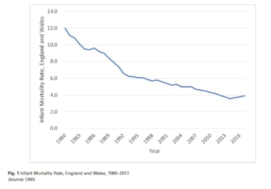
Infant mortality rates in England and Wales rose in the year to 2015, to 2016 and to 2017 (to 3.9 per 1000 births)
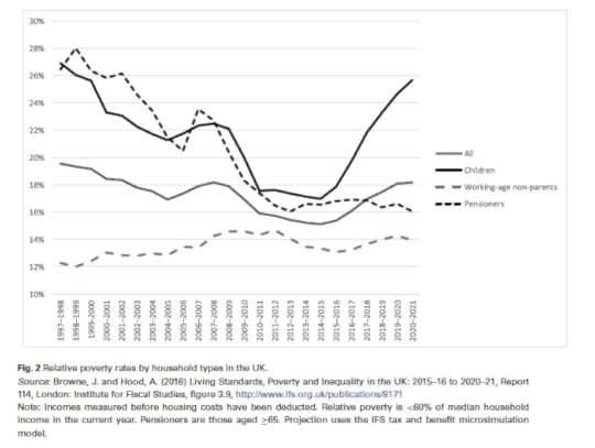
The proportion and number of children living in poverty in the UK began to rise rapidly after the year 2014 and is projected by the IF to rise even higher in 2021
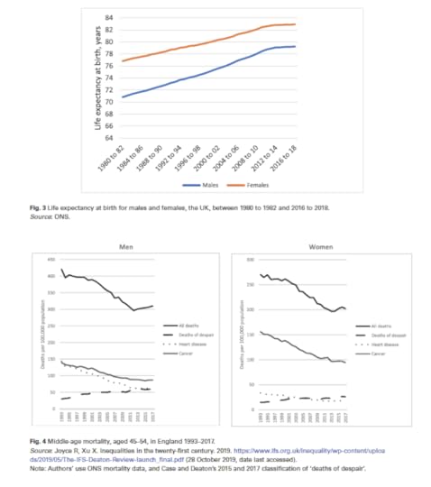
As life expectancy for men and women in the UK stopped rising, there was also an increase in ‘deaths of despair’
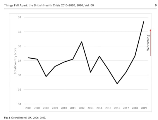
Fragile State Index for the United Kingdom 2006-2019
To read more, and access a link to original published article and its PDF please click here.
March 25, 2020
Coronavirus: how the current number of people dying in the UK compares to the past decade
by Danny Dorling, University of Oxford
The speed of the global spread of coronavirus is staggering.
On March 5, Chris Whitty, the UK’s chief medical adviser, announced the death, in Berkshire, of the first UK patient to have tested positive for COVID-19, the disease associated with the new coronavirus. That patient had contracted the virus within the UK.
Exactly eight weeks earlier, on January 9, in the Chinese city of Wuhan, the first such death worldwide had occurred. At the time it was reported that there was no evidence the virus could spread between humans. That was quickly proved wrong. The virus spread around the world and the rise in deaths is now slowest in those countries it reached first.
In England and Wales, the very latest data has just been published on the number of all deaths registered in the week ending March 13 – which was 11,019 people. This was some 186 fewer than in that same week over the course of the last five years.
It’s worth looking in detail at the period just before the pandemic reached the UK to understand what huge variations in mortality occurred recently before anyone died due to COVID-19. That’s because it’s useful to know how bad the situation already was in late January, February and early March before the crisis fully hit as it is expected to – and how often the numbers dying at this time of year have risen above what the NHS and adult social services have (and have not) been able to cope with in very recent years.
Fewer deaths than average
In the 56 days from January 11 to March 6, the total number of people who died in England and Wales was recorded as being 90,940, only one of whom was known to have tested positive for COVID-19. Others who died may possibly have had the disease, but not been tested for it. However, it’s unlikely that the virus was widespread in England and Wales in the first few months of 2020. That’s because the 90,940 deaths was 5,023 people lower than the average in the same eight-week period over the previous five years, which was 95,963.
One obvious reason why fewer people died in early 2020 was because the previous five years had been extraordinarily bad, as the graph below (at the bottom of this page) shows by comparing the absolute numbers of deaths in these same 56 days in each of the last 11 years.
In England and Wales the most recent year of low mortality was 2014, in which 82,670 people died and life expectancy across the whole UK temporarily reached its highest ever level for both men and women. However, 2014 was not that unusual until recently. For the five years before that, between 2009 and 2013, 85,023 people died on average in England and Wales in these same eight winter weeks. Part of the reason why there may be fewer recorded deaths during these eight weeks in 2016, 2019 and 2020 than in 2015 and 2018 is because more people died when social services and the NHS were particularly overwhelmed, leaving fewer frail people alive and at risk the next year.
The huge rises in mortality across the UK since 2010 are now widely accepted to have been linked to austerity cutbacks on services, especially social services. The rise in deaths was not due to ageing as there were very few births in the 1930s when the population currently aged 81 to 90 were born.
Mitigation matters
So how well is the UK in general geared up to deal with the spread of the virus?
It has been reported that, compared to Germany, the UK has five times fewer ventilators per person at risk. Since austerity deepened the UK has been spending roughly a million euros (£925,000) less a week on its health services compared to Germany.
There has been little planning and a great deal of denial. Reports have suggested it was only on March 11 that the full scale of the challenge facing the NHS fully dawned on the government’s scientific advisers.
What we know at the moment is that the virus is especially deadly among the elderly. The Cambridge statistician David Spiegelhalter has implied that one way of viewing your chance of dying following contracting COVID-19 is that it’s like having the mortality chance of somebody eight years older than you are. For a 20-year-old, having the mortality chances of a 28-year-old is nothing to worry about; but for an 82-year-old having the chances of a 90-year-old is.
Researchers at University College London have produced estimates for the likely number of UK deaths which vary from between 13,791 and 1,110,332 depending on whether mitigation is successful and if the relative risk turns out to be lower than expected, compared to a “do nothing/high-risk” scenario.
Mortality rates in the spotlight
The number of people who die in each country in Europe may well depend not only on government action, but also on the number of already very elderly and frail. Another fact may be whether the usual living conditions mean that old and young tend to live together – something which varies markedly across Europe. This may have been one reason why mortality rates rose faster in Italy.
As cases in China shrank and those in Europe grew, the world map appeared split when shaped by deaths due to COVID-19 as counted up to March 23.
According to the Centre for Evidence-Based Medicine at the University of Oxford, the current mortality rates reported across Europe for people tested and found to have the disease vary from 9.3% per infected person in Italy, 6.6% in Spain, 4% in China and 4.9% in the UK, to as low as 0.4% in Germany and Austria, and 0.3% in Norway.
This is why at 8.30pm on March 23 the UK was put into lockdown. Such action was sensible given how little we currently know. We will know much more very soon.
However, the Oxford estimates also suggest that of those actually infected, as compared to those known to be infected following testing, the actual global mortality rate may be as low as 0.2% – or less. This is what we should hope for – while preparing for worse.
Danny Dorling, Halford Mackinder Professor of Geography, University of Oxford
This article is republished from The Conversation under a Creative Commons license. Read the original article.
 The world shaped by numbers of deaths due to COVID-19 on March 22 2020.
By Worldmapper, CC BY-SA
… and get a PDF here.
 CC BY-SA
February 29, 2020
Labour’s Defeat and the Health Crisis in early 2020
Hensher contrasts the abuse Corbyn received while attempting to become Prime Minster with that Margaret Thatcher received when in office, and for all her life after that. The crucial difference is that Margaret Thatcher was vilified for what she did. Jeremy Corbyn was vilified because of what it was imaged he and his party might do.
The Labour Party under Jeremy Corbyn committed itself to increasing public spending in the UK to a level just below that of Germany. They promised to do this – in part – by raising taxes on the highest paid twentieth of people in the UK, in effect to the levels paid in Germany. Such tax rises alone would have not balanced the books, as they do not in Germany, but they help foster an economy that can support normal European levels of public services, such as those enjoyed in Germany.
Public opprobrium was poured onto Labour’s figure-head by many of those in the top twentieth who determine how public debate is fashioned. Labour threatened to end their way of life and to do so within just five years. The large majority of the highest-paid 5% opt out of the state education system, but they would not have been able to do so under the tax regime Labour was promising. Many, if not most in this small group, use private health care. This tiny group contains almost everyone who owns more than one property. A Labour party that had become a normal European Social Democratic Party was an existential threat to their way of life and so every kind of abuse was hurled in its direction. This, above all else, contributed to Johnston’s victory. The largest flow of the vote was Labour voters in 2017, who had voted then for Jeremy Corbyn’s party, being persuaded and encouraged not to vote at all in 2019.
In 2008 in ‘The Northern Clemency’, Hensher wrote a disturbing description of the neighbourhood of Sheffield I lived in at the time. It was the less affluent corner of the most affluent constituency. He misjudged one key aspect of its people. He saw them as narrow-minded and selfish, living secretive lives and out mainly for themselves. While that might have been true of some, it was and is not true of the majority. In December 2019, despite the core of that constituency being one of the most affluent parts of the North – Sheffield Hallam returned Olivia Blake as their MP – for Labour.
Hensher will see what he chooses to see, perhaps what he is destined to see, and he is unlikely to ever see things the way I do, despite us both having trod the same streets. But he could at least recognise the difference between a Prime Minster vilified for what she did, and a man who never became Prime Minster vilified and accused of all manner of crimes and misdemeanours for fear that he might one day have held power.
Jeremy Corbyn’s footnote in history may be far less damning than many currently believe. He was always ahead of his time. Margaret Thatcher, in contrast, once spoke in favour of flogging young people when she was an MP in 1961. And, of course, in office (from 1979-1990) she did far worse than that.
Danny Dorling
Oxford.
For a PDF of this letter – and a link to the shorten version that was published – click here.
For an audio recording of a 20 minute talk on the health crisis in early 2020, given on the day this letter was printed, please click play below:

The changed trend in mortality rate improvements
February 25, 2020
Tackling the housing crisis
Polly Neate is right that “social housing and homes for first-time buyers don’t have to be either/or”. (“Britain has a housing crisis: First Homes is just a comfort blanket”, Comment) They do have to be a both/and.
A new way out of our dire housing crisis into truly affordable housing for low- and middle-income, renters and first-time buyers must be found. The growing numbers of homeless demand it, as do nurses, police, bus drivers, carers, cleaners and others in low-paid essential services.
For too long, local authorities have used high-value public land to help developers build private housing with rents and prices that are too high. All public land ought to be reserved for building only truly affordable social housing to rent or to buy, while prioritising building homes for low-income homeless renters. Also, the length of time that land or property can be left unused or empty should be limited to six months.
Reverend Paul Nicolson, Taxpayers Against Poverty; Tom Burgess, Progressive Policy Unit; Professor Danny Dorling, University of Oxford; Fred Harrison, Land Research Trust, Stephen Hill, director, C2O futureplanners; Will McMahon, director, Action on Empty Homes; Professor Richard Murphy, City, University of London; Jennifer Nadel, co-director, Compassion in Politics; Paul Regan, chair, London Community Land Trust; John Tizard, social activist & strategic adviser
For a PDF for this letter click here.
For how similar the 2020 government is, in its attitudes to that of 2016 (and before) click here.
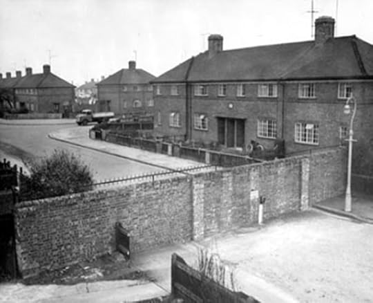
One of the two Cutteslowe walls, Oxford, late 1930s (note the spikes).
January 29, 2020
Rabbit homes, peak inequality and mortality in the UK: 2015-2020
So much goes wrong when a state is at peak inequality. We convert offices into rabbit hutches for people to live in and their life expectancy also falls. This post contains the foreword to Colin Wile’s Report “Rabbit Hutch Homes: The growth of micro-homes” published by the intergeneration foundation in January 2020 as well as a link to a talk given to the London Inequalities Studies meeting in 20 Bedford Way onJanuary 28th 2020.
—
Housing is one of the most visible forms of intergenerational unfairness facing our society today. We don’t have enough of it in some parts of Britain. We aren’t building or updating and replacing enough of it. We use what we have increasingly inefficiently so that a greater and greater proportion of rooms are not much used within what we have. Older generations have too much of it and younger generations need more of it. While older generations are increasingly under-occupying their suburban homes, and a few are buying more and more holiday homes, younger generations are increasingly likely to rent over-occupied homes squeezed into city centres; or have to mortgage themselves to the hilt to live in often substandard property. The United Kingdom can now claim the dubious title of having the smallest rooms, and the second smallest homes, to be found across all of Europe.
We need to increase the supply of new housing by 300,000 homes each year through a mixture of using what we have more efficiently and building more; and we need to do this for at least the next ten years unless there is net-emigration. So where will these new homes come from? Thanks to high land values, unimaginative planning practices, and land-banking stifling the supply of new developments, micro-homes have been seen as part of the solution, with their number increasing five-fold between 2013 and 2018.
Increasing the supply of housing should bring with it a duty to ensure that the new homes built – whatever their size – are decent, affordable and safe. Can we really say that about the many new micro-homes being built? Where an extra
window or good ventilation is seen as a luxury? Are we willing to accept that the footprint is so small it is impossible to entertain friends – or even a partner? This is not just a London phenomenon: the last two years have seen significant numbers of micro-homes built in the North West, the South East, and Yorkshire and Humber.
As this paper by the Intergenerational Foundation makes plain, we need to call time on quick-profit-seeking speculative developments of rabbit hutch homes. We need to tighten, not loosen, permitted development rights for homes converted from offices or business use and ensure that developers are made to abide by the Nationally Described Space Standard, in order to better protect younger and future generations, many of whom are driven by an aspiration to have a home of their own, like generations before, but are now being targeted by clever and slick marketing techniques. And we need to use what we already have so much more carefully and efficiently, rather than think that we can carry on as we are but provide a micro-home to divert attention from so much that is more and more under-used or empty for much of the year.
Read the full report about housing here or list to the podcast on peak inequality and mortality by clicking play below:
January 8, 2020
The 2019 general election and the geography and demography of Brexit
Danny Dorling demolishes myths about the Brexit Referendum result of 2016 and the General Election result of 2019. The old, and predominantly the middle class of southern England, achieved victory in both.

The June 2016 Brexit Referendum result was a shock – when it came. We might now say that it should not have been, but we must not forget that it was. It was especially a surprise to those who campaigned for Leave, many of whom clearly had not expected to win, and were not prepared for victory.
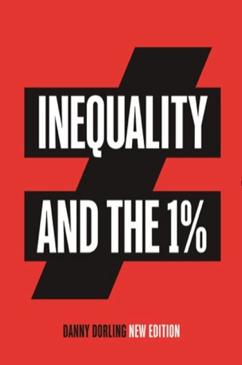
The winners in June 2016 were those members of the 1% who orchestrated the campaign to leave the EU. Further details are given in the preface of the 3rd edition of my book Inequality and the 1%, which can be read for free (here).
As a consequence, there has been political chaos from the date of the vote on 23 June 2016, right through to the day Britain did not leave on 29 March 2019 and beyond – to the General Election of 12 December 2019, and most probably there will be chaos throughout 2020.
With a colleague I wrote a book about Brexit during the first two years of that long period of political chaos (here). It was published on 15 January 2019, on the day of the first of a series of ‘meaningful votes’ which turned out not to be very meaningful at all. To those who read it we suggested that even if Britain fully leaves the EU, Brexit will be part of a diminishing of the UK.
One thing that was not highlighted strongly enough in that book was that that Leave vote was a majority middle-class vote. Some 59% of Leave voters were middle class – an estimate based on a large exit-poll sample. Lord Ashcroft sponsored the 2016 exit poll, and it was his publishing company (Biteback) that also kindly published our book, Rule Britannia.

Leave: a southern middle-class vote
In the book, Sally Tomlinson and I did mention that most of Leave voters lived in the south of England (including London). This was surprising, as it was where only a minority of the UK electorate lived. But it was where the Tory and UKIP voters who most wanted to leave resided in greatest numbers. The south of England is where the elderly of the UK are concentrated, and where electoral turnout is almost always highest, and was highest in the Referendum.
After the south-east region of England, where the referendum turnout was highest, the largest turnouts were, in descending order, the south-west of England, eastern England, and the East Midlands. Nowhere in the north of England was turnout (either in the 2016 referendum or the 2017 and 2019 referendums) as high as in the south, nor was it home to as many Leave voters.
Every county in the map below has a corresponding set of areas that are not in the south of England to which it can be compared, areas which always had fewer Leave voters despite always having a larger total electorate. These southern counties are the same ones that most solidly backed the Conservatives in the general election. The map shows the ‘Brexit Way’, a new national walk you can take to understand the Leave voters as it goes past the homes of the majority of them.
So many people in the south and east of England voted Leave that the walk would take you a very long time. It is better to cycle the route to pass along the site of what I hope in future will be recognised as the Brexit victory of southern England: a permanent reminder to people in the future of where the most and the strongest support for Leave came from; as well as the most solid support for the Conservatives, who now have a large majority in parliament.
The Brexit Way: a proposed new national walk/cycle route past the homes of the majority of UK Leave voters (a minority of the electorate) so that we all know who they are.
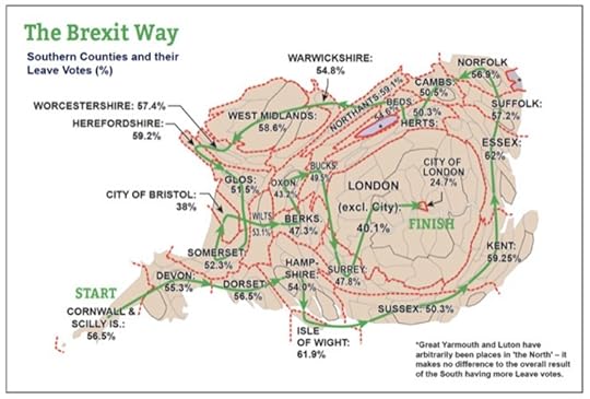
Proportion of the referendum vote for Leave is shown. For each country and area shown there is a separate set of areas outside the south of England that in all cases were responsible for fewer Leave votes but had more voters on the electoral roll.
For every one of the 28 counties and cities labelled in the map above it is possible to find another set of areas of the UK that had a larger electorate but a lower total Leave vote. From Stoke to Hull, from Middlesbrough to Sheffield, without exception there is an equivalent area of the south of England in which more people voted leave, despite fewer people there having a vote – just as far more people in the south voted Conservative on 12 December 2019.
Labour lost seats in the north in 2019 because the Labour vote fell as compared to 2017 – not because large numbers defected directly from Labour loyalty to Tory voting.
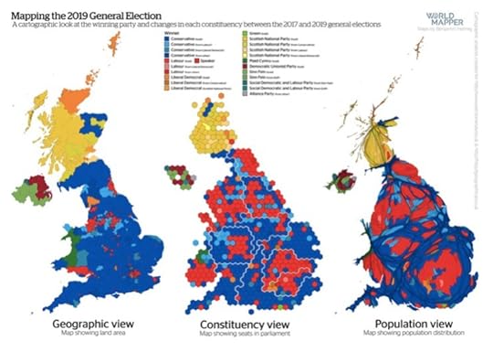
The light blue seats are mostly suburban northern seats that the Conservatives gained in 2019 (map courtesy of Benjamin Hennig).
This little geographical exercise can be carried out in such a way that every single area of the UK and Gibraltar (where people could also vote in the 2016 Referendum) is included, and no area is included twice. Three and a half years after that fateful day, 23 June 2016, we still have so much to learn about what happened.
Power gambles
In 2016, David Cameron took a gamble and lost. In May 2017, Theresa May took a gamble and saw her majority reduced at the general election that year. In December 2019, Boris Johnson took a gamble and was lucky. No doubt similar political manipulation occurred as was revealed after the 2016 Referendum and that will likely be revealed over the course of 2020 and 2021.
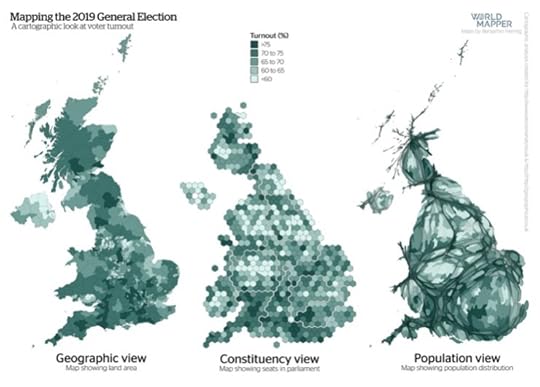
The light grey seats are those with the lowest political turnout in 2019 – mainly in cities (but not London) and the north (map courtesy of Benjamin Hennig).
It is important that we remember the determination of that small group within the richest 1% of British society in their attempts to ensure that the UK should leave the EU, but also that it is a story that is still unfolding. It is important that we see the results of the December 2019 election as a continuation of those attempts.
One way in which the Conservatives won in 2019 was in helping to persuade many people not to vote Labour, people who had voted Labour in 2017. Often, they said they could not vote for a party led by Jeremy Corbyn, having done just that only two years earlier.
Many were cleverly manipulated. Most people in Britain, when given a choice, chose not to vote, and more can be easily persuaded not to vote if the party they might have voted for is painted in a particular way on the BBC, in the newspapers, and in targeted individual Facebook adverts.
The diagram below gives a crude description of who voted for which political party at the most recent 2019 General Election, by age group.

Voting in the December 2019 General Election roughly assigned to age group (note for political parties that are very small this is very crude). Light grey: children. Dark grey: not voting. Black: EU not UK citizen. Blue: Conservative. Red: Labour. Gold: Liberal. Yellow: SNP. Green: Green or Plaid Cymru. Purple: Northern Ireland. (References here and here .)
The UK in December 2019 was home to 66 million people. Demographically, they can be divided into eleven almost equal-sized groups of six million people each. The first group are children aged 0-6; and the last group are all those aged 74 and above. Within each equal-sized age group, a (very crude) approximation can be made of how people voted based on polls released at the time of the election and the exit poll.
The Conservatives were more strongly backed by the old than they have ever been before. This is how they won.
Of the 66 million people living in the UK (where ● represents 30 MPs), and rounded to the nearest million:
20 million did not vote or were eligible but not registered to vote
14 million voted Conservative (gaining 365 seats of 650) ●●●●● ●●●●● ●●
12 million were children (and UK citizens)
10 million voted Labour (203 seats) ●●●●● ●●
4 million voted Liberal (11 seats)
3 million were not UK citizens
1 million voted in Northern Ireland (18 seats) ●
1 million voted Scottish National Party (48 seats) ●●
1 million voted Green, Plaid, or other (5 seats)
The UK’s undemocratic first-past-the-post voting system allows 14 million people to elect a large majority of MPs despite being such a small minority of the population.
For now, it is just worth remembering, as the Sun newspaper might put it (if its owner chose to): ‘It was the South of England wot done it.’ The South, the old, and predominantly the middle class of southern England won the Brexit Referendum of June 2016 and the General Election of December 2019.
However, those in the 1% who have worked so hard to secure Brexit will continue to try to present themselves as champions of the working class and the north. The Brexit saga is far from over…
Danny Dorling is the author of Inequality and the 1%, Rule Britannia: Brexit and the end of empire, and many other books.
Read the original version and a PDF by clicking here
Danny Dorling's Blog

- Danny Dorling's profile
- 96 followers

