
Michael Lopp's Blog, page 50
November 9, 2013
Warlords of Draenor
In what is a first in my gaming experience, after years of not playing World of Warcraft, I fired the game up several months ago and have been actively playing – leveling several toons including a panda. This that while I shouldn’t care about Worlds of Draenor at all, I actually care more than I should.


November 6, 2013
MagicRecs is kind’a magical
As near as I can tell, this Twitter robot will DM you when folks you follow start following someone that you don’t follow. I don’t follow a lot of folks, but it is true that I will give greater consideration to folks that my friends are following. Say that ten time fast. Recommendations are infrequent and, so far, worth investigating.
November 5, 2013
With Great Joy
It is with great joy and a little bit of sadness that I welcome you to next version of Rands.
For a long list of dear friends, I’m “that guy”. I’m the guy who has told an endless number of people that the redesign of Rands has been just around the corner for the last six years and it’s never happened. There have been no less than three designers who have contributed work to designs that simply never happened, and I apologize to each and every one of you. But each design contributed to what you see now – a completely new version of the site.
This final iteration is entirely the fault of my good friend Alex King. Several years ago, Alex was one of the unlucky participants in a “Hey, can you help with me with a redesign?” false start, and to his credit he still speaks to me. This July, he contacted me and wrote:
“You mind if I put together a wireframe or two for your consideration? Scratch that – I’m excited about the ideas so I will be putting together the rough wireframes – and I’ll send them to you.”
Alex’s initial concepts were a marriage of the design elements I loved from the old site – typography, color palette – with a goal for the new site: a focus on the words. While I love the old site like an old beat-up leather jacket that I’ll never throw away, it was accreting cruft. As I look at each piece of cruft, I remember my decision to put it there, but when I look at the whole, I’ve been slowly losing focus on the words.
Everything is Different
Here’s what’s changed:
I believe the new site is incredibly readable on a big screen, tablet, or phone. If you don’t believe me, resize this window and see how responsive design provides a pleasant reading experience regardless of window size.
After a good long run on Movable Type, the site is now run on the latest version of WordPress. My site is not fancy and has happily served up static pages for years. This static page strategy made the site resilient to a variety of traffic conditions. While I’m assured that WordPress’s scalability issues are long gone, I won’t actually believe it until the new site handles the load.
I’m often asked why I chose to put post dates for article at the bottom of the pieces. The people who ask are in a hurry and mostly care only whether the content is new rather than good. There are over 400 articles of greatly varying quality and some are fortunate enough to stand the test of time. For this redesign, a significant amount of work was done to make it easier to stumble upon this content. In addition to spending time categorizing existing articles, I’ve also combined and added new categories to make it easier to find articles. My favorite new category is Tools, which documents my obsession with pens, paper, coffee mugs, and, soon, conference badges.
Frequent readers have noted that I’ve gone from three or four articles a month to maybe one or two. I’ve developed irrational emotional baggage about what constitutes a Rands article and I want to write more. While I believe long form articles are the bread and butter of this site, I’ve created a new Excerpt type that enables me to post much smaller pieces without the word count and editing requirements of the long form pieces. As I don’t know how I’ll use Excerpts, there is a finite chance you may hate these smaller posts, which is why we’ve developed two different feeds for the site:
Everything is what you see on the Blog page and contains, well, everything.
Long form is just the long form pieces – you’ll always see the latest long piece on the front page of the site.
If RSS isn’t your thing, there is a mailing list where I’ll continue the practice of announcing long form pieces and occasionally asking for help on site redesigns. @rands will still announce long form articles, but @rands_briefly will announce all new content.
Lastly, there’s the Sandbox. The Sandbox has been a part of each redesign I’ve never finished and I’m very happy to finally land this simple concept. In addition to providing jumps to various useful content on the site, it also documents what I consider to be additional Rands canon: the Twitter and Instagram accounts. A Sandbox is where you play, I play on Twitter and Instagram, and you should come play, too.
A Little Bit of Sadness
This is the fifth revision to the site, but this is the first time someone else has done a majority of the heavy lifting. It’s been a point of pride for me that I’ve been responsible for every single part of the site save for the hosting, but it’s precisely this pride which has prevented the site from evolving.
Alex and his team at Crowd Favorite borrowed elements from the existing design, but re-implemented the WordPress design from scratch utilizing their responsive CSS grid and Carrington Core templating framework. What they’ve crafted is a site where all of the content is deftly managed inside of the WordPress application. Work that was a pain in Movable Type is an afterthought in WordPress. Additionally, the site infrastructure is deliciously stored in git, which, I’m embarrassed to say, is my first opportunity to really use git. Don’t judge.
When Alex mailed me with his ideas for wireframes in July, I had no credible plan to launch a new version of Rands, let alone a modern, mobile-friendly site that not only provides creative options for the future, but also excavates over ten years of content buried in the archives. Sure, I’d been asking for help from designers and developers, but I wasn’t getting enough help because I wasn’t delegating enough.
If delegating doesn’t hurt, you’re getting less done than you could.
Welcome to new site. I’d love to hear what you think. I’m certain things are broken and I’d appreciate your patience while I fix them. Lastly, thanks for a being a reader. I’ve got more to say, and thanks to Alex and Crowd Favorite, I have a modern platform where I can say it and this brings me great joy.
October 2, 2013
The Codename Rules
A long time ago, there was a big fight between Engineering and Marketing regarding the name of a new 1.0 product. I was not there, but the fight went something like this:
Engineering: "So what are we going to call the product?"
Marketing: "We're not sure yet. The focus group data isn't complete."
Engineering: "A focus group is going to tell us what to call our product?"
Marketing: "No, we gave them a list of 20 different names and they're going to determine which name strategically distinguishes the product from our competitors by conveying its unique positioning."
Engineering: "Screw that."
Knowing that they'd lose a marketing battle with Marketing, but wanting to have some minor say in the name of the product, the Engineers made up a name for themselves. It was their name for their product and you'll never know many of these names because the engineers just invented codenames.
Codenames are Stories
Product codenames are the mysterious cousins of official product names. They are intended to be disposable and are often designed to obfuscate rather than illuminate. For me, a good codename needs to meet a set of requirements because they define an important and personal part of engineering culture.
These are my rules:
Codenames are chosen by the folks building the product. The people who are building the product are the only ones qualified to pick the right name of the product. If Marketing is picking a codename then you don't work at a product company - you work at a marketing company. Good luck with that.
The best codenames are emergent and never picked by a committee. When the idea of a product has enough velocity to deserve a codename, start listening for it. It often just shows up. High quality codenames are emergent and there are likely going to be two or three wandering the hallways before one just sticks. Be open to organic codename rejection and never ever call a "let's name the product meeting". Just listen.
Codenames have multiple levels of meaning; they tell the story of the product. At my first startup, our platform was failing. We'd built it too fast in an attempt to beat competitors to market, and it was missing essential features. One of our senior engineers spun up a product to address the feature gap and after three weeks we called it "Snowball".
When anyone learned the codename, they laughed. They laughed because they got it - they knew we had a snowball's chance in hell of building this product in time. However, they also knew the other intended meaning of the name. They knew of all the engineers on the tea, this engineer was the one most likely to produce a product we build on. He was an architect and he built with expansion in mind. If he was successful, he'd give an initial product that would build on itself - you know - like when a snowball rolls down a hill.
There are bonus points if a codename is "nerd interesting". A codename usually has nothing to do with marketing. It's cultural documentation of a product. As such, codenames tend to emerge from the nerd domain of interest. This is less a rule and a more of a "nice to have", but when a codename meets all the other criteria and remains steadfastly nerd interesting, I mentally clap. Especially since...
Codenames are one word. Exceptions are few and far between. The reason? Efficiency. A codename is chosen as a time saver. My first significant product, Paradox for Windows 1.0, had a great codename "Tsunami". It met all the requirements: a single word, nerd interesting, and it simply told the tale of what we were attempting to do with the product - there's something big coming, we're building the first easy to use relational database to the then-emerging Windows platform. Good codename.
For our subsequent release, we had a codename contest (fail) because the different parts of the the project - the front-end Windows application and the back-end core technology team - each wanted to be represented (lame). We eventually dubbed this new version "Thelma and Louise" which was a fine movie, but a really shitty codename. Say "Thelma and Louise" ten times fast and remember that you picked this name as a convenience... not as a verbally stumbly hindrance.
Never let mechanics pick codenames. The more Vulcan-like on your engineering team are going to want to build structure into your codename process, and as a general rule I think it's elegant when a codename allows for future codenames that show discernible progress. In a less inspired time, I picked "Redline" as a codename because I was currently fascinated with ice hockey. The subsequent releases had a different lead and he picked Orangeline as the next release name, then yellow, green, blue, indigo, and violet. That's ROY G. BIV for you wavelength nerds in the audience. Brilliant.
For each engineer who is up to the task of inventing clever and elegant codenames, there are the mechanics who want to beat the living poetry out of them. Resist these engineers. They will have compelling arguments for why calling the release "Q1-A-4" is the right thing to do, but their arguments lack poetry and entirely miss the point.
The Point
Years ago, we the product team used to get boxes that contained the printed documentation and media that came with the first version of the products we built. The Internet has mostly replaced this channel, which means when we're done with a product we, the dealers of bits, confusingly have nothing to show for it. T-shirts help, but a t-shirt is just a conveyance for an idea, for a name.
Codenames document your product culture and there is an economy to these names. Every single product in your company doesn't need such a name. My rule of thumb is that a codename designates a product or project of significance. What is significant is entirely up to you, but I know that you will never make a project significant by giving it a codename. If your idea or product is shitty, a codename will never help.
The Codename Rules
A long time ago, there was a big fight between Engineering and Marketing regarding the name of a new 1.0 product. I was not there, but the fight went something like this:
Engineering: “So what are we going to call the product?”
Marketing: “We’re not sure yet. The focus group data isn’t complete.”
Engineering: “A focus group is going to tell us what to call our product?”
Marketing: “No, we gave them a list of 20 different names and they’re going to determine which name strategically distinguishes the product from our competitors by conveying its unique positioning.”
Engineering: “Screw that.”
Knowing that they’d lose a marketing battle with Marketing, but wanting to have some minor say in the name of the product, the Engineers made up a name for themselves. It was their name for their product and you’ll never know many of these names because the engineers just invented codenames.
Codenames are Stories
Product codenames are the mysterious cousins of official product names. They are intended to be disposable and are often designed to obfuscate rather than illuminate. For me, a good codename needs to meet a set of requirements because they define an important and personal part of engineering culture.
These are my rules:
Codenames are chosen by the folks building the product. The people who are building the product are the only ones qualified to pick the right name of the product. If Marketing is picking a codename then you don’t work at a product company – you work at a marketing company. Good luck with that.
The best codenames are emergent and never picked by a committee. When the idea of a product has enough velocity to deserve a codename, start listening for it. It often just shows up. High quality codenames are emergent and there are likely going to be two or three wandering the hallways before one just sticks. Be open to organic codename rejection and never ever call a “let’s name the product meeting”. Just listen.
Codenames have multiple levels of meaning; they tell the story of the product. At my first startup, our platform was failing. We’d built it too fast in an attempt to beat competitors to market, and it was missing essential features. One of our senior engineers spun up a product to address the feature gap and after three weeks we called it “Snowball”.
When anyone learned the codename, they laughed. They laughed because they got it - they knew we had a snowball’s chance in hell of building this product in time. However, they also knew the other intended meaning of the name. They knew of all the engineers on the team, this engineer was the one most likely to produce a product we could build on. He was an architect and he built with expansion in mind. If he was successful, he’d give an initial product that would build on itself - you know - like when a snowball rolls down a hill.
There are bonus points if a codename is “nerd interesting”. A codename usually has nothing to do with marketing. It’s cultural documentation of a product. As such, codenames tend to emerge from the nerd domain of interest. This is less a rule and a more of a “nice to have”, but when a codename meets all the other criteria and remains steadfastly nerd interesting, I mentally clap. Especially since…
Codenames are one word. Exceptions are few and far between. The reason? Efficiency. A codename is chosen as a time saver. My first significant product, Paradox for Windows 1.0, had a great codename “Tsunami”. It met all the requirements: a single word, nerd interesting, and it simply told the tale of what we were attempting to do with the product – there’s something big coming, we’re building the first easy to use relational database to the then-emerging Windows platform. Good codename.
For our subsequent release, we had a codename contest (fail) because the different parts of the the project – the front-end Windows application and the back-end core technology team – each wanted to be represented (lame). We eventually dubbed this new version “Thelma and Louise” which was a fine movie, but a really shitty codename. Say “Thelma and Louise” ten times fast and remember that you picked this name as a convenience… not as a verbally stumbly hindrance.
Never let mechanics pick codenames. The more Vulcan-like on your engineering team are going to want to build structure into your codename process, and as a general rule I think it’s elegant when a codename allows for future codenames that show discernible progress. In a less inspired time, I picked “Redline” as a codename because I was currently fascinated with ice hockey. The subsequent releases had a different lead and he picked Orangeline as the next release name, then yellow, green, blue, indigo, and violet. That’s ROY G. BIV for you wavelength nerds in the audience. Brilliant.
For each engineer who is up to the task of inventing clever and elegant codenames, there are the mechanics who want to beat the living poetry out of them. Resist these engineers. They will have compelling arguments for why calling the release “Q1-A-4″ is the right thing to do, but their arguments lack poetry and entirely miss the point.
The Point
Years ago we, the product team used to get boxes that contained the printed documentation and media that came with the first version of the products we built. The Internet has mostly replaced this channel, which means when we’re done with a product we, the dealers of bits, confusingly have nothing to show for it. T-shirts help, but a t-shirt is just a conveyance for an idea, for a name.
Codenames document your product culture and there is an economy to these names. Every single product in your company doesn’t need such a name. My rule of thumb is that a codename designates a product or project of significance. What is significant is entirely up to you, but I know that you will never make a project significant by giving it a codename. If your idea or product is shitty, a codename will never help.
September 16, 2013
The September Issue
On average, 2013 has been a quiet year for Apple in terms of announcements. The arrival of the World Wide Developer Conference in early June ended an increasingly concerning drought on announcements. It was the longest period of time in recent memory without a major product announcement.
WWDC delivered. On top of a major redesign of iOS, Apple not only delivered a monster of a new MacBook Air, they performed major design surgery on iOS, teased us with radical new industrial design on the Mac Pro – a product many thought dead – and, most importantly, they launched an ad campaign reminiscent of their Think Different campaign of 1997. The recent iPhone event held in Cupertino finished what WWDC started, releasing the hardware that would surround the newly realized iOS 7 and, as expected, released a lower end iPhone with less beefy hardware, but a bevy of new colors.
There was another announcement this summer, and I found it to be the most interesting. See, Apple hired Paul Denève, who is the former CEO of the French fashion house Yves Saint Laurent.
iWhat?
First, the bad news. In my opinion, much of what Apple has built since the passing of Steve Jobs has come from his playbook. While amazing products were introduced at WWDC, these products (save for the Mac Pro) are clearly evolutionary, not revolutionary. The MacBook Air might be the best laptop in the history of the portable computers, but the compelling features were all introduced while Steve Jobs was still alive. The iPad Mini, announced in November of last year, is a far superior compact reading experience compared to its big brother and like the Air is a technological feat, but to the average human is simply a smaller iPad.
None of this is exactly bad news. Since a late June flirtation with $400, Apple’s stock has steadily climbed to $500 before the iPhone event, though this was $200 less than the stock’s peak of $700 just a year ago. This does represent an optimism Wall Street hasn’t felt in over a year, but Wall Street trades in the same realm as where the pundits and fanboys worry: the future. While it’s clear that Apple can follow the Steve Jobs playbook, the question remains whether he was the only person who could effectively wrangle the personality, people, and politics that come with the dogged pursuit of the legitimately truly new?
Apple needs to remind Wall Street and the faithful that the company is far more than Steve Jobs, and the only way they can do that is to successfully launch a brand new product. You’re going to giggle when you read this because I’m giggling as I type it, but Apple needs the iWatch.
Enter Paul Denève.
Somewhere at the Intersection of Design, Fashion, and Technology
One of the biggest design triumphs of iOS and iOS hardware remains its painless approachability. Famously, a two-year-old can deftly traverse the operating system because anything resembling an operating system has been abstracted into a handful of obvious and natural interactions: touch it with your finger and a predictable action will occur. No, you don’t need to understand what a file system is, nor a menu item. The triumph of iOS is that the technology gets out of the way and allows the user to act without friction.
Wearable technology is inevitable and its success will be a function of two interrelated design goals: a) it will be fashionable, because b) the supporting technology that powers it is invisible. I remain firmly in the camp that believes that if you wear a Bluetooth headset then you are a dork. Good news, this dorkitude isn’t your fault, it’s just awful design. The black piece of plumbing hanging out of your ear is distracting to the rest of the humans – it calls unnecessary attention to the fact that you may or may not be on a phone call right now. I don’t know, I have to sit there for a second and watch to see if you’re staring off into space talking to no one in particular. These headsets have a definite useful purpose and well-defined value, but the social friction they create is a function of crap design. In their current form, Bluetooth headsets will never be fashionable.
I have the same issue with Google Glass. I can see the technology. It’s RIGHT THERE hanging off your face. Again, I am enthralled by its potential, and we have to start somewhere. I believe these types of wearable devices are inevitable, but mainstream success will only be achieved when we can no longer see the technology; when the object retains its usefulness, but the technology becomes invisible.
I don’t have a clue about the design or feature set of the alleged iWatch, but I do know two things. First, the name iWatch is a bad name because the least interesting thing this device will likely do is tell the time, but we got over iPad, right? Second, it’ll go on your wrist and when people see it (and they will, as it will be designed to be easily visible), nearby humans will either think or say, “OoOOooooo. They have an iWatch,” not primarily because of what it does, but how it makes them feel.
The September Issue
Until this year, Apple was releasing their tentpole products with amazing regularity. March for iPad, September for iPhone. This update cycle is far faster than the consumer’s need to upgrade. The products are well designed and support years of active usage, but every year – same time – another release. There is another industry known for its consistent and defining annual releases. Each September, like clockwork, this industry releases their product lines, which no one needs, but many desire. I’m talking about the fashion industry.
Apple does not aspire to be the fashion industry; they build products that people use to get things done. Moreover, as evidenced by the margins their products command, Apple has proven that their products are not simply defined by what they allow you to do; they are well architected objects of desire.
My question is: what do the products look like when the technology isn’t obvious? They will look like an object you already know, that you already wear. I’m not saying that Apple is going to start selling shirts, but I can imagine a world where you’re cleverly sliding a device somewhere into your shirt that provides iPhone-like functionality. Furthermore, I believe that part of what will make this wearable object desirable will involve intangible aspects of fashion that are completely foreign to me, but a familiar and intimate part of a fashion house’s success.
Paul Denève didn’t come out of nowhere. According to Wikipedia, this is Deneve’s second stint at Apple, having served in multiple positions with Apple Europe, and Apple is famous for welcoming back former employees. However, Deneve’s pedigree since his departure remains intriguing. Apple is well versed in exceeding expectations when it comes to delivering luxury tech, but how is it at thinking different about luxury products where the technology must fade into the tapestry of everyday objects?
September 15, 2013
The September Issue
On average, 2013 has been a quiet year for Apple in terms of announcements. The arrival of the World Wide Developer Conference in early June ended an increasingly concerning drought on announcements. It was the longest period of time in recent memory without a major product announcement.
WWDC delivered. On top of a major redesign of iOS, Apple not only delivered a monster of a new MacBook Air, they performed major design surgery on iOS, teased us with radical new industrial design on the Mac Pro - a product many thought dead - and, most importantly, they launched an ad campaign reminiscent of their Think Different campaign of 1997. The recent iPhone event held in Cupertino finished what WWDC started releasing the hardware that would surround the newly realized iOS 7 and, as expected, released a lower end iPhone with less beefy hardware, but a bevy of new colors.
There was another announcement this summer, and I found it to be the most interesting. See, Apple hired Paul Denève, who is the former CEO of the French fashion house Yves Saint Laurent.
iWhat?
First, the bad news. In my opinion, much of what Apple has built since the passing of Steve Jobs has come from his playbook. While amazing products were introduced at WWDC, these products (save for the Mac Pro) are clearly evolutionary, not revolutionary. The MacBook Air might be the best laptop in the history of the portable computers, but the compelling features were all introduced while Steve Jobs was still alive. The iPad Mini, announced in November of last year, is a far superior compact reading experience compared to it's big brother and like the Air is a technological feat, but to the average human is simply a smaller iPad.
None of this is exactly bad news. Since a late June flirtation with $400, Apple's stock has steadily climbed to $500 before the iPhone event, though this was $200 less than the stock's peak of $700 just a year ago. This does represents an optimism Wall Street hasn't felt in over a year, but Wall Street trades in the same realm as where the pundits and fanboys worry: the future. While it's clear that Apple can follow the Steve Jobs playbook, the question remains whether he was the only person who could effectively wrangle the personality, people, and politics that come with the dogged pursuit of the legitimately truly new?
Apple needs to remind Wall Street and the faithful that the company is far more than Steve Jobs, and the only way they can do that is to successfully launch a brand new product. You're going to giggle when you read this because I'm giggling as I type it, but Apple needs the iWatch.
Enter Paul Denève.
Somewhere at the Intersection of Design, Fashion, and Technology
One of the biggest design triumphs of iOS and iOS hardware remains its painless approachability. Famously, a two-year-old can deftly traverse the operating system because anything resembling an operating system has been abstracted into a handful of obvious and natural interactions: touch it with your finger and a predictable action will occur. No, you don't need to understand what a file system is, nor a menu item. The triumph of iOS is that the technology gets out of the way and allows the user to act without friction.
Wearable technology is inevitable and its success will be a function of two interrelated design goals: a) it will be fashionable, because b) the supporting technology that powers it is invisible. I remain firmly in the camp that believes that if you wear a Bluetooth headset then you are a dork. Good news, this dorkitude isn't your fault, it's just awful design. The black piece of plumbing hanging out of your ear is distracting to the rest of the humans - it calls unnecessary attention to the fact that you may or may not be on a phone call right now. I don't know, I have to sit there for a second and watch to see if you're staring off into space talking to no one in particular. These headsets have a definite useful purpose and well-defined value, but the social friction they create is a function of crap design. In their current form, Bluetooth headsets will never be fashionable.
I have the same issue with Google Glass. I can see the technology. It's RIGHT THERE hanging off your face. Again, I am enthralled by its potential, and we have to start somewhere. I believe these types of wearable devices are inevitable, but mainstream success will only be achieved when we can no longer see the technology; when the object retains its usefulness, but the technology becomes invisible.
I don't have a clue about the design or feature set of the alleged iWatch, but I do know two things. First, the name iWatch is a bad name because the least interesting thing this device will likely do is tell the time, but we got over iPad, right? Second, it'll go on your wrist and when people see it (and they will, as it will be designed to be easily visible), nearby humans will either think or say, "OoOOooooo. They have an iWatch," not primarily because of what it does, but how it makes them feel.
The September Issue
Until this year, Apple was releasing their tentpole products with amazing regularity. March for iPad, September for iPhone. This update cycle is far faster than the consumer's need to upgrade. The products are well designed and support years of active usage, but every year - same time - another release. There is another industry known for its consistent and defining annual releases. Each September, like clockwork, this industry releases their product lines, which no one needs, but many desire. I'm talking about the fashion industry.
Apple does not aspire to be the fashion industry, they build products that people use to get things done. Moreover, as evidenced by the margins their products command, Apple has proven that their products are not simply defined by what they allow you to do; they are well architected objects of desire.
My question is: what do the products look like when the technology isn't obvious? They will look like an object you already know, that you already wear. I'm not saying that Apple is going to start selling shirts, but I can imagine a world where you're cleverly sliding a device somewhere into your shirt that provides iPhone-like functionality. Furthermore, I believe that part of what will make this wearable object desirable will involve intangible aspects of fashion that are completely foreign to me, but a familiar and intimate part of a fashion house's success.
Paul Denève didn't come out of nowhere. According to Wikipedia, this is Deneve's second stint at Apple, having served in multiple positions with Apple Europe, and Apple is famous for welcoming back former employees. However, Deneve's pedigree since his departure remains intriguing. Apple is well versed in exceeding expectations when it comes to delivering luxury tech, but how is it at thinking different about luxury products where the technology must fade into the tapestry of everyday objects?
September 8, 2013
RIP Gotham
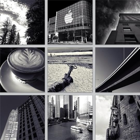
Many dear friends wish I would shut the fuck up regarding the Gotham filter. This article is for you.
In the 2.0 release of Instagram, for reasons never explained, they removed my favorite filter: Gotham. I remember the moment vividly because I was in the midst of falling in love with Instagram. I’d found a compelling reason to take pictures with the iPhone, I was building a small active group of followers, and most importantly, I felt I was actively learning about photography. Suddenly, my favorite filter was gone. Imagine if you were falling in love with someone and one morning they rolled over and said, “Hey, just so you know, we’re never using adverbs. Ever again. Thanks.”
In my cursory research, it didn’t appear that Gotham was the least used filter — it certainly wasn’t the most popular filter — but there didn’t appear to be a compelling reason to remove it either. They had their user interface real estate, so what gives? Why take away an apparently harmless feature? More importantly, a feature that does this:

Instagram’s Gotham wasn’t just a black and white filter. In an article of epic self-serving proportions, I will demonstrate my total lack of photographic experience by describing how Instagram’s Gotham transformed a photo. I will explain how many subsequent Gotham clones failed. How a recent contender might finally allow me to sleep at night, and finally, why all this Gotham angst was worth it.
Turn the Sky Black + Screaming White Clouds
The shot of the Burj Khalifa above contains two major elements that enabled Instagram’s Gotham to shine. First, a broad swath of blue sky. Second, a visually interesting foreground object, which, in this case, is the metallic geometric wonder that is the Burj Khalifa, currently the tallest building in the world, located in Dubai in the United Arab Emirates. This transformation of the photo by Instagram’s Gotham demonstrates the important effects I loved about the original filter.
A blue sky is darkened.
Intricate detail is highlighted.
Very subtle yellow and blue highlights give the photo a decidedly antique moodiness.
This photo is missing a key attribute that I believe makes a great Gotham photo: screaming white clouds.

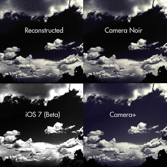
Shortly after the removal of Instagram’s Gotham, similarly outraged but enterprising Internet individuals took it upon themselves to figure out the filter process for building Gotham. As I documented in How I Instagram, here’s the process I believe best rebuilds the original Instagram Gotham filter within the Camera+ application:
Apply a red black and white filter. This doesn’t exist in Camera+ currently, I use Snapseed.
Select the Darken filter.
Apply the Silver Gelatin filter at 50%.
Apply the Vibrant filter at 25%.
Lastly, apply the Cyanotype filter at ~10%.
For comparison, here’s the original photo, the Instagram Gotham version, and the reconstructed Gotham side by side.

As I’ve already written, black and white photography strips away color and reveals unexpected stories. Gotham is certainly a black and white filter, but the use of the red black and white filter brings a a jarring and compelling black to the sky. This sky provides a stark canvas for foreground elements that jump out of the photograph. Finally, the combination of silver and cyan gives the image a sense of instant history.
I was happy with the results of Reconstructed Gotham, so I took to Instagram with my homegrown filter and began posting each photo with the slightly furious hashtag: #ripgotham. Since I began using this convention, I’m happy to report that a handful of similarly outraged others have done the same and the #ripgotham hashtag continues to collect a lovely set of Reconstructed Gothams.
The Competition
In the two years since the beautiful travesty that was Instagram 2.0, several obvious and non-obvious Gotham replacements have arrived, and when you compare these contenders, you begin to fully understand the absurdity of my Gotham obsession.
Your thought, if you’re still reading this piece, likely is, “What is the fucking difference?”
To which I respond: Well, if you consider Instagram’s Gotham to be state of the art, clearly Reconstructed Gotham is the best recreation of that filter. Amongst the pre-canned filters, I’d say the best reproduction is the Camera Noir followed closely by Camera+ Gotham. iOS 7 beta never claimed to be Gotham, but does a fine job of using the red black and white filter and making those clouds scream, but Gotham has that smidge of cyan that is missing.
(Note: If your favorite Gotham/Noir filter isn’t listed here, trust me, I’ve seen it. Yes, I’ve seen Flickr. Yes, the new Flickr. It’s not a Gotham, it’s black and white high contrast marquee monstrosity. Yes, I would be willing to explain this to you in great detail over a beer.)
I Can’t Believe You’re Still Here
I’d like to thank Camera+ and Camera Noir for faithfully reproducing my favorite filter and I’d like to apologize to both of these fine teams, because after all my continuous bitching I’m likely to continue to roll my own version of Gotham for two reasons.
First, the #ripgotham tag in Instagram is one of my favorite hashtags to check. I’ve no idea what filters folks are using for many of these photos, but I’m fascinated that we try, that we are expanding the Gotham universe.
Second, I think one of the defining traits of nerds is that we obsess. In these obsessions, we examine the details that others gloss over. The disappearance of Instagram’s Gotham forced me out of filter complacency and pushed me to begin to understand the components of what makes a black and white filter. The more I dive into the details the more detail I find – it’s delicious.
Many dear friends wish I would shut the fuck up regarding the Gotham filter. It’s not happening because obsessing about the details not only continues to educate me, it also provides me the opportunity to form a well-constructed opinion. In a world where we mindlessly repeat the loudest and most compelling tweets as fact, a well-constructed opinion is rare. It’s rare because a well-constructed opinion can defend itself. Through a combination of experience, facts, and, occasionally, passion, a well-constructed opinion is a refreshing signal among a sea of unstructured, unattributed noise.
I have an opinion about Gotham. Yes, I’m spending my time obsessing about a retired, apparently unpopular Instagram filter, but my obsession is a gateway drug. It leads to the real addiction of building a defensible opinion.
September 3, 2013
RIP Gotham
Many dear friends wish I would shut the fuck up regarding the Gotham filter. This article is for you.
In the 2.0 release of Instagram, for reasons never explained, they removed my favorite filter: Gotham. I remember the moment vividly because I was in the midst of falling in love with Instagram. I'd found a compelling reason to take pictures with the iPhone, I was building a small active group of followers, and most importantly, I felt I was actively learning about photography. Suddenly, my favorite filter was gone. Imagine if you were falling in love with someone and one morning they rolled over and said, "Hey, just so you know, we're never using adverbs. Ever again. Thanks."
In my cursory research, it didn't appear that Gotham was the least used filter -- it certainly wasn't the most popular filter -- but there didn't appear to be a compelling reason to remove it either. They had their user interface real estate, so what gives? Why take away an apparently harmless feature? More importantly, a feature that does this:
Instagram's Gotham wasn't just a black and white filter. In an article of epic self-serving proportions, I will demonstrate my total lack of photographic experience by describing how Instagram's Gotham transformed a photo. I will explain how many subsequent Gotham clones failed. How a recent contender might finally allow me to sleep at night, and finally, why all this Gotham angst was worth it.
Turn the Sky Black + Screaming White Clouds
The shot of the Burj Khalifa above contains two major elements that enabled Instagram's Gotham to shine. First, a broad swath of blue sky. Second, a visually interesting foreground object, which, in this case, is the metallic geometric wonder that is the Burj Khalifa, currently the tallest building in the world, located in Dubai in the United Arab Emirates. This transformation of the photo by Instagram's Gotham demonstrates the important effects I loved about the original filter.
A blue sky is darkened.
Intricate detail is highlighted.
Very subtle yellow and blue highlights give the photo a decidedly antique moodiness.
This photo is missing a key attribute that I believe makes a great Gotham photo: screaming white clouds.
Shortly after the removal of Instagram's Gotham, similarly outraged but enterprising Internet individuals took it upon themselves to figure out the filter process for building Gotham. As I documented in How I Instagram, here's the process I believe best rebuilds the original Instagram Gotham filter within the Camera+ application:
Apply a red black and white filter.
Select the Darken filter.
Apply the Silver Gelatin filter at 50%.
Apply the Vibrant filter at 25%.
Lastly, apply the Cyanotype filter at ~10%.
For comparison, here's the original photo, the Instagram Gotham version, and the reconstructed Gotham side by side.
As I've already written, black and white photography strips away color and reveals unexpected stories. Gotham is certainly a black and white filter, but the use of the red black and white filter brings a a jarring and compelling black to the sky. This sky provides a stark canvas for foreground elements that jump out of the photograph. Finally, the combination of silver and cyan gives the image a sense of instant history.
I was happy with the results of Reconstructed Gotham, so I took to Instagram with my homegrown filter and began posting each photo with the slightly furious hashtag: #ripgotham. Since I began using this convention, I'm happy to report that a handful of similarly outraged others have done the same and the #ripgotham hashtag continues to collect a lovely set of Reconstructed Gothams.
The Competition
In the two years since the beautiful travesty that was Instagram 2.0, several obvious and non-obvious Gotham replacements have arrived, and when you compare these contenders, you begin to fully understand the absurdity of my Gotham obsession.
Your thought, if you're still reading this piece, likely is, "What is the fucking difference?"
To which I respond: Well, if you consider Instagram's Gotham to be state of the art, clearly Reconstructed Gotham is the best recreation of that filter. Amongst the pre-canned filters, I'd say the best reproduction is the Camera Noir followed closely by Camera+ Gotham. iOS 7 beta never claimed to be Gotham, but does a fine job of using the red black and white filter and making those clouds scream, but Gotham has that smidge of cyan that is missing.
(Note: If your favorite Gotham/Noir filter isn't listed here, trust me, I've seen it. Yes, I've seen Flickr. Yes, the new Flickr. It's not a Gotham, it's black and white high contrast marquee monstrosity. Yes, I would be willing to explain this to you in great detail over a beer.)
I Can't Believe You're Still Here
I'd like to thank Camera+ and Camera Noir for faithfully reproducing my favorite filter and I'd like to apologize to both of these fine teams, because after all my continuous bitching I'm likely to continue to roll my own version of Gotham for two reasons.
First, the #ripgotham tag in Instagram is one of my favorite hashtags to check. I've no idea what filters folks are using for many of these photos, but I'm fascinated that we try, that we are expanding the Gotham universe.
Second, I think one of the defining traits of nerds is that we obsess. In these obsessions, we examine the details that others gloss over. The disappearance of Instagram's Gotham forced me out of filter complacency and pushed me to begin to understand the components of what makes a black and white filter. The more I dive into the details the more detail I find - it's delicious.
Many dear friends wish I would shut the fuck up regarding the Gotham filter. It's not happening because obsessing about the details not only continues to educate me, it also provides me the opportunity to form a well-constructed opinion. In a world where we mindlessly repeat the loudest and most compelling tweets as fact, a well-constructed opinion is rare. It's rare because a well-constructed opinion can defend itself. Through a combination of experience, facts, and, occasionally, passion, a well-constructed opinion is a refreshing signal among a sea of unstructured, unattributed noise.
I have an opinion about Gotham. Yes, I'm spending my time obsessing about a retired, apparently unpopular Instagram filter, but my obsession is a gateway drug. It leads to the real addiction of building a defensible opinion.
August 25, 2013
Infinite State
There are two periods of time regarding your job that I'm fond of quoting and they both involve the number three.
First, it takes three months to understand a new job. Until those 90 days are over, you don't really know what hand you've been dealt. Second, it takes approximately three years before you'll become bored with your current gig. While I can't point you to the definitive research paper that confirms this hypothesis, I have been stumbling around Silicon Valley for a couple of decades and my advice hasn't changed: 90 days to understand the new gig, three years before you're bored with it.
In both periods of time, your brain is completing the same task building the same object. Whether you're staring, wondering, and panicking about the intricate and unknown details of a new job or accepting the heavy grim reality that the daily dull monotony of your job of three years is slowly killing you, your brain is busily acquiring content so it can build state.
How to Build a State Machine
My introduction to the concept of state was my first computer science class. We were building a program that would generate the next license plate number in a sequence given a certain format and set of rules. The professor introduced the concept of a finite state machine, and when it comes to state, finite is the absolute best kind of state out there.
A finite state machine is a model used to design computer programs and digital logic circuits. Without getting too nerdy, a finite state machine can only be in one of a finite number of states at a time ("Increment to next license", "Output the license", etc.) Think of a flowchart except in code. Like a flowchart, you can only be in one state at a time.
The idea of a finite state machine deeply appeals to me because if it's built correctly, it clearly describes all potential situations that can occur. There are no edge cases, there are no bugs, or messy unpredictable people. In theory, a finite state machine efficiently and clearly describes how everything works and whether you're an engineer or not, it's the pleasantly unachievable illusion that makes a new gig initially terrifying and ultimately a bore.
You're Always Building State Machines
This is what is terrifying (and awesome) about a new job. You walk in on your first day and everything is completely unfamiliar, so your brain revolts. This is an odd feeling. See, in your prior gig, you used to be able to walk into a random situation with a random set of people and there was a good chance your brain would see this seemingly odd situation, look around a bit, and quickly assess: "Oh, situation X, I know this." The work your brain is doing is using the state machine it built for this particular scenario and set of people.
See, you've been through a lot with these folks. You've seen how they react in different situations with different folks, you've gathered a lot of context, and from that context, you've built an efficient state machine. When Robert feels like he doesn't have enough information, he turns red and he begins to rage. When Andi is asked a question that she doesn't know the answer to, she talks on and on and on.
Your brain has spent a lot of time and energy gathering context so as to build a state machine that explains everything about everyone, but you've forgotten about this time and effort because you were busy taking the existence of this machine for granted. See, it's a machine that you build to forget.
In a new job, you have little idea what type of state machine comprises this particular job. All states are no longer immediately knowable. This machine is no longer valid, so you become ultra-aware of your surroundings, you endlessly ask questions, and you overthink everything. You are busily building state. Now, everything is slightly different and no matter how hard you work, the only way to acquire a comfortable and workable amount of state is for time to pass.
You need to let the time pass so that everyone who treats you like The New Person will eventually argue with you. You need to see the social structure that everyone knows, but that is never written down. You need to see the people you'll work closely with in a variety of scenarios and moods and they need the same of you. You can't force state acquisition, you just have to wait for it to develop organically because it's far more complex than you think.
What I believe transpires in the first 90 days is that you've gathered enough experience enough to build your bare bones version of the state within the team. With this semblance of predictability, you start acting like yourself because you've begun to believe the world is a reasonable and predictable place. You tell yourself, "You know, this place is starting feel familiar. I have built enough state."
Familiar is how it starts to feel, but what has happened is that you've collected enough context and built enough state to begin to believe you understand how the machine works. Whether you actually know everything or not (you don't), your brain has constructed the illusion -- the finite state machine -- that you do. It's actually one of the ways you get through the day: the illusion that some left field event isn't going to occur that will disrupt your carefully constructed view of the world.
Whether you're a nerd or not, it's a comforting thought. The idea that you can build a complete mental working model for your current gig. There are no surprises, there is just the predictable and the knowable. But Rands, variety is the spice of life. You know, I like a spicy curveball as much as the next person, but I don't need my life spicy when I'm trying to get 57 engineers pointed in the same and correct direction regarding shipping a product on a deadline. I need a machine that gives me the impression that we know what we're doing.
Three Years to Steady State
There's another piece of mental machinery in the state machine that I've written about before - it's the relevancy engine. Briefly, the relevancy engine is the means by which you can judge the completeness of your state machine. Think about it like this: when you start a new gig, everything is relevant because you know nothing - it's all new and it's exhausting. With each acquisition of content or context, your state machine becomes slightly more complete. What was a discovery now becomes a boring thing.
After looking at thousands of resumes and having observed my own professional career, I've discovered that it appears that we humans need roughly three years before we believe our state machines are complete. I believe this judgement of completeness is a function of the rate of discovery of relevance. When the rate of discover has lowered below some arbitrary threshold that varies for each and every human, life becomes predictable.
Simply put, nothing new and interesting is showing up in our worlds, so we become bored. For the nerds I work with, the threshold appears to be three years. Three years and the state machine feels complete because the content showing up on a day to day basis is increasingly... redundant.
For me, once this threshold is crossed, I do exactly what you'd expect. I begin looking for the relevant. Having been through this process dozens of time, I've begun to recognize the early signs. In a job I believe I love, I find myself thinking about those recruiter mails rather than instantly deleting them. I glance a moment longer at job pages, and then I realize... there isn't enough discovery in my life, my state machine is annoyingly complete.
Infinite State
A well-running state machine is one you've built to ignore. It magically produces intuition, it decreases the cost of decision making, and it makes you mentally agile. However, while you judge its effectiveness by how little you pay attention to it, occasionally you need to throw it away.
Think about the last long vacation that you really needed. You packed up, traveled somewhere exotic, ordered a Mai Tai (or eight) with all the fixins', stared at the sunset, and thought, "This... is the life. Now I can relax." Then you proceeded to obsessively think about work for the next 72 hours. It is during that time that you discover all the complex mental machinery that you need to collect and maintain state. I'm not talking about the tools you need to deal with sky-is-falling situations, I'm talking about what you need to simply feel the situation in your day and on your team. This is why vacations are essential. They hold up the mirror and show how much energy you're spending simply to achieve baseline steady state in your day.
When you return from a significant vacation, it all feels new. The existing mental machinery is still there waiting to be used, but before it starts up - the world feels refreshingly and optimistically new.
When I'm either in the discomfort of a new job or mired in the boredom that permeates an old one, I remind myself of returning from vacation. I remember how much my brain likes it when I've shut down the state machine and see a familiar world as new. I remember there is always more to learn because the state is infinite.
Michael Lopp's Blog

- Michael Lopp's profile
- 144 followers

