
Michael Lopp's Blog, page 48
December 22, 2013
Eventually Remote
Been spending a good chunk of the break so far tidying up the archives. Some articles need sub-headings, others need a revised URL, and a few simply had to be deleted. It’s been cathartic.
As I reread articles, I can watch as parts of my leadership religion has changed. I now firmly believe that an engineering lead needs to keep coding. I also see remote workers as an inevitability.
In my bones, I know that teams that stare each other in the face are more productive. Decision cycle-time is shorter because communications are more fluid. There is also inevitably more context gathered when you sit there and see Phil uncomfortably and poorly explain his design. This is discomfort that you’d likely not see in an email.
Is totally remote the future? Nope. But it’s certainly gaining steam.


December 19, 2013
Find The Thing You’re Most Passionate About, Then Do It On Nights And Weekends For The Rest Of Your Life
Via The Onion:
It could be anything—music, writing, drawing, acting, teaching—it really doesn’t matter. All that matters is that once you know what you want to do, you dive in a full 10 percent and spend the other 90 torturing yourself because you know damn well that it’s far too late to make a drastic career change, and that you’re stuck on this mind-numbing path for the rest of your life.
December 18, 2013
The Worst Conversation You’re Ever Going to Have
As I mention in this talk, I’ve been attempting to write a talk on performance management for years. Each time I start, I realize the complexity of the topic. It’s not a 2000 word essay, it’s a book. It’s also a topic that when executed poorly results in a variety of leadership disasters that while educational are also avoidable.
When the folks at First Round asked if I had any thoughts on the topic, I produced the following talk which is a small step in educating folks on the complexities of dealing with performance issues.
Great crowd, hard topic.
December 12, 2013
Full of Interesting Strangers
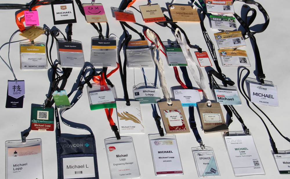
In its second year, XOXO is a legitimate replacement for SXSW. Full of bleeding-edge makers of things, XOXO has a fascination with fuchsia and a great badge.

I can write this because over the years, I’ve developed a strong opinion regarding badges.
A Badge Connects You to the People
The following are my current beliefs regarding what makes a great badge. While this piece is also meant to inform conference organizers, I’m writing this for conference attendees, since there are a great many more of those than organizers.
First, let’s talk use case. Our hypothetical badge-worthy conference and attendee have the follow essential characteristics:
It’s 500+ folks. There are a great many interesting strangers and you are one of them.
It’s a multiple day affair. This is not a single-day conference. You are going to have ample time to mingle with many of these strangers.
You are actively and eagerly attending this conference. No hiding in your hotel room. You’re at a majority of the formal and informal events, and most importantly, you’re wearing your badge.
Your conference experience starts when you check in, and for very good reasons, conference organizers often provide you a shit ton of schwag. Take the badge, politely decline the schwag. You don’t want it. Trust me.
The badge is the only schwag you need because a badge connects you with the rest of the conference and its design quietly affects how much you’ll get out of the experience. The badge achieves this by providing as much social connection with as little social friction as possible.
Here are the rules:
A well-designed badge provides useful at-a-glance information. When you walk up to an interesting stranger, you don’t really want to spend more than a half a second staring at their badge. In half a second you’re only going to grok one piece of information, so badge crafters need to make that most important information ginormous.
It’s hard to predict the single correct piece of information to highlight, but it’s not their first name. It’s either their last name, their company, or perhaps their Twitter handle. Ideally, conference organizers would let attendees flag the single most important bit of information when they sign up, but they usually don’t so I’d go with a big bold last name, but include first name, company, and Twitter handle (or other social something) and that’s it. What’s their title? What do they do? This and other important information doesn’t belong on the badge: it belongs in the conversation facilitated by the badge. This is the point of the badge: to create a great many first conversations.
Here’s who is doing it right:

A badge needs to survive the conference. Three days, hanging around your neck all day and possibly all night (or getting shoved in a pocket when you hit the bar). After those three days, the lanyard needs to be intact and the badge needs to look like when you picked it up. Remember, the badge is likely the only object you’re going to need and keep. It’s the physical and long-lasting artifact that represents the conference, and if, after a day of use the badge looks crumpled and worn, my thought is, “They don’t give a shit about their conference and my experience is an afterthought.” Funconf, which during its three-year tenure has been in a terrific battle for best conference on the planet with Webstock, learned the durability lesson well:
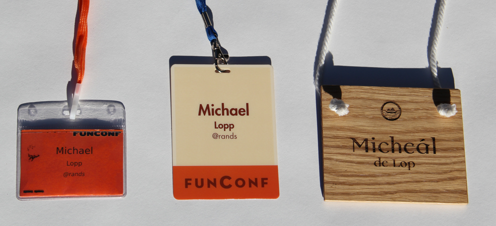
After Year One’s half-hearted attempt, Funconf nailed it with their sturdy and readable Year Two badge. Look at it: it looks like I just checked in to the conference, and it’s been two years. Year Three was a laser-crafted work of art – attendee names layered into sanded Irish oak. It’s tough, it’s gorgeous, but it doesn’t fit in my pocket, which means I didn’t bring it. My definitive use case for sturdiness and usefulness: I need to be able to wind the lanyard around the badge and stuff it in my back pocket for a heavy night of drinking. The following morning the badge needs to still be in my back pocket and look like it hasn’t spent the night in that back pocket.
A badge is not a map nor a schedule. It’s you. I continue to have heated and drunken debates with my friend and fellow conference connoisseur John Gruber on proper badge design. One point we consistently agree upon is the printing of additional conference information on the badge. The rule we determined is that any information for the badge wearer should be printed upside-down for easy reading. Any information for other conference goers should be printed in the usual readable fashion. The iPhone rendered half of this argument irrelevant.
Let’s look at seven years of WWDC badges:
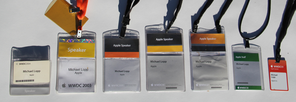
After a couple of misfires, the WWDC badge settled into a steady state semi-ginormous badge. The size was justified because one of the essential pieces of the badge was a conference schedule that you kept tucked in the back. In 2008 and 2009 the badge shrank – why? 2007 was when the iPhone arrived, which provided a far superior and dynamic platform for sharing conference information. I’m assuming conference organizers realized there were now only two use cases for the badge: identification and social connection. This is the form factor Apple continues to use through WWDC 2013, and I would call this one the current best functional design for a badge.
A badge has heart. I included the Waza badge above because of its heart. It’s not sturdy; their badge is comprised of three layers of paper and cardboard, which likely won’t survive in my back pocket, but look at that badge. You likely have no idea what the Waza conference is, but does the badge give you the impression that they care? If you could hold that badge in your hand, you’d feel the rice paper they used for the top layer of the badge as well their soft and silky lanyard. Waza’s badge has heart because Waza has heart.
As an attendee, I learn important information when a badge has heart. When it’s clear that someone has lost their mind on the details of the badge design, it’s likely they’ve lost their mind across the board. Each part of the conference has been thought through, and as an attendee or a speaker that means I’m going to go out of my way to experience as many parts of this conference as possible. There is just no telling where it might be brilliant.
The Remaining Details
There is an important set of remaining details that is going to define a good badge, which I’ll touch on briefly:
Lanyard. I have nothing against advertising at a conference, but advertising on the lanyard is a visually noisy waste. First, can you remember a single advertiser from lanyard-based advertising? No. Second, did I sign up to provide advertising for free when I signed up for the conference? No.
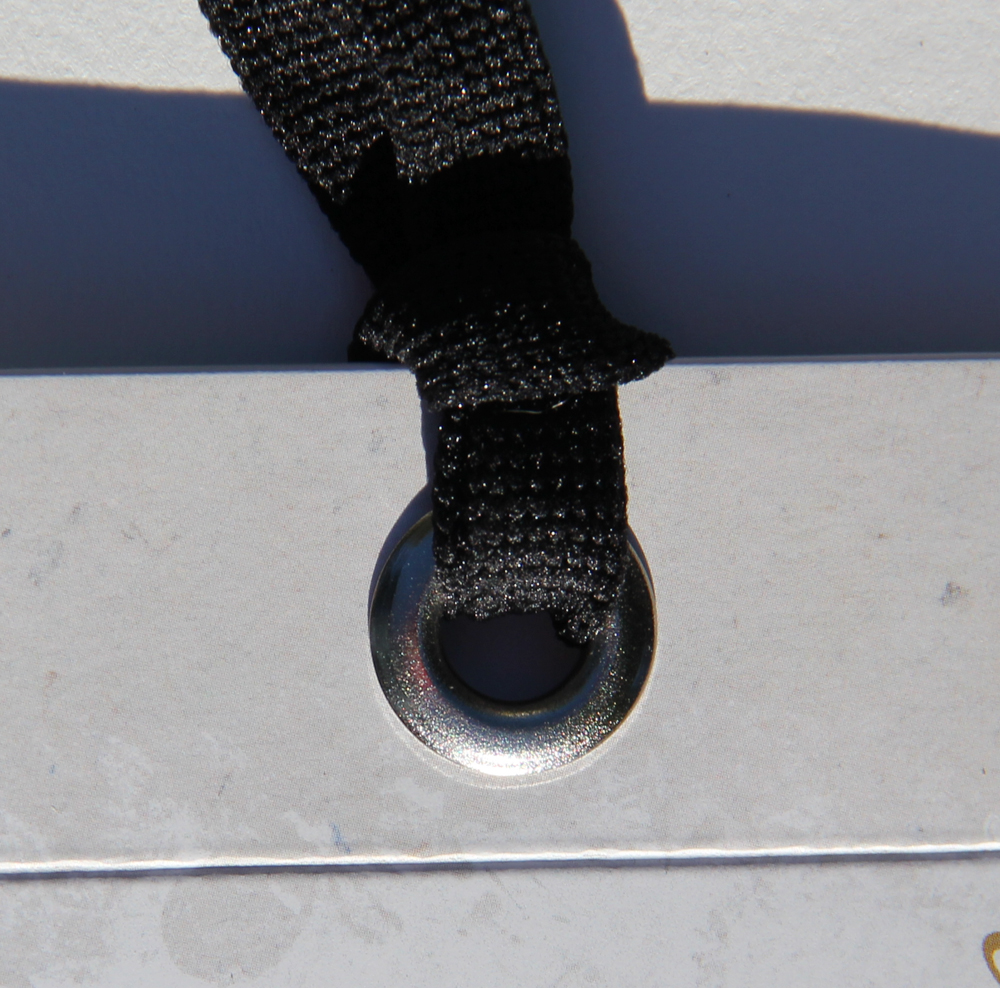
The clip. After a careful examination of every single badge in my collection the definitive clip is the lack of a clip. The all-cloth looped lanyard sported by all three Webstock badges is the gold standard and breaks the mold in a world of cold, angry metal clips.
Two sides. A badge is hanging from your neck, you’re doing a great many things, and it’s flopping around, so the information on each side of the badge is equally valuable and should be the same.
Status. There are two pieces of status a badge needs to convey. First, am I, the interesting stranger, allowed into this part of the conference? A quick glance at the badge should give Random Joe at the door this information. Second, am I, the interesting stranger, also a speaker? Again, a clear but subtle indication that I’m a speaker needs to be on the badge for Random Joe, but it doesn’t need to be over the top. There’s no need for separate speaker badges. Mostly everyone will know who the speakers are because they speak.
The Badge is the Reminder of the Story
SXSW was my introduction to conferences and as such I thought they were the gold standard of badges as well, but after a few years of heading to Austin, I noticed something:
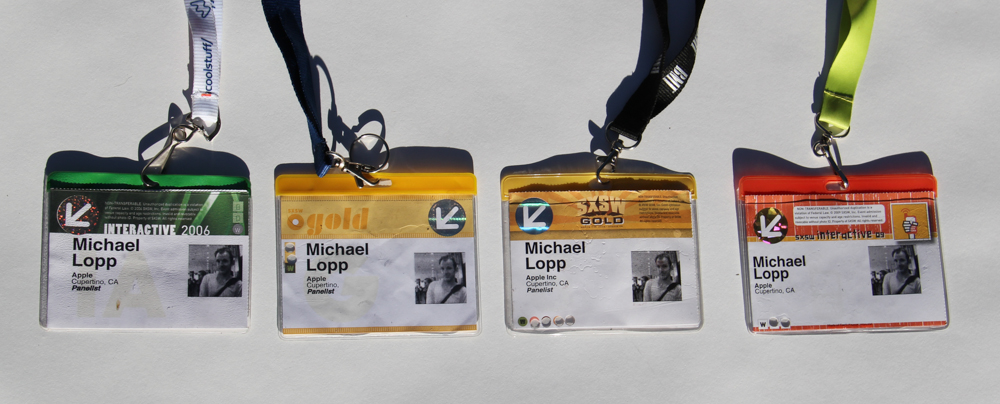
There are a couple of badge travesties here. On top of the typographic mess they include… a picture of me? Why? Probably as a means to identify that it’s my badge, but look at that minuscule smudgy black and white photo that they didn’t ask me to update for four years. It’s a waste of space. The combination of the flimsy plastic holder, the angry metal clip, and advertising adorned lanyard makes for an average badge. But that’s not the problem. The SXSW badge hasn’t evolved, and while I didn’t stop going because of the badge, the badge design and conference design shared the same boring flaw: exponentially more of the same.
It’s confusing: your badge is about you, but your badge is not for you. You know who you are and what you do, but no one else does. Yes, you choose the conference because of the speakers, the company, or the theme, but what will make a conference memorable are the random strangers you meet in the hallway.
As I’ve written, the defining moment for a conference is not seeing the people you know, it’s finding the unknown. What I what to remember on the flight home isn’t how a speaker slayed. It’s the reflection on the incredibly unlikely sequence of random events that I happened to meet a hero of mine at a party at a bar that I never planned to attend. A conference is full of thousands of these brief, unlikely moments of potential, and it’s your badge’s job to make sure that they have a chance to occur.
The badge isn’t the heart of the conference – it’s the people — but when the people are gone, the badge is a link to all of the the stories, and this why I keep my badges.
This is where I met my best friend…

This is the coldest I’ve ever been in my life…
And this is when I figured how much fun it is to get a thousand people to laugh…

December 11, 2013
#NoManagers
Good managers act like servants to their team but far too many like the power and let it go to their heads.
Treehouse removed all their managers back in September – the whole series of posts is worth a read. I am avidly watching the no manager movement. Current thoughts are:
This type of horizontality only works for certain type of business. Software in particular can support this model because healthy organizations have tools which effectively do the work of managers around communications and knowledge management.
This type of model does not scale. My opinion is that somewhere around 200+ folks some type of manager/leader/conductor steps up to act in a management capacity. Happy to be proven wrong here.
In these #NoManager organizations, there are still managers. They don’t have the title, but the instinctively do the work because they’re good at it.
December 9, 2013
People Don’t Actually Like Creativity
Jessica Olien in Slate:
The study shows that if you have the sneaking suspicion you might not belong, the act of being rejected confirms your interpretation. The effect can liberate creative people from the need to fit in and allow them to pursue their interests.
December 3, 2013
Your People, Once More
This is supposed to be a brief explanation of how odd (yet awesome) it feels to have a “making of” post written about the redesign of Rands in Repose and while that is awesome, I want to talk about your people again.
I met Alex King many many years ago when I was actively using his Tasks Pro software. He dropped by for lunch at Apple during which we debated productivity software. I remember disagreeing with him about something fundamental and he held his ground, we agreed to disagree. During this lively disagreement, I decided that Alex was my people.
Your people are your people because while you may not always agree, you are comfortably on the same frequency. Because of this frequency alignment, you invest in them instinctively because while people look at you like you’re crazy, they do not. You answer their emails quickly. You arrange drinks when they are in town – always. They are your people and in a world chock full of people, your people are uniquely yours.
I’m proud of the redesign. I loved working with Crowd Favorite. More importantly, I appreciated the reminder of the value of my people.
December 1, 2013
Care and Feeding of Flow
I.M. Wright writes:
Real products require real teamwork. Nothing substantial exists in isolation. Teamwork only happens when teams discuss together, design together, and deliver together. Specific, narrowly scoped parts can be done with individual flow, but that can’t be the primary thrust of the effort.
Much wisdom in this piece about the care and feeding of flow in a team environment. Hits on a recent theme I’ve been considering regarding optimal space set-up. I think the best working set-up is one that adapts to what you need when you need it.
November 30, 2013
1000 Nights
Each night for a 1000 nights, Ray Bradbury is asking you to read three things:
One short story (Dahl, Hemingway, Matheson, Cheever, Kneale, Collier, Wharton, Irving)
One poem (Shakespeare, Frost, and Pope)
One essay (Huxley, Eiseley )
Bradbury’s goal – to make you the collector of metaphor. He provides a familiar and unfamiliar set of content for each of his exercises all which represent a far better night than the time you’re (I’m) wasting on Candy Crush.
November 28, 2013
A Beautiful Mystery
Design firm Ideo has cultivated an image of being the creative minds behind the idea. As a consultancy, their job is to not take credit for the ideas, but rather design such ideas for other companies. This makes their iPhone video application a beautiful mystery.

Spark is a gorgeous and well-defined video iOS application that fulfills the first rule of great design: get the hell out of the way so I can get to the task at hand. Spark eschews the current fad of making all images and videos insta-square and embraces the 16:9 aspect ratio. On top of this, Spark provides the best real-time filter selection I’ve seen. With a flip of your finger, you slide the different Spark filters on top of your video while it loops.
I’m not doing a lot with video other than occasional experiments, but I keep firing up Spark because it’s one of the rare applications where the designers gave themselves room to experiment. Yes, they are clearly influenced by current flat design and thin typography trends, but the application’s attention to the details is novel.
Michael Lopp's Blog
- Michael Lopp's profile
- 144 followers

