
Menzie David Chinn's Blog, page 43
February 4, 2015
Governor Jeb Bush on the Desired Trend in Real GDP
From Bloomberg, a quote from the Governor’s speech in Detroit:
… I don’t think the U.S. should settle for anything less than 4 percent growth a year–which is about twice our current average.
I applaud the Governor’s aspirations. Here is a plot of what real GDP would have looked like had we had 4% annual growth (log terms) since 1967Q1 (in red), and if we’d had it under the administration of G.W. Bush (green).
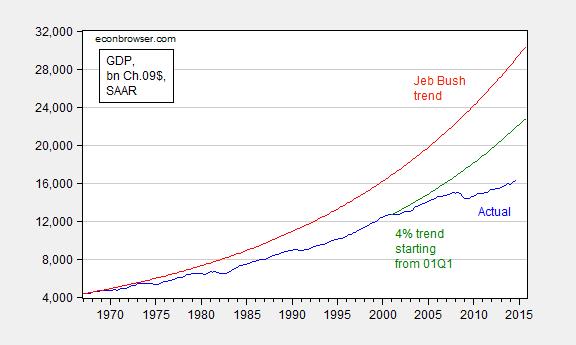
Figure 1: Real GDP, in bn. Ch.2009$, SAAR (blue) and under 4% growth starting from actual level in 1967Q1 (red), and starting from actual level in 2001Q1 (beginning of G.W. Bush administration) (green). Growth rates calculated as log differences. Source: BEA 2014Q4 advance release, and author’s calculations.
Well, if 500,000/month job creation is the norm (as Governor Mitt Romney asserted), why wouldn’t 4% growth be the norm? Just because it hasn’t happened yet, doesn’t mean it can’t.


Keystone XL Employment Effects
They’re small. Really small. From the Congressional Research Service (Jan. 5, 2015):
Because job projections, in particular, involve numerous assumptions and estimates, the State Department’s job estimates for Keystone XL have been a source of disagreement. One challenge to State’s analysis is that different definitions (e.g., for temporary jobs) and interpretations can lead to different numerical estimates and “fundamental confusion” about the Final EIS numbers. Consequently, it may be difficult to determine what overall economic and employment impacts may ultimately be attributable to the Keystone XL pipeline or to the various alternative transport scenarios if the pipeline is not constructed.
The CRS report quotes this portion of the State Department EIS:
During construction, proposed Project spending would support approximately 42,100 jobs (direct, indirect, and induced), and approximately $2 billion in earnings throughout the United States…. Construction of the proposed Project would contribute approximately $3.4 billion (or 0.02 percent) to the U.S. gross domestic product (GDP). The proposed Project would generate approximately 50 jobs during operations. Property tax revenue during operations would be substantial for many counties, with an increase of 10 percent or more in 17 of the 27 counties with proposed Project facilities. …
Additional clarification on what proportion of those jobs would be American, vs. foreign, sourced is from this Cornell report:
Based on jobs information provided by TransCanada for the FEIS, KXL US on-site construction and inspection creates only 5,060-9,250 person-years of employment (1 person-year = 1 person working full time for 1 year). This is equivalent to 2,500-4,650 jobs per year over two years. (page 7)
What about the materials used in the construction of the pipeline?
TransCanada claims that “the $7 billion (KXL) pipeline project is expected to directly create more than 20,000 high-wage manufacturing jobs and construction jobs in 2011-2012 across the Us, stimulating significant additional economic activity.”20 This claim is misleading and erroneous on a number of levels.
First, as discussed above, the budget for KXL US that relates to incremental US employment is $3 to $4 billion and not the $7 billion claimed by the proponents. Second, TransCanada and other KXL proponents are giving the impression that KXL will create a high number of manufacturing jobs. This is simply not true. The main manufacturing activity related to pipeline construction is the manufacture of the steel pipe. The 36-inch steel pipe is the largest single materials input for KXL. This is literally the pipe in the pipeline. In general, pipeline construction is not a manufacturing-intensive activity even if the steel itself is also being manufactured onshore.
This section will present strong evidence that:
(a) almost half (and perhaps more) of the primary material input for KXL—steel pipe—will not even be produced in the United States;
(b) based on the experience of Phases 1 and 2, the final processing work for KXL will probably be performed in the US with most of the steel and pipe sourced from oustide of the US (notably India and South Korea).21 (page 11)
Now, no doubt there will be some spillover effects (Note: If you didn’t believe in spillover/multiplier effects arising from the American Recovery and Reinvestment Act (ARRA), you won’t believe in any multiplier effects from Keystone XL construction.). Let’s assume there is such a thing as a spending multiplier; then using plausible estimates for incremental building, and accounting for imported inputs, the Cornell researchers conclude:
…the incremental US spending associated with KXL project construction is only about $3 to $4 billion. Given a multiplier of 11 person-years per $1 million, this translates into total employment impacts of 33,000 to 44,000 person-years.59 So a reasonable estimate of the
total incremental US jobs from KXL construction is about one-third of the figure estimated in the Perryman study and used by industry to advocate for the construction of KXL.
Moreover, any job impacts associated with KXL construction would be spread over 2 and more likely 3 years.60 So the annual impacts are at most about 22,000 person-years of employment per year, for two years.61 But the annual impacts could also be as low as 11,000 person-years per year, for three years.62 (page 24)
For context, the US economy added 252,000 to nonfarm payroll employment in December alone.
February 2, 2015
Economic Performance under Various Presidential Administrations
Lest people forget what happened in times past.
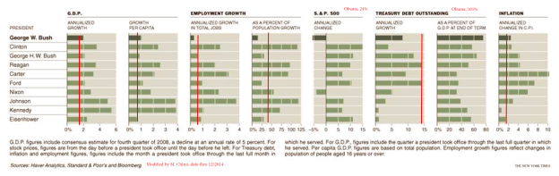
Chart from Floyd Norris, “Economic Setbacks That Define the Bush Years,” NYT, 24 January 2009, updated through 12/2014. Data for debt through 2014Q3. Red lines denote performance under Obama, through 2014Q4.
The original version of this graph was originally included in this post.
Since the graph assumed -5% growth in 2008Q4 (SAAR), rather than the actual -8% realized, the G.W. Bush era average growth rates should be slightly smaller than graphed.
Notice that a couple of series were off the charts, at least in the scales provided: the SP500 has risen by 24% annually on average over the last six years. Gross debt to GDP is 101% as of 2014Q3. Note that Federal debt held by the public as a share of GDP is 72.6%, down from a peak of 74% in 2014Q1.
Average growth and average per capita growth tend to be higher in Democratic administrations. Alan Blinder and Mark W. Watson investigate why, in this paper. The authors conclude:
It seems we must look instead to several variables that are mostly “good luck.” Specifically, Democratic presidents have experienced, on average, better oil shocks than Republicans, a better legacy of (utilization-adjusted) productivity shocks, and more optimistic consumer expectations (as measured by the Michigan ICE).
One question that occurs to me: Why are economic actors more confident during Democratic administrations?
January 31, 2015
Another solid GDP report
The Bureau of Economic Analysis announced yesterday that U.S. real GDP grew at a 2.6% annual rate in the third quarter. Even factoring in the dismal start to the year, that leaves full-year GDP growth during 2014 at 2.4% (the best annual performance since 2010) and growth at an annual rate of 4% over the last 9 months.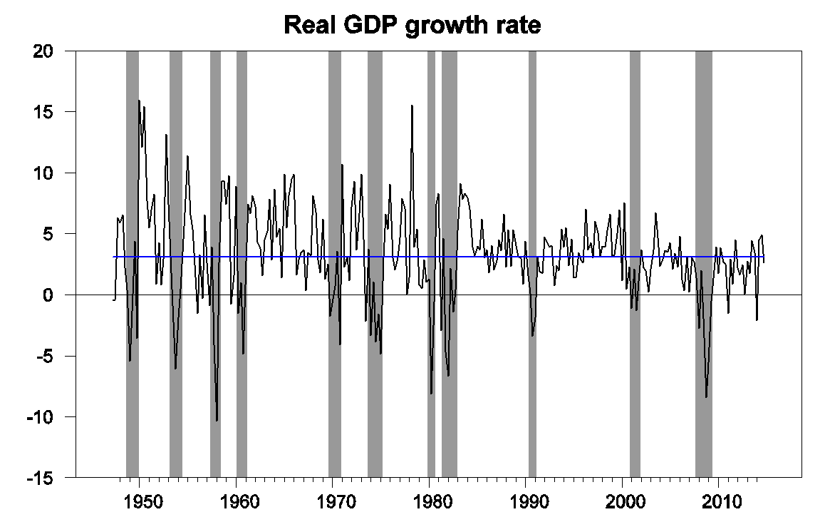
U.S. real GDP growth at an annual rate, 1947:Q2-2014:Q4. Blue horizontal line is drawn at the historical average (3.1%).
Government spending had contributed 0.8 percentage points to the Q3 growth but subtracted 0.4 percentage points from Q4. Most of that swing can be attributed to a one-time bulge in defense spending in Q3. But the biggest reason for slower GDP growth in Q4 than in Q3 was the fact that real imports grew by 8.5% (at a continuously compounded rate) in the fourth quarter. Since imports are subtracted from GDP, more imports mean less GDP.

It’s worth noting that although real imports increased by 8.5% at an annual rate, the nominal value (that is, the actual number of dollars spent on imports) was only up 0.9% at an annual rate. The big story was not simply that we’re importing more barrels of oil than expected for this time of year, but that each barrel of imported oil cost us fewer dollars. That means that the apparent surge in real imports is less of a long-run burden for the U.S. than might appear at first glance from the data, and the underlying situation is reasonably healthy.
Fixed investment remains disappointing. But as Bill McBride notes, there’s still lots of room for growth there and reasonable basis for expecting it’s still to come. Residential fixed investment is still way below normal when expressed as a percentage of GDP– added confirmation of Reinhart and Rogoff’s observation that recovery from an event like the U.S. has gone through takes a long time. Once housing makes a decent recovery, we might expect business plant and equipment and structures to follow.
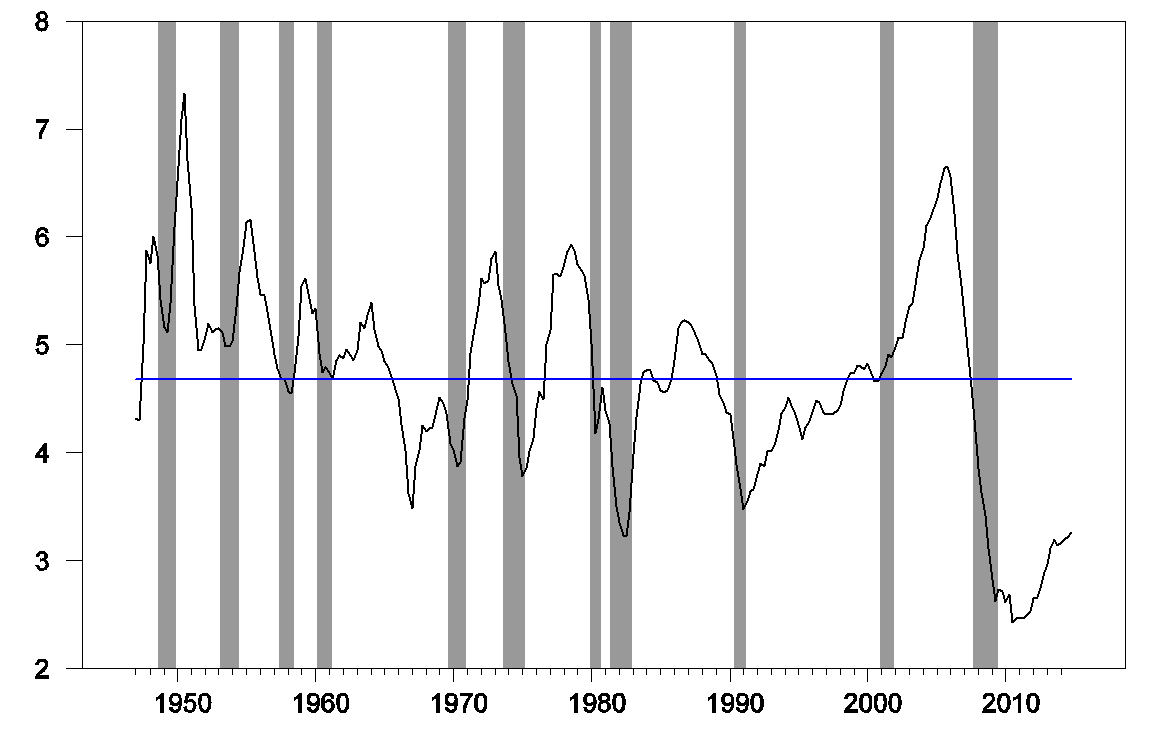
Residential fixed investment as a percentage of GDP. Blue horizontal line is drawn at the historical average (4.68%).
Our Econbrowser Recession Indicator Index, which uses ysterday’s data release to form a picture of where the economy stood as of the end of 2014:Q3, is now all the way down to 1.6%, an unambiguous signal of an ongoing recovery.
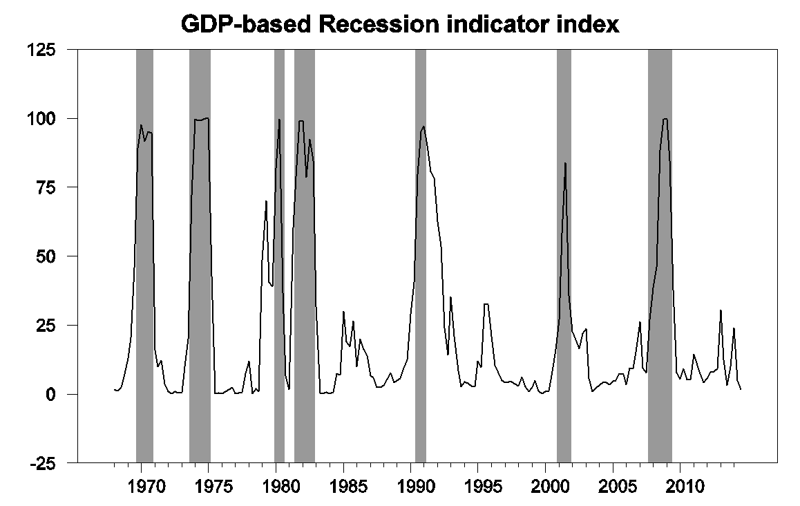
GDP-based recession indicator index. The plotted value for each date is based solely on information as it would have been publicly available and reported as of one quarter after the indicated date, with 2014:Q3 the last date shown on the graph. Shaded regions represent the NBER’s dates for recessions, which dates were not used in any way in constructing the index, and which were sometimes not reported until two years after the date.
All of which is keeping our Little Econ Watcher happy.
January 30, 2015
Some Observations on the 2014Q4 GDP Release
The external sector weighs in, and thinking about the length of the recovery.
First note the contribution of exports and imports to growth (in an accounting sense), in percentage points.
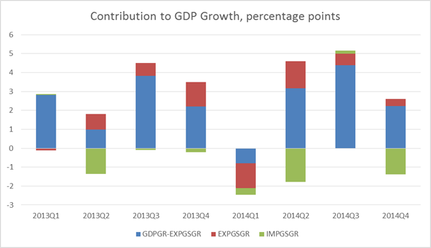
Figure 1: Contributions to real GDP growth, in percentage points of imports (green), exports (red), and all else (blue), all SAAR. Source: BEA 2014Q4 advance release, and author’s calculations.
Instead of having an essentially net zero impact in the third quarter, import growth contributed -1.4 percentage points (annualized). To the extent that the higher growth in imports represents greater consumption in anticipation of a sustained recovery, the news is good. The slowdown in export growth is not helpful, on the other hand. The evolution of real exports and imports is shown in Figure 2.
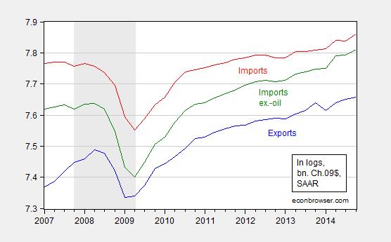
Figure 2: Log real exports (blue), imports (red), and imports ex.-oil (green), all SAAR, bn. Ch.09$. Source: BEA 2014Q4 advance release, and author’s calculations.
Some of this is due to an appreciated dollar; I read a lot about the impact of the stronger dollar, but it’s important to keep in context the appreciation thus far.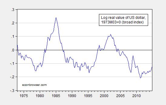
Figure 3: Log real value of the US dollar, against a broad basket of currencies, 1973M03=0. Note 2014Q4 observation is average of October and November. Source: Federal Reserve Board via FRED, author’s calculations.
So, in the absence of a continued substantial appreciation, one shouldn’t worry about the recovery being derailed on this account alone — unless US goods have become much more substitutable for foreign in the past fifteen odd years. That could be the case. (More here).
On the other hand, Deutsche Bank, in its forecasts released today, argues the dollar is only halfway through its appreciation from the July 2011 trough (FX Forecasts and Valuations, January 30, 2015).
Hence, I do think that the Fed should take into account external developments. To the extent that expansionary monetary policy in the Eurozone and Japan put upward pressure on the dollar’s value, it doesn’t seem problematic to counter that effect by going slow on tightening monetary policy. This is particularly true given the absence of inflationary pressure in headline inflation, and modest growth in labor compensation as indicated in todays productivity and costs release.
The other observation I have on the GDP release pertains to the length of the recovery. The last recession ended, by the NBER’s reckoning, in June 2009. That means that by the end of 2014 (assuming a recession had not already begun), the recovery has now lasted 66 months. To place this in perspective, I show the length of the current recovery in a graph from an article in the Economist nearly two years ago.
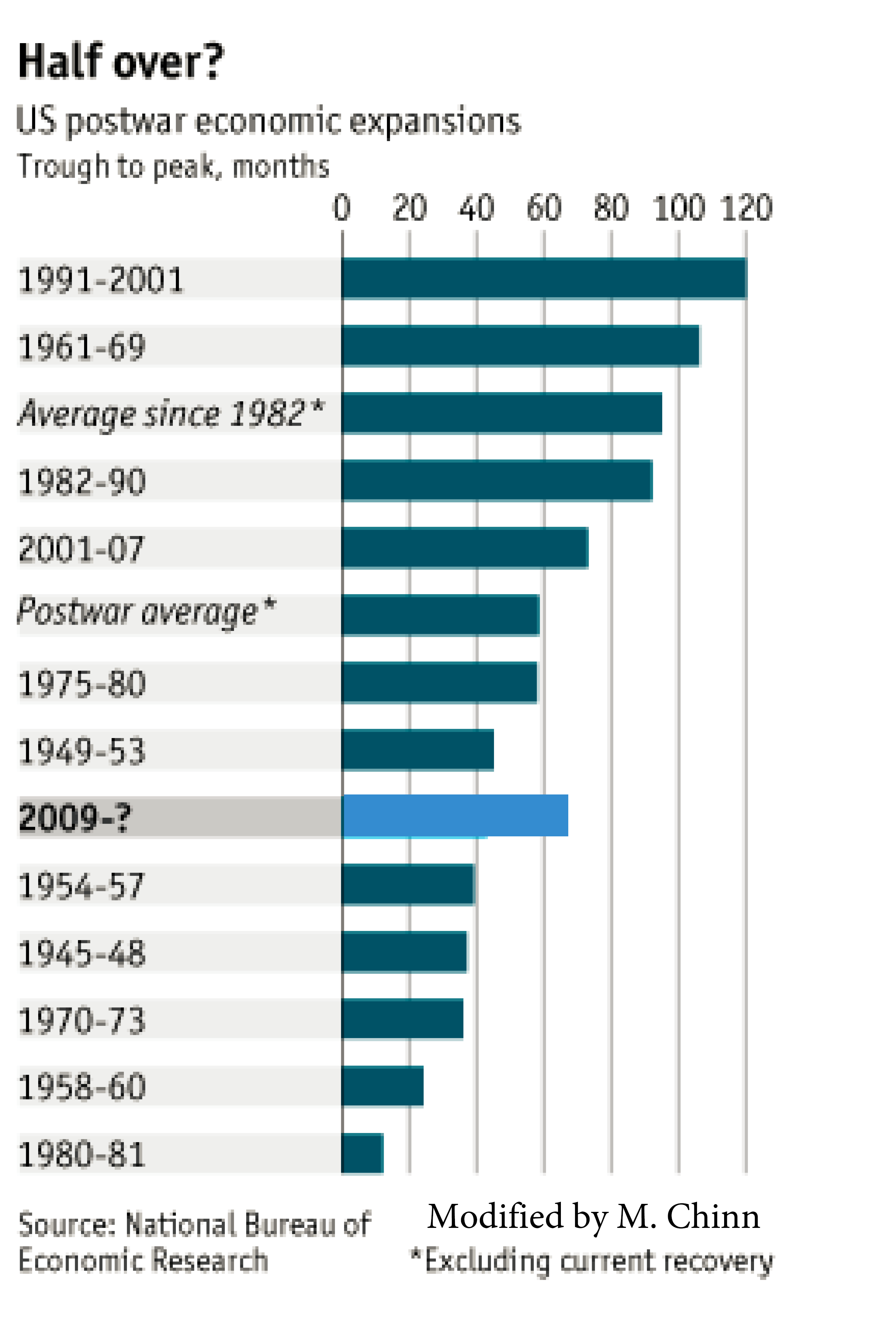
Figure 4: Graph, adapted from “Business Cycles: Running out of Time?” Economist (January 2013).
What the (updated) graph shows is that by the standards of post-1982 recoveries, this recovery has not yet matched the duration of an average recovery. Hence, some (but by no means all) of the anxieties expressed in the Economist article have been allayed.
Now, this is a somewhat mechanistic way of thinking about recovery duration. One should also think about shocks from abroad (Euro area, China), but without knowing if and when such shocks might strike, then one can think about what usually ends a recovery — and there it often seems to be a tightening of monetary policy. That’s yet another reason to worry about over-eagerness in tightening, especially as the dollar appreciates.
Fortunately, for now, the yield curve is not signaling a recession in the next year [1].
For more on the release, see CR, and Furman/CEA.
January 29, 2015
More on U.S. Employment, Post-Trough
Reader rtd states “it is virtually guaranteed that after a nation’s business cycle trough, that same nation’s employment growth will display an upward trend.” I thought this an interesting enough assertion that it merited additional investigation.
If one were looking at data in the US from the beginning of the nonfarm payroll series until the 1990-91 recession, this characterization would be apt, as shown in Figure 1.
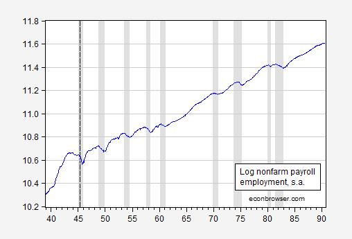
Figure 1: Log nonfarm payroll employment (blue). NBER defined recession dates shaded gray. Long dashed line at end of WWII. Source: BLS via FRED, NBER and author’s calculations.
Employment rises almost immediately after the NBER defined troughs. Inspection of the recessions since 1990-91 exhibit a much different behavior. (On a side note, notice that employment declines with end of the war, with recession ending at 1945M10.)
Now compare the behavior of nonfarm payroll employment after troughs of the last three recessions. There is a much delayed resumption of employment growth, as shown in Figures 2-4.
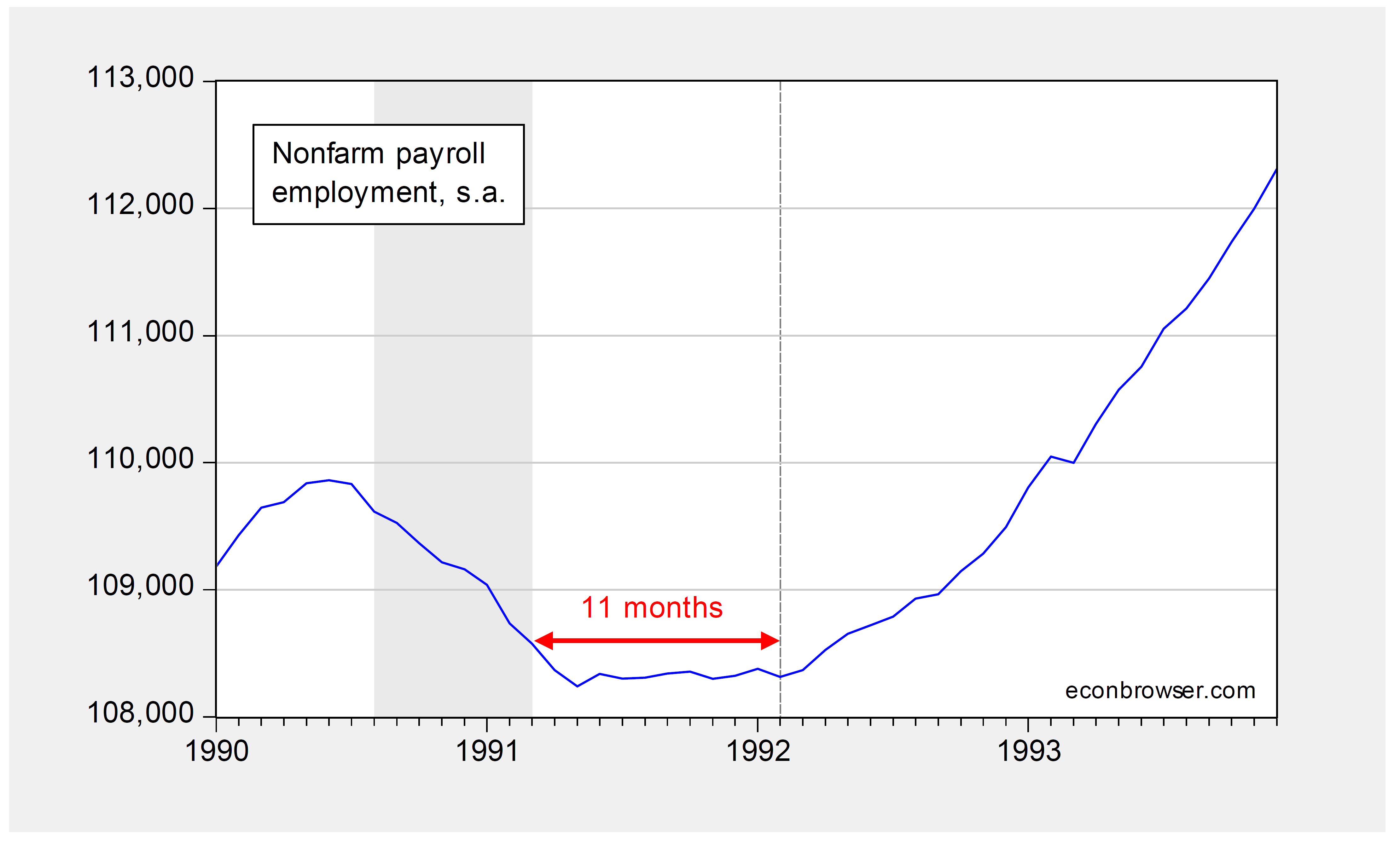
Figure 2: Nonfarm payroll employment, thousands, s.a., (blue). NBER defined recession dates shaded gray. Dashed line at employment trough. Red arrow indicates the 11 months between trough and increase in employment. Source: BLS and NBER.
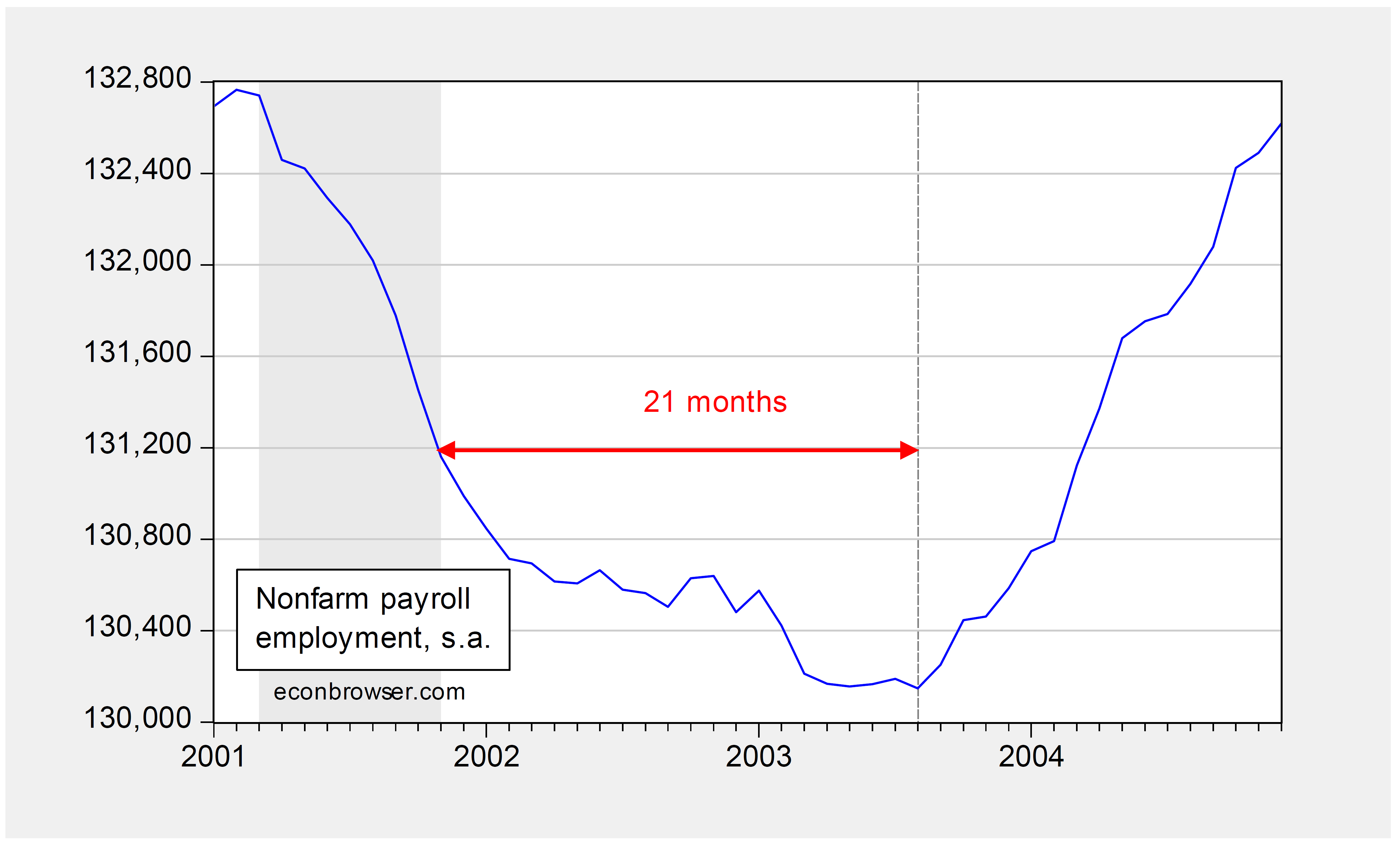
Figure 3: Nonfarm payroll employment, thousands, s.a., (blue). NBER defined recession dates shaded gray. Dashed line at employment trough. Red arrow indicates the 21 months between trough and increase in employment. Source: BLS and NBER.

Figure 4: Nonfarm payroll employment, thousands, s.a., (blue). NBER defined recession dates shaded gray. Dashed line at employment trough. Red arrow indicates the 8 months between trough and increase in employment. Source: BLS and NBER.
On a side note, a similar delay (and smaller rebound) is apparent in Eurozone employment, as discussed in this post. In the UK, employment only exceeds the 2009Q3 level (end of the recession) in 2010Q2.
January 28, 2015
Implications for Economic Growth of Governor Walker’s Proposed Higher-Ed Funding Cuts
From Foxnews:
Wisconsin Gov. Scott Walker is calling for steep cuts to the University of Wisconsin System, while offering the network more freedom in exchange, … [H]is university plan … would cut funding by $300 million over two years…
This measure would amount to a 13% cut in state funding to the university system. In addition, the Governor’s proposal includes a continued tuition freeze until 2017, until which time tuition changes would be unconstrained. That means under the Governor’s plan, funding levels would be reduced, while the university is stopped from raising revenues. Layoffs seem plausible. [1]
I find this approach to dealing with the state’s calamitous fiscal situation (exacerbated by recent ill-advised tax cuts) interesting to the extent that higher education is important to economic growth. From KNOWLEDGE MATTERS: THE LONG-RUN DETERMINANTS OF STATE INCOME GROWTH, in the Journal of Regional Science (2012):
A state’s knowledge stocks (as measured by its stock of patents and its high school and college attainment rates) are the main factors explaining a state’s relative per capita personal income.
We find that these effects are robust to a wide variety of perturbations to the model. Other things equal, being one standard deviation above the states’ average in the stock of patents per capita (75 percent higher) leads to 3.0 percent higher per capita personal income. Similarly, being one standard deviation above the states’ average in high school attainment (a 20 percentage point increase) leads to 1.5 percent higher per capita personal income. Finally, being one standard deviation above the states’ average in college attainment (23 percentage points higher) leads to 1.4 percent higher per capita personal income.
In short, we find that incomes have failed to converge because knowledge stocks have failed to converge. If state policymakers want to improve their state’s economic performance, then they should concentrate on effective ways of boosting their stock of knowledge.
By this criterion, the Governor’s plan is counterproductive.
January 27, 2015
The Economics of China, and More
Two extremely useful books on China and the Chinese Currency: The Oxford Companion to the Economics of China and Renminbi Internationalization: Achievements, Prospects, and Challenges.

The The Oxford Companion to the Economics of China is edited by Shenggen Fan, Ravi Kanbur, Shang-Jin Wei, and Xiaobo Zhang. Here are the contents:
Part 1: The China Model
1: Xiaopeng Luo: From a Manipulated Revolution to Manipulated Marketisation: A Logic of the Chinese Model
2: Joseph Stiglitz: Transition to a Market Economy: Explaining the Successes and Failures
3: Chen Zongsheng: Chinese Residents’ Rising Income Growth and Distribution Inequality
4: Edwin Lim: The Influence of Foreign Economists in the Early Stages of China’s Reforms
5: Pranab Bardhan: China and India: The Pattern of Recent Growth and Governance in a Comparative Political Economy Perspective
Part 2: Future Prospects for China
6: Simon Cox: Will China Continue to Prosper?
7: Nathaniel Grotte and Robert Fogel: China: Prospects for Future Growth
8: Dwight Perkins: China’s Future Performance and Development Challenges
9: Ligang Song: Rebalancing China’s Growth
10: Michael Spence: China’s Middle Income Transition and Evolving Inclusive Growth Strategy
11: Yanrui Wu: China’s Consumer Revolution
12: Guoqiang Tian: Future Strategy for Growth and Inclusion
Part 3: China and the Global Economy
13: Peter Robertson: The Global Impact of China’s Growth
14: Gordon Hanson: Effects of China’s Trade on Other Countries
15: Dong He: The Internationalisation of the Renminbi
16: Chad Bown: Antidumping and Other Trade Disputes
17: Stephen Smith and Yao Pan: US-China Economic Relations
18: Arvind Subramanian and Aaditya Mattoo: China and the WTO
19: Deborah Brautigam: China’s Aid Policy
Part 4: Trade and the Chinese Economy
20: Menzie Chinn: The Chinese Exchange Rate and Global Imbalances
21: John Whalley and Jing Wang: Using Tax Based Instruments for Innovative China’s Trade Rebalancing
22: Kym Anderson: China’s Evolving Trade Composition
23: Bin Xu: Trade Policy Reform and Trade Volume
24: Ann Harrison: Trade and Industrial Policy: China in the 1990s to Today
Part 5: Macroeconomics and Finance
25: Ross Garnaut: China: International Macro-economic Impact of Domestic Change
26: Roger Gordon: Chinese Tax Structure
27: Shuanglin Lin: Government Expenditures
28: Dennis Tao Yang and Guonan Ma: China’s High Saving Puzzle
29: Eswar Prasad and Boyang Zhang: Monetary Policy in China
30: Feng Lu: China’s Inflation in the Post-Reform Period
31: Yiping Huang: Local Government Debts
32: Nouriel Roubini and Adam Wolfe: China is Headed for a Financial Crisis and a Sharp Slowdown
33: Jun ‘QJ’ Qian and Franklin Allen: How Can China’s Financial System Help Transform its Economy?
Part 6: Urbanization
34: Vernon Henderson: Urbanization in China
35: Lina Song: Urban Wages in China
36: David Dollar: Local Investment Climates and Competition among Cities
37: Yongheng Deng: The Value of Land and Housing in China’s Residential Market
38: Zheng Song: The Urban Pension System
Part 7: Industry and Markets
39: Justin Yifu Lin: Development Strategy and Industrialization
40: Loren Brandt: Industrial Upgrading and Productivity Growth in China
41: Jici Wang: Making Clusters Innovative? A Chinese Observation
42: Victor Nee and Sonja Opper: Markets and Institutional Change in China
43: Zhigang Tao, Julan Du, and Yi Lu: Economic Institutions and their Impacts on Firm Strategies and Performance
44: Hanming Fang: Insurance Markets in China
45: Weiying Zhang: The Future of Private and State-owned Enterprises in China
46: Yasheng Huang: Political Economy of Privatization in China
Part 8: Agriculture and Rural Development
47: Laixiang Sun: Food Security and Agriculture in China
48: Funing Zhong: Food Security in China: Historic and Future Perspectives: How does China feed its People?
49: Keijiro Kei Otsuka: Farm Size and Long-Term Prospects for Chinese Agriculture
50: Scott Rozelle and Jikan Huang: Agriculture R&D and Extension
51: Calum Turvey: Rural Credit in China
52: Huang Zuhui: Farmer Cooperatives in China: Development and Diversification
53: Nancy Qian: Village Governance in China
54: Loren Brandt: Local Governance and Rural Public Good Provision
Part 9: Land, Infrastructure, and Environment
55: Chengri Ding: Land and Development in China
56: Sylvie Démurger: Infrastructure in China
57: Trevor Houser: Doing Good While Doing Well: China’s Search for Environmentally Sustainable Economic Growth
58: Ximing Cai and Michelle Miro: Sustainable Water Resources Management in China: Critical Issues and Opportunities for Policy Reforms
59: Hua Wang: Benefit-Cost Analysis of Ambient Water Quality Improvement in China
60: Ye Qi: Climate Change
Part 10: Population and Labor
61: Cai Fang: What Challenges is Demographic Transition Bringing to China’s Growth?
62: Xin Meng: Rural-Urban Migration in China
63: Yang Yao: The Lewis Turning Point: Is There a Labor Shortage in China?
64: Yaohui Zhao: Labor and Employment in China
Part 11: Dimensions of Wellbeing and Inequality
65: Richard Easterlin: China’s Well-Being Since 1990
66: Xi Chen: Relative Deprivation in China
67: Albert Park and Wang Sangui: Poverty
68: Carl Riskin: Inequality and the Reform Era in China
69: John Knight: Inequality in China
70: Hongbin Cai: Overcoming the Middle-income Trap in China: From the Perspective of Social Mobility
71: Wan BaoRui: Trends in Food Consumption and Nutrition in China
72: Douglas Almond: The Great Chinese Famine
73: Martin Ravallion: An Emerging New Form of Social Protection in 21st Century China
Part 12: Health and Education
74: Gordon Liu and Samuel Krumholz: Economics of Health Transitions in China
75: Ling Zhu: The Changing Landscape of Rural Health Services in China
76: James Heckman and Junjian Yi: Human Capital, Economic Growth, and Inequality in China
77: Haizheng Li and Qinyi Liu: Human Capital: Schooling
78: Wang Rong: Commanding Heights: The State and Higher Education in China
79: Yingui Qian: Economics and Business Education in China
Part 13: Gender Equity
80: Xiao-yuan Dong: Gender and China’s Development
81: Hongbin Li and Lingsheng Meng: High Sex Ratio in China: Causes and Consequences
82: Yu Xie: Gender and Family
83: Alan de Brauw: Women and Agricultural Labor in China
Part 14: Regional Divergence in China
84: Kai-yuen Tsui: Regional Divergence
85: Chenggang Xu: China’s Political-Economic Institution: Regionally Decentralized Authoritarianism (RDA)
86: Du Ying: China’s Regional Development Strategy
Part 15: China’s Provinces: Selected Perspectives
87: Dai Peikun: Anhui: Economic and Social Development
88: Guo Wanda: Guangdong: Maintaining Leadership in China’s Next Round of Reforms
89: Cui Zhongren: Guangxi: Rapid Development
90: Yang Chenhua: Inner Mongolia Autonomous Region: Strategies and Considerations of Development
91: Futian Qu: Jiangsu: Pattern Change and Structural Adjustment
92: Qu Dongyu: Ningxia: Poverty Alleviation and Development
93: Zhang Chuanting: Shandong: Scientific Development and New Prospects
94: Hi Tang Jie: Shenzhen: From Labor-Intensive to Innovation-driven Economic Growth
95: Changwen Zhao: Sichuan: A West-China Province with Fast Development and Change
96: Chen Zongsheng: Tianjin: The Third Growth Pole of China
97: Xie Qingsheng: Western Regions: Ideas of Cultural Industry Development
98: Jinchuan Shi: Zhejiang: Economic Development

The Renminbi Internationalization: Achievements, Prospects, and Challenges (Brookings for ADB) was edited by Barry Eichengreen and Masahiro Kawai; an overview by the editors is available here, while Eichengreen discusses the issue in this video. Contributors include Yu Yongding, Prince Christian Cruz, Lei Lei Song and Yuning Gao, Eswar Prasad, Benjamin Cohen, Yiping Huang, Wang Daili, Fan Gan, Yin-Wong Cheung, Changyong Rhee, Lea Sumalong, Hiro Ito, Menzie Chinn and Liqing Zhang. My paper with Hiro Ito is discussed in this post (paper here).
January 25, 2015
What’s driving the price of oil down?
In December I provided some simple calculations of the extent to which a slowdown in the growth of global oil demand may have contributed to the spectacular drop in oil prices since last summer, and I updated those estimates two weeks ago. Some of you have suggested that as conditions keep changing, perhaps I should update those calculations every week. Thanks to the always-helpful Ironman at Political Calculations, I can now go that a step better, and provide eager Econbrowser readers a quick tool they can use to update these calculations on their own on a daily basis, if your heart so desires.
The basic idea behind my calculations is the observation that at the same time that oil price has been declining, we’ve also observed big drops in the price of other commodities like copper, the yield on 10-year U.S. Treasuries, and the value of other currencies relative to the dollar. My assumption is that the success of oil producers in Texas has little to do with the latter three developments.
I used a regression estimated using weekly data from April 2007 to June 2014 to summarize the historical correlation between changes in the price of oil and changes in the other three factors. I used the coefficients from that regression to calculate how much of the change in the price of oil in each week since July could have been predicted statistically on the basis solely of changes in copper prices, bond yields, and the value of the dollar, interpreting those predicted values as the fraction of the oil price change that might be reflecting broader weakness of the global economy as opposed to any specific development in oil markets in particular.
Ironman has put together a little tool you can use to calculate how much of the change in the price of oil between any two dates would be attributed to demand factors with this method. Just input the four prices at your chosen starting date and ending date and press calculate. It’s set up with default values (if you just press “calculate” yourself without entering any numbers) to analyze the change in the price of oil between July 4 and January 15. If you try it you’ll see the answer is that oil prices would have been expected to fall to $75 a barrel based on changes in demand factors alone since last summer, accounting for a little more than half of the observed decline in the price of oil.
Adapted from Political Calculations.
Value of Global Demand Sensitive Indicators
Input Data Previous Values Current Values
Copper [USD/lb]
Trade Weighted U.S. Dollar Index
Constant Maturity 10-Year U.S. Treasury Yield [%]
WTI [USD/barrel]
Projected Price of Crude Oil Based on Demand Factors
Estimated Results Values
Expected Price of Crude Oil If Only Affected by Global Demand Factors
Differences from Previous Price of Crude Oil
Estimated Change in Price of Crude Oil Due to Demand Factors
Actual Change in Price of Crude Oil
Percentage of Actual Change in Crude Oil Price Attributable to Demand or Supply Factors
Percentage of Change Attributable to Demand Factors
Percentage of Change Attributable to Supply Factors
I’ve also provided little self-updating widgets below that should always display the very latest values of these indicators. So you could come back to this page any time in the future, enter the values you see displayed below in the “current values” boxes and see how any new developments may have changed the calculations.
Commodities are powered by Investing.com
And I also provide below a table with the historical weekly values for the variables since every date this summer, if you are interested in how much of the change since a given date might be attributed to demand factors. For example, if you input starting values as of December 12, you’ll see that 68.8% of the change between December 12 and January 15 appears related to developments affecting global markets generally and not just oil.
In other words, increases in oil supply have been very important, but many analysts seem to be overlooking a critical part of the story.
Thanks again to Ironman for letting us use his neat tool.
Data sources: Oil: DCOILWTICO; 10-yr treas: DGS10; dollar: DTWEXM; copper: Investing.com.
Date
Oil
10-yr Treas
Dollar
Copper
7/4/2014
104.76
2.65
75.9606
3.269
7/11/2014
101.48
2.53
76.0685
3.259
7/18/2014
103.83
2.5
76.3295
3.174
7/25/2014
105.23
2.48
76.7712
3.227
8/1/2014
97.86
2.52
77.1377
3.207
8/8/2014
97.61
2.44
77.2883
3.166
8/15/2014
97.3
2.34
77.2246
3.097
8/22/2014
93.61
2.4
77.9607
3.223
8/29/2014
97.86
2.35
77.9769
3.16
9/5/2014
93.32
2.46
78.7604
3.17
9/12/2014
92.18
2.62
79.5593
3.107
9/19/2014
92.43
2.59
79.8452
3.091
9/26/2014
95.55
2.54
80.787
3.035
10/3/2014
89.76
2.45
81.638
2.998
10/10/2014
85.87
2.31
80.8575
3.035
10/17/2014
82.8
2.22
80.5261
3.003
10/24/2014
81.27
2.29
80.8143
3.041
10/31/2014
80.53
2.35
81.8865
3.047
11/7/2014
78.71
2.32
82.7915
3.038
11/14/2014
75.91
2.32
82.6899
3.046
11/21/2014
76.52
2.31
83.0093
3.029
11/28/2014
65.94
2.18
83.4545
2.846
12/5/2014
65.89
2.31
84.2232
2.902
12/12/2014
57.81
2.1
83.5603
2.934
12/19/2014
56.91
2.17
84.7477
2.885
12/26/2014
54.59
2.25
85.0187
2.814
1/2/2015
52.72
2.12
85.8219
2.817
1/9/2015
48.35
1.98
86.5842
2.755
1/16/2015
48.49
1.83
87.0009
2.617
January 24, 2015
Quasi-Stylized Facts about Employment after Troughs
Reader rtd writes: “…it is virtually guaranteed that after a nation’s business cycle trough, that same nation’s employment growth will display an upward trend”, but when asked about the euro area, argues “The Eurozone is a conglomerate of nations with varying fiscal policies, ideologies, cultures, and the list goes on and on. Please don’t compare apples with hand grenades.”
So here is the case where employment does not rise relative to trough.
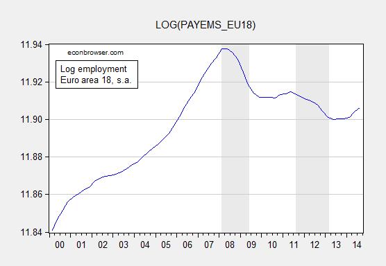
Figure 1: Log employment in euro area 18 (fixed composition), seasonally adjusted. CEPR defined recession dates shaded gray; end date for second recession is from OECD. Source: ECB, CEPR, OECD via FRED, and author’s calculations.
Inspection of US data indicates that employment falls for some time after the trough in the last three recoveries. That’s where the term “jobless recoveries” comes from.
Update, 9pm Pacific: Here is a close-up on US employment trends after the 2001M11 trough.
Figure 2: Nonfarm payroll employment, thousands, s.a., (blue). NBER defined recession dates shaded gray. Dashed line at employment trough. Red arrow indicates the 21 months between trough and increase in employment. Source: BLS and NBER.
Menzie David Chinn's Blog


