
Menzie David Chinn's Blog, page 39
March 26, 2015
Pompeii on SF Bay?
Will a minimum wage increase induce an apocalyptic conflagration of small businesses and low wage employment? Here’s one prediction:
This is not the time to force businesses to raise prices by laying-off employees in order to stay in business.
What good is raising the minimum wage if prices go up? What good is raising the minimum wage if there are no jobs available?
Businesses will be forced to raise prices in order to absorb a 26% pay increase. Restaurants will be especially hard hit.
That is not a quote addressing the impending increase in the SF minimum wage. Rather, it’s the statement by the SF Restaurant Association regarding San Francisco’s Proposition L, in 2003 (ballot instructions ). For a current incarnation of this apocalyptic vision, one has to go no further than Michael Saltsman, in the oped pages of the Wall Street Journal:
Last fall, voters in the Bay Area cities of San Francisco and Oakland followed Seattle’s lead and approved costly new minimum-wage mandates ($15 an hour and $12.25 an hour, respectively) for most businesses in the city boundaries. Now the bills have begun arriving, and some businesses can’t pay them.
Then, as befits the research director of an organization the sometimes publishes irreproducible results (at least I can’t reproduce ‘em – maybe a more imaginative researcher could), Mr. Saltsman conducts a proof by anecdote.
In Oakland, local restaurants are raising prices by as much as 20%, with the San Francisco Chronicle reporting that “some of the city’s top restaurateurs fear they will lose customers to higher prices.” Thanks to a quirk in California law that prohibits full-service restaurants from counting tips as income, other operators—who were forced to give their best-paid employees a raise—are rethinking their business model by eliminating tips as they raise prices.
Though higher prices are a risk that some businesses were able to take, others haven’t had the option. The San Francisco retailer Borderlands Books made national news in February when the owner announced that the city’s $15 minimum wage would put him out of business, in part because the prices of his products were already printed on the covers. (A unique customer fundraiser gave Borderlands a stay of execution until at least March of 2016.)
One block away from Borderlands, a fine-dining establishment called The Abbot’s Cellar—twice selected as one of the city’s top-100 restaurants—wasn’t so lucky. The forthcoming $15 minimum wage, combined with a series of factors like the city’s soaring rents, put the business over the edge and compelled its owners to close. One of the partners told me the restaurant had no ability to absorb the added cost, and neither a miraculous increase in sales volume nor higher prices were viable options.
These aren’t isolated anecdotes. In the city’s popular SoMa neighborhood, a vegetarian diner called The Source closed in January, again citing the higher minimum wage as a factor.
I found the oped particularly resonant because just hours before reading this “piece”, I had been cautioning my students in the econometrics course I teach not to argue by anecdote, and in fact to be particularly wary of those who did. My example of the hazards of relying on anecdotes was drawn from the Card and Krueger’s 1994 American Economic Review paper on the minimum wage. Scrolling through the data set, I highlighted the fact that one particular fast food restaurant reduced employment in after the imposition of a minimum wage in NJ. Of course, those familiar with the Card-Krueger results, which rely upon a differences-in-differences approach, know that overall, average store employment increased in NJ, post-minimum wage imposition, relative to the change in PA average store employment. That is, there was a statistically significant and economically significant increase in employment, even though there were individual cases of employment falling in NJ.
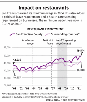
Now, in the context of the impending increase in the minimum wage from $10.25 to $15, what’s going to happen? Well, first thing to mention (omitted from Mr. Saltsman’s piece) is that the minimum wage increase is phased in, so that the $15 level is achieved in 2018. Second, it’s useful to observe what has happened since the 2004 increase in the minimum wage. From L. Thompson/Seattle Times:
So, one can properly take into account the facts, then observe what has happened in the past, and then finally, one can appeal to statistical analyses. Dube, Lester and Reich (2010 Review of Economics and Statistics) report their estimates of the impact of minimum wage changes on income and employment.
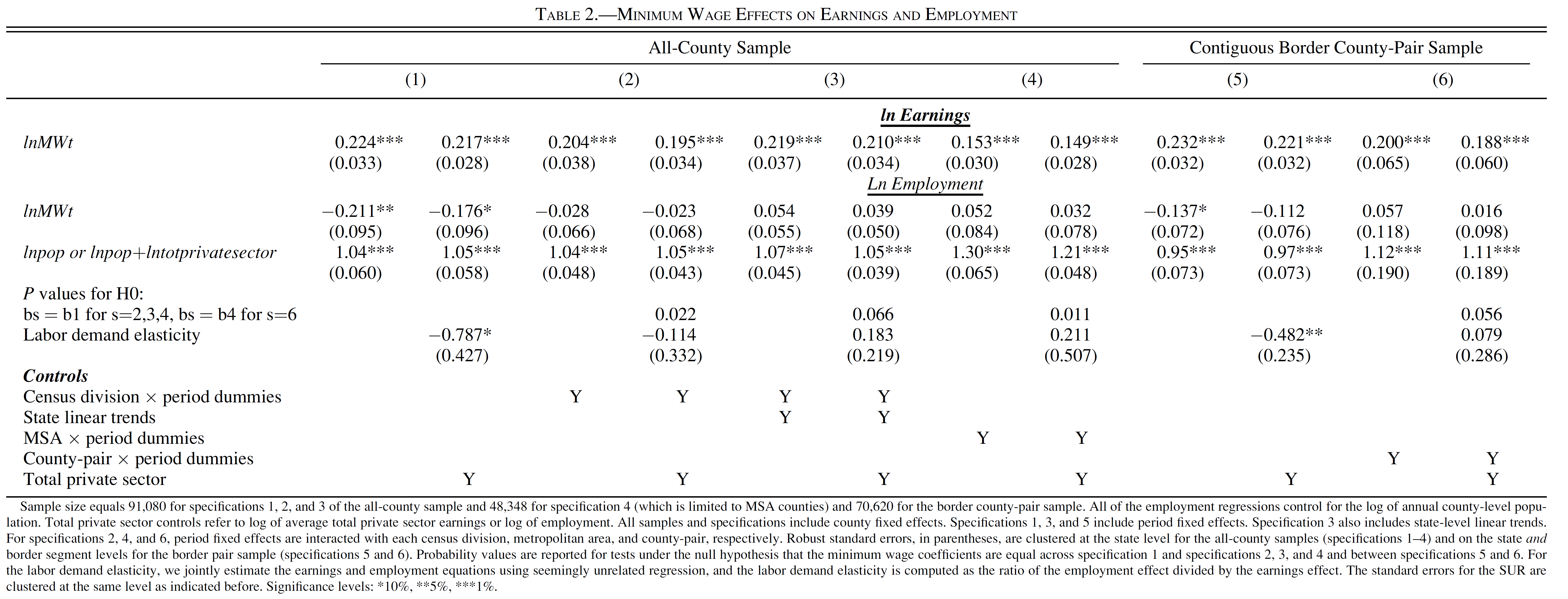
Figure 2 from Dube et al. (2010).
In general, the results suggest that earnings rise and employment is either unaffected, or declines slightly.
Obviously, there are many different estimates, and this is but one set. And I would never rule out the possibility of significant employment effects (never say never is the lesson delivered by Don Luskin’s example). However, as previously discussed, the bulk of the evidence suggests small negative impacts on employment, if any (see e.g., [1]).
Update, 7:30PM Pacific: It is of importance to keep in mind the cost of living is substantially higher in San Francisco than in the Nation as a whole. In Figure 1, I show the evolution of the real minimum wage in US 2010$.
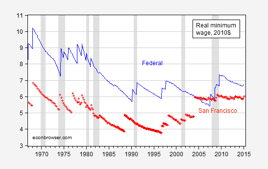
Figure 1: Federal minimum wage, deflated by CPI-all urban, rescaled to 2010=100 (blue), and San Francisco minimum wage, deflated by SF Bay Area CPI, rescaled to 2010=100, and adjusted to be 1.64 higher than US CPI in 2010. NBER defined recession dates shaded gray. Source: BLS via FRED, ACCRA, and author’s calculations.
Note that taking into account San Francisco’s higher cost of living, the SF minimum wage does not appear particularly high, and as of 2015M02, lower by a dollar than the real Federal minimum wage. Projecting forward, one finds the SF real minimum wage climbing to the Federal level in mid-year, and eventually exceeding — although that is half-attributable to the failure to raise the minimum wage at the Federal level.
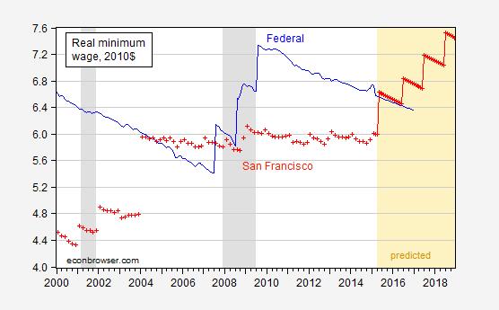
Figure 2: Federal minimum wage, deflated by CPI-all urban, rescaled to 2010=100 (blue), and San Francisco minimum wage, deflated by SF Bay Area CPI, rescaled to 2010=100, and adjusted to be 1.64 higher than US CPI in 2010. CPI are assumed to grow at the rate experienced over the 2009M06-2015M02 period. NBER defined recession dates shaded gray. Source: BLS via FRED, ACCRA, and author’s calculations.


March 24, 2015
Guest Contribution: “Currency politics: Understanding the euro”
Today, we’re fortunate to have a guest contribution by Jeffry Frieden, Stanfield Professor of International Peace at Harvard University, and author of the newly published Currency Politics: The Political Economy of Exchange Rate Policy (Princeton University Press, 2015). This post is based upon a portion of that book.
As the Eurozone struggles through its eighth year of stagnation and limping recovery, many Euro-skeptics are rubbing their hands with “I told you so” glee. The ongoing crisis in the Eurozone demonstrates the weaknesses of a currency union among countries with substantial macroeconomic divergences, separate financial regulations, uncoordinated fiscal policies, and an inability to credibly commit not to bail out member states in trouble. All of the gaps in the design of the euro that were pointed to in the 1990s seem to have come together to demonstrate the foolishness of Economic and Monetary Union in Europe.
Yet the member states of the Eurozone seem committed to maintaining the monetary union, and in fact countries continue to join. Seven nations have adopted the euro since 2001, six of them since the crisis began. It seems hard to square the continued attraction of the currency union to members and (some) non-members alike with the manifest problems that beset it.
The euro project’s strength is puzzling for those who focus on traditional economic reasons for a currency union. The standard approach is to explore Optimal Currency Area criteria: Are the countries subject to similar exogenous shocks? Do factors of production (especially labor) move freely among them? Is their industrial structure similar? These criteria largely evaluate the costs of giving up a national monetary policy. If these criteria are met, then sharing a currency will impose few costs: independent national monetary policies would either be unnecessary or impossible.
These evaluations have two problems: they focus on costs rather than benefits, and they are purely economic. On the first front, the OCA literature largely took for granted that there are welfare gains to a common currency, without developing any good metric for evaluating them. On the second, just as monetary policy is made subject to political-economy constraints, so too is the decision to create a monetary union. On both counts, EMU and the euro may seem more defensible than the standard story allows.
The first point is that the potential benefits may be larger than commonly supposed. It is striking that both popular and policy discussion of EMU focused on the purported value of a common currency in encouraging broader European economic integration. Economic analyses tended to downplay this, finding only very minor gains in the reduction of transaction costs. After all, currency markets are very well-developed and currencies are easily hedged, so the efficiency gains are likely to be small.
From early days, policymakers seemed to believe that a common currency would lead to a substantial increase in the level of cross-border trade and investment. And there is some scholarly evidence to support this view. Andy Rose’s early empirical estimate that being in a currency union increased trade by 300 percent was not widely believed, and it may be an over-estimate. But subsequent work tends to reinforce the view that a common currency does increase trade quite substantially. For example, Lopez-Cordova and Meissner used ample historical data and found that being on the gold standard increased trade among countries by 30 percent. On a related front, the work of Roberto Rigobon and his colleagues in their Billion Prices Project has demonstrated that within a currency union prices are much more similar even than among countries with strong nominal currency pegs.
The euro is seen by many in Europe as a means to an end, with the end being the more complete integration of markets for goods and capital (and perhaps even labor). Indeed, in public opinion polls, political support for the common currency is closely related to support for closer economic ties among the members of the EU. So one source of support for the euro is simply the view – for which there is some empirical evidence – that a common currency will speed the process of economic integration.
The second point is that there are strong political-economy considerations that militate for a currency union. Among countries that trade freely with each other, currency movements remain the principal policy that can affect the competitive position of national producers. A ten percent depreciation is the equivalent of a ten percent tariff plus a ten percent export subsidy. However, among commercially integrated economies this sort of policy is widely seen as predatory, and whatever its ethical standing it is almost certain to give rise to political protests.
In this context, it is not clear that a functioning single market can be sustained if countries are free to manipulate their exchange rates. This was in fact one of the main lessons many Europeans took away from the crisis of the European Monetary System in 1992-1993. The crisis led to the devaluation of many of the region’s currencies against the Deutsche mark (and other northern European currencies). The result was a flood of cheapened imports into the strong-currency countries, and an upsurge in protectionist pressures in those countries, including even some threats to impose emergency protectionist measures.
As I wrote in Currency Politics, “there was an increasing sense that if the single market were to survive, monetary integration might be essential. Member states that had eschewed all trade barriers could hardly be expected to welcome attempts by other member states to promote exports and reduce imports by depreciating their currencies….Otherwise there would be powerful incentives to engage in competitive depreciations, which could reliably be expected to give rise to strong protectionist pressures in response – thus calling into question the very nature of the single market itself.” (page 150)
This dilemma is in fact common among countries pursuing trade integration. Mercosur, the common market of several South American countries centered on Brazil and Argentina, got off to a strong start in 1994 – at a time when both the Brazilian real and the Argentine peso were pegged to the dollar (at 1:1:1 parities, in fact). Trade between the two countries grew very rapidly. However, early in 1999 Brazil devalued the real, flooding Argentina with imports and hindering the sale of Argentine products in Brazil. Argentine producers complained bitterly, the government threatened trade barriers, and eventually the Brazilians agreed to restrain some of their exports. In 2001-2002 it was the turn of the Argentine peso to devalue. Other factors contributed to the stagnation of the region’s plans for commercial integration, but the currency fluctuations certainly helped make Mercosur largely a dead letter.
The broader point is that currency movements can cause substantial political conflict among trading partners, feeding protectionist pressures and threatening their commercial relations. This is true even of countries that are not linked by a customs union or a single market, as ongoing friction between the United States and China demonstrates. It is all the more important for countries that have resolved to create a true single market. Indeed, there are some in Europe who believe that without movement toward a single currency, the single market itself might not have held together.
The problems the Eurozone faces currently are enormous. But these problems should not let us lose sight of the fact that there are reasons the members states have been moving toward some form of monetary unification for over forty years, ever since the collapse of the Bretton Woods system. Those reasons are neither purely economic nor purely political, but they are nonetheless powerful.
This post written by Jeffry Frieden.
March 22, 2015
Fed moves the markets
As widely expected, at Wednesday’s FOMC meeting the Federal Reserve dropped its statement that “the Committee judges that it can be patient in beginning to normalize the stance of monetary policy”, the magic formula that many observers had thought would open the way for a hike in interest rates at the Fed’s June meeting. But the yield on a 10-year U.S. Treasury bond dropped 10 basis points immediately following the FOMC release.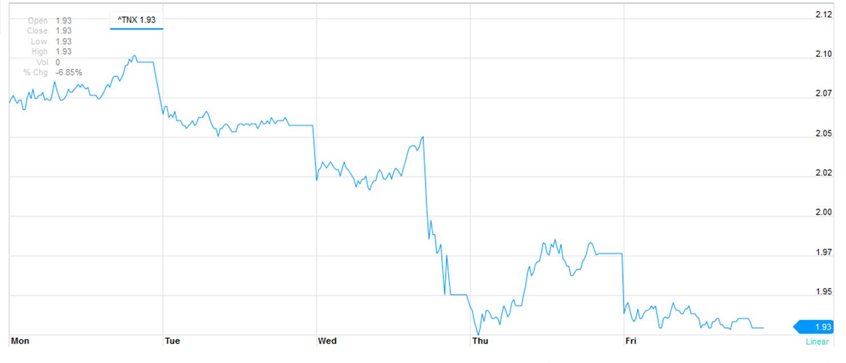
Interest rate on 10-year U.S. Treasury bonds as captured by CBOE TNX quote. Source: Yahoo Finance.
More important than leaving the word “patient” out of the latest FOMC statement was a significant downward revision in the interest rate that the Fed itself seems to be anticipating. The median FOMC member now anticipates a fed funds rate over the next few years that is 50 basis points lower than was anticipated last December.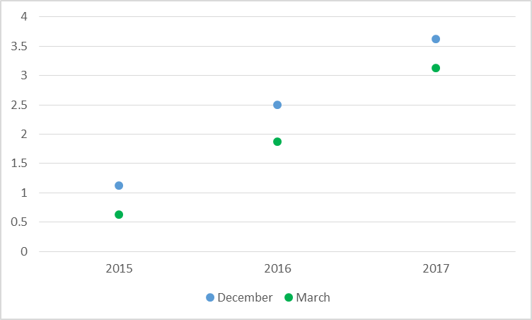
Anticipated target for fed funds rate for end of indicated calendar year of the median FOMC participant as of December 17, 2015 (in blue) and March 18, 2015 (in green).
Notwithstanding, the fed funds futures market is pricing in significantly lower expectations yet.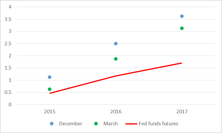
Median FOMC fed funds rate forecast and price as of March 20 of December fed funds futures contract for indicated year. Updates a similar graph by Tim Duy.
It’s also worth noting that the median FOMC “longer run” interest rate prediction came out at 3.75% from both the December and the March meetings, though the distribution of the individual “dots” from the latter has clearly drifted down. With a long-run inflation objective of 2%, that implies an equilibrium real interest rate of 1.5-1.75%. Compare that to the yield on a 10-year Treasury inflation-protected security that is now below 20 basis points.
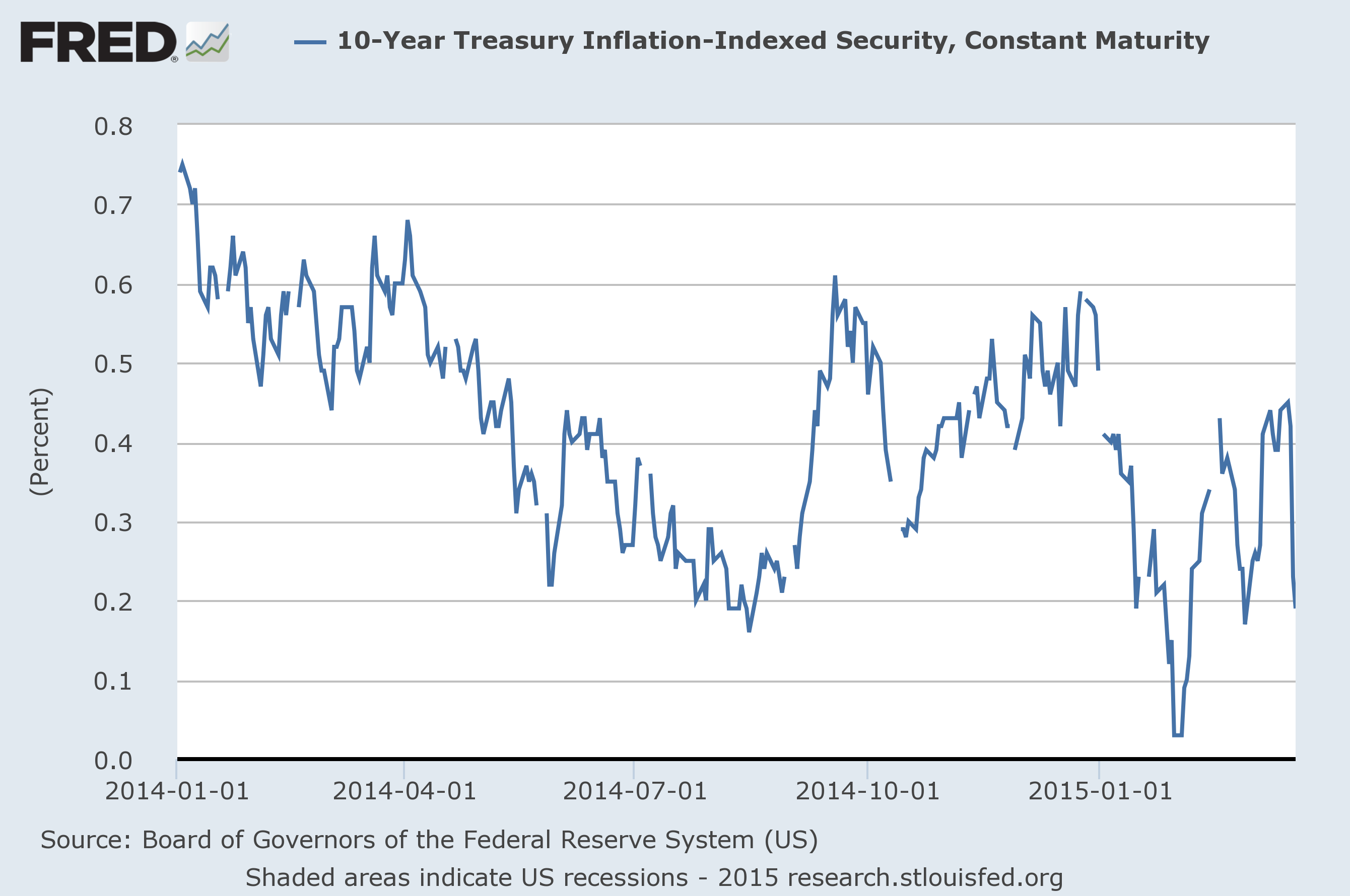
Source: FRED.
All of which raises the question: does the Fed know something the market doesn’t, or vice versa? Tim Duy concludes “it is now clear the bond market is not moving toward the Fed; the Fed is moving toward the bond market.” But my answer to the question is: a little of both. Based on the historical evidence reviewed here I think it’s reasonable to expect an equilibrium real rate significantly above 0.2% and significantly below 1.5%. But given my own (and everyone else’s) uncertainty about exactly where the number is within that range, it makes sense for the Fed to wait a little longer before raising rates.
And as Menzie pointed out last week, international developments are leaving the Fed little choice. One important channel by which monetary policy can influence the Fed’s targets for output and inflation is through the exchange rate. A higher interest rate in the U.S. than in other countries means a stronger dollar. That makes it harder for the U.S. to export goods and makes imports more attractive, both of which mean a drag on U.S. GDP. And insofar as a stronger dollar means a lower dollar price for internationally traded commodities, it also takes us farther below the Fed’s 2% inflation target. When other countries are lowering their interest rates, that by itself tends to bring down U.S. output and inflation, and mitigates any argument for raising U.S. interest rates.
Note that the dollar fell 2% against the euro within a few minutes of the FOMC release.
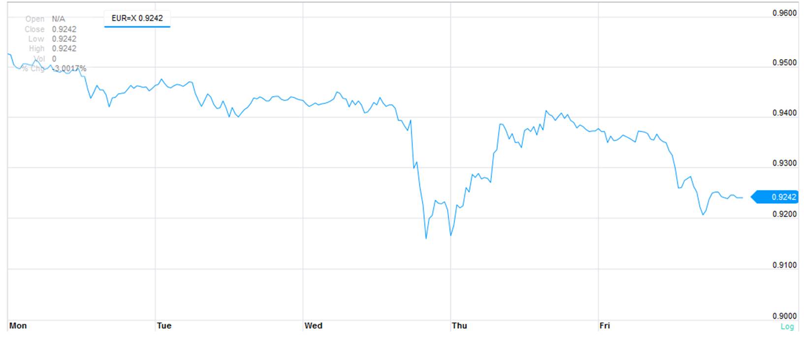
Exchange rate (in euros per dollar).
Bottom line: the Fed sent a dovish signal with its statement last week that to me has a lot to recommend it and seemed to have some of the desired effects.
March 20, 2015
Guest Contribution: “Currency politics, debt politics”
Today, we’re fortunate to have a guest contribution by Jeffry Frieden, Stanfield Professor of International Peace at Harvard University, and author of the newly published Currency Politics: The Political Economy of Exchange Rate Policy (Princeton University Press, 2015). This post is based upon a portion of that book.
The recent volatility of major currencies reminds us of the close relationship between exchange rate movements and international debt dynamics. While many still think of currency values as important primarily for their impact on the relative prices of domestic and foreign goods, today arguably the principal importance of currency values is their effect on the relative prices of assets and liabilities – including their potential to cause debt crises.
“Twin crises” – linked currency and debt or banking crises – have been common for generations. Inasmuch as domestic firms, or the national government, borrow in foreign currency, large depreciations can massively raise the real cost of foreign-currency liabilities. This was true in the gold-standard era, and the experience has been repeated again and again, from the developing-country debt crisis of early 1980s and Mexico’s “tequila crisis” of 1994, through the 1997-1998 East Asian financial crisis and after.
The debt-currency dynamic has also been central to the Great Financial Crisis that began in 2007. Of course, the inability of countries in the Eurozone to use currency depreciation as a path to adjustment has been central to the continuing problems of Europe’s recovery.
European countries outside the Eurozone were also strongly affected by the connection between currency policy and foreign debt. The Baltic states were pegged to the euro, and in them some 80 percent of bank loans were in foreign currency. Most of this was mortgage debt, which made it politically virtually impossible to contemplate a depreciation, desirable as that might have been. They stayed pegged and suffered a 20-percent collapse of GDP. Meanwhile, Poland had a flexible exchange rate, and the proportion of bank loans in foreign currency was under a third. So the Polish government faced few political barriers to depreciating its currency by 40 percent when the crisis hit – thus avoiding a recession.1
Since 2010, the currency-debt connection has taken several twists and turns. As monetary policy in the G-7 headed toward the zero interest rate lower bound, investors in search of yield poured trillions of dollars into the emerging markets. The search for yield led investors to put money even into the local-currency debt of emerging-market governments. Governments from Peru to Thailand issued debt in their own currencies, in national markets, only to see most of it snapped up by foreigners hungry for the high yields they found there. This was not without problems: as capital poured into Brazil and the real appreciated, the Brazilian government complained that the U.S. was sparking a “currency war” that was impeding the ability of Brazilian firms to compete internationally.
But the main trend was the rapid growth of local-currency borrowing by emerging markets. As Wenxin Du of the Federal Reserve Board and Jesse Schreger of Harvard University show, in 14 major emerging-market economies, the share of government debt in local currency held by foreigners went from 15 percent in 2003 to 60 percent in 2012. The proportions vary: local-currency foreign-owned debt of the Colombian government was 15 percent of the total, while for Thailand the share was 98 percent. But overall, most of these countries’ trillion dollars in sovereign debt owed to foreigners was in local currency. The result was that emerging markets had apparently been absolved of “original sin,” the inability of developing-country governments to borrow long-term in their own currency.
The ability of emerging-market governments to borrow in local currency does not mean that currencies no longer matter for developing-country debt. Liability mismatches persist, but are now mostly in the private sector. While emerging-market governments owe well more than a trillion dollars to foreigners, most of it in local currency, emerging-market private corporations owe over two trillion dollars to foreigners – and 90 percent of this is in foreign currency.
This leaves the typical emerging market acutely exposed to currency movements that can dramatically increase the private-sector’s debt burden. If a government attempts to respond to a negative shock with looser monetary policy, the resultant currency depreciation can bankrupt households or corporations that are heavily indebted (and, as is typical, unhedged) in foreign currency. Brazil now finds itself facing some of these problems, as the real has dropped by more than 20 percent in the last six weeks.
The exchange rate is a powerful instrument of national policy, which can have major effects on the real economy. The use of this instrument is now substantially complicated by the impact of currency movements on the balance sheets of both the public and private sectors. An otherwise desirable depreciation can cause massive financial disruptions, even a descent into debt crisis.
The exchange rate and foreign debt are intricately linked. And they are both extraordinarily political, implicating powerful interests of all sorts. Government attempts to navigate the contemporary international economy find themselves – and will continue to find themselves – torn among conflicting pressures as they attempt to design policy. Currency politics is, and will remain, central to the global economy.
Notes
1. Stefanie Walter, Financial Crises and the Politics of Macroeconomic Adjustments (Cambridge: Cambridge University Press, 2013), pages 181-217.
This post written by Jeffry Frieden.
March 19, 2015
The Yield Curve and Economic Activity, Again
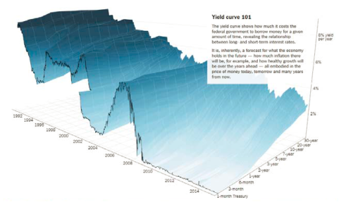
The New York Times has an article in The Upshot today, which shows the yield curve over time in a nifty map. They also show the topography for yields in Germany and Japan.
One conclusion they come to for the US: “The yield curve is fairly flat, which is a sign that investors expect mediocre growth in the years ahead.”
This conclusion is in line with recent work with in Chinn and Kucko (March 2015). We conclude:
This paper has explored the importance of the yield spread in forecasting future growth and recession. Generally speaking, when using the entire data series from 1970-2013, in-sample results suggest the yield spread is indeed important and has significant predictive power over a one-year time horizon. The results deteriorate when forecasting growth two years ahead. Moreover, it appears that the forecasting power is weaker during the great moderation up until the financial crisis of 2008. However, each of the six European country models exhibited relatively high R-squared statistics (above 0.1) when using data from 1998-2013. While the explanatory power is somewhat less for certain models estimated over the early subsample, the data still suggest the yield curve possesses some forecasting power for European countries.
…
In summary, we do not obtain a simple story for the yield curve’s predictive power. The yield curve clearly possesses some forecasting power. However, there is also some evidence the United States is something of an outlier, in terms of its usefulness for this purpose. And overall, the predictive power of the yield curve seems to have rebounded in the lead up to the Great Recession, reversing a longer term trend of declining predictive power.
Here’s the term spread for the 10 yr-3 mo and 10 yr-2 yr Treasurys.
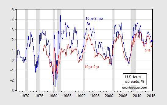
Figure 1: Ten year-three month Treasury spread (blue) and ten year-two year Treasury spread (red), in %. Observation for March pertains to 3/18. NBER defined recession dates shaded gray. Source: Federal Reserve Board via FRED, NBER and author’s calculations.
Using the February observations, and an updated regression extending from 1970M01-2015M02, the implied probability of a recession in the next six months is 8.4% (using the 10 yr-3 mo spread).
More on the subject, here.
“Wisconsin job creation rank falls to 38th in U.S.”
That’s the title of an article by John Schmid and Kevin Crowe in the Milwaukee Journal Sentinel today, based upon just-released state level data on the Quarterly Census of Employment and Wages (QCEW):
Wisconsin gained 27,491 private-sector jobs in the 12 months from September 2013 through September 2014, a 1.16% increase that ties Wisconsin with Vermont and Iowa at a rank of 38th among the 50 states in the pace of job creation during that period.
The state’s national ranking fell from a revised rank of 31st three months earlier, in the previous release of quarterly jobs data, which covered the 12 months through June 2014. In that period, Wisconsin created 36,732 private-sector jobs.
Wisconsin continued to trail the national rate of job creation, as it has since July 2011. The United States created private-sector jobs at a rate of 2.3% in the latest 12-month period, twice Wisconsin’s 1.16% rate, the data show.
What about regional comparisons?
Among its peer states in the Midwest, Wisconsin tied with Iowa for last place. Both states created private-sector jobs at 1.16%. Michigan and Indiana led that group of states with 2.02% and 1.64% growth, respectively.
The downward revision in Wisconsin employment series was not surprising; I’d mentioned the impending downward revisions in this post a week and a half ago. What is surprising is that Wisconsin’s downward revisions were apparently bigger than those in other states, relatively speaking. So, in sum, it just looks worse for Wisconsin.
Note that Minnesota’s growth rate of employment (as measured by the QCEW, year-on-year through September 2014) is matched by Wisconsin’s. Of course, levels matter, and over the past nearly four years, Minnesota’s employment growth was substantially higher than Wisconsin’s. Using the updated establishment series on private employment (released on Tuesday), I display this fact in Figure 1.
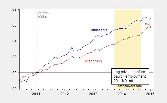
Figure 1: Log private nonfarm payroll employment for Minnesota (blue), and for Wisconsin (red), normalized to 2011M01=0. Preliminary estimates for January denoted as circles. Dashed line at 2011M01, when Governors Dayton and Walker take office. Light tan shaded period is the period over which the last year’s worth of QCEW data is used to benchmark the establishment series. Source: BLS and author’s calculations.
Notice that while there is an uptick in Wisconsin employment after September 2014, these are estimates of private nonfarm payroll employment that are not based on contemporaneous QCEW data, which as readers will recall were the series the Walker administration was in favor of before it was against (or indifferent to).
Finally, since nonfarm payroll employment is one of the four state-specific indicators used to calculate the Philadelphia Fed’s coincident indicators of economic activity, one can infer that it is likely that Wisconsin’s performance will deteriorate in absolute level and relative terms, once these new data are incorporated. The Philadelphia Fed indices will be released on March 23rd.
Update, 6:40PM: Here is a comparison of actual (black) evolution of Wisconsin nonfarm payroll employment from the January benchmarked release, and a forecast (blue) based on data from 1994M01-2010M12, and an error correction model (ECM) using cointegration between log WI NFP and log US NFP, with two lags of first differenced terms. The ECM regression has an adjusted R2 of 0.44, SER of 0.0019.

Figure 2: Actual Wisconsin nonfarm payroll employment, in 000’s, seasonally adjusted (black), and forecast from ECM estimated over 1994M01-2010M12 (blue), and ±1.64 standard error band. Source: BLS (January 2015 release) and author’s calculations.
In other words, Wisconsin employment growth deviates in a statistically significant way (at 10% MSL) from the level predicted using US NFP, since 2011M01.
March 18, 2015
Short Term Implications of the House Budget
The CBO took at face value the revenue and spending levels in the House Budget, FY2016, and assessed the impact on GNP per capita (remember, this is not a score, as there are few details on specific provisions to hit the targets). The impact is shown in Figure 2 from the CBO.
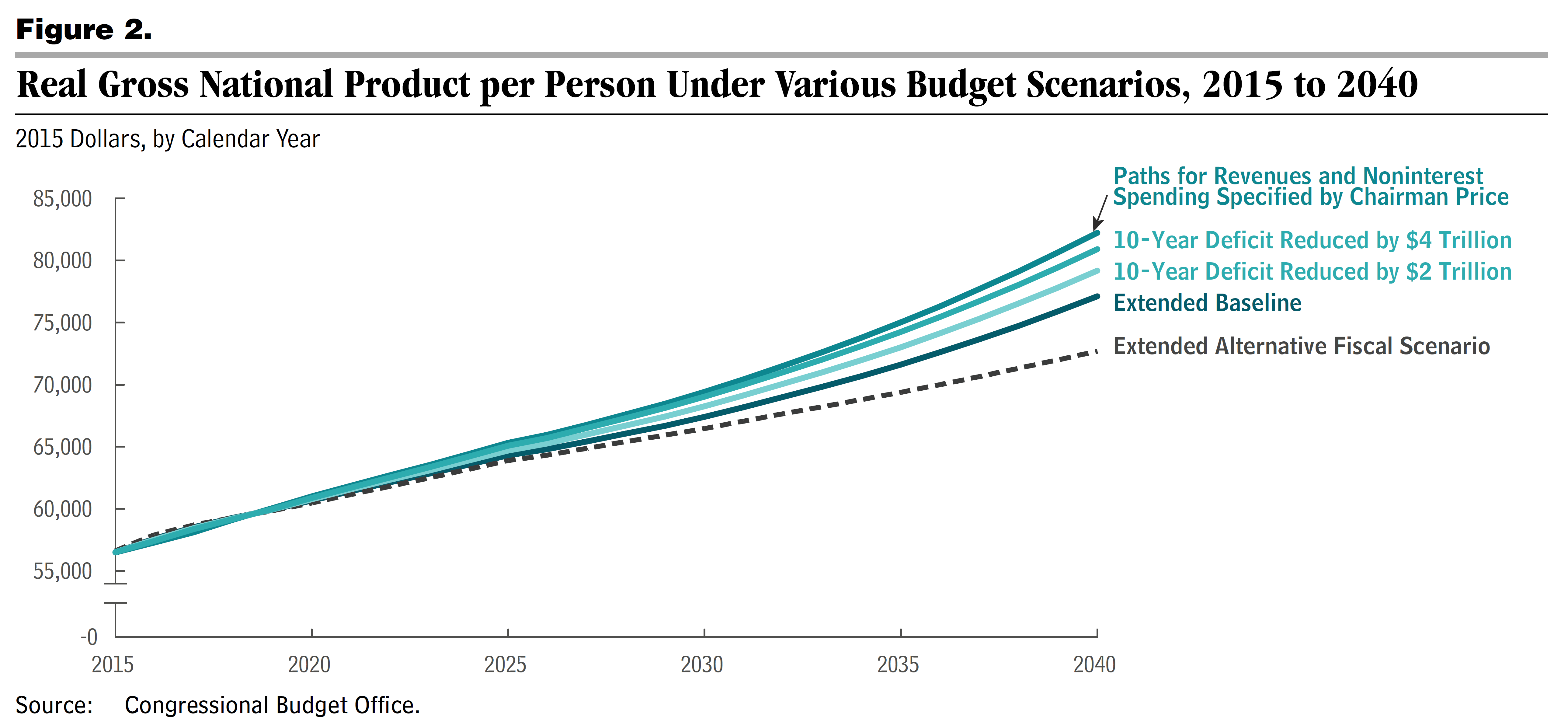
Figure 2 from CBO (2015). Notes: “These results account for the following macroeconomic effects (“feedback”): the ways in which changes in federal debt affect investment in capital goods (such as factories and computers), the ways in which changes in after-tax wages (resulting from changes in capital investment) affect the supply of labor, and the ways in which those economic effects in turn affect the federal budget. The analysis incorporates the assumption that the budget scenarios do not alter the contributions that government investment makes to future productivity and output; those contributions are assumed to reflect their past long-term trends.
Unlike the more commonly cited gross domestic product, real (inflation-adjusted) gross national product includes the income that U.S.
residents earn abroad and excludes the income that foreigners earn in the United States.
The 10-year baseline used in this report refers to the projections for the budget and the economy that CBO released in January 2015. For
information about CBO’s analysis of the extended baseline and other scenarios considered here, see the notes to Figure 1.”
I thought it was of use to investigate what happens in the short term — so zooming in on 2007-2020. Unfortunately, 2014 GNP per capita was not reported in the document, so I had to do some estimating. But in the end, this is what I obtained.
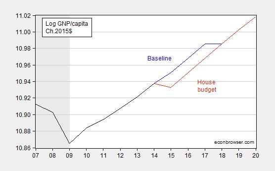
Figure 1: Log GNP per capita in Ch.2015$ (black), extended baseline (blue), and assessment of House budget (red). NBER recession dates shaded gray. Historical GNP per capita series adjusted from Ch.2009$ to Ch.2015$ assuming CBO forecasts of GDP deflator hold for 2014 and 2015; 2014 growth in real GNP per capita assumed to equal actual real GDP per capita growth. NBER defined recession dates shaded gray. Source: BEA via FRED, NBER, CBO, Budget and Economic Outlook (January 2015), and CBO, Budgetary and Economic Outcomes Under Paths for Federal Revenues and Noninterest Spending Specified by Chairman Price, March 2015.
What I have for 2014 real per capita GNP might not match what CBO has, but as best as I can make out, it sure looks like the short term impact is to set growth to zero for 2015 (my actual calculation is -0.5%, y/y — but like I say, I had to estimate 2014 per capita GNP).
More on the (re-)appearance of the magic asterisk, from CBPP.
March 16, 2015
Some Implications of the Dollar’s Rise
Currency appreciation will be a drag; this implies a policy of slower monetary tightening is in order
The Dollar’s Rise In Context
The dollar has risen by over 20% (log terms) against major currencies since July, as of 3/13. Against the euro, the dollar has appreciated by over 25%.
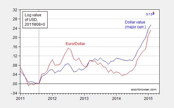
Figure 1: Log value of US dollar against basket of major currencies (blue), and against euro (red), normalized to August 2011. Values for March pertain to 3/13. Source: Federal Reserve Board via FRED, and author’s calculations.
The angst concerning the dollar, in particular the drag induced by expenditure switching (reduced exports, increased imports), is reflected in many accounts, including U.S. economy’s surprise risk: The dollar’s surge could weaken growth:
The surging value of the U.S. dollar promises new bargains for American consumers and travelers but also presents big threats to the U.S. economy — in a trend that is shaping up to be one of the most unexpected and significant factors driving the global economy this year.
…
The unexpected surge has led economists to reduce their expectations for U.S. economic growth this spring; this week, it pushed markets into negative territory for the year. It’s happening largely because the U.S. economy has been unusually strong amid a global slowdown, giving the dollar an advantage over other currencies.
I would take issue with the assertion that the induced drag was a surprise. Analysts had worried about the appreciating dollar back last year, when the surge was already apparent.
The article makes clear that it’s the real value of the dollar that’s relevant. Figure 2 presents a longer view on the dollar’s real value.
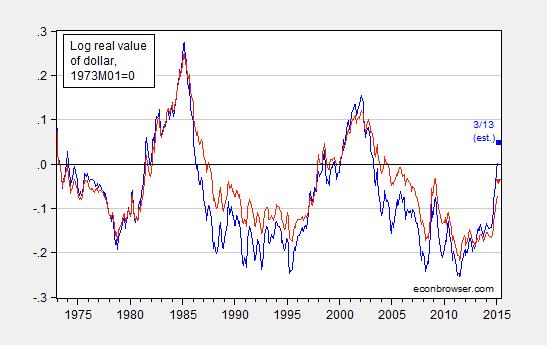
Figure 2: Log real value (CPI deflated) of US dollar against basket of major currencies (blue), and against broad basket (red), normalized to March 1973. Values for March pertain to 3/13, and assume that the real appreciation from February to March equals that for nominal (i.e., inflation differentials are the same). Source: Federal Reserve Board via FRED, and author’s calculations.
Note that the broader index is probably more relevant, given the importance US trade with China (which is not in the major index).
Figure 2 makes two points clear. First, the appreciation over the past six months is very rapid. Second, the appreciation is not unprecedented; however, the last such episode – during the post-Lehman flight to safety – was short-lived. Before that, it was in the wake of the East Asian crises. That episode augurs ill to the extent it presaged a long period of widening trade deficits (although with rapid growth).
Implications for Trade Flows and Growth
The US trade deficit has shrunk considerably since its peak of 5.9% of GDP in 2005Q4. It was 3.1% of GDP as of 2014Q4 (second release). The non-oil trade deficit has exhibited a much smaller decrease; the 3.8% deficit has shrunk to 2.1% as of last quarter. Notice that the real value of the dollar, lagged two years, has an inverse relationship with the trade balance. Hence, eventually, it makes sense that the deficit will eventually deteriorate (relative to counterfactual) as a consequence of the recent appreciation.
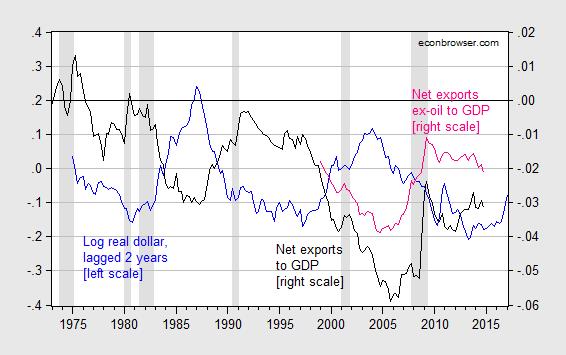
Figure 3: Log real (CPI deflated) value of US dollar against basket of major currencies, 1973M03=0 (blue, left scale), net exports as share of GDP (black, right scale), and net exports ex.-oil (pink, right scale). Note 2015Q1 value of the dollar based on January and February data. NBER defined recession dates shaded gray. Source: Federal Reserve Board via FRED, BEA NIPA (2014Q4 second release) and trade releases, and author’s calculations.
The recent deterioration in the ex-oil trade balance indicates that the dollar isn’t the only determinant. (And, in fact, a better measure of competitiveness would be a productivity adjusted real value of the dollar; such a series does not available for a basket of currencies that includes the yuan. For more, see this paper).
Obviously, domestic economic activity (for instance partly indicated by the recession dates) is important to changes in the trade balance. Foreign economic activity is as well, although that factor is not shown in the graph.
While Figure 3 is suggestive, we would want to know more than the impact on the trade balance to GDP ratio (keeping in mind exports, imports and GDP all respond to the real exchange rate). This leads to the next section.
A Static, Partial Equilibrium, Back of the Envelope Estimate
As in previous instances, I rely on statistical models of trade flows, taking into account at a superficial level vertical specialization and heterogeneity. Imports depend on domestic GDP and the real value of the currency; exports depend on foreign economic activity and the real value of the currency. Since oil imports and agricultural exports are primarily denominated in dollars, I omit these flows from the calculations.
In this paper, I find the long run (in a statistical sense) elasticity of nonagricultural exports of goods with respect to the real exchange rate is 0.690 (Table 1), and nonpetroleum imports of goods elasticity is 0.446. These estimates are obtained using dynamic OLS (DOLS), following Stock and Watson (1993). Assuming the 20% appreciation is sustained, then exports are about 13.8% lower than they otherwise would be, and imports about 8.9% higher.
Given that nonagricultural exports are 1349 billion Chained 2009$ (SAAR), and nonpetroleum imports are 1976 billion Chained 2009$ in 2014Q4, then such changes would be equivalent to 174 and 184 bn Ch.09$ at annual rates. This implies about a 2% decrease in the level of real GDP, relative to what it otherwise would be. Obviously, the impact of the 20% appreciation would take some time to affect flows, so the impact on GDP growth would be relatively small.
Goldman Sachs, in a March 9th note, argues that the drag arising from dollar appreciation should be about one-half percentage point of growth over the next two to three years. That is equivalent to something slightly smaller than the 2 percentage point lower level of GDP relative to baseline.
What Is to Be Done?
There are many caveats to the above static, partial equilibrium, analysis. Scott Sumner for instance argues that one should be careful about partial equilibrium analysis. While this is wise advice in general, in my view is there is, from a statistical standpoint, a very large exogenous component to exchange rate movements (that’s partly why exchange rates are so hard to predict). Expectations of euro monetary easing or (following Krugman) persistent slow growth in the euro area, are largely out of the control of American policymakers, and are be largely affected by US growth rates.
So, I would say the logical conclusion is that policymakers should put a higher weight than they have heretofore on foreign developments, and in particular, the value of the dollar. One way they can weaken the dollar relative to the counterfactual (I know many readers don’t believe in such things, but this is the right way to think about it) is, given the policy rate is essentially at zero, to maintain an accommodative stance in terms of forward guidance.
As I noted in this post, the correlation between the euro-dollar exchange rate and the US-euro area shadow policy rate differential is pretty apparent. Here is an updated version of the earlier graphs.
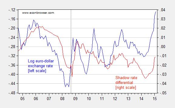
Figure 4: Log euro-dollar exchange rate (blue, left scale), up is dollar appreciation; and US-euro area shadow policy rate differential (red, right scale). Source: Federal Reserve Board via FRED, and Wu and Xia, and author’s calculations.
Delaying the lift-off would serve to maintain growth, with no appreciable risk of inflation.
March 15, 2015
U.S. oil supply update
The EIA released a new drilling productivity report last week, allowing us to update our graph of the drilling rig count in the four major tight oil regions. Active rigs in those areas are now 32% below their peak last October, the lowest level in 3 years.
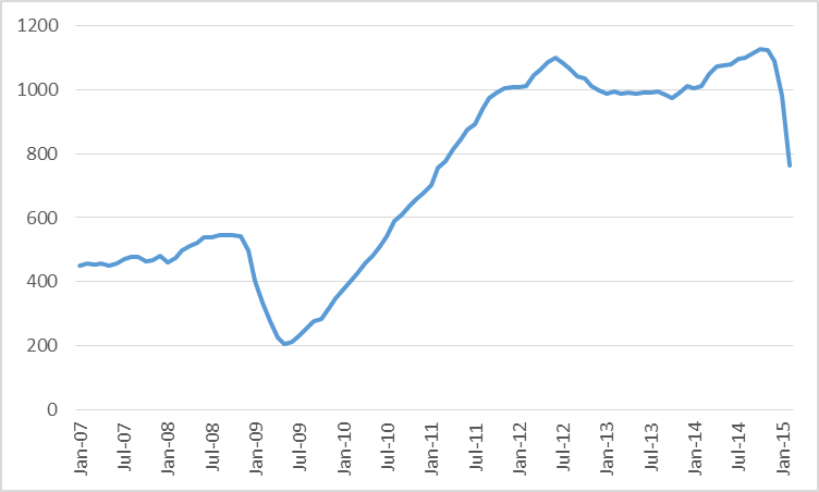
Combined oil rig count for Permian, Eagle Ford, Bakken, and Niobrara, January 2007 to February 2015. Data source: EIA.
The DPR’s forecasting model nevertheless predicts that production from these four regions will be half a million barrels/day higher this month than it was in October, and will only begin to decline starting next month.
But folks over at the Peak Oil Barrel note that while the DPR is estimating for example that Bakken production rose 27,000 b/d between December and January, the North Dakota Department of Mineral Services reported last week that Bakken monthly production was down over a million barrels in January, or about a 35,000 b/d drop from December.
In any case, U.S. crude oil inventories continued to increase last week, signaling that so far supply continues to outstrip demand. And the Wall Street Journal reports a strategy followed by some companies that could enable them to bring production back up quickly if prices recover:
Now many are adopting a new strategy that will allow them to pump even more crude as soon as oil prices begin to rise. They are drilling wells but holding off on hydraulic fracturing, or forcing in water and chemicals to free oil from shale formations. The delay in the start of fracking lets companies store oil in the ground in a way that enables them to tap it unusually quickly if they wish– and flood the market again.
The backlog of wells waiting to be fracked– some are calling it fracklog– adds to the record above-ground inventories to restrain any significant price resurgence. Eventually, however, the economic fundamentals have to prevail, and we will settle down to a price around the true long-run marginal cost.
The 2020 WTI futures contract closed at $67/barrel last week. But today North Dakota’s Williston Basin Sweet is fetching less than $29/barrel.
March 14, 2015
2015 Econbrowser NCAA tournament challenge
It’s time to get ready for the world famous eighth annual Econbrowser NCAA tournament challenge, in which readers and friends of our blog are invited to demonstrate their skill (or luck) at predicting the outcome of the U.S. college mens’ basketball tournament. If you want to participate, go to the , do some minor registering to create a free ESPN account if you haven’t used that site before, and fill in your bracket some time between Sunday at 7:00 p.m. EDT and Thursday before noon.
The big question is whether anybody can beat Kentucky?
Menzie David Chinn's Blog


