
Menzie David Chinn's Blog, page 35
May 19, 2015
Exchange Rate Regimes and the Global Financial Cycle
Relevant or Irrelevant?
The highly integrated nature of the global financial system was amply demonstrated, if we needed any reminder, by the turmoil in emerging market currency and bond markets in the wake of Fed Chairman Bernanke’s statements regarding the normalization of U.S. monetary policy, i.e., the “taper tantrum”. Following close on the heels of complaints about unconventional monetary policy implementation in the preceding years, it is clear that – at a minimum – policymakers in emerging market economies perceive a high and increasing vulnerability to the whims of the global financial system.
The idea that the monetary policies of financial center countries have large spillover effects on the smaller economies is not new. During the mid-1990’s, when advanced economy central bankers raised policy rates, after several years of negative real interest rates, similar complaints were lodged, and some may partly trace the financial crises in Latin America and subsequently in East Asia to the cycle in core country policy interest rates. One key difference is that in the earlier episode’s aftermath, the semi-fixed exchange rate regimes were tagged as a contributing factor. In contrast, countries adhering to a variety of exchange rate regimes all experienced challenges in insulating their economies in the most recent episode. This has led to a grand debate about the continued relevance of the “impossible trinity” or “monetary trilemma”.
Since Mundell (1963) outlined the hypothesis of the monetary trilemma, fundamental policy management in the open economy has been viewed as policy trade-offs among the choices of monetary autonomy, exchange rate stability, and financial openness (e.g., Aizenman, et al. (2010, 2011, 2013), Obstfeld (2014), Obstfeld, et al. (2005), and Shambaugh (2004)). The hypothesis and its extensions suggest a continuous trade off between the three trilemma dimensions, with the possibility that a fourth policy goal, financial stability, may augment it and turn it into a quadrilemma, where international reserves may play a role as buffers.
In contrast, in the aftermath of the global financial crisis (GFC), Rey (2013) concluded that the economic center’s (CE) monetary policy influences other countries’ national monetary policy mostly through capital-flows, credit growth, and bank leverages, making the types of exchange rate regime of the non-CEs irrelevant. In other words, the countries in the periphery (PH) are all sensitive to a “global financial cycle” irrespective of exchange rate regimes. In this view, the “trilemma” reduces to an “irreconcilable duo” of monetary independence and capital mobility. Consequently, restricting capital-mobility maybe the only way for non-CE countries to retain monetary autonomy. The recent experience of Brazil, India, Indonesia, South Africa, and Turkey – the “Fragile Five” – during the so called taper tantrum may make for many observers the “irreconcilable duo” view convincing.
In Aizenman, Chinn and Ito (2015) we investigate whether Rey’s prematurely predicted the end of the trilemma. Inferences based data drawn from times of heightened volatility emanating from the center might be modified once we examine how the propagation of large shocks from the CE can be affected by economic structures and measures of the trilemma variables. In a world of more than hundred countries, one ignores heterogeneity at one’s own risk. For instance, the trade-offs facing the OECD countries may differ from those facing manufacturing based or commodity based emerging markets economies and developing countries. Furthermore, large shocks arising from the EC during the global financial crisis and the Euro debt crisis may have altered the transmission dynamics, especially in comparison to the preceding decade of illusory tranquility.
Figure 1 illustrates the 36- month rolling correlations of domestic money market rates with the U.S. money market rate for developed countries (IDC), developing countries (LDC), and emerging market economies (EMG), and China, from 1990 to 2013. For developed economies, the correlation between domestic and the U.S. policy interest rates is high and hovers at relatively high levels in the last decade. In contrast, developing countries tend to retain high monetary independence from the U.S., while emerging market monetary policy independence occupies a middle ground. All the correlations fluctuate, but experience two pronounced dips in recent years, one in 2005 and the other at the time of the global financial crisis. These two dips correspond to rapid changes in the U.S. Federal funds rate.
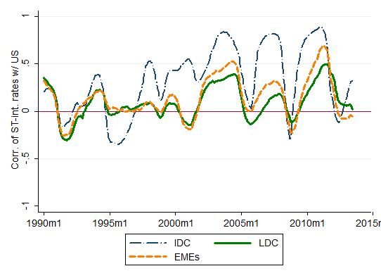
Figure 2 depicts correlations of long-term interest rates. Again, the long-term interest rates of industrialized countries register high correlations with that of the U.S., particularly in the first half of the sample period, though the correlation has been on a rising trend again in recent years. Developing countries experience relatively high correlations in the early 2000s but since the late 2000s, the correlations appear to be trendless for these countries. Long-term interest rates across countries, including both developed and developing countries, were highly correlated during the Great Moderation period.
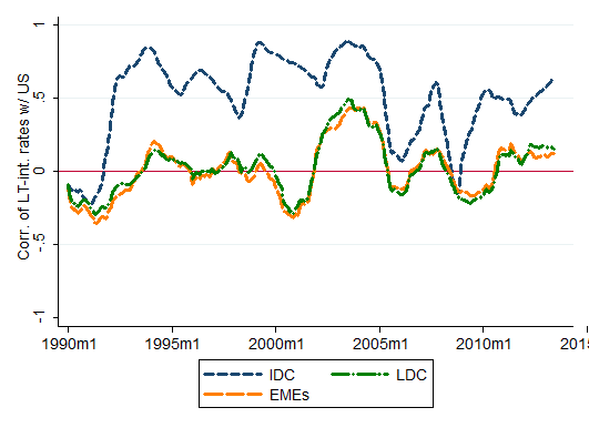
Figure 3 is an interesting picture. It illustrates the comparable correlations of stock market price indexes (expressed in local currency) with the U.S. index. Since the mid-2000s, all the country groups have maintained high levels of correlations of stock market price indexes with the U.S. stock market, with some tail-off since the global financial crisis.
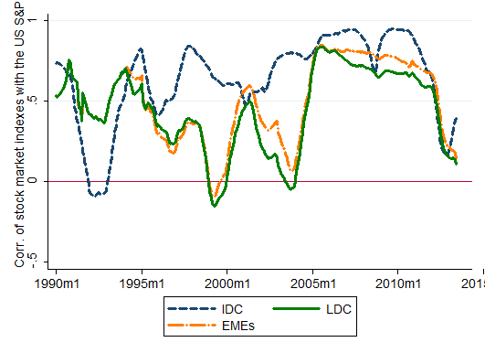
What do these figures tell us? Broadly speaking, the extent of correlations is the highest for stock market price movements, followed by the long-term and short-term interest rates. Given short-term interest rates bear lowest levels of risks, we may conjecture that the prices of assets with higher risk tend to be more highly correlated with that of the United States. Of course, these graphical depictions do not provide conclusive evidence, particularly since we have not controlled for any number of important factors, e.g., the policy regimes, macroeconomic conditions, the extent of trade linkage, the level of institutional development and size of financial markets, and global market conditions. Many studies such as Ahmed and Zlate (2013), Forbes and Warnock (2010), Fratzscher (2011), and Ghosh, et al. (2012) have documented the importance of global factors such as advanced economy interest rates and global risk appetite in affecting capital flows to small open economies. Nonetheless, these studies have also highlighted that domestic, country-specific factors also retain importance. In particular, the institutional and macroeconomic policy frameworks of the emerging market economies also determine the variations in flows.
Methodology
Given this context, we focus on the questions of why movements in the major advanced economies often have large effects on other financial markets, how these cross-market linkages have changed over time, and what kind of factors contribute to explaining the sensitivity to the movements in the major economies. More specifically, we will conduct an empirical analysis on what determines the sensitivity of economies to factors pertaining to the core economies in the world, namely, the U.S., the Euro area, Japan, and China. For the last two decades, the Chinese economy has been growing at impressive rates and quickly moving upward on the development ladder. However, its financial markets may not be developed or sophisticated to the extent of becoming the center of global financial cycles. Despite data limitations as well as China’s relatively short tenure as one of the G3 countries, we will also examine whether our results are sensitive to the inclusion of China as one of the center economies.
For our empirical exploration, we employ an estimation process similar to that employed by Forbes and Chinn (2004), which is composed of two steps of estimations. First, we investigate the degree to which the sensitivity of several important financial variables to global, cross country, and domestic factors. Second, treating the estimated sensitivity as a dependent variable, we examine their determinants among a number of country-specific variables. In so doing, we disentangle roles of countries’ macroeconomic conditions or policies, real or financial linkage with the center economy, or the level of institutional development of the countries.
Results
We find that for most of the financial variables we examine, the strength of the links with the center economies have been the dominant factor over the last two decades. The influence of global financial factors, for which we use VIX and Ted spread, has been increasing since around the time of the global financial crisis. The results we obtain suggest that, across different financial linkages, higher levels of direct trade linkage, financial development, and gross national debt all tend to lead to stronger financial linkages between the sample countries and the three center economies. Open macro policy arrangements such as the exchange rate regime and financial openness also affect the extent of financial linkage both directly and indirectly, i.e., interactively with other macroeconomic or institutional variables. Specifically, we do find that the types of exchange rate regimes do affect the extent of sensitivity to changes in financial conditions or policies in the center economies.
Rey’s (2013) result may reflect the dominance of the US leverage and deregulation policies that contributed to the GFC, as well as the dominance of the Fed’s policies in charting the onset of the tenuous recovery from the GFC. While there is no way for emerging markets to hide from the policies and challenges of the core, the details of the transmission of shocks and the resultant volatility are determined by the trilemma logic. Hence, the open macro policy choice is “still” dictated by the hypothesis of the trilemma. Therefore, the news about the irrelevance of exchange rate changes may have been exaggerated.
Reference
Ahmed, S. and A. Zlate. 2013. “Capital Flows to Emerging Market Economies: A Brave New World?” Board of Governors of the Federal Reserve System International Finance Discussion Papers, #1081. Washington, D.C.: Federal Reserve Board (June).
Aizenman, J., M. D. Chinn, and H. Ito, 2015. “Monetary Policy Spillovers and the Trilemma in the New Normal: Periphery Country Sensitivity to Core Country Conditions,” NBER Working Paper No. 21128.
Aizenman, J. and H. Ito. 2013. Forthcoming in the Journal of International Money and Finance. Also available as NBER Working Paper #19448 (September 2013).
Aizenman, J., M. D. Chinn, and H. Ito. 2011. “Surfing the Waves of Globalization: Asia and Financial Globalization in the Context of the Trilemma,” Journal of the Japanese and International Economies, vol. 25(3), p. 290 – 320 (September).
Aizenman, J., Menzie D. Chinn, and H. Ito. 2010. “The Emerging Global Financial Architecture: Tracing and Evaluating New Patterns of the Trilemma Configuration,” Journal of International Money and Finance 29 (2010) 615–641.
Forbes, K. J. and M. D. Chinn. 2004. “A Decomposition of Global Linkages in Financial Markets over Time,” The Review of Economics and Statistics, August, 86(3): 705–722.
Forbes, K. J. and F. E. Warnock, 2012. Capital Flow Waves: Surges, Stops, Flight, and Retrenchment. Journal of International Economics, 88(2), 235-251.
Fratzscher, M. 2011. “Capital Flows, Push Versus Pull Factors and the Global Financial Crisis,” NBER Working Paper 17357 (Cambridge: NBER).
Ghosh, A. R., J. Kim, M. Qureshi, and J. Zalduendo, 2012. Surges. IMF Working Paper WP/12/22.
Gourinchas PO and H Rey, 2014, “External Adjustment, Global Imbalances, Valuation Effects,” in Handbook of International Economics, Gopinath, Helpman and Rogoff eds.
Mundell, R.A. 1963. Capital Mobility and Stabilization Policy under Fixed and Flexible Exchange Rates. Canadian Journal of Economic and Political Science. 29(4): 475–85.
Obstfeld, M. 2014. “Trilemmas and Tradeoffs: Living with Financial Globalization”, mimeo, University of California, Berkeley.
Obstfeld, M., J. C. Shambaugh, and A. M. Taylor. 2005. “The Trilemma in History: Tradeoffs among Exchange Rates, Monetary Policies, and Capital Mobility.” Review of Economics and Statistics 87 (August): 423–438.
Rey, H. 2013. “Dilemma not Trilemma: The Global Financial Cycle and Monetary Policy Independence,” prepared for the 2013 Jackson Hole Meeting.
Shambaugh, J. C., 2004. The Effects of Fixed Exchange Rates on Monetary Policy. Quarterly Journal of Economics 119 (1), 301-52.


May 17, 2015
UCSD Chancellor’s Associates Award
I was recently honored to receive the UCSD Chancellor’s Associates Award for Excellence in Research and Social Sciences. Here’s a video they made for the event.
May 16, 2015
Keine Roten Kartoffeln für Sie!
Auch keine Garnelen, in Wisconsin.* (Seriously! See page 3, line 9, and lines 14-15, in the bill) From the Milwaukee Journal Sentinel:
Under [the] bill, food stamp recipients could not use the program to buy crab, lobster, shrimp or other shellfish. Additionally, they would have to use two-thirds of their benefits on beef, pork, chicken, produce or foods that qualify for the federal Women, Infants and Children nutrition program. The remainder could be used on foods already allowed under the food stamps program, other than shellfish.
The bill passed the Assembly, and is now on the way to the state Senate.[1]
Here is the text of Assembly Bill 177.
I must confess I find the restriction on shrimp a bit odd, given the fact that the price of farmed shrimp relative to ground beef has fallen drastically over the past 17 years. (Only partly because ground beef prices have risen over 200% since 2009M11, according to the BLS.) In fact, aside from the command-and-control nature of the law, the choice seems a bit ethnocentric. (Hamburger chop suey doesn’t strike me as an appealing low cost meal…)
Implementation of the monitoring required for the new restrictions is estimated to cost several million dollars.[2]
* No red potatoes for you! Also no shrimp, in Wisconsin.
May 15, 2015
A Parsimonious Error Correction Model of Wisconsin Economic Activity
With implications for assessing Wisconsin post-January 2011.
There has been some debate regarding the pace of economic growth in Wisconsin over the past four years. In order to compare the outcome with what might be expected, I construct a counterfactual, based upon the historical correlation of Wisconsin economic activity with US economic activity over the 1990-2015 period. I use as a proxy for economic activity the Philadelphia Fed’s coincident indices, which apply the Stock-Watson approach to extracting a state factor from multiple time series (of possibly differing frequencies).
The log of the coincident series for Wisconsin and the US do not reject the I(1) null at conventional levels. At the same time, they appear to be cointegrated according to standard test (Johansen, constant, no trend, 2 lags of first differences, at 5% msl).
Hence, I estimate a single-equation error correction model, assuming US economic activity is weakly exogenous for Wisconsin, over the 1986M01-2010M12. Let wi be the log coincident index for Wisconsin, and us be the log coincident index for the US. Δ is the first difference operator. The resulting estimates are:
Δwit = 0.008 – 0.0064wit-1 + 0.0047ust-1 + first and second lags of first differences
Adj-R2=0.92, SER = 0.00076, N = 252. Significance at 5% msl denoted by bold face.
Observation 1: This is a pretty high coefficient of variation. Statistically, the m/m growth rate in Wisconsin economic activity is well explained.
Observation 2: The cointegrating relationship between Wisconsin output and US is about 0.62.
Observation 3: Estimating the equation over the entire 1990M01-2015M03 yields similar coefficients with statistical significance. A Chow test at 2011M01 rejects the constant coefficients null.
I use the equation estimated over 1990-2010 to dynamically forecast out of sample over the 2011M01-2015M03 period, taking as given the ex post realization of the US coincident index. (Technically this is a ex post historical simulation.)
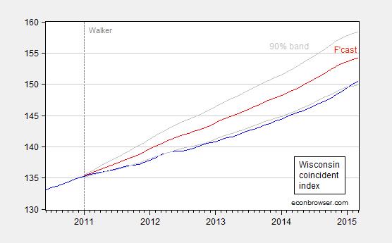
Figure 1: Coincident index for Wisconsin (blue), forecast (red), and 90% confidence band (gray). For forecast, see text. Source: Philadelphia Fed and author’s calculations.
This outcome suggests that Wisconsin has been underperforming since 2011M01 relative to a counterfactual based on historical correlations in place over the 1990-2010 period. As of March 2015, actual activity is 2.4% (log terms) below what it should be.
I would be somewhat wary of putting too much weight on the surge in activity registered in the last few months which puts the actual within the 90% band. That’s because the last six months of data do not incorporate directly the Quarterly Census of Employment and Wages (QCEW) data that the Walker Administration has touted as very precise.
The specification is very simple. One thing it omits is the differential impact arising from shocks, such as the dollar’s movements. Given the relatively heavy share of manufacturing, one would think Wisconsin should have disproportionately benefitted from the weak dollar until about six months ago. And yet, Wisconsin has been underperforming for most of the past four years, according to my estimates.
Currency Misalignment: A Reprise
As the Congress debates currency manipulation [1], it occurs to me useful to reprise my earlier primer on currency misalignment (first published in March 2010), where misalignment is one component of some definitions of currency manipulation.
Currency misalignment can be determined on the basis of the following criteria or models:
Relative purchasing power parity (PPP)
Absolute purchasing power parity
The “Penn Effect”
The behavioral equilibrium exchange rate (BEER) approach
The macroeconomic balance effect
The basic flows approach
An equilibrium approachI have discussed several of these approaches in the past [0] [1], but a review of the approaches bear repeating, if only because there so much confusion regarding what constitutes currency misalignment.
Relative PPP
Relative PPP can be expressed as:
s = μ + p – p*
where lowercase letters denote log values, s is the price of foreign currency, p is the price index, and * denotes a foreign variable, and μ is a constant arising from the fact that p and p* are indices.
Using this criteria, a currency is misaligned if s deviates from the μ + p – p*. One difficulty is that μ has to be estimated. Typically, estimates of μ can vary drastically with sample period. Oftentimes, there is a time trend in q ( which equals s – μ – p + p*), which means that relative PPP cannot literally hold. Then, one might have to allow for a (ad hoc) time trend, which itself has to be estimated. In Chinn (Emerging Markets Review, 2000), I apply this approach to the East Asian currencies, pre-crisis.
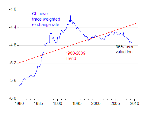
In the case of China, presented below is the (log) trade weighted real effective exchange rate of China, (q), using the latest data spliced to an older series incorporating the swap rates pre-1994 per discussion in Chinn, Dooley, Shrestha (1999). Upwards denotes depreciation.
Figure 1: Log trade weighted real effective exchange rate, CPI deflated (blue); and linear trend estimated 1980-2009. Source:
IMF, International Financial Statistics, various issues; and author’s calculations.Using a simple linear trend, one obtains the counter-intuitive result that the RMB is overvalued. This suggests caution.
For more on effective exchange rates, see this survey paper.
Absolute PPP
Given the drawback of relative PPP, it seems like one could get around the problem of estimating μ by using actual prices of identical bundles of goods across countries, rather than price indices.
s = p – p* or equivalently p = s + p*
where lowercase letters denote log values, s is the price of foreign currency, p is the price level, and * denotes a foreign variable.
The problem is that prices of identical bundles of goods are not collected. One thing that comes close is the Big Mac — hence the MacParity measure. But the problem is that prices of Big Macs (when expressed in a common currency) are systematically lower in lower income countries, and systematically higher in higher income countries. This is true when using Big Mac prices [2] [latest estimate] Parsley and Wei (2005) and when using the “price levels” in the Penn World Tables. This is so much a stylized fact that it is sometimes called “The Penn Effect”.
The Penn Effect
Instead of viewing the “Penn Effect” as a problem, one can exploit this stylized fact. Define r ≡ p – s – p*. Then one can exploit the relationship:
r = α 0 + α 1 (y-n)
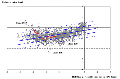
Where y-n is log per capita income. In Cheung et al. (2008), we exploited this relationship (following Frankel (2005), in a panel regression setting. In that study, we found an approximate 40% RMB misalignment (in log terms). Using updated data, namely the 2008 vintage of the World Development Indicators, we found something closer to 10% misalignment. The scatterplot of data, the regression line, and the RMB’s path are depicted in Figure 2, originally discussed in this post (paper here).
Figure 2: Price level-per capita income in PPP terms relationship (blue line), +/- 1 std error band (long dashed lines), +/- 2 std error band (short dashed lines); OLS estimates for 1980-2006 period. Source: authors’ calculations.The Behavioral Equilibrium Exchange Rate (and related) Approach
Yet another approach is to use some theoretically and empirically motivated equations to estimate an exchange rate relationship. The variables can include productivity variables, or relative price of nontradables, or fiscal variables like the deficit, or interest differentials. Typically the variables can be motivated by some model of the exchange rate; which ones are included are motivated by goodness of fit. Goldman Sachs and JP Morgan had models of this sort. Zhang (China Economic Review, 2001) and Wang (2004) in Prasad (IMF, 2004) are some models in the public domain (see this 2007 Teasury working paper). Chinn (2000) implements a specific type of BEER (or productivity based) model for East Asian exchange rates.
The Macroeconomic Balance approach
The Macroeconomic Balance approach takes the perspective from saving and investment rates (see Peter Isard’s survey). Recall:
CA ≡ (T-G) + (S-I)
In other words, the current account is, by an accounting identity, equal to the budget balance and the private saving-investment gap. This is a tautology, unless one imposes some structure and causality. One can do this by taking the budget balance as exogenous (or use the cyclically adjusted budget balance), and then include the determinants of investment and saving. Then one obtains “norms” for the current account. Chinn and Prasad (2003) is one example of this approach.
Then, using trade elasticities, one can back out the real exchange rate that would yield that current account. If that exchange rate is stronger than the actually observed exchange, then that currency would be considered “undervalued”.
The closely-related Fundamental Equilibrium Exchange Rate (FEER) determines the current account norm on a more judgmental basis (in other words, the current account norm is not estimated econometrically, just imposed per the analysts priors).
[update 3/24, 8am Pacific] I should have mentioned Paul Krugman’s take on this issue. My interpretation is that it fits into the Macroeconomic Balance approach, except he sidesteps the step of comparing the counterfactual exchange rate that hits the CA norm against the actual, and just compares the CA against the CA norm. In Chinn and Ito (2008) (Figure 4), we found — at least in the 2001-04 period — that China’s CA was verging on being statistically significantly different from the norm. My guess is that the CA would be significantly different from the CA norm in the 2004-08 period.
The Basic Balance approach
One could take a more ad hoc approach, asking what is the “normal” level of stable inflows — for instance looking at the sum of the current account and foreign direct investment, and see whether that value “made sense”. Or one could look at the sum of the current account and private capital inflows. If either of the flows are “too large”, then the currency would be considered undervalued (since a stronger currency would imply a smaller current account balance).
It is interesting to make two observations. First, note the need for many non-model based judgments. To see this point, recall the balance of payments accounting definition:
CA + KA + ORT ≡ 0
Where CA is current account, KA is private capital inflows, and ORT is official reserves transactions (+ is a reduction in forex reserves).
Saying CA + KA is too big is the same, then, as saying ORT is too small, i.e., reserves are rising “too fast”. Morris Goldstein and Nick Lardy are among the most prominent exponents of this approach (see e.g., this this small volume).
Alternatively, running surpluses that are “too large” for “too long” will lead to foreign exchange reserves that are “too large”. Obviously, a lot of judgment is necessary here.
Second, one aspect of this judgment is that it is conditional on the constellation of all other macro policies, including monetary, fiscal and regulatory, in place. If the CA+KA is adjudged to be “too large”, one could say the exchange rate is “too weak”, but one could say with equal validity that the fiscal policy is “insufficiently expansionary”.
A (newer) Equilibrium View
The final approach would be to step back and think in terms of “equilibrium” exchange rates. One might argue that the exchange rate is undervalued if, in the absence of central bank intervention, the exchange rate would be stronger. Of course, this means that whenever any central bank pegs an exchange rate, then the exchange rate is definitionally misaligned. I suspect when people use this particular definition, it is usually conjoined with some sort of threshold. One problem in my mind with operationalizing this definition is figuring out what that the “threshold” is.
A more fundamental conception of what an “equilibrium” exchange rate is is laid out by my colleague Charles Engel. As noted in this post, the equilibrium exchange rate is the one that minimizes the distortion from sticky prices and other rigidities. That is not necessarily the exchange rate delivered by a free float, even in the absence of capital controls. Indeed, it might be best delivered by some type of monetary policy (see the paper).
This approach departs from the “equilibrium” approach embodied in the real models of the late Alan Stockman, as summarized here, in that those models assumed away nominal rigidities. With complete markets, the free floating exchange rate is almost irrelevant since the real rate will always adjust to the right levels.
Review and Summing Up
Two last observations. First, each of these approaches has advantages and disadvantages. PPP and variants are easy to implement, but are more akin to parity conditions, so it’s not clear over what horizon they apply to. The macroeconomic balance and FEER approaches are most appropriate to the medium term, and hence perhaps more relevant to policy questions. But they require more judgment on the parameters of the models. Moving to the basic balance approach, the time horizon is the shortest, and of perhaps most interest to policy analysts, and yet requires the greatest subjective judgment, since one needs to take a strong stand on what constitutes the appropriate values for critical variables. (There are also data considerations as well — the PPP criteria is most popular in part because of the limited data requirements.)
Second, in some ways, it’s not necessarily correct to think of these approaches as all inconsistent (in some instances they might be). Better to think that some approaches are more appropriate at one horizon versus another horizon. (This echoes Richard Cooper’s description of how elasticities, absorption and monetarist interpretations were all consistent over time, in thinking about the effects of devaluations.) That is why a finding that the RMB is only 10% in value below that predicted by the Penn Effect is not definitive when talking about misalignment in the short run (and it’s why, despite findings of a fairly small misalignment in Cheung et al. (2009), I think a revaluation of the RMB combined with expansionary fiscal policy, and altered regulatory policy, is called for in the context of an IS-LM-BP model. [3])
(Interesting aside: Fan Gang and Yiping Huang have cited Cheung et al. in favor of the no-undervaluation thesis. I thank them for their citation (who doesn’t like publicity?!), but I still think that a finding of small misalignment along one dimension is not conclusive. Other criteria do suggest undervaluation, although I do not think a RMB revaluation is in and of itself sufficient to remedy the imbalance (see Prasad (2010)). See the estimates of trade elasticities cited here.)
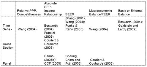
I summarize the typology of studies in this table (which is adapted from Cheung et al. (2006).
Table 1 (modified): from Cheung, Chinn and Fujii (2006)).For a volume on the topic of currency misalignment in developing countries, see Hinkle and Montiel (1999).
A recent survey of currency issues within the TPP debate by Fergusson, McMinimy, and Williams of the Congressional Research Service (March 2015) on pages 50-51. Some more recent discussion of currency misalignment here. PPP applied here.
A survey of TPP economic issues by Williams of the CRS (2013) here, by Petri and Plummer here.
May 13, 2015
Is Wisconsin Outpacing Other States?
How well has Wisconsin economically performed, as compared to its neighbor Minnesota, and to the US overall: here are six pictures of economic activity, employment, unemployment, real personal income, gross state product, and median household income, with which to make an assessment.
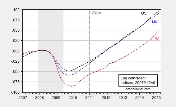
Figure 1: Log coincident indices for Minnesota (blue), Wisconsin (red), United States (black), normalized to 2007M12=0. NBER defined recession dates shaded gray. Source: Philadelphia Fed, NBER, and author’s calculations.
This is perhaps the most significant of the graphs, if one is interested in measures of overall economic activity. The Philadelphia Fed describes the index thusly:
The coincident indexes combine four state-level indicators to summarize current economic conditions in a single statistic. The four state-level variables in each coincident index are nonfarm payroll employment, average hours worked in manufacturing, the unemployment rate, and wage and salary disbursements deflated by the consumer price index (U.S. city average). The trend for each state’s index is set to the trend of its gross domestic product (GDP), so long-term growth in the state’s index matches long-term growth in its GDP.
The approach uses the Stock-Watson methodology for extracting a latent variable for each state economy. The specific method is the Kalman Filter. For additional technical details, see this working paper (published in REStat).
Hence, in order to get the most comprehensive assessment of overall economic activity at high (monthly) frequency, this seems the best indicator, subject to the caveat that this is (like GSP, employment, etc.) an estimate.
Note that Wisconsin economic activity fell more during the recession than the Nation as a whole, and Minnesota, its next door neighbor (which has conducted a much less fiscally contractionary policy). At the same time, Wisconsin has not experienced a measurably faster rate of growth than the Nation (or Minnesota). Since the US trough (2009M10), US growth has been 2.6% per annum (calculated as log differences), Wisconsin growth since Wisconsin trough (2009M12) has been 2.5%. The analogous figures since 2011M01 are 2.9% (US) and 2.6% (WI). Note that Minnesota, which did not experience as large a decline as Wisconsin, has grown 2.9% since 2011M01, and 2.7% since MN trough (2009M10).
Further note that as of 2009M12 (Wisconsin’s trough), Wisconsin was 3.8% lower than the National average (normalizing at 2007M12); that is Wisconsin fell by 3.6 percent more during the recession. As of 2015M03, it was 4.6% — that is Wisconsin has continued to fall behind the Nation. As is apparent from Figure 1, this characterization is true for Wisconsin relative to Minnesota as well.
Hence, the assertion that Wisconsin’s recession was substantially milder than the Nation’s as a whole is not validated using the coincident indicator (although there may very well be an indicator for which it is true).
Figure 2 depicts the evolution of nonfarm payroll employment.
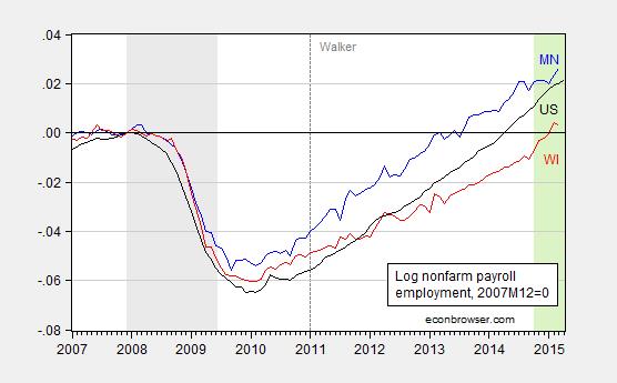
Figure 2: Log nonfarm payroll employment for Minnesota (blue), Wisconsin (red), United States (black), normalized to 2007M12=0. NBER defined recession dates shaded gray. Green shaded area pertains to CES data for which QCEW data is not available. Source: BLS, NBER, and author’s calculations.
Wisconsin employment falls a little less than the Nation’s (0.5% as of 2009M12), but grows much more slowly. Interestingly, Minnesota fell less than Wisconsin (0.8%), but Wisconsin employment has grown more slowly so that by March 2015, Wisconsin cumulative employment relative to Minnesota is 2.3% lower. In other words, in this case again, Minnesota experienced a smaller downturn and yet has faster employment growth.
One could argue that Wisconsin has experienced a slower trend employment growth for many years, predating 2011M01. In order to account for the counterfactual, I estimated a cointegrating relationship between US and WI employment over the pre-2011M01 period, and used out of sample forecasting to assess whether WI employment has been lower than that implied by historical correlations, with statistical significance (technically, an ex post historical simulation where I take the right hand side variable to be exogenous). The answer is yes; see this post.
Figure 3 depicts the evolution of unemployment rates.
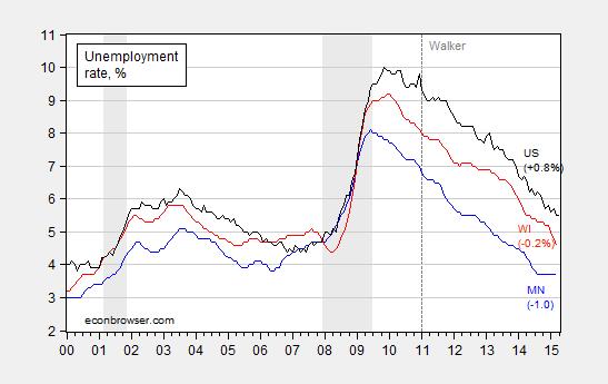
Figure 3: Unemployment rates for Minnesota (blue), Wisconsin (red), United States (black), in %. Numbers denote unemployment rates relative to 2007M12. NBER defined recession dates shaded gray. Source: BLS, NBER, and author’s calculations.
The assertion that Wisconsin’s unemployment rate has come down particularly fast is true over the past few months. However, Minnesota’s has come down more since the onset of the recession in 2007M12 (as has the Nation’s). It is also useful to recall that Wisconsin typically has a lower unemployment rate than the Nation’s by about 0.8-0.9 percentage points.
Turning to personal income (Figure 4), one sees a different pattern. Wisconsin experiences a smaller decrease in real income, and yet experiences slightly slower growth than the US and Minnesota, particularly since 2011Q1.
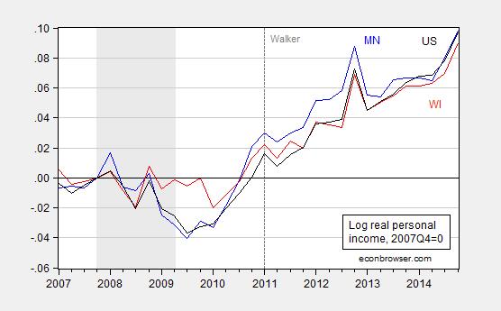
Figure 4: Log real personal income for Minnesota (blue), Wisconsin (red), United States (black), in Chained dollars, normalized to 2007Q4=0. Deflation using CPI-RS. NBER defined recession dates shaded gray. Source: BLS, NBER, and author’s calculations.
We do have a new experimental real GSP series with which to do comparisons of output at the state level. Unfortunately, these series extend only up to 2013Q4. In any case, Minnesota, Wisconsin and the US series are depicted in Figure 5 (normalized to 2007Q4).
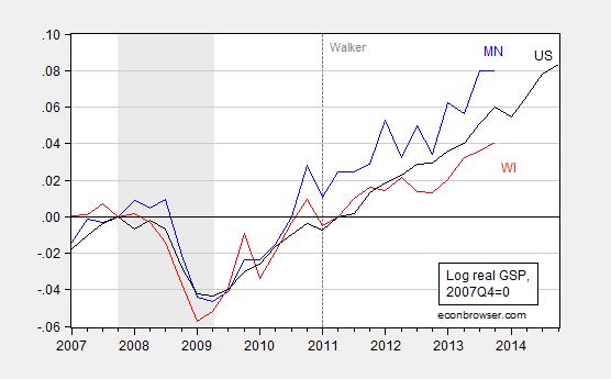
Figure 5: Log real Gross State Product (GSP) for Minnesota (blue), Wisconsin (red), United States (black), in Chained 2009 dollars, normalized to 2007Q4=0. NBER defined recession dates shaded gray. Source: BEA, NBER, and author’s calculations.
Since 2011Q1 to 2013Q4, US real output growth has exceeded that of Wisconsin by a cumulative 2% (log terms).
Finally, median household income has increased in Wisconsin, going into 2013. But before that (2011-2013), it was flat. In contrast, in Wisconsin’s neighbor Minnesota, median income jumped in 2011. While it decreased in 2013, the MN-WI gap was still 3500 2013$ larger than in 2010.
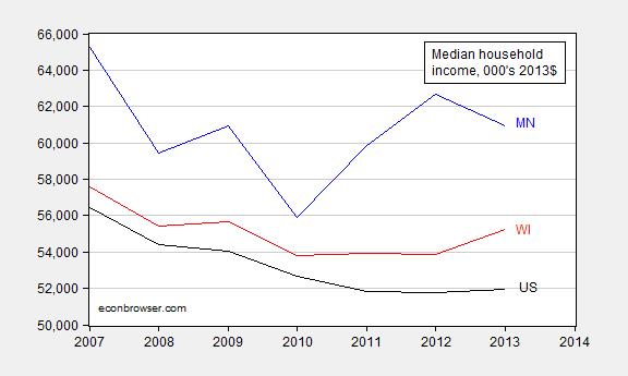
Figure 6: Log real household median income for Minnesota (blue), Wisconsin (red), United States (black), in Chained 2013 dollars, normalized to 2007Q4=0. NBER defined recession dates shaded gray. Source: FRED, NBER, and author’s calculations.
In these comparisons, I have only contrasted with Minnesota and the Nation as a whole. Comparisons with Wisconsin’s geographic neighbors can be found here.
May 11, 2015
Guest Contribution: “New Improved Trade Agreements”
Today we are fortunate to have a guest contribution written by Jeffrey Frankel, Harpel Professor of Capital Formation and Growth at Harvard University, and former Member of the Council of Economic Advisers, 1997-99. This post is an extended version of an earlier column at Project Syndicate.
Trade is now high on the agenda in Washington. President Obama is pushing hard for Congress to give him Trade Promotion Authority (TPA), once known as fast-track, which he intends to use to complete negotiations with 11 trading partners under the Trans Pacific Partnership. Without TPA, trading partners hold back from offering their best concessions to the president’s trade representative, fearing correctly that Congress would seek to take “another bite of the apple” when the White House brought the agreement to them for ratification. Other countries wised up to this trick 40 years ago. That is why the Congress has given every president since Richard Nixon fast-track authority, which allows only up-or-down approval of the final agreement.
Foreign Affairs magazine last month surveyed 24 experts (“experts”?), asking “Should Congress Pass Trade Promotion Authority?” In short, 21 of us said yes, 3 said no. It gives our names and short explanations.
In marketing the Trans Pacific Partnership (TPP), the President emphasizes some of the features that distinguish it from earlier free trade agreements such as NAFTA. They include commitments by Pacific countries on the environment and expansion of enforceable labor rights. They also include the geopolitical argument for the much-discussed “pivot to Asia.” (Detractors, for their part, focus on some new features as well, such as investor protection, which is said to benefit only big corporations.)
The White House political strategy is understandable. As with commercial products, the slogan “New and Improved!” sells. Previous trade agreements are not very popular. This is especially true of NAFTA. Furthermore, longstanding concerns about trade are probably now exacerbated by a deterioration of the trade balance this year.
President Obama’s argument is apparently, “Yes, the earlier agreements fell short in many ways. But we have learned from the mistakes and this one will fix them.” The truth, however, is that the previous agreements did benefit the US, as well as partners. The most straightforward argument for TPP is that similar economic benefits are likely to follow.
The economic arguments for the gains from trade of course go back to David Ricardo’s classic theory of comparative advantage. Each country benefits from producing and exporting what it is relatively best at, and importing what other countries are relatively better at making. Modern theories are more realistic, in allowing for imperfect competition, returns to scale, changing technology, and heterogeneity across firms; but they don’t change the bottom line that trade contributes to economic prosperity.
These standard theories are bolstered by lots of recent statistical studies.
Trade boosts productivity, by specialization in production, access to larger markets, learning about new products and new techniques through trade, and importing inputs to the manufacturing process.
Exporters on average pay higher wages than other companies, an estimated 18% higher in the case of US manufacturing.
The purchasing power of income is enhanced by the opportunity to consume imported goods that are available at lower prices and in greater variety than if households could only buy domestic goods. The cost savings are especially large in food, clothing, consumer electronics [and other manufactured goods], purchases that make up a higher proportion of middle class households’ income than of wealthy households. (Trade boosts the purchasing power of the median income American household by an estimated 29%.)
Trade debates in Washington have long been framed as arguments over whether a policy will raise or lower the number of jobs. This is unfortunate.
The jobs debate is first cousin to the old mercantilist language focusing on whether a policy will improve or worsen the trade balance. A “mercantilist” could be defined as one who believes that gains go only to the country that enjoys a higher trade surplus, mirrored by losses in the trading partner that runs a correspondingly higher trade deficit.
Even by the mercantilist sort of reasoning, one could make an American case for the ongoing trade negotiations. The US market is already rather open; such TPP participants as Vietnam, Malaysia, and Japan have higher tariff and non-tariff barriers against imports of some products that the US would like to be able to sell them than the US does against their goods. Liberalization would thus mean more of a reduction in barriers to US exports to Asia than Asian exports to the US. The same was true of NAFTA, as Mexican barriers to imports from the US had traditionally been much higher than American barriers to trade in the other direction.
But economic theory says that trade balances and employment levels are not determined by trade measures. They are, rather, determined by macroeconomic factors (national saving, investment, labor force participation, etc.). The gains from trade show up in the quality of jobs, as reflected in real wages, more than in the quantity of jobs.
Have these ivory-tower-sounding propositions held in practice? The late-1990s are a good illustration of the theory. The volume of trade increased rapidly, in part due to trade negotiations that put NAFTA into force in 1994 and the World Trade Organization (WTO) into force in 1995. For the United States, imports grew (even) more rapidly than exports: the trade deficit widened. Did this have a negative effect on output and employment? No. Real growth averaged 4.3% during 1996-2000; productivity increased at 2½ % per year and workers received their share of those gains: real compensation per hour rose 2.2% per year. The unemployment rate fell below 4.0% by the end of 2000, as low as it goes.
A stronger trade balance in the late 1990s would not have added to output growth or job creation, which were running at full throttle. Further increases in net export demand would only have been met by pulling workers away from the production of something else. That is precisely why the gains from trade took the form of bidding up real wages, rather than further increasing the number of jobs.
Admittedly it is harder to make the case for trade (particularly for unilateral trade liberalization) when unemployment is high and output is below potential, as it was in the aftermath of the big financial crisis and recession of 2007-09. Under such circumstances, there is a kernel of truth to mercantilist logic: trade surpluses contribute to GDP and employment, coming at the expense of the trade deficit countries. Of course if one country puts up import barriers, its trading partners are likely to retaliate with “beggar-thy-neighbor” policies of their own, which leaves everyone worse off. The Smoot-Hawley tariff of 1930, and retaliation and emulation by other countries, helped put the “great” in the Great Depression. Thus the case in favor of multilaterally agreed renunciation of protectionism is as strong in recessionary conditions as ever. In response to the 2008-09 global recession, for example, G20 leaders agreed to refrain from any new trade barriers. Contrary to many cynical predictions, President Obama and his counterparts successfully fulfilled this commitment, avoiding a repeat of the 1930s debacle. The record compares favorably even with the milder recessions of 1981 and 2001.
In any case, mercantilist logic is once again no longer relevant as of 2015. The American unemployment rate has fallen to 5.4 %, the same as it was 20 years ago, not quite full employment, but getting close. If output and employment were rising this year as rapidly as they did in 2014, the Federal Reserve would probably have felt the need to start raising interest rates as early as this June, to begin restoring normal monetary/financial conditions and to forestall overheating of the economy in coming years. As it is, the Fed will almost certainly delay raising interest rates as a result of the drag on the economy created by a slowdown in net exports. (There are two reasons to expect deterioration in the non-oil trade balance this year: slowed growth among our trading partners and the stronger dollar.) The Fed does not have to put a brake on the economy because the loss in net exports is doing it already.
If the US can negotiate the facilitation of auto exports to Malaysia, agricultural exports to Japan and service exports to Vietnam, it will show up by the bidding up of real wages more than by the creation of additional jobs. Thus the best reason to pass TPA and TPP is pretty much the same as it ever was: to help put real median incomes back on a rising trend.
This post written by Jeffrey Frankel.
When Will the Governor’s Promise of 250,000 New Private Sector Jobs Be Achieved?
Not within the next couple of years, according the Walker Administration’s Wisconsin Economic Outlook, released today.
Figure 1 depicts the latest data on private employment, along with the Economic Outlook forecast and the path implied by Governor Walker’s promise to create 250,000 new private sector jobs by the end of his first term (black line). Note that data through 2014M09 reflects incorporation of Quarterly Census of Employment and Wages data, which the Walker Administration used to tout as the most accurate depiction of the labor market. Data thereafter reflect survey data, based upon levels reported in the QCEW data through 2014M09.
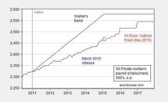
Figure 1: Wisconsin private nonfarm payroll employment (blue), Wisconsin Economic Outlook (May 2015) forecast (red), and the path promised by Governor Walker to achieve 250,000 by the end of his first term (black), set constant after 2015M01. Source: BLS (March release), Wisconsin Economic Outlook (May 2015), and author’s calculations.
Since the forecast horizon only extends through 2017, one cannot infer when the Administration believes the +250K target will be achieved.
In order to gain some additional insight on this question, I have estimated an ARIMA(1,1,2) on log private nonfarm employment over the available sample pertaining to Governor Walker (2011M01-2015M03). Such a specification accounts for 33 percent of the variation in the first log difference of monthly employment. Using this equation, I forecasted out employment. The forecast, and the accompanying ± 2 standard error band is shown in Figure 2.
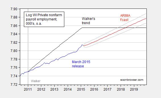
Figure 2: Wisconsin log private nonfarm payroll employment (blue), ARIMA(1,1,2) forecast (red) and accompanying ± 2 standard error bands (gray), and the path promised by Governor Walker to achieve 250,000 by the end of his first term (black), set constant after 2015M01. Source: BLS (March release), and author’s calculations.
The forecast, which is slightly more optimistic than the Wisconsin Economic Outlook‘s, indicates that the +250K target will be achieved by 2018M06. Of course, given model uncertainty, the date could be as early as 2017M10, or as late as 2019M02.
An additional caution: I have used the data up to 2015M03 to estimate the ARIMA; as I noted previously, the QCEW data used in the January benchmark revisions drove a big downward revision in the survey-based data up to 2014M09. Should the same occur in next January’s benchmark revision, then holding all else constant, the forecasts I have plotted in Figure 2 will be overly optimistic.
More on Wisconsin’s lagging performance relative to the Nation, here and here.
Since tax revenues have failed to surge as the Republicans had hoped, it is likely further spending cuts will be implemented. As I have observed in the past, spending cuts are likely to be contractionary in the short run, making it even less likely that employment will continue to grow rapidly. On the budget situation, Marley and Stein of the Milwaukee Journal Sentinel write:
Only one year ago, the state was looking at a $1 billion budget surplus. Republicans used that surplus to add to a series of property and income tax cuts that they have passed since 2011 and are now considering the cuts to state programs to keep the budget balanced.
Overall, the state is left where budget watchers had long expected: in a challenging spot that is worse than the 2013-’15 budget but not as bad as Walker’s first budget in 2011. The difference is that Wisconsin now is having to cut key parts of the state budget amid a slow economic expansion, rather than four years ago when the state was doing so as it came out of a deep recession.
May 10, 2015
Energy prices and consumer spending
Among the disappointments in the 2015:Q1 GDP figures was weak consumption growth, which was a little surprising given the extra cash most consumers have on hand as a result of lower energy prices. I wanted to take a look at how the recent consumer behavior compares with what we’ve seen historically.
The graph below plots the price of energy goods and services relative to the overall price consumers pay for other purchases. Real energy prices have fallen about 20% from where they had been last summer.

Figure 1. Ratio of implicit price deflator for energy goods and services to overall PCE deflator, monthly 1959:M1 to 2015:M3.
Many consumers buy the same number of gallons of gasoline each week regardless of whether the price goes up or down. Such behavior would mean that someone who used to spend 5% of their budget on energy would only need to spend about 4% if energy prices fell 20%. And indeed we see in the data that purchases of energy goods and services now account for only 4.4% of total consumer spending, down from 5.6% a year ago.

Figure 2. Consumer purchases of energy goods and services as a percentage of total consumption spending, monthly 1959:M1 to 2015:M3.
In 2007, Paul Edelstein and Lutz Kilian studied the relation between energy prices and consumer spending using simple forecasting relations known as a vector autoregression. They summarized the effects on consumer budgets of energy prices by multiplying the monthly percent change in the relative price plotted in Figure 1 by the energy share in Figure 2– call this variable xt. Thus for example if the energy share is 5% and the price increases 20%, xt would equal 1, corresponding to the 1% loss of spending power described above. They then related xt to the monthly growth rate of real consumption spending. They used data from 1970:M7 to 2006:M7 to estimate a pair of forecasting equations to predict xt and real consumption growth based on observed values of the two variables over the previous 6 months. The black line in the graph below shows how an n-month ahead forecast of real consumption in that system would change when xt goes up by 1, a graph that economists describe as an “impulse-response function”. The green lines indicate 95% confidence intervals. Historically, an energy price increase that reduces consumer spending power by 1% would on average be followed within a few months by a 1% decline in real consumption spending and by closer to a 2% decline by the end of 6 months. One interpretation of why the latter effect is bigger than 1% is that it could reflect second-round macroeconomic multiplier effects of the lower consumer spending.
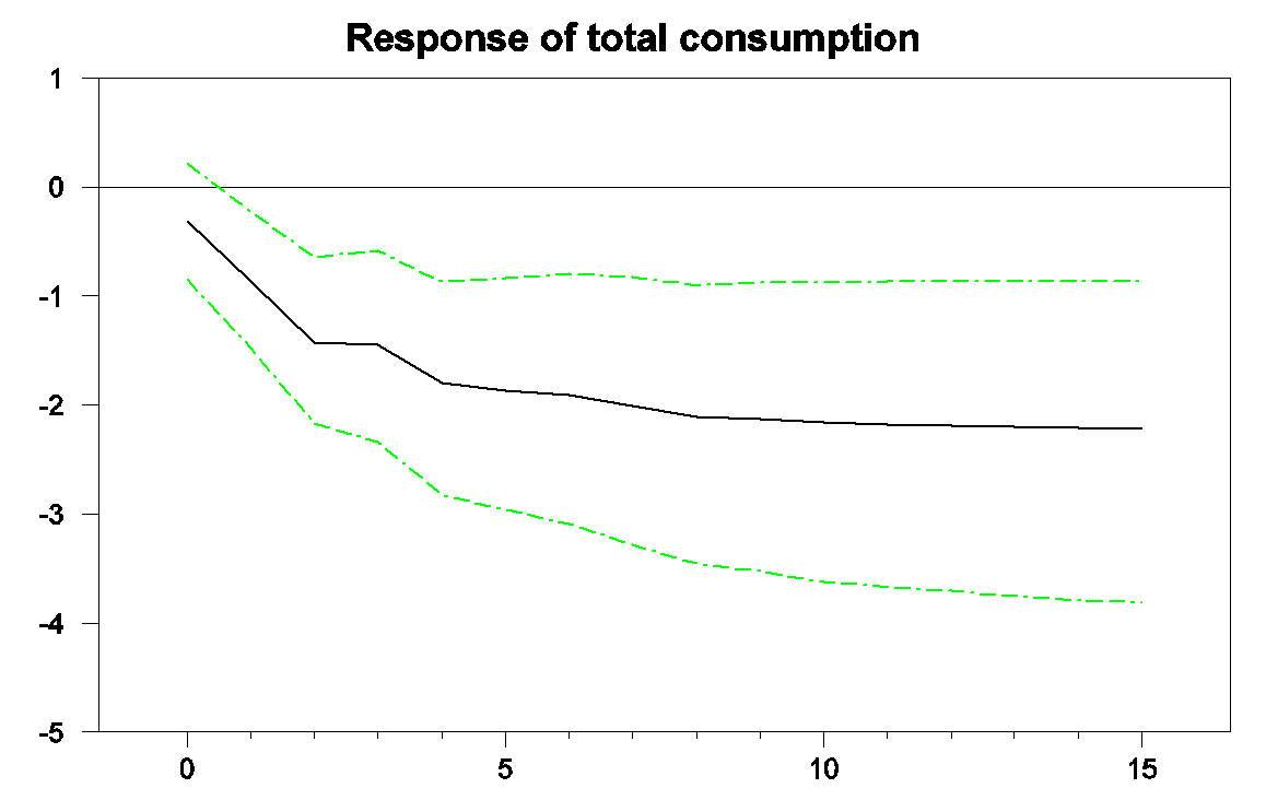
Horizontal axis: months after an increase in energy prices that would lower consumer spending power by 1% at time 0. Vertical axis: predicted percent change in real consumption spending between month 0 and month n. Source: based on Hamilton’s (2009) replication of Edelstein and Kilian (2007).
In a paper published in the Brookings Papers on Economic Activity in 2009, I looked at how much of the first-year’s downturn in consumption spending during the Great Recession could be accounted for by the sharp spike in energy prices that occurred at the time. The black line in the graph below plots real consumption spending between September 2006 and September 2008. It is measured as 100 times the natural log of real consumption, so that a one-unit increase on the vertical axis corresponds to about a 1% increase in real consumption spending. The trajectory of the black line shows the drop in consumption spending that preceded the Lehman bankruptcy in September of 2008.

Black: 100 times the natural log of real consumption spending, 2006:M9 to 2008:M9, normalized at 100 for 2007:M9. Blue: forecast from the Edelstein and Kilian vector autoregression using only data as of 2007:M8. Green: forecast from the vector autoregression conditioning on observed energy prices over 2007:M9 to 2008:M8. Source: Hamilton (2009).
The blue line shows the predicted path for consumption based only on consumption and energy data available in September of 2007, while the green line shows the path predicted given the big increase in energy prices between September 2007 and July of 2008. The graph indicates that about half of the slowdown in consumption growth during the first three quarters of the Great Recession could be attributed to energy prices.
I was curious to update those calculations to take a look at the effects of the recent plunge in energy prices. I first re-estimated the Edelstein-Kilian vector autoregression using data from 1970:M7 through 2014:M7 and used the model to describe consumption spending since then. The black line in the graph below again shows the actual level of real consumption spending, this time for the period September 2013 through March of 2015. The blue line shows the forecast using data only available through July of 2014, before the big drop in energy prices. We would have predicted about a 2% increase in real consumption spending since July if there had been no drop in energy prices, compared with an actual increase in real consumption of 2.2%.
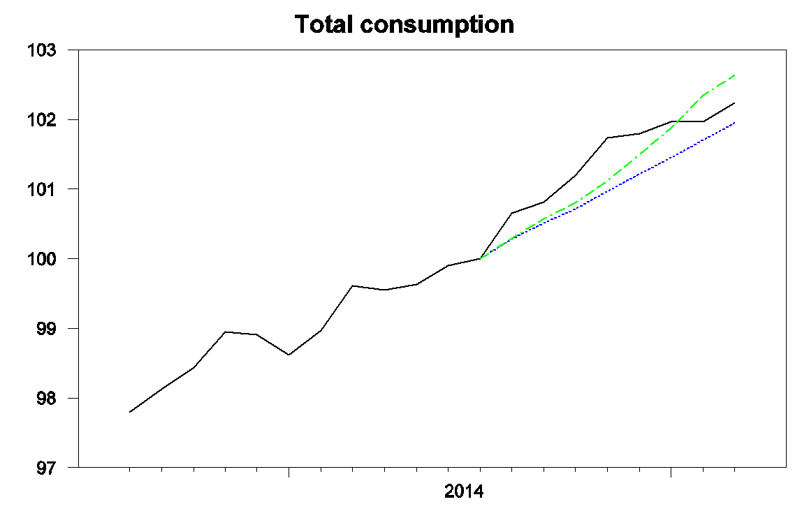
Black: 100 times the natural log of real consumption spending, 2013:M9 to 2015:M3, normalized at 100 for 2014:M7. Blue: forecast from an updated Edelstein and Kilian vector autoregression using only data as of 2014:M7. Green: forecast from the vector autoregression conditioning on observed energy prices over 2014:M8 to 2015:M3.
As before the green line indicates what we would have expected to see happen to consumption spending given the big drop in energy prices. Initially consumption was higher than predicted, with big gains in consumption spending coming before much of the decline in energy prices had actually reached consumers. But consumption since November has grown at a slower rate than would have been predicted even if there had been no drop in energy prices. Based on the historical relation between energy prices and consumer spending, we would have expected to see consumption today about 2.6% above where it had been in August rather than the observed 2.2% increase.
What’s different this time? Of course energy prices are just one of many factors influencing consumption spending and the differences highlighted above are modest. But the Wall Street Journal last week reported on a survey by credit-card issuer Visa that 70% of American consumers expect gasoline prices to go back up. This time consumers don’t trust the windfall to stay in their wallets, and so haven’t been spending the extra cash as freely as in the past.
Whatever the explanation, the facts seem to be that, unlike what we usually observed historically, consumers have been using much of the gains from lower energy prices to bolster their saving rather than using it to increase spending on other goods and services.
May 8, 2015
April Employment Situation: Revisions, Energy Extraction, Manufacturing
The April Employment release confirmed continued growth in total and private employment. My observations: some modest downward revisions, and some sectoral trends diverge.
Figure 1 depicts the estimates by vintages for the past five releases. In general, the revisions are downward.
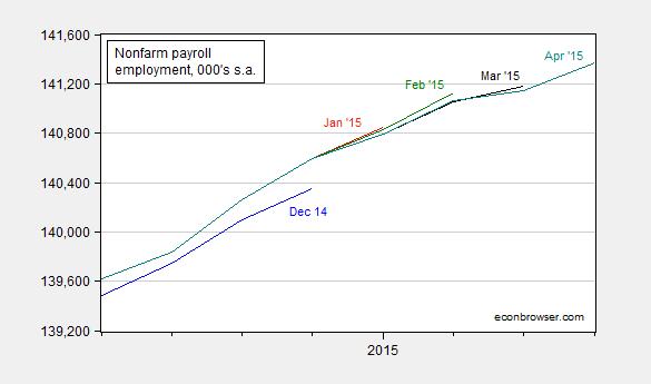
Figure 1: Nonfarm payroll employment, 000’s, seasonally adjusted, from December 2014 release (blue), January 2015 (red), February 2015 (green), March 2015 (black), and April 2015 (teal). Source: BLS various releases via FRED.
Next, it’s of interest to examine the trends in two sectors that have faced headwinds: oil and gas extraction and manufacturing. The former has definitely declined, but back to levels seen in March 2014. (Obviously, this series does not include effects on ancillary activities, including construction.). The latter has flattened out.
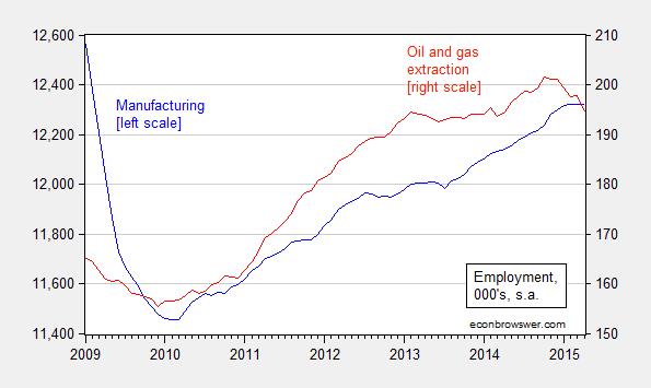
Figure 2: Employment in manufacturing (blue, left scale), and in oil and gas extraction (red, right scale). Source: BLS April release via FRED.
Since employment in manufacturing exhibits an overall downward trend over time due to above-economy-wide average productivity growth, it’s useful to compare to manufacturing production. Figure 3 confirms that output has also flattened out, likely due in important part to the effect of the dollar’s appreciation (see this post).
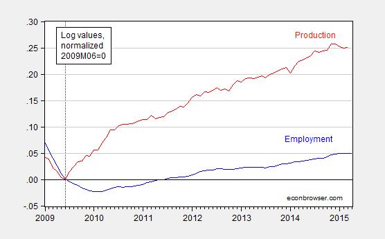
Figure 3: Log manufacturing employment (blue) and log manufacturing production (red), both seasonally adjusted, and normalized to 2009M06=0. Source: BLS April release and Federal Reserve, both via FRED, and author’s calculations.
Additional commentary from Calculated Risk, Davidson at Real Time Economics/WSJ, and Stone/CBPP.
Menzie David Chinn's Blog


