
Economic Performance under Various Presidential Administrations
Lest people forget what happened in times past.
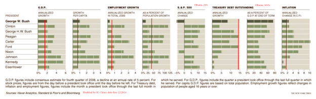
Chart from Floyd Norris, “Economic Setbacks That Define the Bush Years,” NYT, 24 January 2009, updated through 12/2014. Data for debt through 2014Q3. Red lines denote performance under Obama, through 2014Q4.
The original version of this graph was originally included in this post.
Since the graph assumed -5% growth in 2008Q4 (SAAR), rather than the actual -8% realized, the G.W. Bush era average growth rates should be slightly smaller than graphed.
Notice that a couple of series were off the charts, at least in the scales provided: the SP500 has risen by 24% annually on average over the last six years. Gross debt to GDP is 101% as of 2014Q3. Note that Federal debt held by the public as a share of GDP is 72.6%, down from a peak of 74% in 2014Q1.
Average growth and average per capita growth tend to be higher in Democratic administrations. Alan Blinder and Mark W. Watson investigate why, in this paper. The authors conclude:
It seems we must look instead to several variables that are mostly “good luck.” Specifically, Democratic presidents have experienced, on average, better oil shocks than Republicans, a better legacy of (utilization-adjusted) productivity shocks, and more optimistic consumer expectations (as measured by the Michigan ICE).
One question that occurs to me: Why are economic actors more confident during Democratic administrations?


Menzie David Chinn's Blog


