
Menzie David Chinn's Blog, page 47
December 8, 2014
“Asia and Global Production Networks—Implications for Trade, Incomes and Economic Vulnerability”
That’s the title of a book edited by Benno Ferrarini (ADB) and David Hummels (Purdue).

From the Asian Development Bank’s website
Bringing to bear an array of the latest methods and data to study global value chains, the publication assesses the evolution of global value chains at the firm level, and how this affects competitiveness in Asia.
The publication has two broad themes. The first is national economies’ heightened exposure to adverse shocks (natural disasters, political disputes, recessions) elsewhere in the world as a result of greater integration and interdependence. The second theme is focused on the evolution of global value chains at the firm level and how this will affect competitiveness in Asia. It also traces the past and future development of production sharing in Asia.
Here is the link to the publisher, while a sample is here.
Contents:
Foreword
Asia and Global Production Networks—Implications for Trade, Incomes and Economic Vulnerability, Benno Ferrarini and David Hummels
Developing a GTAP-Based Multi-Region, Input-Output Framework for Supply Chain Analysis, Terrie L. Walmsley, Thomas Hertel, and David Hummels
The Vulnerability of the Asian Supply Chain to Localized Disasters, Thomas Hertel, David Hummels and Terrie L. Walmsley
Global Supply Chains and Natural Disasters: Implications for International Trade, Laura Puzzello and Paul Raschky
Vertical Specialization, Tariff Shirking and Trade, Alyson C. Ma and Ari Van Assche
Changes in the Production Stage Position of People’s Republic of China Trade, Deborah Swenson
External Rebalancing, Structural Adjustment, and Real Exchange Rates in Developing Asia, Andrei Levchenko and Jing Zhang
Global Supply Chains and Macroeconomic Relationships in Asia, Menzie Chinn (working paper version here)
Mapping Global Value Chains and Measuring Trade in Tasks, Hubert Escaith
The Development and Future of Factory Asia, Richard Baldwin and Rikard Forslid


December 7, 2014
New estimates of the effects of the minimum wage
A large literature has examined the effects on employment of raising the minimum wage, with different researchers arriving at conflicting conclusions. The core reason that economists can’t answer questions like this better is that we usually can’t run controlled experiments. There is always some reason that the legislators chose to raise the minimum wage, often related to prevailing economic conditions. We can never be sure if changes in employment that followed the legislation were the result of those motivating conditions or the result of the legislation itself. For example, if Congress only raises the minimum wage when the economy is on the rebound and all wages are about to rise anyway, we’d usually observe a rise in employment following a hike in the minimum wage that is not caused by the legislation itself. UCSD Ph.D. candidate Michael Wither and his adviser Professor Jeffrey Clemens have some interesting new research that sheds some more light on this question.
Clemens and Wither study the effects of a series of hikes in the federal minimum wage signed into law in May 2007. The first of these raised the minimum rage from $5.15 to $5.85 effective July 2007, the second from $5.85 to $6.55 effective July 2008, and the third from $6.55 to $7.25 in July 2009. They note that such legislation would be expected to affect some states more than others, since many states already had a state-mandated minimum wage that was higher than the federal. They therefore chose to compare two groups of states, the first of which had a state-mandated minimum wage of $6.55 or higher as of January 2008, with all other states included in the second group. The hope is that this gives us a kind of controlled experient, with the federal legislation effectively raising the minimum wage for some states but not others.
The hike in the federal minimum wage should also matter more for some workers than others. To allow for the latter possibility, Clemens and Wither considered two different groups of workers. The first group had an average wage in the 12 months leading up to July 2009 that was below $7.50, while the second group had an average wage over this period between $7.50 and $10.00. We would expect the legislation to matter more for the first group than for the second. The quasi-experiment is thus to compare the change in wages between low skill and slightly higher skill individuals between states that were affected by the federal legislation and those that were not.
The upper left panel of the figure below summarizes the experience for workers in the first group (an average wage over August 2008 to July 2009 that was below $7.50). The dashed line follows individuals in states that already had a state minimum wage above $6.55 as of January 2008, while the solid line tracks people in states where the raise in the federal minimum wage would have been predicted to have a binding effect. The heights of the lines indicate the fraction of individuals in this group who were employed and earned a wage during the indicated month that was between $5.15 and $7.25. Prior to the hike in the federal minimum wage, this fraction was about 20% in the first group of states and about 40% in the second. After the final hike in the minimum wage, the fraction was about the same for both groups of states. The legislation thus had its intended effects of significantly raising the wage for low-wage individuals in states that did not already have a higher minimum wage.
The upper right panel follows individuals whose average wage over August 2008 to July 2009 was between $7.50 and $10.00, reporting the fraction within that group that earned between $5.15 and $7.25 during the indicated month. These are individuals who at some time before the final minimum wage hike had a much better paying job, but nevertheless took a low-paying job during the particular indicated month. Of course these numbers are much smaller than for the upper left panel. But it was still a little more common for the slightly higher skilled individuals in the low-minimum-wage states to take a job paying below $7.50 prior to the final hike in the federal minimum wage, with this small difference between states again disappearing after the final federal hike.
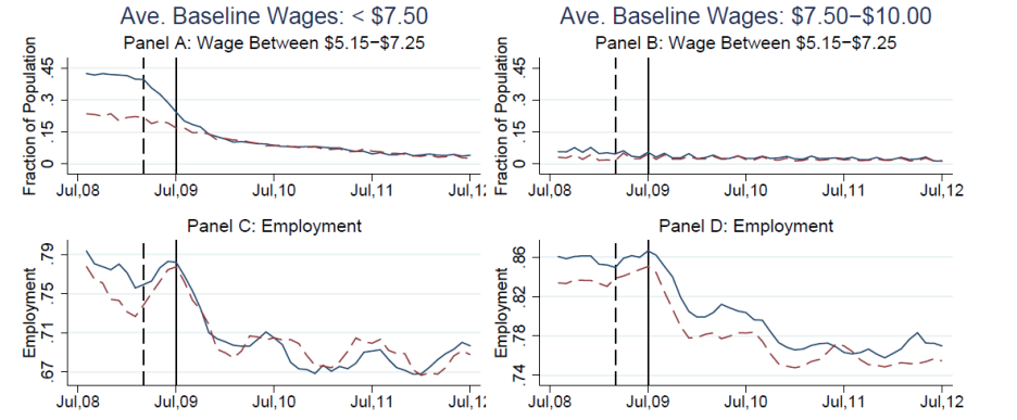
Left column: individuals whose average wage between August 2008 and July 2009 was less than $7.50. Right column: individuals whose average wage was between $7.50 and $10.00. Dashed lines: states whose minimum wage as of January 2008 was $6.55 or higher. Solid lines: other states. Top row: fraction of individuals within the indicated category who earned a wage during the indicated month that was between $5.15 and $7.25. Bottom row: fraction of individuals within the indicated category who were employed in the indicated month. Source: Clemens and Wither (2014).
The second row of the figure summarizes the fraction of each group that were employed in each of the indicated months. Low-wage individuals were more likely to be employed in any given month in the low-minimum-wage states before the rise in the federal minimum wage, but this difference disappeared after the final hike in the federal minimum wage. By contrast, one doesn’t see much difference in the employment experience of slightly higher-wage individuals across the two groups of states as the federal minimum wage changes.
Clemens and Wither examined these differences using a number of statistical approaches. The figure below focuses on the group of low-wage individuals, that is, people whose average earnings over August 2008 to July 2009 was below $7.50. The green x’s come from a regression that tried to predict whether an individual in that group would have earned a wage between $5.15 and $7.25 in any given month. The regression includes state fixed effects (the average experience of people in each state may be different), time fixed effects (the average national experience might be different in each month), individual fixed effects (the average experience of individual i might be different), a measure of house prices in state s in month t, and the possibility of a different average experience for each month in states that had a lower state minimum wage in January 2008 compared to others. The green x’s plot the values for the last group of coefficients for each month, and again show the expected result– the hike in the federal minimum wage successfully lowered the fraction of low-skilled workers who earned a wage below $7.50, as measured by the observed difference between states affected by the federal minimum wage hike and those that were not.
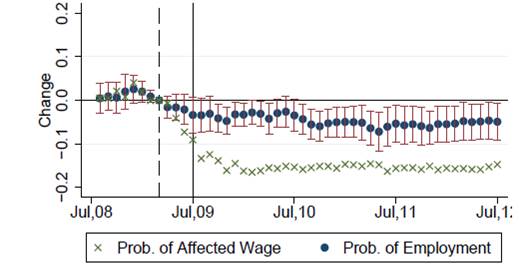
Dynamic estimates of the effects of minimum wage on low-skilled workers. Green x’s denote difference in probability of having a low-wage job between states with low minimum wages and those with high minimum wages. Blue dots indicate difference in probability of being employed between states with low minimum wages and those with high minimum wages, with accompanying 95% confidence intervals. Source: Clemens and Wither (2014).
The blue dots represent the results from a comparable regression to predict whether one of these low-skill individuals had a job. Clemens and Wither found that the federal minimum wage hike resulted in about a 6% decrease in the probability that low-wage individuals would have a job based on this comparison of states in which the minimum wage hike would have been binding and those for which it would not.
The hike in the minimum wage thus appears to have raised the wage for low-skilled workers but made it harder for them to find jobs. Clemens and Wither conclude:
Over the late 2000s, the average effective minimum wage rose by 30 percent across the United States. We estimate that these minimum wage increases reduced the national employment-to-population ratio by 0.7 percentage point.
December 5, 2014
And in Russia
Government borrowing costs are spiking.

Source: FT.
From FastFT:
The Russian central bank’s intervention has bolstered the rouble today, but the country’s government bonds are tumbling.
The 10-year Russian local government bond yield has rocketed 60 basis points to 11.76 per cent, the highest since 2009, as investors dump their holdings en masse.
The dollar denominated 10-year bond yield rose 7 bp to over 6 per cent.
The rouble is the worst performing major currency in the world today, and has only been hauled off its record low by a series of central bank interventions in recent days. The latest data indicate that it spent $1.9bn on December 3 to buttress the currency.
Investors are still dumping their Russian bond holdings, however, as fears grow over the financial and economic impact of the sliding oil price and of western sanctions over Moscow’s support for Ukrainian separatists.
How Come I Don’t Still Hear about the “Worst Recovery Ever”?
Just wondering — where is Ed Lazear when you need him?
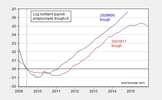
Figure 1: Log nonfarm payroll employment normalized on 2009M06 trough (blue), and on 2001M11 trough (red). NBER defined troughs. Source: BLS via FRED, NBER, and author’s calculations.
Normalizing on beginning of administrations yields this figure.
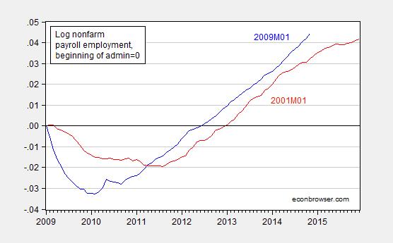
Figure 2: Log nonfarm payroll employment normalized on 2009M01 beginning of Obama administration (blue), and on 2001M01 G.W. Bush administration (red). Source: BLS via FRED and author’s calculations.
Accelerated Employment Growth, Little Inflationary Pressure
Nonfarm payroll employment clocks in substantially above consensus (321,000 vs Bloomberg: mean 230,000, range 140,000 to 275,000), solidifying trend growth. Previous months’ estimates revised upward. Wages continue to rise, but labor costs in productivity adjusted terms are stable.
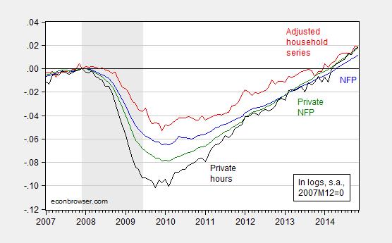
Figure 1: Log nonfarm payroll employment as estimated by the BLS in the establishment survey (blue), and as estimated by the BLS in the household survey, adjusted to conform to the NFP concept (red), and private nonfarm payroll employment as estimated by the BLS in the establishment survey (green), and index of average weekly hours for production and nonsupervisory workers as estimated by the BLS in the establishment survey (black), all seasonally adjusted by the BLS, normalized by the author to 2007M12=0. Recession dates as estimated and defined by the NBER Business Cycle Dating Committee shaded gray. Source: BLS via FRED, BLS, NBER, and author’s calculations.

Figure 2: Nonfarm payroll employment as estimated by the BLS in the establishment survey November release (blue), October (red), September (green), August (black), and July (teal). Source: BLS via FRED.

Figure 3: Log average hourly earnings for production and nonsupervisory employees, as estimated by the BLS in the establishment survey November release, and log CPI-all (red), both normalized to 2009M06=0. Recession dates as estimated and defined by the NBER Business Cycle Dating Committee shaded gray. Source: BLS via FRED, NBER and author’s calculations.
While hourly pay appears to be rising faster than the CPI-all (including energy and food), it’s important to recall that inflationary pressures from the labor sector will only manifest in overall price inflation only if (i) unit labor costs also increase, and/or (ii) inflationary expectations become unanchored (of which there is little evidence thus far). Figure 4, derived from the costs and productivity release (revision released a couple days ago) indicates little upward pressure — see the green line below.
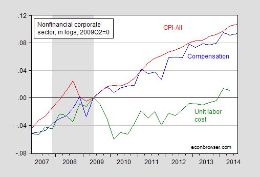
Figure 4: Log estimated compensation for nonfinancial corporations (blue), estimated CPI-all, quarterly average of monthly data (red), and estimated unit labor cost index for nonfinancial corporations (green), all normalized to 2009Q2=0. Recession dates as estimated and defined by the NBER Business Cycle Dating Committee shaded gray. Source: BLS, and BEA via FRED, NBER, and author’s calculations.
Note that unit labor costs are now only 1.1% higher than the previous peak in 2009Q2 (in log terms). I mention this because of the comments by Joint Economic Committee Chair Brady (R) on the employment release:
“This month’s report is good news for American workers,” Brady said. “As the job market improves, the Federal Reserve must begin to normalize monetary policy.”
“In the 1970s, Washington policymakers relied on the Fed’s easy money to compensate for anti-growth tax and regulatory policies. The result was double-digit inflation,” Brady said.
The Chair makes no reference to inflationary expectations, trends in realized inflation, and the trajectory of energy prices (which differ quite markedly from those in the 1970’s). But then, Chairman Brady has a penchant for warning about inflation when none is in sight [1], [2].
See discussion by Furman/CEA, Stone/CBPP, McBride/CR (1), McBride/CR (2), Portlock/WSJ RTE, Zumbrun/WSJ RTE.
December 3, 2014
Keynesian Cassandras? The Sequester Re-Assessed
Tyler Cowen’s anti-Keynesian manifesto has been ably discussed by Professor Simon Wren-Lewis at Mainly Macro. I thought what merited additional attention is Professor Cowen’s first assertion:
1. Keynesians predicted disaster following the American fiscal sequester, and the pace of the recovery accelerated.
I don’t think of myself as a Keynesian (the material I teach in my courses are what have been termed the (old) neoclassical synthesis, i.e., Keynesian short run plus Classical long run — and some New Keynesian), but I thought it useful to take a look at what I wrote about the impact of the sequester. On February 19, 2013, I wrote, citing a Macroeconomic Advisers assessment, the following:
…we now put the odds of a sequestration at close to 50%, and rising.
Our baseline forecast, which shows GDP growth of 2.6% in 2013 and 3.3% in 2014, does not include the sequestration.
The sequestration would reduce our forecast of growth during 2013 by 0.6 percentage point (to 2.0%) but then, assuming investors expect the Federal Open Market Committee (FOMC) to delay raising the federal funds rate, boost growth by 0.1 percentage point (to 3.4%) in 2014.
By the end of 2014, the sequestration would cost roughly 700,000 jobs (including reductions in armed forces), pushing the civilian unemployment rate up ¼ percentage point, to 7.4%. The higher unemployment would linger for several years.
The macroeconomic impact of the sequestration is not catastrophic. Nevertheless, the indiscriminate fiscal restraint would come on the heels of tax increases in the first quarter that total nearly $200 billion, with the economy still struggling to overcome the legacy of the Great Recession, and when the FOMC is constrained in its ability to offset the additional fiscal drag with a more accommodative monetary policy. …
Here is a graphical depiction of Macro Advisers’ estimates of the impact of the sequester.
Source: Macroeconomic Advisers (2/20/2013).
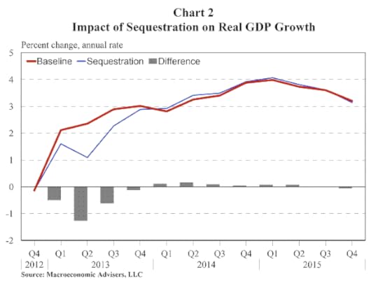
We now have observations on the eight of the quarters depicted in Figure 2 from the Macroeconomic Advisers forecast. Over the 2012Q4-2014Q3 period, MA forecast 2.20% average q/q SAAR growth. The actual average was 2.37%. Below, I reprise Figure 2, with an overlay (in green) of actually realized GDP growth data.

Figure 2: from Macroeconomic Advisers (2/20/2013), with actual GDP growth (green line). GDP data from (2014Q3 2nd release).
Returning to Professor Cowen’s first point, I will note that both the MA baseline and alternative were for acceleration of growth. The fact that growth did accelerate hence does not appear dispositive with regard to the Keynesian perspective.
As an aside, Professor Cowen’s point 12 befuddles me completely:
12. Whether we like it or not, large chunks of Asia still seem to regard Keynesian economics with contempt. They prefer to stress supply-side factors.
I would say that the Chinese government’s response to the global recession of 2008-09 was quintessentially Keynesian. I don’t mean to imply that the approach adopted was the ideal one — merely to highlight the fact that Professor Cowen’s characterization is not, in my view, apt. (In any case, it would not be surprising that leaders castigate a particular approach while implementing it vigorously.) See Table 3.4 from an IMF Staff Position Note written for the G20 meetings in June 2009, which indicates a substantial (discretionary) fiscal stimulus in China.
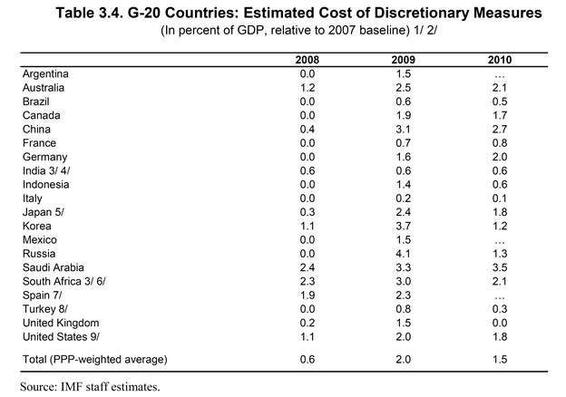
Table 3.2 from “Fiscal Implications of the Global Economic and Financial Crisis,” IMF Staff Position Note SPN/09/13 (June 9, 2009)
I will note that there were additional quasi-fiscal costs incurred when the government encouraged (state-owned) banks to lend. To the extent that some of these loans eventually become nonperforming, and the government has to pick up the tab, the extent of stimulus is even greater than indicated in Table 3.2.
December 2, 2014
A Farewell to Arms?
No more military Keynesianism after G.W. Bush?
It is one of the strange paradoxes that those who disbelieve that government spending can stimulate the economy are sometimes the same individuals that believe reduced defense spending can decrease economic activity. (G.W. Bush is not subject to this criticism; see [1].) Well, internal consistency has not always been a strong suit for some. What is interesting is that, proportionately, spending on national defense has declined substantially; my view is that this has resulted in some drag in growth. Figure 1 shows the trends in defense expenditures (on consumption and investment).
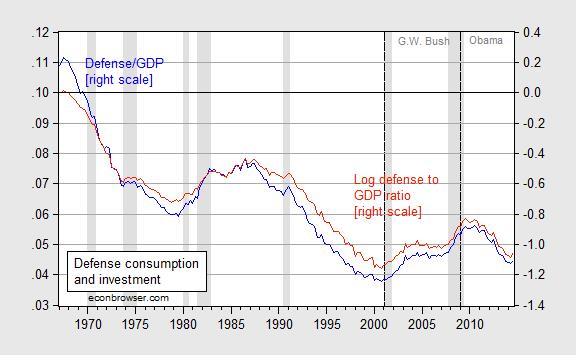
Figure 1: Nominal defense consumption and investment as a share of nominal GDP (blue line, left scale), and log ratio of real defense spending to real GDP, 1967Q1=0 (red line, right scale). NBER defined recession dates shaded gray. Source: BEA 2014Q3 2nd release, NBER, and author’s calculations.
An accounting decomposition of expenditure contributions of defense consumption and investment confirms the net deduction from that category.
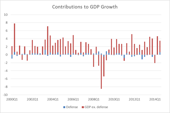
Figure 2: Contribution to GDP growth of defense (blue), of GDP ex.-defense (orange), q/q SAAR, %. Source: BEA 2014Q3 2nd release, and author’s calculations.
Of course, this is just an accounting decomposition. In economic terms, defense spending would account for even more if the multiplier for defense consumption and investment expenditures is greater than that for civilian spending (possible) and transfers (likely). One estimate of the defense spending multiplier is 1.5 [2] (See a discussion of military Keynesianism back in 2007 here).
Taking into account this trend makes the current recovery look much better as compared to the previous. Here I take a normative stand — that defense expenditures might have a different weight in aggregate welfare than non-defense. Figures 3 and 4 depict trends in output and output ex.-defense consumption and investment, for the current (blue) and previous (red) recoveries.
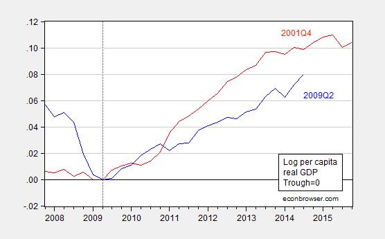
Figure 3: Log per capita real GDP normalized to zero at trough at 2009Q2 (blue), at 2001Q4 (red). Source: BEA 2014Q3 2nd release, and author’s calculations.
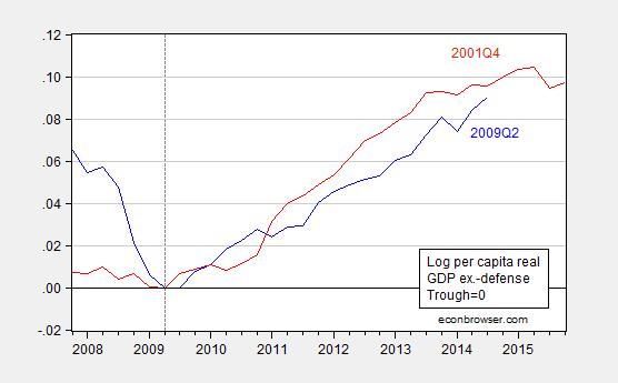
Figure 4: Log per capita real GDP ex.-defense normalized to zero at trough at 2009Q2 (blue), at 2001Q4 (red). GDP ex.-defense calculated using Törnqvist approximation. Source: BEA 2014Q3 2nd release, and author’s calculations.
The cumulative growth in per capita output is 1.9% less than that at the corresponding point in the previous recovery. But taking out defense spending (once again in an accounting sense), one finds that the gap is only half a percentage point. Taking into account multiplier effects would likely shrink the gap. (Note: the GDP ex.-defense variable can not be calculated by simply subtracting the Chain weighted defense consumption and investment from Chain weighted GDP; see this post.)
The foregoing not an argument for more defense spending — especially misdirected spending [3] [4]. Rather, it’s another reason for why the recovery has been so slow (in addition to the contractionary impact of state and local level government spending. [5] [6])
November 30, 2014
A glut of oil?
The world is awash in oil, I’m hearing. The problem is, it’s fairly expensive oil.
Take for example Canada. The country has managed to increase its production of oil by a million barrels a day over the last decade. But almost all of that increase has come from oil sands. If you consider only conventional crude oil, Canadian production today would be a third of a million barrels a day lower than at its peak in 1973.
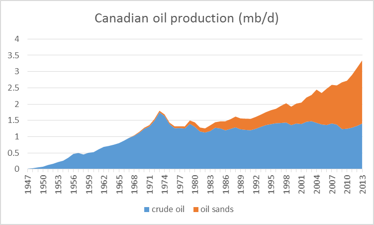
Canadian production of crude oil, 1947-2013, in mb/d. Blue: Conventional crude plus lease condensate. Orange: oil sands. Data source: Canadian Association of Petroleum Producers.
Even without counting environmental costs, that stuff’s not cheap. It was profitable when West Texas Intermediate was over $90. But last week WTI closed at $66. Here are some of the estimates from the Wall Street Journal:
The break-even price for new oil-sands surface mines is among the most expensive in the world, at around $85 a barrel, according to Bank of Nova Scotia . Operating costs at existing mines are less than half that amount. But the break-even point for so-called in situ projects, in which bitumen is heated and pumped up to the surface, range between $40 a barrel and $80 a barrel. Such projects represent the majority of future growth.
Or consider the United States, where production has grown 2 mb/d since 2004. More than 3 mb/d of that growth has come from fracking of oil trapped in tight geologic formations. Without tight oil, U.S. production would be down more than a million barrels a day over the last ten years and down 5-1/2 mb/d from its peak in 1970.
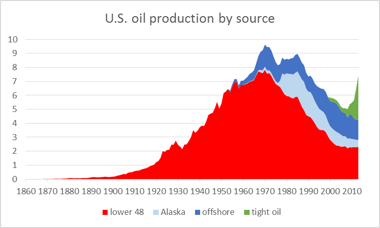
U.S. field production of crude oil, by source, 1860-2013, in millions of barrels per day. Source: Hamilton (2014).
Estimates again vary, but prices this low have to severely inhibit new investment in U.S. tight oil. Without continuing new drilling, U.S, tight oil production would quickly fall. And the economics of deep ocean drilling, which has also been important in supporting production in the U.S. and around the world, have become even more difficult at today’s low prices.
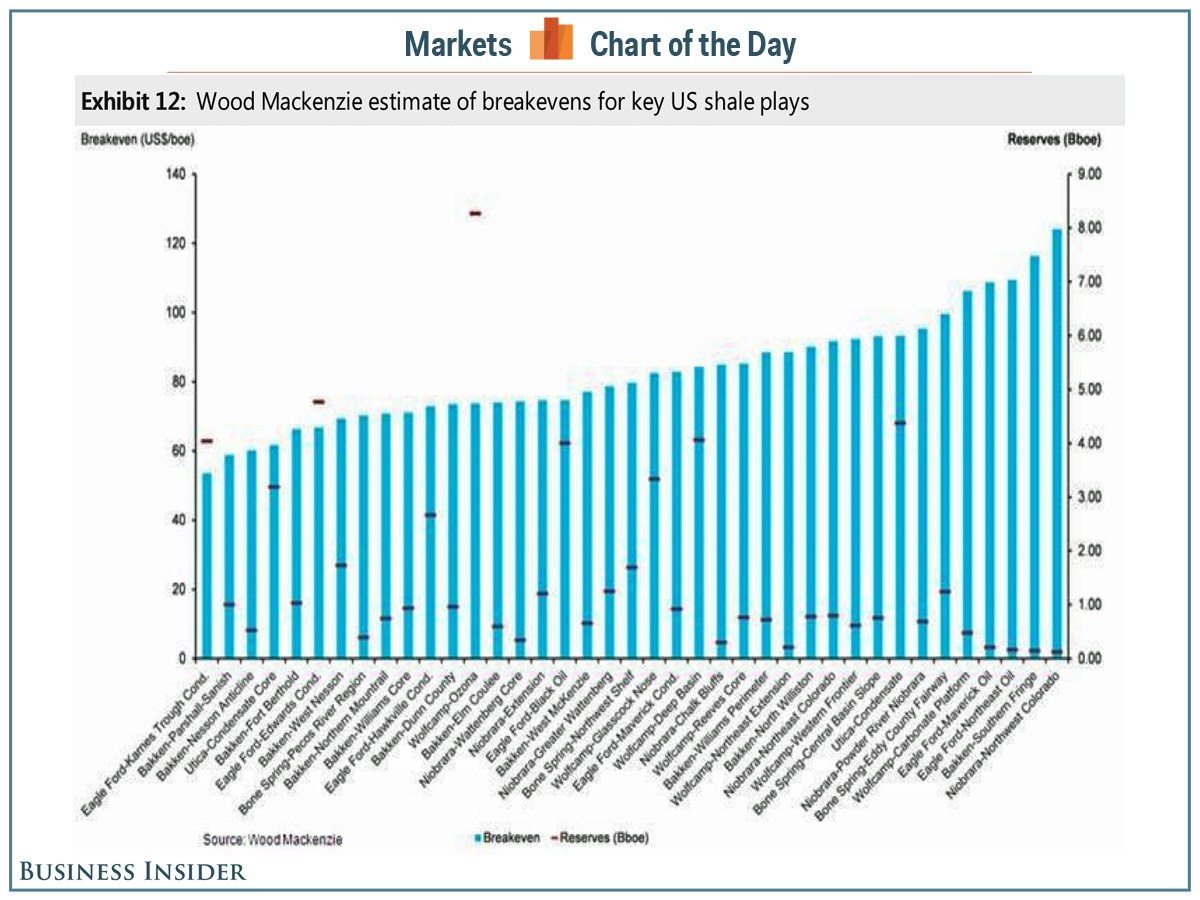
Source: Business Insider.
Why am I talking about the costs for Canadian and U.S. oil producers? Because if it had not been for the success of Canada and the United States, world production of crude oil would be down overall over the last decade.
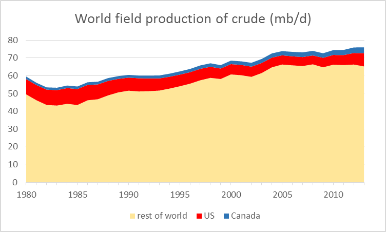
World field production of crude oil and lease condensate, 1980-2013, in millions of barrels per day. Data source: EIA.
Granted, some of the stagnation in global output has been due to geopolitical disruptions, Libya being the most important example. And Libyan production rebounded significantly this fall, contributing to the current excess supply.
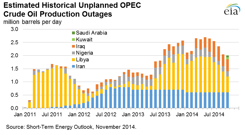
Source: EIA.
But Libya remains a very unstable place. It does not take much imagination to see the recent gains there being reversed again over the next few months. Nor does one have to be an excessive worrier to be concerned about the possibility of geopolitical turbulence in places like Nigeria and Iraq taking out more of their production, which between them accounted for 5.4 mb/d of last year’s world oil supply.
So here’s the basic picture. The current surplus of oil was brought about primarily by the success of unconventional oil production in North America, most new investments in which are not sustainable at current prices. Without that production, the price of oil could not remain at current levels. It’s just a matter of how long it takes for the high-cost North American producers to cut back in response to current incentives. And when they do, the price has to go back up.
Here’s my advice to anybody who’s contemplating selling $85 oil at $66 a barrel– don’t do it. If you can wait a few years, that $85 oil will be worth more than it costs to produce. But selling it at a loss in the current market is a fool’s game.
November 28, 2014
Avoiding Lost Decades: European Edition
From Liz Alderman in the NY Times today:
Germany and France Aim to Avert a ‘Lost Decade’
The economy ministers of France and Germany called on Thursday for urgent overhauls and a series of investments in both countries to help prevent them and the eurozone from falling into a stagnation trap.
This comes as news of increasing unemployment and falling inflation arrives (from WSJ):
…reports Friday confirmed a grim outlook for much of the eurozone’s $13.2 trillion economy, the world’s second largest after the U.S. Unemployment across the region rose by 60,000 last month, keeping the unemployment rate at 11.5%, the European Union’s statistics agency Eurostat said, far higher than in the U.S. Consumer spending fell in France and Spain.
Eurostat also said consumer prices were just 0.3% higher in the eurozone in November on an annual basis versus 0.4% in October, matching a five-year low. The inflation rate has now been below 1% for 14 straight months, while the ECB targets a rate of just under 2%.
The CEPR/Banca d’Italia eurocoin index also suggests slowing (albeit still positive) growth in the euro area.

Source: eurocoin.
The reference to lost decades reminds me of what Jeffry Frieden and I wrote in Lost Decades (p.203):
In the short term, there was no choice but to act decisively, with temporary tax cuts, spending increases, and transfers to the states. And with the economy growing only modestly as recovery began, too rapid a retrenchment in spending and an increase in taxes could very well be counterproductive, throwing the economy back into recession and further accumulation of debt. However, the politics of countercyclical fiscal policy can be perverse, as the Obama administration found. Recessions hit hardest at poor and working-class families, who would benefit most from stimulative fiscal policy. But attempts to undertake these policies face opposition from upper income taxpayers who are less affected by the recession and more concerned about the impact on their future taxes. This opposition can impede an effective fiscal response to cyclical downturns.
In the case of Europe, part of the reversion to too-rapid fiscal retrenchment was due to German demands for fiscal consolidation, part due to the belief that confidence effects would stabilize debt-to-GDP levels. The impact of relatively expansionary fiscal policy in the US (without hyperinflation so many warned of) as compared to the euro area is shown in Figure 1.
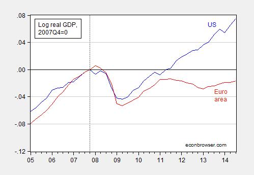
Figure 1: Log US real GDP (blue) and euro area (red), both normalized to 2007Q4=0. Source: BEA, and author’s calculations.
For a comparison to the UK, which embarked upon an experiment in expansionary fiscal contraction, only to relent subsequently, see this post. A cross-country comparison is here.
The document referred to in the NY Times article, calling for a “New Deal” and authored by Henrik Enderlein and Jean Pisani-Ferry, is here. They propose:
1. Reforms in both France and Germany. They are not the same, because the two countries are not facing the same challenges. In France, short-term uncertainties reduce long-term trust, but the longer-term outlook looks better. In Germany, longer-term uncertainties reduce short-term trust, but the short-term situation looks relatively good. In France we fear lack of boldness for decisive reforms. In Germany we fear complacency.
2. Reform clusters. Our reform proposals target priority areas where we see urgent need for action in each country. We propose to group actions serving the same aim into ‘clusters’ and to focus on a small number of such clusters. In France, these are (i) the transition to a new growth model, based on a system combining more flexibility with security for employees (“flexicurity”) and a reformed legal system, (ii) a broader basis for competitiveness and (iii) the building of a leaner, more effective state. In Germany, these are (i) the tackling of the demographic challenges, in particular by preparing German society for higher immigration and by increasing female participation in the labour market, (ii) the transition towards a more inclusive growth model based on improved demand and a better balance of savings and investments. Such reforms are not meant to please the respective neighbour, or anybody else, but to create better domestic conditions for jobs, long-term growth, and well-being in each country and in Europe.
3. A European regulatory initiative. Private investment is a judgment about the future. Investments require trust. In many sectors, public regulation plays a major role in the shaping of expectations on the long-term. In energy, transport and the digital sector, to name just a few, regulators must set the parameters right and ensure predictability. Investors need to know with certainty that Europe is committed to accelerating its transition to a digital, low-carbon economy. To lift uncertainty about the future price of carbon or the future regime for data protection is a major responsibility of public authorities. This could significantly contribute to increased investments in Europe.
4. Investment. The well-identified investment shortfall in Germany is largely private. Here again, regulatory clarity and a streamlined legal framework for settling disputes over infrastructure projects have a major role to play to unlock investment. But we also consider that Germany has given itself an incomplete public finances framework that rightly attributes constitutional status to keeping debt under control, but neglects promoting investments within the remaining fiscal space. German assets are not sufficiently renewed. Passing on a worn-down house to future generations is not a responsible way of managing wealth. We think the German government can and should increase public investment. In comparison to other European countries, France does not suffer from an acute aggregate investment shortfall. Business non-residential investment has remained at a relatively high level in comparison to other European countries. The allocation of investment efforts, however, is an area for improvement.
5. European private and public investment boosters. We do not believe that lack of funding is the main obstacle to European investment, but we do consider that new European resources are necessary: in a context where authorities are asking banks to take less risk, it is their responsibility to avoid pervasive risk aversion in the financial system. Building on our regulatory initiative, we propose to inject new European public money into the development of risk-sharing instruments and of vehicles in support of equity investment. Public investment has also been severely reduced since 2007. We propose creating a European grant fund to support public investment in the euro area that would support common aims, strengthen solidarity and promote excellence.
6. Borderless sectors. France and Germany should promote deepened integration in a few industries of strategic importance where regulatory borders severely constrain economic activities. Building “borderless sectors”, together with other partners, involves much more than just agreeing on coordination and joint initiatives: it implies going all the way to a common legislation, a common regulatory rulebook and even a common regulator. We think that energy and the digital economy are such sectors and we also propose a similar initiative to ensure the full portability of skills, social rights and social benefits.
7. Rediscover our common social model. Europe is more than a market, a currency or a budget. It was built around a set of shared values. It is time for France and Germany to join forces to rediscover and reinvent the social model of core Europe, starting with concrete initiatives in the fields of minimum wage standards, labour market policies, retirement and education. In these fields, convergence on the basis of effective joint action is needed to transform the Franco-German space into a true union based on economic integration and shared social values.
Of course, there are reports, and there are reports, and there is no guarantee of implementation. My particular worry I have is that structural reforms proceed without additional spending on infrastructure (or other means of stimulating the economy). Structural reform in the midst of recession is doomed to failure. This is a concern highlighted by Marcel Fratzscher, at DIW, as reported by Bloomberg:
Germany needs to spend more on infrastructure to support high wages that depend on exports of high-quality manufactured goods, Fratzscher said. Finance Minister Wolfgang Schaeuble’s plan for a 10 billion-euro ($12.5 billion) investment boost starting in 2016 is too little and came late, he said.
While Fratzscher said policy makers aren’t focusing enough on the risk of financial or political shocks in the euro area reigniting the crisis, Merkel regularly says it’s too early for Europe to relax fiscal rigor and that balancing the budget will help future generations.
…
“We need decisive action in overcoming the sovereign debt crisis,” she said in a speech in Berlin two days ago. “We have it under control, but we haven’t overcome it yet.”
Germany’s balanced-budget plan is “a fatal signal,” Fratzscher said. “It says: we don’t care what’s happening to the economy.”
November 25, 2014
If Output Is Near Potential, Why Is Inflation so Low?
There is a lot of discussion of how economic slack is fast disappearing, and I expect a lot of push on this view, given continued rapid growth in GDP as reported in today’s second release for 2014Q3. This view seems counter to (1) the CBO estimate of potential GDP and (2) the slow pace of inflation. My suggestion is that there remains a substantial amount of slack out there.
In Figure 1, I plot log GDP as reported in today’s release, and potential GDP as estimated by the CBO in its August report.
Figure 1: Log GDP (blue), potential GDP as estimated by CBO (gray), and an estimate of potential GDP estimated by use of a modified Ball-Mankiw (2002) method (red). NBER defined recession dates shaded gray. Source: BEA 2014Q3 2nd release, CBO, An Update to the Budget and Economic Outlook (August 2014), NBER, and author’s calculations.
According to the CBO’s estimate of potential (if readers find my repetitive use of the adjective “estimated” tiresome, blame reader Tom), the current (estimated) output gap is -3.5% (in log terms). As I have discussed, there are a variety of other methods than the CBO’s (which is essentially a production function approach), including statistical detrending methods such as the Hodrick-Prescott filter (see [1] [2] [3])
I am going to use economics to infer the output gap and hence the level of potential GDP, i.e., exploiting the expectations-augmented Phillips curve. This means I am appealing to the following data.
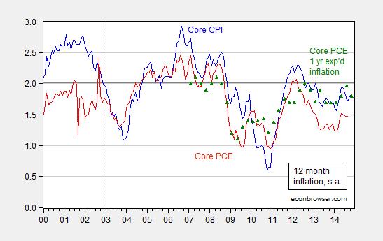
Figure 2: Year-on-year core CPI inflation (blue), core personal consumption expenditures (PCE) deflator (red), and expected one year PCE inflation over the next year (green triangles). Source: BLS, BEA via FRED, Survey of Professional Forecasters.
The methodology is basically that forwarded by Ball and Mankiw (JEP, 2002), which involves inverting a simple expectations-augment Phillips Curve (without supply shocks, but allowing for random shocks), and assuming adaptive expectations (consistent with the accelerationist hypothesis).
(1) πt = πet – a(Ut-U*t) + vt
(2) Δ πt = a U*t – a Ut + vt
(3) U*t + vt/a = Ut + Δ πt/a
Notice that NAIRU plus a random error is equal to actual unemployment plus the change in inflation divided by a. This suggests that NAIRU can be estimated by filtering the object on the right side of the last equation.
I follow the same procedure, replacing NAIRU with potential GDP, and using core personal consumption expenditure deflator inflation (q/q at annualized rates) for π.
(4) y*t – vt/a = yt – Δ πt/a
I estimate the analogous a parameter over the 1967Q1-2002Q4 period (so I’m assuming the accelerationist model holds over this sample); the estimate I obtain is approximately 0.08. (See this post for an earlier implementation.) I further assume that expected inflation equals 2% over the 2003Q1-2014Q3 period — which is pretty close to the average 1-year-ahead CPI inflation rate reported by the Survey of Professional Forecasters over this period. In other words, I am assuming that inflation expectations are now well-anchored. Hence, the variable on the RHS of (4) is:
(5) yt – (πt-0.02)/a
I then HP filter this variable [edits 11/26, 8:40am] using the default smoothing parameter for quarterly data suggested by Hodrick and Prescott, to obtain an estimate of potential GDP shown in Figure 1 (red line).
What is interesting is not the exact path of estimated potential GDP, but rather that — using this method — the (estimated) output gap as of 2014Q3 is -6.0% (log terms). That is not to say this estimate is “better” than the others; just that there are various indicators of slack — some of which indicate more slack than others –, and it makes sense to appeal to several measures in these uncertain times, as argued by Elias, Irvin, and Jordà.
Implications for these findings for the implementation of the Taylor rule discussed in this Reuters article.
Update, 11/26 3:25PM Pacific: With the OECD’s release of the November 2014 Economic Outlook, we now have three estimates of the output gap at an annual frequency. I plot these, plus my version of the Ball-Mankiw approach in Figure 3 below.
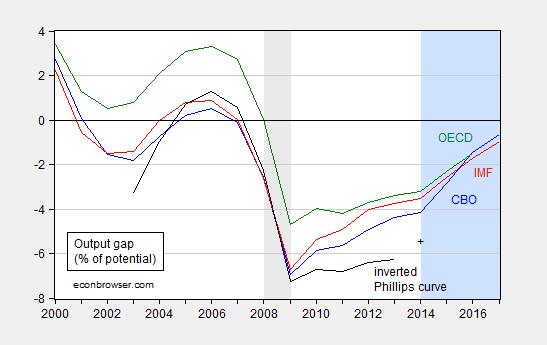
Figure 3: Output gap in percentage points of potential output from CBO (blue), IMF (red), OECD (green), and from author’s estimates (black). + for 2014 is for 2014Q3. Gray shaded area denotes NBER defined recession dates. Light blue shaded area denotes forecasts. Source: CBO, An Update to the Budget and Economic Outlook (August 2014), IMF, World Economic Outlook database (October 2014), OECD, Economic Outlook (November 2014), and author’s calculations.
The degree of economic slack indicated by the three organizations ranges from -4.2% to -3.2% of potential GDP.
Menzie David Chinn's Blog


![[image error]](http://econbrowser.com/wp-content/uploads/2014/11/outputgap1.jpg)