
Menzie David Chinn's Blog, page 25
September 21, 2015
Guest Contribution: “The 30th Anniversary of the Plaza Accord”
Today we are fortunate to have a guest contribution written by Jeffrey Frankel, Harpel Professor of Capital Formation and Growth at Harvard University, and former Member of the Council of Economic Advisers, 1997-99.
Exactly 30 years ago, on September 22, 1985, ministers of the Group of Five countries met at the Plaza Hotel in New York and agreed on a successful initiative to reverse what had been a dangerously overvalued dollar. The Plaza Accord was backed up by intervention in the foreign exchange market. The change in policy had the desired effect over the next few years: bringing down the dollar, reducing the US trade deficit and defusing protectionist pressures. Many economists think that foreign exchange intervention cannot have effects unless it also changes money supplies. But the Plaza and a number of subsequent episodes of concerted intervention by the G-7 countries suggest otherwise.
In recent years foreign exchange intervention has died out among the largest industrialized countries. Seeing as how the dollar is again strong and the US Congress once again has trade concerns, some have asked if it might be time for a new Plaza. My answer is “no, not even close.” The value of the dollar is not as high now as it was in 1985. More importantly, its recent appreciation is based on the economic fundamentals of the US economy and monetary policy, measured relative to those of our trading partners, whereas in 1985 the appreciation had continued well past the point justified by fundamentals.
The Baker Institute at Rice University is holding a conference on Currency Policy Then and Now: 30th Anniversary of the Plaza Accord. Among the key figures participating is James Baker, who as the new Treasury Secretary that year was the main initiator of the agreement. My paper for the conference, “The Plaza Accord, Thirty Years Later,” reviews 1985’s coordinated policy of intervention in the foreign exchange market and contrasts it with the current “anti-Plaza,” a recent G-7 agreement not to intervene. I see fears of “currency wars” as way over-done.
The post written by Jeffrey Frankel.


September 20, 2015
Forecasting interest rates
There was lots of action in financial markets last week, with much of the attention focused on the U.S. Federal Reserve. The interest rate on a 10-year U.S. Treasury bond edged up 10 basis points early in the week in anticipation that the Fed might finally raise its target for the short-term interest rate. But it shed all that and more after the Fed announced it was standing pat for now.
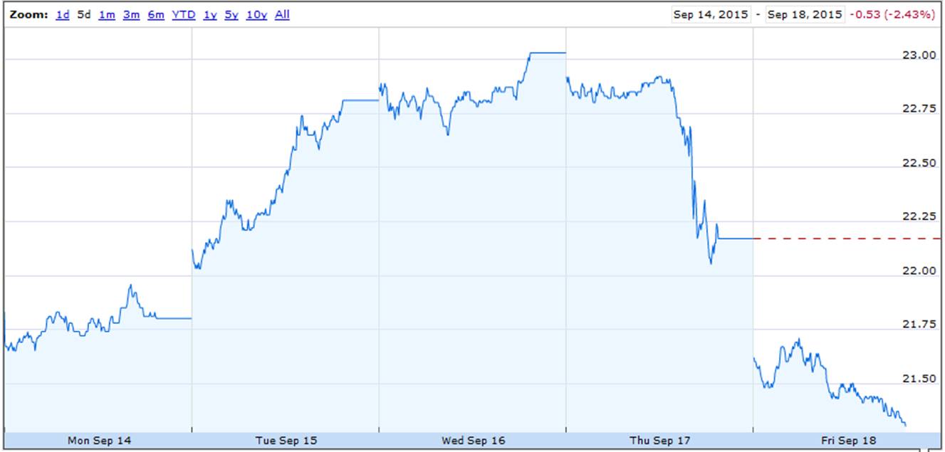
Price of CBOE option based on 10-year U.S. Treasury yield; to convert to the Treasury yield itself divide by 10. Source: Google Finance.
If bond investors were rational and unconcerned with risk, the 10-year rate should correspond to a rational expectation of what the average short-term rate is going to be over the next decade, a conjecture known as the expectations hypothesis of the term structure of interest rates. If instead the 10-year rate was above the average of expected future short rates, you’d expect a higher return from the long-term bond than staying short. If you were risk neutral, you’d prefer to go long in such a setting. But if more investors tried to do that, it would drive the long yield down and the short yield up.
If the expectations hypothesis held true, it’s hard to see how swings of the magnitude observed this week could be driven by news about the Fed. Although the Fed did not raise the overnight rate this time, it probably will by the end of this year or early next. A difference of 50 basis points for 1/4 of a year amounts to a difference of (1/40)(50) = 1.25 basis points in a 10-year average, only a tenth the size of the observed movement. Maybe people see the Fed’s decision as signaling a change in the interest rate that it will set over a much longer period, not just 2015:Q4. Or perhaps the nature of this week’s news altered investors’ tolerance for risk. To the extent that the answer is the latter, can we describe empirically the forces that seem to be driving the changes in risk tolerance and quantify the magnitude of the changes over time?
The nice thing about questions like these (unlike many of the other thorny unsettled issues in economics) is that in principle they could be resolved by an objective analysis of the data. All we need is to calculate the rational forecast of future interest rates, and compare those forecasts with the observed changes in long versus short yields.
The first step in this process is to determine the variables that should go into these forecasts. Finding the answer to this question is the topic of a paper that I’ve recently finished with Michael Bauer. Michael is an economist at the Federal Reserve Bank of San Francisco, though I should emphasize that the views expressed in the paper are purely the personal conclusions of Michael and me and do not necessarily represent those of others in the Federal Reserve System. Our paper confirms the finding from a large earlier literature that the expectations hypothesis cannot fit the data, adding lots of new evidence of predictable changes in long rates that cannot be accounted for by a rational expectation of future short rates. But we disagree with the conclusion from a number of recent studies that claim that all kinds of variables may be helpful for predicting interest rates.
We investigate instead a less restrictive model than the expectations hypothesis, which we refer to as the “spanning hypothesis,” that posits that whatever beliefs or risks bond prices may be responding to, these are priced in a consistent way across different bonds with the result that you only need to look at a few summary measures from the yield curve itself to form a rational forecast of any interest rate at any horizon. We calculate these summary measures from the first three principal components of the current set of yields on all the different maturities. Though the principal components are calculated mechanically, they have a simple intuitive interpretation. The first is basically an average of the current interest rate on bonds of all the different maturities (referred to as the “level” of interest rates), the second measures the difference between the yield on long-term bonds and short-term bonds (a.k.a. the “slope” of the yield curve), and the third reflects how much steeper the yield curve is at the short end relative to the long end (the “curvature” of the yield curve).
The main contribution of our paper is to show why other researchers were misled into thinking variables besides these three factors might help predict interest rates. It’s long been known that one has to be careful using regression t-statistics to interpret the validity of predictive relations when the explanatory variables are highly persistent and correlated with lagged values of the variable you’re trying to predict, a phenomenon sometimes described as Stambaugh bias; Campbell and Yogo have a thorough investigation of this phenomenon. My new paper with Michael identifies a different setting in which a related problem can arise. Namely, if you add other extraneous highly persistent regressors to a regression for which the coefficients on the true predictors would be susceptible to Stambaugh bias, any of the usual procedures for estimating the standard errors on those extraneous variables, such as heteroskedasticity- and autocorrelation-consistent standard errors, will significantly overstate how precisely you have estimated the coefficients, even if the extraneous predictors have nothing at all to do with either the true predictors or the variable you’re trying to predict. In our setting, the variable we’re trying to predict is the excess return on a particular bond, and what we claim are the true predictors are the level and slope of the yield curve (both highly persistent and correlated with lagged values of excess returns). That means when you add another variable to the regression that’s highly persistent such as inflation or measures of GDP, you’ll think you have something statistically significant when it fact it is of no use at all in predicting interest rates.
In addition to working out the econometric theory for how this happens, we develop an easy-to-implement bootstrap representation of the data in which the only variables that can predict interest rates or bond returns are the level, slope, and curvature, and investigate what would happen in such a setting if you performed the kinds of analyses conducted by earlier researchers. We find that a researcher could easily mistakenly think he or she had found a useful predictive relationship when the reality is that there is none, and show point by point how the findings of previous studies are completely in line with the claim that only three variables are of any use for predicting interest rates. We also find that an ingenious test proposed by Ibragimov and Mueller can sometimes work very well to detect the problems in this setting. Basically their test tries to estimate the standard error of coefficients by seeing how much they differ when estimated across different samples. Here again one finds a warning flag in the earlier studies– the apparent predictability of interest rates seems very strong for a short time, but then falls apart on other data.
Our study also updates many of the models estimated by previous researchers, and finds that none of these proposed forecasting relations has held up very well in the data that came in after the original study was first published. By contrast, the predictive power of the level and slope hold up quite well in any subsample we looked at, confirming the solid rejection of the expectations hypothesis in the earlier literature.
The bottom line: bond returns and departures from the expectations hypothesis are predictable. And it’s easier to do than some studies have been suggesting.
Here’s the summary from the paper:
A consensus has recently emerged that a number of variables in addition to the level, slope, and curvature of the term structure
can help predict interest rates and excess bond returns. We demonstrate that the statistical tests that have been used to support this conclusion are subject to very large size distortions from a previously unrecognized problem arising from highly persistent regressors and correlation between the true predictors and lags of the dependent variable. We revisit the evidence using tests that are robust to this problem and conclude that the current consensus is wrong. Only the level and the slope of the yield curve are robust predictors of excess bond returns, and there is no robust and convincing evidence for unspanned macro risk.
September 18, 2015
Kansas: The Collapse Continues
As does the fiscal experiment.
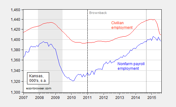
Figure 1: Kansas nonfarm payroll employment (blue), civilian employment (red), in 000’s, seasonally adjusted, Log scale. Dashed line denotes last period establishment series is QCEW benchmarked. Source: BLS.
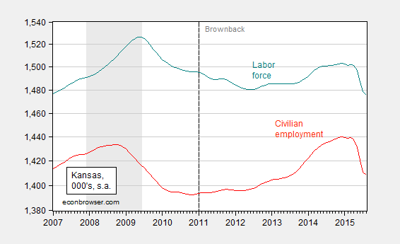
Figure 2: Kansas labor force (teal), civilian employment (red), in 000’s, seasonally adjusted. Log scale. Source: BLS.
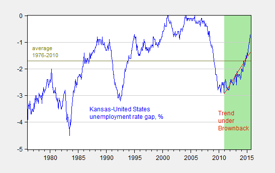
Figure 3: Kansas minus US unemployment rate, in percentage points (blue), and linear trend in this differential over the Brownback terms (red). Average over 1976-2010 (chartreuse) Green shaded area Brownback terms. Source: BLS, and author’s calculations.
Update, 9/19 9:45am Pacific: Kansas City Fed documentation of various Kansas indicators relative to Nation’s, here. The precarious state of the budget is discussed here.
September 17, 2015
Wisconsin: Where Has the Labor Force Gone?
The Department of Workforce Development released preliminary statistics for August today. Civilian employment remains below the 2008M03 peak; so is the labor force.
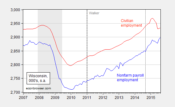
Figure 1: Wisconsin nonfarm payroll employment (blue), civilian employment (red), in 000’s, seasonally adjusted, Log scale. Dashed line denotes last period establishment series is QCEW benchmarked. Source: BLS, DWD.
Wisconsin nonfarm payroll employment has exceeded the prior peak by 9,000; but the broader measure of civilian employment in August is noticeably lower than the peak six months prior. Those who are familiar with the state-level establishment data know that current figures incorporate Quarterly Census of Employment and Wage (QCEW) data up to September 2014. My June estimates of what would happen if we used more recently released QCEW data through December 2014 implies the reported series should be moved down by 12,000, implying that when the benchmarking is implemented next year, it will turn out that August’s employment will not end up being above the prior peak.
The unemployment rate declined from 4.6% to 4.5%, and has been decreasing since the beginning of the year (5% in January). However some part of this is due to a sharply decreasing labor force.
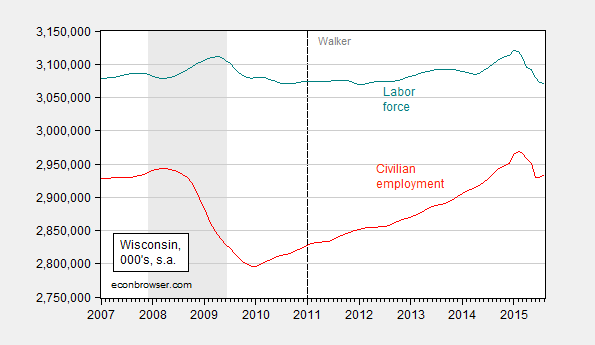
Figure 2: Wisconsin labor force (teal), civilian employment (red), in 000’s, seasonally adjusted. Log scale. Source: BLS, DWD.
One caveat: the household survey estimates are subject to considerable sampling error, more so than the establishment survey (see here). Hence, trends should be the focus of attention — and what’s true is that Wisconsin’s estimated labor force has shrunk 1.6% since January (log terms). If the Governor’s objective is to encourage individuals to work, then there is a lack of progress on this front.
Finally, note that Wisconsin’s unemployment rate is rising relative to the National rate, following the trend that has been in place since Governor Walker took office.
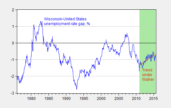
Figure 3: Wisconsin minus US unemployment rate, in percentage points (blue), and linear trend in this differential over the Walker terms (red). Green shaded area Walker terms. Source: BLS, and author’s calculations.
None of these points are noted in the DWD release. However, the last bullet point in the memo does state:
Chief Executive Magazine ranked Wisconsin the “12th Best State for Business” in its annual survey of CEO’s, an increase of 2 spots over the 2014 ranking, and a big increase over 2010, when the state ranked 41st.
September 16, 2015
“Solving” the Immigration Problem
Mass deportation and elimination of Birthright Citizenship as policy options
I see the resurfacing of proposals to eliminate Birthright Citizenship and the forcible deportation of undocumented to solve the immigration problem. What are the implications of such proposals?
Mass Deportation Now
A 2014 Congressional Research Service report cites Department of Homeland Security estimates of 11.5 million undocumented residents as of January 2011. The American Action Forum, headed by CBO’s former head Doug Holtz-Eakin, has estimated the 20 year cost at between $419.6 to $619.4 billion. One time cost (so excluding the subsequent 20 year’s of expenditures) would range from $103.9 billion to $303.7 billion. This would be the one-time direct fiscal cost, amounting to 0.6% to 1.7% of 2014 GDP (2.6% to 7.7% of the 2014 CY Federal budget). The Center for American Progress’s estimate is $114 billion, not including recurring costs.
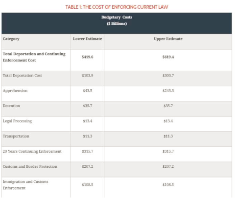
Source: AAF (2015).
The AAF report continues to assess the long term (supply side) impact (it’s dynamic!). AAF estimates that in 20 years, GDP will be 5.7% lower than baseline given the 11 million reduction in labor force.
Ending Birthright Citizenship
The most recent quantitative study on this issue I know of is this 2010 analysis written by Jennifer van Hook and Michael Fix for the Migration Policy Institute. The simulations indicate that passage of the Birthright Citizenship Act of 2009, which would have denied citizenship to any child born to parents who were both undocumented, would imply an increase of undocumented population from 10.8 million to 15.5 million by 2050. This is shown as the red line in the Figure 1 below.
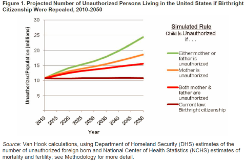
Source: Van Hook and Fix (2010).
The simulations assume future behavior is the same as current (e.g., fertility, deaths), and the foreign born population remains constant at 10.8 million. Obviously, this assumes that illegal immigration continues. If the simulation assumes completely effective border control, so no new foreign born undocumented enter the country, then by 2050, the undocumented population would drop to 3.3 million. Hence, ending birthright citizenship is not in itself a “solution”, even with a completely cessation of illegal immigration – unless one is willing to wait a very long time.
Concluding Thoughts
Mass deportation would be costly. Ending birthright citizenship would not eliminate all undocumented even with zero illegal cross border migration (i.e., even with a “really terrific wall”).
September 15, 2015
Liftoff: Empirical Assessment of the Implications for the Dollar
I have been stressing the international implications of a potential interest rate increase as a rationale for deferring monetary tightening. Export growth is slowing and economic activity in the tradables sector (manufacturing output, manufacturing employment) as the dollar has appreciated. [1] [2] How much more appreciation should we expect should the Fed tighten?
This is actually a harder question to answer than one would think. That’s because over the past seven years, the correlation between the US short term interest rate and the dollar has essentially disappeared as the zero lower bound has placed a floor on rates. This point is illustrated in Figure 1.
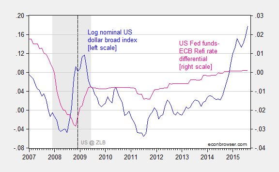
Figure 1: Log nominal USD broad index, 1973M01=0 (blue, left scale), and Fed funds – ECB refinance rate differential (pink, right scale). An increase in the log USD index from 0.021 to 0.178 implies a 15.7% appreciation. NBER Defined recession dates shaded gray. Dashed line at 2008M12 when ZLB effectively encountered. Source: Federal Reserve Board, Bundesbank, NBER, and author’s calculations.
A regression (in first differences) over the 199M03-2015M08 period yields a statistically insignificant negative coefficient on the interest differential, with zero adjusted R-squared. Augmenting with VIX leads to an increase of adjusted R-squared to 0.15, but no change in the coefficient on the interest differential (the explanatory power is provided by the VIX).
As I’ve pointed out before, the US dollar does seem to be correlated with the shadow Fed funds rate. Without a good measure of rest-of-world interest rates, I use the shadow rate for the euro area. Both series are calculated by Wu and Xia.
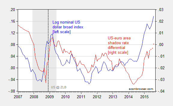
Figure 2: Log nominal USD broad index, 1973M01=0 (blue, left scale), and shadow Fed funds – shadow ECB rate differential (red, right scale). An increase in the log USD index from 0.021 to 0.178 implies a 15.7% appreciation. 2015M06-09 differential observations assume ECB shadow rate at 2015M05 level. NBER Defined recession dates shaded gray. Dashed line at 2008M12 when ZLB effectively encountered. Observations for differential for 2015M06-09 are based on no-change in ECB shadow rate from 2015M05. Source: Federal Reserve Board, Wu and Xia, NBER, and author’s calculations.
Running a regression over the 1999M03-2015M05, in first differences, yields:
Δet = 0.0002 + 0.636Δ(it-it*) + 0.114ΔVIXt + 0.630Δ(it-1-it-1*) + 0.074ΔVIXt-1 + ut
Adj-R2 = 0.26, SER = 0.010, Nobs = 195, DW = 1.34. bold face denotes statistical significance at the 10% msl using HAC robust standard errors.
These results are intuitive; increases in the interest rate result in strengthening of the currency (as in the Dornbusch Frankel model). An increase in the VIX also strengthens the dollar, which is consistent with the safe haven role of the US dollar.
These results indicate that each a 1 percentage point increase in the shadow rate differential results in a 1.3 percent increase in the nominal value of the dollar. There is some reason to believe that the actual impact is larger.
First, given that shadow rates are estimated, the true shadow rates are probably measured with error, biasing downward the OLS point estimates. Second, the long run impact is probably not accurately measured by the coefficients on the included lags. Second, augmenting the specification with a lagged dependent variable yields a coefficient of 0.3; if one were to accept the common factor restriction, this implies the (statistical) long run impact of higher interest rates is closer to 1.9 (which is the coefficient obtained by a regression in levels).
Over the period of the ZLB (2008M12-2015M05), the fit is even better:
Δet = 0.0014 + 1.550Δ(it-it*) + 0.121ΔVIXt + 0.818Δ(it-1-it-1*) + 0.090ΔVIXt-1 + ut
Adj-R2 = 0.52, SER = 0.008, Nobs = 78, DW = 1.54. bold face denotes statistical significance at the 10% msl using HAC robust standard errors.
The cumulative impact of a one percentage point interest rate increase is 2.33.
If markets behave in the wake of liftoff as they have during the last six years, then a literal interpretation of the results suggests a 25 basis points increase will induce 0.6 percent appreciation of the nominal broad-currency-basket dollar index.
Of course, the interpretation of what would happen if the Fed were to raise the Fed funds rate to 0.25 to the interest differential is open. At the end of August, the shadow Fed funds rate was -0.92%. The effective Fed funds rate is now 15 bps, so an increase of 25 bps to 40 bps would mean an increase of about 1.3 percentage points. That means about a 3% increase in the trade weighted dollar (3.6% for the major-currency-basket dollar index).
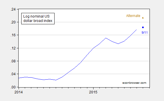
Figure 3: Log nominal USD broad index, 1973M01=0 (blue), observation for 9/11 (blue square), and alternative under assumption of increase of Fed funds target to 40 bps (brown triangle). An increase in the log USD index from 0.021 to 0.178 implies a 15.7% appreciation. 2015M06-09 differential observations assume ECB shadow rate at 2015M05 level. Source: Federal Reserve Board, Wu and Xia, NBER, and author’s calculations.
Is this a big impact? Since the standard deviation of dollar changes is about 1.2% (2008M12-2015M08), it’s certainly noticeable. And I think undesirable for US economic activity at this juncture.
In addition to the effects on the US economy, the stronger dollar on top of a higher Fed funds rate will have measurable effects on emerging markets, as documented here (see analysis here).
Update, 8am Pacific 9/16: See also World Bank, “The Coming U.S. Interest Rate Tightening Cycle: Smooth Sailing or Stormy Waters?” Policy Research Note No.2: .
“Scott Walker’s exaggerated claims of employment trends in Wisconsin”
That’s the title of WaPo’s FactChecker recap of the Governor’s misrepresentations. Three Pinocchio’s!
Here is a graphical depiction of Wisconsin private payroll employment, Governor Walker’s August 2013 promise of 250,000 new jobs by January 2015, and how long it will take to hit that target assuming employment evolves as it has since Governor Walker took office.
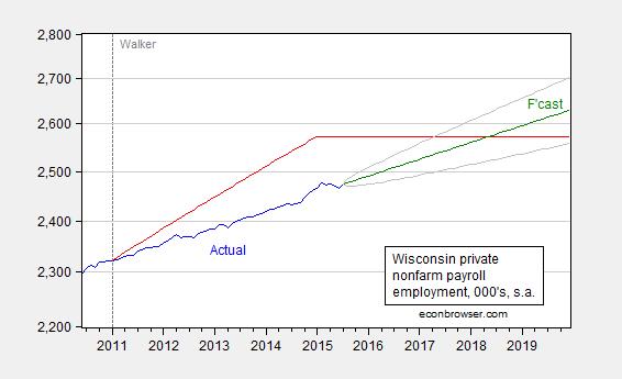
Figure 1: Wisconsin private nonfarm payroll employment (blue), and path promised by Walker in August 2013 (red), forecast from random walk with drift estimated over the 2011M01-2015M07 sample (green), and 90% band (gray). Left scale is logarithmic. Source: BLS, Milwaukee Journal Sentinel, author’s calculations.
Update: The irrepressible Rick Stryker argues that WaPo is merely pushing distortions in the guise of fact checking. Let me merely provide another graph, wherein we see how Walker’s touting of a lower unemployment rate than the US is — at the very least — misleading.

Figure 2: Wisconsin minus US unemployment rate, in percentage points (blue), and linear trend in this differential over the Walker terms (red). Green shaded area Walker terms. Source: BLS, and author’s calculations.
The graph indicates that on average Wisconsin’s unemployment rate is below the national average, so that it is nothing special to say that at the moment, Wisconsin’s unemployment rate is lower than the US.
Observers will note that the trend is upward, i.e., improvement in Wisconsin’s unemployment rate is lagging the Nation’s. The trend is 0.144 ppts per year, t-stat 5.6 using HAC robust standard errors.
September 13, 2015
Common factors in commodity and asset markets
Increases in oil production in the United States and the Middle East were certainly key factors in the huge drop in oil prices over the last year. Nevertheless, one can’t help but be struck by the fact that the weekly changes in oil prices correlate with dramatic moves in other commodity and financial markets.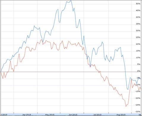
Cumulative percent change in Shanghai Stock Exchange Composite Index SHA (in blue) and United States Oil Fund ETF USO (in red) since March 16.
For some time I’ve been summarizing global macro factors behind oil price movements by looking at the price of copper, the dollar exchange rate, and the interest rate. Here’s a regression of the weekly percent change in oil prices (as measured by 100 times the change in the natural logarithm of the price of a barrel of WTI) on the weekly percent change in copper prices, the weekly percent change in the trade-weighted value of the dollar, and the weekly change in the yield on a 10-year Treasury. The regression is estimated using data from April 2007 to June 2014 (right before oil prices began their spectacular decline). If in a given week copper prices rose, the dollar depreciated, and interest rates rose, then it’s likely oil prices rose that week as well. The regression can account for about a third of the variation in oil prices through June 2014.

Comparing September 4 values with those at the start of July 2014, copper is down 34.3% (logarithmically), the dollar is up 19.3%, and the 10-year yield is down 52 basis points. Based on the above regression, you’d expect we would have seen a 41.8% (logarithmic) decline in the price of crude oil, or that the price of oil would have fallen from $105 to $69. In fact on September 4 oil was at $46. So certainly more was going on than just changes in the broader global economy. But just as certainly, the latter played an important role in the slide of the price of oil.
The solid black line in the graph below plots the dollar price of WTI since the start of 2014, while the dotted blue line gives the price that is predicted by the above regression for each week since July 2014 based solely on what happened to copper prices, the exchange rate, and interest rates during that week.
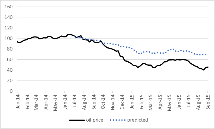
This doesn’t mean that you could have predicted in July 2014 that oil prices were about to plummet, unless you also somehow could have predicted that copper prices, long-term interest rates, and other countries’ currencies were about to do the same. But given what happened in global markets, much of what’s happened to oil prices is not that surprising.
You might try to make a case that developments in oil markets are the cause of the moves in the other variables. The growth in U.S. oil production will ease the trade deficit, which would be one factor in a stronger dollar. And the decline in oil prices will help keep inflation low, which contributes to a lower nominal interest rate. But I believe any such effects could only be a very minor part of the movements we’ve seen in interest rates and the exchange rate. Instead, the real story has been weakness of the world economy. I therefore interpret the above calculations as telling us that gains in oil production from the United States and OPEC are only part of the reason that the dollar price of oil has fallen so much over the last year and a half.
If you’re curious to use calculations like these to take a look at other starting and ending dates, this little tool developed by Ironman makes it easy to do. Just input the four prices at your chosen starting date and ending date and press calculate. It’s set up with default values (if you just press “calculate” yourself without entering any numbers) to reproduce the calculations I just described based on the change in prices between July 4 and September 4. And below the tool you’ll find some self-updating widgets to follow the current prices. Enjoy!
.nobrtable br { display: none }
Adapted from Political Calculations.
Value of Global Demand Sensitive Indicators
Input Data Previous Values Current Values
Copper [USD/lb]
Trade Weighted U.S. Dollar Index
Constant Maturity 10-Year U.S. Treasury Yield [%]
WTI [USD/barrel]
Projected Price of Crude Oil Based on Demand Factors
Estimated Results Values
Expected Price of Crude Oil If Only Affected by Global Demand Factors
Differences from Previous Price of Crude Oil
Estimated Change in Price of Crude Oil Due to Demand Factors
Actual Change in Price of Crude Oil
Percentage of Actual Change in Crude Oil Price Attributable to Demand or Supply Factors
Percentage of Change Attributable to Demand Factors
Percentage of Change Attributable to Supply Factors
Commodities are powered by Investing.com
September 11, 2015
Government Debt Crowding Out Watch, Fall 2015
As I updated my slides for teaching an economics course on the financial system at UW-Madison, I recreated this graph, which depicts the rise in Federal debt as a share of GDP, and the trajectory of real interest rates, as proxied by several measures.
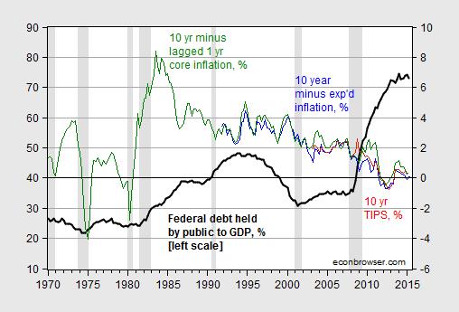
Figure 1: Federal debt held by the public as a share of GDP, in % (bold black, left scale), and 10 year constant maturity TIPS in % (red, right scale), 10 year constant maturity Treasurys minus 10 year median expected inflation in % (blue, right scale), and 10 year constant maturity Treasurys minus 1 year lagged core inflation in % (green, right scale). NBER defined recession dates shaded gray. Source: Treasury, Fed, BLS via FRED, Philadelphia Fed Survey of Professional Forecasters, NBER, and author’s calculations.
Here’s a detail of interest rates, at the monthly frequency.
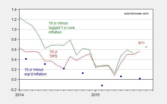
Figure 2: 10 year constant maturity TIPS in % (red), 10 year constant maturity Treasurys minus 10 year median expected inflation in % (blue squares), and 10 year constant maturity Treasurys minus 1 year lagged core inflation in % (green). Source: Treasury, Fed, BLS via FRED, Philadelphia Fed Survey of Professional Forecasters and author’s calculations.
Interestingly, real rates have not risen noticeably even as the shadow Fed funds rate (as measured by Xia and Wu) has risen by about 1.35 ppts since January of this year.
With apologies to Simon and Garfunkel, I ask, Where have you gone, Mister Paul Ryan?.
Update: Reader Jeff asks why I don’t provide a plot of private investment. The answer is (a) I’ve done it before, and (b) it doesn’t change the conclusions. But for the skeptical, here’s the relevant graph:
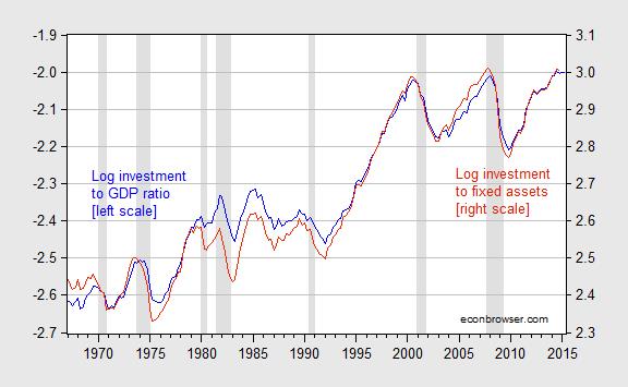
Figure 2: Log nonresidential fixed investment-GDP ratio (blue, left scale), and log nonresidential fixed investment-private fixed nonresidential assets ratio (red, right scale), all in Ch.09$ or Ch.09 index. NBER defined recession dates shaded gray. Source: BEA, NBER, and author’s calculations.
Government Debt Crowding Out Watch, Fall 2016
As I updated my slides for teaching an economics course on the financial system at UW-Madison, I recreated this graph, which depicts the rise in Federal debt as a share of GDP, and the trajectory of real interest rates, as proxied by several measures.
Figure 1: Federal debt held by the public as a share of GDP, in % (bold black, left scale), and 10 year constant maturity TIPS in % (red, right scale), 10 year constant maturity Treasurys minus 10 year median expected inflation in % (blue, right scale), and 10 year constant maturity Treasurys minus 1 year lagged core inflation in % (green, right scale). NBER defined recession dates shaded gray. Source: Treasury, Fed, BLS via FRED, Philadelphia Fed Survey of Professional Forecasters, NBER, and author’s calculations.
Here’s a detail of interest rates, at the monthly frequency.
Figure 2: 10 year constant maturity TIPS in % (red), 10 year constant maturity Treasurys minus 10 year median expected inflation in % (blue squares), and 10 year constant maturity Treasurys minus 1 year lagged core inflation in % (green). Source: Treasury, Fed, BLS via FRED, Philadelphia Fed Survey of Professional Forecasters and author’s calculations.
Interestingly, real rates have not risen noticeably even as the shadow Fed funds rate (as measured by Xia and Wu) has risen by about 1.35 ppts since January of this year.
With apologies to Simon and Garfunkel, I ask, Where have you gone, Mister Paul Ryan?.
Menzie David Chinn's Blog


