
Menzie David Chinn's Blog, page 21
November 25, 2015
Links: Housing Bubbles, Trilemma, Policy Timing Uncertainty
Food for thought over the long weekend.
Why Tighten?
I hear a lot about why, despite (by some accounts) a measurable output gap, and low inflation, we need to tighten because of e.g., an incipient housing bubble (or some other unidentified asset bubble). Reuven Glick and Kevin J. Lansing and Daniel Molitor at the SF Fed deal decisively with the leverage-induced housing bubble meme:
After peaking in 2006, the median U.S. house price fell about 30%, finally hitting bottom in late 2011. Since then, house prices have rebounded strongly and are nearly back to the pre-recession peak. However, conditions in the latest boom appear far less precarious than those in the previous episode. The current run-up exhibits a less-pronounced increase in the house price-to-rent ratio and an outright decline in the household mortgage debt-to-income ratio—a pattern that is not suggestive of a credit-fueled bubble.
Figure 2 from the piece conveys concisely and persuasively their argument.
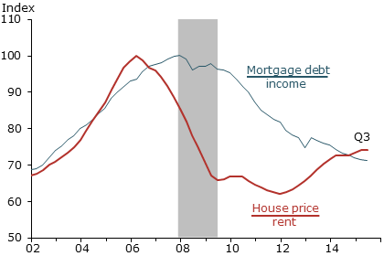
Source: Glick, Lansing, Molitor (2015).
For me, I remain unconvinced that there is tremendous froth in financial markets thereby validating the case for tightening. At least, it doesn’t appear to be in the housing market.
Tightening Already Underway
I’ve mentioned in an earlier post that the tightening has already begun, and dollar appreciation has in part signalled the reduced rate of Treasury accumulation by foreign central banks that in the past depressed long term yields. These trends are documented in Figure 1.

Figure 1: Fed funds/Shadow Fed funds rate (blue, left scale), log real trade weighted dollar – broad index, 1973M03=0 (red, right scale). NBER defined recession dates shaded gray. Source: Federal Reserve Board, Wu-Xia, NBER, and author’s calculations.
What is going to happen when the Fed actually raises rates? This is an interesting question, which is related to the trilemma. Joe Joyce at Capital Ebbs and Flows contrasts the views of Helene Rey (there’s only a dilemma) vs. those of Klein-Shambaugh, Popper-Mandilaris-Bird, and Aizenman-Chinn-Ito (there’s a trilemma). Professor Joyce sides with exchange rate regimes as still mattering, but re-interprets the Rey thesis:
…But her wider point about the linkages of asset prices driven by capital flows and their impact on domestic credit is surely correct. The relevant trilemma may not be the international monetary one but the financial trilemma proposed by Dirk Schoenmaker of VU University Amsterdam.
In this model, financial policy makers must choose two of the following aspects of a financial system: national policies, financial stability and international banking. National policies over international bankers will not be compatible with financial stability when capital can flow in and out of countries.
I don’t disagree with this view. But I must confess to being of limited imagination, and have a hard time conceiving of an international system that co-ordinates in an enforceable fashion a harmonized and effective system of international financial regulation. In other words, we have to consider policy effects in a world — for now — with regulatorily balkanized financial regulation.
In that context, Joshua Aizenman, Hiro Ito and I have updated our assessment of the impact of core country monetary policies on emerging market economies.
Generally, however, the linkages between developing countries’ exchange market pressure (EMP) and CE’s policy interest rates appear weak. The proportion for the significant linkage rises in the 2010-2012 period, but only to less than 20%. The EMP of developing countries is a little more sensitive to the REER movements of the center economies. The proportion of developing countries for which the center economies’ REER are jointly significant for the EMP estimation is the highest among the vectors of explanatory variables in the 2010-2012 period.
In general, the EMP of developing countries is more exposed to the influence of the center economies’ EMP. Especially, during the GFC years and in their aftermath, developing countries’ EMP is found more sensitive to the movements of the EMP of the CE’s, indicating that financial stress that arose in the CE’s must have been transmitted to developing countries during and after the GFC.
Exchange market pressure is a weighted average of exchange rate depreciation, reserve decumulation and interest rate increase, viz., αΔs βΔi – γΔr (changes expressed relative to base country). What is the quantitative extent of the impact?
Based on the estimation results, for the group of EMEs, if the U.S. [real effective exchange rate] REER rises (i.e., real appreciation) by 10%, the EMP on average would rise by about 1.2. This (unit-less) figure stands for about 0.6-0.8 standard deviations of major EMEs’ EMP, which is not unsubstantial.
In other words, the US dollar appreciation — in the neighborhood of 15% — is feeding through into elevated exchange market pressure. The components of the EMP are shown for select EMs below.
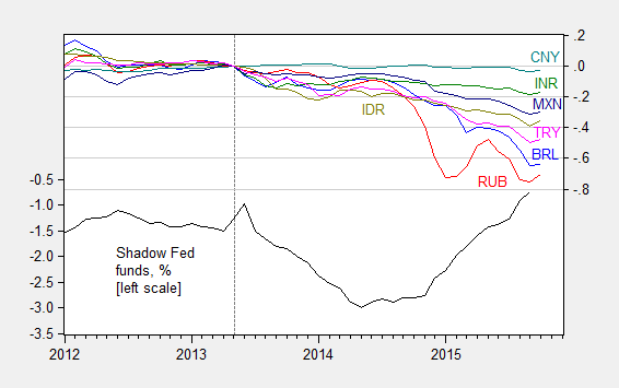
Figure 2: Shadow Fed funds rate, in % (black, left scale), log exchange rate against USD, where down is depreciation, for Brazil (blue), Russia (red), India (green), China (teal), South Africa (purple), Indonesia (chartreuse), Mexico (dark blue), and Turkey (pink), all normalized to 2013M05=0, right scale. October data is through October 14th. Source: FRED, Wu-Xia, Pacific Exchange Services and author’s calculations.
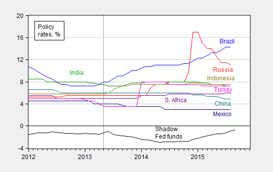
Figure 3: Shadow Fed funds rate (black), policy rates for Brazil (blue), Russia (red), India (green), China (teal), South Africa (purple), Indonesia (chartreuse), Mexico (dark blue), and Turkey (pink). October data is through October 14th. Source: FRED, Wu-Xia, Pacific Exchange Services and author’s calculations.
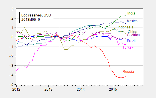
Figure 4: Shadow Fed funds rate (black), and log international reserves ex.-gold for Brazil (blue), Russia (red), India (green), China (teal), South Africa (purple), Indonesia (chartreuse), Mexico (dark blue), and Turkey (pink), all normalized to 2013M05=0. Source: FRED, Wu-Xia, and author’s calculations.
The “Just Get It Over With” Pespective
I’ve been to three conferences over the past month or so involving emerging market central bankers. One common refrain I heard was that it would be better to just get the “liftoff” over with, and resolve the uncertainty. While I think it’s human nature to want to end to act, it seems to me that after the first rate increase, one would immediately start wondering about the timing of the next rate rise.
In other words, an earlier Fed funds rise might be cathartic for emerging market policymakers, but I think their relief might be short-lived.


November 22, 2015
Trends in oil production
World field production of crude oil increased 2.9 million barrels a day in the 12 months ended last July. That compares with a 3.6 mb/d increase over the entire nine years from Jan 2005 to Dec 2013.
World field production of crude oil in thousands of barrels per day, Jan 1973 to July 2015. Data source: Monthly Energy Review, Table 11.1b.
The biggest single factor is Iraq, where production is up almost 1.1 mb/d over the last year. Although ISIS has managed to bring cruelty to much of the rest of the world, so far they have not disrupted Iraqi oil production.

Iraq field production of crude oil in thousands of barrels per day, Jan 1973 to July 2015. Data source: Monthly Energy Review, Table 11.1a.
The second biggest factor in the 2.9 mb/d gain was the United States, where production increased 0.6 mb/d July 2014 to July 2015, thanks to the tremendous success of shale oil, or production based on horizontal fracturing of tight geologic formations.

U.S. field production of crude oil in thousands of barrels per day, Jan 1973 to July 2015. Data source: Monthly Energy Review, Table 11.1b.
But that is going to change. The EIA Drilling Productivity Report tabulates detailed summaries of drilling and production in the main U.S. counties that have been responsible for the shale oil revolution. One of the interesting statistics is their calculation of the change in “legacy” production. To get this, the EIA tabulates production in these counties coming from wells that had been in operation for two months or more as of August, and then looks at how much was being produced by these same wells in September. This calculation comes out to be a drop in production of those legacy wells of some 330,000 barrels per day between August and September. The EIA series for the change in legacy production each month is plotted below. If we were relying only on historical wells without drilling new ones, U.S. shale production would fall about a million barrels/day every three months.
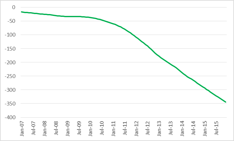
Monthly change in production of oil from “legacy” wells (2 months or more in operation) in counties associated with the Permian, Eagle Ford, Bakken, and Niobrara plays, monthly Jan 2007 to Dec 2015. Data source: EIA Drilling Productivity Report.
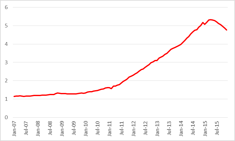
Drilling hasn’t stopped but it has been cut back significantly.
Number of active oil rigs in counties associated with the Permian, Eagle Ford, Bakken, and Niobrara plays, monthly Jan 2007 to Oct 2015. Data source: EIA Drilling Productivity Report.
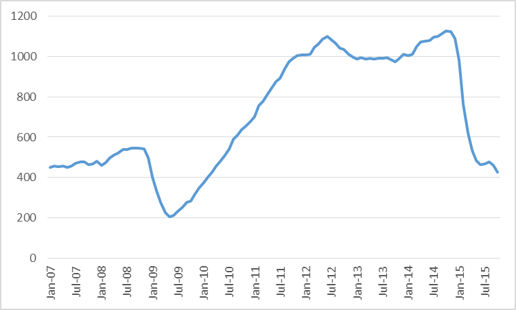
Production has not fallen as dramatically as many of us has anticipated thanks to remarkable ongoing gains in productivity. Even so, the EIA estimates that U.S. shale oil production will be half a million barrels a day lower in December than it had been in June.
Actual or expected average daily production (in million barrels per day) from counties associated with the Permian, Eagle Ford, Bakken, and Niobrara plays, monthly Jan 2007 to Dec 2015. Data source: EIA Drilling Productivity Report.
And it will fall further. The five biggest pure players among U.S. shale oil producers could be EOG, Pioneer, Devon, Whiting, and Continental Resources. Between them, these companies may account for about a fifth of total U.S. shale oil production, and between them they have lost $25 billion so far in the first three quarters of 2015.
Eventually this adjustment will bring crude oil inventories back to more normal historical levels. But we’re not there yet.
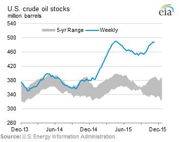
U.S. commercial crude oil inventories. Source: EIA.
November 19, 2015
Wisconsin Private Employment: “highest one-month jump since 1992”
That’s the headline on this afternoon’s release from the Wisconsin Department of Workforce Development. While completely accurate, the summary leaves a just a little context out…
Here is a graph of Wisconsin private nonfarm payroll employment since January 2014.
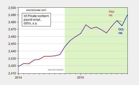
Figure 1: Wisconsin private nonfarm payroll employment, October release (bold blue), and September release (red). Light shaded dates indicate non-benchmarked data. Scale is logarithmic. Source: BLS, DWD.
The jump is a little less impressive once one realizes that September’s figures were revised downward, by 5,700.
The DWD also released Quarterly Census of Employment and Wages (QCEW) figures through June. Recall, these are the series that Governor Walker used to tout as being the gold standard of employment figures, before he stopped touting them as the gold standard of employment figures. In any case, we can use the seasonally adjusted version of the QCEW figures and the historical correlation between the benchmarked BLS series and the seasonally adjusted QCEW figures to determine what the benchmarked employment figures will look like (see this post for methodology). These are shown in Figure 2.
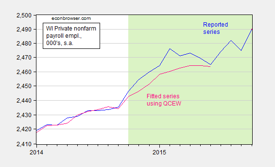
Figure 2: Wisconsin private nonfarm payroll employment, October release (blue), and estimated using a regression on seasonally adjusted QCEW data (pink). Light shaded dates indicate non-benchmarked data. Scale is logarithmic. Source: BLS, DWD, author’s calculations.
The total nonfarm payroll employment series will also likely undergo a similar revision. Here is the counterpart to Figure 1.
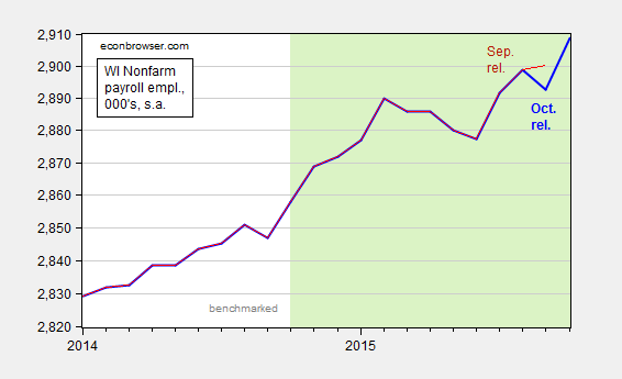
Figure 3: Wisconsin nonfarm payroll employment, October release (bold blue), and September release (red). Light shaded dates indicate non-benchmarked data. Scale is logarithmic. Source: BLS, DWD.
September nonfarm payroll was downwardly revised by 7,400.
The release also notes the fact that the unemployment rate is below the national average. Of course, Wisconsin’s unemployment rate is typically below the national rate. Over the 1976-2010 period, it was on average 0.777 percentage points below. Figure 4 shows the Wisconsin minus US unemployment rate; higher values mean the Wisconsin unemloyment rate is rising relative to the Nation’s.
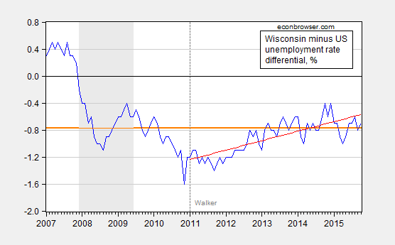
Figure 4: Wisconsin minus US unemployment rate, in % (blue), 1976-2010 average (orange bold line), and linear trend over 2011M01-2015M10 (red line). NBER defined recession dates shaded gray. Source: BLS, DWD, NBER, author’s calculations.
Wisconsin’s unemployment rate is about at average levels relative to history, and in fact over the past nearly five years, Wisconsin’s unemployment rate has been rising relative to the Nation’s.
Closing the Output Gap
…very slowly
According to CBO’s August 2015 estimate of potential GDP, the current output gap is 3.2% (log terms); using the WSJ November survey mean growth rates, even by the end of 2016, output will still be 2.2% below potential.
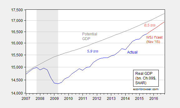
Figure 1: Real GDP (blue), Wall Street Journal mean forecast (red), potential GDP (gray), all in billion of Ch.2009$ SAAR. Figures are cumulative losses. NBER defined recession dates shaded gray. Left axis is a log scale. Source: BEA 2015Q3 advance, CBO, An Update to the Budget and Economic Outlook: 2015-2025 (August 2015), WSJ November survey, NBER, and author’s calculations.
Even using the highest forecasted growth rate (after 20% trimming), the gap is 1.6% (that forecast is from Ian Shepherdson of Pantheon Economics). Increasing the policy rate in December, which seems to be a done deal, is unlikely to mean a faster reversion to potential. The mean forecast implies an additional cumulative amount of lost output of 0.5 trillion Ch.2009$ in the five quarters between 2015Q4 and 2016Q4.
Of course, the CBO estimate is just an estimate. The OECD estimate (November) is 2.0% of potential GDP, while the IMF’s (October) is 1.6%. Both estimates of the (absolute value of the) output gap are smaller than the CBO’s; on the other hand, using information from actually reported inflation suggests a much greater degree of slack than these production function approaches.
November 15, 2015
The Wisconsin Economy since the Last Peak
Compared against Minnesota, Kansas, California, and the Nation
Here’s employment.
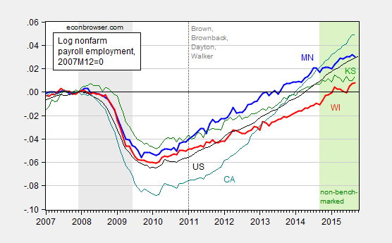
Figure 1: Log nonfarm payroll employment for Minnesota (bold blue), Wisconsin (bold red), Kansas (green), California (teal) and US (black), all normalized to 2007M12=0. NBER defined recession dates shaded gray. Green shading denotes data that does not incorporate Quarterly Census of Employment and Wages information post-September 2014. Source: BLS, NBER, author’s calculations.
While Wisconsin has recently experienced some acceleration in measured employment growth, it’s important to note that that has occurred during a period not incorporating recent Quarterly Census of Employment and Wages (QCEW) data; recall, this is the data source that Governor Walker touted as much more reliable (it is) before he ceased citing it as more reliable. My most recent check of the data indicates that if one were to use the QCEW data to update the BLS establishment series, reported employment would be lower (see this post).
Here’s overall economic activity, as summarized by the Philadelphia Fed’s coincident index.

Figure 2: Log coincident indices for Minnesota (bold blue), Wisconsin (bold red), Kansas (green), California (teal) and US (black), all normalized to 2007M12=0, and forecasted values for 2016M03 using leading indices. NBER defined recession dates shaded gray. Source: Philadelphia Fed (September release), NBER, author’s calculations.
Interestingly, the two bottom performing states are fully controlled (legislature, governorship) by Republicans. The top performing state (California) is fully controlled by Democrats.
An alternative way of assessing Wisconsin performance is to examine where Wisconsin should be, based upon historical (pre-Walker) correlations summarized using an error correction model, and compare it with where it actually is. That depressing story is recounted here.
A final point: In September, Wisconsin employment is over 26,000 below the February 2015 peak. Fortunately, Governor Walker has assured us that Wisconsin is moving in the right direction.
(Latest mass layoff notifications here).
November 12, 2015
Potential GDP, Again
There are various ways of estimating potential output. I typically refer to the CBO’s estimates, which are basically a production function approach (use trend labor and capital stock, and total factor productivity growth, to infer potential output). However, An alternative is to examine price pressures to infer potential output, as in Ball and Mankiw (JEP, 2002).
This is a particularly critical question, given the debate over the desired Fed funds rate, even when just operating within the Taylor rule framework, as discussed in this post.
There are a variety of other methods than the CBO’s (which is essentially a production function approach), including statistical detrending methods such as the Hodrick-Prescott filter (see [1] [2] [3]). Here, I am going to use economics to infer the output gap and hence the level of potential GDP, i.e., exploiting the expectations-augmented Phillips curve, as recounted in this post.
The methodology follows that forwarded by Ball and Mankiw (JEP, 2002), which involves inverting a simple expectations-augment Phillips Curve (without supply shocks, but allowing for random shocks), and assuming adaptive expectations (consistent with the accelerationist hypothesis).
(1) πt = πet – a(Ut-U*t) + vt
(2) Δ πt = a U*t – a Ut + vt
(3) U*t + vt/a = Ut + Δ πt/a
Notice that NAIRU plus a random error is equal to actual unemployment plus the change in inflation divided by a. This suggests that NAIRU can be estimated by filtering the object on the right side of the last equation.
I follow the same procedure, replacing NAIRU with potential GDP, and using core personal consumption expenditure deflator inflation (q/q at annualized rates) for π.
(4) y*t – vt/a = yt – Δ πt/a
I estimate the analogous a parameter over the 1967Q1-2002Q4 period (so I’m assuming the accelerationist model holds over this sample); the estimate I obtain is approximately 0.08. (See this post for an earlier implementation.) I then make two assumptions. First, that adaptive expectations hold, and second that expected inflation equals 2% over the 2003Q1-2014Q3 period — which is pretty close to the average 1-year-ahead CPI inflation rate reported by the Survey of Professional Forecasters over this period, as discussed in this post. In other words, in this second case, I am assuming that inflation expectations are now well-anchored. Hence, the variable on the RHS of (4) is:
(5) yt – (πt-0.02)/a
I then HP filter this variable using the default smoothing parameter for quarterly data suggested by Hodrick and Prescott, to obtain an estimate of potential GDP shown in Figure 1, with green line corresponding to adaptive expectations and red line to anchored.
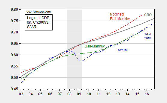
Figure 1: Log GDP (blue), mean forecast from October Wall Street Journal survey (dark blue +), potential GDP as estimated by CBO (gray), and an estimate of potential GDP estimated by use of a modified Ball-Mankiw (2002) method under accelerationist assumption (green), and under anchored inflation expectations (red), all in bn.Ch2009$ SAAR. NBER defined recession dates shaded gray. Source: BEA 2015Q3 advance release, CBO, An Update to the Budget and Economic Outlook (September 2015), NBER, and author’s calculations.
The CBO estimate of potential implies an output gap of -3.2% (in log terms) at 2015Q3. Using the October Wall Street Journal survey estimate for growth over the next year, the gap will still be -2.1% as of 2016Q4! Now, if one believes that the simple accelerationist model of inflation holds (i.e., today’s inflation rate equals last period’s), then the output gap is essentially zero. However, if one believes that inflation expectations are pretty well anchored at 2% (which seems reasonable, given Figure 1 in in this post), the the output gap is nearly -7%! That seems implausible to me, but then, so too does a nearly zero gap, given the lagging inflation rate.
November 10, 2015
“…inflation expectations can change quickly”
One of the arguments for acting sooner rather than later on monetary policy is that if the slack disappears, inflationary expectations will surge. That’s represented in this quote from reader Peak Trader’s comment. While I don’t rule out this possibility, it seems reasonable to me to empirically assess whether this is true for the United States over the past thirty years.
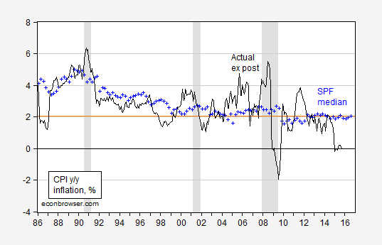
Figure 1: Ex post CPI inflation, year-on-year (black), survey median expectations of 1 year ahead inflation (blue +). NBER defined recession dates shaded gray. Source: BLS via FRED, Survey of Professional Forecasters, NBER, and author’s calculations.
I am sure if there is a drastic regime change, one could see a rapid and dramatic shift in measured expectations; the question is whether that scenario is relevant and/or plausible.
Update, 1PM Pacific: Reader Steven Kopits comments:
The relevant period would be 1960 to 1985. Inflation has been modest since the Volcker days.
Here is a graph with the available survey data.
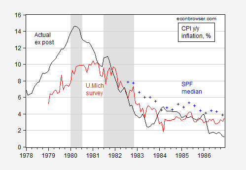
Figure 2: Ex post CPI inflation, year-on-year (black), survey median expectations of 1 year ahead inflation (blue +), and U.Michigan household survey of 1 year ahead inflation (red). NBER defined recession dates shaded gray. Source: BLS via FRED, U.Michigan via FRED, Survey of Professional Forecasters, NBER, and author’s calculations.
I will let readers decide whether expecations turned on a dime. They seem pretty adaptive to me.
November 9, 2015
What the Taylor Rule(s) Say(s)
The St. Louis Fed has a handy webpage where it shows the Taylor-rule implied Fed funds target rate given measures of the output and inflation gaps, and the natural real rate of interest. Here’s recent snapshot I downloaded for my classes.
Source: Federal Reserve Bank of St. Louis accessed 11/4/2015.
The description of the calculations are very transparently presented:
Given a 2% PCE inflation target, the Fed funds rate as of 2015Q2 was just at the implied level.
The careful reader will observe that there are many “Taylor rules”, even from Professor Taylor himself. Besides debates over the proper measures of y, y*, and π (including present or future), and the values of the parameters, there is a crucial debate regarding r*, the real natural rate of interest. For expositional purposes, the St. Louis Fed website uses the 2.5% figure, which — if I were teaching in 2007 — would seem relatively defensible. But for policy purposes, a more nuanced position would seem reasonable. This is where the whole debate over the real natural rate, and more specifically the recent Laubach-Williams estimates come into play. Figure 2 displays the Laubach-Williams estimates as well as the default 2.5% rate used in the above figure.
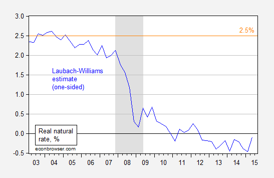
Figure 1: Laubach-Williams real natural rate (blue), and 2.5% (orange). NBER defined recession dates shaded gray. Source: Federal Reserve and CBO via FRED, Laubach-Williams [xls], and NBER.
Substituting in these estimates for r* yields a substantially different picture.
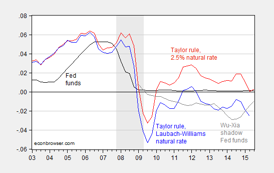
Figure 2: Fed funds rate (black), Taylor rule using 2.5% real natural rate of interest (red), Taylor rule using Laubach-Williams real natural rate (blue), and Wu-Xia Shadow Fed funds rate (dark gray). NBER defined recession dates shaded gray. Source: Federal Reserve and CBO via FRED, Laubach-Williams [xls], Wu and Xia, NBER, and author’s calculations.
Since the Laubach-Williams estimates for the natural rate only extend up to 2015Q2, the implied target only goes up to that data. Nonetheless, the fact that the implied target is about 2.6 percentage points lower than the corresponding value derived using the standard 2.5% equilibrium rate suggests that now is not the time to raise the Fed funds rate; see for instance President Williams’ statement.
Note that if the shadow Fed funds rate equals the actual when the Fed funds rate exceeds zero, then an increase of the target by 25 bps implies that the jump in the shadow rate will be on the order of three-quarters of a percentage point (the end-October shadow rate is -0.53%).
November 8, 2015
Preparing for lift-off
The strong October employment report makes it look likely that the era of zero interest rates will soon come to an end, at least for the United States.
This raises an interesting question for economic researchers of how we bridge statistical models through the episode when the fed funds rate was not a useful summary of monetary policy. I continue to recommend the idea of a shadow fed funds rate that may be negative. Research by University of Chicago Professor Cynthia Wu and Merrill Lynch researcher Dora Xia that will shortly appear in the Journal of Money, Credit, and Banking developed convenient closed-form expressions for magnitudes such as forward rates and risk premia for this model. Here’s the latest value for their series, which had risen to -53 basis points prior to last week’s news.
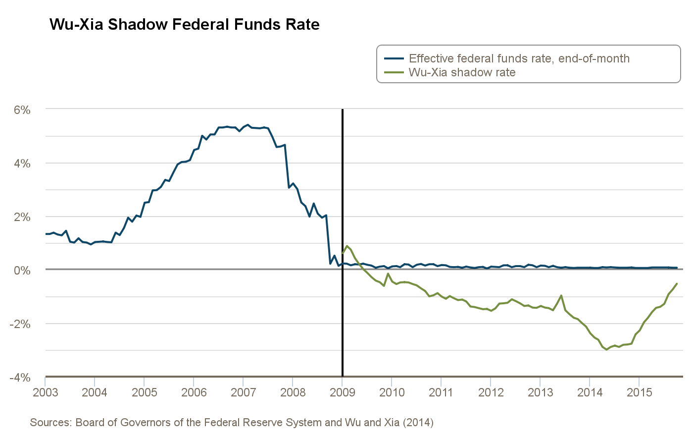
Wu-Xia shadow rate based on data through October 2015. Source: Federal Reserve Bank of Atlanta.
I was at a conference on interest rates at the Federal Reserve Bank of San Francisco last week where a couple of other interesting approaches to modeling interest rates across the zero lower bound were also presented. Fulvio Pegoraro of the Bank of France presented a very nice paper with co-authors Alain Monfort, Jean-Paul Renne, and Guillaume Roussellet that found ways to make the intriguing autoregressive gamma-zero specification quite tractable for many of the questions analysts want to ask of these data. Bruno Feunou, Jean-Sebastien Fontaine, and Anh Le described an alternative tractable approach.
November 6, 2015
Employment in the Recoveries
Despite the depth of the last recession, private nonfarm payroll employment is now higher than the corresponding point in the last recovery.
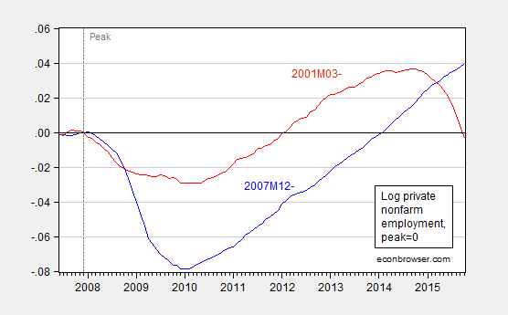
Figure 1: Log private nonfarm payroll employment normalized for NBER peak at 2007M12 (blue), and for NBER peak at 2001M03 (red). Source: BLS via FRED, NBER, and author’s calculations.
Update, 11/7: Reader rtd was confused by the horizontal axis labels in Figure 1, and wants a graph with dates normalized to peak. Here it is. However, I still plot using the same left scale.

Figure 2: Log private nonfarm payroll employment normalized for NBER peak at 2007M12 (blue), and for NBER peak at 2001M03 (red). Source: BLS via FRED, NBER, and author’s calculations.
Menzie David Chinn's Blog


