
Wisconsin Private Employment: “highest one-month jump since 1992”
That’s the headline on this afternoon’s release from the Wisconsin Department of Workforce Development. While completely accurate, the summary leaves a just a little context out…
Here is a graph of Wisconsin private nonfarm payroll employment since January 2014.
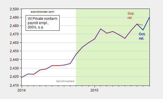
Figure 1: Wisconsin private nonfarm payroll employment, October release (bold blue), and September release (red). Light shaded dates indicate non-benchmarked data. Scale is logarithmic. Source: BLS, DWD.
The jump is a little less impressive once one realizes that September’s figures were revised downward, by 5,700.
The DWD also released Quarterly Census of Employment and Wages (QCEW) figures through June. Recall, these are the series that Governor Walker used to tout as being the gold standard of employment figures, before he stopped touting them as the gold standard of employment figures. In any case, we can use the seasonally adjusted version of the QCEW figures and the historical correlation between the benchmarked BLS series and the seasonally adjusted QCEW figures to determine what the benchmarked employment figures will look like (see this post for methodology). These are shown in Figure 2.
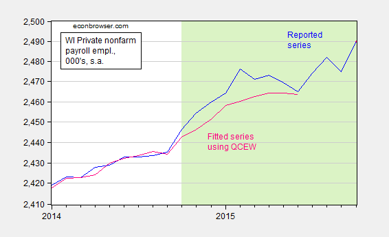
Figure 2: Wisconsin private nonfarm payroll employment, October release (blue), and estimated using a regression on seasonally adjusted QCEW data (pink). Light shaded dates indicate non-benchmarked data. Scale is logarithmic. Source: BLS, DWD, author’s calculations.
The total nonfarm payroll employment series will also likely undergo a similar revision. Here is the counterpart to Figure 1.
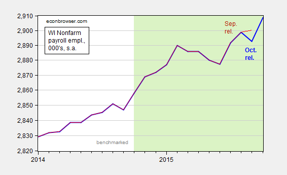
Figure 3: Wisconsin nonfarm payroll employment, October release (bold blue), and September release (red). Light shaded dates indicate non-benchmarked data. Scale is logarithmic. Source: BLS, DWD.
September nonfarm payroll was downwardly revised by 7,400.
The release also notes the fact that the unemployment rate is below the national average. Of course, Wisconsin’s unemployment rate is typically below the national rate. Over the 1976-2010 period, it was on average 0.777 percentage points below. Figure 4 shows the Wisconsin minus US unemployment rate; higher values mean the Wisconsin unemloyment rate is rising relative to the Nation’s.
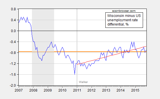
Figure 4: Wisconsin minus US unemployment rate, in % (blue), 1976-2010 average (orange bold line), and linear trend over 2011M01-2015M10 (red line). NBER defined recession dates shaded gray. Source: BLS, DWD, NBER, author’s calculations.
Wisconsin’s unemployment rate is about at average levels relative to history, and in fact over the past nearly five years, Wisconsin’s unemployment rate has been rising relative to the Nation’s.


Menzie David Chinn's Blog


