
Government Debt Crowding Out Watch, Fall 2016
As I updated my slides for teaching an economics course on the financial system at UW-Madison, I recreated this graph, which depicts the rise in Federal debt as a share of GDP, and the trajectory of real interest rates, as proxied by several measures.
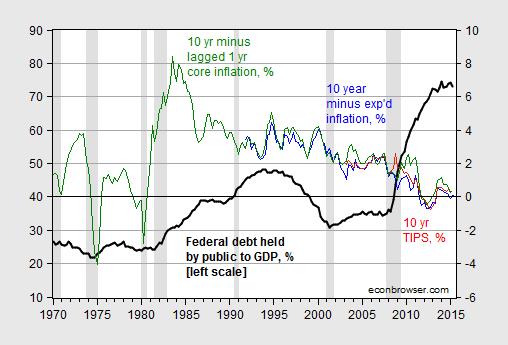
Figure 1: Federal debt held by the public as a share of GDP, in % (bold black, left scale), and 10 year constant maturity TIPS in % (red, right scale), 10 year constant maturity Treasurys minus 10 year median expected inflation in % (blue, right scale), and 10 year constant maturity Treasurys minus 1 year lagged core inflation in % (green, right scale). NBER defined recession dates shaded gray. Source: Treasury, Fed, BLS via FRED, Philadelphia Fed Survey of Professional Forecasters, NBER, and author’s calculations.
Here’s a detail of interest rates, at the monthly frequency.
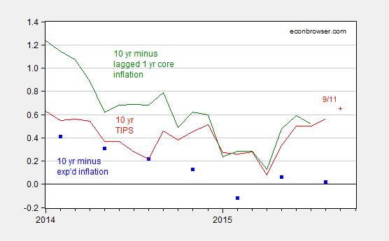
Figure 2: 10 year constant maturity TIPS in % (red), 10 year constant maturity Treasurys minus 10 year median expected inflation in % (blue squares), and 10 year constant maturity Treasurys minus 1 year lagged core inflation in % (green). Source: Treasury, Fed, BLS via FRED, Philadelphia Fed Survey of Professional Forecasters and author’s calculations.
Interestingly, real rates have not risen noticeably even as the shadow Fed funds rate (as measured by Xia and Wu) has risen by about 1.35 ppts since January of this year.
With apologies to Simon and Garfunkel, I ask, Where have you gone, Mister Paul Ryan?.


Menzie David Chinn's Blog


