
David Petersen's Blog, page 16
November 1, 2022
April Mouse Guard 2023 Calendar Art
 This year I'm releasing a Mouse Guard 2023 Calendar. I'll be taking copies with me to Baltimore and selling them through my Online Store. I created seven new pieces of artwork specifically for the calendar (even numbered months mainly). The new pieces were all drawn at 12" x 12" (the size of the Calendar itself)
To the left you can see the final art piece for April. I wanted to do a sailing scene.
Below in this blogpost I'll walk through the steps to creating it.
 Reference:
I've drawn boats in Mouse Guard before, boats as primitive as a few leaves waxed together, or a simple canoe, or a multi-passenger vessel like Conrad's Red Snapper. For this piece I looked at references of junk ships and viking longboats before settling on this norse sailing vessel.
I found a few photos of this ship at different angles and started imagining it coming from the port of Rustleaf rather than Port Sumac.
 Layout:
I drew the boat on a sheet of copy paper with some water suggested on the bow and side. Once I had the boat resized, rotated, and cropped in a Photoshop file, I used a lightpad to draw its passengers on another sheet of paper. I drew the a mouse sailor with a bee companion, a short sword ready Guardmouse, and a healer on the lookout. I added in maple leaf shaped icons to help push the idea that this boat is from Rustleaf (perhaps in an official capacity?). The image was composited together with some color blocking to help fill in the water detail and ropes added using a straight line tool.
 Inks:
Inks:With the above layout all set, I printed out the image (onto two sheets of legal paper that had to be registered and taped back together). I inked this piece on my Twitch stream on a Huion lightpad. Using the lightpad I could see through the 12" x 12" Strathmore bristol to the printout below so I could use it as a pencil guide. I used Copic Multiliner SP pens.
The trick in this piece is how to balance the positive and negative shapes of the water––something I've done since the second issue of Mouse Guard, but always feel like I need to re-learn how to do it when I have to ink bodies of water again.
 Flats:
When the inks were done I scanned them into Photoshop and started the coloring process. In this step I am filling in each area with a flat color (no rendering, no textures)–it's like a professional version of coloring-in-the-lines.
At this stage I also establish the color holds (areas where I want the lineart to be a color other than black), here the water, the maple leaf icons, the sail's stripes, and the healer's embroidery.

Final:
I rendered the piece using dodge and burn tools as well as a stock texture brush to add all the light, shadow, and texture. Figuring out the tones for the water (what should be dark and where there should be highlights) is the first trick in coloring this piece––taking into acound that I can also paint the lineart for the water's color hold. The rest of it was more straight forward, but I felt that some light streaming in helped sell the depth of the piece as well as the Guardmouse shielding his eyes from the sun.
The Calendar is available in my online store: https://mouseguard.bigcartel.com/product/mouse-guard-2023-calendar


October 25, 2022
Soothsayer Deck of Bone Cards
 In the Mouse Guard short story 'King, Knight, Fool, Villain' (which you can watch a reading of here: https://youtu.be/A1lm_necUII) A hermit soothsayer offers to read the fortune of a young mouse using a deck of Bone Cards. I've made the deck a reality that now you can own. Tomorrow in my online store the Soothsayer's Deck of Bone Cards is available for purchase, as is all of the original card art for the deck. http://mouseguard.bigcartel.com/product/soothsayer-s-deck-of-bone-cards
It comes with a reference card that explains the method of fortune telling as well as some suggestions for possible interpretations for each card. The deck comes in a burlap pouch with a stenciled mouse skull and crossbones. Below I'll talk more about the deck.
 As you can see in these selected panels from the short story, I had do design a few of the cards just to draw the comic. Obviously the King, Knight, Fool, and Villain cards were necessary, but I also had to design the card backs and a handful of other cards that can be seen in a few panels. I'd drawn about ten of the cards just for the story. In the narration there's a line about a few of the card names, as well as fleshing out that there were 37 in total (a number I chose for no meaningful reason). So, while writing this tale, I made a list of what all 37 cards should be.
  To the left you can see the full set of card designs. After the story was done I drew the rest of cards on my Twitch Stream. The originals are black brush pen on Strathmore bristol, but after I scanned them, I did some Photoshop trickery to make them a rusty sepia tone to match the story art as well as add some effects to make them look like they were block printed. (for more info on that technique, I just modified Texture Labs' YouTube tutorial for Grungy Block Printing Type: https://youtu.be/nRcpoRHTU0U. I was able to upload a few versions of the card back as well, with different printing/wear patterns on each to help add to the block printing authenticity of the deck.
 In my online store tomorrow I'll be selling the decks, as well as all of the original card art for the set.http://mouseguard.bigcartel.com/product/soothsayer-s-deck-of-bone-cards
 In the drop down option menu, you can order a deck (or multiples) and/or a deck + one of the original pieces of art (you are not limited to only purchasing one original, just every original comes with a deck of the cards).
'King, Knight, Fool, Villain' is a short that hasn't been published traditionally yet. It will eventually be collected with 'Piper the Listener', 'The Owlhen Caregiver, and 'The Wild Wolf' as well as two new shorts when I write/draw them. But, I did ask voice actor David Sharp to do a reading of the story that is currently up on YouTube. You can watch below.
To order The Soothsayer Deck of Bone Cards:
http://mouseguard.bigcartel.com/product/soothsayer-s-deck-of-bone-cards
October 18, 2022
Scary Godmother Tribute for the Baltimore Yearbook
 For roughly a decade the Baltimore Comic Con has published a convention art book called 'The Baltimore Yearbook' that usually features a creator-owned character or property, where that creator is a guest of the convention. Selected guest artists are asked to contribute a piece of fan art for the book to celebrate the creator and property. It allows us to play in someone's world, and offers a chance for attendees to meet new creators as they go around the show floor collecting autographs in their yearbook.
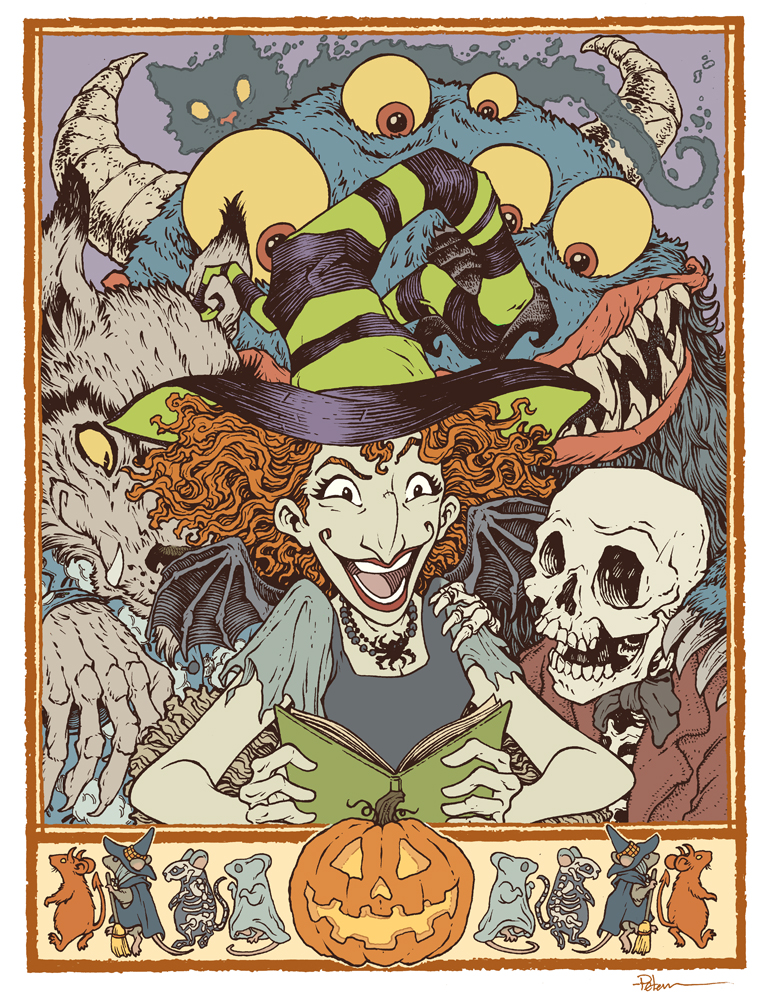
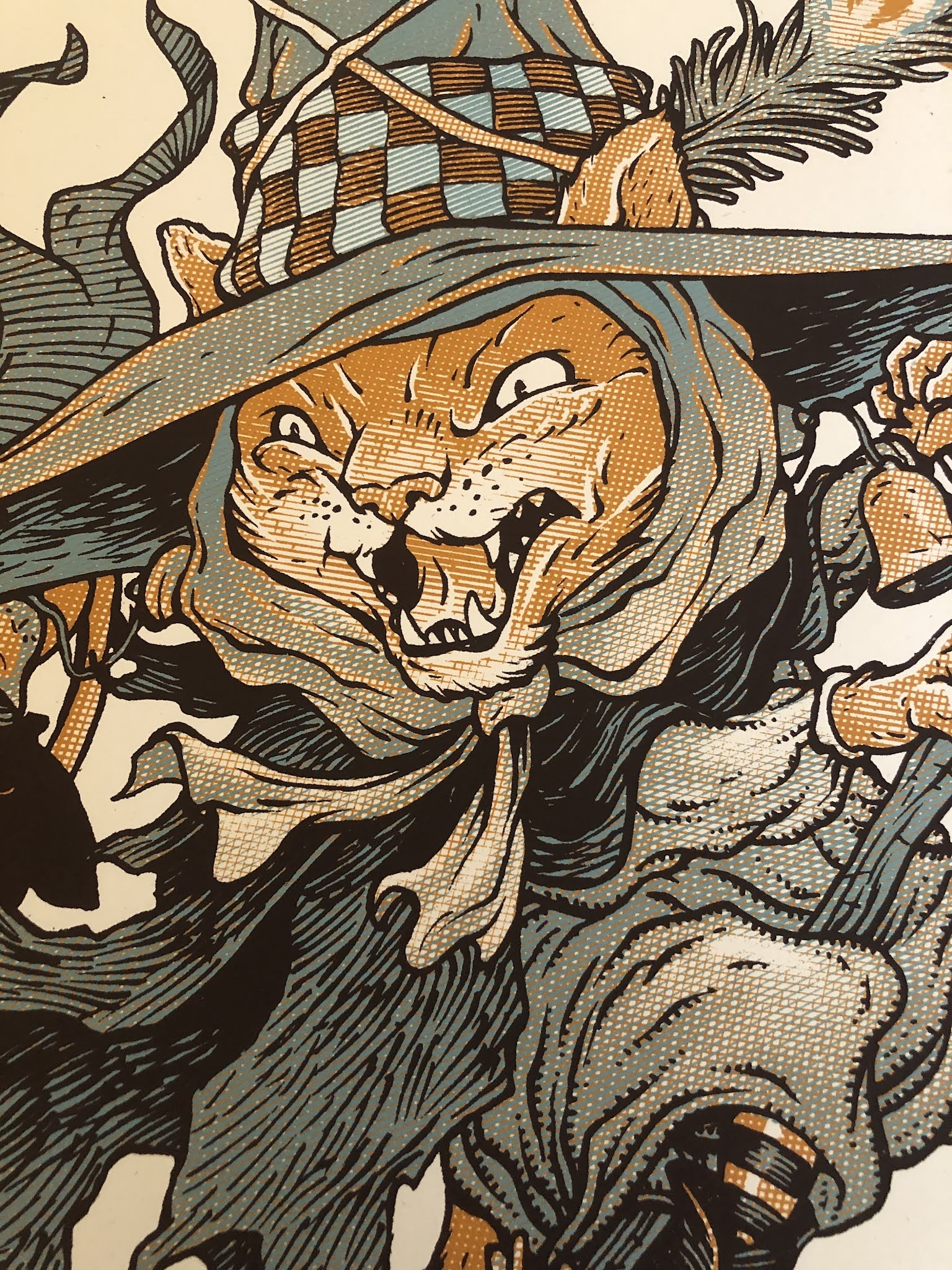
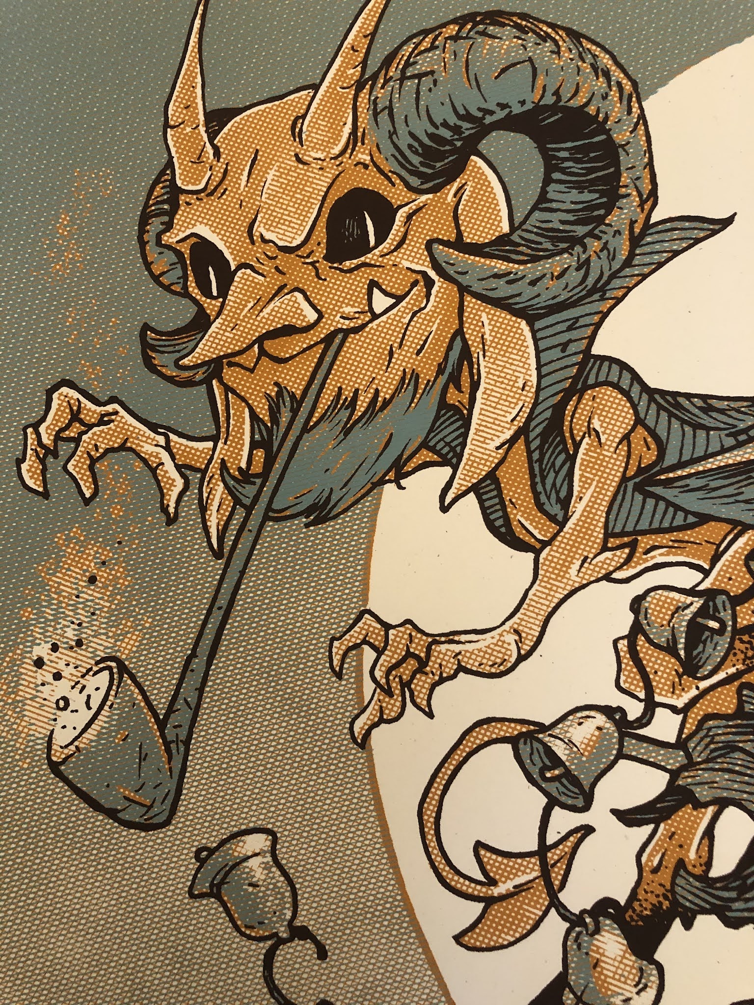
This year's subject is Jill Thompson's Scary Godmother! To the left you can see my finished art, and below in the blogpost I'll walk through my process.
 We are always encouraged to include our own characters into our Yearbook piece--to create a cross-over image that might not have otherwise happened. I'm always hesitant to add mice from Mouse Guard into these pieces––but a few years ago in the Blacksad piece I did add a mouse character as they would appear in that title. And here I thought it would be fun to add in some mice dressed for Halloween characters to form a border (and distract from the fact that the rest of the composition would be a character pile-up.
Once I had my border, I drew each character separately (starting with Scary Godmother herself) on copy paper while using a light pad (think of it as making Photoshop layers in the physical world.) I adjusted the size & position of the characters until I had a composition I was happy with (and adding some quick flat color helped me see if the composition worked in terms of light/dark masses.
 With the pencils/layout done, I printed out the composition (on two sheets of legal paper that had to be registered and then taped back together) and then taped that to the back of a sheet of Strathmore 300 Bristol. On my Huion lightpad, I can see through the surface of the bristol down to the printout to use it as a guide to ink by. I used Copic Multiliner pens (mostly the 0.7 nib) to do all the inkwork.
The trick was balancing my normal texture work with the usually very open forms Jill has when she draws and paints these characters. The original inks for this piece will be up for auction at the convention.
 Once the inks were finished, it was time to start coloring the piece. I scanned the inks and began laying in flat colors. This part of the process is called 'flatting' where the color areas are all established with flat colors (no shading, no rendering, no textures, no effects). Some of the color choices were done for me by needing to be on-model from Jill's comics, but I'd also made some choices for the saturation and values when I did my quick color blocking in the pencils stage.
In this step I also established all the color holds (areas where I want the ink lines to be a color other than black) like Boozle the ghost cat's outline, the border, and the glow inside the pumpkin.
 The last step was to do the final rendering and lighting effects for the piece. I did this mostly using the dodge and burn tools and a stock Photoshop brush.
This piece will be published in the Baltimore Yearbook later this month. That book will be available for purchase at the convention and through the con's website afterwards. The original inked piece will also be for sale in the art auction at the con on Saturday.
 2021: Halloween:https://davidpetersen.blogspot.com/2021/10/happy-halloween-baltimore-yearbook.html
 2018: Strangers in Paradise:https://davidpetersen.blogspot.com/2018/09/baltimore-yearbook-strangers-in-paradise.html
  2017: Tellos:https://davidpetersen.blogspot.com/2017/09/tellos-baltimore-comic-con-yearbook.html
 2016: Archie:http://davidpetersen.blogspot.com/2016/08/baltimore-yearbook-2016-archie-process.html
 2015: Mouse Guard:http://davidpetersen.blogspot.com/2015/09/baltimore-comic-con-yearbook-cover.html
 2014: Grendel:http://davidpetersen.blogspot.com/2014/08/baltimore-yearbook-grendel.html
 2012: Liberty Meadows:http://davidpetersen.blogspot.com/2012/09/baltimore-comic-con-yearbook-2012-this.html
October 11, 2022
Celanawe - 10th of the Black Axe wielders
 For a new 10 piece print set, I illustrated all of the past wielders of the Black Axe from Bardrick to Celanawe. I'd shown and listed the wielders in the Black Axe book--but they were only ever visualized as embroidery details on the Adana Tapestry––and I wanted to give them a more solid design existence. The set of ten 4.75" x 4.75" prints is available for sale in my online store and comes in a vellum envelope:https://mouseguard.bigcartel.com/product/wielders-of-the-black-axe-print-set
To the left you can see the finished art for the Celanawe, 10th of the Black Axes print in the set. Below I'm going to go through the process to create the art.
 Layout:
I wanted Celanawe's piece to feature wolves––which is a trick to include due to scale...either they are so far away that they are silhouettes, cropped to obscurity, or the mouse is so tiny they aren't a focus of the art any longer. So I had to cheat a bit with some foreshortening. I had a Celanawe already drawn and then I started placing in photo reference pics of various wolves until I found one that seemed like a believable composition. I then redrew the wolf from the reference, and added a bit of a rocky bit of coverage Celanawe can hide in. Some of the rock drawing is digital, but the wolf and Celanawe are drawn traditionally on copy paper and scanned into Photoshop and tinted for clarity.
 Inks:
Inks:I printed out the above layout when I was happy with the arrangement and taped that printout to the back of a sheet of Strathmore 300 series bristol. On my Huion Lightpad I'm able to see through the bristol to the the printout to use it as a guide to ink from. I ink with Copic Multiliner SP pens, and I used the 0.7 & 0.3 nibs for this piece.
Knowing the foreshortening and depth of field was going to be important, I left a white gap between the wolf inks and Celanawe, the plants, and rocks in the foreground. This way I could help sell that distance both here in the inks and in the next step.

Color Flats:
When the inks were done, I scanned the art and brought it back into Photoshop to start the coloring process. This is the step where I 'm basically just filling in each area with flat color. In this step I also establish the color holds, areas where I want the ink work to be a color other than black. The wolf and ground in this case became one big color hold, and the runic numeral '10' became another. I did give Celanawe a charcoal colored cloak here––like he had when inducted, but also what he wears in Winter, and unlike the faded light blue he wears in the Black Axe book.

Final Colors:
The final colors were rendered by using the dodge and burn tools in Photoshop (and a textured brush) to add shadows, highlights, and textures. I select areas and play with the color balance to shift colors in some areas.
The entire 10 piece print set is available in my online store: https://mouseguard.bigcartel.com/product/wielders-of-the-black-axe-print-set
October 4, 2022
Halloween Silkscreened Print Repost

Last year around this time I created a Halloween themed piece for the Baltimore Yearbook, and since it didn't have any copyrighted characters, and I really liked the piece, I decided to also offer it as a 18" x 24" silkscreened poster. In this blogpost I'm going to go through some of the process of going from full-color art to a 3 color piece suitable for silkscreening. If you want to go back to the original post to see the though & art process behind the composition iteself, click here:
Original Blogpost:
https://davidpetersen.blogspot.com/2021/10/happy-halloween-baltimore-yearbook.html
And if you'd like to purchase one of the few remaining prints: https://mouseguard.bigcartel.com/product/halloween-trio-screen-printed-18-x24-poster

I'd had some experience with breaking down art for the silkscreening process. With a degree in printmaking and three Mondo Prints under my belt (Brave, Rescuers, & Mouse Guard) I have the basics down. But this this piece was different in that I wasn't starting from scratch and already had a full color version that needed to be broken down to three colors.
Assuming one of those three would be the lineart, I needed just the shaded tones broken down. So, I stripped away the lineart, and the colors to make a greyscale version of the tones.
 Silkscreen printing is binary, an area on a screen either will or won't allow ink to penetrate the screen. to get the tones to be either on or off, I converted my greyscale version to bitmap, and then in the options for how Photoshop should interpret grays, I chose 'HALFTONE SCREEN".
 There are further options for the shape, frequency, and angle of the this halftone treatment. Getting these numbers right for your project always requires a bit of trial and error (or undo and do again--as well as adjusting the levels/contrast of the image before applying the halftone treatment). I went with a line shape and then played with the frequency and angle a bit (in fact, I purposely made alternate versions using different numbers for later steps.
 For my first color, I actually combined two alternate angles of the halftone screen pattern and merged them together (this is a recreation I generated for this blogpost––so the angles and frequency doesn't quite match my final art)
As I mentioned above not only does this take trial and error when converting to a bitmap, but also adjusting the levels/contrast of the original greyscale image helps control how thick and thin those halftone screen lines get.
For the printed piece I also generated one of these (just in one angle) going in a third direction that would be the blue-grey color you see in the final.
 With the orange lines on one layer and the blue-grey on another, I could mask away areas of either to let one of those colors come through more or less. I also masked out some areas where I wanted more extreme highlights where just the paper color would show through.
And this was a trial and error process too. Instead of erasing away these pixels, I used layer masks that can be easily adjusted or restored without having to undo sixty steps back to get to a previous version.
In this image you can see that I also added in the text in these colors
 The final three color print was Silkscreened on 100 lbs French paper by Ocelot Print Shop in Detroit, MI. It's limited to an edition of 50 (signed and numbered).
 And I still have a few left in my online store:
https://mouseguard.bigcartel.com/product/halloween-trio-screen-printed-18-x24-poster
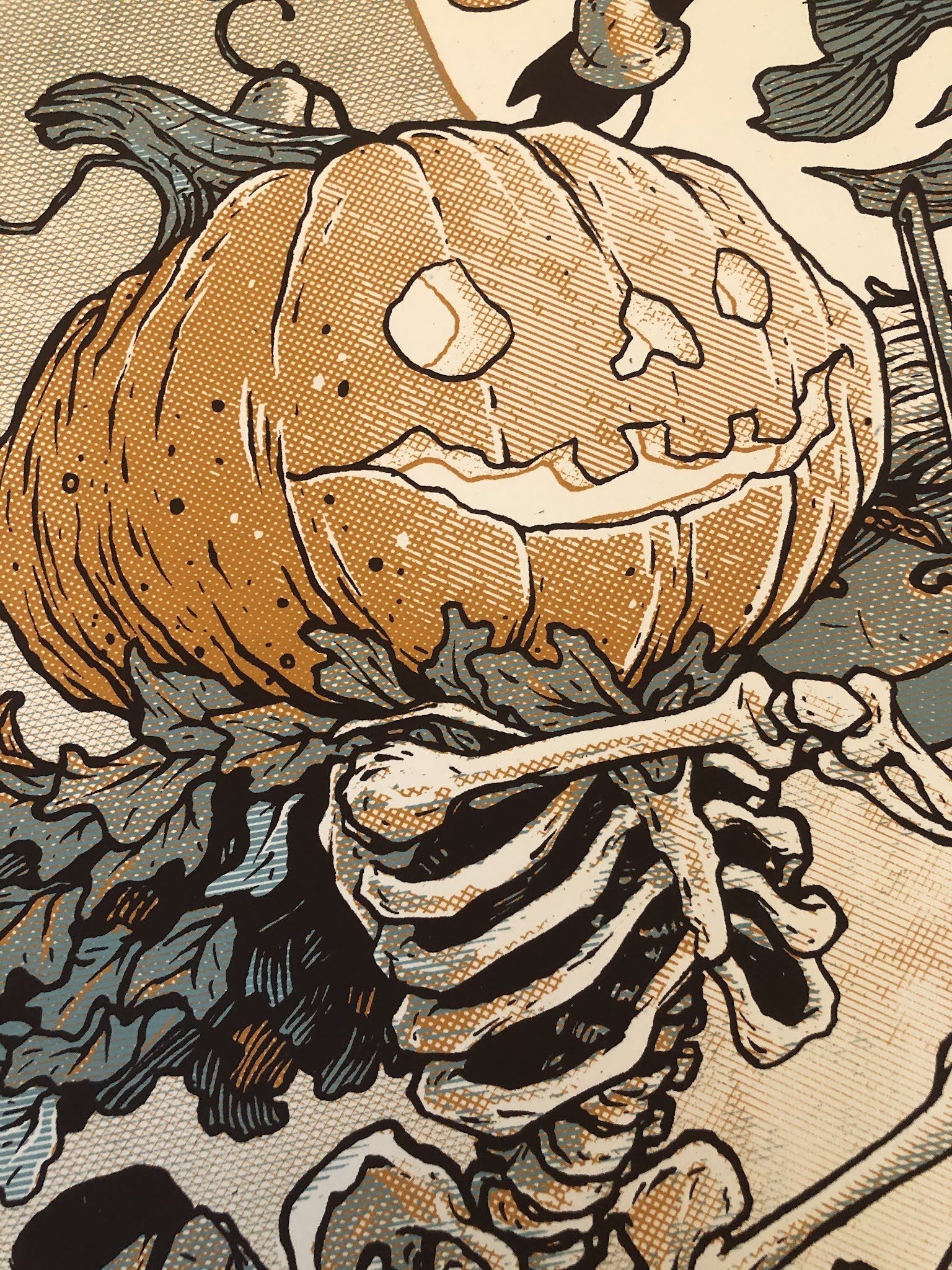
Detail image of the 3 color treatment below:
September 27, 2022
February Mouse Guard 2023 Calendar Art
 This year I'm releasing a Mouse Guard 2023 Calendar. I'll be taking copies with me to Baltimore and selling them through my Online Store. I created seven new pieces of artwork specifically for the calendar (even numbered months mainly). The new pieces were all drawn at 12" x 12" (the size of the Calendar itself)
To the left you can see the final art piece for February. I wanted to have the scene to have some implied romanticism without being overly mushy. So one mouse has brought in enough little blooms to fill the room and kneels as they proclaim their affection for the other.
Below in this blogpost I'll walk through the steps to creating it.
 Layout:
I started with two pieces of reference (not shown here) a photo of a stone arched window nook and a photo I took of little flowers Julia was growing in our garden. I used the architecture photo as reference to pencil the background one a sheet of copy paper. On another sheet I drew my mice, and on yet a third I designed costumes for them as well as the flowers in the room (I did this last sheet on a light pad so they lined up with the figures). I scanned these three sheets and composited them together in Photoshop (tinting each a different color to help me see which lines belonged to which drawing. I also digitally added in some diagonal floor planking, the lead pattern in the glass, and two Lockhaven banners.
 Inks:
Inks:With the above layout all set, I printed out the image (onto two sheets of legal paper that had to be registered and taped back together). I inked this piece on my Twitch stream on a Huion lightpad. Using the lightpad I could see through the 12" x 12" Strathmore bristol to the printout below so I could use it as a pencil guide. I used Copic Multiliner SP pens.
Originally, in my mind, the windows would be flooded with sunlight, rays and streams of it coming in and lighting the characters, so I abbreviated the glass lines to suggest the light blowing out their full forms.

Flats:
When the inks were done I scanned them into Photoshop and started the coloring process. In this step I am filling in each area with a flat color (no rendering, no textures)–it's like a professional version of coloring-in-the-lines. At this stage I also establish the color holds (areas where I want the lineart to be a color other than black), here the standing mouse's clothing embroidery and the banner emblem.
As you can see, the plan for a bright sunny day outside was still in effect at this point...
 Final:
I rendered the piece using dodge and burn tools as well as a stock texture brush to add all the light, shadow, and texture. I was working on this piece on stream and when I was about half to three quarters done, I started complaining about the piece being washed out and losing focus. Someone in chat suggested the windows be revealing a night sky. I duplicated my sky layer and painted it dark blue, and then cut out a circle in it to reveal the original daytime sky colors as a full moon. I added some more digital effects on top to help sell the lighting on the figures I'd already done.
The Calendar is available in my online store: https://mouseguard.bigcartel.com/product/mouse-guard-2023-calendar
September 20, 2022
Childhood Animations
Watch on YouTube: https://youtu.be/4JjwhEY-edI
Animations:
 Pinocchio & Jiminy: 00:06
These two shorts I *think* are my first tries at animation. The figures are both made of placticine clay--but as I didn't have all the colors I needed, I painted the clay sculptures with poster paint. The background was a piece of formica countertop that came off a table I salvaged. I spray painted it blue, and then used poster paints to create the background. The grass is an astroturf scrap from our back porch.
I used the family VHS camcorder, which took full-size tapes, and clicked record and stop record for every frame. The camera's tape indexing was finicky, and I had to watch the counter and let it go 3 clicks before stopping the recording because it would always rewind the tape roughly 2 of those clicks before it started recording again.
 3 Little Pigs & The Big Bad Wolf: 00:35
I used the same setup as before, nut just washed and repainted the scenery. The plasticine characters are also painted (perhaps the same clay as Pinocchio after I was finished with him). It's very hard to tell the narrative, so I'll help: The wolf tries to blow down the brick house (a paper cut out used for huffing & puffing breath) and when he can't get it to fall, he puts out a sign for free corn. The wisest of the pigs come out to get the corn (also a paper cutout) and is cornered by the wolf--but there happens to be a spare brick from his home masonry there too, and he shouts 'Eat this!" (written on a word balloon cutout) and pitches the brick into the wolf's mouth, knocking the predator out and allowing the pig to discard of the sign & return home.

TMNT Figure Battle: 00:55
The backdrop here is the same as the above animations, but with the backside showing where all the old mastic glue was dried. I remember thinking having some rigid articulation would be much easier to move than painted clay (every time I moved the clay too much it may crack, bend too much, or allow cracks in the paint). So, I pulled out my TMNT figures. The amount of flexibility isn't exactly what I needed for martial arts movements (hence the flipping of Michelangelo just switching between him standing on his head to standing on his feet with no moves in between). Not sure why a pair of nail clippers are used as a weapon (other than that I probably lost all their weapons long before this). This segment also suffers from word balloons that go away too quickly to read.
 Roadrunner & Coyote: 01:02
I had a few of these flocked Looney Toons character toys. The backdrop is the same as the TMNT one, but I'd spray painted it to look like 'desert rock'. This was shot in my childhood basement on a card table (the earlier segments were all filmed in the living room)--I only mention that because I think I had illusions of really being able to take my time down there––I wouldn't be in anyone's way, no one would walk by and accidentally knock over a character...but the only part I think has any merit for time being taken is the bit with Wile E. Coyote painting the tunnel. The car Roadrunner drives is an old Mickey Mouse toy (with the mouse long gone). And our flattened Coyote is the (now grey mud colored) plasticine from earlier animations.

The Simpsons: 01:09
Here I tried hand drawn animations. Each image you see is hand drawn on a different sheet of paper. I hand colored every frame with markers––but quickly leaned why cels are so important in drawn animation, so that things like the stage, curtain, and footlights don't need to be redrawn and colored for every. single. frame. The animation abruptly stops when Homer come running in––but I think that had to do with my markers running dry and being called for dinner.

Four Baby Turtles: 01:13
My friends and I were planning to make a TMNT movie with us all in costume (I was making shells out of styrofoam meat trays and spray insulation). For the flash-back where Splinter recalls finding the baby turtles in the ooze and then marveling at how quickly they grew/mutated, I thought I could do that with a mix of claymation and moving the sculpts in front of the camera. This was only a test to see if I liked idea and if I could make it work––even then I knew I'd have to light everything better, make more elaborate sets, and have more in-between frames. We never even started the movie (but I did make all the costumes--twice!)
 Claymation For Its Own Sake: 01:28
There are a few different segments here of just moving clay around. And instead of making specific characters, just have the clay seem like it's a semi intelligent form that is morphing between shapes. The backdrop is again the backside of the formica (though now painted flat black) and the 'floor' is the top of a 60's funky floral TV tray. The animation may seem smoother here, and that's because I was using more frames, but also recording though the VCR. I had the camcorder plugged into the VCR with AV cables so it acted like an eye, but the VCR did the recording. This was an improvement because the VCR's record and pause was a cleaner frame than the camcorder. At some point I know I also played with recording at different speeds than I played back to get the frame rate higher--but I can't tell if I did that on any of these
 Dinosaurs!: 01:56
I did this in an animation class I took at the Flint Institute of Arts. The background was drawn by my friend Mike, who was also taking the class, for his own paper cut-out animation. I sculpted Robbie out of different colored clay rather than painting it like I had years before. His eyes were plastic beads. I showed up to class with Robbie sculpted from home, but nothing for him to do, so I quickly made the little egg nest and a not-the-baby baby for him to eat(?!). Robbie was not very flexible (you can see some cracks on his mouth when I open it too wide) mostly due to how thick he is.

Cats Trio: 02:06
For those unfamiliar with Cats Trio, it was a comic Jesse Glenn and I worked on in High School. Jesse had stayed the night and while I slept, he drew Dave-Cat holding Mike-Cat over a bath tub with a shark in it. The next day he and I worked on this animation. This was using the VCR as the recording device--and in fact we're watching each frame on the living room TV behind it as we animated it.
 Swing Arm Lamps: 02:30
My mother's swing arm lamp from her sewing table, and some tennis balls and a toy car gave me a chance to animate with more movement fidelity. While Pixar's Toy Story wasn't out when I made this, I think I had seen a TV special about the dawn of computer animation where they featured their mascot lamp Luxo Jr. and that inspired these. I knew I liked the idea of having very fine tuning with movement where my subject wasn't going to break, crack, or be limited to points-of-articulation. This was recorded in my living room using the VCR to record the frames from the camera.
 Young Stephen Crane Mouth Test: 02:48
The next batch were all animated using a DOS based program called Disney Animation Studio. Each cel was hand drawn (using a mouse). This wasn't my first animation with the program--in fact, I think it's towards the end of high-school based in the anime style I'm going for. This was to practice getting some lip-synch. The character is a younger version of a Plotmasters Superhero of mine named Stephen Crane. After seeing Humberto Ramos' Impulse, I thought it would be fun to try drawing a few of the characters from that series as wide eyed kids.
 Blackcat on a Rooftop: 03:02
Another Disney Animation Studio test. Getting the background to load in as separate cells was a little challenging in this program, and here I was testing how to do some limited character animation with my rooftop vigilante Blackcat against a very full background (I think Blackcat's head is the only animated cels).
 Lucky Running: 03:14
At some point, I decided Blackcat could have a pet cat, named 'Lucky'. But then somewhere along the line I decided to make Lucky a cartoon style character (opposed to a style befitting a Jim Lee looking superhero owner). This was a run cycle for Lucky while swapping in alternating backgrounds of motion speed blur.
 Wheel-Less Hamster: 03:24
This is only a 3 frame runcycle (and perhaps one of the last animations I ever did on Disney Animation Studio) I know I started working on a spinning hamster wheel, but I never seemed to have finished it or saved the files anywhere I can use them. I did a lot of animation (pencil tests and finished colored stuff like I've been showing) that were lost. The files were not backed up, I perhaps deleted things I wasn't proud of to 'make room' back when disk space was expensive, and I know some of it was on a floppy that was corrupting as I was pulling the files onto a modern hard drive. There were space ship pilots, cargo bay doors opening, an unflattering caricature of a friend bouncing down the sidewalk like a ball, talking alien dragons, The Yellow Submarine going in and out of portals, and animated logos––all lost.
 Beanie Squad: 03:38
But I have saved my two best Disney Animation Studio bits for last. These were the longest things I ever animated. First up is a Plotmasters IP called Beanie Squad where chibi versions of my friends and I are given magical colored Beanies that allow us to fly and use ridiculously sized weapons. Jesse worked with me on some of the animation, most notably the missile launcher. I hope someday Jesse and I will get to do a Plotmasters episode about this one.
 Zippy and Poohbah: 04:02
Zippy and Poohbah are two other characters of mine from the Plotmasters days (hopefully we'll get to do an episode about them someday). It was a little bit Calvin and Hobbes, but where the little boy was eternally happy and could fly really fast. His stuffed 'Poohbah' bear was originally inspired by the Panda from Ranma 1/2. I think I was animating this like it was the opening to a TV show, but it ends and loops because of the limitations of PCs back when I did this, I couldn't load any more cels without the program locking up due to memory.
 Snappy Patlabor: 04:47
This was animated on the water heater in the basement of my childhood home. Before capture cards or digital cameras were a regular consumer product, there was something called a 'Snappy' that used a 9 volt battery and plugged into the parallel printer port of your computer. it had AV jacks to plug in a VCR so you could capture a still frame from TV. Jesse and I used a very long set of AV cables to go from the Snappy, out the computer room window, down the side of the house, in a basement window, and into the old VHS camcorder. Using walkie talkies to communicate with each other, I was in the basement slowly moving the Patlabor model figure, as Jesse clicked 'capture' and saved the frame as a sequential filename.
Occasionally Jesse came down to the basement to help, like when we rigged the Macross model to drop from the floor joists on fishing line spooled on a flat stick (only dropping the model one turn of the stick each frame). I'm proud that we made camera decisions with closeups and even some ambitious pans. I wish this were longer, but we ran out of steam that night, and in the morning something had fallen over or down that ruined the scene and we didn't pick up from a new location or camera angle.
Thanks for indulging me in sharing my childhood dives into animation (or as I said, the ones that survived––I know there was lots of computer cel animation, and a few stop motion bits I wish I still had too.)
September 13, 2022
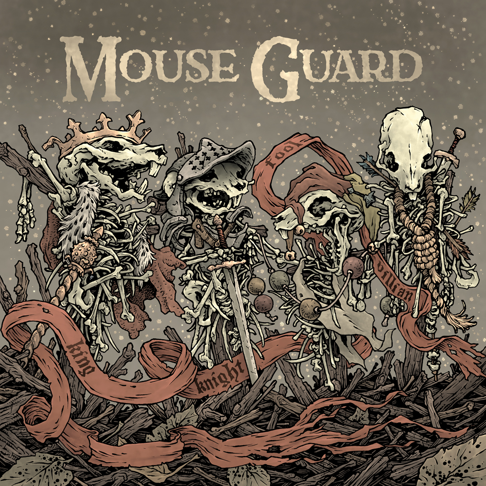
King, Knight, Fool, Villain Cover Process
 A few weeks ago I shared a video: https://youtu.be/A1lm_necUII of a reading of my latest Mouse Guard short story: 'King, Knight, Fool, Villain' performed by David Sharp. The short is in the tradition of Baldwin the Brave and The Owlhen Caregiver, where a Mouse we know from the main series is being told some kind of morality lesson that directly informs who they grow up to be.
The story has not been published in print form––but when I have two more of these types of tales finished, we will have enough to publish another collection of them. In the meantime, this blogpost will go into the process for creating the 'cover' art for this story.

Rough/Pencils:
The story involves mouse skeletons dressed to be certain roles or figures in fortune telling, and the four main subjects of this story are the King, Knight, Fool, and Villain. I drew each set of bones on copy paper, and then on different sheets and on a lightpad, I added the clothing and props so that each would 'read' as their various roles. Another sheet was used to draw the ground cover and the ribbon that would snake around and bear each of their titles. I assembled all these elements in Photoshop and gave a quick blocking color pass so I could easily see what lines belonged to what forms.
 Inks:
Inks:I printed out the above layout (on two sheets of paper that needed to be taped together) and taped it to the back of a sheet of Strathmore 300 series bristol.
I inked the piece with Copic Multiliner SP pens (the 0.7 & 0.3 nibs) while on a light pad. That way I can use the printout as my pencil lines with no need to erase anything when the inks are done.
I added lots of dots in the background––but I knew that in the coloring stage I was going to color hold those so they looked less like ash and more like dust particles caught in the light.
 Color Flats:
When the inks were finished I scanned the original into Photoshop and started the coloring process. This first part of digital coloring is called 'flatting' which basically means filling in every area with flat base colors. A few of the color choices were already established in the rough (the muted clothing, the bones, and the ribbon), but in this stage I need to get the color palette set for the entire piece. I wanted something that was warm, but so muted it also felt cold.
As I mentioned above, I established a color hold (areas where I want the inked art to be a color other than black) for the dust in the air and the type on the banner ribbon.
Final Color:
Here again are the final colors for the cover. I rendered all the shading with the Dodge and Burn tools using a stock Photoshop textured brush.
September 6, 2022
Mouse Funeral
 I've released a new Mouse Guard sketchbook titled "Alone Together" (https://mouseguard.bigcartel.com/product/alone-together-sketchbook) The majority of that material is inked commissions I did during last year's ONLINECON event. But to round out the sketchbook sometimes I need to generate some material of my own both to fill up pages and to add certain tone or subject for a thematic through line for the work in the book
To the left you can see one of those pieces finished and colored ready for a page in that sketchbook––and in this blogpost I'll break down the process to get there.

Layout:
The sketchbook 'Alone Together' has a bit of a theme about living through the pandemic. And while some of those piece of art had to do with hobbies or hiking or isolation, I felt I needed to touch on the idea of the loss of life. I've drawn mouse funerals before in the pages of Mouse Guard, and wanted to show one that had some ritual to it, something that felt like honoring the dead. I drew the body and the platform and then using a lightpad drew the mice carrying them on separate sheets of paper. I drew the mouse leading the service as well as the pre-lit pyre that way too and then digitally cobbled them together and added a few tones to help me remember where some shadows would be.
 Inks:
With the above layout finished, I printed it out and taped it to the back of a sheet of Strathmore 300 series bristol. On my Huion Lightpad I was able to use the printout as a guide to ink from. I used Copic Multiliner SP pens (the 0.7 nib).
Inks:
With the above layout finished, I printed it out and taped it to the back of a sheet of Strathmore 300 series bristol. On my Huion Lightpad I was able to use the printout as a guide to ink from. I used Copic Multiliner SP pens (the 0.7 nib).The trick on this piece was to make the ground cover darkest under the mice & deceased, but in a way where I could feather the technique out to be almost non-existent where the shadows were's to make the piece have to texture-breathing-room.
Color Flats:
 With the finished inks scanned I could start on the coloring process. The original inked art was shipped off to the new owner and I worked on this piece for my sketchbook. The color flats stage is just coloring in the lines with flat colors, establishing what every major area's base color is––no rendering, no textures, no effects. I went with the matching cool toned red hoods & collars to help with that sense of ceremony.
 At this stage (but not shown here) I also added color holds (areas where I want the linework to be a color other than black) to the flames on the candles.

Final Colors:
Using Photoshops's Dodge and Burn tools (as well as a stock textured brush) I added all the shadows and highlights. In some places I shifted colors by selecting areas with a lasso tool and using color balance sliders to get them where I wanted them. I added some lighting effects to the candles and a digital thumbprint smoke effect layer to the censer (which I forgot to turn on before turning in to the printer––and so it's not visible in the printed sketchbook)
This piece is one of the pieces included in the 2022 Mouse Guard sketchbook 'Alone Together' which is available in my online store: (https://mouseguard.bigcartel.com/product/alone-together-sketchbook)
August 30, 2022
Ivonne - 8th of the Black Axe Wielders
 For a new 10 piece print set, I illustrated all of the past wielders of the Black Axe from Bardrick to Celanawe. I'd shown and listed the wielders in the Black Axe book--but they were only ever visualized as embroidery details on the Adana Tapestry––and I wanted to give them a more solid design existence. The set of ten 4.75" x 4.75" prints is available for sale in my online store and comes in a vellum envelope:https://mouseguard.bigcartel.com/product/wielders-of-the-black-axe-print-set
To the left you can see the finished art for the Ivonne, Eighth of the Black Axes print in the set. Below I'm going to go through the process to create the art.

Layout:
The Adana Tapestry image of Ivonne is pretty plain--just a brown mouse with a red cloak--no other clothing or decorative cues. So, for this piece I took some liberties to make her more interesting with details like a tartan cloak and clothing embroidery and scars. I drew her on copy paper with the idea that she's standing on a dead weasel, though I drew that weasel (as well as the axe) separately on different sheets of paper. In Photoshop I merged all three drawings as well as a runic number '8'. Tinting them each a different color helped me see which line belonged to which drawing so I could easily clean them up and scale everything appropriately.
 Inks:
Inks:I printed out the above layout when I was happy with the arrangement and taped that printout to the back of a sheet of Strathmore 300 series bristol. On my Huion Lightpad I'm able to see through the bristol to the the printout to use it as a guide to ink from. I ink with Copic Multiliner SP pens, and I used the 0.7 & 0.3 nibs for this piece.
Besides my normal desire for interesting line weights and textures, the only trick here was to leave a gap around the tartan plain pattern on her cloak from the contour lines of the form & wrinkles.

Color Flats:
When the inks were done, I scanned the art and brought it back into Photoshop to start the coloring process. This is the step where I 'm basically just filling in each area with flat color. I made the cloak red, but with a gold plain pattern, and then used a grey-green for her main clothing palette. In this step I also establish the color holds, areas where I want the ink work to be a color other than black. Here I pushed all the background flower lines back, added the above mentioned plaid & embroidery, her scars, and the numeral '8'.

Final Colors:
The final colors were rendered by using the dodge and burn tools in Photoshop (and a textured brush) to add shadows, highlights, and textures. I select areas and play with the color balance to shift colors in some areas.
The entire 10 piece print set is available in my online store: https://mouseguard.bigcartel.com/product/wielders-of-the-black-axe-print-set
David Petersen's Blog

- David Petersen's profile
- 339 followers

