
David Petersen's Blog, page 19
April 5, 2022
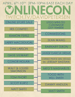
ONLINECON 2022 INFO!
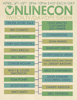 April 6-10 ONLINECON is BACK! A free online event with 20 guests, an online store sale, and much more... I'll be running a special event on my Twitch Stream (twitch.tv/davidpetersen). Over the course of those 5 days I'll be streaming 8 hours per day, spending half the time drawing commissions, and the other half with guests for panels, interviews, and programming!
I'll also be running a sale in my online store and adding new original artwork and merchandise to the store.
To the left you can see the promo for the event and I'll go into more details below!
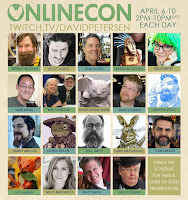
I'm proud of the guest list we've been able to assemble for this event. I'll be drawing on the even numbered hours, but the odd numbered hours of ONLINECON feature a panel or presentation by one of our guests. Joining me will be: Jeremy Bastian, Scott Kurtz, Tom Pohrt, Barnaby Dixon, Iris Compiet, Sean Wang, Walt Simonson & Louise Simsonson, Javier Garcia Urena, Dave Stewart, Ramon Perez, Danny Anduza, Conor Nolan, Will Smith, Larry MacDougall, Dan Larson, Guy Himber, Meg's Mashables, Matt Smith, & Eric Petersen!
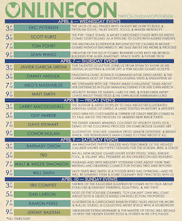
Below you can check out the full schedule of dates/times for each guest and a description of what we'll be covering with them:
In addition to guests, there will be several new items going into my Online Store during ONLINECON as well as a storewide sale:
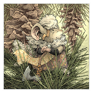
New 11" x 11" Signed & Numbered Limited Print 'Pine Cones'
New 2022 Signed & Numbered Bookplate
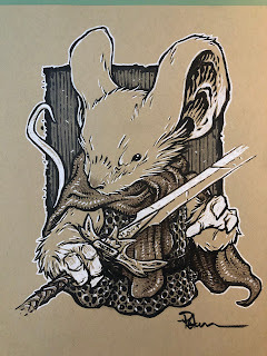
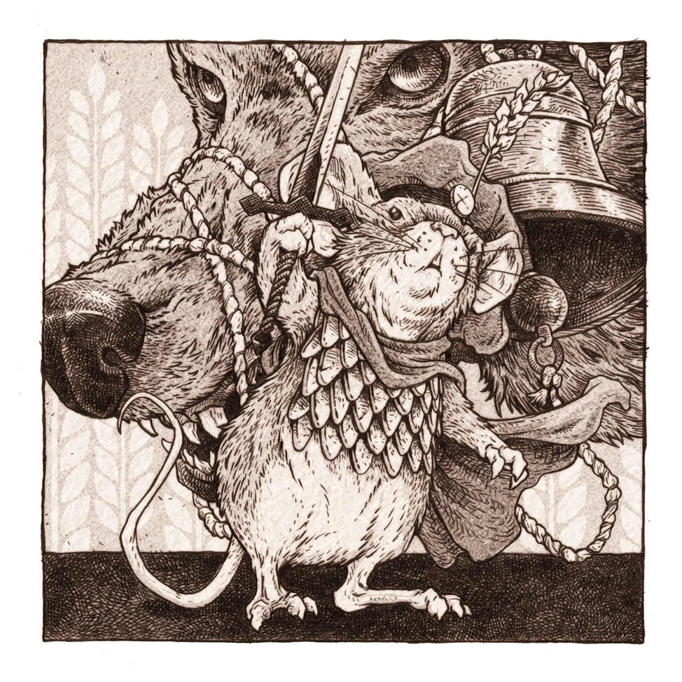
New 'etching' 8" x 8" Mouse Guard print

24 page Mouse Guard Sketchbook: Alone Together
Signed Mouse Guard books with a mouse head doodle
New Original inked artwork
Toned Commissions
These are single figure torso commissions with limited backgrounds on toned paper.
Looking forward to seeing you at ONLINECON!


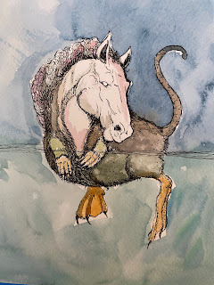
The Croaking Hippomeleon
 Last Friday on my Twitch Stream, we did the sixteenth community draw-along event #DrawTheExtinct where I posted an image from an old block print I made with a few animal photo inspiration prompts and the idea to create an imaginary extinct animal. I worked on my piece live on my Twitch stream while viewers worked at home and then on Monday we shared our finished pieces.
 Here is my finished Croaking Hippomeleon. And below are my steps to create it as well as the community submissions.
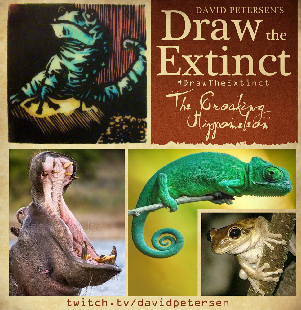 We started with the prompt of my original 2000's era linocut print titled 'Extinct' as well as a a Hippopotamus, a Chameleon, and a Frog.
I told the viewers that they could use any combination of the inspiration prompts––they could make their version as cute and cuddly as a pocket pet stray kitten, as monstrous and deadly as a giant kaiju destroying cities, or anything in between. I also wanted this to be an excuse to get their pencils moving. I invited all skill levels, because I'm a firm believer that you shouldn't have to be good at something or pursuing mastery of it to just simply enjoy the act of it...and art is no exception.
 On the Friday stream I started by drawing with mechanical pencil on a sheet of copy paper to try and reimagine the beast. I saw the jaw & mouth as belonging to the hippo, and the body being more chameleon, and the hind legs of a frog (though I changed the rear feet to hippo feet). But after I'd drawn it, I had second thoughts about the body shape. I wanted to tighten up the length and get closer to a frog when it came to the stance and distance between the front and hind legs, so I placed another sheet of paper over my original drawing and on the lightpad I could redraw a back end that met the goals.
 I then scanned both of the above drawings and assembled them in Photoshop. I liked the original hippo foot I'd drawn so I pasted that into place over the new hind leg while also doing some other quick corrections digitally. To help with the color pattern, I then did a quick digital color mockup to help me keep track of the stripe and spot spacing as well as areas that should be different kinds of texture (like the puffed out neck).
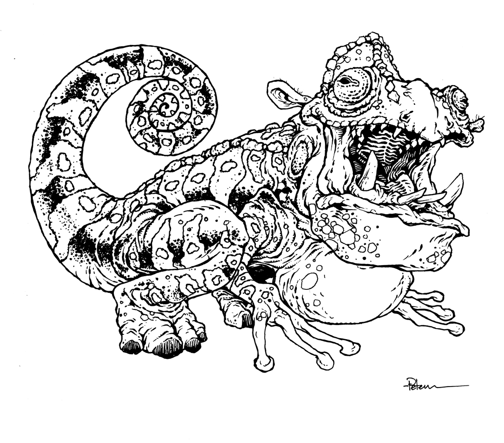 After I was happy with my above design, I printed that piece out on copy paper and taped it to the back of a sheet of Strathmore 300 series bristol. Using a lightpad, I was able to see through the surface of the bristol as I inked the Croaking Hippomeleon. I used a Copic Multiliner 0.7 SP pen to ink the art. I was surprised that I was able to get the inks done before the stream ended on Friday. I assumed all the patterning and the texture on the body and tail would keep me occupied for a long time, but I managed to finish with some time to spare.
 While still on stream I scanned the inks and flatted the colors. For these Draw The Extinct pieces I have a template with background and border already established, so it makes some of this color prep work all the easier.
 I went with the color scheme I'd roughed in when doing the pencil/layout stage since I thought some different colored stripes might be fun.
And with the flats done, and having gone a little over time on the stream, I signed off and wished everyone at home well in their pieces over the weekend.
After a break and some dinner I went back to do the rendering. To get all the highlights, shading, and texture I used the dodge and burn tools with a stock photoshop texture brush. I also selected areas and used the color balance tool to tint them warmer or cooler. Below you can again see the final rendered colors with a border and type applied in this final version.

But, as this is a community event, I wanted to share all the other entries posted in the Discord. I awarded a prize and we voted together on a few more (prize winners marked with *) on Monday's Twitch stream and we all enjoyed seeing what each other had done. I hope we get even more participants next month (First Friday!)
 88UncleErnie
 Amy LeBaron*
 AR
AR BubbaWorld
 Capt.Nemo*
 DePuggo*
 Doombot2015
 EvilCartoonist*
 Itunpsicala
 Morphs
 NardDog85
 Nate Pride*
 Nuvalo
 RoamingWitch
 Sketchy
March 29, 2022
2022 Bookplate Process
 Every year since 2012 I've been creating a new Mouse Guard bookplate as a special item for fans. The idea is that, with these signed by me, even if you can't bring me your physical copy of a Mouse Guard book, this bookplate can be glued in making your copy signed.
I'll be releasing this year's new bookplate in my online store in April when I'm hosting my during the #ONLINECON event on my Twitch channel. Currently you can buy several bookplates from past years (and see blogposts for those bookplates at the bottom of this post). For this Blogpost I wanted to share the process for creating the art for the bookplate this year.
I had a false start with this year's bookplate. I originally planned to emulate the look of an etching for the art, but after deciding that it didn't work reduced to bookplate size, I opted for it to be an upcoming 8" x 8" print.
You can read more about that piece and the see the process I used to create it here: https://davidpetersen.blogspot.com/2022/02/baldwin-brave-faux-etching.html)

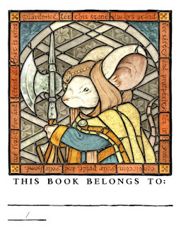
So when I started over, I went with a stained glass look for the art. Using a painting of Gwendolyn (inspired by the concept art for the now-canceled Mouse Guard movie) I designed a stained glass window by drawing overtop a printout of that painting on a lightpad and a clean sheet of copy paper. In photosop I tinted out all the areas that would be replicating painted glass (opposed to the black lead-lines). I used Photoshops line tools to make the frame border, and typed in a mash up of two quotes from my books: Guardmice, Let this stone always stand for safety and prosperity. Let it be your conviction, your pride, and your home. We fight for and defend all that is ours.'

When I liked the above layout, I printed it out and taped it to the back of a sheet of Strathmore 300 series bristol. On my Huion Lightpad I was able to see through the bristol surface to the printed design and use it as a guide to ink the lead lines. Having done actual stained glass before really helped in understanding where all those lines should and shouldn't go––that each shape of glass formed by the lead is something that could be cut and shaped traditionally.
The softer bits, made to look like pained glass, were done with a HB pencil.

I then scanned my ink/pencil hybrid art into Photoshop and started flatting in the color and tinting the pencils to match or compliment those colors.
Most of the color choices were made from the original Gwendolyn painting from that 2019 Heroes Con, but I did have to make subtle adjustments and choices for the border elements. The orange and blue compliments with the yellow corners seemed to time the palate for the whole piece back together.

I then rendered the color layers with the Dodge and Burn tools in Photoshop using a textured brush. I tinted individual pieces of glass in the same color families differently from one another, and I added a slight blur/shadow layer around all the lead lines. The last step was to digitally paint in all the solder joints. Overall, I'm very pleased with the results.
I hope you enjoy this new bookplate when it's released in April...and below you can look back at the past bookplates and the blogposts about them:
 Blogposts:2012 – Lino Print2013 – Stained Glass2014 – Embroidery2015 – Mosaic2016 – Pencil Rendering2017 – Engraving2018 – Wood Painting2019 – Gouache Painting2020 – Wood Carving
 2021 –– Lino Registration Print
March 22, 2022
Pinecones Limited Print
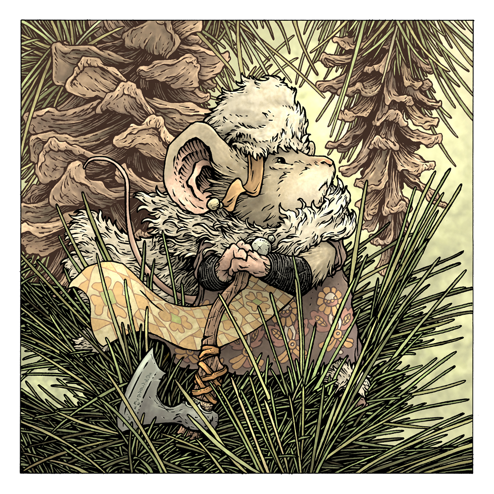
This year the piece is titled 'Pinecones'. Below I'll show the step-by-step of creating the art.
 The inspiration came from a photograph (actually a series of 4 photos) of some pinecones outside our vet's office the last time we had to take Coco in. I liked the shapes and negative spaces they formed, and thought when I took the photos 'these would be good for archer mice to stand atop as they scout and rain arrows down on their foes'.
 I also looked at a few Illustrations by Russian artist Ivan Bilbin for textile & border patterns to use in my piece.
 I drew the mouse who was to be in the pinecone & needle terrain on copy paper. I wanted her to have a fur cloak and a tall fur hat blowing in the breeze. For her to feel somewhere between Russian and Norse. I drew the pattern on the dress once, and then in Photoshop repeated it and warped it to fit the contours of the fabric, and I did a similar thing to warp a pencil drawing for the flowing panel with the border pattern on it.
On yet another sheet of copy paper, I used my photo reference to draw the pinecones and needles behind her, but then I just gave up and slotted in more of the photos (masked out to show as much of her as possible) for the foreground she's standing on.
 Then I print out the above composition. Because of it's size I have to print it in two parts and then tape them together. That whole printout is then taped to the backside of a sheet of Strathmore 300 series bristol. On my Huion lightpad I can ink the piece on the surface of the bristol while still seeing my 'pencil' lines on the printout below.
I inked this with my Copic Multiliner SP pens (the 0.7 & 0.3 nibs). There was a LOT of repetitive forms in the needles, and seeing clearly what bits of white paper were the inside of needles and which were negative spaces was a real struggle.
 When the inks were done, I scanned those back into photoshop to start the coloring. The first part of that is called 'flatting' where I establish what color everything is and where those areas end with flat un-textured colors. Like, professional coloring-in-the-lines. I also established some color-holds (areas where I want the ink work to be a color other than black) like the background cones and needles as well as all the patterning on her clothes.
I'd made most of my color choices when I was compositing the pencil drawings, so this step was rather procedural.
The last part was to render the color––to add light, shadow, and texture. I do this in Photoshop mostly with the Dodge and Burn tools and a stock textured brush.'Pinecones' will be released and made available for purchase in my online store at the start of my March ONLINECON event April 6-10
March 15, 2022
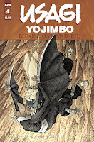
Usagi Yojimbo: Lone Goat & Kid #5
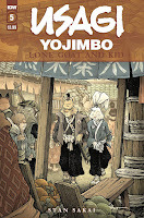 I was fortunate enough to be asked by IDW and Stan Sakai to do a run of covers on the new Usagi Yojimbo reprints of short story issues that will be collectively called 'Lone Goat and Kid'. I've done six in total, and for this blogpost I'll be sharing my process for the creation of the cover art for issue #5.
This issue is currently up for pre-order through Diamond with the code MAR220513. Just ask your local comic shop to order it for you, or order it though an online retailer. The issue will be in shops May 25, 2022.
To the left you can see the finished cover, but below I'll go through the steps in creating it.

Layout/Pencils:In this issue, Usagi meets an old general who is now magistrate of a little town. The one great hero feels that he has been reduced to managing townsfolk after his illustrious deeds are behind him. He and Usagi walk through the town talking about service before what is to be the big (and somewhat surprising) climax to the issue. I wanted to show the quiet moment of the general walking heavy hearted through the busy town. For the kanji I had a friend help me translate 'eggs', 'fish', 'rice', 'fruit' and 'tea' to advertise for a merchant in the market.
I also decided to have one of the townsfolk be a mouse.
 Inks:When the layout was approved by the editor and Stan, I started the inks. First step was to print the layout file onto copy paper (over two sheets that had to be taped together at the seam) and tape that to the back of a sheet of Strathmore 300 bristol. On my Huion lightpad I was able to ink the cover art using the printout as my pencils lines. This way in the end the inked artwork is very crisp and clean with no need to erase pencils lines. I used Copic Multiliner SP pens to ink the art (the 0.7 and 0.3 nibs).
This cover was so busy that everything felt like it took forever to ink even though there were no particularly difficult areas. The main worry was maintaining push from foreground to the far distance without flattening the depth of focus.

Color Flats:
The inks were approved and I scanned them in to Photoshop to start the coloring process. This first part of coloring digitally is called 'flatting' and is a professional version of coloring inside the lines. Establishing what each area's color is and where it ends. This not only is a color base for the image, but also allows a quick flat color area to be able to quickly isolate to render or make adjustments on. Most of the color choices had been made in the layout stage, but I made lots of changes to the townsfolk and building elements so that none of them blended in to another. In this step I also established several 'depths' of color holds (areas where I want the lineart to be a color other than black) to help sell the distance of the street as well as the kanji on the flags.
 Final Colors:
Here again is the finished art (this time sans-logo). To render all of the color I mostly used the Dodge and Burn tools (Photoshop tools based on real photography techniques for purposely over or under exposing film as it develops). Burn is do darken and Dodge is to lighten. I use a stock Photoshop textured brush as I add shadows and highlights with these tools so the work looks a little more organic and less digital.
Usagi Yojimbo: Lone Goat & Kid #5 is out in stores May 25, 2022.
March 8, 2022
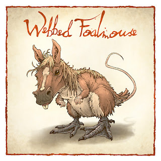
The Webbed Foalmouse
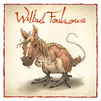 Last Friday on my Twitch Stream, we did the fifteenth community draw-along event #DrawTheExtinct where I posted an image from an old block print I made with a few animal photo inspiration prompts and the idea to create an imaginary extinct animal. I worked on my piece live on my Twitch stream while viewers worked at home and then on Monday we shared our finished pieces.
 Here is my finished Webbed Foalmouse. And below are my steps to create it as well as the community submissions.
We started with the prompt of my original 2000's era linocut print titled 'Extinct' as well as a Horse, a Mouse, and a Goose (I referenced the feet).
I told the viewers that they could use any combination of the inspiration prompts––they could make their version as cute and cuddly as a pocket pet stray kitten, as monstrous and deadly as a giant kaiju destroying cities, or anything in between. I also wanted this to be an excuse to get their pencils moving. I invited all skill levels, because I'm a firm believer that you shouldn't have to be good at something or pursuing mastery of it to just simply enjoy the act of it...and art is no exception.
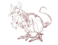
On the Friday stream I started drawing with mechanical pencil on a sheet of copy paper to try and reimagine the beast. My plan was to use the mouse's body & arms, the goose's feet, and the horse's head & mane. The drawing on the left is my 2nd attempt only because I wanted to change the posture to be less upright and more like a T-Rex. Scanned into Photoshop, I could mirror it and see that I had to move closer eye a bit more towards the bridge of the nose––but otherwise it was ready to ink.
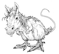
After I was happy with my above design, I printed that piece out on copy paper and taped it to the back of a sheet of Strathmore 300 series bristol. Using a lightpad, I was able to see through the surface of the bristol as I inked the Banded Haremole. I used a Copic Multiliner 0.7 SP pen to ink the art. This piece inked fast for me. I had a family gathering to go to and I was going to cut the stream short, perhaps that's why I got done so quickly––but it also may be that there wasn't anything overly detailed or tricky in the linework or textures.
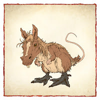 I finished the inks on-stream and was able to scan and finish the color flats while still broadcasting. For these Draw The Extinct pieces I have a template with background and border already established, so it makes some of this color prep work all the easier.
 I decided the Webbed Foalmouse's colors should be the brown of a horse or mouse, a blonde mane (like one of the reference photos of a horse I used) and the dark grey webbed feet of the goose.
I just started playing with some rendering on the piece when it was time for me to say goodbye to the viewers and shut down the stream & drive over to my sister's for her birthday dinner.
Once Julia and I got home from a nice evening with both of my sisters, I went back at the renderingTo get all the highlights, shading, and texture I used the dodge and burn tools with a stock photoshop texture brush. I also selected areas and used the color balance tool to tint them warmer or cooler. Below you can again see the final rendered colors with a border and type applied in this final version.
But, as this is a community event, I wanted to share all the other entries posted in the Discord. I awarded a prize and we voted together on a few more (prize winners marked with *) on Monday's Twitch stream and we all enjoyed seeing what each other had done. I hope we get even more participants next month (First Friday!)
 Capt.Nemo
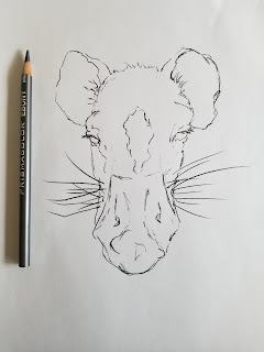 Amy LeBaron
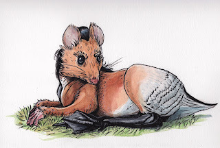 Doombot79
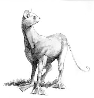 EvilCartoonist*
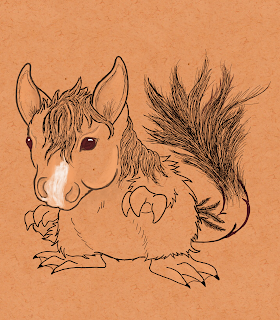 Itunpsicala
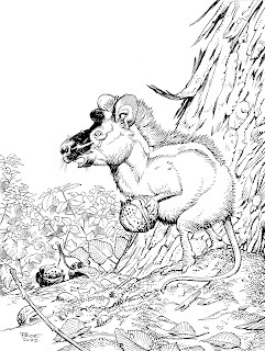
Nate Pride*
 Nuvalo*
 Shake Zula
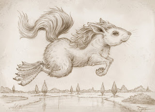 Tyrie*
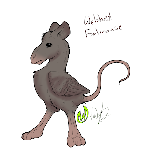 Wet-N-Waste*
March 1, 2022
ONLINECON 2022!
 April 6-10 ONLINECON is BACK! A free online event with 20 guests, an online store sale, and much more... I'll be running a special event on my Twitch Stream (twitch.tv/davidpetersen). Over the course of those 5 days I'll be streaming 8 hours per day, spending half the time drawing commissions, and the other half with guests for panels, interviews, and programming!
I'll also be running a sale in my online store and adding new original artwork and merchandise to the store.
To the left you can see the promo for the event and I'll go into more details below!
I'm proud of the guest list we've been able to assemble for this event. I'll be drawing on the even numbered hours, but the odd numbered hours of ONLINECON feature a panel or presentation by one of our guests. Joining me will be: Jeremy Bastian, Scott Kurtz, Tom Pohrt, Barnaby Dixon, Iris Compiet, Sean Wang, Walt Simonson & Louise Simsonson, Javier Garcia Urena, Dave Stewart, Ramon Perez, Danny Anduza, Conor Nolan, Will Smith, Larry MacDougall, Dan Larson, Guy Himber, Meg's Mashables, Matt Smith, & Eric Petersen!
Below you can check out the full schedule of dates/times for each guest and a description of what we'll be covering with them:

In addition to guests, there will be several new items going into my Online Store during ONLINECON as well as a storewide sale:
New 11" x 11" Signed & Numbered Limited Print 'Pine Cones'
New 2022 Signed & Numbered Bookplate
New 'etching' 8" x 8" Mouse Guard print
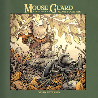
24 page Mouse Guard Sketchbook: Alone Together
Signed Mouse Guard books with a mouse head doodle
New Original inked artwork
Toned Commissions
These are single figure torso commissions with limited backgrounds on toned paper.
(I'll be opening a list through the online store April 4th)
---and a few more surprises!
Looking forward to seeing you at ONLINECON!
February 22, 2022
Baldwin the Brave Faux Etching
 For the 2022 Bookplate, I originally thought it would be interesting to do an etching for the artwork. I was a printmaking major in college, and I really credit that process with so much of my mental organizations as I layout and ink a piece of my work. However, I no longer have access to the etching supplies & equipment I'd need to safely do an etching at home––so, I opted to fake it and do a faux etching piece that looked close enough that it would work for the bookplate...which I should also address, I decided in the end that this image you see to the left didn't hold up when reduced to bookplate size. My plan is to offer it as an 8" x 8" print in my online store (mouseguard.bigcartel.com) in April when I do another ONLINECON event on my Twitch channel.
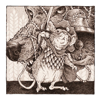
 I started by looking at a few etchings of Albrecht Dürer's, specifically this one of St. George. In fact, I started doing a piece of Baldwin the Brave (from the Mouse Guard short story of the same name) in this same pose (not mounted on horseback) with a goose instead of a dragon, but I didn't like him facing away from the viewer. So I started again.
Etchings are prints where a metal plate (zinc or copper) are coated with an acid resist, that resist is then scratched away wherever the artist wants a line to be, and then place the metal plate in acid for the metal to be eaten away (or etched). When the plate is clean and then coated and wiped with ink, the ink goes into all the crevices where the acid etched a groove into the plate, and the image is printed on semi-damp paper on a press.
 For the second attempt, I drew a better hero pose for Baldwin, and used the wolf that appears in the story, tangled in the bell rope, as the drama and background element.
This is all pencil on copy paper (later scanned into photoshop and tinted), and in some places (the wolf and the bell) I overworked this for just being a pencil/layout for the final piece, but I wanted some practice at the types of line marks and density I wanted to go for in the final artwork.
 I printed out the above layout to the correct scale, and taped it to the back of a sheet of Strathmore 300 bristol. On a lightpad (I use a Huion A3) I was able to see through the bristol surface so I could use the printout as a guide when doing the final drawing. Unline most of my work where I'd use a pen to ink the linework at this stage, I wanted to get a line quality with a little more subtlety and soft edges. So, I 'inked' this piece with a mechanical pencil. I used a lot of pressure, and didn't try to shade my drawing like a traditional pencil drawing, I wanted dark purposeful marks, but with a touch of softness to help sell the faux etching photoshop trickery a few steps down the line.
The original 'inked' pencils were scanned, and I did a tiny bit of level adjustment to help drop out a few light smudges and the bristol's surface texture.
 I felt this piece still needed some tone--which means introducing faking another etching technique called Aquatint.
 Instead of coating a metal plate with a even & complete coat of an acid resist, with aquatint you dust the plate with a rosin. Those little dots of rosin resist the acid and allow the in-between spots to be etched away in the acid bath, making that part of the plate a bit like different grades of sandpaper. Those little pits hold ink at different densities to create different shades of grey/black when printed. In Photoshop I made a grey texture similar to an aquatint texture to use in my last step.
The final assemblage of parts includes: the pencils + a duplicate of the pencils with a slight blur to soften the edges + 3 different densities of my faux aquatint texture (each masked out in places so it appears only exactly where I want it to) + a paper tone & texture & + a sepia color tint over the whole thing.This was a fun project, and while it won't work for the bookplate, I do plan to release it as a print in April. And someday, when it's COVID safer & when I have access to a studio with the right equipment, I'll do a real Mouse Guard etching again.
February 15, 2022
Usagi Yojimbo: Lone Goat & Kid #4
 I was fortunate enough to be asked by IDW and Stan Sakai to do a run of covers on the new Usagi Yojimbo reprints of short story issues that will be collectively called 'Lone Goat and Kid'. I've done six in total, and for this blogpost I'll be sharing my process for the creation of the cover art for issue #4.
This issue is currently up for pre-order through Diamond with the code FEB220445. Just ask your local comic shop to order it for you, or order it though an online retailer. The issue will be in shops Apr 27, 2022.
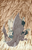
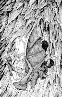
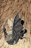
To the left you can see the finished cover, but below I'll go through the steps in creating it.
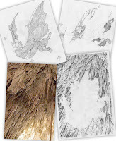 Layout/Pencils:In this issue, Usagi is a captive of the Komori Ninjas––bats with sword blades on their wings. And in a scene oddly like that of Saxon vs the bats in my Winter 1152 book, Usagi attacks one of his foes as they plummet to the bottom of the cave. I wanted to use that moment to draw for my cover.
 So, I started by drawing the bat falling backwards. I did pull up some quickly googled photo reference of people falling backwards to get the pose. Then I placed that drawing on my lightpad and with a clean sheet on top, I drew Usagi's attack lunge.
I used a real photo of Gyokusendo Cave in Okinawa Japan as photo reference. On the lightpad I drew over the forms of the stalactites to get the linework for the background.
Once I had those three drawings, I assembled them in Photoshop. Each drawing was tinted a different color to help me see as I masked out any overlapping lines. I then did a quick blocking in of all the forms with colors. This helps not just me to see the forms and understand the composition overall––but also as I send it in to the editor and Stan Sakai for them to completely understand what I'm going for.
It may seem like overkill to have gone this far in the 'pencils/roughs' stage, but in my experience doing covers, I do less work overall (meaning fewer changes & edits) when the first approval image is so clear and nothing is left to guesswork or interpretation.
 Inks:
Inks:When the layout was approved by the editor and Stan, I started the inks. First step was to print the layout file onto copy paper (over two sheets that had to be taped together at the seam) and tape that to the back of a sheet of Strathmore 300 bristol. On my Huion lightpad I was able to ink the cover art using the printout as my pencils lines. This way in the end the inked artwork is very crisp and clean with no need to erase pencils lines. I used Copic Multiliner SP pens to ink the art (the 0.7 and 0.3 nibs).
On my previous cover I'd spent most of my inking time on the Kimori bodysuit lines. And while there was a lot of that to do on this cover, there was only one of them––and a LOT of stalactites to render in a gradient of ink intensity.
 Color Flats:
The inks were approved and I scanned them in to Photoshop to start the coloring process. This first part of coloring digitally is called 'flatting' and is a professional version of coloring inside the lines. Establishing what each area's color is and where it ends. This not only is a color base for the image, but also allows a quick flat color area to be able to quickly isolate to render or make adjustments on.
Most of the color choices had been made in the layout stage, but I made changes to the value structure as I worked. In this step I also made all the background a color holds (areas where I want the lineart to be a color other than black)
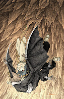 Final Colors:
Here again is the finished art (this time sans-logo). To render all of the color I mostly used the Dodge and Burn tools (Photoshop tools based on real photography techniques for purposely over or under exposing film as it develops). Burn is do darken and Dodge is to lighten. I use a stock Photoshop textured brush as I add shadows and highlights with these tools so the work looks a little more organic and less digital.
Usagi Yojimbo: Lone Goat & Kid #4 is out in stores Apr 27, 2022.
February 8, 2022
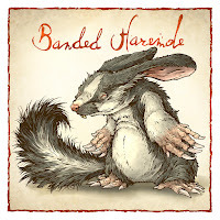
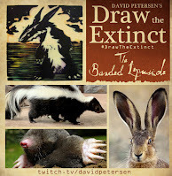
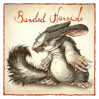
Banded Haremole (or Banded Lepusmole)
 Last Friday on my Twitch Stream, we did the fourteenth community draw-along event #DrawTheExtinct where I posted an image from an old block print I made with a few animal photo inspiration prompts and the idea to create an imaginary extinct animal. I worked on my piece live on my Twitch stream while viewers worked at home and then on Monday we shared our finished pieces.
 Here is my finished Banded Haremole (though originally I called it the Banded Lepusmole as you'll see below). And below are my steps to create it as well as the community submissions.
 We started with the prompt of my original 2000's era linocut print titled 'Extinct' as well as a Skunk, a Mole, and a Hare.
I told the viewers that they could use any combination of the inspiration prompts––they could make their version as cute and cuddly as a pocket pet stray kitten, as monstrous and deadly as a giant kaiju destroying cities, or anything in between. I also wanted this to be an excuse to get their pencils moving. I invited all skill levels, because I'm a firm believer that you shouldn't have to be good at something or pursuing mastery of it to just simply enjoy the act of it...and art is no exception.
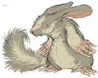 On the Friday stream I started drawing with mechanical pencil on a sheet of copy paper to try and reimagine the beast. I liked the idea of drawing it standing in a similar posture as my original print. I felt like the body shape of the mole made sense to pair up well with the paws (though I did for a brief moment consider hare hind paws). Then Hare ears and teeth, and lastly skunk markings (to denote 'banded') and tail.
I scanned my pencils and did a quick color blocking pass in photoshop to help me see the forms, especially where the darker fur met the lighter fur.
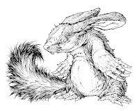
After I was happy enough with my above design, I printed that piece out on copy paper and taped it to the back of a sheet of Strathmore 300 series bristol. Using a lightpad, I was able to see through the surface of the bristol as I inked the Banded Haremole. I used a Copic Multiliner 0.7 SP pen to ink the art. I spent most of my inking time on stream working on the fur contours and mole-like paws––and I saved the darker fur texture/tone for last.
 I finished the inks on-stream and was able to scan and start the color flats while still broadcasting. For these Draw The Extinct pieces I have a template with background and border already established, so it makes some of this color prep work all the easier.
 The Banded Haremole's colors were mostly established by my decisions on the color blocking step when working on the pencils.
After the stream ended and I had a chance to grab some dinner, I returned to finish the flats, blending the transition between the light and dark fur and establishing the paws and claws.
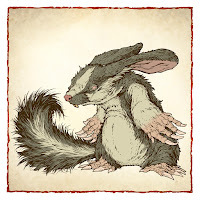
To get all the highlights, shading, and texture I used the dodge and burn tools with a stock photoshop texture brush. Below you can again see the final rendered colors with a border and type applied in this final version.
But, as this is a community event, I wanted to share all the other entries posted in the Discord. I awarded a prize and we voted together on a few more (prize winners marked with *) on Monday's Twitch stream and we all enjoyed seeing what each other had done. I hope we get even more participants next month (First Friday!)
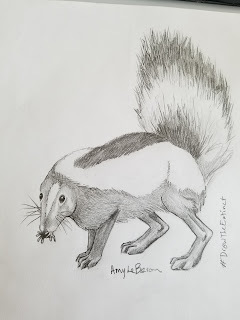 Amy LeBaron
 Andorinha *
 BlueFledgeling97
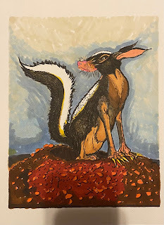 Capt. Nemo
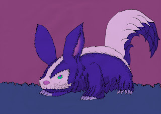 DePuggo
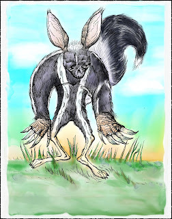 Doombot2015
 EvilCartoonist *
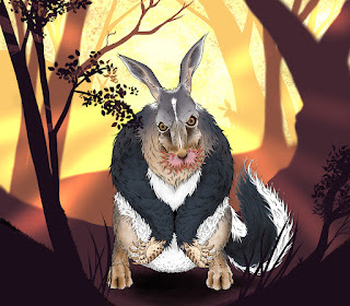 Mjar
Mjar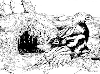 Nate Pride *
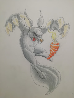 Nuvalo
 Pendrake
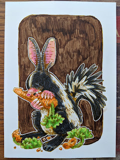 RedJarOJam
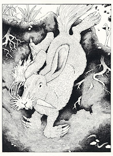 Tyberius
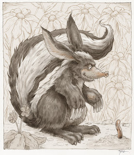 Tyrie *
David Petersen's Blog

- David Petersen's profile
- 339 followers

