
David Petersen's Blog, page 20
February 1, 2022
Nightwatch Gazebo
 Early next year I plan to release a new Mouse Guard sketchbook titled "Aline Together". The majority of that material is inked commissions I did during last year's ONLINECON event. But to round out the sketchbook sometimes I need to generate some material of my own both to fill up pages and to add certain tone or subject for a thematic through line for the work in the book
To the left you can see one of those pieces finished and colored ready for a page in that sketchbook––and in this blogpost I'll break down the process to get there.
 The idea for this piece came from a photo shared on a Twitter account that shares abandoned architecture. The photo is from the gardens of Quinta da Regaleira in Portugal. I altered the proportions to me a it a bit more squat and compact. After I drew the architecture on a lightpad using the photo as a guide, I drew separately two Guardmice on a night's watch. In Photoshop I combined the elements and added a digital moon and some bat silhouettes.

I inked the piece with a printout of the above layout taped to the back of a sheet of Strathmore 300 series bristol. On my Huion lightpad I can see through the bristol down to the pencils and use them as a guide while I ink.
I used Copic Multiliner SP pens (the 0.7 & 0.3 nibs) to ink this as I streamed on Twitch, answering fans questions as I worked.

When the inks were finished, I started the color flatting (the first step of digital coloring where you establish all the color spaces with flat color). I also added all my color holds at this stage. Color holds are areas where I want the ink lines to be a color other than black, like the background trees, the moon, the bat silhouettes, the stars, and the flames.
I'm finding that I rarely do piece with cool blues, so for this night watch I purposely went into that color range--though some of the choices are desaturated or warm enough, nitpickers would say I still didn't get there.
Below you can see the final colors all rendered withe the Dodge and Burn tools and ready for inclusion in the sketchbook I'll release next year.


January 25, 2022
Mouse Guard Boneyard Illustration
 As I work towards filling up the pages for my next published sketchbook, I've been streaming the art process on Twitch.
 'Alone Together', a 24 page color sketchbook of pieces like this will debut in April of 2022.
To the left you can see one of those pieces finished and colored ready for a page in that sketchbook––and in this blogpost I'll break down the process to get there.
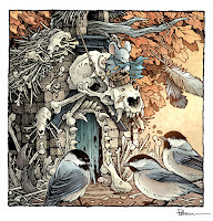
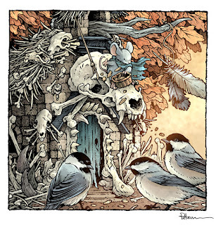
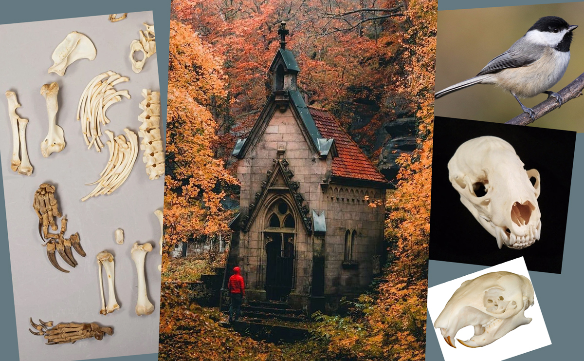 The idea for this piece came from a photo shared on a Twitter account that shares abandoned architecture. I wanted to do more with this little chapel though, and make it spooky. A boneyard with the structure adorned in various animal bones. It's something I've shown the character of Bastian eventually doing with his Skull-Yert dwelling in The Wild Wolf short story. This time I wanted to have some little nuthatches bobbing around the place.
 I drew the structure on one sheet of copy paper and then the birds and mouse on another. In photoshop I was able to arrange the scans into a composition I liked. I tinted each element and added some quick color blocking to help me see the shapes and forms easier.
The mouse originally had a crossbow, but it looked too much like he was threatening the birds, so I decided he could be feeding them instead. Perhaps he uses the bones and animal pieces for raw materials useful to the mice, but then casts the waste out for other critters to eat,

I inked the piece with a printout of the above layout taped to the back of a sheet of Strathmore 300 series bristol. On my Huion lightpad I can see through the bristol down to the pencils and use them as a guide while I ink.
I used Copic Multiliner SP pens (the 0.7 & 0.3 nibs) to ink this as I streamed on Twitch, answering fans questions as I worked.

When the inks were finished, I started the color flatting (the first step of digital coloring where you establish all the color spaces with flat color). The palate was meant to play mostly fall yellow-oranges off of steely blue greys.
Normally this is also the step where I'd add all my color holds (areas where I want the ink lines to be a color other than black) but this is a rare piece for me these days where I didn't have any.
Below you can see the final colors all rendered withe the Dodge and Burn tools and ready for inclusion in the sketchbook I'll release this year.
January 18, 2022
Usagi Yojimbo: Lone Goat #3
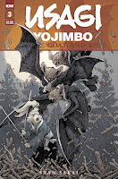
I was fortunate enough to be asked by IDW and Stan Sakai to do a run of covers on the new Usagi Yojimbo reprints of short story issues that will be collectively called 'Lone Goat and Kid'. I'll be doing six in total, and for this blogpost I'll be sharing my process for the creation of the cover art for issue #3.
This issue is currently up for pre-order through Diamond with the code JAN220500. Just ask your local comic shop to order it for you, or order it though an online retailer. The issue will be in shops March 30, 2022
To the left you can see the finished cover, but below I'll go through the steps in creating it.
 Layout/Pencils:In this issue, Usagi faces off for the first time against the Komori Ninjas––bats with sword blades on their wings. Part of their attack strategy is to bewilder the victim by creating a flurry of branch and leaf debris as they come down chopping from the trees. I started my layout by figuring out how I'd draw the Komori. Stan originally drew them as silhouettes in the early days because he was doing a strictly black and white book, but I wanted to figure out something with more detail that implies they wear tight ninja bodysuits with the blades attached to the cloth. I drew each bat ninja separately and then arranged them with Usagi in a fight stance and I added some stock tree shapes and a moon to round out the scene.
 Inks:
Inks:When the layout was approved by the editor and Stan, I started the inks. First step was to print the layout file onto copy paper (over two sheets that had to be taped together at the seam) and tape that to the back of a sheet of Strathmore 300 bristol. On my Huion lightpad I was able to ink the cover art using the printout as my pencils lines. This way in the end the inked artwork is very crisp and clean with no need to erase pencils lines. I used Copic Multiliner SP pens to ink the art (the 0.7 and 0.3 nibs).
The real time went into doing the linework on the Komori bodysuits so they didn't feel like scribbled hatching nor a digitally applied line texture.

Color Flats:
The inks were approved and I scanned them in to Photoshop to start the coloring process. This first part of coloring digitally is called 'flatting' and is a professional version of coloring inside the lines. Establishing what each area's color is and where it ends. This not only is a color base for the image, but also allows a quick flat color area to be able to quickly isolate to render or make adjustments on.
Most of the color choices had been made in the layout stage, but I made changes to the value structure as I worked. In this step I also added color holds (areas where I want the lineart to be a color other than black) to the moon and trees
 Final Colors:
Here again is the finished art (this time sans-logo). I made significant changes to the tones from the flats by adjusting color balance, brightness, & contrast. To render all of the color I mostly used the Dodge and Burn tools (Photoshop tools based on real photography techniques for purposely over or under exposing film as it develops). Burn is do darken and Dodge is to lighten. I use a stock Photoshop textured brush as I add shadows and highlights with these tools so the work looks a little more organic and less digital.
Usagi Yojimbo: Lone Goat & Kid #2 is out in stores March 30, 2022
January 11, 2022
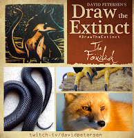
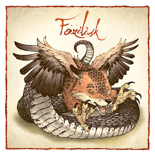
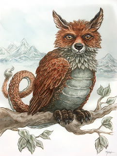
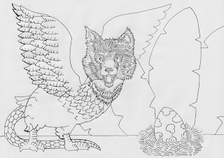
The Foxilisk
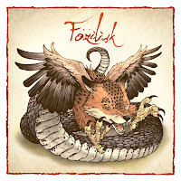 Last Friday on my Twitch Stream, we did the thirteenth community draw-along event #DrawTheExtinct where I posted an image from an old block print I made with a few animal photo inspiration prompts and the idea to create an imaginary extinct animal. I worked on my piece live on my Twitch stream while viewers worked at home and then on Monday we shared our finished pieces.
 Here is my finished Foxilisk. And below are my steps to create it as well as the community submissions.
 We started with the prompts of my original 2000's era linocut print titled 'Extinct' as well as a Red Fox, Snake, and Bird (I went specifically with a Black Rat Snake & Eagle).
I told the viewers that they could use any combination of the inspiration prompts––they could make their version as cute and cuddly as a pocket pet stray kitten, as monstrous and deadly as a giant kaiju destroying cities, or anything in between. I also wanted this to be an excuse to get their pencils moving. I invited all skill levels, because I'm a firm believer that you shouldn't have to be good at something or pursuing mastery of it to just simply enjoy the act of it...and art is no exception.
On the Friday stream I started drawing with mechanical pencil on a sheet of copy paper to try and reimagine the beast. I wanted to keep some of the silhouette of the original print, and that meant keeping the fox's head, but this time really emphasizing the tail into it's whole body.
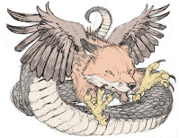
I also wanted to bring in more of the bird (eagle in my case) than just the talons, so I added some wings. To the left you can see the scanned pencils (drawn on two different sheets of copy paper––the wings were on a separate piece) assembled and then digitally colored to help me see the forms a bit better.
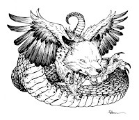
After I was happy enough with my above design, I printed that piece out on copy paper and taped it to the back of a sheet of Strathmore 300 series bristol. Using a lightpad, I was able to see through the surface of the bristol as I inked the Foxilisk. I used a Copic Multiliner 0.7 SP pen to ink the art. I spent most of my inking time on stream working on the fox and eagle bits––and I saved the snake scales until last, which also meant I ran out of stream and had to do them after the broadcast was over.
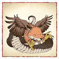
After a meal and some down-time, I got back to finishing the above inks and scanning them to color the flats on Friday night. The colors were mostly established by what each creature naturally is, but I made sure there was some adjustments in hue and value to get it to all work together.
For these Draw The Extinct pieces I have a template with background and border already established, so it makes some of this color prep work all the easier.
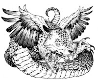 I left the flatted colors for the rest of Friday and all day Saturday before returning to them to finish the piece on Sunday. And when I did, I was disappointed in myself. I felt that the transition between fox and snake was lazy. most of it happens behind the wing, and I should have done more to blend the attributes of each species together.
 So, I went back into my inks and added a scale-like texture down the face and around the eyes (similar to the coloration of the original lino print). I then rescanned the inks and lined them up with the flat colors to start the final render.
To get all the highlights, shading, and texture I used the dodge and burn tools with a stock photoshop texture brush. Below you can again see the final rendered colors with a border and type applied in this final version.
But, as this is a community event, I wanted to share all the other entries posted in the Discord. I awarded a prize and we voted together on a few more (prize winners marked with *) on Monday's Twitch stream and we all enjoyed seeing what each other had done. I hope we get even more participants next month (First Friday!)
 EvilCartoonist*
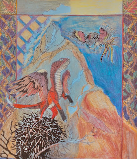
Capt. Nemo
Roaming Witch*
VeryBlueberry2
 WickedGoblinKing*
 Mjar
Mjar
88UncleErnie*
 Tyrie*
 Pendrake (wip)
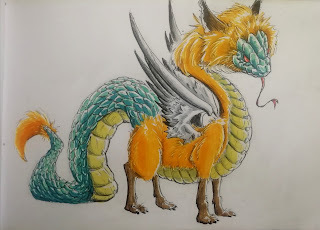 Nuvalo
 Nate Pride*
 Itunpsicala
RedJarOJam
 DePuggo
 SleeplessNinja
January 4, 2022
Anniversary Present
 Last year I did an online event called OnlineCon where I opened up a list for inked commissions. It's not often that I offer fully inked commissions like this any more, but I was open to the idea of making fans happy in troubled times, supplement my income with conventions responsibly canceled, and to generate material for an upcoming Mouse Guard sketchbook.
To the left you can see one of those pieces finished and colored ready for a page in that sketchbook––and in this blogpost I'll break down the process to get there.
 This piece was a special request from the wife of a college friend. Their wedding anniversary was coming up as well as the arrival of their second son, so she wanted to get my pal Seyth a mouse commission of the family in front of their home. I was provided with a reference photo of their house that I could make more like a medieval cottage as well as notes about individuals' likes (the coin necklace, 33 for Larry Bird, Fleur De Lies to signify New Orleans where they met, Lavender flowers, and older son's toy Fox). I drew each character and the cottage on different sheets of copy paper and then scanned them and assembled them in Photoshop (tinting each drawing to help me see where one form ended and the next started.

I inked the piece with a printout of the above layout taped to the back of a sheet of Strathmore 300 series bristol. On my Huion lightpad I can see through the bristol down to the pencils and use them as a guide while I ink.
I used Copic Multiliner SP pens (the 0.7 & 0.3 nibs) to ink this as I streamed on Twitch, answering fans questions as I worked.
 When the inks were finished, I started the color flatting (the first step of digital coloring where you establish all the color spaces with flat color). I also added all my color holds at this stage. Color holds are areas where I want the ink lines to be a color other than black, like the background and Molly's Dress pattern.
Below you can see the final colors all rendered withe the Dodge and Burn tools and ready for inclusion in the sketchbook I'll release this year.

December 28, 2021
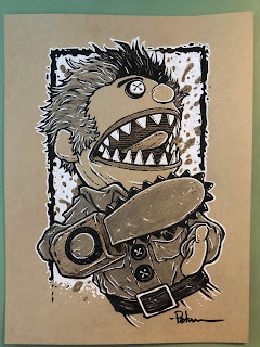
Recent Toned Commissions
I've finished all the toned paper commissions from the 2021 Black Friday Sale and events like FCBD and Baltimore Comic Con. I streamed drawing almost every one of these on my Twitch Stream.
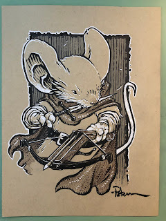
A Guardmouse with a hand-crossbow
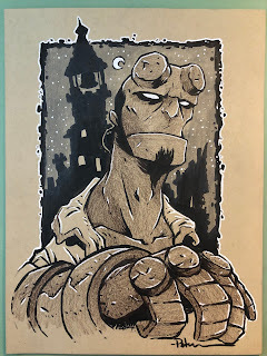
Hellboy
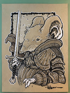
An Elephant Shrew Mouse in Armor
'Slashy Ashy' from Ash vs The Evil Dead TV show
 Demona from Gargoyles
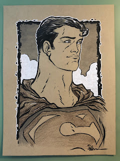 A Frank Quietly-esque Superman
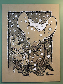 A MI mouse showing where he lives by using his paw as a map
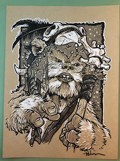 Logray The Ewok
 Throg
Throg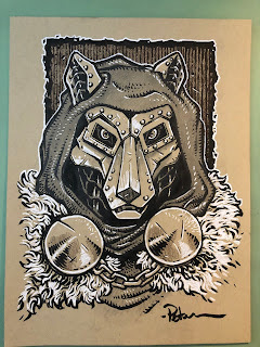 Dr. Doom as a Wolf
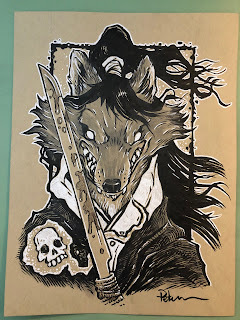 Jai from Usagi Yojimbo
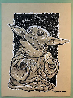 Baby Yoday/Grogu/TheChild
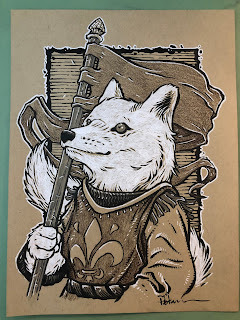 An Arctic Fox Squire
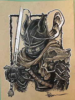 Mouse Black Knight
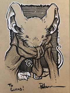 A Guardmouse
 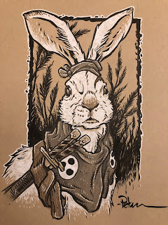 Usagi as a Rabbit in Mouse Guard
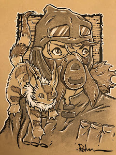 Nausicaa & The Fox Squirrel
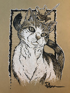 A fan's Cat with a Guardmouse
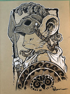
a Mouse Athena
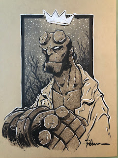 Hellboy
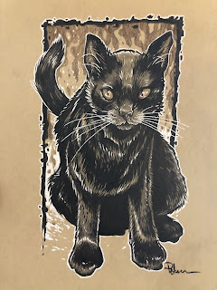 A Black Cat named 'Gimalkin'
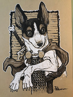 A fan's Pup as an adventurer
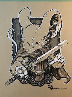 A Guardmouse
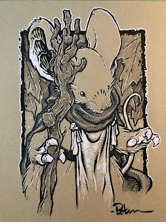 Kenzie, a Guardmouse
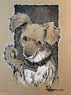 Hudson, a fan's pup
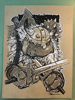 Raphael of the TMNT as a medieval warrior
 Throg
Throg Iron Tortoise
 Ewok Scout
 Guardmouse
 Guardmouse
 Conrad
 Guardmouse with a pipe
 Dwarven WWI Soldier
 Elven WWI Soldier
 Goblin WWI Pilot
 Usagi Yojimbo
 Usagi Yojimbo
 Rat from Wind in the Willows
 A Swashbuckling Guinea Pig
 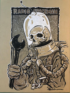 Mike Mignola's Radio Spaceman
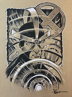 Havok of the X-Men
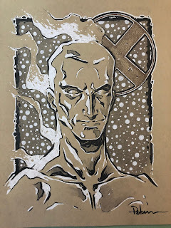 Iceman of the X-Men
December 21, 2021
Abandoned Mouse Dwelling & Mallard
 Early next year I plan to release a new Mouse Guard sketchbook titled "Alone Together". The majority of that material is inked commissions I did during last year's ONLINECON event. But to round out the sketchbook sometimes I need to generate some material of my own both to fill up pages and to add certain tone or subject for a thematic through line for the work in the book
To the left you can see one of those pieces finished and colored ready for a page in that sketchbook––and in this blogpost I'll break down the process to get there.
 The idea for this piece came from a photo shared on a Twitter account that shares abandoned architecture. I thought I could do something fun with this dwelling if I just added a mouse and something for scale. Somehow my thinking lead me to a duck.
And while it wasn't until after I'd done the pencils that I included a Tiger Moth, I'm sharing my photo reference here at this step.
 For the pencils I placed a printout of the architecture on my lightpad and started penciling my version of it on a clean sheet of copy paper. While this seems like simply tracing, I'm certainly focusing on details I want to include and avoiding others I don't care about. I'm also moving the paper around to condense and compress elements, and include new details.
 The duck was penciled separately and added in digitally in Photoshop, where I also quickly drew in my mouse explorer (who I decided after this stage needed a moth companion)
 With the pencils sorted (Though I think I did go through one more round of edits on the above image before this step), I printed them out and taped that to the back of a sheet of Strathmore 300 series bristol. On my Huion lightpad, I was able to see through the bristol to the pencils so I could use them as reference while I inked the lines. I used Copic Multiliner SP pens (the 0.7 & 0.3 nibs).
 I inked the piece on my Twitch stream and answered questions as I worked.

Once the piece was inked, I scanned in the original art and started the coloring process in Photoshop. In this process the goal is to color in all the color spaces with flat colors, no rendering, no texture, no lighting effects. This is so it's easy to grab any of these colors later on as you render them.
Some of my color choices were pre-determined by the photo reference, but I definitely shifted the hues all closer to a warmer yellow area than they strictly needed to be.
Below you can see the final colors all rendered withe the Dodge and Burn tools and ready for inclusion in the sketchbook I'll release next year.

December 14, 2021
Usagi Yojimbo: Lone Goat & Kid #2

I was fortunate enough to be asked by IDW and Stan Sakai to do a run of covers on the new Usagi Yojimbo reprints of short story issues that will be collectively called 'Lone Goat and Kid'. I'll be doing six in total, and for this blogpost I'll be sharing my process for the creation of the cover art for issue #2.
This issue is currently up for pre-order through Diamond with the code DEC210552. Just ask your local comic shop to order it for you, or order it though an online retailer. The issue will be in shops Feb 23, 2022
To the left you can see the finished cover, but below I'll go through the steps in creating it.
 Layout/Pencils:This issue features a lot of story––info about historical kite making, gambling, and a chase with Usagi being run out of town during a kite festival. I really wanted to feature all the cool kites, but also get into that story of Usagi being on the run.
With a low camera angle I could get this pose of Usagi running right towards us, with the kites in the sky being flown by people off camera as the mom just crests the hill in silhouette. I tend to go overboard on this stage roughing in color too, this helps me and the editor to really understand the goal of the final look of the piece without problems to solve in the coming stages.

Kite Designs: I couldn't just have blank kite shapes in the sky for this cover, so I researched Edo Japan era paper kites and tried to emulate some of the themes & styles while catering them towards what would/could appear in Usagi. I used a hex template as I penciled out designs including the Kanji for "Sakai", an owl, a fish, a castle similar to the one in the Dragon Bellow Conspiracy, a Fox and Tiger based on real Japanese art, a Tokage, a rooster, a flower with the kanji for "bloom" and a Samurai version of Saxon with the Kanji for Mouse Guard (which I altered a bit in the final).
 Inks:
Inks:When the layout was approved by the editor and Stan, I started the inks. First step was to print the layout file onto copy paper (over two sheets that had to be taped together at the seam) and tape that to the back of a sheet of Strathmore 300 bristol. On my Huion lightpad I was able to ink the cover art using the printout as my pencils lines. This way in the end the inked artwork is very crisp and clean with no need to erase pencils lines. I used Copic Multiliner SP pens to ink the art (the 0.7 and 0.3 nibs).
The trick here was to leave a white gap between Usagi and everything (kites, the mob, etc.) I also needed to use a lighter method for inking the kite designs so they felt like 2D art drawn on those surfaces. I use a trick I picked up from Mike Mignola with a double line on in-world art helps sell that idea.
 Color Flats:
The inks were approved and I scanned them in to Photoshop to start the coloring process. This first part of coloring digitally is called 'flatting' and is a professional version of coloring inside the lines. Establishing what each area's color is and where it ends. This not only is a color base for the image, but also allows a quick flat color area to be able to quickly isolate to render or make adjustments on.
Most of the color choices had been made in the layout stage, but I made changes to the value structure as I worked. In this step I also added color holds (areas where I want the lineart to be a color other than black) to The kites, the kite art, the kite strings, the mob, and Usagi's scar
 Final Colors:
Here again is the finished art (this time sans-logo). I made significant changes to the tones from the flats by adjusting color balance, brightness, & contrast. To render all of the color I mostly used the Dodge and Burn tools (Photoshop tools based on real photography techniques for purposely over or under exposing film as it develops). Burn is do darken and Dodge is to lighten. I use a stock Photoshop textured brush as I add shadows and highlights with these tools so the work looks a little more organic and less digital.
Usagi Yojimbo: Lone Goat & Kid #2 is out in stores Feb 23, 2022
December 7, 2021
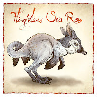
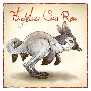
The Flightless Sea Roo
 Last Friday on my Twitch Stream, we did the tenth community draw-along event #DrawTheExtinct where I posted an image from an old block print I made with a few animal photo inspiration prompts and the idea to create an imaginary extinct animal. I worked on my piece live on my Twitch stream while viewers worked at home and then on Monday we shared our finished pieces.
 Here is my finished Flightless Sea Roo. And below are my steps to create it as well as the community submissions.
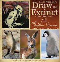 We started with the prompts of my original 2000's era linocut print titled 'Extinct' as well as a Sea Lion, a Kangaroo, & a Penguin (I went with a baby--but others used different species).
I told the viewers that they could use any combination of the inspiration prompts––they could make their version as cute and cuddly as a pocket pet stray kitten, as monstrous and deadly as a giant kaiju destroying cities, or anything in between. I also wanted this to be an excuse to get their pencils moving. I invited all skill levels, because I'm a firm believer that you shouldn't have to be good at something or pursuing mastery of it to just simply enjoy the act of it...and art is no exception.
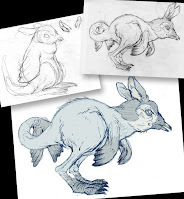 On the Friday stream I started drawing with mechanical pencil on a sheet of copy paper to try and reimagine the beast. I wanted to use the bowling pin silhouette of a penguin body, but tie in the legs & ears of the Kangaroo and arms/feet of the sea lion. The first attempt was fun, but too static, so I redrew it in more of a kangaroo hopping position and opted to use penguin feet and add sea lion feet to the tail to look more like flippers.
To the left you can see my pencils as well as the Photoshop scan with adjustments in proportions and replacement ears pasted on––all tinted to easily see the breaks in forms.
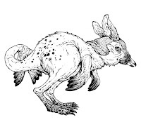
After I was happy enough with my above design, I printed that piece out on copy paper and taped it to the back of a sheet of Strathmore 300 series bristol. Using a lightpad, I was able to see through the surface of the bristol as I inked the Flightless Sea Roo. I used a Copic Multiliner 0.7 SP pen to ink the art. Most of the work was in trying to keep the subtlety of the pencils--including the face, soft short fur, and slight tonal shifts.
I finished the inks faster than I expected so I was also was able to scan the inks and flat the colors. I went with the baby penguin palate for the creature, adding subtle warm areas to the fur, inner ears and spots to harken back to the sea lion and kangaroo. I added only one color hold (areas where I want the ink to be a color other than black) to the spots on the hind haunches.
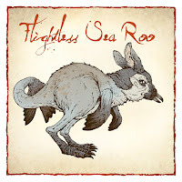
For these Draw The Extinct pieces I have a template with background and border already established, so it makes some of this color prep work all the easier. I then signed off of Twitch and wished everyone good luck with their pieces.. .
And over the weekend, I used the dodge and burn tools (with a stock photoshop texture brush) to render the piece. Below you can again see the final rendered colors with a border and type applied in this final version.
But, as this is a community event, I wanted to share all the other entries posted in the Discord. I awarded a prize and we voted together on a few more (prize winners marked with *) on Monday's Twitch stream and we all enjoyed seeing what each other had done. I hope we get even more participants next month (First Friday!)
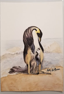 Amy LeBaron
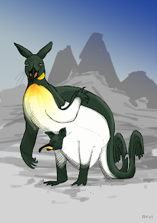 Ayvi
Ayvi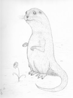 Brett LeBaron
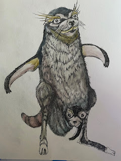 Capt. Nemo
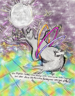 Cortrah
 DePuggo
 Evil Cartoonist*
 Itunpsicala
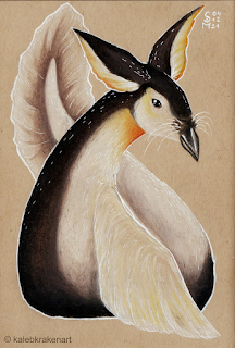 Kaleb
Kaleb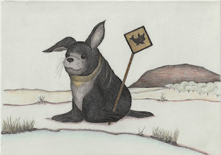 MarlieOnDiscord
 MjarAznabal
 Nate Pride*
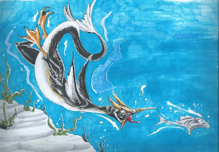 Nuvalo*
 Pendrake
 RedJarOJam
 Skeletortoise*
 Sleepless Ninja
 Steve Sketches*
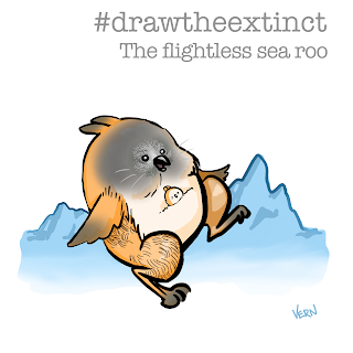 VernNYC
 VeryBlueberry2*
November 30, 2021
Mouse Guard Creator Commentary: Gene Ha
 Back in the March 2021 Onlinecon, I invited comic artist and creator of 'Mae' Gene Ha on to go through his Mouse Guard: Legends of the Guard story: 'Worley & The Mink' with Lowell Francis from volume 1.
 Together Gene and I go page by page of his story to get his thoughts and process. Enjoy!
Watch on YouTube:
https://youtu.be/W2pMocAycOA
David Petersen's Blog

- David Petersen's profile
- 339 followers

