
David Petersen's Blog, page 24
April 27, 2021
Dewberries colored Commission
 Last year for the August 2020 ONLINECON I took a few inked commissions. I don't tend to do these any more because of how much added work they are compared to my toned commissions. But, they are something many fans still ask for, and if they are mouse-themed, I can color them for my own use for later publication in a sketchbook.
To the left are the finished colors of one of those commissions (one I will eventually collect in the next Mouse Guard sketchbook). And below I'll run through the art process of creating the art.
 The layout/pencils for this piece started as several sketches on sheets of copy paper. The fan asked for a Mouse-family portrait of he, his wife, and their boys doing something outdoors. With a little more chat, I found out they enjoy picking dewberries in their back yard in the summer time. With five family members to fit into a composition, drawing each one separately so I can scan them and arrange them independently of one another until I get something that works. Tinting the drawings different colors helps me see those forms more easily. The bulk of the dewberry vines were quickly digitally painted in to help me work with masses and distribution of berries and leaves.
I printed out the above digital composition and taped it to the back of a sheet of 12" x 12" Strathmore bristol 300 series. On my Huion lightpad, I'm able to see the printout and I can use it as my 'pencil' lines as I ink. This way, at the end of the inking process, there are no actual pencils to erase and the artwork is as clean as I can possibly make it for the commissioner.
I inked the lines with Copic Multiliner SP pens (the 0.7 and 0.3 nibs mainly)

Then the inks were scanned before Julia shipped off the original art to its new home. With the high-res scan, I could start the digital coloring process to be able to use it later for publication. This process starts with establishing where all the colors go––like a digital professional job of coloring-in-the-lines. I also used this step to paint in all my color holds (areas where I want the inkwork to be a color other than black). In this piece the holds were limited to the outlines of the berry stains.

Here again is the finished colored image. The rendering was all done using the Dodge and Burn tools in Photoshop while using a stock textured brush. I added some extra layers to simulate the light pushing in from the background.
I most likely won't release my next sketchbook until 2022, but this piece is already a guaranteed page in the publication.


April 20, 2021
Usagi Yojimbo Dragon Bellow Cover 1 Process
 I was fortunate enough to be asked by IDW and Stan Sakai to do a run of covers on the new Usagi Yojimbo reprints of 'The Dragon Bellow Conspiracy'. I'll be doing six in total, and for this blogpost I'll be sharing my process for the creation of the cover art.
This issue is currently up for pre-order through Diamond with the code APR210683. Just ask your local comic shop to order it for you, or order it though an online retailer. The final order cutoff is June 7th, and the issue comes out June 30th.
To the left you can see the finished colored cover, but below I'll go through the steps.
Layout/Pencils:
 For this first cover, I had a dilemma. Usagi doesn't do much in the issue (spoiler alert) and the longer tale is being set up by other characters. I talked with my editor about that and he told me to feel free to deviate from the issue's story to do a more arc-wide style cover with the samurai rabbit. I drew Usagi on one sheet of copy paper, and the dragon on another, and on a third sheet I used photo reference of Nagoya Castle to draw the architecture. I scanned these elements into Photoshop and tinted each drawing a different color to help me see each form clearer. I made a few digital tweaks to each drawing with scale, rotation, even some quick digital paint-overs. Then at the last minute I decided to add the swirling ginko leaves to suggest the wind picking up for the storm that continues through the story.
 Inks:When the above layout was approved by the editor and Stan, I started the inks. First step was to print the layout file onto copy paper (over two sheets that had to be taped together at the seam) and tape that to the back of a sheet of Strathmore 300 bristol. On my Huion lightpad I was able to ink the cover art using the printout as my pencils lines. This way in the end the inked artwork is very crisp and clean with no need to erase pencils lines. I used Copic Multiliner SP pens to ink the art (the 0.7 and 0.3 nibs).
I tried to make sure I was breaking up the forms with different tones of grey by inking different textures and patterns (stippling, tick marks, vertical lines, hatching, etc.)
 Color Flats:The inks were approved and I scanned them in to Photoshop to start the coloring process. This first part of coloring digitally is called 'flatting' and is a professional version of coloring inside the lines. Establishing what each area's color is and where it ends. This not only is a color base for the image, but also allows a quick flat color area to be able to quickly isolate to render or make adjustments on.
 In this step I also established all my color holds (areas where I want the black inkwork to be a color other than black). And this cover has several: The architecture, the dragon, the dragon's eyes, Usagi's scar, and the pattern in the sky.
 Final Colors:Here again is the finished art (this time sans-logo). To render all of the color I mostly used the Dodge and Burn tools (Photoshop tools based on real photography techniques for purposely over or under exposing film as it develops). Burn is do darken and Dodge is to lighten. I use a stock Photoshop textured brush as I add shadows and highlights with these tools so the work looks a little more organic and less digital.
It's an honor to be asked by Stan to do these covers and to get his approvals as I work through each cover.
Usagi Yojimbo: The Dragon Bellow Conspiracy is out in stores June 30th
April 13, 2021
Plotmasters Project: Feather
 The latest episode of The Plotmasters Project went up on the site today. It was an episode Jesse and I recorded LIVE on my Twitch stream for ONLINECON titled: FEATHER!
 To the left you can see my finished art for my Plotmasters update of the idea. Below in this blogpost I'll show the steps of the process
If you haven't seen the episode, I've posted the video at the bottom of the blogpost, or you can link to it directly on YouTube here: https://youtu.be/62WCxKYYjSU
 Once upon a time...ok, it was the late 90's, I was drawing a lot of fantasy folklore & fairy-tale stuff. A character that was like a short bearded elf (who was a stand in for myself) kept reoccurring as I built up a mental narrative about him becoming the lonely caretaker for a world when the rest of his kind departed it. He encountered primitive little lizard creatures, a talking wooden man, hooded figures who cultishly want to burn the world down slowly, and a skeleton with tempting offers meant to be a deal-with-the-devil kind of character. It was all a metaphor for things I was experiencing during a bad break-up in college. And in spite of the hurt I was feeling when I was drawing the pieces to the right, I still am very fond of the story set-up and characters.
 So for my update, I mainly just wanted to draw the characters better, imply a bit more worldbuilding, and set a tone of melancholy bordering on sadness instead of outright sorrow and despair. I wanted all of the characters to feel like they could be puppets for a Jim Henson company project. Feather himself needed to feel both alone and surrounded by the world he's left with. I drew the characters on different sheets of copy paper (Feather's head and body were drawn separately) and assembled them in Photoshop into a useable composition with a stock border pattern, and some type for the title.
  I then printed out the above layout at about 11x17 (on two sheets of copy paper that I assembled into the full image) and attached it to the back a sheet of Strathmore 300 series bristol. Instead of inking at this stage like I normally would, I just did a really tight pencil job. I'd originally thought about rendering the entire piece in graphite, but after just rendering the border, I realized it was going to be too much work and very risky where I could smudge it or mess up the overall value structure all too easily. And there were times where I thought again about inking the outlines, but since I wanted this piece to feel softer than my normal process, I finished the lineart all in pencil and prepared for the next stage.
I scanned the finished pencils into Photoshop and painted in everything in greyscale. This was a digital way of getting my piece to the point of where I'd planned to render the original physical piece in graphite, but in a much safer and more effective way.
I probably don't evaluate my work in greyscale enough. It's a great way to make sure your overall value structure works. In a piece like this with atmosphere, multiple characters, and some light sources the greyscale rendering was an important step.
The last step was to paint in color on new layers that simply tint the values beneath to the color you are painting. It's one of the ways people colorize old black and white photos. I'd debated tinting each lizard creature a little differently, but opted to keep them as a mass of figures all in the same orange tone rather than make them each unique characters fighting for compositional space.
Below you can watch The Plotmasters Project episode: Feather.
April 6, 2021
The Pupmasked Rhesus
 Last Friday on my Twitch Stream, we did the fourth community draw-along event #DrawTheExtinct where I posted an image from an old block print I made with a few animal photo inspiration prompts and the idea to create an imaginary extinct animal. I worked on my piece live on my Twitch stream while viewers worked at home and then on Monday we shared our finished pieces.
 Here is my finished Pupmasked Rhesus. And below are my steps to create it as well as the community submissions.
 We started with the prompts of my original linocut print from a piece titled 'Extinct' as well as a Rhesus Monkey, a Raccoon, and a Foxhound (though I told people to use other monkeys and dogs as inspiration points if they wished . I named the creature 'The Pupmasked Rhesus'. I told the viewers that they could use any combination of the inspiration prompts––they could make their version as cute and cuddly as a pocket pet stray kitten, as monstrous and deadly as a giant kaiju destroying cities, or anything in between. I also wanted this to be an excuse to get their pencils moving. I invited all skill levels, because I'm a firm believer that you shouldn't have to be good at something or pursuing mastery of it to just simply enjoy the act of it...and art is no exception.
On the Friday stream I started with mechanical pencil on a sheet of copy paper to draw the creature. I outgrew one sheet of paper and taped another piece on to the side so I could finish the raccoon inspired tail. The image here is after I'd scanned my pencils and decided to enlarge the dog-ish muzzle and nose. I also enlarged the entire head after that first adjustment in Photoshop.
I didn't want this version to just be a copy of my old print, so I played more with the head shape trying to pay more attention to my prompts than be sentimental about the old piece.

With the pencils scanned and adjusted, I printed out the image and taped it to the back of a sheet of Strathmore 300 series bristol. Using a lightpad, I was able to see through the surface of the bristol as I inked the Pupmasked Rhesus. I used a Copic Multiliner 0.7 SP pen to ink the art.
Most of the inking was pretty straight forward other than figuring out how dense to make the black furred areas around the mask, ears and tail stripes. I didn't want to go solid black, but I didn't want to fiddle with too delicate of hatching textures either.

On stream, I not only finished the pencils and inks, but was able to scan the inks and proceeded to the color flats.
Because I was in a rush towards the end of the stream, I didn't want to be precious about my color choices, so I went with obviously wrong invented color choices. Garrish ugliness that offers the benefit of making sure I've colored within the lines.
Below you can again see the final rendered corrected colors with a border and type applied.

But, as this is a community event, I wanted to share all the other entries posted in the Discord (some are works-in-progress I've been told). I awarded a prize and we voted together on a few more (prize winners marked with *) on Monday's Twitch stream and we all enjoyed seeing what each other had done. I hope we get even more participants next month (first Friday!)
 AllLegsNoBody
 AUTigerCT
 Captain Nemo
 Cortrah
 Dark
Dark Evil Cartoonist*
 FlannelWizard
 Nate Pride
 RedJarOJam*
 Serarel*
 Tyrie*
 VernNYC
March 30, 2021
Mouse Guard 'Mortimer' Wanted Poster Process
 Last year just before everything shut down to COVID, I created a print that was a wanted poster of a mouse named Mortimer. The idea was to lightly poke at Mickey after the Mouse Guard movie was canceled.
I did a very limited run of these, tea staining each one, and sold them at C2E2 in 2020 and the handful that I came home with through my online store. Well, I've reprinted them again (though this is the last batch I'll do) for ONLINECON, and in this week's blogpost I'll run through the process to create the art as well as the tea staining.
You can purchase any remaining prints here: mouseguard.bigcartel.com
 The idea started with an inside joke amongst family and friends who, like me, were still raw about the movie cancelation. I penciled out a drawing of a familiar looking black furred mouse with buttons, gloves, and pale face as an executioner with an axe (note the silhouette of the details on the top and bottom of the axe)
Someone in the group that I was texting the image to mentioned what a fun print it would make...and I thought it would be a fun in-world wanted poster.
So I used my pencil drawing as a guide to ink from

The inks though needed to look very specific. I wanted to have them seem like a block print--something the mice of the territories would be able to mass produce to share far and wide.
Even though my degree is in printmaking, I didn't want to carve a print block for it though, and I found a way with brush pen to replicate a convincing enough look of a woodblock print to satisfy myself.
Below is a timelapse video of me inking the piece on my Twitch stream

With the inked artwork done, I scanned it and worked up the type using a font. I then rasterized the text (meaning to make it into graphic pixels instead of editable type) so I could custom destress it so it too had imperfections like a woodblock print.
I had the posters laser printed at 9" x12" at a local print shop on a heavy stock paper.
 Jeremy Bastian shared with me his tea staining instructions that he uses for all his Cursed Pirate Girl prints. And I cycled through a rotation of prints on a tray getting stained and brushed with tea while others that had already gone though that process baked in the oven at a low temperature.
This means that every print is unique in some way. Some are lighter, some darker, some splotchier, some with streaks, etc--no two are alike, and every one of them was stained by me.
 After the prints come out of the oven, they are pretty warped. I stack heavy books on top of them for a few days to help flatten them out so they are easier for us to bag, board, and ship--and for you to frame or store.
Below again is one of the final Mortimer prints. This is the final run of them and I do not plan to print more. You can purchase any remaining prints here: mouseguard.bigcartel.com
March 22, 2021
ONLINECON MARCH 2021 INFO!
 March 24-28 ONLINECON will be on my Twitch Stream (twitch.tv/davidpetersen) from 2-10 pm east. Over the course of those 5 days I'll be streaming 8 hours each day, spending half the time drawing commissions, and the other half with guests for panels, interviews, and programming!
 In my online store everything except commissions will be 25% OFF using ordercode ONLINECON starting on Wednesday at 2pm
To the left you can see the promo for the event and I'll go into more details below!
I'm proud of the guest list we've been able to assemble for this event. I'll be drawing on the even

numbered hours, but on the odd numbered hours of ONLINECON features a panel or presentation by one of our guests. Joining me will be: Stan Sakai, Angela DiTerlizzi, Jesse Glenn, Serena Malyon, Donato Giancola, Tracy Butler, Norman Chan, Meredith Salenger, Karl Kerschl, Jenny Robb, Armand Baltazar, Kevin McTurk, Very Handsome Billy, Noel Macneal, Steve Hamaker, Alex Kain, Erin Godbey, Sanford Greene, and Gene Ha!
Below you can check out the full schedule of dates/times for each guest and a description of what we'll be covering with them:

But in addition to guests, there will be several new items going into my Online Store during ONLINECON as well as a storewide sale:
 New 2021 Signed & Numbered Bookplate
 New 'SERVICE' 8" x 8" Mouse Guard print
 Tea Stained 9" x 12" 'Mortimer' Print
 Signed Mouse Guard books with a mouse head doodle
 Black Axe Black & White edition with a brush-pen sketch
  New Grey Mouse Guard Tee Shirt
 'Mouse must not kill mouse'
 New Original inked artwork
 Toned Commissions
These are single figure torso commissions with limited backgrounds on toned paper. (I'll be opening a list through the online store March 23rd)
Looking forward to seeing you at ONLINECON!twitch.tv/davidpetersen
March 16, 2021
Hellboy & The Cockatrice Trio! Process
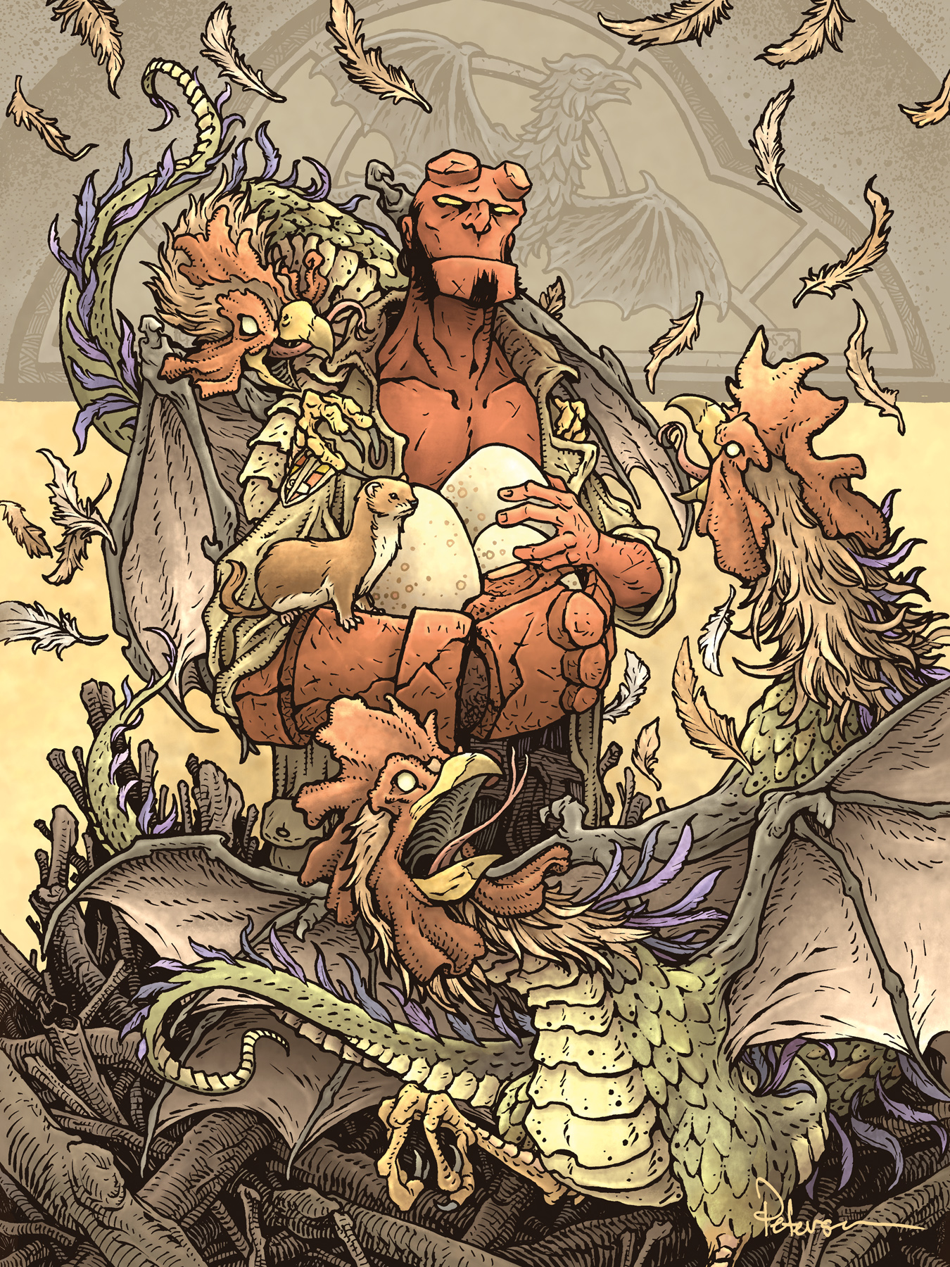 I'm very pleased to have created a piece for the MIKE MIGNOLA: DRAWING MONSTERS Documentary Kickstarter. My piece will be offered as a print for the campaign and eventually the original inked artwork will be offered as part of the reward tiers.
 Mike & Hellboy mean a lot to me creatively. From understanding what the medium of comics could be do beyond superheroes, to listening to every interview with Mike I could find where he talked about his motivations & history to help me create an unusual path of my own for the type of career in comics I was after
To the left is the finished piece, and below I'll run through the process of creating the artwork.

I thought of several ideas for a Hellboy pinup: Hellboy drinking in a pub with skeletons (some playing cards, a cobwebbed dart board, drinks all around), Hellboy in artifact collector's trophy room, Hellboy fighting a big moster and breaking it's jaw like King Kong fighting a dinosaur...and somehow in all that flurry of writing down ideas, I came up with Hellboy stealing the egg of a cockatrice.
So, I sketched out this version (added the 'EGG' balloon just for fun) and gathered some reference including photos of roosters & the cockatrice bronze window on the transom of the Belvedere Castle in Central Park. Pretty much the only bit of this drawing that survived to the next version are the cockatrices
 I felt like a less action-packed scene was more my lane to be in. So on several sheets of copy paper, I worked out a new unbothered Hellboy holding a clutch of eggs, and worked out two more acceptable cockatrice drawings to go with the one from the last rough. I assembled these in Photoshop, while I blocked in the major forms with color. It helps me to see where the masses are, where color tangents could pop up, and to help me figure out when inking what areas need what textures. I added a weasel perched on Hellboy's right hand to the scene––Weasels are the natural enemy of the cockatrice. And instead of going back to copy paper to tighten up the bits that still needed work, I digitally roughed in some falling feathers, one of the beast's wings, and the pile-of-sticks nest at the bottom.
 With the layout all blocked in, I was ready to start inking. With a printout taped to the back of a sheet of Strathmore 300 bristol, I inked the piece on a Huion lightpad.
I used Copic Multiliner SP pens (the 0.7 and 0.3 nibs) to ink everything.
Most of the ink-work was done live on my Twitch stream as fans watched and asked questions.
I tried to vary the density of the ink details, going much darker and more textural on the nest while making the scales of the cockatrices more suggestive and leaving their wing-skin very open.
 When the inks were done I scanned the original back into Photoshop and started the coloring process. This part is all just about establishing flat colors. I'd done some of the color selection work when I did my layout, but those colors become affected by the colors around them and had to be adjusted after adding in the nest, background, and window colors.
I also decided to push back the window architecture further into the distance, so I added a color hold over the inks there (an area where I want the ink lines to be a color other than black)

The last step was to render everything with light, texture, and shadow. I do almost all of this work using the dodge and burn tools in Photoshop while using a stock texture brush. This one took a lot of fiddling to get just the right blend of tonal values, and a big thank-you to Gene Ha who I showed this to at a mid-stage who had some advice that saved me a lot of struggle,
So, go back the MIKE MIGNOLA: DRAWING MONSTERS Documentary Kickstarter! and get a print of my Hellboy piece on one of the reward tiers!
March 9, 2021
The Salamalican
 Last Friday on my Twitch Stream, we did the third community draw-along event #DrawTheExtinct where I posted an image from an old block print I made with a few animal photo inspiration prompts and the idea to create an imaginary extinct animal. I worked on my piece live on my Twitch stream while viewers worked at home and then on Monday we shared our finished pieces.
Here is my finished Salamalican. And below are my steps to create it as well as the community submissions.
 We started with the prompts of my original linocut print from a piece titled 'Extinct' as well as an Orange Salamander, a Pelican, and a Frog's eye. I named the creature 'The Salamalican'. I told the viewers that they could use any combination of the inspiration prompts––they could make their version as cute and cuddly as a pocket pet stray kitten, as monstrous and deadly as a giant kaiju destroying cities, or anything in between. I also wanted this to be an excuse to get their pencils moving. I invited all skill levels, because I'm a firm believer that you shouldn't have to be good at something or pursuing mastery of it to just simply enjoy the act of it...and art is no exception.
 On the Friday stream I started with mechanical pencil on a sheet of copy paper to draw the creature. Then I decided I wanted some minnows in his mouth, and on a separate sheet of copy paper on a light pad I drew his meal as well as one in his hand. The image here is after I'd scanned my pencils and edited the two drawings together (tinting them to help me see the different bits) in Photoshop.
My main pushes for the new design were to make sure the gullet felt like a flexible membrane instead of just a jug-jaw and that the 'S' shape of the body was clear to read and anatomically believable.
 With the pencils scanned and adjusted, I printed out the image and taped it to the back of a sheet of Strathmore 300 series bristol. Using a lightpad, I was able to see through the surface of the bristol as I inked the Salimalican. I used a Copic Multiliner 0.7 SP pen to ink the art.
 Most of the inking was pretty straight forward other than the texture on the gullet. I kept looking to my pelican reference for texture guidance.
 On stream, I not only finished the pencils and inks, but was able to scan the inks and proceeded to the color flats.
The color selections were pretty straight forward when looking at the reference photos, it was just a matter of using different layers to establish where those color areas started and stopped: The main skin vs the beak, the gullet vs the minnows, etc.
Below you can again see the final rendered colors with a border and type applied.

But, as this is a community event, I wanted to share all the other entries posted in the Discord (some are works-in-progress I've been told). I awarded a prize and we voted together on a few more (prize winners marked with *) on Monday's Twitch stream and we all enjoyed seeing what each other had done. I hope we get even more participants next month (first Friday!)
 Wicked Goblin King*
 AU Tiger
 Evil Cartoonist
 Captain Nemo
 Evil Cartoonist
 Cortrah
 Tefrin
 Vern NYC
 Bunce
Bunce Nate Pride*
 Dark
Dark Tyrie
Tyrie Pagan Celt
 Serarel*
 Evil Cartoonist
[image error] Flannel Wizard
March 2, 2021
ONLINECON: March 2021!
ONLINECON is BACK! A free online event with 20 guests, an online store sale, and much more...March 24-28 I'll be running a special event on my Twitch Stream (twitch.tv/davidpetersen). Over the course of those 5 days I'll be streaming 8 hours per day, spending half the time drawing commissions, and the other half with guests for panels, interviews, and programming! I'l also be running a sale in my online store and adding new original artwork and merchandise to the store.
To the left you can see the promo for the event and I'll go into more details below!
I'm proud of the guest list we've been able to assemble for this event. I'll be drawing on the even
numbered hours, but on the odd numbered hours of ONLINECON features a panel or presentation by one of our guests. Joining me will be: Stan Sakai, Angela DiTerlizzi, Jesse Glenn, Serena Malyon, Donato Giancola, Tracy Butler, Norman Chan, Meredith Salenger, Karl Kerschl, Jenny Robb, Armand Baltazar, Kevin McTurk, Very Handsome Billy, Noel Macneal, Steve Hamaker, Alex Kain, Erin Godbey, Sanford Greene, and Gene Ha!
Below you can check out the full schedule of dates/times for each guest and a description of what we'll be covering with them:

But in addition to guests, there will be several new items going into my Online Store during ONLINECON as well as a storewide sale:
New 2021 Signed & Numbered Bookplate
New 'SERVICE' 8" x 8" Mouse Guard print
Tea Stained 9" x 12" 'Mortimer' Print
Signed Mouse Guard books with a mouse head doodle
Black Axe Black & White edition with a brush-pen sketch
New Grey Mouse Guard Tee Shirt 'Mouse must not kill mouse'
New Original inked artwork
Toned CommissionsThese are single figure torso commissions with limited backgrounds on toned paper. (I'll be opening a list through the online store March 23rd)
Looking forward to seeing you at ONLINECON!twitch.tv/davidpetersen
February 23, 2021
Ye Old Lore of Yore Reading
 Back in 2005 Jeremy Bastian and I released a self-published anthology comic called 'Ye Old Lore of Yore'. It has long been out of print, but recently, Jeremy and I decided to share it with fans again by performing a dramatic reading of the five stories within––a Cursed Pirate Girl story, Two Fir Darrig tales, Sir Hannibal of Ash, and a collaboration between the two of us: Gilbert Luther. Enjoy!
Direct YouTube link:
https://youtu.be/Co4VAzcMick
David Petersen's Blog

- David Petersen's profile
- 339 followers


![[image error]](https://1.bp.blogspot.com/-ngw1FuRxHkI/YEfDKrzymNI/AAAAAAAAM1M/5RYZ9UqohRg01YKgbLeppoGggZdaPeWCwCLcBGAsYHQ/s2048/wwwww.png)