
David Petersen's Blog, page 21
November 23, 2021
Usagi Yojimbo: Lone Goat & Kid #1
 I was fortunate enough to be asked by IDW and Stan Sakai to do a run of covers on the new Usagi Yojimbo reprints of short story issues that will be collectively called 'Lone Goat and Kid'. I'll be doing six in total, and for this blogpost I'll be sharing my process for the creation of the cover art for issue #1.
This issue is currently up for pre-order through Diamond with the code NOV210415. Just ask your local comic shop to order it for you, or order it though an online retailer. The issue will be in shops Jan 26, 2022
To the left you can see the finished cover, but below I'll go through the steps in creating it.

Layout/Pencils
This issue's story has to do with Usagi being sent to a village to retrieve an heirloom sword of a deceased Lord and finding the situation to be a moral quandary. So, I chose the moment where Usagi has found the location of the sword and has to choose if he's willing to use force to get it back. It's always nice on an issue one to have the main character in a heroic pose large in the layout. The woman in front of him is a character specific to this issue, and not Tomoe (as some fans thought when I was working on this piece on my Twitch stream).
I penciled each character and the background separately on copy paper and then scanned and assembled them into a composition I liked. I tend to go overboard on this stage roughing in color too, this helps me and the editor to really understand the goal of the final look of the piece without problems to solve in the coming stages.
 Inks:
Inks:When the layout was approved by the editor and Stan, I started the inks. First step was to print the layout file onto copy paper (over two sheets that had to be taped together at the seam) and tape that to the back of a sheet of Strathmore 300 bristol. On my Huion lightpad I was able to ink the cover art using the printout as my pencils lines. This way in the end the inked artwork is very crisp and clean with no need to erase pencils lines. I used Copic Multiliner SP pens to ink the art (the 0.7 and 0.3 nibs).
Most of the inks were straight forward, but I did spend some extra time trying to do some rendering on Usagi's hat.

Color Flats:
The inks were approved and I scanned them in to Photoshop to start the coloring process. This first part of coloring digitally is called 'flatting' and is a professional version of coloring inside the lines. Establishing what each area's color is and where it ends. This not only is a color base for the image, but also allows a quick flat color area to be able to quickly isolate to render or make adjustments on.
Most of the color choices had been made in the layout stage, but I made changes to the value structure as I worked. In this step I also added color holds (areas where I want the lineart to be a color other than black) to the woman's dress pattern, here eyes, and Usagi's scar, as well as a slight fade to the inkwork of the background near the bottom.

Final Colors:
Here again is the finished art (this time sans-logo). I made significant changes to the tones from the flats by adjusting color balance, brightness, & contrast. To render all of the color I mostly used the Dodge and Burn tools (Photoshop tools based on real photography techniques for purposely over or under exposing film as it develops). Burn is do darken and Dodge is to lighten. I use a stock Photoshop textured brush as I add shadows and highlights with these tools so the work looks a little more organic and less digital.
Usagi Yojimbo: Lone Goat & Kid #1 is out in stores Jan 26, 2022


November 16, 2021
Fall Harvest Redux
 For a Mouse Guard Calendar and perhaps a 9x12 print down the road, I decided to redraw a Fall Harvest celebration based on a print for the German edition of Fall from 2007.
Jeremy Bastian and I were talking the other day about the fun and challenge of redoing old work. We both recognize that it's a slippery slope where it's all too easy to want to redo everything and remain stagnant instead of producing new pieces build of the lessons learned from the mistakes of old pieces. But, as this was just a single print image and for a specific purpose, I went forward.
To the left you can see the finished piece and below I'll break down my process to get there.

There are lots of issues of scale in the piece, and it might not have enough compositional focus--not to mention I can draw, ink and color better than I could back then.
 So I started by sketching out a layout on copy paper and then adding in more figures on separate sheets of paper. I wanted to get a better sense of depth so the figures in the front are considerably larger and the scale recedes as the depth increases. I moved around the characters within the piece, removed a few mice, decided against all the lanterns, and to show more of the harvest foods. All of my various pieces of paper were then assembled in Photoshop and I did a quick blocking in of color to help me see the forms.
My original goal (and hopefully repeated here) was to show some kind of rustic & homey party akin to Bilbo's Birthday. There's a casual familiarity with the mice and the surroundings that their guard is down, they are relaxed and just enjoying the simple pleasures of ale, cider, fruits, veggies, and nuts.
 When the layout was done to my satisfaction, I printed it out at about 11x15 (on two sheets of paper I taped together after they printed). I taped that to the back of a sheet of Strathmore 300 series smooth bristol and on my Huion lightpad started inking in the lines and details with my Copic Multiliner SP pens (the 0.7 & 0.3 nibs).
 I inked most of this piece on my Twitch stream while I chatted with the audience and answered their questions.
 When the inks were done, I scanned them and started the coloring process in Photoshop. In this process the goal is to color in all the color spaces with flat colors, no rendering, no texture, no lighting effects. This is so it's easy to grab any of these colors later on as you render them.
Some of my color choices were pre-determined by the quick color blocking I did in the layout stage. At this point I also added color holds (areas where I want the inkwork to be a color other than black) to the leaf veins, apple spots, lute strings, and pottery decoration. I also made a new brush to emulate my thumbprints for the pipe smoke, and painted in a nice little trail of puff.
Lastly I rendered the piece. This is where, with the dodge and burn tools and a stock texture brush in Photoshop, I add light, shadow, and texture to make the forms seem round and full. I rendered most of the background off stream, but rendered all the characters and their accessories on Twitch.I'm pleased with the results, and as we head into Thanksgiving, let me say that I hope all of you have as warm and comfortable a harvest with friends and family as these mice are. I'm thankful for you fans who allow me to make this work as my job.
The Harvest piece will be featured in a new Calendar that I'll be opening up for pre-order tomorrow in my online store: https://mouseguard.bigcartel.com/. It's a 10"x7" desk calendar where as each month is torn away, you can also use the perforated line so that the art on the left becomes a framable 5" x 7" art print

November 9, 2021
The Red Bullrat
 Last Friday on my Twitch Stream, we did the tenth community draw-along event #DrawTheExtinct where I posted an image from an old block print I made with a few animal photo inspiration prompts and the idea to create an imaginary extinct animal. I worked on my piece live on my Twitch stream while viewers worked at home and then on Monday we shared our finished pieces.
 Here is my finished Red Bullrat. And below are my steps to create it as well as the community submissions.

We started with the prompts of my original 2000's era linocut print titled 'Extinct' as well as a Bull Terrier, a Muskrat, and a Red Panda.
I told the viewers that they could use any combination of the inspiration prompts––they could make their version as cute and cuddly as a pocket pet stray kitten, as monstrous and deadly as a giant kaiju destroying cities, or anything in between. I also wanted this to be an excuse to get their pencils moving. I invited all skill levels, because I'm a firm believer that you shouldn't have to be good at something or pursuing mastery of it to just simply enjoy the act of it...and art is no exception.
 On the Friday stream I started drawing with mechanical pencil on a sheet of copy paper to try and reimagine the beast. Proportion-wise I went with a Muskrat body & legs, Bull Terrier head, and Red Panda tail and markings. I wanted him holding something, so I added a clam to his paws. To the left you can see my finished pencils scanned into Photoshop with minor adjustments made & tinted to easily see the breaks in forms.

After I was happy enough with my above design, I printed that piece out on copy paper and taped it to the back of a sheet of Strathmore 300 series bristol. Using a lightpad, I was able to see through the surface of the bristol as I inked the Red Bullrat. I used a Copic Multiliner 0.7 SP pen to ink the art. Most of the work was in building up that repetitive fur texture. I worried I wasn't going to be able to finish the drawing by the end of the stream, but somehow I pulled it off just in the nick of time and signed off of Twitch and wished everyone luck with their pieces..

After the stream ended (and I had a break for dinner) I scanned the inks Friday was Julia's Birthday, so I didn't spend more time of the piece until Saturday night when I flatted the colors. I went with the Red Panda palate for the creature. I added only one color hold (areas where I want the ink to be a color other than black) to the water dripping out of the clam.
For these Draw The Extinct pieces I have a template with background and border already established, so it makes some of this color prep work all the easier. And on Sunday evening, I used the dodge and burn tools (with a stock photoshop texture brush) to render the piece.
Below you can again see the final rendered colors with a border and type applied in this final version.

But, as this is a community event, I wanted to share all the other entries posted in the Discord. I awarded a prize and we voted together on a few more (prize winners marked with *) on Monday's Twitch stream and we all enjoyed seeing what each other had done. I hope we get even more participants next month
(First Friday!)

Capt. Nemo
 Amy LeBaron
 88UncleErnie *
 Cortrah
 DePuggo
 Doombot 2015
 EvilCartoonist
Itunpsicala

MississippiWoodNymph *
 Nate Pride *
 PaperbackRhino *
  RedJarOJam
 Skeletortise *
 Sleepless Ninja
 Dammitch
 Tyrie *
 ValleyDweller
 VernNYC
 VeryBlueBerry2
November 2, 2021
Otter Printmaker Commission/Sketchbook Piece Process
 Last year and earlier this year I did an online event called OnlineCon where I opened up a list for inked commissions. It's not often that I offer fully inked commissions like this any more, but I was open to the idea of making fans happy in troubled times, supplement my income with conventions responsibly canceled, and to generate material for an upcoming Mouse Guard sketchbook.
To the left you can see one of those pieces finished and colored ready for a page in that sketchbook––and in this blogpost I'll break down the process to get there.

The request was a sea otter as a renaissance printmaker. While I'm happy to do this kind of subject, I didn't know if it would fit into a Mouse Guard sketchbook––but as I worked on it, I enjoyed the piece so much, that it's going in even if this isn't how I'd depict otters in my books.
I drew different elements on sheets of copy paper and then assembled them in Photoshop. Besides drawing an otter holding paper, I wanted to ficus on giving him an appropriate renaissance flourish to his clothes--specifically his hat and getting a historically accurate printing press. To bedazzle the hat, I just added a crab instead of a feather plume, and for the press I referenced the Rembrandt Press in Amsterdam.
 With the pencil drawings assembled with a bit of digital assistance into a layout I liked, I printed out the above image onto copy paper. I then taped that copy paper onto the back of a sheet of Strathmore 300 series bristol. On my Huion lightpad I can see through the surface of the bristol down to the printout to use as a guide as I ink. I used Copic Multiliner SP pens (the 0.7 & 0.3 nibs).
 I tried to use a lot of hatch marks to define the greytones in the piece--which ties into my own experience when getting my degree in Printmaking.

The original artwork was then packed up carefully and shipped off to the owner. But before it left, I got a proper high-res scan so that I could include it in the next Mouse Guard sketchbook.
First step to coloring is called 'flatting'. It's basically a professional version of coloring-in-the-lines and establishing what color area each thing in the piece is. The final colors can be altered, but because they are easy to grab flat tones, I can render each color area separately from the other.
 Here are the final colors all rendered and textured. I do most of this work only using two tools in Photoshop: Dodge and Burn. These are tools that date back to when Photoshop was a photo retouching tool and emulate part of the development process to over and under expose areas––ie: make areas darker and lighter. So with a stock textured brush I add shadows and highlights.This piece will eventually be collected with many more in an upcoming sketchbook I plan to release in early/mid 2022
October 26, 2021
Tree Library Process

Last year and earlier this year I did an online event called OnlineCon where I opened up a list for inked commissions. It's not often that I offer fully inked commissions like this any more, but I was open to the idea of making fans happy in troubled times, supplement my income with conventions responsibly canceled, and to generate material for an upcoming Mouse Guard sketchbook.
To the left you can see one of those pieces finished and colored ready for a page in that sketchbook––and in this blogpost I'll break down the process to get there.
 The request was a mouse library The fan knew I'd drawn several of them before and told me to do this piece however I wanted. And it's true, I've drawn formal libraries, ancient libraries, cozy libraries...and this time I wanted to draw something a bit more organic. So, I started drawing a library made of what looked like living trained tree/shrub branches & roots (augmented with shelves, rugs, and rope. The entire room was drawn on one sheet of copy paper, and I scribbled the mouse on another sheet (or off to the side) and merged them together in Photoshop. To help me see the masses and forms, I quickly painted in some color blocking.

I printed out the above layout on copy paper and taped it to the back of a sheet of Strathmore 300 series bristol. On my Huion lightpad I can see through the surface of the bristol down to the printout to use as a guide as I ink. I used Copic Multiliner SP pens (the 0.7 & 0.3 nibs). I wanted the depth & space to be more defined in the inks than the layout, so I added a density of hatching to the upper floor and more distant book shelves. But other than adding details to the books and rugs, the inks were very similar to the pencils.
When I had these inks finished, Julia shipped off the original art to the its new owner.
 Before the art was shipped off though, I got a high-res scan of it so I could start the coloring process for this piece. That first step is called 'flatting' which is basically a professional task of coloring-in-the-lines and establishing what color area each thing in the piece is. The final colors can be altered, but it's good to establish the distinction between the books, branches, ropes, and rugs.
I also took this step to establish a color hold (an area where I want the black linework to be a color other than black) on all of the book spines & cover details and on the rug patterns
 Here are the final colors all rendered and textured. I do most of this work only using two tools in Photoshop: Dodge and Burn. These are tools that date back to when Photoshop was a photo retouching tool and emulate part of the development process to over and under expose areas––ie: make areas darker and lighter. So with a stock textured brush I add shadows and highlights.
This piece will eventually be collected with many more in an upcoming sketchbook I plan to release in early/mid 2022.
October 19, 2021
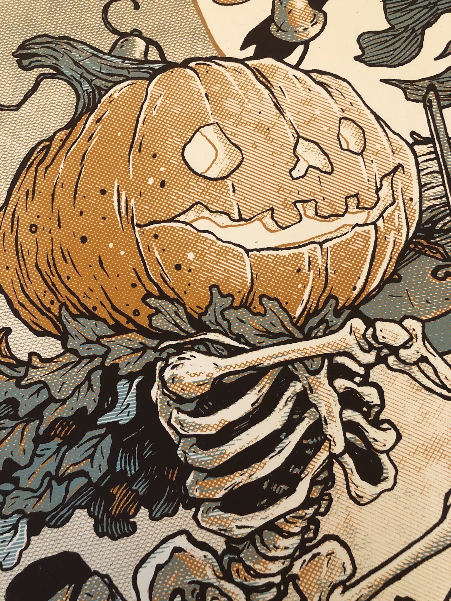
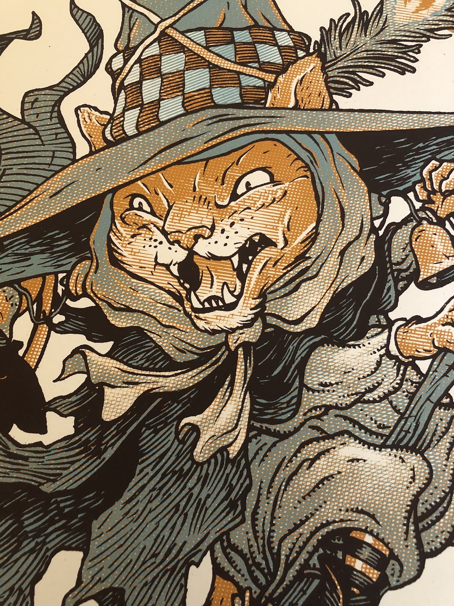
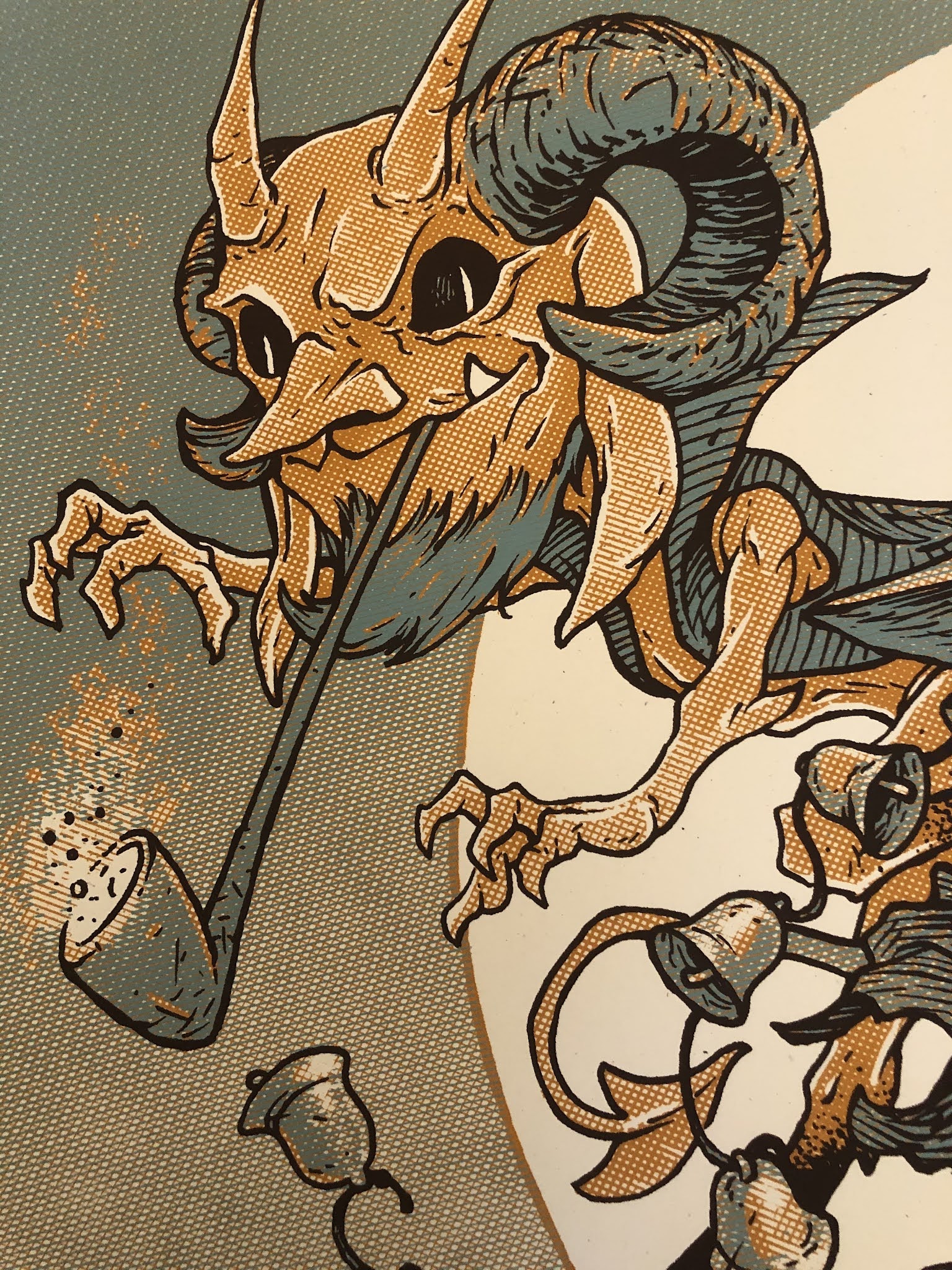
Happy Halloween: Baltimore Yearbook Piece Process
 For almost a decade, the Baltimore Comic Con has released an art book called the 'Yearbook' with invited guest artists attending the show asked to contribute a piece for it. It's a fun way for attendees to walk around the convention and collect signatures and hopefully discover some artists' work they may not yet be familiar with. This year, instead of it featuring a specific creator-owned title or character, they are going with the theme of Halloween!
To the left you can see my finished piece that will be included in that bookBelow I go into my thought process and art steps to get to the finished piece.
Ideas:
 I knew I didn't want to do something too scary or gory––that's not really my nature as an artist. And I thought of trying to emulate the feel of an old halloween illustration with some classic icon style characters like a with, a devil, a ghost, a skelleton, a cat, a jack-o-lantern person...
So I went off in search of inspiration art. And I generated a folder with old illustrations and new work by modern artists who were getting the same mood I was going for (Mike Mignol, Tony DiTerlizzi, & Andrea De Luca).
 Pencils:When thinking of those classic characters I started liking the idea of merging them together in new ways––like a witch cat, or a pumpkin headed skeleton. And I wanted them to have the proportions of their heads being at least 1/3 of their overall height. So I started sketching ideas on copy paper.
 The Fiddle playing skeleton with the pumpkin head and then witch-cat came to me fast, but I had a hard time deciding how or what to merge the devil with, and I think I'd run out of steam when I drew the ghost with bat-wings.
So I scanned these poor souls with no idea how I was going to make it all work as a composition...
 Layout:
The piece from my reference folder that had the big moon face and the type at the bottom with a little rhyme made an impact on me, so I played with some type options of my own for the 'Happy Halloween' and I plopped in a quick block of text for the poem (not the verse I later wrote that you see here) as I started positioning characters around a moon shape.
The Ghost with bat wings didn't make the cut...compositions with odd numbered groupings usually look better and as I was already struggling to assemble my three favorites without any bad coverups or awkward tangents, he had to haunt somewhere else. I blocked in some color to help me see the forms of each character (which was really helpful with all the overlapping characters & details.
 Inks:
Inks:This piece is rather large at 13" x 17", so I printed out the above layout on two sheets of legal paper and taped them together at the seam. I then taped that printout to the back of a sheet of 14" x 17" Strathmore 300 Bristol. And on my Huion lightpad, I inked the final art (which will be going up for auction at the convention).
I opted to not ink in the poem text as it was too small and felt like it would have too much imperfection in the letter forms from my untrained letterer's hand.
 Color Flats:
I scanned the inks, in two passes since it wouldn't fit on my scanner bed, and reassembled it in Photoshop. Then I started flatting the colors in for each character. Most of those colro choices were already established in my layout, but I had to make more decisions about the lightness/darkness of the sky as well as add in color holds (areas where I want the inkwork to be a color other than black) for the 'Happy Halloween' text, the glowing jack-o-lantern features, the devil's pipe, the witch's peacock feather, and the outline of the moon.
Here again are the final colors all rendered and textured. I do most of this work only using two tools in Photoshop: Dodge and Burn. These are tools that date back to when Photoshop was a photo retouching tool and emulate part of the development process to over and under expose areas––ie: make areas darker and lighter. So with a stock textured brush I add shadows and highlights.
This piece will be part of the Baltimore Comic Con 2021 Yearbook, and I will offer prints of it soon after!
 18" x 24" Silkscreened Print:
I was so pleased with this pice that I wanted to also offer it as a large print. It's a 3 color Silkscreened print on 100 lbs French paper by Ocelot Print Shop in Detroit, MI. It's limited to an edition of 50 (signed and numbered). I'll have some with me at Baltimore Comic Con this weekend, and I still have some left in my online store:
https://mouseguard.bigcartel.com/product/halloween-trio-screen-printed-18-x24-poster
Detail photos of the 3 color treatment below:
October 12, 2021
Fan Art!
A great joy as a creator is to see fans drawing, sculpting, panting, modeling, cosplaying, inking, and expressing themselves by making artwork of Mouse Guard characters from the books and moments from their RPG campaigns. And so to celebrate that, here is a whole post of amazing Fan Art
(See past Fan Art Blogposts here)
 Abby Gavit
AAAbattery
 Andy Garcia
 Avery Craig
 Beatrice Nicoletti-fonti
 Benny L Curwen
 Beth Moak
 Brendan Murphy
 Carmenere
 Clare Nolan
 Cosplay Fan
 Dmitry Sitnikov
 Don Kelly
 Eclair Perdu
 Ed Jimenez
Emmy Whalback

Emmy Whalback

Emmy Whalback

Emmy Whalback

Emmy Whalback

EvilCartoonist

Fisher-hu

Francis Lugfran

Guillaume Martinez

Ham on Rye

Hugo Gutierrez
 Jackie Zhang
Jacob Dudek
 Jaedquio Art
James Murlin

Jessica 'Waddler' Adams
 John M Garcia
Jorge Silva

Joseph Bralic

JP Sofia and Andres Wong
 Julia Scargot
KFlaggart

Kristina Huckabee

Lauranja_art

Little Warrior Shields
 Lucas Conegundes da Silva
 Lucas Paulino
marcelozenun

Marcos Novalbos

Marine Lennon

Matthew Gill

misho-baxendale
 neverending_craft
Rasmus Wernersen
 Simone Myers
 Slinky Whippet
 Tanaleth
 Tanguy Weyland
The Glass Drow

The Glass Drow
 Tony Weinstock
 treacherous_tusk
 Tyrie
Tyrie Wagner Chrissante
 Ward Silverman
 Wesley Quiles
 Josh Perez
 HumanityOfAll
 Eriscan Turk
 Cecil Yeatts
 Romain Houbert
 K. Flagg
 The Mother of a Patron of Comickaze Comics in San Diego
 Marvin Law
October 5, 2021
The Dungeness Pillurtle
 Last Friday on my Twitch Stream, we did the tenth community draw-along event #DrawTheExtinct where I posted an image from an old block print I made with a few animal photo inspiration prompts and the idea to create an imaginary extinct animal. I worked on my piece live on my Twitch stream while viewers worked at home and then on Monday we shared our finished pieces.
 Here is my finished Dungeness Pillurtle. And below are my steps to create it as well as the community submissions.

We started with the prompts of my original 2000's era linocut print titled 'Extinct' as well as a Box Turtle, Pill Bug, & Crab.
I told the viewers that they could use any combination of the inspiration prompts––they could make their version as cute and cuddly as a pocket pet stray kitten, as monstrous and deadly as a giant kaiju destroying cities, or anything in between. I also wanted this to be an excuse to get their pencils moving. I invited all skill levels, because I'm a firm believer that you shouldn't have to be good at something or pursuing mastery of it to just simply enjoy the act of it...and art is no exception.
 On the Friday stream I started drawing with mechanical pencil on a sheet of copy paper to try and reimagine the beast. While I chose the crab mainly for the eye stalks, I've draw the underside of a crab several times for Mouse Guard, and I like all the plates around the mouth too. I tried to give the head and shell shape more turtle feel with the eye stalks and underplating (and tiny claws) the crab feel, while segmenting the shell & giving it pill bug legs. To the left you can see my finished pencils scanned into photo ship, tinted to easily see the silhouette and with the box turtle shell pattern roughy painted on.

After I was happy enough with my above design, I printed that piece out on copy paper and taped it to the back of a sheet of Strathmore 300 series bristol. Using a lightpad, I was able to see through the surface of the bristol as I inked the Pillurtle. I used a Copic Multiliner 0.7 SP pen to ink the art. The last bit I inked was the shell's painted pattern--which looks a little overwhelming in the black ink--but I knew I was going to do a color hold for it in the next step. Because the initial pencils had gone so well, I was able to finish inking this piece entirely on Twitch.

I scanned the inks and started flatting the colors before signing off Twitch and wishing everyone luck with their pieces. I also mentioned that I may alter the name to have some reference to the crab portion before I posted my final piece...and it was right after the stream that I decided mine was the Dungeness Pillurtle. With the creature dropped into the template with background and border, I had the color flats ready to render.
I added a few color holds (areas where I want the ink to be a color other than black) to the shell pattern and the pupils.
Below you can again see the final rendered colors with a border and type applied in this final version.

But, as this is a community event, I wanted to share all the other entries posted in the Discord. I awarded a prize and we voted together on a few more (prize winners marked with *) on Monday's Twitch stream and we all enjoyed seeing what each other had done. I hope we get even more participants next month (first Friday!)
 88UncleErnie*
 Amy Lebaron*
 Bentu Estu*
 Capt.Nemo
 Cortrah
 DePuggo
 EvilCartoonist
 Gania
Gania MarlieOnDiscord
 Naereniel*
 Nate Pride
 Nuvalo*
 Paperback Rhino*
 Pendrake
 RedJarOJam
 Sleepless Ninja
 Tyrie
Tyrie VeryBlueberry2
September 28, 2021
Usagi Yojimbo Dragon Bellow #6 Cover
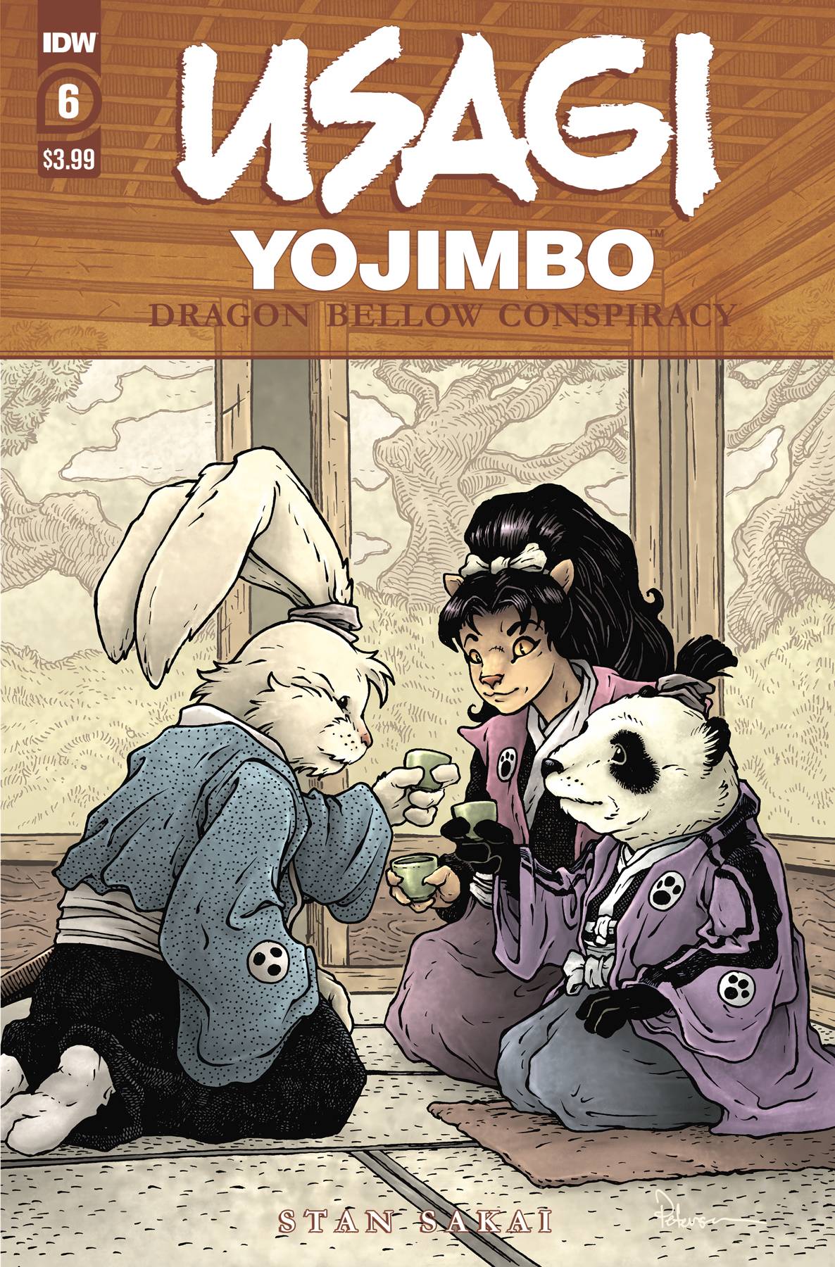 I was fortunate enough to be asked by IDW and Stan Sakai to do a run of covers on the new Usagi Yojimbo reprints of 'The Dragon Bellow Conspiracy'. I'll be doing six in total for Dragon Bellow, and for this blogpost I'll be sharing my process for the creation of the cover art for issue #6.
This issue is currently up for pre-order through Diamond with the code SEP210495. Just ask your local comic shop to order it for you, or order it though an online retailer. The issue will be in shops November 17, 2021
To the left you can see the finished cover, but below I'll go through the steps in creating it.
 Layout/Pencils
This issue almost feels like three separate epilogues for the previous five issues. So, without a concise story that spans the whole issue, I opted for a moment that felt like a nice 'the end' for most of the action the series has had so far. In the issue, Stan drew a scene where Usagi & Tomoe sit with Lord Noriyuki in a room with painted screen panels. I drew the characters all with sake cups (as we see Lord Noriyuki order sake for his guests) but when Stan saw the little bubbles I had over each cup in my piece, he was concerned because the Lord is underage and wouldn't be drinking. We settled that with no bubbles or sake bottle, they could very well be all drinking tea.
 To get the room layout, I used a model I found in the Goggle Sketchup warehouse and rotated it until is suited my needs. I dropped it into my Photoshop file for this cover and resized and cropped it until it fit with my characters. I then printed out the cropped model image and on a lightpad drew the lines in pencil on another sheet of paper. This helped me make some subtle changes and get the details I needed while still being able to draw the screen panels. I then blocked in colors for the above layout so that Stan and the editor could get the best idea of what I was going after for the cover.
 Inks:
Inks:When the layout was approved by the editor and Stan, I started the inks. First step was to print the layout file onto copy paper (over two sheets that had to be taped together at the seam) and tape that to the back of a sheet of Strathmore 300 bristol. On my Huion lightpad I was able to ink the cover art using the printout as my pencils lines. This way in the end the inked artwork is very crisp and clean with no need to erase pencils lines. I used Copic Multiliner SP pens to ink the art (the 0.7 and 0.3 nibs).
I feel like I spent most of the time on the ceiling details, and in trying to capture the look of a printed/painted 2D image on the screens in ink.
 Color Flats:
The inks were approved and I scanned them in to Photoshop to start the coloring process. This first part of coloring digitally is called 'flatting' and is a professional version of coloring inside the lines. Establishing what each area's color is and where it ends. This not only is a color base for the image, but also allows a quick flat color area to be able to quickly isolate to render or make adjustments on.
Most of the color choices had been made in the layout stage, but I made changes to the value structure as I worked. In this step I also added color holds (areas where I want the lineart to be a color other than black) to the background and a lighter one on the screen's landscape paintings.

Final Colors:
Here again is the finished art (this time sans-logo). I made significant changes to the tones from the flats by adjusting color balance, brightness, & contrast. To render all of the color I mostly used the Dodge and Burn tools (Photoshop tools based on real photography techniques for purposely over or under exposing film as it develops). Burn is do darken and Dodge is to lighten. I use a stock Photoshop textured brush as I add shadows and highlights with these tools so the work looks a little more organic and less digital.
It was an honor to be asked by Stan to do these covers and to get his approvals as I work through each cover...but don't worry I'll be back to Usagi covers very soon...
Usagi Yojimbo: The Dragon Bellow Conspiracy #6 is out in stores November 17, 2021
September 21, 2021
Flintrust Commission/Sketchbook Piece
 Last year and earlier this year I did an online event called OnlineCon where I opened up a list for inked commissions. It's not often that I offer fully inked commissions like this any more, but I was open to the idea of making fans happy in troubled times, supplement my income with conventions responsibly canceled, and to generate material for an upcoming Mouse Guard sketchbook.
To the left you can see one of those pieces finished and colored ready for a page in that sketchbook––and in this blogpost I'll break down the process to get there.
 The request was Saxon, Kenzie, and Lieam patrolling a Mouse town or village. I decided as I started to sketch out buildings to make it Flintrust, a town on the map, but has only been seen so-far in the Mouse Guard story 'The Owlhen Caregiver' (You can see a blogpost about the architectural inspiration for the town here: https://davidpetersen.blogspot.com/2020/09/owlhen-caregiver-reading.html I drew the architecture here on one sheet of copy paper, and then the mice separately on another (so I could play with their positioning in the final lauout). A little bit of repeated flint arrowhead pageantry and some digital text, and the layout was done.
 I printed out the above layout on copy paper and taped it to the back of a sheet of Strathmore 300 series bristol. On my Huion lightpad I can see through the surface of the bristol down to the printout to use as a guide as I ink. I used Copic Multiliner SP pens (the 0.7 & 0.3 nibs). There was a lot of detail to try and make sure didn't blend together in the architecture. Playing with textures and density of texture helped make the space clear so the image still reads in the end.
When I had these inks finished, Julia shipped off the original art to the its new owner.

Before the art was shipped off though, I got a high-res scan of it so I could start the coloring process for this piece. That first step is called 'flatting' which is basically a professional task of coloring-in-the-lines and establishing what color area each thing in the piece is. The final colors can be altered, but it's good to establish the distinction between the books, branches, ropes, and rugs.
I also took this step to establish color holds (areas where I want the black linework to be a color other than black) on everything from the midground back, this was my way of helping to sell a depth of focus.

Here are the final colors all rendered and textured. I do most of this work only using two tools in Photoshop: Dodge and Burn. These are tools that date back to when Photoshop was a photo retouching tool and emulate part of the development process to over and under expose areas––ie: make areas darker and lighter. So with a stock textured brush I add shadows and highlights.This piece will eventually be collected with many more in an upcoming sketchbook I plan to release in early/mid 2022.
David Petersen's Blog

- David Petersen's profile
- 339 followers

