
David Petersen's Blog, page 23
July 6, 2021
The Pointed Hedgecock

Last Friday on my Twitch Stream, we did the seventh community draw-along event #DrawTheExtinct where I posted an image from an old block print I made with a few animal photo inspiration prompts and the idea to create an imaginary extinct animal. I worked on my piece live on my Twitch stream while viewers worked at home and then on Monday we shared our finished pieces.
Here is my finished Pointed Hedgecock. And below are my steps to create it as well as the community submissions.
 We started with the prompts of my original 2000's era linocut print titled 'Extinct' as well as a Spitz (American Eskimo) dog, a Hedgehog, & a Rooster. I named the creature the Pointed Hedgecock (with the German word 'Spitz' referring to 'pointed'.)
I told the viewers that they could use any combination of the inspiration prompts––they could make their version as cute and cuddly as a pocket pet stray kitten, as monstrous and deadly as a giant kaiju destroying cities, or anything in between. I also wanted this to be an excuse to get their pencils moving. I invited all skill levels, because I'm a firm believer that you shouldn't have to be good at something or pursuing mastery of it to just simply enjoy the act of it...and art is no exception.

On the Friday stream I started drawing with mechanical pencil on a sheet of copy paper to try and reimagine the beast. I used the shape overall body shape of the Spitz, but went for a mode hedgehog face and back spines and used the comb of the rooster for the ears while making the Spitz's normally curved poofy tail a long rooster tail feather plume. I scanned in my pencil drawing, made a few quick proportion corrections, and then blocked in the color idea of the rooster's feathers as a guide. This simple color I thought would help me see where I'd need to ink delineation notes in the next step.
 After I was happy enough with my above design, I printed that piece out on copy paper and taped it to the back of a sheet of Strathmore 300 series bristol. Using a lightpad, I was able to see through the surface of the bristol as I inked the Pointed Hedgecock. I used a Copic Multiliner 0.7 SP pen to ink the art. I was still streaming this portion on Twitch, though as my end of stream time was coming up, I was nervous I wouldn't finish in time. Turned out, I went a little over-time to get the inks completely finished before I said goodbye to everyone watching and offered encouragement as they worked on their pieces over the weekend.

Off stream I did a few white out corrections to the inks and then scanned the artwork into Photoshop to prep it for final color. First thing was to drop it into the template I have for #DrawTheExtinct pieces with the border, background, and a base shadow already established. Then I started drawing in flat colors. This part of coloring (called flatting) is just a professional digital version of coloring-in-the-lines to establish the color areas.
My color choices were already established from my color blocking back in the layout/pencils stage which were based on the rooster photos I used for reference––but as is my way, most of my greens and blues are a bit muted and warmer than real-life.
Below you can again see the final rendered colors with a border and type applied I also moved the eye a little bit closer to the nose in this final version.

But, as this is a community event, I wanted to share all the other entries posted in the Discord. I awarded a prize and we voted together on a few more (prize winners marked with *) on Monday's Twitch stream and we all enjoyed seeing what each other had done. I hope we get even more participants next month (first Friday!)
 Capt.Nemo
Brittney McInnis (WIP)

Cortrah (WIP)

Dark (WIP)
 Doombot
 Evil Cartoonist*
 iidamariaart (WIP)
 KFlaggArt*
 Nathan Pride
 Nuvalo*
 Pendrake
 RedJarOJam
 Serarel*
 ShnookerDoodle
 Sleepless Ninja
 Tyrie*
 VernNYC
 veryblueberry2


June 29, 2021
Usagi Yojimbo Dragon Bellow 3 Cover Process
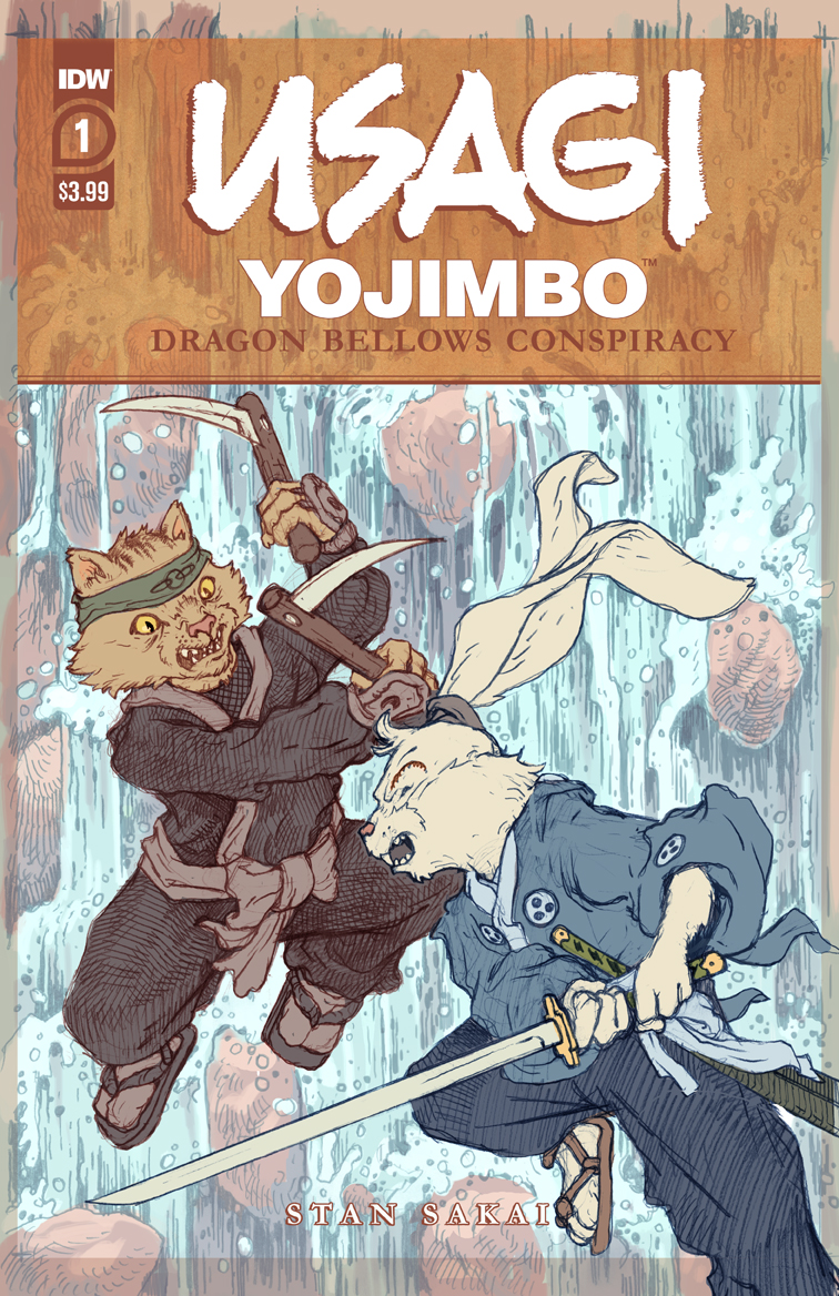
 I was fortunate enough to be asked by IDW and Stan Sakai to do a run of covers on the new Usagi Yojimbo reprints of 'The Dragon Bellow Conspiracy'. I'll be doing six in total, and for this blogpost I'll be sharing my process for the creation of the cover art for issue #3.
This issue is currently up for pre-order through Diamond with the code JUN210503. Just ask your local comic shop to order it for you, or order it though an online retailer. The issue will be in shops Aug 25, 2021
To the left you can see the finished cover, but below I'll go through the steps in creating it.
 Reference
For Stan's 1988 cover of this issue, he'd drawn Usagi and Tomoe rushing out of the castle's jail gates and engaging in combat with several opponents. I decided to do very much the same cover idea but from a bit more distance and from a higher angle to show the architecture more.
While I used Nagoya Castle as a reference model for my first Usagi cover in this series, this time I searched the Google Sketchup 3D warehouse for user uploaded models of Japanese castles with gates that looked similar to the interior drawings from the issue. This is Yamato Koriyama castle, and using the 3D model I could rotate it and get my camera angle just right for what I had in mind.
 Layout/Pencils
Using the model placed into the cover template, I was able to draw over top a printout of it to get my architectural details the way I wanted them (I was also referencing Stand drawings from the interior pages of this issue).
With the architecture and perspective locked, I drew Usagi and Tomoe on separate sheets of copy paper and pasted them into the drawing in Photoshop. I could resize and rotate them until they were placed to my satisfaction. I did the same with the villains. and then gave everything a quick digital color paint job. Not only does this help me figure out the look, tone, and shape blocking of the piece, it also helps the editor see what my intentions are with little left up to interpretation.
 Inks:
Inks:When the above layout was approved by the editor and Stan, I started the inks. First step was to print the layout file onto copy paper (over two sheets that had to be taped together at the seam) and tape that to the back of a sheet of Strathmore 300 bristol. On my Huion lightpad I was able to ink the cover art using the printout as my pencils lines. This way in the end the inked artwork is very crisp and clean with no need to erase pencils lines. I used Copic Multiliner SP pens to ink the art (the 0.7 and 0.3 nibs).
Most of the inks on this piece were for the architecture. The characters are very small and the hardest part was inking Tomoe's face and getting the expression correct from my pencils.
 Rain Effects:
You may have noticed in my original layout, I included the rain drops hitting the roofs and forming rings in the puddles on the ground. I got the idea from some of Stan's panels from the interior art and just wanted to include that element here to add to the drama and challenge our heroes are facing in this jail break.
To ink the rain I flipped the inked bristol art over and inked the rain effects on the back while looking at the art on a lightpad (I've digitally simulated the look of it on the lightpad here). This way all the rain will register with the inks perfectly, and I can isolate the rain inkwork when coloring on a separate layer.
 Color Flats:The inks were approved and I scanned them in to Photoshop to start the coloring process. This first part of coloring digitally is called 'flatting' and is a professional version of coloring inside the lines. Establishing what each area's color is and where it ends. This not only is a color base for the image, but also allows a quick flat color area to be able to quickly isolate to render or make adjustments on.
The colors were fairly straightforward as I'd done a lot of the color choice making in my layout piece. In this step I only had one color hold (areas where I want the black inkwork to be a color other than black) on Usagi's eye scar.
 Final Colors:Here again is the finished art (this time sans-logo). To render all of the color I mostly used the Dodge and Burn tools (Photoshop tools based on real photography techniques for purposely over or under exposing film as it develops). Burn is do darken and Dodge is to lighten. I use a stock Photoshop textured brush as I add shadows and highlights with these tools so the work looks a little more organic and less digital.
It's an honor to be asked by Stan to do these covers and to get his approvals as I work through each cover.
Usagi Yojimbo: The Dragon Bellow Conspiracy #3 is out in stores August 25th
June 22, 2021
Mouse Guard Commission: Beetle/Badger Canoe Explorer
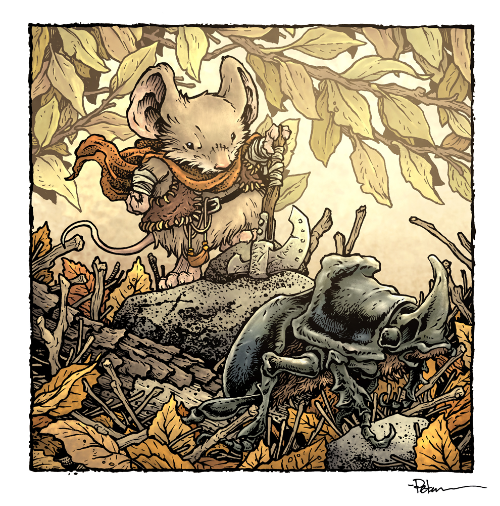
 During OnlineCon last year and this year, I took on several inked commissions that I'd also plan to color for an upcoming Mouse Guard sketchbook.
To the left you can see one of those pieces finished and colored ready for a page in that sketchbook––and in this blogpost I'll break down the process to get there. This piece belongs to the same fan who commissioned the piece I shared the process of last week with a mouse explorer and his badger companion. And the same species swap happened on this piece too.
 Let's start with inspiration. The request was for the same mouse from the last piece canoeing with their spirit animal badger ward. So, I did some google searches for images of people canoeing. I was after photos really, but found several painted pieces used for early/mid 1900's sporting magazines including this piece by Philip R. Goodwin. I liked the composition and figured I could use it even if I placed the figures facing towards us.
 For the canoe reference I did another search and came across a 3D render of a birch bak canoe by Faveral 3D.
 My drawing for this piece started with drawing the canoe and then on a lightpad and another sheet of paper overtop the canoe drawing to get the pose and positioning of the mouse and badger correct. Once I had those the way I liked I scanned them each into photoshop and put them together in a square template the right size for the final piece. That way I could resize and reposition this main focus of the piece before worrying about a background. The cross-hair marks are used to help me register the pieces in photoshop so they line up properly. With the figures were I wanted them I drew the landscape over another printout of the characters. Having each of these pencil drawing separate meant I could tint them different colors in Photoshop to help me see where bits of the drawings started and stopped.
I printed out the above layout on copy paper and taped it to the back of a sheet of Strathmore 300 series bristol. On my Huion lightpad I can see through the surface of the bristol down to the printout to use as a guide as I ink. I used Copic Multiliner SP pens (the 0.7 & 0.3 nibs).
I added a lot of the texture and details of the surrounding landscape as I inked, especially in the fallen logs. With these inks done, the piece was sent off to it's owner.
 And like last time, I'd told the commissioner that I'd be replacing the badger for something more Mouse Guard appropriate for my sketchbook version. Using a scan of the piece, I drew a replacement for the tiny badger and on a new clean sheet of bristol inked a Rhino Beetle (I also swapped out the Everquest mace handle with something more innocuous. In this image I've digitally superimposed the two inked versions to simulate working on the lightpad over a scan of the original. In addition to inking the beetle, I also needed to ink in any ground cover or canoe where the badger originally was.
In addition to getting the new inked beetle piece scanned an registered properly, I had to mask out the linework of the badger so it didn't show through anywhere––especially in the open white areas where it would be very obvious if I missed cleaning it up.
And here are the finished inks for the piece––well. I thought I was.......

The fan who commissioned the piece reached out to me. They had watched me work on the piece on my Twitch stream, and something seemed off to them––the position of the mouse's grip on the paddle was wrong. It would be nearly impossible to pull a stroke in that arm position and to their eye, the paddle looked like it would have to go through the canoe to reach water.
So, I had them ship back the piece. I did a digital drawing to figure out how to correct it and then used ink and white correction fluid on the piece to get it to look like this digitally corrected version.
 Once I had the final clean inks (including my beetle swap), I could start the coloring process for this piece. That first step is called 'flatting' which is basically a professional task of coloring-in-the-lines and establishing what color area each thing in the piece is. The final colors can be altered, but it's good to establish the distinction between the water and the plants or the canoe and the beetle.
I also took this step to establish color holds (an area where I want the black linework to be a color other than black) on the two depths of background, the water, and a little detail color hold on the canoe's decoration to make it look painted on.
Here are the final colors all rendered and textured. I do most of this work only using two tools in Photoshop: Dodge and Burn. These are tools that date back to when Photoshop was a photo retouching tool and emulate part of the development process to over and under expose areas––ie: make areas darker and lighter. So with a stock textured brush I add shadows and highlights.

This piece will eventually be collected with many more in an upcoming sketchbook I plan to release in early/mid 2022.
June 15, 2021
Mouse Guard Commission: Beetle/Badger Warder
 During OnlineCon last year and this year, I took on several inked commissions. The idea was 1) to make some fans happy (since I rarely offer these types of pieces any more) 2) Earn some income in the heights of the pandemic, and 3) build several pieces of work that I could color for an upcoming Mouse Guard sketchbook.
 To the left you can see one of those pieces finished and colored ready for a page in that sketchbook––and in this blogpost I'll break down the process to get there (including a species swap)
 Right off the bat you may notice that the rough is very different from my final. That's because the commissioner requested a mouse with a tiny badger almost like a pet spirit animal. This tied in with their own RPG character. I was totally fine with it, but explained that I would alter the piece digitally for when I published it for a sketchbook. The rough/layout started with two drawings: the mouse (with a requested mace design from Everquest) and the wee badger. I scanned both, tinted them and placed them in a square template before roughly blocking in some digitally painted forest floor foliage.
 I printed out the above layout on copy paper and taped it to the back of a sheet of Strathmore 300 series bristol. On my Huion lightpad I can see through the surface of the bristol down to the printout to use as a guide as I ink. I used Copic Multiliner SP pens (the 0.7 & 0.3 nibs). I added a lot of the texture and details of the surrounding landscape as I inked. The bark, leaf veins, sticks, rock texture, all of that was just figured out as I inked it. Those kid of details are like a zen meditation for me and the only worry is that I go too dense with them and lose the overall focus of the piece. With the inks done, the piece was sent off to it's owner.
  But, I was not done with the inks. Using a scan of the piece, I drew a Mouse Guard appropriate replacement for the tiny badger and on a new clean sheet of bristol inked a Rhino Beetle (I also swapped out the Everquest mace with an explorer's axe. In this image I've digitally superimposed the two inked versions to simulate working on the lightpad over a scan of the original.
In addition to inking the beetle, I also needed to ink in any ground cover where the badger was.
 Here you can see the final inks for my sketchbook version.
I'd added a few registration marks around the patch piece (noting the mouse's eyes or the point of a leaf or two) to help me after I scanned it to get it back into the correct position. In addition to getting the new inked piece in an registered properly, I had to mask out the linework of the badger so it didn't show through anywhere––especially in the open white areas where it would be very obvious if I missed cleaning it up.

Once I had clean inks, I could start the coloring process for this piece. That first step is called 'flatting' which is basically a professional task of coloring-in-the-lines and establishing what color area each thing in the piece is. The final colors can be altered, but it's good to establish the distinction between the leaves and the twigs or the bark and the beetle.
I also took this step to establish a color hold (an area where I want the black linework to be a color other than black) on the background leaves to help push them back and add a sense of depth.
Here are the final colors all rendered and textured. I do most of this work only using two tools in Photoshop: Dodge and Burn. These are tools that date back to when Photoshop was a photo retouching tool and emulate part of the development process to over and under expose areas––ie: make areas darker and lighter. So with a stock textured brush I add shadows and highlights.

This piece will eventually be collected with many more in an upcoming sketchbook I plan to release in early/mid 2022.
June 8, 2021
The Komodo Wyvern
 Last Friday on my Twitch Stream, we did the sixth community draw-along event #DrawTheExtinct where I posted an image from an old block print I made with a few animal photo inspiration prompts and the idea to create an imaginary extinct animal. I worked on my piece live on my Twitch stream while viewers worked at home and then on Monday we shared our finished pieces.
 Here is my finished Komodo Wyvern. And below are my steps to create it as well as the community submissions.
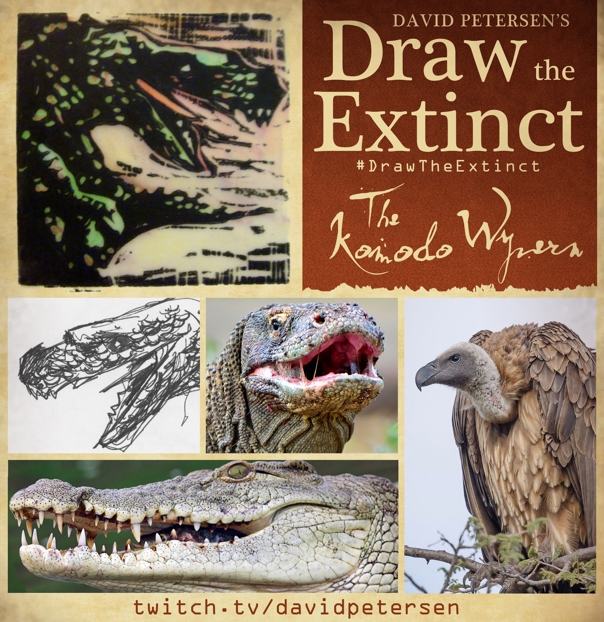 We started with the prompts of my original linocut print & sketch from a piece titled 'Extinct' as well as a Komodo Dragon, a Crocodile, and a vulture (thrown in to make it interesting and a wyvern instead of a dragon). I named the creature the Komodo Wyvern.
I told the viewers that they could use any combination of the inspiration prompts––they could make their version as cute and cuddly as a pocket pet stray kitten, as monstrous and deadly as a giant kaiju destroying cities, or anything in between. I also wanted this to be an excuse to get their pencils moving. I invited all skill levels, because I'm a firm believer that you shouldn't have to be good at something or pursuing mastery of it to just simply enjoy the act of it...and art is no exception.
 On the Friday stream I started drawing with mechanical pencil on a sheet of copy paper to try and reimagine the beast. It went fairly well right off the bat. I looked at a few artists depictions of fantasy wyverns to get the body language right. The image here is after I'd scanned my pencils into Photoshop and made some proportion checks moved the head out a bit and added in a vulture feather ruff.

After I'd locked in my above design, I printed that piece out on copy paper and taped it to the back of a sheet of Strathmore 300 series bristol. Using a lightpad, I was able to see through the surface of the bristol as I inked the Komodo Wyvern. I used a Copic Multiliner 0.7 SP pen to ink the art. I was still streaming this portion on Twitch, though as my end of stream time was coming up, I was nervous I wouldn't finish in time. Turned out, I went a little over-time to get the inks completely finished before I said goodbye to everyone watching and offered encouragement as they worked on their pieces over the weekend.

Off stream I scanned the inked artwork into Photoshop to prep it for final color. First thing was to drop it into the template I have for #DrawTheExtinct pieces with the border, background, and a base shadow already established. Then I started drawing in flat colors. This part of coloring (called flatting) is just a professional digital version of coloring-in-the-lines to establish the color areas.
My color choices were mostly based on the real animal species I based the creature on––but as is my way, most of my greens are a bit muted and warmer than real-life.
Below you can again see the final rendered corrected colors with a border and type applied.

But, as this is a community event, I wanted to share all the other entries posted in the Discord. I awarded a prize and we voted together on a few more (prize winners marked with *) on Monday's Twitch stream and we all enjoyed seeing what each other had done. I hope we get even more participants next month (first Friday!)
 Captain Nemo
 Chris AU_Tiger
 Cortrah
 Evil Cartoonist*
 KFlaggArt*
 Nate Pride*
 RedJarOJam*
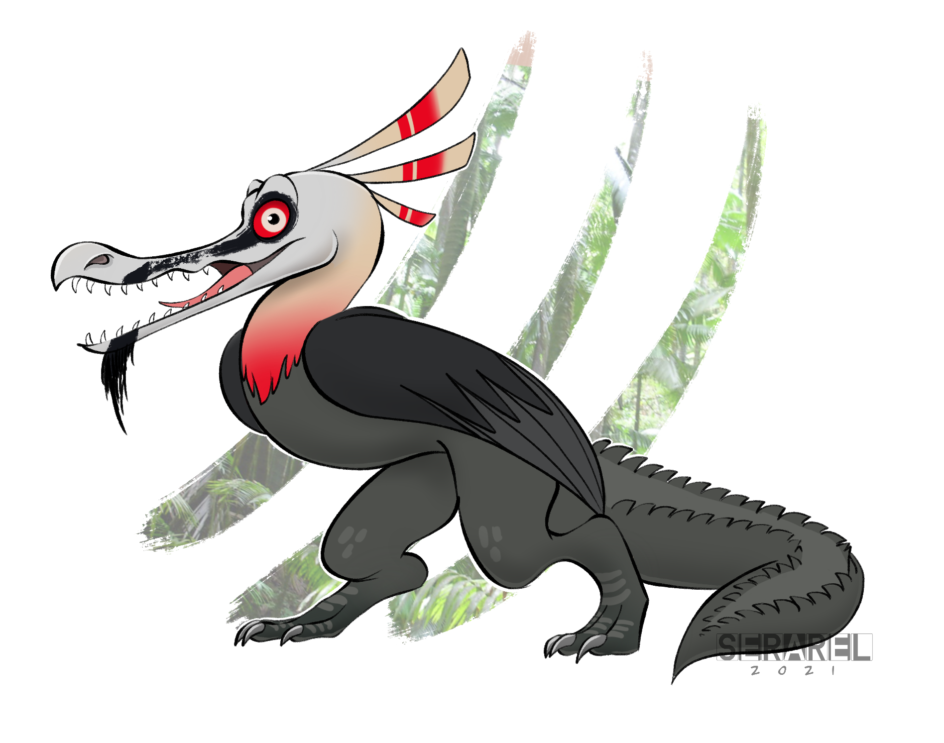 Serarel*
 SpacePiratePluto WIP
 Tyrie*
 VernNYC
 Wicked Goblin King
June 1, 2021
Recent Toned Commissions
I've nearly finished up all the toned paper commissions from the March 2021 #ONLINECON. In addition to having so many fans be able to get original artwork from me, I made sure to create a piece for each guest (as noted with *) who came on my twitch stream and helped make the event a success. I streamed drawing almost every one of these on my Twitch Stream.
 Donatello: A Ninja Turtle*for Jesse Glenn
 Baldwin the Brave Marionette*
For Kevin McTurk
 A Guardmouse
 A Guardmouse Archer*
for Steve Hamaker
 Usagi Yojimbo*for Stan Sakai
 R2D2*for John Duncan
 General Grievous* for Robert Barnes
 Captain Balsamic*for Armand Baltazar
 Hardin from The Western Deep*for Alex Kain
 Bear from the Big Blue House*for Noel Macneal
 Piper the Listener*for Meredith Salenger
 Berg from Bitter Root*for Sanford Greene
 A Guardmouse*for the Billy Ireland Cartoon Museum
 Freckle from Lackadaisy*for Tracy Butler
 Rippley: a Boston Terrier*for Norman Chan
 A Baker Mouse*for Erin Godbey
 The Magical Yet*for Angela DiTerlizzi
 A Mouse Minstrel*for Very Handsome Billy
  Kvido from Mae*for Gene Ha
 A Guardmouse & map*for Serena Malyon
 Rook & the Queen*for Karl Kerschl
 Gonzo dressed as Lancelot
 The owl from the Rockefeller Christmas Tree
 Sprocket from Fraggle Rock
 Cerebus the Ardvark
 Mocha Money with the Black Axe
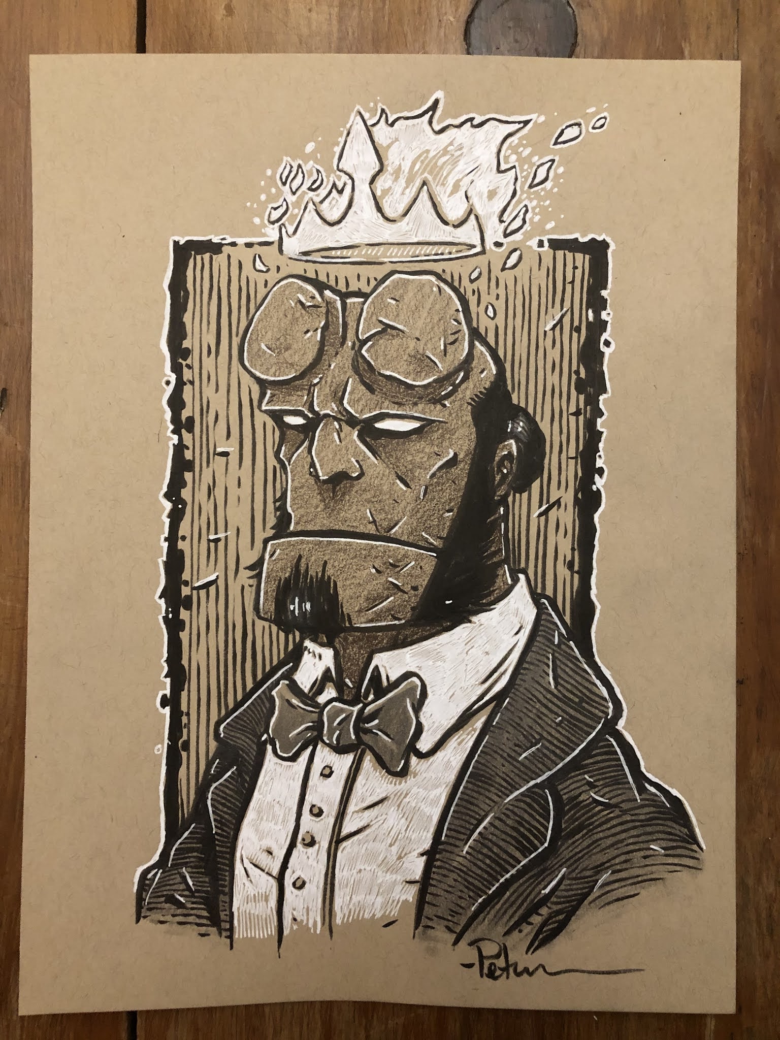 Hellboy
 Alchemist mouse
 TMNT's The Last Ronin
 Lockhaven's Apiary Keeper
 Sadie: A Guardmouse
 Kenzie: A Guardmouse
 Delvin: A Guardmouse
 A Mouse couple playing Swords & Strongholds
 A Guardmouse based on a Jeremy Bastian design
 Pet Portrait of a dog that loves to go fishing
 Saxon & Kenzie in the woods
 Dorothy Gale from Kansas
 A fan's OC RPG Guardmouse
 A Gundam
 E.T.
E.T. Michelangelo a Ninja Turtle
 A Rat named Sadie reading a scroll
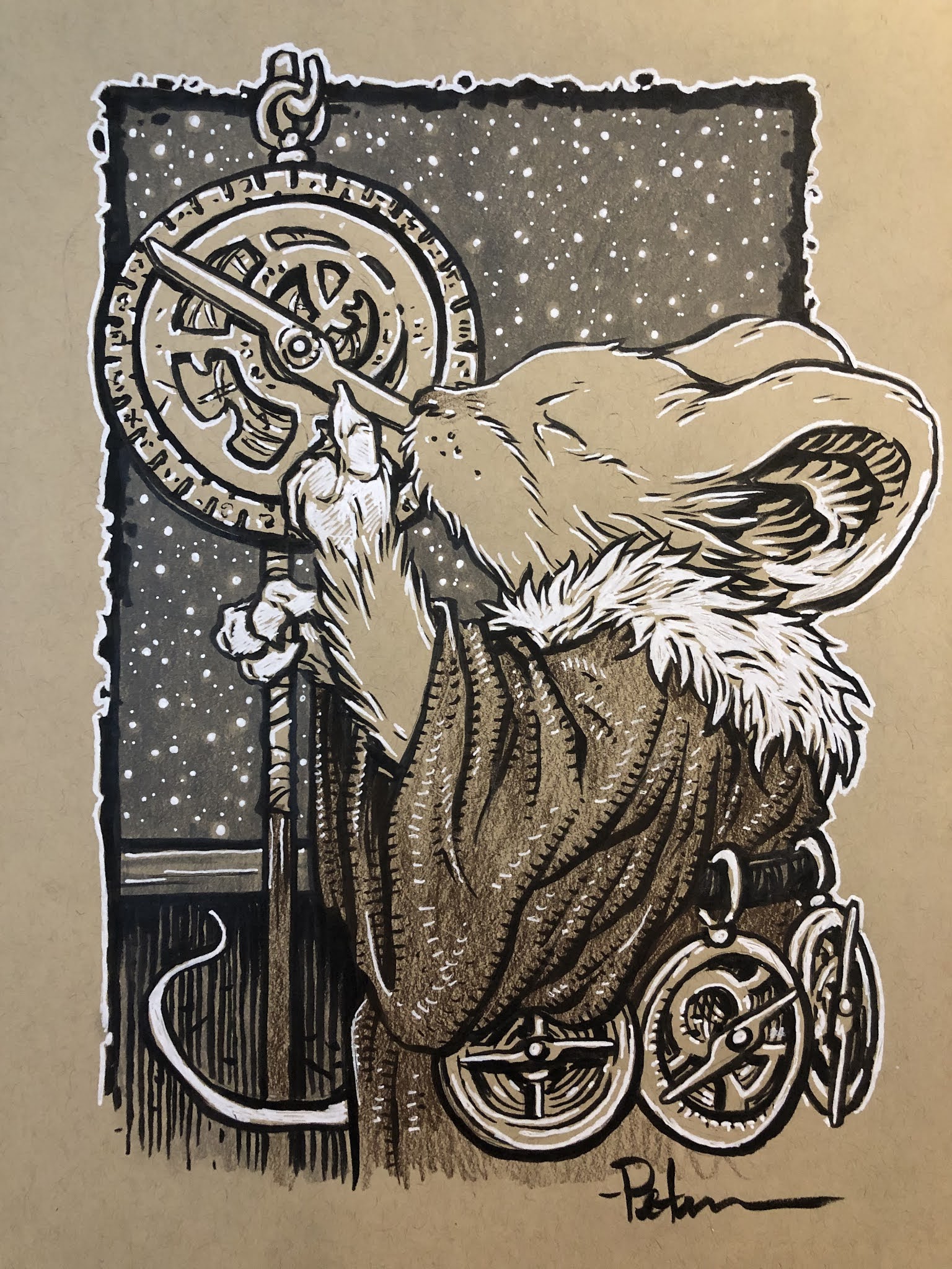 A Mouse Astronomer
 Ms. Brisby
 Bilbo Baggins
 A beachcomber Guardmouse
  A one-armed Guardmouse
 Kate Bush dancing
 Bastian: A Guardmouse
 A Mouse Cartographer
 Fettuccini a good pup
 a one-eyed cat pirate
 A Guardmouse with a shield
Hellboy
 A Mouse Surgeon/Barber
May 25, 2021
Usagi Yojimbo Dragon Bellow Cover 2 Process
 I was fortunate enough to be asked by IDW and Stan Sakai to do a run of covers on the new Usagi Yojimbo reprints of 'The Dragon Bellow Conspiracy'. I'll be doing six in total, and for this blogpost I'll be sharing my process for the creation of the cover art for issue #2.
This issue is currently up for pre-order through Diamond with the code MAY210473. Just ask your local comic shop to order it for you, or order it though an online retailer. The issue will be in shops July 28, 2021
To the left you can see the finished cover, but below I'll go through the steps in creating it.
Layout/Pencils
 For this second cover, the subject was easy. There's a great fight in the issue between Usagi and Shingen the leader of the Neko Ninja (cat ninja). The fight starts in a forest, but then moves to a cliff-side waterfall. I loved the Sherlock & Moriarty duel at Reichenbach Falls vibe it had and set my cover there.
I drew Usagi and Shingen each separately on copy paper in leaping poses, and placed them into my template in Photoshop (keeping in mind where the logo bar will crop the image) There I could resize them and shift them until I liked their placement. Then I spent way too long looking at photos and drawings of waterfalls to figure out how to draw mine, which I also did on copy paper. I then did a quick digital paint test to see how all the shapes and forms blocked out against each other.
 Inks:When the above layout was approved by the editor and Stan, I started the inks. First step was to print the layout file onto copy paper (over two sheets that had to be taped together at the seam) and tape that to the back of a sheet of Strathmore 300 bristol. On my Huion lightpad I was able to ink the cover art using the printout as my pencils lines. This way in the end the inked artwork is very crisp and clean with no need to erase pencils lines. I used Copic Multiliner SP pens to ink the art (the 0.7 and 0.3 nibs).
I left a gap around the characters and didn't let the waterfall inks touch them so that it would help push the background back further, but also to help me in the next step of digital coloring.
 Color Flats:The inks were approved and I scanned them in to Photoshop to start the coloring process. This first part of coloring digitally is called 'flatting' and is a professional version of coloring inside the lines. Establishing what each area's color is and where it ends. This not only is a color base for the image, but also allows a quick flat color area to be able to quickly isolate to render or make adjustments on.
 In this step I also established all my color holds (areas where I want the black inkwork to be a color other than black). The main one was the background (I also used color holds on Usagi's scar and a bit of the detail on Shingen).
 Final Colors:Here again is the finished art (this time sans-logo). To render all of the color I mostly used the Dodge and Burn tools (Photoshop tools based on real photography techniques for purposely over or under exposing film as it develops). Burn is do darken and Dodge is to lighten. I use a stock Photoshop textured brush as I add shadows and highlights with these tools so the work looks a little more organic and less digital.
It's an honor to be asked by Stan to do these covers and to get his approvals as I work through each cover.
Usagi Yojimbo: The Dragon Bellow Conspiracy #2 is out in stores July 28th
May 18, 2021
Plotmasters: CLAW
 The latest episode of The Plotmasters Project went up on the site today. It was an episode Jesse and I recorded LIVE on my Twitch stream for ONLINECON titled: Cats Trio Revisit: CLAW!
 To the left you can see my finished art for my Plotmasters update of the Cats Trio big-baddie. Below in this blogpost I'll show the steps of the process to create the artwork
If you haven't seen the episode, I've posted the video at the bottom of the blogpost, or you can link to it directly on YouTube here: https://youtu.be/ok2waaIu_jI
 I wanted to play up the military side of the character. Give him tactical gear, and show him amidst a pile of destruction and billowing plumes of smoke. In this rough pencil sketch you can see a few abandoned poses on top––the one on the left owing a lot to Wolverine.
 But the sketch I liked best and worked up the most was one where he's almost casual about what he's done: 'All in a day's work' attitude, with perhaps a glare of 'I'm coming for you next'.
I found lots of online reference for various body armor, packs & pouches, and weapons to get the look right.
 As you can see relative to the paper the above sketch was pretty small, so I enlarged it and then on a lightpad redrew it tighter, working out more details as I went.
 I scanned those tighter larger pencils and did a digital paint-up to help me see the shapes and especially the light to dark value shifts of the plume of smoke.
On his kneepads and shoulder armor I added some insignias (the 02 later was changed to 03 to denote Claw's correct order in the the experiment subjects) And for the shoulder piece I made up my own emblem that he fights under.
[image error] I wanted the symbol to have some history, some nazi-like menace, something that makes seemingly regal symbols look sinister when added together in context.
So I did a clipart search for some heraldry. The cross was meant to be similar to the nazi iron cross, but without being rooted in that specific brand of fascism, the grail cup has lots of connotations that go to myth and vessels for purity, and the shield chevron was a military badge shape I found. I added the three together into this patch. I like the design, and I like how it works for a villainous group.
[image error] The next step was to print out the above layout and tape it to the back of a sheet of Strathmore 300 series bristol. On a Huion lightpad I'm able to see through the surface of the bristol to use the printout as a guide as I ink the artwork.
I used Copic Multiliner SP pens (the 0.3 & 0.7 nibs) to ink the linework.
The pencils were fairly tight for this piece, so most of the inks were just direct translations other than adding texture to the rubble and the plume of smoke.
I left a white gap between Claw and that smoke trail. It helps separate him from the background visually, but also makes a part of the coloring a bit easier when I establish the color hold for that area.
 To start the colors, I scanned the inked artwork into Photoshop and added flat colors to Claw. This is a tedious stage of digital coloring called 'flatting' that is essentially a professional version of color-in-the-lines, establishing all the color areas.
 At this stage I also isolated all the linework I wanted to be a color hold (an are where I wanted my inked lines to be a color other than black. That gap I left between Claw and the smoke really helped me care out the lines that belonged to the background and leave the main figure's lines alone.
Most of the color choices had already been made in my quick digital paint up back in the layout stage.
[image error] And here again is the final version with a logo treatment from my original Cats Trio Plotmasters update
The rendering was all done using the dodge and burn tools in Photoshop while using a stock brush.
This piece concludes the episodes for Season 1 of The Plotmasters Project. Jesse and I hope to do more as time permits.
Below you can watch The Plotmasters Project episode: Claw: https://youtu.be/ok2waaIu_jI.
May 11, 2021
The Buck-Toothed Yahbex

Last Friday on my Twitch Stream, we did the fifth community draw-along event #DrawTheExtinct where I posted an image from an old block print I made with a few animal photo inspiration prompts and the idea to create an imaginary extinct animal. I worked on my piece live on my Twitch stream while viewers worked at home and then on Monday we shared our finished pieces.
Here is my finished Buck-Toothed Yahbex. And below are my steps to create it as well as the community submissions.

We started with the prompts of my original linocut print & sketch from a piece titled 'Extinct' as well as a yak, an ibex, and a beaver (specifically the teeth of the beaver and the horns of the ibex). I named the creature the Buck-Toothed Yahbex.
I told the viewers that they could use any combination of the inspiration prompts––they could make their version as cute and cuddly as a pocket pet stray kitten, as monstrous and deadly as a giant kaiju destroying cities, or anything in between. I also wanted this to be an excuse to get their pencils moving. I invited all skill levels, because I'm a firm believer that you shouldn't have to be good at something or pursuing mastery of it to just simply enjoy the act of it...and art is no exception.
 On the Friday stream I started drawing with mechanical pencil on a sheet of copy paper to try and reimagine the beast. One of my problems to solve was how to fit a tall animal into the space of the final composition without losing details and I decided to work on the anatomy of it laying down. The image here is after I'd scanned my pencils into Photoshop and made some proportion checks and moved the hear around a bit.

After I'd locked in my above design, I printed that piece out on copy paper and taped it to the back of a sheet of Strathmore 300 series bristol. Using a lightpad, I was able to see through the surface of the bristol as I inked the Buck-Toothed Yahbex. I used a Copic Multiliner 0.7 SP pen to ink the art. I was still streaming this portion on Twitch, though as my end of stream time was coming up, I was nervous I wouldn't finish in time. Turned out, I was able to get the last bits of ibex-style horn inked as I said goodbye to everyone watching and offered encouragement as they worked on theirs over the weekend.

Off stream I scanned the inked artwork into Photoshop to prep it for final color. First thing was to drop it into the template I have for #DrawTheExtinct pieces with the border, background, and a base shadow already established. Then I started drawing in flat colors. This part of coloring (called flatting) is just a professional digital version of coloring-in-the-lines to establish the color areas.
My color choices were somewhat based on the original lino print, but I tried to make the fur closer to a realistic and believable grey rather than blue.
Below you can again see the final rendered corrected colors with a border and type applied.

But, as this is a community event, I wanted to share all the other entries posted in the Discord. I awarded a prize and we voted together on a few more (prize winners marked with *) on Monday's Twitch stream and we all enjoyed seeing what each other had done. I hope we get even more participants next month (first Friday!)
 Cortrah
 AU Tiger
 Dark
Dark Evil Cartoonist
 Flannel Wizard*
 KFlagg*
 RedJarOJam
 Sarahs_Crumbs (wip)
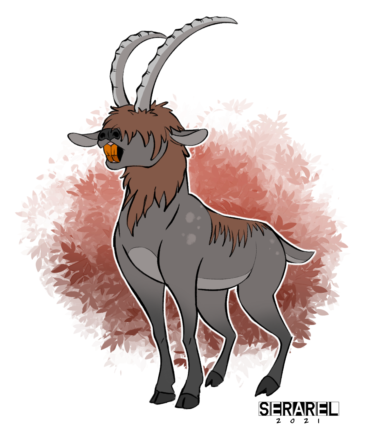 Serarel
 Shnookerdoodle*
 Tyrie*
 VernNYC*
May 4, 2021
Owlhen Caregiver Cover process
 The Owlhen Caregiver is a new Mouse Guard single issue will be coming out soon. The issue collects three short stories: Piper The Listener, The Wild Wolf, and a brand new tale, The Owlhen Caregiver. You can order the issue currently through your local or online comics retailer.
 The Diamond order code is MAY210942. The 32 page issue will be in shops: Jul 14, 2021
For this blogpost I'll go through the steps and references for creating the cover art you see to the left.
 First I should start with the reference material. The Owlhen story, like many of my short stories, adapts a visual stylization for the tale within a tale. I looked to early 20th century Russian illustrator Ivan Bilbin for my reference point. On the interior pages I emulated his work more convincingly, with his flat illustrative style focusing on detailed contours rather than rendered forms or lines for shadow. For the cover art, I wanted a more David Petersen/Mouse Guard looking version so I rendered the piece more naturally. Though I wanted to keep the elaborate flat pattern on the cloak of the mouse character––and I borrowed that design from this piece of Bilbin's titled The Island of Buyan from 1905.
 The next piece of reference is the owl's nest, which I wanted to be more of an architectural location than a natural rendering of a nest made of sticks (this is a fairy tale story after all). To keep in the theme of Russia, I researched their history of wooden stave churches and found this location: The Church of the Nativity of our Lady of Peredki, which has been moved to an open air heritage museum Vitoslavlitsy in Veliky Novgorod, Russia.
Luckily because it's a historic site that is easily accessible, there are lots of photos available online from different angles that would help me use it page after page. In the Mouse Guard version, I turned several of the turret sections from a log-cabin timber construction to a woven bird's nest look.

The last reference I gathered was for the owl. I'd featured a Great Horned Owl in the Winter 1152 storyline and wanted something visually different. Researching various owl species, I landed on the Northern Hawk Owl which had the right size scale I wanted as well as some interesting feather patterning.
 I penciled my characters and location on different sheets of copy paper. With each element drawn separately I could composite them together in Photoshop––this allows me to make size and position adjustment as I go to try and get the compositional layout that works best for my eye. In Photoshop I tinted each drawing a different color to help me see each one and figure out which lines belong to which thing.
 I also used Photoshops tools to warp my re-drawn Bilbin-esque fabric pattern to match the contour of the mouse's cloak.
 I inked this on Strathmore 300 series bristol. First, I printed out the above layout composition onto copy paper (it took 2 sheets that I had to tape back together) and taped it to the back of the bristol. On my Huion lightpad I can see through the surface of the bristol down to the printout to use as a guide while I ink. I used Copic Multiliner SP pens (the 0.7 & 0.3 nibs)
To make the coloring step easier, I left a gap in the inks between the figures in the foreground and the architecture of the nest-building. Even in black and white, it visually helps break up the planes.
 I scanned the inks back into Photoshop and started the coloring process. That first part of digital coloring is like a professional version of coloring-in-the-lines called flatting. It's where you establish all the color spaces with flat colors. I'd already colored the interior story pages, so the color choices were mostly established.
 At this step I also made all of my color holds (areas where I want the inkwork to be a color other than black). I created a color hold each for: the architecture, the owl, the owl's eyes, the fabric patterns, and the feather's stripes.
 The last step was to render all the color by adding highlights, shadows, and textures. I did that with the Dodge and Burn tools and a stock textured Photoshop brush.
Here is the solicitation info for the issue, due out July 14th 2021:
Which of life's biggest lessons can be learned from the smallest amongst us? A young mouse learns that compassion and kindness are the great virtues in "The Owlhen Caregiver." "Piper the Listener" finds a brave mouse venturing into the wild country to learn the tongues of other beasts. And a grizzled oldfur shares the lesson of putting a whisker out too far in "The Wild Wolf." Three poignant tales mark creator David Petersen's return to his beloved Eisner and Harvey Award-winning series in this self-contained special.
Order now through DiamondMAY210942 –– $4.99
David Petersen's Blog

- David Petersen's profile
- 339 followers


![[image error]](https://4.bp.blogspot.com/-JjFU9YYQYq8/Wu-bZT-CJAI/AAAAAAAAKEI/646A4wemZ84pIZUCjNsjUFIdtVScm3pMQCLcBGAs/s1600/claw%2Bicon.jpg)
![[image error]](https://3.bp.blogspot.com/-uncv9EEHP5w/Wu-bZxHxmFI/AAAAAAAAKEU/lEJhSTxgBWw2KppeYhH0LHPAxw1gFRLpQCLcBGAs/s1600/claw%2Binks.jpg)
![[image error]](https://1.bp.blogspot.com/-bnr6AM-c7ps/YJTma-NvO2I/AAAAAAAANAs/RnrPDdUNR5QVn9UiZzNbQFoPy87WIgFSgCLcBGAsYHQ/s1093/Claw%2Bredux%2Blogo.jpg)