
David Petersen's Blog, page 28
July 21, 2020
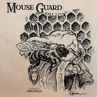
Mouse Guard 'Wasp Hive' Process
 This year I've been creating new Mouse Guard pieces with the idea of collecting them in a new sketchbook. That sketchbook collection is titled 'Dawn, Daye, & Dusk' and is finally off to the printer! I plan to release it in August in my online store https://mouseguard.bigcartel.com/
For this blogpost, I'll share of of the pieces in that sketchbook and show the process steps to get the artwork completed.

I started by being inspired by this abandoned and broken wasp's nest that was outside of our veterinarian's office the last time we had Coco & Bronwyn in for a checkup.
When I encounter items in the wild that would be an interesting visual in Mouse Guard, I try to take a photo of it...something much easier to do now that cell-phone cameras are of such good quality. I have folders of photos like this I've taken of plants, architectural details, fabric patterns, and certain cloud colorations.

I did a lightbox tracing of a printout of the nest on a clean sheet of copy paper. In this stage I was translating the forms into the mark-making that I do, while also doing some visual editing––removing unnecessary details, simplifying & unifying patterns, and removing excess branches to get some visual focus. On a new sheet of copy paper, I drew a mouse looking weary. Once these two pencil drawings were both scanned and tinted in Photoshop, I was able to digitally add some color to block in shapes, including the far away branches.
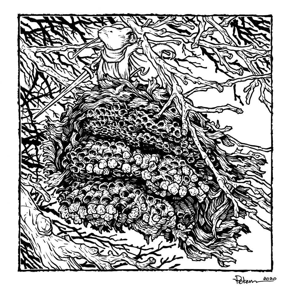
The above layout was then printed out and taped to the back of a sheet of Strathmore 300 series bristol. On a lightpad, I was able to ink the piece with Copic Multiliner pens (the 0.7 for almost everything except the mouse's face that I did with the 0.3). The lightpad allows me to see through the surface of the bristol down to the printout which I use as my 'pencil' lines to guide me.
Because I knew the far branches were going to be painted as color holds when I colored it, I avoided inking those lines up to anything in the foreground (or the border) to help with isolating them.

Once the inks were finished, I scanned them into Photoshop to start the coloring process. This part is called 'flatting' where I just add flat colors (no rendering, gradients, effects, etc) to establish where colors start and stop...which part is hive and which part is mouse, etc.
I used roughly the color palate of the original photo, and then gave the mouse a red-orange cloak to help them stand out in the muted cool tones of everything else.
As I mentioned in the inking stage, I applied a color hold (an area where I want the inkwork to be a color other than black) to the far away branches.
The last step was to do all the texture and rendering to the piece. I do most of this with one stock textured brush in Photoshop and the Dodge and Burn tools.To the right you can see the finished piece––which will also be soon available in print in the upcoming Mouse Guard sketchbook Dawn, Daye, & Dusk.


July 14, 2020
Mouse Guard Harvest Town Process
 Since the COVID-19 outbreak I've been creating new Mouse Guard illustrations with the intent to collect them into a new sketchbook. The sketchbook's title is 'Dawn, Daye, & Dusk' with a theme on lighting and time of day being a component to most of the pieces.
The sketchbook is expected to be released in August 2020 in my online store, but for this blogpost I'm showing one of the pieces 'Harvest Town' and the art steps to get there.
 I started with inspiration from a real place: the intersection of Shambles and Little Shambles streets in York. I've not been there myself, but I cam across this photo while looking for 'medieval streets' in an online image search, and printed out the results. I hadn't looked at the printout in a few years and came across it again as I was prepping for the new sketchbook.
 On a lightpad I put a clean sheet of copy paper over the photo printout and redrew the architecture with my own interpretation of shapes, materials, and details.
 I then also drew a lone mouse returning with grain and some additional background buildings and plants on separate sheets of paper. In photoshop I assembled my drawings (tinting each one a different color to help me see everything clearer)
In Photoshop I flipped the image horizontally (I liked it better that way visually) and added text to the signs. Fun fact, every sign is a nod to the (now canceled) Mouse Guard movie: Director Wes Ball, Screenwriters T.S. Nowlin & Gary Whitta, FOX studios, and 6th and Idaho (Matt Reeves' production company).

With the layout all digitally assembled and tweaked, I printed that out and taped it onto the back of a sheet of Strathmore 300 series Bristol. On a lightpad I started inking it with Copic Multiliner SP pens (I think I inked part of this piece on Twitch) The lightpad allows me to see through the surface of the bristol down to the printout so I can use it like pencil lines when I'm inking.
This piece took some work to add lines and texture, while also not making it too busy and visually muddy.
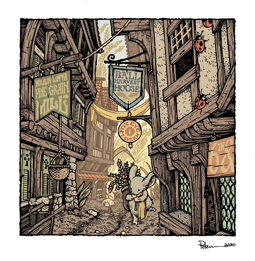
After the inks were finished, I scanned them back into Photoshop to begin the coloring. The first step is to add flat colors to everything to establish what elements are which colors. It's like a professional version of coloring-in-the-lines. This step helps for when I want to re-isolate any area so I can render it without effecting the areas around it.
At this stage I also added color holds (areas where I wanted the ink work to be a painted color other than black) to parts of the background to help imply the lighting effects and the depth of distance.
The last step was to render the color. I do this in Photoshop mostly using the Dodge and Burn tools with a textured brush.To the right you can see the finished piece––which will also be soon available in print in the upcoming Mouse Guard sketchbook Dawn, Daye, & Dusk.
July 7, 2020
Mouse Guard 'PREVAIL' Process
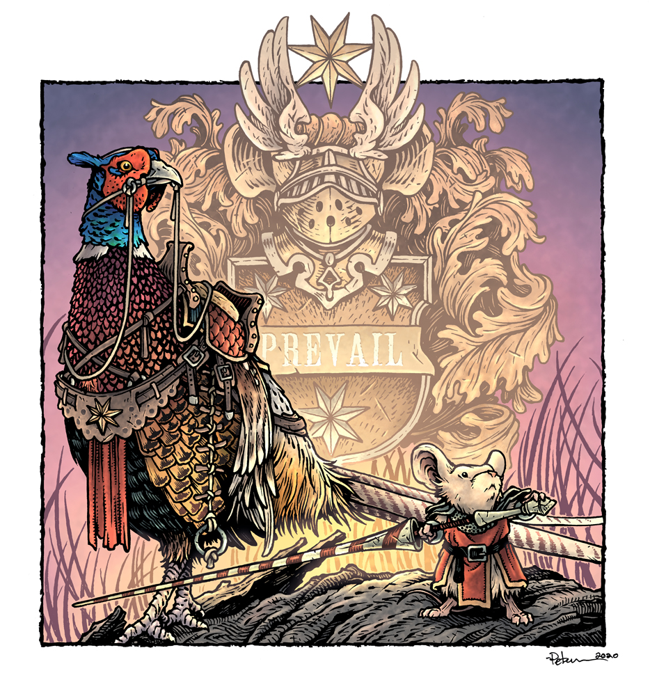 While creating original pieces for my upcoming Mouse Guard sketchbook: "Dawn, Daye, Dusk", I made the illustration to the left titled 'Prevail' of a Guardmouse and a pheasant mount at dawn with a bit of heraldry as the background.
While the finished 24 page sketchbook won't be available for another month or-so, for this blogpost, I'll break down the steps to creating the final art as well as the inspiration and influences.
 My two inspirations were these. First, the idea of drawing a bird all geared up with saddle and rigging to be a mount, and I wanted a visually interesting bird, so I went with a pheasant. This photograph found online became my reference for one.
And second, this bit of heraldry I photographed at the Turku Cathedral when I went to visit my niece when she was an exchange student in Finland.
 I started with drawing my own version of the heraldry––but with a mouse-shaped helm and 7 pointed stars (I like them over 5 or 6 pointed stars because they don't have heavily specific human patriotic or religious connotations) Knowing that the heraldry was to be symmetrical, I focused on only drawing half of it.
I then moved on to the pheasant, using the photo as reference. Once I had the bird drawn, I layed another sheet of copy paper over it on a lightpad and drew all the riding equipment. That way, if I didn't like a part of the gear, I didn't have to erase or re-drawn any part of the pheasant. I, of course, also drew the mouse (and included a helmet which I didn't end up using in the final piece)

With the pencil work done, I scanned all my sheets of paper into photoshop and started laying out my composition. I like working digitally with my pencils drawings, because I can resize, rotate, and adjust it all until the composition is just how I want it. Or, in the case of the heraldry, I can copy and mirror the drawing so that it's complete (as well as adding in the text 'PREVAIL'.
I tint the various drawings different colors to make it easier to see what lines belong to which element in the composition.
 I then printed out the digital layout onto copy paper and taped it to the back of a sheet of Strathmore 300 series bristol. On a light pad, I was able to see through the surface of the bristol down to the printout as a guide while I did the final ink lines. To ink, I use Copic Multiliner SP pens (the 0.7 & 0.3 nibs mainly)
I inked a lot of this piece on my Twitch stream. I was focused on adding the right line weight on the pheasant so that the various feather types were all 'readable' without becoming a complete mess of black. Somewhere in between this step and the last one, I also penciled in a log shape on the printout so that the figures were standing on something.

After the inks were done, I started coloring the piece. The first step of digital coloring (after scanning the ink drawing) is to establish the color areas with flat color (also known as flatting). At this stage of the color-work I also was establishing the color holds. These are areas where I want the ink-work to be a color other than black, and it takes some time and patience. For this piece, I added color holds to the heraldry, the grass, the text, some of the pheasant's feather patterns, and the swirl design on the mouse's lance.
The last step was to do the rendered color. I used the dodge and burn tools in Photoshop with a textured brush to get most of the light and shadow work done.
As a fun afternote, the original of this piece was purchased by a fan of mine in Finland who was unaware of the connection of the heraldry and Turku Cathedral until after he bought it.
June 30, 2020
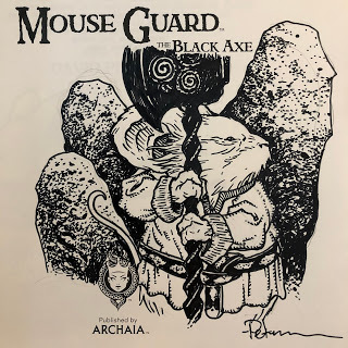
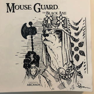
Black Axe #3 Creator Commentary
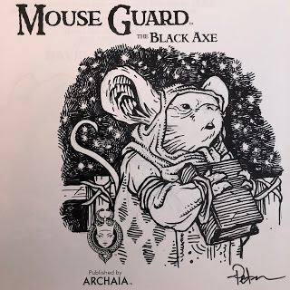
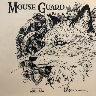
 I've made a Creator Commentary video for the third issue/chapter of Mouse Guard: The Black Axe! Please feel free to follow along in your copy of the story in either issue form of from the hardcover as I talk about the behind the scenes details, art notes, and my head-space as I go page by page and panel by panel. Enjoy!
Direct link to watch on YouTube: https://youtu.be/MnTNSdoRqIs
PLANNED 2020 Appearances
Heroes Con: June 19-21 ??
San Diego Comic Con: July 22-26 ??
New York Comic Con: October 8-11 ??
Baltimore Comic Con: Oct 23-25 ??
June 23, 2020
Mouse Guard Berry Picker Process
 I've been creating one-of illustrations for my upcoming for my upcoming sketchbook titled 'Dawn, Daye, & Dusk'. The piece to the left is one of those. I streamed a lot of the inking and coloring process on my Twitch channel as I worked.
The sketchbook's theme is loosely about me trying to work in lighting, times of day, and atmospheric effects to my Mouse Guard illustrations.
Below I'll go through the steps I took for this illustration.
 For inspiration before I start a piece like this, I'll sometimes browse digital photo albums of trips I've taken. When I travel I try to take photos of architecture, historic landmarks, decorative details, and local plant life.
 In this case, I found a photo of a tree with little red berries I photographed in a park in Copenhagen Denmark. I'm not sure what the species of tree is, but I liked the look of it enough to take a photo, and again when looking back to pick this as the setting for a little Mouse Guard illustration.
To get a mouse up to off the ground to the berry height, I also google searched this photo of a woven basket.
 On a light pad, I did a line drawing on a new sheet of copy paper over top of a printout of the Denmark photo. This allowed me to simplify and edit the form and structure and density of the leaf and berry chaos in my own line. On another sheet of paper, I also drew a version of the basket and suspension gear as well as a mouse reaching for harvest.
I scanned the drawings and assembled them in Photoshop.Having each bit of the drawing separate on various layers helped me to come up with a final composition that I liked. I could resize and nudge any given element until everything fit, I avoided as many tangents as possible, and the image read clearly.
The quick color work just helped me to see each bit of the illustration, to see the positive forms and the negative spaces. To see what was rope and what was branch.

After I was happy with the layout, I printed it onto copy paper and then taped that printout to the back of a sheet of Strathmore 300 series smooth bristol. On my Huion light pad, I was able to see the printout through the surface of the bristol and I could use it as a guide to ink from. I used Copic Multiliner SP pens (the 0.7 nib almost exclusively)
I streamed a great deal of the inking of this piece on my Twitch channel.

When the inks were finished I scanned the artwork and started the coloring process. That first part of coloring a piece digitally is called 'flatting' and is basically coloring within the lines with flat colors. It's where I'm establishing where all the base colors for each object start and stop. At this point I also created color holds (areas where I want the line art to be a color other than black) for the veins on the leaves and the lines on the berries.
I thought the background was looking a bit vacant between the branches, so I digitally painted in some blurry leaves to push some distance and focus in the illustration.
The last step was to render all the color. This is the step where I add shadows and highlights, texture, and lighting effects. I do most of this using the Dodge and burn tools, the freehand lasso, and the color balance sliders.
June 16, 2020
Mouse Guard Floral Festival Process
 The piece of Mouse Guard artwork you see on the left is an inked commission (something I almost never do anymore) that I colored for inclusion in my next sketchbook tentatively titled 'Dawn, Daye, & Dusk'.
I was due to be at an event called FACTS in Belgium earlier this spring, but to do legitimate public health concerns, the event was canceled. Before that though, one of the organizers asked for a favor of an inked commission. In this blogpost I'll run through the process to finish the original artwork for them, and to color it for my own purposes.
 Pencils:
The request was to have a mouse gathering in nature with lanterns and flowers, mice bringing in food and drink, and friends playing games. Something with the spirit of a 'Jill Barklem' illustration was also mentioned. So I started with a sheet of copy paper and pencil ands tarted drawing mice moving game board pieces around, holding tankards, smoking pipes, hauling food, and among them I included a few flower-capped lanterns and shapes for little flower buds that would make good garlands.
 Layout:
With the pencil drawing sheet scanned, in Photoshop I separated out each character or object onto a new layer, tinted it to make it easier to see, and then arranged, resized, and rotated all the bits until I reached some form of composition. With scenes like this, it's tricky to not over complicate the space, while still giving the impression of a bustling little party.
Almost every time I draw a Mouse harvest-type celebration I think back to impressions of Bilbo's Birthday from the book, animated film, and Peter Jackson version to get in the right head-space.

Inks:
When I'd settled on the placement for all the elements, I printed out the layout and taped that piece of paper to the back of a sheet of 300 series smooth Strathmore Bristol. On my Huion lightpad, I was able to see through the surface of the bristol to the printout below so that I could ink using the printed lines as my 'pencils'. I inked this using Copic Multiliner SP pens (the 0.7 & 0.3 nibs).
There was a lot going on here, and I tried my best not to muddy it up with too many textures and tones.
 Color Flats:
The finished inks were then scanned so I could start the coloring process. The first part of which is basically a coloring-within-the-lines step called 'flatting'. I used only flat color to establish what colors the mouse fur was, where it ended and their bare skin showed, the details on their clothes, etc. I also here established a few color holds (ares where I want the ink work to be a color other than black) to give a better sense of glowy light and depth.
Rendered Color:
The final step was to do all the rendering, texture, and lighting effects. I do most of this with the dodge and burn tools in Photoshop.
I tend to stream coloring work like this on my Twitch Stream! Stop by to watch next time I'm live
June 9, 2020
Drawing Like Yourself Lecture Video
 Last year on Twitch I gave a lecture (one that I'd given a few times at schools and colleges––but reworked specifically for a stream) about a concept I call 'Drawing Like Yourself', or––'How I stopped worrying about style and gave myself permission and time to draw naturally.'
It deals with 'style', 'artistic voice', learning from copying and knowing when and how to stop emulating your artistic heroes. Here is the lecture available to watch on my YouTube channel:
Direct Link on YouTube: https://youtu.be/5Iy2nER4dKU
PLANNED 2020 Appearances
Heroes Con: June 19-21 ??
San Diego Comic Con: July 22-26 ??
New York Comic Con: October 8-11 ??
Baltimore Comic Con: Oct 23-25 ??
June 2, 2020
Muse Guard UBERDOODLED books
Several weeks ago I offered UBERDOODLED Mouse Guard books in my online store. These are more detailed and complete drawings than the normal mouse head sketch I always do when I autograph a book. Today I wanted to share all of the Uberdoodled copies (no longer available) I did. I hope everyone enjoys their drawings!
 Saxon
Saxon
 Kenzie
 Lieam
Lieam
 Celanawe
 Sadie
Sadie
 Sefatus
 Lieam
Lieam
 Loukas
 The Wise Weaver
 Rand
Rand
 Kenzie
 Saxon
Saxon
 Celanawe
 Sadie
Sadie
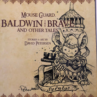
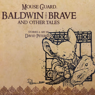
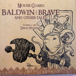
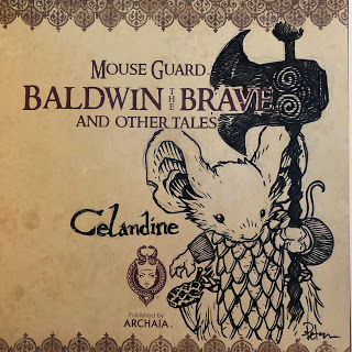
 Baldwin the Brave
 The One Eyed Owl
 Celanawe
[image error] Saxon
 Isabel
 Lieam
Lieam
 Conrad
 Lieam
Lieam
 Midnight
 Gwendolyn
 Saxon
Saxon
 Bard mouse from Oh Day Away
 Ilsa
Ilsa
 a Hare
 Kenzie
 The Fall Snake
 Lynea
Lynea
 Lieam
Lieam
 Sadie
Sadie
 Lieam
Lieam
 Apiary Keeper
 a Darkheather Bat
 Alma the Cook
[image error] Celanawe
[image error] A Guardmouse Map
 Sadie
Sadie
 Kenzie
 Saxon
Saxon
 Loukas' Bones
 Landra
 Abigail
 Ragneir the Hunter
 Celanawe
 Conrad
 Em of Appleloft
 Celanawe
 King Luthebon
 A Fisher
 Saxon
Saxon
 Thane
Thane
 A Hawk
 A Crab
 A Snake
[image error] Baldwin Marionette
 Celanawe
[image error] Em of Appleloft
 Conrad
 Em's Crow
 Benn
Benn
 Arkin the Archivist
 Sefatus
 Rand's Father
 Omaira
[image error] A Guardmouse with a whip
 Lieam
Lieam
 Gwendolyn
 Kenzie
 Saxon
Saxon
 Celanawe
 Baldwin Marionette
 Celanawe
 The Fox
[image error] Celanawe
 Saxon
Saxon
 Sadie
Sadie
 Gwendolyn
 Lieam
Lieam
 Celanawe
 King Luthebon
 Celanawe
 King Luthebon
 Roark
Roark
 Conrad
 The Fox
 Celanawe
 Alma The Cook
 Mouse Minstrel
 Kenzie
 Saxon
Saxon
 Kenzie
 Em of Appleloft
 Baldwin the Marionette
[image error] Midnight
 Saxon in Darkheather
 Celanawe
 Thane
Thane
 Ragnier The Hunter
 Carwyn
 Em of Appleloft Funeral
 A bat of Darkheather
 Lieam
Lieam
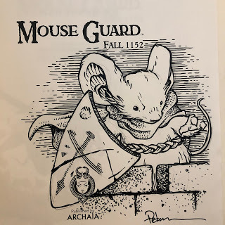
 Celandine
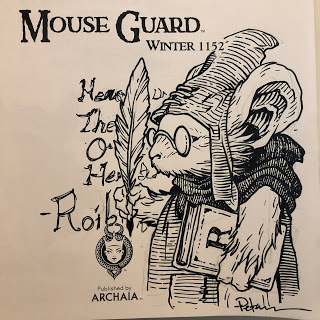 Roibin the Scribe
 Rand
Rand
 Celanawe
 Saxon
Saxon Kenzie
 Lieam
Lieam Celanawe
 Sadie
Sadie Sefatus
 Lieam
Lieam Loukas
 The Wise Weaver
 Rand
Rand Kenzie
 Saxon
Saxon Celanawe
 Sadie
Sadie Baldwin the Brave
 The One Eyed Owl
 Celanawe
[image error] Saxon
 Isabel
 Lieam
Lieam Conrad
 Lieam
Lieam Midnight
 Gwendolyn
 Saxon
Saxon Bard mouse from Oh Day Away
 Ilsa
Ilsa a Hare
 Kenzie
 The Fall Snake
 Lynea
Lynea Lieam
Lieam Sadie
Sadie Lieam
Lieam Apiary Keeper
 a Darkheather Bat
 Alma the Cook
[image error] Celanawe
[image error] A Guardmouse Map
 Sadie
Sadie Kenzie
 Saxon
Saxon Loukas' Bones
 Landra
 Abigail
 Ragneir the Hunter
 Celanawe
 Conrad
 Em of Appleloft
 Celanawe
 King Luthebon
 A Fisher
 Saxon
Saxon Thane
Thane A Hawk
 A Crab
 A Snake
[image error] Baldwin Marionette
 Celanawe
[image error] Em of Appleloft
 Conrad
 Em's Crow
 Benn
Benn Arkin the Archivist
 Sefatus
 Rand's Father
 Omaira
[image error] A Guardmouse with a whip
 Lieam
Lieam Gwendolyn
 Kenzie
 Saxon
Saxon Celanawe
 Baldwin Marionette
 Celanawe
 The Fox
[image error] Celanawe
 Saxon
Saxon Sadie
Sadie Gwendolyn
 Lieam
Lieam Celanawe
 King Luthebon
 Celanawe
 King Luthebon
 Roark
Roark Conrad
 The Fox
 Celanawe
 Alma The Cook
 Mouse Minstrel
 Kenzie
 Saxon
Saxon Kenzie
 Em of Appleloft
 Baldwin the Marionette
[image error] Midnight
 Saxon in Darkheather
 Celanawe
 Thane
Thane Ragnier The Hunter
 Carwyn
 Em of Appleloft Funeral
 A bat of Darkheather
 Lieam
Lieam Celandine
 Roibin the Scribe
 Rand
Rand Celanawe
May 26, 2020
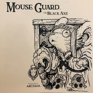
Black Axe #2 Creator Commentary
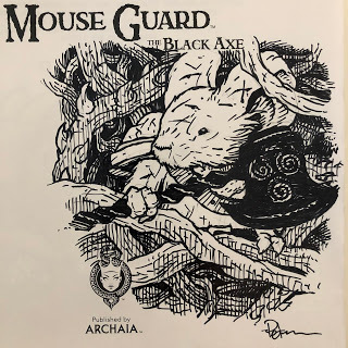
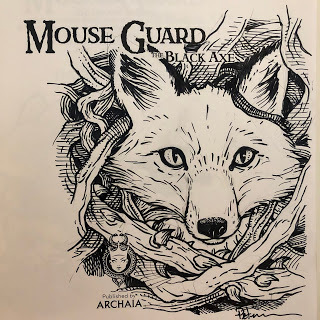
 I've made a Creator Commentary video for the second issue/chapter of Mouse Guard: The Black Axe! Please feel free to follow along in your copy of the story in either issue form of from the hardcover as I talk about the behind the scenes details, art notes, and my head-space as I go page by page and panel by panel. Enjoy!
Direct link to watch on YouTube: https://youtu.be/dxtXU6WX5NA
May 19, 2020
Mouse Guard Daffodils Process
 Though I don't usually do inked 8" x 8" commissions any longer, a long-time fan made a special request that I was happy to make happen. To the left you can see the finished piece, which I also colored for use in my next sketchbook.
Two young girl mice enjoying the spring daffodils.
Below I'll walk through the process I used to create the finished artwork.
 Reference Material:
The fan emailed me a photo of his daughters in a field of daffodils and asked if I could illustrate the scene but with his daughters as young mice from the Territories. He also referenced the cherry blossoms in the far distance. The problem with 'recreating' a photo like this with mice is scale and focus. The Daffodil blooms would be enormous--so it becomes harder to show the mice as central character while still getting enough flowers in the image to imply a field--and that pretty much also means the cherry blossom element had to go too.
Along with the family photo, I also sourced a few closeup photos of daffodils to draw from.
 Pencils/Layout:
Knowing the scale problem, I drew two young mice on a fallen dead branch. I then drew multiple daffodils. All of these were drawn by hand separately on different sheets of copy paper. After I had a pile of drawings, I scanned them into Photoshop and started arranging them into a composition. With the each being drawn separately, it was easy to tint them different colors, keep them on different layers and slide them around or resize them. I also noticed in most of my reference that daffodils tend to all face the same direction, so a few of my daffodil drawings either had to get mirrored, rotated or scrapped to make sure my composition looked correct.

Inks:
When I had adjusted the pencil drawings in Photoshop into a composition I was happy with, I printed out that image on my home printer. I then taped that printout to the back of a sheet of Strathmore 300 series bristol board. On my Huion lightpad, I was able to see through the surface of the bristol down to the printed image that I could use as a guide for inking the final art. I inked this using Copic Multiliner SP pens, the 0.7 and 0.3 nibs.

Flat Colors:
Once I finished the inking, I scanned my artwork into Photoshop to start the coloring process. At this stage, I'm not concerned with any texture or lighting or rendering--just adding flat colors to establish what areas are what colors.
I went with the clothing color cues from the fan's family photo.
Final Colors:The last step was to render the colors to add highlight and shadow and texture. I did this almost entirely with the dodge and burn tools in Photoshop and I also added a color hold (areas of the ink work that I don't want to be black but rather a color I can shade and manipulate to push distance or reinforce lighting effects)
This piece will be eventually collected in my next sketchbook tentatively titled 'Dawn, Daye, & Dusk' later this year.
David Petersen's Blog

- David Petersen's profile
- 339 followers
David Petersen isn't a Goodreads Author
(yet),
but they
do have a blog,
so here are some recent posts imported from
their feed.


![[image error]](https://1.bp.blogspot.com/-HJ4CeU1ELQA/Xqn8XBtJQUI/AAAAAAAAMGo/6qOv8rNgQxAVJdOZCL9V1Tp46DY684MNgCLcBGAsYHQ/s1600/IMG_2607.jpg)
![[image error]](https://1.bp.blogspot.com/-4XIFEk69WXU/Xqn8f06GIfI/AAAAAAAAMH4/FI1ieHPD6OQa_RwnzCr98Bh8ikOaplQxgCLcBGAsYHQ/s1600/IMG_2630.jpg)
![[image error]](https://1.bp.blogspot.com/-pZRJzZVNP80/Xqn8gLdzk8I/AAAAAAAAMH8/HtWncSNenhAhzARY3S26fAqZga2TjhqgACLcBGAsYHQ/s1600/IMG_2631.jpg)
![[image error]](https://1.bp.blogspot.com/-2WZghiGFukM/XsNj1tG86HI/AAAAAAAAMKY/snNZKV6VGjAdK3g_xXqF2GsWHtBkNA4zQCLcBGAsYHQ/s1600/IMG_2683.jpg)
![[image error]](https://1.bp.blogspot.com/-p4qJz_z2ahg/XsNj2DV4tsI/AAAAAAAAMKg/d2VhlHRv8TgwHtO6ApNU0rM45pt10klTwCLcBGAsYHQ/s1600/IMG_2685.jpg)
![[image error]](https://1.bp.blogspot.com/-VBup3CKeL4g/XsNj6BpGhZI/AAAAAAAAMLA/LKgUDuZYLhQz08dbRLynhIxAoGzlogGhwCLcBGAsYHQ/s1600/IMG_2697.jpg)
![[image error]](https://1.bp.blogspot.com/-MfVRwmKRTYI/XsNj-QmjmgI/AAAAAAAAMLk/PS6HrGlwER03krfyZw4OuYvnIMIiJRGcACLcBGAsYHQ/s1600/IMG_2707.jpg)
![[image error]](https://1.bp.blogspot.com/-gOb9ENFIItc/XtH_So4xh_I/AAAAAAAAMPU/avi_-6pKyL4YWFyFj35LICo0N8geuj6GgCLcBGAsYHQ/s1600/IMG_2756.jpg)