
Halloween Silkscreened Print Repost

Last year around this time I created a Halloween themed piece for the Baltimore Yearbook, and since it didn't have any copyrighted characters, and I really liked the piece, I decided to also offer it as a 18" x 24" silkscreened poster. In this blogpost I'm going to go through some of the process of going from full-color art to a 3 color piece suitable for silkscreening. If you want to go back to the original post to see the though & art process behind the composition iteself, click here:
Original Blogpost:
https://davidpetersen.blogspot.com/2021/10/happy-halloween-baltimore-yearbook.html
And if you'd like to purchase one of the few remaining prints: https://mouseguard.bigcartel.com/product/halloween-trio-screen-printed-18-x24-poster

I'd had some experience with breaking down art for the silkscreening process. With a degree in printmaking and three Mondo Prints under my belt (Brave, Rescuers, & Mouse Guard) I have the basics down. But this this piece was different in that I wasn't starting from scratch and already had a full color version that needed to be broken down to three colors.
Assuming one of those three would be the lineart, I needed just the shaded tones broken down. So, I stripped away the lineart, and the colors to make a greyscale version of the tones.
 Silkscreen printing is binary, an area on a screen either will or won't allow ink to penetrate the screen. to get the tones to be either on or off, I converted my greyscale version to bitmap, and then in the options for how Photoshop should interpret grays, I chose 'HALFTONE SCREEN".
 There are further options for the shape, frequency, and angle of the this halftone treatment. Getting these numbers right for your project always requires a bit of trial and error (or undo and do again--as well as adjusting the levels/contrast of the image before applying the halftone treatment). I went with a line shape and then played with the frequency and angle a bit (in fact, I purposely made alternate versions using different numbers for later steps.
 For my first color, I actually combined two alternate angles of the halftone screen pattern and merged them together (this is a recreation I generated for this blogpost––so the angles and frequency doesn't quite match my final art)
As I mentioned above not only does this take trial and error when converting to a bitmap, but also adjusting the levels/contrast of the original greyscale image helps control how thick and thin those halftone screen lines get.
For the printed piece I also generated one of these (just in one angle) going in a third direction that would be the blue-grey color you see in the final.
 With the orange lines on one layer and the blue-grey on another, I could mask away areas of either to let one of those colors come through more or less. I also masked out some areas where I wanted more extreme highlights where just the paper color would show through.
And this was a trial and error process too. Instead of erasing away these pixels, I used layer masks that can be easily adjusted or restored without having to undo sixty steps back to get to a previous version.
In this image you can see that I also added in the text in these colors
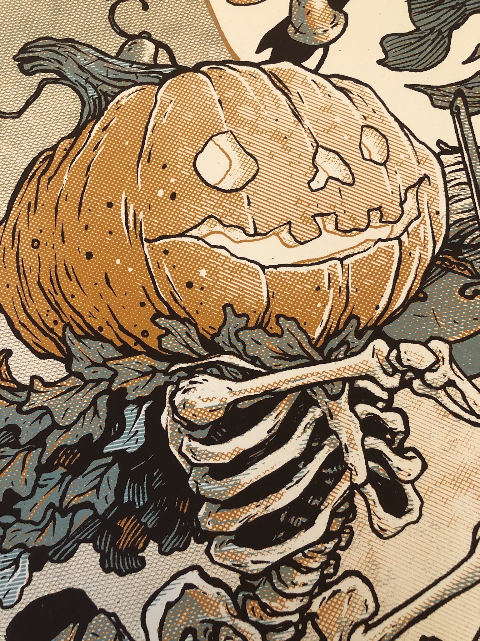
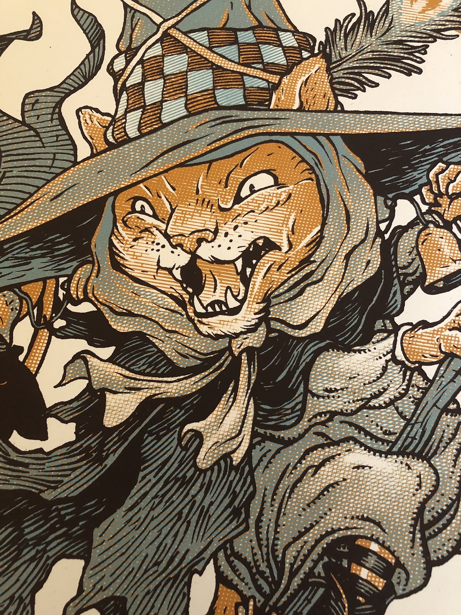
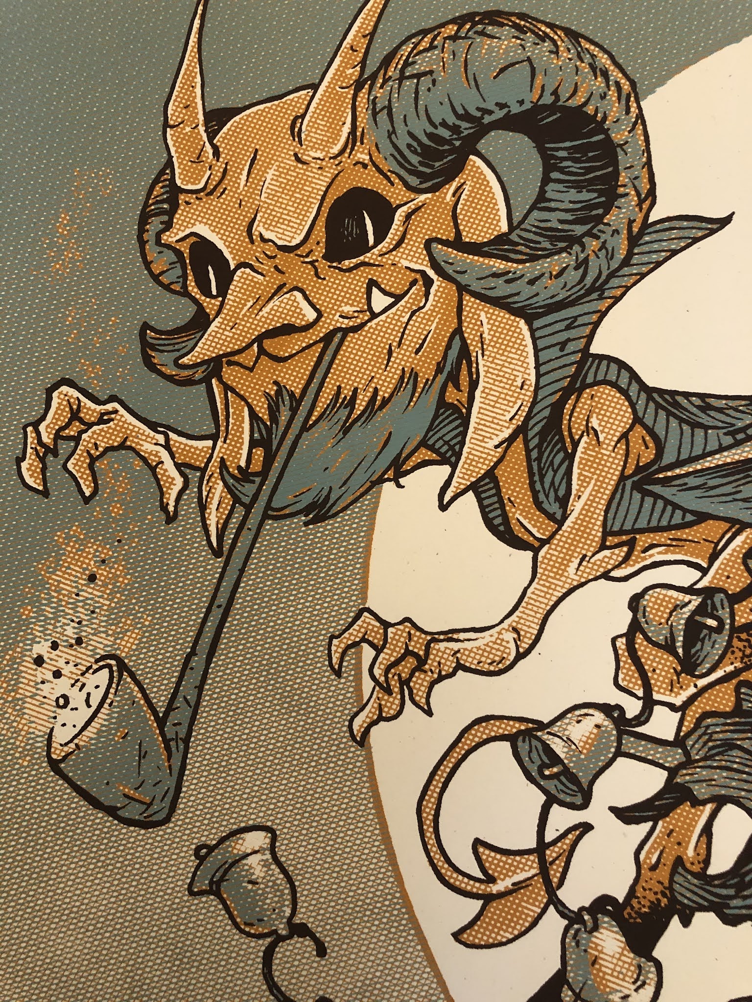
 The final three color print was Silkscreened on 100 lbs French paper by Ocelot Print Shop in Detroit, MI. It's limited to an edition of 50 (signed and numbered).
 And I still have a few left in my online store:
https://mouseguard.bigcartel.com/product/halloween-trio-screen-printed-18-x24-poster
Detail image of the 3 color treatment below:


No comments have been added yet.
David Petersen's Blog

- David Petersen's profile
- 339 followers
David Petersen isn't a Goodreads Author
(yet),
but they
do have a blog,
so here are some recent posts imported from
their feed.

